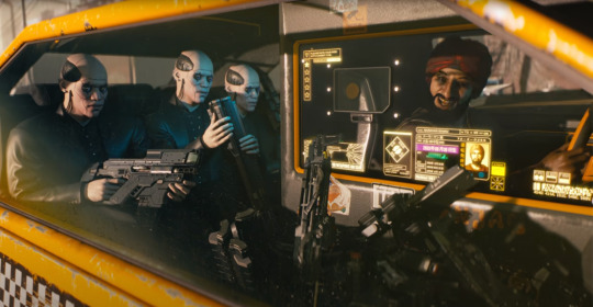
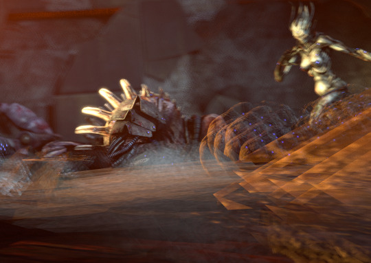
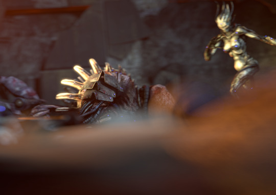
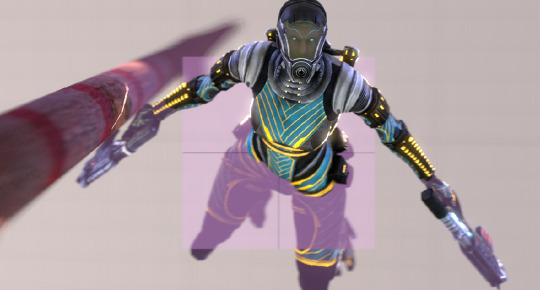
#By high quality I mean not heavily pixelated…
Text

Prompt: someone / something that would be a walmart santa


Just the one because for the life of me I could not find another good quality photo that wasn’t him in a turtle costume…
this is for day 3 of @mizukolai’s 200+ event!
#──★ ˙🎧 ̟ hark! his lordship’s words!#rentry graphics#MIZUKOLAI200#By high quality I mean not heavily pixelated…#I did not mean to post this at 12:31 AM I meant for PM!!! Damn it :(
3 notes
·
View notes
Text
I'm sick and it's the middle of the night...
Yall know what that means...
R-M FIC TIME!!!! :D
Uhh yeah It's been a while since I did chapter 1 (link right here) so I think nows the time to continue!
Man I wish I could just copy paste stuff from my brain-
Uhh so ye let's go
[The Ring-Misstress Chapter 2: A Promotion]
Several days have passed since Pomni and Caine became "coding buddies." Or- since Pomni made her ultimate plan to find the exit. Other than that, it was actually kinda nice. The more time she spent fixing things around the circus, the less time she'd have to spend alone in a room that wasn't hers. Just doing mundane things... heck, maybe that's all she needed...
☆Well then, looks like we're done for the day!! Great work as always, Pomni!☆
And just like that, the mundane was over.
♧Oh... uh, thanks...♧
☆I best be off for now then! Oh-! Don't be late tomorrow morning, because I have some news for all of you!!☆
He looked up to see the Jester walking away, giving a weak thumbs up.
☆Alright then, goodnight, my dear!☆
Pomni shut the door behind her and crawled into bed. She lay there, staring at the ceiling as she recollected the days events. She thought about the last thing Caine brought up. "News? What was so important that they all needed to know??" Part of her kind of dreaded it, but...
Another part of her didn't.
Meanwhile, Caine slowly flew down the circus hall. He, too, reflected on the work they got done today. He was proud of it, really he was!! But... he wondered what caused these sorts of bugs in the first place. He thought about the first time pomni fixed a line of code. What even happened to bubble that day?? He's never seen him glitch like that before. It almost looked like a-
°○ Hi boss...○°
Speak of the devil...
°○All these new textures sure look shiny...○°
Bubble chimed, staring at the wall and licking his lips.
☆Bubble, if you so much as Touch a PIXEL, I-☆
Bubble began gnawing on the wall, ignoring Caine's sterness.
"Pop!"
The ringmaster let out an annoyed sigh, snapping his fingers to fix the wall.
"Just how is he going to deal with Bubble now?! With the big important stuff coming up, his behavior certainly wouldn't do..."
- - - - - - - - - - - - - - - - - - - - - - - - - - - - - - - - - -
The next morning, Caine eagerly woke everyone up, including Pomni. They all quickly gathered to the main stage, ready for whatever nonsense Caine had to give them today.
☆Good morning, Superstars!! Now, you are all aware that I have some very important news today!!☆
•Yeah, yeah, we get it. What's soooooo important dentures?•
☆I'm glad you asked, Jax!! As you may have noticed, the graphics look much more polished now!☆
Everyone collectively looked around. He was right. The circus did look more high-quality.
◇Yeah, and?◇
☆As you are also aware, this place is usually inactive. BUT, I've noticed more of these enhancements, AND, some developers' notes! (Which I haven't found in a while actually) Seems like the game is finally being published!☆
The crew were confused for a moment, but then it hit them. How could they forget this was a kids' game? This place was about to get a lot more crowded... with children nonetheless! They could barely survive this place, let alone could kids!!
This was not good...
♧Uhh, exactly how much time do we have before the game launches..?♧
☆Probably within the next couple of days. So, we should have a little bit of time to-☆
The group was interrupted by a loud "Thud," followed by glitching noises coming from the hallway.
☆... I... I'm gonna go investigate. Pomni, mind if I pull you aside for a second?☆
The Noises in the Distance didn't sound like any normal code bug... but what choice did she have.
They followed the glitching sounds to the hallway entrance, Pomni jumped slightly when Caine suddenly froze to a stop.
☆...Bubble?☆
At the end of the hallway stood Bubble, only larger and heavily corrupted, covered in glitches and code. He kept biting chunks of code from the wall, making him increase in size.
☆My, how did this happen??☆
Bubble didn't reply and continued eating away at the code.
☆Uhm, hello??☆
♧CAINE I DONT THINK NOW IS THE TIME TO ASK QUESTIONS...♧
☆Ah, of course! Now... let's fix this up!!☆
Caine snapped his fingers to no success.
☆Okay, Pomni, any ideas?☆
♧Me? Uhm...♧
She noticed an odd looking piece of code in the center of Bubble's corruption
♧K-keep him distracted! I think I have an idea!♧
Caine followed orders, snapping the walls fixed, making Bubble eat them again, and then He'd fix them again, so on so fourth.
As He kept Bubble Occupied, Pomni snuck behind Bubble and Snagged the strange line of code. Bubble slowly returned to normal size but remained slightly glitchy and corrupted.
♧Got it!!♧
She held it up for Caine to see.
☆Hold on a second... are you sure that's what caused it??☆
♧Well, yeah, I-♧
Caine cut her off, sounding almost confused.
☆That's... That's his central code... he's always had that...☆
Pomni thought for a moment... "That's weird... it looked an awful lot like a virus code..."
☆Well, now what??☆
Pomni stood in silence for a second... she wasn't sure how Caine would take this. But they didn't have much choice.
♧Looks like you're gonna have to pop him one last time...♧
Caine slowly reached his index finger towards Bubble.
"Pop!"
The glitching stopped. And the stray peices of code faded away.
- - - - - - - - - - - - - - - - - - - - - - - - - - - - - - - - - -
•Man, where on earth are those two?!•
◆Hey, I'm pretty sure it takes em a while to fix things◆
•Well yeah, but it definitely shouldn't take more than 20 minutes! I'm outta here.•
◇Honestly, this is the one time I agree with you.◇
Just as the crew were about to go back to their rooms, Caine and Pomni made their return.
♧Heheh... we're back...♧
☆Apologies for that, superstars...☆
•Well it's about time!! What happened back there??•
The pair stood in silence for a long time...
☆So... Bubble is dead.☆
A few of the cast simultaneously gasped, visibly confused, and surprised.
♧L-let me explain. Turns out Bubble... was a virus. He was eating the place inside-out, so we kinda sorta had to...♧
•Eh, whatever. I never liked the guy anyway! He was pretty annoying. Good on you two.•
The others collectively chattered to eatch other.
☆Well, now that that's out of the way... that's really all I have for you. You're all free to go. I have plenty of work to do!☆
The cast all started towards the hallway to their rooms, as usual. Pomni began to follow them when Caine stopped her.
☆Pomni... I have one more favor I need from you.☆
♧Hm?♧
Caine seemed strangley less energetic.
☆I know this is on rather short notice, but... with my- lack of an assistant... I was thinking...☆
He snapped his fingers, and in front of Pomni was a new string of code
☆How would you like a promotion??☆
♧...as what??♧
She examined the jumble of numbers in front of her.
☆As my Co-host!!☆
♧...Gee, I dunno... I don't think I-♧
☆May I add, being my assistant, has its benefits!! You'd share my capabilities! You'd be able to help fix things full time and help with making future adventures!!☆
She thought about it for a moment... she wouldn't have to go on any adventures. Just make them. Also, this gave her a chance to get closer to Caine. Again, to get answers about the exit...
☆Well..?☆
She looked down at the code again... this could be her chance...
She reached out and touched the Code...
With a quick flash, it suddenly disappeared. Or so she thought at first.
She looked down at herself to see that her model had changed. It was a lot higher in quality. Her Jester hat had decreased in size and wrapped around a larger yellow top hat, similar to Caine's. As well as blue and red stripped leggings and a splitting coat tail. Next to her floated a red and blue striped cane (or more of a wand in size). She looked down at her new features and looked back up at Caine.
☆How do you feel?☆
♧... Well, it definitely does look nice.♧
☆Now that's the spirit!!☆
Caine beamed at his new assistant. He then looked down at his own model.
☆Heh, suppose I need an upgrade too!☆
With a snap of his fingers, his model was also polished. Brighter, bolder colors, and star embroidery on his hat and the back of his coat.
☆Well, we've got the looks right! Now, let's get to work kn adventures!! Any suggestions??☆
♧Hm... Maybe we can start making them a little more... mundane...♧
- - - - - - - - - - - - - - - - - - - - - - - - - - - - - - - - - -
Holy moly this was waaaaaaaay longer than chapter one-
This was alot-
I feel like crap rn-
Uhh, yeah, you know the drill. Ask Caine Pomni and Voz, ask me maybe, check out my main acc [ @dayseedrawz2 ]
Buh bye chat
#[R-M fic tag]#tadc#the amazing digital circus#[ring misstress au]#tadc caine#tadc pomni#caine x pomni#tadc showtime#showtime#pomni x caine
32 notes
·
View notes
Text
I've mentioned this before but I've just gotta mention it in its own post because it is so wild to me.
If AI was actually a compositing machine, that would be FAR more technically impressive than it actually is.
To dramatically simplify, diffusion models are really, really beefed up denoising filters that use text guidance to determine what the end result should be "under" the noise. They use statistical correlations between the text and images they've "seen" during training to figure out what patterns to enhance in a bunch of random noise, and what to smooth out. It's a huge breakthrough in computer science, to be sure, but compared to the collage machine people think it is, it's BABY stuff.
An automatic collage machine would have to:
Either store its source images locally (which would be actually MIRACULOUS to do in the file size of any known model even at unusably low quality, let alone at a high enough resolution to sample) or retrieve them from the internet live, EVERY time (which would take absurd amounts of time and severely compromise the model's reliability)
Have an even BETTER understanding of the correlation between pixel patterns and the words that describe them such that it would know WHAT to cut out even where its border isn't clear
Know WHERE to paste what it cut out
Be able to smooth out the boundaries between elements and alter the lighting and potentially even the style to look consistent - including being able to copy-paste more than one image of the same subject together and post-process it this way to create new angles
Be able to do this with or without an image as guide, no matter what that guide image is
Filter the result heavily enough that reverse image search won't expose it without making it unrecognizable as the subject it's supposed to be
And we somehow think THAT'S easier to program than what we have, AND it would still return hands that look like this?

...I mean, hell, I know drawing hands is hard, but I don't usually see people fuck them up in that specific kind of way.
It's like how it was easier to land on the moon than it would have been to fake it with the tech we had at the time.
7 notes
·
View notes
Text
Cyberpunk 2077
I'd have to say the one game that made me think the concept design looked better than the gameplay graphics would have to be Cyberpunk 2077.

Cyberpunk 2077 is an open-world action-adventure role-playing video game set in an anti-utopian future filled with cyberpunk technology and a deeply fractured society, where the elite rule from the heights of the skyscrapers of the City of Night, as well as a multitude of gangs Those who roam the city streets. A mercenary who lives in the fictional Californian city of Night City, where they deal with the aftermath of a robbery.
I remember that in 2022, the cyberpunk style was very popular in China, and many companies began to produce cyberpunk games. Including some pixel games, "Anno Mutation" and "Wheel of Life and Death" all look great. I really like the contrasting colours and cool neon lights. But what’s most fascinating is cyberpunk’s bipolar worldview.


Cyberpunk visual elements, neon lights, rainy nights, damp and narrow alleys. High contrast and high saturation flashing billboard. Towering buildings, ruins, androgynous lights, high technology and slums. The dystopian atmosphere and pessimistic colours of neon cityscapes are the simplest visual elements to express the chaos and loss of control of the world.
It follows that cyberpunk works usually construct two different dimensions, one of lightness and weirdness, and one of dilapidated identity, with gloomy, constricted slums where it rains heavily, and post-modern futuristic metropolises where skyscrapers tower over the city.
The concept designer I'm following, James Daly III, is different from the other Cyberpunk 2077 concept designers in that the images I've found of him are in the early sketching stages as if I'm looking at the world as it was first constructed, slowly getting darker and heavier.


I really like this draft, the absurdity of the design is so real in the context of the story. Whose idea is it that a man who is speaking has his brain replaced?

James Daly III's drawings have a strong storytelling and associative quality, which not only makes me think of exploring the philosophical meaning behind cyberpunk and what humans really are. Humans began to transform themselves, replacing their original limbs and organs with machines, and the emergence of transformed half-human, half-cyborgs blurred the boundaries between humans and machines, which made us think What is a real human being? The emergence of cyberpunk, it's as if it's magnified the present world 50 times over.

I really like his early exploratory concept art, and I feel like the fun of concept design is to keep pushing the worldview. Seeing that these architectural styles don't appear in the game makes them feel even more familiar, so maybe cyberpunk has its own revolutionary significance, hh. And I think looking at the initial drafts of the game wallpaper, it's like you can visualise how their styles have evolved, which I think is very meaningful to me in terms of constructing my own concept art.
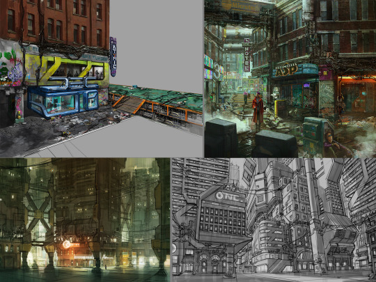

Whilst the concept art for James Daly III has not been updated for a while, the game is still being updated. In the world of cyberpunk, we can see a clear multicultural fusion, with many international cities where East meets West. Reflecting its prosperity and congestion, wealth and poverty, this dichotomy of setting and background history reflects its exploration of the laws of aesthetics. Secondly, the futurists, in an era of highly advanced technology and seemingly peaceful and beautiful times, hide the festering of civilisation and the destruction of humanity. "Cyberpunk 2077: Ultimate Edition" will be released on 5 December - experience the full story of V with panoramic ray tracing, ray reconstruction and Reflex. On a side note, I think Cyberpunk: Edgerunners is pretty good too hh!

References:
CD Projekt Red. Cyberpunk 2077 [Website]. Retrieved from https://www.cyberpunk.net/gb/zh-cn/cyberpunk-2077
ZerowolfZX. (2023, March 20). Cyberpunk 2077 — Next-Gen Update [Video]. YouTube. https://www.youtube.com/watch?v=c1lgKA-AP4I
IGN China. (2022, February 28). Cyberpunk 2077 — Official PlayStation 5 Gameplay [Video]. YouTube. https://www.youtube.com/watch?v=g56D5PZ7_Ew
NVIDIA. (Year, if available). Cyberpunk 2077 Ultimate Edition: DLSS, Reflex & Ray Tracing. Retrieved from https://www.nvidia.cn/geforce/news/cyberpunk-2077-ultimate-edition-dlss-reflex-ray-tracing/
0 notes
Text
ᐅ Pixel 2 XL Used — Cheap Refurbished Pixel 2 XL ᐅ
INTRODUCTION
I had no idea Google created cellphones.
In 2021, Google entered the smartphone market, and it has since been a serious competitor to market leaders Samsung, Apple, LG, and others. With features like Google Assist, exceptional camera quality, and modern and elegant designs, Google Pixel phones are on the rise, despite the fact that Google doesn’t promote them as heavily as other companies.(Pixel 2 XL Used)

Why is Google’s Pixel 2 XL so fantastic, you ask?
The Google Pixel 2 XL is an excellent and adaptable smartphone. One of Google’s most popular offerings, the Pixel 3 is just one example of the company’s commitment to creating beautiful and functional mobile devices. The Pixel 2XL improves upon the Pixel 2 and is a great choice for anyone who wants a sleek all-purpose smartphone.
These mobile phones’ Smooth Design, which features a glass front and a silky aluminum frame, appear as wonderful as they feel.
With protection against dust and water for up to 30 minutes at a depth of 1 meter, you can rest easy knowing your phone is protected.
With its 12.2MP rear camera and 8MP front camera, this phone takes pictures and videos that are nearly as good as those taken by a professional. New, high-quality photos can be stored indefinitely in Google Photos.
Is waiting for your phone to charge a major source of frustration for you? If you’re looking for a smartphone that can keep up with your hectic schedule, go no further than the Google Pixel 2 XL, which features both Fast Charging and a lengthy battery life.
Seeing is believing with a 6 inch Amoled screen and Quad HD resolution.

Squeeze the handle to activate Google Assistant and start using voice commands to get things done.
In addition to what has already been said, Google has packed the Pixel 2 with of fantastic features that are exclusive to Google’s line of smartphones. You can use Google Lens to get information about anything by pointing your phone’s camera at anything, or to translate text by holding it over it. Moreover, the Pixel 2 XL’s Now Playing feature is always on the lookout for music and collecting song samples to keep in a database, so you never have to waste time searching for the name of a song again.
Can you swim with a Google Pixel 2 XL?
The Google Pixel 2 XL, even a refurbished one, is not waterproof but is -IP67 dust/water resistant. This means that the phone may be submerged in water up to 1 meter deep for 30 minutes without being damaged.

A refurbished Google Pixel 2 XL: Why You Should Buy It!
You may save a lot of money by purchasing a refurbished phone, and here at The Big Phone Store, we work hard to dispel the idea that refurbished products are of lower quality. You can be confident that you will find a price that works for you among our reconditioned phones, which have been thoroughly evaluated, tested, and rated to a point that suits their condition. The only real difference between a “second hand” phone and a brand new one is the price, and many phones that are considered “second hand” are in virtually identical condition.
SEE ALSO : 8 Online Marketing Tactics for the Construction Industry
When can I expect to receive my refurbished Google Pixel 2 XL if I order it right now?
If you place your order by 4 PM (Monday through Friday), it will arrive the following business day. If your order total is over £30, shipping is on the house. If you’re in a need, you can choose the expedited shipping option of Next Day Delivery and indicate whether you need it by 1 PM or 9 AM. Unlike other sites, where you may have to wait weeks for your phone to arrive, we pick, pack, and send your smartphone the exact same day you place your order.
Will a power adapter be included with my reconditioned Google Pixel 2 XL?
We include a genuine Google charging cord with every refurbished Google Pixel 2 XL we sell. If you need a USB plug, we sell a variety of them.

In what ways are Big Phone’s advantages worth considering?
Get 12 months of warranty and free UK shipping on orders over £30 when you buy a refurbished Google Pixel 2 today. You may rest easy knowing that you won’t have to look anywhere else for what you require because we also have a large selection of deals on cases, accessories, and other gadgets.
SEE ALSO : Google Pixelbook 12in
At The Big Phone Store, we are conversant in the subject matter. You can tell we love what we do by reading the glowing testimonials of our satisfied customers, and you can trust us because we’ve been selling new and refurbished phones since 1999. Do not fret if you are still on the fence about purchasing a Pixel phone. To ensure you get the appropriate products in the right condition, our customer support teams are well-versed in their fields and can provide as much information as possible.
Sorting & Filtering Why our users adore us.
We think it’s important to hear from each and every one of our customers, and we know you do, too. Check out the feedback our previous customers have left if you need further convincing why you should buy a Refurbished Pixel 2 XL from us.
#Google_Pixel_2_XL_price_In_USA#Google_Pixel_2_XL_refurbished#google_pixel_2_xl_case_with_card_holder#Pixel_2_XL_release_date#Google_Pixel_2XL_specs
0 notes
Text
Black Clover matchup for @nakunakunomi

Matchup for me :D No gender preferences I am a biromantic ace.
Your age: 24
Your general appearance - most striking features, your fashion style, etc.
Answer: Chubby mermaid lol. Long curly hair almost all the way down my back. Red at the moment, but I’ve had all colors of the rainbow. Ears pierced multiple times and a septum ring whenever I leave the house. My general style is comfy alternative, loads of black, boots and ripped jeans but baggy shirts and sweaters. I don’t like drawing much attention to my chest because my boobs are a very prominent feature. Hourglass figure with extra minutes: so there’s boobs and ass but also a tummy and such. I have dimples when I laugh and a whole bunch of moles over my body. I like a killer liner and mascara but don’t necessary wear makeup every day. I like 4 tattoos and waiting for that fifth one.
Your MBTI, western zodiac chart, etc.
Answer: INFP (mediator), Scorpio sun, Libra moon, Pisces ascending. Year of the rat. I’d say my MBTI type is pretty accurate and while I don’t have many of the bitchy traits often assigned to Scorpios, I do have some of the passion towards things I care about and a generally jealous and stubborn personality.
Your personality, how you perceive yourself and how people around you perceive you.*
Your hobbies, interests, life goals etc.*
Answer: Stubbornness and some jealousy (that is always internalized) are my worst traits. I lack self-esteem and confidence and get anxious in new situations. Once I am around people I trust I blossom open and become more giggly (lame jokes and such) my humor is about 50% puns and 50% sarcasm. I am quick-witted with ‘mean’ remarks but I will never intend to offend or cause harm to anyone. Tough exterior comes with a soft interior. I tend to overthink and worry a lot and will usually put a friend’s needs above mine. I often have people coming to me for advice or to help them calm down. I will be honest in the softest way possible, even if the things I need to say aren’t necessarily nice. I want my friends to flourish. I get easily distracted by cute things and can really enjoy beautiful sights, nice food, good company… i am heavily introverted but I do need the handful of people I care about to flourish myself.
I accumulate facts and know loads of small things about a lot of things. I like adding in fun facts every now and then but sometimes I come across as a know-it-all and then I will get really self-conscious about it. I either talk up a storm nonstop or turn into myself and get really really quiet.
Your favorites, likes, dislikes, pet peeves, fears.*
Answer: anything creative: reading and writing, drawing (although I’m terrible at it), pixel art. Singing, making music, playing instruments, DIYing things. I am quite good with makeup and wigs, and I cosplay but the sewing I still struggle with. I love acting and gaming as well although I don’t spend that much time on them.
I am super heavily interested in true crime, cases, and the psychology of murderers and such. I tend to get overexcited talking about such cases, never celebrating violence, but just being very fascinated by what a human brain can do. I also just really love riddles, mysteries, and solving them.
I’d love to become a teacher or a professional dog trainer. I love animals more than I love people and if I could work with dogs every day of my life that’d be amazing. An unrealistic goal would be to sing for a living, or do musicals. But I don’t think that’s ever gonna happen.
Any additional info you would like to share, fun facts, etc.
Answer: food! Mainly Asian dishes (from all of Asia) and pastas. I love cooking and experimenting in the kitchen and trying out new things to taste. I’m vegetarian but not vegan and I will try everything that’s not meat or fish at least once! I love all kinds of animals, not only your average pets. I will also go pet the cows, and in the zoo you’ll have to drag me away by my ankles from the reptilians and the aquarium. I am fascinated by them and I love them. I love plants and flowers, and if you’d let me be, Id have a small jungle in my house with all kinds of plants and animals. I just love taking care of them, talking to them…
I dislike arrogant people, people who are rude against serving staff. I dislike impoliteness and laziness in the sense that other people are suffering from your lack of work. If I am in a group project I will never procrastinate because it can drag the whole group down, it’s okay to be lazy if it only impacts yourself.
I am afraid of loneliness and the fact that everyone I know just pretends to like me while talking behind my back and secretly hating me. I am not easily startled by monsters, animals, and such, but I do get a little paranoid if I have to walk in the street in the middle of the night. (a side effect from the true-crime consumption)
Answer: I think I added most things in the other walls of text (sorry they are so long). But when it comes to relationship and goals around that there are these things that I think are most important:
Love language is mostly quality time and words of affirmation, and that’s what I like too, as well as soft PDA and affections: cuddles, kisses, hand holding… I like spending time together, and even more so I like actually doing things together: sharing hobbies, going out, dates, dinners, walks, adventures, travels… all the things! :hellmo:
Patience, because I have some anxiety issues as well as fear of commitment. I will definitely need some reassurance. Also consent is the sexiest thing in the world, and that’s coming from an ace person.
Honesty, liars are out. I have a lot of trouble trusting again once there has been a breach of trust. White lies for surprises and such is one thing, but any intentional lying in order to avoid confrontation is an absolute dealbreaker.
I match you with...
Dorothy Unsworth!
Despite her being asleep a lot of the time, Dorothy notices more than she lets on. She can see straight through the front someone is putting up and see what they are really feeling. This really helps in letting her support you, who is always supporting others. She’ll remind you that sometimes you need to take a break or that you need to focus on yourself instead of others. With her infectious smile and her own absurd sense of humour, she’ll do her best to cheer you up, or at least to distract you from whatever is bothering you.
Dorothy is very patient and has no rush with any relationship. Everything has its own time and waiting for that time to come it part of the fun, right? She’s also very understanding of your anxiety and is able to adjust her energy to the situation, keeping it low when you need comfort and reassurance, and going straight back to high when you’re feeling better and just want to have some fun.
Dorothy may seem very cute and girly, but she is interested in true crime as much as you are. The gruesome details of a case are not wasted on her and she will gladly talk with you about these cases. In her time as a magic knight she has seen her own fair share of true crime as well and she will gladly share anything that’s not confidential or dangerous.
Her love languages are physical touch and words of affirmation. Not a day will go by where Dorothy won’t hug you from behind, kiss you between your shoulder blades and tell you she loves you. She loves loving you and making you feel loved. When she’s in love, keeping her lover safe, emotionally and physically, is her number one priority. She won’t give you even a second to doubt her love for you whenever you’re together. She’s very conscious of your boundaries and makes sure to not cross them.
Not a single lie will leave her mouth, unless as a joke, which will be very clear when she tells it. She is a knight, an enforcer of justice and peace, and lies are not in her book. Teasing, however, very much is, though she prefers to tease you with truths instead of with jokes. If there’s truth to the teasing, it’s just that much more effective.
You want this small strong captain to be putty in your hands? Cook for her, or cook with her. Dorothy greatly enjoys the good things in life and food is definitely on her list of good things. Her preference is mostly sweets, but she knows she needs to eat healthy food as well and she’s not picky when it comes to her dinner. The only need she has is that it tastes good, and that’s something you with your amazing culinary skills can definitely provide!
#black clover matchup#matchmaker cookie#cookie writes#matchup#600 followers event#requested#nakunakunomi#scheduled post
9 notes
·
View notes
Text
Mickey and Minnie Year of the Rat Solve (Spice Girls Advert)
https://pangenttechnologies.tumblr.com/post/190486705747
This post is a response to an ask by timescapeartist wishing Pangent a happy lunar new year, corresponding to the Year of the Rat.
The last image has a colorful barcode at the bottom. Turns out it can be decomposed to Red, Green, and Blue channels, and each of those grayscale images decoded as a 2d barcode.
The results are seemingly gibberish but that’s par for the Pangent course, meaning is likely to be found eventually.
Red:
LBSKCLKIHANLTVMYN
Green:
JBRFIMYTPDMLEHAOO
Blue:
QQMZKMFRCILRSUDO
Turns out that using a vigenere code with keyword ‘gongxifacai’ we get a reduced alphabet string. (‘Gong xi fa cai’ was part of the original ask text)
FNFEFDFIFAFFFIGBF
EBPFAGKGJGEGEFAGI
CDGCCHFPCAFDFOGG
Then, replace each letter with the associated hex digit, starting with A=1, B=2, … J=0, K=A, … P=F
6D656469616669726
52F617A7075756179
3473386F31646E77
Which can be decoded using ASCII hex to become:
mediafire/azpuuay4s8o1dnw
http://mediafire.com/?azpuuay4s8o1dnw
This is a Pangent-restored version of an advertisement for the Spice Girls’ debut album. a LOT of effort has been put into this by Pangent, and this is the fourth version of the evolving effort. A text file is included in the ZIP archive, so I will share their own words:
We’ve attempted to reconstruct these adverts before. This is version 4.
Victoria’s section is missing from our known copies of the first advert, and is reconstructed approximately using shots of Victoria which appear in later adverts using the same footage. Otherwise the editing is accurate.
In the second version of this advert, the girls don’t speak. The main source was a bit damaged, but the editing should basically be accurate, nearly to the frame. Most audio was replaced from the CD, and most footage replaced from later adverts which used the same footage.
For version 4, I have cleaned up the damaged source used for advert 2 frame by frame in Photoshop, removing glitches, and generating a handful of missing inbetween frames using After Effects pixel motion. Photoshop’s content-aware fill was used heavily. Some frames of Melanie Brown were affected by an interlacing mismatch, and have been reconstructed approximately.
I have also used AI synthesis to generate entirely new frames throughout. In many cases, we had a high quality version of a shot (from a later edit), which cut off at a certain frame. We matched this frame with a cleaned-up version of the lower-quality complete shot, using its motion to synthesize new frames to match. This is especially obvious at the end of the shot of Victoria pointing in Advert 1, which was from a very low quality source. In this version, new frames have been synthesized to complete the shot in full quality (more or less). Many shots in Advert 2 have gone through the same process. Longer shots are synthesized and cross-dissolved back to the original (lower quality) source.
A few shots are repeated here at the very end, when they appeared in longer form in overseas versions of the ad. I have also included a comparison shot of the restoration of Victoria pointing, and some of the original damaged frames which were hand-corrected to remove glitches and then synthesized to match the higher quality footage.
-lw
This level of effort and perfectionism with seemingly no external payoff for the effort seems to be a theme with the Pangent project. Burning the candles from both ends with little regard for the destructive potential. It’s impressive to me, the efforts they’ve gone through, but still confusing as I don’t understand how much time and effort can be invested in something with such a small audience or 'payback’ so to speak.
The journey continues. Thanks again Pangent!
Around 1:00 into the video, grayscale grids flash briefly and can be combined as RGB channels (they are presented in reverse order BGR) which can be re-composed into a color image that is a grid of Pangent color code blocks:

771010015
017907501
411101801
901401601
458900122
145311795
019935101
reverse it and space as decimal ASCII values:
101 53 99 105 97 113 54 122 100 98 54 106 104 109 108 101 114 105 70 97 105 100 101 77
decodes to:
e5ciaq6zdb6jhmleriFaideM
reverse again:
MediaFirelmhj6bdz6qaic5e
which is a mediafire link:
http://mediafire.com/?lmhj6bdz6qaic5e
Which appears to be the same LadyVamp19.mov video from an earlier version of the edit, unchanged. It shows the 2019 Spice Girls concert version of The Lady is a Vamp. Another fine editing job as we’ve come to expect from Pangent.
1 note
·
View note
Text
Improving the quality of your image renders from SFM
So I’ve seen a lot of SFM renders that are absolutely amazing, with great poses, shot composition, scene setup, and lighting. However, so very many of them are also rendered at really low quality. In order to try and inform other users of some simple steps to improve their render quality, I’ve created this post.
Much of what you see here you will likely already know. However, I encourage you to give it a read over in case there’s something you’ve missed. This is primarily aimed at rendering still images (posters or image sequences), not video.
Progressive Refinement Settings
This is the FIRST stop anyone should take to improving their render settings as they are the quickest, easiest, and will often have the greatest impact.

Depth of Field & Motion Blur
These settings affect Depth of Field (DOF) and Motion Blur, (duh). These settings work on a sample basis. The more samples, the better.
What’s the issue?
By default, SFM uses “use camera settings” as the default number of samples. The default camera settings are literally the lowest number of samples you can have without turning the effect off: 8x samples. DOF goes up to 1024 samples and motion blur goes up to 256, which is 128 and 32 times more samples than the default settings.
Here are some examples (effects or lighting exaggerated to show the effect):
No DOF:

Default DOF:
Max (1024) DOF:
No motion blur:
Default Motion blur:

Max motion blur:

You can see the effect is significant in both cases.
Why does this setting matter?
No matter whether you are rendering as a poster or as a image sequence, these settings will change the quality of your rendered image. Rendering as a poster does not mean you can neglect these settings. These settings also greatly impact the quality of the Ambient Occlusion (AO), volumetric lighting, and any lights with the radius that are using radius. If you ever render an image and it’s really grainy, it’s 99.99% likely to be a sample issue. Turn samples up and re-render.
What’s the catch?
The only catch with rendering these is that it will significantly impact your render times. To really show what I mean, here are the render times for the images above, rendered at 3840x2160:
No DOF: 0.368 seconds
8x DOF: 0.606 seconds
1024x DOF: 50.034 seconds
No Motion Blur: 0.299 seconds
8x Motion Blur: 0.500 seconds
256x Motion Blur: 8.356 seconds
In this example, going from default to max samples, DOF and motion blur caused an 82x and 17x, respectively, increase in render time per frame. This is not additive - combining 128x DOF and 128x motion blur has a negligible increase in render time over 128x DOF with no motion blur. Still, this is a significant increase.
what do?
If you are rendering a still image (poster or only a few frames of an image sequence), always push these settings up to the absolute max. Yes, it may take a little more time. Your art deserves that little extra polish, and literally the only cost is time. Be thankful it’s not blender, where single frames can take hours.
I should note that the number of samples that will be rendered will equal the highest number of the two settings. So if you set motion blur to render at 256x, but DOF to render at 16x, you will get both DOF and motion blur at 256x. The only way to completely disable rendering one of these effects while keeping the other is to untick the checkbox next to the setting in the progressive refinement settings window.
Subpixel Jitter AA
This setting applies a very light Anti-Alias to your image. In short, it helps reduce jagged edges. The effect is subtle, and often can only be seen when checking the image through a difference filter
This setting is ON by default. There is basically no reason to ever have this turned off, so leave it on by default.
Poster render vs Image Sequence
There are pros and cons to rendering as posters vs just rendering as a single frame image sequence.
Why posters?
Poster rendering has three main benefits:
1. Resolution: You can render at massive image resolutions, allowing you to get the pixels you might want for a professional print. This is possible because poster rendering renders using a tiled approach. This is gonna get a tiny bit technical:
SFM is running the Source Engine - a video game engine. When you have SFM open, that engine is technically running in the background at a certain resolution. I believe by default, the resolution is set to 1280x720. When you render as a poster, that resolution is the maximum resolution that the engine can render, so in order to go above that, it splits the desired resolution up into “tiles” that are the same size as the engine’s resolution. If you’re rendering at 4k without changing anything, that means that you will get 16 tiles: four wide and four tall.
Anyway, this means you basically can render at massive resolutions. But it has drawbacks, as noted below.
2. Particles. Particle systems, mainly those that change over time, will render exactly at the time of the playhead. Image Sequences have an issue with this, requiring you to render from the start of the particle system life and render each and every frame forward until the frame you actually want.
3. Depth of field. Be it a bug or not, image sequences have an issue with the DOF plane not actually being where the image ends up focusing. Posters do not have this issue. More on this below.
Why not posters?
There are four main downsides to poster renders:
1. Ambient Occlusion: Ambient Occlusion renders on a per-tile basis. As a result, rendering at very high resolutions can cause blocky AO to appear. As an example here’s an image I rendered with the internal SFM engine running at default, rendered AO only at 15360 x 8640 resolution. I’ve blown the contrast all to hell to really show what the effect is like

In some instances, the effect is minimal enough to be overlooked, but in many it might end up looking bleh.
2. Bloom. Poster renders do not render bloom. At all. There’s no way to fix it. rip.
3. Render Time. In my experience, poster renders take longer to render. More time is spent in processing writing tiles to file, and stitching them together, so it takes more time for a single frame.
4. Annoying. This may not affect everyone the same, but the fact that a .tga file must render for each poster, no matter what output file you choose is annoying. Especially if you don’t intend on doing any post processing and just want to post the raw image.
Why Image sequences?
1. 32 Bit Workflow. Rendering as an image sequence allows you to render as a .PFM. SFM is confusing so there’s technically two kinds of .pfm file: A .pfm depth file, and a .pfm output format. The depth file is essentially useless outside of incredibly nich uses where you want to create a sort of 3D vision thing where the image can be displayed with depth. Never tick the ‘Write PFM depth file’ box. It’s all but useless.
However, under the ‘format’ drop down, there’s another .PFM option. This is Source Filmmaker’s 32bpc (bits per channel) output format. All other output formats are at 8bpc. If you’re not going to be doing any form of post-processing, this is meaningless to you. However, if you do a lot of post-processing and can utilize all that 32bpc goodness, this is the file format for you.
I’m still very new to 32bpc workflows, but the quick version of the difference is that 8bpc means that color data is very limited. On the surface with no adjustments, the two images will look identical. However, the 32bpc file contains a metric fuckload more color data in it per pixel. This means that if you’re applying any kind of post processing (at least, post processing that supports 32bpc), you will see significant differences.
For example, here’s 8bpc with some heavily reduced exposure in post:
And here’s the exact same adjustment made to a 32bpc .PFM file:
What about hue? Hue change on 8bpc:

And here’s 32bpc
BIG difference.
The only downside is the file size. As there’s lots more data, .pfm files are hueg. The above images were rendered at 720p. The 8bpc .png was 0.6MB. The .PFM 10.5MB.
2. It does what Posters don’t. Because image sequences don’t using tiling, you won’t ever get that tiled AO issue with posters. Bloom renders, as well. In my experience, it renders slightly faster than posters, too.
Why not image sequences?
1. Limited resolution. As I mentioned in the poster section, SFM has an internal engine running in the background. The resolution of this engine is the maximum resolution you can render an image sequence at. By default, this is 1280x720. Through launch commands (see separate section below), you can extend this all the way up to 3840x2160 (~4k) which is nice, but SFM does not support resolutions over this at the time. 4k is still great quality, so this isn’t much of a downside. However, if you’re looking to get that >4k resolution needed for certain high quality prints, image sequences are no bueno.
2. Particle Systems. I touched on this in the Why Posters section, but image sequences have an issue with particle systems. Particle systems that evolve over time have a start and stop time. Usually, it takes a few fractions of a second for them to “enable” as the particles are emitted. Like with a flamethrower. At 0.00, a flamethrower particle hasn’t thrown any flames yet. You need to move the timeline along a little bit for the particles to have fully emitted. With posters, there’s no issue. However, with an image sequence, SFM cannot deal with particles with a start time that is before the first frame of the render. So a poster of a flamethrower may show you some nice and toasty bad guys, but the exact same under and image sequence will have barely even a sputter of flame. In order to work around this, you have to set the desired render frame a few frames ahead in time, and render out each frame as if it were a movie until you get to the desired frame you want. This takes much more time, and creates many junk image files.
3. Flexes. In a similar manner to the particle systems, I’ve noticed that face and body flexes can sometimes not be set properly for the first few frames of an image sequence, requiring you to render out 3-5 frames before they jump into place. The flexes aren’t jumping from their default position, so it’s not super noticeable. It’s hard to explain. I have a video that shows this effect. Notice how the mandibles jump around a bit. This is because each change in skin is a change in skin is a new shot in SFM. Like with particles, the work around is to render out 3-5 frames or so to ensure that the flexes move in place.
4. Inaccurate Depth of Field Target. This mainly effects projects with a very high aperture in the DOF effect (basically, super exaggerated effect). I do this a lot, and it can be annoying. Here’s what it looks like:
I’ve added a pole moving away to the camera to show distance a little better. Here you can see the focal distance is set on the head of the main character.

You would expect that this would then make the head in focus, but no. With image sequences, the focus target is a noticeable distance in front of the focal plane.

Posters, on the other hand, work just fine, less bloom.
In fact, to get an image sequence to work fine, you have to kinda guess and check in the viewport to ensure it’s set right.
This error shows up in the viewport no matter what, so if you’re rendering posters, trust that the focal plane is set properly. For image sequences, you have to let the viewport render in the clip editor to see the DOF and make sure it’s set right. You’ll have to set the render target to be a little further than your target.
5. Annoying. Posters always render a .tga file? Image sequences always render a .txt _mainframe file. This is a log of your render settings and the time it takes to render each frame, which is really neat when checking or testing render settings for videos, but otherwise just another junk file to delete.
Personally, I always use image sequences. I want that sweet sweet bloom effect, and I can work around the other issues. Render time is not an issue for me, so I’m more than willing to render out a few frames for particles and flexes, and have gotten used to working around the DOF issue. And although I’m a resolution nut, 4k is enough for what I want.
Launch Options
Those of you who have tried to render videos at 1080p or 2160p will know that you have to set a launch option to enable this. There are several other launch options that you can set to help improve quality. The great thing about launch options is that they’re almost all ‘set and forget’ settings, which you can just ignore them once you’ve set them. I’ll go over the ones I use here.
-sfm_resolution 2160
As mentioned above, this enables rendering at 4k as an image sequence. If you’re rendering as a poster, this will also increase the size of each rendered tile. This has its downsides though. As I’ve mentioned, SFMs engine is always running in the background at the resolution you set it to. So with this launch option set, placing objects, posing, lighting, and moving the work camera around can be noticeably slow, because despite the viewports being small, the game engine is still running at 4k in the background (it sure doesn’t look like it :/). This can have a massive impact on older hardware. Hell, I have a beefy computer and even it slows quite a bit just when moving the work camera around if I have this set to 2160, especially in complicated scenes with lighting and AO enabled.
My advice is this: Use different settings for this launch option when you’re editing the scene vs when you’re rendering. I use -sfm_resolution 720 to force it to run at 720p in the background while setting up the shot. Once I’m happy with it, I will save, close, change the 720 to 2160, relaunch, and then render.
-sfm_shadowmapres 16384
This one can be more subtle. Lighting in SFM isn’t “real” lighting. This is a really simplistic explanation, but shadows from lights have a resolution to them. You have to think of shadows as a “texture” that is projected out of the light and only shows when the light is blocked by a model. If the light has a large field of view, to light a large scene for example, this resolution stays the same, but is stretched over a large area.
Imagine drawing in photoshop. If your image resolution is high enough, drawing curves and detail is smooth and nice. But if you’re drawing on a blank canvas that is only 300 x 300 pixels, you have fewer pixels to register changes in color, so it becomes blocky.
By default, the shadowmapres for SFM is set to 2048. I’ve created a quick scene here with a light with a massive FOV to show what I mean. Notice how the shadows are horribly low resolution, and that this low resolution shadow is then projected onto everything behind it.
This launch option forces this resolution higher. Although it’s technically supposed to max out at 8192, in my experience, it goes up to 16384 without issue:
Much better. And the best part? In my experience, this has essentially zero impact on performance and render time. There’s basically no reason to not have it on.
NOTE: If this launch option doesn’t seem to be working, back it down to 8192 as that’s the officially supported maximum. In 99.99% of cases, you shouldn’t need anything more than that.
-r_novis 1
This is less of a quality enhancer and more of a bugfix. Source engine uses a Potentially Visible Set (PVS) system, which uses the camera to see which parts of the map are visible at a time, and then doesn’t render the parts of the map outside of view. If you’re having any kind of map visibility issue, this might fix it. In general, I like to have this setting enabled. Although PVS is supposed to help performance, in my experience, the effect is unnoticeable.
-nop4
Okay this is just another bug fix one, but if you’re ever encountering a “perforce error” in SFM, this launch option disables perforce. I dunno what perforce is, and there’s literally no documentation on what it does for SFM. Well, it does fuckin’ nothing in my books because nothing changes when you put this launch option in, other than getting rid of perforce errors.
+mat_forceaniso 16
This forces anisotropic filtering. The shortest explanation is that without anisotropic filtering, textures in the distant appear stretched out. SFM by default has it set to only 1x pass of anisotropic filtering, which sucks:

SFM supports up to 16 passes. You can see how the texture almost appears higher resolution with this turned up:
I haven’t noticed any significant performance impact on this effect, though I have noticed that SFM might take a second or two more to launch.
Okay this was a long post. Sorry. rip your timeline. But I hope these things have helped improve your renders.
431 notes
·
View notes
Text
FLASHBack: Week 25 - Savlonic
Time for us to check in with the titans of the Flash Animation genre, as the first Thursday of the month means First-Class FLASHBack. Because there was a request for this, we're again turning our sights on Weebl. Music has always been a big component in Weebl's Flashes, all the way back to some of his earliest Flashes from 2003 such as Scampi, or Bonjour (Caution: pixelated penis), to more recent works such as 2013's Business Cat (a song very similar to one that another of FLASHBack's "First Class" artists, Weird Al, would release a year later, Mission Statement, except Weebl's song contains 100% more cat.)
So, it was a natural fit, when in 2008, the exciting new electro-pop band Savlonic asked Weebl to make a music video for one of their songs. Electro Gypsy was released on July 17th of that year. Two thirds of the band, Roscoe Thunderpants and Evangeline D'isco, also did an exclusive interview for Weebl's Stuff website. (Drummer Kandi Flaus had a prior commitment. The video is loaded with references to pop culture, from a Flux Capacitor on the titular Gypsy's robotic horse (mounted in the orientation that Doc Brown originally sketched it, no less), to a Matrix homage (specifically the "We need guns. Lots of guns." scene), to a recreation of the Astro Cat Meme from 2006 using Evangeline as the cat, to a shout-out to Weebl's own parody of the trailer for the first Michael Bay Transformers, in the form of a movie poster for Big Ass Badgers II.
Except of course, there was no exciting new band. Savlonic was merely another invention of Jonti "Weebl" Picking's. He provided the voice of Roscoe Thunderpants, although the singer's look was modelled off of the keyboardist from the band Sparks, Ron Mael. Evangaline D'isco was voiced by his wife, Sara Darling, who was a radio presenter on the Station XFM, a title she shared with the likes of Russell Brand, Ricky Gervais, and Simon Pegg. Originally voiced by a pitch-shifted Sara Darling, Kandi Flaus's role would be taken over by Katt Wade. Virtual Bands were nothing new in the animation world though, not even in Flash Animation, as the Brothers Chaps, creators of Homestar Runner (and also "First Class" alumni), had spawned their own Virtual Band, Limozeen, six years earlier.
Savlonic's next song, Tiny Japanese Girl, was released on 22 April 2010. This video would take on a predominately red color casting for it's background, something that would become a signature in future videos (perhaps in an effort to distinguish Savlonic videos from Weebl's other songs). Mr. Thunderpants assumes the guise of the king of the kaiju, Godzilla, while Evangaline and Kandi don kimonos. Other Japanese clichés include cherry blossom trees, geta sandals, and Mount Fuji. At the end of the video, in keeping with the theme of the song: tiny Japanese girls, D'isco and Flaus take on the role of the two twin fairies that accompany Mothra, activating the giant lepidopteran to save Godzilla/Roscoe from the militarized monster patrol.
Their third song, Wandering Eye would be put out on 8 June 2011. This video marked Weebl handing animation duties over to another Flash artist, Peabo, who departed from the chibi stylizations of the previous two, rendering the band in more realistic proportions while still being generally cartoonish. For the first time Evangaline's bangs are lifted to show her eyes. Roscoe's moustache is given more width to make it less Hitler-like. Like last week, there is an implication of rodents being used for lewd purposes.
On 26 March 2012, Savlonic's fourth song, The Driver hit YouTube, and Newgrounds, as well as Weebl's own site. Roscoe's moustache has gone full-on painter's brush to further deter the Hitler comparisons. Peabo shows off some high technical prowess in this one, with panning rotations around complex-shaped vehicles, as well as some wonderful wind effect on everyone's hair and Roscoe's tie.
Computer Guy, their fifth song, would drop on 27 May 2013. Heavily inspired by the Tron franchise, this was also their reddest video yet. The band are performing at the whims of the titular Computer Guy, literally hardwired in to be peripherals to his system. Midway through the video, when he cranks up the rock out percentage sliders, we see Kandi Flaus actually drum with both sticks for the first time, showing how he has total control over them. No one machine is meant to handle that much rock however, and there's an overload and an explosion that disconnects the band. They bust out with some hoverboards (real hoverboards, the kind that don't have wheels because they actually fucking hover instead of just rolling on the ground like a decapitated segway), and fly over to his tower to do some perfect superhero landings (hard on the knees). At the end is a huge plot twist which I won't spoil here.
On 11 February 2014, a Kickstarter was launched for a Savlonic album in digital and physical forms. It raised £34,768 against it's £12,000 goal, resulting in an album titled "Red". It consisted mostly of the existing five songs plus remixes of the same. A sixth song was produced new for the album, and on 22 August 2014, Spelunker was released. Peabo gave Evangaline a new hairdo this time around, and Kandi has a new style as well. Roscoe's and Evangaline's cave explorations are supported by top-side assistants Damian Bevan and Andrew Neidig, who both donated £1,000 or more on Kickstarter to be in the video.
On April Fools day of 2016, Savlonic launched another Kickstarter for a second album, titled Neon. This time around they shifted their branding to the retrowave/synthwave/outrun aesthetic. Weebl also brought in another new Flash animator to collaborate with, Anthony "Kr3id" Price. They were able to raise £40,778 of their £30,000 goal. On 19 September 2016, a video for the track Broken was released. As before, the video featured cameos by the highest paying kickstarter backers. The song is about hard feelings over a strained relationship and the video's premise is that these feelings come out in the middle of a recording session. Kandi, upset over the band being on the verge of falling apart, again begins to use both drumsticks, and as before, eventually destroys the stage with the force of her rockin' beats. Before that happens however, Evangaline and Rosco both use their keytar and microphone as futuristic weapons to trash the studio. When the band is plunged into the undeground tunnel below their studio when everything falls apart, D'isco and Thunderpants turn their musical weapons on each other while a disgusted Flaus decides to hop into the band's car and drive off, homaging both The Driver (the car), and Wandering Eye (her keychain).
2016 was a busy year for Savlonic, as there was also a release of a remix album for Neon, and also an album called the Rosco EP, which was a collaboration between Jonti Picking and Daniel "Kaspar Funk" Dobbs. Then, at the beginning of 2017, the second video from the Neon Album was released on 6 January. Hi-Lights picks up where Broken left off, with drummer Kandi Flaus driving away by herself. This marks the first time that Katt Wade takes over voicing Kandi. While the video starts out as a pure example of the Outrun aesthetic, two thirds in, there are hints of her car being chased by some ghostly green-eyed dark specter of some kind. We're only shown hints of it following behind her car, with Kandi glancing worriedly in her rearview mirrors. At the end of the video, she's apparently captured, and shown bound to some kind of sci-fi table as we catch more reflections of the ghostly green faces in her eyes. The video ends with "To Be Continued."
However Savlonic's next video would not pick up that storyline. Instead, on 19 January 2018, I Was Made for Loving You would be released to promote the band's cover tunes album, Emulat0r. The video itself is not much to speak of as it's just the band painted up to look like the song's original artists, KISS. They stand there while an elaborate stage rotates around them. It was a bit of a return to form for Weebl, as many of his early Flashes were based on simple looping visuals. A few weeks later on 2 February 2018, a video would drop for Johnny Massacre's track Beastman Blitz, which featured samples from Savlonic's Broken. This video marked the first time that the virtual band had been integrated with a live action person.
In May of 2018, Weebl went back to kickstarter to raise funds for yet another Savlonic album, Black Plastic, raising £37,055 of a £32,000 goal. Nearly eleven months later, on 18 Mar 2019, Weebl would team up with Arkanell to release a video for the song Action Causes Reaction, animated not in Adobe Flash, but in the Unity 3D engine. The change in toolsets was needed to support the making of a video in 360 VR. The video is heavily Tron themed, but it also has a blocky, voxelated look similar to Minecraft.
That's about all I have on Roscoe Thunderpants, Evangaline D'isco, and purple-haired drummer Kandi Flaus. Next week, a different purple haired girl, and her angry squirrel.
#radwolf76FLASHBack#adobe flash#flash animation#early 2000s#early web#jonti picking#weebl#Mr Weebl#Savlonic#Rosco Thunderpants#Evangaline D'isco#Kandi Flaus#Sara Darling#Katt Wade#Peab0#Kr3id#Anthony Price#Kasper Funk#Daniel Jobs#Beastman#Johnny Masacre#KISS#electro-pop#synthwave#retrowave#outrun#First Class FLASHBack
1 note
·
View note
Text
Little Girls, Big Boobs
A self evaluation of my Graphic Design project on female representation. 2017.
My project was an investigation into the way that the media portrays women and girls of every denomination, specifically focusing on film, television, and magazines as sources for criticism. I wanted to draw particular attention to the ways in which these representations affect young teenage girls as I believe that it is at this stage in a girl’s life that they are most impressionable, most vulnerable, and most susceptible to the unrealistic expectations that major media forms encourage them to place on themselves. As a feminist, I take issue with a lot of the representations of women that are fed to young girls on a daily basis. When models who work tirelessly to be skinny and conventionally attractive are covered in make up for photo shoots in carefully lit studios, for the photos to then be altered and manipulated, the versions of these women that are released to the public often show an image of perfection that is unattainable. Girls quickly compare themselves to these images, judging themselves as too fat or too flawed, and in extreme cases these girls can resort to unhealthy measures in an attempt to achieve excellence. My project was an attempt to address these issues in an engaging way, and to redress the distorted way in which femininity is presented in the media.
Whilst I wanted my final piece to be accessible to anyone as it regards a serious issue that I feel everyone should be aware of, I decided to create three double page spreads for a magazine with a female audience. By catering to an adult demographic, rather than directly addressing the group of people that I was specifically concerned with, I hoped to raise awareness of the issue of misrepresentation. Appealing to a more mature audience was an attempt to get the topic taking more seriously, highlighting the importance of acknowledging these issues, meaning readers can help the next generation of women realise their own beauty, rather than obsessing over the heavily edited images that fill our surroundings.
I found the work of David Shrigley and Michel Canetti particularly inspirational during my project as although they have very different styles, they both were very effective and I wanted to translate their impact into my work.
The untitled drawing by Shrigley clearly shows his hand-made, plop almost messy style. Shrigley uses a plain white background for his simple black line drawing, contrasting the unsteady lines of the figure with the straight lines showing the corner of the room and underlining the lettering. This technique particularly inspired my article entitled ‘Distorted’ with the hand drawn figure presenting a rudimentary example of what is supposedly the perfect body image. However, by over exaggerating some features and applying the line drawing style, I hoped that the image would be interpreted as satirical as whilst supposedly perfect in the figure’s weight and proportions, they are flawed and overly simplistic in their drawn style.
The work of Michel Canetti was also influential in my final piece as I had already noted that a lot of fashion illustrators use watercolours in their work, and because I think the fashion industry has a big role to play in the way that young girls view themselves and form their ideas of ‘perfection’, I wanted to apply this same technique in order to strengthen the link between the industry and the issues I was trying to bring to light. Canetti primarily uses black watercolour pain in his work, with the use of one other colour. I really like this technique as I think it can be used to draw the eye to a particular piece of anatomy, such as the lips as seen in the portrait of Marie-Therese. I used watercolours in my ‘Skinny?’ article spread and included a small portrait for which I used black water colours and attempted a style similar to Michel Canetti and Louis Jover. Rather than including a small amount of colour in the portrait, however, I decided to do a gradient wash for the background to add the colour element.
I was quite happy with my final piece as I think each article spread has a nice design and are appropriately simple, meaning the viewer would not get overwhelmed by the amount on the page, which may discourage them from reading the actual article and therefore not really take in the message that I was trying to convey. I looked at the way in which magazines aimed at younger girls were constructed and believe that my designs would be much more attractive to an adult audience, as initially intended. I think by keeping the text minimal on the ‘Bare Faced’ and ‘Skinny?’ double page spreads I would be able to hold the audience’s attention and encourage them to focus on the message, with soft, simple imagery enhancing, rather than distracting, from the reading. I would still make a few alterations to the ‘Distortion’ as I felt the design was slightly too empty.
I liked the use of colour throughout as the warm tone given to the ‘Bare Faced’ piece contrasts with the image of the face, which is slightly inhuman and designed to make the viewer slightly uncomfortable. The use of reverse out with the text also makes it stand out as it is the brightest object on the page, meaning it will draw the eye and make the viewer more likely to read it and pay attention to its message. I also thought that by keeping the ‘Distorted’ article in monochrome, with the exception for a small paint mark obscuring part of the line drawing if the figure, was particularly effective. The paint mark was a red which I enhanced in Photoshop to make it stand out even more against the white background. The colour has obvious powerful and violent connotations, symbolising the danger of the impact of false representations of femininity within the media and add a sense of urgency to my message. The ‘Skinny?’ article uses a lot more pastel type colours, primarily the cyan and pink which also have the associations of gender. This softer look would avoid the idea of feminism as a movement full of angry women who hate men, which is far from the reality as it is just a group of people looking for equality, and one of the issues that needs to be addressed is the way that models are compared presented, and how this can give girls unrealistic expectations for the type of body they feel they should grow up to have.
The main issues I found were in ensuring the pieces of work were of the top quality. The image that I used as the background on the ‘Bare Faced’ article was not a high enough quality and so came out slightly pixelated. In order to resolve this, I put a filter on the photo which blurred the sharper edges and made the pixilation a lot less noticeable, it almost added to the almost oneiric effect of the photograph. I also feel as though my final spreads did not have the level of cohesion that I wanted; they could just as easily have come from three separate magazines as opposed to a singular one. In order to rectify this, I could have a more consistent colour pallet, but I do like the colours that I used and I think I did allow for a certain amount of unity within my piece as I used the same font and same sized type for the article text and headline. I think I could have done more development and experimentation before the production of my final piece in order to enhance my final designs, but I am still quite happy with the work I produced.
In this project I had a little opportunity to experiment with using a needle and thread, I quite liked the effect it made and so if I can find an opportunity to use this technique again in my next project I will. I also really enjoyed line drawing and so will try to do more illustrative work in the future. This project also allowed me to advance my skills in programmes such as Photoshop and InDesign as I used Photoshop for a lot of editing my imagery, and my final piece was produced in InDesign. I am sure that these skills will benefit me in the future and I look forward to gaining more experience with them, as well as using all the development I made in all areas to feed into the next project.
1 note
·
View note
Text
Q&A With Aifrit
Overview.
We were given an opportunity to sit down and get a better understanding of who Aifrit is and after having a little fun going over her work we got to asking her a few questions.
The following is a record of the interview held by Zieg, Hail, Astro, and Luie with author Aifrit.
Q: So, we just recently started covering your fanfiction titled “Farronheit” and we where interested in knowing when exactly did you start writing “Farroncest” and why?
A: 2012. I distinctly remember sitting inside a classroom building in my softmore year of college waiting for my next class and was like “fuck I wanna write some Farroncest... but should I even do that? that lowkey sounds kinda immoral ew” because I found the FFXIII Kink Meme and there were some quality kink prompts on there and a handful of Farroncest ones. I remember sometime before even this I read some Farroncest fic about Lightning ravaging Serah in a bathroom during dinner with Snow and I was like “YOOOO THIS IS WHY PEOPLE WRITE THIS SHIP??” I felt so conflicted because I initially was like “why the FUCK would anyone write this ship???”
So then that day in that classroom building I just decided to write it and do it. And thus Bonding was born. Bonding is my first Farroncest fic ever and also my first smut fic ever. Looking back at it now, it’s really awkward to read and I cringe when I see it but I guess we gotta start somewhere huh?
Q: Do you write professionally or just as a hobby?
A: I don’t know if I could ever write professionally. I write too slowly tbh. It takes me ages just to write a couple thousand words if I’m not super in the mood. I do web development professionally, as well as a hobby, but as far as other hobbies? I love art but I never pursued it as much as I did writing because I always saw how bad my art was but it was hard to see how bad my writing was. I do love doing pixel art from time to time. I wanna get better at art and pixel art and I keep telling myself to, but I need to buckle down and actually deal with it, ugh.
Q: I’ve seen your pairing choices for your fanfictions so far but I have to ask, what was your first ship?
A: Definitely Kagome/Sesshoumaru before I even knew what shipping was. Good ol’ FF.net days.
Q: You’ve come a long way and in that time you’ve written a good number of pieces. Which one of your works are you most proud of?
A: Blue Dream, the Lanille fic. I really wanted to capture that whole weird, floaty feeling of being high, and that feeling that time passes in like... scenes?? Like you can’t fully remember everything that happens but you get snippets of very specific things you do when you’re out — that’s why the last page or two of paragraphs are broken up so differently than the rest of the fic, like little micro screnes. I had a fucking blast writing that piece and I really hope other people enjoy it as much as I did. There’s a lot more I can say about it, including the minor reference to Final Fantasy IV and my decisions regarding how the smut scene was written. I could go into detail a bit if people cared haha.
Q: So, when you are writing, who or what is your inspiration when you write?
A: I started writing when I was little but I didn’t really have any real inspirations then. I wrote because it was fun to create something from almost nothing. The past few years I’ve had a couple inspirations. One writer from tumblr who wrote Princess Bubblegum/Marceline (Bubbline) fics from Adventure Time. They were EXTREMELY well-written. I mean that person’s just an amazing writer overall. What I loved about their writing was how they wrote in present tense. I don’t think I’d really seen this before and I loved how it made everything seem like it was happening now and not being retold by the narrator. Eventually they wrote less Bubbline, but they also got really annoying with their posting so I unfollowed. Oh well.
Now I don’t have many inspirations now, but I can say that as far as fanfiction is concerned, I do really wish I could write as well as SapphireSmoke. I haven’t read all her fics, but every one I do read is just so well-crafted and interesting, and the smut is top notch. I’m always fascinated every time I read a fic (they’re so long tho!).
Q: I understand you are currently on a hiatus, but what can we expect when you make your return to writing?
A: So the biggest reason why I’m on hiatus is because I have no motivation due to a variety of things (adulting, breakup, etc). I also haven’t felt very great about my writing for a long time and I’m trying to take a break to maybe regain some confidence. In any case, there’s a lot of stuff I wanna write when I start back up. I’ve been on a serious Doki Doki Literature Club kick. Love the idea of Monika trying to be the perfect girlfriend for the Player character, and I’d love to see them in some unorthodox fics like college settings where the game either doesn’t exist or exists in some other form.
I’d also love to write more Lanille. I still love this pairing a lot and can do a lot more with it, unlike the Farrons (still wanna write them too but they’re getting difficult). And there’s more that I wanna write too for other pairings including Fang/Serah and Paine/Rikku.
Q: Are you done with writing about the Farron sisters?
A: I am not done writing the Farrons. There’s still prompts I wanna do for Farronheit and I’d like to add to that until I completely burn out of them for good. They are definitely getting difficult to write. They feel too same-y, like there’s always some element of me making sure to show that their relationship is taboo, and then Serah using Snow as some sort of Lightning bait.... It gets repetitive.
Q: Outside of the erotic or smutty kind of stories what else have you written?
A: So I’m a gigantic werewolf fan and like inserting them into anything. I’ve liked them since I was a kid (probably Bloody Roar’s fault) and enjoy writing them as well. I’ve been disappointed with how werewolves are portrayed in media — boring ass one-dimensional movie monsters that are only good for killing. That gets stale. I wanted to write werewolves doing more shit — having families, lives, social circles, dealing with puberty and the shifting stage, dealing with their significant others and getting the courage to tell the ones who are human about their identity. I feel like those make more interesting stories. I literally am so obsessed with werewolves, I took the time out to do mass amounts of research to craft my own personal werewolf species to use as a basis for any werewolf fics I write after that. It needs to be edited heavily.
Q: Anything you don’t write?
A: I don’t have the stamina or speed to write a multichaptered fic, really, or at least a coherent one. I’ve tried with a Lanille once, and now I don’t want to finish the fic at all. Content-wise, and as far as smut, there are, of course, a list of kinks I am definitely not interested in and will never write. But it’s too hard to say on a general level.
Q: Do you have any issues with making sure your staying as true to the characters as possible? For example projecting yourself onto them.
A: Lightning's personality is kinda close to my own so she's fairly easy to write. I can throw a lot more of myself into her and (hopefully) make her sound more realistic. Serah is a bit more difficult because her personality differs from mine so much (Vanille as well). I tried to do a lot of research on the characters before I wrote them so I played the game over, took note of different things like body language and verbal tics. like Lightning has a tendency to say "Right" when she faces an awkward or difficult situation and rolls her eyes a lot. Vanille bounces around a lot .
We’d like to thank Aifirit for taking the time to make this interview possible.
@fyeahnix
4 notes
·
View notes
Text
No One is As They Seem- An Analysis of Undertale’s Ruins
It’s no secret that Undertale is one of the most popular games of the last decade. It’s touched hearts, touched lives, and made fans all over the world recontextualize their understanding of what it means to play a video game. As anyone who has played the game will tell you, the reasons for this can only be gleaned by actually playing the game, so go ahead and buy it on steam for $10 and make your life a little bit more meaningful. This post will only cover the first area of the game, the Ruins, so you’ll be able to understand it even without playing, but I still recommend you play the game before reading. This piece is, at its most basic, an analysis of this area and how Toby Fox uses all the (free) tools at his disposal to create atmosphere in his game.
The very first thing that stood out to me about Undertale as soon as I booted it up was the cheery chiptune soundtrack. Though the first three notes of the melody are simple, an octave up followed by a fifth down, we already hear dissonance creeping into the accompaniment with dissonant harmonies. These first few moments were far too subtle for me to notice on my first trek through the game, but in retrospect I see that the connection between the broader themes of the game and the musical choices is too spot on to be a coincidence, namely that people are not always as they seem. The melody established in this first number, called the “Undertale” theme by most, is elaborated on and experimented with throughout the rest of the game, but its theme is most often used at safe zones, or anywhere that feels like home.
The brief introduction introduces you to the War Between Monsters and Humans, and explains that your character has fallen down a mountain into the Monster World. After this, you are escorted to the menu, where you name your character and, after a slightly unsettling transition, begin the game. You gain control of your character and are greeted by pixel graphics and utter silence. Past a hallway, you encounter a door, and a happy looking flower named “Flowey the Flower.” Immediately, super chipper music kicks in to let you know “Don’t worry, this guy is super nice and cool!” The theme is set in a major key, high above where music usually is played, to emphasize this. The theme also directly references the F.U.N. song from Spongebob, as if to further drive this point home. All seems to be going well until… well, until Flowey tries to kill you. The happy music is replaced with silence and aggressive text scrolling noises as Flowey laughs at your imminent death. Just as all hope is lost, though, you’re saved by the anthropomorphic goat Toriel, and are greeted with the best theme in the game, Fallen Down.
Before we continue, let’s analyze the quick 1-2 punch that’s pulled with the music and character development here. Gamers are used to music playing over just about everything in an RPG, so its absence through the first room of the game is noticeable, or at least was to me. The silence is uncomfortable, just as it would be if you were to fall down a hole and wind up in a dark scary place. A talking, smiling flower would be a welcome sight in such a situation, and the music reflects this. Flowey’s betrayal is a gut punch because we’ve been trained, as gamers, to believe that what we’re shown through character design and music is what it seems at face value. In this case, though, the cute flower is evil, and the mildly creepy Goat Mom is on your side.
Flowey bucks many trends when he stops his happy theme dead in its tracks and tries to kill you. When Toriel appears to save the day, her theme at first might seem like a trap as well, meant to lull the player into a second twist, but the music tells us otherwise. Whereas Flowey’s theme is obnoxiously cheerful after a while, due to the high tessitura, “Fallen Down” is played in a soothing middle register, with much softer instrumentation and a triple meter. The song is reminiscent of a lullaby, with plenty of repetition at regular intervals to comfort the listener. It is also more fully realized than Flowey’s stark, heavily EQed melody and accompaniment.
After this encounter, Toriel leads the protagonist through the beginning of the ruins, where we hear the second most important theme in the game, what I call the “World” theme and ostinato. This theme is repeated and expanded upon throughout every area of the game, with one exception, as detailed in Jason Yu’s Undertale Leitmotif analysis (linked below). When we first hear it, though, all we can tell is that it creates a good deal of mystery. The melody is seemingly always ascending higher and higher, creating an atmosphere of constant anticipation. It creates a great background to explore and solve puzzles against as you navigate your way through the ruins, both with and without Toriel. This is the atmosphere we have throughout the entire first area, with the exception of a few joke tunes (brushing over them for time), and the battle theme, which we’ll get to now.
Undertale has a slightly different encounter system than most other Role Playing Games. The gist of it, to wildly simplify things, is that every encounter can be resolved either through combat or through peaceful means. The challenge comes not from the attacking, but from the defending, which takes place in a “Bullet Hell” like screen where your heart must avoid enemy projectiles. The battles are always intense, and the “Enemy Approaching” theme demonstrates this. The tune is brisk, with a good old accent on 2 and 4 from the powerful percussion. It creates a constant feeling of anticipation, keeping you on your toes, ready for anything. This tune, though, is only the generic enemy theme. Boss themes are where things get fun.
Your first boss encounter, after plenty of fights with frogs and butterflies, is with a sad ghost named Napstablook. As we’ve covered, no one in Undertale needs to die, and Napstablook is one of the enemies that sold me on that concept. In fact, it’s so hard to even take damage in his fight that the first time I played, I felt bad even thinking about killing him. His personality is so lacking in self-esteem that one would have to be truly heartless to do anything but cheer him up. This was coupled with his theme, “Ghost Fight.” This theme is a jaunty swing number, accentuating the fun of his battle, with a fascinating reverb effect on the off beats. It truly sounds like you’re fighting a sad ghost. As Napstablook does progressively sillier things, one can’t help but smile.
After beating Napstablook, the emotional core of the game begins. The player reaches Toriel’s house, at which point she gives him a home, a bed, and some Butterscotch-Cinnamon Pie. The music that plays over this sequence, fittingly, is called “Home,” and utilizes the Undertale theme liberally. It is a gentle guitar track, almost like a lullaby. When the player finally goes to bed, the instrumentation changes from guitar to a music box. This instrumentation choice in particular was what struck me most about this moment, and genuinely made me tear up. The gentle nature of the track contrasts sharply with the severity of the moment. It brought to mind what this poor child must be feeling, having been given solace in a foreign land so far away from home. When the player asks her to go home, Toriel becomes agitated and runs to the basement. The music cuts away as the player descends and Toriel expresses her fear and concern for the player’s safety. She decides to seal the Ruins off so that the child can never leave. The only choice is to fight her. Right?
Cue “Heartache,” my personal favorite track in the game. The motif of 4 16th notes followed by an 8th is repeated later in the game at another pivotal moment, but for now all the player knows is that things just got crazy intense. Part of this intensity comes from the fact that this is the first track written in compound meter, which immediately ramps up the interest curve for this fight. This track also is the most complex of anything we’ve seen in the game thus, with a virtuosic quality to its rhythms and incredibly quick harmonic motion. The most fascinating part of the track for me is the pseudo-ostinato Toby creates with the low bass tone every beat, almost emulating a heartbeat. This motif carries through the entire song, being present even as the supporting harmonies fly up and down the staff. This song is EPIC, and really makes it seem like Toriel means business now. As has been the case this whole game, though, things are not always as they seem.
This fight is a crash course in narrative through gameplay, so let’s talk quickly about something that Toby Fox does to completely mess with the player and make Toriel a fully fleshed out character at the same time. Every enemy up to this point in the game has allowed you to spare them by dropping their HP low enough, and then hitting the yellow “Spare” button. With Toriel, though this is impossible. When you get her to about ¼ hp, your next attack will kill her no matter what. ACTing, which has been the other way to spare enemies in this game, also does nothing to turn the Spare button yellow. As it turns out, the only way to make Toriel sparable is to choose the Spare action repeatedly, until she gives up out of love for the player. Everyone I’ve ever met who played the game blind, including myself, killed Toriel on their first run because we couldn’t think of anything else to do. The plot twist that most of us realized on our second playthroughs is that, despite the epic boss music, Toriel will not attack you if there is any chance of you dying. This is something that triple A game designers might take note of. In Undertale, characterization and gameplay are one and the same.
As we can see just from the first area, Undertale is a game that makes no moves lightly. Every choice, be it in the graphics, music, or gameplay, is a conscious choice that adds to the world-building and character development. This aspect of the game is what is so endearing about it, because everything, especially the music, feels like it was made with love. Unlike Wagner’s operas, which use rather heavy handed methodologies to enforce the meanings of their leitmotifs, Undertale’s messages are simpler and subtler, leaving far more room for interpretation while being simultaneously more enjoyable to explore. Those who fail to see video games as a consummate art form need only look to this classic game to see all the ways in which games can express our human condition.
Leitmotifs in Undertale: http://jasonyu.me/undertale-part-1/
Full Soundtrack on Spotify and at the following link: https://tobyfox.bandcamp.com/album/undertale-soundtrack
Purchase the game on Steam!
3 notes
·
View notes
Text
Cure and Contrasting Light
The mastery of a palette
Cure is a talented pixel artist. His work is vibrant and charming illustrations brim with energy. They possess a beautiful painterly quality that show off his deep understanding of composition and pixel art technique. I want to look at how he uses contrast in his work specifically. It is an important element in pixel art. Contrast is naturally higher in the medium due to the lower number of shades used. However, if the difference between two colors in a piece is too great, they can create a grating look within the composition. In order to avoid this you must tactically use other colors to bridge the gaps between two shades.

Cure does this masterfully. This is possibly his best piece. It is certainly my favorite of his. For all of its vibrancy, it clocks in at only 12 colors total throughout. How has the artist managed to create such a vibrant piece with so few shades? The trick is contrast and context. Notice how incredibly readable the piece is. Try to blur your eyes. When you do so the piece still retains much of its clarity. This is because of the higher contrast involved in the piece, both color contrast and value contrast. Cure uses almost solid black the just a scattered purple to depict the rider, the donkey, and the land. They all meld together but because of masterful use of contrast they remain distinct. For example, notice how the donkey’s nose should disappear amongst the black. However, due to its placement, it is surrounded by lighter colors.
Heavy black on bright colors are made pleasant and unified by the scattered contrasting color throughout the piece. This effect make lends the composition a gritty texture, befitting its desert landscape. At a few points within the composition, the contrasting bright color is even stronger. The sun, the donkeys eyes, and the skeletons eyes all share a strong contrast, yet there is a difference to all three. The sun, despite its incredibly bright value does not heavily contrast against the sky, it is surrounded by a gradient that softens its transition. The Donkey has a similar gradient, though it is much less generous. Some of the bright light spills out of it and heavily contrasts against the black of the fur. This effect is even more pronounced on the rider, who’s black eye sockets completely contrast with the bright teal light.
This picture, and the one below it, are asymmetrically balanced. They pose their focal character on one side of the screen with the larger side of the canvas ahead of them. This creates a sense of motion and energy within the piece.

This is a smaller piece of his, though also quite technically impressive. Note how Cure uses a harshly contrasting teal to depict the light from the waves above. But, surprisingly, they don’t clash, do they? This is because the pale blue serves as a highlight for the purple. Colors can be quite different but, if they are on similar positions on the color wheel, this contrast can be far greater without causing the piece to become unpleasant to look at. In addition, it is very difficult to notice without looking at a closeup of the image, but there is a second shade transitioning from the purple of the skin to the teal of the highlights. This transitional shade bears so little contrast that it is almost more of a subliminal shade of color that blends into the whole. The contrast of position and color between the octopus and the rest of the composition serves to set it apart. It is placed centered in the screen but is asymmetrically placed on the horizontal axis. The large bulbous head is asymmetrically balanced by the direction the octopus is looking.

You can find more of Cure’s work at Pixeljoint: https://pixeljoint.com/p/2621.htm
Glossary
Contrast refers to the arrangement of opposite elements in a composition so as to create visual interest, excitement and drama.
Contrast creates variety within a unit, draws the eye to a focal point, creates a sense of adventure or mystery.
Asymmetrical Balance is a dynamic compositional strategy in which each side of the axis are distinctly different yet belong to the same story.
High Contrast is strong dissimilarity such as black letters on a white background.
Low Contrast means a minimum of contrast between light and dark, so that the image is either predominantly dark or predominantly light.
Symmetrical is a form of balance in which both sides of the axis are the same, a mirror image of each other, creating stability and formality.
Contrasting camera angles Part of your story is how you show as well as how you tell. The camera is your audience’s view of your story and should be well planned to reveal the story in the most effective way possible.
0 notes
Photo

New Post has been published on https://techcrunchapp.com/snap-spectacles-3-review/
Snap Spectacles 3 review
Written by Anuj Bhatia
| New Delhi |
Updated: July 4, 2020 4:07:16 pm

Spectacles 3 smart glasses lean heavily on augmented reality and boast dual cameras to capture 3D videos and photos. (Image credit: Anuj Bhatia/Indian Express)
Snap, the company behind the Snapchat app, has set its sight on propping up camera-enabled smart glasses to dominate augmented reality. Even though its Spectacles have so far gotten a lukewarm response from consumers, the company doesn’t seem to be giving up on smart eyewear yet.
Its latest Spectacles 3 smart glasses lean heavily on augmented reality and boast dual cameras to capture 3D videos and photos. But the stainless steel shades don’t come cheap, with the Rs 30,000 tag being the price you have to pay for blending fashion and art. This is also why Snap seems keen on targeting rich influencers, creators, designers and celebrities.
youtube
I have used Spectacles 3 for about a week to see if it’s worth spending Rs 29,999 on. Is it really the future of AR and computing? Read on.
Vintage meets modern design
For me, the first edition of Spectacles in 2016 felt cheap and didn’t come across as a premium product. But Snap’s third-generation Spectacles take a different route and that also shows in the design language. Spectacles 3 have a stainless steel frame and they come in either a black or gold finish. They have a retro-inspired look yet there is a sense of modernity in the design.

Spectacles 3 have a stainless steel frame and they come in either a black or gold finish. (Image credit: Anuj Bhatia/Indian Express)
The good thing about Spectacles 3 is that they look like a regular pair of sunglasses and you will not stick out in a crowd wearing them. The metal frame makes it slightly heavy and it took me a day to adjust. But be aware that the Spectacles 3’s design does not make it waterproof and if you are caught in the rain, you might wash your hands of the investment.
Interview: Snap’s hardware chief on Spectacles 3, AR in general
The basics
When you press the button at either temple, you can record 10-second videos with sound or take a photo while holding down on the button for a single snap. You can also extend the recording time of videos up to 60 seconds by multiple presses. The glasses can shoot video at 60 frames per second in a resolution of 1216 by 1216 pixels. As for photos, they are stored at a resolution of 1642 by 1642 pixels.

The LED ring lights up when you’re recording a video. This also acts as a warning to other people that you are shooting them. (Image credit: Anuj Bhatia/Indian Express)
The LED ring lights up when the glasses are in use, and there’s also a small inner LED that blinks briefly in the corner of your eye when a photo or video photo is being taken or recorded. There are four internal mics which help improve the audio on captured content. Just for your knowledge, all the components including 4GB of storage, GPS and GLONASS reside in the temples, arms and hinges.
Spectacles 3 also come with a high-quality leather case, which folds flat. The case charges via USB-C, and it can hold up to four charges. A charge takes roughly 70 minutes. Also included a Google Cardboard-like viewer that lets you watch the 3D content in virtual reality.
Testing Spectacles 3
Like previous models, the camera is the central part of Spectacles smart glasses. This time around, there are two HD cameras that will enable depth to be captured in images. Simply put, the dual cameras can capture photos and videos in 3D. However, things get even more interesting when you add new 3D filter effects to your videos and photos. So you can add AR balloons on objects or add neon arches in the frame. Some of the lenses are actually great as they give a new dimension to the captured content.

Spectacles 3 focus heavily on augmented reality and 3D features, thanks to the two cameras. (Image credit: Anuj Bhatia/Indian Express)
While I do like how Spectacles 3 emphasised on capturing and consuming 3D content, there’s a limit to what the glasses are currently capable of. The point to remember here is that you cannot see those 3D effects while shooting the video in real-time. To apply 3D effects on top of the real world around you, one needs to import the 3D photos and videos into the Snapchat app. While it’s easy to connect Spectacles 3 to a smartphone, the process of importing the snap from your Spectacles into Snapchat easily takes more than a minute. Also, I observed that applying 3D filters to videos in the app is rather slow. More so, even on fast Wi-Fi image processing could take much longer than a minute.

Spectacles 3 also come with a high-quality leather case, which folds flat. (Image credit: Anuj Bhatia/Indian Express)
Spectacles 3’s captured video in good quality, but not as good as my iPhone 11’s. It is not great when the light is low and be sure you are in well-lit conditions while using the video recording.
Battery life seems to be ok, and Snap claims the built-in battery can get you between 70 to 100 snaps. That means Spectacles 3 won’t last a full day on a single charge.

Spectacles 3 look like normal sunglasses. (Image credit: Anuj Bhatia)
Should you buy?
At Rs 29,999, Spectacles 3 should be considered as a niche product in every sense. From day one, Snap has underlined Spectacles 3 as a product for flamboyant influencers and creators, a set of people who understand the potential of augmented reality in content creation. For the rest like us, Spectacles 3 does not fit into our boring lives. If you have that much cash to spend, go ahead and buy these augmented reality glasses. But one thing to keep in mind is that it’s still early days for AR. Also, I am a bit worried about wearing Spectacles 3 in public, given the glasses come with a camera and they could invade other people’s privacy.
📣 The Indian Express is now on Telegram. Click here to join our channel (@indianexpress) and stay updated with the latest headlines
For all the latest Technology News, download Indian Express App.
© IE Online Media Services Pvt Ltd
0 notes
Text
LG UM7300 Vs Samsung RU7100 Television Review
LG and Samsung have been two of the leading manufacturers of different types of modern electronics like smartphones, speakers, computer accessories, and, mostly, TVs. Since both companies make high-quality products, you can sometimes get confused about which device to get from these two companies.
Hisense H9E VS H9F Reviews
It is not a surprise that we are here trying to find comparisons between these two TVs, the LG um7300 vs Samsung ru7100. So which one of these should you choose?
This question and more will be covered in this article to help you choose which TV will be suitable for your home, based on the specifications as well as other special features that might interest you.
Furthermore, I will go into the details about the formats that are supported by these TVs as well as those that are not supported.
For your sake, I will give you the advantages of having one TV over the other, base on their various features, displays, connectivity, audio, and video output.
Topics Covered
OverviewCompare LG UM7300 and Samsung Ru7100DisplayVideo FeaturesAudio FeaturesConnectivityFormat SupportPower and WeightCommon ProsCommon ConsPrices and RatingsHow do you choose a TV?
Overview
I should point out that despite that these TVs are made by different companies, they have quite some similar features. Let us highlight the common characteristics of the LG um7300 and Samsung ru7100.
First of all, they both have a 4K Ultra HD (3840 X 2160) LCD display, HDR10 and they have HLG support function, all of which are designed to give you the best TV experience, no matter what you are watching. Check out my Top 10 Best Floorstanding Speakers Under 2000.
Also they both have powerful picture processors. The processor in the LG um7300 is called the Quad-core processor while the one in the Samsung ru7100 is the Ultra HD Engine.
Before getting into the details on the specifications, we will first look at the basic information, to know more about the series of the TV models as well as the years in which they were released.

LG UM7300
Check Prices

Samsung RU7100
Check Prices
Compare LG UM7300 and Samsung Ru7100
Basic Information
FeaturesUM7300RU7100BrandLGSamsungSeriesUM7300RU7100Model43UM7300PUAUN43RU7100FXZACountry of MakeUSAUSAYear of Release20192019Size43 inches43 inchesTypeSmart TVSmart TV
Display
FeaturesUM7300RU7100Resolution4K UHD (3840 X 2160)4K UHD (3840 X 2160)Screen DesignFlatFlatActual Diagonal Size42.5 inches42.4 inchesDisplay TechnologyLCDLCDRefresh Rate60 Hz60 HzBacklight TypeLEDLEDLED TypeDirect LEDEDGE LED
As we can see, the display features above are the same in both TVs. On top of all these, the TVs have the same Panel bit depth of 10 bits (or 8 bits + frame rate control). The 10 bits depth gives out a maximum of 30 color quality.
As of the frame rate control, this allows the screen’s pixels, in which case the 3840 x 2160, to show more tones than what they were made for. This means you have an unlimited number of things that you can watch at a good quality Tv. Here is another one that you should check out. Floor Standing Speakers With Subwoofer.
However, there are some differences in the display specifications. Despite having the same panel bit depth, these TVs have a different Panel Type.
In terms of the panel type, LG’s um7300 uses IPS while Samsung’s ru7100 uses a VA, just like most other flat-screen TVs like the TCL brands. Also, LG has a wide viewing angle while Samsung doesn’t. What the viewing angle does is that it allows you to see everything clearly on the screen despite looking at the TV from the side. You can view everything on the LG but you are likely to see some glowing effects and poor contrast. The LG doesn’t have special color features while Samsung uses PurColor. Both TVs use a color depth of 1.07 Billion.

Video Features
FeaturesUM7300RU7100HDR10YesYesHDR10+NoNoAdvanced HDR by TechnicolorNoNoHLGYesYesDolby VisionNoNoFrame Interpolation TechniqueTruMotion 120Auto Motion PlusFrame Interpolation Frequency120 Hz120 Hz4K HFRNoNo2K HFRNoNoIMAX EnhancedNoNo3D SupportNot supportedNot supported
As I mentioned before, both of these TVs have a picture processor that allows them to convert low-quality videos into high quality.
This allows you to view every video at high quality. The LG has a Quad-Core Processor while the Samsung has an Ultra HD Engine processor.
As of the upscaling characteristic, LG UM7300 uses a 4K Upscaler. On the other hand, Samsung Ru7100 uses an Ultra HD upscaling, seems like Samsung has a lot of UHD capabilities. Here are some of the Best Home Theater Speakers Under 300.
Just like most flat-screen TVs, the LG does not have an auto latency mode while Samsung does. On top of this feature, Samsung has an Auto image depth enhancer.
Also, Samsung has an AMD Freesync function while this is unsupported by the LG.
Audio Features
FeaturesUM7300RU7100Speaker Channels2.02Speaker Type and ConfigurationDown FiringDown FiringSpeaker Power Rate20 Watts20 WattsDTS Digital SurroundDTS-HDNot AvailableDolby AtmosNoNo
Connectivity
Wi-Fi AvailabilityYesYesWi-Fi DirectYesYesWi-Fi Frequency2.4 GHz, 5 GHz2.4 GHz, 5 GHzWi-Fi ProtocolIEEE802.11ac/a/b/g/nIEEE802.11ac/a/b/g/nUSB Ports22USB 3.0 PortsNoNoHDMI Inputs33HDMI Version2.02.0HDMI Audio Return Channel (ARC)ARC (HDMI 2)YesHDMI-CECSIMPLINKAnynet+BluetoothYesYesEthernetYesYesChromecastNoNoRCA Audio OutputNoNoOptical Audio OutputYesYesDLNAYesYesApple AirplayAirplay 2Airplay 2
In addition to the features included above, both the um7300 and ru7100 have Google assistant in them just like on your smartphone.
With that, you are able to talk to your TV. You change the settings (as well as advanced settings, of course), work your way around the operating system, and search for your favorite videos on the web, good thing it can connect to the internet. These TVs also work with a built-in Alexa. You can also check out the Best Soundbar With Subwoofer 2020.
Also, both TVs have 1 Terrestrial input as well as 1 composite input in each. In Samsung, the composite input is shared with the component input. On the other hand, the LG doesn’t have a component input.
Despite the many similarities, these TVs have some differences. For instance, Samsung uses an RS-232C remote control while LG has an AN-MR19 remote control.

Other features
FeaturesUM7300RU7100Operating SystemWebOSTizenCPU Cores44Internet BrowserWeb BrowseryesParental Control (V-Chip)YesYesGallery ModeNoYesPVR FunctionYesYesTime ShiftYesYesTeletextNoNo
Format Support
It’s very important to know the type of formats that your TV can support, especially those that love to download things to view on their smart TV. Many formats exist and more are created from time to time. I am going categorizing them into video, audio, and image. Also, check out my Top 10 Best Bookshelf Speakers Under 500.
Supported Video Formats
3GPPYesYesAVIYesYesASFNoYesFlash VideoYesYesH.263YesYesH.264YesYesH.265YesYesMKVYesYesMP4YesYesMPEG-4YesYesQuicktimeYesNoTSYesYesVC-1YesYesVP9YesYesVOBNoYesVRONoYesWebMNoYes
Audio Formats
AACYesYesAC3YesNoALACNoYesAPENoYesaptXYesNoFLACYesYesHE-AACYesNoM4ANoYesMIDINoYesMP3YesYesWMAYesYes
Image Formats
BMPNoYesGIFNoYesJPEGYesYesJPSYesNoMPOYesYesPNGNoYes
Power and Weight
FeaturesUM7300RU7100Power SupplyAC 120 V, 50/60 Hz110-120 V, 50/60 HzPower Usage in standby0.5 watts0.4 wattsWeight without stand17.6 lbs21.2 lbsWeight with stand17.9 lbs21.6 lbsGross Weight of Package22.5 lbs25.1 lbs
Common Pros
After looking at the various specifications of video, audio as well as connectivity, I have also looked at the common advantages of having these TVs.
Both TVs have an LED backlight type despite that the LG uses Direct LED while the Samsung uses Edge LED.
Also, they both have a panel bit depth of 10 bits (8 bits + FRC), have HDR10, have a powerful image processor and a color depth of 1.07 Billion.
Common Cons
The common weaknesses begin with the lack of 3D capability, Dolby Vision, IMAX Enhanced, Dolby Atmos, and Advanced HDR by Technicolor.
On top of that, these TVs do not have 4K HFR as well as 2K HFR, which would explain why these TVs are a relatively cheaper than those that have the HFR capabilities.
Prices and Ratings
BrandsRatingPriceLG UM73004.5/5.0479.99Samsung RU71004.6/5.0379.99
How do you choose a TV?
When choosing which TV to buy, you mainly look at the specifications and other features that are provided here, for your comparison.
However, the other factor (besides the specifications) that seems to weigh heavily on my choice to buy or not is the price. You can also check my latest reviews on Top 10 Best Soundbars Under 300.
Surprisingly, both of these TVs are very reasonably priced and most certainly worth to be in your home. Since the prices fluctuate, you can visit the Amazon and other sites to find out more about the current prices.
Read the full article
0 notes
Text
Legacy AMD APU Llano laptop for Emulation - Part 4
Radeon HD 6520g GPU Emulation tests

Since I covered the CPU for emulation, let's test out the GPU. The Radeon HD 6520g. It is based on Terascale 2 on lower HD 6000s. It supports DX11, and OpenGL 4.5. Like many Terascale 2 cards, it doesn't natively support FP64, so it's emulated. That means advanced tessellation performance is not good, and Mesa Drivers doesn't have the emulation yet, so it's stuck at OpenGL 3.3 for now. You can force OpenGL versions on games and apps that doesn't need FP64. It's best to try OpenGL 4.3 or 4.4 from commands.
We are gonna test out emulators on graphic scaling, shaders, and effects. To not have CPU bottleneck, there are few methods. One is to run a light game that only uses software rendering on the emulator, like SNES or Genesis, and use less accurate emulator or setting. Two is to find something that has a lot of things on screen that doesn't affect the speed of the emulator from CPU bottleneck. Third is to always use overclocking to reduce or remove any CPU bottleneck. For putting effects like SSAO, Per-Pixel, or traditional anti-aliasing, it may be rarely use since it's from the first gen APU. I couldn't guess the performance for A4s since I don't have any lower APUs than A6-3420m. For A8s or new gen APUs, I can guess they are faster than the results below, in most situations. My laptop comes with single memory slot, with DDR3, and unlikely be a bottleneck.
Shaders: I am testing out shaders and loading Sonic 3 and Knuckles. We're using 320x224 game to have enough pixels for low res games. We are upscaling the screen at 3x since I'm using a 768p monitor with Integer scaling, which many shaders looks better with. Some shaders will have a + on the fps for having a dynamic that goes faster on more simple details and slower on many details on screen. I let the shaders play out, and find the lowest fps. Tested on Retroarcch without vsync, audio sync, and put on Threaded Video.
720p or 768p:
None: 400.0+
Bicubic: 330.0+
xBR-lv2: 174.0
xBR-lv3: 160.0
xBR-lv3-multipass: 268.0
xBR-mlv4: 158.0
Super-xbr-2P: 158.0
Super-xbr-3P: 126.0
xbrz-freescale: 75.0+
xbrx-freescale-multipass: 170.0
4x-xbrz: 50.0+
fxaa: 10.0 (set at 1x: 47.0+)
smaa: 170.0+
ddt: 290.0+
crt-geom: 167.0
crt-royale: 64.0
mame-ntsc: 54.0
gtu: 100.0
lcd-grid-v2: 200.0
pixellate: 290.0+
motionblur: 174.0
nedi: 81.0
nnedi3-2x-luma: 70.0
nnedi3-2x-rgb: 35.0
omniscale-legacy: 24.0
scalefx: 193.0
scalefx-hybrid: 157.0
scalefx-rAA: 63.0
4xScaleHQ: 155.0
hq4x: 234.0
adaptive-sharpen: 11.0 (set at 1x: 85.0)
At HD Ready resolutions, a lot of the shaders play well from 320x224 at 3x. Scaling shaders like Bicubic runs well. xBR series runs pretty good, and multipass is preferred for faster results. Fixed xBRz is not at fullspeed. FXAA should be set to 1x since it's only postprocessing an image and not scaling higher. Somehow, it's still slower than SMAA. Could be how the shader is ported or something? Many CRT shaders works pretty great. Even crt-royale standard works over 60fps, but some crt shaders may not look fine at 3x or 720p resolutions. Hyllian, geom, or cgwg looks fine. Mame-crt one is the most demanding. LCD shaders plays well, and same with sharp upscales at non-integer like Pixellate runs fast. NNEDI3 upscale works fullspeed with only luma, but don't use anything above like RGB, higher neurons, or 4x. Omniscale are pretty slow, and legacy was less than half. ScaleFX worls pretty well. The hybrid and rAA looks similar, but hybrid is preferred for prerendered game for performance. Adaptive sharpen should be set at 1x. Not sure why few shader presets above doesn't use 1x for pure postprocess shaders that has nothing for upscaling. Overall, many shaders runs pretty good for 720p or 768p. It really looks good.
1080p:
Bicubic: 179.0
xBR-lv2: 85.0
xBR-lv3: 78.0
xBR-lv3-multipass: 147.0
xBR-mlv4: 95.0
super-xbr-3p: 79.0
super-xbr-6p: 36.0
xbrz-freescale: 41.0+
xbrz-freescale-multipass: 92.0
ddt: 221.0+
crt-royale: 37.0
crt-royale-fake-bloom-intel: 48.0
gtu: 54.0
lcd-grid-v2: 100.0
pixellate: 199.0
nedi: 57.0
nnedi3-2x-luma: 52.0
scalefx: 137.0
scalefx-hybrid: 115.0
4xscaleHQ: 115.0
hq4x: 162.0
jinc2-sharper: 125.0
At 1080p, many of the shaders holds up well from 720p or 3x to 1080p or 4x. xBR family plays at fullspeed, especially the multipass presets. Super-Xbr ones works great at 2x with 3 passes. Trying to do 4x with six pass preset is almost down to half fullspeed. crt-royale is the chore for great crt shader. I tried the one with fake bloom and for intel windows driver, but it's still below fullspeed, and royale is mostly made for 4k. Gtu is also below, but the rest of the crt shaders should perform fine, and some that don't look as good at 720p should look better at 1080p. Nedi and NNEDI3 also loses their speed for reaching 60fps. Scalefx performs pretty good. Default scalefx scales at 3x. Generally, many shaders above still performs at fullspeed. For fast forwarding, I would choose faster alternative, like the multipass presets of a targeted shader for more speed. It's amazing how the 6520g performs good with shaders. It was a bit lower when I used to use glsl before Retroarch has slang and DX11 and glcore video driver. It's a big improvement from gl driver with glsl shaders and cg shaders, to glcore (linux) and DX11 (Windows) with slang shaders.
Since I want to compare my Tegra K1 tablet, I'll force 5x on 1080p display, and with 5x, it will crop parts of the top and bottom, almost to how most CRTs crops the image.
5x at 1080P (overscan):
None: 237.0
Bicubic: 151.0
xBR-lv2: 62.0
xBR-lv3: 57.0
xBR-lv3-multipass: 119.0
xBR-mlv4: 76.0
super-xbr-3p: 65.0
xbrz-freescale-multipass: 69.0
ddt: 210.0+
crt-geom: 59.0
lcd-grid-v2: 71.0
pixellate: 173.0
scalefx: 137.0
scalefx-hybrid: 115.0
4xscaleHQ: 114.0
hq4x: 162.0
jinc2-sharper: 96.0
First of all, take a look at few framemeister videos about 5x and scanlines and integers like Phonedork. He explains about 5x integer for 1080p. My Tablet is 1200p, which shows full 5x. Anyway, Bicubic and Jinc runs pretty good. xBR multipass and xbrz has the sharpest antialiasing on the filter, and multipass versions are faster. I do recommend using lv3-multipass. Super-xbr-3p is above 60fps, but other filters are preferred. DDT performs very fast and can look a bit better than bilinear for upscaling. Crt-geom is barely, so I do suggest cgwg or hyllian for CRT shaders. LCD from 240p to 5x still performs good. Presets from interpolation folder like pixellate is still very efficient. Although AANN is very heavy, but that's for non-integer nearest scaling to see pixels. scalefx and hq4x didn't change from 4x, but 9x scalefx is too heavy. I'm surprise a lot of those shaders performs fine at 5x upscale. Although, 6520g has no support for 4k, and 1440p may be a tight minimum for 512MB of VRAM.
Let's test 480p image for measurements. Likely in Retroarch, you will play 240p games, but certain PS1, Saturn, N64, and many Dreamcast games have 640x480. A generic 480p image is tested for GPU measurements.
480P to 1080P:
None: 189.0
Super-xbr-2p: 47.0 (without jinc: 62.0)
Super-xbr-3p: 37.0 (without jinc: 45.0)
ddt: 180.0+
nedi: 22.5 (without jinc: 25.0)
nnedi3-2x-luma: 19.3 (without jinc: 21.0)
reverse-aa: 126.0
xbr-lv3-multipass: 90.5
jinc2-sharper: 94.0
I test less shaders since it's more demanding for 480p image to 1080p. I only tested a simple image for shaders. Super-xbr shaders seems to perform all right. By default, it will perform lower than 60fps from 480p. I removed jinc from the last pass and let bilinear scale from 960p to 1080p, and I do get a barebones on 2 pass one. The three pass still is under 60fps. This results can vary on Super-xbr on media players, such as MadVR or MPV. MadVR uses 2P, and Super-Xbr hasn't been looked for MPV, but outperformed by Ravu. I would love to test Ravu on Retroarch, but it doesn't have it. Super-xbr performs more like default 2p one on media players, even without jinc. Back to shaders, DDT performs pretty high, and it does make some edge lines more smooth. NEDI and NNEDI3 are below 30FPS, and they aren't useful for media players based on my tests. Reverse-AA performs pretty good, and it can make digitalized 480p games look good. However, pixelated areas will stay pixellated, so you will get mixed look on reverse-aa, but can look decent. xBR with multipass will help out 480p images that has little to no antialiasing that are prerendered, and it can look pretty great on early 480p games. Letting xBR upscale from 480p to 1080p is not integer scaling, so use 2x on xBR and let bilinear scale it. jinc2 shaders performs fast enough that it delivers high quality scaling than bilinear, bicubic, and lanczos. Overall, the shaders above can make 480p games look great, depending on the content. Likely, you would use super-xbr, nnedi3, and jinc to upscale 480p content, but as for the 6520g, go with jinc2 or reverse-aa.
Since we covered the shaders for Retroarch, let's go to internal resolution on emulators.
PSX:
PCSXR-PGXP will perform really good on 1080p screen, especially using PGXP will make the polygons look even better. Shaders on Pete's OpenGL2 2.9 and Tweak works very well. Although when installing tweak version, make sure you find the ini file on ini folder of PCSXR directory, and change scaling from 8x to 4x. 8x heavily tanks the performance due to 512MB VRAM limit, but 4x is very fine on any situation.
N64:
Using GlideN64 4.0 (Linux) at 1080p with default setting, except using 3-point filtering, depth buffer to 0 for CPU performance, no MSAA or FXAA, and testing the very far and wide view of icy mountains of hailfire peaks from Banjo Tooie. By using the settings, it goes to 36fps (22) on the screen, and I know it should look less demanding, but with framebuffer effects being more accurate, it involves GPU limits. Turning on Legacy Blending and set frame buffer mode to 1 (VI origin) goes up to 47fps (28), and it's still not fullspeed. 3-point filtering has no effect. However, lowering the resolution to 3x native resolution to 720p, or playing it on my internal 768p monitor, it gets me around 54fps, even with the said setting changes on the scene. For 480p or native resolution that you find in Angrylion, it goes to 60fps, as long as you at least have FBE to VI origin. Don't use MSAA, because it is much more demanding than just going few times the native resolution. It should play fine overall. Many games should run fine at 1080p, but demanding parts on late big games can get tricky. Go down to 3x or 2x if you have to.
Using Project64 with Jabo's D3D8 will not have any GPU bottleneck due to its age. Glide64 is the same thing, if you can ignore the CPU bottleneck caused by Glide wrappers for Glide64.
Saturn: I have test a little bit of Yaba Sanshiro, but the APU's tesellation performance is not really great, so I'd use perspetive correction. At 1x and 2x, they perform identical. At 3x (720p), I do see it perform a little bit slower, so it will be more slower at 4x or higher. RBG is set to default for performance reasons. GPU Tesellation usually performs the fastest, but when you have a GPU that doesn't have native fp64 or uses two fp32 to emulate fp64, it would either perform slower than cpu tesellation or won't show any polygons, or quads on screen.
Dreamcast:
Old deprecated NullDC can run at higher resolutions just fine. Reicast's fork, Flycast, can run at higher resolutions fine, but don't use Per-Pixel since it's not good for 6520g. If the game you're playing runs at fullspeed on the APU, you can play at higher resolution on the standalone Flycast. Redream only allows higher resolution on paid versions, but it can run fine. I haven't encounter any GPU bottleneck for Dreamcast yet.
PS2:
PCSX2 can have GPU go high, even at 1x. Often, the CPU is the main bottleneck that even native res or play with hack presets couldn't show the GPU bottleneck as often. However, whenever the CPU isn't demanding for a certain game that is pretty light, the GPU becomes the bottleneck, and even cases on some 2D elements. If the game is pure 2D, use software rendering if it helps more. I tried lowering the settings of GS2X settings, and no improvements.
Gamecube/Wii:
Haven't tested much on the laptop, but I'd advise to use 1x resolution, and don't use ubershaders. It's not enough for 6520g, so use skip drawings to avoid shader compilation stutter. Although, for light games such as Animal Crossing and Sonic Gem Collections, you can use higher resolution.
PSP:
PPSSPP allows internal resolution increase. On God of War, not it's only CPU demanding, but it's also GPU demanding too on my laptop. GOW's titlescreen is slow when you are on higher resolution, even at 2x. Frameskipping may sound ideal, but it can produce glitches and input lag. You can't use frameskip for general use. GOW runs fine at 1x, but we're left with CPU, with overclocking, and default settings on graphics, to encounter small slowdown with fighting several enemies onscreen at the beginning of the game. For the rest of the PSP games, they can run fine at 2x. 2x runs fullspeed in most games. 3x can run fine on some games, but other games can go below fullspeed. 4x is mostly slower and shouldn't be used. 2x is the safe resolution for many PSP games to play.
As for Shaders, the last three on the list are the only demanding ones I found for 6520g. 5xBR-lv2 plays around 41fps, Video Smoothing is around 21fps, and Supersampling AA one is really low to around 11fps. The rest plays fine at 1080p. It's only tested for native resolution, so higher resolution can changed a bit for other shaders, specifically scaling ones like 5xBR and 4xHQ.
NDS:
As mentioned on CPU testing on A6-3420m, Software is faster than OpenGL, even using native resolution, and using software graphics to high settings. On any Desmume builds, using at least 2x will become slower. It's not worth testing Desmume for GPU performance since it all relates to CPU bottleneck.
On MelonDS, it does a good job increasing performance when using OpenGL renderer, but as for increasing resolution, I haven't gone through with it yet. The emulator is still bottlenecked by CPU performance. However, you almost get same performance when you increase internal resolution when playing 3D games, and not become slower that Desmume has as a problem.
Citra: Since it is CPU demanding on the laptop, it won't reach GPU bottleneck until you choose 2x or 3x, but mostly 2x you find the bottleneck, even using hardware shaders and two accurate options turned off.
Overall, 6520g is a decent iGPU for retrogaming, and very good for retroarch shaders. The benchmark is made for test purposes and to show how the 1st gen APU perform in graphics. I didn't test old windows games since I don't have that much of them installed on the laptop.
PCSXR-PGXP: 4x IR + PGXP
Jabo's D3D8 (Windows): Any Resolution
Glide64 (Deprecated): Any Resolution
GlideN64 (Linux): 3x IR + 3-point Bilinear + Legacy Blending
Yaba Sanshiro: 2x
Dreamcast: 1080p (No Per-Pixel)
Dolphin: 1x (Except very light games), async skip
PPSSPP: 1x (GoW), 2x
As a bonus, I'll give you the average of few windows games. Shown on both native Windows and Wine with Gallium Nine DX9.
Crysis GPU Demo: 38-40 Average (Low 800x600)
Fortnite: 20-30 Average (Very Low 360p)*
*Although partially playable, 3.5GB of RAM is not enough for Fortnite to get rid of constant lag spikes.
Another bonus is for players like MPC-HC+MadVR or MPV can use shaders to make video image look better. I'll be testing MPV since I have Linux on the laptop as of this writing. I don't know when I'll be testing Windows to use MadVR. I feel like getting it to work on wine is challenging.
MPV Upscale from 640x360p to 1080p:
Bilinear: 96.3
Lanczos: 71.8
Spline32: 71.8
Spline64: 63.9
Ewa_Robidoux: 14.3
Ewa_Lanczos: 8.0
Ravu-lite-r2: 52.0
Ravu-lite-r3: 52.2
Ravu-lite-r4: 50.0
Ravu-r2: 45.9
Ravu-r3: 45.0
Ravu-r4: 41.2
nnedi3-nns16-win8x4: 36.0
FSRCNN_x2_r2-8-0-2: 26.5
FSRCNNX_x2-8-0-4-1: 28.5
Tested common scalers and image double shaders. All tests are using gather .hook files and use bilinear scaling on luma and chroma be default. Gather shaders performs better than compute on the laptop. (Note: you must force OpenGL and GLSL version to 4.3 at least for gather to work.) No temporal scaling (motion blend) is used. Used FPS check from Gallium HUD, since MPV bar length or display stats can lower fps by few frames lower, however it doesn't happen on D3D11. Surprised that bilinear is over 90fps. Bilinear, Lanczos, and Spline performs pretty good. EWA based scalers performs the worst, and gets very low fps. On Ravu, it performs below 60fps on all of them. Ravu-lite r2 and r3 performs identical. Between r2 and r4, performance is not as different. Standard Ravu performs lower, but Ravu for 360p is good enough to use r4 on videos that are at most 30fps. NNEDI3-16, surprisingly performs a bit better than what I expected. It is below Ravu-r4. FSRCNN shaders are up. They're not useful for this GPU since they're below 30fps and can take a hit on videos that are higher resolution. However, FSRCNNX-8 performs slightly better and has more quality than FSRCNN-8.
MPV Upscale from 720x480p DVD to 1080p:
Bilinear: 86.3
Lanczos: 59.9
Spline32: 59.9
Spline64: 54.0
Ravu-lite-r2: 40.7
Ravu-lite-r3: 40.3
Ravu-lite-r4: 39.3
Ravu-r2: 35.5
Ravu-r3: 34.4
Ravu-r4: 31.4
nnedi3-nns16-win8x4: 26.3
FSRCNN_x2_r2-8-0-2: 19.1
FSRCNNX_x2-8-0-4-1: 20.4
For 480p to 1080p, we see more results. Lanczos and Spline36 are identical and is borderline with 60fps. Although, bilinear should be stable and not have one framedrop per few seconds. Ravu shaders are appropriate for videos that are at most 30fps. Ravu-r4 is nearly down to 30fps, but r3 seems to be safe. r4 is better suited for 360p instead. NNEDI3 performs lower, and neither can any FSRCNN shaders give enough performance for general playback. FSRCNNX performs slightly better than standard FSRCNN again by little.
720p videos won't play well with those image doublers, so you're left with bilinear for 60fps playback and lanczos or spline shaders for 30fps or lower.
Overall, the entire laptop plays really fine with up to 5th gen home consoles and up to PSP portable consoles. It’s a really decent APU to use for emulation and it can have more tweaks with Linux. As a HTPC, it plays well on things up to 1080p. Playback is fine, but GPU performance for scaling can be basic or limiting for upscaling quality. As for games, it should play DirectX 9 era games really fine and early DirectX 11 ones too.
Previous Page on CPU Emulation tests.
0 notes
Last Seen Blogs

kawotiguhuv
Untitled


totallyawsomelostgirl
Untitled

cuddles-bsm-blog
curiousrock

mookiebaby
MY LIFE YOUR ENTERTAINMENT