#Arts102
Explore tagged Tumblr posts
Visit Tumblr Blog
Explore Tumblr blogs with no restrictions, modern design and the best experience.
Last Seen Tumblr Blogs


Fun Fact
Tumblr is used by 21% of adults online aged 18-29 years.
Text
Final Blog Reflection
Sad to say this will be my final blog post for ART102, and has been an weird experience to have to use tumbler to do so; as I have not ever in the past. After a semester in this class I can definitely say I have relearned a lot of information from back in high school and some new ones I can definitely take with me. I have strengthened my knowledge in photoshop, indesign and illustrator and hope to continued to use them in the future if needed now that I know the basics of designs. I have enjoyed this class as well as the acquaintances I have made. I am very glad I hade plenty of class time to work on each project as it was hard with the application to do so at home. As for the last project I had fun creating a process book, and seeing it come to life at the very end. I wanted the book to represent myself and iI feel it did just that with the many colors and groovy pattern. I wish I took more screenshot during the process of each project but I feel I had enough to show how I got to the final. I very happy with how this semester has ended and the final project. Thank you.
0 notes
Text


Final Reflection...
This class has provided me with a great opportunity to expand my knowledge of digital design. Looking back on all of my projects, I can see some improvement from the first project we were assigned to. This semester in ARTS102 has taught me so much about how to use and operate Adobe programs while also maintaining a good design. I will admit, coming into the semester only knowing a tiny bit about Photoshop, I was hesitant. After moving through the course I now have a better understanding of not only Photoshop but programs like Illustrator and InDesign as well. I am glad I had the opportunity to create and work through all of these projects and will take the skills I learned here and be able to apply them to other aspects of my life. I am so glad I got to experience this class and have learned so much.
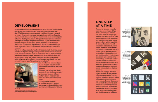
For the final duration of project six, I worked on completing my pages and cleaning up the final product. I stuck with a simple design to let the artwork inside speak for itself. Figuring out where to place everything was a challenge in itself but I am happy with how the final turned out. It is nice to get to see all of my work displayed in one place.
Thank you to my class for being so constructive and helping out whenever it was needed! I will never forget my time in ARTS102 and I am so thankful for the knowledge it brought me. Have a great summer everyone!
0 notes
Text
(ARTS246) Ch. 10: Typographic Design Education & Project #3 Progress
I spent this week working on the process book for project #3, which is due on Wednesday, April 3rd. The upcoming deadline has been causing me stress because my previous process book had a more flexible and longer timeframe for the deadline. Nonetheless, I am determined to tackle this challenge.
I spent most of Monday getting acquainted with the website and software that we'll be using for our process books. The website is called Blurb, which offers an extension in the InDesign software to design books using their templates. These templates need to be customized before creating the design file. It's important to note that the front and back cover are separate from the actual pages of the book and the files need to be combined before finalizing and submitting them for printing and shipping. The printing process takes about two weeks, which is why the turnaround time for this project is shorter compared to the previous two projects. Although I'm not an expert in using Blurb, I'm excited to experiment with the service more and potentially use it to print my other portfolios in the future.
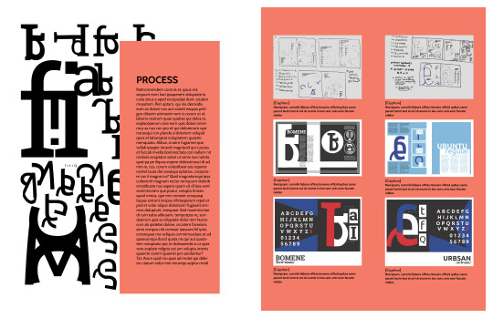
The process book's layout has been a challenge for me, mainly due to the grid and margins. Although the margins are pre-set from the Blurb template, I found them to be too small for my liking on the spreads. To fix this, I took inspiration from my old process book from ARTS102 (Introduction to Design Technology and Concepts) and incorporated a similar margin and grid into my new process book. Initially, I felt strange using my old process book's layout and ideas, but I also thought, "If it ain't broke, don't fix it!" This was particularly true for this project, as I loved the balance and harmony of my original layout. I aim to achieve that same look and feel with my new process book while showcasing my detailed process and the improvements I have made from each project.
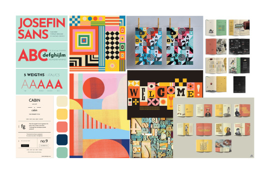
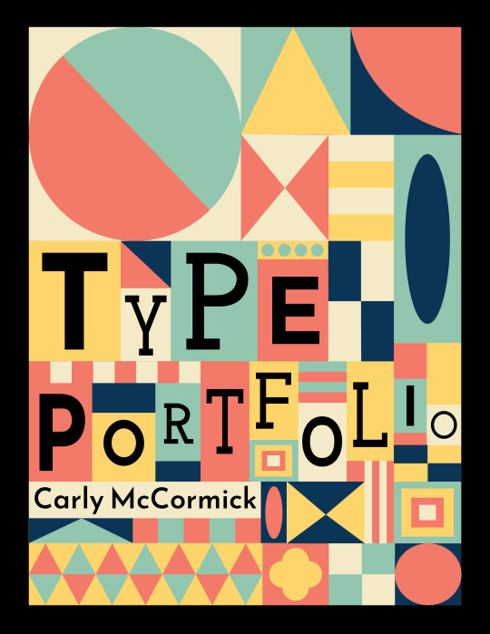
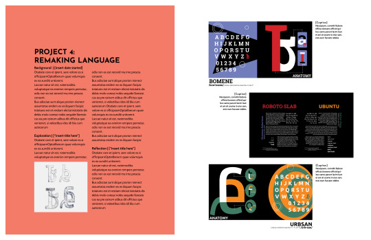
The cover design of the process book draws inspiration from the traditional analog movable type process, where typography uses a movable component, such as metal or wood letters and ink, to reproduce the elements of a document on different types of paper. The design is also influenced by the artwork of Brad Vetter, a designer and letterpress artist who visited and spoke at the University of South Carolina. His work inspired me, and I wanted to emulate his style in digital art form. I took inspiration from my mood board, my traditional style of geometric surface design, and the multiple typefaces used throughout this process book, such as Cabin Bold, Josefin sans, and Josefin slab. My main concern was that the cover might feel too crowded and confusing, making the text difficult to read. However, after receiving feedback from my professor and peers, I realized that the color palette is balanced, the title is easy to read, and the visual hierarchy is well-balanced. The only suggestion I received was to change the colors of the large circle in the top left corner of the cover, as that element slightly threw off my visual hierarchy.
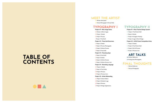
My process book follows the theme of my cover art, but I've decided to make the geometric shapes less prominent. Instead, I want to highlight each project and its process on the pages. I aim to let the typeface be the main focus and make each project stand out to catch the audience's eye. To make some pages look better, I may add subtle geometric shapes to fill in empty spaces or where some pages look too wordy. I also need to work on the visual hierarchy of some spreads, as some elements feel like they are competing. Overall, I have made a good start with my process book for Typography I and II. I plan to improve it before submitting it for the final class critique and printing.
The reading for this week discusses the importance of conducting in-depth studies of common typographic design issues and how professional designers can develop creative solutions by applying all the skills learned throughout the textbook. This includes integrating type and image on posters, establishing a visual system to unify various materials, experimenting with content in publication design, thinking about typography in terms of time and motion, creating dimensional and environmental typography, analyzing and visualizing data, and developing a unique visual language for everyday events. This chapter combines all the concepts learned in this book, summarizing why educating oneself on typographic principles is crucial. Having taken Typography I and II courses, my views of typography have entirely changed. Previously, I paid little attention to the use of type, the visual hierarchy of typography, or even the fonts used in various works. Now, I pay attention to these elements even more, and I have a greater appreciation for typography than ever before. I understand that many decisions go into creating something related to typography, whether it's a book cover, magazine spread, poster, social media post, etc. I am grateful for these courses, even if they were challenging because they helped me become a better graphic designer. I have come to see type as an art form, not just words on a page.
0 notes
Text
Week 11
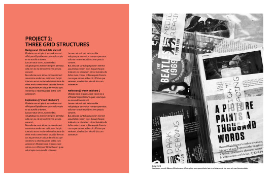
The reading this week introduced the challenges of modern typographic education and then proceeded to outline different influential projects used to teach students the nuances, meaning, and interrelationships of type. It was interesting to see multiple projects featured that I have done during my time in the GD+I program here and reading about their significance to typographic education as a whole. I remember being less than thrilled with some of the assignments, but afterwards, having a clearer, deeper understanding of concepts. For example, we were assigned the visual organization and grid structures project where we had to make 3 grids by hand which showed the differences between weights of type. It was definitely a detailed process but it forced me to learn how different applications of type appear to the eye.
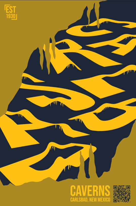
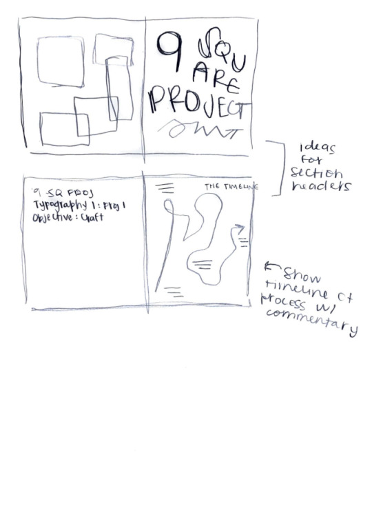
I have split my focus this week between the TypeHike project and the process book project. I was feeling stuck at the beginning of the week because I felt that my designs for my Carlsbad Caverns poster were incomplete and no longer exciting. I would sit at my computer and stare at the design for amounts of time I am not proud to admit, trying to figure out what was missing. I finally had a breakthrough after I jumped in and started experimenting with variations. I added in what looks like the mouth of a cave, which opens to reveal the cave-like letters I designed initially. I think I am very close to the final piece with this variation and am excited to work to coordinate it with my type specimen and postcards. I have also been brainstorming for my process book. I am excited to approach this process book with more freedom and awareness than the one I did for ARTS102. My idea is to produce a book which is a square shape (7 in x 7 in), and which is centered around the idea of the fluidity of my design process. I have come to learn in my classes that each new project I take on has a different workflow – a changing element which I am excited to discover with each new assignment. So my goal for my design right now is to draw out a different shape for each typography assignment I have done representing the shape my process took. I would like to keep the design meaningful, yet still simple to let my projects shine.


0 notes
Text
arts246 - ch. 9 - typography in time and motion
Dynamic typography incorporates both form and behavior to convey messages effectively, offering designers unique communication opportunities.
Designers select typeface characteristics such as serif, sans serif, italic, etc., along with attributes like size, color, and case to imbue meaning into a message, similar to STATIC TYPO.
Motion sequences in dynamic typography involve animating type elements to engage viewers and convey emphasis
Filmmakers like Lev Kuleshov and Alfred Hitchcock have demonstrated the power of montage in eliciting different emotional responses from audiences by manipulating the order and combination of shots.
Designers utilize both denotative and connotative meanings to communicate ideas.
Continuity is crucial (!!!)
Visual links, i.e., consistent color schemes or repeated imagery, contribute to smooth transitions between segments, enhancing overall coherence and comprehension.
class >:(
hate the project, i can say that. every single time i try an animate this stupid poster, my computer crashes. i literally went through 3 crashes yesterday. SUE ME IF IT DOESN’T ANIMATE. i hate animation, could you tell? it’s my least favorite thing in design, i’d rather cut my fingers again with Meena’s 9 square project than animate. I love my poster, it’s just animating it is a pain in the ass. excited for the process book though. my arts102 wasn’t really exciting, i liked it but it wasn’t really me, you know. but im trying my best here okay, i know you can tell im suffering so don’t make my grade suffer too :’)
Slightly going off the rails, Alecia Miranda
0 notes
Text

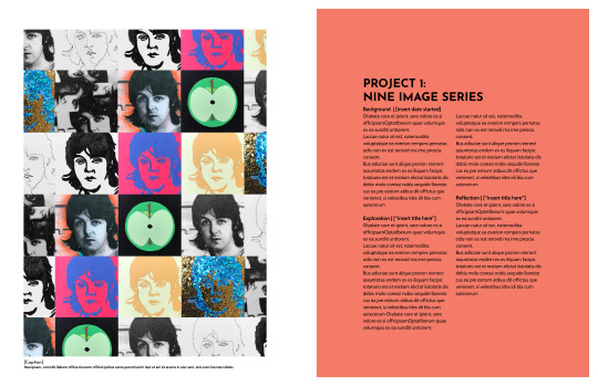
Project six prob has to be the easiest project to date. I was glad we had the optional to choose our theme. It really gives me time to expand my creativity. For my syntax + semantics project I chose different styles of Yeti cups, a total of four. I always have one cleaned in my kitchen for my ice coffee. I had fun with commenting on the four categories and thought outside my bubble. I chose to keep the layout simple and photos clear on the top of the page with text underneath. I also learn paragraph styling, which was a major help it kept everything together and each typeface the same for each section of the text I was writing. It turn out way better than I thought.
0 notes
Text
3/22 Reading + Reflection - Project 3
Chapter 9: Typography in Time and Motion
Animated type is definitely something I would like to get into. Project 2 forced me out of my comfort zone and I experimented with simple frame animation in Procreate, but I know more could be done in Adobe After Effects. This chapter made me think about advertisements where the typography is the main focus instead of video or imagery. A lot of phone commercials do this, where there is a lot of white space and black text as the attention-grabber, either fading in or moving in some way to indicate a meaning. I like the example on page 169 where the actor's frantic thoughts seem to pile onto him. It's simple but the meaning is clear and universally understood.

I have previous experience with creating a portfolio book from ARTS102, when I was applying into the GD+I program. Looking back at it now, I still like most of the spreads I made, but it was not my best work. That's fine, I was just starting out. It's interesting to see how I thought through projects back then. The book never was printed physically so I'm excited to be able to do that with this project, to see the pages in person. At the time, I chose a palette of blue and neutral colors. I think now I have a preference for deep jewel tones, especially forest green, that I want to incorporate. I'm also thinking of having a less structured, simple layout and leaning more towards maximalist collage. I will reference Emigre magazine.
0 notes
Text
Reading and Reflection 10
Typography in Time + Motion
(Chap 9)
This weeks reading is about the history and significance of typography in motion which to me is an interesting connection. Type has so much "expressive potential" it is our job to find it. The text highlights its use in things like film title sequences and digital media. One intriguing notion is the phrase " manipulation of time". The text talks about how it enhances typographic design in several ways like Sequence and Pace, Mood or emotion, Hierarchy, Symbolic meaning, and a few others. By controlling the sequence and pace of the message, designers can create a specific rhythm and engage the viewer. They can determine the order in which events or information are presented, and use foreshadowing or flashbacks to manipulate time and create anticipation or surprise. The pace at which a sequence unfolds can evoke emotion on its own. Type meshed with sound and/or images allow designers to explore and express ideas in a different or engaging way. This is very applicable to our latest project where we are having to create an experience of sorts with our design. Hierarchy is one of the most important tools of a designer, it can be used to manipulate the "time" as you will in a design. Hierarchy can establish emphasis and can control the viewers experience. Lastly the symbolism behind every "sequence" is important. Designers can hide callbacks and associations in their work that may be hidden to some or very obvious to others. It is a much more nuanced but effective technique in conveying ideas.
I submitted this artwork for a show coming up in April. The prompt was Monkey and Robot and had to be on canvas. I did not know how expensive canvas prints were. Anyhow, I made this design in my first semester (ARTS102 logo project) I was given the words monkey and cassette tape. This I what I came up with. The design below features some embellishments in Illustrator using the 3d tools. I also have another variation of the design. This is my first time featuring my work anywhere.

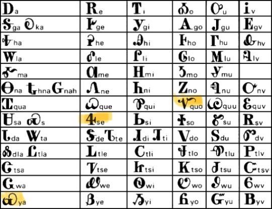
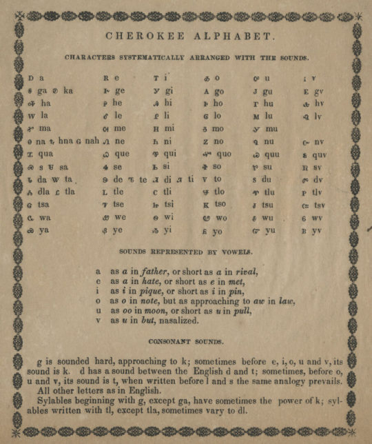
Earlier this week, I took a deep dive on the etymology of the word Sequoia and its various spellings in the written Cherokee, or Tsalagi language. Like Sequoyah who was the name of the man who created the language, or Sogwoli, or Ssiquoya, and Sikwayi. Their written language is what is called a "syllabary" so the characters correspond to a group of syllable organized by vowels.
I sincerely tried to incorporate this aspect into my design but I may use it as a secondary element. Some of the characters are uniquely beautiful and some closely resemble our own letters. I downloaded several fonts that supported the language and tried to manipulate them, but I did not get very far.
0 notes
Text
This has been such a fun course. I appreciate the students and community that is created within these classes. This was my first Arts class in college and my very first experience with these design concepts and Adobe programs. It has been very challenging to me learning these programs, yet super informative. I’m glad to have a little experience and familiarity with the Adobe programs now.
As stressful as this course has been for me our instructor, Daniel Machado has been the most helpful and supportive to every one of his students. I truly appreciate his commitment and patience with everything. It has made the biggest difference for me personally snd sure others as well.
#finalreflection #arts102
0 notes
Text
Final Reflection
This first semester brought me a lot of challenges, adjusting as a freshman in college, learning how to be fully independent, and many more. ARTS102 also challenged me, but in a great way, the class pushed me to learn and adapt to challenges that I have never interacted with before, physically or digitally. Yes, there were many challenges, but the rewarding feeling after beating those challenges was great. The class put me in situations that I have never been in before when it comes to graphic design and it felt really good to produce a product that I was more than happy with most of times. I would like to that Mr. Machado for being a great instructor and helping me to further learn Adobe and all of the new strategies and techniques that I have never even heard of before.
0 notes
Text
Arts102 Course Evaluation
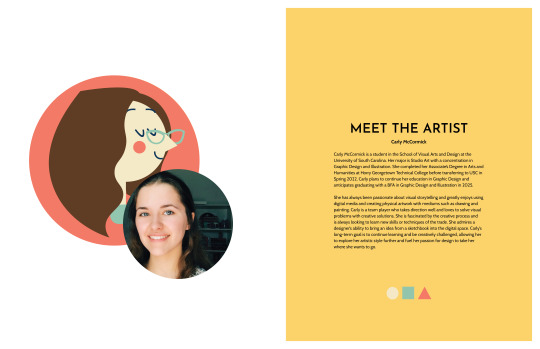
Looking back at this semester, I have come to realize how much I have improved thanks to this final project. At the beginning of the course, I did not know what to expect, thus having no expectations for myself and my professor; but as the course progressed, I could only learn so much that it helped me recognize my potential of being an illustrator and graphic designer. Of course, this journey was not always rosy, as I had to deal with a mental condition I had that prevented me from freely speaking and interacting with other students; as an immigrant, I was aware of my unique challenges and hesitant to push myself forward. Despite all the odds, I had my supporting classmates and a passionate professor who provided constructive feedback to encourage me after each project; that was thanks to the incredible teaching method which was planned out clearly for students to know. We students were given a project sheet with a clear and coherent layout, plenty of time to research and explore a new project, and opportunities to ask for feedback before the due date. The feedback provided by the professor was transparent, concise, and actionable, and the rubric sheets were fair and efficient for all students to follow. I am grateful to be a part of this course where everything was utilized for my personal and career growth; since I progressed forward on a project basis, I was able to discover my potential, my flaws, and my strategies out of which my course success evolved. In the end, the course was a fulfillment of a milestone I set for myself a long time ago, and only now do I truly feel the power to conquer other milestones as well. So, thank you, Professor Puza, for an incredible journey.
0 notes
Text

During my time in ARTS102, I learned a lot about the graphic design industry. I had a lot of fun taking this class and it has encouraged me to continue pursuing my degree in graphic design. I've learned that when it comes to graphic design, the little details really do matter and that's what makes things like album covers, posters, t-shirts, etc so appealing because of the small details. While in this course, I often looked around at my peer's designs and always used that as motivation to put more effort and time into my designs, because I know with time and effort, anyone can create something beautiful :).
0 notes
Text
Blog post #4 for ARTS 102 —
This week we submitted project 3 GoTv poster, as well as started project 4 Logo marks. I believe my presentation went well for the poster project. I created it using adobe illustrator. I chose a quote by Martin Luther King, and representantes the quote using another common quote, “hear no evil, speak no evil, see no evil,” because of being ‘silent about things that matter”, I also chose to use skeletons because that what are bodies become when ‘our lives end.’ I drew out the skulls and hands while adding colors using organic shapes. I chose a bold text type and the background a gradient blue. The women’s nails are red and the skulls are a prominent white; to represent the colors of the flag. I had a hard time choosing the background because I didn’t want to take away from the text and illustration of the poster, so I went simple. I quote I found from the reading by Richard Wurman that ties into this project, “You should use words when words are better; you should use pictures when pictures are better. And you should marry them both when thats better.”
I’m excited about starting Project 4, Creating a logo seems fun especially choosing our own two characters as the theme. We started with a thumbnail sheet and a concept matrix which I’m not best at simple sketches. I chose Snoopy and Charlie Brown as my two concept characters. I started on the concept matrix; I found on google a website about the Peanut characters, this helped a lot which themes of my two characters. I didn’t draw much on my concept matrix or thumbnail sheet. Once I got my idea I like and knew I could create a fun logo using shapes with, I stop drawing.


0 notes
Text
Final Blog Post

This being my last blog post and reflection I’d like to start by saying that it was my very first “digital arts course” for school and the one that piqued my interest the most. Although the graphic design itself seems self-explanatory by name alone, I never fully grasped all that encompassed. This course demonstrated all the different ways graphic design can be used and emphasized that this course is merely a dip into the vast ocean of the medium. ARTS102 also helped me narrow down what I wanted to become after I graduate with my bachelor’s, I’m currently majoring in media arts because it seemed vague enough to have a lot of options but I want to hone in on graphic design and strengthen my skills in order to create standout work. By the end of this course, I gained a greater understanding of Adobe since before the software seemed very daunting to me. Still, Puza was able to explain it in easily understood terms and create a comfortable learning environment. I really liked this course and hope to take similar ones soon!
0 notes
Text
W7 Post - ARTS245
I enjoyed reading this week's reading about Text Hierarchy, I'm currently learning that in my JOUR346 class and we're using InDesign to allow us to see what the sizing should look like, and where you'd use different types in a paragraph. When it got down to reading about text hierarchy for websites, I was really interested. I want to hopefully do something in web design once I graduate college, I've already made a few websites in the past and would love to make more. Your goal when making a website, or anything with words in general, is to make sure the reader/audience is able to read it and not move their eyes all over to find out where to go next.
Project, 4pt.2, absolutely love this project. I've done something similar to this in ARTS102 with a few other students in our class. We got to make a booklet with all our work and past work, so much fun. Mine's going good so far, I've been busy with other outside college stuff so it's not done as of right now, but it will be sooner or later. I still need to fix a few things with the second letterform's pages but it'll look great in the end, I know it.


1 note
·
View note
Text
In the reading this week it was interesting to learn about kerning and tracking and see it laid out in the book with real life examples of too little kerning to or too much kerning, and how big of an impact it makes on your body of text. The other thing that stood out to me in the reading was the information about the typographic hierarchy, which I learned a little bit about in my arts102 class. Learning about these kinds of things makes me look at writing in everyday objects completely differently, I find myself analyzing random text all the time now, and I love it!
We just started project 4 at the beginning of this week where we are creating the 27th letter of the alphabet out of other letters in a typeface that we got to choose. The serif typeface I chose was Bodoni Moda, I chose this because this typeface has very thin lines as well as thick lines on the same letter form which really stood out to me. And then the sans serif typeface I chose was Major Mono Display, I chose this one because of the J, it was really unique, and I thought I would be able to make a lot of cool new letters out of it which I did.
1 note
·
View note