#Aqueous pixel art
Explore tagged Tumblr posts
Visit Tumblr Blog
Explore Tumblr blogs with no restrictions, modern design and the best experience.
Last Seen Tumblr Blogs


Fun Fact
Users from the US are the majority of Tumblr visitors.
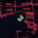
Text
(July 2023) TangoOwO

#Tango#Mega Man#Mega Man V#MMV#Mega Man Megamix#Mega Man Gigamix#pixel art#sprite art#emotes#twitch emotes#emote artist#fanart#Clara's Cohost backlog#Queuetaro Kujo#Mega Man Classic#Aqueous pixel art#Aqueous art
32 notes
·
View notes
Text
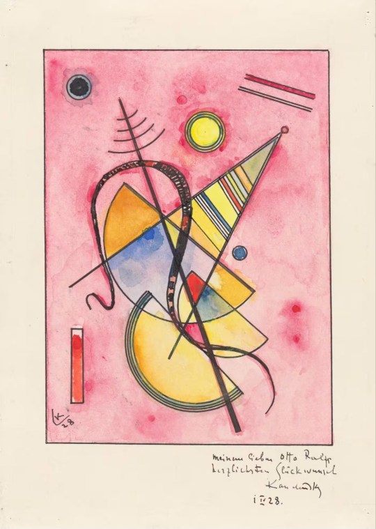
Wassily Kandinsky, ‘Untitled’ (1928) :: [Robert Scott Horton]
* * * *
Imogen Savage: Housed in a 19th-century listed mansion that stretches skyward into spires, the Grisebach auction house gives off the disquieting charm of a German fairytale castle. Outside runs Fasanenstrasse, a leafy street of galleries and skincare boutiques in one of Berlin’s chicest corners. On December 1 2022, Marcin Król, the Polish consul in Berlin, climbed the steps to the building for the evening sale beginning at 6pm. A number of impressive modern artworks were on offer, including a sought-after self-portrait in oil by Max Beckmann. But it was Lot No 31, “Untitled”, a little pink Wassily Kandinsky watercolour from 1928, that had Król’s attention that evening. Król was not at Grisebach as a buyer. Earlier that day he had sent the auction house a message demanding it stop the sale of the Kandinsky. In the hours since, representatives at Grisebach had reviewed the legal status of the artwork and its right to be sold by Inga Maren Otto, a German billionaire and philanthropist. Their decision was clear. They would proceed. At 4.40pm, Król took to Twitter, quoting the message he’d sent to Grisebach. “Withdraw[ing] the painting from the auction,” he wrote, “[was] the only correct and moral action in this situation . . . The provenance/history of the painting stated [in the catalogue] is clear . . . the painting has ownership markings indicating its origin from the National Museum in Warsaw. [It has been registered] from the Polish side in Interpol’s database of stolen works of art.” He finished the thread with an update: “The auction house has not yet stopped selling the work. As of 4.50pm.”
Król watched on a TV screen in the corner of an anteroom as the auction began. Lot No 31 eventually appeared on the screen. Flattened by the glowing pixels, the original aqueous colours took on neon tones. There was a faint scribble underneath in Kandinsky’s handwriting. After a flurry of bids, more than doubling the upper reserve price, the hammer came down. Afterwards, Król posted a photo to Twitter with a solemn summary of what he had witnessed. It read like both the beginning and the end of an art-crime story: “Grisebach sold Kandinsky’s watercolour [“Untitled”] for €310,000. The painting was stolen in 1984 from the National Museum in Warsaw.” Then the Berlin police showed up at the auction house, in response to a report of a stolen artwork being sold on the premises. Król’s message that day was, said Grisebach in a statement issued after the event, the first they’d learnt of the theft.
I heard about the auction of the Kandinsky watercolour some weeks later. I was intrigued by this little work on paper, the size of which is hard to gauge when viewed online. A cluster of geometric shapes and coloured washes not much bigger than a postcard, it’s not a famous piece and was never supposed to be. The personalised dedication at the bottom provides a clue as to its original, more intimate context. Through Król’s media offensive, I began to imagine the painting in its previous lives. A valued artwork can do this; move through history like a time traveller who has seen it all, changing hands, changing walls, changing in value, picking up a few marks and scuffs, but remaining, on the surface, itself. It’s easy to forget that many of the works of art we see today have somehow weathered revolutions, wars and genocide. During and after the second world war, art collections dispersed like breadcrumbs in the mouths of sparrows. Since that time, art dealers and auction houses have continued to sell these works, right up to the present day, with values soaring.
As I began to trace the Kandinsky’s journey, I discovered the story had deeper roots than even Król had imagined. The watercolour wasn’t stolen once but twice. Having survived the Nazi party’s confiscations of modern art in the 1930s, it languished in a depot in occupied Poland before travelling back and forth across the world via private and public sales as the lines between black market and art market blurred postwar. As the trail grew more convoluted, my questions multiplied. How was it possible, I wondered, that a piece of art that we know was once stolen from a major European museum could now be sold, perfectly legally, by an important German auction house? And who, in the chain of ownership spanning nearly a century, is the rightful owner of Lot No 31? In his Dessau studio in 1928, Wassily Kandinsky sat before a small sheet of thick paper. He drew in ink, a balance of precisely placed interlocking semicircles, triangles and floating circles, with a more irregular snakelike mark through the centre. Then he dragged his paintbrush across some watercolour pans, applying the colours to the interior of the shapes in blues, yellows and reds, and washing the surround in pink. The watery paint pooled in different areas, variegating the intensity of the colour where it settled. Then it dried, locking the painting into position. At the bottom, in pencil, the artist wrote: “Meinem lieben Otto Ralfs, herzlichsten Glückwunsch, Kandinsky I IV 28” [“To my dear Otto Ralfs, Happy Birthday, Kandinsky, 1 April 28”]. It was a gift, made for his friend and patron on the occasion of his 36th birthday. Kandinsky’s studio was in a row of identical semi-detached houses located in a pine forest at the edge of town, where artist-professors lived and worked. This was the vision of Walter Gropius, founder of the influential modernist art and design school the Bauhaus, who designed the Dessau “Masters’ Houses” in 1925 to fit his concept of gesamtkunstwerk, or total artwork. Kandinsky lived at No 6, next door to the Swiss-German artist Paul Klee. The day I visited earlier this summer, the sunny weather was heating the pines, filling the air with the same calm, sweet smell that Kandinsky, then in his late fifties, and the younger Klee would have breathed as they sat drinking tea together in the garden.
Inside, the thick, shiny paint was fresh from recent restoration work, distracting the senses from conjuring their presence. The artists’ studios, the largest rooms in their carefully designed houses, shared a wall. From the front, an enormous horizontal window frames the central focus of the house, the parallel studios in which they worked, taught and held salons: Kandinsky on the left, Klee on the right. Otto Ralfs and his wife Käte bought their first works by Klee when they visited the Bauhaus in Weimar in September 1923. After that, their lives changed completely. The couple didn’t have a lot of money. He worked as an insurance salesman and owned a shop in his hometown, Braunschweig, in northern Germany. She was a paediatric nurse. But they were among the first people to see the value in the art being produced at the Bauhaus. At one point, they had the largest collection of Klees, and the second-largest collection of Kandinskys after Solomon R Guggenheim.
[Financial Times]
8 notes
·
View notes
Text
The Ultimate Guide to Digital Printer Printing: Benefits, Process, and Best Practices

Introduction
In today’s fast-paced world, digital printing has revolutionized the printing industry by providing high-quality, efficient, and cost-effective solutions. Whether you need business cards, marketing materials, or customized products, digital printer printing offers versatility and precision. This guide explores the benefits, process, and best practices for achieving optimal results with digital printing.
What is Digital Printer Printing?
Digital printing is a modern printing method that involves transferring digital images directly onto various materials, such as paper, plastic, fabric, and metal. Unlike traditional printing methods like offset printing, digital printing eliminates the need for printing plates, making it a faster and more flexible option for small to medium print runs.
Benefits of Digital Printing
High-Quality Output: Digital printers produce sharp, vibrant, and detailed prints, making them ideal for marketing and branding materials.
Quick Turnaround Time: Without the need for setup processes like plate-making, digital printing significantly reduces production time.
Cost-Effectiveness: Ideal for short-run projects, digital printing allows businesses to print on demand without incurring high setup costs.
Customization and Personalization: Variable data printing (VDP) enables customization of prints, such as personalized direct mail campaigns and promotional materials.
Eco-Friendly Option: Digital printing reduces waste, uses less ink, and minimizes chemical emissions compared to traditional printing techniques.
The Digital Printing Process
File Preparation: Ensure your design files are high-resolution (300 dpi or higher) and saved in appropriate formats such as PDF, TIFF, or JPEG.
Color Management: Use CMYK color mode for accurate color reproduction and consider using ICC profiles for consistency.
Material Selection: Choose the right paper or substrate based on your project requirements (e.g., glossy, matte, recycled, or specialty materials).
Printing: The digital printer applies the ink or toner directly to the substrate without using plates.
Finishing Touches: Additional processes like lamination, varnishing, embossing, or cutting enhance the final product’s appearance and durability.
Best Practices for Optimal Digital Printing Results
Use High-Quality Images: Avoid low-resolution images to prevent pixelation and blurry prints.
Optimize Fonts and Graphics: Convert text to outlines and embed fonts in your files to avoid formatting issues.
Select the Right Printer: Choose a printer with advanced technology that supports high-resolution printing for crisp and vibrant results.
Perform Test Prints: Always print a proof to ensure color accuracy and alignment before running a large batch.
Consider Coatings and Finishing: Depending on your project, coatings such as UV or aqueous coatings can enhance durability and aesthetics.
Applications of Digital Printing
Digital printing is widely used across various industries for:
Business and Marketing Materials: Brochures, flyers, posters, business cards, and catalogs.
Packaging and Labels: Custom labels, stickers, and packaging prototypes.
Apparel and Merchandise: Custom T-shirts, bags, and promotional items.
Photography and Art Prints: High-quality prints for professional photography and artwork.
Conclusion
Digital printer printing continues to grow as a preferred printing method due to its speed, quality, and cost efficiency. By understanding the process, benefits, and best practices, businesses and individuals can leverage digital printing for high-impact results. Whether you need small-batch promotional materials or personalized prints, digital printing provides a reliable and innovative solution.
For more insights on digital printing and how to optimize your print projects, stay updated with the latest industry trends and advancements!
#car wrapping varsity lakes#offset printing#offset printers#a frame signs gold coast#booklet binding#commercial printing#digital printer printing#large format print
0 notes
Text
5 Must-Know Essentials about Large Format Printing

In the world of inkjet printing, large-format printing plays a crucial role in producing high-quality graphics, banners, posters, and other visual materials. So, whether you're creating stunning graphics or providing supplies for large-format inkjet printers, follow these essential key points to optimize your printing process and deliver exceptional print results:
Choosing the Right Media
There are a variety of media also known as materials available when it comes to large-format printing. Each type of media has its characteristics, including texture, weight, opacity, and finish. Understanding the properties of different media options will help you deliver the best results. Paper, vinyl, canvas, or film are the most commonly used materials for printing jobs.
Example: For printing high-resolution photographs, you can select a premium luster photo paper that offers excellent color reproduction and sharpness.
Ink Considerations
Ink selection is another crucial aspect of large-format printing. You can either go for OEM inks or premium quality compatible ink to achieve excellent image quality prints. If you’re a compatible ink user, make sure you purchase them from a reliable compatible solution partner.
Example: Aqueous inks are water-based and produce prints with vivid colors and excellent image quality. These are ideal for indoor graphics and posters. They have lower emissions, making them safer for users and the environment. On the other hand, solvent inks are more durable and suitable for outdoor applications.
Print Resolution and Image Quality
In large-format printing, the quality of the image is dependent on the selection of print resolution. For prints to be viewed in great detail, such as trade show displays or fine art prints, a higher resolution is necessary. Understanding the relationship between resolution, image quality in terms of file size and file type, and printing speed will enable you to make informed decisions for your print projects.
Example: When printing complex architectural blueprints, always go for a higher print resolution with great pixels to capture all the fine lines and annotations accurately. Usually, 100 dpi is the ideal print resolution for any design used for large-format printing applications. However, you can always adjust the image resolution and edit the image in design software depending on your requirement.
Color Management
Implementing proper color management techniques ensures that the colors in your prints are accurate and consistent across different print jobs. Calibrating your printer, using color profiles, and understanding color spaces (such as RGB and CMYK) are crucial steps in achieving reliable color reproduction. Color management tools and software can help you maintain consistent results and meet the expectations of your customers.
Example: When printing marketing materials with water-based inkjet inks, first calibrate your printer and create custom ICC profiles for specific media types, ensuring consistent branding colors.
Printer Maintenance and Printer Care
Regular maintenance is important to keep your large format printer in optimal condition and extend its lifespan. Follow these basic steps to maintain your printer in better condition:
Follow the manufacturer's guidelines for cleaning printheads, inspecting ink levels, and ensuring proper paper feeding.
Maintaining a clean printing environment and addressing any issues promptly will help prevent print quality problems and minimize downtime.
Familiarize yourself with the specific maintenance requirements of your printer model and establish a regular maintenance routine to ensure consistent performance.
Regular maintenance prevents clogging, ensures accurate ink deposition, and extends the lifespan of your printer.
Additionally, always keep the printing environment clean and dust-free to minimize print defects.
Conclusion:
From the above article, we can conclude that by following these tips, you are good to go for your large-format prints that are professional, eye-catching, and effective.
Whether you're a new user of large-format printers or a business owner supplying materials for these printers, understanding the key factors involved in large-format printing is essential.
We hope that this article helped you understand the major factors required for large-format printing.
0 notes
Text
Voltron: Legendary Planning Fail
Thanks to @ptw30‘s post, “A Few Thoughts on DW/VLD Marketing” for reminding me that I’ve had a draft about VLD toys, merch, and marketing copy inconsistencies to complete. Read her post first.
I’ve been researching the toys and merch for several months now to follow-up on weird things that I noticed much earlier. I’m a toy collector who is also a designer and have worked in advertising/marketing, and in broadcasting at Cartoon Network. I left that world to design and develop applications in genetics/life-sciences, best decision I ever made (co-founded a startup in between all of that too. Good times). My experiences had me zeroing in on this show bible business that came up during that Let’s Voltron interview (March 28th, 2019). I’ve been suspicious about it for awhile, as the gradual unraveling of VLD’s narrative, lore retconning, and OOC dialogue and behavior of the characters (most egregiously in S8) is indicative of a lot of problems, and an incomplete or poorly-done show bible is at the top of that list. Now combine that with the weirdly slow-to-market of VLD merchandise and toys.
Both manufacturers and merchandise license program partners can’t get product to market in time to meet (or even anticipate demand) if they don’t have official assets from the show, and that includes anything that would have been in the show bible. When the show-runners let it out that their show-bible was the “loosest you’ll ever see”, and then complained about the elemental icons used on the toys by the manufacturer (Playmates) not matching their aesthetic, and after they redesigned them, Playmates didn’t want to use them, I was like: “Really? Y’all got hung up on that?”
It takes months, sometimes over a year, to design and test molds for toy prototypes and then to go into mass production and distribution. Traditionally, there is also a step where the IP holder has to approve the design concepts created by the manufacturer (toys and other merch).
The IP approval step could potentially have been made more complicated by the different players involved in the communication: WEP, DreamWorks Animation, Playmates, Studio Mir, and the most complicated layer of all, DreamWorks Classics, aka Classic Media. All of them could have been involved, I’m not saying that they all were, but it’s something to consider.
DreamWorks acquired Classic Media in 2011-2012 and formed them into a separate unit within DreamWorks Animation. Classic Media were the managers of the Voltron IP among many other brands in their huge IP library. That’s the short version b/c it’s complicated. IP ownership and licensing is not always as straight-forward as one might think, especially with these toy-cartoon properties from the 80s.
So where did the elemental icons come in during the creation of the show bible and toy design approval process?
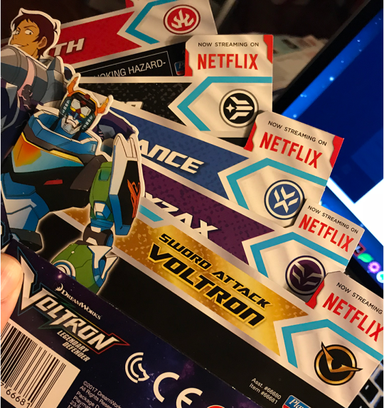
Above: packaging inserts showing the elemental icons.
I kept the package inserts because—as a toy collector—I strongly felt that the packaging was done very well. The graphics are slick and look good. The ink has a nice saturation with a lot of color depth, range, and fidelity. The die-cuts are excellent and intricate. The packaging on the larger lion sets makes great use of aqueous coating and spot varnishes. Whomever designed the packaging knew what they were doing, and also understood the print production process (Hi! I used to do that too).
I kept these even though I always ditch packaging because I wanted to scan them for collage art. There is absolutely nothing wrong with these elemental icons, and they look reasonably well integrated with the graphic assets from DreamWorks and Studio Mir. These inserts were from the toys released in 2017.
The toy packaging gets more interesting when you see what marketing copy was sent to Playmates to use (or work from if it was from the show bible).
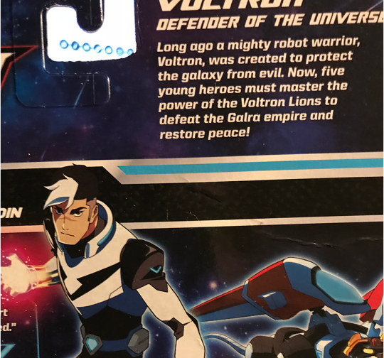
Above: Shiro’s package insert with descriptive text that says, “Long ago a mighty robot warrior, Voltron, was created to protect the galaxy from evil. Now, five young heroes must master the power of the Voltron Lions to defeat the Galra empire and restore peace!”
“Five young heroes” eh? They must have gotten that text early on because that’s kind of a weird way to say it when the Shiro packaging also says “…wise beyond his 25 years…”. I mean, 25 is still young, but that’s not what comes to mind when I read “five young heroes” on a toy box!
Shiro is the only one with a listed age in any of the packaging. I noticed this when I got these toys in 2017 and it reminded me that I had originally read that it would be five teenagers and I had to go looking for articles that I kept (yeah I do that b/c toys).
From this article on ActionFigureInsider.com about Playmates launching the VLD toyline in 2016:
“Let’s Voltron! Playmates Toys and DreamWorks Animation today announced plans for a new toy line based on the new DreamWorks Animation series Voltron: Legendary Defender, a re-imagining of the classic property featuring five teenage pilots and mystical robot lions, set to debut as a Netflix Original Series in 2016. Playmates Toys will serve as the master toy licensee and will create an expansive line of toys set to launch in spring 2017.”
and
“Voltron: Legendary Defender follows five unsuspecting teenagers as they are transported from Earth into the middle of a sprawling intergalactic war and become pilots for five mystical robotic lions in a battle to protect the universe from evil. Only through the true power of teamwork can they unite their lions to form the mighty warrior known as Voltron. Voltron: Legendary Defender premieres on Netflix in 2016.”
LULZ. That ain’t no fluke y’all. That loosey-goosey show bible and the initial story planning drafts/concepts must have had Shiro as a teenager. Oops.
Playmates got part of the message in time to slip-in Shiro’s age on his packaging, but why the discrepancy between the article in early 2016 and the 2017 toy release in the first place?
Obviously, things changed between the first story planning phases, the release of marketing copy to media, the release of production art assets to Playmates, and when S1 was made. There still would have been time to update that copy for Playmates and media in early 2016, given that S1 would have already been in production, with S2 to quickly follow by that time. The show-runners already knew before that article ran that Shiro was not going to be a teenager anymore (and likely many other toy-relevant details). Did they intentionally not update anyone who had a right to know, or did it just slip their minds? Did someone else in the chain of communication mess up? Did that disagreement over the design of the elemental icons take up a lot of time, or possibly include larger disagreements?
Since the first wave of toys were released in 2017, when Keith was in the Black Lion, they would have been designed for production and manufactured much earlier than that. Playmates can’t turn around on a dime to manufacture toys (not to mention design the packaging) to match the seasons. They need to have the information of what will happen in a season way ahead of time. This is one of many banal-yet-important reasons why your show bible needs to be tight, and your character arcs well-planned out.
We can see the first wave of the toys in photos from Toyfair 2017. There’s even a Zarkon figure, and various toys that are clearly for young boys (prop swords, masks, and the like). I remember seeing these photos right after Toyfair and thinking that Zarkon figure was looking pretty cool looking for what it was.
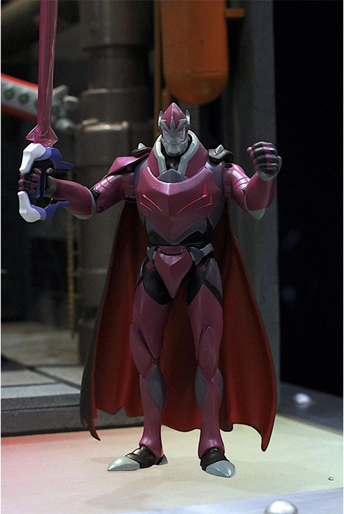
Above: Zarkon prototype figure with black bayard sword. Photo by Jim Kiernan for NerdyRottenScoundrel.com.
Since Playmates was able to create a prototype of Zarkon ahead of Toyfair 2017, that means that they began the design phase in early 2016 before the show first aired (possibly before that even). This also means that they knew that Zarkon had the black bayard, so that much was planned out.
Then in Toyfair 2018, Playmates had new toys, including prototypes for the Hunk, Pidge, and Allura figures, the HyperPhase lions, and the “Stealth Mode” translucent lions. It’s worth noting that photos of the Pidge and Hunk paladin figures show up on the inserts in the 2017 toys as they were originally intended to be part of that wave.
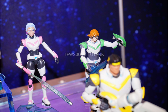
Above: Prototypes for the Allura, Pidge, and Hunk paladin figures. Photo by Joe Moore for Toyark.com.
So salty that Playmates cancelled these.
Below, an excellent video from Toyfair 2018 where Pixel Dan asks the hard questions of the rep (if video doesn’t show here is the URL to it on YouTube):
youtube
Pixel Dan asks about the possibility of a Lotor figure, and what happened to the other villain figures from 2017 (e.g. the Zarkon figure, and there was a prototype for another robeast other than Myzax). The rep says those were pushed back, and there “will be more Lotors” (LOL) in the next phases in development. I’m pretty sure he got Lotor confused for Zarkon.
It’s important to note that Pixel Dan and the rep talk a lot about the slow distribution of the first wave of figures based upon what retailers were doing with their ordering and stock. That people weren’t seeing them in stores. The rep explains that the toys are made in response to demand and that’s also up to the retailers to order them, but there’s also some comments that I interpreted as though they didn’t have enough details about what to make in the first place.
For those who haven’t already seen me share ToyGalaxy’s excellent video about the action figure industry being broken, give it a watch:
youtube
The video above explains a lot about why Playmates had problems with distribution, as ALL manufacturers were-and-still-are having distribution problems. It’s really hard to find toys at stores, my partner and I go hunting all the time, the lengths we go to are absurd.
I’m certain that retail distribution problems contributed to demand for the toys and that’s partly why they were cancelled. But this problem with the show bible also contributes because if Playmates had future season information when they should have, then they might have been able to design toys that more closely matched the show, thus boosting demand once it hit critical mass. I also wonder how much time they lost in the beginning due to the back-and-forth over the elemental icons.
Other merch, like t-shirts should also have been in production before 2017. They would have required details from the show bible as well. We could have had lion slippers y’all. Just sayin’.
So about those Allura with the Red Lion t-shirts that @ptw30 mentioned in her post:
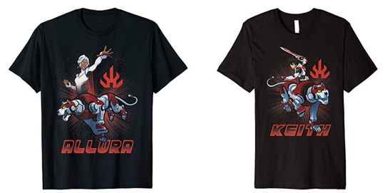
Above: officially licensed t-shirts for Allura and Keith with the Red Lion, bearing the fire element icon.
Someone (ptw30? headspacedad?) called these shirts to my attention privately a few months ago—after S8 but ahead of Hot Topic’s recent new t-shirt release—and alarm bells went off in my head. Typically, this is the kind of error that you’d see in a knock-off, but these are officially licensed and they were linked to directly from the Voltron store page (at the time they had a re-direct promo image for merch on Amazon, in addition to what they sell on their own store page).
Descriptive text in the shopping page for all of the t-shirts of this style reads:
“Join the Paladins Shiro, Keith, Lance, Pidge, Hunk and Coran as they combine their lion mechas together to form Voltron! Help them take on the Evil Galra Empire with these officially licensed Voltron: Legendary Defender graphic tees, pullover hoodies and popsockets!”
Coran eh? Interesting choice for text about combining lions. Why no mention of Allura on her own t-shirt? And what the hell is a popsocket?
On another Allura t-shirt—which also has different product specification text indicating that it’s probably not manufactured by the company that made the t-shirts above—has descriptive text that reads:
“Voltron is the classic cartoon series that began in the early ‘80s. It is an animated show that brings back the nostalgia of classic cartoon fever. Not to mention a popular show pretty much stole the idea. (starts with pow- ends with -angers….) Voltron will always be number #1! This women’s junior’s shirt features a high quality character design of Princess Allura and Blue Lion.”
Why are they dragging Power Rangers in the text for an Allura t-shirt?
And actually, it’s incorrect. Power Rangers aka Tokusatsu Sentai shows came first. Voltron/GoLion descends from the combining mecha genre that began with Go Nagai’s Getter Robo series in the 70s, which was influenced by the Tokusatsu Sentai shows. So no, Power Rangers didn’t steal that idea.
Did anyone involved with VLD do their homework other than Tim Hedrick and May Chan?
We can see here that the t-shirts that are available on the Voltron store, and what’s available on Amazon are not always the same, even though the shirts say they are officially licensed. What’s going on here?
Some—but not all—of the t-shirts in the Voltron store list “From Trevco” in their description. Trevco.inc does licensing for branded merchandise, and selling t-shirts via Amazon appear to be one of their licensing product programs. Both DreamWorks Animation and Voltron: Legendary Defender are among the brands listed. Oh look, another layer in IP licensing cake!
Meanwhile, in the Hot Topic store, there’s a completely different style—in terms of aesthetic and design—of both VLD and Voltron DotU t-shirts being sold. I suspect that HT licensed VLD and Voltron DotU for in-house design, plus artist collaboration design, as these are exclusive for Hot Topic and I’ve not seen them anywhere else. That could mean they have a different kind of license than what Trevco and others selling on Amazon have. The t-shirts from HT don’t list any other manufacturer on the label, other than being made in Haiti. I kind of want to buy that weird Allura with Red Lion t-shirt to just compare them. (Surprising no one, I bought the Lot//ura and Black Paladin Shiro t-shirts from HT).
The difference in style between what’s on WEP’s Voltron store and Amazon, versus what’s in Hot Topic is very interesting, and I assume it has a lot to do with demographics for their respective markets (perceived or real). In a traditional merchandize licensing agreement, WEP and/or DW would still have to approve any designs created by—or if artist collaboration with—Hot Topic.
How long did that approval process take?
The recent release of t-shirts (Feb/March 2019) include a t-shirt with a scene from S5 (the chosen marks scene for Allura and Lotor). There are no MFEs, Atlas, white-haired Shiro, or anything else from S7-S8. There is a Keith t-shirt with his cosmic wolf, and a shirt with the Monsters and Mana designs, so they got something from S6.
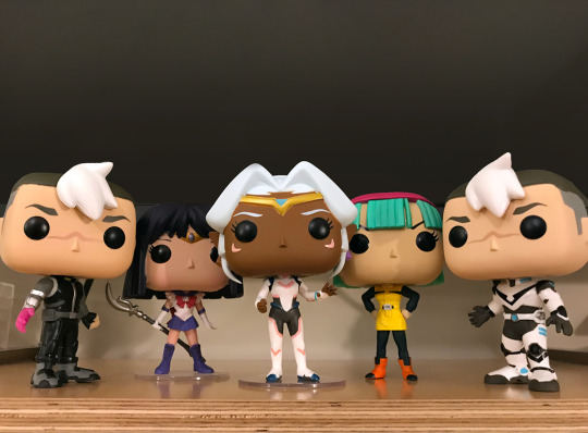
Above: Funko Pops. I’ve got a poorly-painted Allura (her right earring and tiara y’all), both Shiros, and the Pidge, Hunk, and Amazon Exclusive metallic paint VLD Voltron (Pidge, Hunk, and Voltron not pictured).
The VLD Funko Pops came out in the end of 2018 but ahead of S8. I’ve seen them at Hot Topic, and online (Amazon, and BigBadToyStore.com), but I have not seen them at other retailers that carry Funko Pops like GameStop and Target. We go toy hunting to those all the time, in many different places. I guess that demographic of boys aged 9-12 just aren’t interested in VLD to demand it at GameStop and Target. At least Hot Topic knows what’s up.
The Funko Pops use Allura’s uniform from S1-S2, and have two designs for Shiro (Black Paladin, and his black outfit). How long did these take to license and approve? Funko Pops are the lowest hanging merch fruit, so they should have been an obvious licensing choice by the end of 2016 once it was clear that VLD was a hit. But we didn’t see these until just before S8?
Finally, apparently WEP and the Voltron Store don’t mind those elemental icons that the show-runners hated, since they have a lanyard with them on it in their store (image below):
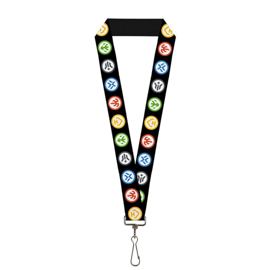
It’s almost as if no one is on the same page!
If I didn’t know any better—oh wait, I do because this is kind of my thing—it looks like these elemental logos were designed to be like Boy Scout merit badges. That’s fitting as the toys were meant to be bought by boys aged 9-12, and are safe for children aged 4 and up. With over 15 years of professional design experience across multiple fields and domains of design, if I were designing these, that’s exactly what I would have done from Playmates’ end, especially if DW and WEP had told me that their target demo was boys aged 9-12.
Shouldn’t the show-runners and Studio Mir’s very different design aesthetic have been made clear in the show bible and in any discussions and communications with Playmates (and whomever else was involved)? Who was responsible for communicating that?
To be clear, I like Studio Mir’s aesthetic much better, but what I like is irrelevant when we’re talking about toys and target demographics for marketing them, vs what’s appropriate for merchandise that could be for all kinds of demographics.
I’ve been in situations where I’ve had to design in parallel with an outside agency, and in the dark with little communication between us. It’s an awful position to be in, and I’m surprised that DreamWorks didn’t know better than to make sure that didn’t happen between those designing for the show and Playmates and anyone at DreamWorks Classics and WEP that might have been involved in communications.
I spat out my coffee when I read that bit about the show bible, because damn, if you’ve ever had to design an ad campaign (which can last for years!) with a half-assed or incomplete branding guide and little-to-no marketing and romance copy (let alone a style guide to help your copy editors write it), then you’re looking at a huge mess once that thing finally gets finished.
How did DreamWorks not catch that?
#vld#voltron licensing#dreamworks#voltron: legendary defender#action figures#montsantos#marketing#toycourse#yes i buy the toys#salt
126 notes
·
View notes
Photo


Students stay busy over summer with research
More than 30 student research projects are underway this summer throughout the region and even overseas. Pennsylvania’s bootleg coal rebellion, the effects of beetle infestation and in-home Internet hacking are just a few of the topics being explored through Bloomsburg University’s annual Undergraduate Research, Scholarship and Creative Activity program.
URSCA provides a stipend of up to $6,000 for a full-time project to students during the 12 weeks of summer session. Thirty-two students of varying majors spanning business to liberal arts to science and technology were awarded research grants this summer.
Several of the projects are being done far from campus, including abroad like David Falacko’s study of new musical styles with master musicians at the Royal College of Music in London and Rachel Yenney’s work as a research intern in the Laboratoire de Physique des Lasers in Paris. Facia Sirleaf’s study of Sub-Saharan immigration in Morocco was actually a year in the making and inspired by her own personal journey as a child.
The environmental, geographical and geological sciences are well represented this summer. Student researchers are tackling a variety of environmental issues to include acid mine drainage in Schuylkill County, the deforestation and water quality in Assateague, Va., along with the petrographic examination of copper deposits from across the country.
Other summer projects have students exploring research in the anthropology, digital forensics, information technology management, nursing, political science, sociology, and social work fields.
Some projects, such as Blake Durante’s chemistry research on different properties of lanthanum chlorides in aqueous solutions, have already hit the conference circuit. The senior presented his initial findings this spring at the 253rd American Chemical Society National Meeting in San Francisco. He plans to advance his work this summer, particularly in increasing accuracy.
Each of the URSCA projects will have an opportunity in August to be showcased on campus during the 7th Annual Susquehanna Valley Undergraduate Research Symposium. Abstracts will be judged in four categories: social sciences and humanities, natural sciences and engineering, biological sciences and in clinical and translational.
2017 URSCA Awards
Classic Maya Elite Households: Exploring Socioeconomic Status within the Chok Group at El Perú-Waka’, Petén, Guatemala by Emily Haney, senior anthropology major
Painting With Pixels by Bela Ball, junior art studio major
Study at the Royal Academy of Music by David Falacko, senior music major
Pennsylvania's Bootleg Coal Rebellion by Mitch Troutman, sophomore history major
Data Modeling for Predictive Analytics by Ty Rohrbach, junior business administration information and technology management major
Determination of Stress Response Genes, Hypoxia-Inducible Factor-1 and Nicotinamide Mononucleotide Adenylyltransferase, in the Solitary Bee Species, Megachile rotundata, in Response to Heat Shock by Brandon Arnsberger, senior biology pre-med major
Using Nonlinear Regression to Develop an Engineer-Friendly Equation for Calculating the Ionic Mobility in Aqueous Potassium Chloride Solutions under Extreme Conditions by Daniel Staros, junior chemistry major
Geochemical Assessment of the Wiconisco Creek and the Effects of Abandon Mine Drainage on Water Chemistry by Mitchell Lenker, senior geology major
Water Quality of Vernal Pools by Anna Ellis, sophomore geography and planning major
Comparative Study of Alteration Zones From Some Porphyry-Type Deposits in the United States by Connor Gray, junior geology major
Role of D1-like Receptors in the Effects of Chronic Stress on Palatable Food Seeking in an Animal Model of Relapse by Lindsay Tosh, senior psychology major
Designing a program to Assist Foster Youth in the Transition to College by Wanda Tarvin, senior social work major
A Study on the Practicality of Identifying and Locating Shoplifters and Drug Users Through Tumblr by Megan Mahle, junior digital forensics major
Synthesis and metalation studies of thioamide-based SNS pincer by Elizabeth Grego, senior chemistry
Effect of chronic restraint stress on subsequent relapse to palatable food seeking induced by food-associated cues vs. re-exposure to palatable food by Erin Hagan, senior biology
The Effects of Beetle Infestation/Deforestation on Amphibian Communities in Assateague, VA by Shannon Bradley, senior environmental geoscience major
Operating Safely in the Cloud by Ireland Nelson, junior business administration information and technology management major
The Mental Health Issues and Needs of LGBTQ Prisoners in a Women's State Prison by Megan Wissert, junior business administration finance major
Synthesis and Evaluation of Second-Generation Rhodium Pincer Ligands by Jacob Morris, senior chemistry major
The Moroccan Perception of Sub – Saharan Immigration by Facia Sirleaf, senior anthropology and communication studies major
Needs Assessment In Columbia County by Jacqueline Liss, senior sociology and psychology major
Knock Down of G-Protein-Gamma Subunits in CHO Cells by Glenn Maneval, senior biology major
The Relationship Between Vertical Jump and Body Composition in Children by Minke Pheiffer, senior exercise science major
Hacking Your Home with The Internet of Things by Zachary Prebosnyak, junor digital forensics major
An Investigation of Sex Differences in the Effects of Chronic Stress on Relapse to Palatable Food Seeking by Claire Pressimone, senior health sciences major
Assessment of Four Passive Limestone AMD Treatment Systems in Schuylkill County by Lauren Barrett, junior environmental geoscience major
The Health of the Nations: A Comparative Study of the French and US Healthcare Systems by Ellen Davis, senior nursing major
Living with Coal, Nuclear, and Natural Gas: Community Perspectives in Central Pennsylvania by Adrienne Tyler, junor anthropology
Determination of the Ion-Pairing Equilibrium Constants in Aqueous Lanthanum Chloride Solutions at High Temperatures and Pressures by Blake Durante, senior chemistry major
Use of the ultra-narrow 689 nm strontium transition for optical cooling to quantum degeneracy by Rachel Yenney, senior physics major
Chasing Turtles by Morgan Ruziecki, senior geography and planning major
Sociological Inquiry of Opioid Addiction Factors in NEPA Residents by Alexandria Martz, senior political science
#URSCA#CollaborativeLearning#ScienceTechnology#business#LiberalArts#HuskySummer#GlobalEducation#HuskyAbroad#research
0 notes
Text
Made Shitscram cards for my family feat. the cats
(with space left blank to sign them)


From top to bottom:
Roxy for my mother
Lucy for my father
Percy¹ for my brother
___
Percy being my brother's girlfriend's cat; they live together so he's kinda sorta his cat as well
#pixel art#Christmas#cats#cat#tabby cat#Roxy Socks#Lucifer Van Pelt#Sir Percival Keanu [surname]#Clara's cats#Cats of Cohost (Lesbian)#Unfortunately the red behind Lucy didn't turn out very well :^(#If I do something like this again I'll have to remember that the reds print darker on my printer than they appear#I also wish I'd gotten the scaling more consistent but oh well ┐(´~`)┌#Of these I'm easily most proud of Percy's (which was ironically the first one I did)#Aqueous pixel art#Aqueous art
6 notes
·
View notes
Text
As mentioned here (warning: artistic nudity...ish, she's a reploid so there're no bits but she is also naked) I transferred the updates to the clothed version... and then also made more revisions and expanded her to the same 48px resolution \o/


And at native resolutions:


I had some trouble interpreting the thingy on the MMZ1 in-world sprite's belt, but since this is the only design to have it, I figured I should make an effort to include it (plus it breaks up what would have otherwise been a wide stretch of blandness)
You can grab my MM emotes on FrankerFaceZ here, though this one is obviously being re-approved ^^
#Mega Man Zero#MMZ#Mega Man#reploid#Aqueous art#Aqueous pixel art#fanart#robot girl#robot#android girl#android#gynoid#pixel art#sprite art#emote#Twitch emote
4 notes
·
View notes
Text
Made a naked version of my "ResistanceV" emote for use in an artistic-nudity-focused server I'm in, expanded and cropped to look good at max size and inline respectively:


and at native resolution:


I might actually go back and revise the original clothed version with some of the changes I made here, assuming I remember to do so...
#Marked “mature” because most people *probably* don't want their boss or parents or whoever seeing them looking at this#artistic nudity#nonsexual nudity#Aqueous pixel art#Aqueous art#Mega Man Zero#MMZ#Mega Man#reploid#robot girl#robot#android girl#android#anthropoid#fanart#pixel art#sprite art
3 notes
·
View notes
Text
Not sure which version of the Clover emblem I want to use, but I think I like it better with an odd width


(I promise the flower's not meant to look like a skull, even though that is kinda metal)
#pixel art#Clover#Machine at Arms#Clara develops a videogame#logo#I feel like I need a more distinct name for the resistance than “Clover” :^I#Aqueous pixel art#Aqueous art
3 notes
·
View notes
Text
Finally got around to recoloring my sorXa emotes to be more on-model


The purble was the most egregiously off-model (it used to be a lot more intense), but I figured I might as well do the whole thing :^)
(The BTTV versions of the 32×32 emotes are cropped to 28×28, but I prefer the full versions so you get those instead)
#sorXa#sorXa my belovèd#Machine at Arms#Aqueous OC#pixel art#sprite art#emotes#custom emote#emote artist#gynoid#anthropoid#robot girl#robot#android girl#android#For context I originally took the raw colors I use when coloring instead of the colors as they actually appear with the filters I use#Aqueous pixel art#Aqueous art
5 notes
·
View notes
Text

Working on an emblem of a clover flower for the resistance force that sorXa & co. belong to, which maaaay just end up being called "Clover" >_>
The post-hoc justification is that clover's a """weed""" that can grow in (and restore nutrients to) barren soil, but truthfully… I just really like Clover from Remastered Tracks Rockman Zero: Idea :^)
#Note that the flower may vary a bit with resolution and further refinement‚ this is mostly just to get a feel for the shapes and colors#Aqueous WIP#pixel art#clover#Machine at Arms#Clara develops a videogame#...?#I guess???#Aqueous art#Aqueous pixel art
4 notes
·
View notes
Text
My MM emotes got approved on FFZ with their new general-use names \o/

They're publicly usable, so feel free to add them to your channel here :^)
#Twitch emotes#Twitch emote#Twitch emojis#emotes#custom emote#Mega Man#Classic Mega Man#Mega Man Classic#Mega Man X#Mega Man Zero#Mega Man ZX#Mega Man Megamix#MMX#MMZ#MMZX#pixel art#sprite art#FrankerFaceZ#FFZ#fanart#I meant to post this earlier but I forgor#Aqueous art#Aqueous pixel art
19 notes
·
View notes
Text
HeatHaha

Inspired by that one sprite of Yoshi's face from Yoshi's Island where it looks like he's laughing awkwardly, which I've seen a few emotes based on.
I somehow didn't have any of the Second Numbers as an emote yet, and Heat Man has a perfect face for that expression, so here he is :^)
Edit: Updated 11/26 to fix the face slightly, and a few other minor tweaks here and there:

#fanart#Heat Man#Mega Man#Mega Man 2#MM2#Robot Master#pixel art#sprite art#emotes#twitch emotes#emote artist#twitch emote artist#Mega Man Megamix#Aqueous pixel art#Aqueous art
9 notes
·
View notes
Text

Renamed all my emotes on FFZ to use the characters' names instead of "aque" as the prefix, so I thought I'd also take the opportunity to revise some that were bothering me!
On a related note, once the updated emotes are approved, they'll be publicly available here, including all the ones that only had their names changed :^)
#fanart#pixel art#sprite art#emotes#twitch emotes#FFZ#FrankerFaceZ#emote artist#twitch emote artist#Mega Man#Mega Man ZX#Mega Man ZX Advent#Mega Man Classic#Mega Man Zero#Mega Man Battle & Chase#MMZX#MMZXA#MMZ#MM1#MM3#Robot Master#reploid#robot#Aile#Ashe#Auto#Ciel#Dr. Ciel#Fefnir#Aqueous pixel art
6 notes
·
View notes
Text
After a brief, catastrophically bad attempt at doing a small fullbody sprite of sorXa (at roughly the scale of MMZ/ZX), I've decided that when I get around to turning sorXa & co.'s story into a video game (assuming that is, in fact, the route I go), I should try to do MML-style low-poly 3D models instead of MMZ-style 2D sprites, because good god does her design not work at that scale at all. D^:
... Unfortunately that does mean I have to learn modeling and texturing and rigging and 3D animating, but honestly I think it might be for the best to do that? Plus I could use that skillset to make myself a Vtuber avatar to use when I stream, which is something I've wanted to do eventually anyway :^D
As for the sprite, I'll put how far I got before giving up under the cut, but it's, uh. Really, really, not up to my standards. :^(

The big problems I'm running into:
Her palette is really not conducive to making details stand out at this scale. The orange of her bangs is too close to the red of the rest of her hair, and if I use a lighter golden-yellow color for them, then they blend in with her skintone. There's a similar issue with her golden irises, which also blend in with her skin, and it's a pain in the ass to include her cheek markings.
It's also a nightmare squeezing her into a reasonable height while maintaining decent proportions. She currently clocks in at 46 pixels tall; I could make her a bit taller, but I'm not sure it'd be enough since I'd like to stay within three 16-pixel blocks tall for the sake of keeping her a reasonable size.
Trying to get all the distinguishing features of her outfit and anatomy in is just... not possible. Like, I can simplify a bit, but I feel like I'm losing too much, y'know? That being said, this is still the mildest of the problems on this list.
#sorXa#Machine at Arms#Aqueous OC#Aqueous WIP#abandoned WIP#Clara learns 3D#← tag I'll be using if I decide to actually pursue learning 3D stuff#(Unless I forget I made that tag. Which is entirely pastable.)#For the sake of my own archival:#pixel art#sprite art#Aqueous art#Aqueous pixel art
4 notes
·
View notes