#And colouring those sketches in a way that's quick but also looks good
Explore tagged Tumblr posts
Visit Tumblr Blog
Explore Tumblr blogs with no restrictions, modern design and the best experience.
Last Seen Tumblr Blogs


Fun Fact
Tumblr is available in 18 languages.
Text
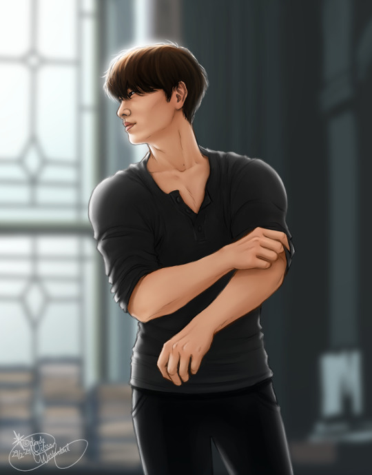


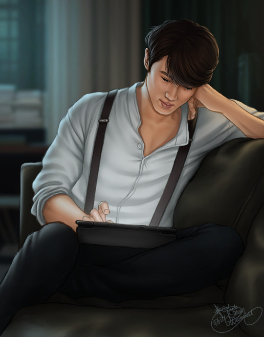

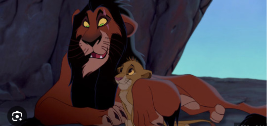
Kang Yo Han in his natural habitat, as observed by Kim Ga On
OR
You want to fuck that old man so bad it makes you look stupid
#The Devil Judge#Kang Yo Han#Gahan#Art#Fan Art#KDrama#Well#The Gahan is implied#If not before then definitely after that last sketch#This is what I've been doing the past three weeks xD#Just drawing a lot#Because I wanted to practice on sketching#And colouring those sketches in a way that's quick but also looks good#The difference between the first and last sketch is kind of hilarious#Especially on the skin#Improvement: Speedrun Edition#These took between three to seven hours each#And I'm very happy with them!#Even if they're also far from as perfect as I could make them if I spent more time on them#But the whole challenge was to not overwork them#So yeah#These are still sketches in my eyes xD#I'm getting REALLY good at the blurry backgrounds
368 notes
·
View notes
Text
Some old outfit sketches from the first few chapters! Feels like a decade since I drew these, but these were the basis for the finished 'Baratheon Brides' piece!

Cersei's wedding dress was largely based off of Sansa's as it was the only real example I could find of women's fashion that carried over the little capped sleeves the Lannister men tend to have, then of course coupled with the gold 'armour' bodice she wears during the Blackwater, since I felt it was a good twist of irony that she'd wear it both times she 'faces' Stannis.
Also, though we are told (and logic demands) that her wedding outfit is the one she prepared for marrying Robert, I like to think she added the rubies (and possibly even the metal bodice) somewhat last minute, as an extra fuck you to Stannis, since all the gold wasn't quite bloody/vicious enough for her.
Her 'setting sail' outfit was one of the rare cases I actually wrote a description for it first, then based the sketch off of that, instead of the other way around, but basically came from just looking at the extravagant matching mother-son capes she and Joffrey wear in Baelor, and thinking that the way that could fold around her bump would be cute, and a 'hey LOOK im PREGNANT' move that she'd definitely go for as part of her 'showing off how successful we are' departure. To that end, she's also incorporated a good bit more red for the bite of it, but is still sticking to primarily golds for unity with Stannis.

Ignore the weird off-centredness, but these were the first sketches of both our main Hightower ladies. Grey/silver is an underutilised Hightower colour (all thanks to that one really good green dress Alicent wore that one time) so I really wanted to bring attention to it, while also highlighting the differences between the two. Malora's is very drab, darker (to match her hair), and she can sort of 'hide' behind her sleeves if she really needs to, where Lynesse's is showy as it possibly can be without fully 'giving the game away'. The opposing flame colours also of course come into play, the first early sign of division amongst Leyton's many spawn.
They also both have the 'turret' motif, though incorporated in different ways, intended to reference the actual Hightower itself! A tower is a lot harder of a 'pattern' to put onto clothes compared to lions and roses etc, so you can bet every single Hightower I ever draw now is going to have it (it was also vaguely inspired by the dark blue dress Alicent wears in s1e2, where the 'rungs' of the sleeves made me think of a chequery-turret pattern being a recurring staple of Hightower fashion)

And the finished piece! Malora's sleeves ended up getting changed, I think because it was either muddying the silhouette of her skirt, or because I'd cut out her necklace and wanted to still show the amber ring on her finger; plus I generally use those slit poofy sleeves (snow white sleeves, as i always think of them) as an indicator of 'Reach' fashion, since they pop up in Loras's wardrobe a few times.
Cersei's veil also didn't make it, mostly because her curls were just TOO bodacious for me to work out the physics of it; the same reason that she has a different style of cape to Malora's! Her curls are just that defined that they actually define everything around them too.
And on the topic of her curls---
Bonus: this very quick sketch I did for a modern au I'm working on!

The specific fic this is derived from is a long way off from seeing the light of day (the main modern au I'm working on would be a one-shot set fairly late into their marriage, whereas this comes from during their dating era) but I love her energy and this DRESS too much not to share it. I imagine this is several clubs in, and her curls are SUFFERING from the humidity and dancing of it all, but every other part of her is impossibly yet steadfastly flawless (including the belly button piercing Tywin definitely doesn't know she has, which she probably conned a piercer into giving her when she was like 15)
(ranna does the exact same thing except robert definitely pays for her to have it done, because she can talk him into literally anything with very minimal effort)
(cersei is not as oblivious to this as tywin was, though she DEFINITELY curses robert out for it while letting ranna think she's gotten away with it)
(anyway psa: cersei in green > hightowers in green)
#asoiaf#asoiaf fanart#digital fanart#cersei lannister#a song of ice and fire#alternate universe#fanart#modern au
25 notes
·
View notes
Text
I reckon it is widely accepted that Crowley and Freddie Mercury were, at the very least, besties, sometimes lovers, sometimes had a fling or dated. But I have feelings and headcanons nobody asked for that I have to share.
They met while Freddie was still in college. Freddie saw Crowley, drew a quick sketch of him and got up and gave it to Crowley. "I promise I will draw you a better one, dear." He never did, but Crowley still keeps the drawing and miracled it to always look like just made.
Crowley never really liked Mary Austin. He didn't like her when she was Freddie's girlfriend and always found a way to inconvenience her. He still doesn't like her, especially after she put Freddie's belongings up for auction. He liked Jim Hutton, however.
Freddie kissed Crowley first. It was after a rehearsal of one of Freddie's early bands, Crowley was giving him his feedback. Freddie just leaned in and kissed him. He avoided the demon for the following two weeks as he was confused (he still hadn't realised he liked boys) and felt embarrassed.
Even though they were both adamant that there were no feelings involved, they both deeply cared for each other. Neither would admit it, saying they were only friends who (more than) occasionally hooked up, but they both knew there was more. However, Freddie fell a bit harder even though he knew Crowley wasn't in love with him. It did hurt a bit, but he was eventually fine with it.
Freddie actually knew about Crowley and Aziraphale being a demon and an angel. Crowley told him one night while they were both drunk and then Freddie remembered and asked him. Crowley tried to deny it, but Freddie insisted so much that in the end, he decided to tell him everything as he knew Freddie wouldn't tell anybody. And he never did, he treated this like his own secret.
The first time Freddie saw Crowley's eyes, Crowley thought he would be scared. But Freddie just said: "I know they're snake eyes, but they remind me of my cats. And what a lovely colour, darling. Yellow's my favourite, you know?".
Crowley ranted A LOT about Aziraphale to Freddie. He was always going on about how much he hated his being a goody-two-shoes, how infuriating his constant reminding him that he was actually a good person and how the fuck can 6000 years be too fast? Freddie just smiled because he knew. He could see how much Crowley loved that angel. It broke his own heart, because he knew he could never be loved that much, but never said a word.
Freddie did write a lot of songs about Crowley and Aziraphale. Obviously Good Old Fashioned Lover Boy, but also Crazy Little Thing Called Love, Somebody to Love and many more. Spread Your Wings is specifically about Crowley and he knew. But what Freddie would never tell anyone, a secret that he brought to the tomb with him, is that he wrote Love of My Life and You Take my Breath Away for him. (told you that Freddie was in love, my poor baby suffered too much in his life).
Freddie taught Crowley how to play the piano.
Crowley auctioned for some of Freddie's belongings. He got some kimonos, some handwritten sheets and his piano. He couldn't let anyone else have it.
Crowley never really left Freddie's side. He was always that mysterious, dark and handsome man showing up especially when Freddie needed someone. People eventually accepted it as part of Freddie's charm as he was always so secretive about his personal life.
Freddie let himself be vulnerable only around Crowley. Just as Crowley took off his glasses with him, Freddie allowed himself to cry only those times in which they were alone. He cried in Crowley's arms so much when his illness was worsening, when he was scared of how much he would have suffered. One night it got so bad that Freddie was basically begging Crowley to end his suffering and Crowley had to perform a miracle so that he could sleep. Neither brought it up ever again.
When Freddie died, Crowley was there with him. He gave Freddie just enough life to allow him to say some words. "You promised me you wouldn't come," Freddie told him. "I'm a demon, I lied" replied Crowley with a broken voice. He then sat on the bed and stayed with him until the very last moment. Aziraphale was there too. He followed Crowley without telling him because he felt he needed him. Aziraphale took away Freddie's suffering so that he could go without pain.
That same night, Aziraphale tried to persuade Crowley to stay at his library because he thought Crowley needed a friend. Crowley refused, hopped on his Bentley and drove away. He parked in front of his apartment building and found a used packet of cigarettes and an old pair of sunglasses that belonged to Freddie in his car. As the radio passed Love of my life, he couldn't hold it anymore and burst into tears. He cried hard, really hard. He felt a familiar hand on his back but didn't look and didn't ask. Aziraphale never said anything either and didn't leave until Crowley stopped crying but before he could be seen. He remembered how much it hurt and didn't want Crowley to grieve alone.
Master post: here
#I am deeply sorry for the last ones#Or maybe I'm not that sorry#I just love the idea of them together for a while#I mean Freddie and Aziraphale have some things in common#And Aziraphale would be friends with Brian May#Good omens#good omens headcanons#crowley#good omens s2#good omens#good omens 2#aziraphale#ineffable idiots#ineffable husbands#freddie mercury#crowley angst#good omens season 2#queen#good omens spoilers
228 notes
·
View notes
Text
Ghost and Soap tattoo headcanons because the brain worms demand it right now!
In my mind at least Ghost has a lot more tattoos than just his sleeve, it's just not common knowledge because until he gets together with Soap no one ever really sees him undressed except maybe for medical staff.
The sleeve was the beginning but he's adding to them whenever leave allows, on his chest and back, on his legs and his other arms and even his hands. Ghost is also the kind of guy that is very stoic while getting tattoos, the pain doesn't really bother him, he's been through so much worse, but he's not the guy who's chatting with the artist either. He just sits through it. Similarly afterwards he's pretty disciplined about the aftercare required. Sun rarely is an issue with the way he dresses and he plans his leave times around the appointments so he can take it easy for a while.
When the inevitable itching starts he just glares at the spot, never actually touching it, but he gets fucking irritated for a few days.
And while he's not the best at taking care of himself in many aspects of his life I can actually see him take good care of his tattoos in the long run, because I imagine him getting them to cover up scars, especially those left by Roba and his men. It's his way of reclaiming his body. The motive itself often isn't as important as the fact that he chose to have it put at that spot. The meaning isn't in the design either it's in the fact that it was his decision to wear it, unlike the scars that were forced upon him.
And then there's Soap, he's only got the one tattoo that we know, at least when he meets Ghost.
Its faded from sunlight exposure and because he never took proper care of it while it healed, even caught himself scratching it once or twice when the itching started. Its always exposed and he rarely thinks of putting sunscreen on, so naturally the tattoo has a hard time and the colour fades quick.
So at some point Ghost asks him if he wants it touched up. He's making an appointment with the artist he trusts anyways and he'd be happy to bring him along. Ghost knows that for Soap his tattoo does have meaning, that he's fucking proud to have made it into the SAS and that he got kinda sad comparing the crisp lines of Ghost's tattoos to his own.
Soap ends up agreeing although he's wary since he can't see it go better than it did last time. But if anything the fact that Ghost is allowing him to come along for this is such a huge sign of trust that he just can't refuse it.
And Ghost's tattoo artist is going to have to recover for a moment because Soap is so fucking chatty compared to Ghost, the pain is kinda exciting to him so he talks more and more and the artist hears more words out of Ghost in response to Johnny than he ever did before. Would wonder if it was the same man if they weren't literally continuing work on a tattoo they had started.
Once they are both done Ghost makes sure Soap takes proper care of the new ink. Threatens to tie him to the bed if he starts scratching at night (something Soap finds entirely too exciting). Shares his care products with him and makes him wrap it up for the first weeks and months. Is always at hand with some sun screen, at least for the arm, even when they are in the middle of nowhere. It's worth the trouble to squeeze some sun screen in his pack when he gets to see Johnny so happy about how good his tattoo looks again.
And once he sees how a properly taken care of piece will look Soap wants more. Ends up accompanying Ghost to the studio whenever he goes.
He's creative, most of what ends up on him is based on his own sketches, always with meaning behind it for him. The next thing he gets is a certain skull based on a specific mask that he wears close to his heart (making Ghost go through emotions he wasn't aware he was capable of having). He also helps Ghost with giving some of his ideas form often redrawing endless variations to make sure Simon doesn't just pick one that seems okay and fitting for its purpose but one he really likes to look at too. Poor man almost loses it when he sees one of his sketches inked on Ghost for the first time and its a good thing they are on leave because he's not gonna let him out of their bed any time soon. Purely to protect the new ink from the sun of course.
#ghostsoap#simon ghost riley#soapghost#cod mwii#john soap mactavish#johnny soap mactavish#cod#cod mw2#cod hc#this hc has nothing to do with the fact that i just got a new tattoo#not at all#also i'm lying#tattoos
320 notes
·
View notes
Text
Replies
A couple of replies related to drawing, so I’ll post them together.
Anonymous asked:
what do you do everyday, do you have a job or just draw something that make everyone fail NNN? Wait, now is already DDD.
The answer is Yes to both of your questions, Anon lol My entire life is dedicated to everyone failing NNN and succeeding at DDD.
I draw for a living! And I spend pretty much the entire day drawing: I spend the first chunk of the day either working on commissions or on our personal projects, then I take a break to write replies (not sure if it’s a break...), then I finish up stuff for us to post (it’s previously made sketches, I mostly just need to clean them up, fix them a little and throw some colours on them; sometimes it takes longer, sometimes it takes a couple of hours), and then I sketch.
I am honestly very grateful and lucky to be able to produce so much art on a daily basis, and opportunities like these unfortunately never last forever, so I would like to do my best and keep posting fun stuff for all of you while it’s possible and fun to do. I am happy where I am at in terms of this stuff, and insanely lucky to draw twst boys for commission work as well.
Anonymous asked:
Hello! How did you end up drawing NSWF? Did it come naturally or was it a meticulous learning process? I'm asking because I'm considering getting into it myself, (seems efficient to brush up anatomy, and also *money*) but I don't know where to start; whenever it gets to ''sexy parts'' it looks kind of awkward, like it shouldn't be there. And morphology references don't seem to help that much : ( If it took a learning curve for you to get where you are, do you have any tips or recommendations? I'm sorry if it's inappropriate to ask, I'm just a bit lost and thought I'd ask someone who knows what they're doing
Hi Anon! I talked about it a tiny little bit in this reply, but that post was mostly about me accepting the fact that I want to draw smut mentally lol I’ll talk a little bit about my actual learning process here!
My first attempts at drawing this kind of stuff were very awkward, which is obvious and perfectly natural. It felt wooden, stiff, like I had no idea what I was doing but I desperately wanted to make it look good, but didn’t have any tools for it. For the record, this was my skill level when I first started drawing smut.

My very first attempts were very inspired by one specific artist that drew cute yaoi pics, so I pretty much copied some poses from them to get myself familiar with how this whole thing works. At first I didn’t even draw any genitalia, just… wooden bodies smushed together lol
I was miserably bad at it at first, but I feel like something shifted in a couple of years, which incidentally was around the time we got into a bunch of very cool R18 artists, including Mentaiko (Itto). Even though my own artstyle is nothing like Itto’s, the way he draws bodies is so spectacular, I learned a lot from his works. I really encourage you to read Priapus if you haven’t already lol And I studied it as well by redrawing parts of my favourite frames, staring at the pages a lot, trying to draw something similar myself. Studying things that you yourself find hot makes you better at drawing hot stuff – go figure…
And to be honest, I feel like this is still the main thing that I do. I found my sketches from a couple of years ago where I just drew like 40 different vaginas being fingered from all the art that I liked lol It’s a very long learning process. But when it comes to tips, here is what I can say:
Study things that you find hot as much as possible; be it art, doujins, 3d gifs, irl stuff – anything. And try to keep in mind what exactly are you currently analysing and studying: the anatomy, the colouring, the ideas, the poses; all those could be studied separately.
Sometimes I scroll through a lot of irl porn just to get some poses ideas. Don’t take too much time doing it though, like very quick tiny sketches that only take like a minute or so. Just as a little reminder that yes, this pose also works like this. Or when it’s at this angle, the leg goes like this. All those little details are important to remember.
You don’t have to draw the entire body and stress about it; you only have to draw the sexy part and indicate which character it is somehow! You don’t have to show any faces either, as long as it’s easy to see who’s fucking lol
Squishing and pulling are your friends. Bodies are soft… sometimes a drawing with bad anatomy still works because the butt is squeezed too deliciously to look away. You can study hands squishing things or parts of the flesh squishing against each other separately, it’s very helpful.
Make everything very very moist. Add dripping sweat and other liquids, add saliva, tears, a lot of wet surfaces and bright highlights. A lot of drawings feel not hot enough because they’re too dry… that’s my bias though!
I think that’s it… if you have any further questions, please let me know! And good luck with learning and drawing spicy stuff, I hope you have a lot of fun with it and get paid a lot!
15 notes
·
View notes
Note
Do you have advice on how to draw characters with different body types and faces like you do? Me and my sister have been amazed with you art style since your first comic and its a big insperation to us
Tons, and I honestly need to just make a video on it x'D But I'll do my best to make something cohesive here, while keeping it quick. I'm also definitely not the expert, I'm just somebody trying to learn as I go and trying to constantly improve.

I bring this up first because this is something of a bad habit I've noticed a lot of people slip into - I've slipped into it myself, and had to make a conscious effort to get out of it. When it comes to bad habits in art, I try to point them out and cut them out, because it'll be harder to steer away from doing it once you've made it a go-to.
You really want to strive to create bodies that are similar "weights" or "builds" while also still looking different. Some people are top heavy and some are bottom heavy. Some people are skinny and other people are lean, they're different. A good way to practice in a way that builds better habits would be to draw a bunch of bodies in a certain weight or form category that still look different.
When it comes to those little things that set your characters apart, you want to strive to keep those unique to them as well, and while this is nice:
it might be relying too heavily on the little details to set characters apart. All your characters wearing different coloured t-shirts doesn't change that, at the end of the day, they're all wearing t-shirts. Try to break things down to the bare bones, and make sure they're still distinguishable and unique to them.
That said, don't become so fixated on making each and every person so perfectly unique that it stunts you. Some characters will have the same bodies, some characters will have similar faces, etc. Aesthetic still plays a role in overall bigger pictures, characters should be cohesive with each other if they're all in the same world, etc.
The single best thing I think you can do as an artist is go out and draw real people. Draw shapes, draw quick sketches, draw structures, draw what you see. There's so much variety and beauty out in the world, it's the best place to find inspiration and practice for your work. I used to sit in cafes or at parks or even bus stops and just draw shapes I saw, very basic shapes and gestures but it got me out of my comfort zone and helped me see more variety.
42 notes
·
View notes
Text
@northerlyy, I found your following comment really quite fascinating; so much so that I wanted to put a response in another following post- (and also because it’s difficult to write long comments lol)
(sorry for taking so long TwT)
——————
(Northerlyy’s comment for reference):
“This is really good advice for artblock, especially for digital artists! Even with pencil, drawing traditionally puts you in a different headspace than digital art like explained in the post. Pen art is genuinely really fun, and it forces you to worry less about product and focus more on just putting shit down and feeling the way you're making the pen move on the paper. Even just sketching traditionally and then doing the rest digitally can help break the funk of art block for some people. For people who draw exclusively digitally, simply creating finished art completely traditionally could be really helpful.
I mostly do digital art now, but I do almost all of my sketches on paper and it keeps me interested in what I'm drawing. However, traditional projects, especially in less-mainstream medias like glass prints, dip pens, etc., have been some of my favorite projects I've ever done. When you have art block, easier is not always better, and something that's challenging enough to make you think but also simple enough that you can get into the rhythm of it is really good for destroying the monotony of one art media and reigniting the urge to draw. If you like nature, getting out can also help too, because there's nothing that makes me want to draw literally anything more than rediscovering the beauty of the world.”
——————
RESPONSE:
Indeed! Yep, pen art is great, lol. And oh, most definitely- taking a tradicional sketch and finishing it digitally is also quite helpful! This also reminds me of something similar that I do sometimes: at least for me, colouring traditionally takes a lot of motivation due to the time and effort it takes- leading to it being one of the main reasons why I don’t have many full colour traditional illustrations…
Mainly because when adding colour to your drawing, it can take at least triple the time that it took you to complete both the sketch and the lineart. Plus, it can even be tedious; colour can either gloriously complete or absolutely destroy the drawing. What if you realise that the character doesn’t look good with the background once you finish? What about shading? What if a pigment turns out darker than you expected? (I always have to make a few mock test drawings…)
And if you are using watercolour and forgot to use waterproof ink for lineart… oh boy.
So! Sometimes I just don’t have the time or patience to go through with this and can resort to simply taking a picture of a traditional sketch and colouring it in digitally. It saves time for stuff like quick references.
And definitely, I agree on that last part- when you finish a full traditional illustration that was quite time consuming and complex, it feels quite neat! It feels like victory. When having gone through all those hours of hard work concentration, I can’t help but stare at what I made and think; damn, I did it? HELL YEAH I DID IT!!!
Even if sometimes the drawing may not come out like I wanted, i still am happy knowing that I can push myself to create such things.
Practice = Progress, not perfection!
Heh, quite true- dip pens are epic. I worked with those a while ago and the whole process is really satisfying. (And ooh, you’ve done glass prints too? Man, I bet they are glorious…)
Hmm, that last part is particularly good advice… I fully agree, there’s something about nature that can inspire like no other thing, or at least provide a calming space to think of ideas. I never feel more at peace than in the middle of a forest, hearing the soft rustling of the leaves above.
Windy, rocky coasts are nice, too.

5 notes
·
View notes
Note
hi hi ! I'm curious how you learned anatomy? (it's v smooth, and your lines are so so clear...) thank you, you have a lovely artstyle !!
hi nonnie! thank you 🩷 i will try to separate it into a few core things that probably helped me a lot (and still do). just to preface, there is no such thing as one correct way to study anatomy! well, except for practice, but how you do it is up to you! also i apologise if my reply is messy but my brain is a bit foggy today 🥹 i have to say it but colours distract from anatomy. imo if you want to focus on anatomy, find art that has either very simple colours or no colours at all. also this is why i’m always swearing when drawing because i focus on lines and mistakes are so visible because i’m not as good at hiding them with colours hahaha
read a bunch of comics and mangas — i’d pick manga because it’s black and white and is usually more creative with merging panelling with poses or action; comics are usually just rectangles haha 😋 watch anime and animated movies or shows. there’s this cool website characterdesignreferences.com that is filled with concept art from various media and you can see how artists approach anatomy in projects. great for studying them!
follow animators on social media. or accounts that post genga (key animations) and sakuga lol i’m serious! animators in general are crazy good at anatomy because they have to simplify everything into just a few lines and draw it thousands of times. they’re also great when it comes to bending the rules to make everything look ‘cooler’ despite not being exactly correct (which is a great thing, especially if you lean more into stylised art rather than realism).
trace reference pictures available online or take them yourself. photos are, once again, colourful and distracting, but if you trace just a single line around your silhouette or any part of the body, you will see how ‘awkward’ it looks without shading. back in art school, our teacher was a bit insane for demanding 20 quick sketches weekly from us (it was simply impossible on top of our other projects and homework) but i found a neat trick to make at least 10 per week with little to no effort. i would just take a picture of myself doing stupid poses and then trace it gently with a mechanical pencil from my computer screen asdfghjkl this way i could see a faint silhouette and then make stronger lines with a pen while adding a pinch of my own style and brushstrokes here and there so it won’t look completely traced lmaooo but i really liked those sketches!
5 notes
·
View notes
Text
Random Scarlett and Browne series headcanons because this fandom needs content (there was supposed to be more Albert, but it turned out to be a little bit for everyone)
He literally adores comfortable knitted sweaters, I mean, he canonically lived in one in the first book, but hear me out: when choosing, his favorite would be purple, followed by brown and light and dark gray.
Albert would have loved those coloured animal patches that they sometimes give to children in hospitals. I mean, I don't know what animal species are left alive in their world, but giraffes or tiger cubs would have been good for him. It's just cute, don't look for logic.
He is sometimes picky about food, in terms of, of course, the harsh realities of survival with Scarlett, he will eat whatever he can, but I think if possible he would have some kind of limited diet of favourite foods and dishes.
Scarlett, on the other hand, eats and loves absolutely EVERYTHING, because it is literally the only way for her to survive and she is used to taking whatever comes to hand. Although, I think she has some favorites too: fish and meat, most probably not so much greens (??? at least because they are not so easy to get and process, and also because I think so). But with all that said, she doesn't really think about it in most moments.
Joe, in contrast to this, also likes meat and fish, but he leans more towards fish because, c'mon, he literally lives and moves on a raft, he doesn't have that much choice, so I'm sure he can fish well)
Scarlett doesn't like chocolate, Albert likes milk chocolate or chocolate with nuts.
Ettie loves all kinds of sweets, although she hasn't had many in her life, so she enjoys fruit, for example.
Thomas also loved sweets, and it was literally the only reason they were ever in the McCain household in the first place. (I absolutely do not want Ettie to bring up Scarlett's trauma in any way, but there you go)
I saw a headcanon, it was @mellowkotto's I think, about Scarlett being terrible at playing computer survival games, and it really fits, but listen.
Albert is a very fast learner, so he would be really good at survival games because he would understand the mechanics and the rules of the game very quickly. This would create a pretty strong contrast, because in reality, things are a little different even after Albert's survival lessons. This led to a whole series of headcanons between me and my bestie about how they would play Minecraft, but that's a topic for a whole another post.
That's the only thing I'm saying from there: Albert built himself a house, tamed a dog, an ocelot and built a garden on his first day of play.
Scarlett spent the whole night trying to kill monsters with her bare hands because she's so angry that there are no knives or guns in this "bloody game" (don't tell her about mods), but then she just burrowed into the ground a few blocks down to survive.
Albert likes his pillow and bed to be warm
Scarlett likes her pillow and bed to be cold.
(It doesn't matter anymore, because if they share a bed, Albert canonically will be sent to sleep on the floor)
Albert falls asleep quickly, almost instantly, no matter how easy or hard or crazy the day has been.
Scarlett falls asleep for a long time thinking about her past and the results of the day, and even meditation doesn't always help. (Because they are both traumatised, except that Albert tends to ignore his traumas/not trigger them much, and Scarlett tends to live in them more than she wants to.)
Albert likes to play with Ettie, spinning small rocks or things in the air in front of her in a circle, like an invisible juggler when no one is looking.
Scarlett is pretty good when she needs to draw a quick sketch of a plan on a piece of paper, although she usually prefers to analyse the situation on the fly and keep everything in her head. And she and Albert are both terrible artists, seriously, some of Ettie's drawings are much better than what they can create even as a team.
(Although I think Albert would like to practice to better understand Ettie, for whom drawing is her preferred method of communication instead of words)
Both Scarlett and Joe are quite canonically gamblers, the only difference is that Scarlett spends large sums of money on gambling, not really caring about winning (she has trauma, just leave her alone), Joe mostly plays for fun, playing, for example, cards with Sal, for example, with a maximum bet of a few coins for show.
Mallory has been trained formal, clean language while working for the Faith Houses and the authorities, and so even if he speaks in a threatening and violent manner, his speech always remains calibrated. Therefore, it was another minus to his perception at Scarlett that she greeted him with a bunch of curses and a fist directly to his face from the truck cab.
And, regarding Mallory, in his childhood at Stonemoor, he would try to bring Dr Calloway some kind of gift after her "experimental sessions", whether it was a flower from a vase or a crooked drawing. Calloway was genuinely pleased with such thing, not because she really loved Mallory, but because it was the clearest indicator that her system was working and that this child was definitely attached to her and would do what he was told.
Despite the fact that Scarlett had the cuss-box after she joined the Brothers of the Hand, I really wish that the idea to pick up this tradition had come to her on her own, not on someone else's suggestion. Perhaps she had a similar jar for monitoring bad habits in her old house and then remembered it.
#the outlaws scarlett and browne fanart#the notorious scarlett and browne#scarlett and browne#scarlett mccain#albert browne#headcanons#don't search for logic#please tell me if any of this is against canon#because I can forget details(
28 notes
·
View notes
Note
small compilation of ways i keep the sketchbooks nice and spicy looking. couldnt tell if you actually wanted this or nah but have it anyways. as a wedding gift
literally always have highlighters nearby in a pencilcase. if not those, coloured pens work just as nice, and sometimes even better due to how little they make everything else bleed. but i had a set of highlighters w me 24/7 at school and they only lasted like, 6 months? cuz of how much i worked them to death
i have a small hoard of.... around 30 or so sticky notes in diff colours and patterns. used to use them way more but theyre a nice way to either make quick backgrounds or cover up mistakes when drawing w pens. on a similar note, i also have an entire folder of scrap paper i use in place of that sometimes, just from random things. mb candy wrappers, or tea boxes. yknow. just fun paper.
people always look at me like im insane when i say this, but i adore sketching with pens right away. pencils make everything muddy and smudgy, pens dont smear and are, obv, in a shit tonna colours.
sometimes, i pick a colour for a day and roll with it. for example, i randomly pick a red pen to doodle with during class, and then only use the red pen for the rest of the day, and the next day is like, idk, a blue one. i like how it makes days easier to tell apart, but this may just be a me thing
washi tape !!!!!!!!!!! can be used to stick in random wrappers or notes OR used to secure the sticky notes from earlier so they dont peel off that easily (although i usually use a gluestick for those anyways)
acrylic paint is a friend. a good friend. best friend (right after pens). good for fun bgs, could be fun t just mess around w!! i was lucky enough to find proper NEON acrylic paint tubes as well, to add to the eye bleedingness!! theyre fun, everything can go on top of acrylic [:<<
stickers. adore stickers, cherish stickers, marry stickers. theyre nice. i love stickers. esp smiley face ones
anyways yeah. ily
saving this. SAVING THIS!!!!
TY LOVE I WILL CHERISH THESE TIPS
3 notes
·
View notes
Text
Escape from Tombstone - Learning Outcome Matrix (pt.3)
Skills learned/Knowledge advanced:
Photoshop- I spent a lot of time polishing my Photoshop skills and I feel like I'm starting to catch up on the skill-gap (still only switched over from traditional art 4 years ago). So I incorporated more things like subtle gradient, editing saturation, lightness and contrast, utilising the lasso and magic wand as well as Layer styles and modes to enhance my art. This manifested in ways such as more warmth to skin-tones and more effective shadows and colour co-ordination.
Animation- I learned to apply Animation concepts such as squash and stretch without breaking the semi-realistic feel of the game. Animating for games in general requires specific understanding such as attack timing (a jab wants to be snappy and efficient, long, detailed animations can slow down combat dramatically and make the game difficult to enjoy) I also tried very hard to keep consistent anatomy while adding some stylistic motion and bounce.
Maya- I learned to utilise Maya for quick Greyboxing of ideas in the service of Environmental Concepting and consistent perspective.
Unity- I dove into Sprite scaling and filtering, generally learned the full ins and outs of the Sprite Editor and slice tool, was forced to edit Pivot points to make my animation work, learned 2D Rigging and utilised Layer order for sprite rendering distance correctly.
Programming- I learned some new Character controller programming patterns from the tutorial I was following. Making sprite flipping simpler.
Character Art- I pushed my Character designs hard this module, particularly Portraiting, focusing on expressing personality and creating intriguing, memorable faces. This carried through into Posing, which I used even outside of animating to get character personality across, such as the Goon aggressively preparing to swing his pipe at the viewer. I also pushed my understanding of Anatomy, especially hips and legs, which was always a problem area for me artistically. I also really pumped out those Clothing variations as my portfolio was missing them.
Environmental Art- Environmental concepting does not come naturally to me. Imagining the places and putting them to paper still took a lot of time, trial and error, but I am very proud of the results and believe I have made major and irreversible advancements that make me confident in approaching Environments.
Light & Colour- I explored Colour and Light even further this module as it's always been a low-key problem area for me. learned about colour emotions and 60-30-10 rule as well as exploring expressing character through colours and tones.
Props- Weapons and Environmental Set-dressing. Another area my portfolio was lacking in, so I was happy to rectify this during this project.
Presentation- Another problem area (can you tell I had lots of them). I would often abandon images before they were fully complete, in an inherent effort to 'catch up' and broaden my skillbase but this developed into an inability to get a "finished" look out of my images. So I really doubled down on the process from sketch to final picture and the final graphic design and polishing that gave it that extra oomph. Still a lot to learn here, but we're making strides.
Efficiency- Incorporating AI into the idea-generation phase has been helpful in breaking deadlocks and creating an influx of unique concepts. I also pushed my Thumbnailing by re-using good anatomy as mannequins to provide a lot of variety in concepts efficiently. Greyboxing in Maya has also been a huge time saver for environments and consistent perspective combining this with my new understanding of the Shapes tool for filling makes it much quicker to design geometric areas in perspective.
Project Management- Through the process from concept to final product I learned valuable skills in Time management, adapting to change, finishing, finding solutions and not shying away from a challenge, maintaining productivity without burnout and was forced to adopt a self-promotion mindset.
Video Editing- Something I've been meaning to get around to for ages, being forced to make a self-promotion video finally got me to engage with my editing software. Forcing me to adapt and learn. However I never did manage to figure out the audio balancing which gives it an amateur feel.
0 notes
Text
Some of my favourite art - a timeline
Part 14: 2024
The first half or so, at least

January. The fake album covers series. This is only a concept sketch but I really like how it looks even so, and I like the logo too.

February. This is actually a panel from my comics. This is one of the more detailed drawings in my black white and red rough sketch style. I like the pose, especially since it was so difficult for me to draw something like this in the past.
April. This is hands down my favourite panel from all the FIF comics I've done so far. The concept and the composition are very good.

May. Self portrait. Technically traced over a photo, but, as I've come to realise, even tracing in an aesthetically pleasing and artistic way is its own skill. (And the colouring and shading as well as the composition is done without tracing anyway). The first full colour picture of the year.
June. Quick sketch for my hacker story.

June. I like how I drew the babies here. Drawing the poses was a struggle, but I'm glad I didn't give up on it. I also liked drawing that transparent ball.

Early July. My first artfight this year (@ user is_noah). This is definitely the best drawing I've made this year, and the highest effort one. I spent about 3-4 full days drawing this, so a cumulative total of 20 hours or more. I like pretty much everything about this drawing, the shading, lighting, colour, mood, perspective, anatomy, poses, composition, clothing, character expressions etc etc. I feel like it looks just as I envisioned it in my mind if not better. And most importantly the emotion, the angst grief etc is there. What I struggled with the most was definitely the composition.

Late July. My second and last artfight this year, and a very high effort drawing for my friend @sea-angle. I like the lighting, colours and poses here. The composition was definitely the biggest struggle, but it was very much worth it. Although I spent a full week on this, I think the net time was about half of the other drawing.
______
The way I would characterise this year so far is that I'm still in an experimental phase especially in terms of subject matter, and am constantly going out of my comfort zone. At the same time, this is the period of time in which my artstyle is the most "my own" it's ever been, and the skills I've acquired over the years stacked up, thus enabling me to draw things that would've been extremely challenging even just last year. And to be fair, they were very challenging this year too, but I was determined to see them through to the end. My biggest improvements have been in terms of anatomy (+ poses), lighting and especially composition, which I've also put a much higher level of intentionality in.
But all of this did not occur overnight. If this 15+ year retrospective showed me anything it's that even those years that I felt like I was stagnating or regressing in my art, were actually crucial steps in building skills that would define my art in the future. I am extremely grateful for the journey I've had so far. I hope that any artist who reads through this series feels encouraged, because every new drawing means progress, even when, or especially when we feel it the least
1 note
·
View note
Text
Character Design Final (Part 1)

^Notes from Toby's Presentation
Thinking about the composition for my poster has me thinking about what genre of poster I'm going to be developing. It's not something I thought about until now, I mean, I've been developing styles based on multiple different sources but now I have to think just what medium is my "story" going to be presented through (be it film, tv, book, or what not). For me, I think it's important to first say which medium would present my story to it's fullest potential.
TV - I don't think my story would make for good television. TV series are usually long and drawn out, pulling together many introduced elements to a climax and then paying it off whilst teasing what's to come. My story follows one singular character and his way through one single major situation, lacking any of those long threads and clues to some bigger narrative. There isn't a reason for the shroud to appear, it just does. Sort of like the fog, or the bodysnatchers, they just appear and are more of a tool for symbolism than a tool for narrative or lore.
Book - I think my story would make a decent book. Book length is variable, they provide ample opportunity to show character thoughts easily, and they're less geared for developing franchise and more geared toward delivering a good story. My main issue with attempting a book cover is that they bring lots of focus to it's title as the main selling point, and while I don't mind making the title a focus point, I don't want to minimalize everything else to bring focus to the title.
Graphic Novel - This is such a broad genre which is great. It's a visual book, so most of my comments about the book manifest here. But the visual element takes host here which basically means the cover is less focused on the title, and more focused on spelling out visually what happens in the novel, and since my story relies heavily on visuals it makes it easier to show ideas rather than telling.
Movie - Movies are also much more broad of a concept, but for my story it definitely works. I feel like my story could be neatly packed into a movie format, relying in visual symbolism to give depth whilst having visuals of epic proportions. Things that might be hard to capture in the small budget of a television show, or the crammed panels of a comic can easily come to life a movie form. Movie posters are also quite varied, giving me a multitude of options/styles to draw from, and explore both grandure and minimalism within the same boundaries.
Summary/Making the decision:
I'm going with a movie poster. It makes the most sense because it fits the story I'm trying to tell and it gives me many influences to pull from/compositions to use.
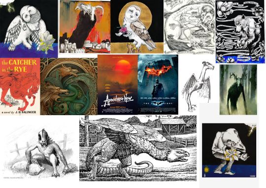
I've also got to think about what genre my story fits into movie wise. I'm looking through this website: https://www.studiobinder.com/blog/movie-genres-list/#experimental-genre To figure out what genre my story fits into.
After some searching, I've found a couple that might fit. - Dark Fantasy - Apocalyptic - Psychological - Monster -


^Here's some posters that have interesting compositions that I might use in my own thumbnail sketches. I want to play with perspective, and I like the idea of using fish eye perspective to capture a panoramic view.
QUICK MOODBOARD:
MOVING INTO PLANNING:
What I want to show:
I want to capture the size of the monsters in comparison to the character, because of that the monsters will have to be larger than the character.
Next would be showing some kind of road/rail/path that the character is on. Symbolic of the journey he's going to make as a character throughout the story.
The character smoking/drinking, showing his self defeating nature.
The character looking forward, or faced away from the danger, symbolic of his tendency to run.
Colour Pallet:
Character/Explosions/Fire:

Monsters/Environment:

^These two colour pallets compliment each other, which means that the character and the destruction of his home are front and center among a moody blue background. It also means that the eye will be drawn to the character first, and then the monsters. I feel like if a monster is less readable and takes a while to process it can be a whole lot scarier once you realise it's actually there. You'll see the character, then the danger, not the other way round.
THUMBNAIL SKETCHES:
Thumbnail Sketch #1: Getting started.
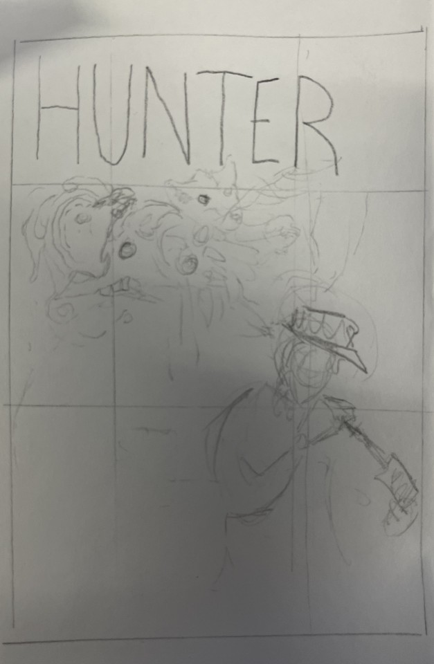
This first thumbnail sketch was just an attempt to get into the grove of things. I have hunter cleaning a pistol while monsters flow out of his head (not literally) as a symbol of how these monsters feed off negative emotion and he has lots of that. It also shows his self destructive nature with the gun pointed in the direction of the flow as if hunter had blown his brains out and the abstraction is the blood flowing out. But, I feel like the idea behind it is cool, it doesn't present any link to the environment/setting, which is also important to show.
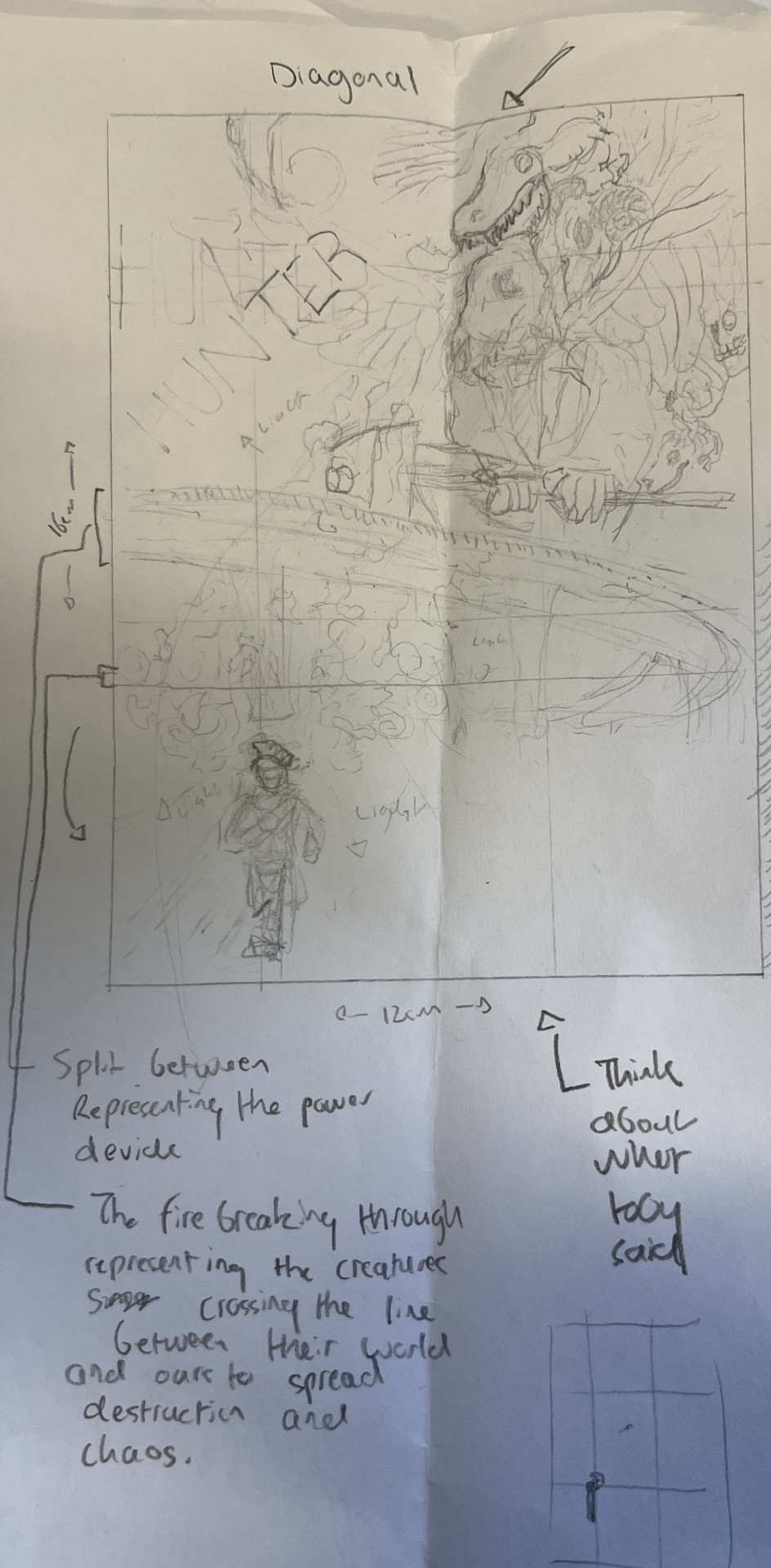
Thumbnail Sketch #2: Scale.
This composition is a lot better in my opinion, it's a lot fuller and displays the environment along with the sheer scale of these monsters. However, there could be more directional lines pointing towards the character, and he could also be along the cross section of the rule of thirds. The bridge also acts as a dividing line, drawing a line that's being broken down, a breaking down of the barrier between worlds. It's cool, but I can do better.

Thumbnail Sketch #3: Film convention.

In this third sketch I've been playing with some conventions usually associated with film. Take this Batman movie poster and how everything in the composition is centered to the middle rectangle of the poster, and look at how the characters fade. That's the sort of feeling I was trying to capture, it allows me to present a focus on hunter as a character instead of a small part of a bigger picture. But, I'm not sure about it, something feels quite barebones in a way I don't really like. The negative space feels like a vacuum and doesn't compliment the used space at all.

Thumbnail Sketch #4: More scale, defined monster.
This composition I did freehand without much help until I added a horizon line which definitely allowed me to structure the whole thing a lot better in terms of the highway bridge pillar and how the extra body and car was positioned. This one both simplifies and complicates the composition. It's simple because it only has two vocal points being hunter and this giant monster which I came up with, fusing multiple influences together (just look at my mood board). I need to make the character less static though.

Thumbnail Sketch #5: Eh....
For this sketch I took heavy inspiration from the movie poster for "To Live and Die in L.A":
I liked how this looked on a surface level observation, but then realised once I started sketching that this works better with perspective rather than just being flat. Plus, this composition is more focused on hunter than anything else, which works but I'm not sure if this is how I want to make my poster.

Thumbnail Sketch #6: Experimenting with perspective.
The idea here is solid, having the character in a calm field while it all breaks down into another scene where the town is getting destroyed. But it's visually cluttered, and takes a while to fully process.
Thumbnail Sketch #7: Toning it down.
Here I'm applying a similar concept of separating hunter from whats going on around him as a way to frame the world as this whole seperate entity from him, his disconnect from reality. I'm not sure if it's enough though, it's not nearly dynamic enough to capture people's attention.
Thumbnail Sketch #8: Fisheye
This composition here specifically uses perspective to distort the image, adding some much needed dynamic motion to the image. I also really like how I've made the title here, sort of lining up with the fisheye distortion. I wanted some action in there, some threat, I want this small army of monsters coming towards him and a giant monster creeping up on him, making it look like he's completely overwhelmed by the sheer power of these creatures. It's important to add some stakes, or some action to make everything feel alive.

Thumbnail Sketch #9: Vertical Title.
This is a pretty basic composition fitting within the rule of threes. It works, especially with the foreboding horror of the skeletal bird man burning down the city, but other than that it's not awfully out there, not a bad thing though.
A3 TESTS FOR FEEDBACK:

I chose this composition to adapt into one of my three because it's quite a basic and solid choice. It's well structured, and is clear.

2. I chose this composition because it's the one I spend the most effort on. I also wanted something more closed off, more personal.

3. This fisheye composition is probably my strongest fundamentally, it's super dynamic and lively.
REFLECTION (BEFORE FEEDBACK):
I really enjoyed doing this and I feel like I have a good foundation to work with, a good selection to choose from. Hunter Price isn't a favourite for me, but I'm sure that'll change once I get to fully realizing his character in the final poster.
0 notes
Text
Research on creating character designs
A few main takeaways I learned through my research:
Redraw your characters several times, don't settle for the first iteration of your character. A few ways you can do this is by changing the shape language of your character and seeing how that fits their look and characterisation. Another way that you can do this is by doing several quick sketches of your character, and exaggerating or changing one body part/aspect of their design each time.
Choose a 'theme' for your character. This theme could convey their philosophies, motivations, intrapersonal conflicts, etc. the theme could also covey the overall message of your narrative. Use this theme to then drive your design. link every design choice back to this theme in some way, that way you can create a cohesive message of everything your character is about.
everything about your character needs to be easily communicated through visual language.
Always keep clarity in mind. Your character design must have clarity in terms of silhouette, palette, and exaggeration.
Silhouette
Break your character down into a silhouette, and see if they are easily recognisable from that silhouette alone. Examine the silhouette and separate some of the shapes to make them more clear and give the overall character more clarity. Use big identifiable shapes to to make the characters more recognisable.
you can take this one step further by taking the characters head and adding a weird and unique shape to it. this is a useful design trick that helps your character stand out in a crowd and even demonstrates the direction they're facing.
Now that your character looks more clear in a silhouette, check which shapes you can push and exaggerate to make it an iconic design.
Shape language
Use shape language - the kind of shapes you use inform us of a character's role in the narrative. Almost all characters can be broken down into circles, triangles, and squares. This visually communicates the personality of the character within an instant.

Squares imbue a sense of stability, trust, and stubbornness in the viewer.
circles are friendly, bouncy, soft, welcoming, warm, and happy.
Triangles, with their hard sharp edges imply edginess, danger, intensity, and speed.
don't use conflicting shapes and commit to a shape motif. this reduces clutter and emphasises the things we want to emphasise.
In more realistic art styles, these big identifiable shapes usually manifest in the form of big clothing, hair, items, or weaponry.
Palette
When it comes to palette, don't use too many colours. Be selective and use a colour hierarchy. in a colour hierarchy, there is one dominant colour and then a few other supporting colours that don't compete with the dominant colour.
when figuring out colouring, break your character down into values. make the design greyscale to then analyse the values and see if there's any colours competing for attention. staying in greyscale, play around with the values of the design until you find something that looks good.
remember to check how your coloured characters would look against their environment background. Again, check for whether the values compete and prevent the characters from standing out.
character colour palette is similar to their silhouette. A good character design should be recognisable from rectangular colour swatches. Remember to make use of colour theory to convey your character's personality.
Your use of colour can also inform viewers about where your characters are from. Historically, cultures and societies closer to the equator tend to have more colourful clothing and art while those further away from the equator tend to have more muted colours.
Exaggeration
Use exaggeration to create characters that connect emotionally with an audience. Try stripping down certain details and pushing proportions and colour to directly connect the viewers to a feeling. The lack of realism actually allows audiences to connect more easily with the characters.

Employ McCloud's 'masking effect'. focus on how a character makes you feel and emphasise the visual aspects of them that convey that feeling.
Have body variety. Using the same body proportions for all of your characters is very boring to look at and isn't representative of reality. A character's body size and proportions can also tell us a lot about them.
character's bodies are made up of essentially three parts; head, torso, legs. varying the difference between these three shapes is what makes a character design interesting. if your character design starts to feel bland, play with the proportions of these three parts or even try grouping these sections in a more dynamic way.
Lineups
when creating more than one character, its important to design them all in a lineup so that you can create complimenting shapes and proportions and be more precise.
1 note
·
View note
Text
What Pet Portrait Artists See During a Session
When it comes to painting/sketching a moving dog, there are a few things that happen that can make it more challenging. One of the main challenges is the proportion of the dog's head compared to their body. A posed dog will give you an idea of where the front and back legs should be, but with a moving dog, it can be difficult to determine which way they're going to turn at any given time. Also remember that it's best not to be too detailed when painting/sketching a moving animal because they aren't going to stay still long enough for you to get everything perfect!
Another challenge is getting all those little details right - fur texture and facial expression are especially important here! If your subject doesn't sit still long enough for you paint without interruption (which can take hours), then just try doing some quick sketches instead!
The differences between painting a dog in good lighting vs painting a dog in poor lighting.
The difference between painting a dog in good lighting vs painting a dog in poor lighting is dramatic. In this blog, I'll show you why and how light affects the appearance of your paintings.
Lighting can make or break a portrait. It is the single most important element to consider when painting any subject matter, whether it's humans or animals. The way light hits your subject will help determine how they look on the final canvas—whether they appear dark and sinister or bright and happy! A few basic rules apply:
Light needs to be consistent across the whole painting (don't leave one side of their face in shadow)
Light should complement each individual's features (bronze-colored fur needs warm tones; white fur needs cool tones)
The challenges of painting other animals, like cats, rabbits and birds.
Painting cats is a lot harder than painting dogs. Cat owners might think that their cats would be more willing to sit still and pose for their portrait, but this is not always the case. Sometimes they are even less cooperative than dogs!
Cats are skittish and don’t follow commands like dogs do. They also don’t like wearing clothes or sitting in one place for long periods of time (especially if there is an open window nearby). If your cat enjoys being outdoors or has been trained to come when called by name, it can be even harder to catch him when you need him most!
What the artist is looking at when they paint - the details that people don't notice on their own pets.
As a pet portrait artist, I'm always looking for the details that most people don't notice about their own pets. For example:
The colour of their eyes. Some dogs have brown eyes, some blue and others green. If you are trying to paint your dog's portrait from a photograph, it can be difficult to get the exact shade of your dog's eyes right if they're not looking directly into the camera!
The shape of their nose - because many breeds have different kinds of noses depending on what part of the world they came from (e.g., Bulldogs were bred in England so they tend to have short snouts.)
The shape of their face - some dogs are bred with longer faces than others; this is especially true with smaller breeds like Chihuahuas and Pomeranians whose faces tend to look long compared with larger breeds like German Shepherds who often have shorter muzzles (the area between where an animal's nose meets its mouth).
How to get a pet to pose (hint: it's much easier with small dogs vs large ones!).
Finding the right pose for your pet can be a challenge. Here are some tips that will help:
Use treats. Have some of your pet’s favorite treats on hand, or have your assistant carry them in a treat bag to help get them in position and keep them there for as long as you need. If it’s only one or two bites, it’ll be worth it!
Let them use their toy(s). Most dogs love toys, so let them pick out a favorite and then use that to get their head turned toward you so you can capture his/her gaze just right. It might take some time to get this right, but I promise—it will be worth it!
Take breaks if necessary. If your subject gets bored or tired after 5 minutes (or less), take a break and come back later when they are ready to go again--but don't wait too long before trying again - once they've lost interest completely it may take days before they'll want another shot at posing!
Pet portrait artists work hard to capture your pets exact likeness.
Pet portrait artists work hard to capture your pets exact likeness, but there are challenges that they face when painting other animals. Birds and rabbits have a similar problem as dogs in terms of being difficult to paint in poor lighting conditions. Cats can be particularly challenging because their fur is so dense and may obscure details, making them difficult to capture accurately on canvas or wood panel. However, there are some ways you can help your pet portrait artist achieve the best results possible:
Make sure you have good lighting when photographing your pet for reference images for the artist (see our blog post on "How Pet Portrait Artists Work").
Avoid using flash photography because it tends to wash out colors and makes it harder for artists to see details clearly. If it's not possible using natural light then try doing a photo session with a diffuser over one side of the camera lens or bounce flash off walls/ceiling/floor etc...
0 notes
Text

so, your probably wondering how this thing just spawned out of existence huh?
yeah...Same
to talk about the process of making this thing is going to be sort of long winded so hand tight while I go over everything.
I needed a title cover for my alternate comic series, understandable right, yeah I guess so, comic covers usually look good right? yeah we can both agree on that so let’s just take you through the methods and story of this thing okay?

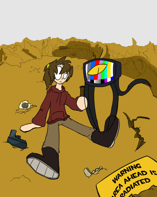
so it started out with the earlier sketch where I doodled some of the character from faulty visions and honestly for some reason the doodle really stuck with me for some reason I decided to use it as a reference point for a theoretical cover for this segment of the comic

so yeah, things started off with this new sketch expanding on the idea a bit, showing the Main characters Jess and Steve just kind of chilling near a canyon with an exploded middle area to show a bit of the story telling implying that the area there hanging around in might of been where one of the nukes went off, pretty dark theming for what I earlier stated to be a buddy adventure comic about a pupil-less Lady and her sentient Tv but considering it’s a background element you’d have to further put thought into to understand the greater implications of I’d say it’s fine to show something considering it isn’t fully upfront with the darker concept of this initially being where a nuke went off.
also quick note about the mild face change I made with the mouth, I personally felt it added more character to her, combined with the pure white Eyes it gives off a sort of “no thoughts head empty” type of vibe and I was kinda endeared to that idea, that Jess is trapped in this completely horrific and hopeless situation yet is completely oblivious to that fact through sheer the sheer power of never questioning where all the humans went, you see a lot of straight man type characters or skilled warrior type character or someone who grows into that archetype be the main character of an apocalypse story, so flipping the script and having somewhat who is completely oblivious to the implications and horror of everything around them yet is also scarily adept at self suffixion despite literally having no idea what the hell is going on is a very funny twist on the trope.

So as for colours explaining my process I began by doing the colours of the characters first before anything with the background being in post i’ll just show everything together though.
ah right the sky, using a similar tactic to my last project I used the gradiant tool with a combined reddish pink and purple to make a convincing looking sunset view and then adding a sun in there as well to complete the look, as sunset covers are really appealing in my eyes and we don’t see those types of views in apocalypses much so having a more pretty view would change things up a bit in a good way hopefully
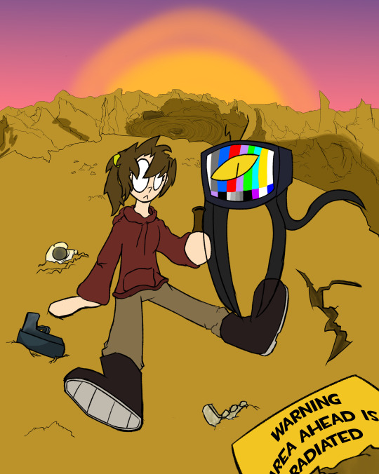

moving onto shading for the characters first I really tried to make extra care to show how the setting sun background effects the lighting and hading of the characters in the foreground with the side closest to the sun being brightened near the end and the harshness creating a bigger contrast with the rest of there colours being darkened from the far harsher shadows made by the bright lights and setting sun.

with the shading for the background wanted the tips of the mountains to better show the brightness of the sun contrasted by the lower areas growing ever darker as the sun slowly lowers ever more.
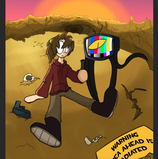
and here we are back at square one, aside from the dirt applied, to the sign at the bottom right, so were done right? haha no! we still have at leas a few more things to add at this point.

to add more to the comic idea included the logo design had made sometime after completing this piece along with a white segment to show the issue number and brand name.

at last i had selected a font to serve as the title, one that would fit the “post apocalypse theme as well as serve as contrast with the somewhat comedic title of the comic.

And at last to finish it all off a old paper layer to fully complete the old comic look.
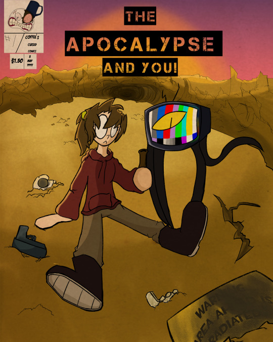
let me just say i am shocking proud of how this one turned out and is probably my second favourite piece of the project, the lighting position background use of lighting and dedication to the bit make it a massive step up from the previous one made and sort of show as a showing of my improvement over the last year or so, utilising an old comic story as a piece in the project itself was honestly one i’m somewhat proud of coming up with as again, it was an opportunity to show my growth over this past yeah, what i learned, what mistakes I’ve learned to avoid and how I innovated from the last piece.
0 notes