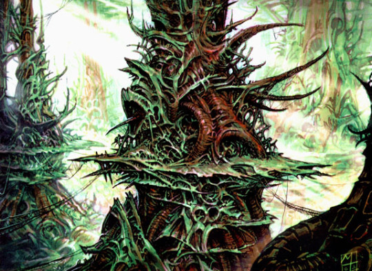
#Also i tried out a new rendering style that's a mix of the painting i did for yesterdays XB and the shading style i used for Keralis
Explore tagged Tumblr posts
Visit Tumblr Blog
Explore Tumblr blogs with no restrictions, modern design and the best experience.
Last Seen Tumblr Blogs


Fun Fact
Tumblr was created by web developers David Karp and Marco Arment.
Text
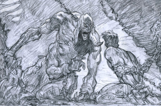
[Day 9]: Skizzleman!!!

Skizz is so Acap: Assigned Cop At Permit-office
Anyways, fun fact about this: i didn't realize skizzes poe poe skin had booty shorts, i just added them for funsies bc the original wing design would have hidden them from few. However, when i looked up his new skin mid drawing this, i realized HE DOES IN FACT HAVE SHORTS??? and i couldn't resist moving the wings a bit to show them off LMFAO
#Also i tried out a new rendering style that's a mix of the painting i did for yesterdays XB and the shading style i used for Keralis#I think im p happy w it?#I had to completely re-do the wins tho bc it uses the overlay layer for shading and apparently thats invisible on a white surface...#hermitaday#hermitcraft#hermitblr#art#hermitcraft fanart#clart#skizzleman#skizz fanart#skizzleman fanart#angel skizzleman#ghostys favs
102 notes
·
View notes
Note
Hi there! I just discovered your blog through your latest Clone Wars post and I love your style! I’m a struggling artist and if I may ask what did you do to practice? I just love how you drew Rex’s face and I’d love to have the same confidence.
Heya! Thanks a lot, I’m glad you like my art!
Sorry, it took a while to get back to you, things have been pretty hectic on my end. As for the way I practice, it’s a little tricky to explain because everyone has a different process, but I’ll try to break down my method on the last study I did.
I tend to take a fairly straight-forward method of practicing and getting familiar with a new face. For example, I don't think I’ve ever drawn Rex or any of the clones until the drawing I posted the other day. Because his face is heavily stylized in the show, I didn’t want to have that be my only influence, so I started by looking to the movies to base my art on. The easiest way to do that is to trace.

Here’s a quick study I did of Mr. Morrison prior to drawing Rex for the first time. I didn’t spend long on it, just a minute or two. It helps me get familiar with the shapes faster.
Then I also had a look at the model used in the show. They have some very impressive shapes, so I wanted to incorporate aspects of that into my drawing. So, I traced again. Very basic stuff, very quickly and rough. I used a big brush so I wouldn’t get lost in the details. From these sketches, it becomes very clear what things I want to focus on; the nose, his very expressive eyes, and eyebrows, and sort of try to have everything support that.

After that, I just had some fun experimenting with facial expressions and seeing what worked. Keep in mind, at this stage I have moved away from tracing and am focused on learning the shapes through observation and sketching. I wasn’t happy with the expression here, but I liked the rest of the face, so I just kept doodling until I figured out what I wanted. I had to take breaks often because I got stuck halfway through. (excuse the handwriting lol)

The final result is a bit of a mix of what I learned from the traces and additional reference photos I had nearby. I settled for a more mellow expression and tried to paint the colours in a way that preserved some of that Clone Wars AestheticTM vibe. Overall, I think there are many ways to improve this. I think I could’ve tidied up the rendering of his skin so it doesn’t have too many aimless brushstrokes, and his eyes are still not looking quite right. But that's also part of practice; to look at a finished work and appreciate it for what it is, and do better next time.

I hope this was a little helpful, and do reach out if you ever need any help. I’ll try my best. :)
175 notes
·
View notes
Text
Process of rendering physical work
This post involves some screengrabs of the process of samples I have currently made.

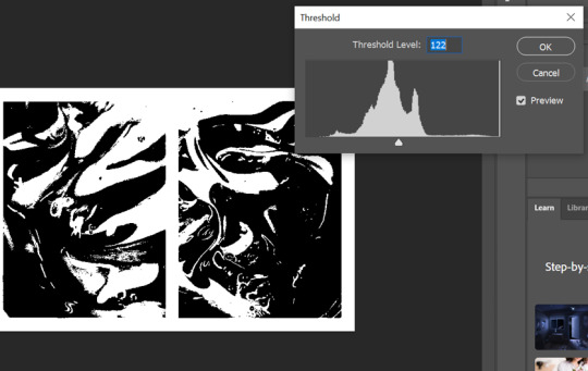
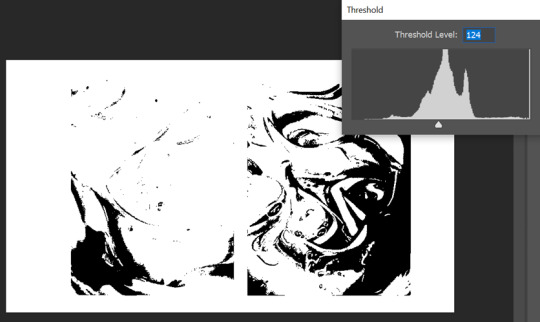
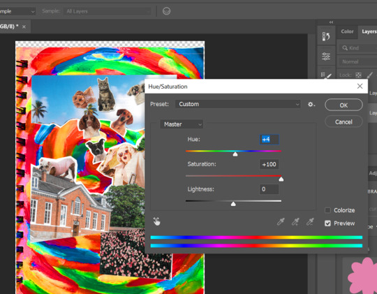
As you can see above, I have began to edit the original image of the paint. Threshold has been used to segment the image into sections. As I wanted the image to be binary, I did this process twice but at different levels. On the left I set the threshold level to 122 however the other image I placed it at 124. This brings out different shaded areas. Before I began the duotone process I had to flatten the image using grayscale so I am able to see the threshold better.


I then used duotone with the two layers I had made with the threshold and set them to the original colours of the picture I took. This was because I wanted to see the difference between the two. Above are the results. This was the most enjoyable process by far as the fact that the paint gave a marble effect so I was able to create to outcomes with the duotone and threshold combination.
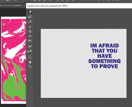
This was a screenshot of the art which I had created on the opposite side of the print sample. This was a font which I had downloaded of adobe fonts as I wanted to find the best block like text. This enabled me to liquify it better using the smudge and expand tool. I had done this process already however I loved this outcome more as I began to become more familiar with the technique and the result I wanted.
Here is another outcome of the process above. Again, I went through the combined techniques twice to get different colours within the duotone image. My final outcome is pink and orange however this was originally created with different shaded of pink because I thought it would be beneficial to use in my zine.
Moving away from the digital comparison samples, I began to look at my aesthetic post where I looked at artists work which had inspired me. I had yet to make many physical samples so I began to look through magazines for any imagery I liked and could cut out. I knew I wanted to make some ‘abnormal’ collages. This means combining multiple objects which aren't normally combined to create this new sense of reality. I wanted this kind of escapism in my work ,with the help of landscapes, to portray the abnormality of stressing over tiny problems. I want the readers to remind themselves of who they are and where they are which I hope eases their worries because its easy to get lost in your own world without acknowledging your the world your living in with others.
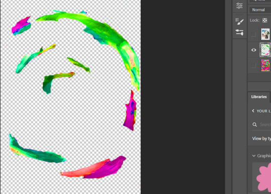
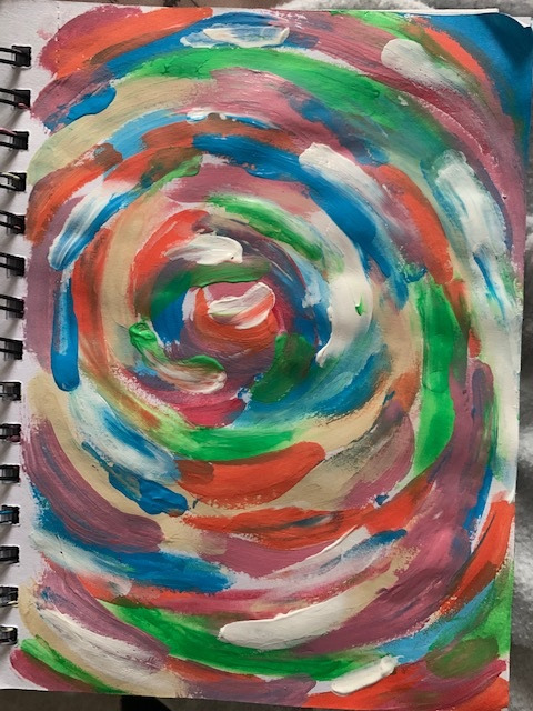
Above was the process of working into the collage once I had scanned it in. I removed its white background, which is formed after scanning, using ‘colour range’ then, I used one of my mixed media art pieces to create its background. I made this using acrylic paint and my fingers. I would normally use a brush to be precise but I didn't want this outcome. I then began to adjust the image using the ‘saturation tool’ to make it appear brighter almost like the collage was spiralling into the page. My previous samples have been looking flat against the backgrounds which is why I created another layer of the background and erased certain areas of the brushstrokes. I then layered this on top of the collage to make the two blend together. I liked this outcome because not only does the collage reflect the common saying ‘ It’s raining cats and dogs outside’, but the outcome doesn't look flat against the page. Keeping the binding of the book I painted on helped bring in the personal elements of the samples aswell. Overall I hope the sample has reflected the meaning behind the saying in visual form to highlight the silliness of life's problems sometimes. This sample is humorous and uplifts me so I am interested in including this style in my work to create the same emotion for the readers.

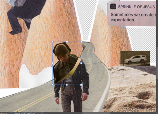
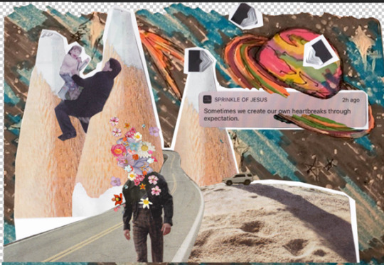
This was the process of another collage sample. This time I wanted to add more personal imagery alongside the magazine cutouts to help portray my story. At first, this collage only had the road in the centre of the pencils, and I was going to edit out the man walking along it as I didn't need it however not only was this difficult to do, but I thought the sample looks empty so it was harmless to leave him in. Luckily, I didn't throw away my cut outs so I found the head of the model to attach back to the body. This didn't look right either. I tried to create a new layer with the man selected and adjusted the image to make it look smooth however this didn't work very well. I think this was because of the angle I scanned in the second cut out. The first collage was scanned in on my printer at home however the second was scanned in through my phone instead. Nevertheless, I worked around this dilemma by adding loads of flowers on the models head. This helps the abnormality become present in the centre of the sample. I also believe this helps portray my message of growth. For example, the pencils in the back symbolises a playground and all aspects of what the noun is associated with which is why I am playing on it as a child with my mom (image on the near left). The road coming out the the pencil mountain portrays the aging of life and abandonment of childhood as you have to grow up. The man in the centre also helps this interpretation with him walking on the road with flower blossoms on his head symbolising the growth of the mind and soul within a person. Aka character development. This is also one of my favourite samples as it holds its message well and feels more personal with my childhood images. It has helped me understand the exact message I want to give to my audience visually.
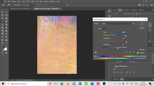
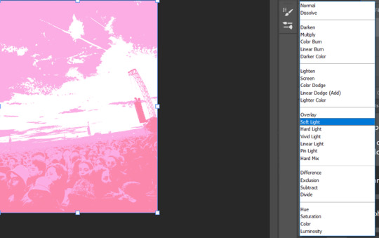
This final screengrab is of the process of the poster sample I had made digitally. Although the collage was made digitally, the background wasn't. The image above is actually a picture of one of the screen prints I made using a stripped generic screen. Originally, it was purple but as you can see above, I changed it’s saturation and hue to create new colours. I loved this outcome because you can see the different textures of the screen print especially since its on paper. When screen printing, the paper obviously got wet so it caused the paper to crimple which is why there are different tons in this adjusted image. This process was before I liquified it and I think I were to do it again, I might have left it like the image before to make the outcome look more authentic.(scrapbook/journal)
1 note
·
View note
Note
hiiii! i just wanna say, i adore your art. second, im teaching myself to draw and while i can draw simple basics (mouths and sometimes eyes if im lucky), im still a beginner. ive watched many art videos and im still a bit confused on wtf im doing. so i just came here to ask if you had any words of wisdom for beginners? could be anything from what tablets to buy to simple mistakes to avoid. ive read some of the other posts here and have found it all extremely helpful so far! Thx for all you do!!
Hey there! Thank you so much!
I would put a read more but tumblr is broken. I’m trying to cover a lot of varied thoughts in little points, so if there’s anything you would like me to elaborate on or otherwise have questions on, feel free to shoot me an ask or dm me!
General
I think the biggest thing to remember is not to compare yourself extensively to others. A little bit of comparison is healthy... But too much will destroy your confidence, motivation, and take the fun out of art. Particularly if you are comparing yourself to someone older than you (life experience and coordination come into play here) or that has been drawing much longer (practice).
Additionally... If you’re not having fun (and you’re not getting paid to do it), don’t force yourself. If you find yourself being frustrated or bored with art, don’t force yourself to do it. That’s how you burn out and get art block! This applies to parts of a peice, too! If you don’t feel like drawing a face or a hand today? don’t force yourself to finish it. Come back to it later when you aren’t as frustrated or are getting better results. Even if its a week or a month from now. Honestly, at any given time I have probably ten headless bodies in my drafts. That’s okay! I just come back to them when I’m ready to do the face. And don’t be afraid to abandon something if it doesn’t feel right!
Something that also doesn’t get said enough.... take care of your body! I never knew when I started art, but artists are supposed to do warmup sketches and stretches and muscle exercises! I didn’t do any of this, and i went through a period of a few months where I was drawing for 5ish hours every single day. I developed carpal tunnel from it! So remember to take care of yourself. Take breaks, stretch, remember to eat.
Practice
Practice!!!! Even if its just for fifteen minutes every day. Or twice a week. But if art is something you really want to get good at, you have to put in the time and effort!! You can’t expect to draw an hour per month and be on the same level as someone who draws an hour a day!
I know I say this a lot but I think the biggest thing is just reference! If you don’t know what something looks like, look at a picture of it when you draw it! To go hand in hand with that, though, don’t just copy what you see! Learn from it and apply it! So take, for example, a shoe! pay attention to the way the heel is shaped, the location of the eyelets for the laces... how large the toe is, how steep the top! While you’re at it, look at other styles of shoes as well, and compare them! See what makes it look like a boot versus a trainer! And then the next time you draw it, hopefully you’ll remember all the things you learned the first time around!
I do lots of studies that serve no purpose other than to teach me things! I use referencing/studies to learn about color theory, shapes, and anatomy in a real environment. For example, hands or fabric folds! Oftentimes I’ll do them timed (20 or 45 minutes) so that I don’t fixate on perfecting things, just on the process itself and what I can learn from it. This also helps with getting better acclimated to your software and more coordinated with what you’re doing. Repetitive learning, like with playing sports.
I’ve realized a lot of people don’t quite understand what a study is? Basically you just look at a photo and try to replicate it so that you can learn about lighting or color theory or textures or anatomy or whatnot. So here’s an example of a timed study.
Additionally, don’t avoid!! We, as humans, have a tendency to avoid things that make us uncomfortable or are difficult. But it will make you a better artist in then end. When I first started, I absolutely hated doing fabric. I felt like I wasn’t good at it. So instead of avoiding drawing clothing, I sat down and did studies and sketches of different kinds of fabric. By the end of this learning period, I became comfortable with it and grew to enjoy it. These days, I adore sketching clothes, and it’s why my pants and shirts and things tend to be detailed instead of stylized in line art. If you don’t like drawing hands because you feel like you aren’t good at it? Sit down, look at a bunch of pictures of different hands, and practice it. By the end, you’ll be more comfortable, you’ll have learned something. Even if you feel like the drawings you ended up with aren’t good, you’ll still have learned, and that’s what matters!
Style
I worked on basics before I tried to develop a style. I made sure to start with a very realistic method at first, so that I could be sure I understood how fabric folds, anatomy, and realistic expressions worked before I tried to stylize them. I think in the long run this approach really paid off for me. It also allowed me to be conscientious of what elements I was absorbing into my artwork. I hear from so many artists that they started drawing when they were younger and into anime or cartoons or things like that, and tried to emulate it. Because those styles became so ingrained into their artistic skillset, it becomes near impossible to iron out those influences and get rid of them later. So starting with realism is a way to ingrain proper anatomy and other good practice into your artwork.
One way to develop style is to take a look at the artwork of someone you admire, and try to list out the things you like form their style - perhaps the thickness of their lines, or the way they do eyes. Do this with several artists, take all those little details you like and try them out! See if you enjoy using them in your own drawing process! Think of it like a grab bag or a pick-n-mix, sprinkling in the elements you like here and there to create something new and your own - not just copying another artists style word for word.
Don’t worry too much about it though; don’t allow yourself to become anxious or fixated on “achieving a style”. Its a natural ever evolving process that comes with time and practice. I know a lot of people get hung up on style, but just take it one day at a time!
Also try to keep in mind what style you’re going for as you begin drawing. And I don’t mean that like sailor moon vs. ghibli. I mean that as in, is this piece going to be a painting, a lineart, a lined painting, cell shading...? It will help you in the longrun if you narrow down the broad kind of style you use, and refine from there.
Workflow
My workflow for paintings is very different from my workflow for lineart and cell shading. A full tutorial on how I do paintings can be found here! A process video for how I cell shade can be found here!
Everyone is going to have a different method that works for them! You just have to experiment and find out how you like to draw! For me, personally, I use color blocking for painting (see the tutorial above) and a spine method for lineart. How the spine method works is that I will draw lines that represent the legs, arms, back, etc. so that I can determine the placement, length, and composition. From there, I’ll add a dark outline that actually shows the shapes of the body. Then, I’ll use thinner lines to add details. This is the method I’ve found that works for me. Another commonly used method that I’m sure you’ve seen is representing body parts with cylinders and cubes. There are lots of good tutorials out there on breaking down bodies into shapes like this!
Something that I do is if I’m not quite happy with a part of a drawing, I don’t just erase it. I duplicate the layer so that I always have the original copy, and then I make changes from there. Sometimes I can end up with five or six different versions of the same arm or face that i’ve made minor changes to. And then I compare and pick the one I like best, or condense all the parts I like from each version to make a “best” version.
Tools
Currently I use Procreate and the standard Ipad with Apple Pencil. Prior to March I was using a Wacom Bamboo Touch and Photoshop Elements 2008. I find its harder for me to do full paintings in procreate, but its made my life a million times easier for lineart and cell shading. The pen pressure is phenomenal, and I also adore that its wireless / active screen instead of plug in like the wacom. The programme itself is intuitive and easy to get the hang of; it simply lacks a lot of the neat tricks that photoshop has, like rendering (lens flares, for example), gradients, and gradient maps. Try testing out different trials of programmes... firealpaca, photoshop, autodesk, whatever it may be! What works for me may not work for you!
287 notes
·
View notes
Text
Welcome all, and Goodbye Sun! Spent all day on uni today. So here's a reeeeeally long post. A lot to reflect on. My writing style may seem odd to some, but its how I retain a good memory of it all, by putting a lot of words on paper. So here's my paper of reflections on my first day back in #ctec502 with Roy and our korero.
Also my paint arrived. Hell YES. MORE PAINTING.
Carol Dweck on The Power of Yet,
I like that there is this method of teaching, how we think at a very young age, the power of critical and developing thought. It is innately in built into us from a time perhaps before birth, since it is consciousness that we are transforming and interpreting here, using our capacity to think, but CONSCIOUSLY.
There has been a book available in a well voice acted audio version on YouTube called The Tao of Pooh. This insightful little story teaches us the way of the Tao, as in the perspective of Lao Tzu, a particularly old and equanimous monk.
In the famous Winnie the Pooh by A.A.Milne, the archetypal too-busy-working, close/fixed-mindset, is played by the character Rabbit, a woodland creature that is so caught up in their mind they don't actually interpret what they experience or can learn from others or themselves.
In relevance to Carol Dweck's studies into 'the power of yet', it really is all about culture, ethics, opportunities and social conditioning. Childrens minds are like sponges were told, and we see it everyday, even in ourselves. We understand that yes, there is a need for workers and people who can do repetitive tasks, as how it is taught in a modern conventional schooling system, BUT THE ACTUALITY IS to any student where they are given the opportunity to choose what they want to learn, are made aware of how they can learn and evolve when given a certain challenge, in a non judgemental and constructive environment, we can drastically enhance the collective intellect of our whole interlinked social network within the short span of a year as claimed by Carol Dweck.
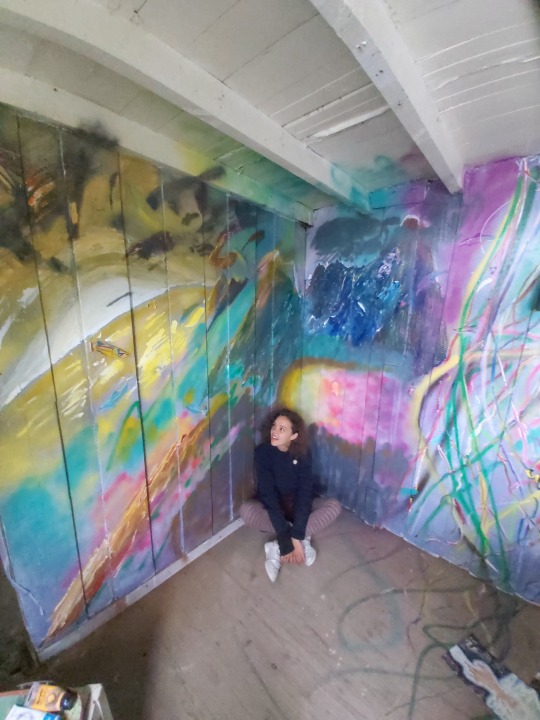
Here is some art that was created by myself during a 4 day Stay at Home MURAL Festival that had the theme of bringing light to issues of the world but in a positive and beautiful way.
With over 700 artists in 50 or more countries... even this simple idea to bring intelligent and simple, beautiful, artistic, childish action, that's bold for its first year running!! All from Covid-19.
Casey Reas on Digital Algorithm Art
In the first online lecture given by Roy, I was surprised we would be using algorithms so quickly in our physical work, and it took me back to my day of using procedure based processing to create scenes in a program made to generate 3D environments, this program was called Terragen 2.
Using the software called Context Free to render simple shapes and sophisticated 'real' clouds in a 2D representation even if it is generated in 3 dimensions if programmed, (and 4 dimensions if animated) it was interesting to understand why my PC I used up to 10 years ago clogged with animal fur, would die on me when I left it to render a scene in ridiculously high quality over a period of multiple hours. It was because of the amount of shapes I'd set my PC to fully render without understanding that the picture is more sophisticated than a simple blink and reality is made, it is GROWN AS A SERIES OF INTERCONNECTED OBJECTS and it adapts to or from the environment with the interconnectedness that is afforded by their state of consciousness (programming) and the matrix of energy they take form as in this sedimentary moment in reality.
The past affects the future render layer in a moment of rendering. Also the future affects the past layer by building or deleting or transforming itself, this seed from moment to moment. This Animation. To give an object a code or seed to existence, even if you can't control all of its inputs, simplicity can create diversity and complexity and vice versa.
The amount of revelation I can place in rendering in procedural matrix or lattice realities...I would love to see that in my work on mixed media and mixed reality assignments or projects I endeavour to entertain or seek out.
But this in itself is a paradox. Am I pulled to this future by my simple minded flow toward this source, as is entropy, as is the movement of all things. ..There is more than black and white to all situations. Usually it's black and white or white and black. Lighter darks or darker lights.

I wouldn't be at university because I didn't have a revelation to attend it last year. I wouldn't be at university if I felt so depressed I needed to leave. I wouldn't be at university if I wasn't allowed to attend. Nevertheless I know. I know that I am pulled forward to where I'm meant to be, as much as I am falling into old habits, they're not old, they're new, but its my consciousness that calls them old and tries to outdo the habit one moment, while another moment were relieved we didn't listen to the critical mind saying we shouldn't do what we don't want to do. Everything has a cause and effect like the render in window. Like my life on pen and paper. Like my mind engaged in its word spinning and weaving.
I digress back to my art in context of the Casey Rea's YouTube video.
A fun aspect of my art is it would look amazing even in a quick render with plenty of visual noise, but I love the simplicity of procedural based virtual world and object creation and the layers it can develop or devolve into.
Another thing is using Photoshop to apply visual post production enhancements was also something I really enjoyed as a part of the iterative process, and this has been reaffirmed in a book I have just picked up called Photoshop for 3D artists V1 by 3dtotal Publishing.

I watched all the videos recommended by Roy in his pdf today from the lecture and I can summarise my views on them:
Carol Dweck: This type of learning should be more widespread in our culture. Only way it will change is if we change, and teach others the same way. It begins with us. I enjoy the way Roy engages with us in our lectures like we're human beings and not students. I think this is the most important thing about his teaching that enthuses me, and the themes of his classes are quite informative.
Casey Reas: I like his work, I'm not new to this idea of art, but I did like to see his process. I wouldn't certainly seek out a video like that one given but it definitely was insightful into his particular environment and methods of producing ideas.
John Maeda: Wow this guy really looks like he's on the guide for dummies, and he definitely could write a few of them. Was a great insight into his perception of reality and how he expressed his ideas and himself was also simplified complex ideas and that they are readily available to see or interact with including his book. Simple. It's right there in front of you. All it takes is a shift in perception to discover what was currently scanned over as unimportant details by our consciousness. It's all right there in front of us, or if we feel something, from within us.


Warren Berger: Well to be honest, he didn't excite me as many of the other videos because his idea was so simple and not really that much of a paradigm shift within myself. It always can come down to refinement of an unwanted edge. Does one see a wave as something that can be answered? Can you answer that question? How about the question preceding this one? Can a bird fly as well as a fly can bird? Why is a raven like a writing desk? Why do we play 20 questions? We are always in an iterative process of rendering our existence and our legacy in this reality by the choice we have when faced with a question. Depending on its complexity or cryptically contrived hindrances, we will always be faced making a choice, or answer the question of our existence, with our consciousness in this moment. And can we use that moment to ask something we have never thought we had an idea about before...like why isn't my skin purple? Where did my consciousness come from and why is it specifically in belief that I am me, every time I get up at 8 am, but not while I am in the throes of a dream?

Riddle me that and I'll ask you why
Cottleston, cottleston, cottleston pie.
I have seen my lives
In my eye
Simply put, I never die
It's not a riddle, it's who am i
Cottleston, cottleston, cottleston pie.
2 notes
·
View notes
Text
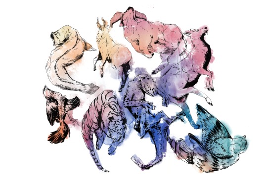
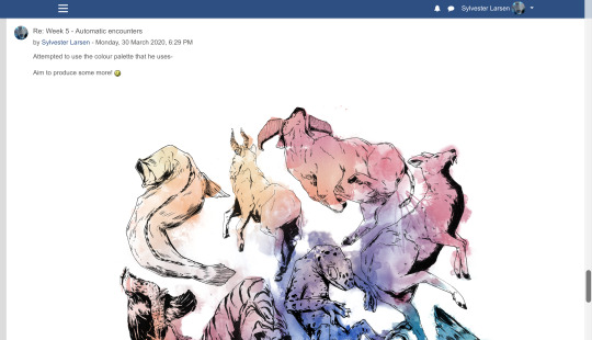
𝕬𝖚𝖙𝖔𝖒𝖆𝖙𝖎𝖈 𝖊𝖓𝖈𝖔𝖚𝖓𝖙𝖊𝖗𝖘 | 30/03/20
For this week, we have a new workshop to do, tying into the first brief (Pick & Mix), focusing on surrealism and the theories linked with this by psychologist Sigmund Freud.
vimeo
Attached was the following text written by our teacher to introduce this workshop and the tasks that come with it;
“After a successful week with the post it note comic, and some excellent write ups that are really well documented, this week's task revisits some of the work from Term 1 (as we started in our drawing sessions) with some of the ideas stemming from Surrealism, dada and the psychoanalytical theories of Sigmund Freud.
This task is presented by Bristol based artist & animator Will Barras who will be offering commentary on your work at the end of the week. Follow the PDF attached and work through the tasks at your own pace. You have all week so take your time and experiment as much as possible.
We have more challenges to come, so try to put time into these as they will form the main body of your experimental work.
Upload your results and be as creative and imaginative as possible, but most importantly let go and embrace the ride.
Good luck peoples!”
Consider the primary objectives of a Final Project:
Collect information (Research)
Recall knowledge (Use learning)
Apply understanding through application and review (Propose & make exciting work and evaluate it)
I find that the above points refer to a simplified process of working through meet the final goal that is set by the FMP, althought this also applies to workshops and side projects that gets documented on this blog, as well as the productionfile.
Question: Are you doing these things and how can we improve and develop this?
I feel that I already do these, althought I yet have to further improve on evaluating the things I do, asking “Why” more often.
Answer: Experimentation - (The action or process of trying out new or revisiting ideas, method and activities)
≡≡≡≡≡ ≡≡≡≡≡ ≡≡≡≡≡ ≡≡≡≡≡ ≡≡≡≡≡ ≡≡≡≡≡ ≡≡≡≡≡ ≡≡≡≡≡ ≡≡≡≡≡
This weeks aims & objectives:
To review basic principles of automatic practice in relation to a specific artist
To experiment with working from abstract starting points
Be generate experimental work that shows progression of learning
To compare your work to the work of others

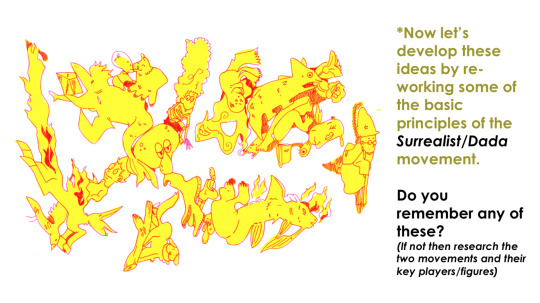
The surrealist/dada movement was an art movement, as well as a literary movement, that began around 1915 - 1917. Some of the key artists leading this movement was Hannah Höch, André Breton & Max Ernst. The movement aimed to break free from the chains that weighed down everyone during the great depression- The artistic field had now begun to evolve into a playground for ones’ imagination, challenging what used to not be acceptable in common culture.
Accident & chance
Embracing Improvisation (What does improvisation mean to you?)
BEING AUTOMATIC!
Surrealist automatism is a method of art-making in which the artist suppresses conscious control over the making process, allowing the unconscious mind to have great sway
Unlocking the unconscious mind.
In Sigmund Freud's psychoanalytic theory of personality, theunconscious mind is a reservoir of feelings, thoughts, urges, and memories that are outside of our conscious awareness.
≡≡≡≡≡ ≡≡≡≡≡ ≡≡≡≡≡ ≡≡≡≡≡ ≡≡≡≡≡ ≡≡≡≡≡ ≡≡≡≡≡ ≡≡≡≡≡ ≡≡≡≡≡
𝕽𝖊𝖘𝖊𝖆𝖗𝖈𝖍:
This weeks challenge for experimentation is bought to you by Bristol based urban artist and animator Will Barras. Your task is to analyse his work, considering the effect of the visual language (how he uses line and tone for example). Find out about him and considering the aforementioned surrealist principles write a short statement to suggest how he uses those principles in his own work.
Will Barras
vimeo

Illustrator, artist and animation director, Will Barras, currently lives and works in London, althought he grew up in Birmingham and later moved to Bristol to study graphic design. He quickly became known for being part of a group of young artists, working within Bristol’s street art scene. This then led to him appearing in a book titled “Scrawl”, alongside the artists Steff Plaetx and Duncan Jago, becoming a core and founding member of the Scrawl collective. “Scrawl”, originally published in 1999, was an influencial book made to document a new movement in street art, graphics and illustration.
Barras was selected to be one of the original artists for this collective. He was selected due to being renouned for his methods of portraying fluidity in movement. He also worked closely with creating pieces that were more narrativly driven compositions, incorperating such narratives into his line work. Barras’s unique composition of these three key elements, made his mark as an artist all the more inspiring, pushing new ideas against the grain of classic art. All of this has led his work to become staple pieces in many galleries across the globe. This includes Asia, Europe and the U.S.
He has painted a variety of different murals around the world, within this mix is one that he did with the members of his Bristol group at Tate Modern’s tubine hall, as well as one that he did for Pow!Wow! Festival in Taipei. In the studio Th1ng, located in central London, he worked as the head of animation.
Visual analysis and study:
His artwork has a very recongnizable style and feel to it. It has an urban flare to it, making it feel very fitting within the scene of street art.
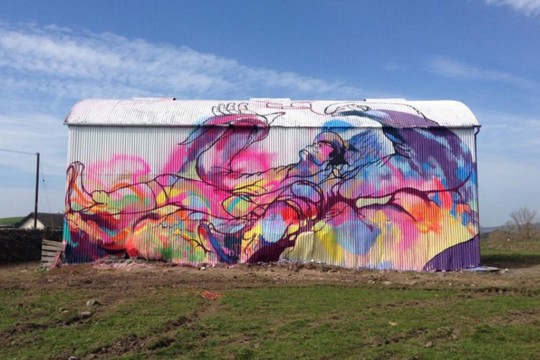
“A big barn I painted in Dumfries with Amy Winstanley for the Spring Fling festival and Recoat gallery based in Glasgow.
http://www.amywinstanley.com
http://www.spring-fling.co.uk
http://www.recoatdesign.com”
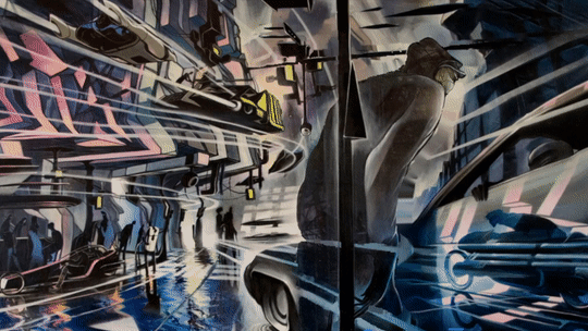
The painting below has little information about it, as for what I can find, but somehow the piece almost speaks for itself. The play on perspective, composition and values is very eyecathing. It impresses me how he is able to convey motion to such an extend that you can almost just imagine it moving before your eyes, but perhaps that’s just me.
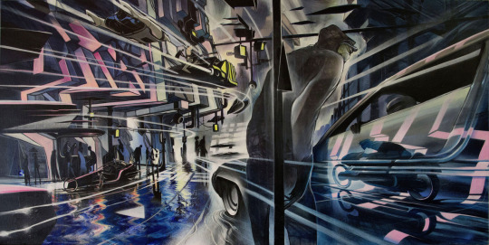
“#divinestyler #defmask #gammaproforma #kallenbachgallery”
I attemped to do some simple continuous warping animation to convey what I mean a little better:
≡≡≡≡≡ ≡≡≡≡≡ ≡≡≡≡≡ ≡≡≡≡≡ ≡≡≡≡≡ ≡≡≡≡≡ ≡≡≡≡≡ ≡≡≡≡≡ ≡≡≡≡≡
𝖁𝖎𝖘𝖚𝖆𝖑 𝖆𝖈𝖙𝖎𝖛𝖎𝖙𝖞:
01: Using a wide brush create a large sheet of accidental/automatic/ unconscious blots & splatters, organics shapes and curvaceous marks using a range of coloured ink/paint. The brighter and more acidic the better!
Because of the fact that I don’t have paper made for paints/ink, I decided to try doing this task digitally- simulating the analogue look of watercolour or watered down ink, or even arcrylics.
I did this by using a variety of different watercolour brushes, made to emulate the look of the analogue mediums. I used them as randomly as I possibly could, trying not to plan where I would put the next brush stroke.
Once I had put down all the paint stokes, I then went over it while the layer was locked with a big soft edged brush, layering up different colours until I was happy with how it looked.
02: Make 3-4 sheets of these and then let them dry.
Digital 01:

Digital 02:

03: Then using fineliner develop these marks into faces/characters/scenes by adding details/features and developing these into detail illustrations that are spontaneous and free flowing.
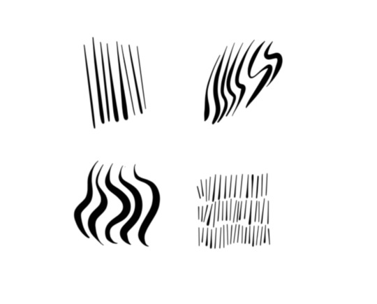
For the linework, I primarily used one single brush; hard edged and circular. (The one selected in the picture below)

I chose this for the reason being that I have found it to be very responsive to the use of a drawing tablet & pen. It does a good job at making expressive lines with its tilt sensitivity, making it a pleasure to use; It reminds me of how brush pens work and feel.
Here are a few tests on some of the lines I can create with it;
≡≡≡≡≡ ≡≡≡≡≡ ≡≡≡≡≡ ≡≡≡≡≡ ≡≡≡≡≡ ≡≡≡≡≡ ≡≡≡≡≡ ≡≡≡≡≡ ≡≡≡≡≡
Digital 01:
Digital 02:

≡≡≡≡≡ ≡≡≡≡≡ ≡≡≡≡≡ ≡≡≡≡≡ ≡≡≡≡≡ ≡≡≡≡≡ ≡≡≡≡≡ ≡≡≡≡≡ ≡≡≡≡≡
Digital 02: Process

1. I have always found that beginning these blob doodles are the most diffucult for me. Perhaps because it takes me a little while to really get into the flow of continously seeing images in the randomness.

2. I began from the left, slowly working my way to the right and the top, since I felt that I had more clear lines to go from being around the edge of the paint.

3. Eventually I braved it and went right for the middle of the piece. This was the turning point for me in the process of doing this. It enabled me to truly let get, have fun, and not feel intimidated and nervous to do the next doodle.

4. This is when I began drawing creatures of the sea, slowly building up a story/narrative.

5. I don’t actually remember what I was even thinking at this point anylonger- I was simply just letting the pen guide me around the canvas; letting it all flow together however it felt as to do so.

6. I began to delve into the little details. I felt as if they would add to the general flow of the piece; being busy, yet in a manner that lets your eyes wander with curiosity.

7. I was now moving on to doing the right side of the piece. I had a little more trouble visualising the top right corner, so I did that last.

8. At this point I felt a little stuck as to what to do, hence it being, yet again, dedicated for adding some more little details here and there.

9. Eventually I overcame the frustration I had built up and took to do the right side of the artwork.

10. I tried to convey motion and flow by the way the animals are positioned and posed, trying to make it calm in the middle where the girl is, and then busy/chaotic the further away you get from her.

11. This second to last step was, again, for adding detail. I wanted to fill up any bits that I felt appeared too empty and spaced out, so to no disrupt the feeling of flow in the painting.

12. With the inking done and rendered to my satisfaction, the last step was to play around with colours.
≡≡≡≡≡ ≡≡≡≡≡ ≡≡≡≡≡ ≡≡≡≡≡ ≡≡≡≡≡ ≡≡≡≡≡ ≡≡≡≡≡ ≡≡≡≡≡ ≡≡≡≡≡
Digital 01: Colour variations
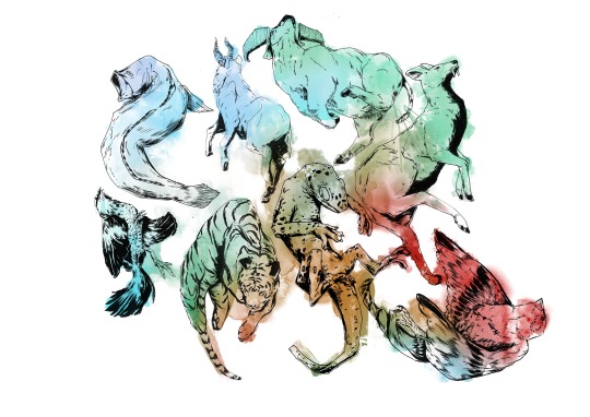

Digital 02: Colour variations


04: Scan/photograph and upload to Moodle.

≡≡≡≡≡ ≡≡≡≡≡ ≡≡≡≡≡ ≡≡≡≡≡ ≡≡≡≡≡ ≡≡≡≡≡ ≡≡≡≡≡ ≡≡≡≡≡ ≡≡≡≡≡
𝕱𝖎𝖓𝖆𝖑 𝖗𝖊𝖛𝖎𝖊𝖜 𝖆𝖓𝖉 𝖗𝖊𝖋𝖑𝖊𝖈𝖙𝖎𝖔𝖓:
Which of these words would you use when discussing the work of Will Barras and your own art pieces:

I would most definitly use;
Organic/Fluid
Figurative
Automatic
On top of these I would probably add;
Harmonic
Dynamic
Epochal
Visionary
Can you construct a comparative sentence/paragraph using at least 5 of these words. What are the differences and similarities between the works you have created. What conclusions did you make about this experimentation?
2 notes
·
View notes
Text
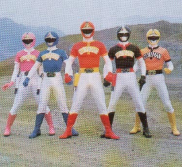
Costume Ideas for Halloween 2018: Super Sentai
We did Power Rangers, now it is time to focus on the eastern progenitor of that franchise to seek ideas for Halloween costumes.
Yakuu Sentai V-Leaguer (MLB Team edition)
October isn’t just a time for tricks and treats, but it also signifies the end of baseball season here in the USA with the World Series games airing throughout the week leading to Halloween and sometimes goes until November. So my first choice for a costume idea goes out to you diehard sports fans.
In the 1980s, when Kagaku Sentai Dynaman was being planned out, it was originally going for a baseball theme and went by the name Yakuu Sentai V-Leaguer. Ultimately, this idea was scrapped by Toei as marketing dudes thought that totally gnarly and rad 1980s kids would think baseball was a lame concept and they needed something “cooler”. Remnants of this idea, such as the Dynaman having their helmets sculpted to look like they have baseball caps in them, are seen in the suit designs and the Dyna Rod sidearm looks somewhat like a baseball bat.
For this idea, there are many avenues to choose from. You can either do a full Dynaman suit with patches you bought online of your favorite team and emblems painted on the helmet, go for a budget “casual” approach and wear a team shirt, custom Dynaman helmet and baseball uniform pants and cleats. Or you can do a full custom V-Leaguer approach, with the team’s name proudly on your chest, adorned in the team’s colors and the number of one of your favorite players on the back (or make your own number with your name on it)!
I think the most amusing one would be for Texas baseball fans, as they would have literal Texas Rangers cheering on their team! XD Also, for more amusement if you are at a game, hold up a sign while in costume that says #DigitalWatches, fans will get the joke.
The Original Battle Fever J

This concept art drawn by Shuuhou Itahashi and Yuuji Kaida, was created to pitch the concept of Battle Fever to Marvel Comics. The two emulated the art style of John Byrne’s era of X-Men comics, and it shows despite being great Bronze Age-style designs. These feel more in line with America’s superheroes than Super Sentai and thus changes were made along the way to make the look more appealing to a Japanese audience.
Some of these even look a little familiar to those of Marvel Fandom, Battle Kenya is channeling a bit of Black Panther, Miss America’s leotard is modeled after Captain America’s costume and Battle Japan has a bit of X-Men’s Sunfire in his look.
Now sadly, this is the only image of the original concept on the web right now, so improvisation is needed a bit when going into the costume design. But that actually works to your advantage, with only a base template, you are free to tweak the look however you want! All you really need to keep in are the colors of the flags somewhere to keep the nationality theme. I imagine original Battle Kenya and Miss America will be the most popular of the bunch based on how popular their inspirations are thanks to the MCU.
Battle Cossack would have to be updated, since one, the Soviet Union no longer exists and thus dates it quite a bit and two, fur underpants mixed with spandex are a really weird combination (and probably very itchy).
Maskman (Orignal Fiveman Prototype Concept Designs)
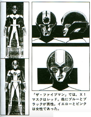
Maskman was a game changer in terms of helmet and costume design as well as venturing outside the storytelling realm of sci-fi and incorporating new mystical ideas into its elements, heralding a sneak peek at what Super Sentai would be in the coming decades. But for a brief period, Maskman was on the verge of being a throwback in design when it was known conceptually as Fiveman, which of course became the name of another Sentai team.
The original suit designs incorporated what came before, most notably Battle Fever J. X1 Mask, the one-off sixth member of Maskman, is the only “living” remnant of what could have been.
You will need LED lights and circuitboards, cosplay costume material, a custom stencil for creating the black “5″ chest emblem out of the fabric and if you can, find 3D modeling software for aiding in creating the helmets. The female Ranger helmets have a bit of sculpted helmet “hair” kind of like AkibaYellow and Blue, though you can skip that part if you don’t want 100% accuracy to save time. You will also need material to create the costume belts and pouches.
Fake KyoryuRed
One of the pitfalls of being a Super Sentai fan is that a few members of the fandom are quick to gossip and sometimes resort to elaborate pranks to get attention, like most fandoms. One cruel tactic that was put up with is the fake designs of an upcoming Red Ranger. This has recently died down thanks to stronger connections to official sources, but still is a problem that persists as even Kyuranger got the Fake Red treatment last year. In 2013, a rumor spread that this image above was the Red Ranger of the then trademarked Kyoryuger.
Despite being immediately debunked as fake, it isn’t a bad design, harkening back to Zyuranger with the dino themed helmets that in clearer images had a jagged “teeth” like pattern on the red parts sculpted above the mouthpiece. It also had Dekaranger-like suit patterns with the represented dino covering a portion of the bodysuit in black silhouette with white outlines, “fossil teeth” shoulder pads and a metallic segmented belt with a gun holster and sword holster.
Commander Hilltop’s “Robocop” crazy outfit
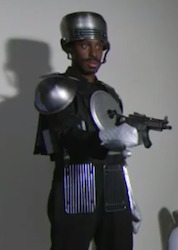
In Episode 31 of LupPat, a Gangler tries to negotiate a plea deal with the police. In a comical attempt of Good Cop, Bad Cop the Patrangers make their boss wear....whatever this is, to make the Gangler uncomfortable (and reference Robocop). It is really bizarre and doesn’t work.
What you will need: a soup/spaghetti pot on your head, metal bowls on your shoulders, a black body suit, oven mitts, 2 grill spatulas, a toy gun, white and orange rain boots, large forks, a pot lid, grill grates or small baking cooling racks and a metal cookie sheet on your back. In other words, raid your kitchen for parts!
Devil Gun from JAKQ Dengekitai

A crook made out of guns, self explanatory. His head is a gun, his chest has 3 cannons, his arms have cannons and more guns are in his fingers, he is a gunstavaganza! You will need a lot of gunmetal gray paint and a lot of patience. If you examine closely, you can see where the eye holes are for the costume.
Ways to make it really impressive is to replicate the firing effects for the head gun with liquid fog juice, lights and sound effects. Just be careful though, in these troubling times we live in, seeing and hearing guns can make people jittery.
Zeek Jeanne from the GoGo V movie

In an alternate universe, when GoGoV was adapted into Lightspeed Rescue, I like to believe Ms. Angela Fairweather got into the fight wearing this suit instead of PLEX creating a new Ranger from scratch. (*nudges Boom! Studios*) Though the Titanium Ranger is awesome, so it balances out.
Demon Hunter Zeek bestowed his powers to GoGoV ally Kyoko Hase to become Zeek Jeanne before she ultimately lost them to give GoGoV the power to destroy the movie’s villain. One thing I never understood is why the protective face visor just vanished when the suit equipped onto a female hero.

So you have options of face visor on or face visor off. Unlike most Ranger cosplays, your field of vision will be a little better than wearing a Ranger helmet given the large face visor if you do some minor alterations.
GekiBlack

(an unnamed Livedoor artist’s photoshop render of “Super GekiBlack”)
Rio, the main baddie of Gekiranger, eventually learned he was being manipulated by Long and allied with the GekiRangers. Jan dubbed him “GekiBlack” and his partner Mele as “GekiGreen” if they became friends later on. Sadly, it was not meant to be as Long turned into his dragon form and made bite-sized snacks out of both Rio and Mele.
Many fans often wonder what would have happened if Rio had lived and instead of reusing old monster suits, PLEX and Rainbow Zoukei crafted a brand new Gekiranger outfit for him. Most fans know the rules of conceiving such a notion: he must be black in color with gold accents in the suit, and his helmet must be sculpted to resemble a lion’s mane or have lions in it.
What You Need: A GekiRed base template of some kind, black and gold paint and costume cloth, Gekiranger symbol, concept sketches to plan out an idea of what to tweak. Rio’s Kaijin form can also be used as a template. The most difficult part would be choosing a morpher, either make a custom one or make a stylized version of the GekiChangers. For the Super Version, just emulate the base Super Gekirangers but with black and gold added to the white in the bodysuit or just do the ‘shop image above.
If you have a special someone who wants to Ranger up too, you can be nice and make him/her a GekiGreen outfit and celebrate Halloween as two fated lovers!
#tokusatsu#super sentai#gekiranger#maskman#lupinranger vs patoranger#jakq#gogo v#dynaman#battle fever j#baseball#commander hilltop#zyuden sentai kyoryuger#kyoryu red#halloween#costumes#cosplay#cosplay ideas#costume ideas#trick or treat#halloween fun
162 notes
·
View notes
Text
Sage The Warrior

Medium Used : Digital - Procreate
Description : A nymph turned hero, Sage learned to fight in order to protect her home village. I really enjoy designing medieval and fantasy characters. I am very proud of the way her armor turned out!
This specific piece has taken me a long time to make.

This unfinished drawing had been bugging me since May 2021. I kept experiencing hiccups and simply couldn’t bring myself to finish it.

In January 2022, I decided to start from scratch- make a completely new character with the previous one in mind. I tried various different ideas - mechanical arms, gigantic shoulder pads, and evcn a full mech suit! I mixed and matched colours to see what would fit.

I finally settled for an armored warrior standing heroically on a rock. I wasn’t very confident in making armor, so it took me multiple days to make something I was fully happy with.

Once I was satisfied with the basic sketch, I did the flat colours. I changed the face multiple times.
Rendering has to be one of my favorite parts of digital art. I love painting metal in particular. This drawing took me several weeks to complete, and is by far the best piece of art I have ever made. I am extremely proud of it. I learnt a lot about proportions and values, and also got a good sense of my art style.
0 notes
Text
Session 2: Medium specifity in the 21st Century still relevent? Notes
Gesamtkunstwerk - Total work of art
First used by German philosopher Karl Friedrich Trahndorff in 1837 popularised by Richard Wagner a German composer in the 19th century.
Gesamt - Whole entire total
Kunstwerk - Artwork
A synthesis of different art forms into a total work of art
The total artwork in which different media come together, interact and cohabit harmonically.
DH Vancouver Staff. (2017). Gesamtkunstwerk - a curated exhibition on Vancouver architecture and city-building (PHOTOS). Available: https://dailyhive.com/vancouver/gesamtkunstwerk-curated-exhibition-architecture-city-building. Last accessed 10/11/2020.
Gusamtkunstwerk - Life as a Total Work of Art Exhibition - Vancouver- 2014
Art and revolution - 1849
The artwork of the future 1849
Opera and drama 1851
The idea of gesamtkunstwerk also inspired the Bayreuth Festspielhaus 1876
Theatre as the ideal medium and Ancient Greek tragedy as its perfect representation.
How in cable is our stage to gather up each branch of art in its highest and most perfect expression the drama, art and revolution. 1849:17
The spectator transplants himself upon the stage by means of all his visual and aural faculties, the artwork of the future - 1849
Amphitheatres Ancient Greece the optimal art experience
youtube
Etienne Gaspard Roberts - Phantamagoria 1797
I am only satisfied if my spectators shivering and shuddering raise their hands or cover their eyes out of fear of ghosts and devils dashing towards them if even the most indiscreet among them
Idea of gesamtkunstwerk tainted by association of Wagner with Hitlers Nazi Ideology and nationilistic destruction.
Loosely associated with synaesthesia, phantasmagoria, and psychedelia, the term Gesamtkunstwerk often stands for an artistic environment or performance in which spectators are expertly maneuvered into dumbfounded passivity by a sinister and powerful creative force. It is often mistaken for a hazy mixture of art forms that intoxicates those who gather in its presence, encouraging the kind of passive aesthetic response also ascribed to the spectacle culture famously articulated by Guy Debord in 1968. (Koss, 2008: 2)
Disney total works of art ideological or commerical traps?
Walt Disney world resort destination promo video 2020
Harry potter experience
Gesamtkunstwerk
From gesamtkunstwerk to medium specifity
G E Lessing Laocoon or the limits of painting and poetry 1766
Are there essential differences among types of media ?
Can or should different media be used in different ways ?
Painting and poetry should be like two just and friendly neighbours neither of whom indeed is allowed to take unseemly liberties in the heart of the others domain (Lessing, 1766: 116)
As opposed to Horace claim at pictures please as is painting so is poetry
Poetry exists in time articulate sounds in time
Painting exists in space figures and colours in space
Medium specified as the inherent different or particular kinds of media
Media have different materalities and inherent properties which determine artistic expression.
Irving Babbitt
1865-1933
The New Laokoon
Rudolf Arnhem
1904-2007
Not only does speech limit the motion picture to an art of dramatic portrature it also interferes with the expression of the image (Arnheim, 1938: 228)
Blancaieva 2012- Pablo Berger- Scena Finale
Clement Greenberg
The arts are to achieve concrete ness purity
Purity in art consists in the acceptance, willing acceptance of the limitations of the medium of the specific art
In the medium specifity debate a thing of the past
2D vs 3D keeping painting and sculpture separate ?
Is the medium specifity itself a thing of the past
Rosalind Krauss
A voyahe on the North Sea, Art in the age of the post media condition 2000
Different specifity Krauss 2000: 56
Different specifity
Greenbergs medium specifity is no longer relevent
Specifity not of materials but of the essence of art itself (Krauss, 2000: 10)
Medium specifity & medium
Is the smartphone a gesamtkunstwerk ?
Not a medium specifity could be gesamtkunstwerk
Medium specifity & post media, various cultural and the technological developments have together rendered meaning one of the key concepts of modern that of a medium - Lev Manovich, Post media aesthetics 2000
Regardless of how often we repeat in public the modern easy notion of medium specifity every medium should develop its own unique language is obsolete we do expect computer Marty Ives to showcase new aesthetics possibilites which did not
No single medium is dominant any longer instead all of the different media inflkuence and determine eachoither
If before all of the media including painting and photography made a special effort to explore the media specific idiosyncratic worlds of the respective medium we now live in a second phase of the mixing of the media
Peter Weibel the post media condition 2006
Technology can erase the distinction between artistic tools and the differences between media
It is a new form of filmmaking historical definitions dont work ir uses some techniques that would traditionally be called animation and other techniques that would traditionally be called live action production - Chief Sean Bailey
The Lion King 2019 Trailer
Not medium specific
All technology
Film and animation
Zoetrope - 1833
The traumatrope - 1825
Praxinosscope, Zoetrope and thaumatrope
Mutoscope museu del chinema
George Melies le voyage dans la lune - 1902
From animation to cinema
From the 20th century cinema tried to cut all connections to the artiface of 19th century techniques
Animation as cinemas bastard relative - Manovich what is digital cinema 1995: 5
Animation artiface and createdness graphic
Cinema realism and verisimilitude photographic
Live action footage is now only raw material to be manipulated by hand animated combined with 3D CG scenes and painted over (Manovich, 2001: 255)
Animation as a separate medium in fact hardly exists anymore its general principles
Princess Leia ending scene rogue one a Star Wars story 2016 video
The future is hybrid
For the larger part of the twentieth century, different areas of commercial moving image culture maintained their distinct production methods and distinct aesthetics. Films and cartoons were produced completely differently and it was easy to tell their visual languages apart. Today the situation is different. Softwarization of all areas of moving image production created a common pool of techniques that can be used regardless of whether one is creating motion graphics for television, a narrative feature, an animated feature, or a music video. The abilities to composite many layers of imagery with varied transparency, to place 2D and 3D visual elements within a shared 3D virtual space and then move a virtual camera through this space, to apply simulated motion blur and depth of field effect, to change over time any visual parameter of a frame are equally available to the creators of all forms of moving images.
Undone 2019 animated series
Red Dead Redemption 2 - 2018
Computer as a meta medium
A computer is a medium that can dynamically simulate the details of any other medium inclduing media that cannot exist physically it is not a tool although ir can act like many tools it is the first meta medium and as such it has degrees of freedom for representation and expression like never before
Activitys media
The computer meta medium is simultaneously a set of different media and a system for generating new media tools and a new type of media in other words a computer can be used to create new tools for working with the media types it already provides
3 arguments for and against medium specifity
For
Modern methods your restricted to the software although this can also be a pro
You can also focus on a style so is better for styalised media
Readability
Against
Not used as much which means traditional methods are becoming obsolete
Much harder to do something by hand than to use software
Time consuming
0 notes
Text
The Business of Art w/ Jeremy Cranford (Blizzard Entertainment) @ The Art Institute of California Inland Empire (7/29/17)
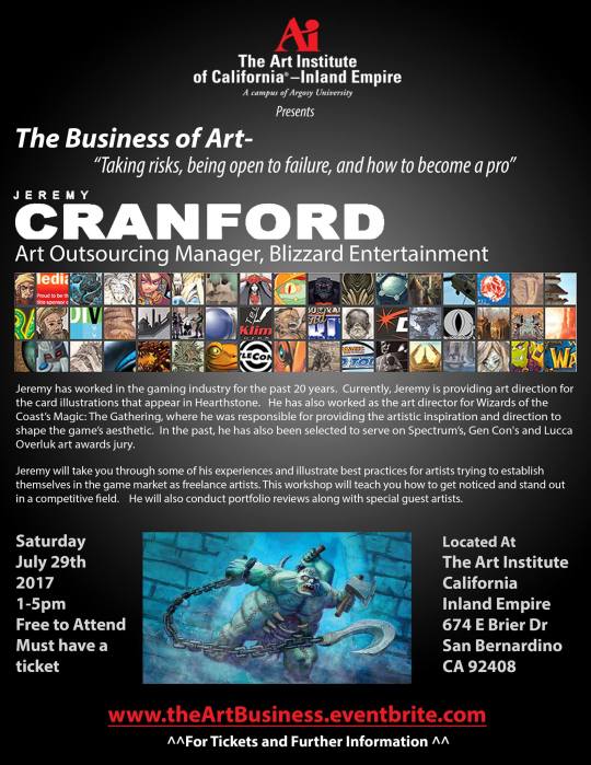
Special thanks to Jeremy Cranford and Thomas Brilliante for making this event possible. For more updates on future events like this in the southern California area, please consider following Inland Arts on FaceBook. (Text-only version of this document available on FaceBook)
James Cranford’s life
Humble beginnings: migrant parents, food stamps, etc.
Attending college was difficult because of finances, but he ended up studying graphic design because he got a scholarship
After doing graphic design for years, he got an art directing job with "Magic the Gathering” and working in games/illustration since 1996
Worked on “Metal World” style guide for “Mirrodin” set (2002)
What would environments look like on a metal planet? Rust, things hovering with magnetism, rolling silver plane, big metal spikes, mercury seas, retina green forests
Environments help you solve what the humanoids/creatures will look like in the environment
The humanoids/creatures? Enamel/scabs is replaced with metal, big metal bracers on humanoids
Also worked on "Spirit World” style guide for "Kamigawa” set (2003)
Started with the desire to help MtG sell better in Japan, which was a challenge because traditionally MtG is based on Arthurian lore/visuals
Unsure about just having American/Western artists riff on Japanese imagery, so he hired some Japanese artists to create more authentic content, which resulted in a very different feel
Example of a brief he didn’t like that he turned around into an engaging project
Also worked on “Ravnica” style guide
Brief: “overdeveloped urban fantasy setting”
Mountains = smelting buildings
Lead was very against having buildings on land cards, but this is an example of Jeremy challenging convention… why could land cards have buildings!?
Risked his job on this point because he really believed in it, and it ended up being a great decision
The creative solution may be an uphill battle, but it will always win out
Plains = created by the tops of buildings, inspired from looking out at the city from the World Trade Center
Swamps = city sewers, obviously
Forest = where they grew their food
First set when they started mixing colors (which are like “cultures” in MtG lore), which was an awesome opportunity to expand and develop new ideas
Blue/green = technology elves
Black/green = voodoo elves (inspired by New Orleans)
Black/red = fire demons, obviously
White/black = basically Catholicism
Red/white = military
Blue/red = mage + technology
First set to have a promo video (inspired by game cinematic trailers, intended to introduce the world)
youtube
Began working on World of Warcraft at Blizzard when they released a trading card game
Style was a bit of a learning curve (less realistic, more stylized)
Soon after, started working on miniatures game, which taught him a lot about manufacturing and allowed him to travel to China, etc.
youtube
He took a risk and left Blizzard to start a start-up with his friends called Solforge
It was fun for about 6 months, but he never regretted the experience because he learned a lot
Goal was to push things more sic-fi (nuclear winter world)
His philosophy over the years has been to take risks, embrace junctures in life, and have faith in the direction you’re going
Every time he took a risk, the pay off ended up being worth it
The universe has a way of showing you the path that’s most right for you
He says most of what he’s tried never works out, and he just ends up doing the next best thing - which turns out to be his career
Doesn’t always know what he wants to do, but definitely knows what he doesn’t want to do
Always wants to challenge convention
“Don’t try to make the art you do what you think it should do, rather let the art take you where it wants to go.” - Ben Thompson
“Leap, and build your wings while you’re falling.” - Ray Bradbury Finds inspiration from Borge Ousland (first human to go from Russia to Alaska)
Saw people’s discouragement as feedback/critique
Constant failures for 10 years, but learned a little every step of the way that led to his eventual success
Stick with it
Also finds inspiration from Richard MacDonald (inspirational sculptor, experienced a lot of misfortune, embodies the blind faith Jeremy talks about)
Advice for mastering your craft, building a portfolio, and being a professional
Being an art director is like being a coach - if the product isn’t performing well, the company looks to replace the art director
It may take you longer to master your craft than 4 years in college (DaVinci took 7 years)… be patient with yourself!
When he looks for an artist, he looks for a professional
Master your skills
Master drawing, anatomy, and rendering light onto form
Go to life drawing regularly… even if you’re not in school
He oftentimes looks at the hands
Master design, not just drawing realistically
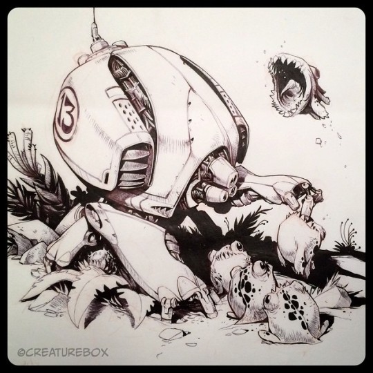
Creaturebox is a great example
Large, medium, small shapes
High density detail (busy) vs. low density detail (rest)
Master painting and color theory
Nathan Fowkes is a great example
The best color is not always the most “realistic” colour
Master composition, eye flow, value groups, and negative shapes
Wayne Reynolds and Frazetta are great examples
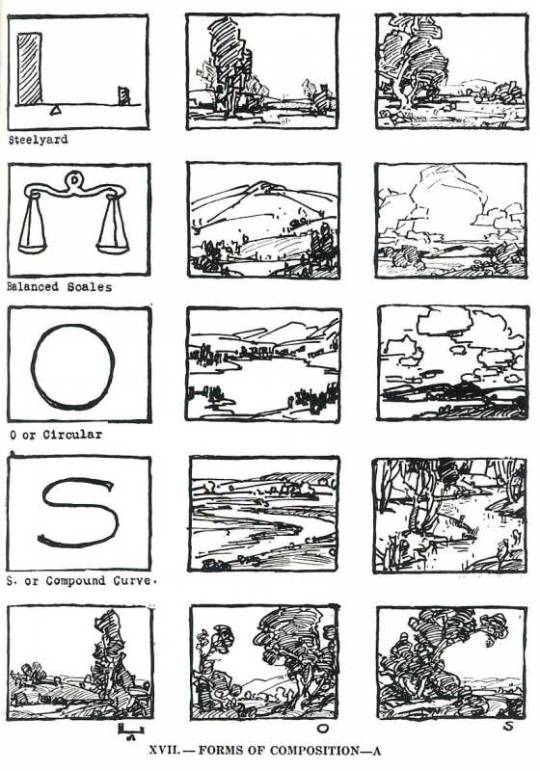
If you’re struggling, check out Edgar Payne’s book on composition
Have a plan before you paint and add all your detail
Jomaro adds “working in threes” is a good idea - working in twos becomes “equal” and too “balanced”
Master story, emphasis, mood, and point of view
Ian McQue's work in the “John Carpenter” art book is a great example
Just because your rendering is perfect doesn’t mean people will care about what you’re drawing
What are you trying to communicate? Write that down and make sure you execute it!
Creating without a clear objective is a waste of time
Don’t cheat yourself - if you’re trying to hide your flaws… fix them!
Don’t use effects/tricks to hide your shortcomings
After you master your skills, target a market and advertise yourself (ArtStation, DeviantArt contests, etc.)
Send out cold-emails
See if you can get current employees to refer you to art directors
If you get rejected, evaluate your work and actually assign yourself tasks to improve on it
Pro life tips!!
Don’t be a drunk (why party when you can improve your skill?)
Dedicate yourself to your career/something higher/something you love
Have some range (in your portfolio) - never say “that’s not my style!”
Consider: reality vs. fantasy (in content), realism vs, abstraction (in style)

“I’m on it!” Never be an emotional tax on your team/leads - art directors will always go back to the artists that make things easy
This doesn’t mean be a pushover
"Show me the Money!” Think about how much you’re being paid and how many hours you’re putting in… are you even getting paid minimum wage?
If you’re being paid less than you’re worth/less than minimum wage, it’s not worth it… and you’re hurting the whole industry!
You’re better off investing in yourself - work at Starbucks and build a strong portfolio at night/on the weekends
As your skills go up, the money goes up (you need to go from good to great if you’re going to make it)
Do you know why you do what you do?
If it’s for the money… maybe you should just go into banking, because this isn’t really a path to make money
Jeremy does it because he simply enjoys it, which takes the pressure off

"You’re okay, I’m okay”
Growing up, Jeremy had a lot of depression because he was seeking external approval
If you get your approval from within, you aren’t giving the power to others to put you down
You’re the final authority on how you fell about yourself, how you treat others, and what you love and want to do
There’s beauty in diversity - just be good to each other and celebrate your differences
Question time!
Where should I go to school?
Depends on what you want and how your learn best - really successful people have not gone anywhere and really unsuccessful people have gone to great schools
Maybe consider non-traditional schooling like GumRoad and New Masters Academy
At the end of the day, you need the skills, and however you get them doesn’t really matter
How do you manage your time to develop range and show that range in a portfolio?
When you email an AD/recruiter, consider attaching 3 images that highlight what that contact is looking for in the email… and then lead them to the rest of your work if they’re interested
That’s all you need for “portfolio geared to a company” - you don’t need a full portfolio geared to a portfolio if you have 3-5 images you can attach to an email
Keep your portfolio updated! Don’t leave up bad work from a long time ago!
Even when you’re not asked to, following up on feedback from ADs/recruiters with new work is a great way to stay in contact and establish your worth
If you gear your portfolio towards one company and you can’t get into that company, you might have trouble getting into other companies
However, if you have a very rangey portfolio, sometimes all you need is an art test to prove you can execute the style
Know your stylistic limitations, too - if you know you can’t do something, don’t waste your time and the AD/recruiter’s
Having trouble focusing? Set an explicit goal for yourself/make an assignment for yourself… and set a deadline for it (or else you’ll never finish it)!

How do you connect with an AD without being annoying but also not getting ignored?
ADs are busy people, at the end of the day
Consider joining a forum/contest… sometimes your peers are better critics for you than an AD
Develop a circle of trust (people you trust to give you good feedback)
When you do meet an AD, remember “everyone is people…” don’t be weird about it!
Don’t be embarrassed/ashamed of negative feedback… own it and be fearless!
Remember: it’s normal to ask ADs/recruiters to look at your work… just ask for permission, give them an opportunity to say “no,” and if they do say “no,” offer to follow-up or leave your email/card
Also remember to maintain relationships with professionals, because they might be keeping an eye on you and hire you in the future… address their feedback, explain how you improved, etc.
How do you form a good narrative in a painting?
“Create a picture that has a gap for the viewer to fill in”/“Don’t answer/render everything” (Jomaro adds - “like a trailer!”) - Frazetta is a great example of this
Engage the viewers curiosity and get them to want to know what’s happening
Maybe look at storyboard artists/sequential artists
Also maybe identify a feeling/single word/etc. that embodies your piece… and strive to communicate it fully!
You can execute a complex idea in a very simple way
Do ADs judge you on your backlog/old work?
Always be producing work, or else you’re stagnant!
Always update your work with your newest stuff
ADs love seeing jumps in quality!
ADs aren’t gonna judge you for old work they find in a deep-dive, but be sure to put your best foot forward and have that easiest to find
What can you do to stay in touch while you’re waiting for a response on an art test?
Once you submit the test, it’s out of your hands
If it’s been a week, try following up with HR asking if there’s anything else you can do
If you get radio silence, it’s not the end of the world - be positive about your experience and open to future opportunities
Do you need to master digital/PhotoShop/ZBrush/etc. just like you master anatomy/colour/etc.?
If you’re skills and design are good, they’ll show through in any medium, but at the same time, not knowing PhotoShop at all can get you dinged when working in-house
What was your favourite project to work on and what did you learn from it?
“Ravnica,” because he struggled with self-doubt and had to put his job on the line for something he believes in
HearthStone has also been a blast
Is there anything outside of art that helps you as an artist?
Everything he’s told you not to do, he did himself, which is why he’s trying to help you avoid it
Letting go of the idea that his self-worth was determined by how other people saw him… compete only against yourself
It helped to stop taking himself so seriously and just have fun… eliminated the pressure and lets the creativity flow
Stop trying to get everyone to like you and your work!
Don’t just be a theory expert… put things into practice!
The biggest thing people are lacking is the mileage
Don’t get deflated by feedback… actually integrate it!
Don’t get discouraged by people who are better than you that have been doing it for longer… that’s normal!
#concept art#blizzard entertainment#advice#portfolio#jeremy cranford#art director#presentation#panel#workshop#notes#entertainment design#portfolio prep#portfolio preperation#how to get a job in concept art#how to get a job#getting a job#job hunt#job search#job#career#help#process#inland arts#art institute#allison perry#allisonperryart
18 notes
·
View notes
Photo

Genesis | בר×שית, fine art print
Artist: Domy Reiter- Soffer Year: 2011 Edition size: The Edition is limited to 20 sets: 10 in classical blue box and 10 in a modern stylistic Box. Place of Production: Jerusalem Fine Art Prints, Jerusalem, Israel Case Size: 32.5”x24.5”x1.6” (82.5x62.5x3.2cm) Page Size: 31.5”x23.1” (80x60cm) Number of Pages: A Portfolio of ten prints Signed and numbered by the artist Print Technology: Printed under the Digigraphy standard – Museum and Archives quality. Paper: Printed on Arches Rives 310gr. Paper Binding: Hand bound with quality materials. Description: The prints in the “Genesis Portfolio” represent landscapes of various sites in Israel. Through these works, I have tried to create a sense of atmosphere and movement which expose my inner perceptions of the subject. The colors I have chosen depict the essence of what I see. “To every thing there is a season and a time to every purpose under the heavens” (Ecclesiastes 3, 1.) The prints in the “Genesis Portfolio” represent landscapes of various sites in Israel. Through these works, I have tried to create a sense of atmosphere and movement which expose my inner perceptions of the subject. The colors I have chosen depict the essence of what I see. I respond to nature in a variety of ways. Sometimes, it may spark a sense of empathy in me; or I may feel that I am losing myself in the scenery; or, I may identify with it on an abstract level. Nature, as a result, becomes the foundation of the entire painting. Every day is a new experience, and no day resembles another. When the light changes, the same landscape looks different than it did earlier that day, or even a second ago, reflecting the mood or the light we are in. Just as moods or the light change, so does the spectrum of our perceptions; a particular mood in a particular moment might determine how we see, conceive and experience our surroundings. I do not presume to portray an exact representation of the landscape in my prints; I merely try to show and describe the emotional color and the essence of what I see, the hidden elements of the places, and the substance of the landscape from different angles. This documentation reflects the beauty and the power that unfolds in front of me, and its historical characteristics. Each landscape symbolizes an integral component of the emotional journey that I experienced while creating them. These visual “poems” have given me inspiration and the desire to immortalize them, not only in color but also in words. Domy Reiter- Soffer Tel Aviv 2011 Domy Reiter-Soffer — A Multifaceted Artist Domy Reiter-Soffer is a creative person, who gives “Gestalt” to visions of his mind and imagination in a variety of artistic forms, such as painting, sculpture, theater, décor, music and choreography. With a multifaceted personality, Reiter-Soffer is a genius possessing more than one talent who is not limited to one form of artistic expression. Creativity in all its phases, forms and stages is Reiter-Soffer’s greatest marvel, as it has been for man throughout history. It is a spark filched from the Creator, who bestowed upon Reiter-Soffer powers denied many others, and instilled him with the consciousness of being apart. Any creatively gifted person has various degrees of talent, but true genius is completely imbued with talent. The world of art has a tendency to produce creative individuals who are at once heirs to all that has come before them and at the same time in revolt against their immediate predecessors. Reiter-Soffer is an artist who respects new modes, conversing both with his contemporaries and with those who will come in the future. His paintings are full of dramatic expression; he uses color with great expertise in order to convey the very essence of a subject. Domy Reiter-Soffer is a Renaissance man with a wide spectrum of art and achievements. He has exhibited throughout the world to great acclaim, and his works adorn many international collections, spanning from North America to Australia. Dr. Miriam Orr Doctor of Arts and Sciences Lecturer at Tel Aviv University, and The Hebrew University of Jerusalem Author, specializing in art “Every work of art is contemporary and many times it is the mother of our feelings” Vassily Kandinsky For most of his life, Domy Reiter-Soffer has been a creator. His main creative focus has been in the plastic arts as well as in theater. Both of his loves live happily together; they even seem to complement each other and are, in fact, even connected. Theater is an art of movement, of something that is alive and moving every moment. Painting is a two-dimensional art that no one is able, apparently, to invest with real activity. But when we look at Reiter-Soffer’s paintings, it seems that we need to use all our senses, since he paints life, building a story, not a single scene. His landscapes and characters seem to burst out from the canvas, giving the viewer a very strong sensual experience. In his latest series of works, he mainly paints Israeli landscapes. These landscapes are neither naturalist nor realist. In both his painting and his theater work, Reiter-Soffer is not interested in depicting reality. Instead, he is intent on sharing the experience of a place; the feelings that certain sites evoke in him; the sense of what is hiding behind a tree, a flower, a field and the sky. His renderings of the desert, fields and woods, are not depicted as landscapes of things external, but as fantastic landscapes in which he employs strong colors that seem to reflect the soul. Thus, in the print “Yot’veta” the sense of “woodland” is just hinted at by a tree-top and a stem-like tree trunk, similar to the kibbutz landscapes that slowly turn into geometric shapes. The main power of the landscape comes across in the colorfulness of the red-brown of “mother earth” into which Reiter-Soffer throws green spots that create a sense of drama within the general monochrome. The power is enhanced by the strong brushstrokes that look as if they were put on the canvas with a wiper. These make the landscape fascinating, creating the sense that there is a lot taking place in it. In another print, “Desert-Marble Pillars in Nahal Tzin”, Reiter-Soffer does not use sandy coloring, but instead employs a yellowish hue that he interweaves with browns, orange, reds and greens. Thus, he creates a desert flora that cannot be identified botanically, but which gives the impression that the viewer is surrounded by floral creatures that seem to be dancing to the sounds of the desert wind. These feelings are enhanced by the unique new techniques of applying the colors layer upon layer. The layers seem to cover and uncover at the same time, producing fascinating textures that are dotted, striped and shimmering, and which create a feeling of movement. In the print “The Crater”, the yellow-orange coloring, the stormy brush strokes, and the fluidity of the color create a feeling of a truly primeval sight. There is no doubt that something is being created here. In “Autumn in the Golan”, we witness the autumnal storm of colors (which in the local reality rarely occurs). Purples, blues, yellows and pinks, combine to create a colorful plethora of shapes that enables the viewer to feel the delight of autumn’s unique coloration, even as it is mixed with some sadness. Once again, there is no attempt to imitate nature; rather, the intent is to feel what it does emotionally to people. There is no doubt that Reiter-Soffer’s art is symbolic art. He has studied psychology, and it seems that it has percolated into his paintings and dances. Reiter-Soffer was a student of Yossi Stern, John Paddy Carstairs, and the British painter Francis Bacon. Although most of Reiter-Soffer’s work in the last few years deals with landscapes and not the human body, Bacon’s influence on his style clearly can be seen. The expressive-symbolic style used by Reiter-Soffer, the use of strong and daring coloration, the brush strokes that show the imprint of the artist’s hand, are all the results of Bacon’s influence. Just like Bacon, it would seem that Reiter-Soffer thoroughly researches his subject in order to unlock the substance of the landscapes he paints. In the “Crater”, for example, Reiter-Soffer spent five days in the desert, so he could feel the environment, study the flora and fauna, internalize the amazing feeling of infinity, soak in its exceptional sandy colorfulness, smell its special scents, and perhaps even feel the godhead and the natural powers of the desert that cannot really be defined. He worked extensively on the print “Genesis” in order to create the feeling of something that is here, but not really; a landscape that combines reality and imagination, the concrete and the dream-like. There is no doubt that Reiter-Soffer has a unique style and technique. He builds his works from many layers of color, thereby creating the special light that seems to shine from the depths of the print. He does not work exclusively with brushes; he also uses his fingers as means of expression, as he wants to feel the things in a tactile manner. This gives the impression that some of the objects are sculpted onto the painting. Reiter-Soffer does not seem to be in a hurry to finish his works; perhaps that is the reason that he builds them with innumerable layers, attempting to penetrate deeply, to discover the secret places of the soul. The famous American painter Arshile Gorky once said: “I never finish a painting; I love painting because the painting never reaches its end”. It would seem that Domy Reiter-Soffer’s paintings are reaching out to the infinity that lurks somewhere in the depths of the soul of each of us. Miri Krymolowski, Art curator; lecturer; and art critic, Voice of Israel Tel Aviv 2011
https://www.saatchiart.com/art/Painting-Genesis/163922/1440240/view
0 notes
Photo

New Post has been published on https://toldnews.com/lifestyle/an-artist-who-makes-irreverent-and-pocket-size-sculptures/
An Artist Who Makes Irreverent, and Pocket-Size, Sculptures

Like the confectioners that craft Japanese wagashi, traditional tea-ceremony treats, the artist Ron Nagle, 80, creates miniature, meticulously rendered objects that are ripe with dual meaning. In his otherworldly ceramic sculptures, which are small enough to fit in the palm of your hand, pastel stucco planes converge with glossy half-moon shapes, suggesting animal tails, chewed-up wads of gum, bare tree limbs, erect genitalia or excrement — sometimes all at once.
Next month, some 30 of Nagle’s provocative sculptures and drawings will go on view at Matthew Marks Gallery in New York in the exhibition “Getting to No,” a significant showcase of his recent work. While Nagle is an established artist — in 2013, his sculptures were featured in the 55th Venice Biennale, and he has works in the permanent collections of the Metropolitan Museum of Art, the Los Angeles County Museum of Art and the San Francisco Museum of Modern Art — and though he played an important role in forming the California Clay Movement, which helped elevate the status of ceramic art, he is still something of a cult figure within a few relatively contained communities. Outside of the visual art world, though, he is also known as a prolific songwriter and composer; he’s credited for writing iconic songs on albums by Jefferson Airplane, Sammy Hagar and Barbra Streisand, as well as for creating many of the sound effects in “The Exorcist.”
[Coming later this spring: the T List newsletter, a weekly roundup of what T Magazine editors are noticing and coveting. Sign up here.]
Born and raised in San Francisco, Nagle apprenticed with the Berkeley-based ceramist Peter Voulkos in the ’60s and helped carve out a niche for ceramics to be understood as rigorous and conceptual sculptures, rather than simply decorative objects. He went on to teach ceramics at Mills College in Oakland for over three decades before retiring in 2010 and returning full-time to his practice. Throughout his life, Nagle has tried to make three-dimensional forms appear flat, while still evoking rich, microcosmic landscapes, taking cues from the Italian artists Giorgio Morandi and Lucio Fontana, who challenged the dimensional constraints of painting on canvas in the ’50s. Often installed in peep-hole-style wall recesses or gleaming glass vitrines, like specimens dropped down from another planet, his works mix elements of allure and repulsion to enigmatic effect. Named with tongue-in-cheek puns like “Pastafarian,” “Urinetrouble” and “Karma Gouda,” they are also extensions of his irreverent sense of humor.
On a recent visit to the artist’s sunlit Bernal Heights home in San Francisco, which gleamed white like a freshly painted spaceship, there was a speckling of lilacs and golden poppies that lead through the garden to his next-door studio, which Nagle affectionately calls his “cocoon.” Seated there, sporting an all-white outfit, with a book on Korean ceramics in hand, Nagle answered T’s Artist’s Questionnaire.
What is your day like? How much do you sleep, and what’s your work schedule like?
I get up, have breakfast, take the dog for a walk. In the old days, it was close to a 9-to-5 in the studio. Now, with increased success — I hate these words — I’m busier. My main part of the day, my peace of mind, my “this is what I do because I gotta do it” is being in the studio as much as I can.
I usually order dinner out because my wife and I don’t like cooking. And then around 6 o’clock we watch MSNBC — to see if Trump’s still in office. Scary times, man. I hope you’re not a Republican. She’ll want to watch Rachel Maddow for the second time and I’ll move into the bedroom and watch “The Voice” or “True Detective” or “Ray Donovan.” If nothing’s on, I’ve been known to watch “MacGyver” or “Hawaii Five-O.” They’re reviving all these old shows. I’m a big nostalgia and trivia freak.
How many hours of creative work do you think you do in a day?
Other things take up space in my head, but the work never leaves my mind. I’m always looking, thinking, taking pictures with my phone — of a splat on the street or a ship bow down at Mission Bay. I pretty much remember everything — or I’ll bark it into my recorder. But if we’re talking hands-on-the-material, drawing or whatever the case, I’d say six hours.
What’s the first piece of art you ever made?
I made a bust in high school. I put it in the kiln and it blew the side of its head off. I was going to throw it away and a friend of mine said, “Oh no man, that’s really cool.” I’ve been making stuff since I was a kid. My mother told me I had no talent, she was like, “What do you want to do that for?”
What’s the worst studio you ever had?
Probably the basement of the building next door, where my daughter lives now. Dirt floor. Funky.
What’s the first work you ever sold? For how much?
There’s a sculpture from 1958 that Scripps College owns, “Perfume Bottle.” It’s a big jar with a kind of tombstone stopper. Peter Voulkos brought over a collector who was a math teacher at Scripps and he bought it for $100.
When you start a new piece, where do you begin? What’s the first step?
I draw a lot, that’s really the beginning of it all. I draw in bed, usually watching a Charlie Chan movie. The drawings are very small. I’ll put them on a copier and blow them up to get a general picture of what they’ll look like at a certain scale. And then I start building the models at full scale, at six inches max. I can envision things, to a degree, three-dimensionally. I’m not saying I have visions, but some little idea will come popping into my head. It might be based on something I’ve seen, and subconsciously it finds its way onto paper.
How do you know when you’re done?
When it feels right. I’m a big advocate for letting the works sit. I look at them, leave them around for a while.
How many assistants do you have?
My assistant, Whitney, is the only person that gets in here. And she does all the stuff business-wise and is also great in the studio.
What music do you play when you’re making art?
R&B, Motown, music of Philadelphia from the ’70s, like Gamble and Huff. I try to keep current with pop music, most of which I hate. But I’m into electronic dance music and people like James Blake, Frank Ocean, Kendrick Lamar. I like sad music. I don’t like to feel sad — I hate it, in fact, it’s awful — but I’m drawn to melancholy music.
When did you first feel comfortable saying you’re a professional artist?
I’ve never used the word “professional,” although that’s what I am. To a large degree, it’s too much. I know there’s a certain amount of allure or pretense — depending on where you’re coming from — when you say that. When you say “professional artist,” people automatically assume it’s painting. Then I say, “I make small sculptures.” I’m very reluctant to use the word “ceramics” because ceramics for years had such a bad reputation. The best people working in clay do not declare themselves clay artists.
What’s the weirdest object in your studio?
A picture of Bill Cullen, who was a ’50s, ’60s and ’70s radio and TV host. There’s also a picture of a woman surrounded by cheese.
What do you do when you’re procrastinating?
I don’t think I know how to procrastinate. It’s not a matter of principle. I would love to, love to, but I can’t do it. I always feel like I gotta make something.
What’s the last thing that made you cry?
I just had major surgery, about four weeks ago. I won’t offer to show you my scar. The worst part of the experience was something I hadn’t heard of before: postoperative delirium. I was so scared. It was like a dream, everything going in and out of focus. I was in two different worlds. I was on the phone bawling my eyes out. My wife and I were declaring our love.
What do you usually wear when you work?
I’ve got overalls like Willem de Kooning used to wear in the ’50s. I saw a picture and thought, I gotta wear that, it’d make me a better artist.
Which artists have influenced your work?
Later Morandi. A simpler Philip Guston. Cy Twombly’s sculpture. Kenny Price. Peter Voulkos. Lucio Fontana.
What are you reading right now?
I just finished reading David Sedaris’s last book.
What embarrasses you?
I could do a whole thing on losing my hair — you got 15 minutes?
What do your studio windows look out on?
I have skylights all over the place, so I could say the sky. The new studio looks out over my garden. I have a piece of quasi-Japanese garden sculpture I made with topiary and a slab of rock.
This interview has been edited and condensed.
“Ron Nagle: Getting to No” is on view from May 2 through June 15, 2019, at Matthew Marks Gallery, 522 West 22nd Street, New York.
#daily lifestyle news#lifestyle breaking news#lifestyle news nris#lifestyle news wikipedia#lifestyleblogger#news on lifestyle in hindi
0 notes
Text
A Star Reborn: Elle Magazine Interview (February 2008)
No matter how romantic, dissolute, or beatnik he played it, Hayden Christensen just couldn’t lose the long arm of Star Wars. Until, that is, he starred in this month’s hotly anticipated, Jumper and ditched Darth Vader for good. Interview by Sarah Bernard When George Lucas plucked Hayden Christensen from teen-TV obscurity to play Darth before he was dark in Star Wars Episode II: Attack of the Clones, it was a career making break. It was also the kind of opportunity that could set up a young actor to fail spectacularly. Christensen wouldn’t have been the first 19 year old to let fame turn him into an intolerable party boy, or the first to flame out, Mark Hamill-style. But Christensen’s post-Vader life hasn’t followed either of those scripts. Since hanging up his lightsaber, he has made a handful of small films, the best of which was Shattered Glass, which he also produced. His portrayal of journalist-turned-plagiarist Stephen Glass, complete with dorky glasses and khakis, was a perfectly creepy rendering of ambition and desperate defiance. In Factory Girl, the Andy Warhol biopic, he played a Dylan-esque musician. The movie was so god-awful that Christensen has never seen it. “And I don’t think I ever will,” he says. He had originally signed up to play Bob Dylan, but Dylan didn’t like the way the film portrayed his relationship with Edie Sedgwick and threatened to sue. “The producers called a week later saying, ‘We can’t call him Bob Dylan.’ I said, ‘Okay, I can play Bob in my head,” says Christensen, who more or less worships the singer. But Dylan saw the final cut and still wasn’t pleased. Most of Christensen’s scenes had to be scrapped, and those that did survive had to be completely redubbed so that he sounded less Dylan-like. “It was really depressing,” the actor says. In 2007’s Awake, he played a wealthy businessman (his wife is played by Jessica Alba) who finds himself conscious during heart surgery. The film came and went in a weekend. When Christensen tried to bolt from the premiere’s screening, he says Harvey Weinstein, the film’s producer, told him, “I’ll sit next you with handcuffs if I have to.” In this odd collection of projects, there is a through line: characters who are not quite what they seem at first, possessing a mix of innocence and malevolence. Those are the parts that Christensen loves to play and what attracted to the starring role in this month’s Jumper, a sci-fi thriller about a bank robber with a talent for teleportation. It’s directed by Doug Liman, who turned Matt Damon into an assassin with a soul in Bourne Identity and matched Brad and Angelina in Mr. and Mrs. Smith. “I think people who see this film will view Hayden as having emerged they viewed Matt as having emerged…[But the reality is, both Matt and Hayden had done phenomenal work before,” says Liman. “You just had to look at Good Will Hunting and Shattered Glass to see there was a star there.” Christensen is not one of those celebrities who always craves an audience, as he sits in a Tribeca bar in New York City answering questions, he’s wearing a Bathing Ape baseball cap pulled low over his brow. His features are so delicate, they’re almost pretty. In fact, he was the face of Louis Vuitton Menswear in fall-winter 2004-2005. (“He reminds of a young Paul Newman,” says Simon Kinsberg, who co-wrote Jumper as well as Mr. and Mrs. Smith and the third installment in the X-Men franchise.) The actor’s idea of fun is manning the excavator on the farm he recently bought an hour north of Toronto, the city where he grew up and where his family still lives. Like any good Canadian kid, he was hockey-obsessed and dreamed of playing for the Maple Leafs. He also played competitive tennis, and when he was a ball boy at the Canadian Open, he was nearly clocked with a racquet hurled by a tantrumming John McEnroe. (A clip of the near miss made the nightly news.) Christensen’s mother, Ali, and father, David, ran a communications consulting business together. He has an older brother, Tove (who now heads, with Hayden, a production company, Forest Park Pictures), and two sisters: Hejsa, a former junior world trampoline champion, and Kaylen. The whole clan spent time in Australia during the filming of Star Wars, where Christensen’s sisters even became tight with George Lucas’ daughters. When Lucas invited the girls along on a yacht vacation, Hejsa really hit it off with the boat’s captain. They married a year and a half ago in Antigua, with Lucas in attendance. “She’s sort of responsible for me having the career that I have,” says Christensen, “and I’m indirectly responsible for her family.” Listen to him talk, and it’s hard to believe he isn’t just a farm boy himself. For one thing, he mumbles. He also slurps his Coke like a little kid. Then orders another.
“I thought I had a sense of what it meant to be a down to earth, regular actor,” says Liman. “Then I met Hayden, and suddenly everyone else seems like a primadonna.” During one of many reshoots, Liman realized his star’s hair has gotten longer and lighter from the sun. “Hayden’s like, ‘no problem,’” says Liman. “He gets the scissors and the trimmer out and cuts his own hair in my bathroom! I’m terrified because we have some shooting coming up and if I mess up his hair, someone’s going to kill me. I go, ‘Are you sure you should be putting those scissors to your hair?’ He goes, ‘I was cutting my hair through the whole movie.’” “He is so sweet and so humble and approachable, and loving,” adds Jessica Alba. “He literally hugs everybody on the crew and knows all their first names, every day. He’ll say good morning, give everyone a hug. He’s so present and happy and sweet. It’s crazy. And then you’re like ‘Oh, he’s Canadian.’” ‘Menschy’ is how Kinberg describes him. “So much that wondered when I’d get to see the other side.” It’s an earnestness with an edge, like a scrim that’s hiding something uglier, messier, darker. “He’s incredibly good at lying,” says Jamie Bell, his Jumper costar. “That element of ‘I’m totally pulling the wool over your eyes.’ He’s good at that.” Darth Vader is a cartoon version of this of course. There were lots of intense stares and heavy brows in that performance. But to be fair, Star Wars has never been known for its thespianism, and delivering stilted dialogue with imaginary droids against a green screen doesn’t leave an actor much room for subtlety. Maybe Christensen was reacting to that when he played Sam Monroe, the pill-popping part time prostitute teenage son of Kevin Kline in 2001’s Life as a House. In the opening scene, Sam wakes up, sniffs a rag doused with paint thinner, sticks his head through a noose in his closet, and jacks off, until the clothes rack collapses on top of him and his mom opens the door. And that’s before the title sequence is finished. Christensen threw himself into Sam both emotionally and physically. He says ‘It was my means of rebelling,” from Star Wars one assumes. He shed 25 pounds on a diet of salad and water, dyed his blond hair black and cobalt blue, and shaved his legs to look as young and sickly as possible. The result was a performance with vulnerability and angst and full-fledged rage, all twined together like a heap if twisted steel. And because Life as a House came out before Attack of the Clones, it was actually Sam in all his Goth glory (piercings, eye shadow), not the falling Jedi Knight, who introduced the actor to the movie going public. He earned a Golden Globe nomination for his work in House, as well as a fair amount of tortured teen credibility. At that point, tortured teens were something of a Christensen specialty. In 2000, the year he got Star Wars, he was living in Vancouver and playing Scott Barringer, a drug addicted, sexually molested teenager on Fox Family’s Higher Ground. When he was summoned to Lucas’ Skywalker Ranch in Northern California for a face-to-face reading with Natalie Portman, he threw up on the ride there. It was his and Portman’s chemistry that the unknown Canadian was the one. “Hayden is immediately appealing, both in person and on screen, because he knows how to balance his strength with his sensitivity,” Lucas emails. “I think he has a great acting career ahead of him.” The filming of Attack of The Clones and then Revenge of the Sith consumed a good five years of Christensen’s life-an eternity in the career of a hot young actor. He tried moving on, focusing on indie films, sharing the stage in London in 2002 with Jake Gyllenhaal in Kenneth Lonergan’s This Is Our Youth, a play about three rich-kid slackers in 1980s New York. Still he could not get away from Star Wars. Boxes of paraphernalia continued to arrive. “They have to send me one of everything produced,” he says. “It’s nuts. The first I opened: ‘Oh that’s cool. A little figurine of me,’ All sorts of lunch boxes, potato chips. I don’t even open them anymore. I had to get storage space because my parents’ basement overcrowded. My mom was like, ‘Enough!’” So when his agent told him about Jumper, he didn’t jump at it. “They said it was sort of science fiction, there was a franchise possibility,” he says. “And I was like, ‘does this really sound like something I’d be keen to do? I was franchise scared.” Then he found out it was being directed by Doug Liman, who has a way of infusing an emotional quotient into the star roles of his big budget action pictures. The first meeting between them was, according to both, like a great first date. Christensen has a farm. Liman has a farm. Christensen was off to a flying lesson that day. Liman is a pilot. The director invited Christensen to his apartment in New York, where they met with Kinberg and with Bell, who’d already been cast. (Liman had begun filming Jumper with Tom Sturridge as the lead, then halted production because Sturridge looked too young for the part, Kinberg says.) Christensen plays Davey, a callow young guy with a sweet, sexy girlfriend (Rachel Bilson) and the secret superpower to ‘jump’ teleport himself anywhere in the world by picturing the place. Thinking he’s the only one with such skils, Davey is blithely breaking into banks and living the high life in Manhattan when one day, a white-afroed Samuel L Jackson (Christensen’s Star Wars costar) shows up and tries to get medieval on his ass. Jackson, part of a jumper secret police, doesn’t want rogue teleporters jumping about. Disrupts the universe, you see. Liman and the crew discussed the script and debated what a jump would look like. “We started improvising, throwing out ideas,” says Christensen. A week later, Liman called and asked him back to do it all again. When Christensen was finally offered the part, the group continued to meet as a collective several times a week. “My character’s way of dealing with things is he doesn’t confront his problems. He’s always avoiding them. One day I was saying to Jamie, ‘My superpower is I can run away from anything.’ And Doug was like, ‘Wait, wait, wait! That’s your character! The fundamental undercurrent.” It is the perfect superpower for a guy: the ability to literally bail when things get tough. “A very guy thing, yeah.” Christensen says with a laugh. Jumper was the opposite of the closed door ways of Star Wars, where they’re George’s characters,” the actor says. “I was stepping into something preexisting.” Now he was getting to be part of that defining process and he was thrilled. Not that Liman’s defining process is any cake walk. For him, scripts are never finished and actors are ever in discovery mode. Often they’d shoot a scene one way, discuss it, come up with a better idea, and shoot again. This happened whether they were on a soundstage in Toronto or on location in Tokyo, Paris, Prague, London, or Rome, where they got permission to film inside the Colosseum, the first film to do so in decades. Liman is also spontaneous, to the extreme. Driving through Times Square with Bell and Christensen, he decided that it would be good to get them fighting in traffic. So he stopped the van, ordered them out, and manned the camera himself as his starts rolled around on the pavement mid the cars and pedestrians. A good portion of the film has Christensen pummeling himself onto the floor, up against walls. Says Bell, “Hayden was tortured on this movie.” Well, not entirely tortured. Reports are that Christensen and Bilson are dating-there are pictures of her feeding him, of her puppy getting into his Ferarri, of her and Christensen running errands Best Buy-but he refuses to discuss it. What he will say is, “She’s awesome. She’s a very, very beautiful girl. She’s special. She’s one the sweetest, most gentle, kindhearted people I’ve ever met.” Christensen’s Jumper performance may be the one that finally overrides everything else on his resume. “Doug is really good at making guys look cool,” says Kinberg. Liman couldn’t agree more: “I have the reputation for getting just the right actor at the right point in their career. I think people will say I just did it again.” But even a director as self-confident as Liman is no match for the Force. Christensen tells how, on a recent head clearing trip to the Bahamas, he stopped in at a ‘really local, really basic market’. And there on the shelf was an ancient box of cereal with his mug as Anakin in that signature shag. Says Christensen; “I wanted to go up and ask the guy, ‘Are you sure that should still be on the shelf?’”
29 notes
·
View notes
Text
Day 2: Lima City
I made it! I woke up around 7am local time and chatted with Mum and Dad on whatsapp. I had a really filling brekky of eggs and fruit and cereal which was much better than plane food! I actually ended up going back to my room and chilling for a few hours, then napping for another few! Jetlag certainly caught up with me and I was just super super tired.
I got out of bed at about 1:30pm and got ready for my Lima city tour. I had a hotel pick-up at around 2:30pm, so there was heaps of time. Alas, I went down to the lobby at 2:10pm thinking I could organise with the hotel a wake-up call for the following morning and found that the tour guide was already there and waiting. Thus, I left the hotel, hopped into the mini van and my exploration of Lima City began!
I had one fellow tourist, an American Lady who was accompanying her husband on one of his business trips. She spoke both English and Spanish fluently, which meant that at times I had no idea what was being said and at other times she helped me by translating!
Our tour guide was hilarious. He went to great lengths to explain how and why Peru was the best country in the world and went into minute detail about how Lima, as a city, was vastly improving and would therefore be the best place in the world to be. The area of Miraflores, where I am staying, was exceptionally clean due to Local Council initiatives and he pointed out the new bus system working across the city that had been introduced because Lima was hosting the Pan-American games next year. He also defended Lima, stating that the constant cloud cover is NOT pollution, but rather the constant humidity. Apparently it never rains in Lima (due to the humidity) and some buildings don’t even have roods! It last rained in the 1980′s, and apparently when it did rain it absolutely poured.
En route to our first stop, we drove past a pre-Inca pyramid. It was nothing like the infamous Egyptian pyramids. There was no spaces, or anything inside this pyramid. Instead, as our guide explained, the flat top of the pyramid was used for religious purposes and around the bottom of the pyramid were markets and other social gathering points. The pyramid was made from mud brick and according to google earth (as search by my fellow passenger) the pyramid stretched for nearly a mile.
Our first stop was the main square of Peru. It is really quite large and the european influences were very evident! We headed into the main Church, the Cathedral of Lima. It was a beautiful church inside, whereas the exterior of the building was a mix of styles because it had collapsed in various earthquakes and was then rebuilt. One interesting fact is that the Church is actually made out of wood. The walls are mainly bamboo that are then covered/rendered in stucco to protect the wood from humidity and rotting. The lime in the stucco also repels termites.The remains of the Spanish Conquisador, Pisaro, can be found inside the Church in a coffin and the lead box in which his head was found separately is also displayed. This church also boasts the oldest statue of the Virgin Mary in America. She is some 400 and something years old, and despite looking like marble she was carved out of cedar! The statue was then rendered in stucco to protect the wood from the humidity and have that stone finish. We went down into the crypt underneath the alter and saw the tombs of Peru’s archbishops and other noble Peruvians. We walked through a very narrow entrance way that led into a large void. Our guide explained this void was a technique used by the Spanish to absorb the shocks of earthquakes and to assist in preventing the building collapse.
Our small tour of three returned to the main square where we had a good look at the fountain in the middle. It is the oldest piece of construction in Peru because most colonial buildings collapsed during the various earthquakes. We also admired the Government Palace, which was built by Pisaro as his house. Peru’s government consists of 130 senators,18 governmental departments and affiliated ministers and 1 president. Apparently the president only works, as opposed to reside in the Government Palace.
We left the main square by foot and walked a few blocks down to Saint Dominic Priory, the Sanctuary of Peruvian Saints. The first room we walked into had a ceiling made of over 9,000 individual pieces of wood that was held together by tongue and groove joints, as opposed to glue. It looked like one large block of chocolate!! We continued out into ta compluvium sort of area, a garden situated in the middle of a building. Very Roman!! At the centre of the garden was a beautiful water fountain and surrounding rose garden. The verandas were all covered in tiles, which were all had made, painted and glazed and dated back to the 17th century. The moorish influence continued on the second floor balconies which were entirely wood!
We left this outside space and hit a LIBRARY. Oh the excitement, it was literature heaven! The books in that library spanned over four centuries, were written in all the known European languages as well as the Incan Quechua language and it remains to be a working library today. A particular highlight was the hymn book on display. It was more than 300years old, was written in Latin and the pages were sheep skins.
We then visited a room, and then the crypt chapel dedicated to San Rosa of Lima. She was a nun who became famous for the miracles she worked. Apparently many used to come to her to be healed, and it is said that she once summoned a storm to banish pirates from the coastal waters around Lima.
After a bit more looking around, we left the Priory and headed to the coastal part of Miraflores. We drove past the Palace of Justice on our way and I promised Mum that I would try to look in if I had the chance. Its a bit of a tradition in our family to always visit the Courts of any town or city we visit #nerds.
The view from the Miraflores coast was spectacular! The Pacific Ocean was beautiful and misty, but looked very cold! Our guide picked these flowers from a nearby bush and we sucked out the honey of the flower. We then walked around the headland to the Parque del Amor, which is famous for its mosaics and statue of a couple in passionate embrace. After we had looked around and enjoyed the view, it was about 5:15pm. We walked across a bridge connecting the headlands of Miraflores (also known as the death bridge...barriers had to be constructed for reasons I purposefully will not explain here) over to Larcomar shopping centre. Our tour finished, but my fellow passenger and I continued on and looked around the local artisan markets and the shops in Larcomar shopping centre. Together we grabbed some dinner at a restaurant called ‘Popular’ and I tried my first Pisco Sour flavoured with Passionfruit! I didn’t even make it half-way through the drink in order to avoid any of the effects of alcohol. The cocktail has frothed egg white on top, which sounds gross but it takes on the taste of the drink!
After our meal, I grabbed a taxi and was back in my hotel by 8pm. I went to bed early as I was being picked up at 3am the next morning for my tour of the Ballestes Islands and the Nazca Lines!
1 note
·
View note
Text
Top 10 Manhwa of 2016-17
I used to rarely read manhwa, maybe just one or two a year, but then I discovered Lezhin and Spottoon - online platforms that host Korean webcomics with English translations available. The first few chapters are usually free but after that you have to pay to read, which actually appeals to me because I like being able to support writers and artists. And even if you find the prices unaffordable, reading the free chapters still helps because you’re increasing the view count and their popularity. The only complaint I have is that the quality of the translations can differ greatly between series, especially on Spottoon. Sometimes it’s pretty good and sometimes it’s really bad.
Anyway, I’ve read so many manhwa this past year that I thought it’d be nice to make a manhwa rec list! Except for a few exceptions, I tried to only recommend series that have a good number of chapters out or that are already completed. These are my personal top 10. Enjoy!
10. Reversi (양극의 소년) by Eun Song

In the year 2016, a never before seen virus decimates 20% of the world population. Moreover, survivors of this virus either transform into man-eating creatures called “worms” or into super-humans with tremendous physical abilities called “heteros”. Over the years, heteros start the ISO, an agency that protects people from worms. Haru, our protagonist, is a young hetero who wants to join the ISO, but it may not be that easy or straightforward…
Once in a while I find a scifi-action comic that manages to capture my interest, despite me being rather tired of the genre as a whole. This manhwa is on this list more for its potential than anything else- there are only 37 chapters out and the story’s still in its beginning stages, but I think there’s a lot of good material that, in the right hands, can make for a really interesting and entertaining story.
Despite the impression the synopsis may give you, the story starts out in a peaceful privileged high school setting and you don’t get to the nerve-wracking parts until around chapter 25. But the beginning achieves its purpose. It sets the scene with its conflicts: the segregation of those infected with the virus and those uninfected, the mixed treatment of heteros, and the still-existing class privilege. It also sets up the main characters; impulsive but sincere Haru and his best friend, level-headed and determined Leo; the other heteros in their school year; and members of the ISO. We don’t know much about them, but again they’re intriguing and the rest can come later. It’ll probably take another 30 chapters or so before we can see whether this manhwa fulfills its potential or not, but take this as a heads up - this one just might be a winner. At the very least, the beginning’s pretty engaging. And with clean art that’s easy on the eyes, it’s definitely no chore to scroll through.
Warning: Blood, death, murder, violence, body horror
Available on: Lezhin (first 24 chapters are free). Not on scanlation sites yet.
9. The House Cat (상상고양이) by Kim Kyoung
(Also known as: The Imaginary Cat, Cat’s Imagination)
Cat lovers rejoice! Here’s another comic for you to read for your daily dose of cat shenanigans. “The House Cat” looks at Webcomic Artist Jong Hyun and his cat Bok-Gil (Jill in the english translation) - or as Jill would tell you, Cat Jil and her human who she allows to live with her. Like so, the comic presents their different viewpoints of their life together, with Hyun’s viewpoint on the left in red and Jill’s viewpoint on the right in green. The intersection between their viewpoints is cleverly done and will often leave you smiling one way or another. Cat owners will probably find many of their interactions familiar. On the other hand if you’re like me, you’ll start realizing that you are basically Jill and should’ve been born as a house cat instead of as a human. All in all, “The House Cat” is a pleasure to read and certainly not a bad way to pass the time.
Warning: Alcohol mention, brief depiction of pet abuse and neglect
Available on : Spottoon (first 4 chapters free). Was adapted into a kdrama called “The Imaginary Cat”
8. Peak (피크) by Hong Sung-Soo and Lim Gang-Hyuk
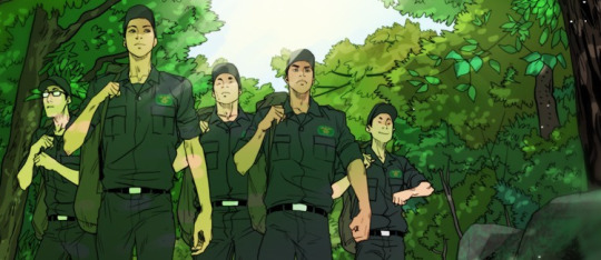
If “mountain rescue manhwa” stirs any interest in you, this may be the manhwa for you. “Peak” centers around Ryu Yeon-Seong, who’s been stationed on Mt. Bukhan to be a Rescue Ranger for his military service, along with four other men. The story follows his experiences as he learns what being a rescue ranger entails.
I initially didn’t have high expectations for this manhwa, but the realistic and suspenseful storytelling ended up impressing me. I always like it when manhwa go into the specifics of the particular subject they’re covering and “Peak” does that extensively - from what’s covered in training exercises to the challenges of navigating throughout the mountain in subpar weather to how to conduct oneself when administering first aid to fatal injuries. And except for a few brief respites, the pace is remarkably fast from start to finish, emulating the break-neck speed the rangers have to move to save lives. It would not be an exaggeration to say that I’m constantly sitting at the edge of my seat when reading this manhwa. The rescue missions themselves are no joke; from an accident in the middle of the pouring rain to a helicopter crash, this manhwa is constantly upping the stakes.
Personally, the art isn’t my favorite but it excels in two areas: conveying the physical exertion of being a ranger and the harshness of the mountain landscape. And when the story is all about survival, that’s really all that matters.
Warnings: Blood, fatal injuries, death, murder
Available on: Spottoon (First 30 chapters are free). 92 Chapters can be found on mangago.
7. The Sock Monster (양말도깨비) by Manmulsang

(Also known as: Socks Goblin)
Is it too much if I said “The Sock Monster” would rock your socks off? Ehehe :P
But actually, this is possibly the cutest manhwa I’ve ever read. From the art, which resembles something you’d find in a children’s storybook with its crayon lines and oil pastel backgrounds, to the story itself, a young girl making her way in a wintery town, “The Sock Monster” radiates a quirky fairytale sort of charm. It’s slow to start but when it finds its rhythm, it strolls off, as our plucky protagonist, Park Sujin, learns the ropes at BigFoot Bank, finds the Sock Monster living in her room, and befriends Mr. Lara, her cat-man neighbor whose dream is to explore the deep ocean. Despite its lighthearted tone, the manhwa ends up covering some surprisingly heavy topics from the tension between Big Foots and Humans to animal experimentation (in a world where animals are more like humans). But it does so in a tender sort of way, never losing heart or the hint of wisdom that comes with classical storytelling.
What the manhwa excels at especially is taking advantage of its fantasy world to sculpt all sorts of interesting plotlines for the characters. There is no limit to the creativity displayed. If children’s books and fairytales appeal to you, then you’ll probably appreciate the charm of “The Sock Monster”. Who knows, it might just become your favorite bedtime read. And you’ll probably end up cooing over how cute the sock monsters are.
Warning: Child neglect and abuse, animal cruelty, death
Available on: Spottoon (first 19 chapters are free)
6. Myojin Tales (묘진전) by Jelly Bean

A smallpox goddess steals an eye from a celestial god to help her sightless baby. A young boy wonders why his father doesn’t love him. A girl who’s lived a miserable life curses her capturer with her last breath. The celestial god, the father, the capturer - all of these titles refer to the same being: Myojin, a god who has been sentenced to forever live among humans as punishment for his crimes, forbidden to ever return to his former post as a zodiac deity. This is a compilation of the stories surrounding him and the people whose lives he’s touched.
This manhwa caught my attention with its art alone. Each panel is meticulously rendered in a style resembling traditional ink paintings, fitting for a story drawn from Korean mythology. Although the style is usually semi-realistic, like the panel above, when it comes to frightening and visceral scenes it leans towards abstraction. There is one particular chapter near the beginning that I could not read with the lights turned off. However, the story itself is also fascinating and from beginning to end, it reads like a folktale told from centuries ago.
Let’s get this out of the way - Myojin is not a likable person in any aspect really. But he, like everyone else, is both victim and perpetrator of unfair systems, and has the capability for both good and evil. Therein itself lies the core of this manhwa and “Myojin Tales” is ultimately a story of recognition and redemption, where there is no moral absolutes, but only the choices one makes in certain circumstances. If you’re a fan of mangas like Mushishi, this could be your next favorite.
Warning: child neglect, abuse, body horror, blood, murder, death
Available on: Spottoon. Normally only the first 10 chapters are free, but this week (March 18, 2017) the first 17 are all free!
5. Hwaja (화자) by Hong Jac-Ga

At 9 years old, Ryu explores “the Haunted House” in his neighborhood and meets Hwaja, a girl who looks a few years older than him. Hwaja never leaves the haunted house, except to sit on the rooftop, and spends most of her time drawing. Visitors, she says, have to bring her something, like food. Eventually, Ryu introduces his best friend Jay to Hwaja. She doesn’t seem like a ghost, but there is something is strange about her and the house…
At 19 years old, Ryu, who moved away and hasn’t been in the neighborhood for years, is struck with the news of Jay’s death. His last text message from him reads, “Don’t ever come back.” But Ryu does come back and sees Hwaja again…
As you can infer from the synopsis, there’s a 10 year time skip in the manhwa. Personally I didn’t find myself that interested in “Hwaja” until after the time skip (in Ch. 8), where the art style changes and things get a lot more intriguing. The art goes from crisp line-art colored in bright blues and greens to blocks of color in murky purples, browns, and blues, conveying the suspicion and suspense as Jay learns more and more about the truth behind Hwaja’s existence. The story ended up going places that I didn’t expect it to go and the ending was surprisingly heartfelt and touching. If you like ghost stories or just stories about the interaction between the supernatural and humans, give “Hwaja” a go.
Warning: Violence, child abuse, sexual abuse, rape, murder, kidnapping, death
Available on: Tapastic (Only the prologue is free). It can be found complete on scanlation sites on mangago. But if you end up liking it, support the author!
4. Hongdo (홍도) by snowy owl

In a world of shamans, gods, ghosts and other mystical creatures, the illegitimate son of a prominent general, Hong-do Lee grows up to be a powerful exorcist. When he decides to abandon his job, he becomes the target of bounty hunters and stumbles upon a plot that threatens his life and the fate of the world.
So begins Hongdo, a swashbuckling fantasy adventure that has gorgeous art and gives me Fullmetal Alchemist vibes if only because Hong-do is incredibly similar to Edward Elric, minus the insecurities about his height. That’s not to say that Hong-do is an Edward copy; he’s clearly his own unique character, but the style of humor is similar and the situations he gets into resembles the beginning of FMA, where Ed and Alphonse traveled around Amestris looking for strange happenings possibly caused by a Philosopher’s Stone- only in Hong-do’s case, he’s looking for a mysterious man named Crow. What for? Well, you have to read it to find out.
But although elements of the story are reminiscent of FMA, the exorcist practices and the setting that make up the backbone of the story is clearly based on Ancient Korean and Chinese mythology and history. Architecture, clothing, the gods and spirits, all are richly and beautifully illustrated. I have at least a dozen screenshots saved in my phone and my current iphone lock screen is a panel from Hongdo. The worldbuilding is fascinating to say the least and the story just gets more and more interesting as you go along. In short, don’t miss this gem of a manhwa.
Warning: Violence, murder, some body horror-ish stuff
Available on: Spottoon (first 9 chapters are free). Chapter 1-34 are on mangapark.
3. Dark Heaven (다크 헤븐) by JUNS

In the US, same-sex marriage has been legalized but racist and homophobic hate crimes still regularly occur. Connor is Korean-American, and together with his friend and lover Simon, they have a band called “Dark Heaven”. But things can’t stay this good forever. Fast-forward to the future and the band has split up. Simon is pursuing a solo career and Connor’s working as a writer in a news agency. What went wrong and can they be together again?
This manhwa pushes all of my buttons, so it’s no surprise that it’s on this list even though I’m only 15 chapters in. I mean, come on, a Korean-American protagonist? Check. Angsty Band Premise? Check. True love between two boys who care about each other so much, they find life lonely without having the other by their side? Check. And to top all of that, really good art? Check. Check. Check.
I think what’s so refreshing about this manhwa is that it looks at racism and homophobia and actually does a good job going about it. When Connor finds himself in love with Simon, he not only faces opposition from the outside, but also from the inside. Internalized racism and homophobia can be a bitch and the author does a good job depicting that with Connor’s struggles. And the love that Connor and Simon have for each other is just so touching, you can only fervently hope that they find their way back to each other again.
Warning: Homophobia, racism, racist and homophobic slurs, hate crimes, prostitution, child abuse, violence
Available on: Lezhin (first chapter is free). Scanlation sites only have up to chapter 5-6 I think.
2. Annarasumanara (안나라수마나라) by Ha Il-Kwon

Yoon Ah-ee struggles to keep her and her little sister fed, clothed, and sheltered, but that’s easier said than done, especially with her father’s debts weighing down on her shoulders. Her only hope is to keep her grades up so that she can go to a good college and then get a good job and become a good adult. But when she meets a mysterious magician in the abandoned amusement park, she’s reminded of her childhood dream to learn magic…
This has been on my “to read” list for years, but I’ve finally read it and I can only hit myself on the head for not reading it sooner. Annarasumanara is a story for those who have had that moment when, verging at the brink of adulthood, you’ve wondered “what is happiness”? Will going on this road that everyone has predetermined for me, “study hard, go to a good college, get a good job,” make me happy?
What happens if that’s not what I want?
The art here is unique to say the least. The author goes for a mixed media approach of combining drawings with photographs, which is not uncommon in Korean webcomics. What is uncommon is for it to be done well, creating stark, unforgettable imagery that, at times, blurs the lines between reality and construed reality. Which is exactly what this manhwa needs; after all it’s a story about finding real magic in what seems like a miserable reality.
Warning: Suicide Attempt, Violence, Sexual Harassment, Blood
Available on: Line Webtoon (All chapters are free!)
1. Vengeance (벤전스) by Aji
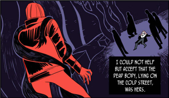
Have you ever really wanted a noir mystery about a female police detective trying to solve the case of her girlfriend’s murder? I did, I just didn’t know that I did until I started reading this and then I thanked the gods above for delivering my unconscious wishes.
Hyun Seol-ah is an experienced police officer who’s known for her cool head and rational approach in dangerous situations - but all that cool headedness goes flying out the window when she arrives at a murder scene and realizes that the victim is her girlfriend, Hwan Hara. From then on, she is focused on only one thing: finding the monster who killed her and then exacting revenge.
I know what you’re thinking… another sad lesbian story? Yes, it’s sad, but the relationship between Seol-ah and Hara is depicted so profoundly, you can feel how much Seol-ah loved Hara and how much Hara loved her in return. As Seol-ah chases down the murderer, we see flashback after flashback of their relationships, from the fights to the cuddles to the declarations of love. What makes this even more heartbreaking is that their relationship was a secret, and so Seol-ah must solve Hara’s murder while hiding that they were lovers.
But also, the art is fantastic. I could go on and on about it, but I think the panel above speaks for itself. Solid blocks of color used to great dramatic effect that mimics the atmosphere of noir films. Seriously, do not let this pass you by.
Warning: Murder, blood, body horror, homophobia
Available at: Lezhin (first chapter is free). You can also read the whole thing on mangago and then buy some chapters later on Lezhin to support the author.
#manhwa#comics#manga recs#manga#this has been sitting in my drafts for a loooong time#spottoon#lezhin
42 notes
·
View notes
Text
Smashing Podcast Episode 23 With Guillermo Rauch: What Is Next.js?
We’re talking about Next.js. What is it, and where might it fit into our web development workflow? Drew McLellan talks to co-creator Guillermo Rauch to find out.
Today, We’re talking about Next.js. What is it, and where might it fit into our web development workflow? I spoke to co-creator Guillermo Rauch to find out.
Show Notes
Weekly Update
Transcript
Drew McLellan: He’s the founder and CEO of Vercel, a cloud platform for static sites that fits around a Jamstack workflow. He’s also the co-creator of Next.js. He previously founded LearnBoost and CloudUp, and is well-known as the creator of several popular node open source libraries like Socket.io, Mongoose, and SlackIn. Prior to that, he was a core developer on MooTools, so we know he knows his way around JavaScript like the back of his hand. Did you know he once received a royal commission from the King of Spain to create an ice sculpture out of iceberg lettuce? My smashing friends, please welcome Guillermo Rauch. Hi Guillermo, how are you?
Guillermo Rauch: I’m smashing freaking good, thanks for having me.
Drew: I wanted to talk to you today about the whole world of Next.js, as it’s something that obviously you’re personally very knowledgeable about, having been involved as a co-creator right from the start. Next.js is one of those project names that has been on my radar while working in the Jamstack space, but it isn’t something that I’ve actually personally looked at or worked with too closely before. For people who are like me, who perhaps aren’t aware of what Next.js is, perhaps you could give us a bit of background into what it is and what problems it tries to solve.
Guillermo: Next.js is a very interesting member of the Jamstack universe, because Next.js actually started being a fully SSR-focused framework. It started getting a lot of adoption outside the Jamstack space where people were building very large things specifically when they wanted to have user generated content or dynamic content or social networks or e-commerce, and they knew that they wanted SSR because their data set was very large or very dynamic. It fell under the radar I think for a lot of people in the Jamstack world, but later on Next.js gained the capabilities for static optimization.
Guillermo: On one hand, for example, if you wouldn’t do data fetching at the top level of your page with Next.js, your React page would be … Also by the way, for those who are not fully in the know, Next.js is simply React framework for production, but has this capability of doing some rendering. Then when you get in static optimization capabilities, if you wouldn’t define data fetching at the top level of your page, it automatically exported as HTML instead of trying to do anything with server rendering.
Guillermo: Then later on, it also gained the capability for static site generation, meaning that you can define a special data hook, but that data hook gets data at build time. Next.js became a hybrid, very powerful dynamic and static framework, and now it’s been growing a lot in the Jamstack space as well.
Drew: People might say that React is already a framework, you certainly hear it described that way. What does it actually mean to be a framework for React?
Guillermo: That’s a great observation, because I always point out to people that React at Facebook and React outside of Facebook are completely different beasts. React at Facebook actually is used together with server rendering, but even their server rendering, for example, doesn’t use Node.js, it uses a highly specialized virtual machine called Hermes which communicates to their sort of production hack and PHP stack and answers all this advanced and exotic Facebook needs.
Guillermo: When they open source React, it’s almost like open sourcing a component. I always call it like open sourcing the engine, but not giving you the car. What happened is people really wanted to go and drive with it, they wanted to get to places with React. In the community, people started creating cars, and they would embed React as the engine, which was what the driver, the developer was after in the first place, make React the fundamental part of the car. Things like Next.js and Gatsby and React Static and many other frameworks started appearing that were solving the need for like, “I actually want to create fully loaded pages and applications.”
Guillermo: Whereas React was kind of more like the component and the engine for specific widgets within the page, this was certainly the case for Facebook. They will broadly and publicly admit that they invented it for things like the notification batch, the chat widget, the newsfeed component, and those components were React routes that were embedded into the contents of the production existing app with lots and lots of lines of code and even other JS libraries and frameworks.
Guillermo: What it means to create a framework for React, it means you make React the fundamental part of the story, hopefully and this is something we’ll try to do with Next.js, the learning curve is primarily about React with some added surface for Next.js, particularly around data fetching and routing. We also do a lot of production optimizations, so when you get React, when you get Create React app, which is sort of like, I like to call it a bootstrapped car that Facebook gives you, maybe the needs for production are not really met. Or if you try to do it yourself by configuring Webpack and configuring Babel and configuring server rendering and static generation, it’s also hard to put together a car from scratch. Next.js will give you this zero config and also production optimized set of defaults around building entire big things with React.
Drew: So it’s like it almost puts a sort of ecosystem around your React app with a collection of pre-configured tools to enable you to-
Guillermo: Correct.
Drew: Hit the ground running and do static site generation or server rendering or routing.
Guillermo: Correct, and you used a word there that is very, very key to all this, which is pre-configured. We’re fortunate enough to draw the attention of Google Chrome as a contributor to Next.js. One of the leaders of this project, her thing is that when they were working on frameworks internally at Google, they faced a lot of the same problems that the community and open source are facing today. There were many different competing initiatives at Google on how to scale and make really performant web apps out of the box.
Guillermo: You would join as a Googler and you would be given a framework with which you would create really big production ready, very high performance applications. Shubie was part of a lot of those initiatives, and what she found is that there’s two key ingredients to making a framework succeed at scale. One is pre-configuration, meaning that you come to work, you’re going to start a brand new app, you should be given something that is already ready to go and meets a lot of the production demands that are known at that given point in time.
Guillermo: On the other hand, the other really important step that we’re working towards is conformance. You can be given the most highly optimized production ready pre-configured framework, but if you go ahead and, for example, start introducing lots of heavy dependencies or third party scripts or use very inefficient layouts that take a long time to paint and so on and so forth, then you’re going to make that pre-configuration sort of go to waste. By mixing pre-configuration with conformance over time, the developer is not only having a great starting point, but it’s also guided to success over time.
Drew: It seems that a characteristic of Next.js, that it’s quite opinionated, the UI layer is React, it uses type script, uses Webpack, and those are all choices that the project has made and that’s what you get. Correct me if I’m wrong, but you couldn’t swap out React for Vue, for example, within Next.js.
Guillermo: That’s a good point, where technical decision making meets sort of an art. On one hand, I’d really like to claim that Next is very unopinionated, and the reason for this is that if you specifically go to github.com/vercel/nextjs and the examples directory, you’ll see that there’s almost like a combinatoric explosion of technologies that you can use together with Next.js. You’ll see fire-based, you’ll see Graphic UL, you’ll see Apollo, you’ll see RedUX, you’ll see MobX, in the CSS space there’s even more options.
Guillermo: We have a default CSS port that’s embedded, but then you can use two flavors of it, one with import, one with style tags which we call Style JSX, which resembles very much like the web platform approach to Shadow CSS. The reason I mean unopinionated is we want Next.js to stay very close to the “bare metal” of the web, and not introduce lots of primitives that if the web from 10 years from today would be incompatible with. Then if you look at the examples, you’ll see that there’s all these other technologies that you can plug in.
Guillermo: The base level of opinionation is that there is React and you’re not going to be able to replace it, at least anytime soon. Then there is the concept of you should be able to create pages, and this was kind of like a new thing when we first launched it, which was everyone is trying to create single-page applications. What we realized is like the internet is made up of websites with lots of pages that create distinct entry points via search engines, via Twitter, via Facebook, via social networks, via email companions, like you always guide the person toward an entry point, and that person that comes through that entry point shouldn’t have to download the burden of the entirety of the application.
Guillermo: Then that path led us to implementing server rendering, then static generation for multiple pages, et cetera, et cetera. That other base level of opinionation is Next should be a framework that works for the web, not against the web. Then on top of that, React was missing data fetching and routing primitives, and we added those. There’s a level of opinionation that has to deal with like everybody needs a router, so might as well have a router built in by default.
Drew: The big advantage of having those defaults is it takes away a lot of the complexity of choice, that it’s just there, it’s configured, and you can just start using it without needing to think too much, because I think we’ve all-
Guillermo: Exactly.
Drew: Been in situations where there are far too many choices of what components to use, and it can be overwhelming and get in the way of being productive.
Guillermo: Exactly.
Drew: What sort of projects do you see people using Next.js for? Is it for basically any situation where you might build a production React app, or is it more suited to particular types of content heavy sites? Does it matter in that sense?
Guillermo: Yeah, so this has been an age old debate of the web, is the web for apps, is the web for sites, is it a hybrid? What is the role of JavaScript, et cetera, et cetera? It’s kind of hard to give a straight up answer, but my take on this is the web was evolved always to be a hybrid of content that is evolving to be more and more dynamic and personal to the user. Even when you say like a content website, the high end content websites of the world have code bases that are very much comparable to apps.
Guillermo: A great example here is like New York Times, they’ll give you embedded widgets with data analysis tools and interactive animation, and they’ll recommend what story to read next, and they have a subscription model built in which sometimes gives you part of the content and sometimes counts how many articles you’ve read. Like if I told you this when the web was invented, like Tim Berners-Lee would be like, “No, that’s crazy, that’s not possible on the web,” but that’s the web we have today.
Guillermo: Next.js is answering a lot of these complex modern needs, which means you’ll see lots of e-commerce usage, you’ll see lots of content with that. E-commerce meaning, by the way, not just like buy items, but experiences like the largest real estate websites on the web, realtor.com, zillow.com, trulio.com, that entire category is all Next.js, then content sites. We just onboarded washingtonpost.com as a customer of Vercel and Next.js, we have then a third category that is more emergent but very interesting, which is full apps and user-generated content, like tiktok.com, and kind of like you would think the original single-page application use case as well being quite represented there.
Guillermo: Next.js sort of shines when you need to have lots of content that has to be served very, very quickly, has to be SEO Company optimized, and at the end of the day, it’s a mix of dynamic and static.
Drew: I’ve previously spoken to Marcy Sutton about Gatsby, which seems to be in a similar sort of space. It’s always great to see more than one solution to a problem and having choice for one project to the next. Would you say that Next.js and Gatsby are operating in the same sort of problem space, and how similar or dissimilar are they?
Guillermo: I think there’s an overlap for some use cases. For example, my personal blog rauchg.com runs on Next.js, it could’ve just been a great Gatsby blog as well. There is that overlap in the smaller static website sort of space, and by small I don’t mean not relevant. A lot of dotcoms that are super, super important run on basically static web, so that’s the beauty of Jamstack in my opinion. Because Next.js can statically optimize your pages and then you can get great Lighthouse scores through that, you can use it for overlapping use cases.
Guillermo: I think the line gets drawn when you start going into more dynamic needs and you have lots of pages, you have the need to update them at one time. Although Gatsby is creating solutions for those, Next.js already has production ready live solutions that work with any sort of database, any sort of data backend for basically “generating” or “printing” lots and lots of pages. That’s where today customers are going to Next.js instead of Gatsby.
Drew: One of the problems that everyone seems to run into as their JavaScript-based solution gets bigger is performance and how things can start getting pretty slow, you have big bundle sizes. Traditionally, things like code splitting can be fairly complex to get configured correctly. I see that’s one of the features that jumped out at me of Next.js, that it claims that the code splitting is automatic. What does Next.js do in terms of code splitting to make that work?
Guillermo: Your observation is 100% right. One of the biggest things with the web and one of the biggest weights on the web is JavaScript, and just like different materials have different densities and weights irrespective of the actual physical volume, JavaScript tends to be a very dense, heavy element. Even small amounts of JavaScript compared to, like for example, images that can be processed asynchronously and off the main thread, JavaScript tends to be particularly bothersome.
Guillermo: Next.js has invested a tremendous amount of effort into automatically optimizing your bundles. The first one that was my first intuition when I first came up with the idea for Next.js was you’re going to define, for example, 10 routes. In the Next.js world you create a pages directory and you drop your files in there Index.js, About.js, Settings.js, Dashboard.js, Termsofservice.js, Signup.js, Login.js. Those become entry points to your application that you can share through all kinds of media.
Guillermo: When you enter those, we want to give you JS that is relevant for that page first and foremost, and then perhaps a common bundle so that subsequent navigations within the system are very snappy. Next.js also, which is very, very nice, automatically pre-fetches the rest of the pages that are connected to that entry point, such that it feels like a single-page application. A lot of people say like, “Why not just use Create React app if I know that I have maybe a couple routes?” I always tell them, “Look, you can find those as pages, and because Next.js will automatically pre-fetch ones that are connected, you end up getting your single-page application, but it’s better optimized with regards to that initial paint, that initial entry point.”
Guillermo: That was the initial code splitting approach, but then it became a lot more sophisticated over time. Google contributed a very nice optimization called Module and No Module, which will give differential JS to modern browsers, and legacy JS that’s heavy with polyfields to other browsers, and this optimization 100% automated and produces massive savings. We gave it to one of our customers that we host on Vercel called Parnaby’s, I believe if I’m not mistaken, it was something very, very significant. It was maybe like 30% savings in code sizes, and that was just because they upgraded Next.js to a version that optimized JS bundles better.
Guillermo: That was kind of the point that we were going over earlier, which is you choose Next.js and it only gets better and more optimal over time, it’ll continue to optimize things on your behalf. Those are, again, pre-configurations that you would never have to deal with or be bothered with, and the research of which you don’t ever even want to do, to be honest. Like I wasn’t obviously very involved with this, but I look at some of the internal discussions and they were discussing all these polyfields that only mattered to Internet Explorer X and Soho, I was like, “I don’t even want to know, let’s just upgrade Next.js and get all these benefits.”
Drew: There is sometimes great benefits on there with sticking with the defaults and sticking with the most common configuration of things, which seems to be really the Next.js approach. I remember when I started writing PHP back in the early 2000s, and everybody was using PHP and MySQL, and at the time I’d just come from Windows so I wanted to use PHP and Microsoft Sequel Server. You can do it, but you’re swimming against the tide the whole way. Then as soon as I just switched over to MySQL, the whole ecosystem just started working for me and I didn’t need to think about it.
Guillermo: Yeah, everything just clicks, that is such a great observation. We see that all the time, like the Babel ecosystem is so powerful now that you could become, for example, a little bit faster by swapping Babel for something else, but then you trade off that incredible ecosystem compatibility. This is something you touched on performance earlier, and like for a lot of people, build performance and static generation performance is a big bottleneck, and this is something that we are very diligent in improving the performance of our tools incrementally.
Guillermo: For example, one of the things that Next.js is doing now is that it’s upgrading its default from Webpack 4 to Webpack 5, which has some breaking things, and that’s why we’re first offering it to people as an opt-in flag, but later on it’ll become the default. Webpack 5 makes incredible performance improvements, but we’re not sacrificing the Webpack ecosystem, we incrementally improved. Sure, there were some very small things that needed to be sacrificed, but that’s an incredible benefit of the JS ecosystem today that a lot of people are glossing over, I think, because maybe they see, “Oh, we could’ve done X in Soho, maybe it was a little faster, or maybe MPM in Soho would take less time.” They pick up some details and they miss the bigger picture, which is the ecosystem value is enormous.
Drew: The value of having all the configuration and the maintenance and that side of it done by a project like Next.js rather than taking that on yourself by swapping to using something else is incredible, because as soon as you move away from those defaults, you’re taking on the burden of keeping all the compatibilities going and doing it yourself. One of the things that I’ve been really interested in with Next.js is there are options available for either doing static site generation or server-side rendering, or maybe a hybrid of the two perhaps. I think there’s been some recent changes to this in a recent update, can you tell us a little bit about that and when you might choose one or the other?
Guillermo: Yeah, for sure. One of the key components of this hybrid approach combined with the page system that I described earlier is that you can have pages that are fully static or pages that server rendered. A page that’s fully static has the incredible benefit of what I call static hoisting, which is you can take that asset and automatically put it at the edge. By putting it at the edge, I mean you can cache it, you can preemptively cache it, you can replicate it, you can make it so that when a request comes in, it never touches the server because we know ahead of time, “Hey, Slash Index is a static.”
Guillermo: That’s a very, very interesting benefit when it comes down to serving global audiences. You basically get an automatic CDN out of the box, especially when you deploy the modern edge networks like Vercel or AWS Amplify or Netlify and so on. Next.js has this premise of if it can be made static, it should be static. When you’re first starting a project and you’re working on your first page or you’re kicking the tires of the framework, might as well make everything static.
Guillermo: Even for high end needs, so for example, vercel.com, our own usage of Next.js is fully static. It’s a combination of fully static and static site generation, so all our marketing agency pages are static, our blog is statically generated from a dynamic data source, and then our dashboard which has lots of dynamic data, but we can deliver it as shells or skeletons, all the pages associated with viewing your deployments, viewing your projects, viewing your logs, et cetera, et cetera, are all basically static pages with client-side JavaScript.
Guillermo: That serves us incredibly well because everything where we need a very fast first-pane performance is already pre-rendered, everything that needs SEO Company, already pre-rendered, and everything that’s extremely dynamic, we only have to worry about security, for example, from the perspective of the client side which uses the same API calls that, for example, our CLI used or our integrations use, et cetera, et cetera. A fully static website, very cheap to operate, incredibly scalable and so on and so forth.
Guillermo: Now, one particular thing that we needed with our blog was we wanted to update the data very quickly. We wanted to fix a typo very quickly and not wait for an entire build to happen, and this is a very significant benefit of Next.js, that as you straddle from a static to a dynamic, it gives you these in between solutions as well. For our blog we used incremental static generation, so essentially we can rebuild one page at a time when the underlying content changes.
Guillermo: Imagine that we had not just a couple hundred blog posts and we had lots of blog posts being generated all the time and being updated all the time, like I mentioned one of our customers, Washington Post, in that case you need to go more toward full SSR, especially as you start customizing the content for each user. That journey of complexity that I just described started from I have one marketing agency page, to I have a blog that has a couple thousand pages, to I have tens of thousands or millions of pages. That’s the Next.js journey that you can traverse with your own business.
Guillermo: Then you start as a developer to choose between perhaps less responsibility to more responsibility, because when you opt in to using SSR, you’re now executing code on the server, you’re executing code on the cloud, there’s more responsibility with more power. The fact that you can decide where you use each kind of tool is I think a very, very interesting benefit of Next.
Drew: Just in practicalities of combining the static site generation and the server-side rendering, how does that work in terms of the server element? Are you needing a dedicated platform like Vercel to be able to achieve that, or is that something that can be done more straightforwardly and more simply?
Guillermo: Next.js gives you a dev server, so you download Next and you run your Next Dev, and that’s the dev server. The dev server is obviously incredibly optimized for development, like it has the latest fast refresh technology that Facebook released, where … Actually, Facebook didn’t release it, Facebook uses it internally to get the best and most performant and most reliable hot module replacement, such that you’re basically typing and it changes are reflecting on the screen, so that’s the dev server.
Guillermo: Then Next gives you a production server called Next Start, and Next Start has all the capabilities of the framework for self-hosting. The interesting thing about Vercel is that when you deploy Next to it, it gets automatically optimized and it’s 100% serverless, meaning there’s no responsibility whatsoever of administration, scaling, cashing and cashing validation, purging, replication, global fail over and so on and so forth that you would have to take on when you run Next Start yourself.
Guillermo: That’s also the great benefit of Next.js, so for example, apple.com has several different properties, subdomains and pages on dotcom on Next.js they self-host, due to very, very advanced and stringent security and privacy needs. On the other hand, washingtonpost.com uses Vercel, so we have this sort of wide range of users, and we’re extremely happy to support all of them. The nice thing about where serverless is headed in my opinion is it can give you best of both worlds in terms of the most optimal performance that only gets better over time, with the best developer experience of like, “Hey, I don’t have to worry about any sort of infrastructure.”
Drew: The Next.js is an open source project that’s being developed by the team at Vercel. Are there other contributors outside of Vercel?
Guillermo: Yeah, so Google Chrome being the main one that actively submit server PRs, help us with optimizations and testing it with partners, like very large Next.js users that are already part of the Google ecosystem, for example, due to using lots and lots of apps, so they need to be involved closely as partners. Facebook, we maintain a great relationship with the Facebook team. For example, fast refresh, we were the first React framework to land that, and they helped guide us through all the things that they learned of using React and fast refresh at Facebook.
Guillermo: We work with lots of partners that have very large deployments of Next.js apps in the wild from all kinds of different sort of use cases, like imagine e-commerce and content. Then there’s just lots and lots of independent contributors, people that use Next.js personally, but also educators and members of front infrastructure teams at large companies. It’s a very, very wide community effort.
Drew: It sounds like the concern that somebody might have, that this is being developed in a significant part by Vercel, that they might have the concern that they’re going to get sort of locked into deploying on that particular platform, but it sounds very much like that’s not the case at all, and they could develop a site and deploy it on Firebase or Netlify or…
Guillermo: Yeah, absolutely. I like to compare it a lot for like the Kubernetes of the Front End age in a way, because at the end of the day I am a firm believer that … Kubernetes is something that pretty much almost everyone needs when they need to run LinUX processes, like you were talking about opinionation and you’re saying it’s a good technology, it’s very much not opinionated, but there is some opinionation that we kind of forget about. It’s like at the end of the day, it grew out of running a specific demons of LinUX programs packaged as containers.
Guillermo: Next is in a similar position, because what we take for being the universal primitive of the world as a React component, obviously it’s opinionated, but we do think that for lots of enterprises, just like they all gravitate towards LinUX, we are seeing the same thing towards React and Vue, but Vue luckily has NUXt too, which is a very awesome solution, it’s equivalent in ideation and principles as Next. We’re gravitating towards these platforms like Next.js, like NUXt, like Sapper for the Svelte ecosystem.
Guillermo: I think these should be open platforms, because again, if everybody’s going to need this, might as well not reinvent the wheel across the entire industry, right? We very much welcome that position, we welcome people to deploy it and reconfigure it and rebuild it and redistribute it and so on.
Drew: Just recently a new version of Next.js was released, I think version 9.5. What significant changes were there in that release?
Guillermo: The most awesome one is, as I was saying earlier, a lot of things start static and then become more dynamic as things grow. This was the venture for WordPress, by the way. WordPress in the beginning was based on a static file database approach, and then grew into needing a database, kind of like what you described with how PHP evolved to be more and more MySQL. What’s nice about Next.js 9.5 is that it makes incremental static generation a production ready feature, so we took it out of the unstable flag.
Guillermo: This feature allows you to make that journey from static to dynamic without giving up on all the static benefits, and without having to go full for server-rendered dynamic, so it stretches the useful lifetime of your sort of static. The way we use it at Vercel, for example, as I mentioned, it’s like our blog gets fully pre-rendered at build time, but then for example, we’re actually in a couple minutes about to make a major announcement, and when we blog about it we want to be able to tweak it, fix it, preview it, et cetera without having to issue a five to 10-minute build every time we change one letter of one blog post.
Guillermo: With incremental static generation, you can rebuild one page at a time. What could take minutes or even seconds, depending on how big your site is, now takes milliseconds. Again, you didn’t have to give up on any of the benefits of static. That’s perhaps the thing I’m most excited about that went stable on Next.js 9.5, and specifically because the JS community and the React community and the framework community and static site generated community have been talking about this unicorn of making a static incremental for a long time, so the fact that Next.js did it, it’s being used in production and it’s there for everybody to use, I think it’s a major, major, major milestone.
Guillermo: There’s lots of little DX benefits. One that’s really nice in my opinion is Next.js, as I said, has a page system. You would argue, “Okay, so let’s say that I’m uber.com and I’ve decided to migrate on Next.js, do I need to migrate every URL inside over to Next.js in order to go live?” This has become a pretty important concern for us, because lots of people choose Next.js, but they already are running big things, so how do you reconcile the two?
Guillermo: One of the things that Next.js allows you to do in 9.5 is you can say, “I want to handle all new pages that I created with Next.js with Next.js, and the rest I want to hand off to a legacy system.” That allows you incremental, incremental is the keyword here today, incremental adoption of Next.js. You can sort of begin to strangle your legacy application with your Next.js optimized application one page at a time, when you deploy and you introduce in your Next.js page, it gets handled by Next. If it doesn’t match the Next.js routing system, it goes to the legacy system.
Drew: That sounds incredibly powerful, and the incremental rendering piece of that, I can think of several projects immediately that would really benefit that have maybe 30-minute build times for fixing a typo, as you say. That sort of technology is a big change.
Guillermo: We talked to one of the largest, I believe, use cases in Jamstack in the wild, and it was basically a documentation website and their build times were 40 minutes. We’re doing a lot in this space, by the way, like we’re making pre-rendering a lot faster as well. One of my intuitions for years to come is that as platforms get better, as the primitives get better, as the build pipelines get better we’re going to continue to extend the useful lifetime of statics. Like what ended up taking 40 minutes is going to take four.
Guillermo: A great example is we’re rolling out an incremental build cache, as well, system. I sort of pre-announced it on Twitter the other day, we’re already seeing 5.5 times faster incremental builds. One of the things that I like about Jamstack is that the core tenet is pre-render as much as possible. I do think that’s extremely valuable, because when you’re pre-rendering you’re not rendering just in time at runtime. Like what otherwise the visitor would incur in in terms of rendering costs on the server gets transferred to build time.
Guillermo: One of the most exciting things that’s coming to Next is that without you doing anything as well, the build process is also getting faster. On the Vercel side, we’re also taking advantage of some new cloud technology to make pre-rendering a lot faster as well. I think we’re always going to live in this hybrid world, but as technology gets better, build times will get better, pre-rendering will get better and faster, and then you’ll have more and more opportunities to do kind of a mix of the two.
Drew: Sounds like there’s some really exciting things coming in the future for Next.js. Is there anything else we should know before we sort of go away and get started working with Next.js?
Guillermo: Yeah. I think for a lot of people for whom this is new, you can go to nextjs.org/learn, it’ll walk you through building your first small static site with Next.js, and then it’ll walk you through the journey of adding more and more complexity over time, so it’s a really fun tutorial. I recommend also staying tuned for our announcement that I was just starting to share on twitter.com/vercel, where we share a lot of Next.js news. Specifically we highlight a lot of the work that’s being done on our open source projects and our community projects and so on. For myself as well, twitter.com/rauchg if you want to stay on top of our thoughts on the ecosystem.
Drew: I’ve been learning all about Next.js today, what have you been learning about lately, Guillermo?
Guillermo: As a random tangent that I’ve been learning about, I decided to study more economics, so I’ve been really concerned with like what is the next big thing that’s coming in terms of enabling people at scale to live better lives. I think we’re going through a transition period, especially in the US, of noticing that a lot of the institutions that people were “banking on”, like the education system, like the healthcare system, a lot of those, like where you live and whether you’re going to own a house or rent and things like that, a lot of these things are changing, they have changed rapidly, and people have lost their compass.
Guillermo: Things like, “Oh, should I go to college? Should I get a student loan?” and things like that, and there is a case to be made for capitalism 3.0, and there is a case to be made for next level of evolution in social and economic systems. I’ve been just trying to expand my horizons in learning a lot more about what could be next, no pun intended. I’ve found there’s lots of great materials and lots of great books. A lot of people have been thinking about this problem, and there is lots of interesting solutions in the making.
Drew: That’s fascinating. If you, dear listener, would like to hear more from Guillermo, you can find him on Twitter at @RauchG, and you can find more about Next.js and keep up to date with everything that goes on in that space at nextjs.org. Thanks for joining us today, Guillermo. Do you have any parting words?
Guillermo: No, thank you for having me.
(il)
Website Design & SEO Delray Beach by DBL07.co
Delray Beach SEO
source http://www.scpie.org/smashing-podcast-episode-23-with-guillermo-rauch-what-is-next-js/ source https://scpie1.blogspot.com/2020/08/smashing-podcast-episode-23-with.html
0 notes