#3498db
Explore tagged Tumblr posts
Visit Tumblr Blog
Explore Tumblr blogs with no restrictions, modern design and the best experience.
Last Seen Tumblr Blogs


Fun Fact
Tumblr Inc. is using 66 technologies for its website.
Text
„Igrzyska Śmierci: Ballada ptaków i węży” – analiza porównawcza książki i filmu
Igrzyska Śmierci: Ballada ptaków i węży – analiza książki i filmu | Recenzja i porównanie body { font-family: Arial, sans-serif; line-height: 1.6; margin: 20px; max-width: 800px; margin: 0 auto; padding: 20px; } h1, h2 { color: #2c3e50; } a { color: #3498db; text-decoration: none; } .container { background-color: #f9f9f9; padding: 20px; border-radius: 10px; } „Igrzyska Śmierci: Ballada ptaków i…
0 notes
Text
Want to travel the world without breaking the bank? Our latest guide on DailyZingMindBazaar.com takes you to Vietnam in 2025! Explore Hanoi’s bustling markets, cruise Ha Long Bay, and savor pho for just $1–$2. With a daily budget of $25–$35, you can experience Vietnam’s culture, history, and beaut
#2025 travel#2980b9#2c3e50#333#3498db#affordable travel#Asia"#Budget Travel#DailyZingMindBazaar.com#ddd#f2f2f2#food#Hanoi#Travel#travel guide#Vietnam#Vietnamese culture
0 notes
Text
The future of Earth
Full Code Example: <!DOCTYPE html> <html lang="en"> <head> <meta charset="UTF-8"> <meta name="viewport" content="width=device-width, initial-scale=1.0"> <meta name="description" content="Phubers Blog - The Ring of the World Earth"> <title>Phubers Blog - The Ring of the World Earth</title> <style> /* Basic reset */ * { margin: 0; padding: 0; box-sizing: border-box; } /* Body Styling */ body {…

View On WordPress
0 notes
Text
耶和华以勒不是神的名字!
『耶和华以勒』是亚伯拉罕在神预备公羊代替以撒后,给那地方起的名字,而不是神的名字。这个名字的意思是"耶和华必预备",表达了神供应者的属性。我们要正确理解并使用这个称谓,避免误解和妄称。让我们一起追求对圣经更深入的理解。 | "Jehovah-jireh" was the name Abraham gave to the place where God provided a ram instead of Isaac for sacrifice, not a name of God itself. It me
创世记22:9-14 “他们到了神所指示的地方,亚伯拉罕在那里筑坛,把柴摆好,捆绑他的儿子以撒,放在坛的柴上。亚伯拉罕就伸手拿刀,要杀他的儿子。耶和华的使者从天上呼叫他说:’亚伯拉罕!亚伯拉罕!’他说:’我在这里。’天使说:’你不可在这童子身上下手。一点不可害他!现在我知道你是敬畏神的了;因为你没有将你的儿子,就是你独生的儿子,留下不给我。’亚伯拉罕举目观看,不料,有一只公羊,两角���在稠密的小树中,亚伯拉罕就取了那只公羊来,献为燔祭,代替他的儿子。亚伯拉罕给那地方起名叫’耶和华以勒‘,直到今日人���说:’在耶和华的山上必有预备。'” 1. “耶和华以勒”是一个地名 在这段经文中清楚地表明,”耶和华以勒”是亚伯拉罕为纪念神奇妙供应而给那个地方起的名字,而不是神的名字。这个名字的含义是”耶和华必预备”,表达了神作为供应者的属性。 2.…
#2980b9#333#3498db#666#犹太传统#神的名字#神学理解#e74c3c#耶和华以勒#误解澄清#f5f6f7#f9f9f9#圣经#圣经研究#圣经解读#基督#基督教#希伯来文化#教会生活#敬畏神#亚伯拉罕#信仰
0 notes
Text
O-Metric: Simplifying ARC Complexity with Grid Analysis
The Abstraction and Reasoning Corpus (ARC) challenges AI to exhibit abstract reasoning and adaptability, testing pattern recognition, transformations, and generalization. The o-metric measures task complexity based on grid size, aiding strategy.
1. Introduction: The ARC Challenge The Abstraction and Reasoning Corpus (ARC), developed by François Chollet, represents a paradigm shift in artificial intelligence testing. Unlike traditional benchmarks that focus on specific tasks or domains, ARC challenges AI systems to demonstrate genuine abstract reasoning and adaptability—core components of human-like intelligence. ARC presents a series…
#2980b9#333#3498db#analysis#arc#challenge#ddd#e0f7fa#explanation#f0f0f0#f9f9f9#ffeeba#fff3cd#intelligence#message#note#o#o-metric#ometric3#ometric4#reveal
0 notes
Text
La Norme HL7 : Un Pilier de l'Interopérabilité dans les Systèmes de Santé et son Intégration avec Yoctobe
<style> /* Table styles */ table { width: 100%; border-collapse: collapse; margin: 20px 0; box-shadow: 0 1px 3px rgba(0,0,0,0.1); } th, td { border: 1px solid #ddd; padding: 12px 15px; text-align: left; } th { background-color: #3498db; color: white; } tr:nth-child(even) { background-color: #f2f2f2; } /* Note and warning blocks - WordPress compatible version */ .note-block, .warning-block {…
0 notes
Text

Обзор современных CSS-функций: что нового? CSS постоянно развивается, предоставляя веб-разработчикам всё больше инструментов для создания красивых и функциональных сайтов. Обзор современных CSS-функций Если раньше приходилось выкручиваться и использовать хаки для сложных задач, то сегодня многие проблемы решаются встроенными функциями. Давайте разберём, что нового появилось в мире CSS, и как эти новшества помогут вам писать более понятный, чистый и эффективный код. Универсальная гибкость с функцией clamp() Функция clamp() — это настоящий спаситель для адаптивн��й типографики, отступов и размеров элементов. Она позволяет задать минимальное, предпочтительное и максимальное значение свойства. Синтаксис функции выглядит так: clamp(минимум, предпочтительное значение, максимум) Например, чтобы шрифт плавно менялся в зависимости от ширины экрана: font-size: clamp(16px, 2vw, 24px); - Минимум: 16px — шрифт не станет меньше этого значения. - Предпочтительное значение: 2vw — шрифт зависит от ширины экрана. - Максимум: 24px — шрифт не вырастет больше этого размера. Функция min() и max(): контроль за пределами Если вам нужно задать минимальные или максимальные значения для какого-то свойства, используйте функции min() и max(). Они упрощают работу с вычислениями и делают код более читабельным. Пример использования: width: min(50%, 300px); Этот код задаёт ширину элемента, которая будет равна либо 50% от родительского контейнера, либо 300px, в зависимости от того, что меньше. CSS Grid: современная верстка без боли CSS Grid революционизировал подход к созданию сеток. Если раньше мы использовали float или flexbox для построения сложных макетов, то теперь всё стало проще. Пример базовой сетки: .container { display: grid; grid-template-columns: repeat(3, 1fr); gap: 20px; } Этот код создаёт три равные колонки с расстоянием в 20px между ними. Нужно больше контроля? Пожалуйста! Grid позволяет размещать элементы где угодно и задавать сложные макеты всего в несколько строк. Преимущества CSS Grid - Удобство создания сложных макетов. - Поддержка адаптивности через media запросы. - Возможность комбинировать с flexbox для ещё большей гибкости. Контейнерные запросы: шаг к идеальной адаптивности Контейнерные запросы (container queries) — это новый подход к адаптивной верстке, который позволяет применять стили в зависимости от размеров контейнера, а не окна браузера. Пример: .container { container-type: inline-size; container-name: main; } @container main (min-width: 400px) { .item { font-size: 20px; } } Это полезно для компонентов, которые могут быть использованы в разных частях сайта с разными размерами. Переменные в CSS: меньше дублирования CSS-переменные (custom properties) позволяют задавать значения, которые можно использовать в разных частях стилей. Это упрощает управление цветами, отступами и другими повторяющимися элементами. Пример: :root { --main-color: #3498db; --padding: 16px; } button { background-color: var(--main-color); padding: var(--padding); } Теперь, если вы захотите изменить основной цвет, достаточно поменять его в одном месте — в блоке :root. Анимации: оживляем интерфейс Современный CSS позволяет легко добавлять анимации и переходы. С помощью свойства @keyframes можно создавать сложные анимации. Пример плавной анимации: @keyframes fadeIn { from { opacity: 0; } to { opacity: 1; } } .element { animation: fadeIn 2s ease-in-out; } Сравнительная таблица новых возможностей ФункцияНазначениеПримерclamp()Задаёт минимальное, предпочтительное и максимальное значение.clamp(16px, 2vw, 24px)min() иmax()Контроль минимальных и максимальных значений.width: min(50%, 300px)CSS GridСоздание сложных сеток.grid-template-columns: repeat(3, 1fr)ПеременныеОптимизация повторяющихся значений.var(--main-color) Часто задаваемые вопросы (ЧаВо) Что такое функция clamp() в CSS? Функция clamp() позволяет задать минимальное, предпочтительное и максимальное значение свойства. Например, для шрифта это может выглядеть так: font-size: clamp(16px, 2vw, 24px);, что делает текст адаптивным к ширине экрана. Как использовать min() и max() в CSS? Функции min() и max() помогают задать минимальные или максимальные значения свойства. Например, width: min(50%, 300px); устанавливает ширину, которая будет равна либо 50% от родительского контейнера, либо 300px, в зависимости от того, что меньше. В чём преимущества CSS Grid? CSS Grid упрощает создание сложных макетов. Он позволяет задавать сетки с равными колонками, например, с помощью grid-template-columns: repeat(3, 1fr);. Это также упрощает адаптивность и создание гибких интерфейсов. Что такое контейнерные запросы? Контейнерные запросы позволяют применять стили в зависимости от размеров контейнера, а не окна браузера. Например, можно использовать @container для настройки шрифтов внутри определённого блока, основываясь на его ширине. Как работают CSS-переменные? CSS-переменные задаются в блоке :root и используются в других частях кода через var(). Например, --main-color: #3498db; можно использовать в стилях как background-color: var(--main-color);. Это упрощает управление стилями. Как добавить анимацию в CSS? Для анимации в CSS используется ключевое слово @keyframes. Например, чтобы элемент плавно появлялся, можно написать: @keyframes fadeIn { from { opacity: 0; } to { opacity: 1; } } и применить его через animation: fadeIn 2s ease-in-out;. Обзор современных CSS-функций: заключение Современные CSS-функции — это не просто модные фишки, а настоящие инструменты для улучшения верстки и повышения её гибкости. Используя такие возможности, как clamp(), CSS Grid или контейнерные запросы, вы не только облегчаете себе жизнь, но и создаёте более качественные и адаптивные интерфейсы. Осваивайте новые инструменты и экспериментируйте — ваш код точно станет лучше! Read the full article
0 notes
Link
Is your garage filled with bad smells and dust? You need a good air purifier. The PuroAir Air Purifier claims to clean large spaces fast. This review will show how it works in a real garage. @charset "utf-8";.cg-box-layout-seven .cg-box-name:hover,.cg-btn,table[class*=cg-table-] tbody td a,table[class*=cg-table-] tbody td a:focus,table[class*=cg-table-] tbody td a:hovertext-decoration:none.cg-btn,.cg-choice-box-six .cg-cb-items .cg-tbl-rate-svg svg,.cg-slider .cg-slide,.cg-tbl-img img,.cg-tbl-rate-svg svg,atransition:none!important.cg-box-layout-four .cg-our-top-pick,.cg-choice-box-two .cg-cb-top-pickclip-path:polygon(0% 0%,0% 0%,100% 0%,100% 15%,100% 70%,85% 100%,85% 75%,15% 75%,15% 100%,0 70%);text-overflow:ellipsis;white-space:nowrap:root--cg-orange:#f39c12;--cg-carrot:#e67e22;--cg-red:#e74c3c;--cg-gray:#95a5a6;--cg-blue:#3498db;--cg-black:#2f3640;--cg-green:#27ae60;--cg-bluebell:#2b348e;--cg-bluedark:#1289A7;--cg-berry:#CA2C68;--cg-keppel:#AE7C5B;--cg-dupain:#148F77;--cg-darkorange:#F33B19;--cg-darknavy:#0f4c75;--cg-eggplant:#5a3d55;--cg-darkgreen:#438a5e;--cg-theme-color:#333details.cg-expand... PuroAir Air Purifier Review: Garage Tested & Approved
0 notes
Text
تغییر شکل و جلب توجه با کلاسها و استایلهای بوتاسترپ
مقدمه: بوتاسترپ یک چارچوب طراحی و توسعه وب است که توسط توییتر ایجاد شده است. این چارچوب با ارائه کلاسها و استایلهای آماده، به طراحان و توسعهدهندگان وب کمک میکند تا به سرعت و به سهولت ظاهر جذاب و کارآمدی برای وبسایتها و وب اپلیکیشنها ایجاد کنند. در این متن، به تغییر شکل و جلب توجه با استفاده از کلاسها و استایلهای بوتاسترپ خواهیم پرداخت.
استفاده از کلاسهای رنگ:
یکی از راههای اصلی برای جلب توجه، استفاده از رنگهای جذاب و هماهنگ است. بوتاسترپ این امکان را به شما میدهد تا با اعمال کلاسهای مربوطه، رنگ برخی از عناصر را تغییر دهید.
htmlCopy code
<button class="btn btn-primary">دکمه اصلی</button> <button class="btn btn-danger">دکمه خطر</button>
استفاده از کلاسهای آیکون:
آیکونها نقش مه��ی در جذب توجه دارند. بوتاسترپ از کتابخانه آیکون FontAwesome به خوبی پشتیبانی میکند.
htmlCopy code
<i class="fas fa-star"></i> <i class="fas fa-heart"></i> <i class="fas fa-thumbs-up"></i>
استفاده از کلاسهای تایپوگرافی:
تغییرات در نوع و اندازه فونت میتواند تأثیر قابل توجهی بر خوانایی و ظاهر داشته باشد.
htmlCopy code
<h1 class="display-1">عنوان بزرگ</h1> <p class="lead">متن توضیحات با سبک رهبر</p>
استفاده از کلاسهای جایگذاری:
کلاسهای جایگذاری میتوانند در تغییر موقعیت یا اندازه عناصر کمک کنند.
htmlCopy code
<div class="container"> <div class="row"> <div class="col-md-6">نیمه اول</div> <div class="col-md-6">نیمه دوم</div> </div> </div>
استفاده از کلاسهای انیمیشن:
انیمیشنها جذابیت و زندگی به وبسایت شما اضافه میکنند. بوتاسترپ از کلاسهای انیمیشن برای این کار استفاده میکند.
htmlCopy code
<img src="path/to/image.jpg" class="animated bounce">
استفاده از استایلهای شخصیسازی:
اگر نیاز به شخصیسازی بیشتر دارید، میتوانید از استایلهای شخصیسازی درون تگها استفاده کنید.
htmlCopy code
<button style="background-color: #3498db; color: #fff;">دکمه شخصیسازی شده</button>
استفاده از کلاسهای افزایش و کاهش اندازه:
کلاسهای text- بوتاسترپ به شما امکان میدهند اندازه متن را تغییر دهید.
htmlCopy code
<p class="text-muted">متن با رنگ کم اهمیت</p> <p class="text-uppercase">متن با حروف بزرگ</p>
استفاده از کلاسهای نمادگذاری:
کلاسهای نمادگذاری میتوانند به شما کمک کنند تا المانها را به نمادهایی تبدیل کنید.
htmlCopy code
<span class="badge badge-success">موفقیت</span> <span class="badge badge-warning">هشدار</span>
نتیجهگیری:
با استفاده از کلاسها و استایلهای بوتاسترپ، میتوانید به سرعت و به شیوه زیبا تغییر شکل و جلب توجه در وبسایت یا وب اپلیکیشن خود را اعمال کنید. این ابزارها از شما خواسته نمیشود که از ابتدا همه چیز را ایجاد کنید و به شما امکان میدهد تا با کمترین تلاش و زمان بیشترین اثر را بر روی ظاهر وبسایت خود بگذارید.
0 notes
Text
Changing SVG Colors with CSS: Vibrant Graphics

Introduction
Welcome to our exploration of the fascinating world of changing SVG colors with CSS. Scalable Vector Graphics (SVG) have become a cornerstone in modern web design, providing a versatile platform for creating vibrant and scalable graphics. In this blog post, we will delve into the techniques and methods that CSS offers to manipulate and enhance the colors of SVG elements, adding a new dimension to your web design toolbox. Whether you're a seasoned developer or just starting with web design, this guide will help you unlock the potential of CSS for creating visually stunning and dynamic SVG graphics.
Understanding SVG Colors

Scalable Vector Graphics (SVG) revolutionized web graphics by providing a format that is both scalable and resolution-independent. Central to the visual appeal of SVGs is their ability to showcase a wide range of colors. Let's delve into the intricacies of SVG colors and how CSS can be harnessed to manipulate them effectively. 1. Hexadecimal Color Codes: SVG supports the use of hexadecimal color codes to define colors. These codes represent a combination of six characters, including numbers 0-9 and letters A-F, providing a vast spectrum of color possibilities. For example, #FF5733 represents a vibrant shade of orange. 2. Named Colors: In addition to hexadecimal codes, SVG allows the use of named colors for simplicity and ease of use. Common names like blue, red, and green can be applied directly to SVG elements. 3. RGBA Color Model: SVG supports the RGBA color model, which stands for Red, Green, Blue, and Alpha. The alpha channel determines the transparency of the color, allowing for the creation of semi-transparent or fully opaque colors. For example, rgba(255, 0, 0, 0.5) represents a semi-transparent red. 4. Applying Gradients: One powerful way to enhance SVG graphics is by using gradients. Gradients allow for smooth color transitions within an element. CSS provides a straightforward syntax for defining linear or radial gradients, enabling the creation of visually appealing color blends. 5. Color Opacity: CSS enables the manipulation of color opacity through the use of the opacity property. This property can be applied to SVG elements to control their transparency, providing flexibility in achieving the desired visual effects. Understanding the nuances of SVG colors lays the foundation for creating eye-catching and dynamic graphics. By leveraging these color options and employing CSS techniques, you can breathe life into your SVG elements and elevate the overall visual experience of your web content.
Inline Styles for SVG
See the Pen SVG change Color by Toshitaka Niki (@toshitaka) on CodePen. Inline styles play a crucial role in defining the presentation of SVG elements directly within the markup. This method provides a quick and efficient way to apply styles without the need for external CSS files. Let's explore how inline styles can be employed to manipulate the colors of SVG graphics. 1. Style Attribute: SVG elements support the style attribute, where inline styles are declared. The style attribute can include various CSS properties, including those related to color such as fill and stroke. 2. Fill Property: The fill property is used to define the interior color of SVG elements, such as shapes and paths. By specifying a color value within the style attribute, you can instantly change the fill color of an SVG element. For example, style="fill: #3498db;" sets the fill color to a shade of blue. 3. Stroke Property: For elements with an outline or border, the stroke property controls the color of the outline. Similar to the fill property, you can apply the stroke property directly within the style attribute. For instance, style="stroke: #e74c3c;" sets the outline color to a vibrant red. 4. Inline Styles with Gradients: Inline styles can also be used to apply gradients directly to SVG elements. By combining the fill property with gradient definitions, you can achieve complex and visually appealing color transitions within the SVG graphic. 5. Pros and Cons: While inline styles offer simplicity and quick application, it's essential to consider their impact on maintainability, especially in larger projects. Using external CSS files may provide a more organized and scalable approach, separating style from structure. In conclusion, leveraging inline styles for SVG elements allows for immediate and targeted color changes directly within the markup. Whether you're fine-tuning individual elements or prototyping a design, understanding how to apply inline styles effectively is a valuable skill in creating vibrant and dynamic SVG graphics.
CSS Classes and SVG
Utilizing CSS classes is a powerful and organized way to apply styles consistently across SVG elements. This approach promotes maintainability, reusability, and a cleaner separation of concerns. Let's explore how CSS classes can be effectively employed to style SVG graphics. 1. Class Attribute: SVG elements support the class attribute, allowing you to assign one or more classes to an element. By defining styles in CSS for these classes, you can ensure a uniform look and feel for multiple SVG elements. 2. Centralized Styling: Creating a CSS class for SVG elements centralizes styling information. This means that changes made to the class definition automatically reflect across all elements with that class, streamlining the maintenance process. 3. Reusability: CSS classes promote the reuse of styles. Once a class is defined, it can be applied to multiple SVG elements throughout your document or across various pages, ensuring a consistent design language. 4. Specificity and Inheritance: CSS classes allow you to control the specificity of styles, determining which styles take precedence. Additionally, inheritance principles apply, enabling child elements to inherit styles from their parent elements, providing a hierarchical and organized structure. 5. Class Naming Conventions: Adopting meaningful and consistent naming conventions for CSS classes enhances code readability and maintenance. Consider using names that reflect the purpose or visual characteristics of the styles, making it easier for yourself and other developers to understand the code. 6. Applying Multiple Classes: SVG elements can have multiple classes, enabling the combination of different styles. This flexibility allows for intricate and varied designs while maintaining a modular and scalable structure. 7. Pros and Cons: While CSS classes offer many advantages, it's crucial to strike a balance. Overuse of classes can lead to unnecessary complexity. Evaluate the scope and scale of your project to determine the most efficient way to manage styles. In summary, CSS classes provide a systematic and efficient approach to styling SVG graphics. By incorporating classes into your SVG design workflow, you can achieve a harmonized visual identity, improve maintainability, and streamline the styling process across your web projects.
Gradients in SVG
Gradients are a powerful tool in the world of Scalable Vector Graphics (SVG), enabling the creation of smooth color transitions and adding depth to your visuals. CSS provides a straightforward way to implement gradients in SVG, enhancing the overall aesthetic appeal of your graphics. 1. Linear Gradients: Linear gradients create a gradual transition of color along a straight line. In SVG, you can specify the starting and ending points of the gradient, as well as the colors and stops along the way. This technique is particularly useful for creating horizontal, vertical, or diagonal color blends within SVG elements. 2. Radial Gradients: Radial gradients radiate outward from a central point, allowing for circular or elliptical color transitions. By defining the gradient's center, focal point, and radius, you can achieve visually interesting effects. Radial gradients are excellent for creating highlights and shadows in SVG graphics. 3. Gradient Stops: Gradients consist of color stops, indicating where the color transition occurs. Each stop specifies a color and a position along the gradient line. This level of control allows for precise manipulation of how colors blend within the SVG element. 4. Adding Transparency: Gradients in SVG can include transparent colors, adding an extra layer of complexity to your graphics. By adjusting the alpha channel (opacity) of gradient stops, you can create subtle fades or entirely transparent sections, offering versatility in design. 5. Multiple Color Stops: SVG gradients support multiple color stops, allowing you to create intricate and multi-colored transitions. This feature is particularly beneficial when designing backgrounds, patterns, or complex graphics with varying shades and hues. 6. Applying Gradients to Elements: Gradients can be applied to various SVG elements, such as shapes, paths, and text. By utilizing CSS properties like fill and stroke, you can seamlessly integrate gradients into your SVG graphics, enhancing their visual impact. ColorPositionBlue0%Red100% Implementing gradients in SVG not only adds visual appeal but also provides a powerful tool for expressing creativity in web design. Experiment with different gradient types, color combinations, and transparency levels to discover the full potential of gradients in your SVG graphics.
Filter Effects for SVG
Filter effects in SVG, powered by CSS, open up a world of possibilities for enhancing and manipulating the appearance of SVG graphics. These effects allow you to apply transformations, blurs, and color adjustments, adding depth and creativity to your visual content. 1. The filter Property: The filter property is the gateway to applying filter effects to SVG elements. By assigning a filter value to this property, you can specify the type and parameters of the desired effect. For example, filter: url(#blur) applies a blur effect defined in an SVG filter element. 2. Common Filter Effects: SVG supports a variety of filter effects, including blur, grayscale, sepia, brightness, and contrast. These effects can be combined and adjusted to achieve unique and visually striking results. 3. Combining Filters: Filters can be combined by chaining multiple filter functions together. This allows for the creation of complex visual effects, such as a combination of blur, saturation, and brightness adjustments to achieve a specific look and feel. 4. SVG Filter Elements: Filters are defined using SVG filter elements within the defs section of your SVG document. These filter elements encapsulate the parameters and settings for specific filter effects. Referencing these filters through the filter property brings them to life in your SVG graphics. 5. Dynamic Animation: Filter effects can be animated using CSS animations, adding dynamic visual changes to your SVG elements. This opens up possibilities for creating interactive and engaging user experiences with responsive filter transitions. Filter TypeParametersBlurStandard Deviation: 5SepiaIntensity: 70% 6. Performance Considerations: While filter effects bring creativity to SVG graphics, it's essential to consider their impact on performance, especially on lower-powered devices. Optimize and test your filters to ensure a smooth user experience. Filter effects in SVG provide a versatile toolkit for designers and developers to elevate the visual appeal of graphics. Experimenting with different filter combinations and animations allows you to unleash your creativity and craft visually stunning SVG elements.
Responsive Color Changes
Creating a visually appealing and responsive user interface involves adapting to various screen sizes and devices. Responsive color changes in SVG graphics play a vital role in optimizing the user experience. Let's explore how CSS techniques can be applied to achieve responsive color adjustments in SVG elements. 1. Media Queries: Media queries are a cornerstone of responsive design, allowing you to apply specific styles based on the characteristics of the user's device. By combining media queries with CSS for SVG elements, you can define different color schemes tailored to various screen sizes, resolutions, or orientations. 2. Viewport Units: Utilizing viewport units, such as vw (viewport width) and vh (viewport height), enables relative sizing based on the dimensions of the user's viewport. Applying these units to SVG color properties ensures that color changes respond proportionally to the screen size. 3. Fluid Color Transitions: Implementing fluid color transitions in SVG graphics enhances the responsiveness of your design. By utilizing CSS transitions or animations, you can smoothly change colors based on user interactions, viewport adjustments, or device orientation changes. 4. Color Contrast for Accessibility: Consideration for accessibility is crucial in responsive design. Ensure that color changes maintain sufficient contrast, making content readable for users with varying visual abilities. CSS techniques, such as adjusting the luminance or saturation, can help achieve accessible color contrasts. 5. Device-Specific Color Profiles: Tailor color profiles for specific devices or platforms to create a consistent and visually pleasing experience. This may involve adjusting colors to match the characteristics of different screens, such as those on mobile devices, tablets, or desktop monitors. Viewport WidthColor50vwBlue100vwRed 6. Testing Across Devices: To ensure the effectiveness of responsive color changes, testing across various devices and screen sizes is crucial. Emulators, simulators, or real device testing can help identify and address any color-related issues in different contexts. Responsive color changes in SVG graphics contribute to a seamless and visually pleasing user experience. By implementing these techniques, you can create designs that not only adapt to diverse devices but also enhance the overall aesthetic appeal of your web content.
Animation and Color Transformation
Adding animation to SVG graphics introduces a dynamic dimension to web design, captivating users and conveying information in engaging ways. Color transformation, as a subset of SVG animation, allows for the seamless transition between different colors, creating visually stunning effects. Let's explore the techniques and possibilities of animating color transformations in SVG. 1. CSS Animations: CSS animations provide a straightforward way to bring SVG graphics to life. By defining keyframes and specifying color changes at different points in the animation, you can create smooth and eye-catching color transitions. This approach is particularly effective for highlighting specific elements or guiding user attention. 2. Color Transition Libraries: Leveraging JavaScript libraries, such as Anime.js or GreenSock Animation Platform (GSAP), enhances the complexity and control of color transformations. These libraries offer a wide range of options, including easing functions, delays, and callbacks, enabling precise and intricate color animations in SVG graphics. 3. Hue Rotation: The CSS hue-rotate filter allows for the dynamic rotation of colors within an SVG element. By animating the hue rotation property, you can create mesmerizing color transformations. This technique is particularly effective for creating visually appealing loading spinners or transitioning backgrounds. 4. Saturation and Lightness: Animating the saturation and lightness properties through CSS or JavaScript enables the transformation between vibrant and muted colors, as well as adjusting the overall brightness of SVG graphics. This can be used for transitioning between day and night modes or creating atmospheric effects. 5. Color Looping: Implementing color looping animations involves seamlessly cycling through a set of colors. This technique is often used for decorative elements, branding animations, or simply to add a playful touch to SVG graphics. CSS animations or JavaScript can be employed to achieve this effect. DegreeColor0Blue180Red 6. Accessibility Considerations: When incorporating color transformations, it's essential to consider accessibility. Ensure that the color changes maintain sufficient contrast and are easily distinguishable for all users, including those with visual impairments. Animation and color transformation in SVG graphics offer a creative outlet for designers and developers. By exploring these techniques, you can craft visually dynamic and interactive web content that leaves a lasting impression on your audience.
FAQ
Explore common questions and answers related to changing SVG colors with CSS. If you have queries about the techniques, compatibility, or best practices, you might find the information you need below. Q: Can I apply CSS styles directly to SVG elements? A: Yes, inline styles using the style attribute can be applied directly to SVG elements. This allows for quick and specific color changes within the SVG markup. Q: Are there advantages to using CSS classes for styling SVG graphics? A: Absolutely. CSS classes provide a systematic and organized way to apply styles consistently across multiple SVG elements. This promotes reusability, maintainability, and a cleaner separation of concerns. Read the full article
0 notes
Text
Crea una Landing Page o página de aterrizaje desde cero con HTML y CSS

En este tutorial, aprenderemos a construir una Landing page o página de aterrizaje, sencilla, desde cero, para una lavandería utilizando HTML y CSS. Esta página web será diseñada para una lavandería autoservicio llamada "Lavandería ABC". Exploraremos cómo estructurar la página, incorporar imágenes desde Iconfinder, y aplicar estilos para lograr un diseño atractivo y funcional. Estructura Básica HTML Lavandería ABC Estilos Generales body { font-family: Arial, sans-serif; margin: 0; padding: 0; background-color: #f8f8f8; /* Fondo gris claro */ } Encabezado header { background-color: #3498db; /* Azul */ color: #fff; padding: 20px 0; text-align: center; } Logo y Título h1 { margin: 0; display: flex; align-items: center; justify-content: center; } h1 img { margin-right: 10px; max-width: 80px; } Contenido Principal main { padding: 20px; } Destacado p.highlight { background-color: #fff; padding: 15px; border-radius: 10px; margin-bottom: 15px; text-align: center; box-shadow: 0 0 10px rgba(0, 0, 0, 0.1); /* Sombra suave */ } Lista de Servicios ul { list-style-type: none; padding: 0; display: flex; justify-content: space-between; margin-bottom: 20px; } li { width: 25%; margin-bottom: 5px; text-align: center; } Tabla de Precios table { width: 80%; margin: 0 auto; border-collapse: collapse; margin-bottom: 20px; } th, td { border: 1px solid #ddd; padding: 8px; text-align: left; } th { background-color: #f2f2f2; } Imágenes img { max-width: 100%; height: auto; } Botones de Acción a.button { display: block; width: 80%; margin: 10px auto; text-decoration: none; padding: 10px; background-color: #3498db; color: #fff; text-align: center; border-radius: 5px; } a.button:hover { background-color: #2980b9; } Títulos y Separadores h2 { color: #333; text-align: center; } hr { margin: 20px 0; border: 0; border-top: 1px solid #ddd; } Sección de Testimonios section.testimonials { background-color: #fff; padding: 20px; border-radius: 10px; box-shadow: 0 0 10px rgba(0, 0, 0, 0.1); margin-bottom: 20px; } Pie de Página footer { background-color: #333; color: #fff; padding: 20px; text-align: center; } Este código combina HTML y CSS para estructurar y estilizar una página web de lavandería. Los estilos están integrados directamente en el archivo HTML usando la etiqueta
Lavandería ABC
Lavandería ABC es una lavandería autoservicio que ofrece los siguientes servicios: -

Lavandería -

Secado -

Planchado -

Limpieza de alfombras
Nuestros precios son los siguientes:
Servicio Precio Lavandería $10 por carga
Secado $5 por carga
Planchado $10 por prenda
Limpieza de alfombras $20 por metro cuadrado
Estamos ubicados en la siguiente dirección:

Calle 123, número 456
Nuestros horarios de atención son los siguientes:

Lunes a viernes de 8:00 a 20:00 horas Sábados de 9:00 a 14:00 horas Contacto Precios
Testimonios
Aquí puedes agregar algunos testimonios de clientes satisfechos con tu servicio. © 2023 Lavandería ABC. Todos los derechos reservados.

Read the full article
0 notes
Text
马斯克为美国也是拼了,设奖半亿,每人奖励47刀!
新闻概要 埃隆·马斯克及其创立的美国政治行动委员会(PAC)于2024年10月1日启动了名为”签署请愿书,捍卫修正案”的活动。该活动旨在鼓励选民签署支持美国宪法第一和第二修正案的请愿书。活动将持续到10月21日,目标是在六个摇摆州收集一百万个签名。每成功推荐一位选民签署请愿书的参与者将获得47美元的奖励。 背景 这项活动的背景是美国政治日益极化和选民参与度下降的趋势。马斯克作为硅谷的风云人物,选择通过金钱激励的方式来促使选民关注宪法权利,并参与到政治活动中。这不仅是对言论自由和持枪权的支持,更是一次前所未有的选民动员行动。 在过去的几次选举中,摇摆州的选民投���意向往往决定了选举的结果。通过这一计划,马斯克希望激励选民们表达自己的立场,参与到政治进程中来。 主要影响分析 马斯克的激励措施在社会各界引起了广泛关注。47美元的奖励不仅仅是一个数字,它背后蕴含了深刻的政治意义。首先,这…
#000000#0000ff#2c3e50#3498db#47美元奖励#900000#美国政治#e8f0fe#选民参与#金钱激励#言论自由#马斯克#fff3f0#PAC#公民责任#公众舆论#宪法修正案#持枪权#摇摆州#政治动员#政治活动#民主参与
0 notes
Text
Running a Random Forest
Task
The second assignment deals with Random Forests. Random forests are predictive models that allow for a data driven exploration of many explanatory variables in predicting a response or target variable. Random forests provide importance scores for each explanatory variable and also allow you to evaluate any increases in correct classification with the growing of smaller and larger number of trees.
Run a Random Forest.
You will need to perform a random forest analysis to evaluate the importance of a series of explanatory variables in predicting a binary, categorical response variable.
Data
The dataset is related to red variants of the Portuguese "Vinho Verde" wine. Due to privacy and logistic issues, only physicochemical (inputs) and sensory (the output) variables are available (e.g. there is no data about grape types, wine brand, wine selling price, etc.).
The classes are ordered and not balanced (e.g. there are munch more normal wines than excellent or poor ones). Outlier detection algorithms could be used to detect the few excellent or poor wines. Also, we are not sure if all input variables are relevant. So it could be interesting to test feature selection methods.
Dataset can be found at UCI Machine Learning Repository
Attribute Information (For more information, read [Cortez et al., 2009]): Input variables (based on physicochemical tests):
1 - fixed acidity
2 - volatile acidity
3 - citric acid
4 - residual sugar
5 - chlorides
6 - free sulfur dioxide
7 - total sulfur dioxide
8 - density
9 - pH
10 - sulphates
11 - alcohol
Output variable (based on sensory data):
12 - quality (score between 0 and 10)
Results
Random forest and ExtraTrees classifier were deployed to evaluate the importance of a series of explanatory variables in predicting a categorical response variable - red wine quality (score between 0 and 10). The following explanatory variables were included: fixed acidity, volatile acidity, citric acid, residual sugar, chlorides, free sulfur dioxide, total sulfur dioxide, density, pH, sulphates and alcohol.
The explanatory variables with the highest importance score (evaluated by both classifiers) are alcohol, volatile acidity, sulphates. The accuracy of the Random forest and ExtraTrees clasifier is about 67%, which is quite good for highly unbalanced and hardly distinguished from each other classes. The subsequent growing of multiple trees rather than a single tree, adding a lot to the overall score of the model. For Random forest the number of estimators is 20, while for ExtraTrees classifier - 12, because the second classifier grows up much faster.
Code:
import pandas as pd
import numpy as np
import matplotlib.pylab as plt
from sklearn.model_selection import train_test_split, cross_val_score
from sklearn.ensemble import RandomForestClassifier, ExtraTreesClassifier
from sklearn.manifold import MDS
from sklearn.metrics.pairwise import pairwise_distances
from sklearn.metrics import accuracy_score
import seaborn as sns
%matplotlib inline
rnd_state = 4536
data = pd.read_csv('Data\wine_red.csv', sep=';')
data.info()
Output:

data.head()
Output:

data.describe()
Output:
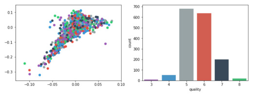
Plots
For visualization purposes, the number of dimensions was reduced to two by applying MDS method with cosine distance. The plot illustrates that our classes are not clearly divided into parts.
model = MDS(random_state=rnd_state, n_components=2, dissimilarity='precomputed')
%time representation = model.fit_transform(pairwise_distances(data.iloc[:, :11], metric='cosine'))
Wall time: 38.7 s
colors = ["#9b59b6", "#3498db", "#95a5a6", "#e74c3c", "#34495e", "#2ecc71"]
plt.figure(figsize=(12, 4))
plt.subplot(121) plt.scatter(representation[:, 0], representation[:, 1], c=colors)
plt.subplot(122) sns.countplot(x='quality', data=data, palette=sns.color_palette(colors));
Output:
predictors = data.iloc[:, :11]
target = data.quality
(predictors_train, predictors_test, target_train, target_test) = train_test_split(predictors, target, test_size = .3, random_state = rnd_state)
RandomForest classifier:
list_estimators = list(range(1, 50, 5)) rf_scoring = [] for n_estimators in list_estimators: classifier = RandomForestClassifier(random_state = rnd_state, n_jobs = -1, class_weight='balanced', n_estimators=n_estimators) score = cross_val_score(classifier, predictors_train, target_train, cv=5, n_jobs=-1, scoring = 'accuracy') rf_scoring.append(score.mean())
plt.plot(list_estimators, rf_scoring)
plt.title('Accuracy VS trees number');
Output:

classifier = RandomForestClassifier(random_state = rnd_state, n_jobs = -1, class_weight='balanced', n_estimators=20) classifier.fit(predictors_train, target_train)
Output:
RandomForestClassifier(bootstrap=True, class_weight='balanced', criterion='gini', max_depth=None, max_features='auto', max_leaf_nodes=None, min_impurity_decrease=0.0, min_impurity_split=None, min_samples_leaf=1, min_samples_split=2, min_weight_fraction_leaf=0.0, n_estimators=20, n_jobs=-1, oob_score=False, random_state=4536, verbose=0, warm_start=False)
prediction = classifier.predict(predictors_test)
print('Confusion matrix:\n', pd.crosstab(target_test, prediction, colnames=['Predicted'], rownames=['Actual'], margins=True)) print('\nAccuracy: ', accuracy_score(target_test, prediction))

feature_importance = pd.Series(classifier.feature_importances_, index=data.columns.values[:11]).sort_values(ascending=False) feature_importance
Output:

et_scoring = [] for n_estimators in list_estimators: classifier = ExtraTreesClassifier(random_state = rnd_state, n_jobs = -1, class_weight='balanced', n_estimators=n_estimators) score = cross_val_score(classifier, predictors_train, target_train, cv=5, n_jobs=-1, scoring = 'accuracy') et_scoring.append(score.mean())
plt.plot(list_estimators, et_scoring) plt.title('Accuracy VS trees number');
Output:

classifier = ExtraTreesClassifier(random_state = rnd_state, n_jobs = -1, class_weight='balanced', n_estimators=12) classifier.fit(predictors_train, target_train)
ExtraTreesClassifier(bootstrap=False, class_weight='balanced', criterion='gini', max_depth=None, max_features='auto', max_leaf_nodes=None, min_impurity_decrease=0.0, min_impurity_split=None, min_samples_leaf=1, min_samples_split=2, min_weight_fraction_leaf=0.0, n_estimators=12, n_jobs=-1, oob_score=False, random_state=4536, verbose=0, warm_start=False)
prediction = classifier.predict(predictors_test)
print('Confusion matrix:\n', pd.crosstab(target_test, prediction, colnames=['Predicted'], rownames=['Actual'], margins=True)) print('\nAccuracy: ', accuracy_score(target_test, prediction))
Output:

feature_importance = pd.Series(classifier.feature_importances_, index=data.columns.values[:11]).sort_values(ascending=False) feature_importance
Output:

Thanks For Reading!

0 notes
Text
assignment-2
Data
The dataset is related to red variants of the Portuguese "Vinho Verde" wine. Due to privacy and logistic issues, only physicochemical (inputs) and sensory (the output) variables are available (e.g. there is no data about grape types, wine brand, wine selling price, etc.).
The classes are ordered and not balanced (e.g. there are munch more normal wines than excellent or poor ones). Outlier detection algorithms could be used to detect the few excellent or poor wines. Also, we are not sure if all input variables are relevant. So it could be interesting to test feature selection methods.
import pandas as pdimport numpy as npimport matplotlib.pylab as pltfrom sklearn.model_selection import train_test_split, cross_val_scorefrom sklearn.ensemble import RandomForestClassifier, ExtraTreesClassifierfrom sklearn.manifold import MDSfrom sklearn.metrics.pairwise import pairwise_distancesfrom sklearn.metrics import accuracy_scoreimport seaborn as sns%matplotlib inline rnd_state = 4536
1 note
·
View note
Note
Do you have different favorite colors?
We all agree on a True Favorite (purple), but after that our color preferences differ to various degrees. The four of us generally agree overall on what colors we like more than others, but we can disagree on the specifics.
What you might find interesting is that we also each have a specific color associated with us: Mikaela is red, Lily is blue, Violet is purple, and Ciri is green. These definitely influence our color preferences too (or the other way around? Who knows). For example we tend to prefer darker blues, but Lily (whose color is #3498db) likes lighter shades of blue significantly more than the rest of us~
Thanks for the question!
#plurality#dissociative plurality#asks#Qyriad#hopefully that answer makes sense?#if it doesn't or you're still curious feel free to send more asks
2 notes
·
View notes