#2d/3d style animated films
Explore tagged Tumblr posts
Visit Tumblr Blog
Explore Tumblr blogs with no restrictions, modern design and the best experience.
Last Seen Tumblr Blogs


Fun Fact
Tumblr has been providing a Korean-language service since 2013.
Text
I will probably remake this poll at the end of the year to include Mutant Mayhem and Wish.
#polls#2d/3d style animated films#the peanuts movie#captain underpants: the first epic movie#spider man: into the spider verse#the mitchells vs the machines#the bad guys#puss in boots: the last wish#spider man: across the spider verse#nimona#blue sky studios#dreamworks#sony animation#netflix
117 notes
·
View notes
Text
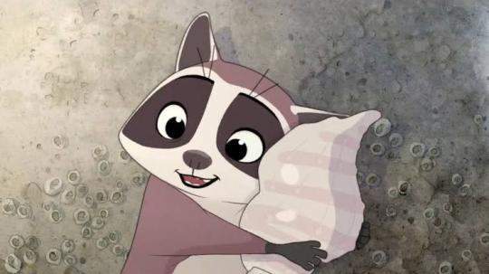
Just finished Earwig and the Witch. hmmm. 1stly, honestly, liked the animation style a lot. Main reason I decided to watch it was bcuz I saw a video complaining about it. I just don't see the issue. I love 3D animation even when its kinda bad, but that's not the case here.
It's an adaption of the ghibli style, but it's also its own thing right. If u can't meet it where its at(wishing it was something else), it'll always look off. Personally, I felt it looked like an improved Monster House with the 'figurine in playset' vibe of something like Thomas the Tank Engine. The modeling/texturing was gorgeous(the glass windows <3). It was much better than I was expecting.
Plotwise, I just don't get why they spent so much time w/ Earwig at the bottom. The progression to her takeover was not satisfying. So much suffering, not enough payoff(same w band reveal). That kinda hindered my enjoyment. (they just skip to the win... I wanted to see them fall in love w/ her :[ she's charming. she could do it.)
3/5 fits how I feel about it. (I liked Earwig + gags were silly :J)
#movie gen#animated film gen#there's literally so much to say about 3d animation styles#exaggerated style -> Arcane/Spiderverse vs. Generic Pixar-esque style#All good but one is more saturated market-wise#2D has similar generic saturation issues but the allure overshadows imo#like the same type of detailed backgrounds regardless of character design <- actual pet peeve lol#like whered the watercolor go#sailor moon OG vs crystal... like the difference in background art... staggering#huge loss of aesthetic#rather than exagerrated i meant distinct or abnormal
1 note
·
View note
Text
What is GitHub?
Vimeo
0 notes
Text
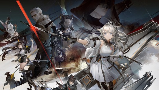
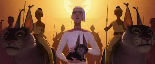
The Evolution of Style in 3D Film
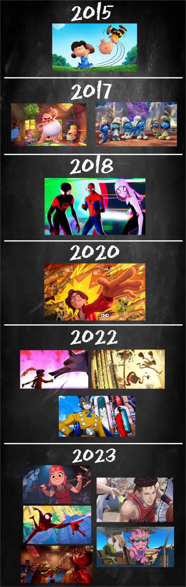
I wanted to show how much theatrical animation has changed in the last few years. Incorporating 2D elements has always been attempted but was rare and went unnoticed. That’s not the case anymore with more adopting it, anime too!
#animation#Sony animation#blue sky#dreamworld#nickelodeon#the peanuts#captain underpants#the smurfs#into the spider verse#spider-verse#the mitchells vs the machines#puss in boots#the bad guys#dbs super hero#nimona#spider-man: across the spider-verse#tmnt mutant mayhem#the first slam dunk#sandland#cel-shaded#art direction
7K notes
·
View notes
Text
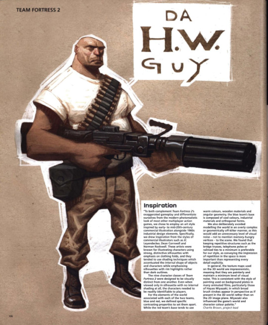

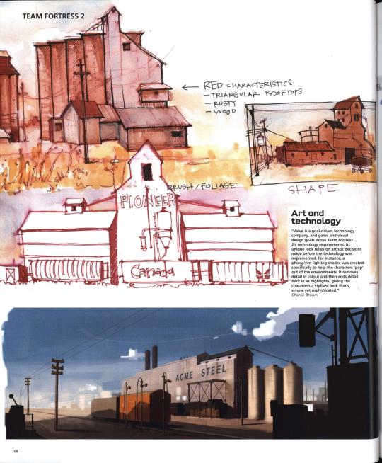

Team Fortress 2's concept art featured in The Art of Videogames (2007)
A transcription of the paragraphs shown can be found below.
Inspiration
"To both complement Team Fortress 2's exaggerated gameplay and differentiate ourselves from the modern photorealistic look of most other multiplayer action games, we chose to employ an art style inspired by early- to mid-20th-century commercial illustration alongside 1960s industrial design elements. Specifically, we drew inspirartion from the styles of commercial illustrators such as JC Leyendecker, Dean Cornwell and Norman Rockwell. These artists were known for illustrating characters using strong, distinctive silhouettes with emphasis on clothing folds, and they tended to use shading techniques which accentuated the internal shape of objects and characters while emphasising silhouettes with rim highlights rather than dark outlines. The nine character classes of Team Fortress 2 were designed to be visually distinct from one another. Even when viewed only in silhouette with no internal shading at all, the characters needed to be readily indeitifiable to players. For elements of the world associated with each of the two teams, blue and red, we defined specific contrasting properties to set them apart. While the red team's base tends to use warm colours, wooden materials and angular geometry, the blue team's base is composed of cool colours, industrial materials and orthogonal forms. We also deliberately avoided modelling the world in an overly complex or geometrically off-kilter manner, as this would add an unnecessary level of visual noise — not to mention memory-hungry vertices — to the scene. We found that keeping repetitive structures such as the bridge trusses, telephone poles or railroad ties to a minimum is preferable for our style, as conveying the impression of repetition in the space is more important than representing every detail explicitly. In general, the texture maps used on the 3D world are impressionistic, meaning that they are painterly and maintain a minimum level of visual noise. This is consistent with the style of painting used on background plates in many animated films, particularly those of Hayao Miyazaki, in whic broad brush strokes appear in perspective as if present in the 3D world rather than on the 2D image plane. Miyazaki also influenced the game's world and character colour palette." — Charlie Brown, project lead
Art and technology
"Valve is a goal-driven technology company, and game and visual design goals drove Team Fortress 2's technology requirements. Its unique look relies on artistic decisions made before the technology was implemented. For instance, a phong/rim-lighting shader was created specifically to help the characters 'pop' out of the environments. It removes detail in colour and then adds detail back in as highlights, giving the characters a stylised look that's simple yet sophisticated." — Charlie Brown
Bold outlines
"The specific characteristics we needed were mostly dictated by Team Fortress 2's gameplay. Foremost, we wanted players to be able to intuit each character's unique gameplay features at a glance. The Heavy Weapons character, for example, had to quickly convey strength, sturdiness, slowness, and the ability to pack a real wallop. To further aid in quick readability, each character class requires a bold, distinct silhouette shape." — Charlie Brown
#Thought this was important to transcript since it contains important information for people who r interested in studying this game's style!#tf2#team fortress 2#concept art#valve#character design#type: concept art#type: environment
396 notes
·
View notes
Text
Animation Night 189: Nonphotorealistic
There is a funny trend in animation-related terminology to define things by what they aren't. Animation is any technique for creating film that isn't live action. Limited animation is any style of 2D animation that doesn't follow the conventions of Disney's 'full animation' on 1s and 2s - a category that includes a wildly diverse range of approaches and techniques, as this wonderful history by Animation Obsessive describes.
In 3DCG circles, there is a similar term: nonphotorealistic. Which describes, naturally, anything that isn't trying to look like a photograph of a real scene. There has been a real boom in this of late, and just like the other terms, it really doesn't narrow it down very much. Other terms like 'hybrid animation' add a bit more hints.
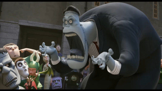
Of course, if you've been anywhere near animation in the last few years, you'll probably know another term: 'Spiderverse style'.
There is no denying that Spider-Man: Into the Spiderverse (2018) by Sony Pictures Animation was an absolute landmark for animation. (I wrote about it way back on AN21, focusing more on the cultural angle.) The ludicrously stylish film pretty much set the direction for animation in the 2020s - making a bunch of money and awards and thus finally throwing open the door to 3DCG animation that doesn't look like the style set by Pixar/Dreamworks in the 2000s. Its sequel, Across the Spiderverse (2023), was even more ambitious and successful (despite a troubled production involving a lot of needless crunch). We'll be showing that soon in a Spiderverse double bill so look forward to it!
So perhaps not surprising that when people see the use of graphical styles, 2D elements, limited framerates and the like in 3DCG these days, Spiderverse comes to mind. In its wake have come various films and series that apply these and related techniques: 3DCG animation is more varied than ever, and it's cool.
It isn't really a style, tho.
youtube
Here I'm indebted to youtuber Camwing who has made a nice video overview breaking down the animation of recent movies in this vaguely defined paradigm. Among them we have The Mitchells vs the Machines (2021, also Sony), Puss in Boots: The Last Wish (2022, Dreamworks), and Teenage Mutant Ninja Turtles: Mutant Mayhem (2023, animated at the French/Canadian studio Mikros animation), and of course over on Netflix you got the wildly popular League of Legends spinoff series Arcane (2021, Fortiche Productions), and the romance film Entergalactic (2022, DNEG), tying in with an album of the same name.
None of these films has exactly the same style, but they all pull from a related bag of tricks. The core techniques are animating on reduced framerates for a 'snappy', high-clarity feeling, the combination of 2D and 3D elements in some fashion, and taking inspiration from traditional media such as paintings or comic books.
For example, Arcane and Entergalactic both use the trick of 2D backgrounds/projecting paintings onto 3D geometry, inhabited by 3D characters with a stylised shader. Arcane is dripping with 2D visual effects. Puss in Boots drops the framerate during its action scenes - the opposite of the old paradigm of full animation, where fast actions would get more frames. Spiderverse draws 2D expressions onto its 3D models to push them further, and is full of all kinds of colourful stylised rendering - screentone effects, kirby dots, outlines, the works.

It's tempting to link this to 2D-in-3D animation, and certainly many of these films apply this technique - this is the major niche where Blender has found its way into industry pipelines. But using 2D isn't mandatory to count here. For example, TMNT Mutant Mayhem has an incredibly striking storybook-painting style, accomplished largely by clever shader work and a strong sense of graphic design. Genndy Tartakovsky's canned 2014 Popeye project was planning to use a ton of 2D-style posing and squash-and-stretch, accomplished largely with rigged 3D models. There are many paths to take!
And mind you, I haven't even covered one of the biggest angles here. Search for nonphotorealistic 3DCG on Youtube and what you'll probably find most is information about cel-shading - aka 'anime style'. This has also advanced considerably in the last few years, with the techniques pioneered by Arc System Works in Guilty Gear such as editing the normals of characters for more precise control over shading, and minute adjustments to break up the mechanical feeling of 3D, becoming widely copied in both games and films. (And particularly, animated porn.)
youtube
Vtubers in particular have really run with this technique, generally speaking using cel-shaded models with edited normals, inverted eyes, etc. etc. to try and get the feeling of an anime character come to life. [You can see a lot of these state of the art techniques if you download Pixiv's free VRoid Studio software and import the model into Blender using the VRM plugin.]
Naturally this kind of cel-shaded approach has found a particular home in Japan. In anime, the biggest champions of it are certainly Studio Orange, whose hybrid approach involves planning out shots with 2D animation before matching them with the rigs. We've covered their adaptation of Houseki no Kuni in great detail on Animation Night 97; their Trigun reboot was perhaps even more popular. But cel-shaded techniques, 3D previs and the like have also made their way into big films like Eva 3.0+1.0 (AN66).
Although this type of rendering aims to recreate the look and feel of 2D animation as much as possible, it always ends up being something new: character models that would be too complex to draw, an ease to 3D movements and camerawork that would be challenging in 2D, and generally a new hybrid style. This is good! 2D animation is already very good at being 2D animation - it's fascinating to see what 3DCG becomes with that inspiration.
So with that brief overview, where does that take us tonight?
I'm not quite ready to do a Spiderverse double bill tonight, so instead the plan is to check out a couple of recent American franchise films that are taking on the new suite of techniques. I've mentioned them up above, but let me introduce them more fully here.

Puss in Boots: The Last Wish is a sequel to a fairly unpopular spinoff about a side character of the Shrek franchise (AN75). Not, on its face, very promising - which is why it is all the more striking that I was told on all sorts of sides that I must watch this movie. I'm finally going to make good on that.
The title character is a kind of feline musketeer type, now facing the end of his swashbuckling career as he's lost 8 of his 9 lives. Not wanting to hang up his hat, he goes on a quest to restore them. What makes it stand out its the action scenes, which go all in on the anime-influenced, extreme perspective and lighting, limited framerate style that we're discussing above. Apparently it looks sick as shit.

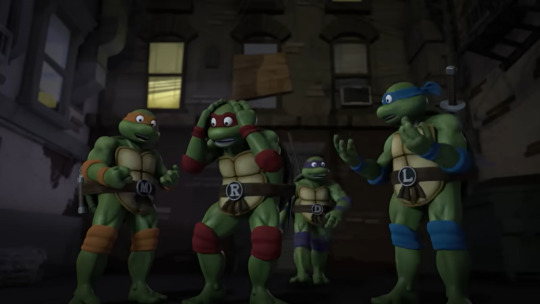
Teenage Mutant Ninja Turtles: Mutant Mayhem is a fresh reboot of the venerable TMNT franchise, which pretty much describes itself in the title: four turtles (named after Renaissance painters, of course!) live in a sewer as ninjas, led by their aging master who is a rat. Starting as a comic book, it became one of the iconic toyline-driven TV shows of the 80s - but it's still going! Indeed, Turtles has been on a roll of late (at least going by animator scuttlebutt), with Australian studio Flying Bark Productions turning a lot of heads with their neo-Kanada School style (and for really stretching the definition of 'storyboard').
This new film takes a different approach to the bombastic action of Rise. It focuses on a new origin story for the turtles, telling a kind of coming of age story - but what makes it unique is the animation style and cinematography. Cinéma vérité is not a phrase you really expect to be associated with ninja turtles, but the film seems to really go all out in a way you wouldn't really expect from a franchise movie, shooting the young turtles in a handheld style and focus heavily on character. Marcel Reinhard's shader work, allowing the animators to isolate lights to specific objects and characters and introducing graphical elements of cross-hatching, stippling, etc. etc. to the lighting, gives it a uniquely painting-like feeling, augmented by a lot of 2D creativity in lighting and effects.
Turtles has never really been my thing, but this film looks unique enough that I really want to see it - and I hear it's a good film too.
So that's our bill for tonight! Puss and Turtles. Let's see what the big studios have been cooking of late...
Animation Night 189 will be starting around 10pm UK time (roughly three hours hence) and carrying on til about 2-3am same! We'll be on twitch.tv/canmom as usual. Hope to see you there!
154 notes
·
View notes
Text
Hello! Here's an update on all of Arknights' currently accessible auxiliary material as of May 2024! There's plenty to check out, so I hope this is helpful for some!
Animation
Arknights Prelude To Dawn (S1) and Perish in Frost (S2): [Crunchyroll]
An adaptation of the main story, up through Chapter 0 to Chapter 6! It's much more fast-paced than the in-game story, so I wouldn't use it to replace actually reading it, but it's very cool to see some of these scenes in full animation. Season 3, Arknights: Rise from Ember, has been announced! Lee's Detective Agency: [Youtube]
A mini-series animated in a chibi style with a comedic tone. Focused on the adventures of the Kuroblood-illustrated Lee's Detective Agency! Distributed by Crunchyroll globally, but entirely free to watch.
Closure's Secret Files: [Youtube]
A cut-out styled series of shorts hosted by Closure which outlines a lot of the game's basic mechanics!
Holy Knight Light: [Youtube]
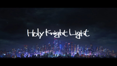
A short OVA focusing around Penguin Logistics delivering a package, celebrating Arknights' first anniversary. Officially posted to Youtube!
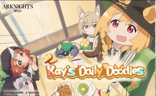
Kay's Daily Doodles: [Youtube]
Another free, comedic Youtube mini-series, posted to the offical Arknights Youtube account and focused around Ceobe! Here's some additional animations! Each event usually also has a 15 second 2D animated preview of the event, but there's so many of those that I can't list them all. Anniversary Event 3D Animations: Zwillingstürme im Herbst So Long, Adele Lone Trail Where Vernal Winds Will Never Blow Il Siracusano Ideal City Stultifera Navis Invitation To Wine Near Light Dossoles Holiday Under Tides Bonus 3D Animated Shorts: Legend of Chongyue Arknights Special - IL Siracusano Lo Scontro Youtube Shorts: Ch'en and Lin's Watermelon Splitting Game Part 1 Ch'en and Lin's Watermelon Splitting Game Part 2 Amiya's Siracusan Food Guide Part 1 Amiya's Siracusano Food Guide Part 2 Amiya's Special Gift Doctor's Gifts in Return 1 Doctor's Gifts in Return 2
Comics, Manga, Manhua
Officially Translated:
Rhodes Island's Records of Originium: Rhine Lab: [Offical Source]
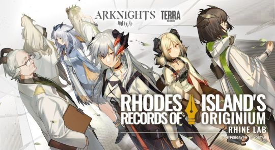
A canon manhua centered around the circumstances that lead to Silence falling out with Saria and joining Rhodes Island with Ifrit, as well as Ifrit's attempt to save a dying infected stowaway on the landship. Essential reading for understanding the Rhine Lab storyline and characters - read it right after Mansfield for when it was chronologically released! One of the characters, Darya, is mentioned in both Ifrit's module and briefly in Lone Trail.
Rhodes Island's Records of Originium: Blacksteel: [Official Source]
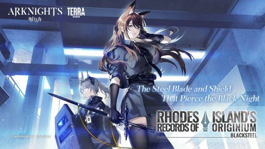
A short story focusing on the lives of the Blacksteel operators aboard the landship. While it often gets overshadowed by the Rhine Lab manga which is bigger in scope, this is a great read especially if you're interested in Franka or Liskarm.
Rhodes Kitchen -TIDBITS-: [Official Source]
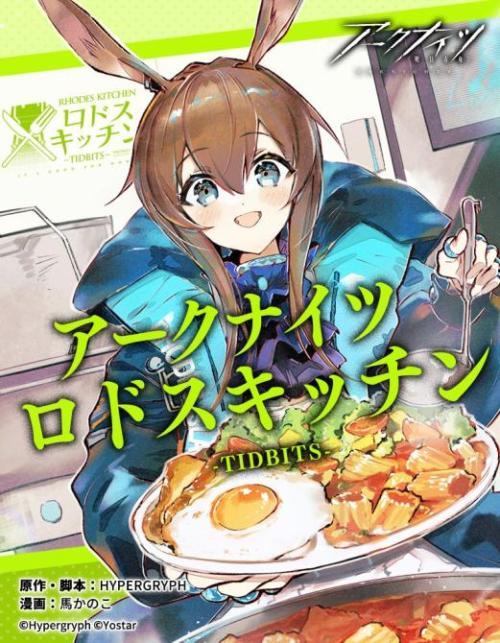
An anthology story related to the cuisine that's important to a variety of operators. While it might seem unassuming, the art is gorgeous and it's really well-written! The Blacksteel, Rhine Lab, and Rhodes Kitchen manga have all been sold in physical copies, if you're interested in having them in print!
Prelude Suite: Cadenza Virtuosa: [Official Source]
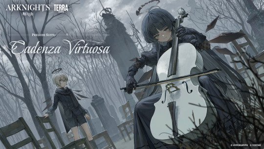
An epilogue to Hortus De Escapismo focusing on Arturia's background, with the second chapter serving as a prelude for Zwillingstrume im Herbst! An excellent read to get better insight into Arturia's character.
Angelina: Sketches of this Messenger's Journey: [Official Source]
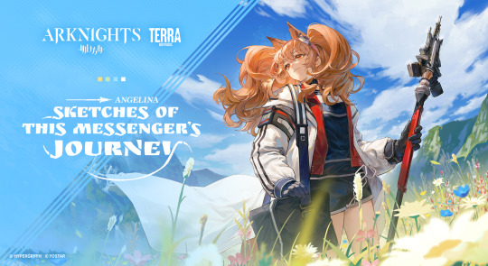
A more comedically focused manwha, centered on the adventures of Angelina travelling across Terra as a Messenger! Currently updating, with recent chapters focusing on Sami and Siesta!
Unofficially Translated
The Dagger's Inheritors: [Youtube]
A 15-minute short 3D animated film about W's past and relationship with Theresa, released for the 5th Arknights anniversary. Arknights Comic Anthology: [Mangadex]
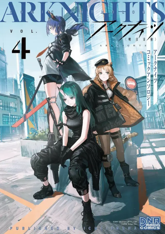
As the title says, a series of non-canon anthology stories regarding the cast of Rhodes' Island! Some of the chapters on Mangadex for the later volumes of the Comic Anthology specifically have been machine translated, but the same is not true for the other manga shared here. Chapters are hit-and-miss, but the whole series is generally a fun read! See the original post for specific chapter suggestions.
123 Rhodes Island: [Mangadex]

A series of non-canon gag comics for the CN server, usually updated when new operators or events release!
Arknights: Operators!: [Mangadex]
A compilation of shortform manga posted on the official ArknightsJP twitter account! Thank you to @sleepywoodscans for their work on personally translating these!
Arknights: A1 Operations Preparation Detachment: [Mangadex]

Part of the Terra Historicus website and not yet officially translated, focusing on Fang, Kroos and Beagle before they join Rhodes Island, and a catastrophe striking the Columbian city of Tkaronto. Thank you to @pooce-art for their translation work!
Other:
Arknights Ambience Synesthesia: [Youtube]

A series of concerts (4 so far), focused around Arknights' music! A live performance has been done every year, with skins released in-game for the concert's theme & 3D animations produced featuring the skin's cast in 2022, 2023, and 2024.
Monster Siren Records: [Spotify] [Official Website]
Arknights' official (and-in-universe) record label publishing game OSTs, themes for almost every 6 star operator that releases, and occasional bonus songs.
Arknights: Endfield: [Twitter]
An upcoming 3D action gacha game from Hypergryph, set in the far future of Arknights' universe on another planet. Currently in closed beta testing for both EN and CN servers!
UNOFFICIAL:
Some fandom-developed tools that might be of use to you are: The Arknights Terra Wiki. While it is a very accurate source for in-game data, take the explanation of in-game story and some specific claims with a grain of salt. The FANDOM version of this wiki is currently no longer mantained and subject to vandalism! Given you can translate or read Chinese, PRTS.wiki is the current best resource for game assets!
As well, the Arknights Story Reader can help you catch up on stuff you don't want to or can't read in game! Jacob Moreau on Youtube provides voiceover readings of many in-game stories as well.
Finally, Aceship's Toolbox provides access to a variety of tools, including a levelling calculator, a calculator to ensure the best recruitments, and all the CGs, backgrounds and character sprites that are available in-game as of So Long, Adele (as far as I'm aware, the sprite/cg gallery is no longer being updated.)
Conclusion:
Thank you for reading! I hope this provided some new information to you or is an easy reference source in the future. Some things, such as merch (i.e. board games) or the official lore book have not been included due to not being accessible or translated for EN players. I'm happy to continue to provide more information like this to make the art surrounding this series more accessible! If you have any questions, feel free to send me an ask.
#arknights#i thought about just editing the original post but i felt like an update was in order! hope this is helpful to some people as the first one#was#:D#if there's anything i missed#let me know! and i'll edit it in#not as comprehensive but a little more concise than the previous version
369 notes
·
View notes
Text
You know what I'm impressed by? 3D animation looking like it's 2D. And I don't mean 3D animation giving cell-shading like you'd see with Borderlands, TellTale games, and Marvel Studio's What If...? I mean stuff like this:
Taking the fluid, snappy, and often overly expressive shots you'd see in a 2D, hand-drawn cartoon, but giving it a 3D makeover.
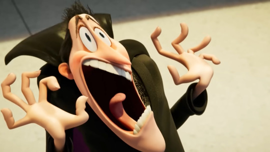
This is a tactic I feel like got popularized by the Hotel Transyvania series. Genndy Tartakovsky, the goat of animation, directed the first movie like he would for his 2D works, having motion and models that were often stiff and slow for the moments they needed to be, but can also look snappy and expressive like any hand drawn cartoon would to make the scene more comedic.

Now, that's not to say there haven't been attempts in the past. Hell, even Laika has tried to do the same thing in stop-motion:
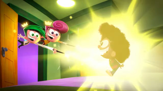
But it's with Hotel Transylvania that I feel like this tactic really started taking steam, being that thing that pushes the envelope of animation just a bit farther. It's not a tactic that's as realistic or as heavily detailed as your other favorite animated films, but it's still impressive in its own right. Because, you see, it's not as simple as making a character that should be 2D and just giving them a 3D model. Just look what happens when animators put Timmy Turner into the world of Jimmy Neutron or making the 80s Ninja Turtles team up with the 2012 ones:
It creates this weird uncanny effect looking at something that was MEANT to be hand-drawn and giving it that third dimension it was never intended to have. Granted, this is all to have the characters fit in with another show's art style, but you can tell that it doesn't work because it's not supposed to.
That's why when a CGI animated project tries to look 2D, they keep the idea that it has to look good, regardless if it was hand-drawn or CGI. To accomplish that requires both changing and altering the models the right way and knowing where the camera is facing. Take this one shot from The Amazing Digital Circus:
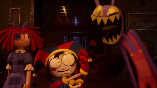
Here's what it looks like from the side:
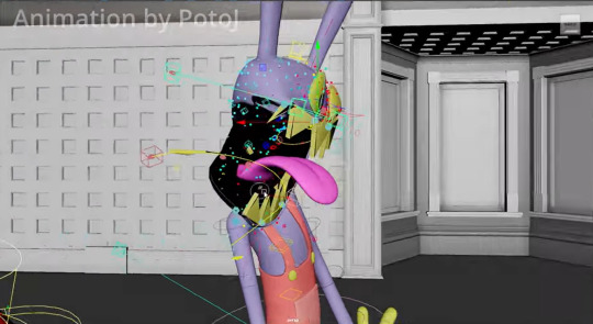
From behind:
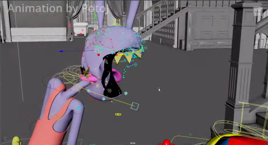
And from the other side:
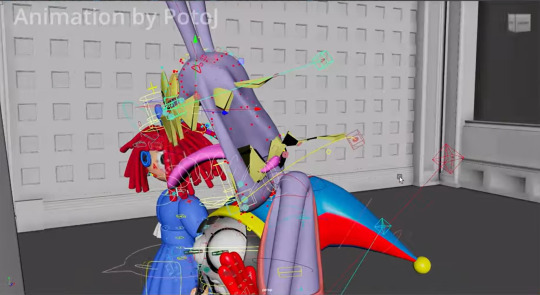
Shout out to animator Protj for giving this neat behind the scenes detail. Check out their whole showreel of Episode Three for yourself, by the way.
And yeah, this shows why this type of animation style is often difficult to pull off. Anyone could have just DRAWN a shot like that, but to shift the model in such a way where it mimics the style is impressive all on its own. It's so much more hard work, all done for no reason at all aside from style points. They could have done this in 2D and it would have been just as fine, but sticking to it being CGI, it shows an extra level of dedication to the craft that I can't help but applaud over. I'm impressed with looking as real as possible, but there something so much more impressive about a CGI show or movie looking as cartoonish as possible.
#hotel transylvania#fairly oddparents a new wish#spider man into the spider verse#the amazing digital circus#storks movie#coraline#paranorman#animation appreciation
71 notes
·
View notes
Text

I haven’t watched the video but I’d like to argue with this title
It’s not that 2D is better than 3D, it’s that artistic animation will always be better than photo-realistic animation
For example, Puss In Boots: The Last Wish is a better film than its predecessor Puss In Boots in terms of it’s animation. While the original spinoff leaned into the realistic style of Shrek, the sequel embraced its artistic value and created something more animated and beautiful
And both those movies are 3D animated! There is nothing wrong with CGI animation, it’s just another form of the medium. 2D animation comes with a lot of nostalgic fondness, but it’s also valued greatly for its smooth movement in hand-drawn works and the authenticity of it being drawn directly by people. This does not invalidate the use of 3D animation, however
The problem with the “live action” Lion King films is that they lack the artistic value the original films had, not that they’re three-dimensional. Animation is animation, and claiming that one form is superior than another is canonically a form of racism in The Amazing World Of Gumball (there’s a scene where “drawn” people are mentioned being from a “flat country” and that claim is “2D-ist”)
I just had to rant cause that title sucks
#the roundtable#animation#rant#the lion king#mufasa#disney#puss in boots#puss in boots the last wish
37 notes
·
View notes
Text
It's funny how WISH was criticized for having "bad animation." The claims made by faux critics is that it's copying Spider-verse.
Anyone who's actually known about animation other than being a "fan" knows that Spider-verse does not own the "hybrid 3D-2D" style. Hell, The Last Wish was literally praised for "imitating it."
This is interesting because in the late 2000's, Disney had originally made Tangled, back then as "Rapunzel Unbraided" to look like a moving painting.
youtube
They scrapped this idea because they don't have the technology for a software at the time, but still kept the hand drawn vibes on the character design.
Heck, Disney even made short films to test if they can make a full film in this hybrid style. WISH just happens to be the perfect film for them to make a full feature in this style of animation.
They even use the style in some of their movies in brief scenes like in Raya and Strange World.
Other criticisms about WISH's animation that it looks like Sofia the First or that it's colorless are just goat crap complaints mostly because "it's different".
The "rumor" that WISH was originally going to be animated in 2D is just false. Disney had numerous made statements that most of their newer original films were intended to be animated in hand drawn, but don't have the time and budget to do so. "Oh, they're a billion dollar company, why can't they just hire hand drawn animators?" Simple reason, either they are retired, working on other projects, teaching at art schools or are still working at Disney, doing character animation for the 3D artists to follow. So, making a film purely for the sake of "bringing back 2D animation" is not worth getting these animators back.
2D animation was DYING during the 2000's. The reason why Princess and the Frog failed to bring 2D animation back was because of its writing, being released alongside Live Action Pocahontas Blue Edition, and that its mostly tied to the Disney staples that were criticized at the time.
Even if WISH was 2D animated, people will still criticize it. Which just shows that the animation alone, regardless of style cannot carry a movie.
Dismissing a work and calling it A.I garbage all because you hate the company behind it is just apathetically insulting the artists and animators who are just doing their job. A job that they are at risk losing to the things you are comparing them to.
#disney wish#wish 2023#wish movie#wish#paperman#raya and the last dragon#tangled#rapunzel unbraided#strange world#Youtube
66 notes
·
View notes
Text
So something I realized watching a few videos and reading a few articles is that most of us aren’t angry at the idea of AI in general. Many of us are excited to learn about AI systems that can identify cancer better than doctors, for instance.
What we’re angry about is generative AI being used to destroy the jobs of artists (and I mean all creatives here), who have already been dealing with their work being devalued by modern society.
And I’m not sure how to deal with it. I do remember learning that when photography became a thing, many painters were horrified and terrified of would erase the art of painting. It didn’t obviously, and in fact photography because a whole new art form.
I grew up during the birth of digital art. I distinctly remember the phase digital art went through where many people declared it to not be “real art” and that it was “cheating” etc. I’m sure other millennial artists also remember this transition. But graphic designers pretty quickly adopted digital tools, and websites like DeviantArt popped up, and I don’t think there are too many people nowadays who would say a digital painting isn’t “art”. Still, I do imagine there is a gulf between how some people would view the “artistic merit” of a 3 ft tall oil painting hanging next to a 3 ft tall print of a digital painting, even if the subject and styles were similar. So the worries that digital art would erase physical painting was also proven false. And for the record, I think digital art is 100% art. The merit of digital art is equal to that of physical art.
On the other hand, I can’t say these changes didn’t affect older forms of art. Like, photography did affect the world of painting. I don’t have statistics, but it seems like it probably affected the world of portraiture the most. And I wonder if many of the 20th century art movements were influenced by photography. None of my art history classes touched on that and it’s kinda weird to me. There is definitely something about a Dada or cubism or surrealist painting that transcends beyond what a traditional photo of a landscape or a portrait can do. There is no location in the real world with actual melting clocks or people whose faces show multiple angles at once.
And then there was the digital photograph that changed everything again! Film has become a niche art form.
There were specific kinds of jobs lost due to the digital transition, too. I’m thinking of things like murals being replaced by printed banners, or book covers often being done in photoshop. Oh, and that’s another tool that was faced with fear: Photoshop! There was a fear it would destroy the need for professional photographers because everyone could just fix their own photos. Turns out nope, and in fact people skilled in photography and photo editing are still in demand. And of course there’s the loss of 2D animation in favor of 3D animation, the loss of practical effects for digital, etc.
And you might argue that in some of those cases people can tell corners are being cut and that they won’t stand for it, but Marvel movies still make billions of dollars so…
So I don’t know what’s going to happen with AI art. I am NOT saying “all current artists are stupid and wrong, in the future history students will laugh at how stubborn they were to resist this idea”. AI art is not comparable to photography or digital painting.
With a photograph, you still need to compose the image in the frame, you need to position yourself in the real world, you need to know your equipment, whether you’re using film or digital. You also need to know how to process that photo either in the dark room or in Photoshop. These are skills the average person does not have. You cannot tell an AI “that shot was good but can you increase the contrast?” It’ll just produce a completely new image.
I read an article about an art director who was encountering difficulties as the department tried to incorporate AI. They got back first drafts of art ideas from the people employed to work with the AI, gave critique, and the second round was just completely new images that didn’t include the suggestions… because they couldn’t. AI does not understand color theory. It does not have the ability to take critique. It can’t slightly alter the layout of a design.
And all of that applies to painting too. AI (currently) can’t do what a trained art student can do. It doesn’t know that to create a sense of atmosphere you should make distant objects bluer. It doesn’t know how to use human physiology and psychology to draw a viewer’s eyes across a large painting to reveal a story.
AI also can’t replicate INTENTION - and intentionality is a HUGE part of art. WHY an artist chose those colors, that medium, that composition, those tools, why they chose to display it a certain way, why the composition is like this instead of that - all of that adds meaning to the painting that you can’t get with AI.
(Yes, there is an absolutely valid field of art critique that evaluates a piece of art on its standalone value and the message it conveys without the context of the artist’s intent, but that should be compared to the analysis that DOES include the artist’s intent! That comparison can bring about so much understanding!)
Anyway I’m going to end this post now because it has gotten WAY too long. I focused mostly on painting and photography in this post because those are my particular fields of speciality, but this applies to ALL ART. It applies to music and writing and scripting and acting and composing music and just. Everything. All art.
I don’t think there are any forms of art AI doesn’t threaten. Now granted, AI can’t currently pick up a paint brush. It can’t use a crochet needle. It can’t hold a camera. And maybe there will be some sort of return to physical media in response to AI produced digital art. Or maybe there will be a response in digital art to stylistically distinguish it from AI in a way AI can’t reproduce. I’m not sure what will happen. Maybe some proof the image was digitally painted by a real person, somehow. Or that it’s a real photo, or a real article. I saw someone mention there may end up being labels like “100% human made” like we do for organic food lol. Maybe work in progress videos or photo metadata will become more commonplace as evidence of authenticity.
Anyway, NOW I’m ending this post. Whew.
106 notes
·
View notes
Text
A handful of random thoughts about the "Ultraman: Rising", with some vague, marked spoilers here and there:
I like the fact that they didn't explain kaijus or where Ultraman came from. After so many superhero origin stories where we have to be slowly introduced to the existence of the supernatural, it's refreshing to get dropped in the middle of a "second-gen" (unclear how many generations of Ultramen exist in this universe so far) superhero's story. The movie isn't apologizing for its genre or its premise. It just goes, "Yeah, you know what a superhero is and what a kaiju is, so let's go already. No, we're not even really going to explain how Ultraman's powers work. That's not what this is about!!! It it about our protagonist's daddy issues!!! Keep up!!!"
If I think about the world building, I do have some questions, like who built the protagonist's fancy tech house that's also a superhero base, but it's not too important. I assume his dad built it and then moved out to give his kid space? OR: "Why do the kaijus seem to attack this place specifically?" This movie works mostly because it's like "this is classic superhero stuff and we're just not dwelling on the logistical setup too much"! It leaves you to fill in some blanks on your own or just suspend your disbelief, which works.
The pacing was a little weird in places and the movie does get a little ridiculous in parts, I'm never quite sure of what the capabilities of these characters are, but it's a superhero vs. kaiju animated movie and that's to be expected. I still enjoyed myself well enough.
A few of the character designs didn't super work for me, like the big-headed kid characters. The kaiju baby is maybe a little too cutesy, but she was very cute and I've forgiven them because they didn't shy away from babies being gross. (There is... A LOT of baby kaiju vomitting.)
I did really like some of the other character designs. I liked the protagonist's big nose and pierced ears and bangs falling in front of his sharp face; he looks like such a dirtbag pretty boy. I like the lean in the industry right now towards more stylized and geometric 3D character designs in general, because I think that the shapes are fun and they'll age better this way.
Dirtbag guy to single dad is a winning story formula, huh.
They did a lot of 2D-style effects in this movie that I thought looked fun. I dig that trend in the industry right now as well. Some of the scenes were a little clean, almost bare, in terms of environmental design, but the colors generally looked great. Some of the scenes were really bright and vibrant and pretty.
(Mild vague spoiler?) There's no romance in this movie, which was surprising when they definitely set up a female journalist in the position for a love interest. No, it's a "strangers to friendly acquaintances" relationship for them. The female journalist is also a single mother, which was interesting, because you don't get a whole lot of career-minded single mother love interests in animated movies.
(Unimportant spoiler:) She told the protagonist to his face that she thinks he has daddy issues. Not stated quite like that, of course, but it was pretty funny. She was also right about that.
The emotional focus in this film was instead about the protagonist, Kenji, repairing his relationship with his father and also taking care of the kaiju baby. Kenji's only friend and co-parent for a chunk of the movie is an AI assistant (Mina) his parents made.
(Unimportant spoiler:) Stumped by an issue, Kenji makes a frustrated comment about how maybe he should ask Siri instead. Shortly after, in response to a different statement, the AI assistant Mina makes a passive-aggressive comment about how maybe he should ask Siri instead. I found that pretty funny.
(Mild spoiler:) Ultraman in this universe is a known and popular superhero and has been for decades. At one point, the baby kaiju gets out into the city, and Kenji has to go get her before she gets hurt or hurts someone else, and he publicly tells her to "Come to Daddy." And this is overheard by a bunch of nearby civilians, who gasp loudly. It is quite funny. It doesn't really come up again, but even if that wasn't recorded, you just KNOW that the news and the internet went wild over that revelation. "Ultraman had a baby with Gigantron???!!!"
(Another mild spoiler:) At one point, Kenji asks the female journalist for some parenting advice, and she IMMEDIATELY asks him if he has a secret love child. (No one is quite sure why this baseball star suddenly came back to Japan from the U.S., as they don't know he's Ultraman.) Kenji denies it, but I'm pretty sure that she must still think that he does.
(Continuing:) Kenji's baby kaiju parenting struggles (along with his ego) are fucking up his baseball career, due to stress and lack of sleep and conflicting commitments. We aren't shown a lot of interactions with his team, but I desperately hope that he also asked a couple of his teammates for parenting advice or something, so that his team could also immediately assume that he has a secret love child.
Like, "Yeah, yeah, Kenji Sato's secret love child, we all know about it. The poor kid is really bad at hiding it. We're trying to keep it hidden from journalists for him, but the whole team knows he's a new dad, for sure." (They do not know that Kenji is Ultraman and the baby is a kaiju.)
All in all: this movie was fun! Very silly, but cute! I think that I might try to pick some other "Ultraman" shows or films out of the dozens that exist, and try some of those ones out. The property seems to exist in a similar vein as "Transformers" where Rule of Cool rules world building and canon is whatever the newest iteration wants it to be.
81 notes
·
View notes
Text
War of the Rohirrim: My Thoughts
So, I just got back from seeing this movie and I thought I'd write up a little review, I'll give a brief overview first and put spoilers under the cut.
First off, let me get this out of the way: I really, really enjoyed it! Which isn't to say that the movie didn't have problems, just that I was thoroughly entertained throughout and also got way more invested in it than I thought I would! It was a nice, self-contained little story that did service to Tolkien's Legendarium while still allowing for creative changes and I thought it all worked really well the way it was told. The animation was absolutely stunning in a lot of scenes (notably the fight scenes!), though I did have some issues with it in others. Notably with the compositing of the 2D and 3D art together, some of those just did not look right, but they were few and far enough between that they didn't detract overmuch for me.
The cast of characters were vibrant and well-crafted, especially the supporting cast for me, and the voice acting for everyone was on point. I also really liked the general design and portrayal of the whole cast, I thought they all looked very good. Notable standout character for me would be: the princes, Háma and Haleth, the King's nephew, Fréaláf, and the shieldmaiden, Olwyn. And honorable mention to the Dunlanding general, Turgg, too. I can't tell if it was just the nostalgic Howard Shore score returning in some parts or if I just generally liked the whole soundtrack (notably not composed by Shore this time), but I felt like the music was very good as well. Very suitable to the world and Rohan specifically.
And, last but certainly not least, I thought the vibe of the film was just incredible. Even moreso than with the Hobbit movies, The War of the Rohirrim felt like Middle-Earth. The vibes of the movie were impeccable and it actually seemed like a genuine story set in the original trilogy's Rohan. The styles and dialogue and whole atmosphere of the film seemed very in line with Peter Jackson's original trilogy and I think that's what elevated the whole thing for me, enough to overlook its flaws, which I will get into more detail in below the cut.
Overall, I personally would rank this a solid 6.5/10. It certainly didn't match the original trilogy and likely wasn't even as good as my favorite of the Hobbit movies, either. (Which is the first one, of course. 😌) A very solid addition to the Middle-Earth series and enjoyable enough that I'll definitely be watching it again, but nothing particularly groundbreaking. If you are a LotR fan, I feel like you'll like it. If you're an anime fan, you might get a good story and some pretty characters out of it. If you're a more casual movie watcher, it might be a tad hit or miss. But overall, I consider it a very solid movie.
Now, on to spoilers.
So, first off, let's talk about Héra. I've seen a lot of entertainment outlets and reviewers criticizing her character (or lack thereof) and calling her a "Mary Sue" which is, in my opinion, just a very lazy critique of her. The movie sets her up as this free spirit, a warrior king's daughter who grew up learning to fight and ride and adventure alongside her brothers. She is a beloved princess of the realm who the people greet by name, who is kind and compassionate, clever and competent, who dreams of one day being free of her royal duties and be able to travel where she pleases. Oh, and she has an overprotective father who wants to marry her off to try and keep her safe. A textbook Mary Sue, right?
Well, no, I'd very much beg to differ.
Héra is a flawed character. Time and again, her youth and inexperience lead her into situations she can't handle and she is a liability just as often as she's shown to be a hero. And time and again her compassion is taken advantage of, to the detriment of herself and others. The fact that she is clever and headstrong and grows into a deadly warrior by the end does not make her a Mary Sue. But that's also not to say that I found her to be the most compelling, either.
Don't get me wrong, she definitely had some amazing moments (her conversation with Wulf in Orthanc, her wisdom in evacuating Edoras and her traps laid out before its siege, her amazing "I'm no man's bride." "Who are you promised to?" "Death!" line read?) but she was rather generic to me all things told. However, she's shored up by an excellent supporting cast and a great plot, so I didn't feel I really needed a super interesting protagonist to follow. She is excellent in her role as the POV character for the events happening around her and she becomes anchored enough in the main plot by the role her family plays and the obsession the main antagonist has with her.
Which, speaking of...
Another character I really want to call out is Wulf. Because he... was a missed opportunity imo. I get what they were going for with him I guess? Hm, a sort of Maeglin approach to him almost, for those familiar with the Silmarillion, where becomes obsessed with the object of his desire to the point of madness and villainy. However, I personally feel as if his character could've been so much better if they'd taken him in a different direction? These are all my own thought and you don't have to agree, but hear me out: I think they should've tried to humanize Wulf more. We are told early on that he and Héra are childhood friends, but we're only ever given the barest glimpse of a flashback between them to set that up? We have one short conversation between them at the very beginning after his proposal to her and after that he takes a sheer dive into villainy that he double and triples down on as the story goes. But if the movie truly wanted us to feel as if there was a connection between them at all, I feel like they should've emphasized that relationship a lot more. Show more of their time together as children. Give more scenes to Wulf of him experiencing discrimination because of his Dunlanding blood. Give him moments of hesitation and remorse when he's forced into conflict with Héra. Like, I genuinely believed that's where the movie was going at the end? I really thought that, after their big fight where Héra has him on the ground and shows him mercy, I thought he was leaping up at her to die. I thought he intentionally missed her with his blade because he wanted her to kill him after everything he's done and that was the only way he could accept it happening. I thought the movie might come full circle again to showing that, despite everything, there was something genuine to his affections? That he wasn't wholly evil or deranged and that his declaration of love had been true once upon a time, even if he'd since forswore it after his father was killed. I really thought they would give him some glimpse of humanity. But no, he was genuinely just trying to kill her again and she beat his ass and that's that. Honestly much less impactful to me. Like, don't get me wrong, I absolutely did not want him to be redeemed. (Especially not after the absolutely abhorrent way he killed Háma right in front of Héra and Helm, oof.) But just any show of him not just being some black and white villain would've been welcome. Just the tiniest bit of complexity to a truly vile villain makes them stand out all the more for me and I think Wulf would've been truly memorable if he'd had that.
Now, my issues with the two leads out of the way, I just wanna bring it back around to the positives again and say how delightful I found the rest of the supporting cast? For all that they were barely in it, I was just instantly captivated by Haleth and Háma, not even joking. As soon as Héra rode in to Háma singing his little song for her, I knew I had a favorite. Oh, what's this? He's a poet and a bard and a handsome warrior prince?! Well, I'll be. It seems he was specially crafted to be my new blorbo, lol! And then Haleth showed up and my mind just instantly associated the two of them with my two absolute favorite Tolkien character and I knew I was a goner. (Please tell me I'm not the only one to instantly get Maedhros and Maglor vibes from them, eh? Which, in retrospect, Haleth is much more how I picture Celegorm, lol, but still. That initial projection really stuck in my mind. XD)
Héra's servant, Olwyn, was also such a pleasant surprise? I didn't expect much of her at the start, but she really grew on me as the film went on. I love that you just have to piece together her backstory as a shieldmaiden of Rohan and then you can start using that to theorize about Héra and how she idolizes them and it all just clicks together so well? And it's always nice to see an awesome older woman kicking ass!
And then Fréaláf showed up and he was just like the coolest guy ever?! Yooooooo, I loved him so much, even though he got so sidelined in the movie. 😭 But his appearance at the end wearing Helm's armor and blowing that horn was just awesome. I don't even care if his whole arc was a bit derivative of Éomer's from the films, I still just dug his whole vibe and personality. And it's terrible how Haleth and Háma had to die (like oof, both their deaths were just... so brutal 😭😭😭), but it's obvious that Fréaláf will make a fantastic king for Rohan.
Helm Hammerhand was, of course, amazingly badass, they really kept that part intact. And though I wouldn't say he was particularly likeable as a character, he certainly was compelling to watch. And his death scene, of course, just went so hard.
And yes, shoutout again to Turgg, the Dunlander, for being cool and levelheaded throughout the whole movie. Honestly, if that guy became the Dunlanding leader instead of Wulf, things would've gone like 2000x better for everyone. And I do love that he finally just outright refuses to do Wulf's bidding at the end. It is certainly an instance of too little, too late by that point, but still. I appreciate that he at least had some sort of line he wouldn't cross, even if it was purely because he finally saw how mad Wulf had become. Cool character, I liked him a lot.
I already spoke a bit about the music and the animation up top, so I won't rehash all that, but I just want to highlight a few outlying thoughts I had.
What the heck was up with that Watcher in the Water just chilling in the woods there? That seemed so random. And also, it ate that entire mumik like it was nothing, wot?
In general, the scale of things was kind a crazy? It seemed to vary a lot scene by scene and it was hard sometimes to really tell the perspective of anything.
I absolutely loved Miranda Otto coming back to act as the narrator for this film? Not only was it wonderful to hear Éowyn again in a new project, but I loved how they used it as a sort of framing device, like it was Éowyn telling us a story of her people. (And I love the thought of her being inspired by this legend of Héra as a little girl and dreaming of being a shieldmaiden, too.)
I love that Olwyn didn't die?! I was just waiting for it to happen the whole movie, she had so many death flags it was unreal. But then it just... didn't happen! Yes!
What on Middle-Earth was that dang siege tower Wulf built? Omg, that thing was ridiculous. When they were raising it up and it just kept going higher and higher and higher?! It was like a skyscraper there for a minute, what? And then it just crashed down and didn't break? XD I'm pretty sure I audibly said "Yo, wtf?" in the theater when I saw that part, lol. (It's okay, I was literally the only person there. >_>)
I didn't realize Dominic Monaghan and Billy Boyd were the voices of those two orcs until I saw the credits? That was a neat cameo!
Why oh why is there no WotR AO3 tag up yet? 😭 How am I supposed to find fix-it fics about mah boi Háma now? 😭😭😭
That one eagle sure was helpful in this movie, omg. And lol, I like that they established that the eagles and wizards can talk to each other? Lol, Maia to Maia communication. XD
But yeah, those are my initial thoughts. Overall, a very enjoyable experience! I was really glad to be back in Middle-Earth again, especially since my interest in all things Tolkien has been massively reinvigorated lately by my newfound fascination with The Silmarillion. This movie hit at a perfect time for me and I enjoyed it greatly. Thanks for coming to my TED Talk movie review. XD
#war of the rohirrim#lotr#silmarillion#tolkien#movie review#spoilers#war of the rohirrim spoilers#long post#if you don't want to read all that just know that I really enjoyed this movie lol XD#not as good to me as the original three or my favorite of the Hobbit films#but still really good#definitely flawed but still a very enjoyable experience ^_^
31 notes
·
View notes
Text
Alright, so I've been receiving many asks about my review for the first 2 episodes of Your Friendly Neighborhood Spider-Man and I think that now is an appropriate time to do it!

Marvel Animation’s Your Friendly Neighborhood Spider-Man reinvents the classic Spidey formula by making a daring change to Peter Parker’s mentorship. Rather than being guided by Tony Stark, this version of Peter finds himself under the watchful eye of another billionaire genius—Norman Osborn. That’s right, the man who is best known in the comics as the Green Goblin, Spider-Man’s greatest foe. This fresh, alternate-reality take on the MCU’s Spider-Man is what makes the show so compelling. It introduces a unique dynamic that sets it apart from the countless other Spider-Man adaptations across television, film, games, and comics. By altering Peter’s traditional superhero journey, the series injects an element of excitement—and just the right touch of menace.
Interestingly, while Marvel already has an animated series dedicated to exploring alternate realities—What If…?—this new show delivers one of the most intriguing "What If" concepts in recent memory, even though it’s not officially part of that franchise. The world of Your Friendly Neighborhood Spider-Man shares plenty of similarities with the MCU, but key differences emerge in surprising ways as the story unfolds. Even Peter’s iconic origin story gets a dramatic revamp, with his fateful spider bite now linked to a chaotic Midtown High battle featuring none other than Doctor Strange and a mysterious creature.


Rather than retreading the familiar beats of Peter first discovering his powers, the story skips ahead by three months, sparing audiences the usual montage of web-slinging trial and error. By this point, Peter is already balancing school, financial struggles, romantic troubles, and the everyday chaos of being a young superhero. His talents soon earn him an internship at Oscorp, setting the stage for his uneasy yet fascinating relationship with Norman Osborn.
Beyond the shift in mentorship, nearly every aspect of Your Friendly Neighborhood Spider-Man takes a fresh approach to the Spider-Man mythos while still preserving the essence of what makes the character timeless. The show’s animation style, inspired by the legendary work of Steve Ditko and John Romita Sr., bridges the gap between nostalgia and innovation, making this bold new take on Peter Parker feel both familiar and refreshingly different.
I think that the 3D cel-shaded animation in Your Friendly Neighborhood Spider-Man does an impressive job of replicating the aesthetic of classic 2D hand-drawn comics. It truly feels as though the art of Steve Ditko and John Romita Sr. has been brought to life. The action sequences are fluid and fast-paced, occasionally incorporating comic panel-style framing as a fun nod to Spidey’s roots. Adding to the show’s charm is a great deal of physical comedy, as this version of Peter Parker is particularly accident-prone. His web-slinging is thrilling, packed with breathtaking acrobatics—though, if we’re being nitpicky, his skills seem a bit too refined for someone who’s only been a superhero for three months.
That said, while the animation mostly delivers, it isn’t without its flaws. Some character movements can feel a little awkward, and the background details leave something to be desired. It’s certainly not at the same artistic level as Arcane, but for the most part, the visuals serve the story well and capture the right energy.

One of the biggest shake-ups in this version of Spider-Man is its supporting cast. Longtime favorites like Mary Jane Watson, Gwen Stacy, and Flash Thompson are absent, but their absence isn’t strongly felt thanks to a fresh lineup of new characters that bring their own unique dynamics. While Peter has navigated high school many times before, he’s never done so with this particular group of friends. His closest ally here is Nico Minoru, a sharp-witted and sarcastic presence that Marvel fans will recognize from Runaways. Meanwhile, Harry Osborn has been completely reimagined—he’s now a wealthy teenage social media influencer. Taking over the traditional jock role usually reserved for Flash is Lonnie Lincoln, a standout character who defies expectations. Instead of being a stereotypical school bully, he’s an intelligent, friendly, and supportive teammate to Peter. (A word of caution—if you want to avoid spoilers, steer clear of looking up Lonnie’s comic book history!)


Moreover, Peter Parker’s high school experience has been explored countless times, but Your Friendly Neighborhood Spider-Man gives it a fresh twist. While he’s still the same science-loving dork at heart, this version of Peter isn’t the social outcast we’re used to seeing. Instead, he’s well-liked, even respected by the kind of jocks who, in other iterations, would’ve made his life miserable. While it’s refreshing to see Peter embraced by his peers, this shift comes with a trade-off—he no longer embodies the struggles of the underdog, the bullied, or those who feel like they don’t belong. The classic theme of perseverance in the face of social alienation feels noticeably absent.


Among the show’s teenage characters, Lonnie Lincoln unexpectedly emerges as one of the most compelling. Torn between his aspirations as a football star and the pressure to become involved with a gang to support his family, his journey closely parallels Peter’s own internal battle with responsibility. Their friendship becomes one of the show’s emotional anchors, with each difficult decision they face carrying lasting consequences that build toward dramatic turning points.


Lonnie’s arc is also one of the show’s most grounded, touching on real-world challenges, particularly issues that affect young Black men, such as racial profiling by law enforcement. Interestingly, the Osborn family is reimagined as Black in this version, yet they don’t experience the same struggles—likely due to the protection their immense wealth and influence provide. This subtle inclusion of social commentary adds depth to the series, especially within a superhero story that largely revolves around action and adventure. The show also does a commendable job of portraying a genuinely diverse New York City. However, compared to animated series like Static Shock or Avatar: The Last Airbender, which more directly engage with themes of discrimination and systemic inequality, Your Friendly Neighborhood Spider-Man only scratches the surface. There’s untapped potential for the show to explore these themes more meaningfully, should the writers decide to take it in that direction.
The animation in Your Friendly Neighborhood Spider-Man does a remarkable job of evoking the look and essence of classic hand-drawn Spider-Man comics.


Firstly, the title cards for these episodes are masterfully crafted, brimming with visual storytelling and homage to Spider-Man’s comic history. The first card, where Peter is swinging through the city while holding a panicked Harry Osborn, immediately sets a playful yet action-packed tone. It cleverly underscores Peter’s dual roles as both a friend and hero, capturing the essence of their dynamic in just a single frame. The vibrant colors and comic-inspired framing make it feel like a panel straight out of a classic Spider-Man issue, and I absolutely adore how it uses Harry's exaggerated panic to inject humor into the heroism. What’s particularly clever is how the card subtly echoes the Amazing Fantasy #15 cover, where Peter swings into action in a similar pose, giving a nod to Spider-Man's very first appearance. The reference adds another layer of depth, blending the classic with the contemporary which really demonstrates that we, as viewers of the show, are about to really know who Spider-Man is and will be.


The second title card, referencing the Brand New Day comic cover, is another brilliant nod to Spider-Man’s comic roots. The pose of Peter in mid-swing, paired with the backdrop of Oscorp Tower, not only mirrors iconic imagery from the comics but also hints at the deeper narrative threads involving Norman Osborn. The Oscorp logo looming in the background serves as a subtle reminder of the tension and conflict brewing in Peter’s world. This card encapsulates the blend of nostalgia and modern storytelling that makes the show shine.
What I truly love about these title cards is how they celebrate the artistry of Spider-Man’s comic legacy. Each card feels like a love letter to longtime fans (like myself) while also welcoming new viewers into the fold. The way they encapsulate the episode’s themes and relationships in such a visually engaging and referential manner is a testament to the creators’ understanding and appreciation of Spider-Man’s history. It’s little details like these that elevate the show and make it a joy to watch for both casual viewers and die-hard fans.
Furthermore, as expected from any Spider-Man story, the theme of responsibility plays a central role. What sets this series apart, however, is the way Norman Osborn presents his own take on Uncle Ben’s legendary lesson about power and responsibility—one shaped by the mindset of a calculating and authoritative businessman. Watching Peter’s early superhero journey unfold under Norman’s morally ambiguous guidance results in some of the season’s most compelling moments, highlighting the weight of their mentor-student dynamic.

Both lead performances bring a striking level of authenticity to their characters. Hudson Thames, reprising his role as Spider-Man from What If…?, gives Peter a youthful, slightly scratchy voice reminiscent of Tom Holland’s, capturing his earnestness and big-hearted nature. Meanwhile, Colman Domingo—two-time Academy Award nominee—delivers a commanding portrayal of Norman Osborn, blending authority with an unsettling amount of warmth and charisma. His performance makes it easy to see why Peter, still inexperienced and eager to improve, would be drawn to Osborn’s mentorship. There’s an almost sinister dramatic irony in their relationship; longtime fans know exactly what Norman is capable of, yet this version of Peter remains oblivious to the danger lurking beneath his mentor’s polished exterior. It’s almost easy to forget that he’s supposed to be the Green Goblin; it’s no surprise that the young and impressionable Peter Parker is so quick to accept his offer to help him become a better hero.


This take on Norman Osborn is more layered than just another maniacal supervillain. He’s portrayed as a calculated industrialist, a deeply flawed father, and even—strangely enough—a compelling motivational speaker. Seeing how he perceives the sudden emergence of superheroes as a problem, and how he envisions Spider-Man as the solution, adds another layer of intrigue to the story.
At the same time, the series does a fantastic job of weaving in references to the wider MCU while keeping its focus firmly on Peter and his personal struggles. Even the surprise superhero cameos enhance the narrative rather than overshadow it. In terms of timeline placement, this reality branches off just after the events of Captain America: Civil War. The show cleverly integrates this context by having characters debate and discuss the aftermath of the Sokovia Accords—the divisive legislation that sought to regulate superheroes under government oversight—through headlines and conversations rather than direct exposition.


Your Friendly Neighborhood Spider-Man rises above the countless other Spidey-related shows, games, movies, and comics in a truly remarkable way. The series expertly introduces multiple villains throughout the story, carefully developing them over time and establishing them as real threats to Spider-Man. One villain, in particular, whose potential was never fully realized in the MCU, is brought to life here in a way that genuinely had me worried for Spidey’s safety. The character designs for these antagonists are also outstanding, with some taking a fresh approach while others seem to leap right off the pages of a classic comic. Every villain is a standout in their own right. Even some of the most infamous, known for their evil genius and calculated plans, are given welcome new depth, including a surprising dose of humor that adds a refreshing twist to their personalities!
Your Friendly Neighborhood Spider-Man is an absolute blast to watch. By replacing Tony Stark with Norman Osborn as Peter Parker’s mentor, the show delivers 10 episodes of deviously fun superhero entertainment. The way it concludes shows that Marvel has a treasure trove of exciting (and unexpected) ideas they’re ready to dive into in the upcoming second and third seasons, which Disney+ has already greenlit. This series offers a fresh and thrilling spin on Spider-Man, packed with unexpected twists and delightful surprises, including fun superhero cameos and jaw-dropping plot developments. The incorporation of real-world issues adds an element of authenticity, though it’s mostly just a backdrop for an action-packed show filled with great characters. While the animation has a few odd quirks, it overall works well, contributing to the lively pacing. With razor-sharp writing and a knack for delivering both laughs and gasps each episode, Your Friendly Neighborhood Spider-Man delivers exactly what we fans need—especially for a character whose stories have been explored so extensively. I strongly recommend anyone to give it a try! It's a must-watch!
#s-mpeterparker speaks#s-mpeterparker rants#spider-man#peter parker#marvel#stan lee#marvel studios#marvel comics#steve ditko#webhead#wallcrawler#spidey#marvel entertainment#marvel legacy#comics#spider-man comics#your friendly neighborhood spider-man#yfnsm#jeff trammell#nico minoru#harry osborn#norman osborn#lonnie lincoln#breakdown analysis#mcu#Colman Domingo#video
24 notes
·
View notes
Note
Continuing on the last ask about learning to start drawing OCs, do you have any tips on developing styles? I find it really difficult to “let go” of the need for things to be proportional or physically accurate, but I really want to start developing a more cartoon style.
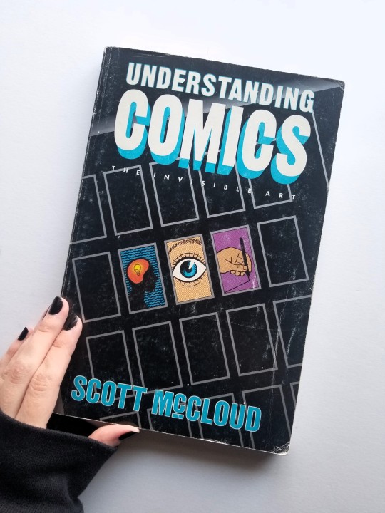
Hi! In reference to this last post. I'm going to site a lot of stuff from a book called Understanding Comics: The Invisible Art by Scott McCloud. It's a great resource for anyone interested in cartooning, visual art, and comics as a unique storytelling art form.
Cartooning, whether it’s for comics or animation, is a very utilitarian art form. Cartooning skills and an artist's style are often forged in the hellfire of a deadline. For example, what my art style looks like when I've drawn an 80-panel comic in one week looks very different from a single illustration I’ve done in that same time frame.
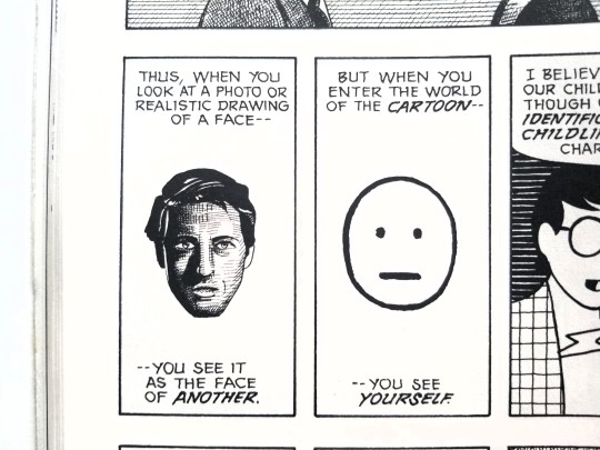
Cartoonists simplify for the function of needing to draw everything by hand over and over and over again. But we also simplify for the emotional universality of the cartoon image! As stated by McCloud in the following three images.
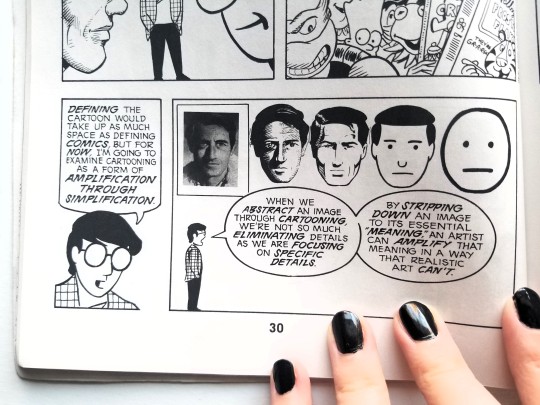
Technically all 2D art is a form of caricature because we are reducing our 3D reality onto a 2D plane - which inherently abstracts form. Anytime someone sits down to draw (or write), they're engaging with a level of representation within pictorial space.
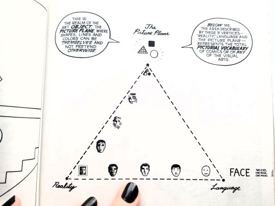
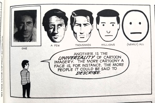
As an artist, we inevitably work in all modes at some point or another. But I think most artists will show a preference towards different corners of this diagram and that influences their style!
Ask yourself: where would you place the style you're seeking to achieve on this triangle? There's a more detailed version below with many cartoonists and styles for more examples.
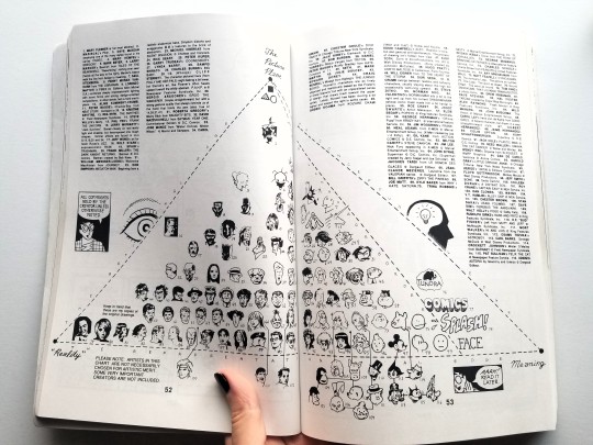
I like this diagram especially because it shows the wide variety of cartoonist's styles. That's why this ask has been particularly tricky for me to answer. It's hard to give advice on becoming more cartoony without knowing what that specifically means for you, anon!
That said, I can still give some general good practice tips that hopefully anyone can utilize in their cartooning journey!
Figure drawing. Short poses (1-5 minutes). Figure drawing from life is ideal because life very rarely sits still. If you don't have any figure drawing studios in your area then go to libraries and coffee shops. You can also ask friends or family to sit for you. And finally there are figure drawing resources online that often include timers. Tip: Try drawing only with ink so you can’t erase. You won't have to do this forever but it's a great way to live with the "happy accidents" and then move on to the next drawing!
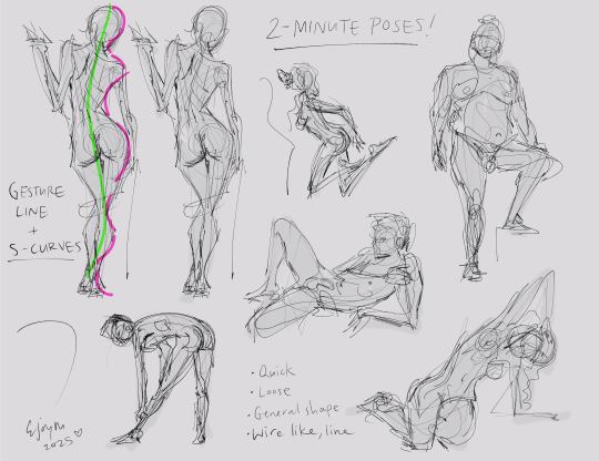
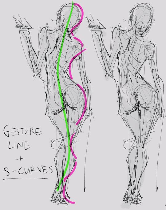
2. Gesture lines and S-curves. The gesture line captures the initial motion of the pose and will often follow the direction of the spine! S-curves are the alternating "S" shaped curves that represent the distribution of weight across the body. Exaggerating the S-curves is how cartoonists and animators often push the expressive form of the figure. When drawing the figure try to find the gesture line first and then build the weight of the pose on top of that!
3. Give yourself a deadline. Set a timer. Stick to it! Even if all you manage is a quick line gesture. Just move on to the next pose!
Finally, I really recommend reading Understanding Comics by Scott McCloud! It's a wonderful resource that anyone interested in the visual arts could benefit from reading. I first read it 17 years ago, back in my high school film class.
Phew! That's a long one. Hopefully, there's some useful info in there for you. But do feel free to ask any follow-up questions. And good luck on your cartooning journey! 🖤
(There's also another ask in my inbox about drawing cartoonish expressions. I'm working on a response but it may take a little bit. But don't worry, I'll have a detailed answer to that in the coming weeks!)
20 notes
·
View notes
Text
tuesday again 10/22/2024
rare tuesdaypost with no fallow sections. i CANNOT find the exact image i am looking for (mouse-drawn person sitting on bar stool with ankles crossed and blushing with eyelashes) but i feel like i found a lot of things this week that charmed me immensely. rare many such cases of many interests intersecting.

listening
almost exactly a year ago i wrote about jolynn j chin's SHIFTED, a piano jazz piece where the time signatures change on every bar, which came with an explainer video that is, spiritually, a physics video.
she's done it again with OFF TIME and a full album of equally bonkers concepts. i have a brain that is fairly good at manipulating 2D things (yarn, fabric) into 3D things but i do Not have this kind of math brain. wild shit.
youtube
youtube
-
reading
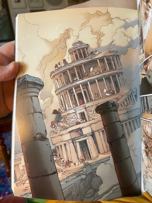
thank you philip for overseeing the photography of this trio of DELILAH DIRK graphic novels from Tony Cliff. i saw these on the library shelf and went "holy shit i read one of these as a webcomic in high school".
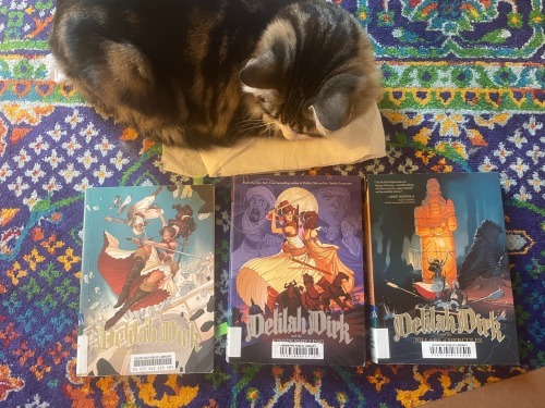
very well-paced indiana jones and james bond adjacent pulp adventures, with a soupcon of steampunk conveyances for taste. delilah started life in 2007 when strong snappy female characters were far less common. this is particularly...not quite grating, but very notable in the first two books (published in 2013 and 2016 respectively). they are intended to be middle-grade (disney villain falling deaths, no tits or ass, etc), but they punch far above their intended age range. a particularly interesting reckoning with the long-suffering native guide trope. not a series overly concerned with historical accuracy, although it's certainly more grounded in real history than you might expect of a middle-grade pulp adventure graphic novel. more colonial political concerns than i remembered or expected.
the art is really killer in all three books. tony cliff really knows the effect of a good page turn spread.
he also has a very charming way of illustrating continuing action across a huge panel. all four shots are from The Pillars of Hercules (2018) bc it happened to be the last one i read and the one with by far the most ambitious art.
-
watching
tubi has acquired the streaming rights to most of the batman animated movies. i keep getting served ads on instagram for an upcoming animated film about batman and the yakuza, where the premise is that a portal from real-life japan has opened up over gotham and the yakuza are pouring through like a demonic horde. this seems to be a sequel to batman ninja (2018, dir. Junpei Mizusaki)
youtube
Batman, along with his allies and adversaries, finds himself transported from modern Gotham City to feudal Japan.
batman ninja includes the lines:
I’m going to rule this country and turn it into a kingdom of monkeys and rewrite the history of the world!
and
What am I going to do with you, Batman? You’ve destroyed a perfectly good giant robot castle!
i would describe this as more of a feature-length animation showcase than anything else. the haters on letterboxed didn't even give it an average of 3 but that's bc they hate fun. this is some real weeb shit. this is not a grimdark or particularly thoughful batman entry. this is an entry to clap your hands in glee at the giant gundam vs monkey army fight. they have once again done my favorite comics boy jason todd dirty but what the fuck else is new.
so much fun even on just the like tree field guide level of identifying the six or seven animation styles. plus everyone's feudal japan looks are sick as shit.


was it Good? no. was i delighted at nearly every moment? fuck yeah.
-
playing
EXCEPTIONALLY charming embroidery-based game jam game, Cross Stitched by Panzerr here for free on itch.io. made in godot. god bless.


(image from the developer) you've got your little baba yaga house gundam in the center constantly firing projectiles, and you have to keep these fucking birds back. you can WASD around the edges of the tapestry, and your health is in the top (i really love how it gets "ruined" dark chunks taken out of it as you lose health, like a piece of embroidery decaying) and the bottom black bar of motifs fills up as you make progress towards adding another level and another piece to your powerup level tapestry.
(following images from me) you do have to think about your placement and plan it out a bit, and you can't embroider over something you've already stitched. would not recommend surrounding your initial base damage motif with other motifs bc then you've sort of fucked yourself over. a really simple concept (a good bite size for a game jam) elevated by a very fun visual style and great music. really delighted me! i am so jaded by my time in the video game marketing mines that i forgot they can be fun actually!

-
making
unphotographable: too many bugs in my house! tried to replace the weatherstripping on my front door and discovering that both the front door and the storm door were installed incorrectly and should probably be replaced.
in better news, the newest pathetic little waif in the office bathroom has been freshly neutered and will be going to a nice cushy indoor home next week-ish. whenever he is fully recovered. the most polite cat i have ever had in this carrier: did not piss, shit, or throw up.
KO'd by six cc's of various goops. poor man.
33 notes
·
View notes