#2d modelling designs
Explore tagged Tumblr posts
Text
Hyderabad AutoCAD space planning is an essential service for creating efficient and functional interior layouts. At nu homestudio, we specialize in utilizing AutoCAD software to design precise space plans that optimize every square foot. Whether you're planning a residential or commercial space, our expert team ensures that the flow, functionality, and aesthetics align with your needs. We combine innovative design techniques with cutting-edge technology to deliver customized, detailed, and accurate AutoCAD drawings. With Hyderabad AutoCAD space planning services from nu homestudio, transform your spaces into organized, stylish, and practical environments tailored to your lifestyle or business.
0 notes
Text

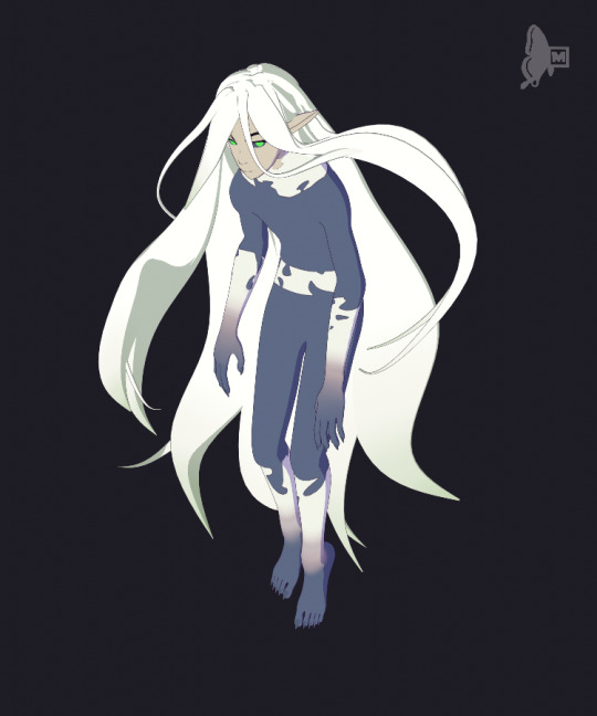

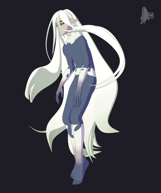
I recently saw @zillychu amazing fire core au and my mind was occupied the whole week with their Danny design. So I made some fanart!
Above is 3D model of their Danny. I tried to recreate one the pose from their artwork.
Below is a small animation draft of Danny crashing to earth from a star(left to right). I thought with his long hair and his firecore he propably could cosplay a shooting star very well!

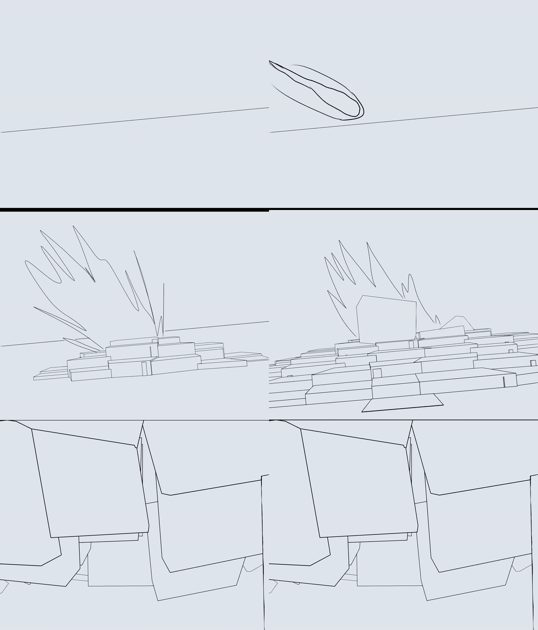
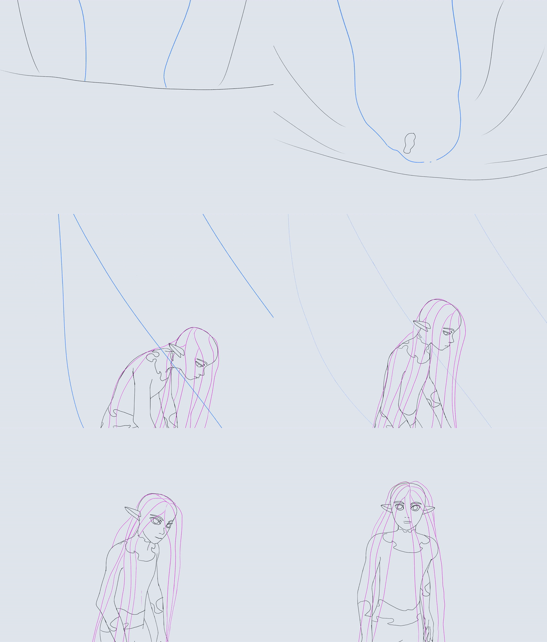
Happy new year everyone!
#danny phantom#fanart#fire core au#danny fenton#3d model#blender#2d animation#my animation#my art#zillychu character design
2K notes
·
View notes
Text

#i dont even think this is some lack of skill on CG artists end this falls more on directing and supervisors#converting some 2D designs into a 3D model is just fitting a square peg in a round hole#unless the entire production is following a more mock 2D style#which modelers and riggers really arent in control to make those calls
66 notes
·
View notes
Text
youtube
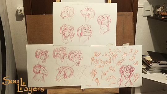

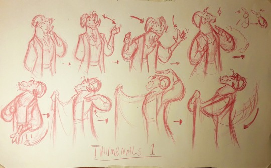
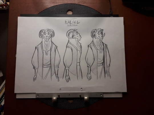
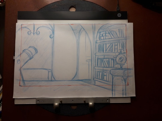


Kaliel The Nephilin
(without inbetween)
Project: Soul Layers
Character: Kaliel
Brief story about the character: Kaliel is a Nephilin, that is, the result of the union of a Cherubi and a mortal. His father was Kokabiel the angel of the stars. Kalieu has the dream of
free your brothers and sisters from the clutches of the Obsessors, spirits of pyre darkness. And to do so, he will have to count on the future bearer of the Agnalis, a spirit full of wisdom and power.
More about the Project on: https://soullayers.tumblr.com/
#Youtube#2d animation#paper animation#classical art#Classical animation#traditional art#traditional sketch#model sheet#layout#tradicional animation#character design#character art#original character#concept art
113 notes
·
View notes
Note
Do you have any personal theory or whatever for why Alttp link has pink hair or do you just keep drawing him like that for the hell of it
My alttp designs are (close to) sprite-accurate colors! the promo art for that game is super different from the actual sprites but i really like the colors they used for the sprites, an he did actually have pink hair in-game, so that's what I go off of. I do also like that the pink hair is a connection to his dark world rabbit form, which I play up in my design with the red eyes and buck teeth lol
#he's a little pink bunny. i love him#for the 2d games i tend to prefer sprite designs over official art but 3d games are hit or miss. i much prefer oot's official art#but that was kind of because they. hadn't really figured out 3d modeling yet. lmao#anyway tldr i draw him like that because of the sprite and also because hes a bunny#asks
55 notes
·
View notes
Text
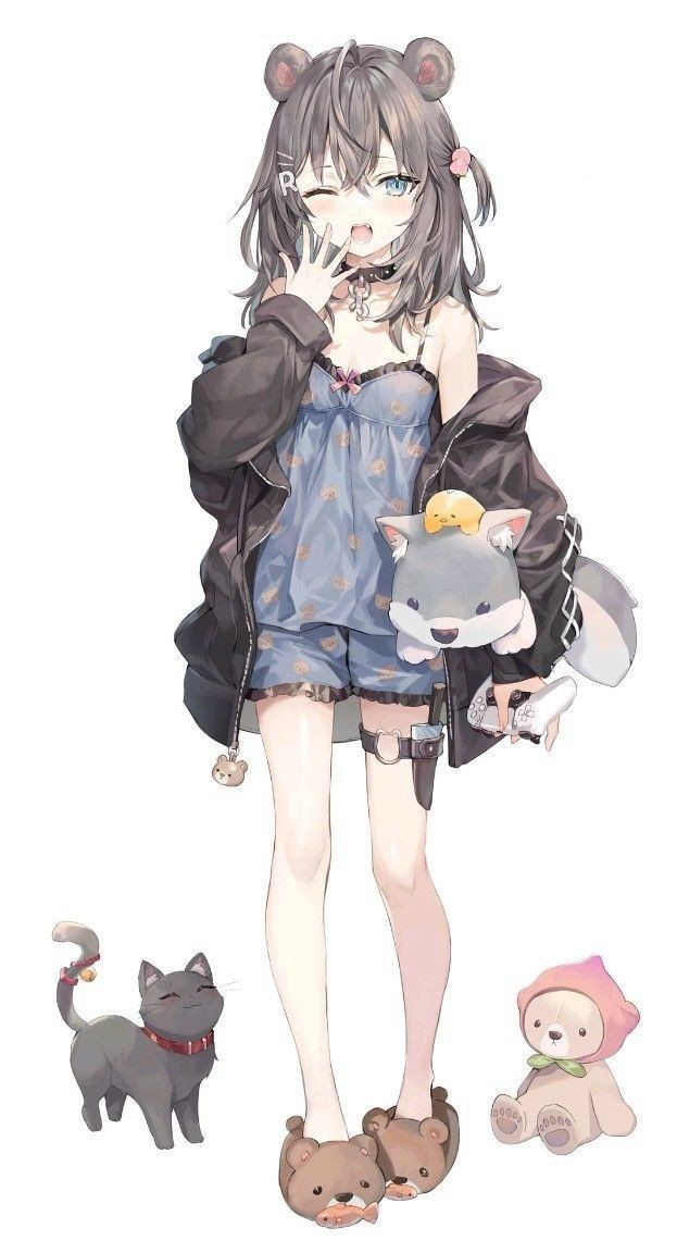
2D VTUBER MODEL
#vtuber model#live2d rigging#live2d#anime#2d art#vtuber#2d animation#vtuber design#2d vtuber model#vtuber rigging#vtuber commissions#vtuber character#character modeling
26 notes
·
View notes
Video
tumblr
My new demo reel is here! This is a sampling of some of the best work I did over the course of my animation degree. I am applying to animation and game studios, but I also plan to continue doing freelance and commissions. My artistic toolbox now includes 3D modeling, 2D and 3D animation, previs work, illustration, comics, graphic design, logo design, motion graphics, and more. So if you find yourself needing any part of that in the future, hit me up! You can view even more samples of my work at my portfolio at www.trippgustin.com.
465 notes
·
View notes
Text
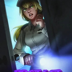

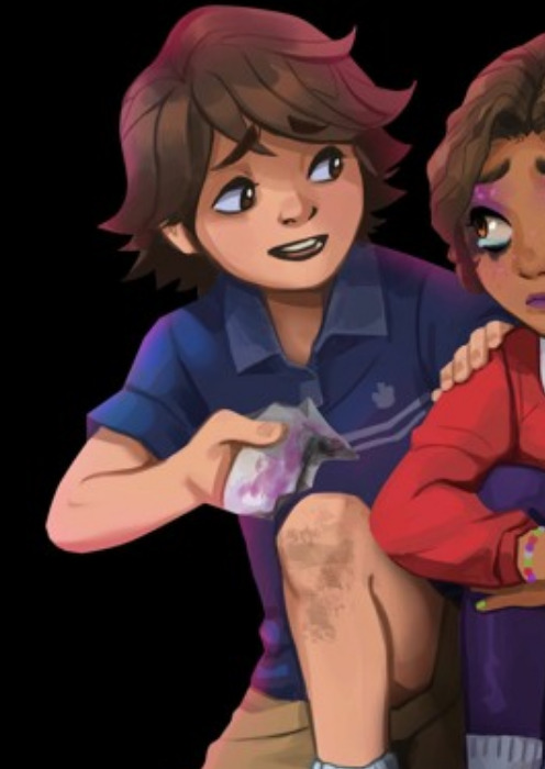
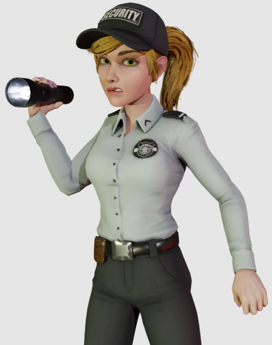

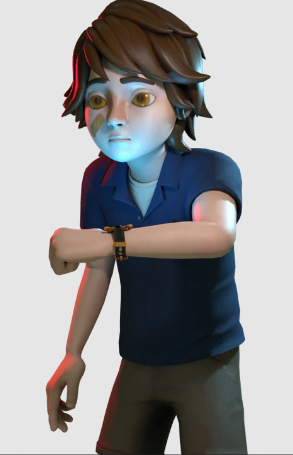
How does this keep happening
#Chip Chatter#I wouldn't go and say these are “bad” models#but like- besides Gregory's which is just kinda awkward- they really don't reflect their designs in their 2d art#Cassie especially... her skin tone is right(?) when not under lighting- but her hair is still unforgivable What The Fuck Man#I added a question mark cause like- when you color pick her textures it's right#but something about her model just makes her skin look slightly lighter compared to her 2d art anyway#Steel Wool is good at making models in general- great even!! But they really need to improve on the their human modeling and keeping#the model designs consistent to their art
104 notes
·
View notes
Text
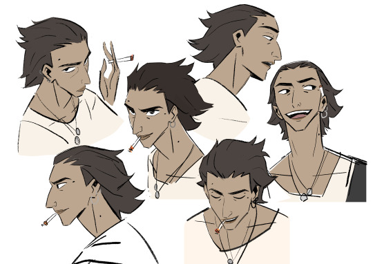
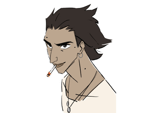
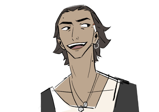
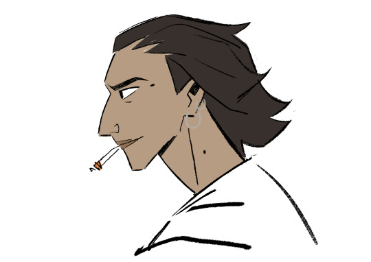
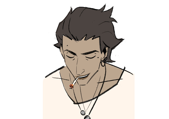
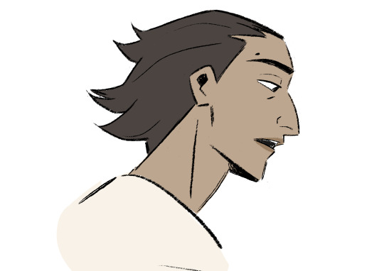
#character design#model sheets#character art#my art oc#musician#bad boy#fuck boy#animation#2d animation
94 notes
·
View notes
Text
ALLIGATOR DESIGN BE UPON YE

tbh I can't think of anything witty or clever to put here XD
#small artist#art#2d art#my art#artists on tumblr#cartoons#character art#digital art#xerox artist#xerox style#alligator#alligator scalie#furry art#furry artist#character design#character breakdown#model sheet#?#illustration#character illustration
25 notes
·
View notes
Text
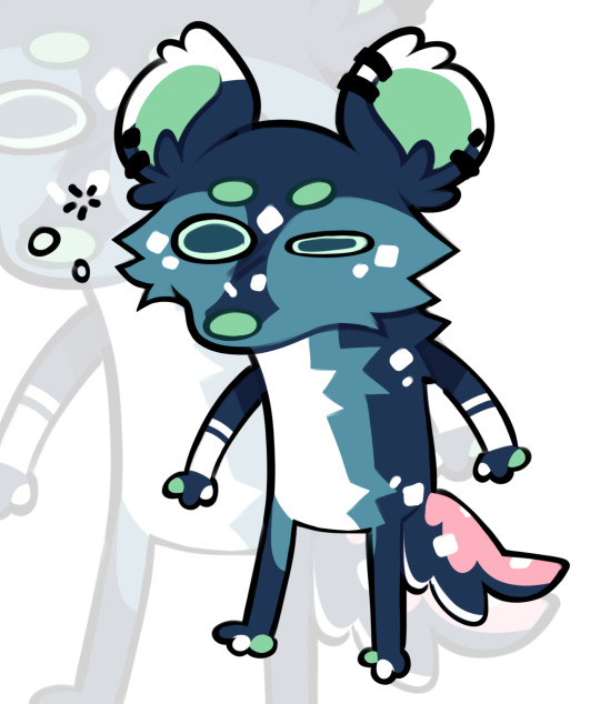
Blorbo's Eepiest Soldier
Thank you everyone for your kind words, I'm doing better and am back to it <3
#helloo!#thank you all for the well wishes#I have really appreciated every kind word#I'm doing better now and have gotten back to school work#i am so eepy though#eepiest soldier#im also being overworked on my capstone game team and the team lead even told me shes over working me so thats#fun#counting going to this capstone class and meetings and such im putting like 25+ hours in a week for it#and i do have 2 other classes#and a social life i enjoy having#haha#but im happy to do the work cause its good portfolio stuff#except when my producer comes up to me and says "yknow how ur in charge of all the 2d art and concepting and branding and ui and pr? yeah g#make a 3-4 page detailed comic for plot at the start of our game cause we dont wanna cut plot (even tho we dont have time for it) and we#dont wanna show plot through interactable objects and dialogue/text so more work for you even tho u legit dont have time for it#ngl tho i have genuinely been enjoying designing icons and doing model concepts#i made some fire designs recently#please hire me a game company tm#anyway enough of capstone talk#love you all!!!#im excited to graduate and finally be able to change my bio!!#hope you all have a very lovely rest of your day <33#furry#fursona#digital art#art#eepy
83 notes
·
View notes
Text

This is a character model sheet I created as part of my portfolio, showcasing the archer with a battle-worn aesthetic.
#digitalart#digital art#painting#commissions#drawing#art#artists on tumblr#oc#original characters#original art#2d painting#character painting#character design#character art#model sheet#character illustration#digital illust#tumblr illustration#illustrators on tumblr#2d illust#illustration#tumblr artists#tumblr art#tumblr commissions#art commissions#commissions open#art community#art commisions#digital artwork#game art
12 notes
·
View notes
Text
So a while ago I got into Warhammer 40k, and as everyone surely does when they get into 40k, I decided that my first project should obviously be to make a skitarii vtuber model.
I had never made a vtuber model before, and cannot quite remember what prompted this thought process. But you know, it feels fitting for the admech. You're telling me they wouldn't be into the idea of being able to look like their ideal robot version of themselves? Imagine their vtuber models. Just imagine.
I feel I should mention that I actually made two vtuber models, because the first one was full of trial and error, and realisations of what does not work with a 2D model. The second one also had trial and error, as is expected, but less so, as my first project had given me a good base to launch off of.

The blue one - nicknamed simply winter skit, though I'm getting attached enough I just might give them a proper name eventually - was actually meant to have a mechadendrite with a camera at the end, which could function either as a nice idle with the possibility of emoting to a comical degree, or it could function like a stand-in for the chat, if I were to start actually streaming. Which is unlikely, and I'm fairly certain using GW's intellectual property for it would be a bad idea, but it's fun to think about regardless.
Although my OBS does not believe in high quality videos, I wanted to share my lil guy, test shown in the rigging program since my laptop's camera resigned between the testing of the first skit and this guy.
youtube
#my art#warhammer 40k#wh40k#admech#adeptus mechanicus#skitarii#yes i know skitarii don't blink. the program just has auto-blinking which i didn't bother to disable for this#and besides having emotive eyes makes for a more fun animation and design#i wonder what sorta planet the winter skit hails from... i want to imagine the turquoise parts glow in the dark#what does that mean for the planet then though? mushrooms or algae or radioactivity?#well then again wherever the skitarii go there will be radioactivity#anyways making vtuber models was fun. i had to return a few times to the drawings and add or delete stuff though#and really should've merged a whole bunch of stuff to make rigging the winter one easier#but regardless it was fun. the rigging gave me flashbacks to my 3D animation and rigging studies#which came in a clutch here kinda even though 2D rigging is different. I think I've rigged 2D stuff only once before...#i do get why people pay big money for the rigging and drawing. keep doing that.#would I sell a vtuber model I've rigged? I don't think I'm at a good enough level to do that yet. And the program I used has a free trial#that's ending for me so I can't actually make more. Unless someone would pay for the subscription as well that is lol#vtuber
14 notes
·
View notes
Text
SLEASH and the BUTTERFLY


Hey guys! I'm so happy to be sharing one of the first animations from this very special project of mine called Soul Layers!
Soul layers is about valuing an energy so intensely in each creature, an energy that makes each one of us unique, an energy responsible for guiding us in our lives and bringing solitude and richness to our journey. This energy is our soul, our inner spirit that brings memories of lives we once lived and these experiences shape who we are, shape our being.
Sleash is a curious and fearless spirit and he was chosen to test my skills in this art of animation.
Well, that's it. I'm very excited to be sharing this project, and there's much more to come. If you like what I'm developing, please consider subscribing to my channel and following the Soul Layers blog.
Thank you very much again and see you soon 💙

#2danimation#youtube#design#art#model sheet#2d animation#artwork#cartoon#animation#anime#character animation#character design#original character#character art#originalcharacter#character concept#character sheet
53 notes
·
View notes
Text
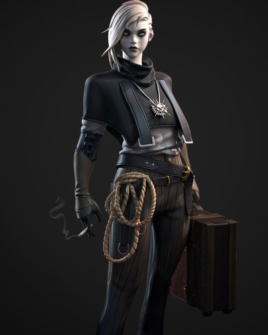
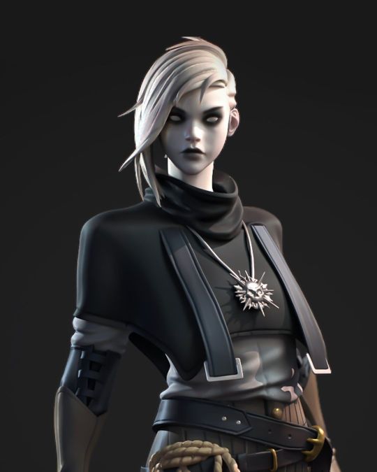
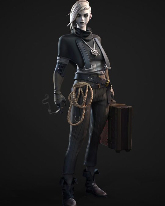
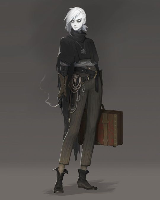
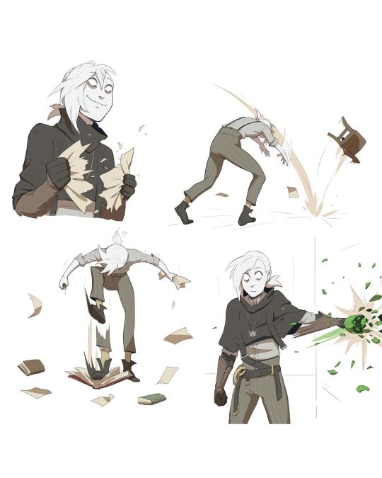
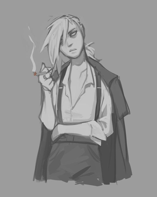
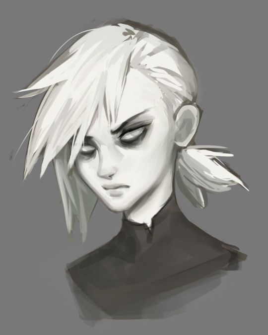
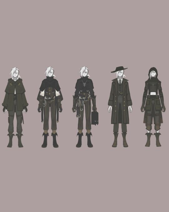
#3d modeling#3d rendering#3d model#3d sculpting#art history#3d character#vrchat#2d vtuber#character design#vrc avatar#vr character#vrchat world#vrchat avatar#vrc model#vr chat#vintage#vtube model#vtuber model#furry avatar#sfw furry#furry art
11 notes
·
View notes
Text
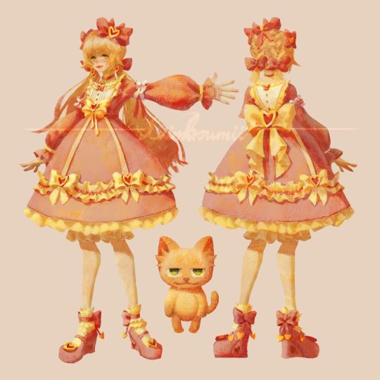
vtuber model concept done for now
gonna make it to a real model later
#art#artists on tumblr#artwork#digital art#11#2d art#character art#drawing#painting#digital painting#original character#character design#vtuber#vtube model
13 notes
·
View notes