#(js want to add that u do not have to get me a present I am just having some fun :))
Explore tagged Tumblr posts
Visit Tumblr Blog
Explore Tumblr blogs with no restrictions, modern design and the best experience.
Last Seen Tumblr Blogs


Fun Fact
Women make up for the other 50% of Tumblr’s audience.
Text
adding the senna vs prost book to my wishlist bc i have seen one too many clips from it and i am ready for the emotional trauma I know i will endure.
#also applicable is the alain prost biography#hes my fave classic f1 driver if you couldnt tell#my birthday#<my wishlist tag to make everything so accessible to#COUGH COUGH#one person#(js want to add that u do not have to get me a present I am just having some fun :))
3 notes
·
View notes
Note
HEAR ME OUT PLS!... reader whos fine w casually/non casually/no romantic fucking... this prompt is sickening LITERALLY as long as reader gets birth control/condoms theyre ay-okay with it
(doesnt need 2 be added:D FIND WHAT U THINK SUITS UR WRITING ATM)
example js
reader scrolling on their phone while nerd is rearranging their guts
or
council president railing reader while theyre in a mating press on a chair
or
childhood friend who didnt even have to ask you to take care of their problem since middle school(?)
seems like NONCHALANT!Reader but this reader just doesnt care abt what they want and just cares for their friends...in their own way...Add whatever u like sosa!!!! <3
stawppp it.
(presents an AFAB reader)
Yandere! Nerd has been so pent up lately and never has time to relive his stress. With all the club meetings, preparing for college and the love of his life ignoring him, it's obvious he's got a lot on his plate. Therefore, when he finally has the time to let loose, there's no way he could bother with protection.
"Please, baby? I know how much you like it raw anyways. You're still on the pill right? oh what he hell, it's not like you care that much. You have been a little snippy with him lately so he deserves this much. The only problem with is that you can't be bothered with putting in that much effort. So here you are now laying flat on your stomach while Yandere! Nerd pounds your brains out.
"Ugh fuckkk angel, it feels so gooddd," his heavy breathing and the light blush on your cheeks make you clench around him harder. You make him pull out as you roll yourself over on your back. You grab your phone again as he shoves himself back in you. You angle your camera to where your hips meet, occasionally aiming it at his face. He cums so much that when he pulls out some of it lands in the camera lens.
!Ping!
Angel😇💕💍: 1 attachment
Angel😇💕💍: srry I can't be there tdy. cramps and what not.
enjoy this instead :p
When do you get off your period again?
Sigh. How's he supposed to work like this?
Yandere! Council president rubs his temples and lets out a deep sigh of frustration. The council is having an after school celebration along with some club members because of last weeks fundraiser.
They did well but someone needs to count all of the funds and there's no way he'll trust anyone else do it.
He stands from his chair opening the door, on his way to tell them to keep it down bug to his surprise your on the other side of the door.
"What're you doing here?"
"I go to school here," he sighs at your blunt behavior.
“Yes, I know that. I mean what are you doing at school after hours?" you held up a bag of food and he already knew what you were gonna say before you said it. He opens the door to let you in, relived that at least one thing can cheer him up.
"Besides." you continue
"I'm horny. I was gonna get a quick one out before I went back but then I remembered you were here. I can obviously see your not feeling well and Im in the mood for something rough: take it out on me,"
The chair bangs against the table as you legs are pressed against your head. Who knew you were this flexible? He'll have to keep that in mind for later, right now he's focused on shooting his load as deep as he can. The music outweighs your moans and isn't until you here a loud bang on the door that you stop.
"(Y/N)? You in there? We're about to start truth or dare. Julie's gonna dare Chris to jump ass naked into the school pool. You don't wanna miss it." says a voice from outside the door.
“I’ll - fuck I'll be out in a second. Ate to much, ugh dip y'know; a little full," and with that they leave.
Yandere! CP turns your face towards him with an animalistic sneer.
"The only thing you'll be full of is my cum."
Please take a plan B 🙏🏾
(You guys are seniors here!!!)
Everyone's masturabted before, let's be honest.
Curious minds wanting to feed their growing sexual appetite. So when Yandere! Childhood friend came to you about his little problem, it was your duty as his best friend to help.
"(Y/N) it hurtssss! Just look how red the tip is!" on queue it twitches and pulses under your gaze.
Jeez the guy has no shame does he? He grabs the base, stroking his hard cock under his strong palm. It didn't take you much conniving since you were already on your knees before him.
"Oh shit baby! Gonna let me pump it all down your throat? Ughh, gonna-gonna milk all of it outta me princess I swear,” he says between pants, continuing throat fuck you. His orgasm nears as he grabs the base of your neck and forces you down on him. Spit and cum dribbling down your child and into your chest. He paints your face and swipes his fingers on your face before forcing it back into your mouth. After you all cleaned, you stand to your knees After you all cleaned, you stand to your knees sitting on the couch turning on Lilo and Stitch.
"Make some popcorn for us will ya?"
You literally suck the soul outta him and then ask him to do something other than go another round; he’s gonna do it but damn 😭
#yandere x reader#yandere x you#yandere x y/n#yandere childhood friend#yandere! nerd x reader#★♑︎☆彡𝐇𝐄𝐀𝐃𝐂𝐀𝐍𝐎✪𝐍!☆♏︎★#yandere student council president#💕 anon
269 notes
·
View notes
Text
since glomas is coming up id like to say somethings specifically abt rollo
him hating mages is not racist as mages may be low in population but they're not a minority group as they usually hold high places in the world. faes on the other hand are a minority as they're discriminated against. rollo hates magic nd its users, not faes.
but he is also implied to hate fae. by his logic a person js a sinner only if they activly use magic, which means he has nothing against faes that don't use magic. except faes need maic to live nd so far we havent gotten any info abt faes who dont use magic so this point is debatable.
the only reason why people think that he is racist becuz he is twisted from frollo, a racist priest who has committed ethnic cleansing nd becuz twisted wonderland's writing is twisted wonderland's writing (aka not the best).
he can get redeemed if he faces judgement, punishment nd consequences for his actions nd truly grows as a person. also he should learn that the death of his brother was no one's fault nd that he cant discriminate against people becuz of an accident nd that his trauma doesn't excuse his actions. but knowing twst this probs wont happen.
edit:: i forgot to add this but he wants to wipe magic out completely which means wiping out faes nd fairys but the way he is presented shows that he isnt thinking of the consequences of his actions nd only the "positive" outcome, which makes sense considering he is eighteen.
also another thing that confuses me is that his thinking is not explained well because why would a teenager's first thought after loosing his younger be to exterminate magic? that makes no sense unless it was to get rid of the self blame or influenced by a third party. maybe if we get chapters abt rsa nd nbc after b7 it could be expanded on.
also also, rollo himself is a mage that hates magic, which is similar to sebek who is a half fae that hates humans. not completely the same as faes r a minority nd mages arent but both half internal conflict abt who theyre which causes them to have negative feelings abt that part of them. (idk if i explained this well)
also also also, in twst there is this whole parallel between that characters nd the villians theyre based one. the villians r evil while the twst charas r js traumatised teens with reason behind their behaviour, with rollo's reason is that HE believes that wiping out magic is for the best. we dont know anything bout rollo's parents so they might not be around or maybe theyre the ones who put this idea in his head.
another thing that people tend to forget is that rollo is 18. he was younger than that when his brother died nd no one ever tried to tell him that his thoughts r bad. blaming him for his trauma induced thoughts that were never shut down is not rlly the best thing to do. do i realise he is fictional? yes. but this is something many teen go through including myself. not the attempted genocide but still.
again js like in nrc, no one in nbc ever picked up on his behaviour nd tried to talk to him or stop (at this point bruv js blame the adults). crowley never picked on the struggles of his students until they overblot and the head of nbc didnt pick up on rollo's behaviour.
does this mean he is a saint. nah literally the opposite. nd to prove that imma list down all the things he did.
attempted murder
tried to kill the prince of brair valley which could cause a war
discrimination
generally a bad person with a bad attitude (nd a bad haircut)
plotted against malleus simply because he is one of the strongest mages
endangered innocent students
arson
attempting to justify his actions
nd even after all of that he got no punishment. at least he shouldve been expelled. at worst? probably jail or a mental hospital.
does this mean u cant hate him? nope. does this mean u cant like him? also no. do as u like, im js trynna educate. plz dont try to kill me 🙏 nd for the love of god js stop arguing.
15 notes
·
View notes
Note
Hey, so im meeting this girl next week and we've been on nd off for a while (its my fault nd i done her wrong but she forgave me). We haven't called before nd when we started talking this week i called her nd we js vibed str8 away. Hours on end basically. Shes been calling me everyday in school,going home, at home ( shes really shy so im happy shes comfortable now). But what i wanted to ask was what to do not to make the first date awkward/a flop. I reallu like her and im trying to make it work. Thnk u i really see u as the big sis i never had
Plan for a full day
even if you think you’re just going to the aquarium. For example, look on maps for places to eat in that area, an arcade , cafe or a park just something chill to do before or after the aquarium just in case neither of u want the day so soon.
Get her a gift
Whether it be flowers or a small gift she may have mentioned in passing cause it shows you’re serious bout her! Flowers are not expensive you can even get one singular one, tie a hand written note or just add a bow. Depending on what kind of girl she is, choose the best option.
Be nice
When you see her, this should come natural but find something to compliment her on & look her in her eyes!(not in the scary i want to kiss you way unless……lol) You don’t have to force it to feel be super romantic and cheesy, just make her feel like the only girl in the world. Be open and interested.
Most importantly, have fun, enjoy the present moment & if she’s cool with it take pictures!
bonus points if u kiss her hand or hold her hand when y’all walk thru the aquarium
I Luv u lil one <3 enjoy your date!! Be safe & make sure u smell good n Tell me how it went afterwards pls pls pls <3
5 notes
·
View notes
Note
Hi, so I'm wondering how I could channel an unknown energy? Because lately I feel as though something/someone important has been trying to speak to me and I'm not sure who or what it is. I thought about trying to channel this energy but I'm not very experienced with that, so I was wondering if you have any tips? Thank you so much!
hi anon!
idk why i feel the need to say this, but it isn’t unknown if you only don’t know them/it in this version of reality. my main advice for channeling someone you don’t know in the 3D would be this: asking the universe to speak to the being that has been trying to reach out to you!
literally, by just affirming or speaking “i am channeling the spirit that has been trying to get in contact with me” is enough. you just have to believe it! the universe will never lead you astray. but, here is my channeling process for anyone else who wants to know! it’s quite simple, but it does take a lot of belief in order to complete it
My Channeling Process
meditate
i primarily do this for my focus, but if i’m channeling on a whim i won’t do it (like before i go to bed, i may just affirm)
2. protection affirmations!
another way is crystals that are blessed w protection around/near you
“i am divinely protected by my spirit guides, deities, angels, and the universe itself”
“i will not channel any negative energies during this session, as i am divinely protected.”
“i am protected by the universe, nothing i don’t want to channel will come within my reach.”
“i am in control of how i channel, and my guides protect me.”
“every positive energy that has looked after me and will look after me is protecting me during this channeling session”
i usually visualize a circle of some of the guides i know, but i used to visualize white humanoid figures ‘dancing’/circling around me.
3. affirm/call the person i want to channel.
now, i usually channel loki (or he channels me bc he’s a BITCH N SCARED THE SHIT OUT OF ME!) or my soulmate — the only other beings i’ve channeled were gage (a spirit guide) kairi (a spirit guide) piper (a spirit guide), my dr best friend, and lucifer (the deity, he was nice).
to call on them; i similar say “i am channeling ____” and if they’re from a dr then i usually add “from ____ desired reality.” I mix this in between affirmations.
4. ask them for a sign they’re present
some ways to ask are for a specific sign (like open pinterest while doing this), a touch (if you have your clairangecy activated) or other means, like a candle flicker or a lightning strike if it’s raining!
5. talk to them bro!!!
literally js chit chat! once u get the sign, you’re set. you’ll hear the voice in a different spot than your head voice. for example, my head voice can be on the left side in the front or near the top center. if i feel another voice in a different spot, or a different voice, i know it’s another being.
to end the session, you ask them to leave and say “i end this channeling session.” i often forget to say i end the session, so if im talking to my s/o before going to bed n i fall asleep, i often wake up w him 💀💀 (he’s an idiot btw)
that’s my process though!! sorry it took so long to get this out :( i lowkey forgot abt this bc it was in my drafts… oops!!
#abyss .answers#loki .speaks#reality shifting#shiftblr#reality shift#shifting#desired reality#shifting community#black shifters#channeling#clairaudience#clairvoyance
9 notes
·
View notes
Note
I don't know if this will qualify in your realm of ask and you can ignore if it doesn't. So here goes my ask. Some were saying that Jensen's tbt IG posting of him and Danneel (the November 2nd one) was actually done by her on his IG. What are you thoughts on the subject? Especially since she responded so quickly after he posted the picture.
Dear Anon,
Thank you for your question. I indeed wanted to talk aboutthis subject, as I don’t think most people understood what Jensen and D didwith that post and comment. See, in order to understand the reason behind what they did, I will have to go back a week before that. Please, bear with me.
Timeline of J2 Slander — Reasons & Damage Control
Wed, Oct 26th — Supernatural Episode 2
The episode causes a major rift in Fandom. And by Fandom Imean The Only Fandom that exists: Sam & Dean fans. Never in all my 12 yearsof being a SPN fan have I ever seen such uproar; so many people screaming theirdissatisfaction with storyline, character erasure, character being dumbed down to jumpstart the spin-off. However,instead of uniting for a common complain, what we saw were BiBros, SamStans,DeanStans fighting each other. Nobody was happy. That was the episode that broke fandom.

Sat, Oct 28th,NOLA Con — D at the Vendor’s Area
D sets up a Family Business Beer Co stand and sells merch at the vendor’s area.Fans line up to talk to her. Some TinHats are attackedfor wanting to meet her, and Hets and Hellers team up to bully them. Here’ssomething you need to understand about Hellers: they love the wives because intheir twisted logic, the wives invalidate TinHats/J2 and anything that could upsetus is game for them. Raise your hand you whose TinHat tweet/post was neverbashed by a minion.
Eventually, things evolve to an attempt to starta witch hunt.

Sun, Oct 29th,NOLA Con — J2 Panels
During the J2 Gold Panel, a questionabout pick up lines prompts a joke that the entire fandom had heard from J2before and no one had ever batted an eye (timestamp: 20:21).
youtube
In the Afternoon Panel, J2 are asked whatlead roles in SPN, other than Sam & Dean, they’d choose to play.

What follows is the longest M*sha/C*stiel shade ever thrownby Jared and Jensen, individually or combined—see for yourself those 3 fullminutes (timestamp: 10:12 to 13:02):
youtube
Once again, I’ve never seen J2 throw such enormous shade, Iguess it speaks volumes about how fed up they are with M*isha. You can see in thevideo the immediate reaction from Hellers booing Jared, who started the shade.
Now think with me: who’s the one Hellers most want out ofthe way because of their nonexistent ship? Jared. The two situations have onething in common: Jared. He was the one to mention the chloroform joke, and hewas the one to initiate and continue the M*sha/C*stiel shade. Now tell mewho Hellers were most pissed at? Jared.
You think I’m exaggerating? Here’s some foodfor thought.
Mon, Oct 31st— pseudo-article trashing J2
A wannabe author from a blog where literally anyone could bea part of, makes an unabashedly Heller post, accusing J2 of making a rapistjoke. To back up their allegations that “fandom was dragging J2” theyunsurprisingly add caps of D*estiel accounts. No agenda at all, as you can see.
[Let’s go back to the Sunday events for a minute. J2 bashedM*sha, Jared was the one starting the shade, Jared is the one they hate, Jaredwas the who told the chloroform joke this time around. Now tell me if thatwasn’t the reason behind that “article”?]
J2 fans lash on the blog’s account for tweeting the “article” and thetweet get deleted, but not the article.
Side note: Jaredattends 1 or 2 Halloween parties in Vancouver and takes pictureswith half the town’s population. Curiously enough, he was alone, no costume anddressed as if he had been dining outand decided to drop by. Oh, wait…

Tue, Nov 1st— T*een V*gue reposts article
What could have well been stopped by CW/J2’s reps on Monday, gets the unexpected and undeserved traction: a bigger, more accredited,teen-oriented website reposts the pseudo-article. No facts were checked, no oneapproached J2 for a statement and guess what? The same H*ellers’ caps werepresent; it was a mere copy of the previous article.
The damage is done and more websites publish the same storywith slight variations but none of them favors or approaches J2 for a statement.The articles get reposted outside of the US.
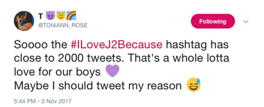
The slander shocks J2 Shippers, TinHats and Hets who,unexpectedly, unite in at least three hashtags to show their love and supportfor Jared & Jensen:
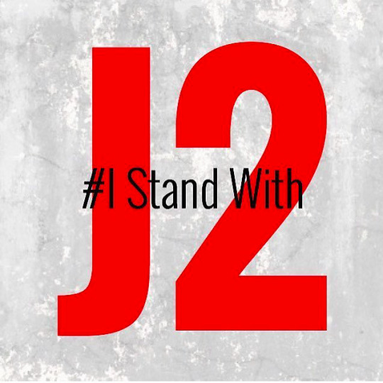
#IStandWithJ2
#ISupportJaredandJensen
#ILoveJ2Because
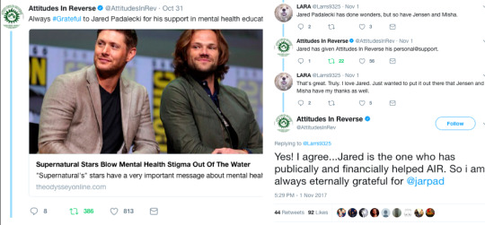
J2 Fans flood the websites that posted the slander with commentspointing out all the good things the Js have done for fans, Mental HealthAwareness, charities, etc. During these 48h of slander, I didn’t seeone single website or accredited institution show their support for J2, exceptfor Attitudesin Reverse.
Not a single peep from J2 co-stars, production, nothingexcept for the one you’d least expect: Mart Pellegrino posts a simple andhonest tweetpraising J2:
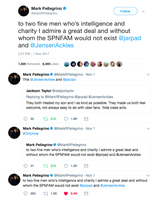
J2 Fans retweet and thank him for being the onlycast member/peer who dared support J2. It seems that the only ones mature enough to be honest and recognize that Supernatural only is what it is becauseof J2, are Mark Pellegrino and Mark Sheppard.
Nov 2nd —J2 issue a statement
Reps for both Jared and Jensen issue combined statementsaffirming they do not condone rape and the subject apparently dies down.
J2 Fans speculate whether this incident will cause Jared andJensen to share less on Con panels. Some even fear the possibility the boysmight eventually cut down the number of Cons.
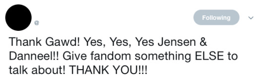
Jensen post a pictureof him and D
Contrary to what Jensen had been doing until now, he poststwo different caps, one for his IGAccount and another slightly different one on Twitterwith an added “❤ u”:

The picture is apparently cozy, once they’re sorta hugging. However,some point out how weird the picture is with her half smile and peace sign, andhis closed off face. Does that scream couple to you? …
As you well pointed out, Anon, D quickly replieswith more information about the #tbt picture: they were at Cabo, they were meeting the parents andthey’ve been together for 11 years and going strong.
Eleven years?? Come again? Oh, wait, she’s justdoing her job, I mean, Jensen was the one who started that 11 years story,precisely in Oct 26th 2007, at an interview he gave for TV Guidetitled UpClose with Supernatural’s Jensen Ackles: Part 2:
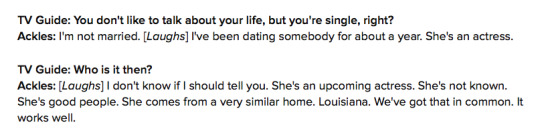
So, one year before that 2007 interview, when they filmed TenInch Hero. How convenient.

Check out the whole story at Anna’s blog.
How interesting that he managed to “hide” his one-yearrelationship from anyone, right?
The funny thing is that apart from that statement he rarely,if ever, mentioned the amount of years they've been together. The only time that comes to mind was at Kelly & Ryan.
Well, Anon, all this ridiculously long post to conclude thatJensen and D were only using social media to take the focus off of the eventsfrom the previous days. Did you see how many RTs/Likes both his posts had?
Twitter: 4.5K RTs/ 36K Likes
IG: 632K Likes/ 3,905 comments(as of today)
Did you see the hets and Hellers swooning over their love?
Jensen did what had to be done to change the focus and giveFandom something else to talk about. BUT much like his mentor Kim Manners wouldsay, ‘give them what they want in a way they don’t expect.’ Jensen did postsomething for PR purposes but on his owns terms. Just look at his face on thepicture he chose to represent how much he loves D.
Bonus: Jensen low key liked Mark’s tweet.

#jensen and d's picture#j2 slander#11 years together#mark defending j2#tv guide 2007 interview#IStandWithJ2#ilovej2because#ask#nola#Timeline of J2 Slander — Reasons & Damage Control#102017#timeline#J2102017#J2112017#112017
243 notes
·
View notes
Text
making a pico8 game during my first week of RC
tl;dr - Play my first ever solo game right here!

On my first day of Recurse, fellow W1 2017 batcher Ayla Myers (whose work you can peep here) presented on fantasy game consoles, PICO-8 in particular. Her presentation ran roughly 5 minutes, but it only took about half that time to convince me that I should give it a whirl. Since asking for help is more than encouraged here, I approached her immediately afterwards and asked if she could do a quick walkthrough of PICO-8 sometime.
“Yeah, of course. When do you want to start?”
“Uh…” It was already 6pm. “Tomorrow?”
“Okay!”
And lo, 11am the next day found myself and a handful of other Recursers sitting around a table in the Turing meeting room as Ayla showed us the ropes.
PICO-8 is a highly-opinionated, highly-constrained fantasy console with a robust set of tools for quickly developing and sharing games. While I’d played a few PICO-8 games before, I hadn’t realized just how core the commitment to retro-nostalgia is to the engine itself. Here are some fun things I learned about PICO-8:
It includes a pixel art editor and a chiptune mixer, both of which are a delight to use.
PICO-8 games can have 2 players, but each player only gets 6 possible inputs: four directional keys and two others (typically Z and X).
On the programming side, developers are allowed a maximum of ~8k tokens and ~65k characters. This incentivizes some extreme optimization, overloading, and other tricks in larger games that near those limits.
The games are super easy to export and share, either as embeddable HTML and JS or as downloadable executables.
As someone who has shipped dozens of games professionally but has never personally programmed one from start to finish, I decided that it’d be a good exercise to build one during the remaining 4 days of the first week.
On programming in a new language.
PICO-8 uses a subset of Lua, which I’ve never read or written before. Under other circumstances, I probably would have preemptively given up and shied away from using a tool that required learning a new language. Fortunately, my current circumstances are “you are entirely here to learn new things and surrounded by people who can help, actually” so I waved off the anxiety and plunged ahead instead.
Turns out that Lua felt very similar to other game programming I’d done in the past, so there wasn’t any need to worry anyway! (One begins to suspect that there is rarely a ‘need’ to worry… 🤔)
There were a few things that stood out in particular as I built my game.
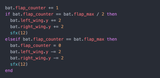
First, to handle animations - like bobbing a sprite or moving UI elements on and off screen - I found myself repeating a pattern using a counter (incremented every update loop) and a maximum (resetting the counter to 0 when it reached this value). I wasn’t sure if a series of timers would be a better fit for cycling through animation states, especially since this pattern meant assigning at least two tokens per animation. Since I was focused on building this quickly and wasn’t worried about running up against the token limit, however, I figured that consistently using a single pattern that I knew worked was the way to go.
Example of the section of the bat’s update loop that flaps her wings up and down and plays a quick beat on each flap:
Second, I learned that tables are “the only data structuring mechanism” in Lua, and that there is no readily available method to query them about the number of items they’re holding. To solve this, I tracked the count of items as a separate variable and updated the count any time I was adding or removing items from the table. If I were pinched for tokens I’d probably handle this differently, likely by writing a separate function that iterates over the the items in the table and returns the count.
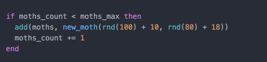
Lastly, and this one was a pleasure to discover, Lua is perfectly a-okay with removing items from a table while iterating over items within that table. For example, during the update loop I want to iterate over each of the moths in the game and check if the bat is in a position to eat them. If the bat should eat the moth, I want to add a quick sound effect, draw some bug-gut splatter to the screen, and remove the moth from the moths table.
I can do all of that like this:

This was a big relief to me because I’ve had trouble doing the same with JavaScript in the past!
On finding relief in constraints and designing a tiny game.
I didn’t have a strong idea when I first started making Sonar, other than that I should be able to finish it in a few days and that it should be about animals. Certainly my appreciation for earth’s non-human lifeforms would stave off any temptation to jump ship if things got confusing or tedious. 🦇
There was a brief moment where I sat, staring at my laptop screen, wondering what I could even do with only two non-directional inputs. It took about five minutes for me to come to my senses. What if this constraint, much like the constraint on tokens or audio channels, was a blessing? “Wow, I’m so glad I only have two buttons to work with,” I told myself, found it to be true. “In fact, let’s start by using only one of those buttons.”
Changing your perspective sure is a time-efficient way to clear obstacles!
On making art and SFX.
While I’d done some game programming (though never a complete solo project), I’d certainly never done game art or audio. In fact, art and audio often felt more intimidating than the rest of the design or development. I didn’t really know anything about creating reasonable looking pixel art or have any kind of background in creating music or sound effects; I just knew that both were important to making a game feel whole.
Once again, PICO-8 provided seamless introduction to these areas of game development. With only 16-colors and 8x8 pixels to worth of space to work with, I never got stuck trying to pick the perfect colors or shape for a sprite. If it worked, it worked, and it only took a matter of seconds to make changes and see them live in the game.
As someone who has zero musical education the responsibility of creating audio made me more than a little apprehensive, but I found the SFX editor similarly quick to learn and pleasant to use. I stopped short of making any ambient music, but I did make a few sounds: a steady but muffled bassline for the bat’s wings flapping, a high-pitched chirp for the echolocation, a gulp for a bug being swallowed, and a confirmation bloop for starting the game. SFX are necessary for giving a non-haptic game the illusion of tactile feedback, and even just these few simple, two-note sounds do a lot of heavy-lifting in making the game feel more responsive.
On jamming fast, alone, in an environment geared towards collaboration.
The single biggest struggle I had while working on this project was worrying if I should be spending my time doing something else. Whenever I spent large chunks of time coding alone, rather than pairing or attending study groups, I couldn’t help but feel like perhaps I was missing the forest for the trees. Shouldn’t the first week be about learning as much as possible about my peers and their interests, in the spirit of future collaboration? Did I somehow find a way to ‘do it wrong?’
Hard to say, what with only one week’s worth of information! My current guess, however, is no. I became familiar with a new language, I learned a new toolset, and I finished a project that I feel at least remotely comfortable showing to other people. Those are pretty solid accomplishments, even in the face of a gnawing suspicion otherwise!
More importantly though, I practiced being comfortable following my own intuition of what an ideal first week might look like. I proved to myself that I could set my own goals and meet them. I also developed a general feel for the ebbs and flows of working with myself as sole author and stakeholder on a project. I’m sure this kind of self-knowledge is valuable at any level, but as a beginner it feels like an especially worthwhile point of reference.
Besides, this was all made possible because I was inspired by a fellow Recurser, asked them for help and got it.
How could that be wrong? 😊
You can play Sonar right here.
ps. I almost forgot something funny!
This is one of the first things that happened when I began animating my pixel bat:

I laughed at this for a solid minute. It was wonderful, and only more so because I had spent the previous two hours setting up new software, familiarizing myself with basic Lua syntax, and fretting over whether my pixel art would be at all legible.
As one of my friends commented, “OH NO, HIS FLAPS FELL OFF!” And then, “or HER flaps, excuse me.”
Making games is generally time-consuming, tedious, detail-oriented work. On the bright side, many of the bugs and SNAFUs you run into are just silly as heck. The moments where ish goes off the rails can provide exactly the right dose of harmless humor to revitalize your motivation to finish. 👑
edit (11/15/2017)
Once again going above and beyond in her helpfulness, Ayla informs me that you totally can get the length of a list in PICO-8!
Here’s how, using the # operator:
local some_list = {32, 4, 72} print(#some_list) -- prints 3
✌️🦇
edit (11/17/2017)
So probably it makes sense to link to the the code, since becoming a better programmer is the whole gosh darn point! 😑
Also, because it may be helpful, I want to provide a quick outline of how you might also crank out a small game in a narrow window of time:
day1 - purchase and install pico8 (if you’re at RC, talk to someone about using their license!) - install a lua linter on your text editor of choice - run pico8 in console mode, so u can use printh to debug - make a player character that responds to input - make a 2-state animation for that player character (eg. flip between two sprites, add some bobbing motion, etc) - get ppl to Play Your Game!
day2 - make an enemy (note that these could also just be Collectable Objects if u aint feeling like defaulting to violence ✨) - make a 2-state animation for that enemy - give that enemy some passive behavior - disappear the enemy conditionally (eg. touched by player, hit by bullet) - make another enemy with similar but more challenging behavior - get ppl to Play Your Game!
day3 - add an end-condition (eg. eating some amount of bugs) - add SFX. this is more important than music for making your game feel whole, and you can do just about everything you need to with 2 note blips - add UI elements (eg. health bar, bullets left, etc) - add a start screen - add an end screen - get ppl to Play Your Game!
day4 - add finishing touches - export your game as html from PICO8 - host somewhere, like itch.io - write a blog post!! - share with your friends and the rest-o the world
2 notes
·
View notes
Photo

I am no stranger to visa applications. Plus, I perfectly know the struggle when applying for a visa especially since I am born in a third world country with only a third world passport — naturally, processes and interviews would always be especially rigorous for us.
But in spite of all the horror stories that you may have heard, seen, or read, getting a visa is still and absolutely achievable! Take it from me!
TIP: Make sure your passport is not expiring anytime soon. In addition, submit all the documents in an organized way. It helps to provide a checklist too in order to give the embassy a quick overview that you have prepared everything that’s needed (though at times this is one of the basic requirements).
Don’t even try submitting fake or ‘doctored’ documents. There’s a high chance that you will not only get denied, but you will also be banned.
It can be through travel tickets/bookings or your passport stamps. Even if it’s not one of the requirements, it helps to show them this to send them a message that you have traveled before, that you always came back, and that you have never overstayed abroad.
INTERVIEWS: Your interview can affect the documents you are submitting; but surely, if you are submitting genuine papers, then there’s no need for you to be nervous about this because the questions are always basic: what is your purpose for visiting, how long do you intend to stay, etc. (Though depending on your answers, the visa officer can be more thorough).
At best: remember to be honest and precise when applying for a visa. Simply answer what they ask for. DON’T launch into a full-blown storytelling spree. It’s not necessary for you to give out information when it’s not asked for! (Besides, the officers unfortunately wouldn’t care about your story, no matter how sad or tragic it might be.)
Additionally, wear something presentable (no need to be too formal), arrive early, be confident, and speak in English (or if you’re more comfortable in speaking your country’s language, then feel free to do so — unless the embassy doesn’t allow it).
travel insurance, I would highly recommend World Nomads since they offer the best price and coverage (they cover all countries worldwide too!).
: If you’re applying for a tourist visa then this shouldn’t be a problem; after all, you really wouldn’t have any other rationale for visiting a country abroad other than for… well, tourism. Supply them the itinerary that you want to do, the places that you want to see, and the experiences that you want to achieve and you should be fine.
The same applies for work, study, fiancé, or marriage visas because those are already self explanatory — to work because you are being sent there by your company, to study because you want to develop your knowledge and the university at that country is known for their outstanding program, etc. etc.
If, however, you’re applying for a visa to visit a friend or family, embassies commonly need a compelling argument to justify your plans of visiting. The first application isn’t typically a problem because seeing a friend or family member for the first time should somehow already be a reasonable purpose; but for the next visits, you or your host must have a stronger cause as to why you want to come back. Such may hold true too if you are planning to apply for 2nd tourist visa to the same country and so on.
Nevertheless, again, this is where dissimilarities can happen: some people can easily get a visa after the first time, but some people cannot. It’salways a case to case basis.
You might be thinking now, “What are examples of strong reasons?” I think it all boils down to having significant or sensible events. For tourism, let’s say you’ve been to Belgium before but currently, you want to come back because you want to see Tomorrowland; provide them the tickets for that and your motivation for wanting to see them (it happens only once a year anyway). Or maybe you have a blog and you want to experience and promote the country even more, blah blah blah. Or you want to take a gap year before you start working on your career. As for friends or family visits, if there’s a birthday, wedding, or reunion, make sure your or your host mentions that too.
» At the same time, don’t forget to prove the relationship you have with your host.
Ultimately, just make sure you have a decent motive or just be true to what your intention is — most of the time, your situation (no matter how simple or complicated it might be) would already be enough of a reason.
TIP: When applying for a visa, don’t ever indirectly imply that you have plans of staying longer because that will go against the 4th section below. If you’re going on a student visa, don’t mention plans of working in their country after finishing your degree; you have to express your desire to come back to your own country.
Or if you’re going on a tourist visa, don’t carelessly mention that their country has a very good education system that you find fascinating, because that might incidentally hint something to the embassy officer that you might want to study there — this is a bit of an exaggeration, but you get what I’m saying. …Then again, I’m pretty sure you won’t say such things if you follow the tips I’ve mentioned in the 1st section: which is to be ‘on point’ about your answers. Say nothing more, nothing less!
Every embassy wants you to convince them that you have enough money to support yourself because if you don’t, they would be very skeptical about how you will be funding your stay and they will also doubt your purpose for visiting their country.
As a general rule, here are ways for you to prove your solvency…
it becomes tricky, because though you have your own business, they need to know that it’s something stable and that you have enough cash. So other than the 1st three bullets below, it helps to provide:
Copy of Official Business Registration/ Business Permit
Tax paying certificate and/or tax statements
Bank Statement or Book of the company and Financial Reports for the last 3 months
Copies of personal credit cards, bank certificates, or bank statements in the last 3 months
depending if your sponsors are your parents or your school, or even both:
Sponsorship letter from parents or legar guardian, with attached documents showing their solvency (as employed, self-employed, unemployed, or retiree persons)
Certification from the institution/school providing you the grant; this document must specify the amount, term, and expenses that the scholarship includes
NOTE: The requirements for employed and self-employed persons are as applicable to freelancers too; depending on your situation, you might have to provide not only your proof of employment but even the registry of your ‘business’.
Also, Please DON’T rely on this list alone; double check with your embassy as there might be some items that they would specifically want from you and which I have failed to mention here.
TIP: For most of my visa applications, I usually have a sponsor in spite of the fact that I can already support myself — I still like to include them in my applications since it adds more strength. It truly helps a lot, especially when I quit my job and started working freelance. Usually my sponsors are friends or relatives, but it’s usually just on paper; it doesn’t mean that I absolutely require them to fund my travels. Of course, in line with this, you would need to provide enough proof to show your relationship with these sponsors and why they are sponsoring you — and that of course you ACTUALLY have the funds to cover your trip since the immigration officers can check on this before your actual entry into their country (they have the right to ask for proof of cash on hand, credit card, bank statement, etc.)
By the way, this is another area that you can overdeliver on; feel free to provide as many documents as you can!
“But what is the minimum amount of money do I need to show in my bank account?”
This is something I can’t really answer because every country would have its own minimum requirement depending as well on the time period that you are going to stay; therefore, I suggest that you call the embassy or check their website for any corresponding info about this.
But in my experience with Schengen Visas for example, most of the member countries would need you to show that you have EUR 50 (Php 2,500+) per day of your stay. This is the bare minimum, that’s why I suggest that you add way more money to it.
Money Saving Tips to Start & Live a Life of Travel
Meanwhile, as an additional way of showing that you can ‘support’ yourself, they would surely need documents that shows you have a hotel booked. To obtain these documents you can (1) reserve with a hotel online or (2) make a ‘dummy booking’ which can usually be done online [like Booking.com and Agoda], or through a travel agency.
Booking.com (function(d, sc, u) { var s = d.createElement(sc), p = d.getElementsByTagName(sc)[0]; s.type = 'text/javascript'; s.async = true; s.src = u + '?v=' + (+new Date()); p.parentNode.insertBefore(s,p); })(document, 'script', '//aff.bstatic.com/static/affiliate_base/js/flexiproduct.js');
If however, you are going to stay over at a friend, partner or family’s house, the embassy would need details of your ‘host’ like their ID cards, residence documents, proof of your relationship to them — all of which are easy to prepare.
In my opinion, this is where embassies put most emphasis on — they really need you to be bounded to your home country, and that you have strong ties that will compel you to come back at the end of your stay. They definitely don’t want you aiming for ways to stay longer (illegally) nor aiming for ways to become an immigrant without going through the necessary procedures at your home country.
What are examples of ‘strong ties’? They vary from country to country: they will consider your circumstances, travel plans, financial resources, and ties that will ensure your departure after the period of visit. Thus, other than the evidences already mentioned in the above sections, make sure that you’ve issued…
Mention an affair that would necessitate your return (it can be a board meeting, company event, etc.)
Business registration
Proof of possession of real and personal property (real estate, etc.)
A letter from you, stating any other reasons why you won’t overstay
School enrollment certificate
Approved leave of absence
A letter from you and your parents or legal guardian(s), stating reasons why you won’t overstay (explanation of family situation, your long-term plans in your residence country, etc.)
NOTE: These are NOT absolute, chances are, one proof would already be enough; yet as usual, it helps to overdeliver on evidences. You can always ask the embassy for any other kinds of documents they might want from you to prove your situation.
I understand that some procedures when applying for a visa would require a round trip ticket to be booked and presented — this would already be a proof that you won’t overstay, but I advise that you provide more evidences still since tickets are the most basic affirmation. (Though of course, most embassies nowadays do NOT require you to have round-trip tickets to be booked and presented before/during the application. If you really need to present tickets, it should be enough to show a flight reservation or itinerary).
In case you’re wondering where to look for the best flight deals, my go-to platforms are Momondo, Kayak, and Skyscanner.
TIP: Your passport stamps help in justifying that you are not someone who overstays abroad.
.title-bar:after, .title-bar:before, .title-bar:after, .title-bar:before, h2{ border-color: }
Overall
I dearly hope that these tips will help you! I wish you all the best of luck!
FINAL NOTE: Even with these pointers, remember to always check with your embassy first. Please also direct any clarifications and follow-ups to your applications to their office, and NOT to me; this is in consideration of the fact that they would always know more about your situation than me. Again: this article is merely a helpful guide for you.
How about you?
Do you have any other tips to share? Or things that I forgot to mention and should include when applying for a visa?
Have you ever been in a difficult situation while applying for a visa? What happened and how did you get over it?
Did you like this article? Follow me on Facebook, Twitter, Instagram, or YouTube and be notified about my newest posts and updates!
The post Applying for a Visa? Here Are 4 Important Tips to Get You Approved! appeared first on I am Aileen.
#><strong>DISCLAIMER:</strong> </span>I#cdcdcd;#ed2665;#><strong>Mind#><strong>Provide#><strong>◘◘</strong></span><strong> Do#><strong>STRONG#><strong>For#><strong>»#>.</span><br#bxtitle_99269667.box-title.box-title-line-middle#bxtitle_99269667.box-title.box-title-line-around#ed2665#DDD;
0 notes
Photo

Google AdWords affiliates? https://www.reddit.com/r/SEO/comments/blh0xy/google_adwords_affiliates/
I run a small SEO/social media/IT support business and one while reviewing one of my clients the other day, I ran across a curious situation. The site that I manage for their business sits atop a framework I coded that, amongst other things, captures all incoming page requests. Essentially, the same thing the embedded JS code that Google gives you to power analytics collections.
Starting around 7 months ago, their bounce rate per Google dropped like a rock. They were in the relatively normal 60% bounce rate range but, starting around September of 2018, it dropped to right around 10% and it's wandered between a low of 7% and a high of 13% ever since. Trouble is, when I go back and run queries against the database where I record my own traffic requests, I'm seeing a bounce rate (as defined as the percentage of visitors who navigate away from the site after viewing only one page) of right around 63% for the same months that Google is telling them their bounce rate is around 10%. Insofar as sessions, users, requests and all the rest goes, their numbers are close enough to my own to be acceptable...it's just the bounce rate that's plummeted. Somehow, we have a difference in bounce rate of around 50 percentage points...and I'm pretty sure my numbers are the accurate ones. No changes made to the site (there have been almost none) can account for this difference.
What prompted this detailed look (I don't usually review Google's analytics as I have my own) is that their "AdWords advisor" asked them to add a "thank you" page for submitted contact form inquiries. What they currently have is a modal popup that fires with the "Thank you" message and advises that their info has been submitted and that they'll hear back from my client soon. That process works pretty flawlessly, makes for a better UX and doesn't overload mobile users loading an entirely new page just to say "thanks". I've never heard of someone from Google ever telling a business what to do to their site specifically...and in this case, it would add nothing notable SEO-wise as far as I can tell.
My client has decided to keep their AdWords activity to themselves and, while I have access to their AdWords account and campaigns, I don't get involved with those past reporting to them what I'm seeing per GA related activity (incoming GCLID URLs and the sessions that follow from them). But, coincident with them passing along this request from a "Google rep" to add pages to their site was my review of their April (just last month) traffic. Because they have an AdWords account and do conduct campaigns I have a report that breaks out GCLID page requests versus the rest. For lack of better phrasing I refer to them as AdWords traffic and non-AdWords traffic. I'm already well aware that the mere presence or lack of presence of a GCLID URL variable in an incoming page request isn't 100% rock solid establishment of the origin of the traffic...but it is for the most part. Anyway, their best "AdWords" traffic month before April was July of 2018 with 1131 page requests. April's total was more than double that at 2470 and if the first 5 days of May is indicative of a trend, May will top 3700 AdWords related page requests...or clicks. To put it in percentages: April was more than double their previous best month and May looks to more than triple that. They tell me they haven't made any appreciable changes to their campaigns.
When I did a Google search against the name of this Google advisor of theirs, it came back with a single BBB forum comment from another small business where he was presented as their AdWords contact via Google and they were complaining (rather bitterly) about how he had blown through their campaign budgets with little to show. When they forwarded his email to me, I noticed his signature was subtitled as "Account Strategist on behalf of Google" and it's all this together with this last part that prompts this post. Does Google outsource AdWords advisors like this? The Google search I did on this guy's name revealed he works for a company in India called Regalix (but he has an email account that does, indeed, go to Google.com). That said, my clients are not paying this guy directly which, of course, makes me wonder: does he get a commission from Google for the amounts of AdWords revenue his "clients" spend with Google? And it's this last part I'm really asking about. Does Google do this?
If such arrangements exist then it would be in this guy's personal financial interest to get my clients to spend more on AdWords campaigns. But what truly concerns me is that if he's able to fudge the data that's appear in their analytics account, they have no real way of knowing what their experience is. Honestly, minus my own data gathering (which this guy cannot possibly know about because it's all done server side and pre request before it ever gets to the embedded GA code snippet) my clients would have no way of knowing what their true traffic experience is. I didn't mention it above but I also track conversion events on our site. That is, I can tell them how many times someone clicks on a phone link or button or an email link or button and I have seen a corresponding spike in phone link events while email has remained flat. I've been suspicious of the phone conversions for some time but since I don't answer their phone, I've been reporting the trend but not commenting on it. Now I have to wonder if this guy has been artificially sending traffic to the site (although I do block traffic from outside the US/Canada/Mexico as well as from Tor exit nodes). I'm really looking for any insight or guidance on this as, while this isn't what I charge them for (managing AdWords concerns), they are my client and I am in the position to see their data and know when something's not adding up.
Sorry for the long-winded preamble there but has anyone else had a similar experience or heard of anyone having this? My next step is to speak to this guy on behalf of my client and try and get some answers from him but I wanted to throw this out here in this forum in advance of that in case anyone has "been there, done that".
submitted by /u/Euroranger [link] [comments] May 07, 2019 at 01:42AM
0 notes
Text
20 Best New Portfolios, August 2018
Ladies, Gentlemen, and Our Secret Reptilian Overlords, I asked for more color in last month’s article, and you have delivered. It’s August, now, and to distract myself from the oppressive heat, I have gathered some 20 of these more colorful designs together for your perusal.
So as you might guess, there’s a fair bit of variety this month. There’s still some good old monochromatic minimalism for those of you who like that, so never fear. There’s just a bit more balance, this time around.
Note: I’m judging these sites by how good they look to me. If they’re creative and original, or classic but really well-done, it’s all good to me. Sometimes, UX and accessibility suffer. For example, many of these sites depend on JavaScript to display their content at all; this is a Bad Idea, kids. If you find an idea you like and want to adapt to your own site, remember to implement it responsibly.
karlssonwilker
The karlssonwilker agency site is a blow to the eyeballs. Whether or not that’s a good thing is going to be down to personal taste; but I literally can’t remember the last time I saw an actual animated kaleidoscope effect used on the Web.
I definitely can’t remember the last time I saw one used this well. There’s also a rather interesting use of flowchart-style layout on the “About” page. Yeah. Flowcharts.
Platform: WordPress
iconwerk
iconwerk is the first icon designer portfolio that I’ve seen in a while. It’s a meta work of genius. Before you can click on individual projects, you’re given a grid of images that contain icons, clients lists, and other snapshots of their work, but also kind of look like icons in their own right.
That’s right, they put icons in your icons, so you can look at icons while you look at icons.
Platform: Static Site
Humbert & Poyet
Humbert & Poyet is an architecture firm, so expect a lot of the usual: animation everywhere, elegant serif type, and text overlapping onto other elements. As is usual though, it’s all about how these elements are combined. In this case, the result is a visual treat that is greater than the sum of its parts.
Platform: Static Site
Juicymo
Juicymo is a mobile app developer, and their site goes all in on the flashy visuals you might expect from them. We get gradients galore, a lot of diagonal lines (a personal favorite of mine), rounded corners, and overall it’s just bright and colorful.
Really, it’s as if Web 2.0 and flat design had a baby. This makes it stand out, and I rather like it. Man, I never thought I’d miss rounded corners.
Platform: Static Site
Effectlab
Effectlab brings us back to that good old flat design with strong type and animated geometry on the home page. Further in, we get some overlapping elements, and a strong use of their admittedly limited color scheme.
To bring us back to the typography, I haven’t seen a lot of Greek websites. But even so, the text feels beautifully rendered, and some of the more rune-like characters absolutely bring out the nerd in me.
Platform: Static Site
Jveb Studio
Jveb Studio uses light animation and background illustration to fantastic effect. With a clearly modern-yet-artistic style, this is a simple-looking site that nonetheless has a fair few moving parts under the hood. Give it a look.
Platform: WordPress
Buzzworthy Studio
Buzzworthy Studio showcases their projects with a list of names, like many sites do nowadays. Overall, their style is clean, playful, and very marketing-friendly, which works for them. Animations is clearly emphasized, but not overwhelming, and I particularly like the way they use color.
Platform: Static Site
Fortnum & Fox
Fortnum & Fox also embrace the dual-color background, but takes more of an earth-tone approach for the most part. But instead of only using this theme on the home page, the site doubles down on the dual-background theme, featuring it prominently when displaying portfolio items.
As presentation sites go, it looks elegant and fancy. It takes some inspiration from print design, without feeling trapped by its inspiration.
Platform: WordPress
Eric Van Holtz
Eric Van Holtz’ portfolio goes big and bold with both color and type, combined with a light dash of animation, and a penchant for those diagonal lines I like so much. It’s a design that doesn’t hold back, and so is memorable.
Platform: Static Site
Salva Lopez
Salva Lopez’ portfolio seems to embrace the “split website” theme as well, with all of his photography organized in “personal” and “commissioned” categories. It’s a simple site with little text and lots of galleries, but that’s basically what you want from a photography portfolio, no?
Platform: WordPress
2xElliott
2xEllliott is a design consultancy, so their site’s aesthetic embraces that sort of corporate-elegant feel we’ve come to expect from that sort of agency. There’s a heavy emphasis on imagery, art direction, and not using more pages than you have to.
By that I mean that clicking on navigation items like “News” or “Contact” will open up a side panel to show that content, since there’s not enough of either to warrant their own pages. It’s a bit JS-dependent for my taste, but I otherwise like the approach.
Platform: WordPress
Canopy Films
Canopy Films’ site takes a highly grid-based approach to showing off its videos, and the grid itself is… animated? I’ll be honest, I’m not sure how that’s done; but it’s actually a pretty cool effect. And that’s coming from Mr. I-wish-sites-depended-less-on-animation. The rest of the site is fairly clean and modern, and is just generally worth a look.
Platform: Static Site
JOJX
JOJX goes for that dead-simple minimalism that was everywhere in last month’s article. Since it’s a portfolio site for directors, that works just fine. It’s just you, some navigation, a video, and a title. What more do you need?
Platform: WordPress
Humble
Humble takes much the same approach to showing off its video portfolio as JOJX, above. They use more color, though, with a bit of asymmetry and element overlap thrown in. It’s an excellent example of how two designs that are very similar on paper can have wildly different personalities.
Platform: WordPress
David Collins Studio
The David Collins Studio site takes me way back to like, a month or so ago, with its serif type, and minimalist collage approach to the art of the portfolio. It’s simple and elegant, and fairly effective.
Platform: Static Site (?)
Barkas
When you first load this portfolio up, it kind of feels like a spreadsheet that’s much prettier than it ought to be. As someone who kind of likes spreadsheets to begin with, that’s actually a compliment.
I’m not a huge fan of the cursor change, but otherwise it’s a good-looking portfolio that gets straight to the point.
Platform: WordPress
Pigment
Pigment shows off their work in a decidedly modernist fashion, with lots of white space and good old black borders. I do find their two-column approach to the actual portfolio items interesting. It looks like a good way to prioritize some of your work while not quite hiding the rest of it.
I also kind of like the way it looks like most of the content is “floating” above the rest of the page/background. It’s an effect you don’t often see in such a relatively flat design. It’s depth without any trace of skeuomorphism.
Platform: WordPress
Pierrick Calvez
Pierrick Calvez’ site is pretty much peak minimalism, but it’s good-looking for all that. I appreciate the way the zoom function works on individual portfolio images, and the typographical style of the whole thing.
Platform: Webflow
U-P
U-P is hard to classify. It’s so reminiscent of the Wild West days of the Internet that it’s almost brutalist. And yet, it looks good in a way that is sometimes a little cramped. Despite its design roots, it follows fairly modern usability conventions. It works, even if it sometimes seems like it shouldn’t.
That’s always impressive.
Platform: Static Site
Dexter Navy
Dexter Navy’s site is an odd duck, and I quite like it. Some photographers and videographers have collage-style sites. Others do that “preview-on-hover-over-the-title” thing. This one manages to combine them both in a riot of color and movement that still manages to feel purposeful.
The photography and video are mixed together delightfully. I also quite like the horizintal-scrolling image galleries for each project.
Platform: Static Site
Add Realistic Chalk and Sketch Lettering Effects with Sketch’it – only $5!
Source p img {display:inline-block; margin-right:10px;} .alignleft {float:left;} p.showcase {clear:both;} body#browserfriendly p, body#podcast p, div#emailbody p{margin:0;} 20 Best New Portfolios, August 2018 published first on https://medium.com/@koresol
0 notes
Text
20 Best New Portfolios, August 2018
Ladies, Gentlemen, and Our Secret Reptilian Overlords, I asked for more color in last month’s article, and you have delivered. It’s August, now, and to distract myself from the oppressive heat, I have gathered some 20 of these more colorful designs together for your perusal.
So as you might guess, there’s a fair bit of variety this month. There’s still some good old monochromatic minimalism for those of you who like that, so never fear. There’s just a bit more balance, this time around.
Note: I’m judging these sites by how good they look to me. If they’re creative and original, or classic but really well-done, it’s all good to me. Sometimes, UX and accessibility suffer. For example, many of these sites depend on JavaScript to display their content at all; this is a Bad Idea, kids. If you find an idea you like and want to adapt to your own site, remember to implement it responsibly.
karlssonwilker
The karlssonwilker agency site is a blow to the eyeballs. Whether or not that’s a good thing is going to be down to personal taste; but I literally can’t remember the last time I saw an actual animated kaleidoscope effect used on the Web.
I definitely can’t remember the last time I saw one used this well. There’s also a rather interesting use of flowchart-style layout on the “About” page. Yeah. Flowcharts.
Platform: WordPress
iconwerk
iconwerk is the first icon designer portfolio that I’ve seen in a while. It’s a meta work of genius. Before you can click on individual projects, you’re given a grid of images that contain icons, clients lists, and other snapshots of their work, but also kind of look like icons in their own right.
That’s right, they put icons in your icons, so you can look at icons while you look at icons.
Platform: Static Site
Humbert & Poyet
Humbert & Poyet is an architecture firm, so expect a lot of the usual: animation everywhere, elegant serif type, and text overlapping onto other elements. As is usual though, it’s all about how these elements are combined. In this case, the result is a visual treat that is greater than the sum of its parts.
Platform: Static Site
Juicymo
Juicymo is a mobile app developer, and their site goes all in on the flashy visuals you might expect from them. We get gradients galore, a lot of diagonal lines (a personal favorite of mine), rounded corners, and overall it’s just bright and colorful.
Really, it’s as if Web 2.0 and flat design had a baby. This makes it stand out, and I rather like it. Man, I never thought I’d miss rounded corners.
Platform: Static Site
Effectlab
Effectlab brings us back to that good old flat design with strong type and animated geometry on the home page. Further in, we get some overlapping elements, and a strong use of their admittedly limited color scheme.
To bring us back to the typography, I haven’t seen a lot of Greek websites. But even so, the text feels beautifully rendered, and some of the more rune-like characters absolutely bring out the nerd in me.
Platform: Static Site
Jveb Studio
Jveb Studio uses light animation and background illustration to fantastic effect. With a clearly modern-yet-artistic style, this is a simple-looking site that nonetheless has a fair few moving parts under the hood. Give it a look.
Platform: WordPress
Buzzworthy Studio
Buzzworthy Studio showcases their projects with a list of names, like many sites do nowadays. Overall, their style is clean, playful, and very marketing-friendly, which works for them. Animations is clearly emphasized, but not overwhelming, and I particularly like the way they use color.
Platform: Static Site
Fortnum & Fox
Fortnum & Fox also embrace the dual-color background, but takes more of an earth-tone approach for the most part. But instead of only using this theme on the home page, the site doubles down on the dual-background theme, featuring it prominently when displaying portfolio items.
As presentation sites go, it looks elegant and fancy. It takes some inspiration from print design, without feeling trapped by its inspiration.
Platform: WordPress
Eric Van Holtz
Eric Van Holtz’ portfolio goes big and bold with both color and type, combined with a light dash of animation, and a penchant for those diagonal lines I like so much. It’s a design that doesn’t hold back, and so is memorable.
Platform: Static Site
Salva Lopez
Salva Lopez’ portfolio seems to embrace the “split website” theme as well, with all of his photography organized in “personal” and “commissioned” categories. It’s a simple site with little text and lots of galleries, but that’s basically what you want from a photography portfolio, no?
Platform: WordPress
2xElliott
2xEllliott is a design consultancy, so their site’s aesthetic embraces that sort of corporate-elegant feel we’ve come to expect from that sort of agency. There’s a heavy emphasis on imagery, art direction, and not using more pages than you have to.
By that I mean that clicking on navigation items like “News” or “Contact” will open up a side panel to show that content, since there’s not enough of either to warrant their own pages. It’s a bit JS-dependent for my taste, but I otherwise like the approach.
Platform: WordPress
Canopy Films
Canopy Films’ site takes a highly grid-based approach to showing off its videos, and the grid itself is… animated? I’ll be honest, I’m not sure how that’s done; but it’s actually a pretty cool effect. And that’s coming from Mr. I-wish-sites-depended-less-on-animation. The rest of the site is fairly clean and modern, and is just generally worth a look.
Platform: Static Site
JOJX
JOJX goes for that dead-simple minimalism that was everywhere in last month’s article. Since it’s a portfolio site for directors, that works just fine. It’s just you, some navigation, a video, and a title. What more do you need?
Platform: WordPress
Humble
Humble takes much the same approach to showing off its video portfolio as JOJX, above. They use more color, though, with a bit of asymmetry and element overlap thrown in. It’s an excellent example of how two designs that are very similar on paper can have wildly different personalities.
Platform: WordPress
David Collins Studio
The David Collins Studio site takes me way back to like, a month or so ago, with its serif type, and minimalist collage approach to the art of the portfolio. It’s simple and elegant, and fairly effective.
Platform: Static Site (?)
Barkas
When you first load this portfolio up, it kind of feels like a spreadsheet that’s much prettier than it ought to be. As someone who kind of likes spreadsheets to begin with, that’s actually a compliment.
I’m not a huge fan of the cursor change, but otherwise it’s a good-looking portfolio that gets straight to the point.
Platform: WordPress
Pigment
Pigment shows off their work in a decidedly modernist fashion, with lots of white space and good old black borders. I do find their two-column approach to the actual portfolio items interesting. It looks like a good way to prioritize some of your work while not quite hiding the rest of it.
I also kind of like the way it looks like most of the content is “floating” above the rest of the page/background. It’s an effect you don’t often see in such a relatively flat design. It’s depth without any trace of skeuomorphism.
Platform: WordPress
Pierrick Calvez
Pierrick Calvez’ site is pretty much peak minimalism, but it’s good-looking for all that. I appreciate the way the zoom function works on individual portfolio images, and the typographical style of the whole thing.
Platform: Webflow
U-P
U-P is hard to classify. It’s so reminiscent of the Wild West days of the Internet that it’s almost brutalist. And yet, it looks good in a way that is sometimes a little cramped. Despite its design roots, it follows fairly modern usability conventions. It works, even if it sometimes seems like it shouldn’t.
That’s always impressive.
Platform: Static Site
Dexter Navy
Dexter Navy’s site is an odd duck, and I quite like it. Some photographers and videographers have collage-style sites. Others do that “preview-on-hover-over-the-title” thing. This one manages to combine them both in a riot of color and movement that still manages to feel purposeful.
The photography and video are mixed together delightfully. I also quite like the horizintal-scrolling image galleries for each project.
Platform: Static Site
Add Realistic Chalk and Sketch Lettering Effects with Sketch’it – only $5!
Source p img {display:inline-block; margin-right:10px;} .alignleft {float:left;} p.showcase {clear:both;} body#browserfriendly p, body#podcast p, div#emailbody p{margin:0;}
https://www.webdesignerdepot.com
The post 20 Best New Portfolios, August 2018 appeared first on Unix Commerce.
from WordPress https://ift.tt/2vhG6Hl via IFTTT
0 notes