#(Makes me happy and inspires some deeper character dev on my end!
Explore tagged Tumblr posts
Text
this is a half-baked thought but something that caught my attention as I was playing Tears of the Kingdom the other day is that TOTK feels less...embodied than Breath of the Wild? like sure, ruins raining down from the sky? floating ruins? that stuff is cool. but BOTW's shrines have a deeper relationship with the land they occupy. some of them have sat out in the open for a hundred years, being a part of the landscape, but a ton of them are buried in the ground. you can feel the ground rumbling as they emerge. they are very physically part of Hyrule even when people don't know that they're there. and at the end of every shrine, it's not a statue that greets you: it's a full on corpse. a person who remained in that shrine in a state of suspended animation, it seems, solely to provide the hero with a reward that will make him stronger. it was equally as planned as the Zonai shrines, set up to deal with a future evil/calamity, but especially with the overall empty and abandoned feeling of BOTW it feels like the last organized stand of sheikah monks against an overwhelming force of destruction. meanwhile the Zonai shrines feel almost happy go lucky by comparison. the story of what happened in the past feels like it has stakes, but that energy doesn't carry through as much as it could past the initial "Zelda is trapped!!" scenes.
but on the other hand I really do like the dual plot with Zelda and Link and the themes of community and the way side characters are more engaged and present in TOTK. I just don't know yet what to make of how the shrines feel kind of lackluster to me as the central mechanic in TOTK. I guess part of it is that constructs are cool and dangerous but way less fear-inspiring than guardians. incidentally guardians also have literal contact with the ground, which maybe makes them feel more sturdy. they also feel less sapient than constructs, which in some ways make them scarier - they feel programmed just to keep attacking you, so you better have a plan or you're screwed. maybe I'm also biased by already knowing the map itself pretty well from BOTW so there's less discovery involved, even with the TOTK changes. and on a meta level I understand why TOTK is so different from BOTW and I'm not faulting the devs for making a different game in itself. but it's also frustrating being like, there were zero hints in BOTW about Zonai tech/early Hyrule despite all that stuff coming into being right away in TOTK. or if there were any I can't think of them. surely SOMETHING would have been hanging around in a place where Link might notice it.
I'm actually hoping that by starting to analyze this stuff I'll gain a new appreciation for TOTK. I don't think I'll ever like it as much as BOTW. but I want to give it a fairer chance by thinking about it.
3 notes
·
View notes
Text
What are you the god of?
Tagged by: @gazelessmenagerie
Tagging: @saiyanbrother @cursedfortune @chancestander @zamaku @viopolis (your pick) @the-demonpr0digy & you!!
Patron of Promises

✧༺ꔫ༻∞ ∞༺ꔫ༻✧

༻✦༺ ༻✧༺ ༻✦༺
They call you naive: of all the things to be the patron of, you have tackled the most mercurial of things. Promises can easily be reduced to empty words, the precursor to brokenness, and truly, you have seen so many end in such a way. But you have also seen promises be kept, whether expected to or not. In a way, the gamble of it all charms you the most. Think of professions and vows screamed in guttural voices, of saying sweet things laced with uncertainty, of beautiful edifices built on unstable land, completely at the mercy of the quaking, crumbling earth.
You are the god of the hopeful, of those struggling to find the good in their blackening hearts. The god of uncertain things, of saccharine words said with pure conviction. A refuge for defiant souls, shelter for those who make poor choices but have good intentions. God of oaths both broken and kept, god of sleeping early so that the new day can sooner begin, god of wonder. You string together the words filled with assurance and rain down belief, on both the promiser and the promised.
The bringer of hope, however frayed and frail it may be.
Patron of Tough Love

。o°✥✤✣ ✣✤✥°o。

✧○ꊞ○ꊞ○ꊞ○ꊞ○ꊞ○ꊞ○ꊞ○ꊞ○ꊞ○✧
Let it be known: you do not stand by and approve of those who actively seek to hurt the ones they claim to love. But just because it is love, does not mean that it will always be soft. Think of how a pack of wolves operate: strategic, deliberate, protective, entirely capable of ripping out throats and still raising their young with a burning love. Think of the promise of safety in such a group, but also the devastation, should you betray its loyalty and upheave the order in place.
You are the god of temperance, of caretakers, and of all those who must carry the weight of responsibility, even when it threatens to crush them dead. God of bending and enforcing rules, god of fair trial and punishment, god of breaking vicious cycles. Protector of older siblings and of soft things needing thicker skin. Deliverer of hard-fought clarity in a fit of rage, weaver of reason into discipline. You teach them how to be strong, to be consistent, in a world that demands them to choose cruelty.
The grantor of armistice at the end of a long war, the one who blesses the hardened and makes them rest.
Patron of Reunions

・:*:・゚★,。・:*:・゚☆ 。・:*:・゚★,。・:*:・゚☆

⭑・゚゚・:༅。.。༅:゚::✼✿ ✿✼:゚:༅。.。༅:*・゚゚・⭑
Humanity delights you, and for all their troubles and hardships, you decide that sometimes, you will let them win. Thus, you grant them the blessing of reunion. Think of harbours lined with people, each one waiting for a sailor to come ashore. Think of chance encounters, of suspiciously serendipitous days where souls gone astray finally orbit one another and collide again.
You are the god of finding courage, of conceding and asking for help. The god of setting broken things to mend, of starting the healing process and seeing it through to completion. God of long overdue embraces, giver of clear eyesight used to navigate a sea of people. Protector of those who lie awake at night in dreamless, fitful sleep, praying for a return. God of leaving a light on and unlocking the door, physically and symbolically. You pave the way home in smooth stone, serving as cushions for blistered, wandering feet. You set the banquet and rehearse the orchestra: you bless the home anticipating the wayward, whether it is a castle or a hovel.
The herald of arrival, the one who guides the lost to where they can finally be found.
Cumber, Gogeta:
Patron of Farewells

✼ ҉ ҉ ҉ ҉ ҉ ҉ ҉ ✼

⋆ ˚。⋆୨୧˚ ˚୨୧⋆。˚ ⋆ ˚。⋆୨୧˚ ˚୨୧⋆。˚ ⋆
You see your craft as a necessary evil, in order to foster growth and allow the world to run its course. You bless both the weary traveller, and the loved one they leave behind—but you can never promise a safe return. Think of the sun setting, bidding farewell to all living things that need its light, so that the moon may rise and take its place in the sky. Think of a queen leaving her kingdom when the winter thaws, and the empty throne beside her king while the world blooms.
You are the god of endings both happy and sad, the one who blesses the beaten path; of wanderers and adventurers, of mapping a way home even when there is no intention to return. god of last words, god of forked roads, god of lingering touches and regretful parting. You bestow beautiful memories unto the dreams of those who are apart, a small mercy for they must wake up alone. You keep them separated for as long as it is required, allowing them to live their lives in half and guiding them to things that will make them feel more whole. Bittersweet farewells are not your only trade: you also bless final farewells, cutting down sharp as a knife and separating lives so that no further harm can be done.
The harbinger of peace, of the unruly kind.
#Tag: Dash Games#Tag: Demoness (Sotarra)#Tag: Best Mom (Gine)#Tag: Bean Boy (Goten)#Tag: Smol Monke (Mirin)#Tag: Ancient Saiyan (Cumber)#Tag: Double Trouble (Gogeta)#Tag: Second Princess (Bura)#Tag: Asshole Dad (Bardock)#(Im actually really surprised at how accurate these are?#(Of course goten and mirin would get the same patron but I never would have guessed Bura and Bardock tho?#(Makes me happy and inspires some deeper character dev on my end!
6 notes
·
View notes
Text
Just ate some shitty chocolate and mulling over my growing dislike of the arcana
Like the characters in the game, fandom (ie. like 5 people), fanartist are cool and sexy
But I feel like I would’ve enjoyed the game more if Nix Hydra actually wanted to portray POC and weren’t such vague and lazy writers
Disclaimer: I talk about Asra but I haven’t finished their route so take this grain of salt
Taking a step back and looking at this game... i don’t like it. Here’s the main reasons why:
They claim to have a diverse story and world but honestly you could change all the characters to look white and nothing would change.
They are so fucking ambiguous it drives me insane. The world in this game is never built up at ALL and neither is the magic system. They have left hints and details of a bigger complex world but never elaborate on it even when it could be relevant to the story.
Magic
Details from some stories aren’t even in others. When explaining magic to my boyfriend I was making a-lot of assumptions about how magic works because everything is so vague.
For example, magic limits are brought up maybe twice. Herbal magic exists (Mazelinka practices it I believe), runes and charms are a thing, glyphs are a thing. All these things are great details for magic that could have been explored as other forms of magic other characters have. Julian using glyph magic was never explored further, Muriel using charms and herbal magic would have been great.
The fact that these are never revisited or expanded upon digs at me. It feels like lost potential.
The minor arcana is a world detail that is only prevalent in the weekly card reading when the concept of another set of arcana is super fucking cool? Even mentioning any form of the minor arcana in the major arcana realms would be a nice tie in. But no its never even mentioned.
The world
Reading the arcana, Vesuvia feels more like a symbol than a place. It lacks a sense of life ehich is strange considering how much time we spend there. Nadia, Portia, Julian and Asra are all people who have a knowledge and understanding of Vesuvia but exploring with them is so focused on romance they lose the chance of building this world.
The outside world follows suit. Aside from names you can’t really tell me anything from outside kingdoms. Anything said about Prakra and Nevivon is vague and broad, even when Julian and Nadia are speaking about it.
The assumptions I’ve made about this world and how it functions are doing a lot of heavy lifting in giving the world life. I’ll make a post about each place in the arcana world about these assumptions just because of how important they are to my interpretations of the characters race. Ill touch on them here.
Race and Culture
This is my biggest gripe with Nix claiming to be diverse. Sure the characters have different skin tones but you could make them white and it wouldn’t affect the plot.
Everyone in this cast is some form of racially ambiguous or their culture is not in anyway important to the plot if mentioned at all.
I cannot speak on Asra’s portion but they’re not from Vesuvia. Their mom wears a headscarf but its never shown whether this is a fashion piece or religious outfit. (The fact that no other person wears a headscarf and it looks like a hijab implies muslim faith exists but its never explained) Asra themself is a magical person in tune with themself. Having them show us some of their culture would have been nice.
Nadia, despite her arc being that of family, never shows any sign of the cultural aspects of Prakra. A nice character touch would be her growing distant from her culture while with Lucio in the palace (spurred on my Lucio’s lack of care and her apathy) and later in the story doing something significant and unique to her culture. Whether it be dressing in a way that’s distinct from Vesuvian citizens to praying or making a Prakran dish with their family.
Muriel’s cultural exploration is the best out of all of the characters as it’s a main plot point. Unfortunately not enough focus is placed on it. A great touch would have been language differences, perhaps even reclaiming the fading language of his tribe after its destruction.
Both Julian and Portia being from Nevivon and having lived on a pirate ship, I expected a deeper look into pirate culture and the life of Nevivon. None are elaborated on so Julian becoming a pirate in his upright ending feels empty as I’m not invested in pirate life at all.
Not doing the bare minimum to flesh out these characters culture means the world feels flat and the characters don’t feel like true representation. A hollow attempt at giving us diverse characters in what should be a living breathing world.
Race and Design
Again, everything is ambiguous.
The smallest gripe I have is that clearly the artists are not people of color. Granted I did get this impression from the fact that the palms of the hands arent lighter than the skin tone. Its a subtle thing but doing it shows a care for detail and it makes my melanin self very happy when it’s shown.
Another smaller gripe is how ambiguous Muriel and Asra look. I had assumed Muriel was just a white guy until the name of his tribe and seeing cultural wear gave a different impression. But I can’t fault anyone fir thinking he was white. Just like I can’t really fault people for thinking Asra is also white.
Why do the lighter skin characters have natural hair colors but as soon as Nadia and Asra are shown they have fantasy hair. While having colorful hair isn’t a crime, its a tactic often used to separate people of color from truly looking like people of color. It was a wall I had from connecting with these characters.
There’s not a single black person in this game. The more I think on it the more it bugs me. So many side characters and yet none of them are black. If the devs hadn’t said the baker is black you could make a strong argument that black or Afro-centric features don’t exist in this world. There is no kinky or very curly hair. Not a wide nose to be seen. Seeing an Asra design that was inspired by African culture and saw it fit the aesthetic so well made me even more confused why there wasn’t any.
It makes me sad truly. You can’t call your game diverse when it isn’t. The Arcana is not a diverse game. It’s a lazy game with a hollow attempt at representation.
I am open to discussion on this as it’s something I’m passionate about. So if you have any insights or want to voice your own opinion I’d be happy to hear it!
#art#the arcana#the arcana julian#muriel the arcana#reverse ending muriel#muriel#julian devorak#asra#asra alnazar#asra route#portia devorak#portia fanart#nadia#nadia satrinava#the arcana nadia#lucio montag#the arcana game lucio#vent
194 notes
·
View notes
Photo
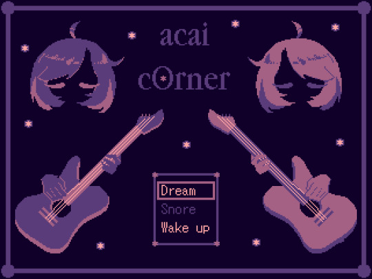
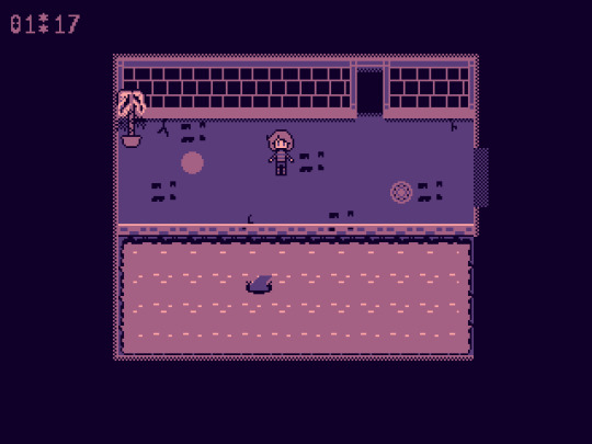
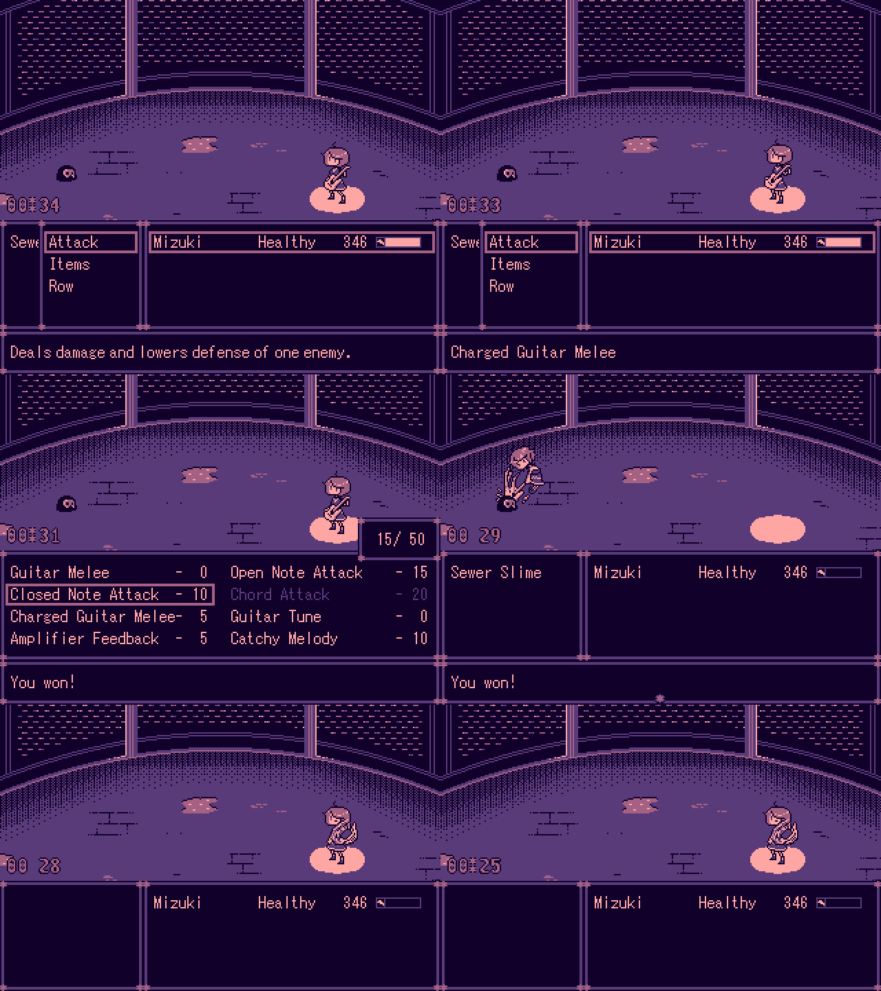
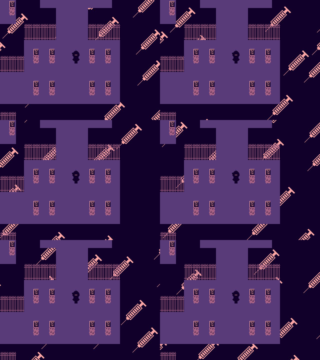
March’s Featured Game: acai cOrner
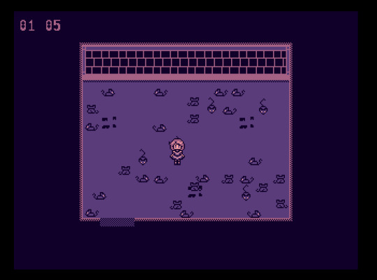
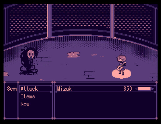
DEVELOPER(S): moca & Mitty ENGINE: RPG Maker 2003 GENRE: RPG, Adventure, Surreal SUMMARY: acai cOrner is about Mizuki, someone who has fallen into the sewers and who happens to find their favorite electric guitar! Upon obtaining the guitar, Mizuki turns into a magical girl who must defend herself against spooky sewer creatures using the guitar's magical powers.
Download the game here! Our Interview With The Dev Team Below The Cut!
Introduce yourself! *moca: Hi, I'm moca, a Starbucks barista aspiring to be a writer and game developer. I have been making RPG Maker games for about six years now, with my first two projects being a Pokémon fan-game and a Corpse Party fan-game. Those two happen to be my two favorite franchises as well! I have also created the RPG Maker game MOMOKA (IGMC 2018). I have founded a group called 'Team Shibu!' dedicated to making horror games! Our current project is a RPG Maker survival horror game named 'Katharsis'.
*Mitty: Hey there, I'm Mitty! I've been working with Moca on several games for a while now, helping with mostly graphics! Please support him, as he is very kind and hardworking!! I'm also the main developer of a game called "Marinette", so I hope you'll check that one out too, when the demo is released!
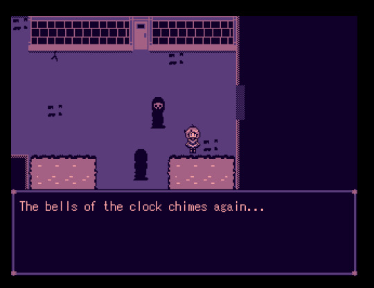
What is your project about? What inspired you to create this game initially? *moca: acai cOrner is an experimental spooky RPG Maker game that only uses 4 colors! You are a magical girl with a just-as-magical electric guitar that you use to fend off spooky sewer slimes and other weird enemies you find in the surreal sewer system. It's half exploration and half RPG battles. What inspired me to create acai cOrner initially was to actually get myself back into the groove of making games again. I had just recently came back from a hiatus and found myself having trouble getting back into the development of 'Katharsis'. That's when I decided to make a short, experimental game to get the juices flowing.
How long did you work on your project? *moca: acai cOrner was finished in just about under a month!
Did any other games or media influence aspects of your project? *moca: I had always wanted to make a Yume Nikki-like game and thought this was the perfect opportunity to try. So for the more surreal parts of acai cOrner, I took inspiration from Yume Nikki and a Homestuck random planet generator. Gameplay wise though, I took inspiration from a RPG Maker game called Ghost Suburb 0! I really loved how unique it was, especially with the timer and no dialogue aspect. I knew I wanted to do something with a timer, so I tried a rogue-like approach with the gameplay.
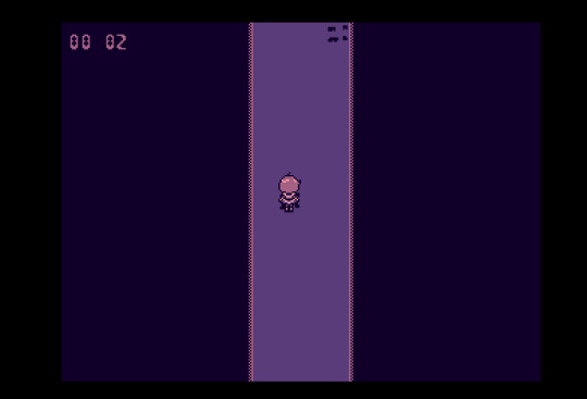
Have you come across any challenges during development? How have you overcome or worked around them? *moca: If you played any of my previous projects, you know that acai cOrner is vastly different than anything that I have ever done. I'm so used to using words to describe the violence in my games, so when it came to making the story, I had a lot of trouble. It wasn't until I looked deeper into why people like these types of games that I had realized that people like to interpret the story on their own, guided by exploration, to enjoy these games. After that, I let loose a bit and made something more open-ended. Another challenge was the difficulty. I was the only one playtesting the game, and since I knew the game front and back, and had no trouble getting the ending. That's why when I sent out demos to friends, I was really discouraged to hear that the experience was mostly frustrating and rage quitting-inducing haha. I worked closely with their feedback and made changes accordingly to make the experience less frustrating but still difficult. *Mitty: I think I was going through a weird artblock during the development of the game, so for some of the illustrations and backdrops for each area's fights, Moca sketched out the basic idea of what it could look like, and I just put my spin on it! It made the work much easier and faster!
Did any aspects of your project change over time? How does your current project differ from your initial concept? *moca: Well, the game was meant to be short so there wasn't room for any big changes. Sure there are a couple gameplay changes and enemy tweaks, but not anything mindblowing. I added in the idea of making four surreal worlds kinda last minute, if that counts, haha.
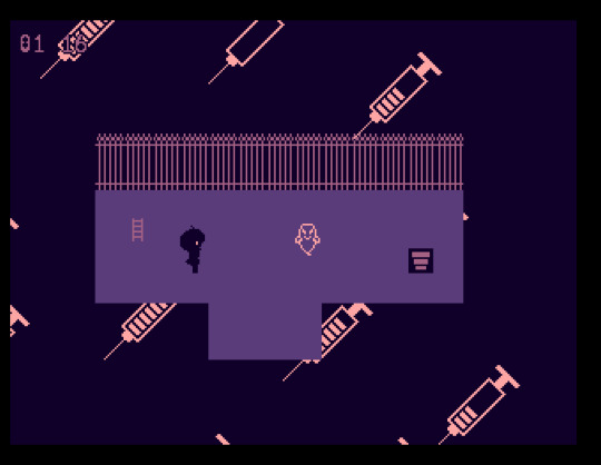
What was your team like at the beginning? How did people join the team? If you don’t have a team, do you wish you had one or do you prefer working alone? *moca: In the beginning, it was just me! I didn't think I was gonna need any outside help since this was supposed to be a relatively easy project to release, but the further in development I got, the more I realized the game needed pizazz. The four color limitation wasn't enough for my lack of graphical talent. That's when I contacted Mitty about helping with the games battle backdrops and sprite animations! She is also a member of Team Shibu!, but we have collabed together even before that. Her art really made the project shine and I enjoy working with them on games! *Mitty: Moca contacted me, and I wanted to help! We are working together on another game called Katharsis, so we are quite familiar with each other. I like working with other people, especially if I'm not in the lead, it releases a bit of the pressure I feel sometimes ahaha
What is the best part of developing a game? *moca: To me, it's seeing everything come together and just... working exactly the way you envisioned it. As a game developer, you section the game off into parts to make development much more organized and faster but seeing it all come together in the end. Pure bliss *chefs kiss*. *Mitty: I like a bit of everything, but currently I've been enjoying animating and spritework, as well as map assets' designs a little more than usual!
Do you find yourself playing other RPG Maker games to see what you can do with the engine, or do you prefer to do your own thing? *moca: Mm... not really! I have an idea of what the engine can do, so when I do go out of my way to player other RPG Maker games, it's usually for writing inspiration rather than gameplay inspiration. Ghost Suburb 0 is something that I accidentally stumbled upon and immediately fell in love with it the minute I played it haha. (Fun fact: the developer of Ghost Suburb 0 is apart of Team Shibu! and is in charge of monster design!)
Which character in your game do you relate to the most and why? (Alternatively: Who is your favorite character and why?) *moca: There is a rat in the game that is internally called 'Ratthew' who leads you into a funky room. I relate them the most. *Mitty: I relate to the land sharks the most on a spiritual level. They are pretty much confused beans, and that's very relatable.
Looking back now, is there anything that regret/wish you had done differently? *moca: I wish I added more random spooky events and trap rooms. But the game was also supposed to be short and I knew that if I kept adding more and more things, development was never gonna end haha.
Do you plan to explore the game’s universe and characters further in subsequent projects, or leave it as-is? *moca: Well, by the time this interview comes out, there should be a new update for the game. The update should include 100% custom music by a talented composer, and a nerf in difficulty. As for sequels, who knows! The next time you see acai cOrner may be in 3D.
What do you most look forward to upon finishing the game? *moca: Definitely the fan reaction! The satisfaction of seeing your work being noticed by people and actually enjoying makes me happy. It's also the relief of just... finishing something! *Mitty: For this particular project I was obviously looking forward to seeing what people said about the little animations and such ahaha! I also was curious about the reaction to the timed difficulty mechanic, I had never seen anything like that before Moca presented it to me, so I had no idea on what people's feedback would be.
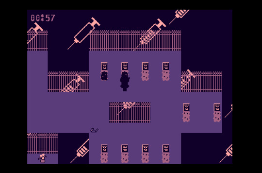
Is there something you’re afraid of concerning the development or the release of your game? *moca: How people will handle the difficulty. The game isn't supposed to be completed on your first playthrough, but in 2-3 playthroughs. There are rooms and places that are meant to waste your time that you should ideally skip the more you play. By later playthroughs, you should be shaving time and be better. I understand that it's not handled as best I could, but I think the experience should still be challenging and hopefully fun! *Mitty: I was a little conflicted on the timed mechanic, I loved it because it's pretty original and helps set an interesting athmosphere of worry and unease, and also seems to tell a bit of the vague story; and at the same time I don't like it much because I prefer more story-driven games and the vagueness mixed with the mechanic feels different from what I'm used to playing! I think it's more of a personal taste kind of thing, it was an experimental jam game, after all!
Do you have any advice for upcoming devs? *moca: Take it easy! Take short breaks throughout development. And most importantly, have fun. If it's a hobby and it's making you overly stressed, just take a step back!
Question from last month's featured dev @ressurflection: What would you say is the weakest part of your game development? *moca: Procrastination. I'm so bad at sticking to my own schedule, it's something that I try to keep in check when working with a team especially.
We mods would like to thank moca & Mitty for agreeing to our interview! We believe that featuring the developer and their creative process is just as important as featuring the final product. Hopefully this Q&A segment has been an entertaining and insightful experience for everyone involved!
Remember to check out acai cOrner if you haven’t already! See you next month!
- Mods Gold & Platinum
#rpg maker#acai corner#acai corner game#rpg maker games#pixel games#indie games#gotm#game of the month#march#march 2020#2020#moca#mitty#interview#needles
274 notes
·
View notes
Text
Tips on Character Development
(AKA the convoluted way I do things)
Ok, so, wow. This ended up being like super ridiculously long. Sorry about that. I just got done adding "a thing or two" and it ended up being longer than what I originally wrote.
So, a while ago I responded to a post on Reddit asking for help developing a character. My comment seemed to help a few people, so I figured I'd add a thing or two and post it for anyone else who may find it helpful!
TL;DR: I think Personality tests —Myers Briggs and Enneagram — used in tandem make a pretty complete, rounded character. Add in some Pinterest Character Inspiration boards to that and you've got some preeettyyy developed characters. Also, OneNote rocks my world.
If you wanna read my entire process, keep reading. If not, just read the first few paragraphs and you'll get the idea. If you don’t care, ignore me and scroll on, friend.
The Personality Tests
When I started getting my MCs together, I took a Myers Briggs personality test for each of them! 16 Personalities is a really great resource because you just answer how your character would and it gives you so much information on what type of person they'd be. If you go to that second link, it goes deeper into their theory and what each aspect of the test results actually mean. If you're looking for that, scroll down to the Five Personality Aspects part of the second link. I think the entire thing is neat, so I recommend the read. Anyways, I've done this for my protagonists, as well as my main BBEGs, and some minor characters that I was kind of struggling with.
From there, I also looked up what Enneagram types they'd line up with according to their Myers Briggs type. That site talks a lot about what the Enneagram personality stuff is all about. It's worth a read. The whole concept is pretty neat. Your personality type is similar to the personality types that are near you, but also reflects to the types across from you. Or something... I'm explaining this poorly, I know haha.
There are a few ways I went about relating the two personality tests. I didn't want to take two different tests. I really like the Myers Briggs because it's all about decisions, but I like that the Enneagram talks a lot about how they interact with each other and the world. It kind of gave me a more rounded vision of who they are. Instead of taking two tests, I used this site to find a correlation between the Myers Briggs type and the Enneagram type.
There are 9 Enneagram types. Russell Rowe (not Crowe, I know, I thought it too) does an AWESOME job of breaking them down... into 15-20 page PDFs.
Enneagram Type 1
Enneagram Type 2
Enneagram Type 3
Enneagram Type 4
Enneagram Type 5
Enneagram Type 6
Enneagram Type 7
Enneagram Type 8
Enneagram Type 9
You can easily find any of those by Googling "Enneagram Type x Russell Rowe" and it'll pop up as literally the first thing. But I linked each of them to the above list. I have each of those PDFs saved into my OneNote folder for each major character, good or evil. I highlighted things that really stuck out to me for each character.
After reading through all those, I was able to figure out if that was truly who I wanted my character to be. Is that personality type and Enneagram type truly who I envisioned my character? If yes, move forward. If not, retake the tests. I retook my one MC's Myers Briggs test 3 times, I think, and once I rounded it out with the Enneagram type, I really got her how I wanted her, so don't get discouraged if you read the results and don't feel like it fits your characters!
This is the point where I kind of venture off into more of how I do things, so I won't feel bad if you don't want to read my word vomit from here on out. I kind of just talk about the benefits of questionnaires vs the personality test method, how I use OneNote to keep track of my character development, and visual inspiration using Pinterest.
If you decide to keep reading, thanks! Also, buckle up, because it's a lot...
Personality Tests vs Character Questionnaires
So, I use Scrivener, but I also have used Bibisco (free!) in the past. Bibisco has a really, really detailed questionnaire that asks questions I hadn't even thought about. How does this character eat? What are they usually dressed like? What's their favorite type of music? Are they a pessimist or an optimist? A realist? Are they book smart or street smart? There's like... literally HUNDREDS of questions on there. It also asks about family members, relationships, sexuality (I think, but it's worth adding), past events that occurred before the book.
While I am a perfectionist, I started with the Bibisco stuff and then ended up falling off the wagon with it because it took so excruciatingly long to complete one for each character. I already had a pretty good idea of how each of them would act and I didn't really want to put myself in a box creatively. Sometimes my characters just grow organically as I write and I make discoveries about them that way!
The Bibisco questions, and questionnaires overall, are so helpful, but again, they can be so so time consuming. If you have the time (and that's your jam) I totes recommend it. Bibisco so in-depth and has so many questions that I honestly hadn't even thought about. But I have 4 main characters, and 2 major minor characters, and 1 BBEG in my first book alone. I just could not handle like hundreds of questions per person. And tbh, the Myers Briggs and Enneagram was enough for me!
All of that to say, the way Bibisco breaks down their information and some questions it asks are really cool and helpful. While I don't answer each question it has, I do like to think of just in general, how does Kein act? How does she carry herself, talk, laugh, cry? Does she belly laugh or is it more of a quiet giggle. When she cries, does she try to hide it and push everyone away (spoiler alert, yes), or does she cry openly and ask for help?
OneNote is your super organized best friend forever
I compile all of this information into OneNote, which... is honestly a post in and of itself (something I would be more than happy to do if people were interested). OneNote is just the most amazing way to keep track of everything in my world (venturing past char dev here, for a tiny second).
I first discovered how useful it was when I started my homebrew campaign for dnd and it has been so invaluable ever since. Especially for the worldbuilding I am currently doing for my fictional world. I'm also pretty sure anyone who has Windows and the Microsoft Office Suite, has it for free. So if you do have Microsoft Office, I HIGHLY recommend checking out OneNote for book/character organization.
In OneNote, I have different collections set up for worldbuilding, chapter notes, a to-do list, a timeline, and most importantly (or relevantly) for characters. I have a section for the protagonists, the villains, the good guys, bad guys, and then misc neutral people. Though, usually, people in my book fall into the good or bad sections. I have neutral people for things that have happened historically, but that's neither here nor there.
Within each section, say, the Heroes, I have a "page" for each of my main characters. Their title page is just a bunch of random notes that I hastily added on the go, but the subpages are where it's at. Each subpage is based off the Bibisco (see above) sections. Personal Data, Physical Features, Behaviors/Attitude, Psych, Ideas/Passions, Interpersonal, Life Before the Story, Conflict, Evolution, and Visual Inspiration.
The psych section of Bibisco is a very in depth 64 questions on their psychological profile. In my OneNote, this is more or less where I put my personality test results and I highlight important information. Instead of answering 64 questions that answer whether or not Kein is outgoing or shy, the personality profiles answer those for you, quite easily.
For example, Kein tested as ISTP-T. She is an Introvert, Observant, Thinking, Prospecting, and Turbulent. Even just looking at that last sentence, it tells me more about my character than any 64 questions about how hardworking, free-spirited, or vain (all Bibisco questions) she is.
I really like how Bibisco broke down the information, but how it goes about char dev doesn't work for me personally. So I modified it to work for me! Instead of answering all those questions, I read through the questions and the personality profiles I have in the Psych section. In the other sections, I just type a blurb or two about how Kein behaves, her passions, and her interpersonal skills (or lack thereof). Instead of reading through a numbered list of questions and answers, I can just read the blurb or highlighted sections in the personality section and be reminded of her overall personality instead of how she acts in one rigid sense.
I think that's why I like the personality tests the most— they give you a more generalized sense of your character instead of how they act in a linear or flat scenario. How do they walk, for instance, is one of the questions, but that really hinges on a lot, right? What's the scenario?
Is Kein coming home from a successful scavenging mission, standing tall and proud, but letting someone else take the spotlight of success? (Introvert vs Extrovert). Or is she folding into herself, thinking about all the things she could have done differently, while she’s being scolded? (Thinking vs Feeling).
How a character, walks, talks, laughs, and generally holds themselves really depends on... you guessed it! Their personalities! Which is why I really like the personality test route.
One extra bit, OneNote lets you do 3 tiers of folders, so I can have Kein>Physical Features and then one more set of subpages under Physical Features. I find this useful for character development that happens over the course of your writing. For example, my MCs fight a pack of wolves at one point (this first book of mine is very Man v Nature). They all walk away with injuries. Under my Physical Features page, I have a subpage for Developments. I either just have notes there, or a table set up by chapter. It'll say, Ch# in the left column, and then it'll have a set of bullet points for things that changed in that chapter.
Ch# - Kein attacked by a wolf - sustained a bite to shoulder and claw slash across her stomach. (A note: for wounds, I'll sometimes add pics, but as long as you can visualize it, it's whatevs).
It goes for other aspects of character development too though! If a romance is blossoming, I'll add notes chapter by chapter using the table system I noted above. If an injury causes someone to move/walk differently I make a note of it. Especially for injuries that I need to remember like, ok, she has fractured ribs. She ain't climbing that cliff side— they're going to have to find a different way or they're going to have to figure out how to get her up it.
Side note for the injury and time keeping — I made an entire post about how I do this, so check that out if you’re interested.
A small bit on visual inspiration
When coming up with a visual of my characters, I turn to Pinterest. Pinterest is the bee's knees for visual character inspiration. If you have a general idea of what you want your character to look like, just search "character inspiration" and then adding any descriptors. Sometimes I don't find what I'm looking for, so instead I'll search "model" and then the descriptors. My MC has red hair and freckles. I searched "character inspiration red hair female" and "model freckles female" and tons of pics popped up.
I created a board named "Character Inspo_NAME" on Pinterest for each main character. A nice spring board for visualizing my characters. It ranges from boots and ripped jeans, to faces of models/people, hairstyles and accessories.
I mass pin things and then I comb through and look for stuff that really resonates with a character— a few pics of models, some outfits, particular accessories or items, shoes, clothes, hair styles!! With those few, more narrowed down pics, I place them into my Visual Inspiration folder in OneNote. I can reference it if I need to remember what someone is wearing or what a particular item someone has looks like. Or just in general if I need a bit of a boost, it helps to write a character's description if I'm looking at the character inspiration.
I’m certainly not, like, the best person to go to for visual inspo stuff. There are so many other people out there who do these amazing aesthetic and mood boards and all kinds’a stuff like that and it’s so so so amazing. So, don’t take my word for it in this area, because I’m certainly not the authority here. I’m just givin yinz an idea of how I do things.
I hope this helps! Maybe I should have added memes or something.
Anyways, that’s all folks. Good luck! Feel free to ask me any questions if you have them! Also, I'd love to hear comments on my process, or how anyone else does their character development!
i also feel like this entire post is a mess so thanks for reading if you made it to the end. also let me know if any links don’t work or anything like that.
#writeblr#writing tips#character development#writing#writing advice#writing tools#writing community#characters#original characters#ocs#writers helping writers#character inspo#character inspiration#novel writing#nanowrimo#i did this instead of writing
8 notes
·
View notes
Photo







Sweden Simulator 2017
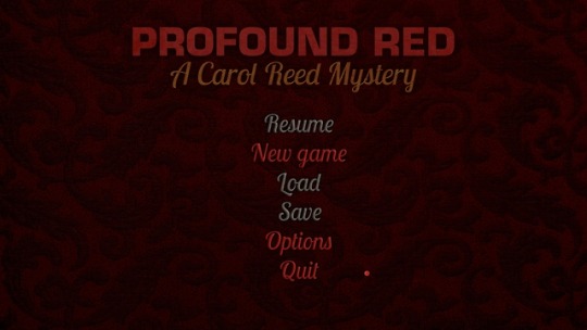
A while ago, I mentioned picking up Profound Red, an adventure game whose title was clearly taken from Dario Argento's giallo meditation on gender constraints, Profondo Rosso, and whose launch icon was pulled from James Sunderland's mental depths. Unfortunately, the promises of these references did not deliver, but the game is such an unusual production that I thought I'd take an extended look at it.
The driving concept behind Profound Red seems to be: "hey, gang, we know code, we have a camera - let's get together and put on an adventure game!" The game environments consist of photographs of real locations from around the designers' hometown of Norrköping, Sweden; characters are acted out and voiced by apparent friends of the designers. The homemade approach continues right down to the method of sale: I purchased Profound Red not by visiting Steam or another storefront but by PayPaling the designers $12 and receiving a download link in my inbox several hours later.

While the prospect of Argento parallels pushed me into a purchase, it was actually this make-do, will-do attitude that drew me to this studio's work in the first place (first gleaned from a screenshot from a review of one of the developer's earlier titles, featuring an actress portraying a bedridden hospital patient but wearing full makeup: OK, I'll be in your computer game, but I'm not taking off my face for you). I unreservedly admire the gumption behind this production; the designers found a way to use the resources they had at hand to work in a field they apparently love. They've found success, too, as Profound Red is the 12th in its series. "Homemade" here doesn't denote jank, either; the photos are professionally composed and shot, and the technical side of the game runs quite smoothly.

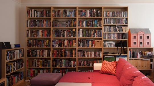
Profound Red stars Sweden-dwelling English expat (and major classic adventure game enthusiast, judging from her bookshelves) Carol Reed, who here is summoned by her hotel-manager friend to investigate a suspicious suicide-note text from a recently-deceased guest. The trail leads to the dead woman's isolated country cabin, a derelict housing development abandoned after a rash of apparent poisonings, a downtown "motorbike basement" (that seems to house primarily non-motorized bikes), and other locations around Norrköping and its outskirts - but it focuses on the city's local swingers' club, where the woman was a frequent patron. Further investigation reveals that the owner was perhaps not privy to the complete range of activities taking place in his establishment.
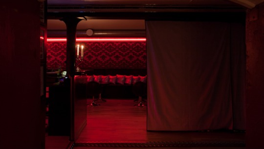
As one might surmise, the club is where the "Profound Red" of the title is most prominently manifested. I was extremely disappointed, though, that the game takes nothing but one salient plot element from its Argento inspiration. Gialli deal in over-the-top visuals and lurid emotions, neither of which are really present in Profound Red; the designers apparently figured, "well, the plot centers around a sex club," and left it at that. The fan base seems sufficiently scandalized by finding enema bulbs and stim cream in examining the environment, with no deeper meditation on sexuality needed or sought. However, if your game invokes the name of Deep Red, a movie that's really invested in examining gender roles and sexuality, you have somewhat of a responsibility to take your treatment of this material beyond the tee-hee level.

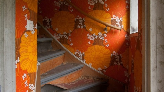
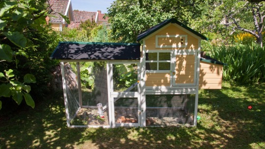
We're left with what the developers wanted to accomplish via their strengths: photography and knowledge of their hometown. All the sets in Profound Red, of course, are real locations in Sweden, and the developers take care to include a few regional landmarks in each of their titles (here, a local museum, a city garden; even the sex club is an actual business). Some of the sights are photographed in close-up seemingly just because the photographer found them visually interesting and wanted to share them, be they local fixtures or happy, fleeting accidents - a friend's rabbit, sleeping it its little house-shaped hutch; a spiderweb artistically spun between the rails of a bridge, glistening in the sun; a trio of decorative boulders covered in an Argus's worth of hand-painted eyes. It seems as if the developers are in part using the adventure-game medium to document and share the history and sights of their hometown, which is an admirable goal and a truly unique use of gaming. It is this decidedly personal portrait that is the most striking aspect of Profound Red.

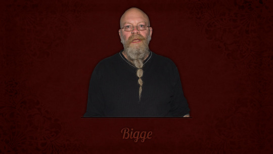
That touch permeates how the designers present their actors and the private residences they used for shooting. While the photos are clean & well-composed, it's also clear that the devs are working with friends, their homes, and the detritus of said friends' daily lives. The creators handle this, though, by letting the player in on the production to an extent. Click on the right places, and you can peek into closets to see the flotsam that had to be corraled to get the location into shooting condition. One of the developers apparently plays a role in each of the games as a running joke, as does a biker-like man in glasses known only as "Bigge," who has, based on forum reactions, evidently become a fan favorite. Series fans are revisiting not only characters, but actors, and Profound Red, to an extent, is about the process of making an adventure game. Given this candor, even the awkwardness many of the actors evince comes off as charmingly authentic, in a way, instead of off-putting - the product of friends' efforts rather than professional entertainers. The end product can at times be weird, but it's a forgivable, earnest-people-trying-their-best weird. Overall, it's instructive how Profound Red's producers have used familiarity and friendliness to turn weaknesses - a limited budget, amateur actors, a shooting location that triple-A gaming would dismiss as unglamorous - into strengths.
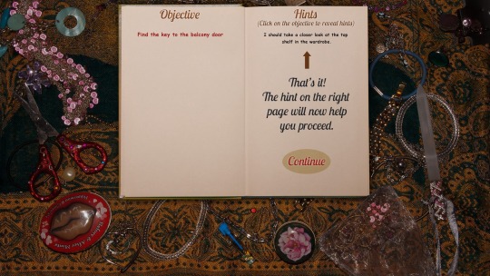
I'm coming off as more positive about Profound Red than I feel, though. The game has decided problems with puzzle design. The designers attempt to head off any gameplay trouble by including an in-game hint system that reveals the very next step in your investigation (but no more) with a couple clicks in the inventory menu. In theory, making direct help safely hidden but easily-accessible should work quite well: it caters to folks who might not be HARDCORE ADVENTURE GAMERS and are more invested in advancing the story, but it frees the designers to work out more involved riddles for those who do want a challenge. In practice, though, the presence of ready help is often taken as a license to play fast & loose with solid puzzlemaking: I frequently found myself stumped because I wasn't clicking in exactly the right place, and the use of certain items, such as the window cleaner, hems too close to cat-hair moustache territory. It's not across-the-board questionable by any means, but there were enough frustrating parts for me eventually to stop engaging with the puzzles and lean full-on into the hint system to get through the experience.

The other big mechanical sticking point is movement. The basic system is fine: locations are selected from a map and navigated via Myst-like clicking through a series of still images. There's only one entrance/exit per venue, though, and the game design frequently requires you to trek deep in and out of locations to pick up or use a single item, which weighs down Profound Red's pacing considerably. (A big long fetch-quest puzzle chain near the end of the title contributes mightily in this regard.) A "leave location instantly" option would help the tempo immensely here.
I'd like to talk about the story in-depth for a bit, particularly as it compares to Deep Red. Spoilers for both the game and movie lurk below the dark mirror of the soul below. You're safe when the comforting visage of Bigge appears!

OK, **SPOILERS SPOILERS SPOILERS** ahead: When the mom appeared, I was dearly hoping that she would turn out to be the killer, and I was not disappointed in that regard. You even get the side bit about the son appearing for a short while to be the killer but in fact acting only to protect her. (Upon seeing that she was wearing a gold necklace, I was also hoping that that would be the method of her demise, but I suppose decapitations are a bridge too far for this series.)
As mentioned, though, that is the limit of the game's Argento influences; for all its invocation of deeper material, the game seems studiously to avoid any closer reflection on its own story. For example: how does Sven, the club owner, feel about everything that's happened? He and Louise, the victim, seemed to be close; Louise seemed genuinely to love him; she was, however, sabotaging his business for self-enrichment via a blackmail scheme. And how did Louise feel about that? Her history of confidence schemes speaks to an ingrained sociopathy, but we never address this contradiction in her character. Then there's the thread about criminal behavior running in the family, which seems to be a major part of the story but is left undeveloped. Yeah, I get the sense that the folks who follow this series aren't looking for deep introspection - but, well, the story elements are there. The designers had an opportunity to go psychological with their inspirations and explore the plotlines they set up, and it would have cost nothing but text...they just chose not to do so.
Profound Red leans hard and somewhat unwittingly into the adventure genre's underobserved wackiness, such as the plotline (played completely straight) revolving around hardcore skateboard forgery, or the blackmail note demanding Bitcoin as payment, or how, at one point, my inventory consisted of a ten-foot-tall ladder, a trampoline, and a packet of lube. What I remember more, though, are the actors, and the sights of Norrköping, and all the photos of soda bottles in closets. I connected with this setting and could relate it to my own everyday experiences and environment (hey, Swedes have those dumb signs about the lake, too!); the game gets its primary focus right. It's an interesting artifact - though your interest may be limited if you're looking for something beyond interesting.

#profound red#deep red#profondo rosso#dario argento#carol reed#let's confuse all the fans of the third man
1 note
·
View note
Link
Time for another update... I went camping for the first time over Labor Day weekend! We went down south somewhere in the middle of nowhere, it was...sort of intense. I did about as well as could be expected, with the number 1 nuisance being the flying buzzies that bothered me constantly. I had my earbuds in for most of the day, otherwise I probably would have gone insane...past that, it was stifling hot so we spent a good deal of time in the creek. We had a nice night hike and glowsticking session, which was fun! The clouds were actually covering most of the sky, so we didn't see any stars, or hardly even the moon (which was super bright when it was visible), which was a bit disappointing, but I actually didn't mind much -- to be honest, I thought it was actually really cool being out in the middle of nowhere with not even the stars out, especially since it was so quiet in terms of ambient noise. (And the buzzies were asleep, YAY) It was a special kind of quiet, I think. Anyways, overall a fun trip, though not something I'd be looking to do again, haha. I was pretty drained after coming back home -- it has been a while since I have felt so socially depleted; I remember I really just didn't want to interact with any human beings. Before that I also went to Crunchyroll Expo! It was fun overall, and very convenient and close to get to -- very laid back, very easy. I'd definitely go again! It's smaller than an event like Fanime, but surprisingly large despite it being only its first year. I brought my Journey cosplay, as I always do nowadays. Here's a photo of me along with this super cool Hyper Light Drifter (!) cosplayer!
By far the highlight was getting to meet the OneShot devs (!!!) who apparently were holding a table at the artist alley!
Official merch omg!!! I fangirled for a while here, looked at all of Nightmargin's cool art, picked out a ton of stuff I wanted to buy from them, and traded contact info (I had one of my spiffy business cards with me, aw yeah!). So cool, I never thought I'd get to meet the devs in person, like they are real people sitting right there on the other side of that table and they made one of my favorite games wahh @_@
This week I'm actually taking the week off from work! Taking some time off after working hard for our PAX demo, which seems to have gone down pretty well! As you might guess, I'll be trying to spend the week focusing on more development for Rhythm Quest, music production, hopefully some art, and overall just catching up on things in my life. It's been going pretty ok so far! I've made some good progress on Rhythm Quest and pushed out a new song as well. My current big focus area for Rhythm Quest is adding a whole new part to the game -- overworld maps! Up until the beginning of the week, the level selection UI (which, admittedly, was placeholder) for Rhythm Quest looked like this:
Pretty boring, right? (though a lot more exciting than before when it didn't even have stage names) But it works just fine, and is even optimized for touch controls (Rhythm Quest is designed for mobile!) and if you look at my other rhythm games, you'll see that it's the same basic menu template as before. Here's Ripple Runner Deluxe:
...and here's Melody Muncher, which adds a little more detail with level info and high scores:
But I really wanted to have more of a sense of progression for Rhythm Quest, especially since, unlike Melody Muncher, there aren't going to be high scores or anything, just a pass/fail, with a special bonus if you clear the stage without dying at all (just like Ripple Runner). I actually think that was one of the strengths of Ripple Runner's design when compared with Melody Muncher -- even though Melody Muncher was a much "deeper" game mechanically, there is a certain simplicity of "have to get this section right" and "one more try!" that I think keeps players engaged, as opposed to the more DDR/Guitar Hero-like mechanism that Melody Muncher uses. Of course you need to be a little more cautious with the difficulty because now you either pass or fail (and failing means not progressing!), but I think there's also a better and more concrete sense of accomplishment after doing a section well. Anyhow, I wanted to have more of a sense of progression and was throwing around ideas about how I should handle level/world selection (I knew for sure that I wanted to divide the stages up into "worlds" with different themes). I couldn't really come up with any simple menu/ui-based schemes that really felt compelling, so I started thinking about map screens -- and more specifically, ideas that would meet the criteria that: - They make sense with touch controls (but could work on PC builds as well) - They provide a clear sense of progression - And most importantly, they are doable in terms of my artistic abilities That third point is always the limiting factor for me, as that's certainly my weakest and most time-consuming point in my trio of skills between coding, audio, and graphics/animation. I knew that doing some sort of map system would be testing those skills, but maybe it would be an opportunity for growth! I've actually already gotten WAY better at pixeling over the years than I used to be, after all. So I started thinking about map screens that would make sense, including some sort of Kirby's Adventure-style platformer-based level selection with doors and a level layout -- which seemed doable in terms of art assets (platformer tiles!) but didn't make too much sense with the rest of the game, and made zero sense to do with touch controls. So I settled upon some sort of overworld map system, with dots or circles that you would tap on in order to select a level. I ended up pulling very heavy inspiration from the Super Mario World overworld map style, which looks like this:
I thought this would be a great fit, as it was roughly tile-based (good -- limiting myself to working with a grid makes things much more structured and easier for me) and the graphics themselves were relatively simple. I could even use the "roads" to mark progression, as SMW did, which would be great! I had a few false starts, and went back and forth on what to do with my color palette -- Rhythm Quest has an interesting facet of its design where the level tileset is drawn using a 4-color palette, but hue shifts to different colors at different points in the song. This is the same technique I used in both Ripple Runner and Melody Muncher, to great effect -- 4-color monochromatic palettes are an absolute joy to work with for me, as they simplify everything a lot and allow me to really concentrate on values rather than worrying about coloring. It's worth noting though, that as with other aspects of 8-bit style, Rhythm Quest breaks this rule in other areas -- the character and enemies and obstacles and UI, for instance, don't actually fall into the same palette, which makes sense because it's important to be able to still recognize red enemies vs orange enemies, etc. and neither spikes nor the character wouldn't be able to stand out as much if they adhered to the same palette. So it's an interesting mix. Anyhow, I was really having trouble drawing out a good "Grass Land" map using my 4-color palette that featured a nice green-ish ground color but also had tree tiles and such, as well as a lighter color for the road. I also knew I wanted a lake or river so that level 1-3 could take place over the water. At one point, I decided to throw the 4-color palette to the wind and started drawing up a more expansive color palette, with blues for the water, greens for the grass and ground, and some yellow colors for the road and dirt. I started to try pixeling some trees and such using that palette, and it was going pretty decently well! But then after that I realized that with a few replacements and adjustments, it actually worked just as well (if not better) with the original 4-color palette after all! Here's what I ended up with:
Again, the blue circles (which are the actual interactable buttons) don't obey the 4-color palette. It's inconsistent, but in a consistent way I guess! Anyhow, I'm really happy with how it turned out so far, and it was a bit of a relief to be honest that I managed to get something workable. With that body of work out of the way, my next task is to actually hook up all the buttons and dialogs (partly done already), and then do a bunch more coding work to get it so that your level progress is saved, and so that the roads actually fill in dynamically like they do in Super Mario World -- that should be really cool once I get it all working!
0 notes