#( IM IN LOVE WITH THIS PSD I DID )
Explore tagged Tumblr posts
Text

"Aodh what do you want from me now?" "Everything" "Take it then."
[HOLD ME TIGHT OR DON'T - FOB ] 00:29 ──⚬──── 3:30
#im so in love??#my partner did the screens!!! it was their first time and im so proud and happy eheh#as i said: i would die for this ship they are perfect goodbye#c: alika diamandis#c: aodh ramsay#ts4 edit#ts4 psd#ts4 sims#ts4 screenies#ts4 screenshots#ts4 simblr#simblr
70 notes
·
View notes
Text
Beinnant Tumblr layoutz


For @lavendergalactic 'z zilly week :3
day 1﹕a crackship
Psd by @/sanguisettes !!
F2u w/ credz )) like/rb to uze
Im not thaaat late :3 )) anywayz I love them they're married .. did you know Im their ceo .. :3
I zhould have rethemed by now uhwwnn . .
#layouts#tumblr layouts#genshin#genshin impact#beidou#genshin layouts#reverse 1999#tennant reverse 1999#tennant layouts#red layouts#lavendersillyweek
70 notes
·
View notes
Text
Do you need roleplay icons or screen caps? Don't want to make them yourself? No worries! Shopkey's here to lend a helping hand.
Rules:
BYO PSD (though I have a couple I've collected over the years) if you did not create it link me to the post where you got it. I will not use any psd that cannot be used with commissions. Do not pass go; do not collect $200.
I will not do screencaps or make icons of people who do not want to be used as faceclaims
I will not make icons for real people roleplayers. I will check your blog
I will not make icons of people who are most commonly on banned FC lists
I will not make icons of deceased actors
Payment will be through paypal
Pricing is what it is both to respect the time it takes and because we have to move out by November and we didn't really see that coming.
Screencap Pricing:
$10 per 10 minute clip (my hard drives only have so much space
Icon Pricing + a psa:
$5.00 per hour worked on the pack bc making icons takes a lot of time and effort to make them look good
All icons will be 100x100 because I cannot see anything smaller than that.
I will make comic icons but you will have to provide the scans as I have neither a good scanner nor many comic books. (I do have "God loves, Man Kills" and "Spiderman Noir" as well as "Batman Year One" though if you're willing to put up with slightly wonky scans)
Feel free to IM or shoot me an ask with any questions.
#icon commissions#commissions#commission post#commission prices#please reblog even if you arent interested
23 notes
·
View notes
Text
MISUN @ SBS GAYO DAEJEON 2023
RED CARPET/CEREMONY & PERFORMANCE STYLING
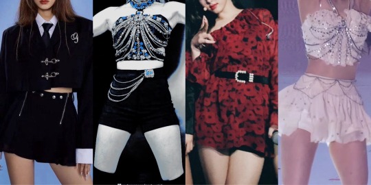
LEFT TO RIGHT : RED CARPET, SOS + ISTJ, GASHINA, BAD NEWS + UNTIE
i forgot to add a psd and im not redoing it
okay so such a fun but also messy ass time… like it was fun at first and then it got messy
first off, the camerawork during sos … a whole ass mess.
yes she did in fact go shade sbs on bbl after she did not gaf especially after learning that ten fucking fell?? yeah she was pissed
she had fun spending time with all the nct members though
she enjoyed aespa, txt, enhypen, skz and the boyz’ performances thoroughly AS USUAL! those are her bffies even if she … doesnt talk a lot to them😭
aespa’s performance … she screamed so loud it shocked hendery who was right next to her lmao
she had a surprise solo stage hehe
she performed gashina right before sos and istj
now … gashina performance was WILD. screams at every second constantly like
the chemistry in the choreography between her and the first male dancer … whew
nctzens went WILD im telling u
dalbits went crazy i think ive chosen dalbit for her fandom name ill explain in this ask i still have to answer
they were jealous as fuck😭😭 but also so hyped cause they know she enjoys doing sensual/mature dances
nct tho … they were shocked after cause not even they knew the details of her solo stage 😭😭
like theyve seen her dance covers sure thats one thing but IN FRONT OF OTHER IDOLS???? girl… who u dancing like that for misun: myself
u can bet ur ass 127 were like WTFFFF ur a child to her after they all got backstage
while the boys did their little dances she went to go quickly change skfjdjd she’s never changed so quickly in her entire life
she was so excited for nctzens to see sos live but when watching the stage back she was so disappointed lmao (us too, girl)
AND THEN! bad news and atittude. she loves those songs sm and the choreos ( nct female unit songs )
somehow at the ending stage jaemin got hold of a rudolph nose and made her put it on ??? atp she doesnt even bother asking lmfao
god bless when nct ALL did the fucking ring around the posie thing she was so EMBARRASSED hiding her face and everything
she walked away and pretended like she didnt know them with nct xs 😭😭
who i still havent posted sorry will be done soon
small interaction between her and txt! mc yeonjun and mc misun meeting once again even tho they see each other like every day lmao
fans got pics of her and karina meeting and karina putting the nose on lets not address the elephant in the room rn its called fan service
she did a tiktok with winter and karina for jingle bell rock. karina and winter did attitude since they’ve already done bad news
myzens that all was for u btw
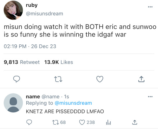
also did watch it trend with sunwoo and eric yup who in return did bad news with her
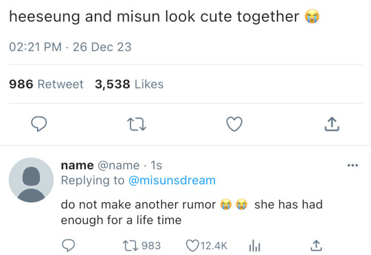
did sweet venom with enhypen’s heeseung and jungwon she loves that song they did bad news too
siren with shotaro too for the millionth time and talk saxy with wonbin she also loves those songs they did attitude!
she also did lalalala with felix with him slaying bad news as usual
both a very fun and messy time
TWEETS
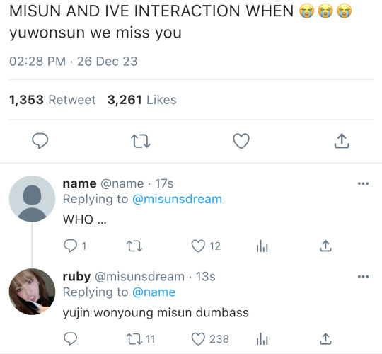
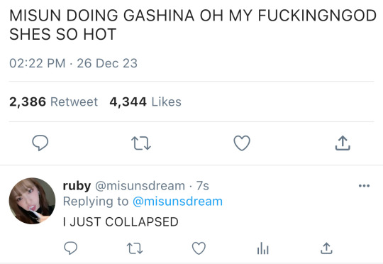
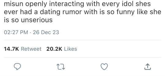
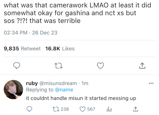
#⁽ ⠀ ҉ ⠀ ⁾ ⠀ ⠀ misun ⠀ / ⠀ * ⠀ misc.#fictional idol community#nct dream 8th member#ficnetfairy#idol oc#nct 27th member#nct female addition#nct female member#nct female unit#nct imagines#fictional idol oc#nct oc#nct female oc#kpop female oc#kpop female member#kpop idol oc#fake kpop idol#kpop oc#kpop imagines#nct dream#kpop scenarios#enhype#txt#the boyz#aespa#stray kids#bts addition#nct u#wayv#nct 127
60 notes
·
View notes
Note
Gray & blue for the azk game !! :3


gray: talk about the colors you tend to use in edits! do you like making bright or dark edits? are there colors you dislike editing?
i tend to lean towards making pink edits i think! i love making pink and red edits mostly :D
and i HATE editing yellow or a light green, i don't know why i can just never get it right- except for this yayoi edit i think the yellows in this one are really nice
blue: do you have favorite editors? is there any specific reasoning for your choosing?
@llocket !! 100% locket i really love anything he makes and i am VERY biased but hey i am locket's #1 fan forever >:) she's been improving their graphics so much recently, i love the married in red edits they did today... the improvement is crazy
@saeriji PROUD SAE OG FAN SINCE DAY 1 BRO 🔥🔥🔥🔥🔥🔥 i love all the gifts she's given me, she's so generous and kind T_T and i'm pretty sure she does all her colouring and editing on ibis paint and literally she is just so good at colouring on ibis paint i strive to be like that
@necroangelz OFC! i've seen hir improve SOO much over the past few months, and idol even hit 1k followers recently which is so incredibly deserved
@hiddencircus i always find myself staring at radio's edits for 5 mins straight like... they're all so incredibly detailed and i just feel so much intention and effort that was poured into the edits
@doveish the way shi colours stuff is so nice on the eyes, and i've got to talk with macalo like two times on discord and shi's such a blast to talk to! shi also got me hooked to the lolitawardrobe account on twitter
@narcbf got me super inspired to make shiny buttons / imvu badges, thanks to their tutorial i can make them too now 🙏 also .co/pixelprism is like an angel sent from the heavens i love going there for any resources or really pretty shiny buttons
@herrscherofmemories (YOU!) the absolute IMPROVEMENT i've seen from amaru is so wild to me like i love to see it fr. im in love with this psd of hers, also i forever associate them with any melusine- i see a melusine in the wild and go "OMGG AMARU!! NO WAY!!" also with s = z typing quirks too, i remember my S key hurt too much to press so i settled with what i called "an amaru typing quirk" it was actually really fun
@spiralssyndrome i love love love her colouring on anything, and their melanin edits she does!!!! im a sucker for genshin melanin edits omg... also they're super helpful when it comes to making renders; it's so sweet how willing she is to help me with rendering an image :D also they helped with colouring on my chappell roan buttons 🙏 my hot to go button would be very different without her help thank u
@ideallyadored SUPER DUPER SMOOPER HELPFUL WHEN IT COMES TO GRAPHIC TIPS!! recently told me i should use sharpen on my stamp gifs, i still have yet to figure it out but i can't stop thinking about that tip it lives rent free in my head, i also love their clean aesthetic approach to things all of it is so nice on my eyes
that was such a yap fest i would have gone more but i'd be here for years guys LMAOFOA


19 notes
·
View notes
Note
I love your art so much, the shapes are so neat and the style feels so visually interesting!!
I was wondering what software you used for the Spamton artwork? And what effect did you use for the Caine poster to create that old print effect? It looks amazing !!
Have a great day/night ^^
Edit: apologies if its weird im on mobile T_T
Hi! Thank you so much, i rwally appreaciate your kind words♡ they really help to keep me motivated it!
To answer your question however!
I use both illustrator and photoshop! Illustrator is used for all my drawings and photoshop for textures ☆
if you ever need the link for the free """"""version""""" *wink wonk* feel free to dm me!
For how to actually put textures!
1st! Open photoshop
2nd! Make your graphic or import your image, here i just made a quick smily face
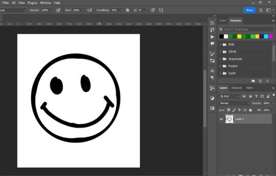
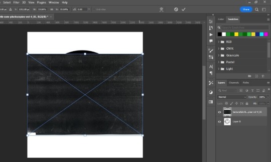
3rd! Import your texture! (You can easly find them by putting a word plus texture i.e. photocopy texture on google) and scale it to you preference, i normally just fit them as big as the canvas itself
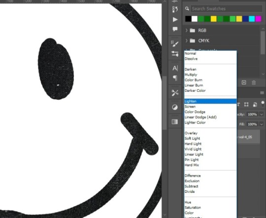
4rth! Blending modes! This is kinda experimental so feel free to browse all of them to see what fits better, in this case i use "lighter" so only the texture will be seen on the graphic, kinda like a layer mask
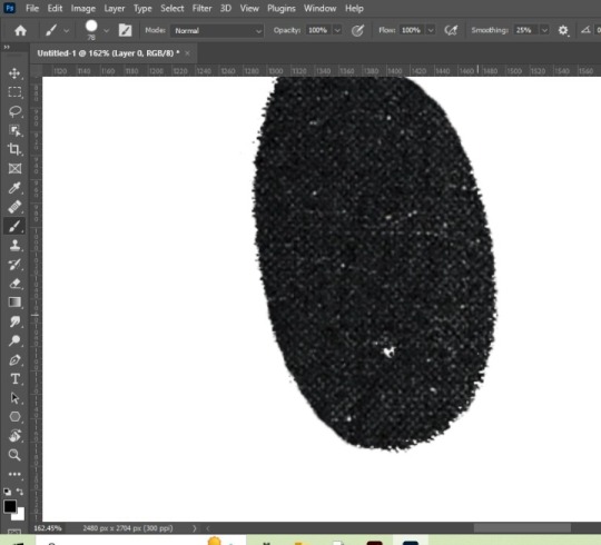
5th! Displace filter! Im not sure if other programs have this filter, but in photoshop basicly takes the texture of another photoshop file, and whatever things has on it, it applies it to the graphic (lets say that you have a photoshop file with a crumbled paper texture, the graphic will take the texture of this, giving it a more realistic look) akso i recommend converting the graphic to a smart object, so if youre not satisfied with it you can easily change the settings
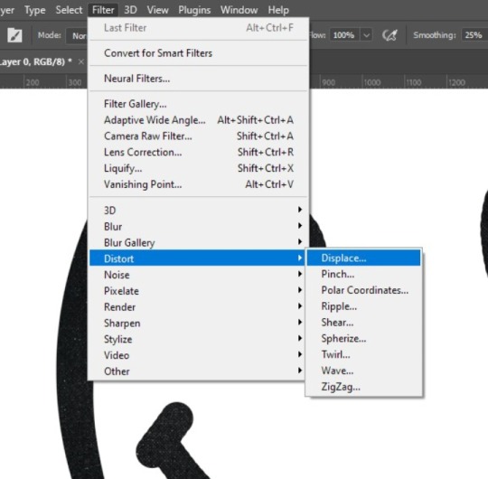
You will get this little square thing, im not going to lie i dont really know exactly what it is for LMAO but, the numbers the bigger they are, the more dramatic the texture result will be
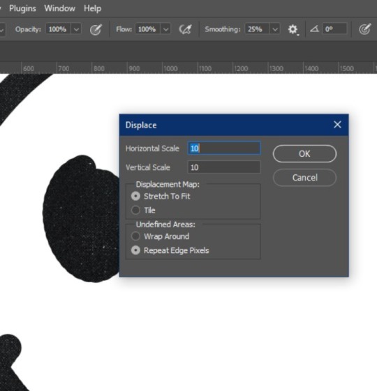
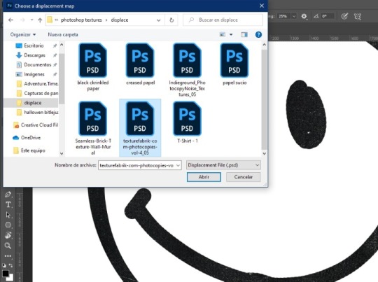
Then this window will pop up, it basicly tells you to choose the file you want, at the end i will tell you how you can make a displace file! And you click open:
Results:
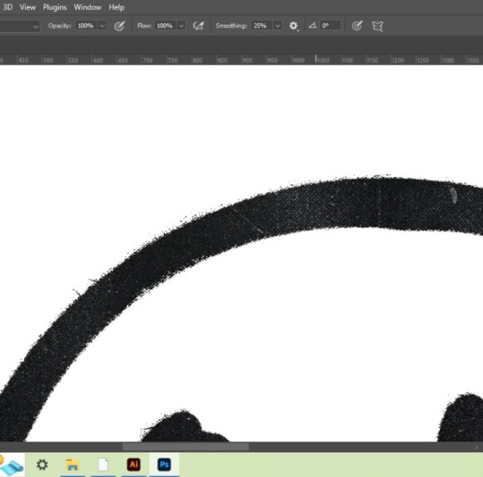
Then if the background looks a little flat you can copy the texture above your graphic, put it below it, inverte it and choose a blending mode, here i use multiply:
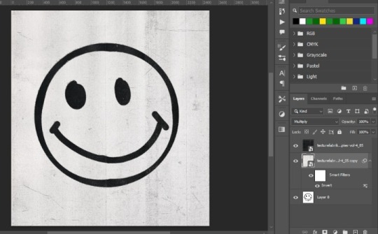
And thats how you get that sort of printed like texture!☆ you can use this method to get every variable of results, i hope you find it usefull hehe!☆ below the cut are the steps to make the displace file, just so this doesnt get too long haha
How to make a displace file:
1st! Choose your texture and open it on photoshop directly so the image is the background
2nd! Without doing anything youll just click on file>save as
3rd! Save it as a psd document
And there you go! You have a ready to go displace file so you can spice up your work☆
(I would put more pics but??? Appearently there is a 10 image maximum? Wtf?))
#mr k' s talk#thank you so much for the question! i hope you find this useful :D#texture#tutorial#graphic design
33 notes
·
View notes
Note
Hii !! Im sorry if you answered this before, but how did you make the postcard layout from your very first legacy post ?
Also, I just read thru ur Postcard legacy posts and I loved it so much !! U inspired to to try this Challenge and I can’t wait to keep up with yours !! <3
I used this postcard psd template then I made a fake letter mockup in photoshop. I googled maxis match icons from ll'universe (the website is in french, you'll have to translate the webpage). I also used the cas traits psd template. I downloaded simlish fonts and included it all over the post along with these though and speech bubbles but the original link is down :[
Thanks for enjoying my content! I'll be honest I don't stick to the postcard legacy challenge anymore but it was a great foundation for me to start my legacy. I think you should try it though, country living is my favorite pack because of this challenge.
25 notes
·
View notes
Note
LOVE your Shadowheart and Gale designs just ugh. Do you ever livestream your sessions?
im very flattered dear anon but trust me even if i did it would be a deeply unenjoyable experience. the stuff i do to my psds can only be described as torture + im scared of everything and everyone
#ask tag#also i need a transwoman in my ear telling me about bloodborne to focus. and like three cigarettes. and im silent the whole time
13 notes
·
View notes
Note
hi!! im currently a tumblr writer and planning on starting a new blog fresh. i love the look of urs sm and was wondering if u have any tips or ideas or references on how to design a good looking organized styled blog?? id love any help or guidance huhu
Thank you so much anon I’m so happy you enjoy the look of mine 🥲🫶 Hmmm,,, I’ll tell you the process of me making my blog and hopefully it’ll be helpful! (Had to add cut bcs it a bit long)
What I did first was look at other blogs to get inspiration for my layout and also see where they got their dividers from (mostly from @/cafekitsune but there are so many other blogs that have lovely resources!)
Once I had a layout in mind I went on deviantart and picked a psd (filter) for the colors. I use photopea (website) for filtering however polarr is also lovely filter apps that have a variety of filters on pinterest !! I try to use images that work well with the filter and have a relatively similar color scheme outcome as well as match each other — for example in my intro post I made it look like liz was taking a photo of robin.
I related my theme to my user — my user is lizdive which is a combo of the kpop idol liz from ive and the group’s popular song 'love dive' however in my into and my asks it’s based off of their song 'ascendio' and for my masterlist i referenced robin with her song 'hope is the thing with feathers'
There’s a lot of blogs that have pretty symbols and moodboards for various fandoms and aesthetics :3
For me personally organized means not too messy and neatly sectioned but of course it depends on what YOU want to do. It’s YOUR blog so do everything as you please and be as maximalistic or as minimalistic as you please !!
I organize my blog with special tags so that it’ll be special to my blog and also so it’ll be easier for people to navigate my blog — if they wanna see all my notes and interactions they can go to robin’s notes / robin’s stars and if they want to see my writing they can use robin’s writing. For a little more organization if they wanna see things written from requests they can do that with the robin’s stars as well. I find organizing with tags very useful.
Also, there are blog themes / layouts that you can use if you wanna get extra complex with your blog layout !! There are many that are very pleasing to the eye and will make your blog look a little more sophisticated (is that the right word?) however they’ll take a bit more time to figure out,,,
I use a this website to do gradient text (there are tutorials on how to properly format it on posts) and this website to color pick from images. Personally I prefer using specific colors so that they, again, will match my blog theme. The tumblr default colors are nice and all but I find that they are too vibrant for most images I use for my theme and therefore will not look too nice. They work well if you plan on having a brighter theme for your blog, tho! I just like following the theme a bit too much 🤕
And the most important thing of all: make sure you have fun with your writing blog and that you actually enjoy writing. Don’t let anyone pressure you or overstep your boundaries 🫶
I hope you’re blog is super successful and if you have any questions I’m always open to answering and helping 🩷 I think that’s everything and hopefully this was actually helpful tho LMAO 😭
6 notes
·
View notes
Note
hello!! those sylveon graphics are absolutely gorgeous oh my god. do you guys do dividers as well? totally fine if not but I would love a few assorted banners in the same colors as the graphics. entirely up to you though of course! thank you so much either way youve saved me a lot of stress with being overwhelmed on rentry choices ♡
hello ! im so glad you liked them!!! unfortunately, our rqs are currently closed and i didnt save the psd for the coloring i did on those so i wouldnt be able to get it exactly the same, so im gonna have to deny this for now :(

3 notes
·
View notes
Note
Mr. Gamer(ism):
Would you say that you go looking for inspo or does inspiration find you?
Also umm, when you think of a gifset you're really!! proud of, what's the first that comes to mind?...This may or may not be an opportunity to show off your faves and all.
(of course, every single one is very worthy and you should be proud of them all, but still!)
tysm for the ask! (adding a readmore bcs i decided to add some of the gifs im taking abt)
Inspiration usually finds me (especially for a lot of the gifsets im abt to talk abt). But occasionally I'll go looking for things. But depending on the medium we're talking about I'm kinda hesitant. (Poetry, for instance, is hard to look for inspiration for. Where as gifsets not so much.)
I do actually have a set that always comes to mind first. It has kind of changed over the years as I continue to improve but current it's definitely this one!
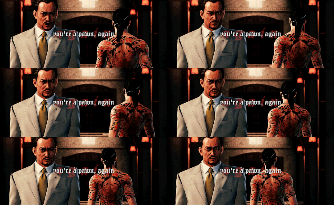
I'm really happy with the colouring and the written part of this one is my own prose.
I aaaam totally gonna mention a few others. lol.
Two general honourable mentions are definitely from my pathologic blog. I've known about the tiled multi-gif thing since like, 2014, and have always thought it was so so cool, so learning how to do that for this gifset was really exciting!!
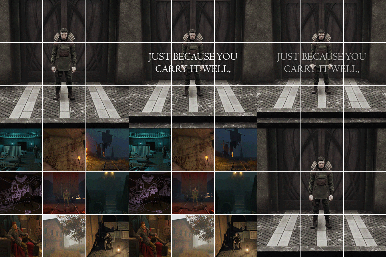
The crossfade is so fun. I gotta do this again.
And the theme of this one using quotes from the game about fate kinda just came together in my head like a webweave.

I was finally able to use some really cool and creative photoshop effects I've known abt for ages for it.
Anyways I've worked hard on getting better at text on gifs this year and both this set and this one really show that, I think!
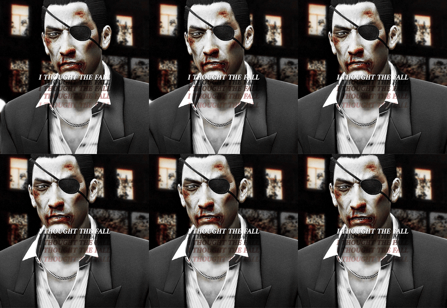
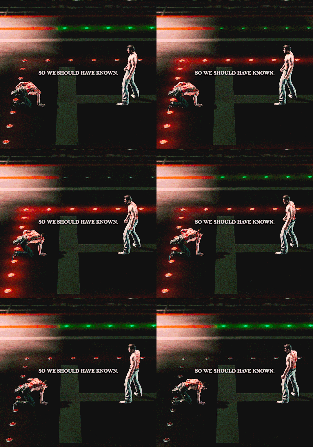
(When I did the yakuza 3 one I immediately went "wait how did I do that, iv totally got use this again". It kinda reminds me of 80s horror movie text)
Lastly I'll just quickly mention this set as well because I still really love how colourful it is. And I've been working hard on my colouring too, since I don't use other people's psds off the internet, I just open some layers and start trying things. (also rip me never finishing this series of sets 💀)

Anyways thank u for indulging me stretching ur question out. I do think a lot about how I've improved and sets I'm proud of and such so guess I've been kinda bursting to talk about it.
#appreciate the q kyle#asks#answers#q & a#<- look at this fool who still hasnt condensed his ask tags into 1 easily searchable tag#my.stuff#my.gifs
3 notes
·
View notes
Note
hello! i really love your gifs!!!! im still learning how to do some effects and i wanted to ask if you could make a tutorial on how you did the blending for this post? https://www.tumblr.com/jikyu/733643818578198528/baby-dont-stop-2018-nct-u-for-berryjaellie?source=share i understand if you dont wanna hehe thank you so much for sharing your work <33
hi, thank you so much ! i'm not like amazing at tutorials but i'd be happy to share with you my layers & process for this particular set (she saved a psd for once ... everyone cheered!) and give some general advice + i'm going to direct you to this tutorial by @woozis who i think does a great job of explaining things and has more experience with gif blending specifically (this was my first set using 2 gifs in this way; normally i use blending for static gfx or using overlays that aren't 2 gifs from the same source content, which are both great ways to practice) . i highly recommend utilizing multiple resources to get a feel for how different creators do the thing you want to learn, but at the end of the day i basically just start throwing stuff into photoshop and watch it come together in real time with anything gfx related lol . anyways, with that big intro out of the way, let's talk about how we made this set using this gif as the example:

so step one for me working with this content aka music video was just picking out the clips i liked and knew i wanted to use in the set . when it comes to gif blending the 2 gifs you're using need to be the same exact amount of frames or you need to be able to get them there, so basically after i had just pulled as many gifs out of the mv as i roughly thought wanted to use, i imported all of them into ps to see the frame rates and started mix-and-matching the ones that were around the same length to see what would look the best layered over each other. this is very personal preference based but in this case i liked that they were executing similar choreography from different angles and in different outfits and settings. for this gif, i ended up with these 2 separate ones:


these are sharpened but no coloring added yet - as you can see one of the clips is black and white so that can be a great option for blending because you can add whatever color you want over it. of course, if the original content isn't b&w you can just put a b&w filter on it and do the same thing - i recommend this if you want to put gifs together that aren't already color compatible. anyway, once you have your gifs you convert them both to timeline and just drag and drop one over the other. it's usually not going to matter which one you put on top, but that's the one you're going to use the blending effect on, so i went with the black and white gif over the color.
to blend the gifs, i set the blending mode to 'screen' on the top gif. for this one i kept the opacity at 100% but on other gifs in this set i brought it down to around 85% depending on how it looked. then i added my coloring to the base gif + i deepened the blacks on the top gif (note that you need a clipping mask for anything you want to do to the top gif without doing it to both). this is where you'll want to start messing around as you go, screen is my most used option for these purposes but sometimes overlay or multiply looks cooler, and you can mess with whatever opacity you think looks best. here's what my layers look like at this point with that top gif selected + what the gif looks like blended before and after coloring:


already pretty cool! but i wanted to add color to the black and white to really bring the effect home. i used the eyedrop tool to grab the blue from the lighting in the bottom gif (for the other color overlays in this set, i used the red from taeyong's hair) and added that into a solid color layer over the b&w gif with a clipping mask, and set the blending for that solid color layer to 'overlay' (again, you can try different ones for the look you like best)


this is my finished blended gif, from there i just added the text! the actual process of making the gif isn't what is so time consuming imo it's more just about finding the clips that will work together and testing out what you like the look of. this one is probably my favorite blending result from the set and there are plenty of things that i feel like don't look perfect, but ultimately i'm happy with the result and i think the set looks cool anyways -- so i encourage you to just give it a try and chances are it's going to turn out looking nice!
hopefully this was helpful, happy giffing (and feel free to tag me in your works if you try this out) !!
#erimail#.resource tag#gif help#again not a great tutorial girlie over here so if this makes no sense i am so sorry <3 ajkdgbjhsdbg
5 notes
·
View notes
Text
𝐆𝐄𝐓 𝐓𝐎 𝐊𝐍𝐎𝐖 𝐓𝐇𝐄 𝐀𝐔𝐓𝐇𝐎𝐑.

𝐧𝐚𝐦𝐞. han or sexy bitch w/e u prefer honestly
𝐩𝐫𝐨𝐧𝐨𝐮𝐧𝐬. she/her
𝐩𝐫𝐞𝐟𝐞𝐫𝐞𝐧𝐜𝐞 𝐨𝐟 𝐜𝐨𝐦𝐦𝐮𝐧𝐢𝐜𝐚𝐭𝐢𝐨𝐧. discord ( ims are ok but staring at the lil box makes me wanna die & i ALWAYS lose track of my ims, especially longer messages ). my discord is always available on request !
𝐧𝐚𝐦𝐞 𝐨𝐟 𝐦𝐨𝐬𝐭 𝐚𝐜𝐭𝐢𝐯𝐞 𝐦𝐮𝐬𝐞(𝐬). heid has been active for a long while now, kaz is VERY active right now & krauser/volgin are nudging me for attention ( they can be found here ! )
𝐞𝐱𝐩𝐞𝐫𝐢𝐞𝐧𝐜𝐞/𝐡𝐨𝐰 𝐥𝐨𝐧𝐠 (𝐦𝐨𝐧𝐭𝐡𝐬/𝐲𝐞𝐚𝐫𝐬?). i’ve been writing fanfics since i was a whippersnapper ( around fifteen odd years ) but i’ve been roleplaying for around twelve on tumblr.
𝐩𝐥𝐚𝐭𝐟𝐨𝐫𝐦𝐬 𝐲𝐨𝐮’𝐯𝐞 𝐮𝐬𝐞𝐝. mainly just tumblr for longer roleplays. i use discord sometimes ( but find it hard to keep track of ) and wire in the past. i like tumblr though for roleplaying, it’s easy and the layout is nice. especially for longer stuff. less pressure than discord, too, i find.
𝐛𝐞𝐬𝐭 𝐞𝐱𝐩𝐞𝐫𝐢𝐞𝐧𝐜𝐞. the friends we made along the way owo. no, really. i’ve had a lot of nice experiences with making friends online while roleplaying. that’s been really fun. in general, there’s been moments in fandoms and stuff that have just been hilarious. i love the sense of community in some fandoms & the connections you form with people over something as silly as a dumb au or character opinion. those sides of tumblr rp are the best sides.
𝐫𝐩 𝐩𝐞𝐭 𝐩𝐞𝐞𝐯𝐞𝐬 / 𝐝𝐞𝐚𝐥𝐛𝐫𝐞𝐚𝐤𝐞𝐫𝐬. there are a few things that immediately turn me off in fandom / rpc. i cannot stand elitism, especially when it comes to canon characters. i have seen people be put down /so many times/ by people who claim to ‘know the characters’ and have put themselves atop a pedestal of ‘best fan ever’ - it’s fucking lame. you’re a full grown adult and you’re shitting on people for not writing a fictional character the way you’d write them. everyone’s allowed opinions and you’re allowed not to like other people’s portrayals, but the elitism by some people just makes me cringe. it’s never needed.
another thing is the people obviously in fandom for likes / attention. they strive for no real connection with peeps and just want the dopamine of getting a bunch of likes on a post. they never post ic shit and just constantly make posts like starter calls / attention calls. it’s become really popular in the last couple years and i’m not a fan of it.
finally, graphics / aesthetics. i say this as someone who makes this shit; it is not the be all and end all of rping. you don��t have to look super fancy to be good. a lot of my favourite writers on tumblr have simple aesthetic / graphics. ultimately, people can style their blogs however they want but when people turn their noses up at others cause you don’t have the latest in deep fried psds with super hard to find links and a theme that makes your eyes scream, that’s sad.
𝐟𝐥𝐮𝐟𝐟, 𝐚𝐧𝐠𝐬𝐭, 𝐨𝐫 𝐬𝐦𝐮𝐭. i don’t mind ! i like them all but certainly lean toward angst. i find fluff is fun to do with characters who are more lighthearted / cutesie and smut is very one-note for me. i can write a couple smut scenes in quick succession and then i’m burnt out ( two pump chump LOL ). i find smut can outstay it’s welcome very fast so that’s why it’s so hit & miss for me. angst, i find fun but it depends on the muse & setting.
𝐩𝐥𝐨𝐭𝐬 𝐨𝐫 𝐦𝐞𝐦𝐞𝐬. both. i like answering memes because anything can come from a meme. a whole au or storyline can be spawned from a silly meme or a line of dialogue from music / a film. it’s why i try to write longer replies to memes, it’s because i try to think of a setting / why they’re in a certain situation. in terms of plots, i only like plots that have an actual plot. i don’t mean setting. i mean plot. saying our character’s are astronauts for this thread is good and all but - where are they going? what happens in the end? how did they get there? i like plots that are FULLY fleshed out and don’t like ‘winging’ plots. i find it way easier to write and enjoy a thread if i know the trajectory it’s on rather than just saying fuck it and writing whatever springs to mind. i should have mentioned above but one of my biggest bugbears while plotting is how everyone seems so reluctant to plot a beginning / middle / end to threads.
𝐥𝐨𝐧𝐠 𝐨𝐫 𝐬𝐡𝐨𝐫𝐭 𝐫𝐞𝐩𝐥𝐢𝐞𝐬. either. i don’t know how people write so much all of the time and find myself honestly intimidated by super long threads. i try to write as much will come to mind. i don’t like one liners much because i hate making icons ( lol rip ) - so, like 2-4 paras is usually pretty comfy for me.
𝐛𝐞𝐬𝐭 𝐭𝐢𝐦𝐞 𝐭𝐨 𝐰𝐫𝐢𝐭𝐞. it’s 6am right now & i’ve written like 6 ask response and this lol. i write at weird times cause it’s when my house is quiet & i pretty much need silence to write. >.<
𝐚𝐫𝐞 𝐲𝐨𝐮 𝐥𝐢𝐤𝐞 𝐲𝐨𝐮𝐫 𝐦𝐮𝐬𝐞(𝐬). LOL. umm, i’ve said before that i think i’m as stubborn and blunt as heid but i try not to be rude / nasty like he is. in terms of my other lads, i’m similar to gladio in that i can be a little self-righteous and i guess i’m like kaz in a lot of my morals / beliefs. but otherwise, i’m not a sadist and i try not to be a villain so hopefully i’m not too much like them lol
tagged by: nobody, i YANKED it
tagging: @alphateamsfinest @poeticphoenix @ubcs @infernocharged @witchcraftandburialdirt @pitgritted
#(ooc)#i tagged u guis cause i wanna all ur deets :eyes:#SERIOUSLY tho everytime i tag peeps for these i wanna tag everyone but then if i did that you would ALL hate me cause#like 90000000000000000000000000000000 peeps would be tagged c.c#iluyall helnlo-#(queue; open the door get on the floor everybody walk the dinosaur)
14 notes
·
View notes
Note
hi again!! this is the anon asking about the eye glow, thank you so much for answering! that answered one of my questions! that mahito picture is what i was thinking of, there’s that soft blue glow around his left eye, it’s kinda subtle. i’m assuming you used a soft brush with a larger brush size and lower hardness but i can’t get mine to look like that 😭 thank you again!! 💕
OH WORD ok i can explain that to u exactly since i still have the psd for that (u can also download it here for further perusal)
you're right about the large brush size and lower hardness dgfhjk here's what the layer looks like without the other adjustments over the top

it's just an overlay layer at 100% in very pale blue to cover the whole eye, and then another one of pure white (still at 100%) to add a bit of detail
im gonna change the layers from overlay to normal so u can see what i did exactly

so this is the first layer as u can see the glow of the eye ur talking about is a lot bigger than the other one but less pigmented

this was the second layer i just wanted to add a bit of emphasis to the unshadowed area of the eye as well as some skin highlighting
good luck to whatever you're editing!! if u wanna chat more or even show me what ur working on i'd love to see it 👀
2 notes
·
View notes
Text
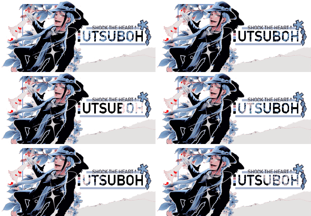
hey there-- this is a CANON DIVERGENT roleplay blog for 𝐉𝐀𝐃𝐄 𝐋𝐄𝐄𝐂𝐇 from 𝐓𝐖𝐈𝐒𝐓𝐄𝐃 𝐖𝐎𝐍𝐃𝐄𝐑𝐋𝐀𝐍𝐃. due to the nature of the character, and the darker content here i ask that MINORS DO NOT FOLLOW ME. also would prefer if non - rp blogs did not like or reblog my content. and any who do will be blocked immediately. crossover/duplicate friendly. and VERY happy to receive any and all ocs!!! est. march 2023.
( RULES FOUND BELOW )


verses: touchstarved , skeleton key , the dreamlands important tags: headcanon , prompts

affiliated with: rebirthee , bitterseadrop , rosehearrt , imarahuyo , chiheru
Hi there, I go by RHYS. They / Them pronouns. I am an artist, and i struggle with anxiety and other illnesses. I also work when I can. So i tend to be pretty sporadic. I can get to things very quickly, or very slow. Nothing against any one person. I just write when I feel like it.
I am 29 years old, and I sleep a lot!!
99% of my edits and psds here are done by @imarahuyo
Also good to keep in mind I am divergent, and play a lot into the horror aspects of the character. I can do meet cutes and slice of life situation but...there will always be unsettling undertones. I also write jade from several points in his life. Anywhere ranging from 17( in game age ) - 20( last year at the college ), and beyond that even. If I'm exploring his life post NRC.
I am mutuals only in regards to threads, and require plotting to write anything at length. however, I do accept asks from anyone and everyone that wishes to send them in. This is for my own comfort. So do not get impatient with me or push me. I will block you the moment you do. I have a life outside of rp, and I need that to be respected.
PLEASE I ask that people be patient with me in character and ooc. I am always happy to talk, and plot with people, but I can be pretty slow with that too. Either because I forget, or just don't have the energy to do so.
asks and thread do not always stick. i love writing with people, i love getting asks, and i love threads. but sometimes im genuinely not sure how to reply to it right away. it isn't a lack of interest, i promise. if i'm following you, then i do want to interact and write. again, just be patient, rp is an outlet for me, and a hobby. i don't force myself to write if it just wont come to me.
on shipping and dynamics. so... i practice ship exclusivity, when it comes to certain dynamics. i do not enjoy recycling, or reusing ideas with other people. and in order to ship with my muse romantically-- i do ask this be mutual. if you do not enjoy that, then it's fine. no hard feelings, i can respect that. when i am comfortable enough to plot these things out, i really try to put out 100% effort. and it doesn't feel very good to see our ideas and dynamic done the same with someone else. again, i do not expect everyone to operate like i do. if you don't want exclusivity in this way, then say so. we can do something different, and work that out. ( to be clear this only really applies to romantic or unique dynamics. not platonic or familial. )
Themes here will absolutely include: murder, blood, torture, body horror, deep sea horror, drowning, manipulation, ocean related imagery and aesthetics, teeth, gore, and more. each will be tagged accordingly. if i ever need to tag something in particular, like a ship or a character, please feel free to ask me.
other blogs: MULTI , JINX
2 notes
·
View notes
Text
do yall remember that time a year or two ago that i found an old edit and loved the psd and wanted to use it again but i didnt save it originally or if i did i couldn't find it. Do you remember how i spent days on end going insane trying to recreate it from scratch by using that edit and unedited screencaps of that scene as a reference. do you remember how i had that new version of the psd for like 2 weeks then hated it. anyway i just saw the remade version of the edit again and im thinking—
3 notes
·
View notes