#'how did you draw that' 'really specific custom procreate brush'
Explore tagged Tumblr posts
Text
RWD S4E9 SPOILERS
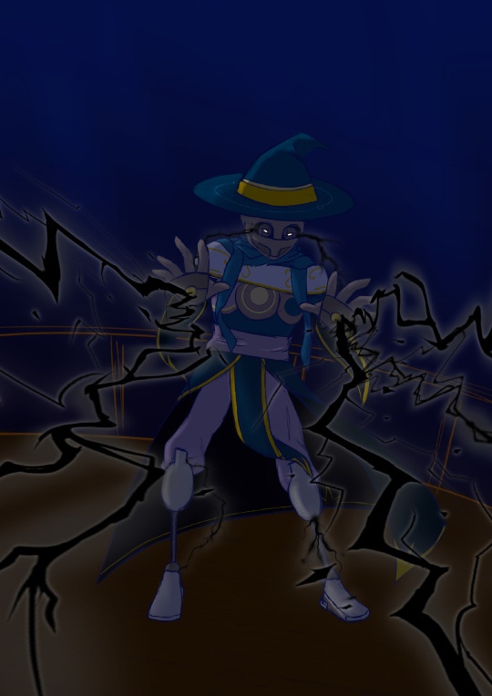
we really do be getting some incredibly fun new lightning flavours from VR-LA these past few episodes huh. anyway black necrotic lightning <3
#rolling with difficulty#vr-la rwd#vr la rwd#you might need to like. turn up the brightness on your device for this one im so sorry#i had my ipad brightness up pretty high and didnt realise how dark everything was#LOVE projects like this thats like#'how did you draw that' 'really specific custom procreate brush'#i love fiddling with custom brushes IDK#anyway no idea what a witch bolt is but the noise austin made when describing the necrotic lightning is *sending* me#for the past few weeks ive been stuck in the headspace of like 'well i kinda wanna draw (thing) but i've also got The ProjectTM'#'so i should probably just.. spend my time on that...'#but this scene was just like. yeah i gotta. i HAVE to draw this#'spooky VR-LA' is basically my summon at this point LMAO#lol my idiot ass was tryna airdrop this and the kyana goop shitpost from my ipad to my computer and#somehow accidentally also sent the qr code for my last online purchase bank payment (?????????)#art I made
75 notes
·
View notes
Text

art by em year in review 2023!
for the fourth time, i present to you a selection of the art i did this year! this definitely was the Year of Understanding Procreate, and i think it paid off. as usual, reflections under the cut.
january: i saw @malcolm-f-tucker tag a picture of abigail thaw with a comment about a theresa faceclaim and it left no survivors, i.e. i decided that theresa should have greying hair and did not look back. this was from when i was still trying to figure out what brush to use for lineart in procreate. luckily i had learned my lesson from the sketchbook learning curve and realized that what i liked for lineart would most likely be in the pencil section. however i wasn’t a huge fan of the brush i used in this one, so i didn’t use it again. instead, for later pieces, i decided to customize the 6b pencil brush to my liking, and…
february: …this came out of it! this is still one of my favorite things i have ever drawn, and it’s my favorite thing i’ve drawn yet for herc and linda. this piece really convinced me to use overlay layers more in my art, and the amount of detail i managed to capture in this one still amazes me now. and before anyone asks, yes, they are doing specific things in the startup procedure for an airbus a320-family aircraft, except linda is doing things off the CM1 checklist and herc is doing something off the CM2 checklist, which i learned later is not really something that is done. let’s just say herc is not the tightest stickler to convention.
march: one half of an intended two pieces centered around the f1 au (which, regrettably, i have yet to continue… i just reread what little of the second part is on ao3 and god, it slaps actually, i really need to continue it so bad) depicting a pivotal scene from around the outside, where theresa and linda decide to put aside a childhood feud at the top of the banked curve at monza. at sunset. on theresa’s birthday. i know, very meaningful, incredibly homoerotic. read the fic to see how well that turns out!
april: i always knew i wanted to redraw the first filipino!hercolyn thing i did back in 2020, the one that completely solidified in my mind the notion that These Characters Are Filipino, Actually, and when i got comfortable in procreate i quickly jumped on that. (if you notice, a lot of the stuff i did this year were redraws of old pieces i really liked but wasn’t fully satisfied with.) of course i wanted to draw them in the traditional clothes in my parents’ and grandparents’ wedding pictures. the implication of this being, of course, that this is the soft shoe shuffle wedding. i have a fic planned centered around that, from douglas’ perspective. now that grad school apps are basically done, if my honors thesis doesn’t kick me too hard, i’d love to get on that as soon as i can.
may: YOU JUST GOT COLINED! SEND THIS TO A FRIEND TO TOTALLY COLIN THEM! ah, colin fairbairn: the figure whose presence haunts all of newcastle but is never actually. named. (much to the chagrin of a lot of people who genuinely thought linda’s dad was named colin bc i Wouldn’t Shut Up About It) i just love him so much and i love this piece, i wanted to depict the wistfulness of an older colin whose airline is on the verge of collapse, who has been secure in his job as chief pilot of air cal, who looks out over glasgow airport (that’s glasgow’s runway in the background) and wonders if it’s time to put himself out to pasture. wondering what he could have done differently. it’s okay bby. there’s no way that you could have prevented this. but he’d never believe it. he’s too duty bound. he lives in my head rent free.
june: another redraw, this time of a piece from 2021. i was so happy with this one, and i am very happy with it still! everything about the older piece i loved was improved massively by this redraw: the poses, the proportions, the line work, the coloring. honestly, just thinking about the two of them just existing in the airport, overlooked by bustling passengers, just part of the landscape, but having such a rich history and relationship between them… it’s something i think about a lot and i love it.
july: this comprises the third part of an unofficial trilogy of drawings i did centered around douglas/martin/theresa. in each one, i centered a different member of the ot3: i did one centering martin last year, one centering douglas in the spring, and this one centers theresa between douglas and martin. i really enjoy how i did the expressions in this one: martin, looking out toward the planes; theresa, following his gaze, eager to share in the passion they both have; and douglas, looking down at both of them (yeah i think they’re both shorter than him. i think it’s cute). i feel like when i draw these three, where they look and how they look is very important to me.
august: can you believe before this point i had never drawn herc and douglas together? yeah, me too. anyway, them 🤍 i’ve literally only ever drawn them as older men so trying to draw them younger was. lowkey kind of hard. i’m hoping to revisit air england herc and douglas in the future, especially since i didn’t intend for this to be anything more than a quick bit due to those bisexual divorcee brackets (which i don’t know what became of them in the end except that douglas got through and herc didn’t, lmao)
september: unposted self-portrait done as a part of my aerospace fellowship application i wound up getting rejected from because they required me to do a creative component. not much to say here. anyways.
october: yet another redraw, this time of a portrait of herc, carolyn, linda, and arthur i did a year prior, in october of 2022. i like to think that lfeu!herc carries pictures of linda, arthur, and carolyn in his wallet: he had never wanted to be the family man for most of his life, but in his new life, this new form, he can play it well. something about the coloring seems a little off to me: i think i may have to go in and adjust arthur’s skin tone because i think it doesn’t look 100% right. but i love this one too. i hemmed and hawed for ages over what they should be wearing but in the end i put them in what they’d wear for work bc i couldn’t think anymore. but it turned out super cute and i think it emphasizes what brought the four of them together in the first place: aviation.
november: a cute little doodle of young!colin with baby linda, from a bigger piece. something i generally feel like i’ve gotten stronger with this year has been drawing a larger variety of poses. i discovered that procreate allows you to import reference images in a smaller window that can be very easily dragged around and resized, which was a massive improvement over my previous strategy with sketchbook, which had been to import reference images as their own layers. often, moving it around or resizing reference images resulted in some loss of quality. anyways there’s something just so tender about colin and linda and i love to revisit them.
december: last but not least, we finish off the way we started, with theresa (and an added douglas lol). and boy, how different does december look from january? granted, it’s a different angle, but i personally think there is so much more dimension at the end of the year compared to the beginning. i was less afraid of using overlays to enhance the coloring. and the brush i wound up settling on for lineart really ended up serving me well this whole year, culminating in this piece. not much to say on this one, i like it a lot :)
overall thoughts: i didn’t think i drew as much as i wanted to this year, but looking back i still think i made really good progress and improved a lot from last year, so i’m still happy. definitely want to draw more next year, explore new subjects, and maybe work on redrawing more pieces from previous years because those projects have been very fun to undertake.
once again i want to say a big thank you to everyone who’s ever shared or commented or left a like on anything i’ve drawn: it will have been 10 years next year since the end of the show i primarily create fanwork for, and to still have people out there who like what i do is such a gift. yes i create for myself, but i do also like receiving feedback from others and sharing it with others, so thank you thank you thank you. and happiest of new years to all :)
14 notes
·
View notes
Note
How does procreate compare to sai for you out of curiosity ?
I’m kind of 50/50 about it.. like once you’re more familiar with the UI and how everything generally works it’s super straightforward which I appreciate! the whole brush customisation aspect is a bit overwhelming for me since im just used to fiddling with a few settings then running with it but now there’s a whole customisation bar so you can get it to exactly what you’re looking for …. which is nice in itself but for me who has like .. virtually no clue on what she’s doing or what any of these means im just ????? 😭 but downloading custom brush packs is so easy too so im not gonna bother with that for now lol
drawing on glass is still a bit tricky for me too it feels like im constantly fighting for grip if that makes sense. I think im still used to how my tablet draws bc the stylus’ nib was a bit sharper compared to the apple pencil’s but it did left scratches on the tablet itself lol. I also like how easy it is to adjust the canvas sizes since you’re just dragging it (compared to sai where you have to type in the exact dimensions) but I also don’t like how they’ll give you less layers the bigger your canvas is 🥲 like I generally work on 3000 x3000 and I’d like more than 100 layers alas
ONE THING that im severely missing is sai’s marker tool though, specifically the marker tool with my own config. like that’s literally my bread and butter and i use that pen in virtually everything - both lineart and colouring. imo that brush gives my prev drawings that soft looking feel (if that makes sense??? idk) but it also doesn’t have that drag that procreate brushes tend to have. like ive been trying to replicate it in procreate or at least find one that feels similar but I haven’t had any luck so far 😭🥲
all in all I do like it better than photoshop or even krita, but I think im just so used to working on sai that I still prefer it, esp since that has the marker brush (my beloved). my opinion will prob change once i do actual illustrations on it though since I haven’t done a fully rendered piece yet and i want to see how I’ll adjust my workflow with the layer constraints. i do like the fact that there’s no colour differences though since the ipad screen is really nice so you don’t have to worry about colours looking different in diff screens
#I also don’t like how you can’t use clipping mask on groups 😭😭#like that’s what made shading easier in sai but now u have to merge everything to be able to do that sigh#i do like the convenience tho!!!! like my ass is really drawing everywheee and it’s SO easy to just boot procreate up and draw#so that’s a win for me specifically lol
15 notes
·
View notes
Text
August Newsletter - Artist of Nothing 002
So far this month
Brushes


I’m still in the process of finalizing the design of the image, but I want to share Ibis Paint custom brushes. A lot art tutorials and resources lean heavily into Procreate and Clip Studio Paint; not too many focus on Ibis Paint X, which is the drawing app I use. So, in addition to brushes, I hope I can also share tutorials as well.
Worked on Website
I worked a bit on my website, which has been up and running for awhile now. I am one of those people who can never stick with a single design. I think my old Synaptic Misfiring website went through 5 redesigns, and I barely drew that webcomic for 5 years.
Art I’ve done


I finished pieces of art, all in Ibis Paint. The pixel art was inspired by Pokémon and the work of Brandon James Greer.
July Recap
Took a social media break
About mid-July I was realizing that I wasn’t really spending work on a lot of the stuff I had wanted to. And in fact, most of 2024 I hadn’t spent working on things. I thought it was The Funk (which it was) but I was also spending a lot of time on social media. And with social media being as broken as it is nowadays, I was putting more hours in to get the same sort of enjoyment that I was getting back in 2019.
So I deleted apps off my phone and just…existed. I didn’t try to force myself draw or work on art, or get into a productivity fugue state. I really put a lot of thought into how I was using social media, both in my personal life and with my semi-pro art life.
A lot of my social media use was due to habit; I would go to Tumblr, then Instagram, and then back to Tumblr, etc. None of it was fulfilling. None of it gave me anything of substance. I can’t tell you any of the posts I’ve actually liked. Or why I follow an artist. I just did things.
And this lead me to look how I was using social media for my art. I wasn’t getting engagement, whether it was comments, shares or likes. So why was I making art FOR social media. Why was I making a piece of art specifically for Instagram if it wasn’t going to perform well? Why appease an algorithm that doesn’t care about me.
So I ended up changing my whole approach not to just social media, but also my art life. It’s about making art first, and then making content from that art, rather than making art as content. It’s the difference between recording myself drawing and making a short form video instead of recording myself making art specifically from a short video.
It also means I don’t need to worry about posting 5 days a week in order to get engagement. Social media is broken, so why try and use it as a central part of my workflow
I’m hoping that this will help me feel better not just about making art, but also sharing it through social media.
Rest of August
Exploring other platforms
I’m looking at Cara, Telegram, Snapchat and other non-algorithmic platforms, while at the same time not being platform-dependent. Platforms aren’t safe anymore; look what happened to Patreon in the last few days.
Store
I’m in the process of finalizing my products. All print-on-demand for now, and starting small. I definitely will be trying some digital downloads.
Find me elsewhere on the web, including Substack! See you next month.
#tonytylerdraws#artist of nothing newsletter#artists on tumblr#ibis paint x#pixel art#social media artist#ibispen
1 note
·
View note
Text
✨Frequently Asked Questions✨
Who are you?
You can call me Lazy! I’m a 30-something artist 👍
What are your pronouns?
I don’t have a preference. Call me whatever you want
What are your interests?
Most of my work right now is from interactive fiction, specifically Fallen Hero and Wayhaven~
I’m probably most well known here for The Arcana, but I like lots if other stuff~ Games like Mass Effect, Dragon Age, Skyrim, Breath of the Wild, ooh and turn based strategies too~ I like fantasy novels. Red Rising is one of my favorite series, and Brandon Sanderson is one of my favorite authors. I’m also a big marine biology nerd~
—
Who is Levi?
He is my oc, and he is also my Sidestep for fhr
What is fhr?
Fallen Hero: Rebirth, an interactive fiction novel (and Fallen Hero: Retribution, the sequel, I categorize them together)
What is a Sidestep?
The protagonist in Fallen Hero
Can I draw him?
Absolutely!~💕 I love when people draw my ocs! Anyone can draw or write any of my ocs however they want. (I would love to be tagged so I can see~)
Can I ship your ocs with my ocs?
Yup! They are free game, do with them as you please~
Do any of them have reference sheets?
Uh, not yet, and I don't really have plans for that, but there's plenty of reference in their respective tags
—
What do you draw on?
I draw digitally on an iPad air 5 with an apple pencil
What program do you use?
Procreate!~ I love it!
What brushes do you use?
They're custom, but you can download them here~ (these are older, I don't regularly use them anymore)
Lately, I've been favoring the gesinski ink brush and the narinder pencil
What program do you animate in?
Rough Animator. (So rarely, I don't even know why I'm leaving this question here)
How long have you been drawing?
I started doodling in middle school (2000?🤔), I started seriously studying it in college (2009) and graduated with a degree in Animation/Illustration.
—
Do you do commissions?
Not really. I just don’t enjoy drawing characters that I don’t know very well very much.🤷♂️ If they do open, I will make a post and start filling slots.
Do you do art trades?
Unfortunately no.😔
Do you do requests?
I take suggestions in my askbox, but whether or not I decide to take them is dependent on if I have time or if I want to. If you’d like to see me draw something, there’s no harm in suggesting it to me!~👍
Did you get my ask??
I probably did.😅 I get a lot of asks. I try my best to get to them, but if I can’t think of an answer, or there are a bunch of similar asks, it may sit in the askbox for a while ((or indefinitely)).
—
Is it okay to message you to just chat?
Yeah man~
Can we be friends?
Come talk to me~ Let’s get to know each other!
—
Do you have other social media?
Yeah!
Twitter: @lazy_voyager (I really hate using Twitter though, so it's pretty dead)
Instagram: lazyvoyagerdraws
Can I repost your art?
Please ask me first 😔 but also, please don’t.
—
Common tags:
I tag characters by name, so you can find specific people that way
#other people’s art, for all the lovely fanart of my ocs~ ((oops some of it is under #other peoples art, I’ll try to fix it))
#spoilers, which I am only using for Retribution content, since it is still in alpha
#lazy life stuff, for random things going on in my life
#for the literary crowd, mostly fanart from books I’ve read
143 notes
·
View notes
Text
Procreate review: A digital artist's treasure trove for just $10
New Post has been published on https://appradab.com/procreate-review-a-digital-artists-treasure-trove-for-just-10/
Procreate review: A digital artist's treasure trove for just $10
During the coronavirus pandemic, setting aside time to pursue creative projects has become one of my favorite ways to spend free time and manage stress. I typically enjoy working with physical media — watercolor, oils, acrylics or simple sketching with pen or pencil — and the idea of going digital was intimidating. But while looking for new ways to draw on my iPad, Apple’s Procreate app caught my eye.
Like
Wide range of tools
Useful for everyone from beginners to professionals
Easy to learn new styles like animation
Don’t Like
$10 price tag
Two different apps for iPhone and iPad use
Large number of tools can be overwhelming for beginners
The digital illustration app costs $10 (£10, AU$15) to download (with no in-app purchases), and its suite of art tools and creative features make it well worth the money. Procreate offers an accessible experience whether you’re a design professional, a seasoned digital artist or a beginner to the world of digital drawing. One downside: The app is only available on iPadOS and iOS.
Read more: Best iPad for 2020
I’ve been using Procreate for a few months, and there are still features I’m learning to use that improve my artwork. The app’s tools, such as quick shape, blend mode, layering, alpha locks and clipping masks, add a new level of professionalism to your art. This is why we’ve awarded Procreate a CNET Editors’ Choice award for 2020.
Discover the latest apps: Be the first to know about the hottest new apps with the CNET Apps Today newsletter.
Toto, I don’t think we’re using Microsoft Paint anymore
Procreate is packed with so many tools and features that I’ll barely scratch the surface in this review.
There are countless ways to customize your iPad’s ($239 at Back Market) gesture controls to make the app work best for you. For example, you can set it so that you tap four fingers to immediately populate the copy and paste options. You can also use three fingers to scrub the screen and clear a layer.


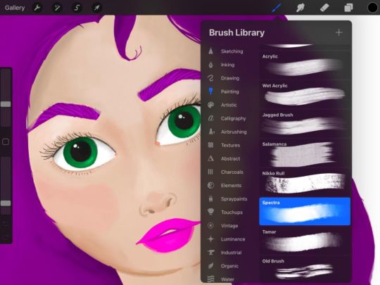
A sketch I did on Procreate and a look at a subset of brushes.
Shelby Brown/CNET
One of the biggest perks of Procreate is its massive library of 150 brushes. The range of brushes available in the app fit just about any creation you could possibly have in mind. You can stick with basic sketching, inking, drawing and painting, or you can explore airbrushing, calligraphy, charcoals and spray paints. Under each category of brushes, you’ll find a half a dozen or more choices. For example, if you choose Sketching, you can select from seven different pencils and three different pastel textures. Take it a step further by tapping the brush again and further customizing the properties of the tool.
Read more: 10 Procreate app tips for budding iPad artists
I also love using the app’s layering feature while I’m drawing. It makes editing in the future much easier. You’ll just have to remember to put your work in piece by piece. You can find extra light and color editing features for each layer as well. Just tap the little “N” next to the checkmark that selects the layer.

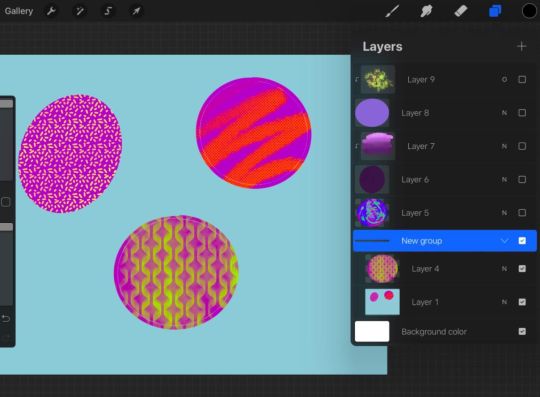


Here’s what grouping layers looks like with some basic doodles.
Shelby Brown/CNET
To stay organized, or if you want an added level of security to a section of art, you can combine layers into groups. Simply tap a layer and you can select either Merge Down or Combine Down. Merge Down makes two layers into one, for example, if you had Alpha Lock on to protect line boundaries in a layer, it will turn off. Combine Down forms a new group, but still keeps each individual layer’s specifications active.
Procreate also makes it easy to learn new skills by making the technical aspect of digital art less intimidating. When I first opened the Procreate app, I saw that it had animation features, but almost immediately wrote them off as too complicated for a novice like me. But with a few taps in the app, I was able to create a rudimentary animation of a ball bouncing across the screen. It was barely two and a half seconds, but I was really proud of it! Now, I’m really excited to see what else I can make.

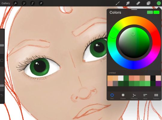


A face sketch I started on Procreate.
Shelby Brown/CNET
To ease the digital illustration learning curve, Procreate has a helpful handbook, forums and YouTube videos to help you along the way.
iPad is the new canvas
Procreate is an iPad-only app. There is a version for your iPhone, called Procreate Pocket ($5, £5, AU$8). But the apps are separate, so you can’t swap back and forth between your phone and your tablet.
I use Procreate on a third-gen iPad Air, but you can find the full list of compatible devices on its website.
The Apple Pencil isn’t required hardware for using Procreate. But if you’re planning to pursue digital illustration, your fingers will thank you for picking one up. I can only speak for myself, but without a stylus, I couldn’t get the same level of detail. I use a first-gen Apple Pencil. If your device isn’t compatible with the Apple Pencil, the app supports some third-party stylus models. You can find the complete list on its website.
Read more: The best Apple iPad apps of all time
Should you try Procreate?
There’s a lot going on in Procreate and it can seem overwhelming, but the more you use the app, the easier it gets. Having fun is the most important part.
If you’re even mildly interested in digital art and have $10 to spare, I’d recommend trying Procreate out. Explore the app, doodle, write your name with different brushes. You can also upload blank coloring sheets to a canvas and experiment with the tools that way, so you’re not creating a brand new work on your own.
If you’re more in the market for a digital coloring book, however, you might check out the Lake app (free, with in-app purchases), instead of shelling out $10 for Procreate. And if you want to get an idea of how much you might use Procreate before investing, Autodesk Sketchbook is a free app that has an impressive set of tools, too — not as many as Procreate, but enough to give you a taste.
There are dozens of ways to customize Procreate to help you discover or improve your art style.
For more on drawing, check out five online drawing classes you can take right now and all the best apps for drawing on your iPad.
0 notes
Text
Evaluation
Final Major Project
I was quite excited when we first got handed the brief for our final major project, titled curiosities. There was no clear set task to work to, meaning we could come up with our own interpretations of what we find interesting and want to know more about. However, this could also pose a problem, as the requirements of the brief are not as clear as previous projects. There are no clear guidelines to follow, as everyone is following a different project proposal. You also have to find your own artists and designers to research, as they have to be helpful to your specific work. Initially, as a class, we brainstormed a list of words to help give us ideas within our brief, such as ‘extraordinary’, ‘intriguing’, ‘unique’, ‘desire’, and ‘mystery’. These were the main words that I took and used within my project. This peer discussion helped my find my original idea, and made me develop an understanding of what the brief of ‘curiosities’ could be about.
My original plan was to create a set of illustrations of certain everyday objects, as I am curious about the sentiment behind things. Ordinary, plain objects that do not have any monetary value are often held dear within people’s hearts, giving them more value.This is usually due to the history of the object, and how important memories have been created with these objects within them. Ultimately, exploring how backstories can add sentiment and value to an object or memory. Originally, I wanted to create a series of rotoscoped animations, as well as illustrations, to portray the objects coming to life within the memory they are held in, for example, I wanted to create an animation of a zombie cabbage patch kid due to a story I heard of one being found from being dug up in the garden after being missing for months.
However, as the project progressed, I wanted to centre my work more around tattoos, as this is the career path I want to go into. Going forward, I used my curiosity for the sentimental value behind objects in a more specific way, as I also directed my work towards the curiosity I have for the reasons why people get specific tattoos. I, myself, have tattoos, with personal reasons behind them, and realising that most people’s tattoos have a reason and story behind them made me very curious and interested in the stories behind them, as well as making me want to create my own designs based around the stories people have told me. In the end, I chose the specialism of illustration, as I created a series of tattoo flash based upon stories and life experiences that people have told me. The purpose of my project was to ultimately show a range of different reasons why a person would get a tattoo, and how sentiment and memories are influential enough to make someone get a tattoo of something that is overall worthless to most people. Furthermore, I want people in society to realise that certain tattoos they may view as pointless and bad, will have meaning to others, making them special.
As a class, we were told to research such artists as Eduardo Paolozzi and David Carson. Comparing these artists, I found that they created pieces of collage with miss-matched imagery to create new meaning within their work. I wanted to do the same, by bringing together things from childhood and creating them within an adult setting (tattoo designs). This then creates new meaning, as it loses its naïve imagery. I also took a lot of inspiration from David Carson and one of his quotes, “Don’t mistake legibility for communication”, as none of my final designs have text that helps to portray the meaning behind the illustrations, as the meaning should be understood by the person getting the tattoo. Additionally I researched Michael Craig Martin, who also influenced me due to the fact he was able to transform seemingly meaningless objects to iconic, recognisable line drawings and illustrations. This linked in nicely to my project by allowing me to create designs which were based upon ordinary objects but became eye catching when illustrated. I also researched Joseph Cornell, who was a pioneer of assemblage. Cornell had an interest in childhood, which links to my project as I also created work around infancy. One of the most relevant artists to my work however, was Sailor Jerry, as he was one of the pioneers of tattooing. Within my work I used Jerry’s method of bold line work and colours, as the pieces are designed to be going on skin which means the lines are needed to be of certain thickness and the colours bright enough to hold when the tattoo is healed. As a class we also took a trip to the design museum in Kensington, where we viewed a range of different installations, including a wall of history where everyday items such as the telephone and television sets were displayed. However, these things are only viewed as ordinary to us as the design of such products were so innovative and successful that they became iconic and recognizable,as well as a staple in people’s homes. Within my project I wanted to show that even though some things may be ordinary to other people viewing the design, the memories will make the tattoo designs more valuable for the owner of the tattoo. Within my work I also developed and took inspiration from artists such as Art Spiegelman and John Pound, the creator and artist for the parody series ‘Garbage Pail Kids’. My tutor had originally told me about this series due to the fact my first Cabbage Patch Kid pieces reminded him of them. I became inspired by this series due to the fact that I was creating parodies myself of the Cabbage Patch Kids, as I was drawing them as skeletons and zombies. Furthermore, i created a piece inspired by the art style of John Pound on the Garbage Pail Kids art, using rough, painterly brushes, but still keeping my work digital, to hopefully provide some messiness and brutalness to the piece. However, my work also resembled the work of Eric Carle, so in the end I also ended up researching him.
As well as researching online, I also relied heavily on primary research to create my pieces. This is because I wanted to create pieces of illustrations based on people’s memories, so I went about collecting stories from various people about different items / memories they hold dear to their hearts, whether it be in person or on the internet. The main stories I took inspiration from was the Cabbage Patch Kid doll, which was lost for months but then dug up in the garden, stories about being LGBT and coming out, rebellious and heartwarming teenage memories, such as the story of a girl falling through a shed roof when trying to get out of the allotments, and many different pets and animals, such as a chicken called Nugget and a lamb called Timmy who acted like a dog. I also created a piece of my guinea pig who recently passed away, who was called Jerry, as I am actually wanting to get a tattoo in memory of him. I created the ‘Sailor Jerry’ by illustrating Jerry in bold lines and colours, along with a pipe and an anchor to give the piece a nautical feel. Furthermore, I created the tribal seal piece for my mother, as an actual tattoo design she wants to get in the future. I drew this due to the memories we share of going to see the seals at Ravenscar, as that is “a memory [she] will treasure forever”, showing that some of my designs will definitely be used in real life situations.
Within the FMP, I believe my experimentation was quite wide and varied. Although I stuck mainly to digital work on procreate, I experimented a lot within this app, with colour, textures and themes / subject matters . I also used the process of using a tattoo gun, although I did not develop this skill much as I wanted a refined outcome at the end. I believe I used my time quite well to develop my work, as I managed to create 4 flash sheets as well as extra designs that weren’t on the flash, along with the design for a tattoo studio sign and a few rough pieces made with prosthetic skin and a tattoo machine. I believe my main process of using Sailor Jerry style lines and colours was a good choice, as all of my pieces look like they belong together as a part of a series. Not only this, I was really passionate about the whole concept of my idea, as I myself have a lot of tattoos and also want to become a tattoo artist when I leave college. I love that idea that most tattoos have an interesting story behind them, and becoming a tattoo artist can allow me to create a piece that tells a tale to the viewer. What I also believe to be a good creative decision of mine was to base my designs on actual stories told by real people. This means that they already have a valuable story to be told behind them. This also meant that the designs I created had to be quite polished and tasteful, due to the fact I was going to show them to the person who had originally told me the story that I was to illustrate. This then lead to me refining my illustration skills, as all tattoo designs have to be high quality if they want to be paid for and put into someone’s skin. Not only this, I have started developing the skill of using a tattoo machine, which will come in handy when I (hopefully) become an apprentice. Creating these pieces digitally was also a conscious decision, due to the fact that it is a lot easier to photoshop a digital piece of work on to the body than it is a traditional drawing. This means that all of my designs can be placed on a photo of the body quickly and easily to see how the design would look before choosing it indefinitely.
When creating work for the FMP, I encountered quite a few problems. Firstly, I had the problem of coming up with various designs for just one memory, such as the cabbage patch doll. Often within tattoo parlours, customers can be very picky and ask for multiple redraws of a design, as they want it to be perfect as it is being tattooed on them. Bearing this in mind, I created multiple pieces with a variety of different outcomes, no two alike, so the different designs would satisfy a range of people. As well as this, I often find it difficult to portray texture within my work. However, in this project I used the illustrations on the Garbage Pail Kids to inspire a piece of textured work, so I managed to successfully add coarseness within a piece. Within the FMP we as a class had all come up with our own personal time plans, which, in the end, I did not follow, due to the fact that I originally wanted to create rotoscope animations as well as illustrations but ended up creating purely illustrations instead. I also encountered a problem within my exhibition. Initially, I had the idea of hiring a projector and a mannequin so that I could project my tattoo designs on to the mannequin. Unfortunately, when tested this idea did not work, as the projections were not clear enough and warped around the mannequin as the projector was too far away. To overcome this, I instead printed out my designs, and pinned them on the mannequin. This method also allowed me to show more than one of my designs at once, so was altogether more successful than the projector anyway. In the exhibition I also placed some flash sheets up on the walls of my exhibition space too, within sleek, basic black frames in rows next to each other. I displayed both the line work and colour versions of my designs, as some clients looking for a tattoo may decide that they only want an outline / black and grey piece. Altogether I was pleased with the outcome of my exhibition as it looked like a place where a tattoo artist was advertising their work, along with the mannequin standing alongside the flash to allow the customer to imagine where a tattoo could be in terms of size and placement. Above the flash sheets I also created a logo for my very own tattoo studio, complete with a (digitally drawn) neon sign reading ‘Sam’s Tattoo Studio’.
In conclusion, I feel like the most successful outcome of my project was the exhibition. Although I encountered a few problems when installing my work, the outcome looks finished and professional, and I think, personally, the designs I have created would not look out of place being advertised in a tattoo studio. Although some of the meanings of the illustrations I have created may not be clear, this was the original purpose of my project, as my ‘curiosity’ was about the backstories and memories behind certain objects and tattoos, and why people get tattoos of these memories. These designs are for people who want to tell their stories about their objects, as they hold these stories with high regard.
0 notes