#✮✮✮ ⸻monu; pngs
Explore tagged Tumblr posts
Visit Tumblr Blog
Explore Tumblr blogs with no restrictions, modern design and the best experience.
Last Seen Tumblr Blogs


Fun Fact
The KCSC sent more than 20K requests to delete posts related to prostitution and porn to Tumblr from January to June 2017.
Text
✮✮✮ ⸻ black & pink png dividers. #01 (not the gg lmao)


request something. all dividers on my blog are made by me and are free to use, a like or reblog would be very much appreciated if you are using them!!
#✮✮✮ ⸻monu; pngs#✮✮✮ ⸻monu; black#✮✮✮ ⸻monu; gothic#✮✮✮ ⸻monu; pink#✮✮✮ ⸻monu; dividers#dividers#tumblr dividers#aesthetic#post dividers#pink dividers#line dividers#cute dividers#divider#separators#borders#aesthetic dividers#fic dividers#themes#free themes#tumblr layouts#rainbow#carrd#pngs#aesthetic pngs#kawaii#pink aesthetic#black dividers#black aesthetic
469 notes
·
View notes
Text
Implementing Dark Mode In React Apps Using styled-components
Implementing Dark Mode In React Apps Using styled-components
Blessing Krofegha
2020-04-28T10:30:00+00:002020-04-29T14:07:00+00:00
One of the most commonly requested software features is dark mode (or night mode, as others call it). We see dark mode in the apps that we use every day. From mobile to web apps, dark mode has become vital for companies that want to take care of their users’ eyes.
Dark mode is a supplemental feature that displays mostly dark surfaces in the UI. Most major companies (such as YouTube, Twitter, and Netflix) have adopted dark mode in their mobile and web apps.
While we won’t go in depth into React and styled-components, a basic knowledge of React, CSS, and styled-components would come in handy. This tutorial will benefit those who are looking to enhance their web applications by catering to those who love dark mode.
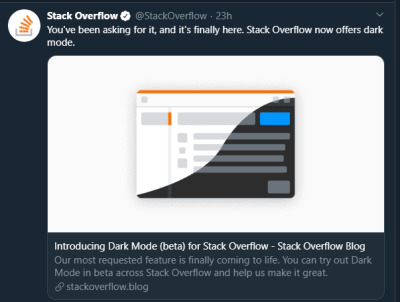
StackOverflow announces dark mode on Twitter (Large preview)
A few days before the writing of this article, StackOverflow announced its release of dark mode, giving users the chance to toggle between the two modes.
Dark mode reduces eye strain and helps when you’re working for a long time on a computer or mobile phone.
What Is Dark Mode?
Dark mode is the color scheme of any interface that displays light text and interface elements on a dark background, which makes the screen a little easier to look at mobile phones, tablets, and computers. Dark mode reduces the light emitted by the screen, while maintaining the minimum color-contrast ratios required for readability.
Why Should You Care About Dark Mode?
Dark mode enhances visual ergonomics by reducing eye strain, adjusting the screen to current light conditions, and providing ease of use at night or in dark environments.
Before implementing dark mode in our app, let’s look at its benefits.
Battery Saving
Dark mode in web and mobile apps can prolong the battery life of a device. Google has confirmed that dark mode on OLED screens has been a huge help to battery life.
For example, at 50% brightness, dark mode in the YouTube app saves about 15% more screen energy than a flat white background. At 100% screen brightness, the dark interface saves a whopping 60% of screen energy.
Dark Mode Is Beautiful
Dark mode is beautiful, and it can significantly enhance the appeal of the screen.
While most products are going for that similar bland white look, dark mode offers something different that feels mysterious and new.
It also provides great opportunities to present graphic content such as dashboards, pictures, and photos in a fresh way.
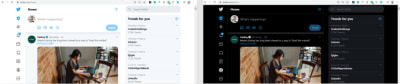
The beauty of Twitter’s dark mode over light mode (Large preview)
Now that you know why you should implement dark mode in your next web app, let’s dive deep into styled-components, which is the defining resource of this tutorial.
Dark mode is the color scheme of any interface that displays light text and interface elements on a dark background, which makes it a little easier to look at on mobile phones, tablets, and computers.
“
What Are styled-components?
Throughout this article, we will be using the styled-components library very often. There have always been many ways to style a modern web app. There’s the traditional method of styling at the document level, which includes creating an index.css file and linking it to the HTML or styling inside the HTML file.
A lot has changed in the ways that web apps are styled recently, since the introduction of CSS-in-JS.
CSS-in-JS refers to a pattern in which CSS is composed using JavaScript. It utilizes tagged template literals to style components in a JavaScript file.
To learn more about CSS-in-JS, check out Anna Monus’s article on the subject.
styled-components is a CSS-in-JS library lets you use all of the features of CSS that you love, including media queries, pseudo-selectors, and nesting.
Why styled-components?
styled-components was created for the following reasons:
No class name hell Instead of you scratching your head to find a class name for an element, styled-components generates unique class names for your styles. You’ll never have to worry about misspellings or using class names that have no meaning.
Using props styled-components allow us to extend styling properties using the props parameter, commonly used in React — thus, dynamically affecting the feel of a component via the application’s state.
Supports Sass syntax Writing Sass syntax out of the box without having to set up any preprocessors or extra build tools is possible with styled-components. In your style definitions, you can use the & character to target the current component, use pseudo-selectors, and experiment with nesting.
Theming styled-components have full theming support by exporting a ThemeProvider wrapper component. This component provides a theme to all React components within itself via the Context API. In the rendering tree, all styled-components will have access to the provided theme, even when they are multiple levels deep. As we continue in this tutorial, we will look deeper into the theming features of styled-components.
To learn more advantages of styled-components, check out Kris Guzman’s article.
Implementing Dark Mode
In this article, we are going to implement dark mode on a simple YouTube-like web page.
To follow along, ensure that you clone the original repository from the starter branch.
Setting Up
Let’s install all of the dependencies in our package.json file. From the terminal, run the following command:
npm install
Upon its successful installation, run npm start. Here is what the web page looks like without dark mode implemented on it.
The web page to be used, without dark mode. (Large preview)
To install styled-components, in your terminal run npm install styled-components.
Implementation
To implement dark mode, we need to create four different components.
Theme This contains the color properties of our light and dark themes.
GlobalStyles This contains the global styles for the entire document.
Toggler This holds the button element that toggles the functionality.
useDarkMode This custom hook handles the logic behind the change of theme and the persistence of our theme in localStorage.
Theme Component
In the src folder, you’ll see components in the components folder. Create a Themes.js file, and add the following code to it.
export const lightTheme = { body: '#FFF', text: '#363537', toggleBorder: '#FFF', background: '#363537', } export const darkTheme = { body: '#363537', text: '#FAFAFA', toggleBorder: '#6B8096', background: '#999', }
Here, we’ve defined and exported lightTheme and darkTheme objects with distinct color variables. Feel free to experiment and customize the variables to suit you.
globalStyles Component
Remaining in your components folder, create a globalStyles.js file, and add the following code:
import { createGlobalStyle} from "styled-components" export const GlobalStyles = createGlobalStyle` body { background: ${({ theme }) => theme.body}; color: ${({ theme }) => theme.text}; font-family: Tahoma, Helvetica, Arial, Roboto, sans-serif; transition: all 0.50s linear; } `
We’ve imported createGlobalStyle from styled-components. The createGlobalStyle method replaces the now deprecated injectGlobal method from styled-components version 3. This method generates a React component, which, when added to your component tree, will inject global styles into the document, in our case, App.js.
We defined a GlobalStyle component and assigned background and color properties to values from the theme object. Thus, every time we switch the toggle, the values will change depending on the dark theme or light theme objects that we are passing to ThemeProvider (which will be created later, as we proceed).
The transition property of 0.50s enables this change to occur a little more smoothly, so that as we toggle back and forth, we can see the changes happen.
Creating Theme-Toggling Functionality
To implement the theme-toggling functionality, we need to add only a few lines of code. In the App.js file, add the following code (note that the highlighted code is what you should add):
import React, { useState, useEffect } from "react"; import {ThemeProvider} from "styled-components"; import { GlobalStyles } from "./components/Globalstyle"; import { lightTheme, darkTheme } from "./components/Themes" import "./App.css"; import dummyData from "./data"; import CardList from "./components/CardList"; const App = () => { const [videos, setVideos] = useState([]); const [theme, setTheme] = useState('light'); const themeToggler = () => { theme === 'light' ? setTheme('dark') : setTheme('light') } useEffect(() => { const timer = setTimeout(() => { setVideos(dummyData); }, 1000); return () => clearTimeout(timer); }, []); return ( <ThemeProvider theme={theme === 'light' ? lightTheme : darkTheme}> <> <GlobalStyles/> <div className="App"> <button onClick={themeToggler}>Switch Theme</button> { videos.map((list, index) => { return ( <section key={index}> <h2 className="section-title">{list.section}</h2> <CardList list={list} /> <hr /> </section> ); })} </div> </> </ThemeProvider> ); }; export default App;
The highlighted code is the one newly added to App.js. We’ve imported ThemeProvider from styled-components. ThemeProvider is a helper component in the styled-components library that provides theming support. This helper component injects a theme into all React component below itself via the Context API.
In the rendering tree, all styled-components will have access to the provided theme, even when they are multiple levels deep. Check out the section on “Theming”.
Next, we import the GlobalStyle wrapper from ./components/Globalstyle. Lastly, from the top, we import both the lightTheme and darkTheme objects from ./components/Themes.
In order for us to create a toggling method, we need a state that holds our theme’s initial color value. So, we create a theme state, and set the initial state to light, using the useState hook.
Now, for the toggling functionality.
The themeToggler method uses a ternary operator to check the state of the theme, and it toggles either dark or light based on the value of the condition.
ThemeProvider, a styled-components helper component, wraps everything in the return statement and injects any components below it. Remember that our GlobalStyles inject global styles into our components; hence, it’s called inside the ThemeProvider wrapper component.
Lastly, we created a button with an onClick event that assigns our themeToggler method to it.
Let’s see the outcome thus far.
Dark mode implemented without persistence (Large preview)
Our App.js file needs to be refactored; a lot of its code is not DRY. (DRY stands for “don’t repeat yourself”, a basic principle of software development aimed at reducing repetition.) All of the logic seems to be in App.js; it’s good practice to separate our logic for the sake of clarity. So, we’ll create a component that handles the toggling functionality.
Toggle Component
Still within the components folder, create a Toggler.js file, and add the following code to it:
import React from 'react' import { func, string } from 'prop-types'; import styled from "styled-components" const Button = styled.button` background: ${({ theme }) => theme.background}; border: 2px solid ${({ theme }) => theme.toggleBorder}; color: ${({ theme }) => theme.text}; border-radius: 30px; cursor: pointer; font-size:0.8rem; padding: 0.6rem; } \`; const Toggle = ({theme, toggleTheme }) => { return ( <Button onClick={toggleTheme} > Switch Theme </Button> ); }; Toggle.propTypes = { theme: string.isRequired, toggleTheme: func.isRequired, } export default Toggle;
To keep things neat, we’ve styled our toggle button in the Toggle component, using the styled function from styled-components.
This is purely for presentation; you can style the button as you see fit.
Inside the Toggle component, we pass two props:
the theme provides the current theme (light or dark);
the toggleTheme function will be used to switch between themes.
Next, we return the Button component and assign a toggleTheme function to the onClick event.
Lastly, we use propTypes to define our types, ensuring that our theme is a string and isRequired, while our toggleTheme is func and isRequired.
Using Custom Hooks (useDarkMode)
When building an application, scalability is paramount, meaning that our business logic must be reusable, so that we can use it in many places and even in different projects.
That is why it would be great to move our toggling functionality to a separate component. For that, we would create our own custom hook.
Let’s create a new file named useDarkMode.js in the components folder, and move our logic to this file, with some tweaks. Add the following code to the file:
import { useEffect, useState } from 'react'; export const useDarkMode = () => { const [theme, setTheme] = useState('light'); const setMode = mode => { window.localStorage.setItem('theme', mode) setTheme(mode) }; const themeToggler = () => { theme === 'light' ? setMode('dark') : setMode('light') }; useEffect(() => { const localTheme = window.localStorage.getItem('theme'); localTheme && setTheme(localTheme) }, []); return [theme, themeToggler] };
We’ve added a few things here.
setMode We use localStorage to persist between sessions in the browser. So, if a user has chosen the dark or light theme, that’s what they’ll get upon their next visit to the app or if they reload the page. Hence, this function sets our state and passes theme to localStorage.
themeToggler This function uses a ternary operator to check the state of the theme and toggles either dark or light based on the truth of the condition.
useEffect We’ve implemented the useEffect hook to check on component mounting. If the user has previously selected a theme, we will pass it to our setTheme function. In the end, we will return our theme, which contains the chosen theme and the themeToggler function to switch between modes.
I think you’ll agree that our dark-mode component looks sleek.
Let’s head over to App.js for the final touches.
import React, { useState, useEffect } from "react"; import {ThemeProvider} from "styled-components"; import {useDarkMode} from "./components/useDarkMode" import { GlobalStyles } from "./components/Globalstyle"; import { lightTheme, darkTheme } from "./components/Themes" import Toggle from "./components/Toggler" import "./App.css"; import dummyData from "./data"; import CardList from "./components/CardList"; const App = () => { const [videos, setVideos] = useState([]); const [theme, themeToggler] = useDarkMode(); const themeMode = theme === 'light' ? lightTheme : darkTheme; useEffect(() => { const timer = setTimeout(() => { setVideos(dummyData); }, 1000); return () => clearTimeout(timer); }, []); return ( <ThemeProvider theme={themeMode}> <> <GlobalStyles/> <div className="App"> <Toggle theme={theme} toggleTheme={themeToggler} /> { videos.map((list, index) => { return ( <section key={index}> <h2 className="section-title">{list.section}</h2> <CardList list={list} /> <hr /> </section> ); })} </div> </> </ThemeProvider> ); }; export default App;
The highlighted code is newly added to App.js.
First, we import our custom hook, destructure the theme and themeToggler props, and set it with the useDarkMode function.
Note that the useDarkMode method replaces our theme state, which was initially in App.js.
We declare a themeMode variable, which renders either a light or dark theme based on the condition of the theme mode at the time.
Now, our ThemeProvider wrapper component is assigned our just recently created themeMode variable to the theme prop.
And lastly, in place of the regular button, we pass in the Toggle component.
Remember that in our Toggle component, we defined and styled a button and passed both theme and toggleTheme to them as props. So, all we have to do is pass these props appropriately to the Toggle component, which will act as our button in App.js.
Yes! Our dark mode is set, and it persists, not changing color when the page is refreshed or visited in a new tab.
Let’s see the outcome in action:
Dark mode implemented, but with a glitch in the button color when the browser reloads. (Large preview)
Almost everything works well, but there is one small thing we can do to make our experience splendid. Switch to the dark theme and then reload the page. Do you see that the blue color in the button loads before the gray for a brief moment? That happens because our useState hook initiates the light theme initially. After that, useEffect runs, checks localStorage, and only then sets the theme to dark. Let’s jump over to our custom hook useDarkMode.js and add a little code:
import { useEffect, useState } from 'react'; export const useDarkMode = () => { const [theme, setTheme] = useState('light'); const [mountedComponent, setMountedComponent] = useState(false) const setMode = mode => { window.localStorage.setItem('theme', mode) setTheme(mode) }; const themeToggler = () => { theme === 'light' ? setMode('dark') : setMode('light') }; useEffect(() => { const localTheme = window.localStorage.getItem('theme'); localTheme ? setTheme(localTheme) : setMode('light') setMountedComponent(true) }, []); return [theme, themeToggler, mountedComponent] };
The highlighted code is the only one added to useDarkMode.js. We’ve created another state named mountedComponent and set the default value to false using the useState hook. Next, inside the useEffect hook, we set the mountedComponent state to true using setMountedComponent. Lastly, in the return array, we include the mountedComponent state.
Finally, let’s add a bit of code in App.js to make it all work.
import React, { useState, useEffect } from "react"; import {ThemeProvider} from "styled-components"; import {useDarkMode} from "./components/useDarkMode" import { GlobalStyles } from "./components/Globalstyle"; import { lightTheme, darkTheme } from "./components/Themes" import Toggle from "./components/Toggler" import "./App.css"; import dummyData from "./data"; import CardList from "./components/CardList"; const App = () => { const [videos, setVideos] = useState([]); const [theme, themeToggler, mountedComponent] = useDarkMode(); const themeMode = theme === 'light' ? lightTheme : darkTheme; useEffect(() => { const timer = setTimeout(() => { setVideos(dummyData); }, 1000); return () => clearTimeout(timer); }, []); if(!mountedComponent) return <div/> return ( <ThemeProvider theme={themeMode}> <> <GlobalStyles/> <div className="App"> <Toggle theme={theme} toggleTheme={themeToggler} /> { videos.map((list, index) => { return ( <section key={index}> <h2 className="section-title">{list.section}</h2> <CardList list={list} /> <hr /> </section> ); })} </div> </> </ThemeProvider> ); }; export default App;
We’ve added our mountedComponent state as a prop in our useDarkMode hook, and we’ve checked whether our component has mounted, because this is what happens in the useEffect hook. If it hasn’t happened yet, then we will render an empty div.
Let’s see the outcome of our dark-mode web page.
Final result of dark mode (Large preview)
Now, you’ll notice that while in dark mode, when the page reloads, the button’s color doesn’t change.
Conclusion
Dark mode is increasingly becoming a user preference, and implementing it in a React web app is a lot easier when using the ThemeProvider theming wrapper in styled-components. Go ahead and experiment with styled-components as you implement dark mode; you could add icons instead of a button.
Please do share your feedback and experience with the theming feature in styled-components in the comments section below. I’d love to see what you come up with!
The supporting repository for this article is available on GitHub. Also, check it out on CodeSandbox.
References
“Documentation”, styled-components
“Create a Dark Mode of your app using Styled Components”, Tom Nolan, Medium

(ks, ra, il, al)
0 notes
Text
VENERDÌ 28 GIUGNO 2019 AL MERCATO DEI PESCATORI PROSEGUE “FISH & DJS” CON GIORGIO GAZZO E LLL
Pescatori e dj tornano insieme al Mercato dei pescatori della Darsena per rivalutare il territorio genovese tramite la musica elettronica. Ingresso gratuito
Genova – House music, suoni groove e fritture di pesce, dal calar del sole fino a mezzanotte: venerdì 28 giugno (ore 18) torna al Mercato dei pescatori della Darsena (Calata Vignoso) ” Fish & Djs“, rassegna targata Electropark che vede dj e pescatori insieme per la valorizzazione del territorio genovese. I protagonisti della quinta tappa del viaggio in musica tra i banchi del mercato dei pescatori sono Giorgio Gazzo di FreeSoul e Andrea Lulli, in arte “LLL“, di Raw_System. “Fish & Djs” è organizzato dall’associazione culturale Forevergreen.fm in collaborazione con Coldiretti Pesca Liguria e Comune di Genova e si conclude il 12 luglio.
Al Mercato dei pescatori della Darsena il calare del sole è accompagnato da sound ricercati e fritture di pesce, preparate col pescato del giorno dai pescatori della Cooperativa Campagna Amica. «A colorare il tramonto di venerdì 28 giugno – afferma Alessandro Mazzone di Forevergreen.fm, direttore di Electropark – ci saranno Giorgio Gazzo di FreeSoul e LLL di Forevergreen. Sarà un’occasione per promuovere l’aggregazione tra persone e creare nuove relazioni di socialità, ispirare nuovi approcci di intendere le tradizioni e generare nuove comunità». Un format nuovo, frutto di diverse sperimentazioni portate avanti negli ultimi anni anche tramite Electropark, festival internazionale di musica elettronica e sperimentazione artistica che, negli ultimi tre anni, ha portato circa diecimila persone a visitare il quartiere di Prè. «”Fish & Djs” rientra nel nostro percorso di rivalutazione del territorio genovese – aggiunge Mazzone – portato avanti cercando di creare una rete sempre più fitta di associazioni del territorio. Pescatori e dj sono una coppia atipica ma ben assortita: due realtà differenti, oggi unite nella rigenerazione culturale di Pré».
Electropark è un progetto di Forevergreen.fm finalizzato a rilanciare il percorso di attivazione e valorizzazione di edifici e luoghi del Centro Storico genovese attraverso la musica elettronica. Electropark è ideato da Forevergreen.fm ed è promosso con il sostegno del Comune di Genova, della Compagnia di San Paolo nell’ambito del programma Performing Arts 2018-2020 e del Goethe-Institut Genua, ed è realizzato in collaborazione con Palazzo Ducale Fondazione per la Cultura, Teatro Nazionale di Genova, Teatro della Tosse, Porto Antico di Genova, Mu.MA, Cooperativa Solidarietà e Lavoro, Palazzo Reale Mibac, Suq Festival, Porto Antico, Le Strade del Suono e Coldiretti Pesca.
L’ingresso è gratuito.
Ulteriori informazioni: Pagina Facebook Electropark Festival
I PROTAGONISTI DELLA QUINTA TAPPA DI “FISH & DJS”
Giorgio Gazzo (FreeSoul)
DJ e party manager con base a Genova dove fonda il progetto Free Soul nel 2011. House, elettronica, nu disco e deep house sono le sonorità che lo contraddistinguono, ma che non si pone come limiti. Nel ruolo di selecter ha lavorato a progetti di interazione con la danza contemporanea e le arti visive nei teatri cittadini, oltre ad essere regolarmente in diversi club e festival. Degna di nota l’edizione 2016 di Electropark Festival insieme a Moscoman. Dall’estate 2017 ha trovato la propria residenza sulla terrazza del Monu Café dove ogni domenica ospita il proprio party, portando così Free Soul ad essere una solida realtà nel panorama house elettronico.
LLL (Raw_System)
Andrea Lulli, nome in codice fiscale LLL, quando è ai controlli fa girare dischi con una certa versatilità di generi, al servizio dell’umore dell’ambiente e sempre vigile a buone vibrazioni. Ha messo dischi in luoghi non convenzionali a Milano come Macao, Arco della Pace, Zuma, Teatro Strehler e Cobianchi in Piazza del Duomo. Proviene dal duo elettronico Fauve! Gegen A Rhino con il quale ha suonato in giro per l’Italia e pubblicato dischi sulle label Tannen, Bedevil e Trovarobato Parade.
#gallery-0-5 { margin: auto; } #gallery-0-5 .gallery-item { float: left; margin-top: 10px; text-align: center; width: 33%; } #gallery-0-5 img { border: 2px solid #cfcfcf; } #gallery-0-5 .gallery-caption { margin-left: 0; } /* see gallery_shortcode() in wp-includes/media.php */
Cooperativa Battelieri del Porto di Genova
NetParade.it
Quezzi.it
AlfaRecovery.com
Comuni-italiani.it
Il Secolo XIX
CentroRicambiCucine.it
Contatti
Stefano Brizzante
Impianti Elettrici
Informatica Servizi
Edilizia
Il Secolo XIX
MusicforPeace Che Festival
MusicforPeace Programma 29 maggio
Programma eventi Genova Celebra Colombo
Genova Celebra Colombo
VENERDÌ 28 GIUGNO 2019 AL MERCATO DEI PESCATORI PROSEGUE “FISH & DJS” CON GIORGIO GAZZO E LLL VENERDÌ 28 GIUGNO 2019 AL MERCATO DEI PESCATORI PROSEGUE "FISH & DJS" CON GIORGIO GAZZO E LLL…
#AMBIENTE#Andrea#Associazione Culturale#Comune#Comune di Genova#Domenica#estate#Genova#Liguria#musica#Porto#Porto Antico#TEATRO#Teatro della Tosse
0 notes
Text
✮✮✮ ⸻ red/white png dividers. #01.


request something. all dividers on my blog are made by me and are free to use, a like or reblog would be very much appreciated if you are using them!!
#✮✮✮ ⸻monu; pngs#✮✮✮ ⸻monu; red#✮✮✮ ⸻monu; bows#✮✮✮ ⸻monu; white#✮✮✮ ⸻monu; dividers#dividers#tumblr dividers#aesthetic#post dividers#pink dividers#line dividers#cute dividers#divider#separators#borders#aesthetic dividers#fic dividers#themes#free themes#tumblr layouts#rainbow#carrd#pngs#aesthetic pngs#red dividers#white dividers
1K notes
·
View notes
Text
✮✮✮ ⸻ cottage/fairycore dividers. #01


request something. all dividers on my blog are made by me and are free to use, a like or reblog would be very much appreciated if you are using them!!
#✮✮✮ ⸻monu; pngs#✮✮✮ ⸻monu; dividers#✮✮✮ ⸻monu; multiple#✮✮✮ ⸻monu; butterflies#✮✮✮ ⸻monu; cottagecore#dividers#aesthetic#post dividers#tumblr dividers#pink dividers#line dividers#cute dividers#cottagecore#divider#separators#borders#aesthetic dividers#cottage aesthetic#fic dividers#themes#cottagecore dividers#fairycore aesthetic#fairycore#aesthetic pngs#pink aesthetic
309 notes
·
View notes
Text
✮✮✮ ⸻ antique png dividers. #01.


request something. all dividers on my blog are made by me and are free to use, a like or reblog would be very much appreciated if you are using them!!
#✮✮✮ ⸻monu; brown#✮✮✮ ⸻monu; pngs#✮✮✮ ⸻monu; antique#✮✮✮ ⸻monu; dividers#dividers#tumblr dividers#aesthetic#post dividers#pink dividers#line dividers#cute dividers#divider#separators#borders#aesthetic dividers#fic dividers#themes#free themes#tumblr layouts#rainbow#carrd#pngs#aesthetic pngs#white dividers#antique
229 notes
·
View notes
Text
⸻ ୨ৎ PINK GRADIENT DIVIDERS ୨ৎ

୨ৎ ˚.・◌ 1 ◌・.˚ ୨ৎ #FFE7F9

. FOR A MOMENT I WAS HEAVENSTRUCK...

୨ৎ ˚.・◌ 2 ◌・.˚ ୨ৎ #FFCBF4

AND FOR A FORTNIGHT THERE, WE WERE FOREVER...

୨ৎ ˚.・◌ 3 ◌・.˚ ୨ৎ #FFA7EC

HE WAS MY BEST FRIEND...

୨ৎ ˚.・◌ 4 ◌・.˚ ୨ৎ #FF6DDF

FOR SO LONG, LONDON...

୨ৎ ˚.・◌ 5 ◌・.˚ ୨ৎ #F612BD

THEY DON'T KNOW HOW YOU'VE HAUNTED ME SO STUNNINGLY...

୨ৎ ˚.・◌ 6 ◌・.˚ ୨ৎ #B4007E

THIS HAPPENS ONCE EVERY FEW LIFETIMES...

୨ৎ ˚.・◌ 7 ◌・.˚ ୨ৎ #890069

WHOS AFRAID OF LITTLE OLD ME?...

request something. all dividers on my blog are made by me and are free to use, a like, reblog or credit would be very much appreciated if you are using them so I can have a little look!!
#2
#✮✮✮ ⸻monu; gradient#✮✮✮ ⸻monu; pink#✮✮✮ ⸻monu; dividers#dividers#tumblr dividers#aesthetic#post dividers#pink dividers#line dividers#cute dividers#divider#separators#borders#pink#aesthetic dividers#fic dividers#themes#free themes#gradient#tumblr layouts#rainbow#carrd#pngs#aesthetic pngs#pink aesthetic
282 notes
·
View notes
Text
⸻ ୨ৎ PURPLE GRADIENT DIVIDERS ୨ৎ

୨ৎ ˚.・◌ 1 ◌・.˚ ୨ৎ #EEE6FF

YOU ARE THE BEST THING THATS EVER BEEN MINE...

୨ৎ ˚.・◌ 2 ◌・.˚ ୨ৎ #E1CEFF

I WAS ENCHANTED TO MEET YOU...

୨ৎ ˚.・◌ 3 ◌・.˚ ୨ৎ #D2AFFF

I HAD THE TIME OF MY LIFE FIGHTING DRAGONS WITH YOU...

୨ৎ ˚.・◌ 4 ◌・.˚ ୨ৎ #B07CFF

YOU'RE STILL AN INNOCENT...

୨ৎ ˚.・◌ 5 ◌・.˚ ୨ৎ #853AFF

I SHOULD'VE KNOWN...

୨ৎ ˚.・◌ 6 ◌・.˚ ୨ৎ #5B00C3

THERE IS NOTHING I DO BETTER THAN REVENGE...

୨ৎ ˚.・◌ 7 ◌・.˚ ୨ৎ #340079

SOMETHINGS GONE TERRIBLY WRONG...

request something. all dividers on my blog are made by me and are free to use, a like, reblog or credit would be very much appreciated if you are using them so I can have a little look!!
#✮✮✮ ⸻monu; purple#✮✮✮ ⸻monu; dividers#✮✮✮ ⸻monu; gradient#dividers#tumblr dividers#aesthetic#post dividers#pink dividers#line dividers#cute dividers#divider#separators#borders#purple#aesthetic dividers#fic dividers#themes#free themes#gradient#tumblr layouts#rainbow#carrd#pngs#aesthetic pngs#purple aesthetic
123 notes
·
View notes
Text
⸻ ୨ৎ PINK & WHITE LACE DIVIDERS ୨ৎ


request something. all dividers on my blog are made by me and are free to use. a like, reblog or credit would be very much appreciated if you are using them so I can have a little look!!
#✮✮✮ ⸻monu; lace#✮✮✮ ⸻monu; pink#✮✮✮ ⸻monu; white#✮✮✮ ⸻monu; dividers#dividers#tumblr dividers#aesthetic#post dividers#line dividers#cute dividers#divider#fic dividers#separators#borders#lace#aesthetic dividers#themes#free themes#tumblr layouts#carrd#pngs#aesthetic pngs#lace dividers#banners#headers
70 notes
·
View notes
Text
✮✮✮ ⸻ butterfly dividers. #01.


request something. all dividers on my blog are made by me and are free to use, a like or reblog would be very much appreciated if you are using them!!
#✮✮✮ ⸻monu; multiple#✮✮✮ ⸻monu; butterflies#✮✮✮ ⸻monu; dividers#dividers#tumblr dividers#aesthetic#post dividers#black dividers#pink dividers#line dividers#pink aesthetic#cute dividers#divider#separators#borders#aesthetic dividers#fic dividers#themes#free themes#tumblr layouts#rainbow#carrd#pngs#aesthetic pngs
70 notes
·
View notes
Text
⸻ ୨ৎ PINK GRADIENT DIVIDERS #2 ୨ৎ

୨ৎ ˚.・◌ 1 ◌・.˚ ୨ৎ #FFE7F9

. BUT EVEN STATUES CRUMBLE IF THEY'RE MADE TO WAIT...

୨ৎ ˚.・◌ 2 ◌・.˚ ୨ৎ #FFCBF4

AND THE YEARS PASSED LIKE SCENES OF A SHOW...

୨ৎ ˚.・◌ 3 ◌・.˚ ୨ৎ #FFA7EC

"I LOVED YOU THE WAY THAT YOU WERE"...

୨ৎ ˚.・◌ 4 ◌・.˚ ୨ৎ #FF6DDF

'CAUSE LOVES NEVER LOST WHEN PERSPECTIVE IS LEARNED...

୨ৎ ˚.・◌ 5 ◌・.˚ ୨ৎ #F612BD

I FEEL SO HIGH SCHOOL WHENEVER I LOOK AT YOU...

୨ৎ ˚.・◌ 6 ◌・.˚ ୨ৎ #B4007E

AND SO A TOUCH THAT WAS MY BIRTHRIGHT BECAME FOREIGN...

୨ৎ ˚.・◌ 7 ◌・.˚ ୨ৎ #890069

THAT WAS INTERTWINED IN THE TRAGIC FABRIC OF OUR DREAMING...

request something. all dividers on my blog are made by me and are free to use, a like, reblog or credit would be very much appreciated if you are using them so I can have a little look!!
#1
#✮✮✮ ⸻monu; gradient#✮✮✮ ⸻monu; pink#✮✮✮ ⸻monu; dividers#dividers#tumblr dividers#aesthetic#post dividers#pink dividers#line dividers#cute dividers#divider#separators#borders#pink#aesthetic dividers#fic dividers#themes#free themes#gradient#tumblr layouts#rainbow#carrd#pngs#aesthetic pngs#pink aesthetic
40 notes
·
View notes
Text
✮✮✮ ⸻ star dividers. #02. black/grey version.


request something. all dividers on my blog are made by me and are free to use, a like or reblog would be very much appreciated if you are using them!!
#✮✮✮ ⸻monu; stars#✮✮✮ ⸻monu; black#✮✮✮ ⸻monu; grey#✮✮✮ ⸻monu; dividers#dividers#tumblr dividers#aesthetic#post dividers#pink dividers#line dividers#cute dividers#divider#separators#borders#aesthetic dividers#fic dividers#themes#free themes#tumblr layouts#rainbow#stars#carrd#pngs#aesthetic pngs
118 notes
·
View notes
Text
✮✮✮ ⸻ star dividers. #01.
reds


pinks


purples


blues


greens


request something. all dividers on my blog are made by me and are free to use, a like or reblog would be very much appreciated if you are using them!!
#✮✮✮ ⸻monu; stars#✮✮✮ ⸻monu; multiple#✮✮✮ ⸻monu; dividers#dividers#tumblr dividers#aesthetic#post dividers#pink dividers#line dividers#cute dividers#divider#separators#borders#aesthetic dividers#fic dividers#themes#free themes#tumblr layouts#rainbow#stars#carrd#pngs#aesthetic pngs
47 notes
·
View notes
Text
✮✮✮ ⸻ gif line dividers. #01.
#1.

#2.

#3.

#4.

#5.

#6.

#7.

#8.

#9.

#10.

#11.

#12.

#13.

#14.

#15.

#16.

#17.

#18.

request something. all dividers on my blog are made by me and are free to use, a like or reblog would be very much appreciated if you are using them!!
#✮✮✮ ⸻monu; gifs#✮✮✮ ⸻monu; dividers#✮✮✮ ⸻monu; multiple#dividers#tumblr dividers#aesthetic#post dividers#pink dividers#line dividers#cute dividers#divider#separators#borders#aesthetic dividers#fic dividers#themes#free themes#tumblr layouts#rainbow#carrd#pngs#aesthetic pngs#black dividers#gif#gifs#gif dividers
570 notes
·
View notes
Text
✮✮✮ ⸻ skull dividers. #02. black/grey version.


request something. all dividers on my blog are made by me and are free to use, a like or reblog would be very much appreciated if you are using them!!
#✮✮✮ ⸻monu; grey#✮✮✮ ⸻monu; black#✮✮✮ ⸻monu; skulls#✮✮✮ ⸻monu; dividers#dividers#tumblr dividers#aesthetic#post dividers#line dividers#cute dividers#divider#black dividers#separators#borders#aesthetic dividers#skulls#fic dividers#themes#free themes#tumblr layouts#rainbow#carrd#pngs#aesthetic pngs
116 notes
·
View notes
Text
✮✮✮ ⸻ skull dividers. #01.
red


pink


purple


blue


green


yellow


orange


request something. all dividers on my blog are made by me and are free to use, a like or reblog would be very much appreciated if you are using them!!
#✮✮✮ ⸻monu; multiple#✮✮✮ ⸻monu; skulls#✮✮✮ ⸻monu; dividers#dividers#tumblr dividers#aesthetic#post dividers#pink dividers#line dividers#cute dividers#divider#separators#borders#aesthetic dividers#skulls#fic dividers#themes#free themes#aesthetic pngs#tumblr layouts#rainbow#carrd#pngs
49 notes
·
View notes