#…ig it’s going in the art tag
Explore tagged Tumblr posts
Text
she’s a very freaky girl…
#making this was Bad for Me#i have so many left over clips i might make more#this was fun tbh#i didn’t buy cute cut for 10bucks in 2013 to not use it for old man fancams#tourdust#fob#fall out boy#videos#patrick stump#pete wentz#joe trohman#spi.arts#…ig it’s going in the art tag#fancam#video edits
150 notes
·
View notes
Text
read left - > right

she ace on my trap til i pola
#is this considered aceyuu#i asked while drawing a marriage scene#cant gwt aany more platonic than this#this was like supposed to be from months ago but#yea#where is deuce you may be wondering#idk i didnt think this far ahead#srs tags go!!!#twst#twisted wonderland#twst ace#ace trappola#twst oc#twst yuu#twst mc#aceyuu#ace x yuu#i guess?#grim#hes there too ig#twst grim#my art
6K notes
·
View notes
Text

Drew this real quick because I fucking love these two so much ???? Especially Bee. I wish they interacted more so badly. PLEASE.
Also learning how to draw these guys.. slowly.
#IT WILL NEVER NOT BE FUNNY TO ME HOW DELIGHTED B GOT ??? FOR VIOLENCE?#the brainrotsreal's art tag ✧˖°:*♡#like okay you have d17/megatron okay#d17 got consumed by vengeance. iconic of him. you SEE him grow more ruthless/ violent........AND THEN YOU HAVE B 127#he got knife hands for 0.00937 seconds and immediately KILLED PEOPLE SO EASILY IM SCREAMING SDJKJSDS#did by accident and then did it gleefully. AND SO WELL TOO LIKE ???? bro got that hunger for violence ig. got that delight.#i wish we got to see d17 and b127 interact more cause imagine b got his knife hands early and d17 was like.... alright start stabbing#and b127 is LONELY. mf is deprived of interaction and CLEARLY clingy. i see him telling d17 to stand down so he isn't hurt.#not necessarily because he has the SAME morals as orion/optimus#like look me in my eye. tell me if d17 didn't say something like “needing an ally not a leader” (friendship bait)#AND UR TELLING ME BEE WOULDN'T FOLD AND HELP HIM? HM? HMMMMMMMM?#like i feel like b's morals are mostly match whoever he's around. if he was around d-17 more? WELP? let's assassinate together bestie!#anyways optimus and elita gotta watch b fr cause mf is already an incredible ally on the battle field SDKJKDSS#like just tell him where to go and that place would DESTROYED. NO WITNESSEES LEFT. LIKE HELLO#transformers one my beloved#d 16#megatron#tf one#tf one megatron#tf one b 127#b 127#transformers one fanart#never know how many actual tags to use istg.#imagine being isolated for years and all that shit went down like what is going on in b's brain rn. mf got 3 friends and then lost one#SO QUICKLY
1K notes
·
View notes
Text
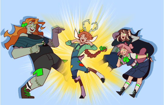
Traffic Gals- Introducing Gem!
#secret life#secret life smp#zombiecleo#geminitay#pearlescentmoon#ldshadowlady#trafficblr#traffic smp spoilers#traffic spoilers#life series spoilers#SEASON 5 AND IT MEANS IM BACK ON MY BULLSHIT LETS GOOOOOOOOOO#My Gem design is basically just a dorito. She is a rounded triangle to me in the same way that Pearl is a stick#I watched some episodes half way through drawing this and im going feral RHHRHRHHR#idk what the offical spoiler tag is so im just- using as many as i found ig#my art
8K notes
·
View notes
Text
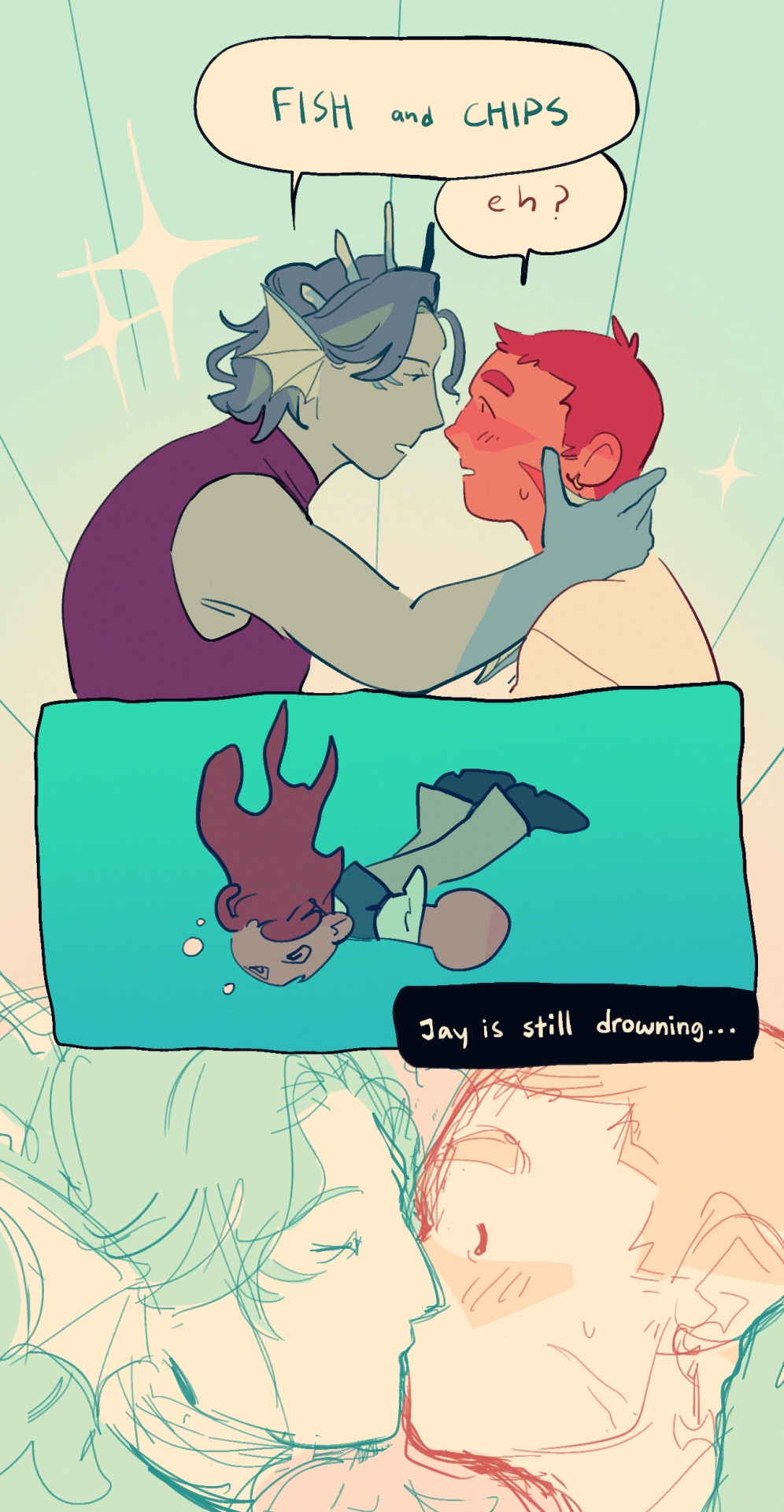
"this is regrettably the best kiss of your life, you understand?"
#that “you understand?” kills me everytime...#i love how high condis voice got during this bit its so fkn funny DHASHGFSFGHASFhg#hi yes have the inevitable ep21 crit kiss piece except i watched ep53 today and am so 😀 im so 😀 damn i m so 😀#i love eps where they just go through so many different gimmick rooms its so fun its so fun when its not so painful 😀#happy valentines too ig#just roll with it#jrwi riptide#gillion tidestrider#jrwi chip#jay ferin#jrwi fish and chips#my art#i had a bit of a meltdown over gill through uhm... 1-3am today and i just hm#sorry to everyone in the mayors QAC uhm im not really sorry but like sorry if you could hear every msg ping uhm yeah#it was like hours of me sobbing to myself in the interests channel and it was really good for my mental health ngl like its really therapeu#-tic to just scream abt a blorbo all night#and i ended up dreaming abt infodumping to one of my brothers friends of all ppl n i got so intense abt how much i love marshall john n my#brother came into the room and dragged his friend out 😭😭😭 i just wanted to ramble abt the himbo pls.....#my walls of tags are so consistent... only consistent thing abt this fkn blog smh.
2K notes
·
View notes
Text

Sequel to Sunshade
#my art#warrior nun#wn fanart#avatrice#still set in:#au where they get to go home and take a nap at the end of s2#Ig I felt bad I drew a fluffy snuggling scene and still didn’t let poor B rest#my painting ‘sunshade’ is structured around a visual pun#(cause people call B a ‘sunshine protector’ and funny if more literal)#but what makes avt so good is how A coaxes B out of the protector role and A is given space to not always be sunny#the sunshine protector/knight-princess dynamic is exhausting for both parties (which is why JC/ Ava doesn’t work)#so here’s the natural follow up#couldn’t think of a good pun for the caption though. Moonshine?#I actually really enjoy where the series left off. Their relationship is thematically complete.#(<- Burying this deep in the tags because I know nobody agrees with me)#imerr fanart#me: I’m totally over WN — also me:
831 notes
·
View notes
Text

Um. Am I too late too the murder drones bus guys...
#murder drones#it looks bad because its a sketch leave me alone#n#n murder drones#n fanart#murder drones fanart#md#fanart#art#digital art#uzi is there too ig#uzi doorman#md uzi#n x uzi#kinda#like in one#uhm#sketch#i also suck at drawing drones go away#i refuse to fall into the bite me phrase.#why am i even tagging that
430 notes
·
View notes
Text
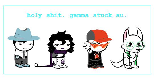
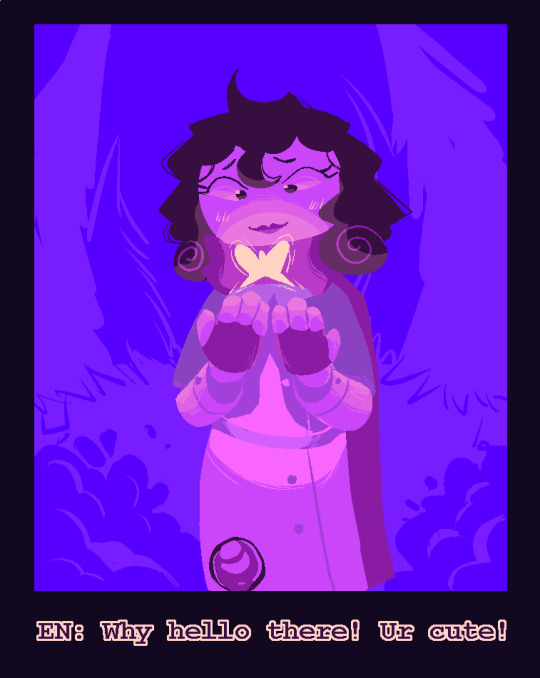
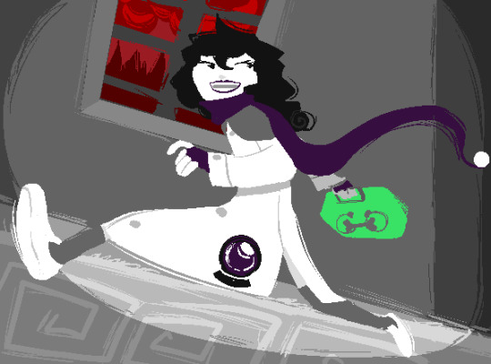
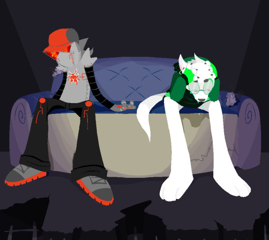
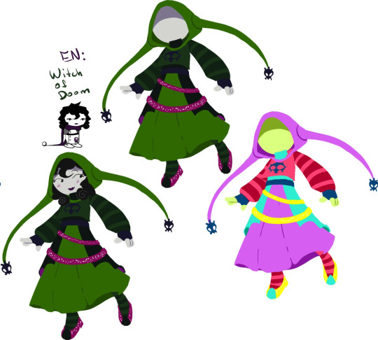
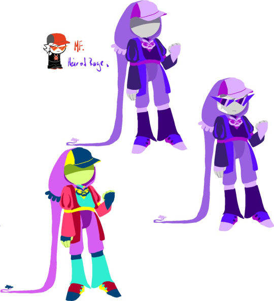
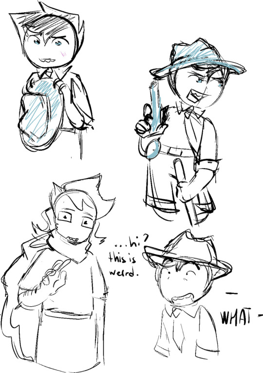
gammastuck au !
au with my friend that goes something like "earth c kids discover glitched version of sburb and the codes goes so wild that caretakers and beta kids are switched so badly that these are completely different versions"
eM - "mom lalonde" mF - "bro strider" eN - "dad egbert" fN - "bec"
#homestuck#homestuck au#bro strider#mom lalonde#dad egbert#becquerel#june egbert#well at least mention of them ig?#anyway i might answer some questions if they are going to be asked lol#frogisanut-issuesh gammastuck#miss them so much actually like the best designs i ever made#jettikus maximus harvey art tag
809 notes
·
View notes
Note
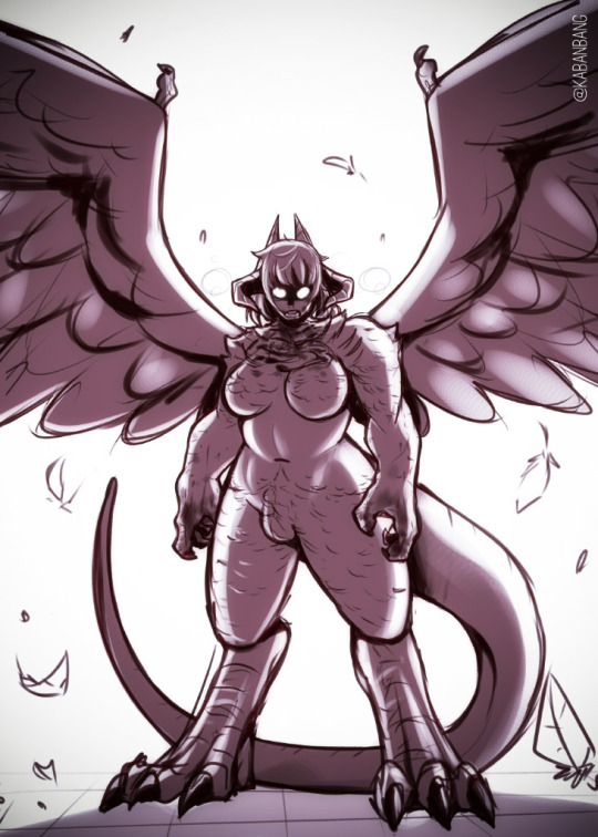
Si beside the feathers, fangs and dragon dick do you headcanon something else for falin ‘s chimera body ? I headcanon her eyes glowing in the dark, physically stronger than Laois now, not fire breathing but she can make smoke come out of mouth. Wish you a happy weekend
Two things: 1. Extended lifespan (HERES HOW FARCILLE CAN STILL WIN) 2. COOL EDGY DRAGON POWER UP TRANSFORMATION:
#this was originally going to be a quick doodle but I ended up getting too into it#dungeon meshi#dunmeshi spoilers#falin touden#post canon spoilers#tagging mature for the bulge and dick mention ig#cw blood#muh art
657 notes
·
View notes
Text

Some ZoSan in their 40s 💚💛
#don't let them fool you .. they still fight all the time 👀#ok so i'm starting this “ posting my old sketches / drawings that i only shared on ig stories” with this zosan drawing c:#tbh i really enjoy drawing Sanji with long hair :D it's fun !!#oh btw i'm also going to be uploading art on Bluesky#zosan#zoro#sanji#roronoa zoro#black leg sanji#sanzo#one piece#40s zosan#<- is there a tag for the “old man” zosan yaoi ? if there is pls tell me asdjfks#one piece fanart#diamondsheep art#my drawings#oof it's been a while since i posted art in here
387 notes
·
View notes
Text
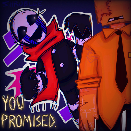
guys I think he promised something but im just guessing....
#every so often I go “NEXT!!!” really loud and drag out the next dsaf art outta a folder knowing I made it like 2-3 months ago#I like that this ones kinda messy#and also#in my simpler artstyle ig??#the one where their heads r square and I draw the arms and hands in a goofy way#also for those of you that read this#im thinking of making fanart for dearly detested but im not sure..#if u dont know what that is#its a dsaf fanfic on AO3#looks around#blinks at you#anyways..#dsaf#dayshift at freddys#dsaf jack kennedy#dsaf dee#dsaf art#dsaf jack#dsaf fanart#dsaf dee kennedy#UHH OK I THINK THATS ALL THE TAGS#IDK HELP
203 notes
·
View notes
Text
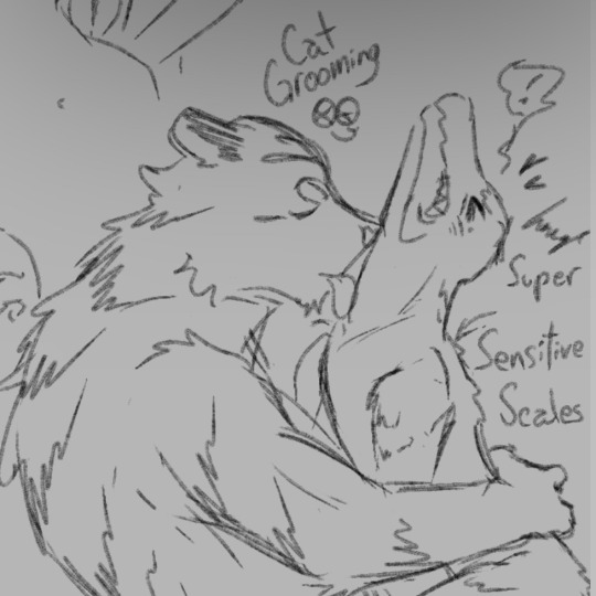

*Throws my swampcat brain rot at y’all*
Swampcat MorningKrem (Morning Frost x Kremy Lecroux)
I’m in literal rare pair hell man, no one understands me nor my freak. I’m gonna be the crazy one that draws them like crazy (draws them only once)
Clean Freak 4 Clean Freak, they both particular and shit okay?!?? SIGH, they would prolly even hold hands but to me… they can be silly (do taxes togther)
#my art#I don’t fuckign know bro#does this count as nudity? they’re furries so I dunno#suggestive#tw partial nudity#I might get suspended for this I dunno but some blogs be posting dick so I think I’m fine#SUGGESTIVE OKAY LOOK AWAY#I just think clean freak x clean freak tickles my brain— their foreplay is giving eachother a bath and doing eachother’s laundry#ouaw swamp cat#ouaw#Swampcat#ouaw Swampcat#Swampcat ouaw#swamp cat ouaw#kremy Lecroux x morning frost#Morning Frost x Kremy Lecroux#I can make this angsty but hmmmm maybe later#I wish I could write well but the scenarios in my head eat so hard man#like literally#I dunno how to tag this I’m being so real#kremy lecroux#morning frost#bro I dunno I’m going to shoot my shelf#not even sexual— just them being naked ig#Kremy x frost#frost x Kremy
254 notes
·
View notes
Text
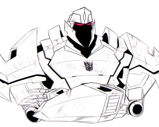
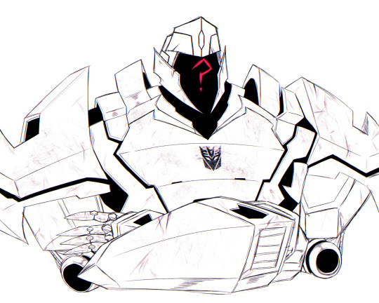
a tired and disappointed mom i've been wanting to draw that one tfp concept art for a while, and since my internet decided to implode on itself, i decided to do exactly that to cope 🥲
some silly alternatives under the cut bc i thought they were funny 😂

#transformers#tranformers prime#tfp#megatron#maccadam#rkgk#⋘ 『 ─ noms' art; 』 ⋙#definitely forgot to fix some things here and there lmao#not really sure if i *should* be tagging tfp but uh#we ball ig 😂#you done goofed showing me that concept art#i will absolutely go to town with it 😩#i love masked/faceless characters that can somehow emote with their “faces” so much#zer0 from borderlands further solidified that for me 😭😭#yes‚ that last one is absolutely a reference to omen
511 notes
·
View notes
Text
why Aurora's art is genius
It's break for me, and I've been meaning to sit down and read the Aurora webcomic (https://comicaurora.com/, @comicaurora on Tumblr) for quite a bit. So I did that over the last few days.
And… y'know. I can't actually say "I should've read this earlier," because otherwise I would've been up at 2:30-3am when I had responsibilities in the morning and I couldn't have properly enjoyed it, but. Holy shit guys THIS COMIC.
I intended to just do a generalized "hello this is all the things I love about this story," and I wrote a paragraph or two about art style. …and then another. And another. And I realized I needed to actually reference things so I would stop being too vague. I was reading the comic on my tablet or phone, because I wanted to stay curled up in my chair, but I type at a big monitor and so I saw more details… aaaaaand it turned into its own giant-ass post.
SO. Enjoy a few thousand words of me nerding out about this insanely cool art style and how fucking gorgeous this comic is? (There are screenshots, I promise it isn't just a wall of text.) In my defense, I just spent two semesters in graphic design classes focusing on the Adobe Suite, so… I get to be a nerd about pretty things…???
All positive feedback btw! No downers here. <3
---
I cannot emphasize enough how much I love the beautiful, simple stylistic method of drawing characters and figures. It is absolutely stunning and effortless and utterly graceful—it is so hard to capture the sheer beauty and fluidity of the human form in such a fashion. Even a simple outline of a character feels dynamic! It's gorgeous!
Though I do have a love-hate relationship with this, because my artistic side looks at that lovely simplicity, goes "I CAN DO THAT!" and then I sit down and go to the paper and realize that no, in fact, I cannot do that yet, because that simplicity is born of a hell of a lot of practice and understanding of bodies and actually is really hard to do. It's a very developed style that only looks simple because the artist knows what they're doing. The human body is hard to pull off, and this comic does so beautifully and makes it look effortless.
Also: line weight line weight line weight. It's especially important in simplified shapes and figures like this, and hoo boy is it used excellently. It's especially apparent the newer the pages get—I love watching that improvement over time—but with simpler figures and lines, you get nice light lines to emphasize both smaller details, like in the draping of clothing and the curls of hair—which, hello, yes—and thicker lines to emphasize bigger and more important details and silhouettes. It's the sort of thing that's essential to most illustrations, but I wanted to make a note of it because it's so vital to this art style.
THE USE OF LAYER BLENDING MODES OH MY GODS. (...uhhh, apologies to the people who don't know what that means, it's a digital art program thing? This article explains it for beginners.)
Bear with me, I just finished my second Photoshop course, I spent months and months working on projects with this shit so I see the genius use of Screen and/or its siblings (of which there are many—if I say "Screen" here, assume I mean the entire umbrella of Screen blending modes and possibly Overlay) and go nuts, but seriously it's so clever and also fucking gorgeous:
Firstly: the use of screened-on sound effect words over an action? A "CRACK" written over a branch and then put on Screen in glowy green so that it's subtle enough that it doesn't disrupt the visual flow, but still sticks out enough to make itself heard? Little "scritches" that are transparent where they're laid on without outlines to emphasize the sound without disrupting the underlying image? FUCK YES. I haven't seen this done literally anywhere else—granted, I haven't read a massive amount of comics, but I've read enough—and it is so clever and I adore it. Examples:


Secondly: The beautiful lighting effects. The curling leaves, all the magic, the various glowing eyes, the fog, the way it's all so vividly colored but doesn't burn your eyeballs out—a balance that's way harder to achieve than you'd think—and the soft glows around them, eeeee it's so pretty so pretty SO PRETTY. Not sure if some of these are Outer/Inner Glow/Shadow layer effects or if it's entirely hand-drawn, but major kudos either way; I can see the beautiful use of blending modes and I SALUTE YOUR GENIUS.
I keep looking at some of this stuff and go "is that a layer effect or is it done by hand?" Because you can make some similar things with the Satin layer effect in Photoshop (I don't know if other programs have this? I'm gonna have to find out since I won't have access to PS for much longer ;-;) that resembles some of the swirly inner bits on some of the lit effects, but I'm not sure if it is that or not. Or you could mask over textures? There's... many ways to do it.
If done by hand: oh my gods the patience, how. If done with layer effects: really clever work that knows how to stop said effects from looking wonky, because ugh those things get temperamental. If done with a layer of texture that's been masked over: very, very good masking work. No matter the method, pretty shimmers and swirly bits inside the bigger pretty swirls!
Next: The way color contrast is used! I will never be over the glowy green-on-black Primordial Life vibes when Alinua gets dropped into that… unconscious space?? with Life, for example, and the sharp contrast of vines and crack and branches and leaves against pitch black is just visually stunning. The way the roots sink into the ground and the three-dimensional sensation of it is particularly badass here:

Friggin. How does this imply depth like that. HOW. IT'S SO FREAKING COOL.
A huge point here is also color language and use! Everybody has their own particular shade, generally matching their eyes, magic, and personality, and I adore how this is used to make it clear who's talking or who's doing an action. That was especially apparent to me with Dainix and Falst in the caves—their colors are both fairly warm, but quite distinct, and I love how this clarifies who's doing what in panels with a lot of action from both of them. There is a particular bit that stuck out to me, so I dug up the panels (see this page and the following one https://comicaurora.com/aurora/1-20-30/):

(Gods it looks even prettier now that I put it against a plain background. Also, appreciation to Falst for managing a bridal-carry midair, damn.)
The way that their colors MERGE here! And the immense attention to detail in doing so—Dainix is higher up than Falst is in the first panel, so Dainix's orange fades into Falst's orange at the base. The next panel has gold up top and orange on bottom; we can't really tell in that panel where each of them are, but that's carried over to the next panel—
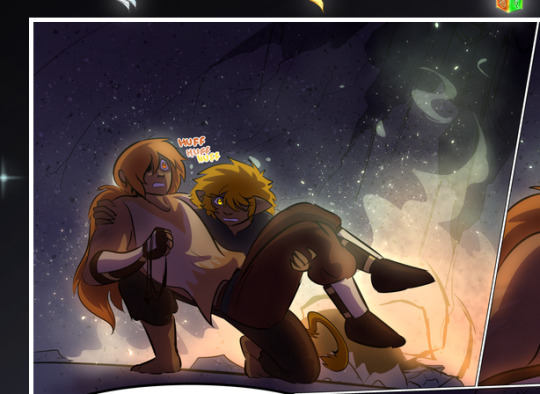
—where we now see that Falst's position is raised above Dainix's due to the way he's carrying him. (Points for continuity!) And, of course, we see the little "huffs" flowing from orange to yellow over their heads (where Dainix's head is higher than Falst's) to merge the sound of their breathing, which is absurdly clever because it emphasizes to the viewer how we hear two sets of huffing overlaying each other, not one. Absolutely brilliant.
(A few other notes of appreciation to that panel: beautiful glows around them, the sparks, the jagged silhouette of the spider legs, the lovely colors that have no right to make the area around a spider corpse that pretty, the excellent texturing on the cave walls plus perspective, the way Falst's movements imply Dainix's hefty weight, the natural posing of the characters, their on-point expressions that convey exactly how fuckin terrifying everything is right now, the slight glows to their eyes, and also they're just handsome boys <3)
Next up: Rain!!!! So well done! It's subtle enough that it never ever disrupts the impact of the focal point, but evident enough you can tell! And more importantly: THE MIST OFF THE CHARACTERS. Rain does this irl, it has that little vapor that comes off you and makes that little misty effect that plays with lighting, it's so cool-looking and here it's used to such pretty effect!
One of the panel captions says something about it blurring out all the injuries on the characters but like THAT AIN'T TOO BIG OF A PROBLEM when it gets across the environmental vibes, and also that'd be how it would look in real life too so like… outside viewer's angle is the same as the characters', mostly? my point is: that's the environment!!! that's the vibes, that's the feel! It gets it across and it does so in the most pretty way possible!
And another thing re: rain, the use of it to establish perspective, particularly in panels like this—

—where we can tell we're looking down at Tynan due to the perspective on the rain and where it's pointing. Excellent. (Also, kudos for looking down and emphasizing how Tynan's losing his advantage—lovely use of visual storytelling.)
Additionally, the misting here:
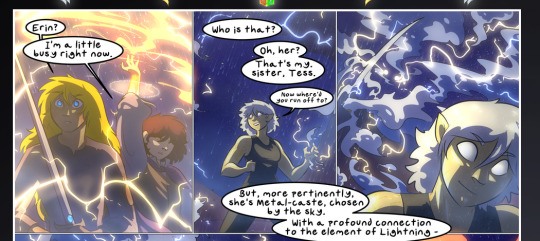
We see it most heavily in the leftmost panel, where it's quite foggy as you would expect in a rainstorm, especially in an environment with a lot of heat, but it's also lightly powdered on in the following two panels and tends to follow light sources, which makes complete sense given how light bounces off particles in the air.
A major point of strength in these too is a thorough understanding of lighting, like rim lighting, the various hues and shades, and an intricate understanding of how light bounces off surfaces even when they're in shadow (we'll see a faint glow in spots where characters are half in shadow, but that's how it would work in real life, because of how light bounces around).
Bringing some of these points together: the fluidity of the lines in magic, and the way simple glowing lines are used to emphasize motion and the magic itself, is deeply clever. I'm basically pulling at random from panels and there's definitely even better examples, but here's one (see this page https://comicaurora.com/aurora/1-16-33/):

First panel, listed in numbers because these build on each other:
The tension of the lines in Tess's magic here. This works on a couple levels: first, the way she's holding her fists, as if she's pulling a rope taut.
The way there's one primary line, emphasizing the rope feeling, accompanied by smaller ones.
The additional lines starbursting around her hands, to indicate the energy crackling in her hands and how she's doing a good bit more than just holding it. (That combined with the fists suggests some tension to the magic, too.) Also the variations in brightness, a feature you'll find in actual lightning. :D Additional kudos for how the lightning sparks and breaks off the metal of the sword.
A handful of miscellaneous notes on the second panel:
The reflection of the flames in Erin's typically dark blue eyes (which bears a remarkable resemblance to Dainix, incidentally—almost a thematic sort of parallel given Erin's using the same magic Dainix specializes in?)
The flowing of fabric in the wind and associated variation in the lineart
The way Erin's tattoos interact with the fire he's pulling to his hand
The way the rain overlays some of the fainter areas of fire (attention! to! detail! hell yeah!)
I could go on. I won't because this is a lot of writing already.
Third panel gets paragraphs, not bullets:
Erin's giant-ass "FWOOM" of fire there, and the way the outline of the word is puffy-edged and gradated to feel almost three-dimensional, plus once again using Screen or a variation on it so that the stars show up in the background. All this against that stunning plume of fire, which ripples and sparks so gorgeously, and the ending "om" of the onomatopoeia is emphasized incredibly brightly against that, adding to the punch of it and making the plume feel even brighter.
Also, once again, rain helping establish perspective, especially in how it's very angular in the left side of the panel and then slowly becomes more like a point to the right to indicate it's falling directly down on the viewer. Add in the bright, beautiful glow effects, fainter but no less important black lines beneath them to emphasize the sky and smoke and the like, and the stunningly beautiful lighting and gradated glows surrounding Erin plus the lightning jagging up at him from below, and you get one hell of an impactful panel right there. (And there is definitely more in there I could break down, this is just a lot already.)
And in general: The colors in this? Incredible. The blues and purples and oranges and golds compliment so well, and it's all so rich.
Like, seriously, just throughout the whole comic, the use of gradients, blending modes, color balance and hues, all the things, all the things, it makes for the most beautiful effects and glows and such a rich environment. There's a very distinct style to this comic in its simplified backgrounds (which I recognize are done partly because it's way easier and also backgrounds are so time-consuming dear gods but lemme say this) and vivid, smoothly drawn characters; the simplicity lets them come to the front and gives room for those beautiful, richly saturated focal points, letting the stylized designs of the magic and characters shine. The use of distinct silhouettes is insanely good. Honestly, complex backgrounds might run the risk of making everything too visually busy in this case. It's just, augh, so GORGEOUS.
Another bit, take a look at this page (https://comicaurora.com/aurora/1-15-28/):
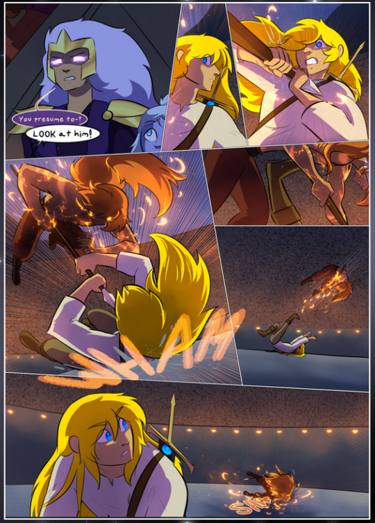
It's not quite as evident here as it is in the next page, but this one does some other fun things so I'm grabbing it. Points:
Once again, using different colors to represent different character actions. The "WHAM" of Kendal hitting the ground is caused by Dainix's force, so it's orange (and kudos for doubling the word over to add a shake effect). But we see blue layered underneath, which could be an environmental choice, but might also be because it's Kendal, whose color is blue.
And speaking off, take a look at the right-most panel on top, where Kendal grabs the spear: his motion is, again, illustrated in bright blue, versus the atmospheric screened-on orange lines that point toward him around the whole panel (I'm sure these have a name, I think they might be more of a manga thing though and the only experience I have in manga is reading a bit of Fullmetal Alchemist). Those lines emphasize the weight of the spear being shoved at him, and their color tells us Dainix is responsible for it.
One of my all-time favorite effects in this comic is the way cracks manifest across Dainix's body to represent when he starts to lose control; it is utterly gorgeous and wonderfully thematic. These are more evident in the page before and after this one, but you get a decent idea here. I love the way they glow softly, the way the fire juuuust flickers through at the start and then becomes more evident over time, and the cracks feel so realistic, like his skin is made of pottery. Additional points for how fire begins to creep into his hair.
A small detail that's generally consistent across the comic, but which I want to make note of here because you can see it pretty well: Kendal's eyes glow about the same as the jewel in his sword, mirroring his connection to said sword and calling back to how the jewel became Vash's eye temporarily and thus was once Kendal's eye. You can always see this connection (though there might be some spots where this also changes in a symbolic manner; I went through it quickly on the first time around, so I'll pay more attention when I inevitably reread this), where Kendal's always got that little shine of blue in his eyes the same as the jewel. It's a beautiful visual parallel that encourages the reader to subconsciously link them together, especially since the lines used to illustrate character movements typically mirror their eye color. It's an extension of Kendal.
Did I mention how ABSOLUTELY BEAUTIFUL the colors in this are?
Also, the mythological/legend-type scenes are illustrated in familiar style often used for that type of story, a simple and heavily symbolic two-dimensional cave-painting-like look. They are absolutely beautiful on many levels, employing simple, lovely gradients, slightly rougher and thicker lineart that is nonetheless smoothly beautiful, and working with clear silhouettes (a major strength of this art style, but also a strength in the comic overall). But in particular, I wanted to call attention to a particular thing (see this page https://comicaurora.com/aurora/1-12-4/):
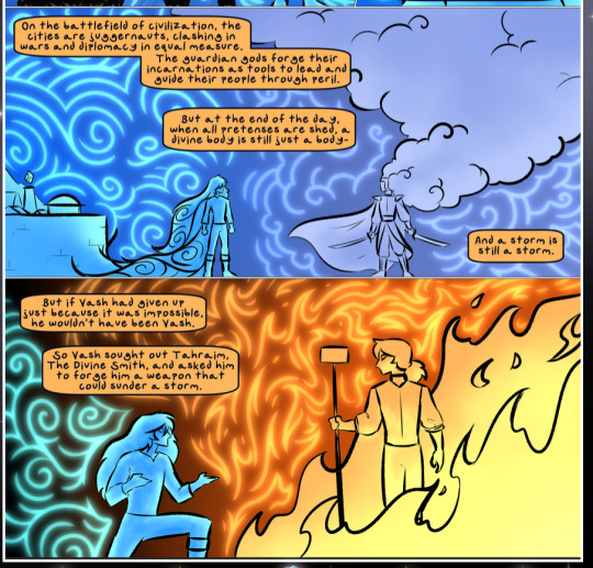
The flowing symbolic lineart surrounding each character. This is actually quite consistent across characters—see also Life's typical lines and how they curl:
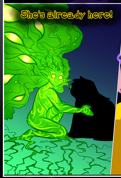
What's particularly interesting here is how these symbols are often similar, but not the same. Vash's lines are always smooth, clean curls, often playing off each other and echoing one another like ripples in a pond. You'd think they'd look too similar to Life's—but they don't. Life's curl like vines, and they remain connected; where one curve might echo another but exist entirely detached from each other in Vash's, Life's lines still remain wound together, because vines are continuous and don't float around. :P
Tahraim's are less continuous, often breaking up with significantly smaller bits and pieces floating around like—of course—sparks, and come to sharper points. These are also constants: we see the vines repeated over and over in Alinua's dreams of Life, and the echoing ripples of Vash are consistent wherever we encounter him. Kendal's dream of the ghost citizens of the city of Vash in the last few chapters is filled with these rippling, echoing patterns, to beautiful effect (https://comicaurora.com/aurora/1-20-14/):
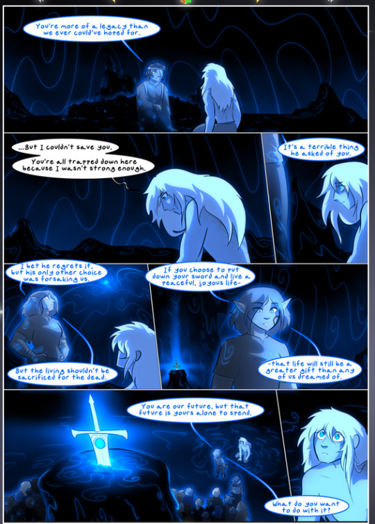
They ripple and spiral, often in long, sinuous curves, with smooth elegance. It reminds me a great deal of images of space and sine waves and the like. This establishes a definite feel to these different characters and their magic. And the thing is, that's not something that had to be done—the colors are good at emphasizing who's who. But it was done, and it adds a whole other dimension to the story. Whenever you're in a deity's domain, you know whose it is no matter the color.
Regarding that shape language, I wanted to make another note, too—Vash is sometimes described as chaotic and doing what he likes, which is interesting to me, because smooth, elegant curves and the color blue aren't generally associated with chaos. So while Vash might behave like that on the surface, I'm guessing he's got a lot more going on underneath; he's probably much more intentional in his actions than you'd think at a glance, and he is certainly quite caring with his city. The other thing is that this suits Kendal perfectly. He's a paragon character; he is kind, virtuous, and self-sacrificing, and often we see him aiming to calm others and keep them safe. Blue is such a good color for him. There is… probably more to this, but I'm not deep enough in yet to say.
And here's the thing: I'm only scratching the surface. There is so much more here I'm not covering (color palettes! outfits! character design! environment! the deities! so much more!) and a lot more I can't cover, because I don't have the experience; this is me as a hobbyist artist who happened to take a couple design classes because I wanted to. The art style to this comic is so clever and creative and beautiful, though, I just had to go off about it. <3
...brownie points for getting all the way down here? Have a cookie.
#aurora comic#aurora webcomic#comicaurora#art analysis#...I hope those are the right tags???#new fandom new tagging practices to learn ig#much thanks for something to read while I try to rest my wrists. carpal tunnel BAD. (ignore that I wrote this I've got braces ok it's fine)#anyway! I HAVE. MANY MORE THOUGHTS. ON THE STORY ITSELF. THIS LOVELY STORY#also a collection of reactions to a chunk of the comic before I hit the point where I was too busy reading to write anything down#idk how to format those tho#...yeet them into one post...???#eh I usually don't go off this much these days but this seems like a smaller tight-knit fandom so... might as well help build it?#and I have a little more time thanks to break so#oh yes also shoutout to my insanely awesome professor for teaching me all the technical stuff from this he is LOVELY#made an incredibly complex program into something comprehensible <3#synapse talks
778 notes
·
View notes
Text

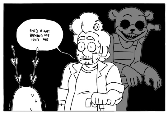
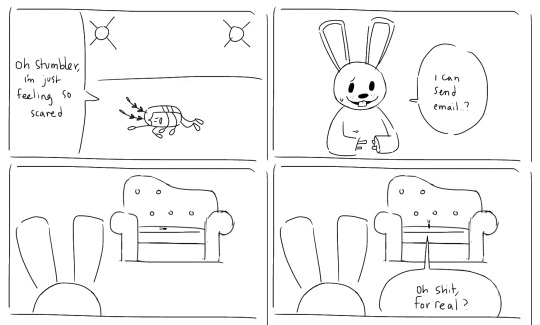
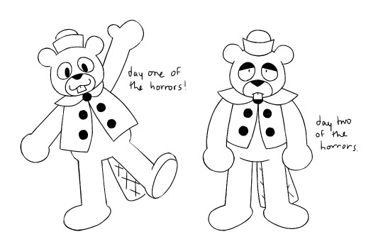
shipwrecked 64 is fun :] also scary. know this. also frankenbugs’ streams are good (second and third images are Loosely based on their most recent stream here! second being bc olivia shows up in the border, which is where their pngtubers are :] the first img is even more loosely based on their previous one iirc, where one of them mentioned how the girl rabbit stumbler has a crush on doesn’t have a name or model and i thought up a-little-mostly-joke-theory that ……….what if it’s hornz………..
#the art gallery#shipwrecked 64#frankenbugs#I’ve talked abt them before but I’ve never drawn anything For/Because Of their streams hence why I didn’t have a tag for them until now ig#maybe i should go back and find them and tag them#missing limbs#body horror#jic
283 notes
·
View notes
Text

blorbos ive missed drawing,,, mostly cookies cus i miss those fuckers so bad help me

and me throwing various sketches on a page, slapping color on em n calling it a day
#that kaeyas fully from memory and i dont have it in me to even be embarrassed about how much i could recall#i dont want to tag#genshin impact#kaeya alberich#cookie run#cinnamon cookie#plum cookie#vampire cookie#mononoke 2007#kusuriuri#stardew valley#sdv farmer#sdv elliott#sdv shane#sdv sam#sdv maru#maru undercut maru undercut ok i have been haunted by this for so long now maru undercut#sdv leah#nick nack#drawtectives oc#fom farmer#dw abt him#olruggio#oc#..ig#my art#i giveu p#i might.. go draw cookie yaoi n yuri.. going back to my roots
244 notes
·
View notes