#[the icon above is drawn by me]
Explore tagged Tumblr posts
Visit Tumblr Blog
Explore Tumblr blogs with no restrictions, modern design and the best experience.
Last Seen Tumblr Blogs


Fun Fact
Tumblr has 4 main sources of revenue.
Note
Ok so I absolutely love your Hera art.
But
Have you considered
Pink/orange/multicolored Hera
Honestly I feel like warm colors in general just suit her so well.
oh, i don't know! when i ask people to draw hera blue, the reasons for that are: 1) it makes her more immediately recognizable, and 2) i like what it represents! it draws on existing sci-fi imagery of holograms. a projected image of someone who is physically elsewhere. it's associated with water and sky, distance and longing.
physically, i think there are two heras: there's the way people literally perceive her from an outside perspective - formless, or associating her with the hephaestus itself, which is misidentification. i love when people draw eiffel interacting with hera's cameras + monitors very much, but i also think it's clear she feels she's seeing through them, not that she is them. and there's hera as she sees herself in her own mind (and in eiffel's mind, in the finale), where... i really think she just perceives herself as an average, tangible person.
so i don't think she's literally blue, i just think it's a good way to give her a visual presence in art that's closer to her self-perception, while still communicating some sense of distance / disconnect, if that makes sense? if hera had a body and could wear clothes, i think she'd love to try on all sorts of colors!!
#hi i'm so sorry about the delay! you caught me in the middle of eiffel questions#(just moving this part to the tags for clarity but i said before like. i know you mean 'your' as in art done for me of my design#for hera. but i feel like i should still acknowledge all of the wonderful people who have drawn her for me.)#anyway. blue is the hera color to me for all of the above reasons but also that shade of blue looks great with eiffel's bright orange.#i think it can be neat if people give her an orange visor or floating screens etc. to mirror hephaestus uniforms as like. work equipment#and i would love if someone made blue + pink art of hera in like. a trans way. but as a base color to represent her... i don't know#nothing except that shade of blue feels right to me.#i think warm colors would be lovely on her! but i think even that is more effective as like. if she has a body#then it communicates connection and presence and self expression and all of that in contrast. you know.#(though i think she would like blues as well anyway because of that association with the ocean. blue + yellow's a really sunshine-y look.)#thank you for asking!!#and your icon is so cute btw. is that your dog#asks
16 notes
·
View notes
Text
EDIT: CLOSED NOW! thank you everyone
---
will be closing on JAN 29, 9 AM PHT/JAN 28, 5 PM PST
thank you so much to those who donated! i wasn't expecting to have a considerable backlog from just the 3 days since i've posted this, that's why i mentioned before that i'll be leaving this up for a week. still, i'm afraid i'll have to cut this short since i've lots more drawings to do and i unfortunately have college to juggle at the same time.
i am extremely thankful for all the generous people who have emailed me about donating! i'll be closing this at 9 am tomorrow (my time) since, again, busy. so if you've been thinking about donating and getting a doodle from me, there's a little bit of time left!
---
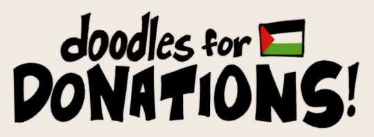
hello there! i’ll be doing character doodles for donations (donations done after i post this) for gaza!
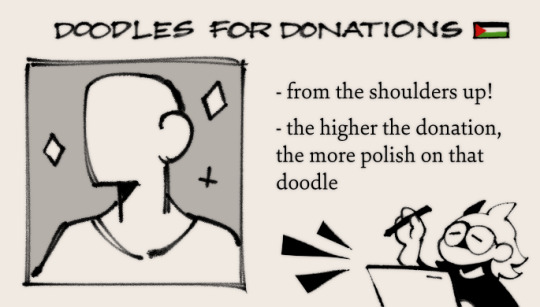
what will these doodles look like?
the characters will be drawn from the shoulders up! the higher the donation, the more polish that doodle’s gonna get!
what do you need to do for a doodle?
you could either:
donate e-sims to palestine (starting from sims priced 14+ usd). the post linked includes tutorials, relevant links, and discount codes you can find in the replies. instructions can be also found on https://gazaesims.com/ (you can donate another/more sims for an extra doodle or more polish, you decide)
donate 14+ usd to care for gaza. you can donate to them via paypal over here
or donate 14+ usd to palestine children's relief fund
afterward, take a screenshot that you’ve successfully donated to any of the ones mentioned above and send the proof of donation to [email protected] as well as:
the amount you've spent/donated in usd
the name/reference pictures of the character you want me to doodle (ocs included!)
now, please note that my work is for personal use only, not for commercial use/profit/merch/ai training/nfts. you can use it on icons, headers, etc. but please credit me and do not crop/edit out my signature.
i'll end up being a lot busier in the following weeks so this will be available for a limited time, i'll announce it here once i close this. thank you so much, free palestine!
#sunnysiderambles#e sims for gaza#free palestine#described#id in alt text#edit: fixed the typo. i always miss those things i swear orz#edit 2: will be closing this soon. thanks again everyone! 🫶
6K notes
·
View notes
Text
My dynasty finally found it's place!

And this became possible thanks to SimsDynastyTree!!! • Since I have been using the Figma template for my dynasty tree for a long time, first of all I would like to note the intuitive, responsive, concise and easy-to-learn interface of the site (those who also used Figma will understand me);

• I was very pleased with the interface of the tree itself, which is made in the style of The Sims 4. Thanks to this, the tree does not look "foreign", and perfectly combines with the game itself, complementing it;

• Despite the fact that the appearance of the tree is close in design to what we are used to seeing in the game, there are many customization options on the site: background, icons with characters, relationship lines and even the icon of the heir display - all this can be customized to your liking from the blanks proposed by the developers. By combining these blanks with each other, you can create a truly unique style for your tree;

• Special attention should be paid to the icons of relationships and life forms, which were hand-drawn by the project designer. They fit perfectly into the game style, although they differ from those icons that are presented in the game;
• PHOTO GALLERY! You can create your own photo gallery for EACH character in the tree and add a description to each photo. Saving a character's memories of places and events that are important to him is now easier than ever;

• In addition, the character card contains special slots for portraits corresponding to each life stage (from newborn to elder). I need this function like no other - I really like to watch my dynasties grow up and change;
• As a user, I was very pleased that the Sims DynastyTree development team does not stand still, but constantly develops its project, improving the functionality of the tree.
• And it's free! Of course, you can buy a subscription to open additional customization options, but the main functionality of the tree is absolutely free.
• Summarizing all of the above, I can say with confidence that, whether you are hardcore dynasty player or, like me, humble owner of a small family that has only three generations, SimsDynastyTree can become a worthy repository of memories of the time spent with your characters.
285 notes
·
View notes
Text
FULL ILLUSTRATION COMMISSIONS OPEN


questions about possible pricing, any of the boundaries or if i can draw something that isnt mentioned are more than welcomed, my inbox is open with anon enabled and my dms are open aswell!
you can contact me through tumblr dms or discord to either request a commision or just ask any questions in private!
(discord name is "wadds")
drawings you commission may not be used for merch,nfts or any other comercial means unless some form of compensation is added to the price of the commission. otherwhise theyre meant exclusibly for personal use (EX: phone wallpaper, to print for your own room, icons, fic covers, or character references)
payment through mercado pago would not be done with us dolars and prices would be adjusted to still make sense in that case (en pesos argentinos, pueden esperar un descuento de hasta mas la mitad)
FAQ:
difference between a closeup and a PFP?
a closeup is a zoomed in drawing where any composition, posing or extra elements are present, they can go from half the torso up Generally. while pfps are centered solely on a characters face and have no background beyond simple patterns, elements like "character holding something" could also be present and they dont add to the total
when exactly does the background start costing extra?
rough guidelines are written above in the picture, but I tend to be pretty lenient on them. if you ask for a drawing with a simple background (ie, Not payed) and I later ask if I want to add any details to it they will not add to the cost and you do not need to worry.
how long will this take?
depends on the drawing but it shouldn't take more than a couple of days once I've started working on it, that being said if there are commissioners in from of you in the line it could take longer for me to get to it. but I always try to get every commission done I'm at least one week
why is mercado pago argentina only?
mercado pago doesn't accept international transactions sadly and I am argentinian
can we negotiate the prices?
I consider my prices to be very low to begin with so no. however if you are from a country with a very high dollar price I might CONSIDER it cus I'm nice and all.
what does "obvious fetish content" mean?
it refers to drawings that might not include sex directly but alude directly to an sexual fetish or scenario, ie a girl being restricted by tentacles or someone being gagged and tied while naked. if your fetish is like, feet or smt then it's fine.
what does "predatory pairings" mean?
a pairing where the power imbalance is the main drawn for it. think teacher student relationships, cop / prisoner or similar dinamics. I'm simply not comfortable with it so I won't draw them.
why no background with the clean línes style?
i don't like how my backgrounds look without rendering and don't feel comfortable charging for them in that state
why no profile pic with Ms paint lineless?
the canvas size on those are pretty small and the style doesn't allow much detail, I don't think it'll look too good simply
372 notes
·
View notes
Text
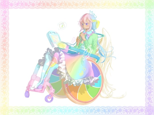
cumulus / nephos / “cloud” / ☁️
[plain text: cumulus / nephos / “cloud” / ☁️ cloud emoji]
[id: pastel fem looking person in pastel manual wheelchair looking down to slug in lap. there also slug on head n slug slide down skirt (don’t ask how). (all color pastel). person hair pink bangs, purple side hair, & blue low loose pigtails go below hips. purple eyes & medium-light ish skin. wearing bright turquoise ish color shirt collar with pink ruffles, & white shirt body with blue ruffles decorate, n green long sleeve cardigan over it also with ruffles. rainbow midi above knee skirt with white ruffles overflow from side of wheelchair. wear mismatch stockings, person’s left side rainbow stripes, n person right side turquoise blue with clouds on it. person not wearing shoes.
their wheelchair has yellow headrest, teal stroller push handle, green contoured backrest with supportive panels on two side lateral, teal to blue transition arm rest, orange big wheels with rainbow windmill candy swirl as cover & red push rim. frame is turquoise blue gradient to pink, has dump/slant, with yellow slug on one side’s turning point. purple fat caster wheels. attach to backrest is big white angel wings, & above arm rest has glowing yellow halo. their AAC device floating by them, has turquoise blue case with white cloud patterns. is saying “slug” icon. border of art lined with rainbow gradient lace. end id]
☁️.
(otherwise known as hate names terrible at decision)
VERY pastel n rainbow overload >:)
they level 3 autistic (“requiring very substantial support”) with high support needs—meaning they cannot independently do most adaptive functioning skills, needing other people physical help to do/do for them. they also need 24/7 supervision & physical help for all iADLs & bADLs.
they nonverbal & use AAC full time. their AAC is symbol based speech generating device.
their (most likely [<haven’t decided] partner who act as their) disability caretaker is hyacinthos shinya🪻🌌.
they also full time non-ambulatory wheelchair user with very specific posture & seating positioning needs so not out of it for long or really much at all.
angel wing on back of wheelchair is power assist! is magically powered by hyacinthos (who angel) & can be powered even remotely / far away. way control wheelchair & power assist part by intuitive / hand motions & gestures / etc, part by halo hover above armrest that act as joystick. can use it like traditional joystick or wear as bracelet n control that way! (gimme it i want one) (if you recognize this setting it may be because previous version)
they do mix of self propel, power assist, & caregiver push. their wheelchair have stroller style push handle instead traditional push handle for easier caregiver push, especially one handed.
is set in magical world & they do some magic (< haven’t decided]!
character not slug obsessed, artist the slug obsessed one
character sheet below cut!!
artfight character profile (VERY wip)
please do feel free draw them (with credit) n tag me!!!!!!
reblog welcome but please don’t repost
will fight you if debate about autism levels & support needs
.
hi under cut
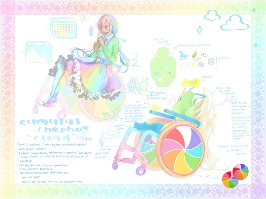
[character sheet. functionally described below]
top left is full character clothing (with wheelchair translucent in background) because in original there some key parts blocked by wheelchair especially arm rest.
skirt around waist have purple band with blue small ruffles. center have rainbow bow with rainbow star on top.
n also have front n back of AAC device. what drawn here is 5x7 grid with various colored squares showing different parts of speech but grid size more so because like. is how much could fit comfortably. so even when redraw n isn’t exact 5x7 with colors exactly right where is right now, is okay. colors & where they are based on own AAC device >:) because of course
design of aac device case basically same as above. back side just have bigger clouds. oh also device has handles. tho it float around so handles get used less. float around so don’t have worry about how to carry it how to mount on wheelchair etc etc etc it follows you it automatic come to your hand when you wanna say something (kinda also acting as prompting bc sometimes think about say something but don’t actually say in device) it get out way when you don’t want it. if only like this irl lol
bottom left is info about character already said
bottom right is wheelchair design
parts covered up by person: rainbow gradient side guard, blue contoured cushion.
n also drawing of back of backrest: when not in use, wings power assist shrink to small decoration on back. not big there all time.
also have stickers! sticker of nessie, banana slug, sheep, cloud, star, rainbow, & an AAC symbol of “AAC”
wheelchair may also have magical tilt & recline & elevate. how? don’t know!!! why not just make full powerchair? uhhhh like manual chair look better
n picture of irl windmill candy
border of art also rainbow gradient lace.
yea that all please draw them 🥲
praise me put lots work into them
pls be nice to them
#art#artist on tumblr#disabled#disability#wheelchair user#wheelchair art#autism#autistic#wheelchair#pastel#fairy kei#slug scribbles#🍞.txt#oc#original character#original charater art#long post#disabled artist#art fight#art fight 2024
320 notes
·
View notes
Text
Jade west x masc female reader

The sky above Hollywood Arts was a perfect blue, its clarity interrupted only by the occasional wispy cloud drifting lazily by. The iconic school of performing arts buzzed with its usual electric energy, a tapestry of creativity and ambition woven together by the eclectic student body.
Y/N walked through the main entrance, her combat boots thudding softly against the polished floor. She adjusted her leather jacket, glancing around the hallway filled with colorful lockers and bulletin boards plastered with show announcements and club flyers. Her short hair was artfully tousled, and her strong, confident stride drew a few curious looks from her classmates. But Y/N was used to it. She knew her butch style stood out in a sea of trendy fashionistas and aspiring stars, and she embraced it.
Her eyes scanned the hall for a familiar face. She spotted her friends by the lockers, deep in conversation. But it wasn’t them she was looking for. It was Jade West. The girl with the raven hair and piercing eyes who had a way of making Y/N's heart race and her palms sweat.
Y/N found Jade by her locker, her usual scowl in place as she fiddled with the combination lock. Jade's dark, enigmatic aura was what had drawn Y/N to her in the first place. There was something magnetic about her intensity, her refusal to conform to anyone's expectations.
Taking a deep breath, Y/N walked over, trying to ignore the fluttering in her stomach. "Hey, Jade."
Jade looked up, her expression shifting from annoyance to mild curiosity. "Y/N. What's up?"
"Not much. Just wanted to see if you’re free after school. I was thinking we could hang out."
Jade raised an eyebrow, a small smirk playing on her lips. "Hang out? With you?"
Y/N chuckled, used to Jade's sharp tongue. "Yeah, with me. Unless you’ve got better plans."
Jade closed her locker with a metallic clang. "Actually, I don’t. What did you have in mind?"
"I thought we could head over to Nozu, maybe grab some sushi and chill for a bit. Then, if you're up for it, there's this indie band playing at the Black Box later. They’re pretty good."
Jade's eyes lit up slightly at the mention of the Black Box, a small, underground venue known for showcasing raw, edgy talent. "That doesn’t sound terrible."
Y/N grinned. "Glad to hear it. Meet you by the front entrance after class?"
Jade gave a curt nod. "Sure. See you then."
The rest of the day passed in a blur of classes and rehearsals. Y/N found it hard to concentrate, her thoughts constantly drifting back to her upcoming date—if she could call it that—with Jade. When the final bell rang, she grabbed her backpack and headed to the front entrance, feeling a mixture of excitement and nerves.
Jade was already there, leaning against the wall with her arms crossed. She looked effortlessly cool in her signature black attire, her hair falling in perfect waves around her shoulders.
"Ready to go?" Y/N asked, trying to keep her voice steady.
"Ready," Jade replied, pushing off the wall and falling into step beside Y/N as they walked towards Y/N's motorcycle.
"You okay with riding this?" Y/N asked, patting the sleek, black bike.
Jade's eyes gleamed with interest. "Definitely."
Y/N handed Jade a spare helmet and mounted the bike, feeling a thrill of adrenaline as Jade climbed on behind her. Jade's arms wrapped around Y/N's waist, sending a warm shiver down her spine.
They sped through the streets of Hollywood, the wind whipping past them as they made their way to Nozu. The ride was exhilarating, a perfect start to their evening together. When they arrived, they found a quiet corner booth and ordered a variety of sushi rolls, the conversation flowing surprisingly easily.
Y/N found herself laughing at Jade's dry wit and sharp observations, and Jade seemed to relax, her usual defensive demeanor softening. As they finished their meal, Jade leaned back in her seat, a rare smile playing on her lips.
"Not bad, Y/N. Not bad at all."
Y/N chuckled. "Glad you approve. Ready for the next part of our adventure?"
Jade's eyes sparkled with anticipation. "Lead the way."
They made their way to the Black Box, the small venue already buzzing with energy. The dim lighting and graffiti-covered walls gave the place an edgy, underground vibe. Y/N led Jade to a spot near the stage, the close proximity to the performers adding to the thrill.
The band started their set, their raw, powerful music filling the space. Y/N glanced at Jade, who was completely absorbed in the music, her eyes closed and a content smile on her face. Seeing Jade so at ease made Y/N's heart swell with affection.
As the night wore on, the music grew louder, the crowd more animated. Y/N felt a rush of happiness being there with Jade, sharing something they both loved. When the final song ended and the applause died down, Y/N turned to Jade, her voice almost lost in the cacophony of departing concert-goers.
"So, what did you think?"
Jade opened her eyes, her gaze locking onto Y/N's. "I think tonight was… amazing. Thanks for inviting me."
Y/N smiled, feeling a warmth spread through her chest. "Anytime, Jade. Anytime."
They left the venue and headed back to Y/N's bike, the night air cool against their skin. As they rode back towards Hollywood Arts, Y/N felt a sense of contentment she hadn't felt in a long time. She parked the bike and turned to Jade, who was removing her helmet.
"Hey, Jade?"
"Yeah?"
"Would you want to do this again sometime?"
Jade smirked, her eyes softening. "I'd like that."
Y/N's heart soared as she watched Jade walk away, her confident stride as captivating as ever. She knew their relationship wouldn't be easy—Jade was complicated, fierce, and often difficult. But Y/N was ready for the challenge. Because underneath all that, she saw the real Jade: passionate, loyal, and capable of great love.
And Y/N was determined to be the one Jade let in.
#lesbian#wlw#wlw post#jade west#jade west x reader#jade x reader#jade x female reader#victorious x reader
214 notes
·
View notes
Text

INTERLUDE ;; Homelander goes to you whilst on a break from filming a new box office movie with The Seven.
12.31.24 Masterlist

Homelander stood with a relaxed posture, his striped cape swaying slightly as he shifted his weight from one foot to the other. The break on set buzzed with activity—crew members shuffling, Starlight checking her script, A-Train downing a bottle of water after his last sprint scene. But Homelander paid them no mind. His attention was singular, drawn entirely to you.
A real smile touched his lips, the kind that softened the sharpness of his usually calculating blue eyes.
You couldn’t help but smile back, the moment feeling strangely serene.
"Enjoying the show so far?" Homelander asked, his voice lowered to a more intimate tone, one reserved for these rare moments when no cameras were pointed at him.
"It’s impressive," you replied, shifting slightly to look up at him.
His smile grew, a rare expression of unguarded pride. "Of course it is. We’re The Seven, after all."
Despite the countless stares burning into your back, you found it hard to feel uncomfortable under Homelander's gaze. His looming figure, broad-shouldered and imposing in his iconic suit, made you feel protected rather than trapped.
He stepped closer, casting a shadow over you that felt like a blanket, hiding you from prying eyes. There was an unspoken understanding that no one dared interfere when he was near you. The power he exuded wasn’t just physical; it was the silent authority that made others instinctively steer clear.
Starlight, from across the set, shot you a glance—concern flickering in her eyes before she turned back to her script. A-Train did his best to appear indifferent, but the subtle furrow of his brow betrayed his curiosity. Even Black Noir, standing silently in the corner, seemed to tilt his head ever so slightly in your direction.
But no one said a word.
Homelander noticed their glances, of course he did. He thrived on attention. But this time, he let it slide.
"They’re curious," you murmured, tilting your head toward him. "About why you’re over here."
He chuckled softly, the sound warm but edged with something darker. "Let them wonder. I like keeping them guessing."
You looked up at him, studying his face. For a man so used to wielding terror like a weapon, he seemed… normal. Almost human.
"You know, you don’t have to keep watching over me. I’m fine."
Homelander's eyes narrowed just a fraction, the warmth in his expression dimming, but not vanishing entirely. "I’d rather be sure. I can’t have anything happening to you."
It wasn’t a threat, not directed at you at least. But the weight of the words hung in the air. Anyone who so much as thought about bothering you wouldn’t live long.
You sighed softly, leaning slightly into his shadow. "You really do take this whole protector thing seriously, huh?"
His gaze softened once more. "For you? Absolutely."
Moments like this were rare—when the larger-than-life figure of Homelander melted away to reveal something else, something deeper.
The break was called to an end, and the crew scurried back to their positions. Homelander lingered for a moment longer, his gloved hand brushing your arm in a fleeting gesture of reassurance.
"I’ll see you after," he said, his voice just above a whisper, but carrying the weight of a promise.
And just like that, the mask returned. Homelander straightened, turning back to the set with that signature confident strut, his cape billowing behind him. The untouchable leader of The Seven was back, but for a brief moment, he had been yours.
ᵉᵃᵗᵐʸʰᵉᵃʳᵗᵒᵘᵗ
#homelander#homelander x reader#the boys#the boys fanfic#the boys amazon#fanfiction#fanfic#gn reader#the boys x reader#starlight#black noir#black noir x reader#the deep#a train
110 notes
·
View notes
Text

Raffle time!
End time: Raffle will end once the anniversary event ends~
Rules: - Reblog this post with your FR username and ID# to enter - You do not have to be following me - You do need a Flight Rising account - Winners will be chosen randomly - Number of winners depends on how many enter - Raffle ends after the FR anniversary event ends - Only FR dragons will be drawn
The winners will get one, non-animated Chibi Icon like in the above graphic of whichever dragon they want!
Have fun during the anniversary event, everyone~!
#flight rising#fr art#art raffle#flight rising art#jem draws#happy 11th anniversary!#let me know if you have any questions!
256 notes
·
View notes
Text
@recom-week
RETURN TO PANDORA MONTH
DAY 1 - MOUNT DESIGN (1.12.2024)
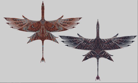
Ikran Series - Ngulya, Kxasi's Ikran

Name meaning - 'gray air' Bonded to - Kxasi of the Kxayltirey people Age / sex - nearing an older adult's prime, female About - Ngulya's psyche has a calming, comforting effect on Kxasi. She enjoys complex tasks that require good memory, making her an ideal companion to Kxasi, who is very ambitious and energetic.

Above: Only minimally shaded, mostly flat color reference missing the glow effects on the bioluminescent markings.

Above: Ngulya's bioluminescence in dim lighting

Above: Ngulya's bioluminescense in night lighting
History of Ngulya's design


Above: February 18th in 2023 - Here you also see Kxasi's old design. The purplish-gray look and orangeish/reddish bioluminescense have been a part of my vision for Ngulya from the very beginning.


Above: March 9nth in 2023 - Here is my first take for a full reference for Ngulya. This is the point where the pale head and neck became iconic traits to the otherwise dark purple design.
I've always been torn between oranges/browns and actual purples for many of the color areas in this design, as you see from that earlier color draft.
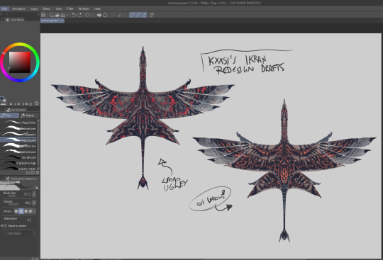
Above: This year, I wanted to finally make proper ikran templates for the sake of more comfortable designing of all my ikran characters.
This is an early version of the final template set I created, and two different drafts of Ngulya.
Sadly I never saved these drafts, so these are just badly compressed screenshots from my Bluesky and Twitter accounts.
The one on the right is my last draft before beginning work on the final one, as I started to be happy with the markings.
The orange one on the left of the 2nd image is not Ngulya, but a draft for another ikran entirely.

Above: For a very long time, I could not make the bioluminescent highlight markings fit anywhere into this design, so I almost called it 'done' in this stage.
The color pallette was more brown than purple. It was a really hard decision to tweak the pallette once more, so I could make it all good-looking with the highlight color.
About my thought process...
I create my ikran OC designs entirely via body/emotional/visual synesthesia. This intuitive process doesn't contain conscious thought, but rather letting an 'inner eye' show me things.
This method lets me get ideas I couldn't otherwise get, unlike when combining my old clichés in a calculated manner etc. Instead of such calculated process, instead I succumb to a more dreamlike intuition where my brain can just fire whatever.
For these ikran, I must feel like I am them, to create their appearances. For the same character, like Kxasi, even for a long period of time, I've been getting the same results with this process...
I imagine the na'vi during their 'Iknimaya' (or equivalent), the type of feeling I would have about them as a person, as if they stood in front of me.
Then, I imagine I'm indeed an ikran looking at them, - what kind of a mental and emotional being would I be, to feel particularly drawn to this na'vi? I imagine the feelings.
These feelings inform me of the ikran's whole design, as well as personality.
Kxasi's ikran Ngulya is a character I can understand, put myself into, imagine her feelings and personality/temperament from the inside, and how she'd feel even when connected with Kxasi's consciousness via tsaheylu.
I can also imagine how Kxasi feels connected to her.
Their personalities contrast each other. Kxasi is hot-headed and energetic, while Ngulya is a calming presence. Usually, Ngulya even discourages Kxasi's antagonistic impulses when they're connected.
However, if overwhelmed by the need to protect, Ngulya's mind will be drunken on quite the berserker's adrenaline, - also affecting Kxasi that same way. Their minds will melt into one demonic entity with the sole goal of turning someone into minced meat. This can be triggered by putting their loved ones or personal home etc. in danger.
Ngulya resembles my favorite, now-deceased dog Lola a lot by her personality. Her 'feel' is very much like what Lola was, even though I did not intentionally create her in Lola's image.
She's funny and silly like Lola, obsessive and persistent in tasks like Lola, has basically endless energy to run (fly), hunt and play, - and there is a soft comforting energy to her. She's also fiercely territorial and protective, - just like Lola... I definitely see her as a Pisces, like that dog was, also.
#returntopandora#kxayltirey#ikran#knarme's ikran series#na'vi fanclan#navi fanclan#na'vi oc#navi oc#avatar oc#na'vi clan#navi clan#avatar fanclan#james cameron's avatar#atwow#avatar twow#avatar2#avatar the way of water#mountain banshee#pandoran animals#spec-bio#spec-evo#creature design#avatar 2009#return to pandora
111 notes
·
View notes
Note
https://www.tumblr.com/whatudowhennooneseesyou/765031256699404289/greeting-ruby-are-u-able-to-do-felix-red-and
No I think it’s me 😭 I think I put that request a while ago I’m not sure but happy to see ur doing it Ruby
Have a great night 🌹
𝐍𝐚𝐭𝐚𝐥 𝐂𝐡𝐚𝐫𝐭 𝐀𝐧𝐚𝐥𝐲𝐬𝐢𝐬: 𝐅𝐞𝐥𝐢𝐱 𝐋𝐞𝐞 (𝐋𝐨𝐯𝐞 𝐚𝐧𝐝 𝐑𝐞𝐥��𝐭𝐢𝐨𝐧𝐬𝐡𝐢𝐩 𝐅𝐨𝐜𝐮𝐬𝐞𝐝)

ᴡᴏʀᴅ ᴄᴏᴜɴᴛ: 1K
ᴅɪꜱᴄʟᴀɪᴍᴇʀ: Think about it. Write about it. Have hard thoughts. Do not take it seriously. None of this information is confirmed and all theoretical. 18+ and contains smut.
ᴍᴇᴛʜᴏᴅᴏʟᴏɢʏ: Traditional Astrology & Whole Sign
ᴏᴠᴇʀᴠɪᴇᴡ:

This analysis will be slightly shorter and less detailed due to Felix's Rising Sign being unknown.
Virgo Sun
Aries Moon
Rising Sign Unknown (although if I were to guess, I do strongly believe Felix is a Cancer Rising- his personality traits, appearance and life themes align with being ruled by the Moon)
Libra Mercury
Libra Venus
Leo Mars (again, Mars in 2nd House would explain the deep voice and why he's one of the most popular (if not, the most popular) member of Stray Kids.)
ꜰᴜᴄᴋʙᴏɪ ʀᴀᴛɪɴɢ:
9/10!!!
The fuckboi energy is STRONG with Felix because his Aries Moon and Leo Mars indicates he's not the most romantic person in relationships and he's quite primal/pleasure-focused in his escapades.
He can detach and separate emotional from physical feelings and he has a HIGH drive so he might require constant and copious amounts of sex in order to feel satisfied.
Felix also loves A LOT of attention, praise and reassurance with his Libra and Leo placements and the more, the better.
If a man with a Leo and Libra placements is unhealed (which let's face it- Felix is in his 20s so I doubt he's seeing a therapist) then he might prefer constant attention from groups/hordes of people, rather than a singular person b/c they prefer to be desired by multiple people.
I kid you not, I think Felix is on the same wavelength as Jeongin regarding hidden fuckboi energy.
Before you come for me, just look at the way this man flirts on stage, with Stays, with his members and that iconic Risabae interview. The man has EXPERIENCE.
ʀᴇᴅ & ɢʀᴇᴇɴ ꜰʟᴀɢꜱ:
ʀᴇᴅ:
Commitment phobic (potentially)- see above for my biggest reason why, if he was toxic enough- he could be the type that's for the streets permanently.
Emotionally impulsive and volatile! His Aries Moon indicates he struggles with emotional regulation and is the type to go off the deep end over the smallest of issues because he's the type to bottle things up.
Superficial! His Virgo Sun and Libra Venus can make him superficial and appearance- focused and could be more interested in how well you two LOOK together vs how well you two actually are compatible.
ɢʀᴇᴇɴ:
Loveable! By this I mean he does have an endless amount of love and passion to give to you, you would never feel like he doesn't love you because he'll show it constantly through acts of service and physical touch.
Confidence! Felix's confident nature means he's not afraid to initiate or reveal his feelings, he has enough self-reassurance to take those risks, no matter how anxious he feels internally.
Adventure! His Leo Mars indicates he gets bored easily so he would always find a way to keep the spark alive in the relationship, no matter how long you've been together.
ɪᴅᴇᴀʟ ᴛʏᴘᴇ…ɪꜰ ʜᴇ'ꜱ ɪɴᴛᴏ ᴡᴏᴍᴇɴ:
ᴘʜʏꜱɪᴄᴀʟ ᴛʀᴀɪᴛꜱ:
Felix's sexual orientation is unknown BUT if he were into women, would be attracted to the 'effortlessly put-together' aesthetic with his Libra Venus, feminine, elegant but simple in their appearance.
His Leo Mars attracts him to confidence and aura so ppl with a big smile, nice teeth, straight posture and shiny hair would also be physical traits he'd find attractive.
Virgo/Aries placements typically are drawn to the 'natural/glowy' look so if you can look hot with no makeup or light makeup and have your hair thrown prettily in a messy bun whilst wearing a baggy T-shirt or workout gear? Then Felix is your man.
ᴘᴇʀꜱᴏɴᴀʟɪᴛʏ ᴛʀᴀɪᴛꜱ:
Extroverted! He does need someone who is extroverted or at least an ambivert that enjoys consistently being social and attending group environments like he does.
Social! He finds charisma incredibly attractive, if you can light up a room and have people gush over you with a simple smile and a twinkle in your eye, he will adore you for life.
Playful! He has to be with a partner who he feels he can release his inner child and be playful and kinda quirky with, that won't make fun of him for his weird noises.
I feel like I'm just describing Bang Chan here.
ᴅᴏᴍ, ꜱᴜʙ ᴏʀ ꜱᴡɪᴛᴄʜ:
Hear me out, hear me out, hear me out!!!
I do think Felix is more dominant than what he lets on because he knows the company and Stays prefer him to have that 'cute fairy boy' persona but his dominant side creeps out on stage, particularly when he performs by himself or when he's on solo press tours or promotion.
I definitely see him as a hard dom and can be quite freaky in the bedroom BUT it would take a long time to coax it out of him, he wouldn't show you that side of him until he's been intimate with you a couple of times.
I think the switch-dom ratio would be 60/40 and I don't think he'd prefer someone who's extremely bratty all the time but definitely a soft brat, someone who's nice and bubbly but has a slight attitude problem you know?
ᴋɪɴᴋꜱ…ᴊᴜꜱᴛ ᴀ ꜰᴇᴡ ᴏꜰ ᴛʜᴇᴍ:
Auralism! It's obvious but it's very true, we see this with Felix's loves of ASMR and how he's quite an auditory person. He would love your voice but also loves the noises your body makes during a tryst of passion, the slap of skin on skin-, the licking of his tongue against your cunt etc.
'can you hear the sound of your cunt taking my fingers in baby? that's the sound of heaven for me'
Camming! This is an intrusive thought but Felix wasn't an idol, he would have made a killing on OnlyFans providing ASMR content with his voice and fem!boy appearance. His Leo Mars indicates he likes to be watched and be appreciated by multiple ppl.
'all your comments are making me so hard right now, if I keep receiving them, I might just wear the tiara one of my beautiful subscribers bought me'
Voyeurism! Idk what the kink is called but I do think Felix might get aroused over his own performance and voice so I wouldn't be surprised if he enjoys filming something sexy and then wants to watch you watch the footage and get hard over watching you get yourself worked up and then fuck you after.
'Look how wet you got just from watching me jerk off babe? It's a good thing you've got the real thing right here to make you feel good'
Taglist: @scuzmunkie @marievllr-abg @umbralhelwolf @starsareseen @lino-jagiyaa @mischiefsmind @mrcarrots @junieshohoho @partywithgyu @whatsk-poppinhomies @craxy-person @hologramhoneymoon @gyuhanniescarat @staytinyinmybpack @necessiteez @wooyoungmybelovedhusband @berryberrytan @sensitiveandhungry @laylasbunbunny @bangchanbabygirlx @i-love-ateez @anyamaris @krishastumblernow @hexheathen @michel-angelhoe @northerngalxy @youre-alittle-taste-of-hell @starillusion13 @justaaveragereader @ja3hwa @jus2passtime @shroomoth @marykpoppin @leomggg @daddysspecialdollyworld @mykryptonitelight @wisejudgedragonhairdo @craxy-person @sanakimohara
#kpop smut#stray kids smut#skz smut#stray kids hard hours#felix smut#lee felix smut#yongbok smut#stray kids fluff#skz fluff#felix lee x reader#stray kids hard thoughts#skz fanfic#felix lee smut#lee felix stray kids#stray kids x reader#skz x reader#kpop x reader#lee felix x reader
88 notes
·
View notes
Text
Fandom Trumps Hate 2025!
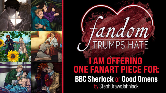
Looking for a scene drawn for your story? A piece to help inspire you to write a fic? A new icon? How about covers for your story with full print-ready Graphic Design service? Maybe a pinup, or some trading cards (up to 10)?? Maybe a gift for someone, or just your vision of a character(s) (up to 3 character sheets) for your AU?
Well, that’s just some of the stuff I’m willing to offer for this year’s @fandomtrumpshate Charity Event! FTH is a WONDERFUL community project that supports amazing non-profits through donations for fanworks via this wonderful annual event!
I am offering ONE fanart Piece for BBC Sherlock or Good Omens!
Because of my day job's circumstances this year where I will be guaranteed to be indisposed for about 3 months and unable to work on my personal projects, I feel I am only able to offer up one piece this year instead of my usual 2 to 4. This will be my sixth year, and the piece will be for either the BBC Sherlock or Good Omens fandoms, starting at 10$ for the non-profit of your choice!
Here are some past FTH pieces I’ve done, if you’re interested in seeing the scope of the work you would be getting from me:
2020:
GO - :FTH 2020 – Lagniappe for Big_Edies_Sun_Hat:
GO - :FTH 2020 BONUS – Réveillon for Big_Edies_Sun_Hat:
2021
SH - :This Year: (FTH #1 for @discordantwords)
SH - :Burlesque Johnlock: (FTH #2 for @ohlooktheresabee)
2022
SH – :A Quiet Moment: (FTH #1 for @totallysilvergirl)
SH – :Against the Wall: (FTH #2 for @anarfea)
2023
SH – :Let Me Come to You: (FTH #1 for ShakespearelovedLadyMacbeth)
SH – :Couch Cuddle: (FTH #2 for @discordantwords)
SH – :More Every Minute: (FTH #3 for @totallysilvergirl)
2024
GO – :Come On, Dear: (FTH #1 for Box Human)
GO – :You're Alright?: (FTH #2 for mltrefry)
====
And of course, you can browse all my art (primarily fanart) to see my range:
@stephdrawsjohnlock
stephdrawsfanart on Instagram
@stephratte (Primary Multifandom Art Blog)
stephratte on deviantART
I will draw any ship from either of the above fandoms, though I do prefer Johnlock or the Husbands. All my work is done digitally at a minimum 2000x2000 print-ready piece in Procreate. Traditional media (markers, India ink, and pencils) is also available if you prefer, done on illustration or marker paper at the paper’s size, with the option of acquiring the original if you choose. I will also do it at a requested size if you have a preferred format for something specific (like a book cover or a comic panel). Feel free to DM me if you have any questions before bidding on me, or to see if I am able to draw what you would like!! I want you to be satisfied that I can achieve what you want!
The browsing begins on February 21, and the bidding opens on February 25! I hope I once again get a chance to do a fantastic piece for one of y’all!! I love doing this so much, so keep an eye out for the official info post link once FTH officially opens!
Thank you to everyone who is interested!
**NOTE!! If you've bid on me before and want to try again, I've changed my User Name this year to this blog's name, StephDrawsJohnlock (I-J), for easier finding once the listings are posted!
42 notes
·
View notes
Text
Thoughts on the DA:TV Companion Concept Art:
General
I love that we saw these and I think the art is beautiful!! it's so cool seeing different versions of a character, different ideas for a character, and how things translated from concept arts into the character models in the game. I can't waaait to look through the rest of The Art of Dragon Age: The Veilguard, with a fine-toothed comb!!
each character has iconic color palettes and iconic shapes and stuff :)
I feel like there is a lot to examine in these pictures, even with the spoilery text redacted!! 🔍🔍
I'm so extremely curious about what the redacted text says. 👁️
It looks like the geometric patterns drawn behind the characters are slightly different each time?
In the ones where multiple different outfits are shown for the character, do you suppose that these are only discarded concept ideas, or are some similar to some of the alternate outfits for the companions that we can find or upgrade for them in the game?
in some of the pages, there appears to be additional parts of the page blanked out/redacted rather than just the paragraph of text. I wonder if there are small text captions or even additional small drawings in those spaces that also needed to be redacted for spoiler reasons 👁️
In some of the sections below I just described what part of the art I was referring to, in others I popped in images because I was finding it hard to describe what I meant ^^
Also, the associated tweet mentions the BioWare Gear Store-exclusive variant of the artbook. The link in it just takes you to the general Gear Store website landing page at the moment. At the moment, the BioWare Gear Store variant of the artbook is out of stock (it went out of stock really quickly after release). However, CM Violet mentioned in the Discord that "We are planning on another printing [of the Gear Store variant of the art book], but no date yet! I'm sure we'll announce it when we have more news!" [source: the official BioWare Discord]
Bellara
Bellara's page is the only one I think with no name. did her name have to be redacted too bc of a spoilery reason?
I LOVE Bellara's pages. she's just so 🥺 (clenching my fist). some aspects of the design of Bellara's clothes remind me of butterflies or butterfly wings.

Left: the angle of this one reminds me of her party icon art. Center: this one shows a different design concept for her vallaslin. in this one she also has different earrings. in the full version of this drawing, it looks like she is holding some kind of tool in her hand (makes sense considering her Tinker ability), while in her other hand it's a piece of cloth, reminding me of the way mechanics are sometimes drawn holding rags during their work. her posture in the full version of this drawing is like 'You can fit sooo many triangles inside this bad boy [the giant elf head artifact/sculpture]'. hhh. Right: can anyone make out what the text above her bag says? ^^ btw, this bag design is so cute. edit: thankyou to @squidaped-oyt who mentioned in the replies of this post that this looks like it says "Foldable map"! more on that here.

HELLO??, this ancient elven sculpture/artifact thing is extremely 👀. the scale of it compared to Bellara is massive. there are beams of light coming from its eyes and the triangle set in its forehead. the triangular parts are a now-familiar aspect of ancient elven magic-tech and artifacts. the nose bridge reminds me of the design of elven nose bridges circa Dragon Age II - only he has a pointed part on his in addition. the bald head we're all familiar with from ancient elven statues, in-world murals/wall paintings etc. is it just me, or are the teeth also pointy? I wonder what this thing is.. was it just decorative (a head of a giant statue)? (this kind of thing in this Veil Jumper/Arlathan Forest concept art comes to mind). was it an art piece representative of a particular Evanuris or one of their chosen? or did it have some kind of actual function - maybe it was part of a giant protective automaton kinda thing? what this head really reminds me of is Codex Entry: Vir Dirthara: Signs of Victory -
The pages of this book—memory?—describe a monument made in a single afternoon by a thousand-thousand toiling servants swarming over a lump of fallen stone as large as a collapsed mountain. By the end of the day, the stern figure of Elgar'nan stares down into a valley, carved out from the foothills of the rock. The slaves have disappeared. Light radiates from the eidolon's narrowed eyes and its open, snarling mouth. "Hail Elgar'nan, first among the gods! Mark his victory eternal!"
Could this be [part of] one of those sorts of monuments/eidolons? It sure looks like it's snarling through its open mouth. And it has narrowed eyes and light is radiating from them.
The other things it reminds me of are: 1. the ancient elven sentinels (the magic-bot kind, not the Abelas and crew in Temple of Mythal kind), two. like maybe it's a giant one of these. 2. these big ancient elven hands and the Dead Hand landmark (see Trivia section) in DA:I, which is found in the Dales and contains an elven shrine and is not far from Ghilan'nain’s Grove.
Horace Medford wrote of that landmark,
"The great stone hand was something of a mystery. One assumes it is a piece broken off from a larger whole. If so, judging by the size of that one hand, I imagine the entire sculpture to be... well, large enough to require the use of obscenities to describe it. Thus I have only one question: where is the rest of the statue? It is difficult to imagine how something so large could go missing."
like maybe the head from Bellara's concept is the giant head to a similar kind of pair of giant hands (of either type).
(^ post which discusses these both here)

Left: the way this bracelet thing is worn gives it the impression of a watch, which is cool and fits her machinist/inventor kinda vibe/aesthetic :) Center: the cloth, a bit dirty from active use (what a thoughtful touch), tucked into her belt :) Right: I love the eyepiece/monocle look!! It's giving Artificer, it's giving gadgets. does anyone else think Bellara and Dagna would get on super well? 💜

These are all super interesting and I love that they were thinking about the different parts of Bellara's kit and belongings like this. in the top row, it looks like the book on the left is the closed version of the book on the right. Bellara's book full of research notes :D what I wouldn't give to browse through it!! I love how she's filled it with different bookmarks, it gives you an insight into her mind and the way it works. on the front is one of those ancient elven golden faces (like on Solas' armor's knees in Trespasser, on the Sentinels in the Temple of Mythal, on the ancient elven Deluxe edition of DA:TV armors, etc). inside, it looks like she has pressed a flower, which is so lovely. on the right-hand page, I'm really curious about the drawings there. what is it of? a map, a diagram? it reminds me a bit of the map of Arlathan Forest in the Veil Jumper issue of Dragon Age: The Missing (and it would make sense for her to have a map, Arlathan Forest is changeable lately). and if you squint, maybe that's an 'X marks the spot'? also extremely curious is the drawing on the left-hand side of the page:

Who is this depicting? the figure's headshape/headpiece/mask reminds me a lot of the Evanuris headshapes. and the general vibe of the drawing reminds me of the ancient elven Evanuris mosaics (example). Sylaise-y? but maybe it's not an Evanuris and it's more like a figure from Bellara's past? the way the flower is pressed on this page makes it look tender, like memory. or if it was an Evanuris, it makes it look like an offering or token. perhaps Bellara's vallaslin correspond to Sylaise or whichever member it is. there was a time before the gods came back the way they did in DA:TV.
It's also really cool to get a look at the fold-out material thing. do you think she usually carries this rolled up at her belt or in her bag? it looks like somewhere where she stores various kinds of ancient elven triangle fragments, or maybe it's even some kind of strange map. A map of a bunch of different reality-fragmented Veil Bubbles or something would look really strange no doubt, not like a normal map.. edit: more on that here.
Davrin
It's neat to see different hairstyle versions of Davrin! the shape of the blue sword reminds me just a lil of Starfang, which is really nice. and we saw Davrin with a griffon-wing shield like there is in these concepts in the character reveal trailer.

Comparisons of the various vallaslin designs he has in his concept arts to the final one in the game. (in some of the concepts, his vallaslin look a bit bluer, which reminds me of his tarot-style art from the party selection screen). though, in the right-most version, it looks more kind of like a circlet, a Samara Mass Effect-type situation instead :)

This on his heel is totally a spur. makes sense, for a Warden that may one day be a griffon-rider like the Grey Wardens of old :') (at least in the sense of visual language, like "spur - riding - horse - griffon").

We see Davrin equipped with an additional dagger/shortsword like this in the warrior gameplay video, albeit not this specific one, if you go by the handles.

He maybe has some stubble here. ^^

In this version of Davrin, it looks like he has a staff. (though, he still has a sword here too). Is it a polearm kinda deal, or was there a time during development when Davrin was a mage? perhaps the elf in this concept art is a version of Davrin? that elf is wielding a staff to fight, and there are some similar aspects in the outfit designs, like the considerable collar.
interestingly, his staff here reminded me of the staff held by the elven figure on the front of the DA Vinyl art. 🤔

^ Looking at that staff-Davrin concept more generally, it's interesting that this version has more overtly Grey Wardenny-parts to his armor compared to his final look, like the griffon symbol on the chestplate and shoulder.

This Davrin holds out his arm, like a falconer. in Dalish culture, the hawk is a sacred animal of the Huntress Andruil.

And this Davrin straight up is a falconer. how cool!! due to image resolution I'm not sure if the darker parts on the raptor are parts of its plumage or accoutrements, but in falconry, the birds sometimes do wear these types of accoutrements. Falconer Davrin Concept reminds me of that one DA:I Dorian concept art where Dorian had a monkey haha. :D the attention to detail in Falconer Davrin is neat too, you can see that on the hawk-perch arm he has a thick extra cover on his arm, due to the sharpness of raptor talons and grip. I really love Falconer Davrin's griffon shoulderplate, and when looking at the more geometric diamond design of his vallaslin here, what struck me was its resemblance to the diamond geometric pattern behind him.

Harding
Harding is the only one on the concept art among the named characters there who is listed as her surname rather than her given name haha. she's just Harding just like Hawke is Hawke, that's just the way it is.
The flower and leaf pattern in the top left is cute, I wonder if it was inspiration for the flower and leaf stitching Harding has on the collar of her casual clothes in the game. In the concept art it looks like the kind of design that you might have on the leatherwork on the front cover of a beautiful leatherbound journal or something. :) In the central picture she's holding and appreciating a blue flower, which is so cute ♡ and which ties to what was said about her loving plants, raising plants, and nature. she has what looks like the Inquisition hairy eyeball symbol on her belt pouch as well as on her knee pads. (;;) the version of her to the left of that shows her with her hair down, in a more pony-tail like sort of style. on that version of her, you can see flower and leaf floral patterns curling up the bottom of her cape. (very pretty).
To the right of the central image, there's a big diagonal blank rectangle of content which has been removed, presumably due to spoiler reasons. Was this also text? It seems like a weird angle to have placed text at. Maybe it's a drawing of an object of some kind being hidden? A different version of her bow perhaps? (this is the case in a few of the companion concept arts btw.)
The tailored coat and pinstripe pants version of her is so cool. :D look at the tails on the back of her coat in that image. dapper. Harding formal wear? :D
of course, the two most !! images from Harding's one are these ones. copying over my thoughts from that post,
Presumably this is to do with Harding’s new magical stoney earthy powers. (In the second image, along with the bow, it looks like half her face, part of her neck and her arm itself is also stone/crystal). The glass-like shiny parts reminds me of quartz or something. :)
I do wonder if (if they are still things in the game) perhaps those two images or the stoney parts of them could also potentially have done with being redacted for spoiler reasons? how I wish the Harding image was higher resolution so we could take a closer look at stone-Harding..! somewhere off in the distance, Varric "haha, you'd be Harding in Hightown" Tethras is like "haha, Harding, you're hard/hardening" hhhh. 💀
In the image with her hood up, the blue veins on the bow remind me of blue lyrium veins. I also wonder, is she holding the stone/crystal bow with her stone/crystal arm, or is the bow simply growing from the arm? does the hard surface of her body when it's like this repel or take less damage owing to its hardness? is this something she might be able to do in gameplay later on as her story (and powers) progress?
it stands to reason that if you can turn other people/things to stone, as she did to some ghouls in the release date reveal trailer, you might also be able to extend this power to yourself. presumably this ability is tied to the Titans, the dwarves as their children, the Stone, maybe a restored (in Harding's case) connection to that, the way dwarves used to be. it also reminds me of how golems are created using live dwarves. Caridin said "It allowed me to forge a man of steel or stone, as flexible and clever as any soldier." 👀
Btw, speaking of Harding's magical powers, I wonder if Harding dreams at night now..?
Lucanis
it looks like there's a spot on Lucanis' page other than the text at the top that is blanked out/redacted. I wonder what it contained.
part of the geometric designs behind him reminds me of his eyes motif.
some of the alternate outfits for him look really like, majestic. in the one with the manbun, he has big poufy shoulder pieces and huge sleeves.
I wonder if any concept art of clean-shaven Lucanis exists anywhere? ^^ I'm really curious about what he looks like clean-shaven, or without a beard as he was in The Wigmaker Job.
I'm losing my mind at all the different concept ideas for Lucanis' hair, especially the one with the curled forelock and LUCANIS MANBUN omg. but I like his feathery mullet that he has in the game the best. :D


The design and coloring of his sword is just so COOL. The oil-like iridescence, purple-black, is like corvid feathers.

What a lovely sketch, lovely pencilwork. ◕‿◕ his eyebrow is slightly raised and you can see here again that his nose is slightly 'crooked' (perhaps he's broken it in the past?). I love this sort of feature sm in every character that has it.

In this one his eyes are doing the glowing purple thing again. again he is not defeating the possessed/dead/abomination/-somethingelserelatedorsimilar-is-going-on with him allegations. this one has a hood in an Assassin's Creed sorta style and the general vibe is like a ninja. the shoulder pieces look feathery, and the cloak/coat looks like feathered wings or tailfeathers. this piece feels the most "The Demon of Vyrantium" in vibe hh 👁️ And are you guys seeing this?? Here it looks like has claws like Wolverine hh!! :D though he could simply also be holding multiple knives in between his fingers (of the sort you can see at his belt in another concept, I've put that one just below here to show them), or have a bladed gauntlet, etc.
This person coming at you in the night, no wonder the evil Venatori magisters are scared of him :)


Coffee, no doubt :) cool mug shape.

Bird design again on this leg-piece.

Left: a take on the now-iconic Antivan Crow bird-masks. really cool design. here it's giving Batman, it's giving masquerade ball. I really hope we see him wearing a Crow bird mask of this sort at some point during the game!! 🧎🕯️🧎 it's a big missed opportunity if not imo hh. Right: Lighthouse casual-wear, or something very close to it. his vibe in this art is also similar to his vibe in the Lighthouse group shot.

Veilguard symbol on his chest? some of the alternate outfits include a more Veilguardy purple to them, and this one reminds me of how the Veilguard symbol looks for Rook here for example.

Lastly, in this main one, his general shape is sooo triangular. :D and his face/expression here really captures this description of him from Tevinter Nights:
Lucanis stared ahead, focused and intense. He was the kind of man you couldn’t look away from—until he looked at you.
In this one I also get the sense of dark circles under his eyes, which is a trait that in fiction reminds me of coffee-drinkers. ^^
Emmrich
Both staffs in Emmrich's concept art are different to the one we see him with here, but the bigger one on the concept art is close to it.

In this concept it looks like Emmrich has a scar on his chin.

Left: without his jacket on, he looks so svelte. the gold parts on his boots/knees remind me of the gold headpieces fixed to walking dead in the Necropolis. they are also hexagonal in shape, which I've become convinced is part of Nevarra's visual design language (and therefore part of Nevarran architecture, fashion/culture etc. :D he has so many bracelets and rings. Center: he looks so happy here and in the one next to it! these versions of Emmrich seem to lean more to the purple side of his color palette. these ones have a sorta futuristic vibe. you can see some of the tools of his trade at his belt, and it's a different version of his staff. here the skull floats at the top of the staff and burns with green fire, rather than being fixed to the pole of the staff. Right: Emmrich with big hair! quiff-like, and it looks like a large part of it is white rather than gray.

in this alternate outfit he's wearing a work apron with tools of his trade on the front. he's holding a glass flask that is filled with green liquid and billowing green smoke. I wonder if Emmrich is skilled at alchemy? do you think he has a lab, or that his room in the Lighthouse might be filled with stuff like alembics?

Looking again at Emmrich's outfit in these arts - from the back, the back of his coat reminds me of depictions in art and tv/film of the blood eagle?? (if you are sensitive or squeamish to gore and things of that nature, please don't google that!). the lines on the back of his shoulders remind me of musculature. The repeating pieces down the center of the bottom part of his coat reminds me of a spine. and the back of his gold belt-piece from behind straight up looks like a pelvis. the skeleton and body imagery here is an amazing art direction/symbolism for him!! what a bigbrain idea. is that sort of detailing why the design of the front of his coat looks like someone's chest has been opened on an operating table?
also, the long coat reminds me of labcoats. :)
I wonder if the bracelets and things are a Nevarran cultural thing/common fashion in Nevarra, or more of just an Emmrich thing? ^^
lastly his expression in the one on the right is so gentle and kind.
Neve
There are two spots on Neve's page other than the text at the top that are blanked out/redacted. I wonder what they contained.
I love that they tried out differing concept/designs for the look of Neve's leg, and what looks like a stand for it as well. they're all really neat and you can see serpentine aspects in all of them. a person could also have more than one.
this image contains another great reference for Neve's wand-cane thing. here the orb in the middle looks like a big pearl, like from inside a mollusk. the ring around it is definitely evoking the body of a snake coiling.
The concept art contains a blond version of Neve. because of her ice powers, it reminds me a bit of Emma Frost (Marvel). look at that Neve's heeled boot, and the size of her hat!!
I prefer the Neve they decided to go with in the end. ♡♡ ^^
Taash

oh my goooood. breathing in and out rapidly into a paper bag. oh my godd. she looks sooo cool!! I'm posting the whole thing again here just bc omggg.
Most versions of Taash have the green crystal horn. her concept arts show versions with different skin colors. her eyes in some of them look green. I love all her different-version Lord of Fortune / Rivaini gold pieces. in the top-left hand version of her, her bigger shoulder-piece is really cool (the right-hand side one); it could at once be a piece of spiky dragon bone or a piece of a big spiky sea-shell (both ideas work perfectly for her character and background). I've said this before when talking about Taash's design, but I love the parrot-break design of one of her weapons. it's very piratey. in this page, we can see several different versions of the parrot-beak weapon. also, I love all her different facial expressions.
in the right-most Taash concept, the dragon tooth-like pointy bits on her gauntlets look like they're made out of gold, not tooth. her big piratey boots are so cool and they even have a gold coin on them! you can see the spike braided into the end of her ponytail, and in that drawing the dragonscale-looking parts of her iconic armor look even more scaley, owing to the way they graduate from a full covering of scales to a partial covering to not present (in a way that reminds of how on some fantasy arts of things like dragons, there can be softer/less protected areas of their hide with no or less scales, like towards their undersides):

The bottom-left most illustration looks like it might be her iconic armor, only seen from the back, which is good to have a reference of. the design of her sword scabbard is cool, it's like the segmented flat of a dragon or sea-serpent's tail. in that image it also looks like the eye of her parrot-weapon is matched by an eye on the scabbard. something about the designs of her sword and scabbard remind me of weapons like daos. from behind, it also looks like her gauntlets might have thicker armor on one-side, better protection for the upper side of her forearms. the fingers of her gauntlets also look taloned, in a way that reminds me of Fenris.
Okay now let's talk about the concept in the center at the top! this version has longer horns and more spikes in her ponytail, in fact the ponytail here looks like a dragon tail as a result. it reminds me of Flemeth's dragony hair from Dragon Age II onwards. this version also looks like she may have blue-ish facial tattoos, or it could be vitaar. it also looks like she may have a second, smaller set of horns. in this version, the red ropes are cyan-blue instead, and she not only has the spikes/teeth on her gauntlets, but also on her boots (knee 'pad' and the heel, like spurs). in this version, her swords are dragon wing-shaped, which is pretty metal. I can't tell if the triangular piece that hangs down in the center is from the front piece of her clothing or the back piece, but it gives the impression of a dragon tail.
Lastly, the concept in the center at the bottom: here her boots remind me a lot of Dragon Age II Isabela, who is of course, also a piratey type of character from Rivain. the giant axe here is cool, the shape of its blade also evokes the shape of a dragon wing and it looks like the handle might be made of bone. the way she's carrying the axe here reminds me a bit of how Iron Bull carries his weapon in this art piece. the teal and gold color scheme of this piece reminds me of the gold and blue/green of some Ancient Egyptian things, and round her neck it looks like she is wearing a torc.
#dragon age: the veilguard#dragon age the veilguard spoilers#<- this is my spoiler tag!#dragon age: dreadwolf#dragon age 4#the dread wolf rises#da4#dragon age#bioware#video games#long post#longpost#mass effect#gore cw#dragon age: tevinter nights#fenris#the fenaissance#dragon age: the missing#dragon age: the missing spoilers#squidaped-oyt#solas
115 notes
·
View notes
Text
A while ago I saw a post that started out wishing Lilith's aroace identity got addressed onscreen, and I was like "yeah I totally agree, a voice acted stream reveal is many steps above 'some writer tweeting it after the show ends' but it would've still been far more exuberant and impactful to see it in the show." But then OP continued by saying there's nothing in Lilith's arc that reflects aromantic experiences, and look, I'm biased as the Lilith icon person, but like. Your experiences are not universal.
And... that's okay! My experiences aren't universal either. But as an aroace, I do have to say: Lilith does reflects one type of aroace experience, and that's the chronically ill aroace experience in particular.
It's the way that she's an adult who needs care from others, but first moves back in with her sister, and then moves back in with her parents, instead of moving in with or seeking out a romantic partner.
It's the way she grapples with independence and individualism, struggling to unravel "what she wants" from "what she needs in terms of support" and from "what society revolving around the Emperor's Coven has tricked her into conflating with self-worth".
It's the way she looks at her reflection and asks: "Am I broken?"
Not all aroaces are disabled and chronically ill. Not all aroaces have (or want) intense platonic friendships or close sibling relationships, and not are able to heal from trauma by living with their family. These are all arguments for more variety in aroace representation, to say nothing of a-spec representation as a whole — that just doesn't mean aroace characters with these traits don't represent anyone.
And this is also a chance to touch on a distinction that I feel isn't drawn often enough when talking about queer subtext of any form: I don't think Lilith, if you're only looking at the show itself, is a strongly or undeniably aroace-coded character. But she's absolutely a character whose arc is enhanced upon learning that she's aroace.
So don't get me wrong: I would like more than this. Lilith is like a baby step in terms of a-spec representation in animation — a meaningful step, but a small one. But for a series where each season except the first was heavily impacted (read: compressed) by the cancellation, and the unaffected first season was also the only one Lilith spent as an extremely polarizing villain, you can see how the crew could've gone in with extremely conscientious intentions and wound up having to make a tough call, right?
I don't even necessarily think they made the right call, I'm just willing to give them the benefit of the doubt that they tried. It feels like they put more than just some performative 30 seconds of thought into imagining how a disabled aroace with serious self-worth issues would interact with the world and improve herself — or, at least realized after some experience writing Lilith that being aroace fit her, and let that inform much of her Season 2 arc.
Like, maybe I'm personally extra desperate for disabled a-specs in media, but honestly? Lilith is a well-written one in all aspects but the lack of an onscreen "I've never felt attraction to someone" — and you don't have to agree with me, but I'll die on the hill that that all counts for something.
No hate to OP — if you know what post I'm vagueing about, be chill and normal about it, please. It's fine for some people not to feel represented, and put their thoughts out there — but it also seems that I, as a person who feels very represented, should put out some of my own thoughts for balance.
102 notes
·
View notes
Text
You had me at
"Crowley In a Lab Coat"
by LaudaddySmitten
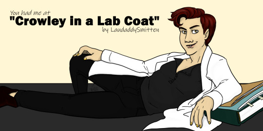
(GOAD Writer's Guild presents!)
I continue my theme of writing Good Omens fanfiction - WITH SCIENCE! 🥼 ♥️ 🔬🧪 ♥️ 🥼
I teased the artwork on this baby a bit in the past while (hint, amazing photo from the BAFTA's), see below the AO3 info for more on that!
Summary
Aziraphale's eyes were immediately drawn to the triangle of bare skin at the base of Crowley's throat, and all queries died before reaching his tongue. Crowley's deliciously deep v-neck henleys, which he always made even more enticing by undoing more buttons, fit just out of sight under the lab coat's lapels, showing off the curve of his clavicles and the deep suprasternal notch between them. With a start, Aziraphale realized he’d been blatantly staring at Crowley's throat and upper chest for heaven knows how long. Mortified, he snapped his eyes to Crowley's, which, uncovered, only further fueled his lust for the enticing botanist. Aziraphale was surprised to see that Crowley was sporting a smirk that looked…pleased. “Enjoying the view?” He arched an eyebrow in amusement. “Oh my, I er…..” Aziraphale gulped and looked down at his wringing hands. “How rude of me. I'm…ah, terribly sorry…” “Angel. Don’t apologize. I was actually…hoping you would.” Hands instantly stilled, Aziraphale looked up quickly. Had he heard that right?
CW: Rated E for Explicit sexual content. Read the tags on AO3!
Continue Reading on AO3:
This photo was the artwork tease/ clue:
Now that you've seen the artwork you probably know why. But just in case...

David Tennant (Crowley, ofc) + Jeff Goldblum's most iconic movie pose (from Jurassic Park):
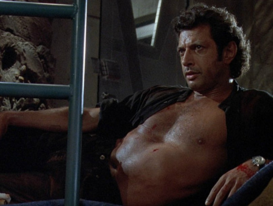
Equals: Crowley In a Lab Coat by @lexarturo (She killed it!)
My original post/ tease on the matter:
Thank you betas of awesomeness, especially @ladybracknellssherry !! Also thanks to you and @riverstyx125 for the very last-minute help!
And help ages ago from other awesome people: @unapologetic-apathy @gingerhaole (for reference/inspiration art) and a couple other betas whose usernames I will find and add b/c tumblr hates me rn! lol @ezomind-the-other-one
And of course thanks to the Writer's Guild of @goodomensafterdark !
#crowley in a lab coat#science always belongs in fanfiction#good omens fanfiction#good omens fanfic#good omens fanart#good omens after dark#goad#goad writers community#writers of after dark#aziracrow#ineffable husbands#my fanfiction#my posts#david tennant#jeff goldblum#bafta 2024#I can't remember what else I should be tagging
46 notes
·
View notes
Text
Proximity to disability is not the same as living with it - Writing disability quick tips
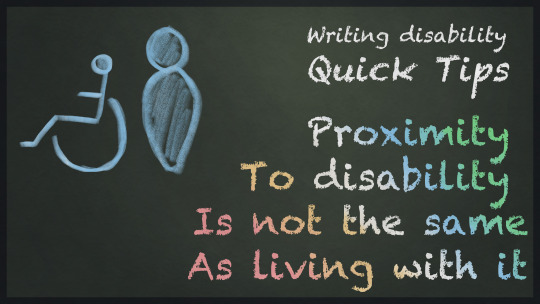
[ID: An image with “Writing Disability quick tips: Proximity to disability is not the same as living with it” written in chalk the colour of the disability pride flag, from left to right, red, yellow, white, blue and green. Beside the text are 2 poorly drawn people icons in blue, one is standing, the other is in a wheelchair. /end id]
One of the really common ways people push back against disabled people trying to give them feedback on how they’ve depicted disability in their work shows up as something along the lines of, “Well I have a child/parent/grandparent/friend with that disability, so I don’t need to consult other disabled people because I already know what a life like that is like!”
I see the most vehement pushback like this from parents of disabled children. the parents who are their child's advocates, their carers, they see everything their kids go through and have been with them through it all, so they "know what they're talking about already". And the thing about that is, while it means you have much, much more experience with the disability in question, it's not the same as direct experience living with it. Don't get me wrong, it's still an incredibly valuable experience to have, I'm not saying to disregard it, but it's not the same as having that disability. And when you're writing about characters who are disabled, and telling those stories to a public who already have a lot of misinformation about us going in, that lived experience is very, very important.
This isn't unique to parents of course, like I said, I've seen the same kind of pushback from children, friends and other loved ones of disabled people, and honestly, as someone who's been on both sides of the conversation (being a disabled person, but also having loved ones with disabilities different to my own), I do get where it comes from. But no matter how close you are with your disabled loved one, no matter how much you talk, no matter how much they explain everything, unless you yourself have that same disability, it's incredibly hard to understand the details of what life with a disability is like.
Let me use my partner as an example:
Often times, before these larger articles go up, I run them by my partner to ensure the tone and message I want to get across is actually what’s being conveyed. Which means he’s read pretty much every single article I’ve written on this blog. We talk about disability representation and tropes a lot, and he is one of the only people who sees my unmasked and unfiltered reactions to media when it’s done poorly. He’s also done a great deal of his own research on the subject, and worked with other disability sensitivity readers for his own writing projects. Not to mention, well, we live together, he sees pretty much every part of my day-to-day life and he’s one of the only people who doesn't share my disability who I talk to about the more complex emotions that come with it.
I think it’s pretty fair to say he’s quite knowledgeable on the subject of living with the specific disabilities I have for someone who doesn't have them. Despite that though, he still makes mistakes. He still misses things, and sometimes, internalised ableism - something everyone has, even disabled people - still creeps its way into his work. So do mistakes he simply didn't consider to run past me or his sensitivity readers. It’s not because he’s not listening or not trying, I’d confidently say he’s gone above and beyond in that regard, but it still happens. He still misses things that seem so obvious to me, specifically because of my lived experience as a disabled person who has to deal with these things all the time. It’s not unique to him either. A lot of people in my life are aware of the issues I talk about, but struggle to recognise them in practice or struggle to understand why them being depicted poorly is a problem.
This isn't to discourage creators from trying, mind you. But just to serve as a reminder that everyone makes mistakes, and that's ok, so long as you're still trying and still listening. No matter how close you are to a disabled person, no matter how much work or effort you put into unlearning things like internalised ableism, it's still going to pop up occasionally. And that's fine, but it means that you still need to be open to the criticism you get from people with that disability.
#Writing disability with Cy Cyborg#Quick tips#Disability#Disabled#Disability Representation#Writing Disability#Writing#Writeblr#Authors#Creators#Writing Advice#Disabled Characters#On Writing
84 notes
·
View notes
Text


As I mentioned, I read a bunch of Emma backstory comics, starting with Emma Frost (2003), and it got me on a character design kick. Before starting to draw Emma's journey, though, I actually went and sketched her whole family!
The second image (of which I've already posted the Emma bit) is from the scene at the end of issue #6 where Mr. Frost names his successor. It was previously depicted in New X-Men #139, and later again in Dark Reign: The Cabal, but I didn't really take other depictions into consideration - not for this scenes in particular or the characters in general.
I have a pretty solid idea of how Emma currently looks (and I've drawn it not long before starting this), and I know what she's been said/shown to have changed (bleached hair, nose job, breast implants). I took that, and the way the characters looked in this particular comic, into consideration.
I started with the parents, giving them different enough traits that I could mix and match for 4 other characters, and also that Emma could inherit, either to keep or to dislike enough that she'd change them. And then I took those pieces and built the kids. I know that's not really how genetics work, but if I'm (re)designing an entire dysfunctional family you bet I'm taking the chance to get slightly philosophical with it. So:
Winston has brown hair, a smaller face, a hooked nose, small eyes, very thin lips, and a few moles.
Hazel has blonde hair, a longer, thinner face, a button nose, larger eyes, slightly fuller lips, and a more prominent chin.
Adrienne has her mother's hair, face shape, and nose, but her father's eyes and eyebrows, and also a single mole near her lips. She got all her mother's Pretty Girl features, but has her father's cutthroatness. On top of that effortless beauty, she also has a tan and fuller lips, because her appearance is something she takes pride and care in, and is definitely not above going an extra mile for it.
(I know in Adrienne's other appearances her hair is brown, and the common interpretation - or at least the one that made it to the wiki - is that she's a natural brunette who used to bleach it, but 1. as I said, I was going just by the 'Emma Frost' comic, where she's blonde the whole time, and 2. I think it's far more interesting if she naturally has all the things that are iconic - but artificial - in Emma, since she's clearly a dark reflection of her character)
Christian has his mother's hair, face shape, nose, and eyebrows (though harsher versions), and his father's eyes and lips. They're almost exactly the same features from each parent as Adrienne, but he's The Son, he's not supposed to take after his mother.
Emma has her mother's eyes and eyebrows, and the rest is all her father's. Her looking the most like him works twofold: it gives her physical traits to feel insecure about (and eventually change) and creates a direct connection between the two, since he's gonna chose her as his heir.
Cordelia has her mother's nose, eyes, eyebrows, mouth, and chin, and her father's face shape and moles. Unlike Emma, she got so many of the Pretty Girl features naturally, but goes out of her way to reject them. I like to think she probably dismisses all her conventionally attractive traits and instead focuses on small things she's insecure about, like the moles.
And, once again, if you read all of this you get a bonus sketch!

It's from a scene in X-Men Origins: Emma Frost (2010), because I wanted to draw Emma with Hazel before she got sick, but it didn't really fit in the other post (which was exclusively about Emma and starts when she's already a teenager). Not sure how en vogue pinky drinking is atm, sorry if Mrs. Frost looks tacky.
#marvel#x-men#x men#xmen#emma frost#art#digital#fanart#regular#sketch#colour#character design#winston frost#hazel frost#adrienne frost#christian frost#cordelia frost#this one is basically a part 2 to the previous post - where i ramble just as much 😁
22 notes
·
View notes