#<- i'm still figuring out what their color palette will be so that is subject to change. but they won't be yellow
Explore tagged Tumblr posts
Note
Really curious to know how you got so good at art? Bc you've improved so much in the last few years but even back then you were really good...
Hmmm I'm not sure about which "back when" you're referring to 🤔 I've been drawing seriously for over thirteen years so I've got a few "stopping points" of skill
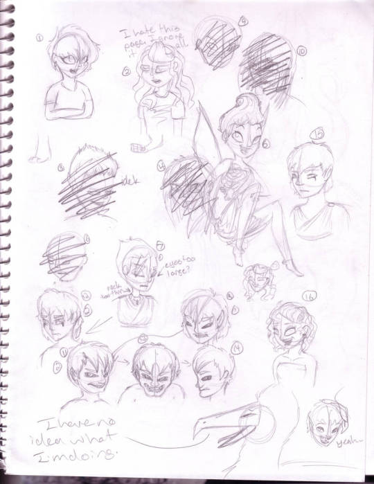
This is about where I started, if that gives you a good reference point. It's... bad. I am pretty sure it was my best attempt at a stylized human face, but it was not supposed to have cartoonist anatomy. At this point I was going for realistic proportions, and it was a struggle. It's not awful but it's got a lot of room to improve.
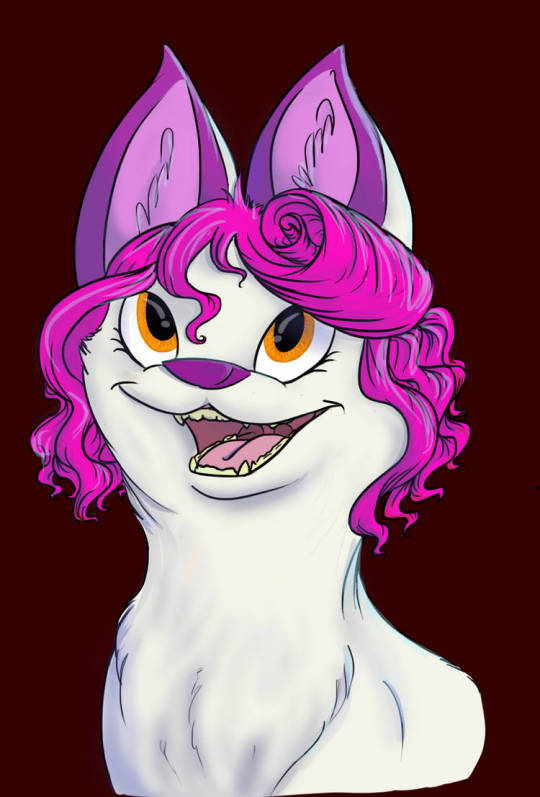
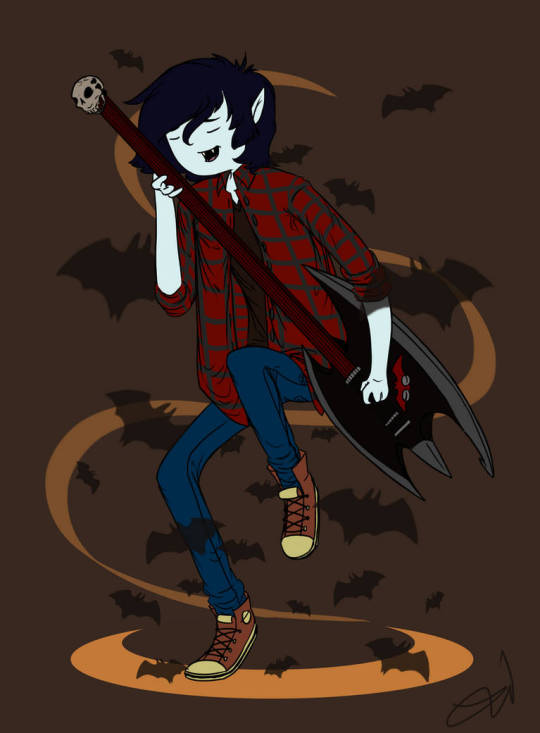
A year or two later and I'm in my adventure time phase, but I have a better understanding of form and posing. Human faces are still hard for me so I avoid them, animal faces are easy enough that I'm trying to experiment with more difficult angles. My digital art knowledge is very very low.
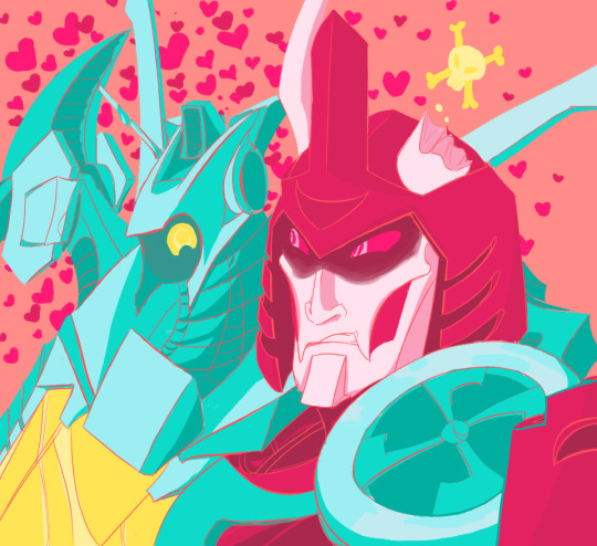
I branched out into bots for the next couple of years and that gave me a much better idea about form and perspective just because it was trial by fire. Mecha are incredibly hard but I had (and have) brain worms so I did it all out of love. It was challenging but fun (and rewarding), I tried a lot of new color palettes and tried to figure out how to make digital art look better.

Even going back to something I hadn't drawn in a long time after drawing bots showed I'd made significant improvements overall, but drawing human faces was still extremely hard.
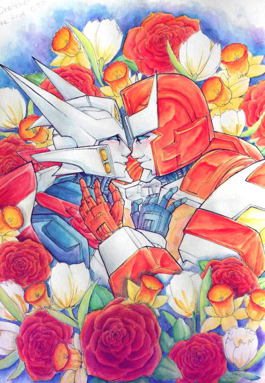
At the end of the bot era I've massively improved, but I still shy away from humans. My traditional lines are very controlled and uniform, my digital lines still leave a lot to be desired.
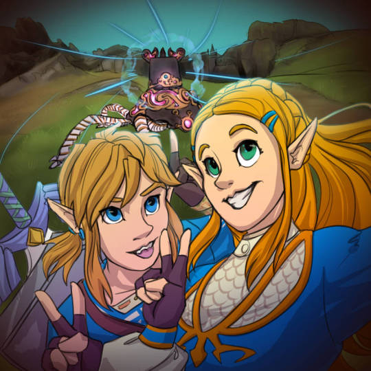
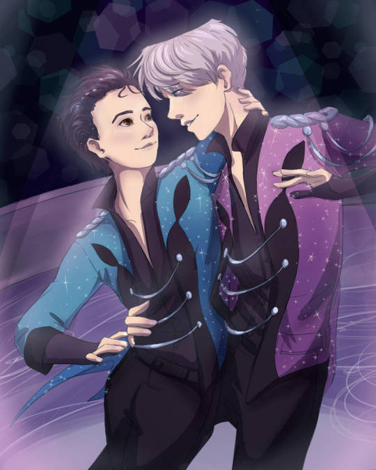
I finally have to learn how to draw humans but it's a struggle. I draw every day, not vigorous traditional studies but just small sketches, practicing over and over. I'm starting to understand digital art a little better and I have a much better sense of posing and framing characters

Around this time I finally have a firmer grasp of how to draw humans and how to use a tablet. I want to show this piece even if it wasn't my favorite because I still wasn't happy with it. My composition is better and there's a lot of improvement on my line steadiness and varying width, but even the two profiles were giving me trouble. The movement felt dynamic but disconnected.
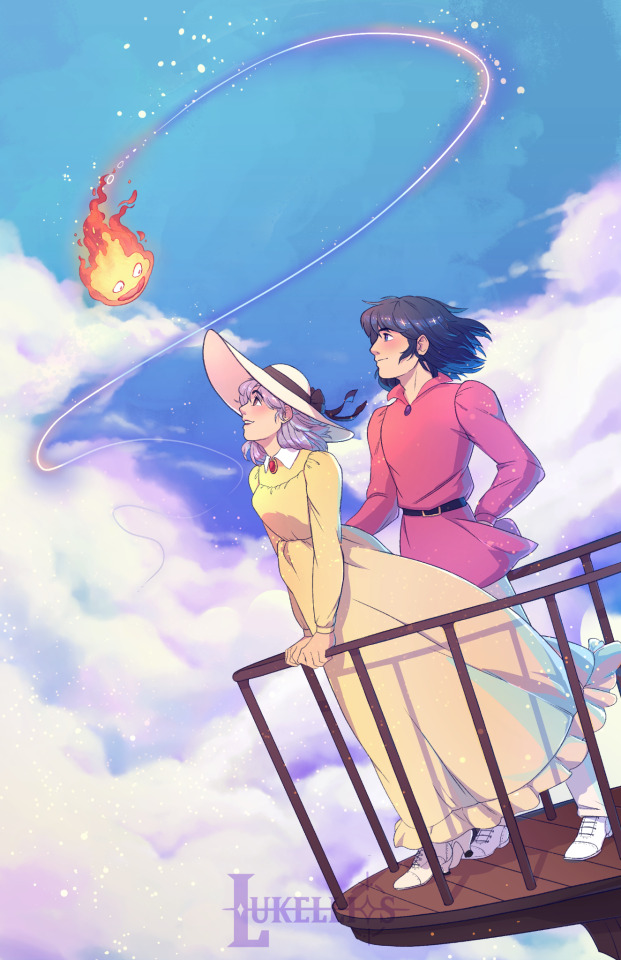
I redid this piece a year ago because I could finally see what I was unhappy with and change it. The profiles are much better, the hair and clothes are following the same direction of wind, the clothes have weight to them, and the shoes have much better form. Everything is also just a little more polished, and I didn't even have to change the background from the first attempt.
Really over the years it's just been about fixing a few things at a time by branching out and trying a lot of different things. Dipping my hand into a lot of subjects and really challenging myself has helped me learn a lot. Even though I wasn't always studying the same thing, learning as I went helped me in a lot more areas than just the ones I was focusing on at the moment. Hope this helps, if even a little! It's a really hard question and there's no one right way to improve, so take a mixed bag of advice and try it all c:
14 notes
·
View notes
Note
3, 14, 22, and 28 for the art asks :3
3. your favorite piece(s)?
Oh boy, that's hard to choose... I'm still incredibly proud of these two. The one on the right took me nearly a month and a half of work.
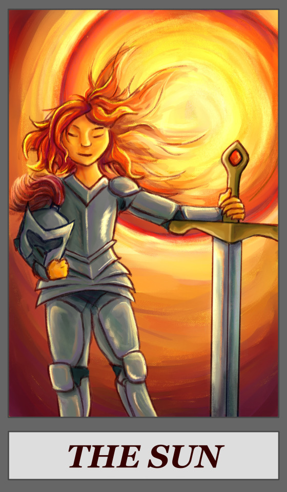
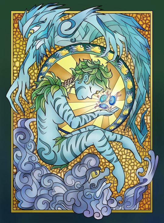
Wait can I share two more real fast. Love these ones.

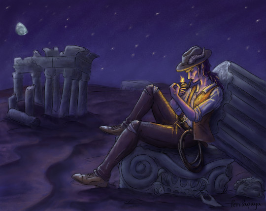
14. whats your favorite thing about drawing?
Answered in the last ask!
22. do you have a favorite color palette to work with?
I really enjoy bright, saturated palettes. I also like subjects that let me play around and go a bit wild with blending colors. Like these two are both off-the-cuff speedpaints I did just to entertain myself for an evening, and both times I had SO much fun just noodling around with the color mixing.
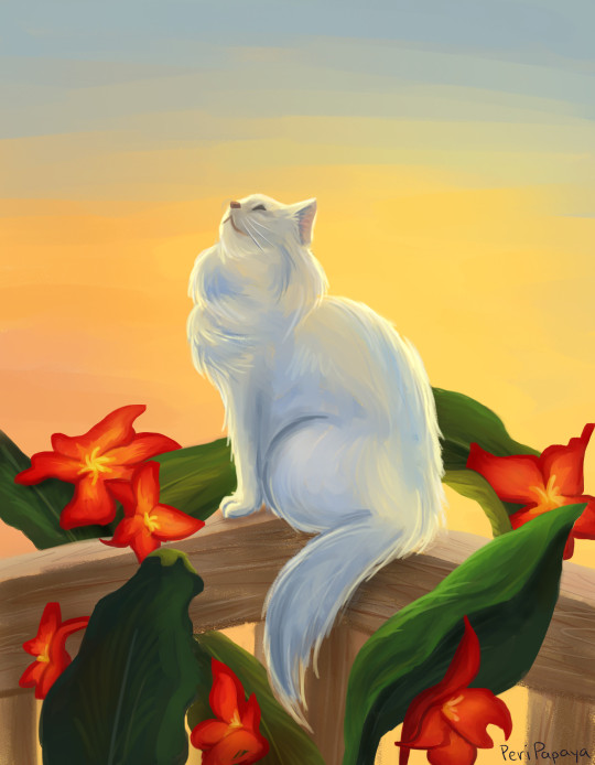

28. whats a piece you would like to redraw at some point?
Does this count? I still want to go back and finish the very first digital drawing I ever did. This piece is the reason I got a tablet in the first place, because I was doing all the shading with my laptop track pad O_O I stalled out trying to figure out how to do faces and never quite got back to it. But I still think the pose is great and this character is one of my blorbos of all time so :)
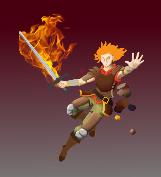
#my art#asks#papaiary#I really don't do big pieces at all these days sadly#most of my creative energy goes into writing#and I find it hard to get myself to work on pieces that take multiple weeks to finish now that it's not pandemic times#and I'm not stuck at home for weeks on end#but! I know art will always be there for me :)#I'm looking forward to getting back into it more at some point in the future
4 notes
·
View notes
Text
Songs of the Summer, 2023: Intro & Rules
check out #my fave songs for my (admittedly inconsistent) past best-of lists! consistency is NOT my strength, but i have so much fun writing these & i want to practice finishing what i start, so i hope you'll have fun along with me :)
Intro: A Summer-y (haha)
My listening this summer has been embarrassingly chill. It’s not that I normally dislike really soft tracks—I’m a BOL4 fan, after all—but I definitely wasn’t expecting this many of them on my favorites list, and certainly not in the top spots. I like melodrama; I like shimmery, glitzy things; I like to dance. But this list’s color palette is beige, like a day where the sun is so bright, the heat so heavy, that it just kind of washes everything out. Even most of the dance tracks here are pretty toned-down—the kind you can leave on repeat while studying.
So, I don’t know, it just feels kind of weird. It’s not that there weren’t any big, exciting statement-songs this summer: Stray Kids and Ateez and Itzy had big, noisy releases, and I just… I don’t know, I couldn’t make myself care about them? My favorite song from the Itzy album isn’t even the cool, fast-paced rock track, which is what I usually like from them—it’s the muted, simple, repetitive “None of My Business”. And Dreamcatcher’s album, which I think is absolutely stellar, didn’t consume my listening nearly as much as it should have this summer. Instead, I found myself drawn to sleepy indie and end-of-album ballads. Do you see why it’s kind of embarrassing?
And I don’t think it’s that I didn’t have any fun this summer. This summer was actually pretty great, especially considering my how past few summers went. Comparatively, oh my GOD this summer was absolute heaven. Hell, maybe that’s why this list is less angsty. Maybe I’m sick of the angst, and I just wanted a nice, sleepy summer to balance out the others.
Or maybe it’s NewJeans fever. I still can’t stand “Attention” (I'm SORRY), but their laid-back style did finally get to me with “Ditto”, and so my obsession with barely-there, TikTok-ready music this summer might just be a reflection of the NewJeans trend hitting me a bit late. And anyway, strange as my list turned out, I like the songs I chose a whole lot, so I do stand by it!
There was another defining trend of this summer’s music for me: Barbie movie anthems. And not just songs from the Barbie soundtrack—the movie’s super-popular, super-iconic advertising seemed to kick off a trend of unapologetically mean-girl music, arrogantly teenage in a way that I find quite fun (& good for my confidence, too, as an obnoxious, girly teenage being-thing). I loved these releases, from Aespa’s “Spicy” in the spring, to G-IDLE’s “Queencard”, to Kiss of Life’s “Shhh” (though none of these are on the list, the mean-girl vibes will definitely show up). I’ve always loved when Flo Milli took on this kind of aesthetic, so it’s really fun to see 2023 become the year of hot pink, both inside and outside of kpop. Still haven’t seen the movie, but thanks, Barbie!
Rules
Songs on this list are from singles or albums released between May 12, my last day of spring semester, and August 21, my first day of fall semester. I hope to work in education for the rest of my life, so I figure it makes sense to let the school year determine my list! Though, because it takes so long for songs to grow on me, I’m willing to fudge the rules a bit to encompass some songs that, despite being released a bit before ‘summer’ started, were truly my Songs of the Summer anyway.
In keeping with my tradition, I’m allowing myself 14 list entries this year (plus some honorable mentions), one for every year of school I’ve completed since kindergarten!
Blame it on the creative writing class I’m taking this semester, but I decided to, alongside my usual description of why each entry made my list, write a little poem-thing trying to capture what each song feels like to me—not similarity in subject, but instead in atmosphere and sound, was what I was going for. So hopefully you’ll enjoy those as much as I enjoyed writing them, and hopefully they’ll be a good intro to the songs you haven’t heard of before!
2 notes
·
View notes
Text
Ares' mission was simple. Give Newcrest a fair chance. She could do that.
First, she needed to love her new house. Would you believe she hired someone to decorate it for her? The only thing she told them she wanted to see was the color red. She figured that they would know what they were doing enough to read her mind. Understand her vibe. Just know what she wanted by telepathy.
She had hired them to furnish the house 2 weeks before she moved in. It.... was not what she thought it would be like at all....
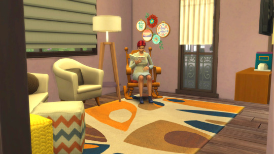
Ares: "I can't even read in here. It's so loud.... Ugh"
She wondered who she really hired to decorate in here because it looked like a weird mix of modern and Victorian.

Ares: "What's with all the old paintings? Am I in a museum?!"
Ares decided to get out for a bit one day to give her eyes a break. She wanted to see what Newcrest had to offer. (spoiler alert: not much)
Where she lived was all residential. A few streets over was a long stretch of undeveloped land that had one small Boba and thrift shop that must have been renovated from an old truck stop or something.
On the other side of town there was a park geared towards children and family get togethers and a pool which would be nice to check out but it was closed for the season.
Ares: "I do like Boba. Haven't had it in years. Guess I'll try that out."
But when she got there....
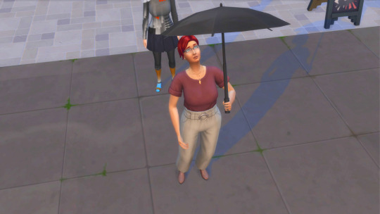
Ares: "Watcher. I have a feeling you're having a good laugh at my expense. What have I done to deserve this?"
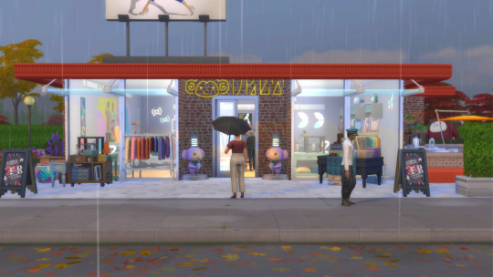
The place definitely looked like it was previously a truck stop.
Inside Ares went up to the counter and already had an idea of what to order. Anything with strawberry in it was a win for her. She settled on a strawberry matcha tea.

Ares took a sip and was instantly transported back to her early teen years. Before leaving for college. Before Gunnar's confession. Before their love affair. Back to a simpler time.
One thing surprised her.
Remembering those things didn't bother her like they used to. Maybe she was finally moving past it all. Maybe she was growing as a person.
Maybe Luke was right. Maybe this was the right move.
Ares is taken out of her trance when some guy comes up to her and asks for her opinion on the outfit he's contemplating on buying.
Dude: "Hey... What do you think?"
Ares: "I'm sorry?"
Dude: "The threads. How do they look? Do the suit me? You seem like a girl who would know."

Ares assesses the ensemble.
Ares: "Actually..... Yeah. It suits you. I wouldn't wear it but it's not my style. You pull it off pretty well, though."
She wasn't lying. He did pull it off.
Back at home, she decides to video call Luke to tell him about her trip out.
Ares: "Yeah. I finally decided to check out some of the local hotspots. Still not much but I got bubble tea. I used to love the stuff when I was a teenager."
Luke: "You did? Seems kind of sweet for your tastes. I'm surprised."
Ares: "Hey! You don't know everything about me."
They both laugh.
Luke: "As it should be."
He winks at Ares which makes her blush. Luke notices and tries to change the subject.
Luke: "So.... Has the commute been too much. I'm sure it was nothing at first but you're so used to practically being available 24/7 that I'm sure it's become a bit of an annoyance."
Ares: "A little bit but I'm doing okay with it. In fact, I think it's giving me a good amount of time to get myself more organized for my meetings. Now that I have to commute, I have a bit more freedom."
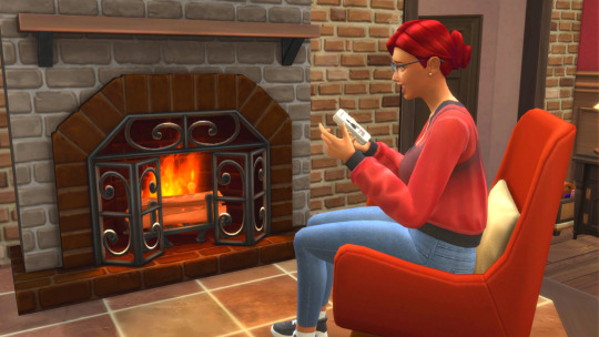
Luke smiles: "That's what I like to hear, Miss Palette. Keep it up. I'm proud of you."
That makes Ares blush twice as hard.

0 notes
Text
Thank you to everyone who voted! There's still a few hours left in the poll but I think it's safe to call it from here.
I'm genuinely surprised how many people voted, much less people who voted "yes", so the verdict is I will start getting into adopts!
If you wanna hear me ramble how I'm gonna plan it + pricing I'll put it under the cut:
So obviously a lot of people voted "unsure" which is totally understandable, as it's pretty much subjective to each design and what each person likes so there's no pressure there. The goal again is that I'll likely have these in my Ko-Fi shop and figure out how to set it up, so if people change their minds it will remain as a shop item until purchased.
The goal is I'll make some "starter/appetizer" adoptable sets of about 4-5 adoptables all centering around a basic theme, and see where it goes from there. I've already started sketching the first set, and I don't know how many sets I'll make as it will depend on feedback, but that's the general idea. I think each one will simply have the adoptable itself (fully colored) and maybe a flat color and/or the color palette of each character. Pretty basic stuff.
Edit: as for character DESIGNS themselves as similar to the example art above, most of these will be "humanoid" adoptables. I wanna do some variation between humans/humanoid monsters and throw in some furries in there. That's always been kinda my niche of designing characters, but I figured it would be better to describe what for people to expect.
I've thought about it a bit and decided I'll make each adoptable $15 USD. Yeah I know artists shouldn't be undercharging themselves for their work, but again I'm in the unique position where I already have a job and I can afford bringing the price down, plus factors like I'm not necessarily an artist that gets many commissions. Plus let's be real-in this economy? Many of us can barely afford a luxury commission these days so I figured it would be more fair for the wider audience.
(If this was a few years ago where I didn't have a job mayhaps I would bring the price up, or if this project gets successful maybe I can bump up the price later on or have additional bonus content for each adoptable. But again that's something to work out later.)
Ko-Fi does thankfully fix the pricing conundrum though. From what I'm aware of each adoptable will be a "purchasable item" in a Ko-Fi shop, and will mostly be placed on a "minimum price basis". So as such each adoptable will be priced for a minimum of $15 but there will be an option to tip at the buyer's discretion. I think it's also on a first come-first serve basis so there's no bidding, simply whoever buys it first.
Future feedback: again where this project goes from here kinda depends on how it's received, I think Ko-Fi let's you make comments to the buyer whenever you send money/buy stuff? Or even comments on the body of this post also work but I don't really know much else. I guess in the future if there's certain themes you want me to draw or feedback in general that's open, but I kinda have to figure out the system.
Uhh I think that covers most of my thoughts. Just planning and how I'm gonna approach it since I've never done adoptables before. I'm sure I'll update in the coming days but that's the general idea for now. Again feel free to add on your thoughts to this post if you wanna share, and thank you to everyone who voted!
Future plans for art?
So I've been thinking where I should go from here lately, given I'm technically an "artist" on here. Since I'm no longer posting on Instagram/Redbubble and mostly on Tumblr, and will be doing a Masters degree this coming January, I wonder if I should be taking a new approach?
Aside from branching out to newer sites, I was thinking maybe I can do adoptable designs? Given I extremely rarely get commissions and will likely be busy, Ko-Fi seems pretty good with posting adoptables/designs/posters as they can simply remain on there until whoever buys it (as opposed to rushing through a commission order). It would probably be a good replacement for Redbubble as I was never quite good at "merch designing" and just stick with art.
Although I would have to ask if people would be interested in this. So, if y'all know me for my art:
Some example character designs I've done just for reference:


#the moon speaks#shout out to the people who voted ''no''; i appreciate the honesty#im genuinely surprised how the people who voted ''yes'' and ''unsure'' almost tied? i mean this ran for a week but again thank you#but yeah I'm excited to get started! i will have to figure out how to use Ko-Fi though lol
11 notes
·
View notes
Text
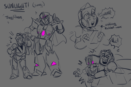
what if i gave megatron a newspark..
they like music and would like to become a medic one day, like ratchet !!
#transformers#megatron#sunlight#au#art#i like the mentors concept of idw2 so im stealing it#so basically a cybertronian has to sign up to vector sigma's database or something like that and agree to take care of a sparkling#and it will let the mech know. after some time has passed (can be maybe 10 years or up to a millennia) when its time to pick up their child#so they have to go to the designated hot spot and get the kid to successfully emerge from the dirt and take em home#the mentor has to teach their apprentice about life and spending money wisely. help em choose their alt mode.. the basics#sunlight transforms into foc bumblebee's alt mode but with a big window at the front. and instead of being yellow#they're light blue or something different LOL#<- i'm still figuring out what their color palette will be so that is subject to change. but they won't be yellow
324 notes
·
View notes
Note
Hey Earth I've been trying to figure out what makes a good character reference sheet, what to include and what not to. What do you suggest is the most important things to have on a reference sheet?
The most important thing about a character reference is the character's design, full-stop. It's great if a character ref has extra bits to it to make it look pretty and interesting to look at, but in the end, if the character's design isn't clear, it's missing the point. SO! In my opinion, the most important aspects a basic reference MUST have, no questions asked:
-At least 1 fullbody of the character. Bonus points if the character is in a pose that hints to their personality, but the pose should be clear and very easily show off as much of the design as possible. 3-quarter views are popular for that reason: shows a lil bit of everything.
-Character's palette. I've been doing this for years, and I can safely say I often don't color pick from the palette, BUT it should still absolutely be there on the chance that A) a different artist does color pick from the palette and B) it's just much easier to see the base colors and double-check you have the right colors when coloring the client's design.
-Character's name. This one is subjective; it isn't necessary to have the character's name on the ref, but it's a good idea if only so it's easier to call the character by name. It's also basically an introduction to the character, so knowing their name would be nice. ----------
What NOT to add to a ref sheet:
-DO. NOT. SHADE. YOUR. REF. This is something I'm seeing more often, so to reiterate: The point of a ref is to showcase the character's design, and to do that the artist much have access to said design to make sure they're getting it correct when they work with your character. This includes coloring. Shading could make things pretty but is ultimately one of the biggest pains in the ass to deal with when working with a character, because it suddenly becomes a guessing game in trying to figure out what is the correct color. At the very least, if you insist on shading your refs? Have a flat-colored version. That is not up for debate.
-Similar vein: If your reference has a watermark, have a version that lacks it, especially if the watermark covers the whole ref. The unwatermarked version is for ease of the artist to color-pick and see the design of your character. You don't have to post it, just have it on hand to give to artists you plan on commissioning.
----------
What isn't necessary for a character ref but are nice/helpful little additions:
-Expression shots. This is a great visual way to showcase the character's personality as well as showcase how a character emotes. How one character smiles is NOT the same as how another smiles, so seeing that in action could help the artist, or viewers of the ref in general, get a better feel of who your character is.
-Detail shots. I'm talking close-ups of eyes, hands/paws, teeth/mouth, tattoos, items the character always wears. This is to give the viewer a better view at the thing in question, and helps artists who are drawing your character get a clearer reference if it's something that is integral to the design. For example: Closeup of a character's cutie mark. Now the artist doesn't have to guess what it looks like base on the one angle; they have the full image of the cutie mark right there to work with. Bonus points: it's a PNG item that you can send the artist so they can just copy-paste that shit onto the character. Work smarter not harder.
-Character notes/funfacts. So long as you keep it short and sweet, it's never a bad idea to have little text that gives the view snippets of your character, whether that be explanation of how a part of their design works, or just funfacts about their personality, or their pronouns so no one can get it confused.
-Additional full-bodies or half-bodies. It takes more work but is great to have if your character has asymmetrical elements in their design, such as markings that you can't flip. It's also a fun way to give the viewers a glimpse at, say, their wardrobe, or lack-thereof is you need a shot of the character nakey vs them in clothing.
------
Aaaand there ya go! Hopefully that helps! :>
123 notes
·
View notes
Note
how long does it take you to draw and colour? since you post everyday which is great for me :D any tips for colouring cause Im still tryna figure all that out
hmm welllll, i don't exactly time how long it takes to draw but my partner said that sometimes i'll be working on a piece when they go to sleep and i'll still be working on it when they wake up 7 hours later so...my guess is anywhere from 3-8 hours each depending on complexity? at least for the art that i normally post, most of which is relatively simple.
not entirely sure what kind of tips you were looking for, but i'll just throw out some of my thought processes and stuff i try to keep in mind whenever i color. i'm gonna try and keep these relatively to the point so i won't go into much detail on art terms n whatnot, BUT i am also pretty terrible at explaining things so if you need clarification on anything, feel free to ask!
(sorry it's so longggg, i got carried away. i am...very wordy when it comes to art lol)
i like to block in the colors during the sketching stage before i do the lineart, especially for pieces where i know i want to do something funky with the color palette. you can see this in a lot of my process shots. doing colors in the planning stage just gives me a lot more freedom to focus purely on the colors and shading and how they work with the composition, without having to worry about the minute details like making sure the colors are inside the lines.
in order to save time while coloring, i'll usually just select the negative space (after making sure all the lineart is closed) > expand selection by 1 pixel (to make sure the edges are hidden within the liineart) > invert selection > fill bucket, then use clipping layers above that to color individual areas.
layer modes are your friend! i use multiply, overlay, and glow dodge (this one may be specific to mangastudio?) in almost every one of my drawings, but it's definitely worth playing around with all of the modes just to familiarize yourself with them if you haven't already.
color is honestly SO subjective. i'm never a fan of color picking (from source material or my own refs or whatever) bc while it may have its uses when it comes to consistency, imo it's much more fun to make them up as i go. you get a lot more variety from piece to piece while also familiarizing yourself with the character's palette that way. usually i'll start by deciding on the overall mood/palette (cool/warm, de-saturated, neon, pastel, etc), filling in the background color, then picking the characters' colors based on that. like with this venti pic, i started with a purple background and based my colors around that purple so they all fit the specific look i was going for. i could maybe get a similar effect by starting with the normal colors and using filters, shading, layer modes, etc to get the funky colors, but it will be much harder/more work and doesn't get as drastic of an effect imo.
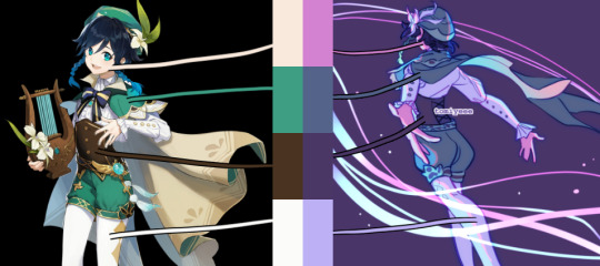
on that note, don't be afraid to use shades/colors that may seem odd! you'd be surprised how many times i've used gray in place of blue, orange, purple..basically any color. in the above example, you can see just how different the colors ended up being from the original. after i decide on my palette + bg color, i'll just throw down the color i think will work and then (bc that first guess is usually wrong and meant only as a ballpark estimate) see if it needs to be warmer or cooler/darker or lighter/more or less saturated/etc and adjust accordingly. it's like mixing paint or tuning an instrument! it takes a little bit of practice, but after a while you start to get the hang of what colors will look like in which color palettes. white is usually the easiest to start with bc it will always just be tinted whatever color your palette is (like how the "white" in the above example is just a light purple).
this and the next point are more about shading but i include it as part of the coloring process: the easiest way i've learned to do shading is to darken the entire image/character/part you want to shade (usually with a solid color multiply layer) then add in the lighting either by erasing parts of the multiply layer or by using a separate layer set to overlay or glow dodge (or a similar lightening layer mode). it works a lot better than drawing the shadows imo because it kind of mimics how light works in real life; things are dark by default until you let light in and it hits what it can while leaving the rest still dark.
if you want to blend shadows, i usually still use the above method, but just blur certain areas of it and when i'm deciding which parts to blur (bc i don't just do so indiscriminately) i'll mentally sort all of the shadows into 2 categories:
shadows created by light being blocked by an object: like putting your hand in front of a flashlight. these shadows will retain their sharp edge, but can transition into the 2nd category if they are far enough from the obstruction, like how your hand's shadow will become blurrier the further you move it from the flashlight. the more distance between a light source and the surface it's projecting onto, the more chances for the light to scatter = softer edges
shadows created by light "rolling" off the surface: like the shadows on a ball or rounded surface. these will get blurred and i usually like to put a little bit of color along the blurred edge (a different and usually brighter/more saturated color than the rest of the shadows) just to add some life to the shadows.
here's an annotated version of this mikey pic with just the shadows so it's a lot easier to see :) sorry im bad at annotating..
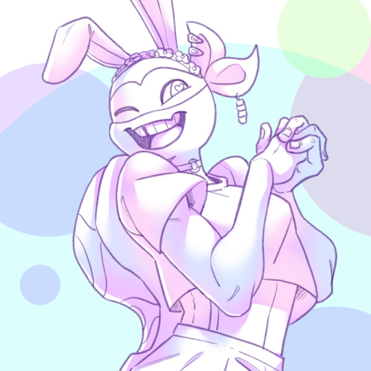
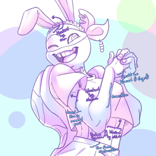
aaaand this post has probably gotten way longer than you were hoping for so i'll cut it off here 😭 hope this has been at least somewhat useful, and good luck with your art!
27 notes
·
View notes
Text
Inside of Your Light
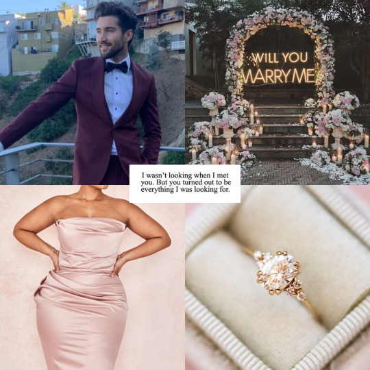
Pairing: Jeff Wittek x Plus Size Model! Reader
Summary: The vlog squad threw you a special surprise for your birthday, including a big present that may change your life.
a/n: songfic What Have I Done by Dermont Kennedy
You woke up around 7 o'clock in the morning when your phone rang. You groggily grab it and see that your boyfriend, Jeff, started to facetime you. "Hello?" you whispered as your eyes tried to pry open.
"Happy Birthday, baby girl." Jeff said brightly, making you blush.
"Aww, thank you, Jeff. But why did you call me so early in the morning?" You joked as you started to sit up on your mattress. "Sorry, I'm at the gym at the hotel and I thought you'd be awake right now." Jeff replied sheepishly. Jeff got offered a brand deal in New York so he wasn't able to celebrate your special day in LA.
"It's ok, I was meaning to get dolled up a bit before Carley and Erin pick me up to get our nails done." You started to yawn as it made Jeff's heart melt a bit. "You're so cute when you wake up." he said, admiring how the sun hits the back of your head.
You smirk back at the screen as you playfully roll your eyes. “And to everyone else in the world, I’m Frankenstein coming back from the dead.” Jeff laughed harder as he smiled at you. “I gotta go and wrap my reps. Just wanted to wish my best girl an amazing day.” You blow him an air kiss as he winked back. “Love you, babes.” You said as you got out of bed. “Love you more,” Jeff said before he hung up the call.
You take a deep breath and thought how lucky you were to be with a guy like Jeff. You and Jeff joined the vlog squad around the same time a few years back. You were a plus-size model for a few companies like Fashion Nova and Pretty Little Thing. Once you started off your YouTube channel, Carley saw your videos and dmed you on Instagram to hang out sometime. You met up at a lunch with the group and she introduced you to everyone, but somehow caught Jeff’s eye.
The whole time, you and Jeff started to hit it off. Then with a lot of flirting and calling each other late at night, you both decided to make it official. Jeff thought you would turn him away due to his past, but you truly accepted him for his journey, even if it wasn’t pretty. Now you were going strong for about three years, and you wouldn’t have it any other way.
After you’ve gotten ready, Erin texted you that they were outside. You head out and enter their car as they began filming. “Hey, guys! We just picked up our queen, happy birthday!” You smile brightly as you buckle in the back. “Thank you guys!” you said. Carly turns back to you and gives you your favorite Starbucks drink and a cake pop. “Thought you could use a little sugary treat to start the day.” You make a small pout from the gesture, thanking her again.
On your way to the nail salon, you guys start talking about David’s latest antics as well as a fancy restaurant that just opened that you really wanted to try. The girls make a face at the camera but you didn’t make of it as you arrived at your appointment. Carly switches off the camera as you all started heading out of the car.
Once you were all done, you all started to fan over the amazing job of your nail artists (which you all generously tipped) and decided to go out for lunch. “Are we still clubbing tonight?” Carly asked as she sipped her Seltzer. You nod yes as you finished a bite of your appetizer. “Yep, I’m so excited to wear this cocktail dress Jeff gave me before he left. I just wished he was here to celebrate.” You said, fumbling with the end of a napkin in front of you.
The girls give you a sympathetic look, knowing how much you’ve been missing him the past couple of days. Even after they changed the subject, all you could think of was Jeff. But after a good meal and a little site seeing, you started to feel a bit better. The girls dropped you home so you could relax before clubbing the night away.
Right when it hit evening, you began getting ready as you curled your hair and did your makeup just right. You slipped on the dress Jeff gave you that adored every curve on your figure, silently thanking your boyfriend for his taste in fashion.
You suddenly hear a knock at the door, thinking it's one of the girls. You unlock the door and open it to reveal no other than your very well-dressed boyfriend. "Jeff! You're back!" You screamed as you gave him a crushing hug, later kissing him. "Hey, doll." Jeff whispered as you took his breath away, taking out a bouquet of your favorite flowers.
"What are you doing back home?" You asked, still dazed that's actually at your doorstep. "C'mon, did you really think I was going to miss my best girl's big day?" He questioned with a twinkle in his eye. You roll your eyes and hug him again, truly blessed to have such an amazing boyfriend.
"I'm here to pick you up to your destination, shall we?" He offers his hand that you gladly took it. He helps you in his car as you both drove off to the main road with his hand on your upper thigh. You notice that he doesn't take the road to the club. "Babe, I think you missed a turn." you told Jeff who was smirking even more at your cluelessness. "Don't worry dolI, I know where I'm going." he takes a hold of your hand and kisses your knuckle as you blush harder.
He then parks in a parking lot and goes out of the car to open your door. Before you could actually take in your surroundings, Jeff shielded your view. "Hey! Jeff seriously, where are we?" you lightly scolded him. "You gotta trust me now, okay?" you agreed as you grumbled under your breath. With a few more steps, you start to enter a doorway that was decorated with...
streamers?
Jeff takes his hands off and you see all of your friends surrounding you. "Happy Birthday!" they all screamed out loud. You smile from ear to ear as Jeff wrapped his arms around your waist. Utterly shocked, you did your best to express your happiness but you were beyond speechless.
You suddenly realized that the place you were in was the restaurant you've desperately wanted to try and you turn around to Jeff who was beaming at your joy. "All for you, baby girl." his husky voice told you as you hugged him, pecking his face with kisses. Then, all of your friends ushered you both in to dine and dance. You saw how the entire restaurant had accents of rose gold decorations, as well as your friends wearing the same color palette.
Although this surprise was really touching, something was bothering you. Usually, they would throw parties like these for David, so why would they celebrate something big for you?
Later on, you all ate the most mouth-watering food as well as dancing to your favorite songs. Once they take out the birthday cake, you lose sight of Jeff. You ask Carly where he is but she brushed it off, saying that he's probably getting you a drink. As you started to dish out the cake, David stood up and clinked a knife to a glass.
"Hey everyone! If I could get your attention please." David shouted as the whole party calmed down. "There is a special surprise waiting outside on the back patio for our birthday girl, so could our celebrant please wear a blindfold?" Everyone started to cheer except for you. "I swear David if it's a wild animal..." you warned him but it was too late. One of the guys used a long fabric to cover your eyes, guiding you outside.
They take off the blindfold to reveal your boyfriend standing in front of you. You don't understand what's going on until you see a flower arch in the back of him, with a message illuminating "Marry Me." You gasp lightly as you cover your mouth with your eyes starting to water.
Jeff takes your shaking hands into his, ready to start his speech. “I wasn't really in New York for a brand deal, I was picking up your birthday gift.”
He then lowers himself on one knee, taking out a small pastel pink box to reveal a beautiful gold band decorated with transcendent diamonds. Both of you start to cry, but Jeff is literally a mess as he tries to finish his words.
“Before I met you, I thought I’d be better off alone. Now, my soul has been torn and reborn, started breathing for the very first in my life. As I’m standing in front of you, I wanna get it right for once.
Oh, believe me when I say I've been knocked out and beat but this feeling is fleeting. Even this morning, I've been thinking 'bout the way you smile golden…I want to move inside of your light.
I never thought I needed saving, I was right where I should be Good God, I know it's dangerous, but it's you that I need I'm in love this time. So, do you wanna be mine forever?”
You uncover your mouth and shake your head.
"Yes, yes, a thousand times yes." you said. The waterworks literally overcame both of you as he slid the ring around your finger, getting up to kiss your lips. Your friends cheer as they close up to you, firing confetti cannons into the air. You look up to Jeff as you wiped away his happy tears away from his face.
No words were exchanged, but you could tell through his eyes that he was forever grateful for you to be a part of his life. You both kiss again, ending the night with great friends and memories that will forever last in the video Joe has been recording for Jeff's channel (which trended 14 million on YouTube for a whole month).
You were the light in his life and he will bask in it for eternity.
#jeff wittek#jeff wittek x reader#jeff wittek fluff#jeff wittek imagine#jeff wittek x y/n#vlog squad#david dobrik#carly and erin#youtube#vlog squad imagine#jeff wittek fanfic#vlog squad fanfic
279 notes
·
View notes
Text
Yingzhe - Super Diamond Level Evoker [Current Design]

A few days ago marked the 7th anniversary of me first posting for Withering Hope. I thought it would be fun to post Yingzhe's current design, courtesy of @eldridgeparkingart who I am proud to announce is the official THV artist. (Seriously, they are a godsend and I have no idea how they're so good at designing characters. If it weren't for them, all of the cast would still be vague shapes in my head 😭.)
This design is still subject to change, but I've been really happy with it for a while and I don't see it changing too much. (We'll see if I have to eat those words.) You've probably noticed that Yingzhe's color palette includes blue and not purple. I felt like it made more sense for Yingzhe, given his past, to dislike the color purple despite that being the color of his magic. I also think blue fits the "enchanter" vibes I wanted him to have, since lapis lazuli is required for enchanting things. But I wasn't sure what shade of blue fit him until I thought of blue glazed terracotta. Of course, Parker somehow took my vague spitballing and made it into something amazing.
Anyway, thank you guys for sticking around still. I ran into a long rut of writer's block, but after taking a writing break and spending some time figuring out key events, I think I have more motivation now. I'm just telling myself that if I can manage to finish the first part, then I can finish the rest of the story.
24 notes
·
View notes
Text
Thumbnailing: Subject's Way
Thumbnails are an important workflow tool artists use to make creating their works more efficient. They are essentially tiny, low detail versions of the idea you may have in mind, and save time by helping you catch potential compositional errors, clashing colors in palettes(if you blob some colors on), and poses that simply might not.. work in character art as well as many other things not mentioned.
I am a very visual person and sometimes putting ideas to paper really helps me focus better on the task at hand. Organizing things into steps on the page really helps me not get overwhelmed. It might prove helpful to you as well.
In this tutorial, I'll take you through my workflow process when planning paintings and simple character illustrations.

I start off the process by doing a ton of sketches of whatever thing from many angles, poses, etc. Usually if I have a certain image in mine I simply sketch that and adjust little things like angle, placement of limbs, etc. Work teeny tiny, you can enlarge it later. I,t really depends on what the goal is for that piece what the process looks like. Here the goal was to just draw a character, so I have many options.
environment sketches look a bit different for me, as I will sketch them in literal cubes. I am still working through the technique. I just haven't gotten good enough at them yet to consider a tutorial by me would be helpful to anyone though.
Like with piece D, it's good to plan compositional elements here too. I added the moon that would go in the eventual background, swords in the hands of B and E, etc. Had I had more time, F would have gotten rough roses, but I digress.

After I have base sketches, I do very rough lines so I know what I'm looking at, and it primes me for what I could possibly have issues with in doing the final. I keep it VERY loose and don't dwell too much on details. If I'm drawing a character, I'm not even going to look up references, unless their silhouette is very complex. There is not much need for accuracy here. Just to nail down your subject's silhouette.
At this point, you can start eliminating which poses you don't want. Here I was very indecisive so I went through with sketching all of them.
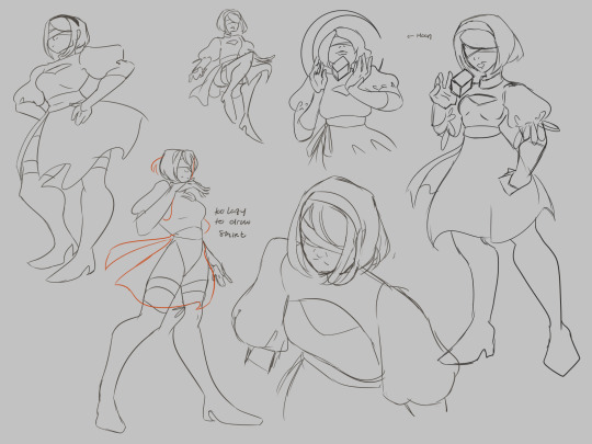
At this step ill also take the time to plan variants if I feel like I would be indecisive about them/need them for certain platforms (optional).

Here's where things start to actually take the form of thumbnails. I work large and draw most of the anatomy of the subject so that things are positioned correctly in the frame. Draw the whole of something, even if you know it's going to get cropped out. There is nothing worse than trying to draw in a way that is already cropped, it messes up your anatomy bad, and you'll spend more time trying to fix it, especially if you are just starting out as an artist.
Physically drawing a box around them to help with framing is really good to help plan the composition of the final piece. Again, you can eliminate stuff here as well if they don't make interesting compositions. Consider the rule of thirds and how much breathing room you want or need in your piece. The one not in a box was eliminated because I didn't like the pose nor would it make a very interesting piece.
I also use different colors on the boxes so I can overlap them and keep my eyes from getting confused where one "drawing" ends and one begins.

If I'm planning portraits/art in my painterly style, I'll take the time to block in some colors just to see what I should shoot for in the final. I will also do several pairings of colors in their own sets of thumbnails if the piece needs it/i want varients. I highly suggest blobbing so that you can see how potential colors will play with one another. Learning the teeniest bit of color theory will help, I promise, but for now, i'lI'lll refrain from the mini-lecture.

these three two (you'll see), I figured would make better cel-shaded/quicker pieces due to how zoomed out they are, any true details I would want to focus on don't exactly work for my current style faraway. Be sure to tailor compositions that suit your style. I will be keeping these sketch ideas for future reference.
It's important to remember that just because an idea doesn't get used in this piece, that doesn't mean it can't be used in a further piece down the road. I actually have a horrible habit of deleting my thumbnails after I'm done with them, but if I'm thumbnailing in a sketchbook? I find myself browsing back over them for future pieces to get some rough ideas of what could work later.
One last thing, you don't have to plan as many thumbnails as I did, but I do suggest at least 3 or 4 to really stretch your creativity.
Thumbnails also make for a good warm-up. If you're curious, I did the initial sketches in this order: A C E D B F. I think it helped me loosen up a bit, but you can be the judge of that.

I went back and tried another approach for a painting, but now I have the base for 3 paintings I could pursue, albeit rough, but it's good to learn how to paint like a sculptor, I digress.
That's all there is to it. the key is being clean enough to get the idea down, but rough enough to save time. work small, using basic shapes to create silhouettes. You can enlarge it later and use it as a base sketch.
Last two cents: I've also learned that sometimes if a piece is just not working, it's probably more than likely a compositional issue, anatomy, or perspective, Which is why thumbnailing can help you catch these issues early.
happy drawing :)
a/n: this is my first time really creating a tutorial. this might not be groundbreaking information for some of you and that's okay. this tutorial was initially created for someone in an art server I'm in on Discord, hence the slide-text-slide format. I have taken the images and text from that and compiled them here to make it easier to pick up the tips. I do not consider myself a pro on any of the things mentioned by any means, merely my take on it all. Get multiple sources, educate yourself, practice, and find what works for you. - Sub
#its not perfect#but i hope it helps#tutorial#composition#digital art#digital illustration#digital painting#reference#art tutorial#art#sketch#thumbnails#illustration#medibang paint#medibangpaint#digital drawing#drawing
21 notes
·
View notes
Text
of mice and artblock
So, midterms happened and I abandoned this blog for a while. But now I’m back, and I come bearing mice.
*
I’ve been really struggling with finding subjects I like to draw. I’m happy to work on skeleton studies until Judgment Day to better understand anatomy, but I know I need to balance “homework” art with “for fun” art, or else risk losing motivation for learning to draw -- and I’m so used to writing fiction at this point that no subject really appeals to me artistically unless it’s got 5,000+ words of story attached (or at least some narrative/character ideas, yanno -- something for my brain to pick at). The obvious solution is to draw concept art and characters from my written stories, but I feel really intimidated by that because I’m such a beginner artist that nothing I create now will do justice to the vision I have in my head.
I need art OCs and concepts – things that I will only draw art of, and have never written a story about. Stuff that doesn’t have to match a previously established, written story, and that I can change as I learn more and my skills improve.
I ended up drawing a bunch of mice.
This was initially just a whim. Human anatomy requires a lot of skill to pull off, especially faces and hands, but mice felt more beginner-friendly to me. Admittedly, I was going for a more cartoony style as opposed to photorealism, so if you’re looking at this from a realism perspective then these are pretty poor mice. However, I don’t feel ashamed of them, which I am taking as a good sign.
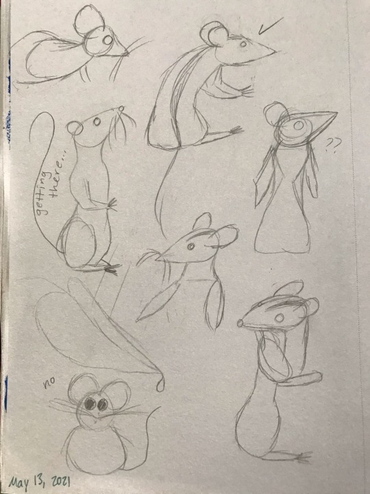
I kept drawing one mouse over and over. I ended up calling him Leo just because it was funny – “leo” refers to lions, but here Leo is just a little mouse. But of course, giving him a name (and a gender, incidentally) is the start of a story. Via a flight of fancy, I got it into my head that I wanted to do a painting of Leo trying to catch a big snowflake. I made some thumbnails of what I wanted the scene to look like, and then cut out a roughly 7 inch x 7 inch piece of watercolor paper from a big sheet that I had under my bed, sketched the scene in pencil, and then finished with watercolor pencils (and a white gel pen for the snowflakes). The process probably took 2.5 to 3 hours.
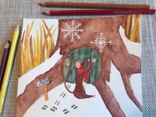
So, now the lore is that Leo is a mouse living in a little house in an old tree at the edge of the woods, and he wears a red scarf. I did not like this painting. It seemed over-saturated and the colors didn’t quite work the way I wanted them to. I ended up watching a tutorial on color theory, and decided to redo the painting using my newfound knowledge of color schemes. I used this color palette tool to get an idea of what kinds of colors would look good together, and settled on a complementary scheme with bluish green and brownish red.
And then, everything went wrong.
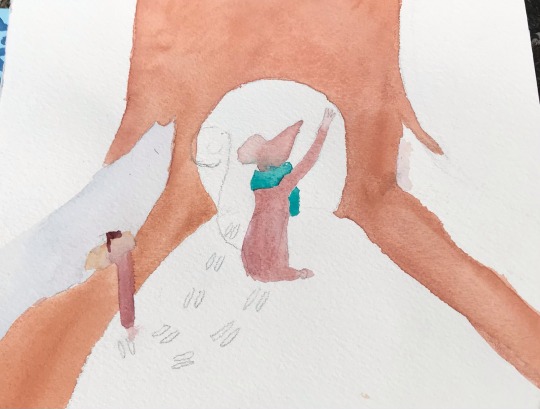
I tried to redo the painting, still working traditionally. I rushed the sketch because I was so eager to get right into working with color. This time, to avoid over-saturation, I used watercolors out of a pan rather than in pencil form. Mixing the colors in the lid of the pan took a really long time because I was so picky about shades, and because I continued rushing I didn’t allow the layers enough time to dry. Leo’s scarf (now green instead of red) bled into his russet fur, and the mailbox was the wrong shape, and I tried to erase a pencil line and created a dark blotch over an area that was supposed to be white with snow – and then I gave up.
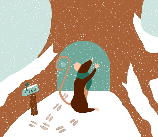
I had downloaded Krita, a piece of digital drawing/painting software, a while ago, but hadn’t had any success using it because my desk isn’t big enough to accommodate both a laptop and my small tablet. Using my lap to hold the tablet was an exercise in frustration, and I knew so little about how digital art works that I just felt really overwhelmed and lost whenever I opened the program.
However, Krita (like most digital art software) has an undo button that I find very alluring, so I decided to try it again, now on a shiny new desk from Ikea that is actually big enough to support tablet and laptop together. I think just the space on the desk really made all the difference, but also I was determined to get this artwork of a mouse to a place where I felt satisfied with it.
I spent a solid 5 hours working on what ended up being a very simple colored drawing of a mouse catching a snowflake outside his little house. I barely blended anything at all, and there’s no light source that required me to shade anything – it’s just flat color. However, I really like these colors, and I think I did well (for an absolute beginner). I want to go back and add textures/shading to give an impression of depth, but I'm not sure how.
Leo – like all of my figures – feels really stiff, so I also want to work on gestures/studies of mice doing things. And, thanks to the popularity of mice as lab animals and pets, there are way more reference photos of mice than I expected! Most refs depict the house mouse, Mus musculus, but I did find the work of a wildlife photographer named Dean Mason who spent 15 years photographing harvest mice (micromys minutus).
Unfortunately, all of the prior artwork in this post I had drawn almost purely from imagination, and I think it shows. I studied two mice from photos in pencil, then erased the lines until they were barely visible and tried to do the fur texture in ink (with a dip pen, so there is some unevenness when the pen was extra inky).
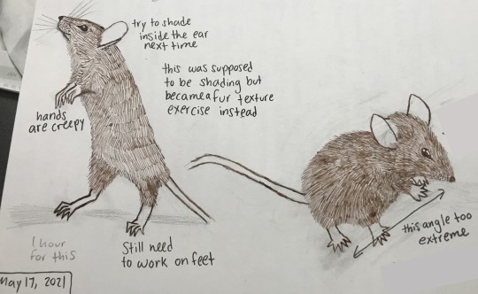
Left is my first attempt doing the fur texture. I was more cautious with layering pen strokes, so you can see the lines of strokes fairly evenly. Right is my 2nd attempt, where I was bolder with the pen. I like these mice more than the one I created in the digital painting; these ones (especially the right) feel more Beatrix Potter-ish, which is a vibe I like.
Do I want to go back and fix the anatomy in my digital art of Leo? Yes. I also want to take another stab at doing this piece traditionally, but this time, I'd go monochrome and try to do everything in brown. However, part of me is exhausted from drawing ten million snowflakes and does not want to relive that experience with a gel pen -- I've already done it once with a tablet pen, and that was enough.
I have a hazy, far-off goal of creating a comic of Leo having adventures with another mousy friend, but that’s so far in the future that it’s not worth spending time considering right now. In the nearer future, however, Leo’s friend might become a reality – I know he’s an albino mouse (name TBD) who either escaped from a drug-testing facility (I loved The Secret of NIMH movie as a kid) or else is a pet who was dumped into the wild by a human owner who no longer wanted him. Leo is outgoing and adventurous, and this friend is shy and cautious.
2 notes
·
View notes
Note
Ah ok so unpopular opinion i guess since I've noticed many Spongebob fans enjoy seasons 11-12, the most recent ones: I honestly think they're worse than seasons 6-8. Seasons 6-8 were at least bearable and somewhat entertaining, but the flanderization and exaggeration have become so awful in the past couple of years. Seasons 9-10 were headed in the right direction but shit went so downhill in 2018😔
You're coming for me personally my guy😭 its okay though, its fun💖
Yeah I'm personally one of those who think seasons 10-12 were great and wasn't a huge fan of seasons 6-9a.
Of course its a pretty subjective topic and that doesn't mean I'm right and you have your reasons why you feel the opposite.
Buuuut I will explain why I feel like this just for fun.
Idk?? The newer episodes are just fun and goofy in their own way. Its not like classic spongebob or really any Spongebob but still felt like our little yellow boy. It felt different and kind of out of the box if I can explain it right? It was refreshing.
I remember my interest in Spongebob began to resurface around 2014 when cartoon reviewers were critiquing Spongebob and it was a popular thing to drag anything past season 4. I don't remember how I found it but it strangely was able to sum up why I felt uncomfortable by Spongebob and why I stopped watching the show when I was 11. I didn't agree that everything past season 4 was garbage but some of the points hit home.
I spent some time rewatching episodes online and figuring out about the show and why I liked it and what I didn't like about it. I could pin point the time of Spongebob I felt was starting to get that weird off beat vibe I was getting around the time when I stopped watching the show which was around season 6. Not all of season 6 was bad but it was when I could strongly identify it was uncomfortable.
The weird change in color palette change (tbh the color palette in this show changes every season) but here it was just bright and hard to watch (and I have an eye condition which made it harder to stand bright colors and lights when i was younger but here was just harder) the episodes didn't have much of a direction, they felt really slow, background characters were very grotesque (season 7 is where this peaked), the story was frustrating to watch since its often dragged out, squidward torture porn, the character's personalities were all unlikable to me. It just didn't feel right. It felt eerie or blank at most.
Soon the spongebob movie 2 comes around and I was a depressed angsty teeeen and that movie was a huge pick me up and made me feel so happy and I started to keep up with the show again.
The show picked up season 9b and season 10. Season 9b was pretty fun to watch and I enjoyed it. It wasn't hard to watch like season 9a or season 8.
Then there was season 10 which was completely different. I think lost in bikini bottom was my first season 10 episode but it was just different. Spongebob's design was more stretchy, his voice sounded slightly different, the colors are too bright still but tolerable.
There was more episodes like Mermaid pants that I absolutely love!! It felt similar to a classic episode because of Squidward joining in on the fun with spongebob, playing along as a mermaid man villain known as Dr. Negative.
Not all of season 10 is perfect. Its some hits and misses but I liked the new tone and vibe of the show and it got carried on to season 11. I just liked this goofy new sponge. His design is so stretchy and fun!
I remember season 7 and his cardboard box design. His arms drawn so high and he'd barely move besides talking unless it was plankton stealing the formula type gag.
I do agree though that seasons 11 and 12 exaggerate it too much but I'd rather have that then no movement at all. Though I do think season 1 was probably the best example of how spongebob's stretchinees and mobility was drawn. I feel like that should be the blueprint.
The show also picked up pace and I felt like it was going somewhere. I admit now it can be a little too fast paced to the point of disorienting at times.
I also feel like at times its more consistent? With the characters. Not all the time but the idea that Spongebob can be a perfectionist and Squidward can be selfish and arrogant and is meant to get karma in the end, not a cruel punishment from the universe for existing.
Its still a hit and miss. Some episodes can suuuuck in these seasons but for the ones that I liked, I'm accepting of it. There are some episodes that ignore all I've said above.
The problems I do have with these episodes aside from bright colors and being too wild to keep up on is the ableism. That's the biggest problem. It comes up once in a while even with pre spongebob movie 2 episodes but its jarring to watch.
There are also a problem with recycled plots. Spongebob in randomland is rock bottom and pizza delivery smooshed together. Its actually lost in bikini bottom. It rips off other episodes.
I know the show has been on so long so its bound to repeat itself but its kind of shameless?
I feel like I'm just rambling here since I'm typing this out on my phone at 3am. Its hard to explain that I just find seasons 10-12 spongebob adorable and fun to watch. Its strangely comforting, when I feel down I just get the feeling to watch it again. There are references to classic episodes that feel like a treat to notice. Sometimes I feel like they're milking off the legacy of them though. Like doodle dimension was my least favorite. I could ramble on and on about it.
But I should mention seasons 6-9a since I've been dragging on it. I stopped watching the show roughly around season 8ish? The episode listings are messed uuuuup from what I remember. But anyways these episodes always had the most fun concepts? Some episodes did feel boring at times like only taking place at the Krusty krab but when they weren't, they had genuinely great ideas! Some I feel weren't executed as greatly as they could but it was a fun thing to try to rewrite the episode's idea and that lead to this blog being created since I had so much ideas and stuff about it. I don't have my notes anymore. I think I have one about rewriting the Stanley Squarepants episode somewhere if you'd like to hear it then I could dig it out.
Also while writing this I remembered something! Why I got back into spongebob! It was a song from the episode "spongebob's last stand" there was a song that popped into my head, the jellyfishing song. Its funny to remember since that's one of my favorite episodes from that middle era seasons 6-9a.
It was a good episode with a strong environmental message that managed to piss off Republicans! For me I just thought it was cute and that jellyfishing song is too catchy. I remember seeing a YouTube video where some fans meets the voice actors and they sing that song for them. If I met them then I'd like to ask that too!
Sorry about this rambling! It was fun to talk about this stuff~ it just let to a rabbit hole of thoughts. I hope its not too hard to read💜
4 notes
·
View notes
Text
Final Project: Art Style
How I would describe the style I'm aiming for.
At first I misunderstood what it was I was trying to emulate. I was thinking of the style as what it technically is: low-poly, flat texture, unlit, using vibrant, cartoonish colors, and potentially with touches of line-drawn elements. Games I had in mind as references were somewhere in the range of Donut Country, Stikhold, Untitled Goose Game, Frog Detective, Wattam, Before Your Eyes and Virginia. Frog Detective is probably more squarely what I'm gunning for, with a simple, graphic style as it seems like it would be a little easier to accomplish. What I didn't realize was that this style is what is considered cel shading. I thought cel-shading was specifically when you put cartoon stroke lines around all of the images. So, I wasted a little time trying to logic through how to accomplish cel-shading from scratch not realizing I could just follow a cel-shading tutorial (though there isn't really a lot of step-by-step instructions/tutorials out there for doing it).
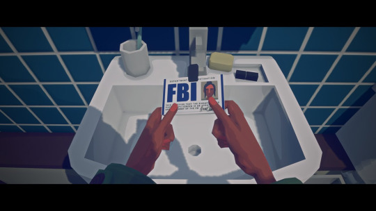
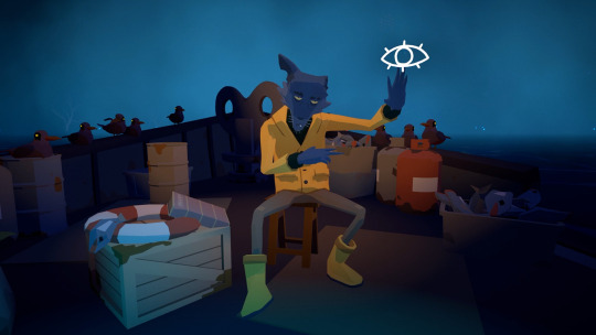
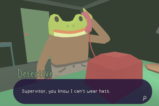
Why I've chosen this style.
I enjoy games with a tonal imbalance, where the look and feel seems cheerful, but the subject matter is a little more serious. I'd love to try a PS1 style game with a dark and weird aesthetic but with themes and subject matter that ends up optimistic/cheerful, but for now with this game I think the more common cutesy but serious combo will serve my story best. A main theme of the story in my game is that a main character doesn't feel comfortable opening up to people, but discovers a llama in a petting zoo that she weirdly feels comfortable opening up to and, to her surprise, the llama can talk and happens to be a skilled psychologist who helps her process an event she is currently dealing with.
How to technically achieve this look.
Based on my initial understanding, there's two possible ways to go about this. Both methods are attempting to removing lighting and reflection and replace it with emission and color palette to create whatever sense of depth I need.
One method is to remove shadow, normals and textures from individual materials, add roughness, and substitute lighting effects with emissive colors; the other is to apply a shader in the post process volume (I don't really actually know what this one means but that's what It's doing) and playing around with emission values.
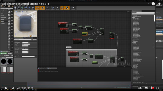
The node map for constructing a post-production shader is a little complex so I haven't attempted to build one out yet. This is what it looks like from the tutorial.
I've gotten some of the basics applied for the other method, though still working on what a more complete aesthetic would look like. I started by eliminating casted shadows through world and object settings and by deleting primary sources of lighting, but I'm still trying to figure out how to substitute Unreal's default baseline environment (the sky) with the bare minimum lighting/materials to still make my environment visible.

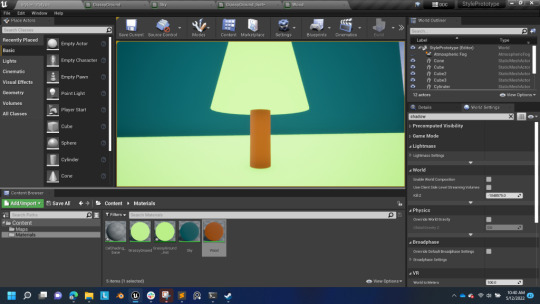
It took me awhile to figure out that the effect ends up being pretty straightforward to set up by simply funneling your material color into the Emissive Color parameter instead of the Base Color parameter in your nodes. You then simply attach Multiply/Param nodes to control the strength of the emission.
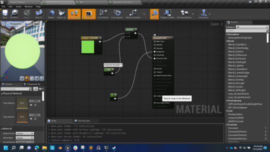
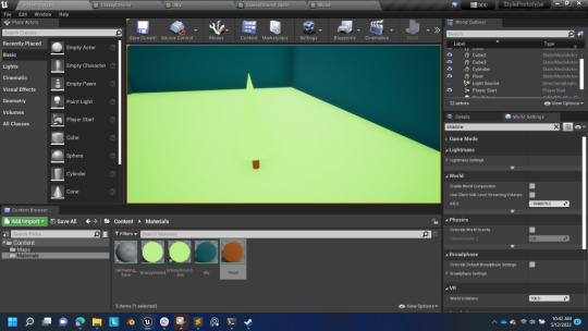
This is how things start to look once you've remove shadows/lighting from the materials:

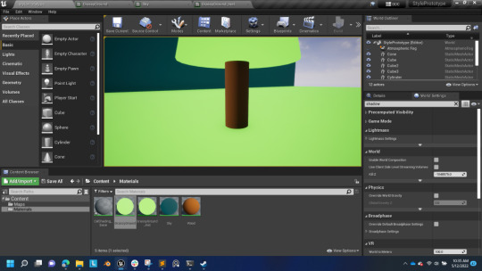
I'm not yet sure how to make adjustments to the material instances. So my grass and tree and still the same color/emission, making them blend into each other. I want to change the tone of the green in the tree without creating an entirely new material.
This shows how changing the Emission Color, though, ultimately removes the shadowing from the object.
0 notes