#//i still tried to make unique design / keep inspiration from their original designs
Explore tagged Tumblr posts
Text
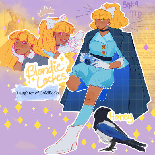
As per usual, info under the cut <3
IM BACK BITCHES!!!
Alright, here's the design stuff:
I wanted to go for kind of a Lois Lane vibe, including the way she gets all the way up in business she should not be up in. At the same time I wanted to bring the super cutesy gothic lolita style in at least a little. So I ended up going with a poofy short jumpsuit with bows and teddy bears. I would love to make a specific thank you to @themooncallsyou for suggesting I look at the Moschino 2022 spring line for inspiration, it ended up having a very heavy impact on the final design.
I tried to lean into the investigative part of investigative reporter, so that's what the heavy coat is about. I thought adding that classic detective silhouette would be a nice final touch. Plus, I think Blondie likes the drama of the coat flying behind her as she's chasing down a lead. It makes her feel very cool.
Alright, so her original pet is a bear cub named Grizz but I have. Several problems with that. The main one is that it's not clear what the difference between Grizz and the actual sentient bears and her story is. There is never any differentiation between them. It's a Goofy-Pluto situation. Like it doesn't need to be explained, but the minute you start thinking about it too hard it gets weird real fast.
Anyways say hello to Honey the magpie!! Magpies are great mimics and lovers of shiny things, so I thought one would be a perfect fit for Blondie. She repeats bits of gossip and steals little trinkets and clues to help Blondie with whatever case she's on. Honey is where Blondie gets her infinite supply of bobby pins. Her scale is a little off, I don't think magpies are actually that big, but I still think she's cute so I'm not changing it now lol.
Now for character stuff:
Honestly I'm not really changing anything as much as I am exploring what's already there. I think Blondie has the potential to be really interesting, because she's unique within the class system of the school. She's kind of the inverse of Raven status-wise. Raven was born to royalty, but because her mom is the Evil Queen she's actually considered a commoner by society. Blondie was born to a wealthy commoner family, but her fear of rejection leads her to exaggerate the prestige of her lineage. Everyone sort of knows that she's not a Princess but she's so desperate to keep up the image of royalty that no one knows where she actually lands. Most of the royals assume her parents are Lord and Lady or Duke and Duchess or something. In reality they don't have any noble title, and Blondie is very insecure about that.
Blondie isn't so much ashamed of her family as she is terrified of exclusion and rejection. Her standing in society is the one major thing that makes her different from all the other royals, but she has major anxieties that she's always on thin ice. In her mind she's permanently one wrong step from total ostracization.
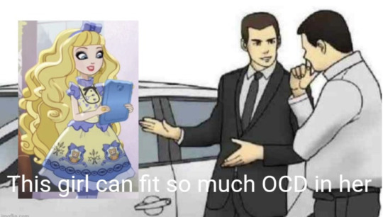
On a happier note, she does have a genuine passion for journalism! She considers her news blog/podcast practice for her future career. She starts out discussing school drama and gossip, but tries to stay a neutral third party. That's why her hair is so big. It's full of secrets. As the story goes on she starts reporting on more political and social topics beyond the boundaries of the school (and therefore becomes one of Milton Grimms worst nightmares). She is really, really, really good at getting into shit people do not want her to get into. She's got her eyes on prize and good luck stopping her
#eah#ever after high#coffeepaintart#eah fanart#blondie lockes#eah art#yes i have thought about this cartoon for children designed to sell dolls from almost a decade ago for far too long why do you ask#eah redesign
308 notes
·
View notes
Text
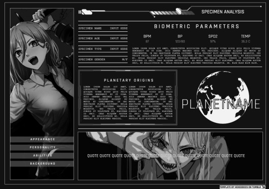
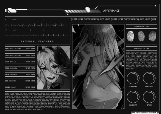
[ 9 ] . noir... 𝑫𝑶𝑾𝑵𝑳𝑶𝑨𝑫 𝑵𝑶𝑾!
Finally -- a new template, after months of being away! I wanted to say thank you so much for your patience and for the love that I've received while away. I truly have the best supporters, and I wouldn't be here without you guys.
NOIR is a sci-fiesque template that is perfect for those who love to write a lot about their character. With multiple sections to add your own unique descriptions, it showcases all aspects of your character, making it perfect for the perfect all-inclusive template!
While I originally tried to stick to a more medical-interface type of template, it sort of deviated to its own thing -- sort of computer-file like -- but I'm still very happy with it. It took many weeks to finish, but the end result was worth it!
How to edit
To edit the pictures, right click on the image and select "replace image." DO NOT COPY AND PASTE PICTURES INTO THE DOC. This will cause elements to shift and the design to break.
DO NOT REMOVE CREDIT.
Feel free to change whatever aspect you'd like, just PLEASE keep the credit!
This doc contains drawing elements. To edit, simply double click on the image and the menu will pop up -- allowing you to edit the colour, font, anything you wish!
The picture on the first page is behind the text. To click and select it, right click over top of it and click "select picture," and then move it in front of the text. From there, follow the directions on how to change the picture. Just make sure to put it back to "behind text" after all is said and done!
If you plan to change the background colour, just beware that the EKG gifts are not pngs, so you may have to tinker a little bit with it.
The thing I really like about this template is that for the statistics drawings, you can change the inner most part of the circle to show a sort of "percentage." To edit this, double click on the image and then click the middle portion of the circle. From there, you can slide it to make it smaller or bigger to your preference!
As always, likes and reblogs are MUCH appreciated. I hope that you enjoy this template as much as I enjoyed making it!
Many thanks,
Kira <3
Inspiration: https://www.pinterest.com/pin/298785756542843881/
#google docs template#rp template#character template#gdocs#docs#google docs templates#docs template#docs templates#rp resources#rp doc template#template#gdocs template#discord rp template
685 notes
·
View notes
Text
LUCIFER MORNINGSTAR RE-DESIGN/RE-IMAGINE/RE-ALLY DON'T KNOW
!Disclaimer! This was all for fun, not hate to the Hazbin crew or Viv. I love and adore the show, and respect if you dislike the design !NOT ANIMATOR FRIENDLY BTW!
I love this show so much, but the designs just don't sit right with me half the time. I know Viv made most of these characters as a teen, but I still feel like something could've be done, but I won't complain about the designs too much because most of them are fine. I only have some problems with certain designs.
Original design, from Hazbin Hotel

My Re-Design

OK MY GOD MY MOTIVATION SPIKE WENT UP
I only have a couple things I dislike about Hazbin's Lucifer's design, and I tried to fix in my Re-design
The amount of white and red
His lack of "royal" attire
His hat and bowtie(it's repetitive in viv's designs and not really needed for a character like Lucifer)
His cheek/blush on his face(what is it for???)
Lucifer in the show to me, shouldn't be wearing so much white, that just a fashion peeve of mine wearing so much white- but the KING of HELL should be wearing more royal attire. SUCH AS PURPLE BECAUSE IT JUST WORKS IN SO MANY WAYS.
1 : Purple for centuries has been associated and used for royal attire for the rich and elite
2 : It's the color most associated with the sin of Pride(not the gay one srry fellas) and the most connected color with Lucifer.
3 : It's unique definitions are tied back to Lucifer's behaviors in different media, Mystery, Ambition, Power, Wisdom, etc.
Couple of side notes I forgot to mention
His Outfit is both a mix between 1700's inspired outfits, fantasy, and gothic clothes
The snake on his hand is like half alive and half asleep/still, it's more of a half-alive puppet he can control sometimes
His "wings" are fake because he's ashamed of his real wings
His winged bowtie is stationary
He has a broken halo he hides 99.99% of the time
His hair/head fire constantly moves
That's all for now, maybe I'll re-design more characters in the show. If I keep making re-designs btw, I'm starting from what designs I dislike the most, then moving on to designs I don't dislike as much. So tell me what you think about this lil purple guy, and who I should maybe Re-design next.
More Lucifer redesign

oops made my redesign lesbian /j
#hazbin hotel lucifer#hazbin lucifer#lucifer hazbin hotel#hazbin hotel#hazbinhotel#hazbin art#hazbin hotel fanart#hazbin redesign#hazbin hotel art#artwork#art
48 notes
·
View notes
Text
Wish Granted AU: Gabo 😡
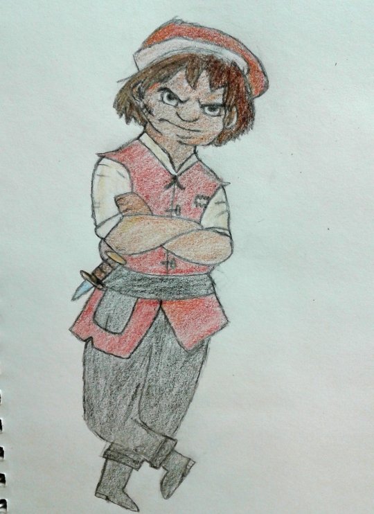
THE ANARCHIST— I mean grumpy boi is finally done! I've been wanting to show me redesign of him for ages, and I finally found the time! That being said, I can drop a little more lore not only for Gabo, but for Wish Granted's version of Rosas.
Design wise, he's still inspired by Grumpy, but I added a little more detail from his concept version. It looks like all the teens clothing were really leaning into the Dwarves reference, but it got changed later. Most of the citizens of Rosas wear more regal attire, but their outfits look strangely similar in color and length, with only the style being different. Gabo refuses to wear those conforming clothes, so he wears a really basic outfit that's just a vest (with the rose symbol ripped off) and undershirt. His mom makes him wear the hat though. 😂
(Here's one of his original outfits. It actually looks more unique.)
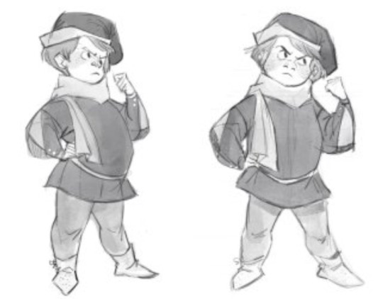
And notice this little detail here? 👇 Gabo had a dagger at one point.
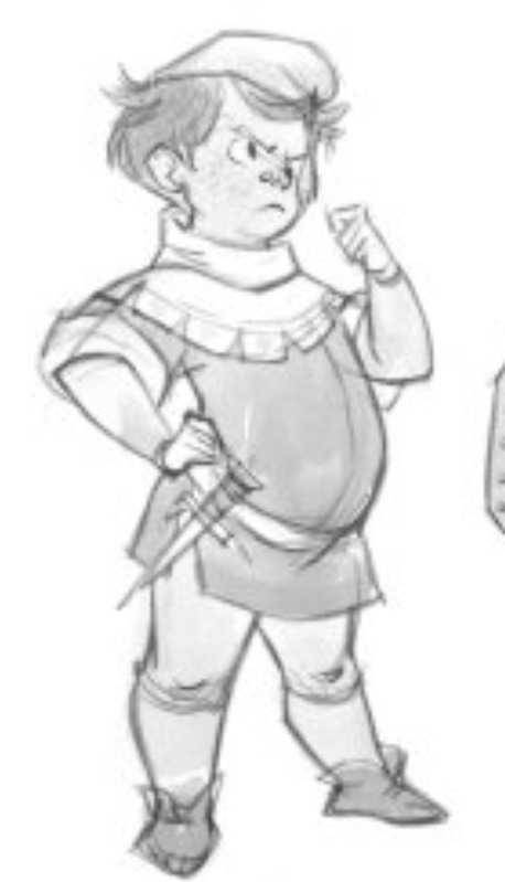
GABO HAD A DAGGER. The angry guy had a weapon and they cut it out?! You know how hilarious that is?! If this kingdom is so safe, why did he need a weapon? I like to think Gabo had it to defend himself because the original version of Rosas had some shady things happening with the royals. So I'm keeping that little accessory in my AU as well.
Gabo does have a little scar on his face that he likes to call his "battle wound". He claims he got it from fighting off a guard single handedly and got cut by the guard's sword. No one really believes it though.

No offense to people who like the canon movie, but to me, Canon!Gabo was kind of an asshole. Like, the insults weren't even funny, he just was saying mean things to his friends. And the fact that Perrito's voice actor is Gabo makes it sadder. Aside from his best line "What are you, five?" I didn't really like his portrayal.
Wish Granted Gabo's his personality is SASS. Lots of it. 😂 He's also sarcastic, pretty easy to annoy, and pessimistic. However, he can keep a secret better than anyone in the kingdom. Gabo can come off as a jerk sometimes, but he's still got a good heart. He just wants Rosas to finally wake up and smell the.....roses. (That was a bad joke) Especially when finding out Asha wants to take down the royals and is proven right about his belief that the royals are evil. Gabo does have to get adjusted to Star, though. He's a little too happy for his taste, but deep down he's glad to have someone more upbeat around. And he found a kindred spirit with Asha, both of them hate the rulers, are pessimistic and want to tear down the monarchy! Of course he's gonna help them!
Now for some facts about him:
• Gabo is the youngest of the teens, being 15 years old. Though some think he acts younger.
• He's voiced by Landon McDonald.
• He has a mother who is just a regular citizen who's a jewelry maker, (OG Seven Dwarves nod) and is very loyal to the king and queen since they provided a home for them. She doesn't approve of Gabo's anarchist behavior and tries to get him to show a little respect to them. Gabo is also an only child, so its just him and his mom.
•The reason Gabo has become the resident conspiracy theorist is because he actually saw a few of the local citizens disappear shortly after they expressed their discontent with Magnifico not granting their wishes. They were growing suspicious on why it was taking YEARS to grant. One shopkeeper stated he was going to leave Rosas and demand his wish back. Gabo hasn't seen him since. Since then, he's been trying to warn the people that the royals are evil, but nobody believes him. However, Magnifico and Amaya haven't silenced him because he's literally no threat.
• He causes minor problems like breaking the mirror in the center of town, defacing the royals statues, and basically destroying anything that idolizes them. Its his way of fighting back, little by little. This really pisses off Flazino because he has to fix it every single time. Gabo loves screwing with Flazino since he works for the royals, but he has no idea Flazino is a double agent.
• He actually got that scar from Sabor, who caught him sneaking around looking for a dungeon he believes is where the missing citizens are. It left a really deep cut, so it didn't fully heal.
•Gabo does have a wish, but he doesn't want to give it to Magnifico and Amaya for obvious reasons. He also refuses talk about his wish with the Teens or Asha. His wish is to have some friends.
• Finding out he was right about the royals being evil, the dungeon, the missing people, and literally everything he was shouting about is great. HE IS LIVID RIGHT NOW.
•Most of the teens don't really like Gabo since he causes trouble (Dario and Hal seem to be fine with him), but he has major beef with Simon since he's the one chasing Gabo a lot. He's also on Dahlia's bad side because he destroys her Magnifico and Amaya shaped cookies whenever he gets the chance. Soooooo Dahlia is REALLY reluctant on helping Asha knowing he's with her.
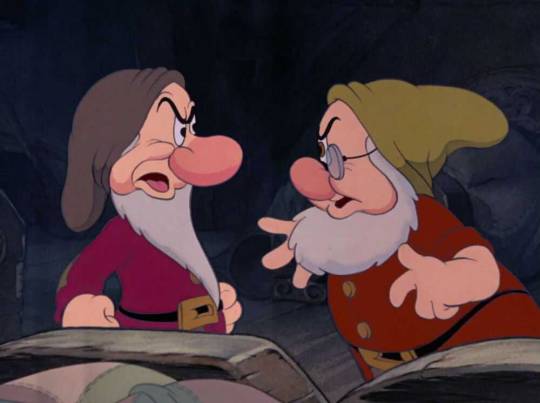
Kind of referencing Grumpy and Doc arguing with each other a lot from the original film.
• Gabo might be asexual? I'm dropping a few hints in the story, but I'm not sure if I want to fully make it canonical. One reason is because I kind of got that vibe from the canon Wish movie. And Harvey Guillen is queer in real life so its possible Canon!Gabo is too. I don't think Disney has ever had an openly asexual character in a movie or series either. Second reason is because I don't want to just write stereotypical things for him or just throw it in for no reason. I have a few ace friends here and on YouTube, so I want to learn a little more about how it works for asexual people before making it canon.
And there you have it! The other teens will get full redesigns later on, I just wanted to show Gabo first. Since I'll be busy this week, the only thing I will draw out is the rough draft for the first teaser poster so I can get some help on it. And the next chapter will be written after Christmas. See ya!
@your-ne1ghbor @tumblingdownthefoxden @oh-shtars @chillwildwave
@annymation @thesafireartist @snackara @pinkninja0708
@uva124 @jojo-ker06 @kenihewa
#rascal entertainments#wish rewrite#wish granted#wish reimagined#wish granted au#wish concept art#wish 2023#disney wish#wish movie#disney#wish rewrite fandom#wish fanfiction#wish fanart#wish fandom#wish gabo#lore drop#wish redesign#backstory#character bio#Gabo
21 notes
·
View notes
Text
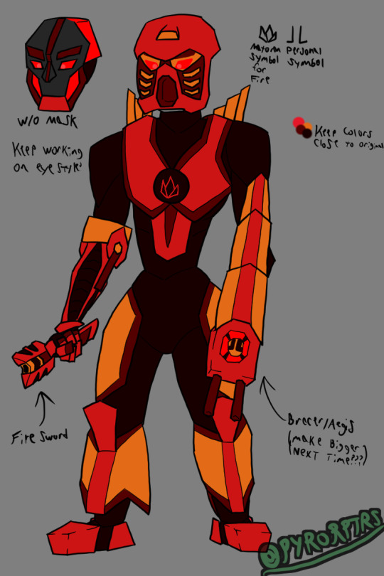
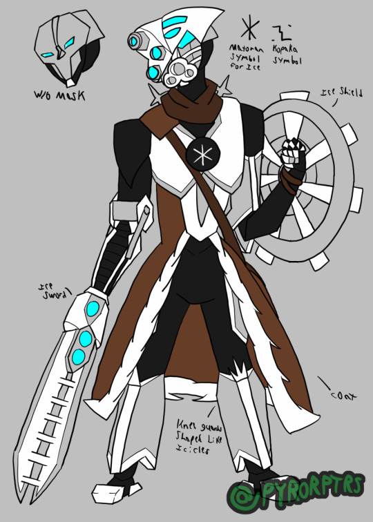
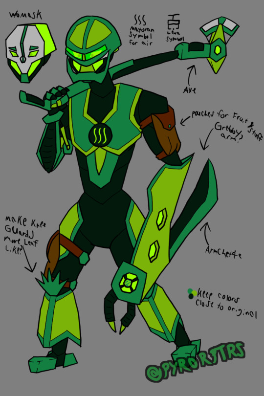
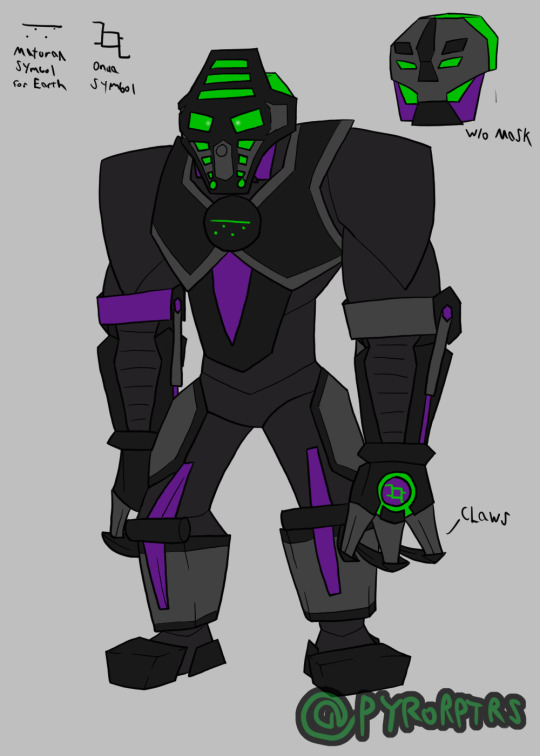
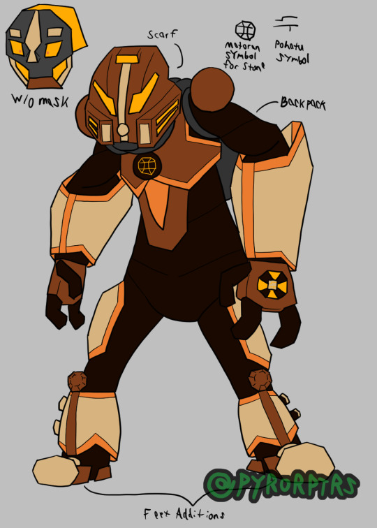
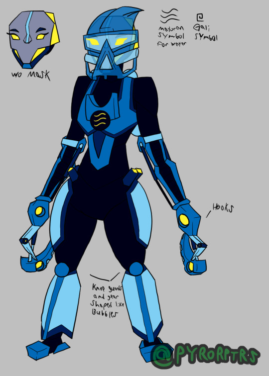
Awhile back I did my own redesign of the Toa Mata from Bionicle. Mostly just trying to find a way to draw them without having to keep the toys permanently on hand for reference and a bit more streamlined to make them easier to draw in general. As far as universal details go, I gave them a segmented body template to lean into the biomechanical aspect of them, I also tried to find a consistent way to draw some of the more common limbs they had. I also tried to play with the gears on the back by giving each of them something unique and tried to give them unique kneeguards. I also tried to incorporate the orbs they had their chest by incorporating their elements matoran symbols into them
Tahu - Tahu served as kind of the template for the others, so he's probably the most standard out of them. I wanted to stick primarily with his original colors so made the bright red and orange the most prominent colors on him, but I also used the dark red he sported later as an accent color for more color blocking. His sword is based more on the Bionicle Heroes interpretation of it, though I may change that if I ever redraw this design. His left arm was never really stated to be anything, so I tried to purpose it as a sort of Aegis; it still matches his more aggressive personality, but also gives it a more utility. I also modeled his back gear after exhaust pipes to relate towards his element. Though it probably won't be seen that much, I did try to define his head too, making it kinda broad; specifically basing the heads off a combination of the originals, the glatorian heads from the end of the original line, and the heads from the reboot.
Kopaka - Since Toa of Ice tend to stick around cold places, I incorporated a bit of a coat into his armor for insulation. His sword also draws some inspiration from the Heroes version, but it also still works like his toy. His left arm was a bit awkward so I limited the armor to mostly just his bicep, I also tried to make the shield look like a snowflake on top of the radar dish look it obviously was piece wise. Kopaka was also one of the few toa consistently depicted is hauling around the McGuffins for whatever saga they're directly involved in, so I gave him a satchel to call back to that. His back gear is directly modeled after a snowflake like his shield, but a bit more obviously. I also tried to make his kneeguards resemble icicles. I tried to give his head a sharper look to call back to his cold and distant personality.
Lewa - Tried to make Lewa look a bit more lanky compared to the others since he's supposed to be the resident tree swinger. His axe leans more towards the original, but I still tried to incorporate aspects of the heroes version for fun. I tried to make his left arm a big grabby arm since most people turn it into a gun or something, but BlazeTBW thought it looked like a machete so I incorporated a fold-our arm blade to help him cut up vines and foliage as he swings around. His kneeguards are supposed to look like palm leaves but I'm not satisfied with how they turned out. I also gave him a few pouches since I figured he's want to keep a few snacks on hand or maybe even swipe a souvenir here and there.
Onua - Tried to make Onua look pretty broad since he's supposed to be strong even without his mask buffing him. Unfortunately his monochromatic color scheme can make things hard to color block, so I threw in some purple from his G2 version in order to help highlight some parts of his body. obviously made his claws his actual hands. I also did something a bit different with his legs sinw his original toy had them flipped around to bulk them, so I tried leaning into that while also making it look like a heavy duty hinge. I also tried to make his head particularly broad too.
Pohatu - Pohatu was pretty different from the original toa in that his torso was flipped around to make him more bottom heavy, so I tried to call back to that with his body shape. I also took inspiration from the toys arms to make them bigger than the others. I did include the two orbs on his shoulders, but recolored them to make them different from the chest one and included the extra pins on the leg. Since Toa of Stone live in the dessert I gave him a scarf to wrap around his head for sandstorms and gave him a decently sized backpack since he's also been happy to regale his own adventures (so it works for holding souvenirs). His kneeguards are based on boulders. I also inlcluded the orange his Phnatoka version sported to highlight parts of his armor
Gali - Obviously Gali's body is mostly just a female version of the standard one I came up with. I did call back to the pins her original toy had in her hips and I incorporated the mata hand into the chest orb I try to include on all of them. Her hooks are intended to slip onto her hands more-so than replace them. Her back-gear and kneeguards are also based on a bunch of bubbles. finally I incorporated her Mistaka colors as a highlight to add more color blocking.
#Bionicle#Toa#Mata#Tahu#Fire#Kopaka#Ice#Lewa#Air#Onua#Earth#Pohatu#Stone#Gali#Water#Hau#Akaku#Miru#Pakari#Kakama#Kaukau
46 notes
·
View notes
Text
Pomni the Human (redesign)

Pomni is one of the few remaining humans in the remnant of… whatever this place was before it got destroyed. She spends most days gathering whatever resources and supplies are available from the land and the few standing factions. But with the world essentially dying, there’s only so much available for anyone. Regardless, she and the head wizard she resides with make do with what they have. Despite the growing tension amongst the remaining people and the steady increase of monsters and the forgotten, Pomni still tries to keep her spirits up and help anyone she can. A little kindness and decency can go a long way in a time like this. It at least can't make things worse than it already is...
So… I redesigned Pomni a little bit. it might not look that different from the original, but if you were to compare the two side by side, you’d see the difference. The main reason I redesigned her is to fit with this idea I had where parts of the world are based/inspired by the 1970s to the 90s (because clothing design for characters is not my strong suit and I like older style clothing, alright?). Pomni has been redesigned to be loosely based on the 70s, with the research giving me some interesting trivia of the past. Did you know they had a bodysuit version of every kind of top in the 70s? Every. Kind? I do now.
You probably guessed by the character blurb, but this is going to have some fantasy elements. Expect some unique creatures making up the residency here as well as magic and monsters. Not to mention the lore I'm going to fluctuate between sprinkling in here and there and dumping onto your laps. And don’t forget that there’s some sort of cosmic being that watching and waiting for the right things to consume and leave no trace of anything behind.
One more thing. Something I wanted to do with anything I made for a while is have music that goes with it. Whether it’s a song or a track, something that adds a little extra bit to the art and stories I post. This post, other character posts, as well as some lore bits will have music that matches to some degree. I’ll have both the Spotify link and a YouTube link for whichever is more convenient.
For Pomni, Stayin’ Alive by TheBeeGees. Totally not because it’s what she and everyone else is doing in the post-apocalypse world they live in. I admit this one is more of a joke, but everything else is accurate and serious (mostly).
YouTube link here
#Spotify#the amazing digital circus#the amazing digital circus pomni#tadc pomni#pomni#pomni fanart#redesign#post apocalypse au#post apocalypse#tadc au#character redesign#redraw#tadc fanart#tadc art#digital circus#artists#artists on tumblr#christian artist#art#illustration#character design#music#70s music#70s fashion#humanradiojmp
47 notes
·
View notes
Note
Hello! May we hear/read more about Revelator, please? 👀
You wish to know about my original work??? Chatter mode has been unlocked with this query.
Revelator is my attempt to make my workaholic brain shut up. I struggle to continue finding purpose in writing fics when I can't capitalize on it. So I decided it would be a good idea to take the basic premise of one of my fics and apply it to my own original work to inspire me to work on something productive and maintain my hobby. That said, Revelator follows the general premise of my most popular fic, The Many Lives of Optimus Prime.
Rant incoming.
In a universe where humanity has fled to the stars after their empire was shattered by an unknowable entity, twenty sentient robotic units are created by a relic that humanity does not understand but still houses. Due to a series of misfortunes on the world they tried to terraform, the last remnants of humanity are wiped out, leaving the entire world to the Twenty and the relic that made them.
The main character of this tale is the only one out of the Twenty who foresaw the coming deaths of their human masters and was promptly ignored. After humanity fell, he tried to guide the rest of the Twenty into creating a civilization in light of more of their kind being forged by the relic. His vocal nature led to his destruction at the hands of one of his fellows. However, against the odds, he found himself returned to full functionality in a new frame and with newfound purpose.
The relic that made him and the rest is more than it seems. It has sensed the threat that doomed humanity and it has no interest in watching its creations fall as well. And so it has chosen a champion, one whose sole mission is to endure the test of time, learn, grow, and ultimately gain enough power to shape this fledgling race so that they might stand a chance against the doom that is coming.
My original work follows my main character throughout his various lives and throughout the various eras of his world. He will watch, he will learn, and when he has lived long enough to have gained wisdom, everything will come together with him taking power. In many regards, his tale will mirror my fic. However, I am taking care to create an original world with a unique race to inhabit it. I hope to make each life its own story so that there is always something new to see and explore. In a way, its my worldbuilding project. I also want every excuse to not write humans. I need to keep to my niche or I will lose interest immediately. Thanks TF.
Thus far I have twenty three pages written, nine chapters fully planned, and the second arc mostly conceptualized. Here is a snippet from chapter one.
━━━━━━ ⊙ ❖ ⊙ ━━━━━━━━━━━━
“You were not made to serve us, child of the Mind. Your creator made you for a reason that far exceeds anything myself or the commanders of this vessel could ever envision.” There was something sad in the priest’s tone as the lift came to a stop. Nineteen found himself conflicted as he watched his master step forward and onto the platform that ran around the exterior of the Great Mind.
“That conclusion has no logical basis.” He managed to murmur as he followed the priest. There was always something strange about being so close to the thing that made him. The thrum of its crimson core always had Nineteen’s personal fusion core pulsing in sync with the greater machine.
“Child of the Mind, you have so little faith. Look upon yourself and your siblings, then see the rest of those made by the Mind. You are unique, each and every one of you.” The priest paused and gestured to Nineteen, prompting him to stop in his tracks. The surface of the Great Mind shifted in time with the priest’s words. Nineteen would almost claim it to be in response to his master’s commentary if he were a believer in any capacity.
“We have purpose, and we shall serve.” Nineteen stated simply. There was little thought in his response. Whatever the priest was getting at was beyond his design. He and the twenty were made to serve. That was all. The loyalty coding, their sentience, and all the rest meant very little in the grand scheme of things. Nineteen would still be disposed of if he proved a burden, regardless of the potential mysticism around him and his kin.
“You shall serve. But it shall not be those of flesh that you give your loyalty to.” The priest smiled, and it was only then that Nineteen noted the cables running from underneath his master’s robe. They were part of the augments priests of the mechanicus received, and at some point during their short walk, those cables had connected to the Great Mind.
There was no railing separating them from the relic, and as such, there was nothing to theoretically stop the priest from connecting to the Great Mind. Even still, Nineteen found himself unsettled. When had the connection occurred? Why did his master’s eyes hold a strange gleam to them?
“I do not understand.” He stood stiffly, his gaze flicking between the relic and his master. The thoughts of machines did not often translate cleanly for organics. Perhaps the priest was confused and interpreting the logical processing of the relic incorrectly. The twenty were made for the express reason of serving those aboard the Eden. They had been told as such from the moment of their forging and it had thus far proven true. There was no reason to believe the murmured prophecy of the elderly human before him.
Despite that, there was a degree of unease that wormed its way into his mind as he watched the priest grin in an almost understanding way.
“You don’t need to. I have a feeling it will make more sense to you as you age.” A red glow entered the priest’s eyes. It was hardly present, but to Nineteen who possessed far superior vision than any unaugmented human, it was almost impossible to ignore.
“Come here and pass me that cloth if you would be so kind.” Then, just like that, the moment ended and the priest disconnected from the relic. His cables slipped back beneath his robes into whatever holster they originated from and he approached the only work table on the platform. Nineteen quickly reset his optics and filed away the data for later review. It wasn’t important right now.
#lets try some writing mumbles#I am so self concious about my little story because I KNOW my family will shred it#but its my novel and I will write the bloody thing even if it sucks#will it mirror TF in some regards?#yup totally#but I think that just shows how much I love TF content as a whole#annyyyyyways it was nice to ramble about my passion project
20 notes
·
View notes
Text
The band’s all here! (WIP)


I still haven’t finished their new endoskeletons yet, but I think I have their suits mostly down!
Feel free to ask any questions you may have in the inbox!
EXTRA INFO AND SCREENSHOTS UNDER THE CUT!!!
At first glance, these are obviously inspired by the traditional Chuck E. Cheese x Rockafire Explosion suits, designing them more like sports mascot costumes and having very little of the endoskeleton showing at all times (say for Foxy, of course). This was not only for more realistic world-building, but also to optimize animation, as we now have less moving parts that are actually showing, and therefore, less to render.
You might be wondering “if you wanted a more realistic approach to the suits, why not take a more realistic approach to the masks, like a more ShowBiz Pizza style?” And to that I say: everyone does that.
Okay, that isn’t entirely the reason. I like the idea of basing the designs more off of the canon models than something that already exists, because I like the idea of FazEnt having their own style of making animatronics. The ShowBiz style isn’t the only way to do animatronic masks, and these masks are how FazEnt would go about making them. Even when FazEnt does use the trademark ShowBiz rubber-face masks on the Junior models, they don’t do it the same way that ShowBiz does it.
Something interesting I want to do with Freddy & Friends is to set narrative moments apart from the moments meant to be passed off as real footage. The designs shown above are for the latter, meanwhile the narrative will use more artistically stylized suits textured to more so resemble a comic book, sort of like Into The Spider-Verse (except instead of going for a generalized comic book feel, the Freddy & Friends style is gonna be more reminiscent of the Batman: Year One comic). The designs will be more reminiscent of how I draw them on paper, as opposed to being faithful to the canon.
Here’s some extra info as to how I came up with the designs, as well as some extra renders and concept art!:
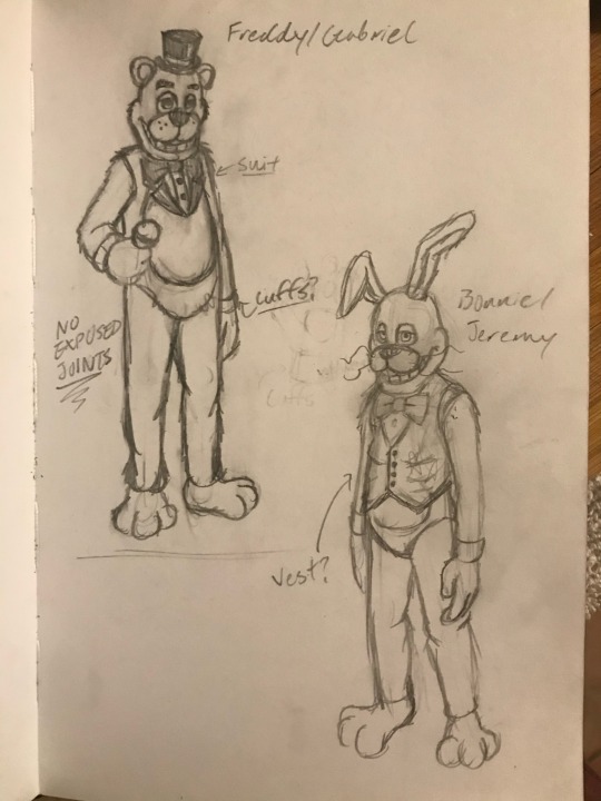
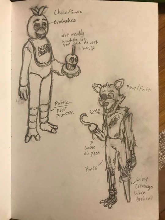
Original concept art from September 30, 2020.
Freddy was a little obvious to design, probably because everyone seems to design him like this when making more cartoonish versions of him. A more defined tuxedo complete with a collar and cuffs with a red stripe around his hat. It just seemed like the right direction to go in.
Bonnie was initially intended to wear a vest, though I was holding out for something else so that he could be differentiated from the evil rabbit (the evil rabbit wears a vest). I asked my friends what I could change it to, and one of them said “Try a cardigan”. Honestly, that fits Bonnie’s personality so much better, both in terms of spirit and cartoon.
You might also notice that Bonnie was supposed to have buck teeth, as well as more squared off teeth. That was originally part of his V1 model, but when I tried applying that to the new models, literally any way I tried to arrange it made Bonnie look like so much like an insufferable asshole that I wanted to punch him in the face. Ultimately, I ended up ditching the buck teeth and just gave him his classic teeth.
Chica was a little hard to do something unique with at first. I initially wasn’t really sure what I wanted to do with her, but when I modeled her V1, her little chef’s hat was a last minute addition to her design. I’m also thinking about changing her bib into an apron, per the toon designs that Henry posted a while back.
Foxy was probably the most fun to design. Obviously, his final model has a lot of details inspired by the FNAF movie, but when I was designing him 4 years ago, I really just wanted to go crazy with his design. I wanted him to have a beard, I wanted him to have a peg leg (I really liked the idea of animating him with a limp). Unfortunately, I don’t know if I’ll keep the peg leg, because it might be a little too hard for Henry to animate with the tech that he has.
As a cheeky little reference to the roots of the FNAF fandom, I wanted Foxy’s hook to resemble the hook seen on the Splinks Foxy model. ;)

Endo01 - Version 4 WIP
I’ve done a few different versions of the endoskeleton. What I’m trying to do for this new one is to assemble him modularly, allowing me to make each component a recognizable component (they’re also actually modeled after real components).
I’m not gonna go into detail about the functionality of this guy, because I eventually plan to make a Freddy & Friends Instructional VHS series centered around being a mechanic for FazEnt. However, what I will say is that these designs are intended to have plausible functionality, especially using the technology of the 1980’s (which is not restricted to pneumatic technology, because making an animatronic walk with pneumatic actuators while maintaining the traditional complexity of animatronic endoskeletons is simply impossible).
EXTRAS:
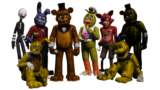
The original Version 1 designs

My failed attempt at giving Bonnie buck teeth (I wanna punch him so bad…)

Fixed Foxy
???
#freddy & friends#freddy and friends#freddy & friends AU#f&f#five nights at freddy's#fnaf#fnaf au#freddy fazbear#bonnie the bunny#chica the chicken#foxy the pirate#work in progress#wip#endo 01#endoskeleton#animatronic#fnaf ask blog#fnaf fanart#fnaf movie#worldbuilding#webcomic#writers on tumblr#writing
40 notes
·
View notes
Text


anybody else up completely redesigning the cast of one of their stories to make it original and not a pokemon universe based one
no? just me? shame
(tawny | nutmeg | hibiscus sarsaparilla | firecracker | stripes clawin | glare | arkea)
thoughts and philosphys behind their design changes and such below the cut!
tawny: borderline unchanged! besides a little bit of change to his ear markings and removal of all plusle association. and thank god because fuck those plus tails man. but his design is so strong i couldnt really change a whole lot - thank you 2020 wheat for making such a good design!
tawnys scars however got a HEAVY redesign them make them look more intense. those lame scratches from before did not come from a dragon. added a bit more spread out to his neck too for a big bite mark across the back of his neck. i kept his usual trouble with opening that eye over because i think its iconic and much more interesting than just keeping it closed or removing it
also he limps now. he broke his leg in the attack too and didnt rest it properly so it didnt heal properly. i decided against giving that a visual indicator because i dont think it would really have one logically - this isnt a cinderpelt situation, he broke it by landing at a poor angle and then didnt let it heal properly, so it wouldnt really be scratched up or be twisted in any way.
nutmeg/lewis: a name change to match some new lore about rabbits (naming them after stuff they'd know about instead of human names) and also because as much as i liked the name lewis, it felt very strange having it stand out as the super different name in the family
otherwise? also borderline unchanged besides a few new and recoloured markings to make them a little more unique from his brother. they arent twins or anything man. nothing else to say about it really, hes literally the same guy as before basically.
hibiscus: a complete design overhaul, although using the philosphy of her old design; she still looks like shes related to her kids without looking like a carbon copy like the old design. i wanted her to appear as Parent with only a few shared traits with her kids instead of all of them. you can see what they inherited from her and what they didnt instead of them being borderline clones of hibiscus
i leaned heavier into the pinks and making her lighter than her children (sunnyside warren is mostly dark coated rabbits, so shes on the lighter side for them) and i tried to inspire a bit of a flower motif with her face marking, relating back to her name. i wanted to actually make her look a bit like the flower in general
continues to be the only character in shattered glass with an accessory! i couldnt remove it. its iconic. and i made her future scars a little more obvious on her, although the design pictured is where she is early-story
sarsaparilla/elsa: a name change again for the reasons spoken of in nutmegs section, and also because of the unfortunate frozen association. i did not name them (they are from a very old rp and was the child of a character who was not mine)
a COMPLETE overhaul pretty much, going from poochyena to a jackalope of all things, making them the only fantasy animal in the story, although jackalopes are not regarded as such in universe (instead being considered a rare mutation of normal rabbits and are treated like and called rabbits). i thought it was fun as it makes their role as the soothsayer of the warren more standout in their design by giving them a very unique trait. im sure this special treatment given to them because of it implies nothing.
this was because becoming a xenofiction story, the implication of going 1-1 with their pokemon species and making them a wolf of some sort felt... contridictary with their role, so i completely overhauled them from a young-ish wolf to a elderly jackalope, old and wise and full of wisdom and future visions, for sure. i managed to keep a little bit of that old design intact with their markings and colours though, as a little nod to poochyena my friend poochyena
firecracker/jenga: so the backstory around sunnyside warren, the home of all of the rabbits we've seen so far, is that they struck a deal with stoats that moved into the area to stop them from hunting them. these stoats are firecrackers parents.
previously a mightyena/braxian hybrid, i wanted to go a completely different route for jenga. i dont know why i gravitated to the stoat family, it just slotted in... perfectly. they had been slated to have been a childhood friend of tawny and nutmeg before drawing away after nutmegs death and ultimately going missing entirely, i felt like slotting them into the role of the future guardian of the warren kept the reason for them to interact with the siblings since theyre of similar age while providing inheritant conflict that would keep them further apart when they get a bit older despite their shared experiences.
so! a changed name for a new stoat name custom (named after more human concepts) and basically the exact same colours with a different set of markings to give that firecracker name good reason. i think they came out SUPER solid and cute i love it sooo much
fun fact: i initially planned for it to have the black as a base with white and orange markings, but after colouring the rabbits first i realized that white would look nice as a contrast against the darker coats of the warren, and i think that was a good call.
stripes: OH BOY. the hardest of all the designs in here to figure out. ve was the only one i hadnt settled on a species on when i started sketching these about a month ago and i still didnt until about a week ago - i initially planned on vem being a pegasus, and playing around with the exact design of pegasi in the universe (they were going to be quite bulky and designed for mountain environments, and their wings were going to be more for gliding than flying), but in the end i felt this didnt suit xem, even if this meant ditching the wings from their design for reasons ill get into in arkeas section
i knew i wanted her to be big, and i didnt want to make xem a predator of some sort, so i was kind of stuck with either monkey, marsupial or large herbivore. i am NOT drawing a monkey and i couldnt think of a marsupial that really fit vem, so after much messing around i settled on mountain goat.
xer colours stayed effectly the same, but i converted their "stripes" into sort of a patched classic tabby cat appearance. im not really sure why i did that, honestly i just thought of it randomly and thought it looked good. ve didnt have many markings before so i just started throwing stuff around until something stuck. some early concepts leaned more pink and orange calico markings or doing a cloud theme.
also, a missing leg, because i realized lately that i have a habit of making all my disabled characters anthro animals that fly who have a flight-related disability. while a fun idea to play with (coming up with the way flight aids would work, the ways a flight disability would effect someone in a flight-based society, etc), pegasus!stripes had this instead of the leg at the time, and then i realized my trend and wanted to make it something that was more grounded in real disabilities instead of making them all based in traits we, as humans, dont have.
CLAWIN: ohh. clawin clawin clawin. im so glad i went for a redesign angle on this story purely for him - i love minun, its one of my favourite pokemon, but that yellow looked so FUCK UGLY on him man. this design i did in one take, and i nailed it i think. its such a huge glow up im so proud of how it came out
first, his eyes, which i consider one of his most important traits - i kept over his weird heterochromia, although instead of giving him an unexplained blank red eye (leftover from when clawin was evil and the reincarnation of a dead character), i gave him a broken iris. coming from a concussion he had earlier in life, his vision is blurry in that eye as a result. its a fun way to keep his "strange looking" red eye while it having a reason to exist. not that i minded him having a random evil looking red eye, but i think its more fun to base it in realism.
i especially am fond of making him a hare instead of a rabbit, making him tower above most of the rest of the cast and giving me the option of making the guy ive always written as being very limited in his expressions (its probably autism now instead of being emotionally repressed) a little more creepy factor by leaning into hares really freaky eyes. not seriously or wahtever, but i think it gets weird when he stares at you for too long.
in general tawny and clawin are meant to contrast eachother as characters, and i wanted to match that design-wise too, which i think i finally succeeded with here. tawny being soft, round and sweet looking and clawin being long, lanky and a little scary looking, despite tawny being full of hate and clawin being nice to a fault.
GLARE: just like stripes, just a complete overhaul for them. again, 1-1-ing an umbreon, especially for the character who is romantically involved with clawin, felt strange for their dynamic. i ended up landing on a flying fox for him instead, since it still kept the 1-1 in concept (being a flying fox instead of just a fox) and its a lot more fun to get a little more out there with the species, especially in a story of mostly rabbits. i can see them being awkward going forward in terms of anatomy and interacting with other characters as a result, but i think it was a good choice and made glare, one of the less inspired designs in the cast before, far more visually interesting
i ended up keeping the umbreon yellow around though, although with a leaning into a heavier purple for the base and some new markings. i think it came out really nice in the end, although i did basically make up the markings on the fly instead of keeping any of their old ones (but they were just a normal umbreon, so...)
i did, for some reason, go the lineless fur effect, especially around the mane, something that i spring for occassionally to give "puffball fuzzy" as the texture im going for. i basically did this on vibes too. this whole design was just kind of winging it to completely remake glare from the ground up with little to no reference to their old design really.
ARKEA: ohhh boy. arkeas previous design was as equally as uninspired as glares and i think got thrown out EVEN MORE than glares too. at least glare shares yellow in common in umbreon. you wouldnt guess what pokemon arkea was before if you didnt know already (its an eevee)
i threw everything out but the kitchen sink and decided to add the only BIG carnivore of the series - a komodo dragon! a total overhaul from the previous design, which is what i wanted, with colours and markings inspired by chinese water dragons to finally give them the unique look theyve deserved for YEARS. being the """villain""" figure (not really but thats spoilers), i wanted to make them all big and imposing to contrast on them kind of being a bit pathetic, as the guy whos going around kidnapping and abusing people because they want the rabbit to kill a guy for them and/or teach them how to kill that guy.
being rebuilt from the ground up meant that theres no major philosphy behind their redesign to the new one though - i literally just made a whole new character with 0 relation outside of name really. i picked green because they were the last one i coloured and green was the colour i didnt use at all for the rest of the cast, so i just rolled with it, and thats pretty much it.
anyway if you read this far: thank you for listening to my horrible ramblings, feel free to send any questions you might have about my freaks to my main blog @squidslugs, and let it be known that the flower images i used as background are selected for a reason and if you can figure out what they are they might tell you a little bit about said character. WINK.
#ocs#original characters#xenofiction#how do i tag these freaks idk#im trying to like.#un-pokemon my pokemon ocs#since the fact they were pokemon were borderline irrelevent#god. shattered glass i love youuuuu#story:shattered glass#tawny#nutmeg#hibiscus#sarsaparilla#firecracker#stripes#clawin#glare#arkea#digital art#artists on tumblr
11 notes
·
View notes
Text
Concerning the Mouse
Disclaimer. This is a blog post. It's not an essay or legal advice or any of that. It's mostly a collection of thoughts. If you want something a little more well researched, might I suggest this post here. Anyways, let's talk about this lovable rat right here.

As of January 1st, 2024, Mickey Mouse, as depicted in Steamboat Willie, The Galloping Goncho, and Plane Crazy is in the public domain. Personally, I've been looking forward to this, and I've kinda taken it as a personal challenge to figure out how exactly I can reinterpret the mouse for my own projects. And I actually think I got it. But before that... let's talk about this.

I don't think the image above is safe.
It's true, Steamboat Willie is in the public domain, but Mickey Mouse is still protected by trademark law, and those frames and that get up specifically are still very much protected.
I can't be too sure about this, because both Infestation 88 (The Videogame) and Mickey's Mouse Trap (The Horror Movie) seem to use variations of this specific design, but like... those ears are probably still protected, as are those pants. This version of Mickey also lacks his iconic white gloves, but contrary to what other people might say, I don't think "old cartoon wearing white gloves" is something uniquely trademarkable to the Disney corporation.
So if you wanna play it safe, it might be a good idea to use other elements provided by these cartoons as the base for your own interpretation of the character.

This is the version of Mickey Mouse as depicted in the title card of Steamboat Willie, and like, there's a bit more to work with here. His pants have stripes not seen in other incarnations of the character, and he also has a pretty distinct hat and cane.
More notably, his eyes are actually very different from Modern Mickey. They're huge, and the pie eyes that everybody associates with this era of animation are actually pupils. Not the eyes by themself.
What's funny is that there's a definite resemblances between these eyes and those of Sonic the Hedgehog. Sonic was apparently based on Mickey Mouse, so I'm not super surprised.
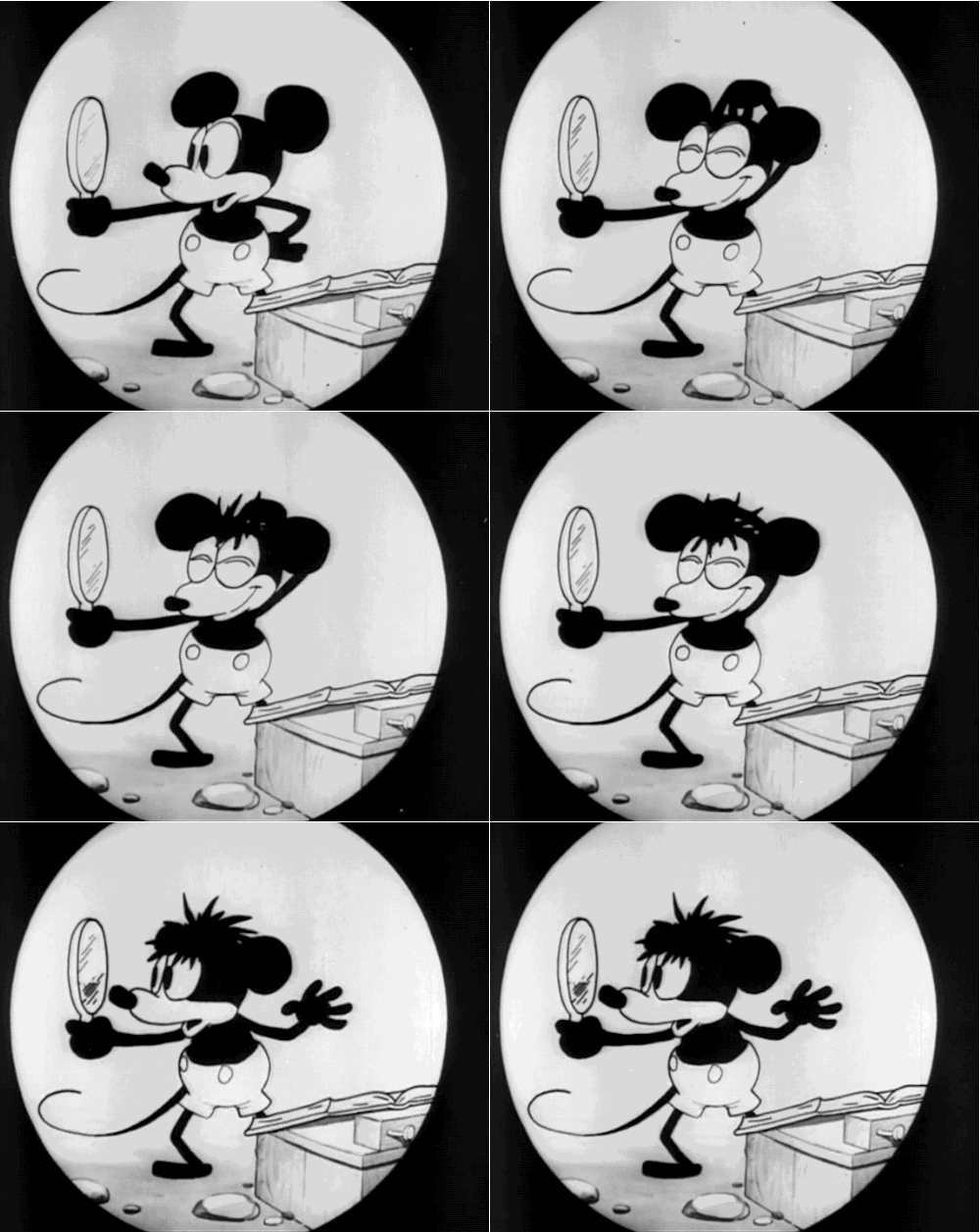
Those eyes in the title screen actually seem to be a holdover from Plane Crazy, where Mickey Mouse continues to have huge eyes. From that same cartoon, We also have Mickey Mouse deliberately messing up his hair to resemble the pilot Charles Lindbergh.
And like... it's cute. It's a look.
One thing I also keep seeing on social media is that Mickey Mouse has to be Black and White and he's not allowed to speak, because both Mickey's voice and his iconic red pants wouldn't be used until much later.
But like... you're allowed to build on these designs. Just because you can't color his shorts red doesn't mean you can't use color period. And using a different voice for the mouse is a very good way to differentiate your incarnation of the character from Disney's. This isn't legal advice, but I do believe you could get away with giving him a different colored outfit and, say, a deep souther accent ala Foghorn Leghorn.
Anyways, with all this in mind, allow me to introduce my own take on the character, Micheal Elias Mouse Jr. (Mike E. Mouse for short)
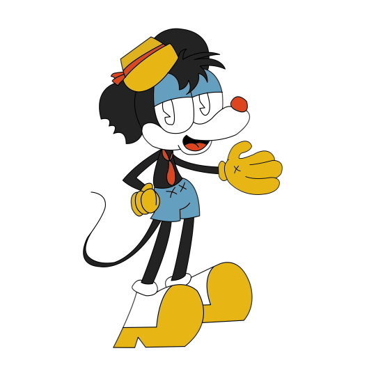
He's a former childstar, the son of the original Mickey Mouse, and an intellectual property lawyer with a dubious degree.
I intentionally made him rattier to make him more distinct, but don't let the smell of beef and cheese scare you off. This mouse might of been hit by hard times, but he still has a big heart, and deep down he's still the mouse we all know and love.
From a design standpoint, I tried my best to make the character recognizably mickey life while also changing up the original silhouette. Neither of the ears are perfect circles and one of them has a pretty significant bite taken out of it. The ratty hair and hat also help.
His gloves are yellow, inspired by various promotional materials for the original Steamboat Willie where Mickey dawns yellow gloves instead of the usual white. Further, I changed up the design of his shorts just because pushing the design that much further would help make this version of the character distinct from the Disney version.
If I'm not already protected by the public domain, I'm also protected by the fact that this character is obviously a parody. Middle aged dilf Mickey is not something Disney would never make, and the story I have in mind for him is more or less critical of the Disney corporation while still celebrating the artistry of the original cartoons and animation on the whole.
Anyways, Mickey Mouse entering the public domain is a big win for creatives everywhere, especially for fans of the original character. My interpretation isn't the only valid take on the character out there and I'm excited to see where everyone else goes now that the rat is free use.
#Mickey Mouse#Steamboat Willie#Public Domain#Plane Crazy#Mickey's Mouse Trap#Infestation 88#Art#Fair Use#Creativity#Mickey#Cartoons#Animation
23 notes
·
View notes
Text

FINALLY. This re-design took forever, I had to redraw it like 6 times, the poses kept not being right, and then the look itself wasn't working... you see, a thousand years ago when I was 15, my best friend and I made up a bunch of super heroes. One kid had super strength, which was cool and all, but other characters also had enhanced strength, so it wasn't very spectacular. The character himself was very interesting, so for a long time early on, I kept trying to add something to make him special. At first, I tried adjusting the abilities with the super strength; maybe he can manipulate gravity (making heavy things light/light things heavy), maybe he can also increase/decrease his size (always keeping his original super strength, even when tiny), maybe he has additional limbs (basically Four Arms from Ben 10, but with a different color-scheme). Meanwhile, in the background was this one side character, who wasn't very important for the grand plot, but VISUALLY looked very cool... because that character had been my friend's idea, I eventually asked them- "Hey. Can I use that for this guy?", which they were cool with, so FINALLY he has more unique powers; Phaze (spelled with a Z because that's cool~) is physicall strong, but his real powers are more "intangible", he can turn himself invisible, pass through solid objects, and rip open spiraling portals that allow him to teleport! When his powers first develop, he needs to be able to SEE where he wants to teleport to, but as he gains more control, he can also go to any location he is very familiar with, and also lock-on to his friends whenever they need help.
I knew I wanted spirals somewhere in his outfit, but I tried not to make it too busy or "stripey". I won't like, way back in the day, wegave the first version of Phaze JTHM claw boots because we had just gotten into all that, and I wanted to keep it somehow... after struggling to make the spirals work as the focus of the design, I thought about making them the accents/trim . So, it still needed SOMETHING. Instead of a sleek onsie kind of outfit, I tried to add a jacket... I didn't want it to be a big coat/cloak and hood, because then he'd have Grim Reaper vibes. Not bad, just not his brand exactly. Though, a spooky "darkness/underworld" touch might help. Less with the idea of death itself, more with the idea of moving between worlds/passing through the portals he creates. I started to lean into bats, WITHOUT making him look like a lost Batman kid (or a vampire). The character is indeed Mexican, so I thought about different depictions of Camazotz that I've seen, and that helped with the idea of the claw boots being like bat talons, and part of the mask design having a lower jaw with fangs, and bat wings as the collar of the jacket. I also took inspiration with some luchador designs, finishing up the mask, adding in the spirals, and at last- he looks OK! I'm still not sure if I want to keep the outfit in shades of gray, or with the vibrant magenta (either way, his powers are still the magenta colors). I tend to lean toward very saturated colors, and it definitely has the look of energy/putting on a grand show, but the grays have their own charm too~
4 notes
·
View notes
Note
So what is your headcanon for your Daphne x Allegra ship and how would there dynamics work?
OH I'M SO GLAD YOU ASKED ♥
SO, a little backstory, this all started with thinking about what happens to the Spark hunters after the events of Sparks of Hope.
With Cursa gone they are pretty much forgotten about, but I'd like to think that Edge would feel some sense of responsibility to make sure they're not completely left out in the cold, especially seeing what happened with Kanya after she went solo. Also Edge got the amazing opportunity to hang out with Mario and friends, and it changed her life. So the other Spark hunters should have the opportunity to make something good of their lives outside of their original design.
So I headcannoned Edge striking out on her own after the Last Spark Hunter/Phantom Show DLC on the Arc with JEANIE, finding the Spark hunters and bringing them to places where they would fit in and their unique skills could be better utilised so they can find fulfilment.
Midnite would end up on the Space Opera Network station, helping Rayman and the Rabbids produce content for the network. I can see her larger than life nature and spotlight craving personality being a huge boon to up the quality of content produced, and also give Ray a break having to wrangle the other rabbids by himself XD
Bedrock would end up on Barrendale Mesa working with Momma. I can see a big, strong girl like Bedrock being a huge help to the building projects in the Mesa, and also getting that mother/daughter bond going with Momma who can validate her. I can just see Bedrock being completely moved anytime Momma compliments her strength ;0;
Kanya I pictured ending up in Palette prime and being semi 'adopted' by Sweetlopek and Dryad. She's still a little chaos gremlin but with the limited tech resources on Palette Prime she is given the chance to mellow out and experience having a family who care for her, something she clearly never had from Cursa or her 'sisters'. Gives her a kind of twisted 'little red riding hood' vibe in the forest setting XD
FINALLY Daphne would end up making a home in Melodic Gardens, a beautiful natural paradise perfect for her more plant-based nature. While the natives are a little spooked by her loud and cheeky personality, Allegra sees Daphne for what she needs. A means of expression and an outlet for her chaotic brand of joy.

Originally Daphne kinda just wanders off on her own to explore the mesa and start trouble, with Allegra following at a safe distance and keeping an eye on this enigmatic new Rabbid friend. Allegra becomes besotted when Daphne is inspired to sing along with some of the plant life, hearing how free and creative this plant rabbid is in a new environment.
Daphne is 100% aware she's being stalked, and while initially untrusting with a 'I don't need anybody lol' attitude she is taken aback by Allegra's sudden infatuation with her. Daphne believes that as a creation of Cursa she's pretty much an unlovable freak...and she's ok with that! But having a (undeniably gorgeous) Rabbid sincerely telling her how perfect and inspiring she is throws her. She's not used to this kind of love bombing, so she tries to maintain distance by showing off the violent, spiteful trickster she is.
This turns into Daphne deliberately causing more havoc in an attempt to push Allegra away, showing her how 'vile' and 'unlovable' she is. This has little effect (other than causing chaos for the other Mesa residents) until one of Daphne's pranks ends up indirectly hurting Allegra's friend Dorrie.
At this point Allegra snaps out of her revere and fights back, demanding Daphne stop harming her home and friends. This warrior side of Allegra catches Daphne off guard, and sends her packing into the darkest reaches of the mesa to tend her wounds and rethink her plans.
Allegra, still deeply curious about Daphne's true nature goes on her own journey to find her. In the peace and seclusion of the far lands of the Mesa the two rabbids meet up and start to form a more honest relationship. Daphne starts to see the playful beauty of the mesa and vibes with the musical energy, and Allegra comes to understand Daphne's past and how devoid of genuine love it was. She offers Daphne safe refuge in her home, on the condition she stop trying to ruin it for everyone else. She introduced Daphne to the various musical elements of her home, allowing Daphne to find her own vibe and unlocking new sounds and musical combos more suited to her personality.

Now more in tune with the energy of the Mesa Daphne is welcomed into the community with (tentative) open arms. She's still a prankster and her music choices leave a lot to be desired by the residents, but for the first time in a long time she is happy, and thrives off the love and adoration Allegra gives her. Plus where she originally saw Allegra as a bit of a stick in the mud seeing her grace and warrior devotion to her home helps Daphne view her in a whole new light ♥
Allegra sees Daphne as her muse. Daphne's chaotic tendencies are great for breaking the mould and avoiding art block. The two often spend a lot of time together composing new music, exploring the mesa, and just generally enjoying one another's company.
There are still a few bridges to be mended and barriers that need breaking, but the two are learning from one another and finding comfort in being together ♥
....so yeah that's my long and overthought views on this random pairing I hope you like it AAA
#mario rabbids sparks of hope#the last spark hunter#Rabbids#Allegra#Daphne#headcannons#long post#jkajkvkbvkbskdvbdkvkdh
13 notes
·
View notes
Text
Bloody Roar redesign concept breakdowns Part 3
The last of my character design breakdowns for the Bloody Roar redesigns!
First off, for this DLC set I wanted to do some of the weirder characters, but with a twist (at least for most of them). Uriko, Uranus, Nagi, and Xion all had some strange stuff going on with their transformations, mostly resulting in monsters that had no animal associations. I don’t mind this as a concept, but the results in the games didn’t excite me too much, which is why I didn’t do them in my first big round.
So, I had the idea of doing all of them with animal forms like the rest of the cast. I wanted to keep them a bit special though so I figured they could have the ability to half transform, and letting them retain some of the gameplay ideas they had in the original games.
With all that said, let’s take a look!
Nagi (Now a lobster)

As I said on the main post for her design, Matt McMuscles referred to her original design as “lobster girl” so I thought it would be fun to run with that and make her beast form a lobster. Then she could replicate her old red sword arm by half transforming and getting a big claw to mess people up with. I tried to take some inspiration from her original costume, but I wanted to give her a fashion identity that separated her from some of the other girls.
Xion (Now an orchid mantis)

With Xion, I wanted to keep some elements of his original design, but move him away from looking like a combination of Devil May Cry’s Dante and Final Fantasy’s Sephiroth. I still made red is main color, but gave him a white coat to change the balance of colors a bit. For his beast form, I wanted something that still had long antennae, big pincers, and a light coloring, so I went with an Orchid Mantis. I think it gives him a unique and sinister look.
Uranus (Now a carnotaurus)

For Uranus, I wanted her main outfit to look more like she escaped from a facility, and less like a fancy super lady. Her original transformation was into a chimera, which at first made me think something bovine as it had big horns and hooves. It didn’t quite sit right with me though. Then I remembered the carnotaurus which gives off the feeling I wanted and still had horns. Added bonus is it finally gives Bloody Roar a dinosaur character!
Kohryu (Robot mole)

Kohryu was always an interesting idea to tackle. Old man ninja mole from the first game was killed off, and they introduced a robot clone of him as a villain. My main problem with the original design was it covered up too much, it could be mistaken for a guy in armor wearing a mask. I wanted to show off the robotic nature of him a bit more, and add a skeleton jaw to reference the fact that the original guy was dead.
Uriko (Cat)

Always wanted to end it all with Uriko. With her I just updated her outfit a bit and took some things I liked from a few of her designs. The main thing I did with the main picture of her was give her the human form, the half cat form, and a full cat form. So she could have that cute catgirl look still, but also go full beast form as well.
Hope you enjoyed these!
120 notes
·
View notes
Text
Hi loves! Just wanted to pop in here real quick, to discuss a new boundary for when it comes to my au! Please read if you can, just because I get these comments daily! (literally.. Everyday-)
I'm not upset with anyone, nor angry! Not at all! It's just recently it's been making me a little sad I suppose (this is mostly just a problem on tiktok)
Please please please, try to limit how much you compare my Welcome-home Bakery-au to other medias! I understand it's very similar to things such as Bonnie's bakery, the Sweeny Todd musical, all of that sorta thing... And I get it because it's just as I said, they were main inspirations for my au! So I completely understand where people are putting 2 and 2 together!
However... It does make me a bit sad when others compare my au to said media, or begin calling it [insert said media]-au, or when peeps just... Begin to only see it as something based off of something else, if that makes any sense.
I tried to make my au as unique as possible while still running with the theme that I wanted, I've put a lot of thought into it, and so it just makes me a bit.. Ehh.. Unhappy, when I keep getting comments like..
"This is so much like Bonnie's bakery" "isn't this the plot for the the Sweeny Todd musical?" "so... Bonnie's bakery, basically" "omg this is like the exact same story as [insert thing]"
I understand this may be asking a Handful, but I really.. Don't want my personal au compared to that of other medias! Do they take inspiration from those things?? Yes absolutely! Are the stories similar?? Heck yeah! But this isn't the Bonnie's bakery-au.. Y'know?? (sorry if this all sounds... Insensitive, I'm bad at words)
Also please try not to compare my Character designs to other characters! I'm not angry, not at all! it just sorta... Makes me feel like I didn't put enough thought into the designs, and it makes me a bit insecure about the designs in general! I don't mind getting an occasional comment like "oh, baker looks like pinkie pie!" because I get it, yeah he kinda does!
It's just... Getting consistent, and it's making me feel like my au has just become a whole mixing pot of OTHER medias, which it isn't supposed to be
Again sorry if this sounds insensitive I genuinely don't mean it to be! I understand that the story of my au ISN'T original, and has been used in other medias! I just... Don't really appreciate when people compare them so closely, yes they're similar... But they're not the same thing
Gah, sorry if this is all like... Upsetting to anyone! I don't want to make anyone upset, I just get a bad feeling when people start to compare my au to other stuff! It's not that big a deal, and if peeps continue to do so i.. Probably won't say anything..- haha..-
I love yall, I hope you can understand my reasoning and respect my boundaries! <3 /Gen /pos
#wally baker au#wally baker darling#welcome home baker au#wally darling bakery au#bakery au#wally bakery au#baker wally au#welcome home baker wally#wally wh#wh wally#wh au#welcomehome#welcomehome wally#welcomehome au#welcome home puppet show#welcome home#welcome home arg#wally darling my beloved#welcome home wally#wally darling#wally darling welcome home#wally my beloved#wally welcome home#welcome home au#wally au#wally darling au#welcome home alternate universe#welcome home wally darling#boundaries#personal boundaries
28 notes
·
View notes
Text
RaR Musings #25: Re-trod Ground
In a perchance perusal of game sites and reddit threads, I saw a post asking about the risk of spiritual offense in using a tarot card deck in a mechanic. The comments assured OP that tarot wasn't even explicitly used spiritually, originally just a randomized deck of cards, no more spiritual than the gods influencing how dice might land, but one comment brought up the use of a couple games: The Hidden Isle, which uses existing tarot but with new rules, and Kult, which invents it's own tarot deck.
Given that I'd had the idea for Road and Ruin to have a tarot-esque deck for randomization elements several years ago, I try to keep an eye out for anything that might cleave a little too close to what I considered to be a good and unique idea, and that I might be accused of ripping off.
And so, I would become distraught and tormented by the realization that not only had Kult: Divinity Lost come up with a system that, at least at a distance, was entirely indistinguishable from what I had wanted to do, but that a 4thED remake was kickstarted in 2018, based on the original game, released in 1991, naught but a few years before I was even born.
TTRPG design spaces recommend doing your research on existing options, lest you discover that another game already does what you're looking for a game to do. I'd half-ignored the advise, letting myself be inspired by the gist of rules in other games rather than look too deep into them, but I'd tried to stay independent, convinced I could reason my way into good design first, and then look into other games later to see how to refine it, with examples done right.
I take a lot of pride in original ideas. It usually paints me as an idiot, one way or another. If anybody is like me, my best advise is to use a good idea, either your own or someone else's, as a foundation, but to let your skill in transforming that idea into a masterpiece of engineering speak for itself. Ideas are cheap, and a vessel of potential value, but it takes doing something about it to actually have that value realized.
In any case, after reading into it a bit further, I could see why I'd never heard of Kult before, not in the six years since it's kickstarter, and not in the 33 years since it was first released.
Kult makes a few brutal mistakes in their engineering of what is otherwise a pretty solid idea (if I do say so myself, given that I had the same). Between the insistence that they change all the tarot cards, but still use a 78 card deck of 22 major arcana and 4x suits of 14 cards, their rather esoteric (and sometimes downright opaque) meanings and applications of each card forcing players to check a guidebook for definitions, and their somber, "spiritually-guided" attitude in encouraging the GM to light a candle, play atmospheric-relevant music, create a mental space by clearing your mind, take deep breaths, let go of everyday stress, and focus your thoughts on the narrative, letting the question form in their mind, and open themselves to curiosity, empowerment, and manifestation, all because "a tarot reading can be much harder if not in the proper mood and moment", I would almost believe that doing a switcheroo between a standard tarot deck and the Kult tarot deck wasn't for marketing or merchandising, or for player ease of use or system adoption rate, so much as it was for easing the conscious of the designers, who might have felt using a "real tarot" in such a way bordered on sacrilegious.
Road and Ruin's card system didn't spring fully formed from my brow, either, and is the result of many years of incorporating cool ideas I'd seen, or interpreted, for my own purposes. As such, I can see exactly where such pitfalls could have been avoided, and why I'm actually more confident in my system than ever.
To begin with, I'd thought of keeping characters and campaigns organized using cards long ago. Rather than having endless scrawl on a character sheet, players could show up with cards that represent what making an attack, or casting a spell actually meant for them, and, Magic: The Gathering style, play their cards and resolve the stack in order of initiative, slow characters having to play first, with pre-emptive reactions occurring chronologically first. Enemies could have their info detailed on a card, which would offer players some kind of visual feedback, but the card could be stylized, to help inspire their imaginations, rather than show them verbatim what a ghoul looks like.
I'd played a game of DND's Curse of Strahd, where a fortune teller at the start of the campaign tells your future based on "drawing of cards", and these results influence the events you encounter later in the campaign, leading to unexpected stories and replayability. I thought it a great idea, given how fortune-telling "tells the future", especially for a GM-less game as I was trying to make, to have cards direct the players in a slightly more restricted way.
But I couldn't use tarot cards. Tarot meant purchasing some, and marking them up to reflect what I actually meant them to be, or having to refer to a lookup table for how they work, or learning to actually read them, an insane requirement obstacle for any game.
As a kid I'd watched Card Captors, and loved the idea of cards that represented powers or objects; I even own a deck, found at an anime convention. I'd wanted something a little bit more like that, but when showing some off, someone asked "how would this one be used?". I found I couldn't really say. It was a bad card, and so I needed to refine the system, so that it better guided the players in a more intuitive way. Less, "let me parse the heavens and the spirits for what your fortune reads" occultism, and more of a Rorschach test, "what does this make you think of?" Pop culture elements and personal experiences meant that there was no wrong answers, just tools to help guide the players, and dice to confirm whether the idea held water, or was just a good guess.
For the third inspiration, the map-making game A Quiet Year (that I still have yet to play) absolutely blew my mind with the realization that a standard deck of 52 cards split between 4 suits, could be used to correspond to a year of 52 weeks, with 4 seasons. Apparently it's just one of the most insane coincidences to happen in game design, as a standard deck derives it's 13 cards/suit, from tarot, with 14 cards/suit, with 22 major arcana, and people eventually just decided 13 cards was fine. At any rate, it got me to consider the role of suits, colors, and the cards within them differently, and so, rather than have 4 suits of 13 cards, Road and Ruin has 13 suits, of 4 cards. It's easier to come up with categories, and a small number of examples within them, than it is to come up with few categories, and a large number between them, and while the issue still stands of having to 'remember' what each number and suit combination means, this is solved by a visit to walmart and using a marker on a standard playing deck. I'd appreciate it if people purchased the deck that I made, with the art and such, but I didn't want this system to act as an obstacle in players adopting the system.
A couple years later, I would come up with the Story Roster, a tool for defining narrative flow in an emergent way, and confirm that cards could be added to the roster, their significance increasing if they were ever drawn again. Likewise, an Oracle class of sorts could preemptively draw cards, letting the players see what lies ahead, though not knowing the context until it actually occurred. If a monster was deemed "weak to fire", questing could be done until the reward for a task was a Fire-type card, or a Water-type sought to counter a Fire-type opponent, thus producing a "random, but eventual conclusion" mechanic. Of the Three Pillars mentioned in RAR Musings #24, 'continuity/story' would have a place through the use of a deck of cards, both randomized, yet permanent.
As a "tarot-adjacent" game, Road and Ruin understands that there are no wrong answers, and that everyone at the table contributes to an end experience that is wholly and uniquely their own, changed by the addition or removal of even a single individual. The game may be playable with no GM, such that the active host could not show and the game still go on, but I wanted everyone to feel the sting of a player not being present to continue to collaborate. Likewise, for a player who doesn't mesh with the group's ideals to be soothed into feeling like their time is better spent at a different, more like-minded group, than to feel like their ideas and interpretations are constantly getting voted down. Kult, as a "tarot-alternative" game, feels like it believes that players can make the wrong interpretation, but hopes that you'll get it right someday, the tarot reading a little game for the GM to play, but one that slams the brakes on every other player's engagement while the GM does the reading.
There is still work to do, however. Kult has given me insights into some ways that some cards are flawed, and will need to be updated, but in promoting "create a character/creature/item/location/cult/plot" mechanics that I disagree with, has given me pause to consider whether I'm doing enough to enable those mechanics in my own system. And, as always, the artistic mountain of having to design and paint 52 different cards (at least) sits ever on my backburner.
I should be doing some of those and posting them, somewhere. I should be advertising this and getting credit, somewhere. Ideas are cheap, engineer and refine and apply, ideas are cheap, engineer and refine and apply, ideas are cheap, engineer and refine and apply.
4 notes
·
View notes
Text
Shadow Spider
So, I've mentioned this concept before, even posted a bit of the edits I made for it, but I never fully went into detail about it, just showed off the design. And since I've been seeing a lot of Shadow Joker recently, both in fanart and different verses of the Joker's I follow, I figured it was finally time to go in depth with the idea
(Edit: This has been sitting in my drafts for MONTHS, but I finally got it to a point where I feel like sharing it. So here you go!)

The Set Up
During a routine patrol, Aaron comes across his version of Mysterio, breaking into a lab researching the Metaverse and how it effects the mind. This version of the Illusionist is somewhat inspired by Scarecrow from DC. Instead of using special effects from movies, he uses a hallucinogenic gas, a gas he's also addicted to, to warp his victim's perception of reality. In small doses, it can heavily disorient someone. In larger doses, and with a bit of mental prodding from ol' Fishbowl head, the victim will be thrown into whatever ridiculous scenario Mysterio decides to put them through.
And it's that last part that he's looking to enhance, planning to add a chemical compound found in this lab to make the people under the influence of his gas MUCH more susceptible to persuasion.
Now whether or not this is the first time Aaron's fought Mysterio (originally it was, but now I'm not so sure), he'd still be new enough to his tricks that fighting the guy is a struggle. And during that struggle, he'd end up shattering a container holding the compound, allowing its fumes to mix with the gas already in the room, giving Mysterio exactly what he needs to get the edge over the Spider.
Mysterio makes him believe that he got away, that he failed to stop him, and that single suggestion planted a seed that would spread like wildfire.
Aaron has a lot of insecurities, a lot of doubts about if he deserves his powers or not, a lot of fears of letting everyone down, and this suggestion plays into that and cranks it up to eleven.
He starts seeing hallucinations of his friends, all mocking him, all tearing into him for failing, telling him how much better they'd be with his powers, how they were wasted on a loser like him.
And he just breaks. Because he believes every word of it.
Not to mention, the illusions are so realistic, and his mind and heart get so messed up from this, that he can't even tell what's real anymore. As far as he knows, his friends really said all that, and that really tears him up inside.
So, this isn't exactly a typical shadow. His desires haven't been naturally distorted, they've been twisted by a lie he was fed by Mysterio's gas, and that slowly begins to infect every part of his mind.
In and Out of the Mask
Aaron's unique bond allows him to keep some of his powers, despite no longer having access to Arséne, though he's been made far weaker as a result. Even still, he'd be a challenge for any regular person to take on, and if they're his friends, they'll probably have to take him on. (You'll see why in a bit)
But this distortion has also made the difference between him in the costume and not a lot more distinct.

Aaron outside of the mask has been made a total mess. He shuts himself into his room, refusing to talk to anyone. And if anyone tries to talk with him, especially his teammates, he begs them to leave, seeming almost terrified of them. He's barely eating, barely sleeping, hardly taking care of himself at all. He doesn't see himself as worth... anything when he's not wearing the mask. Which only causes him to spend more and more time in it.

In the mask, however, he's a much different beast. Whereas Aaron reacts to his distortions with fear, the Spider reacts in anger. And because his costume is cognitive, it has changed to match his new outlook.
He's lashing out at the world, brutally beating any criminals he comes across. And if he comes across any of his teammates, HOO BOY they better shocking run. The distorted illusions of his friends have made him despise them, actually reversing his social links with them. Meaning the closer he was with them before, the more he hates them now.
And this distortion isn't stagnant either, it grows and evolves over time. At first, it's only his teammates that appear in the hallucinations, but slowly more and more of his confidants begin to appear, all throwing out the same insults and vitriol, starting with the ones he was closest to and working its way down the list. And as we'll later see in his palace, its effecting his memories too, slowly erasing all the good times he's had with his friends, until all he can remember is the pain and the hatred he feels right now.
If left unchecked, he might start lashing out at more than just his friends and random thugs, but the citizens as well. After all, who else has thrown more hatred his way than the general public, who sees him as nothing more than a menace?
Two Different Paths
Now, obviously his friends are going to want to save him, to change his heart and get him back to the way he was. But it doesn't have to be through his Palace.
Since in the AU there is no MetaNav, obviously any version of this event set there would require a method to change his heart without entering it. Which is part of why I went for this unnatural shadow approach. Sure, changing a heart without the Metaverse isn't impossible, but this makes it a bit easier. Though it's still not a cakewalk.
Mainly, the IRL version of this would be figuring out what's wrong with him, maybe through an investigation, or just picking it up from context clues he drops. Then it's just a matter of convincing/reminding him of the good times, of how much they care about him, and how they're not willing to give up on him and let him suffer alone. This would naturally mean coming to blows with the Spider a couple of times, but eventually they would be able to get through to him, and help him break through the illusions Mysterio had infected him with.
The Palace version... well, that's a bit more complicated.
The Spider's Palace
Now because I never got to finish this event properly, I was going to put this section under a read-more. But because it's so complex and dense that it's why this post has been sitting in my drafts since December, I'm gonna just make a seperate post for that at some point down the line, since I really like this concept and want more people to know about it to (maybe) spin this event off into its own verse and do some in-depth threads for it.
So yeah, that post will come eventually. I've actually just put everything I'd written so far in a Google Doc so I wouldn't lose any progress. In the meantime, let me know what you think!
#ooc - out of costume;#verse unspecified;#au thoughts#I'm not kidding this has been in my drafts since Dec 2nd of last year#Still love this concept to death though which is why I kept it for so long
3 notes
·
View notes