#"cotton mill studios"
Text
JOAN BLONDELL: The Honest Con
Every carny is the same: the same hicks milling around in overalls and print dresses, as trusting as cows; the same stalls and banners emblazoned with fat ladies and fire-eaters; the same bored cooch dancers listlessly gyrating their hips; the same pickpockets working the packed, sweaty crowd; the same atmosphere of hucksterism pervading everything as thickly as the smells of grease and popcorn and sawdust and cotton candy. The cacophony of spielers: Step right up! Move in closer, folks. The show is about to begin! Try your luck. Everybody wins a prize. Only a dime, ten cents, the tenth part of a dollar…
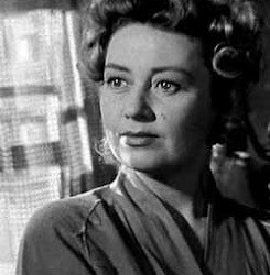
Every movie set in a carny opens the same way, with the camera elbowing through the midway, taking in the sights with a knowing eye. Sinner’s Holiday (1930), Joan Blondell’s first feature film, began this way, and so does the masterpiece of her later years, Nightmare Alley (1947). Here the camera glides over the crowd to find Blondell standing in the shadows at the back of her booth, surveying the scene. Her flowing robe, poised stillness and grave expression give her a hieratic air. Her eye is fixed on a handsome young roustabout in his undershirt, but her look is pensive rather than lustful. The wary, contained way she observes the world, and her calm unmannered presence, were with her from the beginning of her career, but here they have aged and deepened and mellowed like spirits.
She’s come a long way from Myrtle, the brassy photographer’s model of Sinner’s Holiday. Now she’s Zeena, a mind-reader, “the miracle woman of the ages” as her barker tells the gullible throng. Zeena’s act is pure hokum (she gathers questions from the audience, pretends to destroy them, and reads cues supplied by a hidden accomplice), presented with good-natured flim-flam that would fool only the most naïve. Off-stage, though, Zeena is a true believer in the Tarot, a woman of much deeper intuition and understanding than her gimcrack act suggests. Here Joan Blondell pulls off the same paradox that defined her greatest early roles in Blonde Crazy (1931) and Blondie Johnson (1932): in all these films she’s a con artist who makes her living off scams of one kind of another, yet who somehow remains fundamentally decent and even honest.
One of the links between pre-Code and film noir is their mutual obsession with dividing the world into chiselers and suckers, the wised-up and the chumps. Pre-Code movies, made at a time of mass disillusionment courtesy of the Depression, reveled in the exploits of con men, sharpies, hustlers, and maestros of ballyhoo. Films like the exhilarating James Cagney vehicle Hard to Handle (1933) depict a country where everyone is either on the make or being taken. “The public is like a cow, bellowing, bellowing to be milked,” Cagney declares, echoing his speech to Blondell in Blonde Crazy about the “age of chiselry” in which “everyone has larceny in his heart.” In the first scene of Nightmare Alley, Blondell’s Zeena listens to Stan Carlisle (Tyrone Power) as he explains why he loves the carny racket: how looking at the rubes out there gives him a feeling of superiority, a sense of being in the know, being on the inside while they’re on the outside.
She’s heard it all before. At 41, Blondell is seasoned and wise, yet still vulnerable and open-hearted—just like she was at 25. What she brought to all these movies about rackets, about schemers and saps, was the ability to put over a con and let us enjoy her triumph, yet also to express, without sanctimony, the melancholy weight of too much knowledge. As she listens to Power’s speech, all this is in her eyes and in her silence. The oily Stan is an homme fatale who shamelessly uses his wiles on the older woman, making love to her because he wants her to reveal the secret of a verbal code she and her former partner used in a successful vaudeville act. Blondell’s role could easily have been a humiliating one—as soon as Stan gets what he wants from Zeena, he cheats on her with the pretty, innocent young Molly (Colleen Gray)—but Blondell makes Zeena’s susceptibility appealing rather than pathetic. When Stan tells her she’s a “real woman” (praising her generosity to her washed-up, alcoholic partner Pete), it’s with his usual slick insincerity, but she can turn this smarmy compliment into simple truth. Zeena blames herself for her Pete’s drinking, since he hit the bottle after she cheated on him. It was Pete who said she had a heart like an artichoke, “with a leaf for everybody.” She ruefully quotes this to Stan as they drive through the night with Pete sleeping drunkenly in the back of the truck.
Wanting to pick Pete’s brains about his past success, Stan plies him with liquor, but what he learns is that even he can be suckered by a spiel. Gazing into the bottle of moonshine as though it were a crystal ball, Pete summons a vision of a barefoot boy running through rolling green hills, a dog at his side. “Yes, his name was Gyp!” Stan eagerly confirms, at which Pete reveals that it’s a stock reading that fits anyone. “Every boy has a dog!” he laughs. Much later, when Stan has followed in Pete’s alcoholic footsteps, he pulls the same trick on his fellow bums in a hobo jungle. The mind-reading racket depends on the fact that people’s memories and feelings are all pretty much the same, and nothing is more universal than the belief that one is unique.
In pre-Code, con games exploit the simplest appetites—chiefly greed—and their elaborate mechanisms rely on no profound psychology. In Nightmare Alley, Stan plays with more volatile elements: with people’s insecurities, guilt, regrets, memories, and desires. The film lays bare the irony of the mind-reading scam, in which the appearance of uncanny sympathetic understanding, a luminous glimpse into the human heart, is just a ruse to bilk money out of suckers. Stan eventually teams up with a cruel, manipulative psychiatrist, who practices the same sort of racket under the cover of science. In the book by William Lindsay Gresham from which the film was adapted, the key to Stan’s character turns out to be a textbook Freudian revelation, his sexual desire for his mother. Forced by the Production Code to drop this, the film actually improves matters by replacing it with an account of his childhood in orphanages, during which he learned to cynically manipulate authority by feigning conversion and repentance. All this pretense of empathy and communication only accentuates the alienation at the heart of the story: Stan’s destiny is to become a geek, an isolated freak who has traded his humanity for a bottle a day.
The movie’s tacked-on, studio-imposed ending not only rescues Stan from his proper fate as a geek, but adds a pat moral to the story: he fell so low, a carny-owner opines, because he reached too high. What really happened was that Stan finally encountered someone who was even more skilled and ruthless than he as a manipulator of minds. But although it’s trite, the moral accords with noir’s foundational pessimism: an un-American distrust of ambition, a certainty that those who crave more, who want to make it to the “top of the world” are courting failure, destruction and death. When Zeena reads Stan’s fortune with the Tarot, his card is the Hanged Man, a figure derived from Odin, who hung upside-down from the world-tree and sacrificed an eye to gain knowledge that would make him supreme.
Movie stars are, by and large, people driven by the burning need to be “somebody,” the same drive that Robert Warshow pinpointed in “The Gangster as Tragic Hero”: to be separate from the crowd, to be “way up high where it’s always balmy,” as Sidney Falco says in Sweet Smell of Success. One reason, perhaps, why Hollywood was so good at making movies about confidence tricksters is that so many of its great stars were self-invented, bearing names that weren’t their own, inhabiting personas that were nothing like their real selves. Joan Blondell belonged to a smaller group of stars whose air of authenticity was not an act; and that burning drive to get ahead and be the best that defined the personae of actresses like Crawford and Stanwyck was not part of her make-up. Her screen persona (like the off-screen Joan) knows poverty and will do what it takes to stay off the pavements, but she’s not naturally aggressive or afflicted by restless hunger. She is, for this reason, not really a noir type, and Nightmare Alley proved to be her only stroll down noir’s dark alleys.
It’s part of Blondell’s mystery that she is compelling on-screen despite lacking that fierce need to be the center of attention. How many genuine movie stars could be plausible in the role of a stand-in, as Blondell is in Stand-in (1937)? One of the better offerings from the mass of her post-Code films, this is an off-beat movie about Hollywood that focuses on the “little people” who labor in the film industry. In the title role, Blondell plays former child-star Lester Plum (she had, in real life, started in vaudeville as Baby Rosebud), and performs a hilarious, squeaky-voiced impersonation of Shirley Temple singing “On the Good Ship Lollipop.” Having failed to establish herself as a grown-up star, Lester uncomplainingly does the standing around and sweating for a bitchy, temperamental actress, and lives in a boarding house inhabited by trained seals, their keepers, and other show-biz oddities. Her task in the film is to awaken the heart and humanity of an Asperger’s-stricken mathematician played by Leslie Howard, who has been sent west by the New York money men to assess the financial viability of the studio where she works. Directed by the underrated Tay Garnett, the film features an array of eccentric character turns, including Humphrey Bogart as a director who goes through the film toting a Scottie dog under one arm.
It’s a cut above most of her post-Code films, which took on a drearily routine quality. The problem with the movies she cranked out during the remainder of the thirties is their relentless lightweightness. They try for the dizzy comic tone of her pre-Code films, but have none of the edge or the ballast, the dark shadows under their eyes that gave those early-thirties gems their bite. The pre-Code films had a delirious exhaustion that made them tremble on the verge of hysterical laughter or sobs; the post-Code B comedies merely feel tired. In movies like Topper Returns, or her many pairings with the deliciously acerbic Glenda Farrell, Blondell is all round eyes and pearly teeth, but the scripts deny her the wounded reserve that was, paradoxically, essential to her comic presence. There’s often plenty to enjoy, and the constant stream of wisecracks in Kansas City Princess (“Your grammar ain’t fit to eat!”) is almost enough to disguise its basic insubstantiality. But something was lost, as it was for other stars like Warren William and Mae Clarke whose careers declined after the Code sanded off their edges.
Blondell struggled to find work in her middle years, partly due to her age and partly to the personal turmoil of her third marriage to Mike Todd. Strangely, she never got many of the mother roles that subsumed actresses like Mary Astor (though off-screen she was the devoted mother of two children.) Her best-known later part was as the free-spirited, scandalous Aunt Sissy in Elia Kazan’s A Tree Grows in Brooklyn (1945). Rather than matrons she tended to play older, single working women: she was Jayne Mansfield’s secretary in Will Success Spoil Rock Hunter? (1957), and in Desk Set (1957) she shares a surprising rapport with Katharine Hepburn, who never seemed more relaxed or likeable than when she and Blondell get drunk on champagne together at an office Christmas party. A work-horse to the end, Blondell put in a lot of time on television and returned to the stage, often in stock. In 1972 she published an autobiographical novel, Center Door Fancy, about her life in show business.
She had that brand of level-headedness that seems common to people who started in show biz as children, those lifers who see through every illusion yet understand better than anyone the value of illusions. Throughout her career, Blondell exemplified one definition of what good acting is: an honest con.
by Imogen Sara Smith
6 notes
·
View notes
Text
"Biancheria da letto per hotel di lusso Crescita del mercato 2021-2028|By Market Players: Frette WestPoint Hollander Carpenter Wasatch Downlite Sigmatex 1888 Mills Venus Garnier-Thibeaut Fabtex Sampedro Pacific Coast Sferra ANICHINI BELLINO DEA Hypnos Atlantic Coast United Pillow Manufacturing SafeRest GBS Enterprises Luna Mattress CRANE & CANOPY John Cotton Canadian Down & Feather ZAS Textiles GTex International "
Global Biancheria da letto per hotel di lusso Market By Type (Luxury Type,High-grade Type,Mid-range Type,Economic Type,Applicable Type), By Application (Three Piece-suit Bedclothes,Duvet,Pillow,Mattress Protectors,Other Objects) Geografia (Nord America (Stati Uniti, Canada e Messico), Sud America (Cina, Giappone, Corea, India e Sud-Est asiatico), Europa (Germania, Francia, Regno Unito, Russia e Italia) , Asia-Pacifico (Cina, Giappone, Corea, India e Sud-Est asiatico), Medio Oriente e Africa (Arabia Saudita, Egitto, Nigeria e Sudafrica) Tendenze del settore 2021-2028.
<strong> <a href=https://www.statistifymarketresearch.com/reports/luxury-hotel-bedding-market/sample-request-123747>Request For View Sample Biancheria da letto per hotel di lusso Market Report </a></strong>
<strong>Panoramica di mercato</strong>
Il report fornisce previsioni di consumo per applicazione, prezzo, ricavi e previsioni di produzione per prodotto, previsioni di consumo per regione, previsioni di produzione per regione e previsioni di produzione e ricavi. La ricerca sul mercato Biancheria da letto per hotel di lusso sarà applicabile a investitori, imprenditori, esperti del settore e varie persone. Il rapporto offre statistiche e informazioni su dimensioni del mercato, azioni e fattori di crescita dal 2021 al 2028. È stata esplorata la ricerca su diverse sezioni tra cui opportunità, dimensioni, crescita, tecnologia, domanda e tendenza di attori altamente significativi. Quindi, fornisce profili dettagliati degli attori chiave come parte del panorama competitivo del mercato Biancheria da letto per hotel di lusso. Il rapporto di ricerca di mercato globale sul valore del rapporto di mercato di Biancheria da letto per hotel di lusso stime, considerando l'applicazione e i segmenti regionali, la quota di mercato e le dimensioni, mentre le previsioni per ciascun tipo di prodotto e applicazione nel segmento. Il rapporto indaga il ruolo degli importanti attori di mercato coinvolti nel settore, compresa la panoramica aziendale, il riepilogo finanziario e l'analisi SWOT. Il rapporto è tutto fatto considerando i suoi dati essenziali nel mercato globale Biancheria da letto per hotel di lusso, i componenti essenziali responsabili dell'interesse per i suoi prodotti e amministrazioni.
<strong>Metodologia</strong>
Esperti e specialisti del settore svolgono un ruolo significativo nella creazione di strumenti statistici e modelli di ricerca, che vengono utilizzati per esaminare i dati e raggiungere un grafico accurato con risultati di ricerca altamente informativi che possono essere successivamente utilizzati per prendere decisioni davvero importanti relative al business. Le fonti di dati provengono da un gran numero di studi di ricerca e dalla nostra scheda tecnica interna. Inoltre, il report utilizza l'approccio top-down per riportare i numeri per ciascuna divisione e li attesta con l'approccio bottom-up. Tutti i fattori capaci che influenzano i mercati inclusi in questo studio di ricerca vengono valutati, elaborati ed esaminati attraverso la ricerca di base e studiati per ottenere dati quantitativi e qualitativi. Vengono utilizzati database strutturali come D&B Hoover e Bloomberg che aiutano a riconoscere la situazione competitiva dei principali attori del mercato insieme ai dettagli del profilo. Questi dati vengono uniti e combinati con input e analisi dettagliati dalla ricerca di mercato di Statistify e rivelati in questo rapporto.
<strong>Riepilogo rapporto</strong>
Questo rapporto sui Biancheria da letto per hotel di lusso supporta e fornisce i tratti globali e il modo in cui i migliori attori e marchi controllano l'industria della ricerca in termini di crescita attuale. Vari fattori sono responsabili del grafico di crescita del mercato, che sono studiati in dettaglio nel rapporto. Inoltre, il rapporto elenca anche le restrizioni che rappresentano una minaccia per il mercato Biancheria da letto per hotel di lusso. Il rapporto fornisce una conoscenza e una comprensione complete della situazione del mercato a partire dal livello iniziale.
<strong>Segmentazione del mercato</strong>
La ricerca di mercato contiene dati di mercato storici e previsionali, domanda, dettagli sull'applicazione, tendenze dei prezzi e quote societarie dei Biancheria da letto per hotel di lusso dominanti per area geografica. Il rapporto divide il mercato in diverse sottodivisioni e quindi copre l'intero mercato. La valutazione delle entrate per il mercato globale e i suoi sottosegmenti sono inoltre offerti in questo rapporto. Identifica i fattori che stanno influenzando prontamente il mercato che include le strategie e le metodologie di produzione, le piattaforme di sviluppo e il modello di prodotto. Il rapporto suddivide le dimensioni del mercato, per volume e valore, in base all'applicazione, al tipo e all'area geografica. Ulteriori informazioni sui principali leader trattati nel rapporto includono siti di produzione, specifiche e applicazioni del prodotto, produzione, entrate, prezzo, margine lordo, il loro portafoglio di prodotti/attività, quota di mercato, stato finanziario, quota regionale, entrate, analisi SWOT e strategie chiave .
<strong>Top Listed Companies in the Biancheria da letto per hotel di lusso Market Include</strong>
By Market Players:
Frette
WestPoint
Hollander
Carpenter
Wasatch
Downlite
Sigmatex
1888 Mills
Venus
Garnier-Thibeaut
Fabtex
Sampedro
Pacific Coast
Sferra
ANICHINI
BELLINO
DEA
Hypnos
Atlantic Coast
United Pillow Manufacturing
SafeRest
GBS Enterprises
Luna Mattress
CRANE & CANOPY
John Cotton
Canadian Down & Feather
ZAS Textiles
GTex International
<strong>Motivi per acquistare questo rapporto:</strong>
Fornisce un abbozzo delle imminenti opportunità di mercato, insieme alle dinamiche di mercato negli ultimi anni a venire.
È stata menzionata la ricerca qualitativa e quantitativa, compresi i risultati delle politiche economiche e i loro aspetti.
Nel rapporto sono descritte le ricerche regionali e nazionali, compresa la domanda e la catena di approvvigionamento che influenzano il mercato.
La situazione del mercato negli ultimi cinque anni, compresa la concorrenza, i nuovi team di marketing, i progetti e le azioni sono ben elaborati.
<strong> <a href=https://www.statistifymarketresearch.com/checkout/?currency=USD&type=single_user_license&report_id=123747>Do Inquiry Before Purchasing Biancheria da letto per hotel di lusso Market Report</a></strong>
<strong>La ricerca fornisce risposte alle seguenti domande chiave</strong>
Qual è il tasso di crescita stimato del mercato per il periodo di previsione 2021-2028?
Quale sarà la dimensione del mercato durante il periodo stimato?
Quali sono le principali forze trainanti responsabili di plasmare il destino del mercato Biancheria da letto per hotel di lusso durante il periodo di previsione?
Chi sono i principali fornitori di mercato e quali sono le strategie vincenti che li hanno aiutati a occupare un forte punto d'appoggio nel mercato Biancheria da letto per hotel di lusso?
Quali sono le principali tendenze del mercato che influenzano lo sviluppo del mercato Biancheria da letto per hotel di lusso in diverse regioni?
<strong>Analisi regionale</strong>
Aree distintive in tutto il mondo, ad esempio, Nord America, America Latina, Asia-Pacifico, Europa e India sono state sezionate in base alla base di assemblaggio, alla redditività e ai ricavi netti. Questo rapporto di Biancheria da letto per hotel di lusso indagini statistiche è stato esaminato sulla base di varie analisi contestuali organizzate in modo pragmatico da diversi specialisti del settore e responsabili delle politiche. Utilizza vari metodi di introduzione grafica, ad esempio tabelle, diagrammi, grafici, immagini e diagrammi di flusso per una comprensione semplice e migliore degli utenti. Sono state esposte diverse variabili interne ed esterne che sono responsabili di guidare o controllare il progresso delle organizzazioni. Per trovare le porte aperte in tutto il mondo sono stati incorporati vari sistemi per espandere rapidamente i clienti.
<strong>Personalizzazione del rapporto:</strong>
Vengono utilizzati approcci di ricerca primari e secondari insieme a varie tecniche metodiche al fine di produrre un rapporto soggettivo. Forniamo report personalizzati con uno sconto del 25%.
<strong>Benefici:</strong>
1. Informazioni ben aggiornate.
2. Rapporto statistico fornito.
3. Offerta di sconto nella personalizzazione.
4. Servizio a livello globale.
5. Rapporto di ricerca della società fornito.
<strong>Servizi:</strong>
1. Analisti esperti al tuo servizio.
2. Servizio in base alle tue esigenze
3. Liquidazione delle vostre domande.
4. Servizio per l'intera giornata
5. Rapporto ben aggiornato.
<strong> <a href=https://www.statistifymarketresearch.com/luxury-hotel-bedding-market>Full Report Summary of Biancheria da letto per hotel di lusso Market </a></strong>
<strong>Informazioni sulle ricerche di mercato di Statisify</strong>
Statistify è una società di ricerche di mercato che offre un'ampia indagine sul settore della ricerca. L'azienda incoraggia i suoi clienti a creare strategie di business e raggiungere uno sviluppo sostenibile nella sua particolare area di mercato. I valori incorporano la soddisfazione del cliente e la riservatezza insieme a mezzi di trasporto opportuni. Statistify Market Research (SMR) è una società di ricerche di mercato e consulenza con sede in India. Adottando ampie metodologie di ricerca, SMR è determinante nell'aiutare i suoi clienti a prendere decisioni aziendali strategiche e raggiungere una crescita sostenibile nei loro domini di mercato. Siamo dotati di analisti ed esperti qualificati e abbiamo una vasta esperienza di lavoro con molte aziende e piccole e medie imprese.
<strong>Company Name - Statistify Market Research</strong>
Office Address - 156, Sector 9 Vasundhra Aptts Rohini,
New Delhi 110085 IN
Telephone Numbers - (+44) 162-237-1047 (+44) 162-237-1047
Email ID - <a href="mailto:[email protected]"><strong>[email protected]</strong></a>
Contact Us – <a href="https://www.statistifymarketresearch.com/contact-us/"><strong>https://www.statistifymarketresearch.com/contact-us/</strong></a>
0 notes
Text
Steve Aoki & Alberto Candiani Closing Speakers Fashinnovation Worldwide Talks - June 8

Two-time Grammy-nominated DJ/producer, fashion designer, and entrepreneur Steve Aoki and denim master Alberto Candiani, owner of the Candiani Mill, will be the closing speakers of the 2nd edition of virtual global fashion sustainability summit “Fashinnovation Worldwide Talk 2020” on June 8th (World Oceans Day). The talk follows the debut of their first collaboration DIM MAK x CANDIANI EC-01, crafted with ReGEN Denim, a water-saving and more sustainably made jean, hand-painted by Aoki and his Dim Mak artisans.
Friends for over 10 years, Aoki and Candiani combine forces in a conversation sharing their passion for creating music and supporting responsibility for our planet on June 8, 2020 at 6:30PM EDT. The duo join 90 inspiring leaders, a community of powerhouses, international business leaders, founders, entrepreneurs, fashion designers, innovators, influencers, artists, CEOs over the course of 2 full days. The event is expected to be watched by 2 million people, from all around the world (150 countries) assembled virtually to discuss important topics in the “Fashion Industry” during COVID-19, with the inclusion of Solidarity for Social Justice & Injustice and Equality, with the support of the United Nations Office for Partnerships & the Conscious Fashion Campaign.
Quote from Jordana & Marcelo Guimaraes, Co-Founders of Fashinnovation:
We are really excited that fashion industry collaborations are being formed with intersecting industries, which is a great way for new thinking as well as sharing knowledge with the general consumer who may not be so adaptable to fashion but can bring those thoughts into their reality - allowing smarter buying decisions to improve the environment via ways of sustainability.
MORE INFORMATION ON THE DIM MAK x CANDIANI EC-01 JEAN:
Completely made in Los Angeles with fabric created by globally-recognized Candiani Denim and hand painted by Aoki and his Dim Mak artisans, the ECO-1 jean ($150.00) is available on www.DimMakCollection.com and the Dim Mak App available on iTunes and Google Play.
● Crafted with ReGEN Denim - a statement indigo selvedge fabric created for the 80th Anniversary of Candiani Denim - the EC0-1 jean is made without using any fresh cotton. The exclusive fabric is composed of equal parts recycled cotton, made from the mill’s own production waste, and REFIBRA™ Technology, a recycled fiber created by Lenzing using cotton waste.
● The ReGEN material won the ITMA Sustainable Innovation Award in 2019, the most prestigious award in the textile industry.
● The distressing, vintage-effects, and even the artwork itself was created by using lasers to gently burn the fabric’s surface with varying degrees of intensity.
● The yarn is dyed using Candiani’s water-saving Indigo Juice® and Kitotex® technologies which enhance the custom laser treatments that give the jean its signature look. The whole process of creation allows for incredible savings in terms of water, chemicals and energy without compromising the aesthetics, performance and durability of the final product.
● In the hands of Dim Mak, the EC-01 jeans have a deconstructed pop art meets manga aesthetic which has evolved from Dim Mak’s ‘AOKI 1of1’ series, where Steve Aoki, the multi-platform, modern day renaissance man has been upcycling clothing and making original, one-of-a-kind wearable art pieces.
● At the Candiani Design Innovation Center in Los Angeles, Aoki chose hardware and learned about denim treatments and processes before adding another very personal touch to each pair – Japanese Yōkai, demons including the misunderstood Rokurokubi, the mischievous Karakasa kozō, and monstrous Gashadokuro. These were individually hand-painted with the help of Dim Mak’s artists at Aoki’s Las Vegas home, where Aoki has a design and recording studio.
0 notes
Text
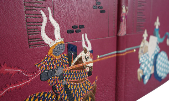
“Knights” Binding
Sorry for the blog silence, I've just moved house (no mean feat with two under twos!) and I am now living in Bristol. This is a stop gap on our way into Somerset and country life, we have downsized and therefore my studio is temporarily residing in a storage unit down the road.
I am taking an enforced break from the physical act of bookbinding in order to take care of Ivy and Winnie (however it is impossible to switch my creative thoughts off during this time!) and I hope to take this opportunity to also catch up with the digital side of my life. For months I have been meaning to sort out my computer as have about a million baby photos to sort through, files duplicated numerous times and/or in the wrong order, photo editing to do for my website as well as numerous other onerous tasks.

I am also due to take on a new role come September, I will be the Project and Events Manager (PEM) for Designer Bookbinders so want my files to be in order before then. The PEM is the switchboard for information coming in from DB members and going out to the public. I therefore need to be completely up-to-date with all DB and other select bookbinding-related activities including dates for meetings, workshops, fairs and competitions. I will be responsible for publicising the above whilst trying to gain a stronger international presence for the society - watch this space for further updates on the role once I get started!
Before moving I managed to complete two bindings, it was great to draw a line under these before packing up my workshop. These were two books that unfortunately got delayed by my two pregnancies and although were started many (many) months ago laid dormant for quite a while. I am very thankful to my clients for being so patient and understanding during this time and was pleased to be able to hand over both in person before leaving London. The final task with regards both of these bindings is to write a blog post about each starting as follows...
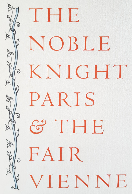
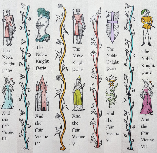
The first of these bindings was an 1956 Allen Press publication of, “The Noble Knight Paris and Fair Vienne”. The book is a romance of thirteenth-century France which was regarded as the most popular story of medieval times.
Inserted into the original book was a promotional leaflet about the publication from 1956, with details about the text block as follows:
_______________________________________________________________________
ANNOUNCING A NEW BOOK
The Noble Knight Paris and the Fair Vienne, Translated out of French by William Caxton
This edition, limited to 130 copies, has been produced by hand and is being published by the Allen Press, the private press of Lewis and Dorothy Allen, Kentfield, California.
The text of Paris and Vienne is a romance of thirteenth-century France, and was regarded as the most popular story of the middle ages. Although often copied in manuscript, and frequently printed in the fifteenth and sixteenth centuries, there are few romances so rare as this one. From the original Catalane language, it was translated into Latin, French, Flemish, Italian and English. A noted seventeenth-century critic stated that “it would be impossible to find a work more fitted to imbue the mind with correct taste and elegance of style, or to influence character by the wisdom of its reflections, or to forearm hearts against those assaults of fiery passion which blindly precipitate one into the abysses of misery. The work is truly admirable. The situations are so interesting and the dénoument is so happy, that their conception would reflect honor on the best writers of the most renowned ages.”
The only known copy of Caxton's printing (1485) is in the British Museum; the present edition is based on that copy.
The Allen Press is pleased to offer this important and delightful romance in a hand-made book of the finest materials and craftsmanship. The book was set by hand in the handsome Romanée types designed by Van Krimpen for the Enschedé foundry in Holland. The paper (printed damp) we believe to be the most distinguished sheet produced in modern times. It is named Val de Laga, and is from the Richard de Bas mill in France; this mill has provided hand-made paper continuously since 1326. When we wrote to the manager in Paris to question the high price, the reply was this, “Unfortunately, you have correctly heard the price of our fine paper. I do not know how expressing myself, but our old mill is not a 'commercial affair,' it is a 'thing of beauty' as said Keats, and our paper costs to us much than we sell it (we make only three hundred sheets a day!). That mill was founded in 1326 and we have no changed the process of fabrication. Every sheet costs much time: that is why it is dear and beautiful as not other one.”

The book was printed on Acorn-Smith handpress which was made in Philadelphia about 1830. On every page there are wood engravings by Mallette Dean; each (122 per book) has been hand-coloured by Dorothy Allen. There are approximately one hundred pages, 11 by 8 inches. The binding consists of an Invicta parchment spine, and sides of French paper decorated with wood engravings. The books are enclosed in slip-cases covered in the paper of the binding,
The publication date is May 15, 1956. On advance, PREPAID orders, a special price of $18.50 has been set. After May 15, the price will be $20.00. Because there are only 130 copies, we respectfully suggest that orders be mailed promptly.
The Allen Press 516 Woodland Road Kentfield California
_______________________________________________________________________
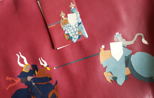
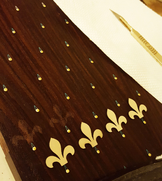
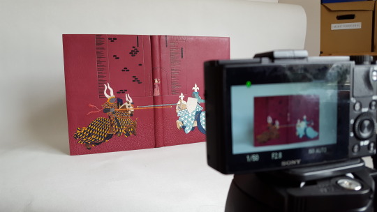
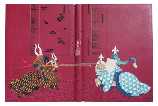
The book is a love story and I was taken by the idea of Paris the Knight jousting against his rivals for the admiration of Vienne. I thought that this would create a strong design and I could place the characters so that they would mirror well across the cover; Paris appearing on the front cover and his rival on the back with the jousting poles crossing the spine.

Quoted from the text, "Alle other knightes there were knowen by their armes, but the two white knights were unknowen...Said Vienne, yonder two white knightes that bear no armes on their sheldes are more to my fantasie".
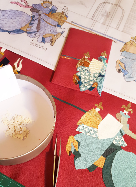
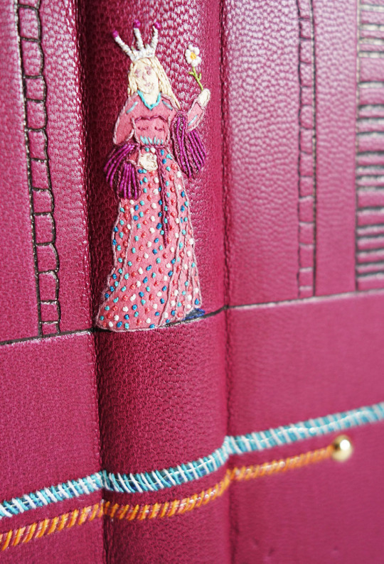
Paris bore no arms on his shield therefore I decided to depict him with a plain white shield - in the story he goes on to win a crystal shield and a gold garland of flowers, presented to him by Vienne. On the cover design I drew her on the spine section - the same image as that taken from the wood block print in the text block. I placed her standing in the doorway to her castle, the castle being a much larger version of the wood block print that also features in the text block. The outline of this castle I planned to carbon or blind tool, with Vienne embroidered in colour.
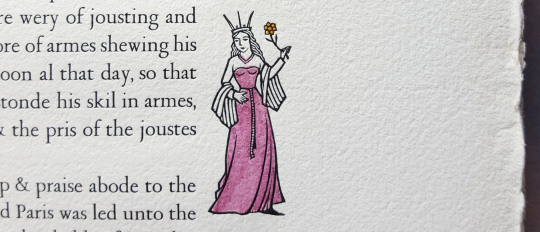
When it came to choosing the colour palette, the wood block prints in the text block were hand-coloured in pastel tones so I wanted this to follow through into the cover design. I had a lovely pink/purple Pergamena skin in my leather drawer that I chose to cover the book in and selected the leather onlays to go with this.
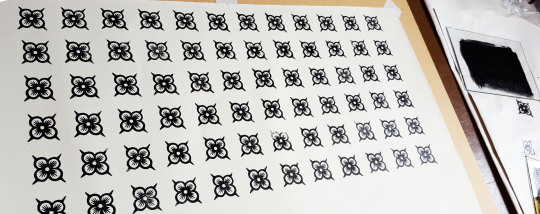
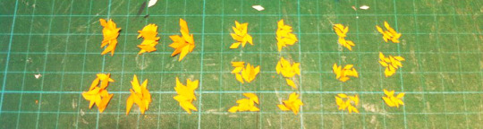
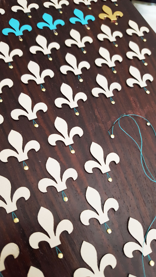
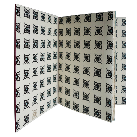
The woodblock prints were also my inspiration for the endpapers and doublures. I used the leaf and floral elements from the illustrated vines to carve some lino stamps, much larger than the originals.
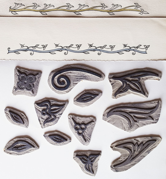
I didn’t originally have a vision about the pattern I was going to print these in so did some tests using an ink pad and some paper. It turned out that using all of the stamps together appeared too fussy so in the end I used just one to create a gridded repeat pattern. I felt that this worked better with the cover design, as the fabrics of the horses were repeat patterns too.
I used an oil-based ink, Intaglio Printmaker Black Litho/Relief Ink, for the printing. These inks are recommended for block printing but are slow drying so I had to do this a few days ahead of the forwarding.
Given the leaflet that was included with the text block detailed the quality of paper used for the original binding I felt it important to get something as close as possible to that for the endpapers and doublures. I took one of the sections into Shepherds in London and found a very suitable match, both in weight and colour:
Ruscombe Mill 1840's Wove - 110gsm (RM184W11)
“This range was conceived to match European papers. These papers are available in 65 & 110 gsm and are made in both laid and wove versions. The papers are manufactured from cotton and flax, have four deckle edges and conform to archival standards.”
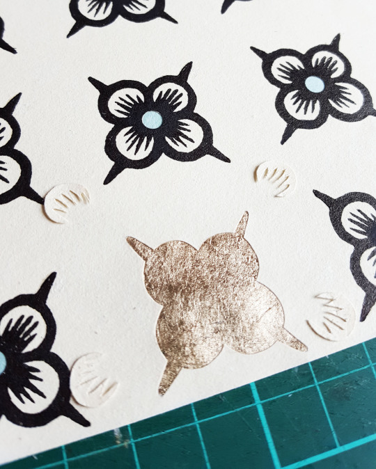
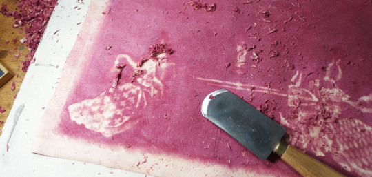
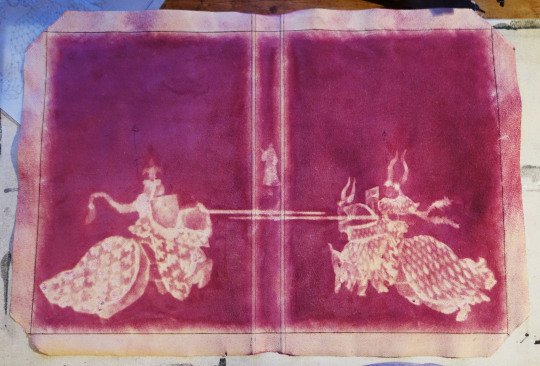
Once the ink was dry I punched out the centres of each of the flowers with my Japanese hole punch and stuck a circle of coloured paper, slightly larger in size, to the reverse of the hole with some PVA.
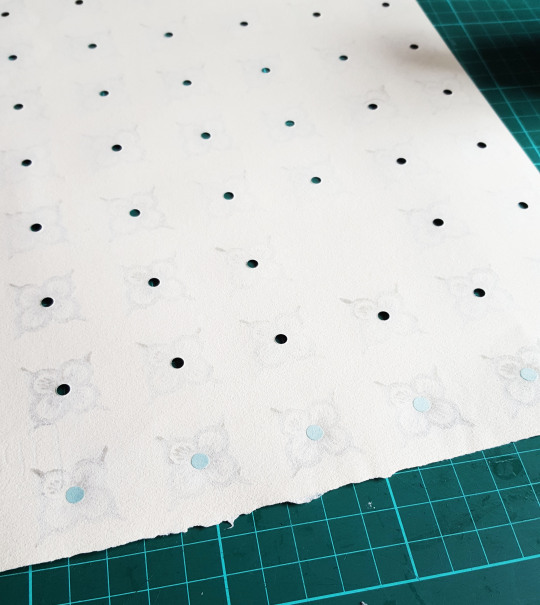
I also chose one flower on both the front and back doublures to back with gold leaf. Firstly I carefully pierced around the outline of the flower and then backed the hole with Moon Gold leaf that I had adhered to Japanese tissue in advance. This really caught the light and added a satisfying visual change in comparison to all the other black flowers.
Once the endpapers were made up and sewn to the text block the book could be rounded and backed with a backing hammer. The spine was then lined with linen, leather and a hollow. The text block had deckled edges on the foredge and bottom of the pages which I kept but I sanded the top edge flat.
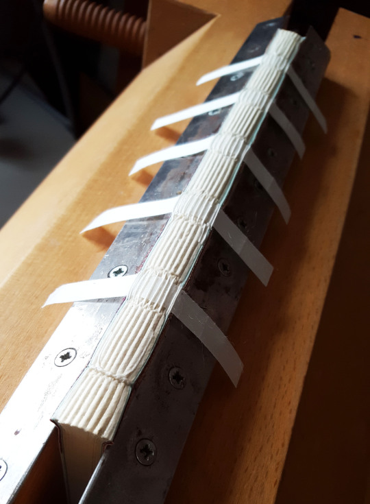
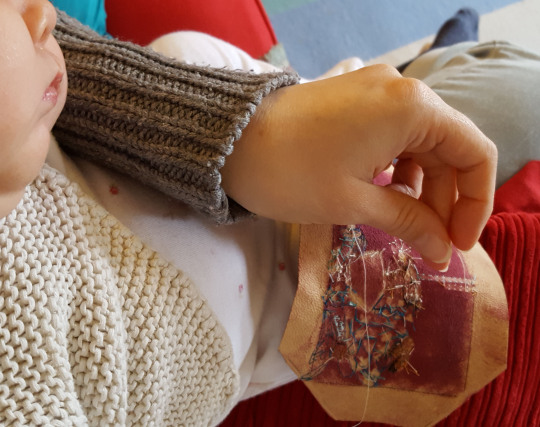
Once the book had been rounded and backed I sewed the endbands with colours to match the cover design and then laced on the boards. At this point it was possible to mark out the exact size of the book and cut the leather (yes, that is a newborn baby in the sling asleep whilst I work!).

As with all of my bindings I make a sample board ahead of working on the book leather to test out colours and stitches (this board comes in at number 50!). On a photocopy of the cover design I spent a while working out a colour chart for my onlays. Unless they really are too tiny to do anything with I rarely throw any of my leather scraps away so I have boxes of odds and ends to work with - perfect for a job such as this.

I first set about sticking onlays down onto the sample board leather. This included some alum-tawed leather for the white of the shield and fleur-de-lis on the cloak of the horse.

I also used some of the Moon Gold leaf I had stuck to Japanese paper for the head pieces of the knight and horse.

Once these were stuck down and the onlays back-pared I was able to start on the embroidery. I used a combination of different stitches to build up the design, pricking through the leather with a bodkin into some foam so I then knew where to place the stitches.

The embroidery stage of the binding is the bit I enjoy the most, in fact I find it quite therapeutic. It was also quite possible to achieve whilst sitting with a sleeping baby on my lap!
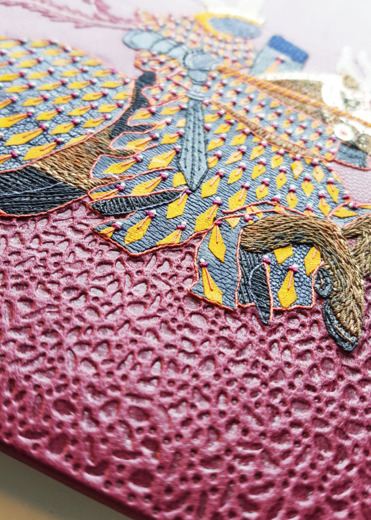
The white alum-tawed leather of the shield was given some texture with cross-hatched stitches in a thread of the same colour. I also built up the fur of the horse using small stitches in a variety of colours.
Once the embroidery was complete it was then time to stick it to the sample board. I always find it interesting to observe and capture the back of the piece before it goes onto the board/book as it will never be seen again!

It was then time to work on the leather for the actual book starting with glueing down the onlays. To ensure I get these in the correct place I work through a tracing paper template that I stick in place on top of the leather so it can be lifted up and down whilst adhering down the small leather pieces.

I worked on the larger block pieces first, building up the onlays layer by layer as I go trying to ensure there is not too much of an overlap between each piece.
Once the larger pieces were down it was time to cut out and stick down the smaller onlays to make up the pattern of the outfit material of the horses and the knights.
Lots and lots of tiny onlays later.....
...the glueing was done and they were stuck down in place. I cut out three different sizes with the smallest glued at the top and the largest at the bottom.

And finally the onlays for Vienne were added to the spine.

The leather could then be pared. Firstly the edges were first run through a Brockman down to 0.4mm and then the “step” was taken off using a French paring knife. The main body of the leather was then back-pared using the knife, ensuring I vacuumed away the leather dust at regular intervals so as not to get any trapped under the leather leading to thinner patches being pared in the wrong places.
The joints of the leather where the boards were to hinge were sanded over a rounded edge to remove some of the thickness. It was then further pared in these areas when flat with my French paring knife to graduate the thickness.

I find it quite satisfying when you start to see a sort of “halo” image from the front coming through on the reverse of the leather in amongst all of the leather dust - this was the final result!
Along with my little “helper”, Winnie, the embroidery of the leather then commenced. I try and work on the outlines first and then build up the detail second, working through colour by colour. In order to access the part of the leather that I am embroidering I coil up the leather and fix it into a tube with bulldog clips at each end. The leather is too thick to use an embroidery hoop with but I find this works well and makes it more manageable.

Further to how I did the shield on the sample board I added French knots to the cross-hatching on the book cover to add a bit more textural detail. One of the main reasons I do a sample board is to help to visualise what the book is going to look like and I often embellish the actual book leather further than than of the board.

French knots and linear stitches were also added to the diamonds on horse number one.

Yet again, the back shows the random nature of the stitches in comparison to the front - how the thread passed its way around in order to create the cover detail. This will be forever concealed once the leather is on the binding...
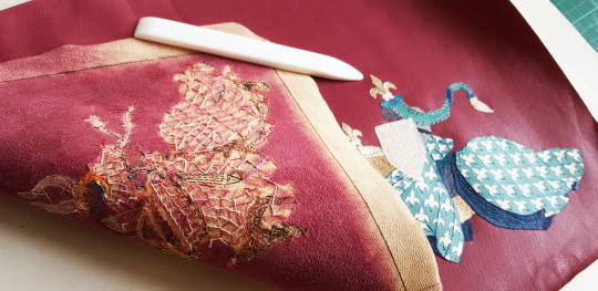
It is always a satisfying feeling to have finished the embroidery but then a slight feeling of trepidation steps in having to get it onto the binding!
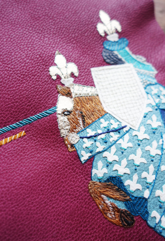
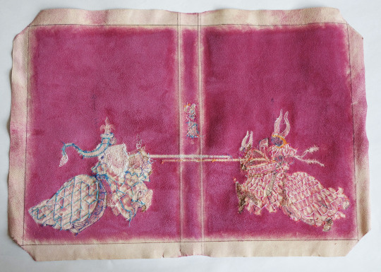
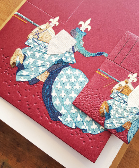
The completed embroidery on the front:

The completed embroidery on the back:
The book was then covered with the leather - definitely a stage of the process when I made sure the baby was elsewhere so as not to be disturbed during this crucial time! I dampened the front of the leather using a water spray before pasting out the back three times with paste. After covering I waited for it to dry for a good 24 hours before putting the leather joints down.

I then moved onto the tooling of the binding. The castle outline was first blind-tooled with pallets before filling in the lines with carbon. I used hand-made finishing tools to blind tool some texture beneath the horses and knights. These hand-tools often make an appearance in my bindings and have been a very useful little set to have made.
I was very pleased with how this tooling worked out, adding a visual difference to the bottom half of the leather, as shown in detail below.
A small amount of Moon Gold was also tooled onto the fleur-de-lis of the Noble Knight Paris’ horse.

And then the book was held in a finishing press in order to tool the spine.
I had visions of the box of this binding ahead of working on it. A number of years ago I bought some planks of ebony, I think they were actually being sold for instrument making. I thought that the rich, dark colour of the ebony would work really well as the container of this binding so dug it out. The planks I had weren’t quite wide enough to make a solid lid so the panels were “book-matched”:
“Bookmatching is the practice of matching two (or more) wood or stone surfaces, so that two adjoining surfaces mirror each other, giving the impression of an opened book. As applied to wood, bookmatching is usually done with veneer (produced in one of several ways), but can also be done with solid wood”. Wikipedia
I wanted to carry over the fleur-de-lis pattern from the cover design onto the box and decided a good way of doing this would be to get a series of these laser-cut. I know a wonderful jeweller called Emily Kidson who uses Formica laminate in her work. She gave me some pieces a while back to try out and this seemed a perfect opportunity to have a go with it. I also had some wood veneers in my drawers so had some cut in this too.
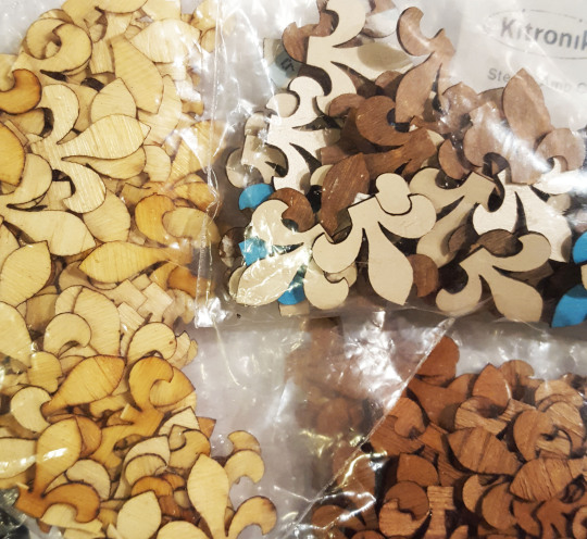
I was really pleased with how the laminate fleur-de-lis looked when I got them back and set about working on how to place them on the box lid.

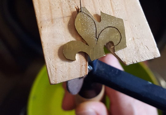
I also wanted to include one gold-plated fleur-de-lis so pierced the same shape from brass sheet. I then soldered some posts to the back of it so it could be physically fixed into the box lid.
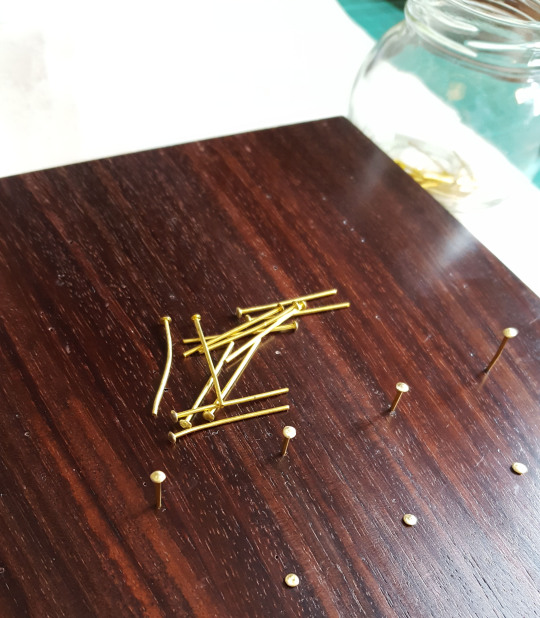
As well as the fleur-de-lis I want the jousting poles of the knights to be made from metal. I rounded the ends of some brass rod with a file, then removed the file marks with wet-and-dry paper before cutting the rod down. I then soldered these ends onto some posts - the smaller of the three circles was for the sample board.

I then had all these metal pieces polished and plated with 2 microns of gold.
The ebony was finished with Danish Oil and then a layer of bees wax. Under where each of the fleur-de-lis were to be placed on the lid I drilled some holes and pushed through brass pins.
The heads of which were wound with a length of thread to add some detail with the ends of the threads being glued in place inside the lid.
Because the box had been oiled and waxed, I needed to abrade behind where they were due to be stuck down in order for the glue to have something to bind to. I cut out a paper template of the fleur-de-lis and used this through which to score the wood with the end of a scalpel blade.

The laminate fleur-de-lis could then be stuck down with PVA, a few at a time, and a weight placed on top of the whilst the glue dried.
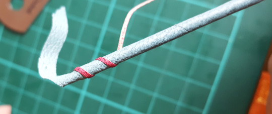
As a change from shop-bought catches, for this particular box I wanted to add an additional element in the form of a jousting stick to act as a clasp. I first covered some thin brass tube with Japanese paper using Lascaux Acrylic Adhesive. This glue is extremely elastic with the dry film remaining permanently tacky. It is great for adhering paper to non-porous surfaces such as metal so was perfect for the job.

Once there was a layer of Japanese paper adhered to the brass I had a suitable surface upon which to stick a leather layer to it. I first wound a strip of turquoise leather along the length with PVA and then stuck a thinner strip of purple leather on top of this around the join along the whole length.
I stuck a bead on the tail end and had the “handle” end machined to my dimensions. Each of these two ends had a pin attached to it that was glued inside the brass rod. The jousting stick then had to have an tubular attachment made to be fixed to the box for it to feed through and close the container.
This was made by soldering some flat sheet to some brass tube, the inner diameter of which fitted the end of the turned brass jousting pole handle. This was then cut in two and one half of each drilled and pinned into a chiselled groove on the top/bottom of the box. When the lid was closed they married up and the jousting pole could be slid through it therefore holding the box closed. A second tube of the same specification was added a bit further down for the beaded end of the pole to sit in. These pieces were also covered in thin leather.

The box was hinged and then lined with felt, mainly to protect the book, but also to conceal the pins and thread that were visible inside the lid of the box.
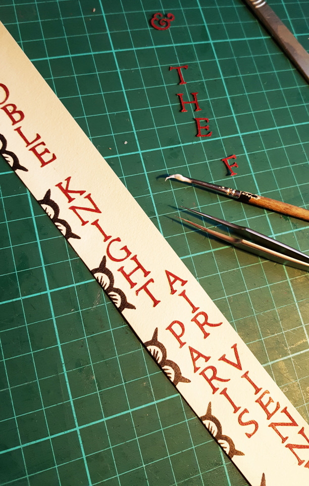
I have now made it common practice to order each of my bindings and accompanying wooden boxes a conservation grade box to be housed in. I order these from the Bodliean Library and label them so they can be identified on a book shelf. The letters for this outer box were cut from the title panel for the ebony box, therefore the offcuts weren’t wasted.
And so comes to an end the making of this binding! But not to the work surrounding it as I had to photograph and catalogue the book for my website.
I have a new website in the making at present by my husband George therefore this will be one of the last to appear on my existing site. With that however comes a lot of work as I assess what from my old site makes the cut to the new one.
I will also be amalgamating this blog onto it so I no longer have so many different platforms to publish things on! I will however have a bit of a cross over where my posts will appear simultaneously on both for a while until the change happens for good.
I will leave you with a few select photos of the final piece in all it’s glory, for more please visit my website.
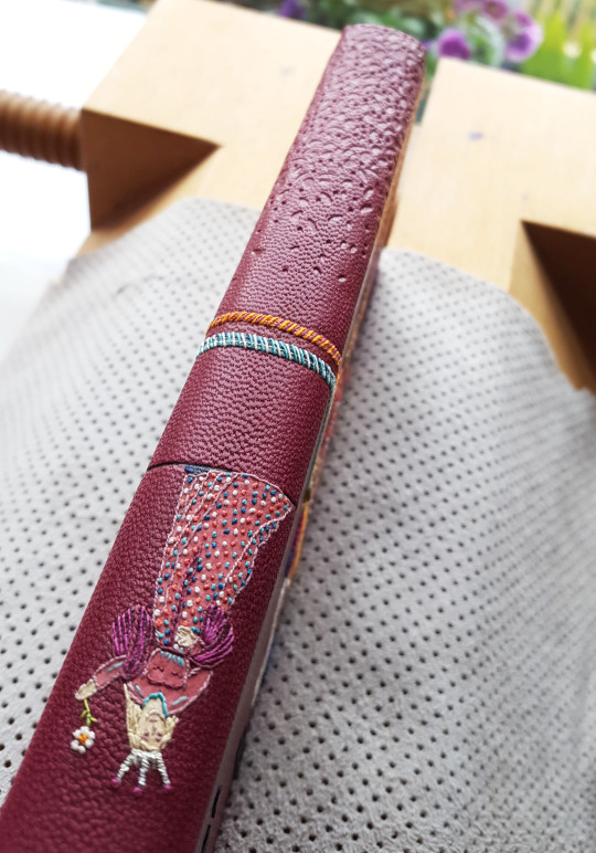
FRONT COVER:
ENDPAPERS AND DOUBLURES
SPINE DETAIL OF VIENNE:
COVER DETAIL:
BOOK IN BOX:

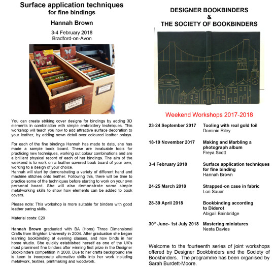
On an end note, if you are interested in making your own “sample board” I am due to teach a class for the DB/SoB joint workshops in February next year in the beautiful Bradford-on-Avon, details can be found on both the DB and SoB websites over the coming weeks.
#bookbinding#designer bookbinders#society of bookbinders#embroidery#soldering#jousting knights#knights#jousting#leather#linoprint#shepherds#ebony#bookmatched#laminate#formica#teaching#sampleboard#paring#romance#printing
43 notes
·
View notes
Text
Professional Text // Corrected
Collection 1 “Painted Skin Ghost Story”
Name Yingqi Xu
Insta moushisi14
Background
“The Painted Skin” is a short ghost story by the Chinese writer Pu Songling, collected in "Strange Tales from a Chinese Studio” in 1740. The plot is about a ferocious ghost dressed in a painted skin who pretends to be beautiful. The amative scholar, called Wang, took her home and, later, she killed him and ate his heart. After that, the priest killed the ghost and asked Wang’s wife to beg for a heart and, finally, Wang was back to life.
Pu Songling (Chinese: 蒲松齡, 5 June 1640 – 25 February 1715) was a Qing Dynasty Chinese writer, best known as the author of “Strange Stories from a Chinese Studio” (Liaozhai Zhiyi).
Pu was born into a poor merchant family from Zichuan (淄川, in Zibo, Shandong). At the age of 18, he received the ‘Xiucai’ degree in the ‘Civil Service Examination’; it was not until he was 71 that he was awarded the ’Gongsheng ‘degree for his achievement in literature rather than for passing the Imperial examinations.
He spent most of his life working as a private tutor, collecting the stories that were later published in “Strange Stories from a Chinese Studio” in 1740. Some critics attribute the Vernacular Chinese novel “Xingshi Yinyuan Zhuan” to him.
Liaozhai Zhiyi (Liaozhai; Chinese: 聊齋誌異; Wade–Giles: Liao²chai¹ chi⁴yi⁴), translated variously as “Strange Tales from a Chinese Studio “or “Strange Stories from a Chinese Studio” is a collection of Classical Chinese stories by Pu Songling comprising close to five hundred "marvel tales” in the zhiguai and chuanqi styles which serve to implicitly criticise societal issues then. Dating back to the Qing dynasty, its earliest publication date is given as 1740. Since then, many of the critically lauded stories have been adapted for other media such as film and television.
The main characters of this book apparently are ghosts, foxes, immortals, and demons, but the author focused on the everyday life of commoners. He used the supernatural and the unexplainable to illustrate his ideas of society and government. He criticized the corruption and injustice in society and sympathized with the poor. Four main themes are present in Strange Stories.
The first is a complaint about the skewed feudal system. The author argued that many officers and rich people committed crimes without being punished, because they enjoyed the privilege and power granted to them by the government, purely by their status and/or their wealth. This theme can be found in short stories such as “The Cricket”, “Xi Fangping”, and “Shang Sanguan”. It is fairly clear that the author presents the feudal government, skewed and unfair as it was.
Secondly, the author revealed the corrupt examination system at the time. Pu had taken imperial exams and discovered that the exams were unfairly graded. He postulated that many students cheated and bribed examiners or the grading officers. The education system, thus, became pointless in Pu's eyes, as it had destroyed the scholars’ minds and ruined their creativity, as illustrated in such stories as “Kao San Sheng”, “Ya Tou” (The Maid), and “Scholar Wang Zi-an”.
Pu's third theme was a clear admiration of pure, faithful love between poor scholars and powerless women, writing many stories about the love between beautiful and kind female ghosts and poor students to illustrate the allegory. The author highly praised women who took care of their husbands’ lives and helped them achieve success, as can be found in chapters such as “Lian Xiang”, “Yingning” and “Nie Xiaoqian”.
Lastly, Pu criticized the people’s immoral behavior and sought to educate them through Strange Stories. He embedded Confucian-styled moral standards and Taoist principles into parables; some examples are “Painted Skin” and “The Taoist of Lao Mountain”.
https://en.wikipedia.org/wiki/Pu_Songling (accessed 7.9.18)
Collection 2 “Lost Boys”
Elisha Hill-Wood
Instagram
Design account: elishacorinnemenswear
Personal account: elishacorinne
Portfolio
www.elishacorinne.com
Background
Elisha Corinne is a Menswear Designer from the South West of England who completed a BA with Honours in Fashion Design at Birmingham City University in 2018.
Elisha's debut collection is a clear representation of her personality as a designer, focusing on detailing, colour and print combinations and the use and mix of fabrications and other materials. Deciding to explore her interest of travel through famous expeditions and explorers, which eventually lead her to historic and modern-day fishermen.
Oversized and paper bag silhouettes combined with longline fishermen jackets and straight leg trousers created a well rounded and considered collection. Combining opposing details in knitted textiles such as polished hand knitted cables with ragged fringing created new exciting designs. Mixing ready-to-wear garments with showpieces created a visually strong yet wearable collection.
During the Birmingham City University preview show at the Birmingham Museum and Art Gallery in February 2018, Elisha was selected by a panel of industry professional judges to take part in and represent Birmingham City University at Graduate Fashion Week 2018. Elisha has received some press following the annual four-day event at London's Old Truman Brewery, including being featured in two online magazines, Sagaboi '10 Designers To Watch From Graduate Fashion Week' and Bricks Magazine 'Our Favourite Looks From Graduate Fashion Week'. As well as sent samples from her graduate collection to Belgium and Switzerland for artist Coely to wear during her performances at festivals across the summer.
Collection
Elisha Corinne's debut collection titled 'The Lost Boys' came from her interests into travel and exploration of new places. Shackleton's famous Antarctic voyage first inspired this story with influence from the equipment, clothing and surrounding environments. This influenced Elisha to look into historic and modern-day fishermen. Wanting to make her collection more personal, Elisha interviewed a couple of men who were fishermen in her local area of Bristol. Which led her to The Black Rock heritage site in Wales.
During the design development process, Elisha wanted to distort the normal shapes and silhouettes of garments. Enlarging and folding trousers and classic shirts, then pairing these with fisherman inspired silhouettes creating a well-considered collection. Elisha developed her collection by combining different fabrics such as twills and oilskins with original bold check designs. Wanting to add more texture to her line up, Elisha incorporated hand knitted cable textiles with ragged fringing. Influenced by traditional Guernsey jumpers and fishing knots, creating a modern take on perfected cable knits. For this collection, Elisha created classic sou'wester hats in her own prints and water resistant oilskins to elevate particular looks in her collection.
From visiting The Black Rock heritage site in Wales and collecting original materials and research, this informed and inspired the majority of Elisha's bold colour palette, texture, prints, and silhouettes. 'The Lost Boys' being a clear representation of Elisha's personality as a designer, mixing ready-to-wear garments with showpieces creating a visually strong yet wearable collection.
Fabric information and pricing
Dry Oilskins £22 pm from Merchant and Mills
Heat Press Printed Matte Oilcloth from Contrado 5 meters £257.25
Digitally Printed Cotton Twill - price varied depending on amount brought from Contrado
Textured Cotton Elastane £18 pm from The Cloth House London
Sirdar Cotton Rich Aran yarn £3.50 per 100g ball from Knitwell
6mm Macramé Bleached White Rope £15.95 per reel from Whimsy Designs on Amazon
Styling - Lucy Hawksworth
Photographer - Alexander Batdepat
Model - Ludovic Jean-Francois
--------------------------------------------------------------------------------------------------------------------------
Note from the tutor:
This is for use as a final text. If you opt for this as your final text you are working to a professional level.
You will be able to complete techniques such as:
· Kerning
· Reducing hyphenation
· Deleting orphans and widows.
· Typographic hierarchy
· Spell check and grammar
· Glyphs
· Paragraph breaks
· Rules (keylines)
ADDITIONAL
· Credits for photography/models/designers
· Pull quotes
· Organise the flow of the work
· Delete or add to copy
· Increase the photography content using stock images (or your own)
· Break the rules now you know them!
· Add in logos such as Instagram
· Be creative with folios (page numbers)
· Consider page breaks
· Consider more advanced experimental layouts
· Add in your own sketches to the designs
· Check the designers online profile – add more content in (image wise)
· Pricing next to garments for collection 2
· Are all images the correct resolution and mode?
(RES: 72dpi or 300dpi?) (MODE: Should they be RGB or CMYK)
Always credit the photographer/model/fashion designer/add your name in as the graphic designer.
TAS will be showing your work to the fashion designers involved…this could be the beginning of a bigger collaboration for the future. Your work will be exhibited at BCU
TAS sourced extra copy for Collection 1 as the fashion designer is in China and has limited time (you have to be resourceful!)
0 notes
Last Seen Blogs

im-the-evilqueen-in-this-story
I'm the hero of my story.

on-my-throne-of-books
Pink is Punk


shire-witch
Creative Blurbs from an Angsty Artist

on-art-restoration
Le Art Restoration Blog