“Our job is to imagine and develop fascinating Mobile, Social & Web Applications.“
Don't wanna be here? Send us removal request.
Text
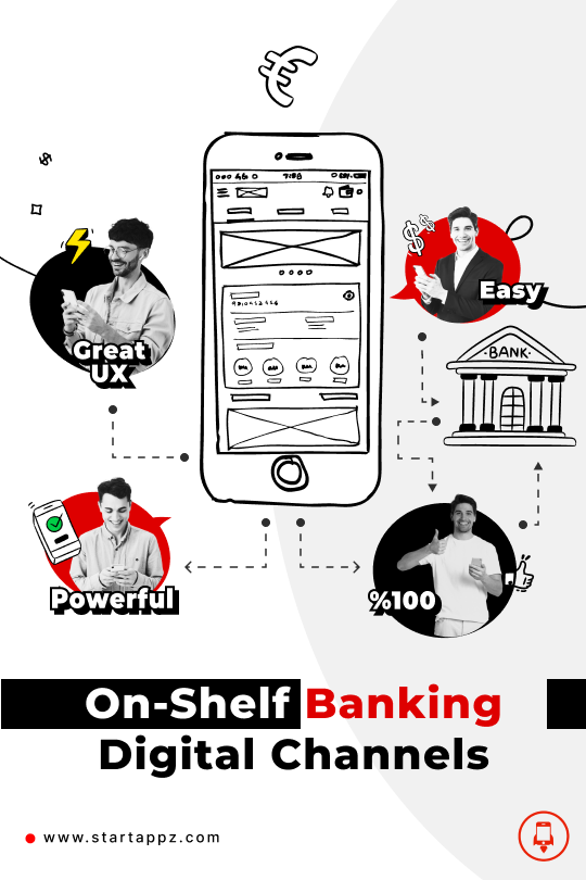
In banking, the problem is not about building your own digital bank or buying it, the main problem and pain is about the level of agility you have with your provider, Do you pay for an on-shelf product or a total agile service? Are you just a company client or a success partner? On-shelf products are the real pain!
Why?:

1- Outdated: To clarify, I am not here to criticize tech service providers in the banking market, Rather, I respect their effort in developing the sector, the article is about reality.
The Digital world is changing rapidly, daily or monthly, User requirements and expectations are growing day by day, and what do you provide? If you don't work in a fast agile environment you already decided to deliver an old and outdated experience for your customer.
If the bank doesn't have an agile development plan, month by month, in-house or outsourcing, interacting with the environment, customers, and competitors, the bank always will provide an outdated experience, It a mathematics, the time needed to build a whole product and sell it in the market, it is exactly the time that made the product experience is outdated, at the end, the bank will be a follower for the new experiences, but do you think that will work in this era? Read the next point!

2- Switching between brands is the new normal: In the digital era, there is no loyalty in the way it was before, as there is no intermediate human relationship between you and your customers, there is only their behavior and user/customer experience through the mobile device or the Internet in general.
Social networks, a flood of people, sparking may start from one customer, a good new experience that may raise the bank’s shares and attract new customers or interactions, and by the same time, one bad experience may return the flood in the opposite direction.
That means, the bank doesn’t have the time to keep its clients if it decides to continue in the same on-shelf product purchasing way, when something bad happens what is the time and flexibility to solve it? or if a new trend forces itself in the market, the bank will follow it after ???
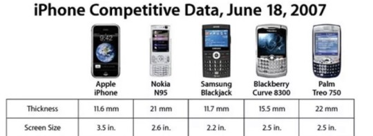
3- Uniqueness: This point is the clearest one, how will the bank compete if it buys similar experiences pre-sold for several banks?! Away from the Core-Banking functionality, even in the restrictions environment, banks have a wide gray area to build a unique experience for their clients, a lot of non-core functionality is in the bank's hands.

4- Change Requests: Another pain with the On-Shelf is about changes, CRs with providers, the time needed for that, where after the purchase the bank feels handless, not unique, and always a market follower.

** Conclusion: When the bank decides to purchase digital products from the shelfs, specially digital channels, I think that bank should build a unique user experience and present it to the suppliers before purchasing the product, so that the provider modifies the product to fit the user experience presented in all its details.
The bank must first ensure the uniqueness of Its product in the market, and that this product reflects its vision with its customers, not the vision of companies that provide banking products, knowing that it will always be better to obtain agile contracts differently, especially with things related to the digital channels, because it is the interface of the bank with its customers.

**Do not hesitate to ask about the best methods and practices that Startappz.com has implemented to ensure the success of our world-class partners, and how we provide them with digital technology with results that exceed doing it in-house.
0 notes
Text
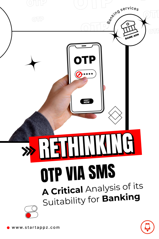
During a consultancy we were working on for a bank and the company providing its digital channels, we had a hot discussion to reach important decisions related to security and protection, and at the same time without posing a problem in the user experience and ease of digital channels, one of these The important points that I liked to publish about is the use of OTP via SMS in the main verification processes.
As I personally just accept - not support - the use of OTP via SMS in verifying operations through mobile/web applications, but I have an oppositional and strict opinion on its use in the main operations such as (changing the password, activating a new phone, unblocking an account), and I think It is can be used - not support - with the operations that take place inside the applications after making sure in a safer way for what was mentioned previously, for example, I do not accept changing password using OTP I receive through a text message, on the other hand, I think it is ok to use it to transfer money - with limits - or any other procedure inside the system.
On the contrary, I consider it a mistake made by some banks, One of my bank accounts I unblocked it after several wrong and even suspicious operations, as soon as I sent the phone number and the national number, then verified through the OTP via SMS, and POW I am using it again with full privilege! In your opinion in the current era is the national number considered confidential information?
Next, I will try to summarize the reasons for my lack of belief in OTP via SMS to use in these cases, in a much-simplified manner for each point, many may see it as theoretical points, but when designing such systems I always go with zero-trust.
1) The problem of the channel mediating the code sending:

In theory and practice, if the message containing the code is sent to the phone number, it arrives through a telecommunications company. Therefore, your primary reliance on the security of the information will come from your reliance on the security and protection of the telecommunications companies, technically, or even for the people working in it, in my personal opinion It is considered a security vulnerability, in this case, the telecom company and its employees play the role of man-in-the-middle I can’t trust.
2) Problem with the receiver itself:

Our current devices are no longer for calls and receive messages only, therefore you cannot be sure of all the applications that customers use, and from these applications, many applications have the power to access and read SMS, also These applications are used in hacking operations for this type of protection, so the possibility of access SMS, it means access to all its accounts through another device in a different place, and this happened a lot with breaches of chat accounts (WhatsApp) specifically, where WhatsApp use an alternative than SMS OTP system for protection, the (PIN code), but unfortunately it is not compulsory, seems that they care about ease of use more than protection.
3) Ownership of the intermediary phone number in the process:
Ownership is carried out in a contract outside the framework of the bank’s system, so the owner of the number may change at any moment. This point, in particular, may seem very theoretical, but if we think about it and use it in a way targeted to a specific person, our view will change. Remember we talk about zero-trust in such designs.
4) Something the customer does not have:

The code in this way is something that the customer does not have, but something sent to him through an intermediary, thus the security responsibility is transferred from the customer to the customer and the system, but in the case of using something that the customer has and not with the bank or any other party, the security responsibility will be on the customer and not on the system, nor I mean here the legal! Rather, the responsibility is in the hands of a person and not a large number of possibilities.
For this and many other details, I am a supporter of using a code that follows different criteria to change the password or activate a new device… etc., and then it is possible to use the easiest method such as OTP via SMS in other operations such as entering the account or transferring money and so on, we need a 2FA more than 2-step-auth which can be useless sometimes for what written above. What do you think? Do you have another opinion?
0 notes
Text
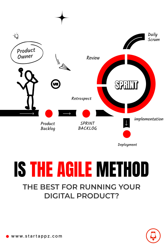
It depends! But in many cases, I see the agile method was not the best option in the market!
Especially when you launch a digital product/ service in a mature market with many well-established competitors, going agile and launching your MVP to get user insights may take you nowhere, as these insights can be misleading.
Why?
MVPs could harm many sectors, like banks, telecoms, marketplaces, shipping, and e-commerce. All these businesses have been there for a long time, and they have a lot of solid references and studies, so when you are going to the market with fewer features than the others, especially with incomplete features or user journeys, you will kill the real business opportunity for a digital product. I'm not talking about one new feature you invented and want to test in the market; I'm talking about the product itself.
For example, you can't go into the app for banking with three or four features; even if they are new features or new experiences, you have to start from where others have stopped and then add these new features using the agile methods.
And here, I have to differentiate between the internal process of working on the product and what you release to users to interact with.
Internally you can use whatever method you like, and your team is comfortable with, like planning for 2-week sprints and testing them as part of the development cycle. The issue is not to go live from the very first sprint, where you are just covering the basic functionality and features, with maybe a new experience or feature you are excited about. The reason is simply that users expect a full-fledged service with a mature offering as a benchmark with competitors' offerings.
It's good for your team to work on iterations -internally- to get more visibility and do quick enhancements based on internal testing, which goes in all product phases (Research, design, development). All these steps have a significant dependency, so you always have to reflect on all your testing outputs on these steps accordingly.
This question triggers memories I had with the UX case study developed earlier this month; I started doing and thinking about how people can manage their finance, So I ended up doing a full utility app for banks, including all the known feature lists, from transferring money, managing accounts, profiles, history transactions, and online others services and above of that I proposed the new features including the budgeting and expenses analysis that empowers my feature along with experience enhancement.
Finally, as UX designer/ product manager/ always steer your concerns about your recipient, which, in our case, your users, not about the limitations or challenges that may occur behind the scene — as users don't care and can't wait for months until your MVP reaches what they aspire for!
0 notes
Text
Imagine you’re a teenager struggling with depression. Every day feels like a battle, and you can’t find any relief. But one day, you come across a new form of therapy that could change your life. This therapy uses artificial intelligence (AI) tools to create a virtual reality experience that immerses you in a new world, helps you learn coping skills, relax, and even interact with realistic holographic characters.
It sounds like science fiction, right? But according to recent studies, this type of therapy using AI and mixed reality could be a game-changer for adolescents struggling with mental health issues. Research shows that technology tools can be an effective and cost-efficient way to deliver mental health services.
But despite the potential benefits of AI and mixed reality therapy, there is still a lack of academic research on how it can improve the well-being of adolescents with depression. That’s where the proposed study comes in. The researchers aim to answer three key questions: how can AI and mixed reality be applied to enhance mental health coping skills? How can it be a positive distraction for teenagers with emotional distress, and how can it stimulate sensory-deprived teenagers?
This study’s results could significantly impact how mental health professionals and policymakers approach the treatment of depression in adolescents. It could also provide hope and a new form of therapy for one in seven teenagers worldwide who experience mental disorders.
Introduction Artificial Intelligence (AI) tools that facilitate human-computer interaction (HCI) and user experience design (UXD) allow a user to experience 3D imaging (Cham et al., 2021). Some tools, such as virtual reality, use Natural Language Processing (NLP) to incorporate audio and visual feedback and other human senses like vibration, taste, touch, and smell (Noam, 2021). Usually, these AI tools provide a life-size and exciting experience whereby users feel they have been taken elsewhere. Also, AI tools use hologram technology to provide realistic characters that a user can interact with (Cham et al., 2021). The whole experience with AI tools can significantly influence how people feel emotionally. In this view, the proposed study conceptualizes that AI tools can offer a rewarding psychological experience that can positively affect adolescents diagnosed with depression.
Integrate AI and mixed reality therapy with social media platforms to create a more personalized experience for users. Using user data from social media profiles and other sources, AI tools can create customized virtual reality environments and experiences tailored to the individual’s interests and needs. For example, if an adolescent struggles with social anxiety, the AI could create a virtual reality environment that allows the user to practice social interactions and communication skills in a safe and controlled setting.
Incorporating social media data into AI and mixed reality therapy also allows for more personalized recommendations for coping skills, relaxation techniques, and other strategies to improve mental well-being. For example, the AI could suggest mindfulness exercises or activities that align with the user’s interests or hobbies based on their social media profile.
Overall, integrating AI and mixed reality therapy with social media platforms has the potential to provide a more personalized and effective experience for adolescents struggling with mental health issues. However, it is important to consider the potential privacy and ethical implications of using personal data from social media profiles in this way.
Keywords: Artificial Intelligence, Mixed Reality, Mental Illness, Machine Learning, behavior changing,
Background and context Statistics indicate that, globally, one in seven of 10–19 years old experience mental disorders (WHO, 2021). The leading causes of mental disorders include anxiety and depression. Poor government policies at the macro and micro levels are why suicide is the fourth leading cause of death among individuals aged 15–29 (WHO, 2021). Recent actions by healthcare agencies have focused on addressing the early detection and prevention of depression among teenagers, while there have limited attention paid to docents that are already depressed (Wahid et al., 2021). Among the strategies used to ensure the wellness of depressed individuals include altering personality (e.g., reducing levels of neuroticism and extraversion), applying dispositional optimism by developing resilient attitudes to stress, and increasing the amount and quality of social support (Burešová et al., 2020). Despite teenagers being tech-savvy and known to interact creatively with the latest technologies, there is limited academic attention on the role of AI tools in improving the well-being of adolescents diagnosed with depression.
Problem statement In line with the current statistics, which show the high prevalence of mental illness among teenagers and the adverse socioeconomic outcomes associated with depression, the proposed study maps the role of AI/Mixed Reality in bringing wellness to adolescents suffering from depression. More specifically, the proposed research preconceives that human-computer interaction (HCI) and user experience design (UXD) can provide a rewarding experience that can positively impact mental well-being. Researchers have confirmed that technology tools can deliver mental health services cost-effectively (Boydell et al., 2014). On the other hand, some researchers (e. g (Figueroa & Aguilera, 2020)) have called on additional research into a mental health technology that could help treat individuals diagnosed with mental health issues. In line with these considerations, the proposed study examines if an immersion into a virtual environment can produce a sensation that can positively impact well-being and offer a training environment where teenagers can learn cognitive strategies, interpersonal skills, relaxation, and mindfulness.
Research questions The research questions are as follows:
How can AI/Mixed Reality enhance mental health coping skills (e.g., cognitive strength, interpersonal skills, mindfulness, and relaxation)? How can AI/Mixed Reality distract emotionally distressed teenagers positively? How can AI/Mixed Reality be used to stimulate sensory-deprived teenagers? Relevance and importance of the research The proposed study is relevant because, when completed, its findings will develop a better understanding of the novel and creative ways of treating teenagers’ mental health problems. Drawing on the results, mental health professionals and policymakers will be able to make educated decisions regarding how to use AI tools to improve the mental well-being of teenagers diagnosed with depression. Parents can make evidence-based decisions regarding acquiring AI/Mixed Reality tools such as Virtual Reality and holographic devices. They will better understand why human-computer interaction (HCI) and user experience design (UXD) offer their depressed teenagers that 3D imaging can positively impact mental well-being. Educators will find the findings of this study as they develop curricula that prepare programmers to work in a new era where AI tools could be used for mental health. Programmers will gain by applying the recommendations of the proposed study as they design AI tools that can improve the mental well-being of depressed teenagers. Teenagers will also gain by consciously understanding the importance of interacting with AI/Mixed Reality tools.
Methods and Design A research design is a detailed plan that guides the research process and entails choosing a quantitative, qualitative, or mixed-method study (Creswell, 2014). The objective of the research design is to provide guidance during the execution of a research study and give direction for analyzing the following data. This will be quantitative descriptive research.
Various types of qualitative designs can be used to explore varieties of phenomena. Also known as design strategies, including a systematic review of literature, case studies, participant observation, and individual and group interviews. This study will align itself with a systematic review of literature which, in the words of (Suri, 2019), is a ‘comprehensive and unbiased synthesis of large numbers of relevant studies within the confines of a single topic using transparent and rigorous methods (p. 12).’ This implies taking a large number of studies relevant to the topic and then combining all these studies into one document. The individual studies will be found in standard online search engines, including Google scholar and academic papers, books, and online articles. This means data will be collected from the reports in the systematic review.
As well as drawing the results from various studies together, data synthesis will consider the strength of evidence of individual studies and explore whether findings regarding the viability of AI tools in helping teenagers diagnosed with depression achieve positive health outcomes and well-being. The narrative analysis, which will examine the data, will begin by presenting a theory or theories of how AI tools work and how they support mental health, summarizing the findings of the individual studies, discussing the relationships between studies, and providing an overall assessment of the strength of evidence as it relates to the problem statement.
Limitations The limitation relied on a relatively limited number of databases to identify potentially eligible studies to be reviewed.
To solve this limitation, looking at internet sources that ngines suggest will be essential.
References Bogdan, R., & DeVault, M. (2015). Introduction to Qualitative Research Methods: A Guidebook and Resource. Hoboken, New Jersey, United States: John Wiley & Sons.
Boydell, K. M., Hodgins, M., Pignatiello, A., Teshima, J., Edwards, H., & Willis, D. (2014). Using Technology to Deliver Mental Health Services to Children and Youth: A Scoping Review. J Can Acad Child Adolesc Psychiatry., 23(2), 87–99.
Burešová, I., Jelínek, M., & Klimusová, H. (2020). Predictors of Mental Health in Adolescence: The Role of Personality, Dispositional Optimism, and Social Support. SAGE Open, 10(2). Retrieved from https://doi.org/10.1177/21582440209179
Cham, K., Shakiry, R., & Yates, C. (2021). Dual Cognitive UXD and Explainable AI. Journal of Usability Studies, 17(1).
Creswell, J. W. (2014). Research Design: Qualitative, Quantitative, and Mixed Methods Approaches. SAGE,.
Figueroa, C. A., & Aguilera, A. (2020). The Need for a Mental Health Technology Revolution in the COVID-19 Pandemic. Front. Psychiatry. Retrieved from https://doi.org/10.3389/fpsyt.2020.00523
Noam, E. (2021). The Content, Impact, and Regulation of Streaming Video: The Next Generation of Media Emerges. Cheltenham, United Kingdom: Edward Elgar Publishing.
Suri, H. (2019). Ethical Considerations of Conducting Systematic Reviews in Educational Research. Systematic Reviews in Educational Research.
Wahid, S. S., Ottman, K., Hudhud, R., Gautam, K., Fisher, H. L., Kieling, C., . . . Kohrta, B. A. (2021). Identifying risk factors and detection strategies for adolescent depression in diverse global settings: A Delphi consensus study. J Affect Disord., 15(279), 66–74. doi:10.1016/j.jad.2020.09.098
WHO. (2021, November 17). Adolescent mental health. Retrieved from WORLD HEALTH ORGANIZATION: https://www.who.int/news-room/fact-sheets/detail/adolescent-mental-healt
0 notes
Text

Unlocking the Future: Revolutionizing Governments, Fintech, and Telecommunication with Startappz Apps and Websites
In an ever-evolving digital landscape, Startappz is at the forefront of innovation, empowering governments, fintechs and telecom companies with groundbreaking apps and websites As a leading technology company, Startappz is revolutionizing the way they deal with public services, budgeting and media , efficiency, security , is harnessing the power of technology to drive user satisfaction and In this article we will delve into how Startappz is changing the game.
Transforming governments with smart apps and websites Governments around the world face the challenge of delivering services seamlessly and efficiently to citizens. Startappz fills this gap with customized apps and websites that streamline business processes, improve public services and engage the public. From digital portals for mailings to communication systems for public feedback, Startappz is a solution that makes governance accessible and transparent.
Startappz’s official apps and websites adhere to SEO best practices, ensuring citizens can easily find and access important services. By optimizing the right keywords, implementing clean code, and ensuring mobile responsiveness, Startappz increases its online visibility and improves search engine rankings.
Reshaping Fintech: Secure and user-centered apps and websites The economic landscape is rapidly moving towards digital solutions, and Startappz is at the forefront of this shift. Startappz, which caters to fintech companies, develops apps and websites that are secure, scalable and user-centric. From mobile banking apps with biometric authentication to advanced payment gateways, The company’s solutions are redefining the way people interact with their finances.
Future Tech Focus: Understanding the competitive nature of the fintech industry, Startappz integrates new Tech Tools features into every aspect of its fintech apps and websites. By conducting keyword research, optimizing metadata, and adhering to an world web URL structure, Startappz ensures that its fintech solution is visible to a wide audience.
Empowering telecom companies: New forms of communication In the fast-paced world of telecommunications, effective communication channels are the key to success. Startappz partners with telecom companies to develop feature-rich apps and websites that enhance user experience, provide seamless interaction, and enhance customer retention From customer service portals to data usage monitoring no, Startappz's solutions empower telecom companies to stay ahead of the competition.
For visibility and visibility, Startappz uses various SEO strategies to optimize the performance of telecom apps and websites. By using site speed optimization, using the right meta tags, and focusing on link building, Startappz ranks high in search engine results, attracting more users to them client's platforms
Conclusion
Startappz is a game-changer in the tech industry, enabling governments, fintech organizations and telecom companies to thrive in the digital age. Through its Expert team, Startappz ensures that its apps and websites remain highly visible, drive organic traffic and help its clients achieve their business goals. With a commitment to innovation and excellence, Startappz continues to shape the future of technology, creating a world of government, fintech, and telecommunication companies can thrive and deliver exceptional user experiences.
0 notes
Text

Strengthening the Fortress: A Guide to Cyber Security for StartAppz IT and Software Company
Introduction:
In today’s digital age where businesses are increasingly reliant on IT and software solutions, cybersecurity has become a key factor in protecting sensitive information and business continuity StartAppz, as an IT software company, plays a key role in shaping a digital environment. This article aims to highlight the importance of cybersecurity and provide practical guidance for StartAppz to strengthen their defenses against cyber threats.
Understanding cybersecurity
Cybersecurity is the protection of computer systems, networks, software, and data against intrusion, breach, destruction, or theft. As a company specializing in IT and software services, StartAppz handles valuable information including proprietary software code, customer data, and intellectual property. This is an important requirement to build customer trust and protect the company’s reputation.
Knowing the cyber threat StartAppz needs to be aware of cyber threats in the digital landscape.
Common cyber threats include:
Phishing attacks:
Cybercriminals use fraudulent emails or messages to trick employees into revealing sensitive information or clicking on malicious links.
Ransomware:
Malicious software encrypts data, requires a ransom prior to release, and often causes significant performance disruption.
Malware and viruses:
Harmful software enters systems and steals corrupted data or files, disrupting a company’s systems.
Insider Threats: Employees or former employees with access to sensitive data may intentionally or unintentionally cause a security breach.
DDoS attack:
Distributed denial of service attack beyond the system.
Implementing cybersecurity best practices o enforce cyber security measures, StartAppz adopts the following best practices:
Conduct regular security training:
Educate all employees about cyber threats, safe browsing practices, and the importance of strict password management.
Secure network design:
Use firewalls, intrusion detection systems, and encrypted connections to protect the network from unauthorized access.
Update software regularly: Keep all software, including operating systems, antivirus, and applications, updated with the latest security patches.
Use Multi-Factor Authentication (MFA):
Employees are required to use MFA to access critical systems, adding an extra layer of security.
Data backup and recovery:
Test recovery options by backing up critical data to ensure business continuity in the event of a cyber incident.
Monitor system activity:
Use real-time analytics and log analysis to quickly identify potential threats and unusual activity.
Limit access:
Provide access privileges based on the principle of limited access, and allow employees to access only resources necessary for their role.
Develop an Incident Response Plan:
Develop a comprehensive incident response plan to effectively address security breaches and minimize damage.
Third Party Risk:
Monitor and control the security practices of third party vendors that have access to StartAppz’s systems or data.
Conclusion:
Cybersecurity is a constant battle against evolving threats, and as an IT and software company, StartAppz’s legacy should be proactive in protecting customer data. St. by investing in strong cybersecurity programs, regular employee training and staying abreast of the latest security trends, StartAppz can build a formidable defense against cyber threats. Remember, cyber security is not a one-time effort but an ongoing commitment to safeguarding the company's reputation, data, and customers' trust.
0 notes
Text
tumblr tuesday: this barbie is a tuesday
We're all in Barbie fever, and you're all doing what you do best when you're excited about something—enriching everyone's enclosures. Sublime!
@landrylovesmatcha:

@jiianie:

@koreemii:

@reprehensible-ghost:

@jaohannart:

@deominrei:

@ferdilustra:

@balonioni:

@thepencilgirlsv:

@snarkspawn:

@nickeldoodle:

@thapunqueen:

@mayopocket:

@dr-paint:

@a-curious-squirrel:

@jeniferprince:

@cheesy-cryptid:

@fluffylittleguy:

And, as ever, there's more where that came from here.
9K notes
·
View notes
Text
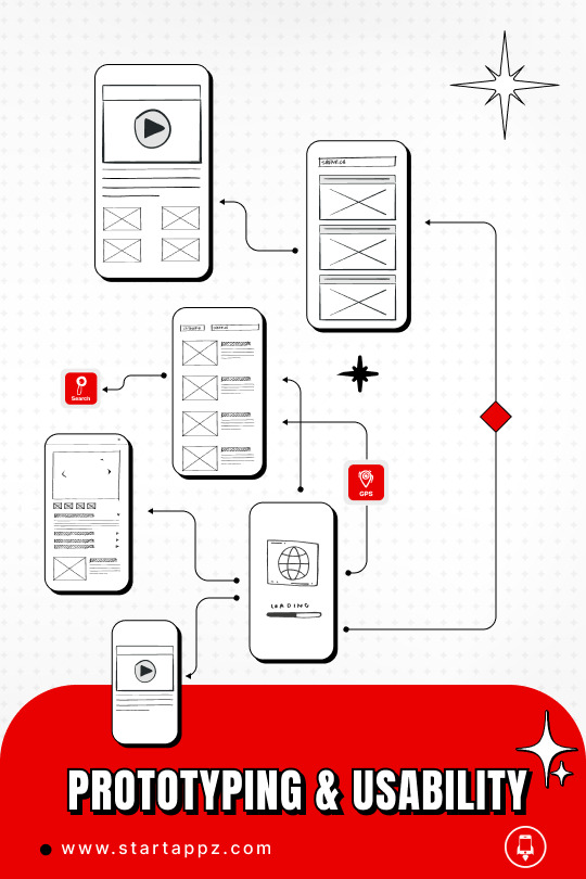
The prototype is a method that makes you create the story to test, validate, find the gaps, and refine the experience and the context to be suitable for the target audience to achieve their required task. for me, I prefer to do it right after the diagram flow and define the user stories by mapping all the steps to check his reaction to using your services, if the service left the assumed Impact and the impression that you are looking for or not,
So by doing usability testing on your product/ service, you always get the proper feedback and precision for each design U.I. element that should be revised to enhance to be more fitted and appealing for your users.
The moderator usability testing gives you more insights as a qualitative result; So you can ask, have more impressions, and lead you to the right decisions in the designs. But the thing here is that you have to check what they are doing and match it with their feedback because sometimes they don’t match.
Each usability test is associated with a task; you can’t start testing your product by not giving a specific task flow to let you have accurate remarks and suggestions. And the more important thing while doing the test is to prepare your assessment sheet and give weights for each usability aspect to be filled by the observer.
In addition to the above, you have to consider the limitations that occur by using the prototype tools, so you cant cover all the cases in the same flow; your focus will be on the happy scenarios/ flows because you can’t mimic the actual experience with all what have from issues, the benefit of the prototype and usability testing is that it’s easy to do and has a tremendous:
Saving time
Quick enhancement
Find all the uncovered cases
Help all the contributors to imagine the product/ service flow.
Check multiple experiences as A/B testing to adopt the succeeded experience.
Help you to create the proper context and content.
In my challenge activity for this week, I created a prototype for an onboarding wireframe to let user register their account in the app.
And as I mentioned above, I covered the happy scenario, despite this I got many remarks that helped me to improve the flow, like:
I added one input to enter the password for login. However, I tend to make it easy to remember, So I limited this to four digits in the registration; after receiving feedback, I made four separate inputs for each number.

Prototype:
Reference cited:
Experience, W.L. in R.-B.U. (2016). Checklist for Planning Usability Studies. [online] Nielsen Norman Group. Available at: https://www.nngroup.com/articles/usability-test-checklist/ [Accessed 13 Mar. 2022].
0 notes
Text

IA is the way to organize and structure your service to make it recognizable and predictable for the users, so I always have to focus on the user stories and their needs to achieve an intuitive experience and flow.
After I finished the value proposition of my service and completed the competitive analysis, I can find where the thing that makes my service suitable and has something to be added more than the similar services in the market.
It’s to create a self-care app for digital/ branch banks and make it personalized to the user’s financial lifestyle activities. And this happens by not just accomplishing a service-based app or a reporting app; it’s by taking all these services into a proactive approach that gives value by steering the user behavior, predicting, and communicating with the users personally to have a lifestyle financial app.
Here I can list all the proposed features that help distinguish my service and illustrate a seamless experience for my target user.
Area for personalized messages and interactions
My balance amount
Setups Monthly/ weekly/ daily Budget.
Summaries / Account / deposit /expenses/ Credit card.
Analysis Expenses/ credit card/ income.
Loyalty points summary.
Open account / Close accounts
Request Money/split invoice
Currency Exchange
Calculator investment deposit/loan
Request Loan.
Request cheque.
Request a credit card.
Request debit card.
Request cheque.
Request e-statement.
Request stamped paper.
Transfer within Same Bank.
Transfer Domestic.
Transfer Abroad.
Transfer Near-by.
Transfer via the Phone number.
Beneficiary Management.
User profile picture.
User name.
Manage user credentials.
Passport ID.
enable/ disable Biometric.
Bank Name.
Swift code.
IBAN.
Bank location.
Account Number.
Account holder name.
Account Currency.
Open Account.
Notification setting.
Contact account representative.
Contact via call/ chat/ email.
FAQ.
Banks map location/ ATMs.
Redeem points.
Marketplace.
E-Vouchers.
Points history.
Favor and tracked offers.
New Offers/promotions.
Tracking/analysis Alerts.
New Services.
Points.
Now I need to cluster these features according to the user’s understanding of relations, functions, naming, etc.
I tried all the sorts of card exercises, open/closed/hybrid, which has the most valuable outcome, the Hybrid one. So by using (optimal workshop.com), I shared these features cards to let the participants arrange them based on their understanding.
Therefore, I got confused responses; some participants arranged the cards regarding the naming similarities. So, they tend to combine them under the same category even if the functionality is different, like Issuing a card, card summary, card analysis, closing card, etc.
And some of them arrange them according to the functionality, like requesting loans, redeeming points, managing beneficiaries, etc.

After this, I did another one to limit and refine the result.
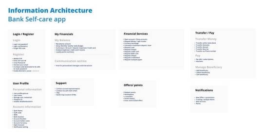
Here in the above IA, I can see how all features took their place under each label; despite this, it does not mean they will look like the above from how they will be displayed in the app. So to do this, I have to prioritize these services/ features regarding the dependency and user stories.
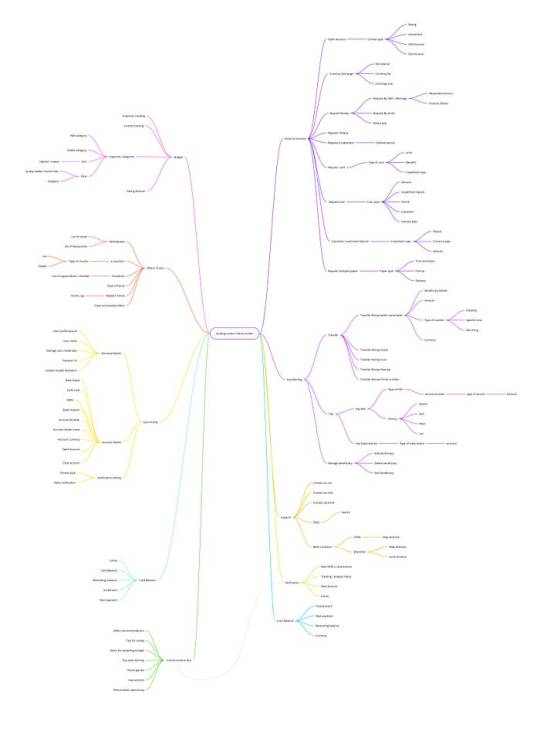
I arranged all features based on relativity and functionality, starting with the leading service covering user interest and story.Checking the balance.
Checking the balance.
Searching or requesting service.
Searching for offers and new privileges.
Support.
Pay/ Transfer.
For these, I can follow the globe navigation experience to make them accessible from anywhere in the first level of the app.
Other services that were added to the app to be more personalized:
Communication box. (tips, alerts, welcoming, offers, services, etc.)
Customizable budget account.
Tracking the Money In/ Money Out.
For the second level of the app, I can use the local navigation to show the types under the same service, like Transfer money as a first-level— > Within the same bank, domestic, abroad, Phone number, Near-by.
For the inside screen in the offer services that consider the third level of the app, I can use the Contextual navigation by showing related, recommended offers.
Hereafter this exercise, I can start doing the full diagram flow for the whole app. covering all the cases and stories to enhance and close any gaps with user flow.

Reference cited:
Zhiyang, L. (2020). Navigation Systems — Information Architecture for Designers. [online] Medium. Available at: https://uxplanet.org/navigation-systems-information-architecture-for-designers-d2aed177a54a [Accessed 6 Mar. 2022].
Spencer, D. (2019). The Ultimate IA Reading List. [online] Optimal Workshop. Available at: https://blog.optimalworkshop.com/the-ultimate-ia-reading-list/ [Accessed 6 Mar. 2022].
ANDERSON, N. (n.d.). How to Conduct an Effective Card Sort: a Comprehensive Guide. [online] dscout.com. Available at: https://dscout.com/people-nerds/card-sorting [Accessed 6 Mar. 2022].
1 note
·
View note
Text

Pioneering Development: Blending Cutting-Edge Techniques with Seamless Integration at Startappz!
Introduction:
In today's digital landscape, a good design is only as strong as the underlying technology that supports it. At Startappz, we understand technology's crucial role in delivering exceptional development solutions. With a steadfast commitment to staying at the forefront of technological advancements, Startappz prides itself on employing the latest techniques to ensure seamless integration across various projects, be it an online store or complex software systems. Our dedication to excellence in development enables us to surpass client expectations and deliver robust solutions that drive business success.
Embracing Technological Advancements:
At Startappz, we believe that technology should be harnessed to its full potential. By constantly exploring and adopting the latest techniques, we empower our development team to create solutions that are innovative, efficient, and future-proof. We stay abreast of emerging trends, programming languages, frameworks, and methodologies to ensure that our clients benefit from cutting-edge technology and best practices.
Agility and Adaptability:
In an ever-evolving digital landscape, agility, and adaptability are paramount. Startappz recognizes the need to be flexible and adaptable in our development approach. We leverage the latest techniques to build scalable, modular, and extensible solutions that can easily integrate into existing systems. By embracing agile methodologies and staying up-to-date with industry advancements, we ensure that our development process is efficient, iterative, and capable of accommodating changing business requirements.
Seamlessly Integrating with Existing Systems:
Integration plays a crucial role in the success of any development project. Startappz places great emphasis on ensuring that our solutions seamlessly integrate with our client's existing systems. By employing industry-standard APIs, protocols, and best practices, we guarantee that our developments align harmoniously with the existing technological infrastructure. Our team possesses the expertise to navigate complex integration challenges and deliver solutions that enhance efficiency, streamline operations, and maximize the value of existing investments.
Comprehensive Testing and Quality Assurance:
At Startappz, we recognize that robust development extends beyond implementing the latest techniques and involves rigorous testing and quality assurance processes. Our development team employs comprehensive testing methodologies to identify and rectify any potential issues, ensuring that our solutions meet the highest quality, reliability, and security standards. We conduct extensive testing across multiple platforms, devices, and scenarios to deliver flawless experiences to end users.
Tailored Solutions for Every Job:
Startappz understands that each project is unique, with its own set of requirements and objectives. We possess the expertise and versatility to tackle a wide range of development jobs, from e-commerce platforms to complex software systems. Our team takes the time to understand the specific needs of our clients and tailors our development approach accordingly. By customizing our techniques and strategies, we deliver solutions that align precisely with our client's goals, providing them with a competitive edge in their respective industries.
Conclusion:
At Startappz, development is not just about good design—it is about leveraging the latest techniques to build robust, scalable, and seamlessly integrated solutions. Our commitment to staying ahead of the curve, embracing technological advancements, and delivering tailored solutions sets us apart in the industry. With a team of skilled developers, rigorous testing processes, and an unwavering dedication to excellence, Startappz ensures that every development job receives the utmost attention and delivers results that exceed expectations. Trust us to bring your vision to life, backed by cutting-edge techniques and a passion for innovation.
0 notes
Text

Embracing the Power of Research and Development: Fueling Innovation at Startappz
Introduction:
In today’s rapidly evolving technology, companies face the challenge of staying ahead of the competition. Amid this scenario, Startappz recognized the need to set up a dedicated research and development (R&D) department. Rather than focusing solely on delivering high-quality software, Startappz’s R&D division was designed to push boundaries, encourage innovation and solidify its position as an industry leader.
Demonstrating R&D potential:
Startappz understands that innovation is the lifeblood of success. By investing in R&D, the company demonstrates its commitment to exploring uncharted territories and adopting emerging technologies. The R&D department acts as a catalyst for continuous improvement and enables Startappz to deliver sophisticated solutions to the ever-changing needs of its customers.
To stay ahead on the sticky ground:
The technological landscape is in a constant state of flux. Startappz recognizes that stagnant projects are in danger of becoming obsolete. Through its R&D efforts, StarTappz remains active in finding trends and leveraging its capabilities to deliver future-oriented solutions Staying ahead of the curve, Startappz can watch the market change approach, implement new technologies, and provide customers with new products that outshine the competition.
Other promotions:
At the heart of Startappz’s R&D department is a commitment to fostering innovation. The company firmly believes that pushing boundaries and challenging traditional ideas is essential for sustainable development. By providing resources for R&D, Startappz empowers its talented researchers and development team to think outside the box, test new ideas, and create innovative solutions that change the industry.
For a valuable and verifiable evaluation:
Startappz understands that investing in research is not just an abstract venture. The R&D department focuses on practical and verifiable research. Through empirical research, prototyping of new technologies, and extensive testing, Startappz ensures that its R&D efforts show tangible results. This approach reinforces the company’s position as a trusted and reliable partner, supported by evidence-based solutions that meet the highest standards of quality and performance the
Collectively contributing to success:
Startappz recognizes that collaboration is critical to success. The R&D department actively seeks cooperation with academics, industry experts, and technology leaders. Startappz gains access to diverse ideas, cutting-edge research, and interdisciplinary collaboration by fostering an open ecosystem. This collaborative approach promotes the potential for disruptive innovation and positions Startappz as a leading development hub.
Conclusion:
At a time when businesses are reducing R&D costs, Startappz’s dedicated R&D department is a testament to its unwavering commitment to innovation and growth By investing in practical and verifiable research throughout the year, Startappz maintains a competitive edge, adapts to the evolving technology landscape and delivers solutions that exceed customer expectations. Startappz’s R&D department stands as a beacon of innovation, pushing boundaries and propelling the company into a future filled with endless possibilities.
0 notes
Text
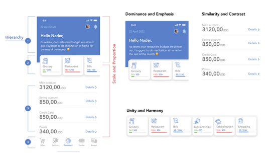
Visual design is the spirit of the UX as a final stage, to polish your user experience and empower it by adapting the visual design principles, giving the user the recognizability of what I meant by communicating the user empathy.
The elements of visual designs are many, like colors, spaces, fonts, structure, images, etc. And to manage all these aspects, some principles help you to find your way by using and adapting these design principles, which are :
Unity and Harmony
Balance
Hierarchy
Scale and Proportion
Dominance and Emphasis
Similarity and Contrast
All these principles/guidance rules are connected and affect your whole design approach, so as a reflection of my exercise, I couldn't do the hierarchy by doing the Dominance and emphasis alone, so it's tough to start doing these criteria one by one. from my exercise you have to do them all in one time to have the desired look and experience, and you can add above of that, especially in the digital environments the way of the (transitions and interactions)
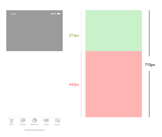
So at the upper part (dark gray), I used it to emphasize the communication area with the user by displaying all the due bills, alerts, advertisements, budgeting tips, personalized messages, etc. This is the most dynamic area.
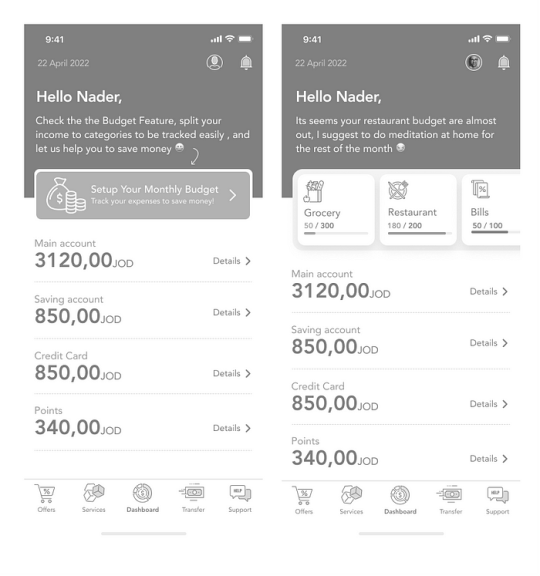
At the bottom of the screen, I placed the tab action bar as global navigation, which should appear all around the app screens at the first level screens.
For the color palette, I tried many options. I went through many iterations to find the harmony and the combination, so by doing my research on related apps in the same financial industry, I found that Blue is a good indicator of finance activity; it gives the user the feeling of trust and honesty as it instills confidence and inspires feelings of loyalty and integrity. In addition, the JOD currency has two denominations in blue color.
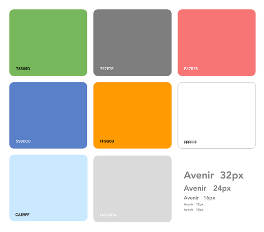
White color: the base to make the spaces and clarity, especially some many numbers and elements should be readable.
Dark Blue color: emphasizes some areas and distinguishes between screen parts, and I used it for text links and icons all over the app.
Light Blue: I used to highlight some areas and text on the dark blue background to give me more ability to hierarchy my content.
Dark Gray: I used the text numbers on the white background.
Light Gray: separators/ lines and inputs.
Green/ Red colors: I used them to recognize between your transaction IN/OUT money easily, and these colors are heavily utilized in the financial industry for the same purpose.
Orange color: the action design elements in my design and the interaction component tell the user what to do and guide him to end his task—also, the orange color indicator of activity, confirming, and power.
The typography elements affect the user experience on many sides, like readability, credibility, and feeling. By choosing Avenir font, I benefited from the font weights; this font has many weights that helped me emphasize and hierarch my design elements.
Also, Avenir font is a modern font from google library and is compatible with different digital platforms, so it helps with consistency.
Reference cited:
Esposito, E. (2018). The Golden Ratio — What It Is and How to Use It in Design. [online] www.invisionapp.com. Available at: https://www.invisionapp.com/inside-design/golden-ratio-designers/ [Accessed 24 Mar. 2022].
Aragon, K. (2013). 15 Color Palettes from Top Financial Websites. [online] The Daily Egg. Available at: https://www.crazyegg.com/blog/color-palettes-financial/ [Accessed 27 Mar. 2022].
Gordon, K. (2020). 5 Principles of Visual-Design in UX. [online] Nielsen Norman Group. Available at: https://www.nngroup.com/articles/principles-visual-design/.
Bruna (2020). Meaning of the Color Blue: Symbolism, Common Uses, & More. [online] Colors Explained. Available at: https://www.colorsexplained.com/color-blue-meaning-of-the-color-blue/.
Today's Eggspert (2018). 16 Great Website Color Palettes to Increase Engagement (2019). [online] The Daily Egg. Available at: https://www.crazyegg.com/blog/website-color-palettes/ [Accessed 27 Mar. 2022].
0 notes
Text

Introduction: In today's fast-paced digital world, businesses need to adapt to ever-evolving consumer demands and stay ahead of the competition. One of the most effective ways to achieve this is by investing in app development. Developing a mobile application for your business can bring numerous benefits and pave the way for future success. In this article, we will explore why making apps is good for your future business and how it can revolutionize your company's growth.
Enhanced Customer Engagement: Mobile apps provide a direct and convenient channel for engaging with your customers. By offering features such as personalized content, push notifications, loyalty programs, and seamless purchasing options, you can significantly enhance customer engagement. Apps enable you to create a more personalized and tailored experience for your users, fostering brand loyalty and driving customer retention.
Increased Accessibility: With the growing reliance on smartphones and tablets, having a dedicated app ensures that your business is easily accessible to customers at all times. Apps eliminate the need for users to navigate through search engines or browser bookmarks, providing a one-tap solution to access your products or services. This accessibility can lead to increased customer satisfaction, as users can effortlessly interact with your business whenever they need it.
Competitive Advantage: Developing a mobile app sets you apart from competitors who have not yet embraced this digital frontier. It demonstrates your commitment to innovation and staying at the forefront of technological advancements. An app can be a powerful marketing tool, helping you capture and retain new customers. By offering unique features, seamless user experiences, and exclusive app-only promotions, you can position your business as a leader in the market.
The visibility of the logo has been improved: A well-designed app with an attractive user interface acts as an extension of your brand. It allows you to display your company’s identity, values , and offerings in a visually appealing and easy-to-use way. Engaging users regularly through your app can strengthen brand awareness and increase their visibility in a crowded marketplace. In addition, users are more likely to recommend and share your app, further enhancing your brand reach.
Data-Driven Insights: The app provides valuable insights into user behavior and preferences through analytics. You can track user interactions, gather information about their preferences, and make data-driven decisions to optimize your business processes. Understanding consumer preferences allows you to customize your offerings, improve customer experience, and better target marketing campaigns.
Income Earned: Apps provide economic opportunities for businesses. You can earn money by making in-app purchases, subscribing to advertisements, or by offering goods or services. With a well-designed budget, your app can be a lucrative investment, helping your business grow and survive.
Conclusion: In the digital age, building apps has become increasingly important for future business success. From increasing customer engagement and brand recognition to potential growth and revenue, the benefits of app development are undeniable. By embracing app technology, you can position your business for long-term growth, build a loyal customer base, and stand out in a competitive market. Invest in your future professional success by jumping into app development today.
0 notes
Text

Nowadays, websites are used by users on different platforms and devices. And the good news most of these sites, especially the services and extensive sites, have followed a responsive layout to serve user needs and behaviors.
So in this week's topic, we went over these approaches to find out the difference between them, and how these structures will impact your design layout, and affect your user target.
To start a responsive layout, you have to structure your design using a grid system. This will assist you in arranging your design elements to avoid un justifying design objects issues from spaces, padding, and margins and help the user easily distinguish your whole design parts.
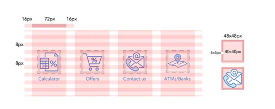
The most usable grid system is the 8pt grid, Why?
It's easy to scale your design using this logic of 8pt, especially in the different sizes of mobile screens. And it's not only used for the design layout or the main container, it's used for all the design elements, text and icons, and the vertical spaces as well, which gives complete control of all the design elements.
The 8pt is the multiple of 8:

Using this principle for icons, text, and images and your whole design canvas, you will find your design balanced and save a lot of time by arranging and finding the appropriate spaces; also, it's compatible with differences in screens' mobile proportions.

Here is a sample of the used icons using 8pt on mobile devices screen (four columns)
Mobile screen Grid:
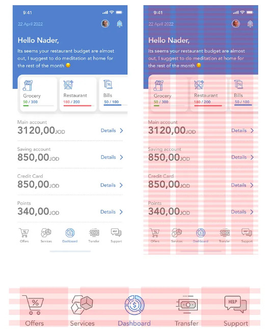
For the bottom action bar, the max-width of the icon size is 32px offset around it is 40px, the padding width 32px between them.
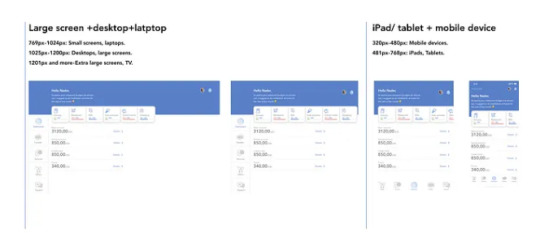
Despite the fact that my service is a native mobile app, especially at this stage as an MVP, I will check the web to see how many changes I have to be aligned with user needs and the hierarchy; the result came as the following.

From size 1440px, the wide desktop screen until the size 960px using the 8pt grid system, I don't have changes in the designs for rearranging design and the structure.
And from size 600px until 320px, it back again to the mobile view to cover these screen sizes, so as a result, I don't need to do an adaptive design, so the responsive design is fair enough for me by using a column shifter as a responsive method by removing the action bottom bar to be a left column navigational.
320px — 480px: Mobile devices.
481px — 768px: iPads, Tablets.
769px — 1024px: Small screens, laptops.
1025px — 1200px: Desktops, large screens.
1201px and more — Extra large screens, TV.
Reference cited:
Vitsky (2021). The Comprehensive 8pt Grid Guide. [online] The Startup. Available at: https://medium.com/swlh/the-comprehensive-8pt-grid-guide-aa16ff402179 [Accessed 30 Mar. 2022].
Rumman (2022). Everything You Should Know About 8 Point Grid System in UX Design. [online] Medium. Available at: https://uxplanet.org/everything-you-should-know-about-8-point-grid-system-in-ux-design-b69cb945b18d#:~:text=The%20principle%20of%208pt%20Grid [Accessed 30 Mar. 2022].
Mads Soegaard (2019). Adaptive vs. Responsive Design. [online] The Interaction Design Foundation. Available at: https://www.interaction-design.org/literature/article/adaptive-vs-responsive-design [Accessed 30 Mar. 2022].
Eygi, C. (2020). Media Query CSS Tutorial — Standard Resolutions, CSS Breakpoints, and Target Phone Sizes. [online] freeCodeCamp.org. Available at: https://www.freecodecamp.org/news/css-media-queries-breakpoints-media-types-standard-resolutions-and-more/ [Accessed 30 Mar. 2022].
#grid#art#design#graphicdesign#architecture#logo#creative#typography#abstractart#illustration#startappz#tech#business#developer#ai#innovation#technology
1 note
·
View note
Text
Why Building a Website is Beneficial for Your Traditional Business?
introduction:
In today’s digital age, a strong online presence is essential for all types of businesses, including old-school brick-and-mortar businesses The most effective ways to engage and expand your online presence and building a website. In this article, we As Startappz will explore why building a website for your traditional business can be so beneficial and how it can help you reach a wider audience, increase customer engagement, and your income has finally improved.
Increased visibility online:
By creating a website, you can expand your business beyond the physical confines of your location. With most consumers turning to the internet to find products and services, an online presence ensures that potential customers who might not have seen you otherwise can find your business A well-designed website will make you more visible in search engines, making it easier for people to find you
24/7 availability and convenience:
Unlike a physical store which has limited hours, a website provides 24-hour access to your business. This means potential customers can browse, order, or collect your products or services and your business information mouth when it suits them. Websites also eliminate the geographical and temporal limitations associated with physical stores, allowing you to cater to a global audience and potentially drive sales even in your sleep.
Showcasing products and services:
The website gives you a way to showcase your products or services in an attractive and informative way. Create detailed product descriptions, high-quality photos, And videos to showcase the benefits and features of what you offer. This detailed description helps potential customers understand the benefits of choosing your business over competitors, reliability, and higher conversion rates.
To build customer confidence and trust:
In today’s digital environment, consumers often research businesses online before making a purchasing decision. A professional and well-designed website helps build your business’ credibility and professionalism. It provides a way to showcase customer testimonials, case studies, testimonials, and other relevant information that builds trust with your audience. A robust online presence through a website enhances your brand’s reputation and establishes your business as trustworthy and reliable.
Cost-effective marketing and advertising:
Traditional marketing methods such as print ads, billboards, and radio spots can be expensive and can reach a limited audience. On the other hand, digital marketing through websites provides cost-effective targeted advertising. You can use search engine optimization techniques to improve your website's visibility in search results, use social media marketing to connect with your audience and create online advertising campaigns to target specific demographics Such techniques allow you to maximize your marketing budget and reach a wider audience that monitors how effective your campaigns are.
Conclusion:
At Startappz we strongly advocate for you, Adding a website to your old-school business is a strategic approach that opens up a world of opportunities. It extends your reach, increases customer engagement, and enhances your brand’s credibility. Due to its simplicity and cost-effectiveness, a website is a powerful tool to get maintain and expand your company's online presence. Create a stunning website immediately to take advantage of the internet's possibilities and grow your established company.
What exactly are you hoping for? Startappz can create your exceptional website now. The clock is ticking!
#ai#art#developer#innovation#technology#artificialintelligence#design#business#startappz#tech#website#webdesign#websitedesign#marketing#digitalmarketing#designagency#building#engagement#email
0 notes
Text
Using gyroscope-based hand gestures to improve user experience
All content producers are trying to innovate new hooks that grab human attention. The most recent trend is short-form videos (Reels, stories, and Youtube shorts), which are used heavily in almost all social and content apps because of the substantial impact of user interaction.
And this refers to allowing new policies that will enable individuals to post freely on the internet and utilize the available platforms.
The Challenge
Enjoying short-form videos can mean lots of time spent on the internet, which is associated with exhaustion from browsing the internet and, thus, an increasing need for an aiding tool to help the users.
For instance, some people have pain in their thumbs, which lessens their ability to scroll over the screen of an internet-enabled device, which happens after spending a long time using the device. The reflection will explore an innovative tool available for users who use one hand to navigate short-form content.
I believe the gyroscope is a feature that can be a pleasing alternative that offers a new experience for the targeted users.
When does this happen?
Align to the left
Align in the middle
Resize to full width
Align to the right
Add a link to the embedded imageAdd alt text

Users continuously consume a lot of time while using their mobile devices, specifically for entertainment purposes like watching reels, which causes hand pain, especially for the thumb joint, especially when using the thumb for scrolling up and down for more than one hour.
Navigate Intuitively
The gyroscope is a microdevice that consists of a disc mounted to spin rapidly around an axis (Armenise & Ciminelli, 2020).
The gyroscopes' sensitivity is incredible; it feels like it is activated by your brain, not by your hand!
So moving the hand at a slight angle that is barely noticeable will crawl to reveal more content.
Gyroscope In Mobile Devices
Utilizing a gyroscope to measure the accelerometers' velocity along the x, y, and z axes. It was used in many different techniques and fields, like navigation, wellness, gaming, and many more. Here are some examples:
Align to the left
Align in the middle
Resize to full width
Align to the right
Add a link to the embedded imageAdd alt text

Gyroscope In Content Browsing
The gyroscope can deliver a seamless experience by tilting the mobile device up and down along the Y axis, which offers the ability to scroll between screen components that have a specific height for each post, regardless of the content type, for the sake of reducing the use of the thumb heavily.
Align to the left
Align in the middle
Resize to full width
Align to the right
Add a link to the embedded imageAdd alt text

Content Size
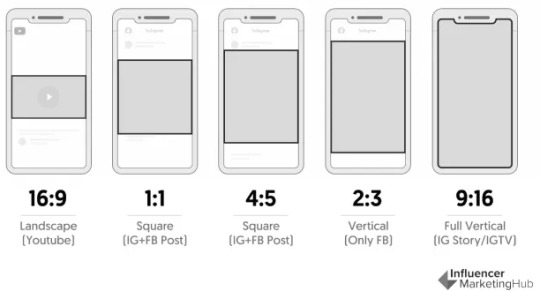
Determining the size of posts is essential to assist hand movement and the gyroscope sensitivity to measure how much the user needs to tilt their hand up or down to jump back and forth between different contents.
The social content depends on the following sizes to represent short video content, whether the label is a reel or any other similar video type. Those types usually have the same time duration, which is less than one minute, and they share the transition experience and functionality.
Align to the left
Align in the middle
Resize to full width
Align to the right
Add a link to the embedded imageAdd alt text
Targeted users
Align to the left
Align in the middle
Resize to full width
Align to the right
Add a link to the embedded imageAdd alt text

The findings indicated that 70% of the respondents used Facebook and Instagram, 40% used TikTok, 20% used Snapchat, and 40% used Pinterest. Moreover, 90% enjoyed watching the short-form video (reels)
Furthermore, 40% of the respondents were annoyed by the experience of sliding up and down to reveal content on their favorite social media platform. 70% of participants enjoyed watching short-form videos for more than 2 hours, and the rest were between 1 and 2 hours.
40% feel hand pain from browsing on their mobile devices, which makes them switch the device between hands to continue. Most of the participants enjoy browsing early morning and directly before sleeping.
A significant number of the respondents (80%) stopped using their devices because they were busy. 100% of the respondents use one hand and spend their time on social media applications.
How it works
By linking the gyroscope sensor with the desired content, The gyroscope can respond to changes with a hand gesture. Any movements can be calculated and connected with a particular output on the application.
Align to the left
Align in the middle
Resize to full width
Align to the right
Add a link to the embedded imageAdd alt text

Thus, the size of the short-form videos is defined, and the gyroscope can move from one video to another without the old-fashioned experience that depends on using the to scroll up/down.
Moreover, by shaking the device, we can refresh the current content and download the newest one, and this is by taking the user to the top of the screen again.
Reference: Nader Al-azzeh CCO at Startappz
#gyroscope#pubg#pubgmobile#Ksa#amman#gaming#business#wellness#art#developer#innovation#technology#artificialintelligence#ai#design#tech#startappz#dubai
107 notes
·
View notes
Text
NVIDIA RTX: Revolutionizing the Graphics Industry

NVIDIA RTX is a powerful graphics card that is revolutionizing the industry with its ray-tracing technology. Read on to learn more about its features, benefits, and FAQs.
Introduction:
In recent years, NVIDIA RTX has been taking the graphics industry by storm. With its powerful ray-tracing technology and groundbreaking features, it has transformed the way we experience games, videos, and other visual content. If you're a gamer, content creator, or someone who loves high-quality visuals, then NVIDIA RTX is worth exploring. In this article, we'll dive deep into the world of NVIDIA RTX and explore its features, benefits, and FAQs. We'll discuss how it works, what makes it stand out, and why it's a game-changer in the graphics industry. So, let's get started!
What is NVIDIA RTX? NVIDIA RTX is a series of powerful graphics cards that are designed for gaming, content creation, and other visual applications. Its real-time ray-tracing technology makes it stand out from other graphics cards, which allows for stunningly realistic lighting, shadows, and reflections. Before the introduction of NVIDIA RTX, ray tracing was a complex and time-consuming process that required powerful hardware and specialized software. With NVIDIA RTX, however, this process is now performed in real time, making it possible to create incredibly lifelike visuals in games, videos, and other applications.
Features and Benefits of NVIDIA RTX:
Real-Time Ray-Tracing:
As mentioned earlier, the real-time ray-tracing technology is the defining feature of NVIDIA RTX. With this technology, the graphics card can calculate the behavior of light in a scene in real-time, resulting in incredibly lifelike visuals. This means that games, videos, and other visual content can now have realistic lighting, shadows, and reflections that were previously impossible to achieve.
DLSS (Deep Learning Super Sampling):
DLSS is another groundbreaking feature of NVIDIA RTX. It uses artificial intelligence and deep learning to enhance the image quality in real-time, and boost performance. This means that games and other applications can run at higher frame rates without sacrificing image quality, resulting in a smoother and more immersive experience.
High Performance:
NVIDIA RTX is designed to deliver high performance for gaming, content creation, and other visual applications. With its powerful hardware and specialized software, it can handle even the most demanding workloads with ease. This means that you can enjoy smooth and responsive gameplay, fast rendering times, and quick video encoding, among other benefits.
Ray-Tracing Enabled Games:
One of the most exciting things about NVIDIA RTX is the growing number of games that support ray tracing. From popular titles like Cyberpunk 2077 and Call of Duty: Warzone to upcoming releases like Battlefield 6, ray-tracing is becoming an increasingly important feature in modern games. You can enjoy these games with stunningly realistic visuals and smooth performance with NVIDIA RTX.
Common questions:
What is the difference between NVIDIA RTX and GTX?
NVIDIA RTX and GTX are both series of graphics cards from NVIDIA, but they have some key differences. The main difference is that RTX cards are designed for real-time ray tracing, while GTX cards are not. Additionally, RTX cards have specialized hardware and software for AI and deep learning, which GTX cards do not have.
Can I use NVIDIA RTX for content creation?
NVIDIA RTX is ideal for content creation, especially for 3D modeling, rendering, and video editing tasks. With its powerful hardware and specialized software, it can easily handle even the most demanding workloads, resulting in fast and more efficient workflows.
#nvidia#gaming#rtx#intel#pcgaming#amd#pc#gamer#gamingpc#geforce#pcgamer#asus#pcmasterrace#gamingsetup#msi#pcbuild#ryzen#rgb#gtx#corsair#nvidiageforce#pcsetup#ti#gpu#gigabyte#ps#computer#gamers#custompc#pcmr
0 notes