A collection of my personal art as well as tutorials and tidbits I find helpful.
Don't wanna be here? Send us removal request.
Photo
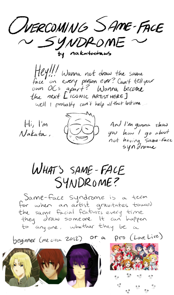


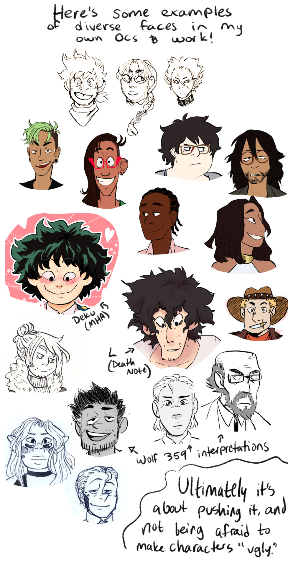

i didn’t mean to make this so long but i wanted to both analyze my own style and give other people a look into it! I hope someone can find some use for it!

53K notes
·
View notes
Photo

Anatomical Framework Tips 2.0 by Astrikos
* Update*
Digitized/cleaned up this framework & uploaded layered graphics files so you can go through it, layer by layer.
The purple lines indicate rhythms of muscles, red is mostly bony landmarks/armature, and the bracket lines show relative proportions.
I find learning equivalent widths to be a bit easier than measuring 8 heads every time, at least for gesture drawings.
> Layered file
> Old version
Instagram | DeviantArt | Art Tutorial Tumblr
2K notes
·
View notes
Photo
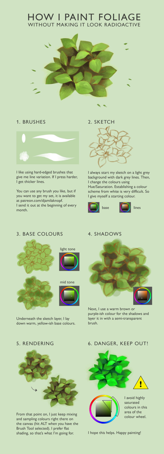
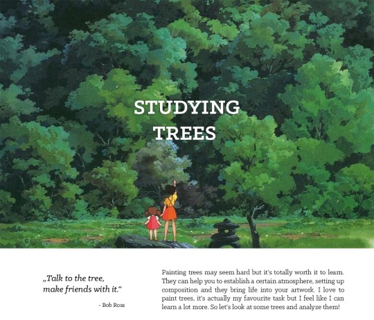
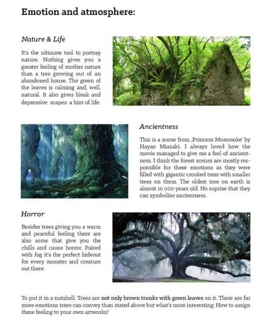
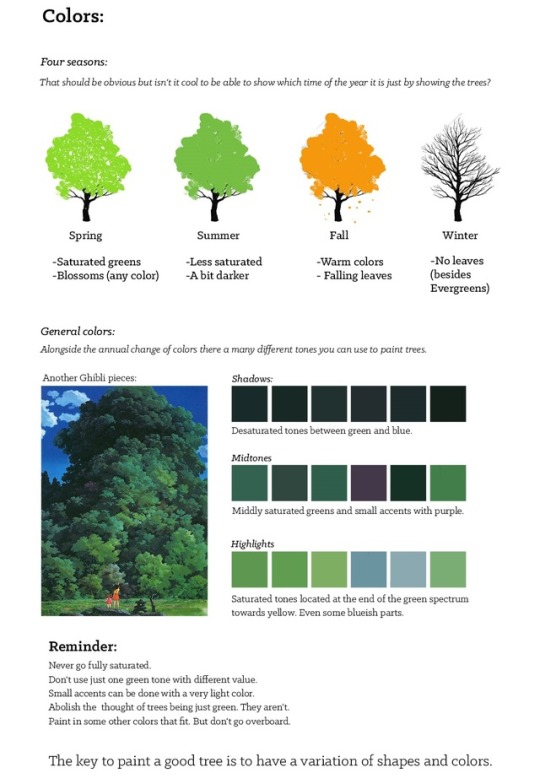
How I paint foliage by DjamilaKnopf
Support the artist on Patreon!
5K notes
·
View notes
Photo
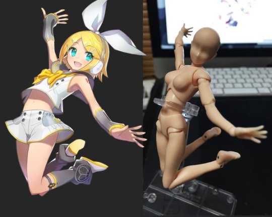
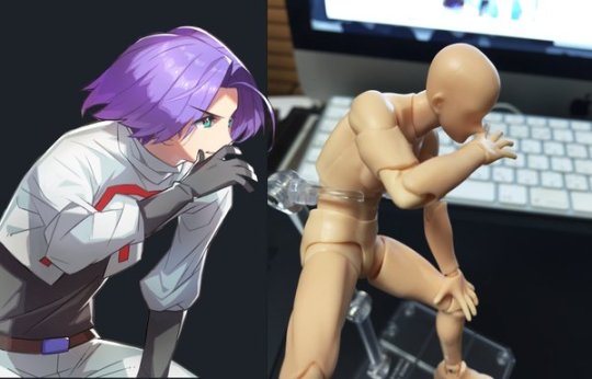
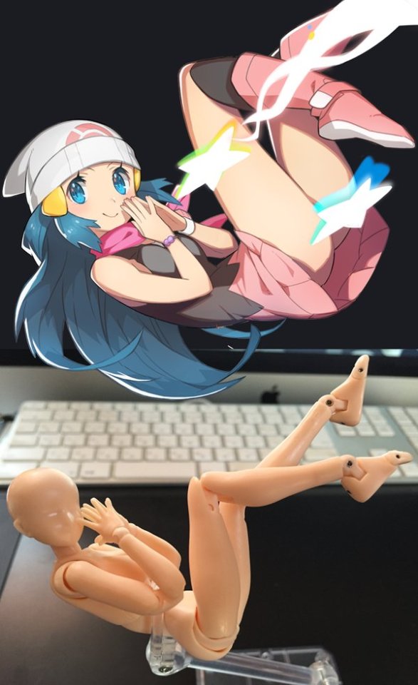
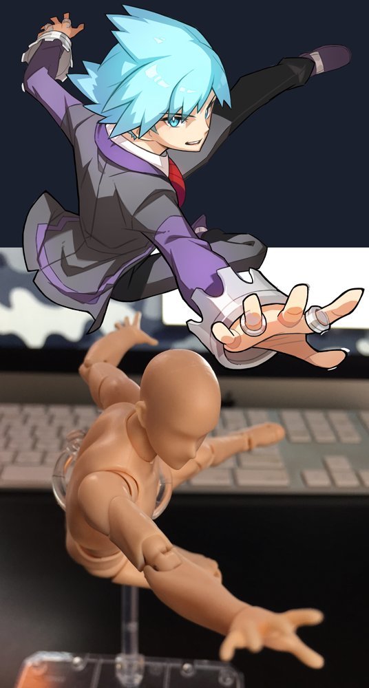
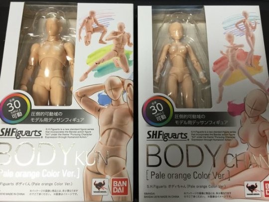
S.H.Figuarts ボディ♂♀の可動が凄く良くデッサン人形に最適です!画像はイラストのポージングを再現したモノ。脳内補完前程のデッサン人形ですが、細かなニュアンスも結構出せます。
204K notes
·
View notes
Photo


TEETH | BLOOD | DROOL
As promised, you fine freaks, here are some tutorials for how I draw teeth, blood and drool. My three favourite things to draw. 。◕ ‿ ◕。
I hope that someone finds this helpful(I’ve written these thinking that those reading know a bit of basic photoshop), but if you have any questions then I’ll do my best to answer of course.
52K notes
·
View notes
Photo


Couple of tips on some bird things for art! Some which people rarely touch on in their own tutorials or tips, mostly the first and second one! If there’s any specific things you’d like some tips on just let me know with an ask~
23K notes
·
View notes
Video
youtube
Light and Shadow - 10 Minutes To Better Painting by Marco Bucci
1K notes
·
View notes
Photo


Do you ever look at social media and just cringe *yikes*
#deadpool#deadpool 2#domino#marvel#deadpool movie#racisim#people are terrible yo#also i think its hilarious that someone is getting upset that her hair could get shot#like wtf guys lmao
34 notes
·
View notes
Photo
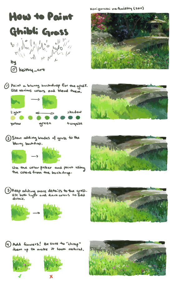
Little tutorial on how to paint Ghibli style grass
49K notes
·
View notes
Text
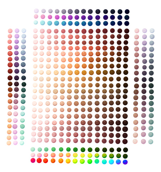
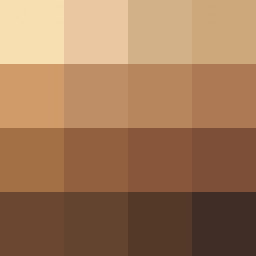
if you’re doing black edits of a character please please please use a color palette for reference so your edit doesn’t end up looking racist (like orange/red) here are some good ones



54K notes
·
View notes
Photo
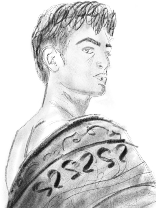
Playing around with charcoal on Procreate
1 note
·
View note
Video
youtube
Okay so I followed this video about foreshortening and…
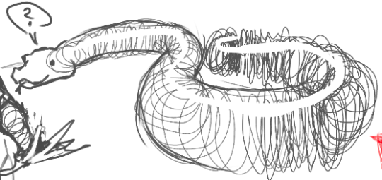


Sycra. I love you so much for making this video.
511K notes
·
View notes
Text
shading colour tips
hey yall its me the Art Mom™ to help you shade pretty
rule 1: DO NOT SHADE WITH BLACK. EVER. IT NEVER LOOKS GOOD.
red- shade with a slightly darker shade of purple
orange- slightly darker and more saturated shade of red
yellow- i think like..a peach could work but make it a really light peach
green- shade with darker and less saturated shade of blue or teal
blue- shade with purple
purple- a shade thats darker than the purple you’re using and maybe a little pink (MAYBE blue)
pink- darker shade of red
white- a really light lavender or blue..or i guess any really light colour??
black- okay listen dont use pure black to colour anything unless you want to leave it with flat colours because you cant really shade black lol
grey- a slightly darker shade of purple or blue (less saturated)
brown- slightly darker and less saturated shade of purple or red
aaaaand thats all i got lol. let me know if there is anything i should add to this list!!
469K notes
·
View notes
Link
Thanks for reading! If this post helped, please consider reblogging it or sharing this link on your social media! ❤️
More useful articles and resources / support Art-Res | my art tumblr
2K notes
·
View notes
