
I am me. My website: https://sites.google.com/view/someexistite
Last active 3 hours ago
Don't wanna be here? Send us removal request.
Statistics
We looked inside some of the posts by someexistite and here's what we found interesting.
Average Info
Notes Per Post
561K
Likes Per Post
341K
Reblog Per Post
219K
Reply Per Post
1K
Time Between Posts
5 days
Number of Posts By Type
Text
17
Last Seen Tumblr Blogs


Fun Fact
Women make up for the other 50% of Tumblr’s audience.
Text
i think everyone should program at least once just so you realise just how fucking stupid computers are. because theyre so fucking stupid. a computer wants to be told what to do and exactly that and if you make one typo or forget one detail it starts crying uncontrollably
29K notes
·
View notes
Text
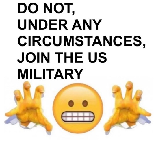
hoping that registering for selective service thing doesnt count
i had to register with it to get in-state college tuition
i wouldnt if i dint have to
fuck ohio law
103K notes
·
View notes
Text
On the issue of the recent UK online “safety” act.
KEEP THE PRESSURE UP
IT MIGHT NOT HIT ITS GOAL BEFORE GOING INTO AFFECT, BUT EVEN THEN KEEP GOING
YOU CAN GET IT REPEALED IF YOU KEEP FINDING WAYS TO SHARE IT
KEEP SHARING THE PETITION, KEEP SIGNING IT, KEEP THE PRESSURE UP AND IT CAN BE TAKEN AWAY
EVEN IF YOU'RE NOT IN THE UK
KEEP FUCKING SHARING IT
SO MANY PEOPLE ARE GOING TO LOSE THEIR COMMUNITIES FROM THIS, AND IT WILL DO MORE HARM THAN GOOD
KEEP PUSHING IT. KEEP FIGHTING THIS. GET THIS TAKEN AWAY.
https://petition.parliament.uk/petitions/722903
4K notes
·
View notes
Text
The mayor of Butler, Ohio (population 941) ‘accidentally’ struck a wanted pedophilic rapist with his car as the man attempted to evade the police. Right in front of the rapist’s grandma too. Based on previous news coverage of the rapist in question, he seems to be the local menace. Truly an entertaining read and a breath of fresh air in comparison to the rest of the current news cycle.
22K notes
·
View notes
Text
when i first heard about the male loneliness epidemic i was like oh yeah close camaraderie and bonding between men is often discouraged in favor of competition or, if not discouraged, at least filtered through a lens of individualism that precludes deep connections. and then i learned what people meant by it (men arent getting laid) to which i say skill issue
112K notes
·
View notes
Text
Another Thrift Store PC
Hello people of Internetland! Today I come to you with another PC from the thrift store.


If I'm honest, I'm still not sure what it is, but I'm a simple man; If I see a computer at the thrift store, I buy it.
It appears to be an IBM server-ish PC from around the year 2000.


Inside was a mess of ribbon cables and old paper, including the manual for some Intel desktop boards. If it's for this computer, it probably has a Pentium III or Celeron. Also included was an extremely dusty board layout diagram, showing that the motherboard could optionally have a VGA and RJ45 port. This one doesn't have those, which is what the two cards are for.
The motherboard has three DIMM slots, which I find interesting. I'm not too well versed in old computers, so idk if this was common or why there's an odd number of slots.
The hard drive is a Seagate Medalist drive, 7200 RPM, 6.5GB. Also, anyone know what the three things in the 5.25" bay are? All are the same, except only the one in the middle has something in it. They all have a fan, and they appear to say "KWI" on the front. I'm thinking those are swappable hard drive things, but unsure as of right now.
The computer is quite dusty and dirty. I'm not convinced it was ever cleaned, or at least not within the past 20 years. I'm also keeping an eye out for spiders, 'cause I'm irrationally arachnophobic. Haven't found any yet. Yet.
Does anyone know exactly what this is? I couldn't find anything online that looked like this.

This computer is the second IBM computer I own (other is ThinkPad R51), third computer I bought from this thrift store (other is ThinkPad and Thrift Store PC Sr.), and the new oldest computer I own (previously an OptiPlex GX280, still need to share info on that one).
Thanks for reading!
#thrift store pc#thrift store computer#thrift store#thrifstorefinds#ibm#server pc#2000#pentium iii#computer#mystery#what is this#pc#old computer#server#Add tags...
1 note
·
View note
Text
i hate to ask, but i really need some help. this year has been really hard for me financially, and it looks like i'm gonna be about $600 short on rent for this month, on top of not having money for food, gas, or meds. please give me a hand if you're able, i would gladly draw you something for just a couple bucks. thank you all so much.
464 notes
·
View notes
Text
Do the road signs in NFS: Hot Pursuit make sense? (Part 4) (Final)
[Link to Part 1] [Link to Part 2] [Link to Part 3]
52. Just Like Heinz


Some miscellaneous things I forgot to include.
Image 1: Wrong Sign AND Wrong side of street, double whammy.
Image 2: Further proof of Californication.
Image 3: Nonserious, nonstandard, remaster fodder. It's fine.
Image 4: Why is the "F" capitalized? The road is called "Southface Drive". Did it used to be "South Face Drive"? do do do do x files theme conspiracy confirmed
Image 5: That's fun, add a little bit of life to the world. Sign does not pass inspection anymore. For Seacrest DOT's sake, let's hope the sigh has the graffiti-resistant laminate finish.
Image 6: Remaster fodder.
Image 7: Business entrance on an interstate? Big no-no.
Image 8: I've heard of crash-rated, but this is ridiculous! If you get even a little close to signs in this game, the signs get disturbed and fall down. Even AI do this, and it causes them to hit it and slam on the brakes. Does not pass inspection, because when inspection was being performed, the signs fell down in a slight breeze.
Conclusion
The road signs generally make sense, especially when only considering signs from the base game. However, many of them are nonstandard and non-compliant. Does any of this matter? No, not really. It's a video game from 2010, not a warning of imminent death.
Side note: This game is beautiful for being 15 years old, even before the remaster's few and far improvements. I also love the little details the map design team put in, little bits of life, in-universe brands and such. It makes Seacrest County feel like a real place you could go to. I also like 95% of the songs on the soundtrack, it's very nice and definitely has influenced my taste in music. Can you tell that I like this game?


The end, thanks for reading! Or not, since no one is reading this. Whatever.
#nfs#need for speed#need for speed hot pursuit#nfs hp#nfs hot pursuit#nfs hp remaster#2010#2008 financial crisis#road signs#mutcd#camutcd#california#mutcd monday#in spirit at least#part 4#image limit#clearview#highway gothic#font#seacrest#arra#american recovery and reinvestment act#ea
0 notes
Text
Do the road signs in NFS: Hot Pursuit make sense? (Part 3)
[Link to Part 1] [Link to Part 2] [Link to Part 4]
31. National Forest Route

Cardinal direction stupid french words small letters needed Clearview numbers? National Forest.
32. Police Dept

Wrong font, wrong arrow, nonstandard.
What makes it worse is that they have a plethora of real signs to choose from. D9-14 POLICE, G66-57 (CA) HIGHWAY PATROL, G66-61 (CA) SHERIFF, or G66-62 (CA) POLICE, used in conjunction with an appropriate M series arrow sign, would be a much better and more standard choice.
33. Police Vehicles Only

Nonstandard, wrong font, wrong arrow, message threatening police brutality. It's in the same general style of similar signs in California, but no. They're lucky it's not on a public roadway. 4/10.
34. Seacrest Route Nonsense

All clearview. Cardinal. Complains would end here, except...
THIS IS CALIFORNIAish!
Which means that the sign needs to be cut out to the white shape! No black background!
35. Red Chevron

No. Why? It's done correctly everywhere else except here. It should be a black chevron on a yellow background. Also not convinced this is even what you should do. The road is getting "narrower" (i.e. no dirt driving 'cause tunnel), not turning.
Plus, the double whammy of also a double set of lane-use control signals, one steady, one flashing.
36. Visitor Center

Not far from being fine. Wrong font, "?" should say "INFO", the third box should just have the building, and the boxes feel a bit too rounded, but overall not the worst.
37. Sign Location

This sign is fairly standard. Not quite the accepted design, and a little worn, but overall passable. EXCEPT it is WAY too close to the road. The edge of the sign is literally in the lane.
38. Parking Sign

In any other place, I'd complain about this design. But, it's correct here. Doesn't mean I can't complain about the lack of arrows and awkward, off-center design.
39. Picnic Area


Image 1: I was gonna complain about nonstandardness, but no, this used to be the design. However, when it's replaced, they should use the newer RS-044 design.
Image 2: This is maybe still used in some places, but again, use RS-044.
40. Chevron Shenanigans

While it is admittedly a vibe, the chevron should have a yellow background, not a white background. I'm gonna give them the benefit of the doubt and assume they used to be yellow, but it has faded over time, and should be replaced.
41. City Limit

I think this is the only official "city" on the map. Lucky for them, this sign is in the CAMUTCD, albeit minus the Clearview. They also missed the opportunity to have the elevation and population on the sign.
42. What the?

No. Just no. Don't do this.
Wrong sign
Wrong color
POINTED IN THE WRONGEST DIRECTION
IT'S TRYING TO GET PEOPLE TO CRASH INTO IT
Use OM-3C (CA) or W12-1.
43. Caution

Painfully generic. Use the OM-3C (CA) or W12-1 like the previous sign.
44. Diagonal Lines

For one, I think the lines are supposed to connect with the white road edge line. For two, they're angles the wrong way. You see how it kinda looks like parallel parking lines? That's not good. It should be angled the other way. I don't think they change angle through the corner, either, so at the end, they are angled the correct way.
45. Engineering Judgements


If I were an engineer, I think I might have a problem with the helicopter pad going over the roadway. That doesn't seem very safe. Neither does having the gas station so close to the road.
Also, I imagine those gas prices used to seem egregious to non-Californians.
46. Uhhhh...

I don't think they should drive there. For some reason, both in the original and the remaster, the AI traffic lanes are messed up at this corner. The paths are shifted one lane over, so traffic uses the diagonally striped shoulder, but not the outside lane on the far left.
47. Narrow Bridge

The sign design looks off. I don't know why, but it does. Also, that bridge is not very narrow. The road narrows, as in loses a lane in each direction, but it's not exclusive to this bridge.
48. Not a road sign, but...

I like that it's in Clearview. Also, Seacrest NATIONAL? This game gives mixed signals. USA Flag on the police vehicles, US Coast Guard, but also Seacrest Coast Guard, and Seacrest National Parks Service? I'm gonna assume it's stupid. Also, no linguist, but I think it's supposed to be "TODAY'S", rather than "TODAYS".
49. What?

I've read it like 50 times, I still don't understand. Damn remaster.
50. Reflectors

That's a lot of reflectors, and they shouldn't be red. Charitably, they should be yellow, like an object marker, but realistically, it should be white, as an edge delineator.
51. Misc Road Marking Nonsense


Image 1: That's not how arrows look.
Image 2: The double yellow line shouldn't be there through the intersection.
Image 3: What the hell?
Image 4: The white edge line shouldn't be going across the exit ramp entrance.
Continues in Part 4...
This one is the last part, I swear.
#nfs#need for speed#need for speed hot pursuit#nfs hp#nfs hot pursuit#nfs hp remaster#2010#2008 financial crisis#road signs#mutcd#camutcd#california#mutcd monday#in spirit at least#part 3#image limit#clearview#highway gothic#font#seacrest#arra#american recovery and reinvestment act#ea
0 notes
Text
Do the road signs in NFS: Hot Pursuit make sense? (Part 2)
[Link to Part 1] [Link to Part 3] [Link to Part 4]
15. Lane-Use Control Signals


Image 1: Many lane-use control signals (what tells people what lane they can and cant use) in this game flash. While aesthetically cool, they should remain steadily lit.
Image 2: Just about perfect. No flashing, one per lane, all good. Only comment (and this goes for all of 'em) is that the green arrow should look a little different, though admittedly this seems to be a problem in real life as well. I also like that these steady-lit ones each have an unlit LED pattern for the other symbol in the texture. The flashing ones' texture means they will only be able to display one symbol, AKA not very useful.
Image 3: Nope. Why are there two separate sets of them? The top ones don't flash (good), but there's only one for each direction, instead of one per lane. The bottom ones flash (not good), but there is one for each lane, albeit not exactly over each lane (not good).
16. No Parking | Prohibido Aparcar

Nope. No. Don't.
Wrong font, wrong design, Spanish text for some reason, all around bad. Try this sign or this sign.
17. The Remaster Strikes Again


Image 1: No. It's not that. It's a highway entrance ramp.
Image 2: I mean, yeah, but how is that useful? It's like putting a W3-3 Traffic Signal sign before every traffic light in Manhattan; redundant clutter.
18. Directional Assembly

A few problems here:
Same issue as earlier with the text being the same size on the cardinal direction sign (should be "WEST" rather than "WEST"), plus it's Clearview font
Same issue as earlier where the Interstate shield is on a blue square background for some reason, plus the "INTERSTATE" text is in Clearview
The arrow signs should have more blank space above and below the arrow
The arrow on the left should be an M5-1 (or M5-1P) advance turn arrow sign, since you don't turn left RIGHT NOW into the oncoming lanes on the interstate
The arrow on the right should probably be an M6-2 (or M6-2P) or M6-2a (or M6-2aP) directional arrow sign, since it isn't a hard right angle turn
19. Freeway Exit Sign

Oh boy, this one's not good.
Sign on left:
Weird spacing
Fwy name before route number and direction
Cardinal direction in mixed case
Unnecessary arrow (if including arrow, it should either be facing up as part of an arrow-per-lane sign, or facing down over each lane)
Interstate shield doesn't say "INTERSTATE"
Interstate shield number in Clearview
Sign on right:
Exit sign
Exit sign without a number
No exit number on an Interstate
Mixed case cardinal direction
No reason for a cardinal direction
Stupid arrow
"EXIT ↓ ONLY" when it's not an exit only
Two "EXIT ↓ ONLY" signs when there's only one lane and that's not how you'd do it if there were two lanes and it was an exit only
Total arrows: 3, Appropriate number of arrows: 1
Better version:

(w/ example exit number; yes it's a separate plaque but I've seen that in California so get off my case)
20. Revenge of the Overhead Guide Sign

These have all the flaws of the normal overhead guide sign, plus:
"EXIT ↓ ONLY" sign haphazardly placed below each sign, for no reason, adding more arrows to the arrow-filled mess
Exit sign with no number on the left side of the left sign for no reason
Remove Exit sign and "EXIT ↓ ONLY" sign, apply same treatment as other overhead guide signs
21. Obey Lane Signals

Nonstandard, but apparently they exist in real life, too, in installations the dev team probably took inspiration from.
22. "Ye Olden" Route Sign

Again with the papier-mâché Clearview signs, this time in combination with incorrect cardinal direction sign design and placement.
Why do different route signs exist, all for Seacrest County? NFS HP is set in Seacrest County, which has police, sheriff, and highway patrol. There are Seacrest County license plates, county routes, state routes, and US routes. The county routes make sense, it is Seacrest County. The state routes don't make sense, but you could make the argument that it's Seacrest County in the state of Seacrest. This sign makes no sense. That's the design for a US Route, which would say "US" at the top, either where it says "SEACREST", or below the line. And we're not in the country of Seacrest, unless the US is now named Seacrest in this universe.
23. Speed Enforced By Aircraft

Well that's 3 hours of my life wasted for no reason.
Something something papier-mâché Clearview something something nonstandard something something looka like this image something something why is there a crosshair in the middle of it? Fuck.
I was trying to find the location of this sign, current or former, with minimal luck. This photo is reportedly from the 1980s. Best idea: Highway near Barstow, CA, near an exit that ends in a stop sign, possibly before a slight curve in the road, exit sign with no exit number listed, nearby a place beginning with "R" (unconfirmed). I'm not paying $400 on Getty Images, $40 on Alamy, or $MyDignity on Dreamstime for a 5K resolution version of this image for a fucking saiohtfdskjhgamgkfsd. An email has been sent to Joe Sohm, awaiting response.

24. Whatever I was doing before that rabbit hole

Remaster addition, wrong font, unserious message.
25. Mobile Message Board

Issues:
"ROAD WORK" is a painfully generic message
Why is it flashing
Why is it fading in and out when flashing
Those are LEDs
Not Incandescents
Why are there so many of these
Letters don't take up the full height of the module for some reason
5/10
26. Intersection

The interstate abruptly ends without warning in a 4-way stop. A 4-way stop with two incoming lanes from each direction, where no traffic stops, where only the outside lane gets a painted "STOP" on the ground, and where only two directions get a stop sign, speaking of which...
27. Stop Sign

How do you fuck up a stop sign? The font is wrong, I don't know what font they used in its place, but it's wrong.
If you're reading this and aren't road sign autistic, can you tell that something is wrong with this stop sign? To me, it's painfully apparent.
28. County Route Sign

Same comments on Clearview and direction signs.
Am I alone in having little experience with county routes? My county has zero county routes, so the concept is pretty foreign to me. I don't really see their purpose. It feels like something a state route could do just as well, if not better.
29. BROWN

Destination Guide Sign, brown edition. Clearview except for the number. Rather worn. "BEAR HOLLOW RAILROAD MUSEUM" should be in mixed case. Overall not bad.
30. Rail x Road


Image 1: That sign looks quite ancient for Clearview font. Today it'd require a stop sign, yield sign, or lights. Also there are not three tracks. There used to be a track. Sign should be removed, since the railroad tracks are long gone.
Image 2: The image below is a more appropriate aspect ratio for the RxR road marking.

Continues in Part 3...
#nfs#need for speed#need for speed hot pursuit#nfs hp#nfs hot pursuit#nfs hp remaster#2010#2008 financial crisis#road signs#mutcd#camutcd#california#mutcd monday#in spirit at least#part 2#image limit#clearview#highway gothic#font#seacrest#arra#american recovery and reinvestment act#ea
0 notes
Text
Do the road signs in NFS: Hot Pursuit make sense? (Part 1)
[Link to Part 2] [Link to Part 3] [Link to Part 4]
I love Need For Speed: Hot Pursuit (2010). It's a great game, and I have a lot of nostalgia for it. However, I can also point out its flaws, like the road signs.
I'll be going through a bunch of road signs and other road infrastructure to see both if it makes sense and if it is MUTCD compliant.
For those uninitiated, the Manual on Uniform Traffic Control Devices is the book that dictates how roads and road infrastructure ("traffic control devices") should look and work in the United States. Specifically, I'll be checking signs against California's version of the MUTCD, since Seacrest County is most based on California (judging by license plates ["Remastered" edition] and some signs).
Without any further adieu, as if anyone is reading this...
1. Speed Limit

A sensible sign, a good start. One thing to note is that traffic in the left lane goes 80 MPH, traffic in the middle lane goes 70 MPH, and traffic in the right lane goes 60 MPH. There's also something to say about the frequency of speed limit signs in this game. They repeat every 1/4 mile or so, which while not realistic, is better than the sign repetition in other games cough cough NFS Rivals cough cough.
Keep in mind that I have skipped over some signs if I don't have anything to say about them, for example curve warning and chevron signs.
2. Interstate Sign

This will be a common theme, so I'll explain it now.
There are two common road sign fonts in the US: Highway Gothic and Clearview. Highway Gothic is the standard font in use since time immemorial (1950s), while Clearview is an alternative font developed in the 90s & 00s to increase legibility, with mixed results.
The "WEST" sign seen here, as well as many other signs in Hot Pursuit, use Clearview. This is interesting since Clearview is proprietary, meaning they had to pay a non-insignificant amount of money to include it here, while Highway Gothic is free to use. I don't know what compelled EA / Criterion / whomever to be so in tune with US road signs to use not the standard font, but a paid font that is also actually used, instead of like Arial or something.
In any case, it's not compliant, since the first letter should be taller than the rest ("WEST" rather than "WEST").
The interstate shield sign should be cut out to just the shield, not slapped on a blue square. Could it at least be a white square? I've seen that before.
Overall, not bad, 7/10. (no, I won't be rating every sign)
3. Object Markers


A common mistake I see in video games is having red and white striped object markers. This is not Europeland, you see, this is Ahmericaland, where we have yellow and black stripe object markers.
Another common mistake is having the stripe pattern go the wrong direction. In the US, they are supposed to be angled down towards the road, relative to which side of the road they are on. The one on the left is angled correctly, directing traffic to the right, keeping them in the correct lanes. However, this same sign is used on the other side of the road too, where it is incorrect.
The one on the right is also wrong. It should look like the one on the left, but instead is directing traffic to the left of the barrier into oncoming lanes. Really, there's not a lot of situations where the center design shown is correct.
I've also rarely seen one with a light, but I see no reason it shouldn't get one. It should be amber, though, not red.
4. Sponsor A Highway


These signs were added in the 2020 "remaster" of Hot Pursuit, and are overall pretty nice. They are fairly MUTCD compliant, being close to the design of D14 signs. The font isn't Highway Gothic or Clearview, but doesn't look out of place at all. They incorporate in-world brands, too. My only complaint is... EA. Easily the worst part of NFS Hot Pursuit (and most NFS games, for that matter) is EA.
8.5/10
5. Sign Shop Mishap

hehehe
it's like the one sign (possibly this sign? idk too low quality to tell, im doing the best with context clues and 144p 2009 Google Street View)
Not serious, does not count. (I wonder if they [game devs] meant to say "RIGHT LEFT" and not "LEFT RIGHT")
6. Road Closed Barricades


You'll use yellow and black stripes for this, but not for the object markers?
For an interstate, you'd probably want something more than sawhorse, and go for something like in the third image, but in orange and white stripes. Also, you'd want a "ROAD CLOSED" sign like in the second image (though in the correct, Highway Gothic font [idk if that's Clearview and I'm too lazy to check, but it'd be moot anyway since Clearview is/was only approved for positive-contrast signs, or light letters on a dark background]). I've found that people often misuse the "STOP" message for situations where a "DO NOT ENTER" sign would be more appropriate.
7. 2008 Financial Crisis

Fun fact: This sign implies that the 2008 Financial Crisis happened in the Need For Speed cinematic universe.
This sign, and several others like it, resemble signs put up at construction projects funded by the American Recovery and Reinvestment Act (ARRA).
I like it.
Clearview strikes again, along with some weird spacing issues common with signs in this game. Also not sure why the top part is yellow and not orange.
7.813/10
8. Overhead Guide Signs


Signs like these are all over Seacrest, before every junction, and I have mixed feelings about them. They look very nice at a glance, but:
Route numbers should be put above road names
The route shield should always be put before the cardinal direction
The cardinal direction should be in all uppercase, with letters after the initial one being smaller, but still uppercase
The US route shield should be changed (if we're going by CA rules)
The interstate shield should say "INTERSTATE" on it
Route numbers should probably be in Highway Gothic
I don't think it's necessary for overhead signs to be for certain lanes, but it sure does seem more intuitive than these
Probably other issues I'm not versed enough to notice
A more compliant version (of the first image) might look like:

(NOTE: Clearview is not used in California, so I'm not using it either. This design could be easily adapted to Clearview. Also, I just installed the Roadgeek font [a theoretically more accurate digital recreation of Highway Gothic] and wanted to try it out. Also also, I'm not saying these signs I made are 100% accurate or even good. It's just what I would do to make it a little better.)
9. Junction Signs


The "JUNCTION AHEAD" sign is woefully generic and word-filled, and should probably be a specific intersection sign (W2 series), like the sign in the second image.
However, the sign in the second image, an addition with the remaster, is small and wrong. The intersecting road is to the right.
10. Historic Route

This sign must be made of papier-mâché with how it's holding up, especially since it's new enough to use Clearview for the shield (though, oddly, it uses Highway Gothic for the "HISTORIC ROUTE" text).
Much to my surprise, this sign design is actually mostly complaint with the CAMUTCD. The CAMUTCD one has the "HISTORIC ROUTE" text as beige on the brown background.
11. Historic Bridge


In the same way, these historic bridge signs also surprised me, in that they are also mostly CAMUTCD compliant. I don't know about the third image, where it says "SEACREST HIGHWAYS DEPT", but I'd let it slide. Also, again, weirdly, the letters on these signs are in Clearview, but the numbers are in Highway Gothic.
Fun fact: At the time of release (2010), the Griffin Gorge Bridge, considered "HISTORIC", was 34 years old. Today, that would be the equivalent of a bridge built in 1991. The J. Charlick Bridge could now be considered "HISTORIC" by this metric.
12. Junction Guide Signs


Similar junction guide signs are placed 2 miles, 1 mile, and 1/2 mile away from the intersections in Seacrest. Being picky on design:
Many signs suffer from awkward spacing between letters
There isn't enough distance between the "Junction" line and the "X MILE(S)" line
"MILE(S)" should be smaller than the number
2 miles is a long enough distance on this map that on many roads you see signs for the next junction before signs for the previous junction are finished (roads less than 4 miles long)
If you look closely, you can see where the texture artists covered up whatever text used to be there in one solid shade of green
In other news, the signs in image 2 and 3 would not pass inspection, the former for being obscured by a bush, and the latter for being roughly 18 smoots away from the road (too damn far, since they have to put the junction signs behind a fence).
13. Seacrest State(?) Route

Clearview, blah blah blah, "OUTH" should be smaller, blah blah blah. Put the "SOUTH" sign above the shield, you heathens.
14. Vertical Clearance Signs


Image 1: Close but wrong font. Better than some signs I've seen in real life. 8.5/10
Image 2: My eyes are bleeding from trying to understand the pure blue Arial text the CAMUTCD uses, so I can't determine if it's technically correct. Either way, it's in Clearview, so no, I can't get behind it. If you use the diamond sign overhead, I hate you, no matter if you're correct.
Image 3 and 4: Those both say they are 19' 6", but those don't look like the same size.
Continues in Part 2...
(Damn you, 30 image limit!)
#nfs#need for speed#need for speed hot pursuit#nfs hp#nfs hot pursuit#nfs hp remaster#2010#2008 financial crisis#road signs#mutcd#camutcd#california#mutcd monday#in spirit at least#part 1#image limit#clearview#highway gothic#font#seacrest#arra#american recovery and reinvestment act#ea
0 notes
Text
fuuuuck i just realized that the future idealized version of myself cant exist without current me being the catalyst for change and doing hard things. has anybody heard about this
213K notes
·
View notes
Text
I'm not exactly on Bonnie Tyler's level as far as needing a hero goes. I definitely want one. A hero would kinda go hard right about now. But am I holding out for one? Not really. And I wouldn't say he's gotta be strong, fast, larger than life etc. I'm flexible. He could be equivalent in size to life - maybe even smaller, you know? That'd be adequate for me. I ain't picky.
271 notes
·
View notes
Text
My most redeeming quality is the autism, my most damaging quality is the autism
655 notes
·
View notes
Text
is it bad that i didnt know the switch 2 was out until i read this
All of the flop theories seem to be not holding true

301 notes
·
View notes
Text
I don't mean to be pedantic, don't think that's Columbus, OH, as claimed in the full story.
I was recently doing research on exit signs (because of course I was), and learned that Chicago has exit signs that say "STAIRS", and are pretty much the only ones that have them. And, you can see one in the background! This is CHICAGO! (which makes sense, it's where The Onion's headquarters is)

Locked into a steely focus while readying himself for the task at hand, area IT support specialist Jeff Miller reportedly prepared to address a tech issue Thursday by slipping on his carpal tunnel braces with the calm of a soldier prepared to die in battle. “Okay, let me take a look,” Miller said in a measured-yet-intense murmur, taking a sip of lukewarm coffee as if it might be his last and slipping on the braces with the stone-cold, unfeeling disposition of a grizzled veteran, his furrowed brow suggesting he was prepared to make any sacrifice in his attempt to troubleshoot the tech issue before him while preventing strain to his wrists.
Full Story
714 notes
·
View notes
Text
i hate driving. here are the laws! if you break them there will be consequences! except youre also expected to break the law just a little bit. people will get mad at you if you dont. you dont have right of way but the person who does is waving you forward for some reason. here's the speed limit! it's not the speed limit, the actual speed limit is that plus ~5-10. the light is green but you're in the turning lane. can you go? should you have gone just then? the person behind you is honking at you. there's a weird noise coming from your engine; if you try to do the right thing and get it checked out, will you get scammed? you are driving a 1-2 ton metal machine rocketing at speeds unknown to humankind for most of history. around a million people die in car accidents every year; that's about one person every thirty seconds. if you take that seriously and try to drive safely then people get mad at you.
75K notes
·
View notes