Old art blog revived into new art blog! Most posts are for and from my Intermedia class.
Don't wanna be here? Send us removal request.
Photo
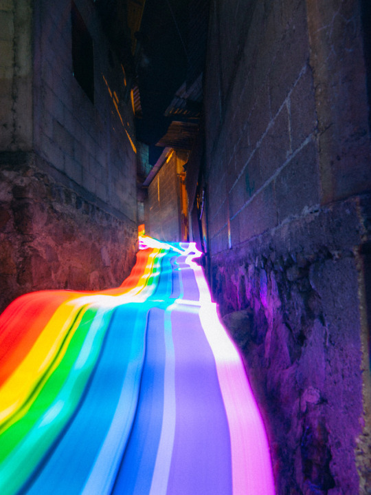
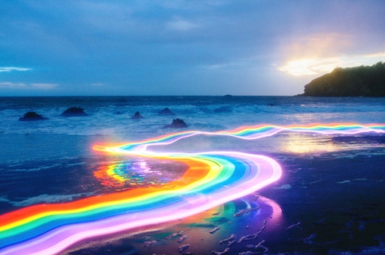
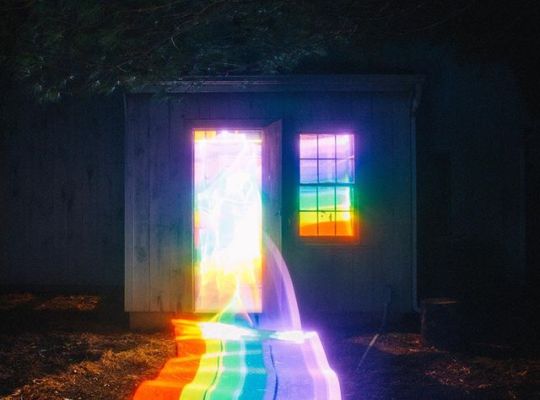
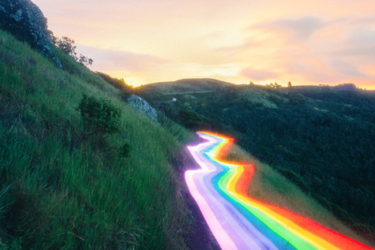
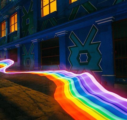
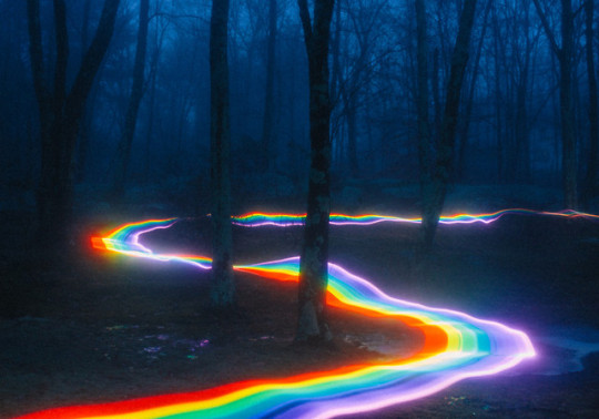
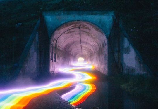
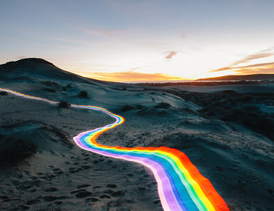
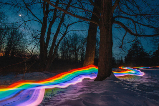
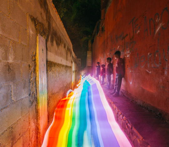
Rainbow Road
Daniel Mercadante has a slate of unique films under his belt, made in partnership with his wife Katina, as The Mercadantes, including Ball and Breathe. More recently, Daniel has been exploring the still image in a colorful series called Rainbow Road. Using long exposure photography and a custom built lighting rig covered in colored gels, the process of creating the images is surprisingly simple: the roads are created by Daniel running around with the lighting rig. No other post-production manipulation occurs, other than basic color and exposure balancing.
16K notes
·
View notes
Photo
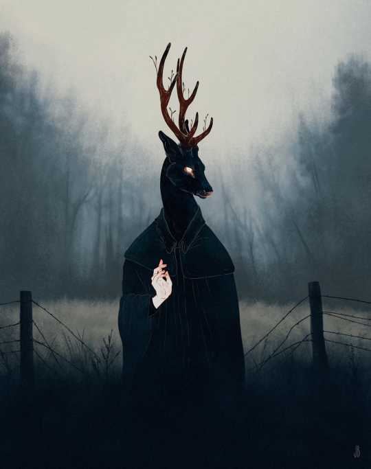
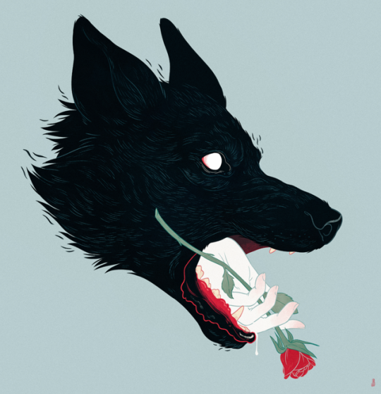
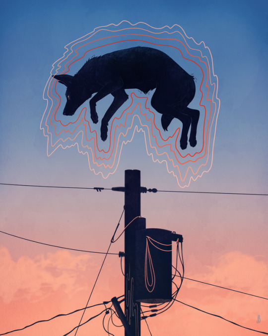


Jenna Barton, Recent Work.
Amazing recent illustrations from artist Jenna Barton (Previously on Supersonic Art).
Don’t miss Supersonic Art on Instagram!
12K notes
·
View notes
Photo


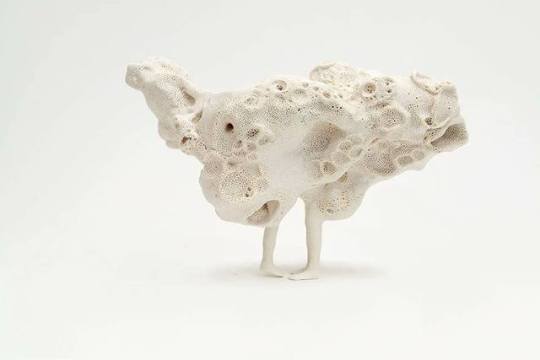
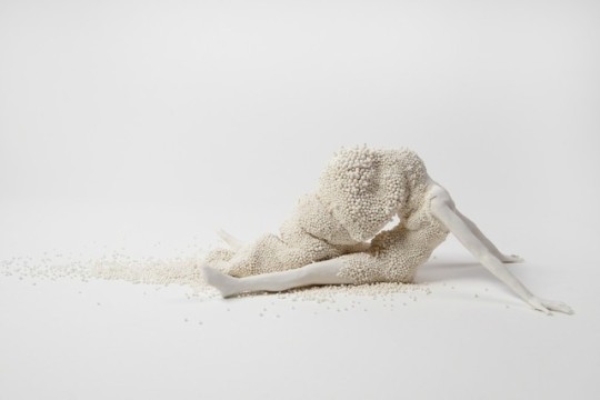
Anonymous Figures Struggle Against Nature in Porcelain Sculptures by Claudia Fontes
4K notes
·
View notes
Photo

Art for an independent book cover
Check out my tumblr for more art!
Website
—
Immediately post your art to a topic and get feedback. Join our new community, EatSleepDraw Studio, today!
134 notes
·
View notes
Photo


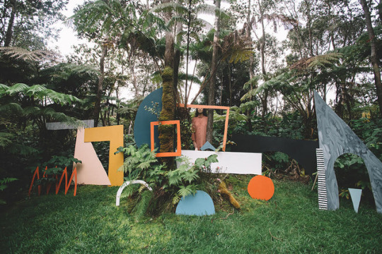

“Nothing is Separate: A Collaboration with Nature.”
“Nothing Is Separate: A Collaboration with Nature,” is an experimental, traveling installation created by mixed-media artist Ellen Rutt as part of Temple Children’s artist residency in Hilo, Hawai‘i. By creating intuitive compositions of painted, repurposed wood shapes and costumes at several of the island’s majestic, distinct and isolated terrains, Rutt explores the complex relationship humans have with both natural and constructed environments. The bright colors and familiar shapes signal our attraction to aesthetics and modes of idealized presentation.
Check out the excellent short video about the project by Emad Rashidi below:
Keep reading
457 notes
·
View notes
Video
Huntsman spider playing super smash brothers melee on the nintendo gamecube
46K notes
·
View notes
Photo


These Ryan McGinley photographs were shot during a glacial New York winter, in which naked young things squirm and blossom amid acres of white. McGinley prints these excellent photographs in studiously low resolution, which imbues the white of the snow and ice with strange chromatic variety. Near one of the Finger Lakes, an ecstatic model runs toward a waterfall frozen into pillars of ice. The blue snow beneath her bare feet is flecked with pixels of red, as if McGinley’s camera could not contain its grandeur.
227 notes
·
View notes
Photo

“VIOLENT AND STILL”
Frozen roses #5
103K notes
·
View notes
Photo


clothes of wood, a series by kurdish artist aso mohammadi
1K notes
·
View notes
Video
youtube
How to make Xerox transfer art | IN THE STUDIO
Black and white Xerox posters were a major part of the 1970s counterculture aesthetic. Artist and graphic designer Marlene Weisman guest hosts a special Club 57 takeover edition of IN THE STUDIO and demonstrates how to transfer the ink from Xerox prints to a new sheet of paper to create collages, posters, and other works of art using the same pre-Photoshop technique that she used in the 1970s and ‘80s.
381 notes
·
View notes
Photo

Image from PS1′s & the Center for Afrofuturist Studies’ website
I wish I could write an essay about everything that Public Space One means to me. It’s a place where I hold many fond memories watching performances, participating in workshops, and viewing galleries. I’ve tired becoming an active member (one summer I helped paint the walls of the Press Co-op) but alas being a student has been more or less of a demanding lifestyle.
Nevertheless, I love the space despite my inabilities to currently contribute to it. The people heading it are so determined to put ART out there, and host artists, and their dedication to other fellow artists has helped make Iowa City a little more accessible to those looking for an art center.
I hope at some point I can actually spend some time volunteering at PS1, but for now I’ll be supporting their events as a patron. It will be a place I will greatly miss upon graduation, but hopefully it won’t slip my grasp too easily.
0 notes
Video
youtube
Documentation for my “Meaningless” mini-project. The whole class was to do some sort of activity that made no real effect on the world. I wrote the numbers 1 2 3 4 5 6 7 8 9 over and over again for 7 minutes.
0 notes
Photo

Image from Doug Rickard’s website.
I stumbled upon Doug Rickard’s project A New American Picture after looking through Pier 24′s videos. As a person who loves photos of other people and scenes of their daily lives, I was struck by the simplicity (yet complexity) of Rickard’s project.
After listening to an audio clip of Rickard talking about his project, (listen to it here) I learned that all the pictures were simply from Google Earth Streetmap photos. Having taken some “tours” around the world through streetmap myself, I thought the idea of framing particular moments caught by Google Earth was intriguing.
Rickard looked to neighborhoods in America that have been neglected, those that provoked definitions of the United States that often times Americans themselves do not use to describe their home country. The idea that America is doing fine is negated when observing these photos. The images portray loneliness, poverty, and sometimes danger.
For having been taken by a car driving down the road, no person was keeping in mind composition or content. Yet composition and content come through, simply because it was just caught. A story is told, without having any intention of being told.
There is the issue regarding the personal lives of those being documented by the images. Their lives, not particularly glamorous, are exhibited front and center through Rickard’s project. Yet Rickard defends his collection of these photographs—street photography, he claims, will always be intertwined with the intricacies of what it reveals. He rather likes the discussion that comes forward because of such photographs.
Check out Rickard’s website here.
#art#photography#featured artist#doug rickard#a new american picture#america#us#ui-intermediaconcepts-collections
0 notes

