Text
Better for iOS: That's a redesign!
If you keep track of this place, you might know about Better and how it changed over the past few months. It is my only iOS project and i'm very fond of it. It finally got someone willing to develop it, so i'm giving it my full spare time to create the best design possible. The following images are from the seven screens i've made to show some of its features.
The images will be uploaded on Tumblr, and if you don't know, it ruins images completely, so if you want to check all screens in retina-ready display, check it here.
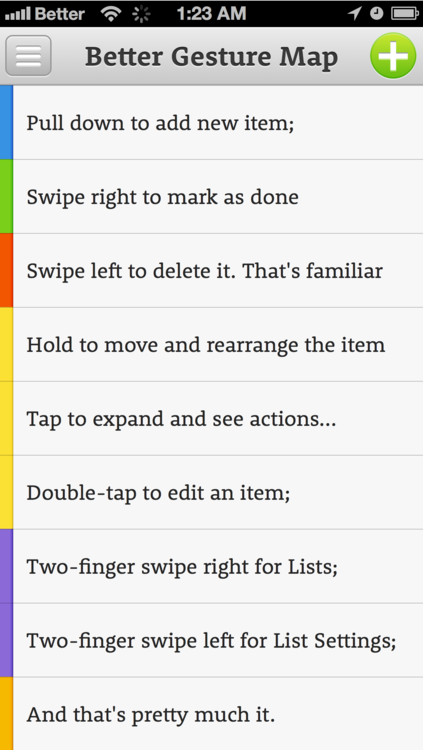
From the last designs, the navigation bar used to be green, but there's a reason why you don't see green being used often (at least not without a few blue, right, Vine?). I went for a gray navbar to don't clash in case the user picks a green color for the item label. I also added separators between each item to keep the same colors for background and font. I also removed the checkboxes.
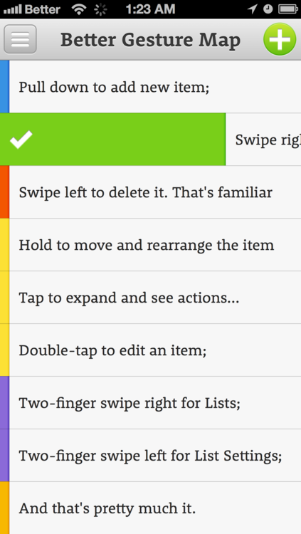
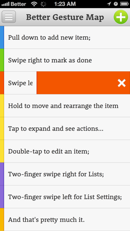
One of the reasons why i love my girlfriend is that she's just a human being when it comes to technology, This makes her perfect to test your interfaces, but also to come up with the most intuitive set of gestures. I've asked her to do a list, mark a few items, exclude a few more and you can see the results in the gestures listed. In the end, it is just like Clear, but that's only because Realmac did a great job with gestures, Clear is sincerely an inspiration to anyone who wish to work with iOS interaction. And no pinch, etc, gestures, they suck.
A little detail that may pass unnoticed. When you swipe to the right (archive), the item slides with your finger, like fitting in a drawer, meanwhile, when you swipe to the left (delete), your finger will swallow each character, so you know that you're excluding the item.
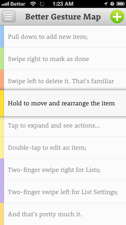
This is the early concept of the fading the rest while one is selected. This is supposed to make pretty clear that you've selected an item to rearrange it. Also, it grew a bit tall, just to be certain.
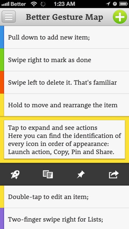
This was a tough screen, tapping expands the item, just in case you wrote more than a single line, but most importantly, it displays actions. If you know Better from its earlier days, you know that its trick is allowing you to perform actions based on its plain-text syntax. It is all about making it easier to call someone, send a SMS or even visit a URL. Hitting that little rocket (clear reference to Launch Center Pro) will perform the action that you've added to the item. There's also Copy Text, Pin and Share. Pin is to send the item to the top of your list, independently of your sorting mode.
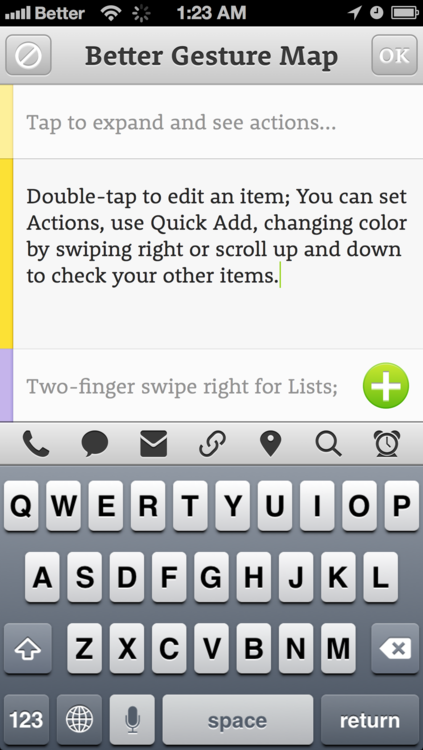
Welcome to the most difficult screen of the day. This is not only a preview of Editing an item, but on the Editor overall. First, the navigation bar changes to display a Cancel icon (which may be replaced to a back arrow) and the OK in the right to say you're done editing. The 'fade away everything while one is selected' is back, showing exclusively the item below and the one above, so you keep reference of what you're editing. Then there's also the Quick Add button, which is basically a rip-off from Listbook, another awesome list manager. Above the keyboard you have the list of actions. Can you identify each one by the icon? Here's some help: Call, Send a Message, Email, Link to an URL, Set a location, Google Search and Set an Alarm. I must admit that i love this screen.
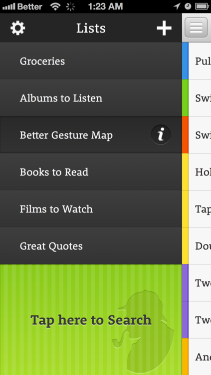
And the last screen of the day is about showing the Lists navigation. It keeps the reference for the actual list, just in case you want to swipe to return. You can create a new list or check the general settings from the navigation bar, the pressed item has an info icon to take you to its specific settings. At the bottom, you have Sherlock and the search, but this is a concept to be taken through the entire application. When you're at the end of your list, it won't block you at the bottom of the screen, but in the middle and the remaining space below will show you this huge spot to tap and take you to the search, just in case you couldn't find what you were looking for.
This is pretty much it, i'm done writing or designing for the day.
0 notes
Photo


Back to the drawing board (:
0 notes
Text
Foxhole is not an information manager anymore
Foxhole began as an alternative for software like Yojimbo and even Evernote. But think for a moment, Evernote is highly praised due to its mobile sync, without that it would fall into the same hole as every other information manager. When we go down to the OSX software, there are already plenty of options to organize your files. IPhoto for your photographies, iTunes for your music, maybe Yep for your PDFs, Notational Velocity for your quick notes, Lyn or Pixa for your general images, perhaps LittleSnapper for screenshots or Papers for academic research.
But then there's always a piece missing to complete your workflow. Anything buckets are applications created to fill that gap. They pack several features, turning them into malleable solutions to easily fit in your workflow. But they're band-aids and much of their praise come from the fact that they give the feeling of completeness. If you ever made the jump from a band-aid bucket to a specific application, you know it is an improvement, yet one not every workflow is able to afford.
What i've noticed is the problem i've used Anything Buckets to cover could be dealt with more specifically and that is a better environment to store all articles I may use for further reference. As i've declared earlier, I need a read-it-forever service.
Services like Readability, Pocket and Instapaper are great, read-it-later has become a market these days and if you organize it properly, you can create a good place to stash your articles there. They're just not made with that in mind. The latter even declares it openly:
> But Instapaper isn’t optimized for keeping track of thousands of pages. This isn’t the right tool to collect, categorize, tag, filter, and search the contents of every web page you’ve ever found — for that sort of use, try Pinboard or Evernote.
Consider the suggestions. Honestly, Evernote is as good to store web articles as any other anything bucket, since its web clipper also keeps the formatting of the article and it is not always the best format for reading. Evernote itself isn’t a very good reading environment overall. Unless you use another application like Evernote Clearly or Instapaper to send articles to Evernote, you won’t carry a good reading experience.
Then comes Pinboard. I’m a huge fan of the service for bookmarking and they offer a $25/year to store an image of the webpage. I’m willing to get the service (I have the basic only) as a last attempt to organize my web articles, however, it falls onto the same dilemma it seems, as i don’t believe it stores as a clean, nicely readable article.
Foxhole is thought to cover this issue once for all.
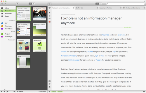
You have tags and folders. I don’t believe that tagging by itself is a proper organizational system, so I support hierarchy. Tags, at least for me, is more about searching and filtering. The only place to navigate through folders and smart folders is from the sidebar, even if a folder contains another folder, the folder won’t be displayed among the stored articles, but within the wiki structure of the sidebar. If you also check the status bar (bottom of the image) , you’ll notice a quick access to your tags, just like ReadKit does, but which would follow a structure closer to Yojimbo, as i’m a big fan of its Tag Explorer. You’d be able to pick colors to folders and that kind of stuff. The Inbox is a smart folder by itself, if a file is untagged and/or not in a folder, it will display there, inducing you to organize that article.
The article browser (middle) offers two different views, you can find both on Evernote as I consider those two the best ways to visualize a library. Of course, there’s a twist. It is easier to change how you sort your files, but you can also manipulate the size of your thumbnails, something Evernote misses. Beyond that the article browser is pretty straightforward, with each thumbnail displaying title, reference link and sorting reference (in this case, Date Added).
Before moving to the reading panel, you have the Edit panels. It is optional of course and there’s a button right above it in the toolbar to hide or activate it. It gives you quick options to highlight, note or link your article, with any color. In the bottom you have quick options to view in browser, share or print. On top you got the More Info option, but that one is always available even when the Edit panel is off, only a bit more hidden.
Then you got tabs, which are also optional, but will help you opening whatever references the article has and already storing them into the app’s cache and making reference with the original article. This means that I could not only view the original article offline, but also all the links it carries along for reference. The articles won’t be displayed in your library unless you want to, but they would be stored anyway. And just in case you missed the details, there’s a quick option in the Toolbar to change between a Light and a Dark theme. Meanwhile, in the Statusbar you have the possibility to include and view tags or to collapse all the side menus and have a full reading experience.
Besides that, not much to talk about the readability of the article (meta, isn’t it?), it’s a larger font, using a larger character and line spacing with decent margins, the font is Avenir Next, which i’ve used for the whole mockup. I hope that it makes a good enough environment for your texts as well.
Something not included in this mockup (but coming for the next ones) is the Similar Readings panel, which would show up on the More Info panel or at the bottom of your article. Since Foxhole stores text content mostly, it is easy to search and compare for content, so creating reference between your articles is just one step forward.
This is what Foxhole became. A read-it-forever application. I hope it could help you as much as it would help me.
0 notes
Text
Oh, you got Sketch? Here's an OSX UI
Sketch is an application to create vector art released by Bohemian Coding. Even though it misbehaves a lot, crashes more than any beta i’ve ever been into and could have a few improvements, it still seems like a nice alternative to Illustrator. Specially for its price.
Besides tradition, part of the problem is that if you have Illustrator, you don’t have only a powerhouse of features, but also resources. I believe in the promise of Sketch so i designed an wireframe GUI for OSX (you can find one for iOS here).
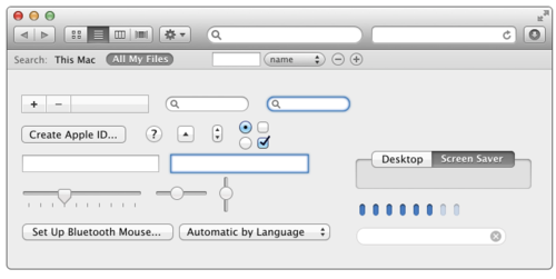
Download the wireframe.
The original was designed by Jonatan Castro for Photoshop and you can find it here.
I have no clue if this is actually perfect, but you can change it however you want.
1 note
·
View note
Text
I want to read forever, not later.
Here's my actual issue with the app world. I love the way Instapaper or Pocket translate my article for better reading. But their focus is still a read-later service and they're not actually made to store and organize articles. Meanwhile, apps like Evernote, DevonThink, Yojimbo, do a lot of stuffs and offer better ways to store and organize your files, still, none of them deal perfectly with Web Articles.
I need an application which will store and organize my web articles properly. And do that well.
Suggestions?
0 notes
Text
Six Tiny Cats
If you follow me on App.net, you know that we got six tiny little cats at home.

A woman found them forsaken on the roadside and took them. Yet she couldn’t keep them and she got in touch with a shelter. The shelter has only one employee and couldn’t give the necessary attention six kitties require. Help was asked on Facebook and we attended.
These little guys are extremely lucky already, as another girl also offered her place to take care of the cats and one day later some force of evil threw poison at her backyard. Now her cat is dying. Could have been these little beauties too. Her cat still has a chance to survive, it seems, but how could these puppies take a dose of poison and live to tell?
We expect to keep them for no more than one month, then they’ll have grown enough for adoption.
If you want to help us out, independently of where you’re in the world, we’re accepting donations of any value. The whole group consumes 40 USD of food per month. But then comes all the cleaning, they don’t know how to use the litter box yet, so the poop and pee anywhere. Then comes a whole new expenses of wet wipes, paper toils, cleaning products, etc. I still don’t know how much this will cost.
You can find more of the cuteness in my Vine (look for Phillip Gruneich up there). I’ll keep links of all the videos i already got next.
Watch them: 01, 02, 03, 04, 05, 06, 07, 08, 09, 10, 11.
I can't predict the internet, but if the amount donated exceed our expenses, everything will be donated to the shelter, so they can improve its space and offer help to more kitties when the time comes.
0 notes
Text
Writing a Post on Bill.
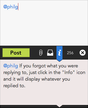
Just a really quick update with the New Post Window from Bill. You got a clean space to write your post. A big green button to send, the paperclip to include an attachment, the drawer to save as a draft and the little 'i' to show what you're replying to (if you're replying to anyone). Then the number of characters and the option to close the window.
0 notes
Text
Bill - An App.net Client (cont.)
The race for the winning App.net iOS application has been close, you got great clients like Riposte, Netbot, but specially Felix. They’re robust and offer a great experience of the social network. However, those fond of the desktop computer don’t have much of a choice but stickying to Wedge, the best client at the moment.
Wedge works, i use it, but after you get in touch with the possibilities those applications for iOS introduce, it is hard not to be frustrated about it. And then you have the money concern, the iOS competition is so tight that the applications are going free to grab a bigger slice of the 20k offered by App.net to support developers. But the desktop is still an uncovered battlefield, just waiting for the perfect app.
I believe that not only a great OSX client would grab a nice slice of the support jackpot, but it could also be a paid application. Would anyone mind paying 10 USD for it? I don’t think so, actually, that would be cheap as the iOS apps were released by 5 bucks.
Let’s move on, shall we.
The necessity for a different App.net client came from its own differences to Twitter. Keeping track of several conversations, useful hashtags and the global feed is not an easy task for an application that offer a single window. Then i went for Tweetdeck for reference, but also Tweetbot (which also offers multiple columns).
I own a noisy 13’ MacBook Pro and when i open a client like Wedge or Tweetbot the feed occupies 1/3 of my screen by default. Since displays are going wider, why not using the space? Bill is about bringing the whole App.net experience to your desktop, allowing you to follow everything you want.
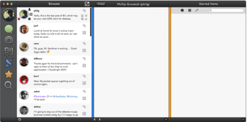
This is the first sketch done after my computer returned and it focuses on the sidebar, topbar, bottombar and an example of a stream. You may find a few features from the other columns, but we’ll move into that later.
What is really interesting about this first look is the pie menus included on each post. The one surrounding the poster’s image is activated by clicking in the picture. It allows you to see the profile, send a private message, follow and mute the user. In the right side, you have a little pie menu activated by mouse-over on the 4-squares icon. It allows you to view the conversation, star the post, repost it or open the conversation in a new column.
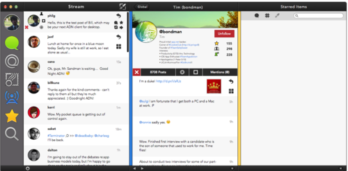
The second draft contains the full profile view and the beginning of the transformation into a flat design app. As everything in the profile view is new, let’s go to the other modifications.
The icons in the sidebar became larger and brighter. The localization bars (those colored vertical bars left of every additional column) had their colors changed accordingly. I’ve removed the large outline from the poster’s pictures, darkened all the icons and removed gradients. As the icons from the right side only appear when the mouse is close (1/2 of the post), as the stream goes i’ve included the information to be displayed when the mouse is far away. Oh, you probably already noticed, but the Global icon changed completely. The top/bottom bars went darker and the sidebar lighter to avoid most of the comparisons with Tweetbot.
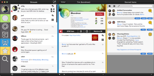
The third (and final draft so far) is where the magic happens. Sidebar? No more gradients. Not a single one, you can zoom on it. Actually, there was a drastic reduction of all the gradients on the app, i can say that if you don't count the top/bottom bar it is 95% flat design. Why haven’t i flattened the top/bottom bars? Because i have this feeling that if i’ve done that the application would look like if made in Java instead of Cocoa. I feel that these gradients help keeping everything OSX alike.
The Starred Items is the new thing for this version. You have a quick filter in the top for Conversations, Hashtags and Posts. Also a search bar to refine your results. I’m aware that searching the content of the starred items would require a storage that would clutter soon and cost too much to maintain, so the search feature is to look after hashtags, people and tags.
Tags are something easy to keep in your own hard drive or at your App.net storage with little concern. Every tag would keep reference to a post, conversation or hashtag that you marked with it.
Maybe later i could draw the New Post screen and wait for all the feedback yet to come. After some critics are diggested i would fix the layout overall.
Remember: Don’t hold your breath, i only design, unless we find a developer able to put this concept into xCode, there’s not much hope it will ever see the daylight.
0 notes
Text
Bill - An App.net Client for OSX
Hello, hello! My computer just got back yesterday and after spending the day restoring a bunch of backups i could dedicate today to finally sketch my App.net Client, **Bill**, named after the developer of [Felix](http://tigerbears.com/felix/). This is the first draft, so please beware a lot may change: [](http://i1304.photobucket.com/albums/s534/philgruneich/Slice2_zps7ea61137.png) It is very [Tweetbot](http://tapbots.com/software/tweetbot/mac/) alike and i won't deny the reference. As i change the dark theme those similarities may fade away. The main difference is that Bill is all about splitting your experience with additional columns so you may follow a conversation and keep an eye on Global, for example. The functionality is closer to [Tweetdeck](http://www.tweetdeck.com) than to any other client. In the actual draft you can visualize the pie menus through the Posts in the first screen, the use of the bottom bar to manage your additional columns. I also included the search function in the Starred view, with its 3 filters (conversations, hashtags and posts). You may also find the bars preceding the column, matching colors with the respective icon in the sidebar for easy identification. For the rest of the week i want to pack up the main template to focus in little details like the New Post window. But this is pretty much it, i doubt that something huge will change. Colors will, certainly, gradients and contours also, but the idea is already there. Feedback is always welcome, you know it.
0 notes
Text
Unnamed App.net Client for OSX
My MacBookPro is still on maintenance due to Carnival and if i get any lucky i may grab it by the end of the week, but i couldn't stop playing around with some nice stuff to add here, right?
In my last post, i wrote about a new App.net client for OSX:
Here’s the thing: remember TweetDeck? I never found much use of its multiple columns as a regular user, because, to me, Twitter has a single flow of information, which is my following, and very rare long-term interaction. But for App.net it would be wonderful as users mostly keep track of their regular feed and global simultaneosly, but the you could also move whole conversations to a column aside. You wouldn’t find trouble getting into 2 discussions by the same time while also staying tuned for some Global surprise. So, yeah, i sort of believe this is the future for desktop App.net.
Why is this a good idea? Sometimes, conversations grow endlessly, with many users and posts per minute and everytime you get into one of those, you lose track of someplace else, Global, for example. This happens to me almost in a daily basis. If you're in a conversation or checking a hashtag, you'll lose Global content and that means new chances to talk and meet new people.
Using the multi-column structure from Tweetdeck in a App.net client means that you could check several branchs of the community simultaneously. Are you talking with a Group of people and would like to check Global as well? Maybe you want to keep close track of a hashtag like #teamappdiction for posts while doing something else? This is the solution. And one no iPhone client can offer.
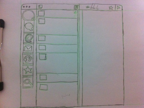
I drew something poorly just to jot down the initial set of ideas concerning the features of the main window in this imaginary application. It's really straightforward with a structure ressembling the Wedge and many other applications like Sparrow, Tweetbot, etc. Why that structure with a minimal sidebar? Because it is healthy for widescreen displays and the only reason why multi-column would be a welcome feature is because of the constant inclusion of these resolutions at people's computers.
Sidebar menu contains direct links to Feed, Mentions, Private Messages, Global, Starred items and Search. The top menu is the one interesting. Because the first window contains the New Post button and a mysterious one. The little button without a name yet (magnet, perhaps) is the one that will remain highlighted if clicked and will open your windows in a different column. I'll probably move it to the sidebar and replace that little arrow within a ball on the bottom-right of the profile image (that one within the circle). I believe it would come further more in hand there. If the 'magnet' button is unchecked, them things you click will open in the primary window.
Every active window gains a colored bar below it, similar to how an iPhone client would tell you where you are. However, as you can have multiple windows opened, those colors would vary and you would find the same color at the little spacing bar right in the beginning of the second window. This is not only a quick way to identify where you are without checking the top bar, but also to give some empty space between the columns.
Top bar of the secondary window contains the name of the place you're at, a button to Star the item and, maybe, a little arrow. See, i don't want to limit the amount of windows that you can follow, so this arrow would be useful to navigate through your secondary windows. Whenever you star a conversation, you'll be asked to choose a name for it (and maybe even tagging) so you could find them later effortlessly.
As i've posted this idea on App.net, only one user gave some feedback, which is @curtisp:
@philg looks pretty standard, nothing wrong with that. Just thinking aloud, what if it just showed the current timeline and doing things depended on gestures and or a radial right-click menu.
I'm really not a being fan of gestures for the OSX, honestly, that's one of the reasons why i believe that Clear sucks. Yet i couldn't get the radial right-click thing. This is an example of what he might have meant: Sapiens, Trampoline, DropZone, or just google for Pie Menus (its official name) for more examples. It doesn't fit anywhere, but it seems like a great idea to attach into each post. A reply button and a multi-option button where you can star, repost, copy or open the conversation in a new column. The options open wide as you roll the mouse over, so i'm using a cleaner solution to offer many options and still 1-click away.
There's still a lot of thought to be given for this application and as soon as my computer returns i'll possibly work on a full UI for it. Feedback is always welcome, but you already know it.
0 notes
Text
Unfolding plans
This will certainly be a long week and i better get used to use my fat thumbs for typing on my iPhone. I don’t post in quite some time due to several reasons:
I just began writing for MacAppStorm, you might have read my first article on Airmail, an email client, similar to Sparrow, in current Beta. And you’ll read more from me soon!
Another issue is that my MacBook went for a fix and they need to order the pieces and all that story that takes a while to conclude. I still need another week until i can put my hands on my baby again.
Even if WritingKit is an amazing application, writing long texts on an iPhone 4 is a pain. No, i don’t have an iPad (accepting donations, though), so it is all about the fat thumbs.
But i can’t pause my mind and i’d like to relate what i’ll work with as soon as i get back on track.
On Better
Our dearest plain-text list manager. There are plenty of things to move along. I’d like to discuss its gestures and my beliefs on how any application should behave: If it is on the screen, it better be clickable. This would also bring on a few more functions, like how to send an entire list as an email, for example.
Another important thread would be sorting and also how important it is for smart apps that organize your files to realize you must be able to turn it off: there’s no automatic setting that will please everyone.
Then comes a luxury: i might want to redesign the whole thing. I have good intentions and always try to do my best, but i’m not a designer. I try to follow the last tendencies and it seems like Better is antique and unnappealing as it is right now. Then, yep, you may expect something entirely new hitting soon.
I also didn’t forget about how Better was born: as a menubar application, as the ideas flew around the iOS development, i shall urgently update the OSX app accordingly to the iOS’ new thoughts.
On Foxhole
You haven’t heard much about it because there’s nothing simple about it. And as i study and overthink the whole concept of information managers, i keep wondering if they’re really necessary. In the beginning i thought that i was creating an application for power users, as i kept including more and more features, however, that’s not where the jackpot is: i want to give something Evernote can’t provide.
The phrase echoes in my mind about being better to have an specific application and do it well than having one that do many things but no so great at it. Perhaps the answer is that an information manager is not about being able to adapt to whatever you need, yet knowing what you want in advance.
Then as i think a little bit further, Foxhole wouldn’t be an Anything or Everything Bucket, but a personal storage for little thing you stumble upon your way. It wouldn’t be about going paperless or working on a file with your teammates. But organizing your snippets of thought, random images you collect online, tiny audio notes and, most importantly, articles you would like to keep.
Narrowing down what Foxhole could do is also a good way to viabilize the possibility to have it on mobile platforms. It’s my little pet project and cutting down its fat gave it nothing but objectiveness.
Other Ideas
A web-environment to help people to stop smoking. I really want to give it more thought, but i must clear my head first. It’s an idea that may be appreciated by political institutions and i want to step carefully onto it. But you’ve read about this one before, let’s go to the brand-new stuff.
As you know, if you’d ever need to find me, the best place to look after is App.net. I’m a big fan of the service and it keeps growing. There’re many thoughts on ADN after my 1-month experience (but if you want a good sign, it feels like i’m there for a year) and they might get a post someday, but let’s talk about a desktop app. IOS competition had been rising in the past few weeks, but still your best option for OSX is Wedge and even though we ignore ourselves most of the time, it is undeniable that it could do much more.
Here’s the thing: remember TweetDeck? I never found much use of its multiple columns as a regular user, because, to me, Twitter has a single flow of information, which is my following, and very rare long-term interaction. But for App.net it would be wonderful as users mostly keep track of their regular feed and global simultaneosly, but the you could also move whole conversations to a column aside. You wouldn’t find trouble getting into 2 discussions by the same time while also staying tuned for some Global surprise. So, yeah, i sort of believe this is the future for desktop App.net.
To pack things up and leave, i also want to make spreadsheets even more simple. Really simple. Honestly, the learning curve for eithet Excel or Numbers is way too long. Even Google Docs has its issues. You’ll hear about all this soon.
0 notes
Text
What is open in your Mac?
What's in my Dock?
Mail.app - After Sparrow's downfall, it was a tough quest to find the e-mail client i'd use. For a while i kept using Postbox, however, i bought a 1-day offer for the Indev software. So it's not only Mail.app, but also MailTags, Mail Act-On and Mail Perspectives converting it into my little powerhouse.
Reeder - I don't follow many RSS, but i do and Reeder is always there to tell me what is new.
Safari - I've been a Chrome user for years, but after Mountain Lion, Safari became my browser of choice.
ITunes - If i had to choose a moment to listen to some music, that would be every moment. ITunes 11 came and made the standard even higher, so i ditched the 'music only' applications like Ecoute and Enqueue. They're great applications though, don't get me wrong.
Mou - I write everything in markdown and i've been using Mou for quite a while. It's free while in beta, but there's not much to fix there. It's an amazing application.
Wedge - I'm a big fan of app.net and Wedge is the best desktop client for mac at the moment, so it is always open.
What is in my menubar?
Fantastical - Nothing beats Fantastical for regular guys like me dealing with the messy Calendar. I don't use it actively all day long, however it is daily reminding me to take the garbage out (no, i won't use Due until they make it good).
Trickster - This is not the most well known application, but Trickster is a joy. It tracks your recently used items and displays them for you. I just drew something and want to share it with Droplr? I can drag it from Trickster to Droplr and job's done.
Droplr - I share a lot of stuff every day and i chose Droplr to be my best friend. Even got Droplr Pro to support them as i can.
Bartender - My dock is always hidden and you can't avoid to clutter your menubar these days. Bartender certainly makes my life cleaner. And removing Notification Center and Spotlight from my menubar is certainly a PRO.
What Bartender hides?
Moom - A do a lot of window management in the macbook, Moom allows me to set a collection of keyboard shortcuts and also drag the windows to corners.
Houdini - If Houdini is not on, something is wrong. It's a free menubar application that will hide inactive items if you don't use them after a certain amount of time.
RescueTime - I do procrastinate a lot, if you allow me i'll die wasting my time. RescueTime tracks how i spend my time on the computer and rates my productivity.
Caffeine - Who doesn't have Caffeine? It doesn't let your mac sleep, simple as that.
TextExpander - I write a lot and TextExpander is a great friend. When collecting data it made a significant improvement in my speed and saved my fingers. As i write in Markdown/Fountain, it also helps me to place syntax i forget. And yes, my actual name is ;name.
What is completely hidden?
F.lux - Most of my day is in front of the computer, this tiny application tints the screen according to the hour of the day. Looks strange at first, but your eyes will appreciate that you started using F.lux.
Screenfloat - I screenshot a lot and Screenfloat creates a floating window of my recent screenshots so i can take them as a reference into any application i'm working on. You may manage your shots as well.
DragonDrop - Oh, Two-Dollar-Tuesday, how i adore you. DragonDrop allows me to drag files into a little window so i may drop them any place else. Great for macbook users.
Dropbox - You already know Dropbox, it's where i sync every god damn file i find useful. I also backup my entire Together library there, so i may access from the iPhone.
Hyperdock - This is a nice system preference that displays a window whenever i have the mouse above a Dock item. It's great when you have more than a single instance application of an application open. Hyperdock is also how i realize there's more than a single Wedge client open.
Hazel - I can't praise Hazel enough. What i used to do constantly, now Hazel does. Whatever has a constant parameter, Hazel deals with it.
Launchbar - I need a launcher, so why not one that is much more than that? Launchbar allows me to navigate anywhere in my mac, pick my iTunes song, access a Pinboard bookmark, there's so much this little thing can do i barely use the Finder anymore.
This covers the applications i have constantly open in macbook. Of course, there are also a bunch of applications i use for specific tasks. But now tell me, what is open in your mac right now?
0 notes
Text
Searching in Foxhole.
In the previous articles…
Foxhole was the first idea posted on this blog. It is a long article reviewing Yojimbo and Evernote as anything buckets and jotting ideas that would make a better information manager.
Intuitive and discreet way to add files;
Reinforcement of the tagging system;
Tags within tags: the sub-tags;
A better way to handle web content;
Make it better to view files.
After that article i chose Together as an information manager and yesterday i compared the three: pros, cons and how i'd integrate them in my workflow. I briefly described the functions i believe an information manager should support: add, organize, visualize and search.
The main concern
They’re poor filesystems, poor text editors, poor databases, poor to-do lists, poor calendars, poor address books, poor bookmark managers, and poor password managers. At their worst, they’re even poor web browsers, poor encryption systems, and poor synchronization schemes.
This is a quote from the article that triggered most of the discussions surrounding information managers. And it certainly has a point to consider. Then quoting myself:
(…) that’s the whole point of owning an Anything Bucket, it has to be an application with the flexibility to be whatever you need.
Flexibility. If there's one word i'd like to stick on top of my desk while thinking of Foxhole, that would be it. Comes down that an information manager is a Finder, but a very specific environment of it. So, yes, the critic made by Alex Payne echoes. If you're going to create a file system that does what Finder does, what's the point? Turns out that the whole concept of sub-tags as i've introduced in the aforementioned article is a step ahead that leads to another concern i wish to cover.
Large libraries. That's a common issue i see around the blog-world, as your library is tiny, everything is great, when it starts growing, then you're screwed. Unless you own a very, very specific filing system. This could happen anywhere, that's a risk you have to consider even if you keep your whole library on Finder.
Integration & Unobtrusiveness. Evernote is the party boy and we'll find it integrated anywhere, however, it is invasive to access the files. Yojimbo fails in both categories, as it is not integrated to anything and relies on opening the application to view the files. Then i chose Together because i may cut down most of the disruptive behavior and use it as an organizer. Guys like me are always trying to simplify the workflow and we have no remorse to cut an application lose if it is not integrating properly. Integration, in most cases, can be generated (spread the love for Hazel), unobtrusiveness can't.
Visualization: what for? Most of unobtrusiveness means that the application won't stand in your way, so if you want to access a file stored in your Anything Bucket you shouldn't need to open the application. You have better stuff to visualize that item already. Yes, they allow you to open the item in another application from it, but why make the path longer? You need a great way to visualize your archive, but not the individual file. Thumbnails, people, thumbnails.
Foxhole
Foxhole is supposed to be an orchestra, as i'd prefer to make it a collection of 'two apps'. The main engine, which would be focused in organizing and previewing items and the helper, which would add files and search even if the app is closed.
It's easy to believe that such a helper is impossible, however, applications like 2do allow you to add items with the helper and WITHOUT opening the application itself. Hazel also moves your files via the hazelworker, so, yes, it is viable. As i'm focusing the main application further as an organizer, there is much more to research, like Yep and Leap, from Ironic Software.
Stickying to the division of applications, i'd like to discuss the function of search. Yojimbo has this great thing to create a keyboard shortcut to Search within the library, the only problem is that it open the whole application. The less invasive the better, so this is how i'd like Foxhole's out-build search to look like.

It's pretty much Launchbar on steroids. As a big fan of the application, you might not be surprised. It is highly unobtrusive and will only show up if you call. That's the first window and you may see the Foxhole tiny icon in the right (there's one in the menubar as well, but that's for another day), so you know that you're searching on Foxhole. This is the template when you effectively type for something.

Yes, there's nothing written because i suck to create these text examples, but you see the point. This is not an exact copy of Launchbar because of that bar right below the search bar. So what it does? It suggests search terms. As you type your first parameter, it'll suggest to autocomplete it to you and offer you more terms based on that tag. It's a great way to navigate through the sub-tags without relying exclusively on the main application.
There's also a quick syntax, ':' means that what follows is a Folder name, '@' for tags and '*' for extensions, '@@' for sub-tags. As there are automatic folders for every kind of file Foxhole would support, you may search through your images, narrow for only the .png files tagged with vacation like this: :Images *png @vacation. As you have a folder for Recent Items, you may check them via the Search. And as your searches are organized per relevance, you'll see the items organized per Date Added.
You have a bunch of shortcuts in the search engine as well, show it by pressing F6. TAB will include the first suggested term to your search, you may also include the following suggestions by using TAB+2 for the second suggestion and so on. Just remember that if there are only five suggestions displayed, you can't hit TAB+6 for the sixth one. Sorry about that. Use the UP/DOWN ARROW keys to navigate through the results, hit ENTER to open the item on Foxhole. Press the RIGHT ARROW on an item to display the applications you may open the item with, then press ENTER to open the item on the chosen application.
This covers the first set of ideas towards Foxhole. Next time you jot your ideas somewhere, think how could it be better. That's what Foxhole is all about.
0 notes
Text
Why we need a new Anything Bucket?
An Anything Bucket
Anything Bucket is a term carved by Shawn Blanc to describe applications like Yojimbo, Evernote or Together.
Because apps like Yojimbo are not where you should keep everything, but rather, where you can throw anything. They are not replacements for the Finder – nor the opposite – you should use them both.
Previously i've covered them partially and wrote down an idea for a brand-new application, nicknamed Foxhole.
Later on, Shawn wrote another article discussing how he's replacing his Anything Bucket of choice (Yojimbo in his case) for more specific applications, like Pinboard or 1Password.
But over time, many of the things that I first used Yojimbo for have been replaced. Apps and services like Pinboard, 1Password, the Mac App Store, FileVault 2, and Simplenote/nvALT have all but obviated the majority of Yojimbo’s daily usefulness for me.
I share the same feeling as Shawn. While writing the aforementioned piece on Foxhole, i decided to go with Together because it bugged me less and this is already a bad way to start, because you shouldn't get an application because it bothers you less, but because it fits your workflow.
But just saying is no good, so before write about my new thoughts on Foxhole, i'll review Yojimbo, Evernote and Together very briefly, covering elements that concern me when it comes to an anything bucket.
Together
Together accepts any kind of file because it just organizes them into a folder library. This also means that there's no compression of files, so as your library grows your hard drive (and your searches) will certainly feel it.
I can index the main folder at Launchbar and search for my files with Together closed. As Together uses OpenMeta tags, Launchbar doesn't read its tags, but there's an applescript to solve that. Spotlight searches work perfectly. Although this is tricky, because it is the main reason not to keep Together open, but also why i chose it in the first place.
Together is great to visualize your files, has a beautiful PDF reader, but in the end, using Launchbar to search within the library and preferring Preview to read them myself i barely use any sort of visualization for the files stored within Together. This is another double-edge, as Together allows me to do that without having the application opened, so i just don't open it.
As you may place Together's folder in your Dropbox, you have it synced anywhere, so that's another pro of the non-compression system.
There are several ways to send a file to Together: a shelf, a shortcut and services. I hate the shelves mostly because they're invasive. The shortcut is straight forward: select a file, hit F8 and it sends it to Together, but it only works if Together is open. If you select an URL and presses F8 it'll create a bookmark, however, if you select an web article and hit F8, it'll still create a bookmark. If you drag the same text to the Shelf you'll get a RTF file and the main actual function of Together in my workflow today is to store web articles (for future reference, so if the source goes down i still have the content) and organize PDFs.
The shortcut doesn't work as i want and i hate the shelf, this means that i organize my files with the Services menu. This might sound boring, but if you're using Launchbar it is the most effective way. The services are there if you don't have the application opened, so that's another pro over the two other options even though it opens the application. In the end, sending files to Together is not as breezy as you would expect.
Another issue is that you can't tag files as you send them (unless you use tag bundles on the shelf), so you must always do it later. I know that most of the time you'd just send them and let it turn into a mess, but the option is good.
I also use a few scripts with Hazel to control routine files, but all applications i'm checking for this article have a way to do this.
So if an Anything Bucket is supposed to add, organize, visualize and search, i only use Together for the first two, being 'add' more an obligation than a choice.
Yojimbo
Yojimbo accepts only a few file formats and it compresses them into its library. Yojimbo will only accept text, pdf and images (considering that html counts as text). Even limiting your experience, this means a smaller library in the end, allowing for faster searches.
There might be a way to make Launchbar index Yojimbo's library, however i couldn't manage to make it work. Spotlight searches work perfectly. Yojimbo also has a shortcut to Search the Library, unfortunately, it opens the application. You may backup your library at Dropbox, but it's only a backup (the files you must index are within ~/Library/Caches/Metadata/com.barebones.yojimbo and i believe you can't index a hidden folder).
Yojimbo has a single view mode, which is great to navigate through your files, but awful to visualize them, though it allows spotlight searches, the file will open in Yojimbo, not is default application. When you force an user to view the file somewhere, it better have a decent visualization mode, as in Together i could ignore searching and visualization, Yojimbo obligates me to keep it open in order to make use of it.
Covering a limited amount of files may also be the real charm of Yojimbo as adding files to it is pretty intuitive. Yojimbo also contains a shelf, a shortcut and services. The services allow you to create a note, an image, a web archive or a bookmark, which is sort of everything Yojimbo can store. Every shelf sucks and Yojimbo is no exception so i'll just skip this part and go to the good part:
Yojimbo's quick input is the best way to send files and if there's a reason to stick to it is the magic that happens when you press F8. Select some text and press F8, it intuitively creates a note. It works with any file and also allow you to quickly tag, flag, label and comment your file. It interacts with your clipboard with the Quick Input as well.
It frustrates me how it deals with web articles (this being the main reason why i chose Together over it) as you may only save a bookmark or a heavy web archive. Everyone uses a service to read cleaner and better nowadays, be it Pocket, Instapaper, Readability, RSS, Evernote Clearly, Safari Reader, or any goddamn option, if you decide to store this post on Yojimbo, it won't look readable.
Yojimbo takes a different approach when searching by tags. In Together, you select a tag and it will narrow the search, you may select more tags using the shift key to expand the search. As you select a tag in Yojimbo, it'll narrow the search and show you only the additional tags those displayed items contain.
If you use Spotlight and Yojimbo limitations fit your workflow, i'd say it is the best option in the market. For more on Yojimbo's basic resources, watch this video.
Evernote
The dearest information manager. I really hate almost everything about it. Because if there's one thing worst than an application that invades your workflow is an application that forces you to wait to use it. Evernote is "free" and stores your files online. There's a physical alias stored in your Library folder so you may search through Spotlight, however, you can't access it through Launchbar, although there's an applescript to search Evernote through Launchbar. It opens the application, though. Evernote is "free", but it is thought to push Premium down your throat. It stores files mostly like Yojimbo, main reason for Yojimbo to do that is to compress your files in a database, which leads to a smaller library overall. Evernote CERTAINLY compresses your files after upload, yet it displays (and counts for) their actual sizes. As you have a monthly upload limit, you actually use less space than what they tell you do.
Even hating Evernote, we must evaluate its pros. Evernote has four modes of visualization including the Card View, which is the best way to visualize a library of images and bookmarks (with thumbnails). There is also the viability to create shortcuts in the sidebar, to files and notebooks. The recent notes displayed as a list instead of a smart folder is also a great way to deal with recent uploads. Include audio notes is also a cool thing to have.
The Web Clipper is great tool to store articles from the web as it allows you to include tags and comments. But how do you include files out of the web? It's the worst possible way if you're not dealing with screenshots (Evernote deals quite well with those). You may drag the item to the dock icon, you may create a new note via shortcut or menubar and drag the item into it. Both methods require Evernote to be open, however there's a menubar helper that remains open after you quit, but, guess what, if you use it, Evernote opens.
The deal breaker of Evernote to me is that it has the worst navigation among all anything buckets. Simply put: it demands many clicks and has a lot of useless information displayed. There are only a few methods of organization: notebook stacks, notebooks and tags. Yojimbo narrow the searches, Together expands, Evernote only shows and tells you to deal with it. There are no smart folders, tag bundles, nothing to organize your files even further. Oh, and if you add a file without tags you must manually look for it in order to organize it.
I see people using Evernote mainly for its portability and integration to other applications, specially mobile, those are its main qualities compared to the competition. But what's the cost? If you see yourself in the constant need to store files from your phone, Evernote is easily the best bet, but save yourself the trouble to use its desktop application.
Conclusion
It's impossible not to be biased when writing an article comparing applications, but i tried my best to keep it minimal. You might have read some presumptions here, i didn't have the time to explore everything of each application and make a deep analysis, so, please, if you know a way to avoid the issues i've listed in this review, let me know your workflow. Pointing out these problems are part of the development for Foxhole, an information manager i'd like to work on. You'll read more about it in the next few days.
1 note
·
View note
Text
Flurry Icons
Yes, my main hobby is not laboring data spreadsheets or developing user interfaces, it all began drawing icons. Flurry icons, to be more specific.
Flurry is an icon concept created by Louie Mantia & David Lanham from Iconfactory. These are icons for OS X with iOS looks. You can find them everywhere. So i'm bringing to tumblr the icons i designed.
You may download them here. A preview is right below (icons in 128px for the preview).
Beware: prepare to scroll.
0 notes
Text
Quit Smoking: A Social Network
Stop smoking is tough, i daily consume an average of 20 cigarrettes, this means that i pump 14mg of nicotine and 180mg of carbon monoxide (varies per brand) into my bloodstream every day. Then comes the price, i spend $3 a day in a pack, that's $1095 a year, which is a full, comfortable month of expenses around here.
People say you lose a day for every cigarrette you smoke, however, that information is probably biased and we don't actually care about losing another day of life, we're young until it's too late. If people had a countdown indicating that they have X days of life left and losing a day for every cigarrette they smoke, maybe people would bother, but that's not the case. If there's one thing people care about is money, because that's the present, so, yeah, taxes on cigarrettes increase, price skyrockets and it hurts my pocket badly.
I need help, but help is a problem when it comes to quit an addiction. All my options are more about informing you than acting with you. I don't need a doctor, i need support. I need a buddy.
This is a problem and if you know me well, you know that i don't sit and wait, i look for solutions. So why not a social network to help you quit addictions?
Quit Smoking
It's simple, you create an anonymous profile with the most basic information: e-mail and password. This approach is quite the opposite of the social network as we know, as they usually ask you to input all kinds of information (only to sell you afterwards).
You would also include some hidden personal data about your addiction. Your age, height, weight, the brand you smoke and how much you do it daily. I have no idea what would be the algorhythm to effectivelly put that in practice, however, i have a guess it wouldn't deviate much from that. Just quitting is impossible, if you ever tried you know that after a few hours you're crazy. Motherfucking crazy. So the site would use the information you provided to fill an algorhythm that would lead to some sort of timeline, which would reduce the use of your addiction in a slow but noticeable pace.
This means that from time to time this website would display a notification telling you to smoke a cigarrette and as you respect its indications it will increase the space between the cigarrettes until you're done with it. But this shouldn't be contained exclusively to the website, it must be everywhere: browser extensions, hidden applications and, most important, phone apps.
What if people cheat?
Cheating will obviously happen, people will smoke in moments the application doesn't tell them so. Then the I'VE CHEATED option is really necessary, anytime you light a cigarrette out of time, you click there and it recalculates your timeline for the rest of the day. If you cheat a lot it will slow the pace of your progress. But then you have those people who are quite good at quitting, so whenever the application tells them to smoke a cigarrette, they may choose GOT CANDY!. If there's one truth about quit smoking is that you can't simply push it into someone's throat. It is a slow and variable process.
There's no social network there
This little helper is good enough by itself, however, the mutual support a social network could provide in this case is promising. We have a lot of people with the same problem fighting for the same cause. But i see a different approach, as you progress into quitting, the site would allow you to include more personal information, customizing your profile even further. It's coming out of the shadows, but also a discreet way to portrait the addiction as shameful.
You could make friends and follow up how they're progressing, so every one help each other, inspiring discreetly to continue.
My first thought was to create an open diary. You could include entries and they'd be shared among the social network for everyone to see, but without any kind of link to you. It's about writing testimonials, everyday, so you may put it out of your mind, but also inspire others when they feel unsupported and looking for that extra push.
I also had to idea to include leaderboards, though i believe that instead of motivating people to progress, it would reinforce cheating, so this is an idea that requires extra thought. But turning it into a competition could work for a few, perhaps the way it already is projected is enough to motivate the user.
How to cash in?
This is just a brainstorm for an idea i have for a few months. But a full project shouldn't include advertisement and most important, shouldn't sell your information to third parties. Yes, Facebook would never put their hands on this thing. A paid subscription is temptating, but sorta kills the impulse to join it. Still the best option so far. But then you have the largest money pot around supporting these projects: the government. A full project could easy be sent to the Health Department and get constant financing. The data (on your progress only!) would be used to help studying the cigarrette addiction solely. It's a win for the government which gains a lot of data for barely nothing, it's a win for the user who wouldn't have to worry about ads, payment and privacy and it is a win for the developer, which would get his monthly check and a huge amount of free advertisement.
Please leave your ideas or talk to me at app.net.
1 note
·
View note