oliviamiller-extendedpractice
39 posts
Don't wanna be here? Send us removal request.
Photo

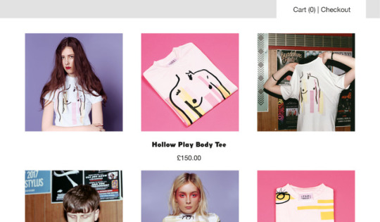
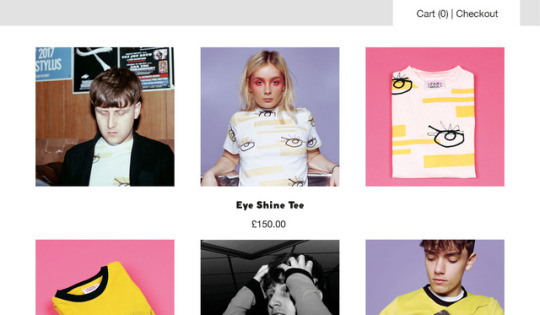
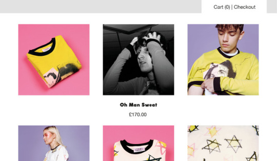
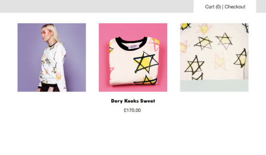
Each website researched so far showcases brand identity and values as well as using the online platform to sell products. As far as Fan Mail is concerned; key brand identity points, USP’s and values are:
-Mid-luxury product level: fabrics; finishings; quality; UK manufacture.
-Artisan ethos and aesthetic; products hand-screen printed in the UK; each garment designed and made in the UK; print designed stemming from artist interpretations of music.
-Music inspired image and aesthetic; t-shirt prints are inspired by music; styled photographs are inspired by music; brand prides itself on creating products that make the consumer feel individual, iconic and alternative.
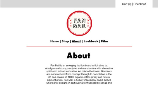
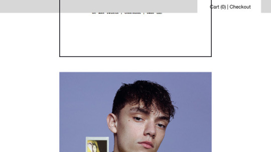
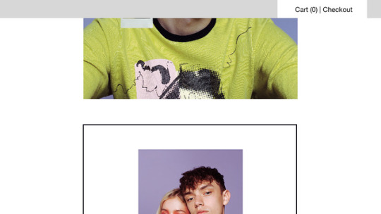
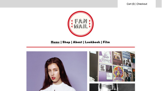
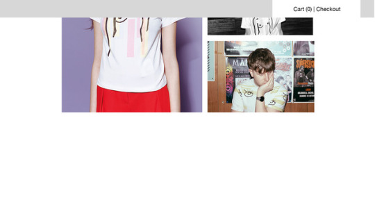
Fan Mail’s website has to reflect these core values to portray it’s brand image correctly and attract the desired audience of male and female millennials with an enthusiasm for style and music. Most of the research on how to brand Fan Mail in this light has already been undertaken and executed in the form of styled shoots, an Instagram campaign, logo designs, look-books etc so it is just a case of slotting components in a format that suits Fan Mail’s style.
0 notes
Photo

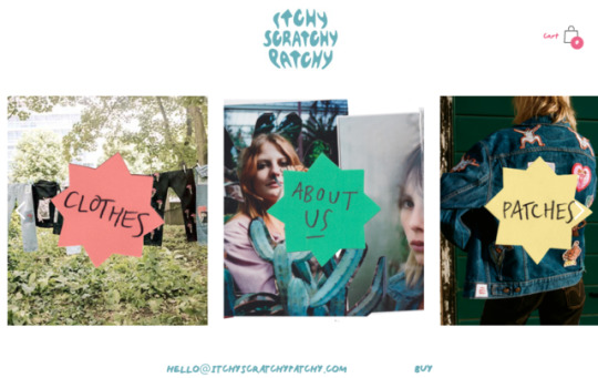
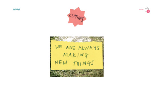
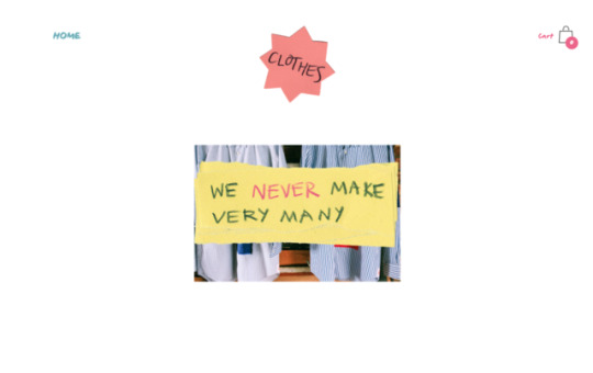
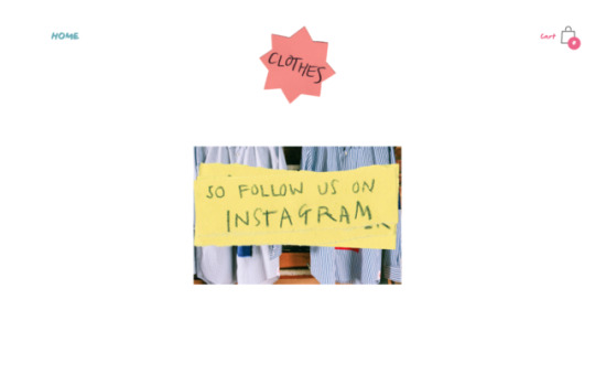
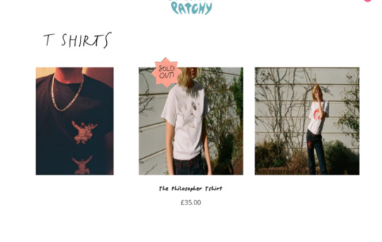
Itchy Scratchy Patchy is a main competitor of Fan Mail’s as they have a very similar aesthetic and ethos, they’re both low-fi, edgy and limited edition in that not many of the products are made therefore increasing demand. Itchy Scratchy Patchy reflects this brand image through a very low-fi style website consisting of hand-written notes on torn/cut paper and candid style photographs to advertise the clothes. The website design itself is very simplistic with only a ‘Clothes’, ‘About’, ‘Patches’ and ‘Buy’ page but the content itself is what keeps the website interesting and reflects the brand identity.
0 notes
Photo

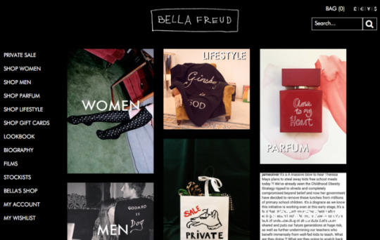
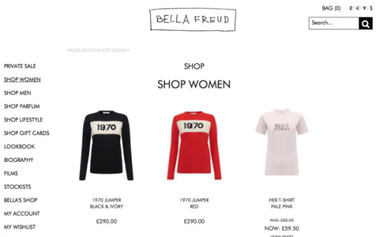
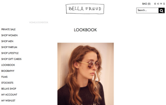
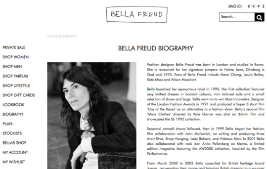
Bella Freud’s website has a lot more options for browsing where customers are even able to shop a ‘private sale’. This is possibly to entice loyal customers who vistit the website frequently into making a purchase, they will feel as though they have grabbed a bargain that no one else is aware of; something VIP for them. Bella Freud also includes her look-book on her website, which I feel is a good idea for my brand as I aim to do most of Fan Mail’s sales online instead of store-based whilst the business is small-scale.
0 notes
Photo

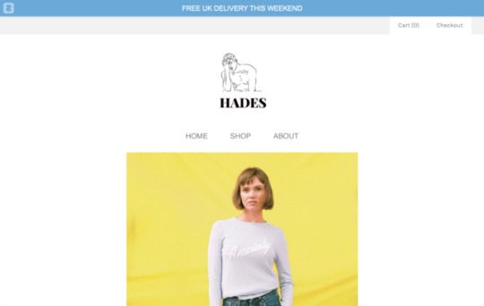
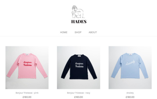
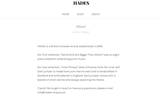
In order to gain inspiration for Fan Mail’s website, I have looked at one of it’s main competitors’ website; Hades. Hades’ homepage is simple with the logo placed in the centre top and demanding the most focus. There are three pages below consisting of ‘Home’, ‘Shop’ and ‘About’. The home page included a recent photograph from the current collection as well as a direct feed from the brand’s Instagram. This creates a multi-channel connection allowing the consumer to interact with the brand through different platforms. The ‘Shop’ page allows the consumer to browse products and add them to their cart and the ‘About’ page outlines what the brand stands for. It is a fairly simplistic design but works well with Hyde’s brand image; quite simplistic yet attractive and ‘pretty’.
2 notes
·
View notes
Photo

My second formative critique for the module, in note form, went as follows:
- Looked at Itchyscratchypatchy.com as a strong reference for a brand competitor – reference this in your statement of intent.
-Good independent working & professionalism. You have identified your USP and market level and aesthetic. Continue developing your brand indentity considering – FAN MAIL .You have fallen a bit behind whilst considering your direction & aesthetic so it is now essential that you focus on producing the garments/products so you can still achieve all your communication work effectively. Another concern is the understanding of the screen printing process
– Factor in enough time for this mixing the colours, sampling. Colour palette inspired by Hockney, sourced organic jerseys from Fab Works that are suitable.
-Discussed automatic drawing and free style drawing to the songs you have mentioned to help you develop your aesthetic for the screen prints. Choose x4 albums to undertake automatic drawings in response to iconic albums. Ready for screen printing workshop tomorrow- CONSIDER the effect that the colour and binding will have on your coloured fabric as you are not working on white.
-Incorporate this in to your branding – the artisan, artistic response.
-Good progress with toiles, happy with the shapes. Buy your fabric (in case stock runs low) go to Berwick street fabric stores for jersey ribbing or you could consider dying the fabric?
-Hoping to produce x2 sweat shirts (mens/womens) and a selection of t-shirts, You could also offer other options on the website.
-Plan photoshoots & films .
It is clear that I really need to start developing my product in cohesion with my brand philosophy. It may be that as I start the screen-printing process my philosophy and aesthetic may change and I therefore may need to adjust. I have come across the name ‘Fan Mail’ inspired by a Blondie song and would like to continue this music themed inspiration through-out my process as well as including the hand-screen printing as part of my USP. It is important that I get my products completed over the Easter Break so that when I come back I can concentrate on the communication of my brand.
0 notes
Photo

Logo design and brand name. Decided by March 5th.
Unisex design t-shirts and sweat-shirts. Two designs of each, toiled and made. Have all garments completed by April 25th.
Labels, tags and packaging. Designed and printed by April 27th.
Super 8mm mini films to be uploaded to Instagram as part of Instagram campaign either filmed by me or in collaboration with a film student. Storyboards, films and editing to be completed by May 5th.
Low-fi shoots on polaroid and 35mm to be taken by me. Completed by May 3th.
Refined shoot on digital with photography student Harrison France. Completed by May 5th.
Lookbooks. Completed by May 7th and sent to print at Precission that day.
Website designs and Instagram campaign creation. Designed and executed (maybe not in the case of the website) by May 8th.
Send garments in packaging to musicians and bloggers, maybe three. (Added to Instagram and used in exhibition space) Sent and possibly photographed by May 14th.
Costings. Note should be kept throughout the process, but a proper excel document should be completed by May 21st.
Statement of Intent/Communication package. Completed by May 21st.
0 notes
Photo

0 notes
Photo
0 notes
Photo
0 notes
Photo
0 notes
Photo
0 notes
Photo

Demographic:
Estimated age range: 20-30.
Gender: Male and female.
Location: London, Manchester, Leeds. UK based.
Education: University level and beyond.
Occupation: Student (on an aspirational level), musician, creative marketing, journalism, fashion blogger, general creative.
Income Level: £25,000 + per annum.
Family Structure: Living on their own or with partner, no dependants in most cases.
Psychographic One:
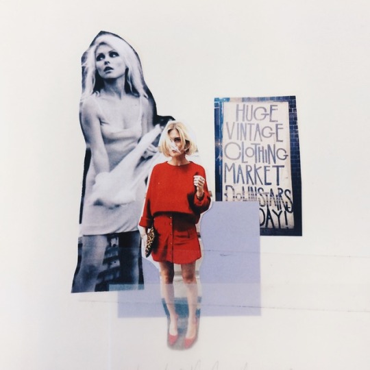
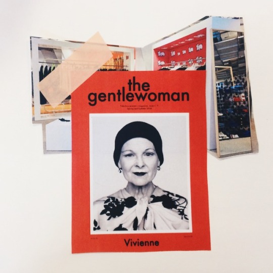
London-based Heidi is a 25 year-old female living in a rented flat in Shoreditch, South-East London. She works as a marketing assistant at Vivienne Westwood as well as DJing in London’s underground clubs and bars at weekends and in the evenings. She is a general creative and sees clothes as an art-piece; each piece of clothing or accessory is carefully chosen to reflect her personality and vibrancy. She avoids all aspects of high-street clothing and shopping and likes to combine quality staple pieces with luxury statement pieces. She lives a vegetarian lifestyle and is conscious of ethical and sustainable processes within fashion as well as looking good. She frequently visits Dover Street Market for more high-end purchases such as Comme Des Garcons and Bella Freud as well as searching London’s brick lane vintage shops for luxury items with a past. She showcases her creative life, style and relationships via Instagram, where she has over 12,000 followers. She is influenced by iconic style, and looks up to the likes of Kate Moss, Jane Birkin and Debbie Harry as well as contemporary style icons such as Alexa Chung and Pandora Sykes. She finds London’s Soho the best area to shop and enjoys visiting independent book-stores for the latest reads and magazines, the gentlewoman being a current favourite. Her shopping habits tend to be influenced by Instagram where creative styled posts and feeds influence her personal style. However she does minimal shopping online and prefers personal in-store experience where she gets excited by creative displays and styling; something she can post onto her Instagram feed. Although she is concerned with ethics and sustainability as well as garment quality, she primarily makes a purchase based on her interest in style, fashion and self-expression. She enjoys looking and feeling good through creative colour combinations and interesting prints.
Psychographic Two:
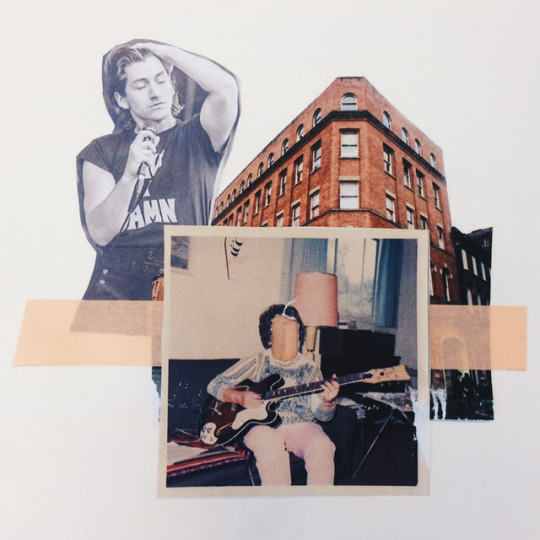
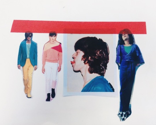
Manchester-based Lucas is a 22 year-old full-time musician who plays guitar in an up-and-coming electronic/alternative band. He is also a full-time store-assistant at Oi polloi. He enjoys dressing to self-express and so loves to wear bold colour and print as well as combining classic tailored pieces with printed jerseys and t-shirts; especially when he’s playing gigs. He loves to shop in Paul Smith and Vivienne Westwood for his staple garments however he also likes the aesthetic of well-made vintage pieces; his general style is vintage inspired where he looks up to David Bowie, Marc Bolan and Mick Jagger alongside contemporary icons such as Alex turner. Lucas doesn’t tend to read books or magazines, but does most of his reading online through Facebook pages and sites such as NME. He is very interested in music culture and music based style. Lucas’ image is a big part to his personality, and therefore the clothes that he wears are important to him. He purchases garments in an aspirational attempt to be seen as iconic, influenced by his music-based idols, and therefore aspires to wear luxury brands with a statement, contemporary demeanour as well as something that he can style and make his own.
Based on my customer intentions, is is clear that I need to develop USP’s in terms of style and design. Both my consumers are highly creative and use fashion to show-case their originality. They’re also very interested in vintage style and music, so I need to develop this into my design development to form a selling point to my consumer.
0 notes
Photo

Philosophy:
The driving force of my project is to create my own luxury t-shirt and sweatshirt brand for both men and women that has a iconic, timeless demeanour, adhering more so to a slower pace of fashion where each garment is treat as a limited edition art piece; something that stands out against the noise of an over-saturated fast fashion industry and is cherished as a iconic garment within my consumer’s wardrobe. My brand will be made luxurious through the use of 100% organic cotton jersey fabrics, all manufacture being undertaken in the UK and general careful consideration throughout all my branding from the quality of labels and finishings on my jerseys to the consumer experience within my pop-up concept store space.
An iconic, desirable and limited edition feel will be given to my garments through a variety of methods. Firstly, they will be deemed stylish and desirable to my audience through the use of bold colour combinations and unique prints; something my target audience can wear and feel iconic and individual in. Secondly they will be deemed iconic due to their inspiration from wider culture such as music, art and literature; prints and silhouettes are not influenced by fad styles but by icons and appreciated art. Initial inspiration will be drawn from contemporary exhibitions such as David Hockney at the Tate Britain and JW Anderson’s ‘Disobedient Bodies’ at the Hepworth in Wakefield. All prints will make the garments feel limited edition due to the fact that they will all be hand screen-printed in the UK in a batch of 100 for each style. This means that the garments, if successfully branded, will be deemed as ‘in demand’ where consumers will feel as though they have a special purchase if they managed to buy one before they have sold out. The fact that the jerseys are being hand screen-printed links to the alternative scene of producing merchandise for musicians and bands. I would like to emphasise this by sending final products in creative luxury packaging to selected musicians to wear at their gigs. This is something I could photograph and use as promotional content for my brand on channels such as Instagram. Finally, this limited edition feel will be enforced by the fact that my brand will have a bi-fashion attitude to designing and buying clothing; standing completely against all aspects of fast, high-street fashion from the quality and style of products through to the consumer experience that can be expected in store. Having a bi-fashion attitude will mean that my brand only releases new styles twice a year and continue to sell batches of stock until they sell out; my brand never goes into sale. This is something that adheres to the luxury element as well as creating this limited edition feel.
USP’s:
UK manufacture: guaranteed quality; reduced carbon emissions; putting money back into the UK economy.
100% organic cotton jersey will be used; keeping the customer cool in warm conditions and 100% organic, brushed loop-back jersey for the thicker sweats to keep customers warm in colder conditions. They are both machine-washable on a cool setting, comfortable against skin and environmentally considerate as well as being durable.
Hand-printed t-shirts and sweaters which give the garments a limited edition feel as well as a link to the alternative music scene; they can feel a part of something that is ‘cool’ and unique. This is enforced by the prints being influenced by wider culture, consumers will feel ‘in the know’ and linked to something beyond the physicality's of the t-shirt.
Due to the rare batches of 100 for each style and slow fashion pace of only two collections per year, consumers can feel as though they own something that is limited edition and links them to a scene that not everyone can be a part of but wants to be a part of; it makes them feel unique and luxury.
Market Level/Position:
It is clear that my brand will have more of a commercial focus, where it is aspiring to sit at a mid-luxury market level. Future intentions would be brand placement on a global scale, with trading happening online and shipped globally as well as being stocked in various Dover Street Market stores across the world. However, I feel that the made in Britain USP will sit well initially within the UK where I would eventually like to envision my brand stocked in Liberty’s in London as part of a small pop-up alongside competitors like Hades and Bella Freud.
0 notes
Photo

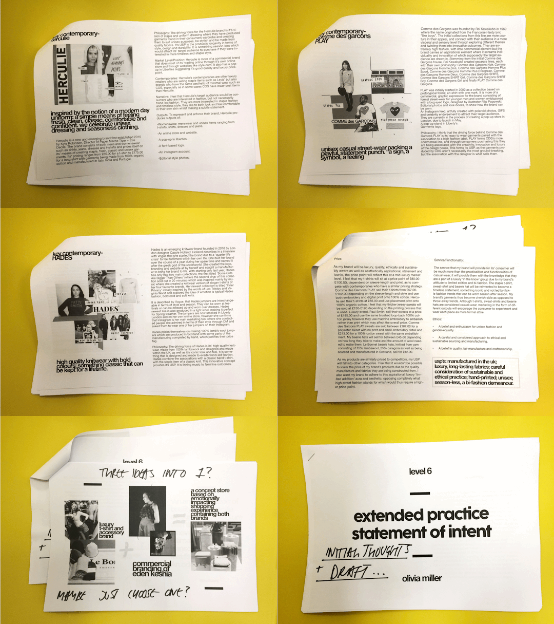
For an up and coming critique with my tutors, I have started to put a statement of intent together discussing the market research I have conducted and also my intentions of my own luxury brand specialising in causal-wear with an iconic, luxury demeanour (t-shirts, thick jersey sweats and woolen beanie hats) as well as the collaboration with Eden Keshia and the eventual plans of the creation of a concept store.
Feedback:
My formal critique went well, where it was discussed that my luxury brand idea was an exciting concept, with good scope for a successful fashion brand. It was however suggested that I focus on the development of my own brand rather than commercialising Eden’s as it will allow me to be more creative. It was suggested that I visit London and research high-end t-shirts and sweats as well as sourcing my own fabric suppliers. I am also in the process of getting screen-printing inductions as hand-printing luxury fabrics could be a USP for my brand as well as allowing me to experiment creatively. I stated within my critique that I am interested in how my products are communicated after production and therefore I need to establish and create my designs as soon as possible so that I can create different communication outputs surrounding them. I spoke about wanting to create mini super 8mm films to promote them, something that can be added to an Instagram page or a website. I have a super 8mm camera that I could experiment with however it is risky in terms of how the film will develop as it is something I’ve never done before, and also quite expensive. My tutor suggested maybe collaborating with someone who is familiar with using super 8mm which may be an option. Going forward with my project, I’d like to re-work my brand philosophy and intentions slightly, create a brief rationale so that I stay on track with my work and also start researching, experimenting and developing in terms of logos, colour palettes, silhouettes and potential prints.
0 notes
