
saoirse/elio - he/mint+ - #1 digimon fanfellaart blog! use #saoart to find my stuff >vO
Don't wanna be here? Send us removal request.
Statistics
We looked inside some of the posts by mintaffy and here's what we found interesting.
Average Info
Notes Per Post
334K
Likes Per Post
178K
Reblog Per Post
155K
Reply Per Post
2K
Time Between Posts
2 days ago
Number of Posts By Type
Text
17
Last Seen Tumblr Blogs


Fun Fact
Celebrities use Tumblr as well.
Text
I'm Mad About Appmon in the TCG
And not for the reasons you might think.
A rant about Digimon Card Game art under the cut. It's long, and I brought visuals.
When BT-21 was announced, I, like many other Appmon fans, ate so fucking good at the news that we would finally be getting a scrap of recognition after so long. Inclusion of Haru in the Anime PB Set already had many of us excited, and we were very excited to see what would come of things once BT-21 was shown with Globemon on the packaging.
With spoiler season almost over for BT-21, however, I want to vent a frustration that's only been getting worse with every card spoiler for this set. Specifically, the Appmon ones.
That's to say, why the fuck does all the Appmon art feel so phoned in?
To no surprise for anyone who knows us well, this was prompted finally by the straw that broke the camel's back. Today, if you weren't paying attention, Satellamon BT21-074 was announced, and... well...

You might notice that the artwork is just a 1:1 pose redraw of the reference art, which is also what the 3D cut-in from the Anime references. And I'm kind of frustrated by that, because it shows a lack of creativity that I haven't really seen this consistently in the Digimon Card Game.
(A friend of ours who also likes Satellamon also pointed out that Nakano Haito miscolored the buttons on Satellamon's scarf here, which. Woof.)
In the above image, I decided to also show the other chip that many folks might not know about for Satellamon, as well as--- and this was a surprise to plenty of people I know at my local gaming store--- a card from the Applimon card game.
The reason I include the second one is for a topic that will become clear as we go: composition. Something I want to really hammer home through this post is just how generic a lot of the Appmon cards for the DCG feel. And while you could say that the ACG card on the right is rather generic, there's something to be said that the pose isn't just 1:1 that of the Appmon Ref Book Art.


Something similar happened with Charismon when it dropped earlier this spoiler season. Notice how the artwork once again is just a simple redraw of the Charismon Ref Book art! I find this less egregious than Satellamon at least, since the inclusion of the energy ball shows that some further research beyond looking at said art was done!
But again, it's reusing the composition of previously existing artwork.
I also wanted to highlight a specific piece of Charismon/Globemon artwork from sasasi here. Keep that in mind when we get to Globemon.

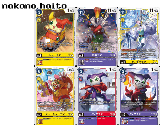
Timemon is another Appmon whose DCG card is done by Nakano Haito, and yet again we have a rather frustrating piece of art. Unlike the previous showings, however, it is not a 1:1 redraw of the ref book art, which is better than nothing, I guess...
That said, I also struggle to be interested in the Timemon artwork knowing the personality of Timemon in the anime. Again, it's a lack of creativity here.
While I was trying to nail down why the Appmon artwork bothered me so much, I had started to wonder about what could have been (something that, I acknowledge, is unfair to what we do have). I find it an achingly missed opportunity that nothing was done to reference Timemon's behavior in the anime, something which I am certain even non-Appmon fans would've appreciated, especially considering he's a walking Jojo reference.
That's to say, why not reference the scene we meet Timemon, where he freezes time, drinks five cups of tea, and then beats the everlasting shit out of DoGatchmon? Why instead give us Timemon in a generic digital background?

Something I'll give Sasasi's card art for BT21's Appmon is that it at least isn't a 1:1 redraw of Appmon Ref Book artwork. However, I'm still somewhat bothered by the generic feeling of the backgrounds, which detracts from the artwork as a whole for me. This is something that usually the Digimon Card Game excels at, which is why it feels all the more disappointing to see backgrounds like this in nearly all of Gatchmon's line!
I think it would have been nice to see some more visual references to the series itself. Maybe we'll get some in an alt artwork, but considering the alt Haru artwork we saw revealed from Bandai Card Fest, it's looking unlikely.
We could've easily seen something referencing Globemon's debut episode--- one of the best episodes of the series and something that, visually, hearkens back to one of the franchise's more famous visual scenes (that being Omnimon's fight with Diaboromon in the web). Instead, we get these strange digital backgrounds that feel like they're more at home in a Cyber Sleuth themed card set (but we're not at BT22 yet!).

The disappointing part is that we also have cards for less popular Appmon that sell the design much better than most of previously-existing Appmon media!
Look at how goofy Shotmon looks next to Beelstarmon! This artwork from Yuuki also gives us a dynamic pose for Shotmon that highlights its eyes--- something I never even noticed as an Appmon fan who's watched the show a few times!
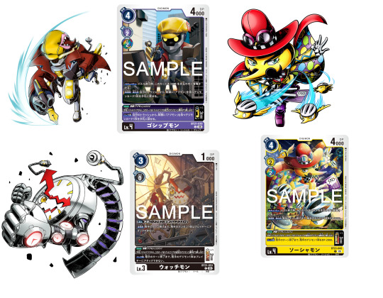
And of course, I want to highlight a few other Appmon whose card art did excite me! Gossipmon and Watchmon especially are superlative examples, as we yet again see Appmon interacting with the world around them.
In the first example, Gossipmon is interacting with Diarimon (you can tell because it's green), an Appmon that I will be surprised if we even get a card for in the future! And it's from a newcomer artist to the DCG that I'll talk about in just a sec...
Naru also shows Watchmon interacting with Clockmon, something that I'm overjoyed to see as an Appmon fan! A lot of Appmon visually reference Digimon, and calling attention to that in the card game feels like it's attempting to make the inclusion of Appmon more cohesive.
Of course, I also have to shout out Yamuretsu's fantastic color work as always. They also did the Appmon egg for this set, which is equally lively. While it's busy and I can hardly tell what's going on in the background, and the pose is very similar to the ref book art, at the very least it is more visually interesting than the unfortunate showings of Satellamon and Charismon.
Something you might be thinking is that I am unfairly critiquing these artists, but I would like to highlight a smattering of their work in this next section.
Nakano Haito has been an artist with the Digimon Card game for quite some time, and here I've chosen to highlight primarily work from the last year or so. While the backgrounds (something I greatly complained about above) are fairly generic, most of these cards show off the personality of their subjects quite well.
I'm especially a fan of the EX7 Impmon, which I think exemplifies how one could use a fairly "generic" background in an interesting way, here incorporating them as a prop that Impmon is seated on.
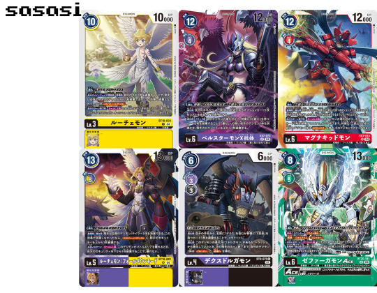
Sasasi's Appmon cards frustrate me perhaps the most, however, as we know they are capable of much more visually interesting pieces than the bulk of their cards for Gatchmon's line. Gatchmon, Navimon, and DoGatchmon especially have the same issue with generic backgrounds that I've railed on Nakano Haito for, which is something Sasasi usually doesn't struggle with!
I've included Zephagamon Ace here as an example of one of Sasasi's more simple backgrounds, comparable to Gaiamon in terms of artistic quality I would say.
But also, remember that artwork I said we'd talk about later?

Hey, so, this was also done by Sasasi. Can we take a moment to appreciate the expressiveness of both Globemon and Charismon here? Can we take a moment to also appreciate the quality of the colorwork? This is a gorgeous piece of artwork, and I'm surprised that Sasasi wasn't tasked with doing a pair artwork like they so regularly do for Charismon and Globemon.
Sasasi is a phenomenal artist. So why do Gatchmon, Navimon, and DoGatchmon feel so... stiff?
And of course, I want to highlight the artists whose Appmon card art I actually like!
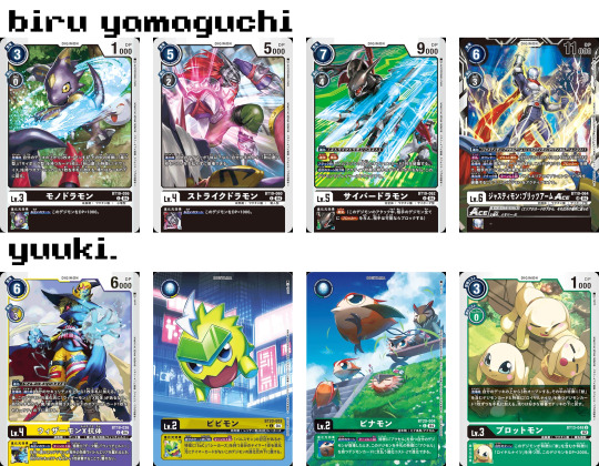
Biru Yamaguchi is a newcomer to the DCG, and has only done Cyberdramon's line aside from Gossipmon and Scopemon. I wasn't a fan of their Monodramon art, if I can be honest, but the dynamic poses and coloring in the rest of the line look phenomenal! I'm especially glad that they were allowed to do something interesting with Gossipmon.
And yes, I can admit the Cyberdramon background is a little generic. I get the feeling that might be a WS game reference I'm not getting though, considering it looks like a literal circuitboard.
Yuuki meanwhile has a prolific portfolio in the Digimon Card Game. I especially love their colorwork, and have picked a few superlative pieces from the most recent sets. They have been with the DCG since BT1 though!

Next, another newcomer(? I think?), Naru! Their use of contrast in their colorwork is gorgeous, and pretty much all of their card art makes the personality of their subject Digimon shine! I'm glad they got to do the Palmon line for the upcoming Starter Decks.
Yamuretsu meanwhile has been with the DCG since at least BT12 as far as I can tell. Their artwork has a distinct style, and while sometimes I find it a little too messy to read, I also would rather something messy and colorful than bland and stale.
Why Does This Matter?
I'm sure some of you might've opened this post wondering why I even care that much, besides the fact I'm an Appmon fan. After all, we're finally getting Appmon recognition after so long! The DCG, after 5 long years, is finally adding Appmon!
But the thing is, for a lot of people, this will be their first interaction with Appmon.
And I gotta say, it feels frustrating that so many of the pieces do little to inspire my friends at my LGS to actually watch Appmon. There is no intrigue, no bite to many of these cards.
It also bites thanks to the fact that, usually, I am excited to collect the cards in a set, because even Digimon I don't care about always have wonderful artwork! You think I give a shit about Shamamon? NO! But by god Naru's artwork of them is pretty as all get out!
So seeing Appmon art that feels like it was phoned in just makes me sadder than it should.
The reason I highlighted the potential of all of the artists (including those I praised), is that the Appmon card art suggests to me a failure in the art direction of the set. We've seen a lot of amazing artwork from these artists, and yet nearly half the Appmon cards feel like these artists weren't given any information on the series or its characters.
It just feels like giving us expired food, on Bandai's part, while Adventure gets yet another banquet out of the cards in this set and the new starter decks alike.
-Satty
#digimon#appmon#nods solemnly#appmon is so often an afterthought for Bandai so I was also excited to see new artwork for certain appmon#i feel like especially satellamon and charismon cards could have been so freakin cool!!!! But it’s sad that like.#no extra thought was put into them.#Like with satellamon#you could probably have him in that saloon that we first saw him in or something#I think I’m also gonna have to mention the adventure pv sequence not including Haru’s goggles#shakes the bars of my cage and cries
20 notes
·
View notes
Text


My 2 favorites
5K notes
·
View notes
Text


Man idk I just wanted to draw them. I MISS THEM SO MUCHHH. “My little boys” as they are fully grown adults
#digimon#digimon adventure 02#daisuke motomiya#ken ichijouji#saoart#for a small price you can help daisuke get back his melanin
122 notes
·
View notes
Text

Wrathful Route
317 notes
·
View notes
Text


421 notes
·
View notes
Text


Anybody else remember when Daisuke mentioned that he was one of the kids who was taken by the Bakemon and held at the Convention Center. Because I remember
218 notes
·
View notes

Text
to answer a few questions bc I’m not sure where else to answer them, iris shapes are more visual flair for the audience if anything plus some character design symbolism :] for the same reason, I believe hiro would have his different irises prior to meeting gammamon and gulusgammamon
you’re also free to use/draw these designs as long as I’m credited!! Thank u for the interest :D

I actually finally got around to making some design notes on my ghost game redesigns, but I totally forgot to post them ^^’ here they are!


A lot of this is based on my own personal interps/hcs :] I received so many kind words abt my redesigns, so thank you so so much to everyone!
25 notes
·
View notes
Text

387 notes
·
View notes
Text

Found several packs' worth of pokemon cards strewn across a target parking lot and took a pic to show my friends without realizing how much my outfit elevated the scene to "aftermath of a wizard duel"
106K notes
·
View notes
Text
I actually finally got around to making some design notes on my ghost game redesigns, but I totally forgot to post them ^^’ here they are!
A lot of this is based on my own personal interps/hcs :] I received so many kind words abt my redesigns, so thank you so so much to everyone!
25 notes
·
View notes
Text
who is the first david you think of when you hear the name david
40K notes
·
View notes
Text
who is the first david you think of when you hear the name david
40K notes
·
View notes
Text

doodled andromache in class today and decided to digitize and color the sketch because i miss her
#ankiart#RIPS THINGS AND SCREAMS#I LOVE ANKI ART!!!!!!!!!!#SOOO CUTE#really nice and clean :3#RAGHHH
62 notes
·
View notes
Text

A redraw of an older eri piece :3 I LOVE HER!!!!
42 notes
·
View notes
Text

(001_inputmon.png)
#appmon#digimon#THIS IS AWESOME OMG#i fully thought this was a pre-existing appmon at first glance#The textures in the black are so yummy
41 notes
·
View notes
Text
despite what popular opinion may lead you to believe, some rocks actually do have scientifically-proven auras! Unfortunately, those rocks are uranium and the aura is cancer.
142K notes
·
View notes