Don't wanna be here? Send us removal request.
Text


At this point, I started to delve into the possibilities of vertical continuous volumes and apertures of different sizes and positions. The landscape was also added to some of my study models to show the interaction between my structure and the terrain.
0 notes
Text

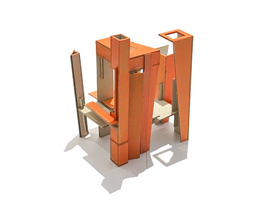
Similar design language also took place in my exploration three models. At this point, I realized that the zigzag language was more like a façade than a spacial element. On the other hand, the overlapping planes have much more possibilities to explore. I was able to create a sense of hierarchy when putting planes of different thicknesses together or incorporating two or more design languages together. Huge elevated planes also create volumes and masses.
1 note
·
View note
Text


For some of the study models I got, I mainly replicated the design language of overlapping planes and repeated zigzags. I also paid some attention to casting unique shadows while making the models.
3 notes
·
View notes
Text


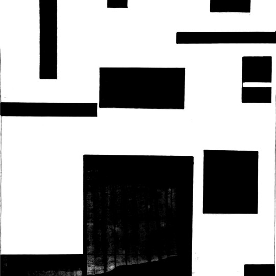
The original image I got is a collage work from American artist Jeffery Gibson. Some of the elements that became evident to me were the zigzags, the orthogonal regulated shapes, and the sense of layering created by overlapping pieces. In my analytic diagrams, I included analysis of void, linework, regulating lines, proportion, textures, and forms.
1 note
·
View note
Text


The most important thing to remember when making furniture for children is to be safe. Trivial matters such as "whether it will be demolished" or "whether it looks good" can be put aside. The red wooden roof I saw in the kindergarten before was really beautiful and useful. Since driving an electric drill or nails wasn't necessary or realistic, such ideas were all abandoned.
Under the premise of safety first (to ensure that even if the children tear down the house, they will not hurt themselves), flexible materials are a better solution.
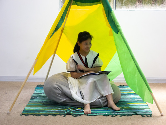
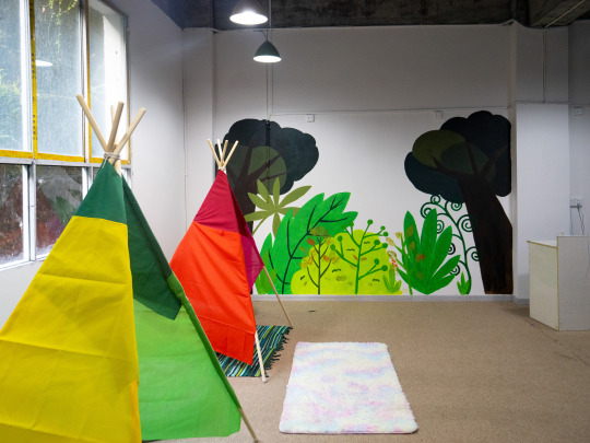
Considering that we are going to paint one wall of the reading room as a forest this time, I think of my fantasy when I was a child when I read "Where the Wild Things Are" by children's author Maurice Sendak: a part of the room becomes a forest, and then Sleep in this indoor forest at night.
1 note
·
View note
Text


Xiaotaihua Library is located in Tianhe Town, Kaizhou District, Chongqing City, covering an area of about 800 square meters, with 10 rooms, including a library, dance room, and sports room. Many left-behind children in the local area lack high-quality educational resources and a growth environment. The HalloWorld team and the founder of Xiaomohua, Ms. Haiyan, hope help local children by bringing in books and a good reading atmosphere.
I got the inspiration from my kindergarten's little "Emotional Angle," so I think I can also build such a solitary corner for Xiaotaihua's children: some small tents.
1 note
·
View note
Text


I've always felt that typography is irrational, and it doesn't hurt to have more or less space between a few pictures cuz I can't see it anyways. But when I became the author, I fell into an obsessive-compulsive disorder. All words, photos, and emojis need to be neatly aligned without any slop. I also began to seriously consider the matter of "I am the designer of this book." It really needs a bit of rigor and truthfulness. Later, I also found that I was wrong at the beginning: the layout rules do make sense. Part of it is about "how" I line up, and the other part is about "what" I line up. For example, the red wall texture and the light blue sky on the first few pages of this album echo each other until the introduction page of the club begins. For the introduction page of the members, everyone needs to look decent. The title is changed from "And So We See" to "And So I See" to add a bit of pride to the photographer himself/herself. The grid preview of pictures is designed to make everyone able to see the works of the members at first sight and look forward to some "love at first sight." If this small book comes to you in the future, you will see several works with large spreads while flipping through it.
The layout satisfies the visual impact and conforms to several members' styles and personalities: It is worth stopping for a while, watching it slowly, and then turning away. When checking the images for the last time, I made a few pictures in black and white on my own initiative. First, I would like to apologize to the authors of this change with no sign, but I still hope you can understand and like the intention of doing so.
1 note
·
View note
Text


An annual photo album for the 2022-2023 OAO photography club⬆️
1 note
·
View note
Text


Ancestors are an essential part of the culture of the Sea Peoples: when you see some sculptures with human features, they are not necessarily direct images of people or ancestors but more like an embodiment of the ancestors of the tribe. For the people of the sea, the death of their ancestors is not silent. They believe that their ancestors can participate in the tribal rituals in a vigorous form and endow them with strength and courage.
"Their work differs from ours not in skill but in concept. The whole history of art is not a history of technical proficiency but of changing ideas and requirements. The tribal artist's work can correctly represent nature, as well as the most exquisite works of Western masters are not inferior." Many expressions of tribal art also influenced Western artists.
1 note
·
View note
Text

Some PS render trials...🤩
1 note
·
View note
Text


Some material testings...💡
2 notes
·
View notes
Text


This is an arm I made using cardboard for my IB VA course. I mainly followed the technique of tenon with some operative terms such as cutting, slicing, dicing, intersecting, penetrating, superimposing, fragmenting, and inserting. Very little glue was used(probably only when I was trying to attach the facades to the base of the arm). I felt the complexity of cutting precisely and intersecting pieces together, ensuring that it’s stable and solid. But still, Tenon is a very playful technique with infinite possibilities hidden inside those joints, superpositions, and intersections.
2 notes
·
View notes
Text


The technique of Tenon is just like playing Legos, where clicking components together is basically the only move one must take during the process. I once made a simple Lego design of a typical Chinese-style temple with a tenon rooftop. Later on, I also had some other hands-on experiences, whether it was building a model of the Tiantan temple or duplicating “The Great Ming Palace” in our Minecraft server all gave me some further understanding of the technique: Not just being precise and wise, but also very fun to practice.
2 notes
·
View notes
Text

To be very concise about the term “Tenon”, I would describe it as a technique of building using no glue or nails. The technique emphasizes cutting logs and slabs into good shapes that fit each other, eventually constructing a system of structures that has the same functions as modern girders, beams, lintels, and piers. There is also careful consideration of the application of the law of kinetics within any traditional Chinese tenon architecture. Alongside its practicality, the tenon also sets as ornamental elements for Chinese palaces. Artisans use to paint and carve on the tenon structures to show the social status and political power of the owner of the architecture.
3 notes
·
View notes
Text


The concept of intersecting planes was surely not invented by Atelier Deshaus (The company that Designed the Dragon Museum), but it has an origin that’s more well-known and old: Mies van der Rohe, Barcelona Pavilion. The all-time classic Barcelona Pavillion displays the Modern Movement of Architecture design at the time. Mies did not intend to make the Expo Hall a “Hall” (with closed space and exhibitions), but a real “Pavilion” (though it also means expo hall, anyways, here we take its meaning of a garden.) where it would be a place of tranquility and escape from the exposition. By using intersecting planes, Mies successfully took control of the audience’s vision, dynamic visiting route, and emotions within the architecture. My maze, similar to Mies’s Pavilion, encapsulates feelings of tranquility and freedom and a gradual change of vision. In addition, I also did not use any pillars to support my roofs, suggesting a floating weightless state of the top of the structure.
4 notes
·
View notes
Text


Inspired by the Dragon Museum, I later got interested in the concept of “Intersecting Planes”, where space is formed not by closed boxes but by intersecting walls and roofs. In the Dragon Museum, the positions of the geometric boundary of the walls and roofs are blurred, thus forming a very unique spatial experience with a certain sense of shelter and freedom. I thought I can use the blurriness of space provided by intersecting planes to design a Maze. Traditional Mazes usually come to be closed boxes where walls wander inside. Later, we see artists like M.C. Escher create paradoxical spaces, or impossible spaces created by the game “Monument Velly”. The space within a maze becomes more and more open and free. In my Maze, I planted vertical walls of different sizes and lengths to roughly define the contours of the Maze, and also to enclose a free dynamical space. The roofs are set to define the upper boundaries of the Maze. With these open intersecting walls, the Maze is successfully made into a structure with a clear individuality, but, at the same time open to fully interact with the external world.
2 notes
·
View notes
Text


Dragon Museum West Bund is located on the bank of the Huangpu River in Xuhui District, Shanghai. The base used to be a wharf for transporting coal. I took these photos just before the pandemic lockdown in Shanghai. I found the architectural space of this Museum to be fascinating, especially when there is a single direct light source, for example, the setting sun. The Dragon Museum was designed to be composed of many “Vault-Umbrellas”, a specific structure that resembles an umbrella made of concrete. The arches of these “Vault-Umbrellas” enables light to have shape. At this point, not only the artworks that lie inside the museum but also the architecture itself and the light that interacts with it stand for the artistic value of the Dragon Museum.
3 notes
·
View notes