Text
Major Project Dashboard and Links

https://work.synthesesia.com/
All Posts
Milestones
Research materials
Branding
Main Application
Launch Strategy
Colophon
0 notes
Text
Project conclusion
This project has been a blast to work on. Whilst I’m ecstatic with the final outcome, this project has seen it’s fair share of bumps along the way.
I was able to play into my strengths in visual design and front-end code, being able to create things quickly and efficiently.
However, I do feel that I wasted a lot of time not making confident and quick decisions in terms of the project direction early on.
Time management was also a problem, and I found it challenging at times to balance my time between this project, and external work. If I were to work on another project of this scale, I would definitely try to be more confident with decisions, and break up larger milestones into smaller, more manageable tasks, to prevent project fatigue and burn-out.
In general though, and to conclude, I feel that I exceeded my expectations coming into this project, and I’m proud of the work that I’ve produced.
0 notes
Text
Colophon - Final Print
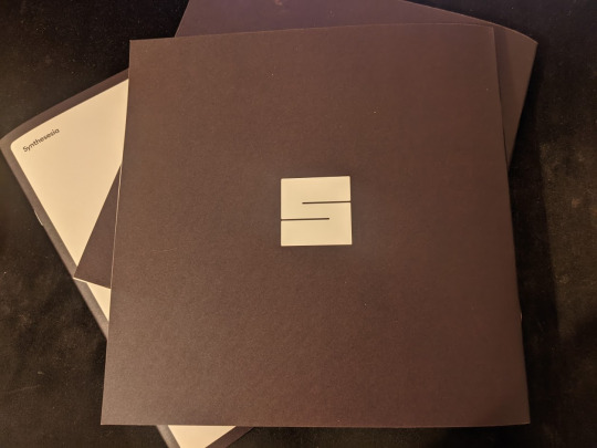
It’s arrived!
The printed Colophon is here and it looks incredible, I’m so happy with how it turned out. Also pleased that I went with a square format as it complements the logo really well.



0 notes
Text
Colophon - Off to print
With the Colophon document laid out in Figma, I then painstakingly recreated it in InDesign, so that I can export the file with printer’s crop marks and bleed.
It was a bit of a pain at first getting everything up and running, but actually after a while I found it relatively easy to work with. In the future though I would still approach print design in the same way of mocking it up in Figma first for speed and fast iterations.

With the InDesign file finished, I’ve now sent it off to print! Excited for how it will turn out
0 notes
Text
Billboard Brief - Sketches
As part of my launch strategy, I’m also intending to submit my work for an open billboard brief run by the University, where accepted work will be shown on billboards across the country!
My plan for the billboard design is to essentially translate my poster designs for the provided dimensions, to keep things straightforward.
As far as the content goes, I’m slightly refactoring it to have a link to the site, instead of a QR code. I’m sure most people wouldn’t be able to scan a QR code on a billboard 20 feet in the sky...

0 notes
Text
Brand guidelines and Typography
At this point in the project, there is no more refactoring or opportunities to drastically change my brand.
That being said, I have also produced a short brand guideline document to outline the entire brand, from logo and colour palette, to typography and grid structure.
I don’t think that it had been mentioned before officially, but I have been using this beautiful typeface ‘Euclid Circular’ almost all the way throughout the project, as typography was one thing I wanted sorted out as early as possible.


0 notes
Text
Launch strategy v3 .final-final_(final)
Sadly my earlier launch strategy had already been submitted before I committed to the new brand direction, but I still felt that it was in my best interests to redesign it anyway to make it more in line with all the other materials. Especially after learning more about print design and using multiple columns for easier reading.


0 notes
Text
Colophon design v3 - Main layout design
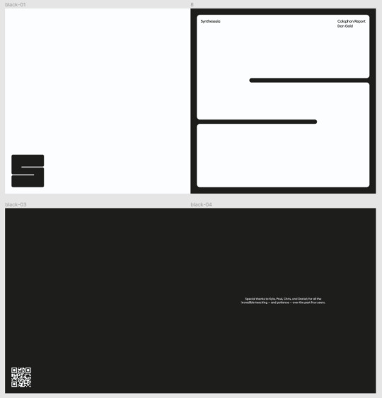
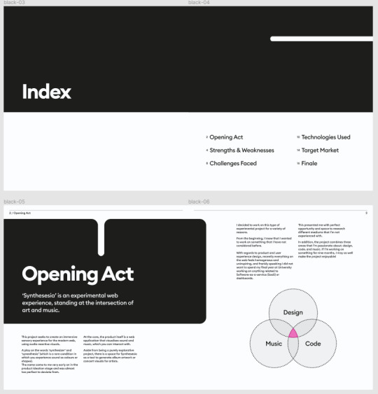
Taking this new direction through to the rest of the document, I changed the colour palette and column layout to feel closer to the recent type specimen inspiration that I found. 3rd time’s a charm, but I’m really happy with this *hopefully* final version!
I also took this refactoring opportunity to add a few more paragraphs to the document to make the reading more cohesive.
0 notes
Text
Colophon design v3 - Cover design
Going back to the 3rd iteration of my Colophon design, I took another approach to the cover design.
Being more bold with the logo, I played around with the idea of covering the entire page with the logo, then using the negative space to add the title and other text.

0 notes
Text
Colophon design v3 - Taking a step back
After creating this newer Colophon design, I’m with the general direction and layout, but I do think I went a bit overboard with the use of colour... it’s just a bit much.
Going back to earlier inspiration and conversations, I think that printed documents and more formal work should use a monochrome palette, with hints of colour here and there.
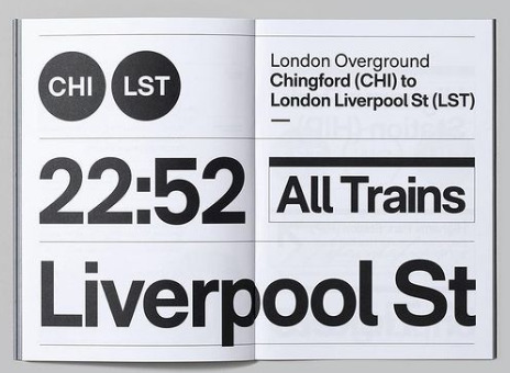
Before going straight back into redesigning the Colophon, I took a look at a range of type specimen books and other carefully crafted design books that mimic the style I have in my head.
I really like the use of subtle lines and whitespace to frame the page, as it makes a for a very easy reading experience, which is what this document is all about right?!



0 notes
Text
Colophon design v2
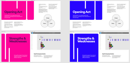
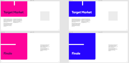
After deciding on a new brand colour palette and direction, I revisited my initial Colophon design to make it more cohesive with the posters and other materials.
As well as updating the colour palette, I also took a step back and realised the typography layouts and page size felt way off.
It makes much more sense, especially with my logo, to use a square format.
Taking the previous design, I now have two newer versions with the updated colour palette, although I feel like this might be a bit too much colour in one go.



0 notes
Text
Poster designs v2
With the brand changing art direction, I looked at my earlier poster designs, and refactored them to feel more in line with the new aesthetic.
Here’s a small selection of the colour variations and layout.
I’m also trying to incorporate the logo much more in the brand, where it takes up as much space as it can.


0 notes
Text
Brand design refactor: A new, bolder, frontier
Continuing from the decision to shake up my brand design. I delved into more of the aesthetics that were mentioned, of using bright neon colours, with a dark colour layered on top.


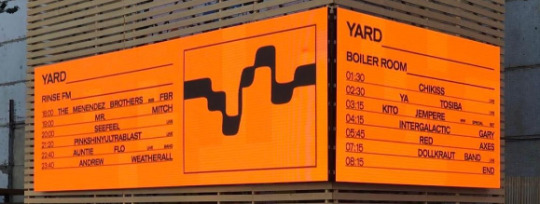


I also looked at old gig posters for inspiration. In doing so, I’m really really liking this particular aesthetic, and I think it will suit Synthesesia really well, as it all related to music and going against the status quo.


0 notes
Text
Changing brand direction
This might be quite late in the process, but after mulling over my brand, I’ve decided to change the aesthetics and colour choice used throughout (from posters to colophon report).
After some conversations around the use of the holographic style, it seems as though it gives a corporate vibe.. which is definitely not what I’m trying to go for. On reflection, it doesn’t seem to be overly clean and ‘manufactured’.
As far as the new direction, I had encouragement from peers and tutorial time that the initial neon colour palette was a much more bold and interesting direction. In particular, the idea of using those colours gives the impression of gig-posters that use bright coloured paper with black ink on top, which I think is more the direction I’d like to take my brand!
0 notes
Text
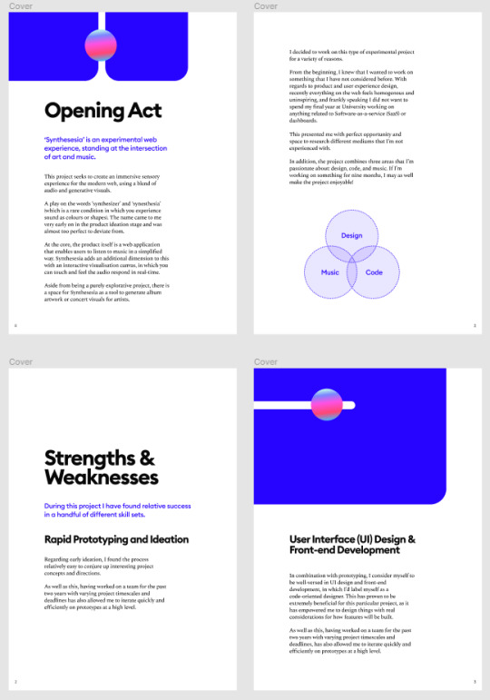
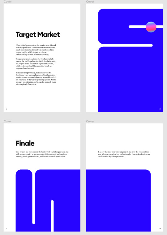
Colophon design v1
Taking to the screen, I tried to recreate the colophon sketches in Figma. As I’m not comfortable using InDesign, I think the best way of working will be to create everything in Figma first, then once I’m happy with everything, port it over to InDesign for the final sign-off and proof.
As far as art direction and aesthetics are concerned, I’ve tried to keep it to a similar style as my launch strategy, so everything feels cohesive.
One thing that I’m currently struggling with (as I’m not used to working on printed documents) is judging the correct scale of everything. Making sure that the type is legible is a funny thing to measure, as it might look fine on the screen, but could be a completely different perspective when actually printed off.



0 notes
Text
Colophon sketches
Finishing off the colophon draft document, I have now moved on to actually designing the report. One bridge that I will have to cross later down the line is professionally printing off the report, which will most likely mean I will have to use Adobe InDesign, which I don’t have any experience with.
Much like the launch strategy, I set about designing the Colophon by first breaking the document into different sections in thumbnail slides.
I also don’t have much experience with printed work, or editorial pieces. I’m trying to be a bit more bold in my layouts, using the logo graphic device to extend it across pages... which might look pretty nice when printed?

0 notes

