My name is Heather Toler and I am a Richmond native. I am a Liberty Alum and a recent Full Sail University graduate. I finished my Bachelors in Creative Writing for Entertainment in the fall of 2016 and am currently pursuing my Master of Fine Arts in Media Design. I own RVA Creatives, LLC a Brand Development and Design Company located in Richmond, Virginia. Follow Me: LinkedIn RVA Creatives RVA Creatives Instagram Personal Blog Personal Instagram
Don't wanna be here? Send us removal request.
Text
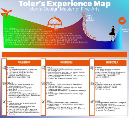
MDMFA Reflection
Month 1: Mastery – Professional Development and Leadership
In the beginning, I didn’t get the point of this class but as I read the book I finally deciphered it. It was a beautiful picture of where I was heading and while I am not yet a master, I am getting there.
Month 2: Defining Clients Needs
Typography poster design. This was fun as I was learning the importance of layout, contrast, type, and more. I also was learning how to articulate the needs of the client into a physical piece.
Month 3: Brand Development
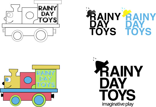
Rainy Day Toys! This was the beginning, a second beginning of feeling like yes, I this is where I need to be. Creating a branding campaign and being honest about the why’s and how’s I came up with my solutions was awesome.
Month 4: Effective Copywriting
I had a few hard times during this program, but this one was the first time it was hard because I didn’t get the content. Ad writing, testimonial ad writing was and is difficult for me to wrap my mind around mentally.
Month 5: Design Research
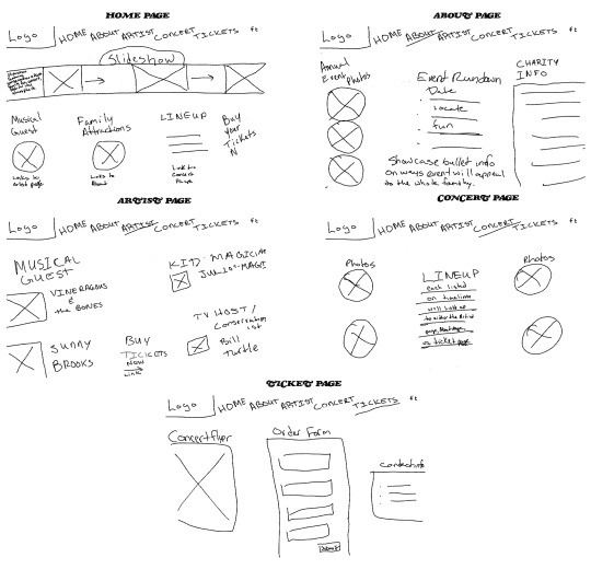
Wireframes!
I finally learned to wireframe my projects and boy did it save me a lot of time. I also learned to draft design mockups within photoshop to give a good visual of how the website will look for the client.
Month 6: Organizational Structures
Fast, Fast, FAST and TIRED!
This was the last four weeks of what I call the sea turtles phase of my degree.
Sea Turtles WERE EVERYWHERE!!!!
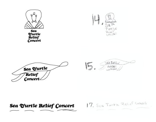
I had to sketch logo designs for the web mocks from the previous month, create the vectors and prepare to create a motion graphic. I learned After Effects in 48 hours. I also returned to my love of video editing and created a promo for the relief concert.
Month 7: Design Strategies & Motivations
This month we had to choose whether we begin work on one of the thesis projects or if we go back and revise our work based on feedback. I didn’t receive any feedback other than, the class can move forward but I knew there was work to be done, so I plotted out a path to revise and improve the work.
Month 8: Design Integration
This month began with inspiration as a designer and ended with furthering our revision processes for the program in preparation of our thesis.
Month 9: Multi-Platform Delivery
This month was another round of revisions for our previous work and it felt good. I felt my personal style coming forth, my creative confidence and willingness to step out and try something new and different.
Month 10: Measuring Design Effectiveness
Did it send the message I meant it to? I remember doing a set of Instagram covers for a client and one of them was focused on money, so I did old school Scrooge McDuck Money Bags...
The client asked why I uploaded wedding dresses with money on them.
The point of this class was to survey an audience, something we had learned about early, but I had forgotten about, to see how to effective the design was, then take some time to tighten things up before month 11′s thesis.
It was nerve-racking to send that survey out, but I got useful feedback that was pretty helpful.
Month 11: Presentation of Design Strategies
In this course, it was all about verbally and visually communicating the purpose of the iteration. We delivered a thesis, which I learned that I am not as good of a communicator as I thought. I also learned that I belonged here. I had been fighting so long to prove that I was good enough to be in art school, good enough to be a designer, good enough to survive this program, I finally realized that I am all things and belonging. I worked my ass off and I’ve made it. It’s been hard fought, but worth it.
Month 12: Professional Practice
I assumed this class was one on resumes and portfolio building but it was a class on ethics. Ethics are important to me as a Virgo, I like things in order, I like justice. So learning that I can mix my sense of justice, my passion for ethics (often channeled in my political work) into my actual design work by choosing to do the ethical thing and even in researching societies and finding one that promotes expansive social work from the artist. The finer points of this class for me was that as a designer I should respect my craft, my clients, and the work of another artist in everything that I do.
0 notes
Text
Mastery Journal Reflection: You Belong Here!
Virginia Commonwealth University just opened International Contemporary Arts Center, (ICA) a new museum at Belvedere and Broad. I’ve watched the construction of this building wondering what it’d be. Initially, I thought it’d just be for students, a classroom, but then it turned out it was for us, for the city.
You Belong Here.
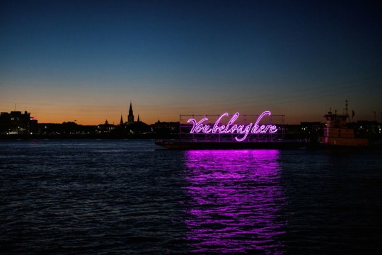
"You belong here" by Tavares Strachan. Photo by Joseph Vincent Grey.Tavares Strachan's, "You Belong Here" (Flamingo II) is currently installed at ICA and is on the 2nd-floor balcony facing Broad. Tavares' work left me experiencing something only to be explained as duende a heavy experience of emotions. First time I saw this piece, really saw it - I cried.
When I was in undergrad I spent the last three months of that degree trying to convince my academic advisor to let me change majors. I wanted to be a designer. It was suggested to me to consider a second bachelor or go for my masters in Media Design. I decided on the MFA, knowing I'd have to work to belong among these professionals, this cohort because I don’t belong here. I am a writer, a former tv/film hair, and makeup artist, but now I am to be a media designer.
It was only in the book that I realized I no longer had to work incredibly hard but simply exist, Stories that Move Mountains: Storytelling and Visual Design for Persuasive Presentations
Reading that book is when I realized I do belong here because a design is nothing but storytelling.
Storytelling is nothing but showcasing how a persons life was good until there was an “inciting incident” and he had to make a decision to make the hero’s journey and fix whatever “the problem” is and save the day...
The design is nothing but storytelling aka fixing problems, communicating why you need something.
My Top Three Takeaways:
1. Are You Communicating What You Think You Are?
Often we pop up with these funky designs, thinking we're innovating when its often just a jumbling piece of messaging. Simplify. Stop thinking that folks aren't “ready” when the truth is our execution of the message was poor.
2. If you’re quick to defend your choices, check your ego (Is it based on emotion or solid ground?)
I’ll never forget hearing Erykah Badu’s Tyrone for the first time, and it isn’t due to what you’re thinking. At the beginning of the track, Erykah starts off by saying, “Now keep in mind that I'm an artist and I'm sensitive about my sh*t.” I’ve been learning to be passionate about what I do but learning to separate the critique of what I have created from the value of who I am. Don’t get me wrong, I'm sensitive about my work, but I’ve been able to glean some valuable lessons when I moved my ego out of the way and hear how I've executed the mission or haven't. This is where the RISE model of critique is so important. Citiiquogn to elevate the work and artistry of another is helpful to the artistry and the ego.
3. The WHY is relevant.
While reading Stories that Move Mountains, I realized I needed to complete my business presentation for client onboarding where we talk about “Their Why”.
Establishing what are they doing, why are they doing it, how are they doing it will be big in creating success for them.
This past year I figured out and reaffirmed my why and my focus.
My focus is the small business, offering those big business solutions to them to help them go out and impact the community, be it the author, coffee shop, whoever doing whatever.
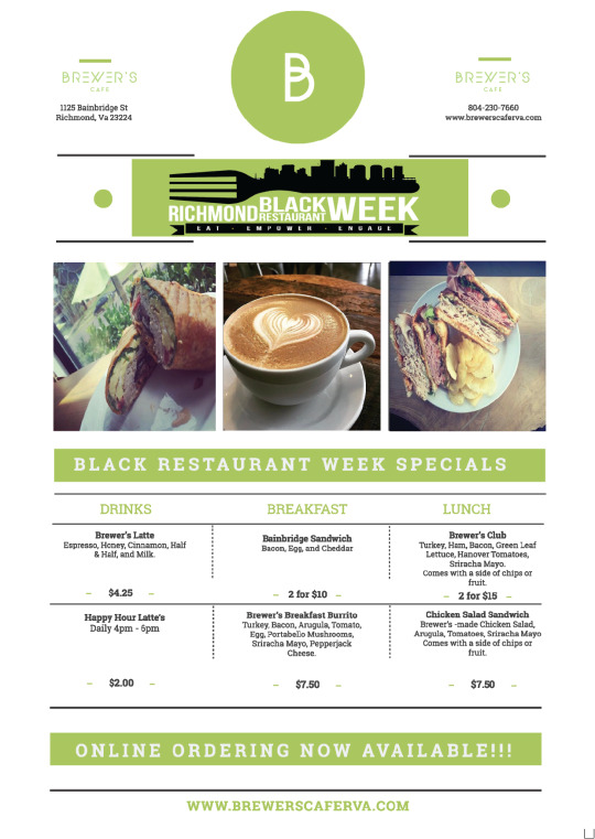
I’ve had to solve design problems under crazy deadlines, such as figuring out how to do a custom menu, in forty minutes, for a restaurants premier during Black Restaurant Week.
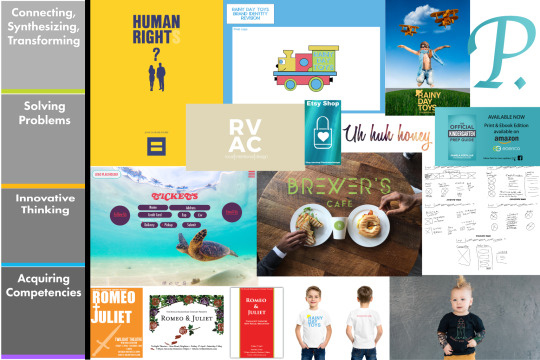
Acquiring competencies was learning to wireframe ALL THINGS. The more I go straight to the design process the more time I waste on the other side of things. If I begin by taking the time to figure out what is absolutely essential to the floor plan and then adding it to the wireframe and eventually the iteration I finish with a well thought out product.
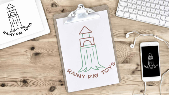
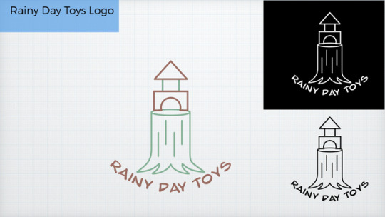
The best example of Connecting, Synthesizing, Transforming would be Rainy Day Toys. Connecting with the needs of the brand, learning to merge my needs with their wants and transforming it all into a happy medium
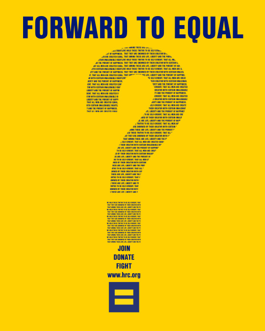
And finally, Innovating Thinking comes in with the HRC (Human Rights Campaign) Testimonial ads. Learning what makes an ad successful, following the brand guiltiness and using their attributes.
All and all, this program has confirmed something for me.
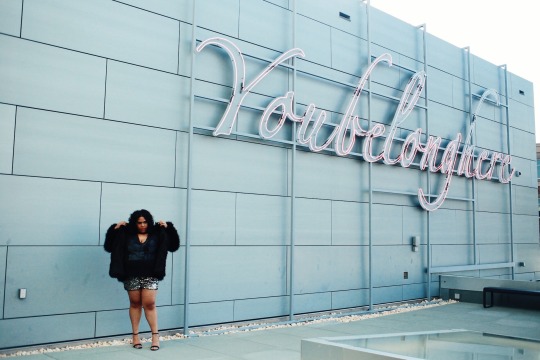
I belong here.
#FSO#Full Sail#full sail university#mdmfa#Tavares Strachan#You Belong Here#ICA#VCU#HRC#Brewers Cafe#A Hidden Exposure
1 note
·
View note
Text
Month 10 Reflections This month.... I had to survey folks about their perception and legit feelings about my work and it was probably the most scary thing I have done.

I spent the first week of the month considering the questions to ask to get quality feedback back on my work.
Then utilitzing Survey Monkey, we launched our surveys and waited for reponses. I put mine on facebok where I have a built in audience of 2,000, messaged a few folks and ended up with 14 solid answers.
People generally had good responses to the logo and who it was for. Me, comparing it to previous iterations I will be making some adjustments, using some gradients and strokes to the color versions to it doesn’t feel so flat.
I can definitely recognize that I felt this way before and now after the survey. Ntothing truely negative came of it, the general response was 4-8 stars on the logo itself and that was good for such a small group.
I wish I had made the time to reach out to other professors and my whole cohort. Their feed back would have been awesome.
In the world of behanced.... I cleaned up my Design Research project, and also posted my current Fiverr Gigs. Yeah, I’ll talk about that soon.


1 note
·
View note
Text
Mastery Reflection
This month I had the opportunity to revise my testimonial ads from Effective Copywriting.
This was fun because I got to reduce the elements, colors, and style of my ads, while keeping the visual identity of HRC.
I learned to rely on Brand Guidelines and work within it. Sharpened my inDesign skills, and played with my background eraser skills in photoshop.
All in all I am settled on my final looks and look forward to continuing to expand my skills.


0 notes
Text
Brand Guides Make You Refine Your Rational - Month 8
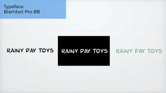
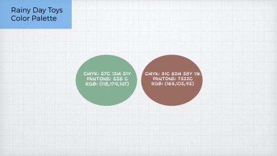
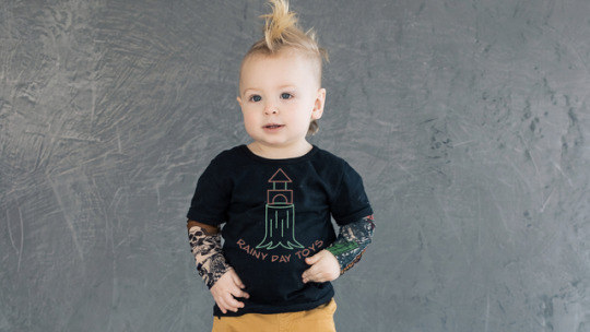
In month 8 I revised the Rainy Day Toys Logo yet again.
Truthfully it was the work on the Brand Guide that caused me to go back and create from fresh.
Each revision, each piece of feedback was critical to my growth as an artist.
Mostly the typography feedback.
The professor reminded me to adjust the tracking, leading, and kearning in my work.
How sway? How do you forget these things?
Anyways here’s a peak at the work.
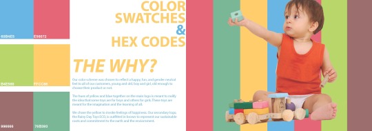
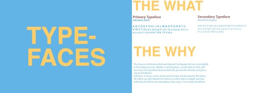
It’s been a cool journey working through the why and the how and has challenged me as a artist to understand the importance of knowing this from the beginning of the design process.
0 notes
Text
Rainy Day Toys Revision
This month I was to map out the next ten weeks.

And begin the project with Rainy Day Toys.

I decided to revise previous work based on the new skills I had sharpened, namely my ability to sketch and create vectors.
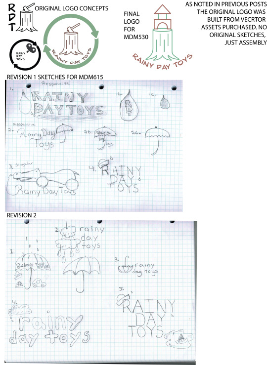
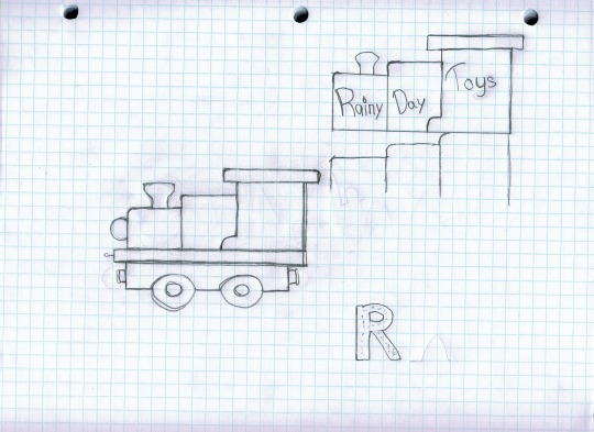
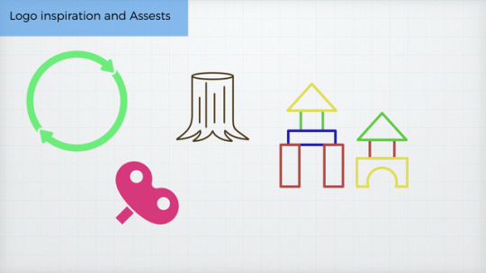
After a research on our various student platforms I saw the over use to Rain related items and decided to go the route of an actual toy that could be made, a gender neutral toy train branded Rainy Day Toys.
This was fun to do.
I sketched it, used the illustrator pen tool, and learned the difficulties of coloring in a vector with lines that didn’t connect or weren’t connected properly.

0 notes
Video
youtube
This month has been a whirlwind. This work has been incredible overwhelming at first glance, challenging with missing nearly every deadline, its been rough. Its been rough, but I have learned so much. I finally learned how to work the pen tool in illustrator and feel like I am officially a legit designer because I can literally make my own stuff.
Top three Logo Sketches and matching rough vectors.
Finalized Logo

I learned the basics of After Effects in 48hrs, I stretched myself.
Final Motion Graphics Comp
youtube
I remembered how much fun I have editing. I forgot that.
Audio Branding was another high point. I’ve always known the choosing of a soundtrack, effects, or dialogue should be well thought out, but I know realize how integral it is to the branding of a thing the reasoning as to why we buy in.
This month as great and this year was a rough one work wise but I feel worked out, stretched.
Onward and Upward.
0 notes
Text
Design Research
This month is was a godsend. I spent the summer beating myself up because I was trying to teach myself coding and the time would escape me, the will to learn, the ability to learn. I am naturally a creative so the technical aspects of web development can be challenging.
This month blew all of this out of the water. Weeks before the class started I was on Instagram watching a colleague who is an App Developer do Wire framing and was told by her it is something that would rock my world. It did.

The future of my web design desires...
Because of this class I wireframe it all. I create the plan before I design and therefore I am not personally stuck. While I would essentially be qualified to be an Creative Director by the end of this program, I personally would like to stick with developing and designing. To be able to research, wireframe, design comps, and then produce an end result would absolutely blow my mind.

This month has given me an edge I didn’t have before. Before it was luck of the draw that I gave a client what they needed. I could drag and drop resources for them. I could research their companies. But now, having the knowledge of Wire framing, researching, and more, I have come to a place of “purposeful design”.
0 notes
Text
Effective Copywriting Reflection

INALIENABLE calls into question whether Workplace protections and benefits are An inalienable right or something available only to those of the correct gender and sexuality.

The What Would You Do ad is meant to appeal to the empathetic nature of the viewer. Employing the use of a vulnerable child and the headline, “What Would You Do?” compells to viewer to to sit back and trade places with the stock image and imagine it being their lives or family.

The Human Right ad calls into question the humanity of those who are being discriminated against. The bold statement below, proclaiming that sexuality, gender, and family status should not determine who benefits and work place protections are allotted.
Reflection:
Overall, I have learned that copy must be clean and to the point. It must directly address the needs of client and their target audience. Research must be conducted to correctly address the needs of the client. Speaking of the client, it is the client who must be heard first and foremost. A brand is the voice of company and this voice must shine above the voice of the copywriter. The writer voice must be able to pair the brands voice with the research and the product needs The copy must reflect multiple points of view, both the needs of the company as well as the voice of the writer and the needs of the buyers. Research the target audience, create a profile, and create within the box you and the client have laid out for yourself. Using this method give you a better chance at coming back for a minimal amount of revision.
References
Felton, G. (2013). Advertising: Concept and Copy (Third Edition), 3rd Edition [VitalSource Bookshelf version]. Retrieved from https://bookshelf.vitalsource.com/ books/9780393733921
0 notes
Photo
The mind of a designer is a mind like no other. A designer looks at many perspectives, collects information for many sources to design a simple or complex campaign. The campaign is usually dictated by upper management who submits an RFP to the designing while also hoping for the best.
Having your creative director, designer, on staff with you, immersed in the culture of the brand will help when it comes to creating something that is authentic to the identity of the company. The creative director can also ensure that your resources are properly allocated, and used to the best of their ability.
According to our text, Designing Brand Identity, there are many benefits to hiring a Creative Director to oversee the branding and design process. There’s a level of maturity in workflow and design that comes with the decisions made by a well in-formed staff thanks to a Creative Direction who is well rounded in how to communicate and how to design for us (Wheeler. p. 115).
Three take aways from this course...
1. Research is EVERYTHING. Dig as deep and you can, then go deeper. If you do it you may find something extraordinary for create an amazing bran die
2. Start in Black. It’s easy to design a logo in color, but if you can get it right in Black and White, you’ll have further troubles in color.
3. Margo Chase. We lost Margo last weekend, but the best aspect of this course and the one before it was finally having a female designer to look up, such as Margo.
Wheeler, A. Brand Identity: An Essential Guide for the WholeBranding Team. Retrieved July 27, 2017 from
0 notes
Video
youtube
The mind of a designer is a mind like no other. A designer looks at many perspectives, collects information for many sources to design a simple or complex campaign. The campaign is usually dictated by upper management who submits an RFP to the designing while also hoping for the best.
Having your creative director, designer, on staff with you, immersed in the culture of the brand will help when it comes to creating something that is authentic to the identity of the company. The creative director can also ensure that your resources are properly allocated, and used to the best of their ability.
According to our text, Designing Brand Identity, there are many benefits to hiring a Creative Director to oversee the branding and design process. There’s a level of maturity in workflow and design that comes with the decisions made by a well in-formed staff thanks to a Creative Direction who is well rounded in how to communicate and how to design for us (Wheeler. p. 115).
Three take aways from this course...
1. Research is EVERYTHING. Dig as deep and you can, then go deeper. If you do it you may find something extraordinary for create an amazing bran die
2. Start in Black. It’s easy to design a logo in color, but if you can get it right in Black and White, you’ll have further troubles in color.
3. Margo Chase. We lost Margo last weekend, but the best aspect of this course and the one before it was finally having a female designer to look up, such as Margo.
Wheeler, A. Brand Identity: An Essential Guide for the WholeBranding Team. Retrieved July 27, 2017 from
1 note
·
View note
Photo
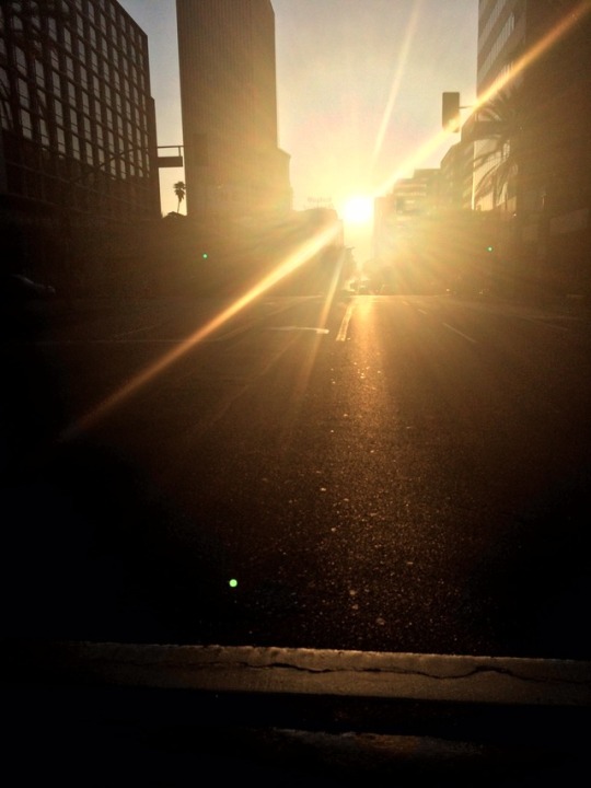
This photo inspires me. I took it at 7am on the streets of Koreatown in Los Angeles as I was headed across the street to get a bagel. The streett was empty because it was roped off for a race, no traffic was present or parked cars.
The concrete mixed with the beautiful rising sun gives me the visual of hope rising.
Toler, H. (2015, November 29). Hope Rising [Digital image]. Retrieved June 1, 2017, from heathertolermakeup.com
#FSO#mastery journal#Mastery Journey#Full Sail#Grad Student#Media Design#LA#Koreotown#The Line Hotel#Wilshire
0 notes
Video
youtube
Lately I’ve been digging on Chance the Rapper.
Specifically his song Same Drugs. The video is freaking wild, but this performance sends goosebumps up my spine.
Listening to Chance, Francis, and Abbey makes me want to sing, paint, create, design, and run. The signs, the melodies, the colors I hear within the music. Mostly its Abbey though, Abbey causes me to pause, close my eyes and imagine new things.
#Chance The Rapper#FSO#Mastery Journey#Master Journal#Full Sail#Grad Student#Media Design#Taste Like Juicy Fruit#abbey smith
0 notes
Text
Mastery Journey Reflection: Defining Client Needs
In this course I was finally able to learn the principals of Typography. I was able to learn that I can do what the client wants, even if I feel it arbitrary or low value, while also adding my touch to it. Finally I learned about research.
The act of design entails many things. It’s not just about creating and delivering a slick, dope, and complete design, it’s about solving a problem through your work. Defining the needs of your clients is an important part of your work as a designing. The act of research is crucial to the design process.
Our text refers to research as aiming our creative impulses properly (O’Grady, 2009). I have worked on many projects where lack of research on my part and the client’s wasted substantial time. Doing the due diligence of research will help to transform the results a client is given in the end.
In a recent client interaction, I showcased a male version of the unilome for woman owned yoga studio. Showcasing the male unilome was a fluke. I didn’t realize there was a different versions of symbol. Ultimately I figured it our throughout the presentation and then argued to keep it. The only thing I can think of is what if I did my due diligence? What if there was purpose to my decision and not just a fluke.
Projects:
Week 1: We were tasked to create a dynamic black and white, no frills poster for Much Ado About Nothing. This project was to show our knowledge of the Typography tutorials.

Week 2: Two projects, three sketches, and NPS. We were tasked to slightly improve on the original designs of the Romeo & Juliet posters below. We were also tasked with creating an original National Park Service Poster.


Week 3: I personally was encouraged to stretch myself, get out of my own box. This time around I went with an obviously modern poster, an avant garde one, and a classic look.

Week 4:: My favorite poster is the modern poster, the one on the left. I chose to return to the color red, crimson specifically, to keep a level of romance and mystery flowing with he poster.

1 note
·
View note
Photo
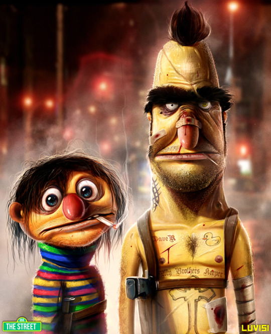
Being willing to see things and create things I have never seen before. Dan Luvisi gave me my childhood icons in a way I didn’t recognize, a real truthful way. May I stretch my interpretations as well.
Luvsivi, D. The Street. Retrieved May 19, 2017 from http://bellahead87.tumblr.com/post/50070918971/nevver-the-street
3 notes
·
View notes
Photo

This image by Lindsay Adler is a source of inspiration for me because it shows how all it takes is deliberate simplicity and artistic eye you can create something beautiful.
Adler, L. [Image of Painted Woman ]. Retrieved May 12, 2017 from http://www.lindsayadlerphotography.com/index/I0000NCqrCUCdgUM
0 notes


