Don't wanna be here? Send us removal request.
Photo
The Art and Design Catalogue displayed on my furniture. A great insight to our work from an outsiders perspective.


MA Art & Design Catalogue 2016
Designed by negotiation with WEST, [email protected]
printed by Rope Press, Birmingham,
http://ropepress.org.uk
1 note
·
View note
Text
Evaluation
I initiated this project by doing extensive research exploring the changing role of Art and Design Education within Birmingham School of Art. I wanted to see if there was a need for an interdisciplinary approach to art and design education in the post-industrial age and how this consequently challenged the role of space within art institutions.
Margaret Street School of Art was designed and constructed in the industrial era. Opening in 1885, the institution was located in a purpose built Arts and Craft styled building, calling itself the first Municipal Art School. I explored how the needs of local industry in Birmingham influenced the educational practice at Margaret Street; with the curriculum once focused on specific craft lead courses reflecting the needs of the times. The functionality of space for art education has lead this project. A contextual history on Birmingham School of Art allowed me to see how the university structured its curriculum to benefit surrounding manufacturing industries. Evidence of student work and Birmingham School of Art archive research suggested the relationship between educational structure and its response to local industry is symbiotic.
This bought emphasis onto emerging interdisciplinary course structures in the 21st century. Now a century on, education is responding to technological advances in the post-industrial age.
This highlighted how practitioners within art institutions might use space, but also how the space reflects the needs of artists and art educators. Again bringing emphasis on the functionality of space for art education. If the education structure chances how does this change the space?
Now we look to the future challenges of art and design education. New emphasis has been seen on studio practice and the way we use space in art schools as we see evidence of cross-department modes of study. These seem to be appearing within institutions creating a, school within a school, type structure. As technology develops, the way we define ourselves as artists and designers also expands. Art and Design becoming a blanket term for a wide range of disciplines. As we struggle to define and compartmentalise specialisms, interdisciplinary modes of study become relevant changing the way we work in studios.The main focus researches possible advantages of interdisciplinary course structures. Student’s diverse practice and thinking drive and initiates the use of space in these art ‘hubs’.
Taking all of these changing factors into account this lead my practice to start developing designs to make a functional workspace to reflect the professional needs of art and design students and practitioners. They were to be flatpack pieces that could be made by artists in a studio to create one of these’ school within a school’ hubs for creativity.
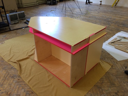
The 2 pieces of furniture in the exhibition have been designed to combine form and function, visually showing the relationship between my illustrative printmaking practice and how this has influenced functional pieces to be then used as a workspace. I created illustrations that evolved into a net or diagram to develop 3D designs for functional furniture.
The 3D designs responded to my image-making aesthetically. I used a bright colour palette that was kept constant to unify the work and also this later showed functional aspects to the 3D designs.
As Donald Judd states:
‘Of course if a person is at once making art and building furniture and architecture there will be similarities. The various interests in form will be consistent.’
The forms of my work will be aesthetically similar in shape and colour if that is the starting marker - aesthetics. However I would not want to confuse my furniture too much as art. The images I started creating slowly influence the general forms that made them my work, this is what made the furniture unique to my design - however they are functional and should not be over complicated as something else. A table, a chair/bench.
The furniture was to be a flatpack style, functional workspace that could reflect the professional reality of today’s artists and designers. It is to be put together as a team, encouraging social awareness and trans-disciplinary or collaborative projects. Groups of practitioners would assemble the furniture to be used in collaborative practice and studios. By putting together these design pieces practitioners were then meant to be inspired to feed their own creativity, the furniture being a trigger for the work then to be made on them. The aesthetic attractiveness of them would also be a nice thing to work and design on and around.
This table and this chair however are unique. They are from my designs and have become one off pieces. Each piece of furniture designed from this would be different in size, colour, scale if always a reflection of my developing practice. My printmaking will then develop after making the furniture and so on and so forth - everything I make being art or design influencing each other.
I think if these were to be mass produced objects it would change them completely. There would be no design development from my screen printing. They slot together and are made from traditional materials like plywoods which is seen as a mass produced method, however they would then be no longer one off pieces, lowering the artistic and design value.
Donal Judds goes on to say:
‘The only possible way to perhaps to make cheap mass produced furniture is to start with a construction cost and to design accordingly.’
I have in fact done the opposite...started with designed aesthetics and then made accordingly.
In this blog you will see 3 main hash tags throughout. These are:
#3Ddevelopment
#2Ddevelopment
#display methods
These are to clearly show the different strands of this project and how each one was developed.
There is also a #west showing how the Art and Design duo WEST collaborated with the curation of the whole group to respond to our work and make a catalogue to navigate the show.
The conclusive findings through this research developed my own practice and set up an ongoing dialogue that I can reflect upon. Myself as a practitioner can see to what extent possible changes in education could alter how I define my work, my own relationship and myself with my workspace and my peers.
My interdisciplinary Art and Design practice has provided me with a framework within which interests, research, collaborations and knowledge can be shared. From this I have not felt limited and have been able to develop my work, I feel, more successfully than if the project existed within the boundaries more traditional art education.
Ideas for the future:
The nature of this projects means I could constantly develop it - Image making, screen printing and then designing the furniture. These methods are all very mechanical ways of working - becoming almost a system that I must follow. The materials have all been quite traditional and low- tech so far.
If I were to develop this further I could think to experiment with materials - more high tech, lightweight or modern components in the design. This could expand on the new language for working environments that I am progressing in. This might also alter the construction of the furniture and how people interact with it - changing the working environments and how these practitioners will inhabit their space. This work does not stem from tradition and conservativeness so the materials should really reflect that.
There is lots to think and expand on, but this has been an incredible starting point. This MA has gone beyond the limit on what I thought I would achieve and has opened up many avenues of critical thinking for the future.
0 notes
Photo


Learning environments. At Ikon I have worked in various spacial settings including the john Lewis community hub, a canal boat and in the space of the galleries. The range of spaces reflects the tasks of a contemporary art gallery in the 21st century. Visitors can experience and learn in a environment where there are crossovers, differences and the interrelationship between art and design. This could be a place where my designs could work functionally. It would not have to be a traditional art education space as it suits the interdisciplinary values of my project.
1 note
·
View note
Photo


Learning spaces - This image show a current Art and Design teaching room used here at Margaret Street. I could see my furniture being used back into Margaret Street where my research initially started. It could encourage Art and Design students to push their interdisciplinary and collaborating practice by creating their own environments with my design.
1 note
·
View note
Photo


One off aesthetic art pieces....or functional pieces of furniture design.
0 notes
Photo


The front cover of Don Normans ‘Emotional Design - Why we love (or hate) everyday things.’ is adorned with the iconic Philippe Starck - Juicy Salif lemon squeezer.
‘First produced in 1990, this squeezer is as controversial as many of Starck's other designs. Some say it doesn't work very well and makes a mess of the worktop. Others celebrate it as a piece of form over function. Whatever your opinion, it now ranks among the greats of modern design with a place in the Museum of Modern Art in New York, which means that it's a work of art in your kitchen.’ Kate Watson - Symth, The Independent, 2010
Norman jokes how he has a limited edition gold plated one that he keeps...in his hallway. It was accompanied with a note reading: ‘Please do not use this juicer to make juice.’
This is a great example of a design object being aestheticised. This is to the point however when its function is now obsolete. However if we follow Normans theories then you could say even the purely aesthetic design, in which appearance is all, is intended to evoke a response. An emotional response. Therefore affected how we interact with the design object.
1 note
·
View note
Text
Emotional Design - encouraging collaboration and cross-disciplinary thinking?
Expanding on Normans theories of Emotional design and how by combining aesthetics with function it will create this visceral response to design...the catalyst for making this functional furniture was to use it in workspace and studio environments to encourage interdisciplinary studio practice between students. The advantages to this out of the box thinking and a more interdisciplinary approach to designing and learning was seen to outdate the more traditional craft approach to Art Education. Billows and Nicolson express the need to acknowledge more collaborative ways of teaching and practicing:
‘There is a demand for new models of art education that reflect the professional reality of today’s artists and encourage social awareness and trans-disciplinary or collaborative projects.’Billows and Nicolson, 2010. Pg. 54
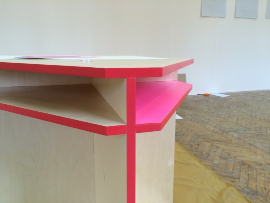
The work provides a platform that encourages this type of practice, matching this shift in the functionality of the Art School. Yes the work is physically appealing from the design process that has made it a functional piece, however the bright colours hint to the function of it - colour profiling of storage and shelves.
0 notes
Link
In this TED talk,design critic Don Norman introduces a framework for our response to objects, with three layers. The focus is on Emotional Design, returning to this theme of the aesthetic quality of design objects and looking for principals that show how well this works.
The talk discusses the theory of emotion and if an object is functional but also beautiful then the user can use it reflectively, being a pleasant thing it will work better.
The 3 stages discussed are.
Visceral
Behavioural
and Reflective design
Our visceral level of processing design is all subconscious - going deep into how our systems work and how we respond to emotionally. We as humans are programmed to be subconsciously drawn to things like bright colours and bold shapes. This therefore affecting our emotional behaviour towards objects.
We are biologically susceptible to different behaviour when these levels change and our emotional responses differ. For example when we are happy and find things pleasant we are more susceptible to interruption from our systems feeling relaxed and not so on a one track focus. This then encourages out of the box thinking! Brain storming, creative ideas.
0 notes
Text
Aestheticising a functional design object
A design is an act of communication. Even the purely aesthetic design, in which appearance is all, is intended to evoke a response. My project is both practical and appealing. By stating my design process from my arts practice I have wanted to define a new language and functionality within furniture that we use from day-to-day.
By designing a functional flatpack piece of furniture from my illustrative practice I have aestheticised the product, taking into account the physical appeal of the colours and shapes. My prints and paper cuts have been used as nets and as a diagrammatic. The users will inhabit their places with this product, building it together and deciding where it will be functional in the space. In a way they are personalising its use - making it their own which could define the success of the piece as a functional design object. It is important to find that balance between the aesthetic quality of my creation and its ability to also function well.
0 notes
Photo


construction
The furniture was aimed to be made as a group - becoming a social way of inhabiting a working art and design space. Most pieces were light enough to be carried by one person - needing 2 or 3 for the lager top pieces to make it safe and not to damage any of it in construction. The colouring of the pieces made it easy to distinguish where pieces went from my 3D plans in Sketch Up. Overall it took around 40mins to construct which I think could be shortened if I designed an installation guide if this was a more commercial product.
Linking this back to my Research in Practice:
Bianca Elzenbaumer studied MA Communication Art and Design and is currently a research fellow at Leeds School of Art. As one of the developers of the experiment when Department 21 built separate chairs to add to their studios, she comments:
‘Inviting people to make seats for Department 21 might also open up the space for them: once you made a seat for the space, you probably feel that you are already part of it.’Elzenbaumer, 2010. Pg 20.
She comments that by making a physical object you could then feel an emotional connection to the place. This creates more of a relationship between person and studio, making you feel part of a community.
Again I see the advantages of using this furniture in an open studio and working environment - creating a social and co-working space.
0 notes
Photo


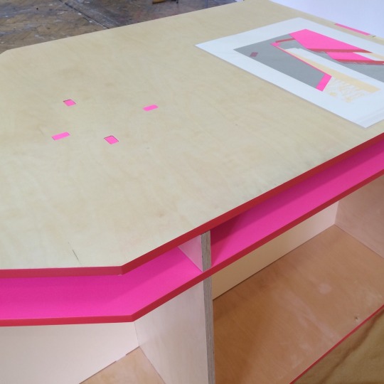
Displaying my prints and 2D designs next to my flatpack furniture. Obvious observations are that the aesthetics of the work are similar: sharing forms and colour.
Although the design work and art making could be seen as two separate enterprises they of course emanate from the same conceptual basis and have developed with each other.
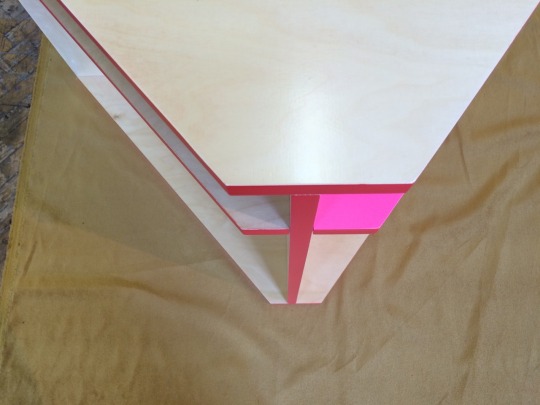
The initial colour choices alone were purely aesthetic to begin with. It developed from the very early paper cuts which then turned into a colour palette that I wanted to keep constant throughout the project to link all the work. However the colour then developed into a tool to highlight areas of interest in my prints or to show areas of functionality in the furniture. e.g. the profiling of boxes in different bright colours show storage spaces or shelves. I thought very carefully about colour balance in designing the prints - sketching red boxes or pink shapes to draw peoples attention to 3D forms.
I could think to develop the colour further - colour coding the furniture, each colour could represent a different action or use within the workspace.
Although functionality in my design has compromised a few things of the original artistic elements, the origin of the shapes and colour has always related back to my 2D work. If someone with a different practice and way of image making experimented with the same process of creating functional furniture they would finish with very different results. Through collaboration of ideas and knowledge with different people I have been able to construct functional design pieces, however I feel the design and artistic choices have been original to 2D work.
0 notes
Photo

Now I see the furniture physically here full size, it would be great to create more flat images of the colours working together, looking at different profiles that I could then use to design more screen print compositions. This way I can always link the 3D work back with the 2D, playing off each other to push both designs forward.
0 notes
Photo


Paint colour matching my prints. These are images in Dean’s workshop of him colouring the pieces after they went through his CNC. By using the plans I gave him he coloured each piece exactly, colour matching the 3 chosen colours from some screen print swatches I gave him.
0 notes


