
Statistics
We looked inside some of the posts by elizabeth-derby and here's what we found interesting.
Average Info
Notes Per Post
0
Likes Per Post
0
Reblog Per Post
0
Reply Per Post
0
Time Between Posts
4 days
Number of Posts By Type
Photo
16
Video
1
Last Seen Tumblr Blogs


Fun Fact
Tumblr was attacked by a cross-site scripting worm deployed by the Internet troll group GNAA on Dec 3, 2012.
Photo

FINAL ADVERTISEMENT
After lots of Photoshop retouching, designing and illustrator here is my drink design. I discovered that I love Indesign but Illustrator is not yet my friend. I will be working on this relationship. I was surprised the class chose this classic direction but was happy I had two strong enough ideas to make them both work. It was a great class.
0 notes
Photo

WEEK 13 - Final Presentation
Finishing off my designs and using adobe stock images to create my advertisement. Creating a design rationale to finish off class. I am happy with the results.
0 notes
Photo

WEEK 12 - Repeat Pattern
This weeks tutorial task was using repeat pattern in Illustrator. I personally think that this looks pretty as wallpaper however it is too distracting from the Whiskey bottle, my logo is the main feature so I wont be using a repeat pattern for my final image display.
0 notes
Photo

WEEK 12 - Finding a Mock up
This weeks Tutorial Task was to find a workable mock that we could use in our final product images. I found this Whisky/ Cognac bottle for free on
https://www.psdmockups.com/glass-whisky-bottle-psd-mockup/
0 notes
Photo

WEEK 11 - Anatomy of a Label
Breaking down labels so we don't forget what to include on ours to make it realistic and professional.
https://hiconsumption.com/how-to-read-a-whiskey-label/
0 notes
Photo

WEEK 11 - I Hate Illustrator
Having massive trouble trying to visualise how my label would look flat took me ages to get this far! Arrrrrgh
0 notes
Photo


WEEK 11 - Changing my Label
After Feedback in tutorial I changed my label to have red stripes and made the logo fill half of the bottle this looks much better and more in line with my mood board.
0 notes
Photo
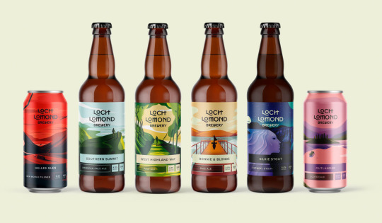

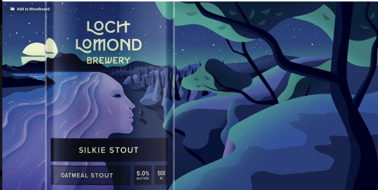
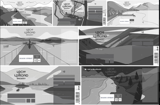
Week 10 - Research Tutorial Task
After some research on behance our group decided on this packaging design which shows creativity and how they placed the necessary label items on the can design so as not to detract from the beautiful illustrations.
https://www.behance.net/gallery/62630945/Loch-Lomond-Brewery?tracking_source=search_projects_recommended%7Calcoholic%20labels
0 notes
Photo

WEEK 10 - The Cap
I added the leaves that I used in my logo to the cap which makes it look rather fancy! Using overlays in Photoshop. I love retouching.
0 notes
Photo

WEEK 10 - Close up of Label and logo design
I have started designing my logo to fit this bottle and had fun retouching it this week.
0 notes
Photo

WEEK 10 - Putting Logo in Situ
This week I wanted to try my logo on the bottle im using as to make sure im designing it correctly. My bottle is Grants whiskey which I retouched to make look pretty and remove elements that branded it grants.
0 notes
Video
tumblr
WEEK 9 - LOGO
I hade fun doing this, I made a video of my logo design layers. Using Photoshop some cool and brushes to create this effect I placed the leaves on separate layers. I have then flattened and moved the logo into Illustrator and converted it into a vector shape. I rendered the video in Photoshop using the layers and timeline making a small animation to show the process.
0 notes
Photo

WEEK 9 - LOGO Refinement
Here is a simple mood board of the logo I am trying to design I want an elegant lady silhouette to make in a gold gradient. I really the idea of making a dress out of a leaves pattern.
0 notes
Photo

WEEK 9 - Font Research
With feedback from Crystian on the font Grafolta Light previously chosen, he said the double PPs were broken and on a script type it works better if they flow together the ones that are broken I would have to fix myself in Illustrator. So I have researched some Adobe Fonts and chosen some that I think will work better after I make my label and get some feedback on which one suits best I will refine more.
0 notes
Photo

WEEK 8 - Video Presentation
After My video presentation to the class the more classical whiskey brand direction was chosen. I now have to move forward and refine my idea.
0 notes
Photo


Week 6 - Final Mood Boards
This week I updated the mood boards including my logo directions and drink name with a font I feels represents the brand. These are not much changed from my first ones.
The logos are not my final representation as these were pulled of pintrest and manipulated in photoshop. I will make an original in Illustrator it was suggested I put more colour on the purple direction. I tried this and felt it just detracted from the logo, as a stark simple bold design is one I am going for. I have done some research and found no purple cans on the shelves. I changed the ones in my mood board to show how I would like to represent this drink and brand.
0 notes
Photo

Week 5 - Logo Directions
One more stark and bold the other more sophisticated and refined correlating with my mood boards.
These are from wikipedia and Pintrest. I have manipulated them in photoshop and will be making my own original designs in illustrator once the final direction is pitched.
https://www.pinterest.com.au/pin/747245763160410205/
0 notes