
Don't wanna be here? Send us removal request.
Statistics
We looked inside some of the posts by dagmara-fmp-blog and here's what we found interesting.
Average Info
Notes Per Post
0
Likes Per Post
0
Reblog Per Post
0
Reply Per Post
0
Time Between Posts
22 hours ago
Number of Posts By Type
Text
16
Photo
1
Last Seen Tumblr Blogs


Fun Fact
Tumblr is available in 18 languages.
Text
Critical Review
1. Briefly describe the context of your project. Describe how a range of critical perspectives helped you realize this idea. (max. 50 words) The question for my final major project was 'Healthy eating, the aim of the project was to visually attract younger audience to eat healthier by promoting food in an entertaining way. The exploration of good and bad labels has helped me to understand the sort of aesthetics that the targeted audience was more into. In the initial stages of this project the context was much more focused on labels and personal opinions towards the aesthetics of the product, as the first step to solving the problem was realizing that I had one. From this I have learned that labels that do not have much illustrations may not attract younger consumers to eat healthier.
2. How did you use your researched contextual perspectives to develop your project? (max. 50 words) At the beginning of the project, I did a lot of primary and secondary research by visiting exhibitions, for example; The House of Illustration, Wellcome Collection, Museum of Brands, Packaging & Advertising etc. As well as carrying out questionnaires and surveys, from which I was able to develop possible ideas. Although, some of the exhibitions were not as relevant as others, I was inspired by their use of color and their graphic style, for example; the work of Martin Rowson exhibited in The Guardian Office.
3. Please discuss your exploration of alternative ideas and how they led to your final outcome. (max. 50 words) Although my project started with research into good and bad labels, towards the end of my project I was looking into and responding to artists that used color. At the time, I was not sure how I had ended up here with my research, however I felt that through changing my 2 focus into making food look more appealing could lead me to create a better result at the end.
4. What systems did you use to plan, organize and develop your project? Please reflect on the effectiveness of these tools. (max. 50 words) Throughout my Final Major Project, I was mainly using my sketchbook to brainstorm my ideas and gather my research. I found this particularly helpful when I was developing my ideas, as I was able to then refer back to previous work and compare concepts. By using my sketchbook to plan my ideas I found I was much more organized, it helped when deciding the most appropriate composition and color.
5. Discuss practical skills you employed to realize your project. Describe how you explored, adapted and stretched your skills and knowledge. Are there specific skills you have developed that will affect your future course/career? If so, describe said skills. (max. 100 words) The use of materials and techniques in this project wasn't as vast as I wanted it to be. I feel that I have spent too much time on thinking about the concept and perfecting one piece of work, instead of creating more ideas that I could later develop. However, I still did try to experiment as much as I could with using different techniques. For example; using Adobe Photoshop, Adobe Illustrator, Painting with Ink and Watercolors and drawing my ideas using a marker or a fine liner. Also, I have learnt how to print my work in a professional format.
6. What type of evaluative and reflective records did you keep? How did a continuous analysis help you to inform and develop ideas? Provide specific examples. (max. 50 words) To help with the reflection of the work that I have done, I had a lot of peer assessment, where I was able to receive some helpful feedback from my peers and reflect on my work. This really helped because it allowed me to go back to the weaker areas and change some of the aspects that were not as good, so that I could improve them in the future and learn from my mistakes.
7.1 Discuss the range of considered strategies you employed to present your personal project.
7.2 Who is your audience/ customer? State what type of end user you had in mind for this project, and how/where project would be presented. In this project one of the key strategies which I employed was to focus closely on the concept of my work. This was due to how I wanted the images to come across, with meaning and evocative content, drawing interest as a result of what they show rather than how it is shown. The audience that I did have in mind for this particular project was initially people from the age of 14-19. I did not really consider the range of different types and ages of people who may be able to relate to the images. Regarding the demographics, I think that E was the most 3 appropriate audience for my posters because students fall under this category and they are most likely to be influenced. I was aiming at the age 14-19, based on the research that I gathered, people under this age are likely to change their habits of eating, as they fall for the aesthetics.
8. Overall summary: Describe a few key points to take away from this experience, and a few things to change about your approach to creative production. (max. 100 words) Overall, I have learnt to be more open minded and to be able to consider multiple ways of producing the work. I have also group crits to be beneficial to me as an approach to my creative production as I have learned from the work that my classmates have been doing along the way and taken inspiration from where their concepts have led them. Further to this I feel that I benefitted from a group’s critical approach and commentary on both my work and that of others, as it enabled me to gain further research in a different way than I could from the internet or exhibitions revealing a unique perspective or point of access I hadn’t considered, and may never have done if it were not for these crits.
0 notes

Text
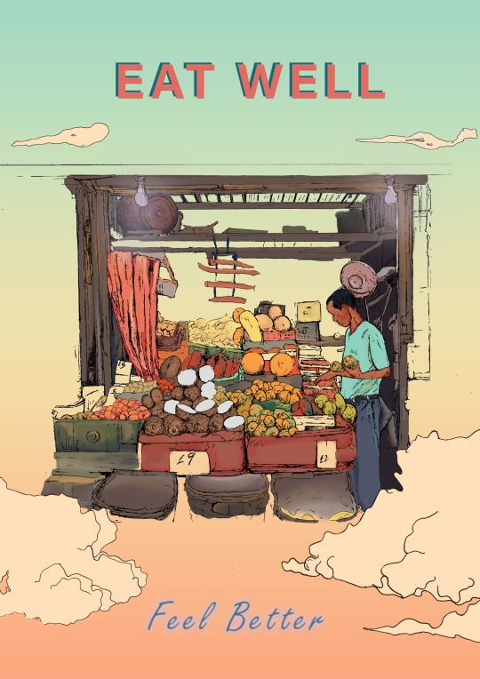
Final Poster
At the early stage of creating my final outcomes, I was influenced by the work of Didenko and his compositions, I wasn't really sure, how I wanted my outcomes to look, until the very last stage of my final major project. Therefore, the work of Didenko was a dose of inspiration when it came to colour choice placement of the fruits. Firstly, I have experimented with my designs before picking the desired colour as it needed to relate to the audience that I was targeting. Also, I was facing a problem, as the drawing which I produced was A3, as a result I had to crop some of the areas of my drawing and ensure to fit the a4 portrait poster. I think that, the colour palette that I have worked with was matching the preferences given before. One thing that I would change would be the typography in both of my posters as they do not reflect the idea of being truly healthy, whereas the use of more flowing type would match the natural look that I was going for.
0 notes


Text

Based on my final major project on 'healthy eating' I decided to bring together some of my previous initial ideas, where I have drawn individual fruits and vegetables and decided to put them into one poster that would show different food groups. The placement of the individual fruits was not planned, however I really like this composition as it suggests that the food is rich and compacted in vitamins. One thing that was successful about this poster was the idea behind it because it gives the feeling of farm food, and the sensation of something so fresh and healthy.
0 notes


Text

After experimenting with a range of different materials, I think that the most successful outcomes were the ink drawings as they are the closest to my targeted audience, which represents fruits and vegetables being presented in a fun way.
0 notes


Text

Fine liner and watercolour experiments
Through the use of waterecolours, I wanted to achieve a look similar to Florian Feible, as he has also used mixed media in order to create his work. However, I believe that this experiment was not successful, as I have not followed my targeted audience. Through the use of darker tones and washed out colour, this drawing would aim at older audience as it has some type of serious appeal.
0 notes
Text

Influenced by Rowson’s tonal drawings
My initial ideas were based on the idea of making food look aesthetically pleasing, the tonal shading was a part of experiment influenced by Thomas Rowson. Although my project started with a research into good and bad labels, I also wanted to responding to artists that used color. At the time, I was not sure how I had ended up here with my research, however I felt that through changing my focus into making food look more appealing could lead me to create a better result at the end. Therefore, I decided to focus my design ideas around making food look exciting, as based on my questionnaire, people would buy healthy food more often if it was promoted in an engaging way.
0 notes
Text
The Guardian | Martin Rowson

Although, Martin Rowson’s work focuses on cartoons with political satire, the dark and sketchy tones wee striking against the white background. I believe that, this is the style that I would like to experiment with in my further development.
0 notes
Text
Questionnaire

During the process of research, I created a questionnaire as this will help me to determine my target audience. I wanted to find out more on their views towards healthy eating as this would show whether they consume a lot of healthy food or if they rather eat junk foods. The survey has shown that, the majority of people were young adults, who do not know much about reading labels and making healthy food choices. However, they would be willing to choose healthier options if there were appealing ways to do so.
0 notes
Photo

‘Made in North Korea’ exhibition
The free hand typography in this style makes it readable and appealing in display as the font size fits the product, it also complements the graphics on the packaging.
0 notes