My main blog is asuraum, but I decided to make just a blog for my art so I can easily share it all with you! I hope you enjoy it and I love feedback! 💕
Don't wanna be here? Send us removal request.
Text
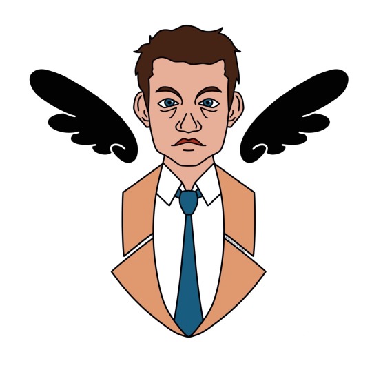
This cute little Castiel is available at my Society6 page (asuraum) - https://society6.com/asuraum
It is available as: ~Art Prints
~Stickers
~Throw Pillows
~Carry-All Pouches
~Tote Bags
#supernatural#supernaturalartistsnet#supernaturalfanart#supernaturalart#castiel#castielfanart#society6#artprints#prints#art#stickers
11 notes
·
View notes
Photo
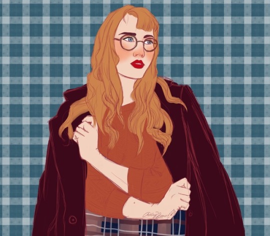

Haven’t posted on this page in about a year. Here’s a rough sketch/painting of one of my favorite fashion instagramers, jerianie.
1 note
·
View note
Photo
0 notes
Photo
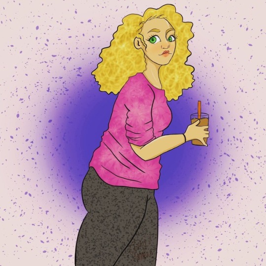
Illustration of my friend Julia.
0 notes
Photo

0 notes
Photo

$10 commission I did for sweet little Abby.
1 note
·
View note
Photo
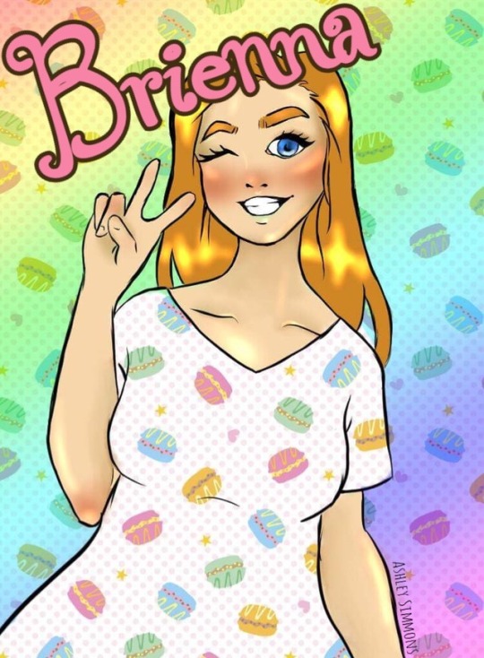
A $10 commission I did for my lovely friend, Brienna.
0 notes
Photo


so i figured out this really easy trick a while ago and i needed to share it with yall
im sure this has already been done or figured out before but i haven’t seen a lot of blood tutorials using this technique so ¯\_(ツ)_/¯
59K notes
·
View notes
Text
CamScanner: a must have for traditional artists!
hello! I recently found this rad app called “CamScanner”, a mobile app for android and iOS
what does this app do? well, basically it imitates a scanner, so even if you don’t have one, you can take real cool pictures of your drawings!
for this to work, i suggest you take a picture of your entire paper / sketchbook / etc. The app will automatically crop your picture and come out with something like this:
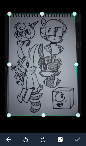
(sometimes it wont be too accurate, but that can be easily fixed by moving the frame yourself)
once scanned, the app will make it so your drawing looks like this:
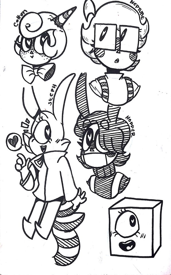
(the app will have some presets, so you might want to mess around with those. OR you can mess with the settings yourself to get a look you desire)
this can be really helpful if you plan to color your traditional piece on a computer, or something similar.
this can even work with colored drawing, if you’d like!
original:

edited with CamScanner:
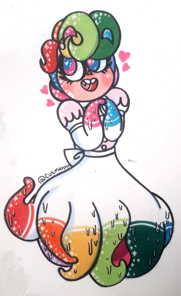
if you mess with the settings yourself, i bet you could get the picture to look better, as i did this with the presets.
anyway, i hope this helps!
98K notes
·
View notes
Text
Digital Painting: tips for beginners
Heyo! I got asked if I could make a tutorial on digital painting so I’m gonna throw together some advice meant for people who are starting out and want to figure out exactly how this stuff all works. Because it’s hard! What I hope to accomplish here is to make painting more approachable for you.
Firstly, I have put together something like this before, so for archival purposes here it is: http://holy-quinity.tumblr.com/post/89594801811/i-dont-know-how-much-of-this-kind-of-thing-you
For those of you who don’t wanna bother reading that, here are the main points:
1. Learn your program and its tools, from brush properties to layer styles. And I mean learn them. Make a cheatsheet that shows you exactly what each button and scale does, both in isolation and in conjunction with other buttons and scales. Refer to this as much as possible until it is intuitive. The end goal is to know exactly what to do to your brush’s settings to achieve a given effect.
2. It’s perfectly okay to use your sketches, linearts, and other forms of line in your paintings. They can help guide the form and there’s no need to make something fully “lineless”! I never make things “lineless.”
3. Study other people’s art and try to think how they could have possibly achieved the effects they did. You can learn a lot just by observing and mentally recreating the process stroke by stroke—muscle memory is a powerful tool at your disposal. This becomes easier to do once you’ve started doing item 1 above.
OKAY!
So where the heck do you even begin?
What I’m gonna do is try to make digital painting as approachable as possible for someone who’s never really done it. The main idea here is that digital painting is just like real painting. So if you’ve ever done real painting, you already kinda know what’s coming.
I’m gonna assume you know the basics of digital art: you can sketch, line those sketches using layers and opacity changes, and fill the lines with color, maybe even opting to add some shading…and you’ll get something like this:

You know, cell-shaded, or maybe the shading’s blended, but you’ve still obviously a line drawing with color put down on layers beneath the lines.
The next intuitive step is to try going “lineless”…but when you remove the lines you get this:
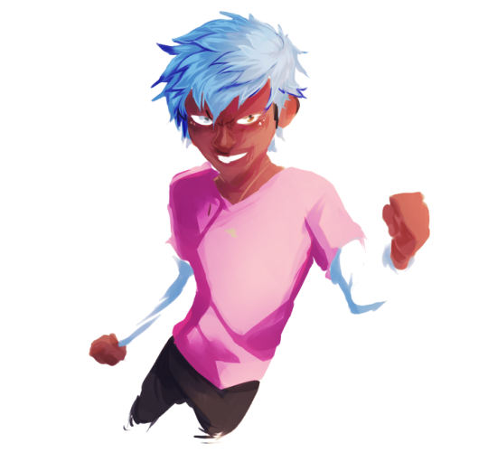
idk about you but I’m laughing at how stupid this looks
When I was first teaching myself to paint digitally, I didn’t really know how to deal with this. Without lines, the form of the subject vanished or became a mess like the above. Even if I was meticulous and careful about placing down the color such that without the lines layer turned on, the shapes fit together, it didn’t look quite right. There’d be gaps, I wouldn’t know how to incorporate the subject into a background, the contrast wouldn’t be high enough, or it’d just in general look too much like a screenshot from Super Mario 64.
Painting requires a different process than the above. You’ll have to let go of some of your habits and conventions. Such as staying in the lines. Such as fully relying on the lines. Like, I love my lines, I love my sketches—but in painting, they are guides for form, and are not the form itself. So let me go through how I approach a given painting:

My painting process starts with a sketch (here a boring portrait for demonstrative purposes). I make the opacity of the sketch layer something like 30%, and then throw down my base colors on a new layer underneath. I’m not being meticulous about the sketch itself, because again it’s just meant to guide my placement of color. I’m also not meticulous about my placement of the color.
We’re essentially sketching with color. Because ultimately what we want is for the color to take on the form and shapes conveyed by the sketch.
There’s a lot going into this about how to use value, how to shade, how to use color, etc. that I’m kinda skipping over because it takes a lot of time to explain…but there are hundreds of tutorials out there on those topics so please, google around! I found some helpful tuts that way when I was starting out.
Something I find v useful is to keep selecting colors that already exist in your image for shading and hue adjustment. This is why I start with really blendy, low-opacity brushes when throwing down color on top of the background. I can then select colors within there that are a mix of the two.
For instance, I’ll select the color of the lines here:

…and use that to shade:

And maybe I’ll select one of the darker shades around his eye, but not the darkest, to make the shading a smoother gradient…and so on.
What I do in general at this point is go over the shapes and lines of the sketch. Such that I can turn off the sketch layer and see this:
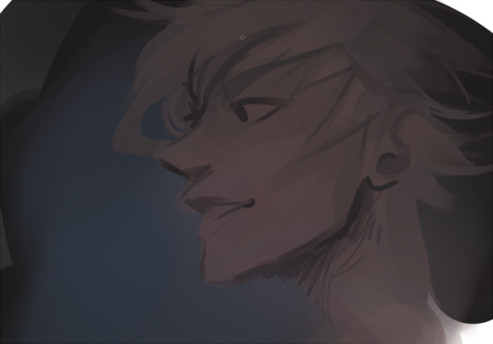
I’m replacing the lines with shading and value. I’ll continue to do this as I keep adding color.
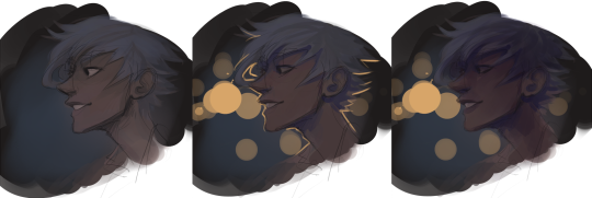
This is all super loose. I am not dedicated to any particular stroke. I just want the colors and shading and light source to be right. I’ll use overlay layers to boost contrast or add a hue.
Here are other examples where I used this process:

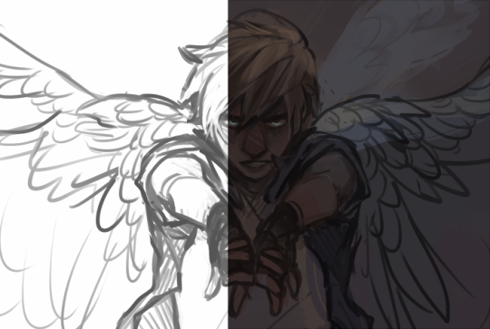
I am constantly changing brushes and brush settings as I paint. It really depends on what effect I want where. I am also constantly selecting new colors and applying or blending those in. I don’t believe in having some uniformly applied base color and then shading with only one or two…that’s what I’d do if I was cell-shading like the first drawing I showed you here, but painting should be about messing with color and opacity and blending to make millions of hues!
Good rule of thumb: Hard, opaque brushes for applying color. Soft, dilute brushes for blending colors. Sometimes hard, dilute brushes can make some cool blending effects! I personally prefer harder edges on my shading so that’s a brush I use often.
This is getting a bit long so I’m gonna split it up into multiple parts, but really what I want you to get from this is:
1. learn the tools at your disposal until they are intuitive
2. sketch and line are guides for form, not the form itself
3. rather, hue and value will produce the form
And of course, practice makes perfect!!! Every drawing you make, every painting you make, will bring you one step closer to the artist you want to be, and thus every drawing and every painting, no matter what, is a success.
9K notes
·
View notes
Photo
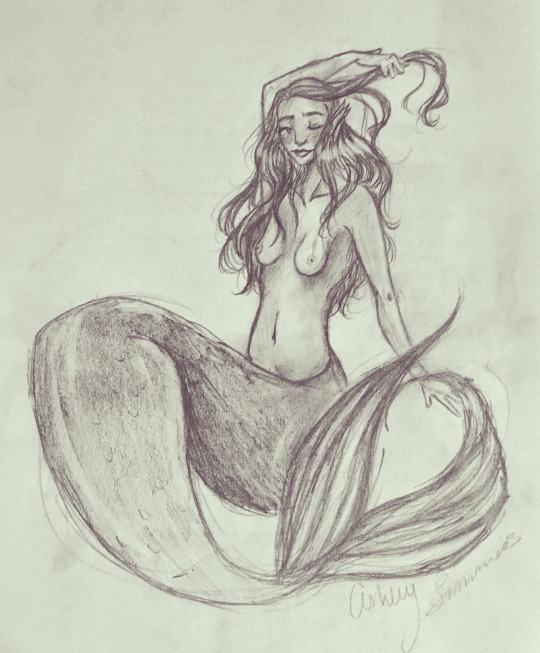
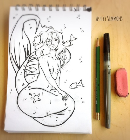
Mermaid by Ashley Simmons (asurart)
1 note
·
View note
