Text

Wanted to add to the collection of Emmrich hands appreciation illustrations.
#‘slow deep’ haunts me in my dreams#my art#digital art#illustration#digital painting#digital illustration#dragon age#datv#dragon age fan art#emmrich volkarin#emmrich x rook#emmrich romance#emmrook#dragon age emmrich#datv emmrich#emmrich hands appreciation#my rook
149 notes
·
View notes
Text


I needed something sweet
#my art#digital art#illustration#digital painting#digital illustration#bg3#bg3 fanart#gale dekarios#gale of waterdeep#bg3 gale#gale x tav#galemance#baldurs gate gale#I love that freya is taller#like let me just grasp that chin and bring it down to my level -Gale#Freya
128 notes
·
View notes
Text

I’d be stealing this crow if my friend didn’t call dibs :P
#lucanis dellamorte#dragon age lucanis#da4 lucanis#datv lucanis#datv#dragon age the veilguard#dragon age#dragon age fan art#illustration#digital painting#digital art#digital illustration#my art
269 notes
·
View notes
Text

Hellooo Professor 💕✨
Really happy with how this two color palette turned out on emmrich
#emmrich volkarin#dragon age emmrich#datv#dragon age fan art#dragon age#dragon age the veilguard#digital portrait#digital illustration#illustration#digital art#my art#cell shading
72 notes
·
View notes
Text

I’m nearly 400 hours into this game and I will happily start another play-through next update to roleplay my babies again!
#bg3#bg3 tav#bg3 fanart#bg3 gale#gale dekarios#gale of waterdeep#galemance#gale x tav#digital painting#digital illustration#my art#digital art#illustration#Freya
42 notes
·
View notes
Text

It’s no surprise that the med. illustrator picked the necromancer romance
#emmrich volkarin#dragon age fan art#dragon age#datv#datv emmrich#dragon age emmrich#emmrich the necromancer#digitial painting#digitalart#digital illustration#illustration#my art#digital art
44 notes
·
View notes
Text


He always looks like a blueberry in my original scenes because I’d always forget to clean off the blood.
#my art#gale dekarios#gale of waterdeep#gale x tav#bg3 gale#baldur's gate 3#baldurs gate gale#bg3#bg3 art#bg3 fanart#digital painting#illustration#digital art
105 notes
·
View notes
Text


The moment I fell flat on my face in love
#balders gate 3#bg3#bg3 tav#bg3 fanart#gale dekarios#gale of waterdeep#gale x tav#bg3 gale#galemance#digital art#my art#ends my tumblr hiatus absolutely smitten by the wizard even a year after playing#Freya
77 notes
·
View notes
Photo
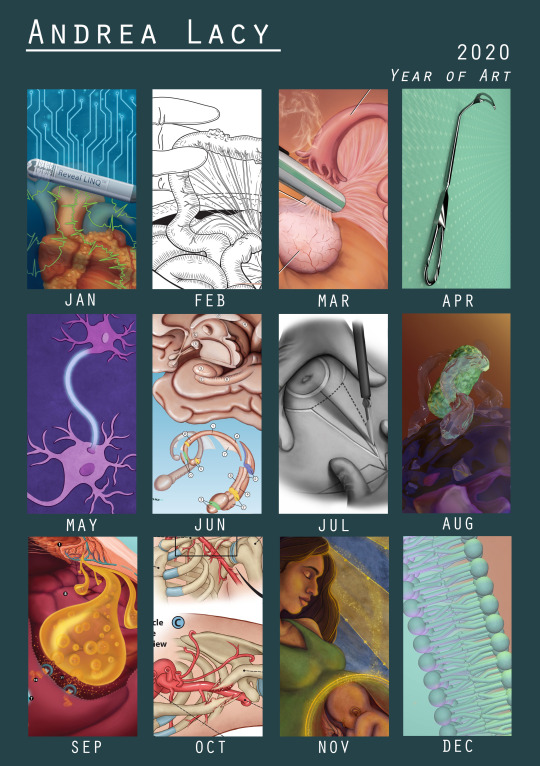
Hello tumblr, very long time no see, but its a personal tradition to share my yearly art review:
Despite everything that happened this year that resulted in lots of undesirable firsts, I also must look back fondly at 2020 as really my year to surround myself in medical illustration. As you may note all the work in this year’s round up is class work done for my graduate program. I did very little personal work, just sketches here and there but especially with an additional summer semester of classes and six months working alone on projects during quarantine, I was completely immersed in medical illustration this year. And one of the best things about that experience is where last year if felt like I stepped through the threshold into the world of medical illustration, now I feel that I have lived in that room and its hard to see myself doing anything besides this.
Now onto the art. Each row roughly lines up with my semesters which is handy. Highlights this past spring were my first experiences with surgery which were rewarding but also very overwhelming experiences. There’s something very humbling about being in surgery and having the surgeon be concerned about whether or not you’re getting a good view of the action and if all your questions are answered. One surgeon this year even let me sit at the robotic surgery controls to see her work in stereoscopic view (no worries the safety lock was on, so I didn’t bump anything). Something I also did back in spring was start learning my first 3D modelling program: Cinema 4D.
Over the summer I did a lot of work in animation and more 3D modeling with a good dose of surgery illustration work as well. This summer I feel that I switched from being rather scared of surgical illustration to being quite proud and even a bit comfortable with the process which is something that undergrad me would be shocked to hear. I also submitted work to the AMI for the first time with my pieces from June and July as my example of my skills. In August I did my first bit of 3D animation; a neutrophil engulfing some bacteria.
And finally, in Fall I was back to in-person classes and busier than I had ever been. I worked on a large-scale poster in September which was very rewarding, struggled so hard to achieve the look of ‘med-legal’ in October, and managed to squeeze in my love for tarot card/ art deco symbolism in a mock journal cover. And I also created a fully 3D animation on the cell membrane. And that is only part of the work I did but some of the other work in kind of under NDA for the moment.
Thank you all kindly for reading and being curious about this little journey of mine. I hope your holidays are pleasant and safe this year, and make sure to take some time for yourself to reward yourself for all the hard work this year.
2 notes
·
View notes
Note
Hi, I love your artwork! I was especially struck by your self portraits, that one from 2017 reminded me of Prudence Heward (one of my all-time fave artists!) and the colour temperature oil painting is really rad too!
Thank you so much!, self portraits are so fun and interesting to experiment with, and thanks that temperature painting was crazy haha, throw a colored light bulb on an object and everything you think you know about color is challenged haha.
Also I feel that I must say that I’m not using my tumblr much anymore, I’m most active on Instagram (same name) and I’m expanding into twitter right now, also I’m currently in school for medical illustration, if thats an interest to you, of course I’ll still continue illustration work in general.
And thank you again for the kind words!
7 notes
·
View notes
Photo
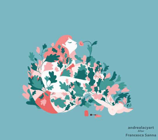
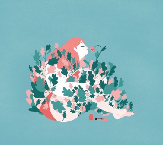
A study of a panel from “Her Hair” by Francesca Sanna: Her Instagram - This is my last post for my History of American illustration, it was really satisfying to go through this whole process and actually experience all these new techniques and styles. - - When we covered Francesca’s work we discussed her book ‘The Journey’ which tells the true life tale of immigrants that she interviewed herself. I wanted to try my hand at her line-less, curvy shaped style. As someone who really likes flow in their work, I resonated with the feel of her illustrations. I really enjoyed the pattern work with the leaves as well.
#art#my art#artwork#master study#american illustration#history of american illustration#illustration#digital illustration
3 notes
·
View notes
Photo
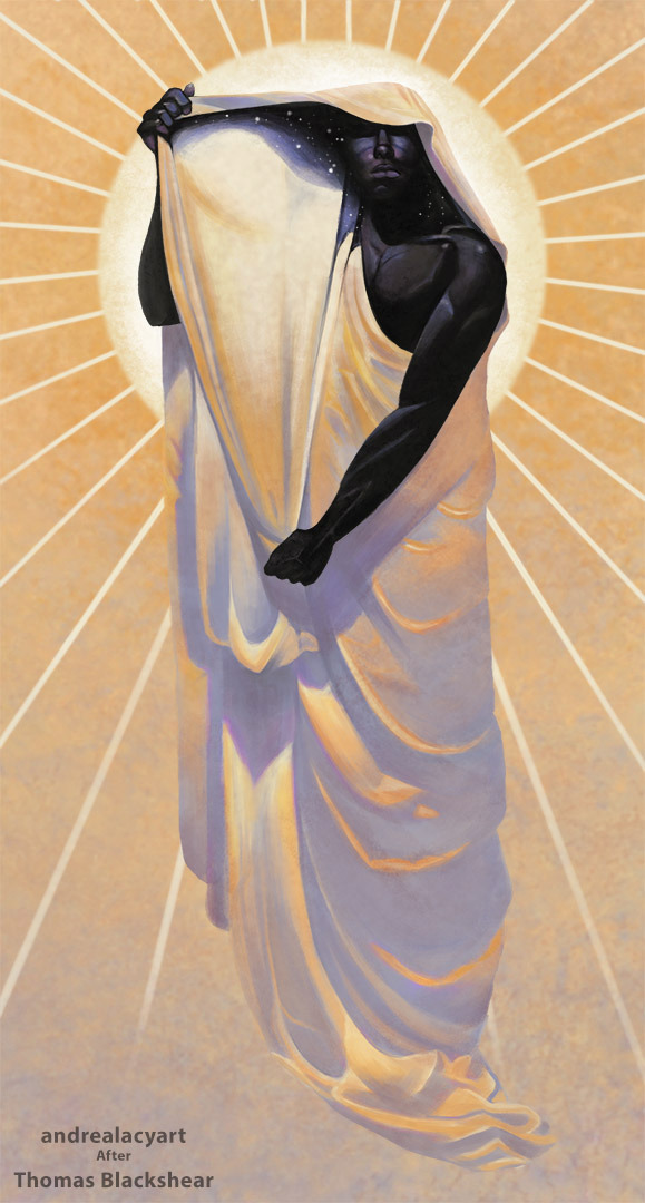
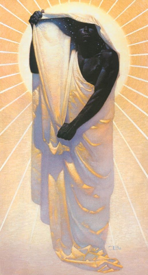
Study of “Night in Day” by Thomas Blackshear. - - - I really wanted to do a study on this particular piece after my professor had shown us this picture in my first illustration class. I love the dynamic lighting and the nouveau inspired composition. And as I was working on it I was particularly interested in the method to which he rendered the folds in the cloak, the colors and shadow shapes were so different than what I would have typically chosen. I also have to say that I’m particularly happy with that right hand.
#thomas blackshear#my art#art#master study#illustration#American Illustration#History of American Illustration#digital art#digital painting#Digital Illustration#illustrator
125 notes
·
View notes
Photo
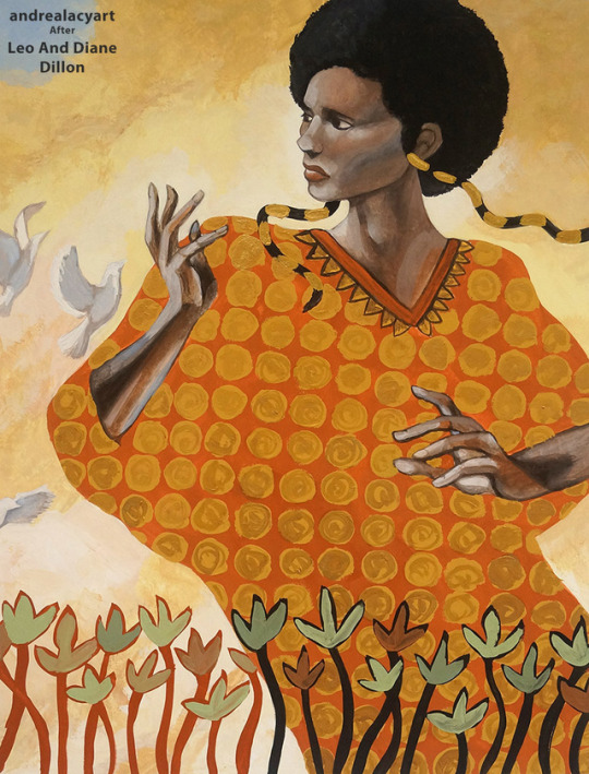
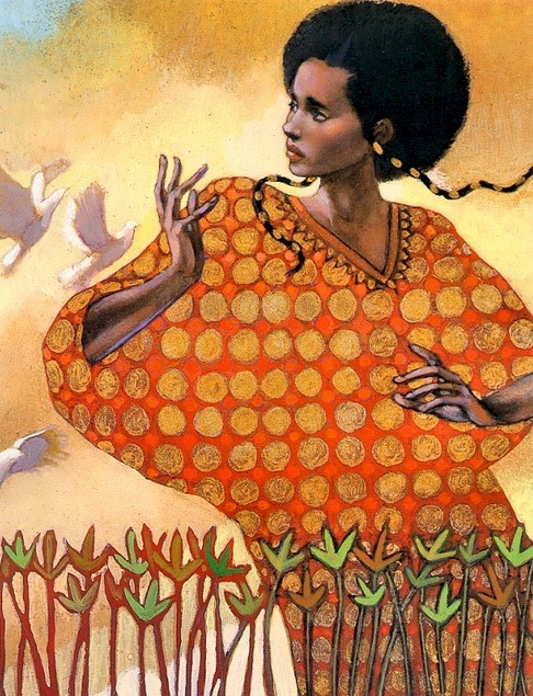
Study of Leo and Diane Dillon in 1990 from the children’s book Aida. - - - Leo and Dianne were not friends when they first met, they were actually in fierce competition with each other for the first three years of their college education. It wasn’t until their senior year when they concluded they actually caused each other to be better artists and if they worked together instead of against each other, they realized the strength of collaboration. They became a great working duo and worked together on each illustration. I really liked their combination of geometric shapes and fully rendered elements.
#art#my art#illustration#master study#American Illustration#History of American Illustration#casein#casein painting#painting#illustrator#vintage illustration#Aida book#leo and diane dillon
12 notes
·
View notes
Photo
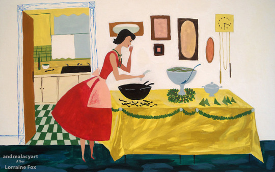
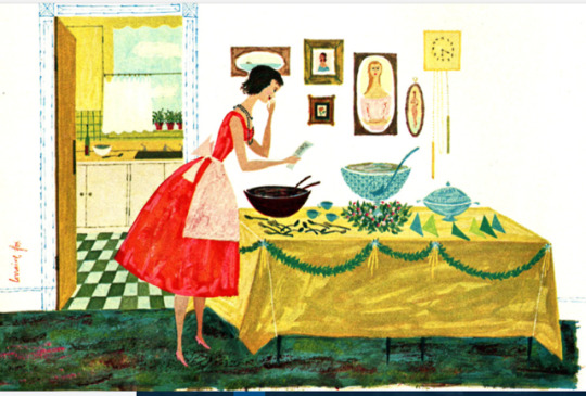
Study of a magazine illustration in 1955 by Lorraine Fox. - - Learning about Lorraine Fox, I admired her commitment to her own style throughout her life, but she also constantly strived towards redefining what that meant visually. Her work was unique to the industry when she was starting her career, emphasizing design and had cues of folk art, but as she got more popular she felt she needed to branch out because she started to feel cornered into a style by publishers. This piece was really fun to replicate, so different from my own. I really enjoyed the color pallet and working with all these bold shapes.
#my art#art#artwork#lorraine fox#master study#American Illustration#History of American Illustration#painting#casein painting#illustration#vintage illustration#magazine illustration#vintage magazine art
1 note
·
View note
Photo
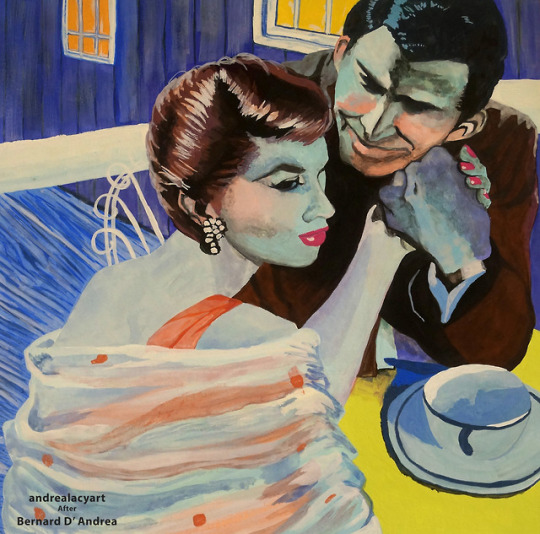
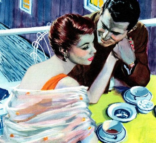
Study of an illustration for the story “For Kiss Under the Moon.” Illustrated by Bernard D’ Andrea in 1956. - - Back to my illustration studies. Bernard D’ Andrea studied through Pratt through a Scholastic Magazine full scholarship, but got interrupted by WWII, he still finished his degree but during the draft he got in contact with Cooper studios where he got his start in illustration. He was part of a movement of magazine illustratiors nicknamed “boy-meets-girl illustrators.” These pieces were overly positive and romanticized depictions. He also did some Sci-Fi illustrations and was good friends with Issac Asimov. He lately got into abstract expressionism and in the 80’s became a plein air painter where he stated he felt like Van Gogh, who was a childhood inspiration. I chose to recreate this piece simply because of those bright vibrant colors. I also enjoying recreating the textural qualities from flat washes to blended colors. I really focused on picking those color hues.
#my art#bernard d' andrea#master study#American Illustration#History of American Illustration#vintage magazine art#vintage illustration#illustration#casein#casein painting#painting
2 notes
·
View notes
Photo
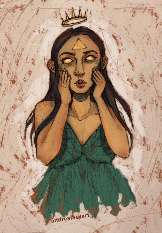
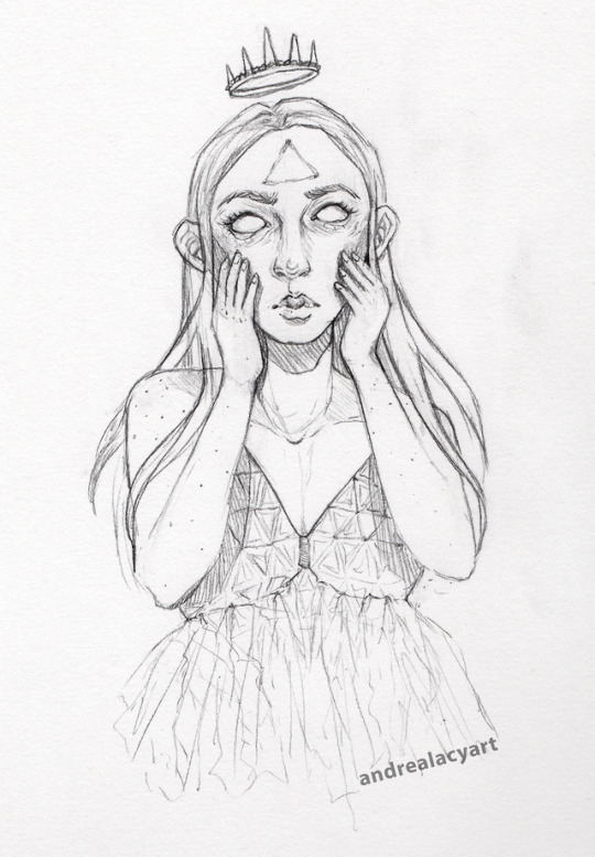
DTIYS for Nate Hilyer over on Instagram: Nate’s Instagram & My Instagram
#my art#art#draw this in your style#dtiys#drawing challenge#instagram art challenge#digital art#digital painting#illustration#digital illustration
0 notes
Photo
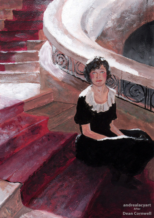
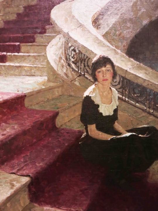
Study of “Waiting” by Dean Cornwell in 1921. - - I wanted to try my hand at Dean Cornwell’s ‘bold, light drenched style’ where I focused on all the textures I could made with a brush and how I can push those lights and shadows like Cornwell did. Although he became a well known illustrator, his family struggled with money so he was often overworked and at one point picked up illustration jobs only to make ends meet. He struggled with the lack of legacy that is often associated with illustration and sought out other pursuits like being a muralist, which was a somewhat common side pursuit of other illustrators at the time. He later became the president of the National Society if Mural Painters.
#my art#art#dean cornwell#master study#History of American Illustration#american illustration#illustration#casein painting#painting
46 notes
·
View notes