Don't wanna be here? Send us removal request.
Text

I wasn’t really sure what to do for the cover so I started of with the game play and it could be a nice back cover if I work more on it. However it didn’t look good for a cover so I decided to change it. I didn’t feel like putting the main characters so I decided to put the most important object the lantern and underneath the shadow light as this two are import mechanic. It look too bland to only those two so I decided to make a dark background to keep the focus. Looking at it I wanted to put the characters as it was still missing something. I made the shadow boy rally big and making his eyes glow and drawing the general body shape
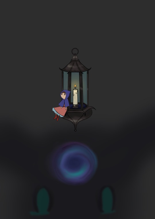
And I added the little girl I wanted her to be smaller then the lantern and the shadow even if she is normal size in the game. I wasn’t sure if she should be sitting on top of the lantern or hanging from it. At the end she fitted best on the side at the bottom.
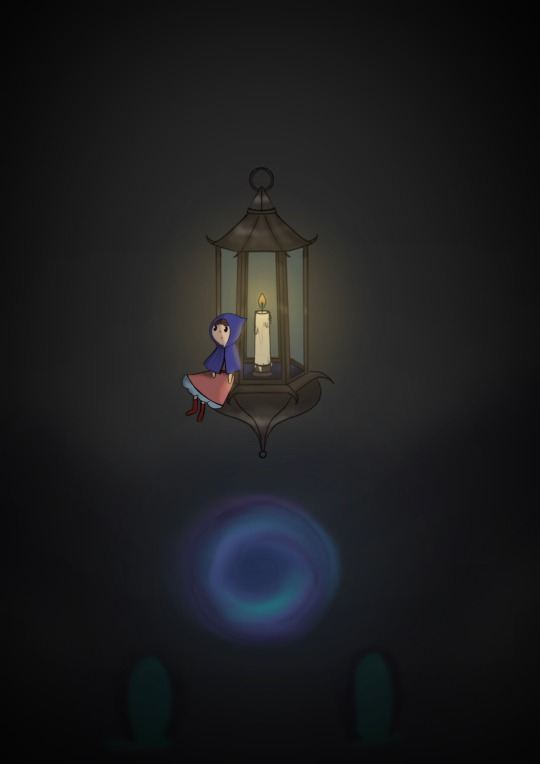
Of course I had to add lighting for atmosphere and realism. Putt more depth and detail as well as making the lantern and the little girl more noticeable.
I thought of leaving it as it was but I wasn’t sure that I liked it so I added a forest background by reusing a already made background and changing the colours making it darker and mor mysterious.


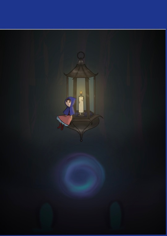
Now that the page was full I was ready to start working on the name , ratings and the logo of the game company. I choose ps4 as the blue fitted perfect with my colours palette. Most games put a chart with a massive game name and a bright colour to catch the attention. But I always found myself more drawn to mysterious looking games as I love puzzle games with a good story that you have to find yourself. I think my cover would sand out. That is why I made it dark focusing on a object rather then a character.

I also have a 30 second Timelapse to show my progress
0 notes
Text
China introduces new age rating system
Regulation body China Audio-Video and Digital Publishing Association introduced a new age-based rating system for games in the country this week.
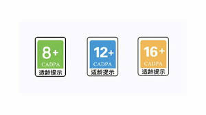
Under these new standards, games will be divided into three age categories, each represented by a colour: 8+ (green), 12+ (blue), and 16+ (yellow). Games must display these labels on their website and "other relevant materials," the South China Morning Post reported.
The new guidelines were announced at the Chinese Games Industry Annual Conference, held in Guangzhou, on Wednesday. The new system has been crafted by giants Tencent and NetEase, as well as 52 other organisations, and is called the 'Online Game Age-Appropriateness Warning'.
The new guidelines are currently in a pilot phase, said first deputy chairman of CADPA Zhang Yijun, adding that the aim is to provide "positive guidance for underage consumers."
Niko Partners senior analyst Daniel Ahmad pointed out in a Twitter thread that the new age rating system has been revised 41 times before being agreed on.
The new policy expands upon measures taken last year to protect minors. These guidelines included an obligation for players to register in a game under their real name to be able to verify their ages, as well as spending and playtime limits depending on age. For instance, minors were restricted to an hour and a half per day.
But there wasn't any official age rating system implemented across China until now. Back in 2019, Tencent pushed for the creation of a publisher-driven age-rating system, which was recommending games to be split across four age categories: 6+, 12+, 16+, and 18+.
0 notes
Text
Biggest Video Games Companies in the World 2022
Sony

Sony remains the biggest video game company in the world in 2022. The Japanese tech giant now makes most of its gaming revenue, which totaled $24.9 billion last year, with the PlayStation 5 which came out in 2020 and became the world’s most popular next-gen video game console. However, Sony also produces many original video games for its console. The company’s handheld video game console, the PlayStation Vita, contributed to Sony’s no.1 position on the video game market as well.
Microsoft

The world’s largest software company is also the world’s second-largest video game company. Microsoft made around $16.3 billion with Xbox Game Studios, the company’s gaming branch. The gaming revenue was primarily generated by Microsoft’s new next-gen Xbox Series X/S sales of course, but Microsoft additionally develops video games itself or owns studios that do. A good example of this is Mojang. The Swedish video game studio, which is owned by Microsoft, is known for creating Minecraft, which has recently become the most popular video game in history.
Nintendo
Despite remaining in third place in this ranking of the Top 10 biggest video game companies in 2022, last year was still a very successful year for Japanese video game company Nintendo, helping the company to remain the world’s biggest purely video game developer. Nintendo’s revenue success, $15.3 billion last year, is largely driven not only by continued sales of the Nintendo Switch console but also by Pokemon Legends: Arceus, which proved to be the best-selling video game for Nintendo in the past year.
Tencent

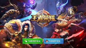
Chinese internet conglomerate Tencent is also involved in the video game business with an impressive gaming revenue of $13.9 billion. Tencent primarily focuses on online and mobile smartphone games, such as the company’s mobile flagship games PUGB: Mobile or Honor of Kings. But through the many video game studios, the corporation owns all over the world, Tencent has also become a big player on the video game big screen.
Activision Blizzard

Activision Blizzard comes fifth in the top 10 biggest video companies ranking of 2022. Founded in 2008 by the merger of American video game companies Activision and Blizzard Entertainment, Activision Blizzard generated $8.8 billion last year. The California-based video game studio can, as always, rely on its by far most historic game series Call of Duty, even the series’ latest installment, Call of Duty: Vanguard, saw a decline in sales compared to last year’s Call of Duty: Black Ops game.
0 notes
Text
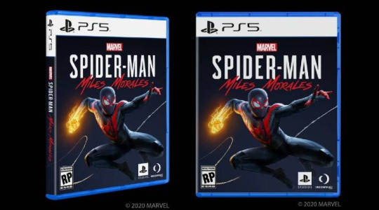
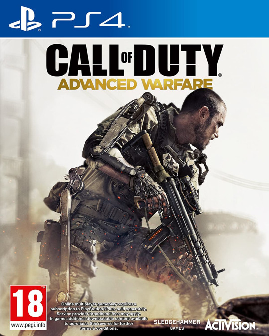
Most game case have the main character on the front with the tilted above their head on a coloured backroad.

0 notes
Text
Game age ratings explained
What do game ratings mean?
To help you choose age-appropriate games for children most platforms will feature an age rating on the game. Due to the way certain platforms categorise games according to their content, at times the age rating for one game may not be the same across all platforms. So, it can be confusing when taking a call on whether a game is age-appropriate. However, you can set parental controls on your games console to limit what content your child accesses.
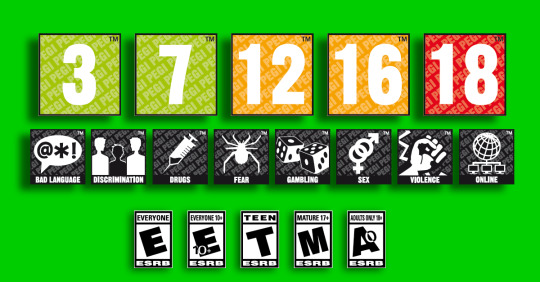
Choosing age-appropriate games
It’s important to pay attention to the age minimums for the video games your child plays. However, there is sometimes contradicting information. For example, Clash of Clans is rated Everyone 10+ on the Google Play app store, but Supercell – the makers of the game – have set the minimum age of the game to 13 and over because it features a chat function and in-app purchasing.
Therefore, it is important to understand what the ratings mean and why these may have been categorised in this way. Below you’ll find a list of the main age ratings you’ll find and links to find out more about about how each rating is used to classify games to make an informed choice on which games are suitable for your child.
PEGI ratings – What do the labels mean?
These are primarily used in Europe and Asia.
PEGI 3 – suitable for all ages PEGI 7 – suitable for young children PEGI 12 – suitable for children 12 and over PEG 16 – suitable for children 16 and over PEGI 18 – Only suitable for adults

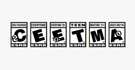
Entertainment Software Ratings Board (ESRB)
These are primarily used in the US.
RP – Rating Pending EC – Early Childhood E – Everyone E 10+ – Everyone 10+ T – Teen M – Mature A – Adult
0 notes
Text
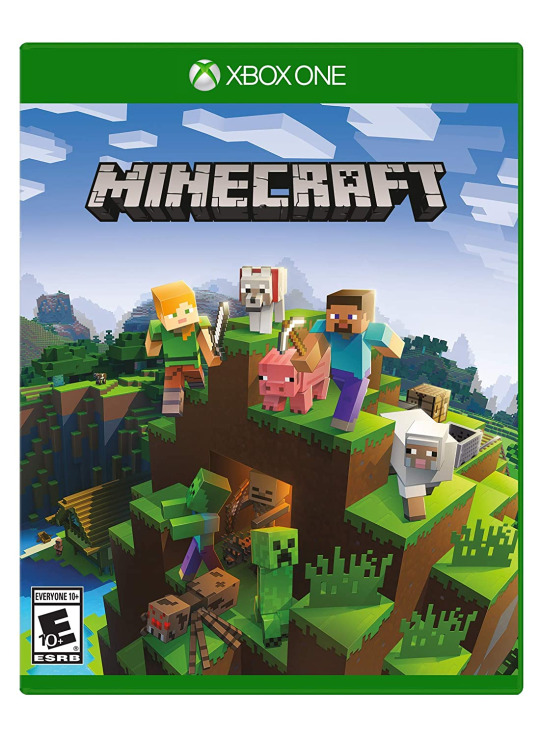
Minecraft game case
Introduction of creatures found in the game accompany by how the wold could look like. Game that is for usually displayed at the top And the age rating is at the bottom left corner.

0 notes
Text
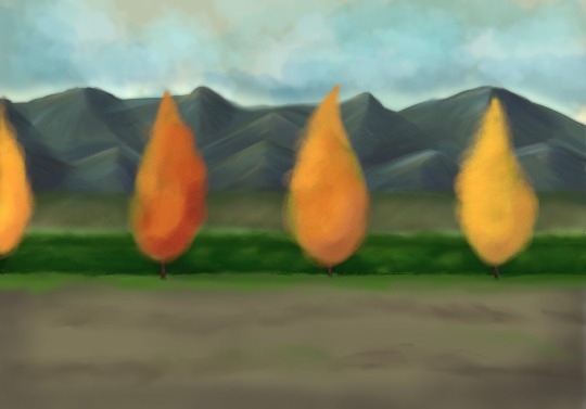
I need a background for the end animation I thought of making the front garden of the mansion however I got carried away and made it look too much like a oil painting rather then a simple background for a cartoon. I thought of making it into a picture of the hall way but that didn’t work. So I had to leave it but I can use it as a painting for a project for the future.
I still needed a background for the end so I decided to use a already made background and change it up. The backroad from the run is sequence was perfect as it tied the two places together.
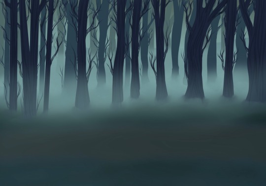
Now that I had the main shapes I had to mark it less spooky and to make some changes as some years have passed by and grass grows quickly. I did struggle with colours so I decided to get some help, first looking at forest colour palettes.

Which didn’t help so I decided to look at gravity falls backroads as the give the atmosphere I was looking for and I have wanted to work with them before

So I looked a picture that I found on Pinterest and chose some of the colours

Starting with the group and background colour

I had to improvise on the colours of the path so I used a brown that was not too dark but also not incredible bright. And I blur it to mix it with the grass and blend it to not stick out.
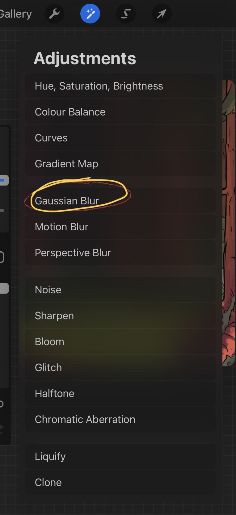
After that I had to start working on the trees by picking the colours on the picture and making shadows on the trunks.

I added bushes to hind the trunks and to show passing of time.
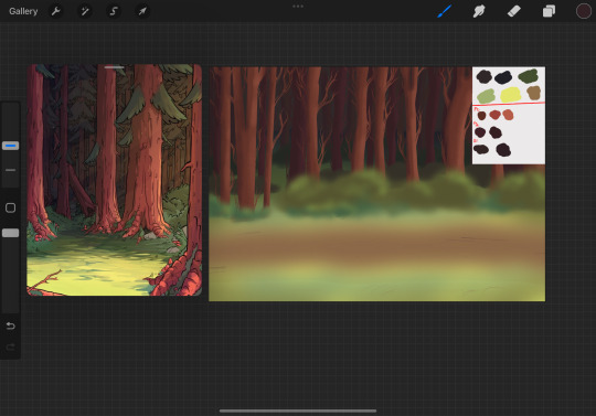
And I added outlines to make some details

I also have a video showing my process
0 notes
Text
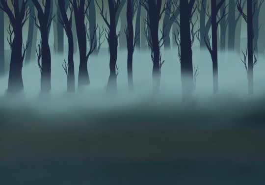
For this backroad i took the trees from the other backroad rearranged them added a few more trees however I made it too far up making it hard to line them both. After that I made it black and white for the running animation .
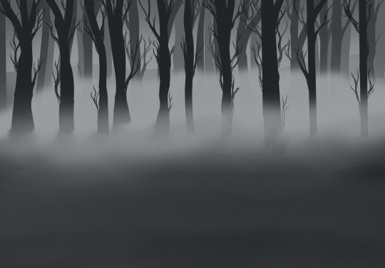
I did a very similar thing for the 3rd background adding less trees

0 notes
Text
The final outcome for the 3rd animation (the giving of the lantern)
0 notes
Text

The lantern is a very important part of the game and I had to be different therefore I made the bottom part like a tunkish lantern as it seemed magical. I didn’t want it to have too many details as that would mean I have to go back and redraw them every few frames.
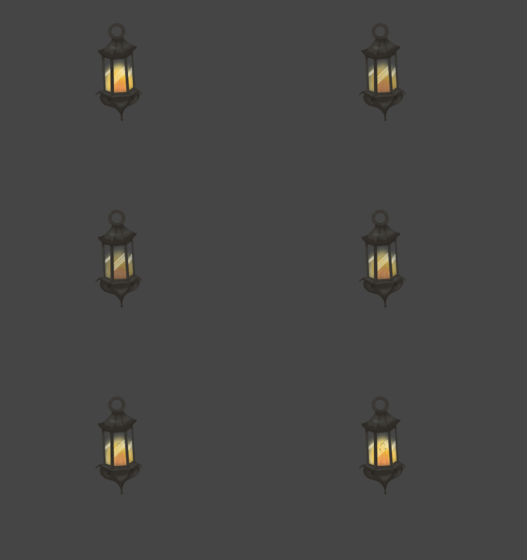
This was supposed to be in the animation however I scraped the idea as it would say too much about the story and I wanted the viewers to be confused.
I did do a lot of sketches for the lantern however they were on a little piece of paper and someone throw it in the bin. So I have no pictures of other lanterns.
0 notes
Text

Mother giving the lantern
I just cut and moved the top part of her body down making her bend.
0 notes
Text
This is the fixed version the mother is not walking up and down and she is moving the right speed and the little girl is walking correctly with all the frames delayed. This is without the background as usually I like to start with the charter on their own to make sure they are moving correctly without being distracted by the background of course if it was interactive I would have the background at the bottom and switch it on and off when needed.
0 notes
Text
Sometimes when animating mistakes man be made for example when the little girl starts to walk y can see a frame that is not supposed to be there making her go back and forward making a jump. It could be that while transporting the layers i put one in the wrong place making the mistake. It took me a few seconds to realise that I made the mistake.
0 notes
Text
The animation before I combined the two together.
0 notes
Text

This part was important as it show the relationship between the little kid and her mother. To start off I wanted her to be debating if she wants to be there. As she starts walking she looks down trying to avoid eye contact. She doesn’t know what is going to happen but she has a feeling that it won’t be good. When she stop that is where her mother will be standing with the lantern. I made it so she lift her head slowly not ready to face her mom.

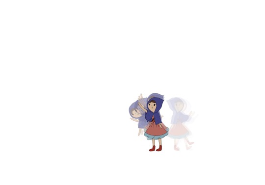
I knew that the lantern would be heavy at first making her fall a litter makings that part of her getting to the lantern was hard as the mothers hands were too short so I had to make her struggle to get it getting her on her tiptoes therefore when finally grabbing it she falls and has to support it with both hands. I had to play around with the delay and it changed a lo through out the process.

0 notes
Text

I wanted something grand and empty as most places that are big are usually very empty with a lot of eco. When I was done with the sketch it remanded me of the last corridor in Undertale .

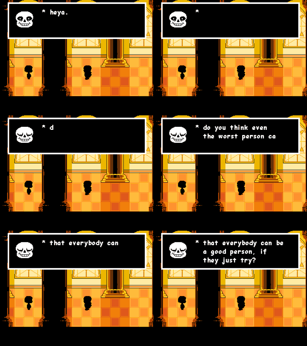
For colours I was struggling as I didn’t want it too be the same colour. At first I wanted to be a light coloured room. But I didn’t like how it look however I did like the dark window frames and the black floor and grey walls however they were too similar to everting else.

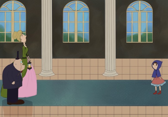
At the end I choose a dark colour for the wall and stuck with the black frames I also did a red carpet. And made the sky outside dark and gloomy as it set the mood for the little girls doom.

0 notes