Ongoing ideas, expression, visual manifesto by Andrew Ashton, Design, Naarm / Melbourne, Australia / Visit our website for more of our work
Don't wanna be here? Send us removal request.
Photo

Happy twenty twenty three! As it turns out the calendar project has me thinking a lot about the future. The design of this piece was completed last June, and 2024 is in development now. Mostly I feel I don’t have much to add in the relentless noise that is social media. One observation that is with me always when I look at it is — how many amazing moments people live. Looking at the several thousand images I have made in the last 12 months in my small way I have lived and witnessed many amazing moments too. Twenty or so years I have got myself in the habit of stealing a moment where appropriate by making a photograph and spending the majority of that time being in it like it may never happen again. What could smell, what was on people’s faces, what was the light like, how do I feel, what was the mood. And spend just a little time remembering that time I just spent. The turning of the year is very much about creating a vision for the future and yet as the progresses on is best served by being present in that time and occasion. Thanks to all of you that has taken a moment to see what I am up to, the work I have made, travels and encounters. You will note, my boys are in their too. I can’t believe how 19 years has passed, at one time I was squeezing in a few minutes to share my practice, because I had parenting to do, and now, I am lucky to spend a few minutes with them, as they move into the world. I am so glad they taught me to being present. https://www.instagram.com/p/Cm7rYYYS6D5/?igshid=NGJjMDIxMWI=
0 notes
Photo

AaGT Calendars are back! Buy two and ship anywhere in OZ free! Discount code: 2023AALOVE This year our wall calendar comes from a place of harmony and growth as the days travel through time like waves. The grid is traditional@perfect for people who live space and order. The moon features too appearing in full each month. With an eclipse in March. Printed and designed with love in Melbs. Stock is limited. https://www.instagram.com/p/Ck9UmH1SM1s/?igshid=NGJjMDIxMWI=
0 notes
Photo

Southbank Bvd, playground. Super exciting to witness a public space that is truly pushing materials, design, experience, and design. Their is a sense of joy and risk, playful and elegance. What an extraordinary time to be alive with such brilliant thinkers and designers pushing their ideas of design and experience. This park will be made and alive and all way fun. Congratulations @mikehewson and @cityofmelbourne A wonderful outcome. (at 88 Southbank Bvd) https://www.instagram.com/p/Ck5JcuwS66I/?igshid=NGJjMDIxMWI=
0 notes
Photo

Making type from scratch is one of my guilty pleasures. Gravity had a name rejig and there was an opportunity to upgrade the identity system. Influenced by the iconic Duralex glassware type mark, I made letter forms that responded to the existing lozenge form. First creative decision was to establish a shape that has a classic squarer proportion, then I develop sketch where the letter transform into unique shapes, which are easier to trademark. Gravity has been around well before coffee became hip, there was a vision to be informed by the tradition of Melbourne coffee yet be its own thing. A planned and art worked pack system was in the pipeline, yet a change of ownership never saw this range hit the shelves. The mark has been modified in the last few years, however there are some outdoor wind barricades and cafe umbrellas sporting this mark around Melbourne. (at Naarm) https://www.instagram.com/p/CkSH8kihe97/?igshid=NGJjMDIxMWI=
0 notes
Photo

@redstitch 2023 launches at the end of October. However it is nice looking back over six or so seasons work. We only have moments with this project, as often time and budget are against us. However it’s a great process to make something out of nothing and strip creativity back to the very essence of creating stories and making images. The last few year has been very patchy for in the performing arts. Theatre relies of people, people coming to a space, people who make the space work, and people that perform in the space. Lots of people in the performing arts space, have had a tough time, there were lots of gaps in pandemic support and many great people have had no choice but to move on. It’s a privilege to come back, help, sit in the audience, applaud and witness live creativity. Now is a great time to subscribe and help organisations like Red Stitch find their groove again. Image making by: Aa, @robblackphotography @earlcarterstudio @jeskerss & Alan Perry (at Red Stitch: The Actors' Theatre) https://www.instagram.com/p/Cj1prZOSogH/?igshid=NGJjMDIxMWI=
0 notes
Photo

@redstitch 2023 launches at the end of October. However it is nice looking back over six or so seasons work. We only have moments with this project, as often time and budget are against us. However it’s a great process to make something out of nothing and strip creativity back to the very essence of creating stories and making images. The last few year has been very patchy for in the performing arts. Theatre relies of people, people coming to a space, people who make the space work, and people that perform in the space. Lots of people in the performing arts space, have had a tough time, there were lots of gaps in pandemic support and many great people have had no choice but to move on. It’s a privilege to come back, help, sit in the audience, applaud and witness live creativity. Now is a great time to subscribe and help organisations like Red Stitch find their groove again. (at Red Stitch: The Actors' Theatre) https://www.instagram.com/p/Cj1oE01y_yv/?igshid=NGJjMDIxMWI=
0 notes
Photo

The rest is up to you. Exhibition by @melbfringe Go see. It’s exciting to witness your work in this setting. It was nice to remember and relive making the work and see it out there. We pulled off a few all nighters getting the programs done. What truly humbling is witnessing decades of work, done by fellow creatives all tasked to communicate, create awareness and help the project to succeed. The opening statement touched on the idea that developing the creative product is mostly hard work. It’s humbling to understand that this effort is something that we all share each in our own ways. (at State Library Victoria) https://www.instagram.com/p/CjuNNkph4Bm/?igshid=NGJjMDIxMWI=
0 notes
Photo

The ACF is an online fundraising platform for Australian artists. In 2015 we were engaged to bring this venture to life with a new brand, communication system rolled across print and digital platforms. Our vision was to put cultural organisations, in all their diverse wonderfulness, at the centre of a brand system, with a simple yet distinctive frame, or lens. We wanted system to be really painless to work with, allowing the ACF to build a cohesive, engaged, and ever changing brand story, that connected with artists and inspired donors. The brand mark framed C for Cultural. The C letter form could take on any of its forms, to represent the diversity of cultural organisations. The A for Australia took on a business friendly letterform, along the F letter form reflecting a type design often found in currency, supported our diver’s cultural lens. The tagline Make Culture Happen inspires one to participate and make a difference. A comprehensive case study is coming. In the meantime here’s a preview of this successful brand featuring concept image of the ACF lens (yes the pig artwork is by Gregor Kregar), finished launch images, a folder / poster made by @geoffnees and a brand sting. Cheers to @ausculturalfund it’s wonderful to witness our work doings it’s thing and helping business and artists connect. (at Naarm) https://www.instagram.com/p/CjqrdPoheXS/?igshid=NGJjMDIxMWI=
0 notes
Photo

@melbfringe 2007 This is what Fringe Festival looked like 15 years ago. Print still played a big part of the telling the story. For a really tight budget less than $15k we produced over 300 line items… programs, flyers, a ticket booth, press ads, digital assets, signing, apparel posters. There was three of us grinding out work, Alex from @transmissiondesign helped us refine the information design in the programme. There was no intention to profit from this project. The client was really ace and it was a special time. I made this work in a really great time. Social media wasn’t a thing and their with this sense that people where about to create avatars of themselves and make a new life of themselves in the digital realm. We made a tool kit of faces and bodies for all sort of random stuff and people collided with the idea of being an avatar. I had this anti design thing going on and it was really nice to bump into slick design and say - oi! I am too close to judge if the work has dated, but I feel it’s held up over time (at Naarm) https://www.instagram.com/p/Cjg6cHpB5LZ/?igshid=NGJjMDIxMWI=
0 notes
Photo

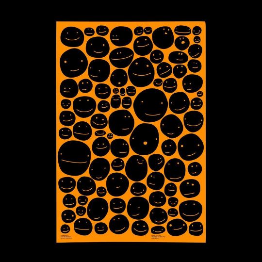
Together poster for @agigraphic for the latest congress @agi_open in Trieste It’s a pretty simple idea, type as people - some happy, some coping, some thoughtful, some sad - people are complex and what makes it work is there space for everyone, together, to work their thing through… Bruno Munari was in my head and his faces project, for sure. I made this image in few hours, black acrylic, the subtlety of the expressions took most time to get happy with. The limited colour palette was a dream. I love an red that is almost orange. Let me know If you want a print. A1 A0 perfect… https://www.instagram.com/p/Cjgt21OBUql/?igshid=NGJjMDIxMWI=
0 notes
Photo

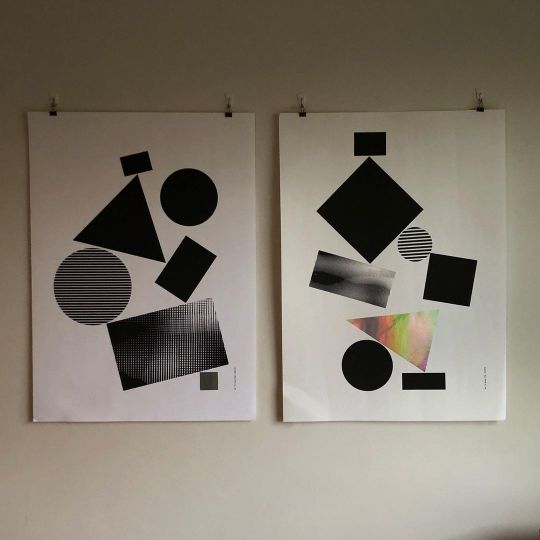
The Balanced project poster series was exhibited in July 2018 at @stuartgeddes ‘s studio come bookshop come print shop come cafe, on Queensberry St, Carlton. Ten A1 posters where made along with a 10pp A5 editioned portable graphic work. The project was a graphic response to working with @circusoz for their Precarious show. I remembered getting a little toasted on Mulled Wine at the opening, I can see why ski people spend much of their time there https://www.instagram.com/p/CawzBt9BaQw/?igshid=NGJjMDIxMWI=
0 notes
Photo

Ajax and Cassandra, painting by Solomon J Solomon Artist Norman Lindsay saw this image with his grandfather as a boy, its scale, energy and luminescence in times predating cinema, it must of been a great spectacle, as it is today. @artgalleryofballarat https://www.instagram.com/p/CX-QQzWB8da/?igshid=NGJjMDIxMWI=
0 notes
Photo

@peugeotau love love https://www.instagram.com/p/CbmLp9ahxr5/?igshid=NGJjMDIxMWI=
0 notes
Photo

Every kinda people by Robert Palmer (1978) was the inspiration for this poster that I made in 2019 for @sfdesignweek ‘s Unity theme — each and every man (person) is the same inside — one of those songs that need to be played loudly whilst a few privileged people plan wars and suffering for many that mostly live and want a simple peaceful life. #nowar #peace #unity https://www.instagram.com/p/CapGsqJhdVc/?igshid=NGJjMDIxMWI=
0 notes
Photo

Wow! The picture of Dorian Gray by Oscar Wilde. Extraordinary performance by Eryn Jean Norvill and Nikki Shiels and direction by Kip Williams https://www.instagram.com/p/CgqmDgnhLJC/?igshid=NGJjMDIxMWI=
1 note
·
View note

