Don't wanna be here? Send us removal request.
Text
DIGGING DEEPER
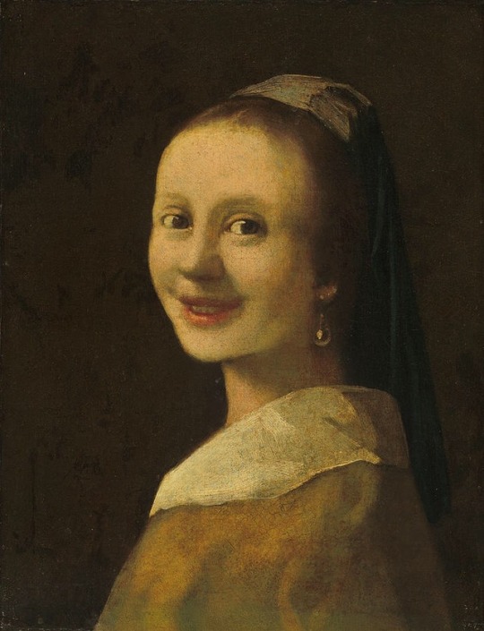
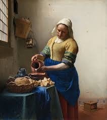
When we were presenting our last project (producer as storyteller), someone mentioned that my work reminded them of ‘Girl with a Pearl Earring’ by Johannes Vermeer so I decided to pick this one.


Looking them side by side I can actually see the resemblance. Black background, her facing away a bit, blue headband,...
My first thought is why is the earring so important the artist had to put it in the title? Is there a story behind it? I like the contrast of light and dark colours, it makes her stand out of the background. But because there is no background I can't imagine the story behind the picture. Who is this girl, what is her story, where is she. I can't even figure out her face expression. Is she happy? Sad? To me it just looks really tired and just done with everything. And how does the earring tie in?
All these questions are running through my head. I like the painting, but I would really like some explanation.
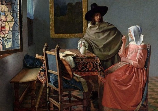
The painting was made by Johannes Vermeer. He was a Dutch painter who focused his work on domestic interior scenes of middle-class life. He was a fairly successful local painter in his life. He probably wasn’t very wealthy, since he left his wife and children in debt after his death. Perhaps that’s because he produced relatively few paintings. He was frequently using very expensive pigments and was known for his use of light in his work.
He was commonly using two rooms in his house as a reference and he was often portraying the same people.




KEYWORDS:
- PORTRAITS: faces, people, identity, drawing, painting, photography, posing, facial expressions
- PAINTING: paints, pigments, brushes, art, canvas, traditional, digital painting, gallery
- SEMI-REALISM: realism, abstraction, shading, true colours, proportions, idealism, interpretation, stylization
0 notes
Text
GALLERY VISITS
EASTSIDE PROJECTS:
We visited the Eastside Project in Digbeth. The exhibition was really interesting and i loved the silver crab shells hanging from the ceiling. I was expecting more different pieces of artwork.
WALSALL:
The exhibition was really nice. I like how they kept it really simple and how they distributed the canvases is a really spaceous rooms. I loved Elizabeth Magill’s work. The landscapes the painted were really calming and soothing to look at.
LAPWORTH.
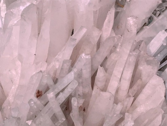
We visited the Lapworth Museum of Geology at University of Birmingham. We went there to try to understand how producer works as historian. The exhibition represented the evolution on life on Earth. The part I liked best was the room filled with crystals. They were nicely arranged by colour and it was really pleasing to the eye.
BMAG:
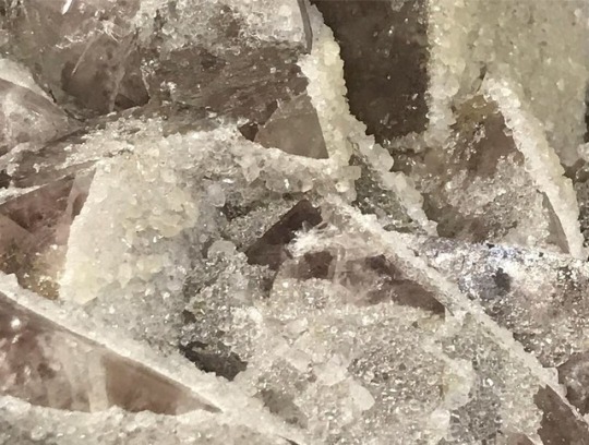
BMAG was the first museum we went to when we started our historian brief. We had a workshop there and we were allowed to touch the objects and take pictures of them. What was very interesting was looking at them through the USB microscope. We picked one of those objects as a starting point for our artist book.
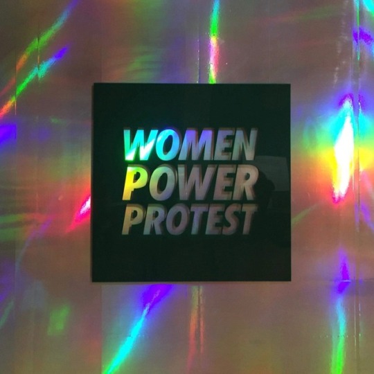
BMAG Women’s Power Protest
I really liked how they curated the exhibition. I felt like they really used the space the best they could. I liked how it was a mix of more traditional and more modern styles of artwork combined together.

0 notes
Text
GLOSSARY OF TERMS
HISTORIAN:

ACTIVIST / DESIGNER:


CURATOR:
THE WHITE PUBE:
The White Pube is a collaborative identity of Gabrielle de la Puerte and Zarina Muhammad. They are 23-year olds who write about contemporary art on their own terms. They describe themselves as ‘art critic baby gods’. They have their own website and different social media accounts @thewhitepube.
They publish every Sunday and they mostly write exhibition reviews and sometimes short essays.
They started writing about art because they found everything else to be boring/overly academic/white nonsense or male.
They are not experts in art, they are writing the reviews based on their encounter and how they experienced the exhibitions.
They also have a Patreon where they are accepting donations because the texts they are publishing are not funded.
0 notes
Text
STEAMhouse workshop

https://vimeo.com/311975879
https://vimeo.com/311975952
https://vimeo.com/311975668
0 notes
Text
STORYTELLER
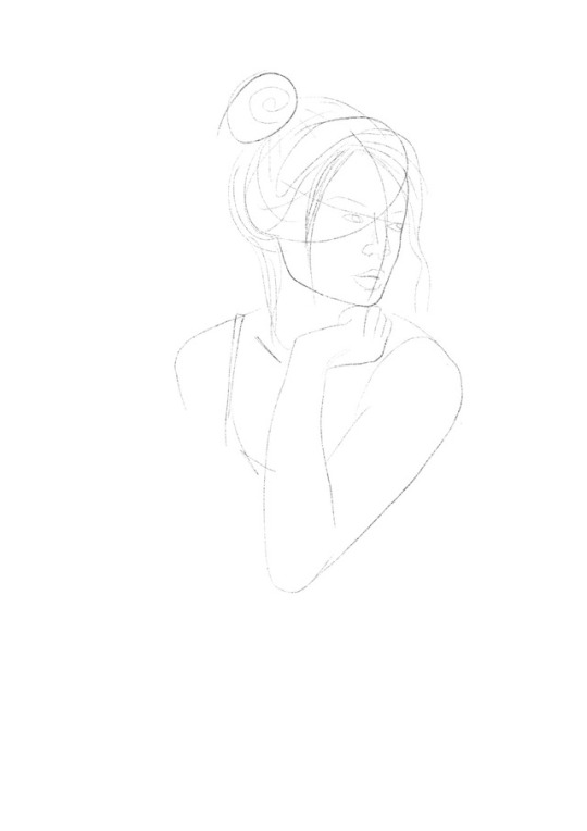

I chose Cinderella because I was the most familiar with this story. I feel like what I did is a modern version of Cinderella, but I wasn’t necessarily trying to re-stage it in the present day. It might be a sequel. My first obvious association was Cinderella as a Disney princess. I was thinking about how most if not all Disney movies have a happy ending. I don’t think I can name one tale/movie/animated movie that doesn’t end happily for the princess. So I decided not to give Cinderella her happily ever after.
I guess after the marriage it all went downhill for the happy couple. They might have realised that it’s not the best idea to marry someone after the first time you meet them and all you ever shared was a dance. Surprisingly it did not work out for Cinderella and her prince. She did what every other princess does after a break-up. She went to a pub and drowned her sadness in alcohol.
After I started drawing I realised that it wasn’t the best thing to go with my initial idea. I wanted to make a whole body portrait. I wanted to draw her in a beautiful puffy baby blue princess dress so it would be more obvious who she is. I wanted to draw her leaning on the bar and a pub in the background. But i feel like it would all be too much. You wouldn’t be able to focus on anything because there would be to many things going on and also I feel like the emotions in the picture would not be as strong. (now that I wrote that down I realised that the line on her face could be confused with the shadow of her hair instead of a mascara running down her cheek because she’s crying...)
And to be completely honest I don’t think I would be able to finish everything I was planning on doing in the given timeframe we were given and if I would it would all just be very rushed.
I made a digital painting because I like the control of fixing my mistakes since i’m not very confident with drawing and I get frustrated pretty easy. Also I was travelling and it was the easiest way for me to carry it around on my iPad. I used the app Procreate and an apple pencil.

When we were presenting our work in groups pretty much everyone guessed it was Cinderella and I got some pretty interesting feedback.
One of the first comments was ‘She looks like me after a breakup.’ so I didn’t even have to explain that the prince and her split up in my version of the story.
I got some pretty funny suggestions on what to name the drawing: ‘after midnight’ or ‘hit the bar/Cinderella hits the bar’
• Realistic, but you know it’s inspired by a cartoon.
(I’m guessing because of the colours and the headband?)
• Would look good as an actual traditional painting
• No one could imagine it being bigger than A3
• One person said that it makes her feel like she wants to be friends with her
• It is pretty obvious that she is sad/heartbroken/something went wrong in her life
• Reminded them of ‘ Girl with a Pearl Earring ‘ by Johannes Vermeer
• Modernised
• The black background makes you focus on the girl and facial expression / makes her pop
• They liked the semi-realism and actual skin-tone colours instead of pink cartoony skin
• Almost a 3D illusion of her coming out of the screen
• The thing that gave away who she was was the blonde hair and that I used blue colour
For the time given I’m pretty happy with what I did. If I had more than a week I would probably develop my story more and it might take me in a totally different direction.
0 notes
Text
DESIGNER
Designer
noun
A person who devises or executes designs, especially one who creates forms, structures, and patterns, as for works of art or machines.
synonyms: creator, deviser, inventor, producer, originator, planner, author, maker, fabricator, architect, engineer, builder
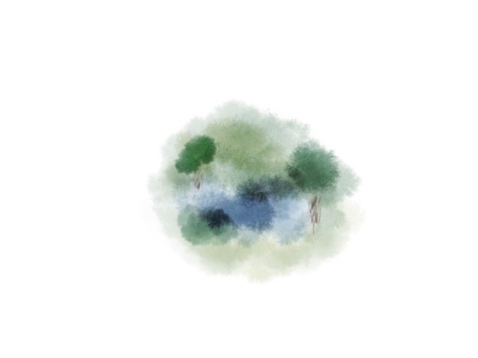
PURITY
0 notes
Text
WORKSHOPS
PRINTING
Printmaking was the first workshop we had and also probably one of my favourites. When we first started he told us all about the health and safety (steel toe caps!) since there is a lot of machinery we have to be careful around. He told us about different techniques and how to use the machines.
When we were done with the theory part we did some prints ourselves.
First we used the rollers to put down some water based ink in a thin layer. Over top we placed a sheet of paper and we had to draw out a quick portrait of one of our classmates.
Next we made prints of out shoe soles with charcoal rubbing andd drew around it to create a pineapple, bird and a scots guard.
And lastly we were playing around with mixing the inks with spatulas, rolling them on a surface and scraped out different patterns/made stencils and placed them on top. We made the prints just by placing paper on top of it and later we also tried out the press.
I had a lot of fun and even went back the next day with some other students.
LBM
For the Lens Based Media we had Photoshop in the morning and Premiere Pro in the afternoon.
I used both of these softwares quite a bit before, but I still learned some new stuff. For instance i never made an animation/GIF in PS before.
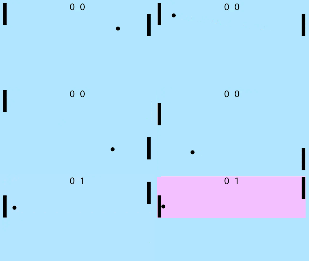
We made a GIF of two bats and a ball that looked like a game. We had to keep changing the score and also the colours in the background.
Premiere Pro is a video editing software. We were shown the basic options and how to set up a new sequence. We were given a few clips and we had to play around with them, try out different effects, etc. Then we ended up editing them together in a video.
METAL
We were first told all the health and safety instructions (steel toe caps, goggles!).
They explained how each machine works and we tried out most of them.
We had to bring a sketch of a simple object with us to make out of copper sticks. I decided on a pyramid.
I had to measure and cut up 8 sticks that we melted together in a desired shape. We were working with this machine that had a pedal that you step on to push together a clamp that melts the sticks.


WOODWORK
As per usual we went over the health and safety first. Woodwork had a few machines that were very similar to the ones in the metal workshop.
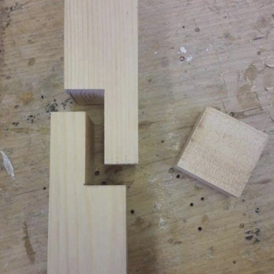
We were given a piece of wood that we first cut up in 3 same sized blocks. learned how to use the files,saws, how to drill in the holes and how to use the screw machine to make different pieces of wood stick together.

TEXTILES AND LASER
Those two were the workshops where we did the least I feel like. They went over health and safety and then showed us what different things you are able to make there and what kind of equipment/machines/softwares are available.

CAMERA
We were shown the basics of how to use the camera and a tripod. He told us a bit about exposure, white balance, ISO,..
Even though I already knew all these things I found it quite hard to understand what he was talking about.
We had 30 minutes to go around school in pairs/groups to test out everything ourselves and then we looked at all the pictures together and talked about what we could have improved.
PLASTER
I had a lot of fun at this workshop and I remembered doing this or something very similar as a kid.
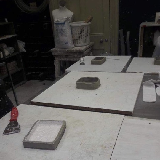
First we got a piece of clay and rolled it down to a certain thickness. We used wooden sticks that helped us make clay the same thickness all around. We cut it into a rectangle that was the size of a postcard. Using various tools we were creating marks on it. We got more clay to make a ‘walls’ around the already existing piece. We had to connect the pieces together well so it would hold the plaster in. We mixed the plaster ourselves by putting cold water in a bowl and gradually adding plaster powder and then mixing it together. We then ‘ flicked’ the plaster in the mold with our hands, which created the first layer that picks up on the details. We then poured in the rest and let it set. When we came back from the break we peeled the clay off and cleaned it. I was a bit too agressive with cleaning it and while scraping off the tiny pieces of clay that were stuck on I also scraped off most of the design. Oops.
STUDIO LIGHTING


0 notes
Text
ACTIVIST
Activist
countable noun
plural noun: activists
An activist is a person who works to bring about political or social changes by campaigning in public or working for an organisation.
synonyms: militant, partisan, organizer, warrior
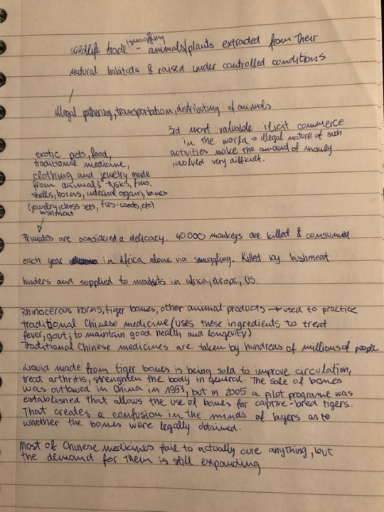
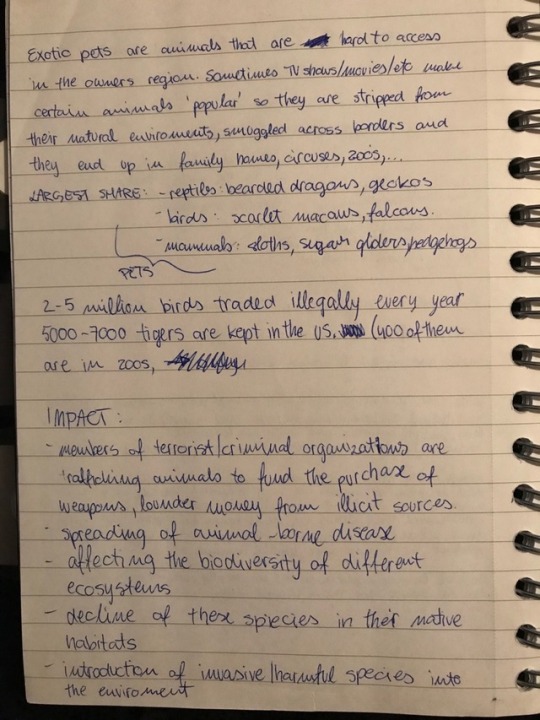
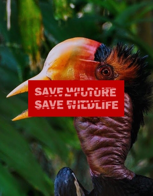
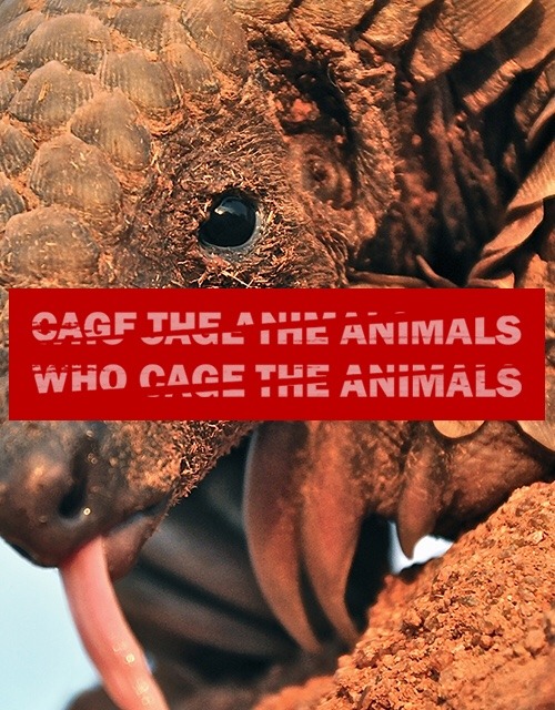
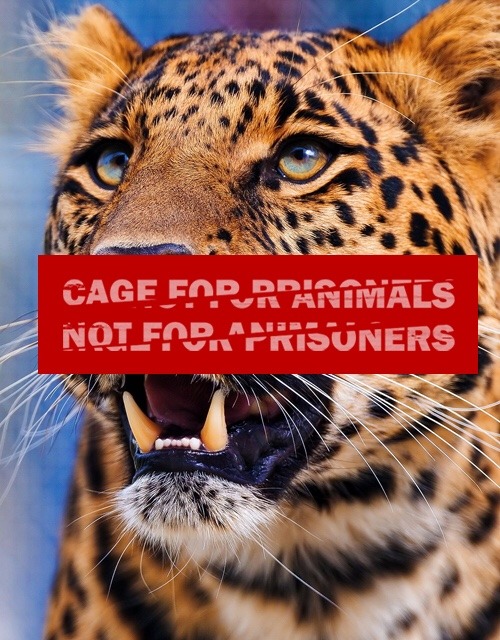
I was struggling with what I wanted this project to be and where to start. I didn’t know what I wanted my political party to be. I love animals so I decided that’s the direction I’m going to go in. But that is still very broad. My first idea was to make it about animal shelters, but it somehow shifted to wildlife/animal trading and smuggling. I couldn’t decide on one manifesto so I made a few and decided to incorporate it in design itself and that’s when I decided to make a series of posters which could also work as handouts when printed in smaller format.
A made a series of 8 posters and each of them contains text and a picture of one of the most endangered animals due to animal trading.
Overall I don’t think this project was the most successful. I’m not that kind of person that would go out on the streets and force my opinion on people, even if it’s with good intentions. For that reason I was never really interested in protest art and this was actually the first time I looked more into it.
When I was given feedback on the finished project people in my group and also the lecturers were a bit confused so I’m going to explain what my intention was.
The first thing I was told I should change about the posters were the pictures. I put animal portraits as the background because they were the most HD ones I could find. I got a suggestion of changing these pictures with ones that show what actually happens to animals. That was actually my original idea, but I wasn’t able to find appropriate pictures that would be big enough for a poster, so I decided to focus more on the text. I still chose pictures with cute animals and vivid colours because I thought it would grab peoples attention.
‘‘Aw that’s cute, what does it say?”
And that’s where all the confusion came in.
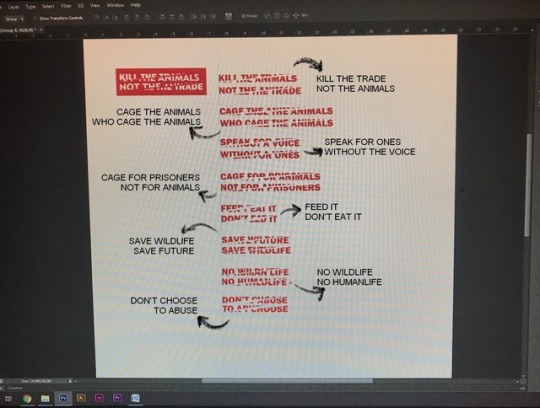
I wanted to make the text force someone to stop and actually think about what it says. And the easiest way to do that is make it hard to read, right? Wrong.
So what I did with the text was I chose a simple bold font without serifs. I typed each line separately, so that I can manipulate it later on.
I cut up each line diagonally and then changed the lower halves. I didn’t realise it would be that hard to pick up on it. The cuts were supposed to represent what happens to a lot of animals that are traded for their fur, fins, tusks, shells, horns, internal organs, bones, etc.
If I started this project again I don’t think I would do something completely different, but I would really try to execute it better.
0 notes
Text
ENGINEER - THE DRAWING MACHINE

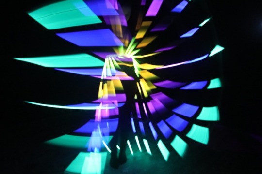
Our idea generating started with everyone contributing their own ideas. We were contemplating about the pros and cons and ended up merging multiple ideas into one.
We also looked up some artists to use as references:
Hussein Chalayn - Laser Dress
Gary Card
Sadlers Wells - Body Remix
Bauhaus Ballet

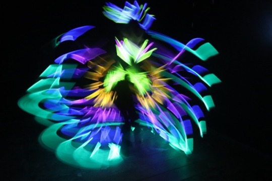
We started out with word associations and one of the words we focused on was ‘a trace’ and that’s how our long exposure photography idea emerged.
We wanted to make it more interesting than just moving a single light in front of the camera so we decided to design a costume.
We right away thought about using glowsticks, but had no idea how the actual costume is going to look. I think the hardest part was that we didn’t know how the finished product is going to look like until the very end. Once you crack the glowsticks you only have a few hours until they stop working so we couldn’t really try it out.
At first we wanted to make the costume a really interesting shape, stick with a theme, etc. The problem was, that when you shoot with long exposure, the slightest movement makes the picture blurred, so we decided to take advantage of that.
We went to the textiles workshop and talker about what the best way to attach glowsticks together would be. We bought a pair of dark leggings and a t-shirt to wear under the glowsticks.
We made a prototype of the costume and it took us a few tries to decide on what would work best.
In the end our costume consisted of a headpiece, gloves, top and skirt/wings.

When we were taking the photos we were playing around with different settings. After a few test shots we got a hang of it pretty quickly. We were using two different cameras so we ended up with a bit less than 500 pictures in just a couple of hours.
When it was time to edit I was using Adobe After Effects for the opening sequence and Adobe Premiere Pro for the rest. At first I had no idea how to make an interesting video just out of pictures so I decided to arrange them in a way to make it look like the light traces are moving cohesively around the screen, almost creating some kind of a story. In the end I added some background music that I found at royalty free audio library on youtube.
vimeo
0 notes
Text
CURATOR
Curator
noun
a keeper or custodian of a museum or other collection. "the curator of drawings at the National Gallery"
synonyms: custodian, keeper, conservator, guardian, caretaker, steward
“a person who selects acts to perform at a music festival.”
We had to use three digital platforms to curate our own curated pages (instagram, tumblr, youtube, soundcloud, twitter, other). We were given a week to curate 3 pages with minimum 20 posts each.
It doesn't sound that complicated but after I actually started I found it quite hard to come up with ideas. I'm still finding it hard to grasp the concept of someone being a curator.


https://www.instagram.com/_positive.5
https://www.instagram.com/_slo.slo.slo
For the first curated page I decided to make an instagram account @_positive.5 which definitely took me the longest to make. Not only it was my first time doing something like this, but it also took me quite a while to make even when I already had my idea.
As I said I didn't really understand what to do so I was looking through instagram for some inspiration. Personal accounts, fan accounts, art accounts, company accounts, animals, food, fashion, memes, quotes,... And that's where i got my idea. First i wanted to do lettering but i realised that it's not very likely i'm gonna be able to make 20 posts in a week. I tried thinking of some alternatives.
You can see quotes basically everywhere now (shirts, mugs, notebooks,...) but I know a few people that still like to print them out and put them up on their walls.
I realised it would be tricky drawing a wall, to actually look like a wall and not just a plain white background so I decided I'm going to make the whole feed look like a pinboard. I put the quotes on cards that looked like polaroid pictures, and made string-like lines they could hang from with the help of some clips. A couple of polaroids are stuck on a board with cellotape.
I drew all the elements in Adobe Illustrator and put it together in Photoshop just because I find it easier to make the shaddows and some other details there. I then cut up the picture in 21 same-sized squares which became 21 posts of my first finished curated page.
My second page @_slo.slo.slo (I absolutely hate this @ but everything else was already taken lol) was inspired by some travel accounts on instagram, which sparked up a conversation about Slovenia when we were at UNI. So I decided to make a page of nice things and nature you can see if you visit. I didn't want it to look like i just put up some random pictures so I encorporated them in a grid again just like i did with the first page. First I created a collage of pictures and cut it up later. I wanted the pictures to look good next to each other so I was paying attention at the colour, format and what is actually on the picture.

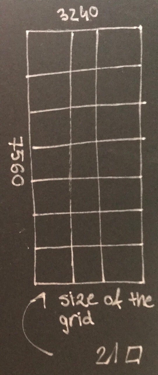
Having to calculate the dimentions of pictures to put in a grid was surprisingly hard and a reminder that this is my second math-less year after highschool. At the end I made each post/picture 1080x1080px which meant that the whole grid of 21 posts is 3240px wide and 7560px high.
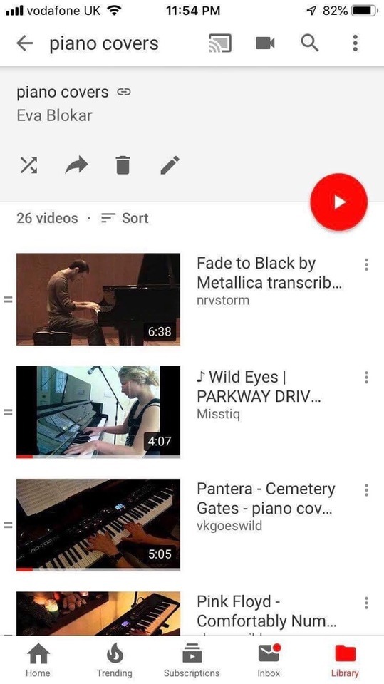
https://www.youtube.com/playlist?list=PLFWXyLrZscppD92JiORdocKUgJdrJtQGW
My third and final curator page was a youtube playlist. I wanted to make it a bit different than just 20 songs by Taylor Swift or 20 videos on how to make DIY slime, because well, what would be the point of doing that? I feel like youtubes main purpose is listening to music/watching music videos, so I decided on making a song playlist. But what would the playlist be? 60's music, relaxing music, covers, dance music, music to workout to, K-Pop, 20 of my favourite songs, 00's pop hits? I decided to make it a bit more personal. I listen to a lot of rock/metal bands. At the time I was making the playlist I've had a headache and felt like listening to something more relaxed and that's how I came up with the idea of making a playlist of rock/metal piano covers.
I was actually quite surprised with everything that I was able to find. It was really interesting listening to a completely different versions of some of my favourite songs and comparing them to the original ones.
1 note
·
View note
Text
HISTORIAN - Cloaking of Identity
Historian
noun
noun: historian; plural noun: historians
an expert in or student of history, especially that of a particular period, geographical region, or social phenomenon."a military historian"
synonyms: chronicler, annalist, archivist, recorder, biographer, historiographer, palaeographer, antiquarian, chronologist

We visited BMAG museum and that's where my idea generating started. We each had to pick an object and I decided to go with the Egyptian Death Mask. In ancient Egypt, masks were primarily used for two purposes: as death masks and as ritual masks.
Ancient Egyptians believed that it is very important to preserve a body of the dead because the soul has to have a place where to dwell after the death. Preservation of the dead body was done by mummification - a process that involved removing of the internal organs and placing it in canopic jars, wrapping body in linen and embalming. It was also considered very important for the soul to be able to recognize the body so it can return to it.
The most famous one is the mask of the Tutankhamun. He is probably the most well-known Egyptian pharaoh. His mummy shows that he died at approximately 18 years old. He had the smallest royal tomb in the Valley of the Kings. He was burried in three coffins, which fitted one inside the other.The middle one was found to be second-hand. It had a different style and its face did not look similar to oned on the other two coffins. Two of his coffins were wooden and the third innermost coffin was made from thick sheets of gold. A coffin like that would today be worth well over £1m. In the process of mummification all internal organs except from the heart were removed. They left the heart in place, believing it to be the center of a person's being and intelligence and would be required in the afterlife. If it was accidently removed they would sew it back it. Tutankhamun, however, has no heart.There were two daggers discovered inside the mummy bandages, one gold and one iron - which was at the time very rare and precious metal.
I used the Egyptian Death Mask from the museum as my starting point. A mask is an object normally worn on the face, typically for protection, disguise, performance, or entertainment. I made a list of word associations and I somehow connected death mask with Death Eaters from Harry Potter since they were wearing masks in the movies.


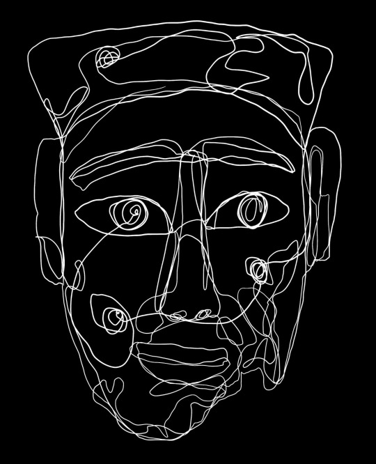
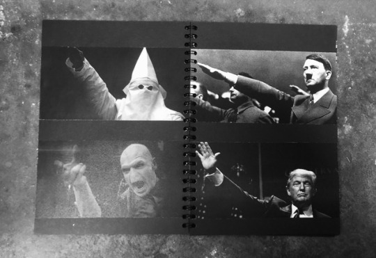
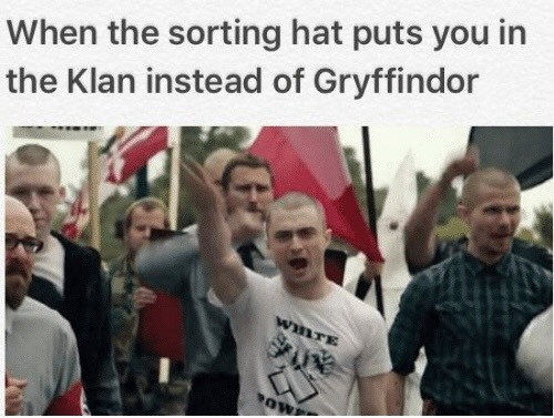
I was doing reaserch about the Death Eaters and I came across an article stating that their costumes in a movie were inspired by KKK, which I found interesting. I tried to connect the two and after digging deeper I actually found similarities between not only Death Eaters and Ku Klux Klan, but also Hitler and Donald Trump. Trump wasn't the one killing 'the mudbloods' in the movie, but they did all have the same ideology and were killing/suppressing people who were different.
I'm a huge Harry Potter fan so I made this assignment quite fun for myself, but now that I look back on it I should really spend more time on actually making the book instead of reaserch. Even though it was very interesting I dug way too deep and ended up watching hour long youtube documentaries about KKK, looking up HP/Nazi memes, etc.)
DEATH EATERS
Death Eaters were Voldemorts most trusted followers, his inner circle. You had to really earn your place if you wanted to join. He had some requirements for people/wizards who wanted to be a part of his army: blood status, loyalty, talent, value.
'DARK MARK' → their symbol (a skull with a snake for its tongue / a skull biting snakes tail). The incantation for the dark mark is 'MORSMORDRE', which translates to 'to bite death'. Maybe in this case it's not the skull that represents death, but rather the snake. Voldemorts goal is immortality, they seek to destroy death → they eat death → they are Death Eaters.
Dark mark represents the Death Eaters. Voldemort would have seen a snake emerging from the mouth of a statue in the Chamber of Secrets at Hogwards, which was confirmation that he was the true heir of Salazar Slytherin. Basilisk itself represents death (a giant, fanged snake trying to kill you). It resides inside the statue of Salazar Slytherin and enters and exits through the mouth.
SYMBOLISM
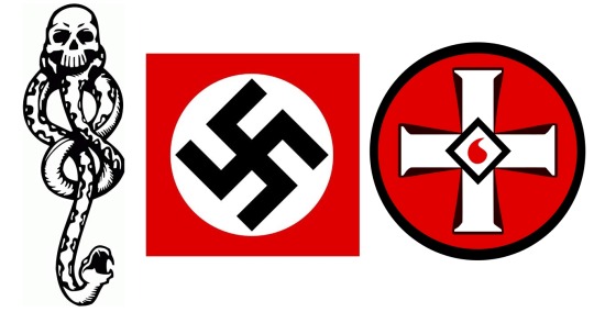
THE OUROBOROS (snake eating its own tail) was a symbol of immortality, which was the very thing Voldemort was after.
Ouroboros represents coming full circle. It is an ancient symbol depicting a serpent eating its own tail (usually a snake or a dragon). The name originates within Greek language. 'ouro' meaning tail and 'boros' meaning wating, thus 'he who eats the tail'.
The tail (the end that the skull bites) is not just a physical end of a snake, but also a metaphorical end of life.
I realised both dark mark and swastika symbols used to represent something positive and the meaning was changed later on. The ouroborus symbolised the cyclic nature of the universe: creation out of destruction, life out of death. The snake eats its own tail to sustain its life in an eternal cycle of renewal. Before Hitler 'stole it' swastika was used by many cultures to represent life, sun, power, strenght and goodluck.
Groups whose central belief is that theirs is the one true race and that all others are inferior. While the KKK are known for their negative (to say the least) views on people of colour, especially African Americans, the Death Eaters have a similar opinion on Muggles, or non-magic folk. The terror that the the Death Eaters inflicted upon the magical community during Voldemort’s heyday can be seen as a microcosm of the KKK’s chokehold on the southern US. Both believed in ethnic cleansing and the inherent power of being a pure-blooded wizard/white, and used murder, riots and general evil to achieve their ends.
Many parallels can also be drawn with Nazism and WWII Germany; the goal of eliminating Muggle-borns and half-bloods from the wizarding community was ultimate, but the execution of this goal was undertaken gradually, somewhat like the Holocaust and the rampant antisemitism under Nazi Germany. It’s also not very difficult to compare Voldemort to Adolf Hitler.
The one difference between the Nazis and the KKK that I feel really draws more of a similarity to the Death Eaters is the use of masks. To me, this brands the KKK and the Death Eaters as more secretive and private in that as much as they may be fervent supporters of their cause, there is a clear line drawn between their private lives and public activities. A Nazi is a Nazi and the swastika was a symbol worn with pride, whereas the use of masks by Death Eaters and the KKK evokes a sort of cowardice, an aversion to the world being able to put a face to the acts they commit.
Sure, you might know the names of every Death Eater or member of the KKK there ever was (or currently is), but what difference would it make if you walked past one in the street if you didn’t know their face? This distinction is vital.
I started thinking about how I could show all of that in pictures. Some of the pictures I took from the internet and some of them I drew myself with the help of Photoshop, Adobe Illustrator and Procreate.
For example I found similar pictures of KKK and Death Eaters wearing robes with pointy hats and made a silhouette drawing of both of them to make the resemblance more noticable.
DESIGH & PHYSICAL BOOK

https://vimeo.com/311950521 (in case the gif isn’t working)
When I started thinking about how the actual book is going to look like I knew I wanted to make it look quite simple and dark. I like the contrast of black and white and I thought it suited the theme.
I made the page layouts in Adobe InDesign. This is where i hit an obstacle. I realised that every picture had a different shade of black (or should I say dark grey?) and it didn't match the background. I didn't have enough time to colour correct everything so i decided I'm gonna cut out individual pictures and glue them on 160gsm black paper along with the text. I cut down the paper to an A5 format, glued everything in and went to Kall Kwik print store where they did the spiral binding for me. I wanted it to be spiral bound so it's easier to flip through the pages and also the paper is quite thick so I thought it was the best option.
If I could change one thing I would definitely took a bit more time and fix the colours on pictures so I could stick with my original plan of just printing out a finished pdf and avoid the cutting and gluing part. It would also definitely make it look a lot more neat and professional.

When we all finished our artist books we had to curate our own exhibition.
We had a lot of books to display and not many stands so we had to be smart about using the space. We decided to divide books in different categories. We tried out a few different options and decided on fiction, non-fiction and somewhere in-between.
1 note
·
View note
