
Last Seen Blogs

diazsichbear
Sin título (sin título)

studio-scandi
Every moment has its own pace

definitely-minnesota
Totally the state of Minnesota
defreitasjournalfinalproject
Album Recording Journal

tuanm
you're my moon ☾
Text
Mock-ups

My first attempt at incorporating the design into some sort of real world scene, using Photoshop to position the design and apply a plastic like effect, that adds to the reality. I like what I’ve done so far but I need to try and finalize where the plastic shimmer will sit and edit the clipping around the hand, currently looking out of place.

second attempt at incorporating my design into a real world situation using Photoshop, reusing the plastic effect on the previous design to try and add to the realism of this one. I prefer this one to the other one because I feel the perspective is better and the mask around the thumb of the hand is less visible, however I’ll keep experimenting and hopefully come to a design that I’m relly happy with.

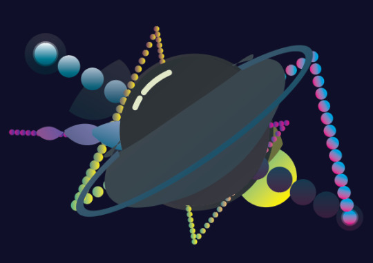
The final mock-up I made and have submitted to the final show. Overall I’m happy with how it’s turned out, I could argue that the edges of the planet are a bit blurry and I used to much noise trying to give the affect of texture however your so zoomed out that you barely see it. From the previous design I changed the opacity on the plastic, trying to make it blend with the cover more and moved the asteroids around curving them to flow with the direction of the planet more.
If I could change anything now I might move the asteroids up more to the left, centering them more to the bottom left of the screen. However I do like how they fade off the side, so I’d need to move the others accordingly to try and keep the fading element.
As mentioned previously another section I might change would be the noise around the edges of the planet, making the edges less harsh similar to previous designs. regardless of the changes I would make I’m still happy and would make the appropriate changes if I had more time to do so.
0 notes
Text
End Of Year Project
I set myself the task of creating a space themed album cover/poster for the song ground control (David Bowie-Space Oddity). I’ve never really attempted album covers or posters before knowing that they require good colour coordination which I struggle with, so that’s why I chose this brief, but before I started anything I had to research graphic design and find out how this could help me to create an effective album cover/poster. After conducting the research (see below this post) I noticed most of the covers are relatively simple, with each element only being made of a few shapes, because of this I came to the conclusion that I should try not to overcompensate the design.
I’ll admit I often don’t plan as long as I should, I try go straight into the designing stage of the task, but when starting this I took my time to teach myself how to do this properly. I spent time looking for tutorials to try and help me learn the style and techniques of modern graphic design after a while I felt comfortable enough to start.
I found an interesting tutorial describing how to make a cool looking planet (the image below shows my attempt) and I really like the art style so I’ll try to create a similar one in my design.
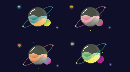
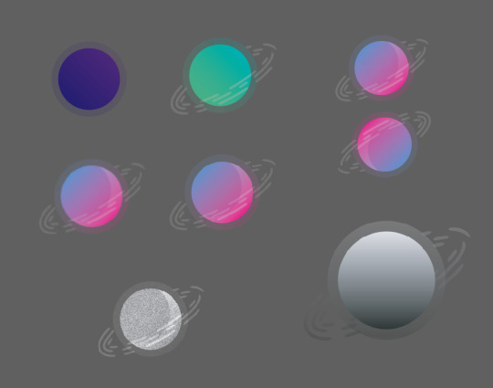
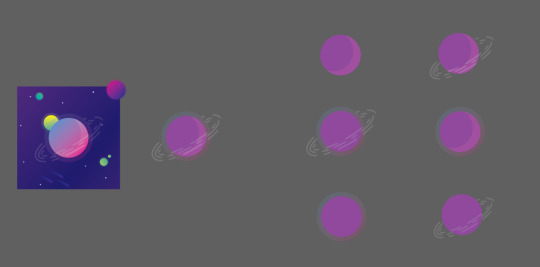
I tried out varying styles and colours to find the right planet design for the cover. After a while I came to the conclusion that I would use the pink and blue planet (see below or above), believing they had the best colour coordination and would work best with the space theme I was trying to emulate. However I may consider using the other designs later on to try and create some sort of solar system, with all the planets orbiting each other, or being spaced out around the page.
After analyzing my work and assessing it against other album covers/posters I found that most are done in a square format, which means for my final design I will need it to be on a square document, however for the design stage I will keep to a rectangle (above), as this leaves me with more room to experiment.
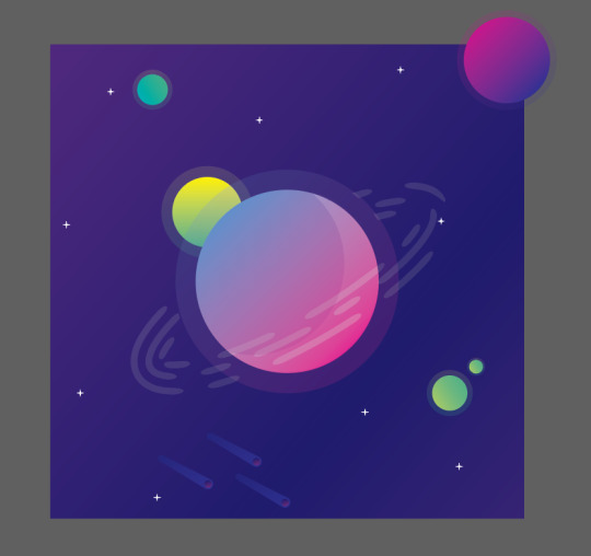
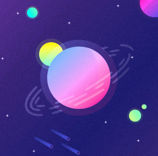
The image below shows the process of how I made my planets (the descriptions their as well), all of them were made the same way just with altered gradients. When changing the colour of the planets I had to find ones that compliment each other, as mentioned in my brief, I tend to struggle with colour theory and have had to teach myself about it in order to achieve an effective design.
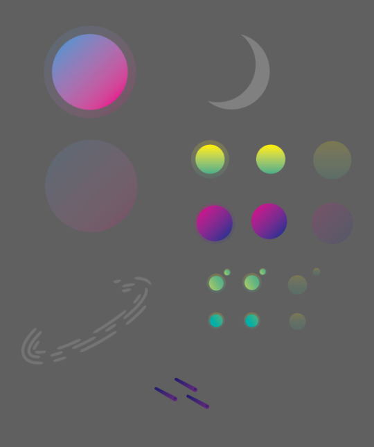

The image above shows what elements I used to construct the planet, showing. most of the sections started as ellipses that I changed using the direct selection tool, once I had the shapes I wanted for the inside I added a gradient to them, sticking to my theme of bright colours. The ellipses that make up the outside of the planet stayed to their original shape just having the opacity lowered to make them appear transparent. After I placed the inside and the outside together, I felt they needed more emphasis on the fact this is meant to be a 3D shape so I added a shine and glare to the right side (the crescent shape in the image above) adding to the glass effect.
The ring around the planet took surprisingly long to get right, I struggled to find a way to make the independent shape without effecting the planet. eventually I got it to work, using a mask to take away the middle, however this did make the section behind the planet disappear but you don’t see it so it’s not that important.
Finally their are the moons that orbit the planet and the large moon at the top left. similar to the actual planet their made from ellipses that have had a gradient applied to them. I used three gradients in total for all the moons, the first (being the bottom right moon) going from a dark green to light green. The second a warm yellow to vibrant green, you can see this above the left of the ring. finally (on the top right side of cover) the last moon follows a similar colour scheme of the main planet, directly going from dark purple to vibrant pink.
In conclusion to the design of the planet, I like the colour scheme I used, trying to stick to more vibrant colours. I like how I laid it out keeping the spacing nice and I’m happy with how it looks.
After deciding a colour for my planet I went thorough lots of development to decide weather I want to add an effect to the design or not, the images above show what I tried. out of what I did I think my favorite is the image above, I’m not entirely sure how I made it but I like the repeating shapes and the solid colour, it reminds me of a cover the early 90s and if it worked then, it could work now.
above you can see I separated out the design, I did this because I wanted to try and find an angle that looked good for the design, however none of them really compliment the whole thing so I chose to keep it the same.
I removed the gradient from the design on the left, which led to the one on the right, personally I still like the gradient version more, but the solid colour version could be used for something else. I chose to keep trying new things with the solid colour version, removing parts, changing colours and adding new effects. removing the front of the planet yielded an interesting result, making the colours appear brighter, however removing the illusion that the planets contained within some sort of orb.
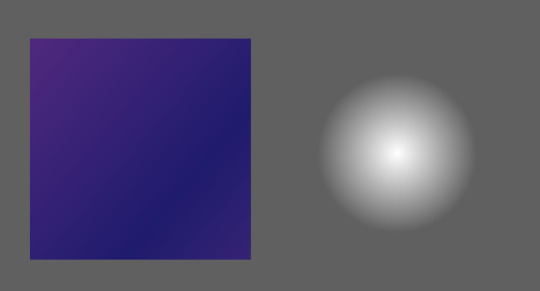
The background was fairly simple to make only using a radial gradient that I lowed the opacity on to create the glow effect (see image above).
Previous design-not being used. The space shuttle was too realistic not following the rest of the style (graphic), however I do like how it looks and might consider using it at another point. besides that I like the planet and will use this in the final design.
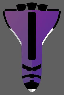
I remade the rocket, trying to keep it simpler and to a nicer colour scheme using tone to try and add shape. I like this rocket much more to the other and will most likely use this in the final design to replace the role of the rocket above (entering the atmosphere)
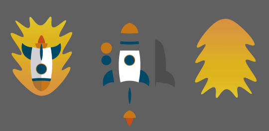
I went through a few designs for the rocket trying different styles and proportions, but came to the conclusion I wanted to use a simple design sticking to the theme of the rest of the album cover/poster. The image above shows how I constructed the the rocket, once similar to the planet being made of ellipses which I warped to make the shapes I want. The only section of the rocket I didn’t make this way is the shadow that cover the left side (facing down), I made this by placing a rectangle of the top of one half of the rocket lowering it’s opacity and then using the shape combiner to remove all the rectangle that doesn't cover the rocket.
The flame that surrounds the rocket I made by hand individually movie points to create the effect, later adding a gradient going from a dark orange to a brighter orange (bottom to top).
In conclusion to the rockets design I think it follows the rest of the album cover/poster and I feel the colours aren't to out of place. However I’m still unsure weather or not I’ll use it in the final cover
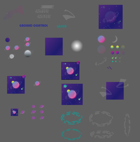
The layout of my work-space, containing all the designs, tests and assets.
As mention previously I was debating weather I wanted to use the multiple planets. But as you can see I chose to use and I think they work quite well, bringing more variation to the design and generally making the whole thing more interesting. Out of the designs I tried with the planets, I think my favorite is the one below, with the planets being different sizes it makes the layout more like a solar system, adding both character and emphasizing the space theme.
To answer the question was it successful at being a cover, I think so yes, the colours are vibrant and would draw attention, they compliment each other and follow a space theme. The entire design has been done in a graphically pleasing style and it isn’t too complicated being made primarily of simple shapes, yet the design still retains some complexity not being too simple.
Throughout the process of making the cover I’ve come to appreciate even more how important colour and direction can be when creating a poster or still image, learning how it must have direction drawing the attention of whoever sees it, moving their eyes around the image emphasizing certain sections. Learning new techniques on how to make an effective design taking inspiration from previous album covers and researching into their history. Adding effects to my work to try and give them texture and depth and experimenting with layers to change colours and gradients, using Photoshop more than I ever have before.
In conclusion to the entire design, I’m happy with how it turned out, I like the colours and think the design follows the target I set myself, however I would work on the spacing for the final album cover/poster refining the design even further, moving the smaller sections round the page emphasizing on the direction mentioned previously. I would also look at the colours I have chosen assessing weather they really were the right choice, or weather their were colours that would have better followed the center planet. Regardless of these points as said I’m still happy with the design and will take these into consideration in the future.
0 notes
Text
Inspiration
When looking for inspiration for my cover I chose to find other that were reminiscent of modern graphic design, of the four below the one by coldplay is the one that appeals to me the most, this is because (to me) it looks the most like modern graphic design, seeing in my head how something like that could be created quite easily in illustrator out of simple shapes, utilizing opacity to create the raindrops.

GREEN DAY
The style of this cover is defiantly graphic in nature, however it’s not the style I would like to use. The whole thing is very in your face (if you know what I mean) and I would like my cover to be much softer, drawing you in with colour, though the red does this very well, which I’ll take into consideration when designing my cover.
Another feature of the cover I like is the way its been made, it isn’t over complicated with fancy designs and advanced shapes, being made from simple shapes with bold edges. I mention this because I would like to keep my design simple as well, learning from my research on a graphic designer (Aaron Draplin) that simple shapes and good colour coordination can create amazing results.

PINK FLOYD
when evaluating this album cover I thought it was very simple, but I suppose that’s not a bad thing, the whole point of the cover is to tell someone straight away who the band is. With it’s mixture of bright colours and simple shapes this is done very effectively, telling you straight away this is Pink Floyd.
the original design emerged from Powell’s and Thorgerson’s practice of conducting brainstorming sessions that stretched from late evening until 4:00 a.m. “Hipgnosis had been given little creative direction by the band other than a suggestion by keyboardist Richard Wright to “do something clean, elegant and graphic”. One night, Thorgerson showed Powell a black-and-white photograph of a prism with a color beam projected through it . After graphic designer George Hardie provided his expertise, Hipgnosis presented the prism design along with some others ideas to the band.
I’ll utilize this in my cover to achieve the same goal of instant recognition, however I make it a bit more technical.

COLDPLAY
I really like the style this cover has been done in, seeing in my head how I could make this in illustrator. It appears to incorporate the possessives of both previous covers being simple (but not to simple) and using bright colours. When I make my album cover I would hope to try and make something in a similar style to this one.

WEEZER
I’ve never heard of Weezer I only included this because I like the cover, once again seeing how I could create this in my head (using Photoshop) replacing the background and changing the hue. Another style I might consider using.
After assessing the two styles I like the most I have chosen to design my cover a similar style to ColdPlays. I’ve never made an album cover before and I’m less confident in Photoshop as I am in Illustrator so that helped me to decide, believing I can create a higher quality cover in Illustrator.
1 note
·
View note
Text
3 Pitches
Pitch 1
For my first pitch I set myself the task of creating a space themed album cover/poster for the song ground control (David Bowie-Space Oddity). I’ve never really attempted album covers or posters before knowing that they require good colour coordination which I struggle with, so that’s why I chose this brief.
Before I started anything I had to research graphic design and find out how this could help me to create an effective album cover/poster. After conducting the research I noticed most of the covers are relatively simple, with each element only being made of a few shapes, because of this I came to the conclusion that I should try not to overcompensate the design.
If I was to make the album cover I wold most likely use illustrator to create it, later taking the design into Photoshop to refine the look and add more precise detail. I would use these two programs because they allow me to freely manipulate shapes, adding gradients and colour to create the look I want, giving me lots of options with the style I would like it to be done in.
Pitch 2
For my second pitch I want to create a minute long animation in pixel art that would be based around similar pixel art games, or taking inspiration from a movie. I would like the pixel art animation to be based during a medieval time period, narrowing my options for what it can be based on. However something like Lord Of The Rings, or The Hobbit would be prefect for my animation.
From my research I learnt that creating the assets for a pixel art animation can be time consuming and actually animating them even more so. However once animated reusing the same animations and walk cycle for pixel art is quite common, meaning a lot of excessive animation can be negated.
When making this I would use use both Illustrator and Photoshop, Illustrator to make the background and any other sections of the environment that won’t be animated. Then using Photoshop to create the animated parts, effectively making a gif for the movement, looping and ordering the motion (stop, start, stop, jump ect).
Pitch 3
My final idea is to create a 3D model of either something I will draw, or something that has been drawn. I have previous experience with this, having created a small 3D model for the young creative awards, so I know how I would do it. The scene I would like to draw would be similar to my previous, being something small yet detailed contained within landmass, based in a fantasy environment.
When researching the programs I could use to make my 3D model I took into consideration what the college currently has installed on the computers and how I could use those the best of my abilities, looking at tutorials on how they work and how to create what I set myself. Out of the 3D programs I could use (Sketchup and Unreal), I felt Google Sketchup was the best option, giving me more flexibility when it came to how I could make objects and having some previously gathered knowledge on what I wanted to make.
The process I would take to make the animation would start with the base of the 3D model (land, sand, grass ect) and then building the rest up from their. after creating a basic shape for the model I would proceed in adding detail and colour later taking the design into Photoshop adding even detail to finish off the model.
0 notes
Text
Sketches


Some quick sketches I made trying to come up with a definitive design for my planet and any other parts I would want to be featured within the cover. I wanted to keep the style unrealistic however I took into consideration how I could use modern design to influence how my cover looks, also trying to decide a layout for all the segments (text, designs ect).
0 notes
Text
Graphic design
Graphic design is art with a purpose. It involves a creative and logical way to solve a problem and achieve certain goals, with the use of images, symbols or even words. It is the visual communication of concepts and ideas using various graphic elements and tools to convey meaning and form in a visually pleasing way.
Elements of Graphic Design
Graphic design can use image-based designs involving photos, illustrations, logos and symbols, type-based designs, or a combination of both. These designs can include many of the following.
Lines: Straight, curved, wavy, thick, thin. Lines allow designers to divide a space or separate a layout. They can also be used to guide the eyes of the viewer, or make other elements of a design follow a path for easier guidance to information, For example point A to point B on a map.
Shapes: Shapes offer a variety of ways to fill spaces creatively, to support text and other information and to balance a design. Shapes can be created out of nothing, using negative space to give a shape structure.
Colour: Colour, or the absence of colour, is an important in any design. With an understanding of colour theory, designers can influence a design and a brand, integrating colour boldly or with brilliant subtlety.
Type: Type can transform a message from text to art. Different fonts, combined with custom spacing, size, and colour, can add power to the point you are communicating.
Texture: Even a smooth and glossy advertisement can seem real with texture. It gives a surface through its visual appearance and adds a sense of depth.
Isometric
https://www.youtube.com/watch?v=RPyrUI6s10w
3D painting
Current Specialist
Aaron Draplin design approach
https://www.youtube.com/watch?v=zOPA0NaeTBk

Aaron starts his process simply with writing out the name of the company, using the name of the company to help him with the initial stages of the design. He speaks about how defining a type for the logo can help with how it can look writing it’s name in both capital and lower case, trying to distinguish one design from another.
I will take this into consideration when deciding my design using text to help me, writing out the name of what I choose, helping to define a style, for example a bold or smooth design.
When Aaron begins to sketch he spends a very small amount of time on each one quickly deciding which designs he likes more than others, finalizing a style of design he likes most.
when sketching myself I tend to spend to much time on each one, however after watching his process I’ll try to embrace his method of quick drawing leading to a quicker conclusion.
After looking at some his sketches I noticed a lot of them are very similar in design just with slight alterations to each one, however besides these small changes each one seem unique. On the next page you can see how he started to flesh out the design and try new things, this is were I go wrong as I tend to linger on old designs and should keep pressing foreword until I find the best design possible.
After he finishes his sketches he talks about his inspiration, be it from other designs, everyday objects and even his own previous work. when looking for inspiration I end up on the same sources and from this I learnt that I should look to new things to help me with my work.
By the time he reaches the digital stage he has a clear plan on how he wants the design to look and the colour pallet he’s going to use. however even in this stage of development he still experiments with the design changing it.
History of Graphic Design
Graphic design as we know it today really started developing in the modern era, roughly the late 1800s up until the end of World War II. While the 19th century was more about technological advancements and new capabilities, the modern era was about learning how to exploit these advancements for more artistic aims. With printing now a common tech and competition fueling innovation, artists and designers were pushed to explore new styles and techniques, which quickly trickled into advertising and branding
https://99designs.co.uk/blog/design-history-movements/history-graphic-design/#thebirth
Link to the website I used to acquire this information, giving detailed descriptions about how graphic design has evolved and influenced the modern world as a whole.
0 notes
Text
Work Timetable
Specialist field
I plan to start my process by researching into my chosen specialist field, looking at both the history of it and finding an example of a modern counterpart. After doing so I will write up the process they take during their work, taking notes, helping me in future when I come to design my final piece. My research into it’s history will start as far back as I can trace it, leading to modern day, hopefully helping me to develop my techniques.
Investigate and practice
Once I’ve conducted the necessary research I’ll begin planning and sketching what I would like to do, coming up with three ideas of what I could produce for my final piece. I will take into consideration the tools I will need to use to make my final piece, how long it will take me to produce it and what techniques I will be using throughout.
I will try to keep what I Make realistic, not going overboard and giving myself either to much work to do within the time constraints, or to little, leaving me with to much free time.
Pitch
When presenting my pitches I will clearly state what I will make, how I will make it and what tools I will use to produce it. I will also go in to detail describing the purpose of each of my pitches and what roles they would fill within my chosen specialism in modern day. After describing all of the above I will give my own opinion on each and decide which of them I would like to do, referencing my research, using it to come to the best conclusion.
Produce a final piece based on one of your pitches
During the production stage of my piece I will keep a log of what I’ve done, later helping me during the description stage, allowing me to go into deeper detail about how I made the piece and how it is relevant to my chosen specialism. After I describe how I made it, I would like to give my own opinion on it, linking it to my research and hopefully adding to the description.
Evaluation
When evaluating my work I will compare it to the goals I set myself during the early sections of the task, makings sure I have fulfilled them. I will also conclude the task as a whole evaluating both what I have made and the way I have made it, deciding on weather their is anything I wish I could change now that I’ve reached the final stage of the task and giving my overall opinion on weather I thought it went well or not.
0 notes