
Welcome to the shit show, friend.
Last active 4 hours ago
Don't wanna be here? Send us removal request.
Statistics
We looked inside some of the posts by undertheashtree and here's what we found interesting.
Average Info
Notes Per Post
2
Likes Per Post
2
Reblog Per Post
0
Reply Per Post
0
Time Between Posts
6 days ago
Number of Posts By Type
Text
6
Last Seen Tumblr Blogs


Fun Fact
Tumblr.com rank in the US is 25.
Text
Reimagining the Rare Beauty Confident Energy Palette.
As most makeup lovers do, I love a good metallic. Occasionally brands release all metallic palettes, and they’re fun for a little while, but they’re ultimately a novelty and not practical. For me, a well-rounded eyeshadow palette has to contain enough mattes to build a foundation for a variety of looks and at least a few metallics to balance it all out.

That being said, having an all-matte eyeshadow palette feels more useful than an all metallic palette. Had this Rare Beauty palette been all-matte, I think I would have been much more tempted by it.
Also, coincidentally, I was messing around on a website called Coolors.com (Coolors.com) and it generated this color story for me:

As I saved the screenshot in my folder of other color stories (that I keep on hand for palettes like this), I couldn’t stop feeling like I’d seen a palette like this already. I’m sure there’s been a few with similar color stories, but after a few days, I remembered it was because of the Rare Beauty Confident Energy palette.
I’d seen it when it was released and was very attracted to the chartreuse and the blue, but, as I said, wasn’t interested enough to buy it. I still don’t want the Rare Beauty palette, but I was inspired enough to create my own version of this.

I kept the number of eyeshadows the same, but obviously opted for mattes instead of metallics. I also kept the green, blue, yellow, and white in their respective places, but switched out the pink and brown for a black and an orange. I preferred the way the black and orange contrasted off the other shades and, while the pink and brown might make the palette more user-friendly, I thought switching them would make it altogether more interesting (both to look at and to use).


There’s not much to say with this one, since I was only trying to mimic the randomly generated color story and also find a matte version of the gold in the Rare Beauty palette. I rather enjoy this little palette, and I’m happy to have spent time making it. The eyeshadows used are listed down below, if you’re curious, and I’ll also provide a link to my YouTube channel. I do a lot of other BYOPs on my channel, so if you like this kind of content and want to see videos of it, click on the link down below! And thanks in advance if you do.

Eyeshadows in order from left to right: Arsenic - Sugarpill single Sky - Beauty Bay Wilderness palette Nevermore - Blend Bunny Blends palette Marigold - Beauty Bay Wilderness palette Cream & Sugar - Blend Bunny Blends palette Barley - Blend Bunny Blends palette
0 notes
Text
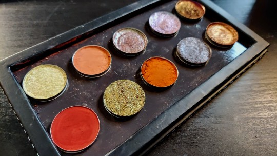
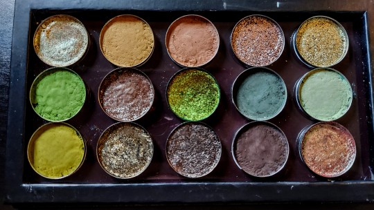
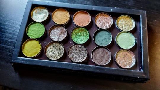
Improving the Urban Decay Cyber Palette.
The Cyber palette came out a couple years ago, and it’s as disappointing now as it was then. The concept was promising, the packaging was pretty, but the execution was poorly done, in my humble opinion. Back when this palette was new, I knew immediately that it wasn’t going to be for me. Two-thirds of the palette is varying shades of pale peachy orange, leaving only four shades that add anything interesting to the color story. Even still, one of those things is a warm metallic pink and the other is a burnt orange.
There’s nothing wrong with a more monochromatic color story. Just look at ColourPop and their dozens of monochromatic 9-pan palettes which were hugely popular once upon a time, and are still widely raved about in the beauty community. I myself have collected many of their monochromatic palettes over the years. Although a lot of them aren’t a part of my life or collection now, I got a lot of use out of them and they have a special place in my heart.
While there’s nothing wrong with monochromatic palettes, they have to be done well. In my opinion, since you can’t get contrast and variation through multiple colors, monochromatic palettes require different textures and making the eyeshadows significantly different depths. The problem with palettes like Cyber is that they feel very monotonous and, therefore, boring (which is never something you want a palette to be. A palette being user-friendly, utilitarian, and/or basic doesn’t make it boring by default.).
I did attempt to keep my version of this palette as similar to the original as I could stand to make it, but I made some, what I consider necessary, changes, in order to make this palette more appealing to myself. Without further ado, here’s my version:
This is definitely one of those BYOPs that I find appealing because I know and love the eyeshadows in it, not necessarily because I love the look of them all together, or because the colors are particularly interesting to me.
If you compare my version right next to the original, you’ll notice that my palette is a little brighter, there’s a bit more color, and I’m obviously missing the metallic reddish shade that sits next to the matte burnt orange at the end. I do wish I had something to use in place of the metallic reddish shade—called Override—but I just didn’t have anything that wasn’t similar to other things I’d already put in the palette or that felt cohesive with the rest of the colors.


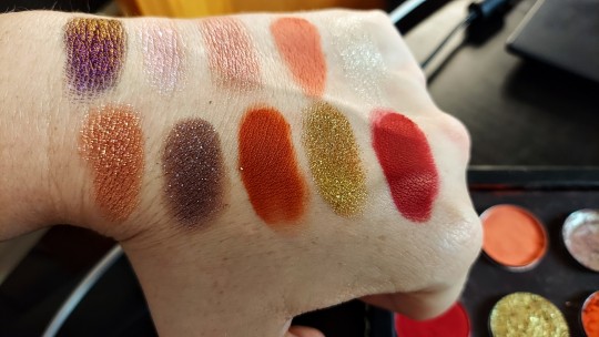
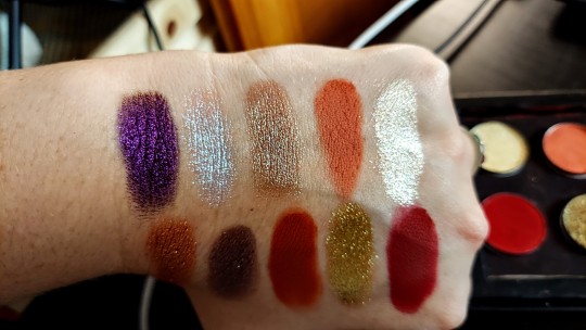
I’m only going to delve into the highlights for this one, simply because it’s not that exciting to me. The first three shades I tried to keep as similar to the original shades as I could, but my choices are slightly more colorful than Urban Decay’s. Also, my metallics are definitely shinier than what I can tell from multiple swatch photos of the Cyber palette.
For Electrode (first row, fourth shade), I opted for a glitter. Since I was trying to keep the colors similar, I decided to add some extra texture by using this peachy orange glitter from ColourPop (called Full Effect).
The brown to green duochrome that I used for Cyberspace seems pretty close, although I think the green flip in my eyeshadow (Crystal, from Beauty Bay’s Book of Magic palette) is much stronger than Urban Decay’s, making it much more obviously duochrome. The base color also seems more pink that the Cyberspace, which influenced by decision with what to use in place of Gadget.
Gadget looks very similar to Virtual in the brand’s swatches, the biggest difference being that Gadget is a bit more pink and Virtual is more orange. I decided to go with something more mauve-y to better match the base color of Crystal.
For Call I.T., Not A Bot, Static, and Y3K, I just went with more colorful versions of the Urban Decay shadows. They’re still toned down, but I think my options are more interesting, textured, and will perform better than Urban Decay’s.
With Override, I wanted to try to dupe it. I don’t have any metallics similar to it, and I didn’t want to use another glitter because it would be too similar to Full Effect. Instead, I decided to use this shade as an opportunity to add more texture and a little more coolness to the palette. I went with this glitter from ColourPop, called All Aura Again, and it’s got a mix of chunkier and finer iridescent glitter. It reflects purple, blue, green, as well as some pink and orange.
Finally, for Byte, I really wanted to keep this the same, so I went with this burnt orange matte from Natasha Denona (called Amhara). I wish there was at least on more matte with some depth, but I feel like this compliments the palette really well and adds some visual interest.
So there you have it, my (improved) version of the Urban Decay Cyber palette. If you’d like to see me build this palette, the video is up on my YouTube channel. I’ll also be posting a video on Friday showing three looks I’ve done with the palette. The link to my channel will be below the swatches.


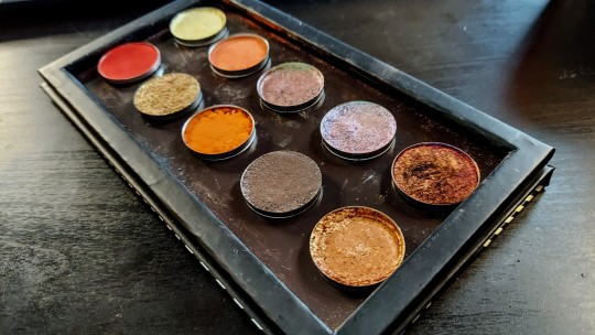
Eyeshadows are listed in order of the palette (left to right, top to bottom).
Musk Rose - Ace Beaute Floral Vintage palette Peach For The Stars - Give Me Glow Pastel Dreams palette Samus - Kaleidos Club Nebula palette Full Effect - ColourPop single Crystal - Beauty Bay Book of Magic palette Vintage Taupe - Natasha Denona (from several palettes) Misty - ColourPop single You're My Only Hope - Kaleidos Club Nebula palette Tundra - E.L.F. Cosmetics Earth and Ocean palette Unexpected - J.D. Glow single All Aura Again - ColourPop In A Trance palette Amhara - Natasha Denona Peak palette
0 notes
Text
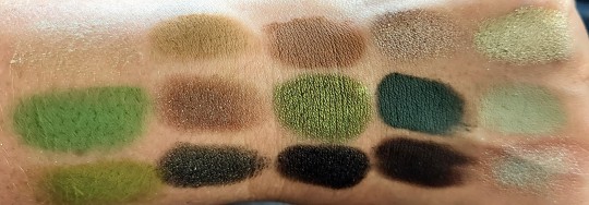
All Because I Saw a Purple Tree.
I’ve recently struggled through a large creative block, and waiting for my normal stream of ideas and creativity to begin flowing again has been a bit disheartening. About a week ago, I was driving around, running errands, and trying to come up with a new idea for a BYOP (build your own palette). As soon as I told myself to stop trying to force it, and that inspiration would come when it was supposed to, a beautiful little sight came up on my right. A tree with what appeared to be plum colored leaves (which I’ve since learned might be called an Eastern Redbud, but I’m not totally sure), settled between two trees with dark green leaves, captured my attention. It felt so wonderfully autumnal compared to bright blue sky and overbearing sun, and I knew at that moment that my next palette needed to be plum and green.

And, of course, it’s beautifully grungy. I wanted only plums and greens in this one, no blues, no neutrals, just those two, gorgeous, contrasty colors. Notably, there aren’t any light or pastel mattes in here either, and the lightest shade is a metallic lime green (top right).

Making this palette also made me realize that, while I don’t wear my multichrome eyeshadows all that often, I do reach for them a lot when building my own palettes, especially ones with contrasting colors. It’s an easy way to bridge the gap between the colors I’m working with, and multichromes can be incredibly versatile.
There’s not much to explain with this one, but I’ll try to give some more insight into my thought process.
Black Hyacinth (bottom left) is a black with plum undertones, and before I even sat down to make this palette, I knew this would be the first thing to go in. Most black eyeshadows tend to lean neutral or cool-toned, so having a plummy, warm-undertone black is nice for a palette like this. It works best with warmer toned shadows when blending, but I find it’s black enough, and the warmth is subtle enough, that it can work with other colors like green.
I essentially built the rest of the palette around Black Hyacinth, which is definitely the backbone of the palette, given it’s the most versatile thing in the palette. The reason it’s the most versatile is mainly for it’s depth (making it useful for deepening different kinds of looks, as an eyeliner, and/or for detail work), but it can work with the plums or greens in the palette, and as pairing or base for the black-based multichrome in the palette.
Speaking of the multichrome, Nirvana (middle row, last shade) shifts from a couple shades of green, blue, and silver. Depending on the angle, I can also see some warm purple, but that’s really dependent on the lighting and the angle. The dominant colors are definitely the greens and the warm silver, which I feel compliments both the greens and plums in the palette.
For the rest of the matte shades, my main priority was being able to create a blend with either the plums or greens. So I went with a dark matte of each color that was lighter than Black Hyacinth, and then an additional, slightly lighter shade to accompany that.
For the metallics, I wanted to keep them dark, and kind of grungy. Dress Up (center), is a really grungy plum with gold, green, and orange glitter, and Nightsky (bottom row, middle shade) is a blackened green with green, blue, and gold glitter. The last shade I chose was Prismatic (top row, last shade). I honestly didn’t know what to use to finish this color story, but I wanted it to be a 9-pan, so I decided to go with something light that I could potentially use to highlight or just brighten up a look. Prismatic has a lime green base that shifts pink and blue. Normally, it’s too pigmented for me to use as a highlight on my fair skin, but I’m wondering if the brightness of it will contrast off the darkness of the palette to be an effective highlight.
As always, I’ll leave you with some swatches (including a video I took that allows you to see the shifts in Nirvana) and a list of the eyeshadow names (along with their palettes, if any) which are written in order from left to right, top to bottom, according to the pallete.


Top row: Ego - Sugarpill single Forest - Beauty Bay Wilderness palette Prismatic - J.D. Glow single
Middle row: Speakeasy - Beauty Bay Age of Opulence palette Dress Up - Blend Bunny The Dollhouse palette Nirvana - Chaos Makeup single
Bottom row: Ivy - Beauty Bay Wilderness palette Nightsky - Dose of Colors Block Party single Black Hyacinth - Ace Beaute Floral Vintage palette
Here’s a link to my YouTube channel as well, if you want to see more from me!
#build your own palette#building my own palettes#byop#singles#makeup#cosmetics#beauty#eyeshadows#eyeshadow#palette#palettes
0 notes
Text
Creating My Own Version of the Pat McGrath Mothership XI Palette
If you haven’t checked out my YouTube channel, then something you need to know about me is that I love the Pat McGrath Mothership palettes. I own the first ten (nine of which were given to me as gifts by my husband and my mother-in-law). I’ve lusted after these palettes for years, though I never actually thought I would own so many of them.
Since “completing” my collection at the beginning of this year, I’ve had no desire to add to my Mothership collection. I also wondered if the brand would end the line at ten palettes, mostly because the last three received a lot of criticism for being too similar and too pink, but here we are with number eleven.
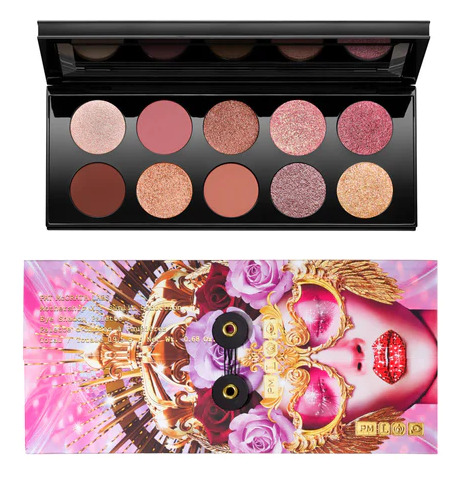
(This picture belongs to Pat McGrath, I just took a screenshot off the website.)
Upon seeing this palette for the first time, it immediately reminded me of Divine Rose I and II (the seventh and eighth palette). Everything appears to have some level of rosy pink to it, with the exceptions of the dark matte brown (bottom row, first shade) and the gold (bottom row, last shade). I can acknowledge this palette is pretty, but it’s painfully boring and repetitive, especially since I have every other Mothership palette. Without trying, I know I could easily dupe, or at least come extremely close to, this new palette with the Pat McGrath eyeshadows I already own.
Furthermore, the name of this palette—Sunlit Seduction—speaks to its wasted potential, in my opinion. Sunlit Seduction. I saw the name and was overwhelmed with the idea of what this palette could have been. Sunsets and sunrises came to mind, with their bold, fiery, warm color palettes, with just a hint of blues and purples. I spent some time Googling sunsets and sunrises, along with noting the names of the original eyeshadows, and set to work creating my vision of this palette.
By the way, there is a video of me building this palette up on my channel, if you’d like to check it out.
I used the names of the original eyeshadows as additional inspiration for what colors I wanted to use in my version of the palette. I’ll talk about the eyeshadows going top to bottom, left to right. The first shade is called Skintense Radiance, and it appears to be a champagne metallic with a pink undertone. I felt this should have been more yellow, something more sunshine-y, so I opted for a pastel yellow metallic. This is a franken-shadow I mixed together a while ago, and I don’t remember what went into it.
Next was Nude Rose. This felt too cool-toned, almost mauve. Looking at the sunrise/sunset pictures, some of the pinks do lean somewhat purple, but more like a lilac and not mauve. There were also a lot of warm pinks, although the majority seemed softer than I was imagining. I settled on this warm, peachy pink called Eden. The pigment is soft, but still bold, which mimicked the pink in the pictures really well.
Then we have Hypnotic Bronze. I’m not a fan of these orange-leaning bronzes/coppers, like what’s in the original palette, and which Pat McGrath insists on including in so many of her palettes. Also, bronze, the metal, can look blue and green. In the sunrises especially, I was seeing hints of pastel green, and thought this would be a good opportunity to include a small flash of green in the palette. The eyeshadow I included is called Crystal, and it’s got a pinkish brown base color with lots of green and blue shimmer.
Onto our first “special” shade, called Astral Pink Fetish. Another eyeshadow color I’m not a fan of is pink to gold duochromes, and no amount of sparkle—and this one seems to have a lot—will change that. This is also a duochrome that we see a lot from Pat McGrath, which makes this “special” shade the least special in the palette. I wanted to keep the pink but wanted the finish to be more blue/purple, so I went with Good Gawd for this shade. Even though this isn’t the same formula as Pat McGrath’s “special” shades, this eyeshadow is definitely special in its own way, and I felt it would replace that particular formula really well.
Then we have Blitz Crimson Ecstasy, which is the most disappointing shade in the palette. Nothing about the original eyeshadow says “crimson”. It’s incredibly pink and seems to have very little red actually in it. I have a few really lovely metallic reds, but I chose to go with a multichrome, which is called Lucid. It’s a black-based multichrome that shifts purple, magenta, red, orange, gold, and a hint of green at the end. I felt this really embodied the vibe I was trying to go for, especially the sunset side of things, and I wish the brand would include some bolder multichromes in their palettes.
Next was Xtreme Vermillion, which isn’t vermillion in the slightest. The color vermillion is more of a red-orange, leaning more towards red. The eyeshadow in the palette is a dark, warm brown. To be fair, I also didn’t go with a real vermillion, but I did want a primary red matte. One day, I hope Pat McGrath puts out some bolder colorful mattes like this one, called Button Bush, so I suppose this decision was partially driven by wishful thinking. I also love a good, matte, primary red, and I felt this was a good palette to include it in.
Next was Copper Dawn, which looks more gold than the bronze, but still very warm and orangey. My vision for this palette warranted a strong gold, but I didn’t want anything too yellow, or that leans orange. The one I chose, called 365, is a gold with brown undertone, giving it a bronzier look. It also has a subtle green finish, which, I think, added something interesting to the palette.
Then we have Sienna Mystique, which is a warm, midtone brown matte. Looking at the color sienna, it’s more of a burnt orange, so that’s what I went for. I considered going a little more neutral, but the brightness of this shade, called Enigma, embodied the fieriness of a sunset really well.
Probably the only shade in the entire palette that I enjoy is Astral Amethyst Allure. It’s a hazy kind of purple, lots of sparkle, and has a pink finish. My initial instinct was to dupe this shade, but I didn’t have anything close, so I went with a grungier brownish purple with lots of silver glitter, called Wild & Free. It has a similar vibe to the original shade, but adds an interesting amount of grunginess to the palette that I quite enjoy.
Finally, we have Astral Gilded Aura, which is a sparkly gold. It looks really bright, but also like a glittery gold in the Mothership X. For this shade, I chose to put my dislike of orangey metallics aside and opted for a gold with an orange base, called Stardust. It’s similar to 365, but the base color is bright, more red-orange, and it’s got a strong gold finish.
This is far from my usual color story. I’m much more drawn to greens, blues, purples, and greys, so this warm, orangey palette is out of my comfort zone, but I think I like it. It’s at least more interesting than Pat McGrath’s version, so I’m counting this as a win for that reason alone.
I’ll leave you with some swatches. The eyeshadow names, as well as their palettes, will be listed below (written in order from top to bottom, left to right, in the palette).
Yellow franken-shadow Eden - Anastasia Beverly Hills Prism palette Crystal - Beauty Bay Book of Magic palette Good Gawd - J.D. Glow single Lucid - Chaos Makeup multichrome Button Bush - Ace Beaute Floral Vintage palette 365 - J.D. Glow single Enigma - Blend Bunny Blends palette Wild & Free - Dose of Colors single Stardust - Beauty Bay Book of Magic palette
#byop#byops#building my own palettes#build your own palette#pat mcgrath#pmg#mothership#sunlit seduction#eyeshadow#eyeshadows#singles
1 note
·
View note
Text
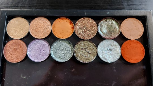
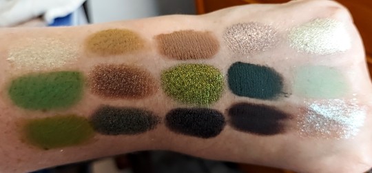
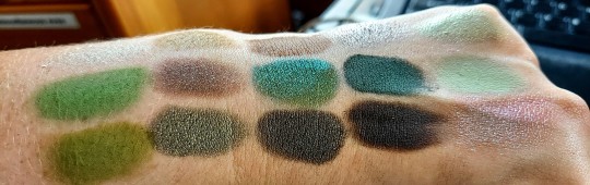
Mint Chocolate Chip, but Make It Grunge.
Hello there! I’m back with a new BYOP, and this one is pretty straightforward. Green and brown is such an underrated color combination in makeup. I love doing a brown eye with a green lip, or vice versa, or doing a neutral eye with a bright green eyeliner in my waterline. Hell, sometimes I’ll even bronze up my face (something I don’t do very often) and then swipe some green highlighter on the high points of my face.
So, having said that, sometimes I get the urge to build myself a green and brown eyeshadow palette to play with. I originally wanted to go more minty with the greens (as the title of this post suggests, I was originally planning more of a mint chocolate chip inspired palette), but as I was swatching and deciding what to put in the palette, I found myself more drawn to the grungier greens. Even still, I did want some brightness from the greens, so I did a mixture of brighter greens and grungier, brownish greens.
The pictures of the palette were taken in natural light, which washed out the colors a bit but I tried to edit them in such a way that you’d get a more accurate representation of the color story. This was also only supposed to be a 9-pan palette, but I got carried away.
I started off by picking my browns because I knew I wanted a really rich, dark, cool-toned brown, and I ended up choosing two finishes for this particular color, one matte and one metallic. I also wanted a matte taupe, and ended up picking a really foiled metallic taupe to accompany that, as well. As I sifted through my browns, Lithium was calling out to me, so I added it to my group. It’s a bit warmer than my other browns, but it has some green/blue glitter in the finish and thought it would make an interesting addition to the final palette.
The greens are where I got carried away. Green is one of my favorite colors, but especially in eyeshadow, and I have such a lovely, diverse collection of greens that I felt compelled to add a few different shades to the palette. As I wrote earlier, I intended to go in more of a minty green direction but decided to go with more plant-like greens to start with. I will also take any excuse to include Chantilly (bottom row, second shade) in a BYOP, so that was the first shadow I picked. It’s got a brownish/greyish base color with a foiled olive green finish, so it tends to play really well with browns.
This is when I decided not to go the mint route, although I added a touch of minty green with Hint (middle row, last shade). I added that particular shade after pulling in Untamed (middle row, fourth shade), which is the most cool-toned green in the palette. It works well with the warmer, more yellow greens in the palette, but I also wanted a way to blend it while maintaining its coolness.
I followed that up by picking a more leaf green matte, a chartreuse matte, and a green-undertone light brown. It was then that I decided to make this a 15-pan palette because I couldn’t bring myself to whittle the palette down. This left me with four spots to fill, so I opted for some metallics.
My first choice was the multichrome in the center of the palette, called June Bug from Chaos Makeup. It shifts from orange, gold, green, and a bit of teal. I’m not sure how well it will work with the entire palette but I couldn’t help myself and added it in. Marvel (top row, last shade) was also calling out to me, and I think it pairs really well with the entire palette, so I was happy to include it. Finally, I pulled my two favorite green duochromes. One is more of a tan base—although on me, it matches my skin tone pretty well—with a bright green shift and the other is a soft reddish brown base with more of a blue-green shift.
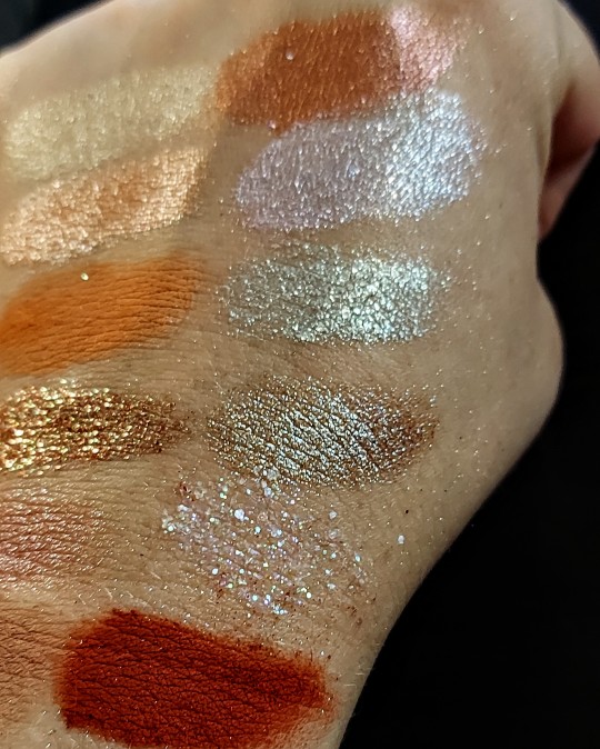
All in all, I really like how this one turned out! The greens feel a bit eclectic, but I think the browns really ground (no pun intended) the color story and bring a cohesiveness to it all. I’ll leave you with some swatches and a list of the shade names, as well as which brand and palette they’re from.
List of eyeshadows in the palette (left to right):
Top row: Ray - Beauty Bay Wilderness palette Figure - Blend Bunny The Dollhouse palette Twig - Anastasia Beverly Hills Sultry palette Trance - Tarte Make Believe in Yourself palette Marvel - Tarte Make Believe in Yourself palette
Middle row: Alive - Blend Bunny Surge palette Lithium - Urban Decay Moondust palette June Bug - Chaos Makeup multichrome Untamed - Anastasia Beverly Hills Subculture palette Hint - Blend Bunny Surge palette
Bottom row: Leaf - Beauty Bay Wilderness palette Chantilly - Blend Bunny The Dollhouse palette Coconut - Beauty Bay Sunset Horizons palette Madame - Blend Bunny The Dollhouse palette Crystal - Beauty Bay Book of Magic palette
Thanks for reading! If you’re interested, I also have a YouTube channel where I do lots of low-buy/no-buy content, BYOPs, and other makeup-related videos. Here’s the link, and thank you in advance, if you check it out!
My channel Under the Ash Tree:
0 notes
Text
Hi there. My name's Ash and I like to make fun little eyeshadow palettes in my limited free time. I made this one at 11:30 PM, after deciding that I could be more productive while avoiding going to bed (as opposed to simply doom scrolling through YouTube shorts).

One of my favorite things about color is how some contrast, yet compliment one another, and finding ways to bring those contrasting colors together in one palette. In this case, pastel green and bubblegum pink. Both are soft, bright colors at opposite sides of the color wheel. The somewhat muted, indigo-leaning blues sit in between pink and green, which I thought gave them an interesting way to connect.


And, yes, I could have used yellow. I tried putting yellow in, but it began to feel to close to a rainbow palette, so I instead opted for a matte white and an iridescent glitter with a white/clear base color. The matte white felt more versatile and, I feel, highlights the colors around it, instead of competing with them like the yellow did.
As for the metallics, I decided to go with a light green duochrome metallic that has a more subtle pink shift, a white duochrome with a really strong pink shift (also, the base color essentially disappears when applied, so it comes off more like a sheer metallic pink), and a multichrome that shifts pink, purple, blue, and green. In retrospect, the multichrome and green duochrome are probably too similar to warrant them being in the same palette, especially with how small it is, but I liked having a metallic with some blue in it without being a blue metallic. The glitter also adds an extra hint of blue.

(I have a slight tremor in my hands, and it apparently didn't like how I was trying to get a straight on picture of the palette. Apologies for the blurriness.)
Eyeshadows from top to bottom, left to right:
Flipper - Menagerie Cosmetics Pastel Pup palette Firefly - Kaleidos Club Nebula palette Lovesick - Beauty Bay Pastels palette Ceres - Lethal Cosmetics multichrome Cream and Sugar - Blend Bunny Blends palette Pretend - Blend Bunny The Dollhouse palette Void - Kaleidos Club Nebula palette Deep - Beauty Bay Sunset Horizons palette All Aura Again - ColourPop In A Trance palette
(Also, I do intend to repan my Lethal Cosmetics eyeshadow, so it won't stick out like a sore thumb in these palettes. I just haven't had time to get around to it yet.)
1 note
·
View note