
Don't wanna be here? Send us removal request.
Statistics
We looked inside some of the posts by tpaone-blog and here's what we found interesting.
Average Info
Notes Per Post
1
Likes Per Post
1
Reblog Per Post
0
Reply Per Post
0
Time Between Posts
2 months ago
Number of Posts By Type
Text
12
Photo
2
Last Seen Tumblr Blogs


Fun Fact
When “GIF” was named word of the year in 2012, Oxford Dictionaries U.S.A. credited Tumblr for pushing the word.
Text
Safety Signs 101 - Looking At ANSI Z535 Safety Alerting Standards

TPA has developed and will be presenting a series of articles to help explain the ANSI Z535 Safety Alerting Standards which are used by product manufacturers to create hazard labels for their products and the manuals that support those products.
Introduction
The information provided in this presentation is based on the American National Standard ANSI Z535 Safety Alerting Standards.

This “Safety Signs” guide is not meant as an all‑inclusive guide to designing safety signs (decals). This presentation is meant to help you, the manufacturer of a product, to be better informed on the basic importance of safety signs, their use, and their location.
These guidelines will help you to better understand the different facets of the American National Standards Institute (ANSI) Z535 Safety Alerting Standards. Please consult the full standard to ensure compliance when creating safety signs for your product.
Design of Safety Signs
The key to a good design is to make the safety signs easily readable and understandable.
The Z535 standards are valuable for those needing a comprehensive source of standards relating to the design, application, and use of safety signs, colors, and symbols. They are used by manufacturers to design safety signs, labels, tags, and tapes.
The safety signs you place on your equipment or product is a reflection of your company’s intent to promote safety awareness. Safety signs should visually demonstrate your care and concern for the health and safety of the end user.
Purpose for Safety Signs
Safety signs should:
• inform people of potential hazards and how to avoid them;
• reinforce safe working practices; and/or,
• direct users to the location of emergency equipment.
The goal of any safety sign should be to prevent any type of injury, and especially to prevent a fatality.
Goals for Using Safety Signs
There are at least two good reasons for any company to spend the time and money to develop effective and understandable safety signs.
Reason 1: To better protect people from harm.
• Visually providing a text message with simple illustrations will help explain potential hazardous areas and how to avoid them.
• The use of color, illustrations, and safety sign placement will help draw attention to a potential hazard, increasing end user awareness.
• Using internationally understandable symbols, along with simple illustrations, can help overcome language barriers for those end users unable to read the safety sign or operator manual.
Reason 2: To better protect your company from litigation.
• We currently live in a society where the prevalent thought is “it’s not my fault”. Safety signs show forethought in your desire to educate people in the proper use of a product.
• Properly using safety signs will provide your company with a higher level of protection, should an accident occur and/or a lawsuit arise. No one wants to see someone injured, or even worse killed, through the unsafe use of a product. However, no matter how safe your product may be, someone will use it in a way that was not intended. Safety signs will help protect your company from frivolous or unjustified lawsuits.
• The use of properly designed and worded safety signs should keep insurance premiums from rising due to a successful lawsuit. Many insurance companies base their rates on the level of detail put into safety signs attached to the product, as well as the written user documentation that accompanies the product.
0 notes
Text
Vector and Raster Images 101

Many clients often come to us for illustrations to meet their technical, marketing, and other various documentation needs. Unless they have an extensive exposure to the graphic and printing industry, many do not understand the difference between vector and raster images, after all that's why they are seeking out the services of a professional graphic designer or illustrator. We’ve decided to write up this brief article to help shed a bit of light on the differences between vector and raster images to better help clients to understand and be able to make more informed decisions for their artwork needs.
Our first task, is to define vector and raster illustrations? The simple answer is a vector illustration is made up interconnected lines and geometric shapes whereas a raster illustration is made from dots or pixels placed in a square grid pattern.
Vector illustrations are created using mathematical formulas and geometric shapes such as polygons, lines, curves, and points. Specialized programs such as Adobe Illustrator or Corel Draw are used to create vector-based illustrations with file formats such as EPS, AI, PDF, and SVG.
If an illustration is not vector-based then it's a raster or bitmap image which uses a dot-matrix structure made from a rectangular grid of pixels or points of color. Raster images are created with programs such as Adobe Photoshop, Corel PaintShop, or Corel Painter with file formats such as TIF, JPG, GIF, and PNG.
In some applications you cannot tell the difference between a vector and a raster image. Take this smiley face for example. The smiley on the left is a vector based illustration, while the smiley on the right is a raster illustration.

From a distance they both look very similar, however, as the images are magnified the raster image begins to appear slightly out of focus and jagged around the edges. Vector images will maintain a very crisp almost Hi-Def appearance no matter how big they are enlarged.

The final use or destination of the artwork is usually what drives the format used in its creation.
Now let's look at this old Chevy truck.

This illustration will dramatically illustrate the difference between vector and raster images. You will clearly see where the rubber meets the road; pun intended. Using a vector format will allow you to size this image on anything from a postage stamp to a billboard and still retain the crisp, clean, Hi-Def appearance.

If we create a raster image to print on a postage stamp and then want to enlarge it you can see how the image gets very grainy, and you actually see its dot-matrix structure.

Whenever you create images that will be used with multiple applications like technical manuals and then also for advertisement purposes it's easy to see that the vector illustration will consistently provide a more professional appearance.
We hope you have found this brief article to be helpful, as time permits, we will post more material to help with a deeper understanding into the world of illustrators and graphic designers.
0 notes
Text
Technical Writing - Quote or Estimate
When any of us have to pay for a service we want to know what's the final cost. From a service point of view, providing this "final" number is easier to do when the service you offer is something that is repeatable or, at the very least, similar to other work you have done in the past. For example, a mechanic can put a definite cost to an oil change on your car because it is a process that usually does not vary much from car to car. On the other hand, if you tell the mechanic the car makes a funny noise when I drive down the road, that will be harder to give a firm quote as to the final cost of the work.
Whether you are quoting a project or giving a ballpark estimate, it must be based on the factual information available at the time of the quote. It can sometimes be difficult to determine a firm quote because there is usually a lack of reference information as a basis for the quote. Many small to medium manufacturers may have never needed the technical writing services required to create a product owner's manual and therefore have no idea how much it will cost.

There are different ways to charge a client for technical writing including cost per page, cost per word, cost per hour, or cost per project. The problem with the cost per page and cost per word methods is that a client can accuse you of increasing the cost of the manual by adding extra words or extra pages. The cost per word method works well when you're translating something into a foreign language because you already have a known quantity of words, but does not work for the initial creation of a manual.

Our clients normally prefer a firm quote, but they understand the need to provide a ballpark number when information on the product is lacking. Quoting a firm price for a manual can be a problem because there may be unknown variables in the project that do not become evident until the project is started. Suddenly the one-hundred hour quoted project turns into a two-hundred hour project, effectively cutting your income in half while doubling your expenses.

I have been quoting projects for over 30 years and I still have not found a sound formula to be able to accurately quote the cost of an operators manual. The one thing I would recommend is that on larger projects, break the quote down into several phases. In Phase 1 you can determine exactly how big the scope of work will be and what will be needed to complete the project. This information is vital in establishing a quote for Phase 2 of the project. The good news is, in Phase 2, you will now be quoting on a known quantity of work. Also make sure that you state in writing exactly what is to be delivered to the client, just in case something is discovered and added after the project has begun.
The best way to work with a new client is to gain their trust that you know what you're doing and will get it done in the most timely and accurate method possible. I trust my mechanic and therefore trust he will not do anything more than is required to fix the problem. The same is true with technical writing in that you need to trust the company doing the work and rely on their expertise to get the work done in a timely and efficient manner.
0 notes
Text
Thinking Outside the Box Using a Plastic Bowl

Sometimes we get so entrenched in the way we do things, that we can't see it any other way. When looking at a process, I always tend to ask, "why do you do it that way?" The typical response is because that's the way it's always been done. This was the response we got as we were gathering facts for a process documentation manual. To cut to the end of story, our 50 cent idea saved the company almost $15.00 on every engine ($750 per day) they reworked and here's how.
The process being documented required covering the opening of a large industrial engine's turbocharger. Whatever was used to seal this opening had to be watertight. This was to prevent water from entering the turbocharger housing during the high pressure cleaning process, which was done before the engine could be painted.
The easiest and quickest solution, as it was currently done, was to cover the ten-inch opening with masking tape. We watched the technician as they went around-and-around the opening with a roll of masking tape. After using half the roll of tape and 15 minutes of time, the opening was sealed against water infiltration. This procedure was then repeated on the second turbocharger. Imagine the time and expense when they were reworking over 50 engines per day.
Sometimes we need a fresh pair of eyes, in any process, to reveal the obvious. When we went to lunch, I suggested we stop by the local "dollar" store and see if we could find something that would be reusable and cover a ten-inch opening. That's when we came across the 50 cent plastic bowl shown in the photos.

Using this reusable bowl dramatically reduced the amount of tape being used and reduced the time to seal the opening to just under two minutes. Our suggestion was simply an added benefit to our documentation of the rework process.
As we continued our documentation of the process, we found a paint mixing bucket that actually covered the opening even better than the plastic bowl. Another benefit was the mixing bucket was less than half the cost of the bowl.

The client was not only presented with a complete manual of the rework process for the engine, but also an immense cost savings. We helped eliminate approximately 30 minutes ($10.00) of labor and around $5.00 in the cost the non-reusable masking tape per engine. Now take the $15.00 of cost savings times the 50 engines being reworked on a daily basis. We helped our client find an $750.00 per day cost savings. This savings more than paid for the cost of creating the process documentation.
Our advice to anyone, including ourselves, who has been doing the same thing, the same way, for a long period of time is to have someone look over the process with a fresh perspective!
0 notes
Text
Those Were the Days?

We often long for the "good old days", but how good were they, really? I suspect not many of us would choose to live without the internet, air conditioning, indoor plumbing, or modern medicine. Some people might even go into cardiac arrest if deprived of their Smartphone.
As technology has increased the complexity of our everyday conveniences, it has also increased the need for more precise instructions to operate and maintain them. Consider this passage from an old British motorcycle owner's manual:
"Should the silencers require de-coking, see to the exhaust ports as well."
And this from an old American truck owner's manual:
"Use as heavy an oil as will permit starting."
While the excerpts above may have provided adequate advice for their day, they would not be considered particularly helpful today. The British motorcycle manual expects the owner to diagnose a poorly running engine, and then perform two maintenance procedures without guidance. Worse yet, common carbon removal techniques involve caustic chemicals or high temperatures, and both of these are significant safety concerns.
In the other example, the American truck owner's manual wants us to select an engine oil by trial and error. The problem with not specifying the correct oil is the potential for engine damage with increased wear to the starter and a drain on the cranking power of the battery.
Today, this is not the way to ensure a positive ownership experience. A current motorcycle manual would have a troubleshooting chart directing us from the symptom (power loss) to the cause (exhaust restriction) to the remedy (cleaning). The procedure would be explained in detail, with appropriate safety messages, or we would be referred to a dealer service department if this was not a do-it-yourself procedure.
With the cost of a new vehicle in the tens of thousands, engine oil selection is not something to leave to chance. A modern-day manual would have a table matching the oil viscosity to the appropriate temperature range and would be aided by another modern development, multi-viscosity oil.
While it may be true that things are not made like they were in "the good old days", when it comes to technical documentation, that's a good thing.
0 notes
Text
Thanksgiving Safety Tips
Discovering dangerous and hazardous situations are commonplace to the staff at TPA. As we develop technical documentation for operator/owner's manuals we identify potential hazardous situations that could occur when operating electrical appliances and cooking equipment. With Thanksgiving just a few days away, we would like to share some safety insights for a safe and happy Thanksgiving.
Most people do not realize that every year at Thanksgiving, there are four times more cooking fires than any other time of the year. Also, in home related fires, cooking equipment is involved in almost half of all reported incidences.
If you manage to escape the wrath-of-the-bird by avoiding the fire hazards, you are still vulnerable to food poisoning. Tom Turkey may still have his vengeance via food poisoning as an average of 400,000 Americans suffer from food poisoning each year caused by mishandled food.
With all the potential hazards associated with Thanksgiving, the staff at TPA and Tom Turkey would like to help you to stay safe by sharing a few safety tips for the holiday.

Keep fire extinguishers close by and ready.

Make sure all smoke alarms are working.

Keep all knives away from the reach of children.

Always wash your hands before and after handling raw food.

Wash all fruits and vegetables before prepping.

Make sure the turkey stays at 40°F or below until ready to cook.

Stay in kitchen when cooking, do not leave the stove or oven unattended.

Keep children away from stove and oven.

Use timers and routinely check all dishes that are cooking.

Cook Tom until he reaches a temperature between 165°F to 180°F before serving.
We hope these tips will keep you and your family safe this Thanksgiving. Here's wishing you a Happy Thanksgiving from all of us at TPA.
And now for a lighthearted message from Tom your Turkey Ambassador...

0 notes
Text
Workplace Safety — Preparing for an OSHA Safety Inspection
— How do you prepare for an OSHA inspection? —
Our job, here at TPA, is to mainly help you protect your customers against unwanted injuries as they use your products. We help you protect customers by way of creating concise and effective user documentation. However in regards to the work force side of your business, we came across an article we wanted to share that may help prevent injuries to your workers on the shop floor.
Disclaimer: TPA does not have any affiliation with the company who wrote this article nor did we have any input into the article. This article is simply being presented to our clients as part of a workplace safety awareness campaign.

What's in the article?
INTRODUCTION
REASONS YOU MAY BE INSPECTED
AN INSPECTOR ARRIVES. NOW WHAT?
PHASES OF INSPECTION
UPON INSPECTION COMPLETION
STEPS TO PREPARE FOR AN INSPECTION
CONCLUSION
ADDITIONAL RESOURCES
An OSHA Safety Inspection
We’re not surprised if the thought of one [safety inspection] may be unsettling for you. After all, someone searching around your business for things that you’re doing wrong so that they can potentially cite you isn’t exactly a pleasant thought. On top of that, OSHA inspections are almost always unexpected, giving you no time to prepare. These factors are why writing this guide was important to us. By understanding the process of a safety inspection as well as measures that you can take to always remain prepared in the event that an inspection happens, our goal is to make you feel a little more at ease with the idea of an OSHA safety inspection.
This guide will cover reasons why OSHA may choose to inspect you, what to expect in all phases of an OSHA inspection, what happens during an inspection follow up and, most importantly, the proactive steps that you can take in order to be prepared for an inspection.
Reasons You May Be Inspected
THE BAD NEWS: In most cases (besides planned inspections, which we will speak to), there is no way to assure that you absolutely 100% will or will not be inspected.
THE GOOD NEWS: This doesn’t mean that it’s completely random. In order for an inspector to be able to walk into a business, they must have a probable cause that warrants an inspection. There is a hierarchy for probable cause, meaning that certain items make it more likely that you will be inspected than others.
Download Full OSHA Inspection Article
I hope this information helps protect your staff from personal injuries due to workplace accidents.
Steve Nichol, President and CEO Technical Publication Associates, Inc.
0 notes
Text
How Effective Are Your Product Illustrations in Conveying a Message of Safe Operation?
These photos show an area of this product that should not be touched. In the black and white photo, you cannot clearly see the directional arrow or the "X" indicating the danger area? You can see the red "X" and the red arrow in the color photo to the right, but that doesn't help when the Operator Manual is printed in black and white. Furthermore, from our viewpoint, you should never show someone physically touching the prohibited area.

Make sure the illustrations you use in your Operator Manual are clearly defined, whether printed in black and white or in color, as shown in the following illustrations. As stated above you should not show the action being described, such as "do not touch" the hot surface. Even though the international "Do Not" symbol is shown, it is possible that not everyone will understand. For legal purposes, it is better to show the operator's hand at a safe distance along with the "Do Not" message and symbol.

Initially you may save money using the photos supplied by the exporter, but these photos do not provide a clear understanding of the prohibited action. Using quality illustrations, however, will make a clear statement of the prohibited action.
Ultimately you need to compare the cost savings of using photos with an unclear meaning to that of your attorney defending you in a personal injury lawsuit. Our recommendation is to invest in the one-time cost of creating a clear and concise Operator Manual and not multiple times defending ongoing lawsuits over the lifespan of the product.
1 note
·
View note
Photo

Most operator's instruction sheets for products can reduce costs by reducing the amount of text needed for the instructions. The more visual instructions can be, with less text, means less text needing to be translated for other languages. This is just another small way to help reduce production costs. When was the last time you have evaluated your product's instruction sheet?
0 notes
Photo
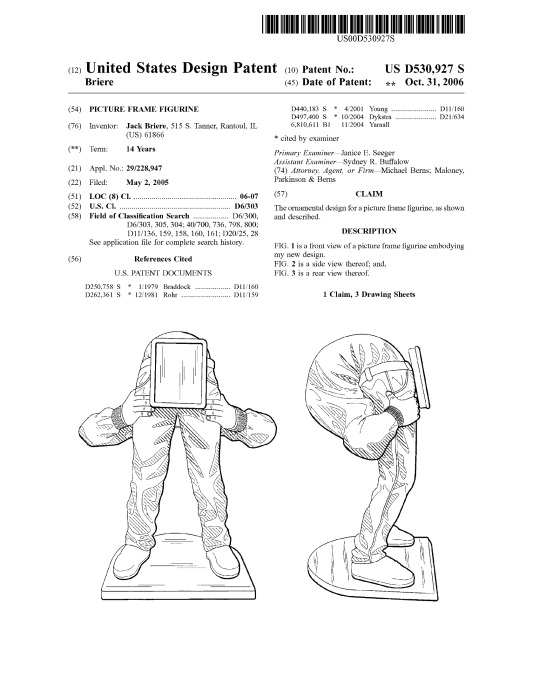
You can patent just about anything that is unique. Here is a picture frame patent drawing from our archives showing a person with great contorsional skills. We are not taking a political side, but this does kind of reminds us of the political climate taking place today among all politicians. Why can't our leaders just be Americans striving for what's best for the country? We hope this makes you smile and that you will not take offense.
0 notes
Text
Help Make America
We came across the "I Make America" movement today and wanted to share it. The one thing TPA believes that has made and continues to make America great is her people. Each of us is one part of the "I" that make America what it is today.
http://www.imakeamerica.com/makeamerica/IMA-One-Pager_2016.pdf
0 notes
Text
Lockout Tagout (LOTO) Program
These days many large consumer products, and virtually all industrial, agricultural, or construction machinery has the potential of causing serious injury during a repair or maintenance procedure. A lockout tagout procedure should be used on anything from lawnmowers to cultivating equipment to large off-highway machines whenever the potential for injury exists if the equipment is inadvertently started. If you are a manufacturer of equipment, you should at least alert operators, repair people, and other personnel, who may be in a potentially harmful position, of the danger should someone unknowingly start the equipment. A Lockout Tagout (LOTO) program should be developed to cover machine/equipment maintenance and service procedures to which the unexpected energization, start-up, or release of stored energy could cause injury or death to the person performing that task.
In the United States, on October 30, 1989, OSHA launched the Lockout/Tagout Standard, 29 CFR 1910.147, to reduce worker death and injury rates within a manufacturing facility. This standard can also be helpful in educating people when working on any type of consumer, ag, industrial, or construction equipment which has an equal potential for causing injury or death.
Lockout tagout programs ensure that an energy-producing component cannot be used until the lockout device is removed. Lockout devices utilize a proactive approach using a key or combination lock, which prevents the starting of the machine or equipment. You should inform users that all lockout devices must be substantial enough to prevent removal without excessive force or unusual techniques.
As a manufacturer of equipment, you may want to consider adding a design feature on your product that would allow the use of a lockout device. Also, be sure to stress the areas of potential danger in your owner/operator manual, as well as directing attention to the hazard with a safety sign attached to the equipment. A state Lotto is a game of chance, but equipment LOTO is a matter of life and death!
0 notes
Text
Manufacturing and Marketing Can Make a Great Team
Two Illinois companies are working together to provide consumers with an exceptionally useful product. Technical Publication Associates (TPA) from Morton, Illinois and Plano Synergy (Plano) from Plano, Illinois are working together for the benefit of the consumer. Plano manufactures molded plastic cases to hold and protect a variety of sporting and/or hunting goods. TPA develops simple, yet effective, consumer instructions on how to use a product. “Our two companies working together has resulted in a high-quality product (Plano) with simple, effective instructions (TPA) on how our gun case can be customized, used, and maintained”, says John Whalen, Plano Engineer.
Steve Nichol, President of TPA, said “You wouldn’t think there’s a lot that can be said about how to use a simple molded plastic container. However, a lack of instructions can be very frustrating to a customer trying to find replacement parts or just learn the basic facts about a product.
”For example, Plano’s 109130 Gun Case has a built-in pressure release valve. The question we asked is “Why”? The answer was simple, but not all that intuitive. This case has an airtight seal to protect the contents from external moisture. When you close and seal the case at a high altitude (up on the mountain), there is very little pressure contained inside the case. When you go back home to a lower altitude (sea level, for example), you have a higher atmospheric pressure on the outside of the case. This pressure difference literally causes a vacuum to be formed inside the case, which results in not being able to open the case. Once the pressure release valve is opened, the pressure difference is equalized and the case opens. Simple, but how would you, the consumer, like to get home and find out you destroyed your gun case getting it open, only to later find out there was a simple solution that you didn’t know about.
Nichol and Whalen both believe the two companies working together is providing consumers with a better product; it’s the best expertise from both companies. Plano manufactures exceptional molded plastic products. TPA creates exceptional consumer documentation. We work together for the benefit of the consumer.
You can learn more about the wide variety of products offered by Plano Synergy at www.planosynergy.com or to learn more about the services offered to manufacturers by TPA, go to www.tpaone.com.
PDF Article for Download
0 notes
Text
Branding - Don’t let it be Bi-Polar
All companies in today’s business atmosphere need to be aware of the importance of branding. Branding is a "clear identity" that conveys your promise to your customer. Branding says, "This is what you can expect from my product or service". Your brand identity should set you apart from your competitor in a positive manner. Branding affects any business, but we are focusing on equipment manufacturers and products, primarily smaller manufacturers that cannot afford an entire department to maintain their branding strategies.
Are There Different Rules for Branding? We all have different likes and dislikes, and the branding strategies will vary accordingly. There are a lot of “do this” and “don’t do that” rules. These rules range from where and how you advertise, the shape and color of your product, the design and content of your consumer documentation, the consistent look and usability of your website, and the list goes on. What’s most important is that the brand has a consistent verbal and visual definition. Consistency is essential to building the perceived value of your product. Unfortunately, all too often, we see companies suffering from what we are calling bi-polar branding.
What is bi-polar branding? It’s the pitfall of having a branding image and message which is not consistently displayed throughout a company’s marketing materials. This inconsistency is most likely due to the myth that a company's success is in the corporate mission statement, the logo design, the corporate colors, and having a unique business card. The reality is that the brand identity is the message and theme you represent in the product, as well as in the brochures, ads, websites, and last but not least, the owner’s manuals that are used to sell and support this product.
We feel the number one rule for branding is a consistent look across all the platforms of consumer marketing.
Why Should I Be Concerned About Brand Identity? Branding is the key for consumer recognition of your products. You want a consumer to have a preconceived expectation as to the quality, consistency, and value of your products. Here’s a true story for an example. Someone says, "Think of a carbonated beverage in a red can with the name of the product in white lettering." Most of us will instantly recognize the product even without the name being given. That’s the power of branding. That's the power you want to achieve. Now let’s say you walk past a display of green carbonated beverage cans, but you notice that same familiar white lettering style with the product’s name on the can. Something must be wrong. Someone definitely did not follow the book for this product's branding requirements. In this case the answer is the company is expanding its brand identity. It’s a new product line containing healthier sweeteners in a green can. It’s still the same company we have learned to trust, but it’s not what we have come to consistently recognize.
The second rule to your success is having the consumer recognize and trust your brand because you followed the first rule.
Let's use the automotive industry for another example. You watch the TV ads, go to the website, visit the dealership, see the banners, and look at the brochures. All of these are tools being used to clearly and consistently define the consumer's opinion of the car. It's the style, look of quality, the colors, the characters, and the message that all work together to reinforce your brand. The brand also needs to apply to the owner’s manual and other technical documentation which should reflect the same theme and message of quality.
Why Should I Care If I Have A Recognizable Brand? How many of us have purchased lawn and garden equipment or a “some assembly required” product with user instructions that either looked severely inadequate or worse, a 10th generation photocopy you can't read. Suddenly the perceived quality of this product falls into question. If your consumer documentation is filled with poor illustrations, misspelled words, missing or hard to understand information, etc., then your customers will naturally question your product's quality.
Also, maybe you have shopped for a product where the printed brochure has a certain look, the website looks totally different, and their TV ad has yet another look. In fact, we wouldn’t even call that bi-polar. That’s more like multiple personality branding which really confuses a brand message. Seth Godin would call that a “Meatball Sundae”, after his book with the same name. Again, inconsistency can crush a company’s branding efforts. With so many product choices available to the consumer, this is a pitfall you can't afford. There are many small manufacturers with products that are very useful, of high-quality and affordable, but their bi-polar or multiple personality branding theme gives their potential customers the perception of a low-quality, and poorly manufactured product regardless of the cost.
How Can I Establish My One Unique Brand? Technical Publication Associates (TPA) has been helping companies in many different industries to establish and maintain their brand identity by creating and managing their owner manuals, marketing materials, and basic websites. Keeping your brand consistent throughout all your consumer sales and user documentation requires a focused effort. We understand how small companies can dilute their brand because they have used one provider to produce their manuals, another for their marketing materials, and a third for their website. So a typical manufacturer may do the manuals in-house, hire a small firm for marketing materials, then see John Doe for their website. With three groups in the mix, you wind up with a discombobulated look and feel to your brand.
If you’re going to use several different sources for creating your brand, then we would recommend starting with one firm for the most important piece of the brand identity (possibly your website). Once the website is established, then create the marketing materials using the website as a foundation. Then use both website and marketing materials to develop any consumer documentation. With multiple groups, it's essential they all communicate with each other. All the groups must align themselves with YOUR goal to develop a solid, consistent brand image. Let’s say it again; the key to any good brand is consistency.
What If I Don't Know Where to Start? Using a single source, such as TPA, for creating and maintaining your brand, allows you to focus on finding potential consumers and maintaining a high-quality product. We focus on providing you with consistent branding materials and you focus on business.
If you are a company that is suffering from this branding disorder, then it’s time to stop and identify what clearly defines your message and your brand. Once you have identified a brand identity source, use it as a starting point to change the other areas that don’t match. Maybe your owner’s manual has the look and feel that represents your product's high-quality, if that’s the case, then have us create new brochures to reflect that same image and then we can move to your web page to do the same so everything works together and is well balanced.
If you’re a new start-up company, then it’s critical that you think through what you want your brand to convey. If you don't use our services, you may want to hire a marketing advisor to help develop your brand. Once you have a theme for your brand established, you need to ensure that everything that follows stays true to the theme of your brand.
The Payoff! Creating a consistent brand will pay dividends in consumer awareness of your product and in increased sales. A clearly defined brand gives consumers confidence in your product and assurance in you, the manufacturer. As for the branding itself, it doesn’t even have to be that fancy, it just has to be consistent.
0 notes