
Notes from an antiquarian bookseller in London's Cecil Court
Don't wanna be here? Send us removal request.
Statistics
We looked inside some of the posts by timbryars and here's what we found interesting.
Average Info
Notes Per Post
168
Likes Per Post
112
Reblog Per Post
56
Reply Per Post
0
Time Between Posts
1 month
Number of Posts By Type
Photo
1
Text
16
Last Seen Tumblr Blogs


Fun Fact
Tumblr posted its first advertisements in May 2012 and subsequently earned $13M in revenue.
Photo


Bryars & Bryars, WC2N. Back to Cecil Court and the infinitely charming B&B. This antiquarian map and early edition specialist has blown my mind with their selection of rarities; earliest sea chart of the Americas? Check. London wartime tube map posters? Sure thing. First edition of Lord of the Rings? You better believe it. The Bryars (Tim and Pinda,) are gushing with knowledge and will give you a tremendously warm welcome. Tim has previously shared his cartographical expertise on the BBC and is is currently collaborating for a very special exhibition of the history of 20th century Maps for the British Library opening October 2016. With items for all pockets/wallets you would be woefully remiss to deny yourself a outing to this very fascinating corner at the heart of Charing Cross. http://bryarsandbryars.co.uk/
152 notes
·
View notes
Text
Keep visiting our blog at bryarsandbryars.co.uk
It’s been great fun blogging on Tumblr, and people have been in touch with some fascinating information (and maps) as a result. I’m not about to stop, but new posts will go live on our new website at www.bryarsandbryars.co.uk - see you there!
0 notes
Text
Kerry Lee, his dog Jim, and Dick Turpin on Hampstead Heath.
Now and again the internet brings surprises of the best possible kind. In an earlier blog post about pictorial maps of London I lamented that next to nothing had been written about the artist Kerry Lee, best known as a creator of pictorial, often gently comic maps of British towns and cities in the mid 20th century. His life and career had been summarized in rather unsatisfactory two-line entries like this one: http://www.artbiogs.co.uk/1/artists/lee-kerry-ernest
I guessed that the most likely candidate was Kerry Ernest Lee, born in Hackney in 1903; a trawl of institutional holdings revealed various works which were potentially attributable to the same artist, ranging from text-book illustrations to wartime cut-away drawings of German aircraft, but I had no immediate way of linking them. Then, out of the blue, I had an email from Kerry Lee’s son, John, telling me that Kerry Ernest Lee is indeed our man.

Many of Kerry Lee’s maps depict the artist sitting sketching in the corner, with his dog beside him. John writes: “if I remember right the first one was called ‘Jim’. He was a particular pal of mine and my confidant as a small boy. But over the years in the maps the dog by Dad’s side became symbolic rather than particular.”
John has been enormously generous already with his time and with images of material which remains in the family. What follows makes no claim to be definitive, either as a biography or as a catalogue raisonné, but I’m delighted to reveal a few things here, which I hope will lead to further research.

Kerry Lee with his son John
Lee spent some of his early years in Switzerland with his brother Don. He then attended Reading Schools of Arts and Science, the Slade, and the Sorbonne in Paris. For a time he assisted his step-father, Mr Harvey (an architect and builder), as a draughtsman for several large buildings in London, including one of the earliest to boast a roof garden. The 1929 Wall Street Crash and the Great Depression pulled the rug from under the business. Mr Harvey seems to have lost his fortune and emigrated.
Lee looked for an alternative source of income, and produced his first map of London. He established Blandford Studios off Baker Street with a small group of fellow independent commercial artists, known as ‘Associated Artists’.

Kerry Lee at Blandford Studios
His first pictorial map of London may have been produced for the Coronation of George VI in 1936. His well-known map of London produced for the Southern Railway in 1938 shows the royal coach at the foot of the map, attending the State Opening of Parliament.
Lee was attached to the Air Ministry during World War II. He was based in Hertfordshire making detailed cut-away drawings of German aircraft, apparently recovered from crash sites, to advise RAF pilots of new developments, for example in armour plating or firepower.

Heinkel He 177
After the War Lee returned to Blandford Studios. His celebratory map London: the Bastion of Liberty was published for the Travel Association of Great Britain c. 1946-47. He designed numerous maps as posters for British Rail: Cheltenham Spa (1951), Bedford (1953), Carlisle (1953), Nottingham (1953), Londonderry (1953), London (c. 1954), Dublin (1954), Edinburgh (1955), Norwich (1955), Cambridge (1957), Lincoln (1962), ‘Come to Wales’ (c. 1965). John notes that his father made two maps of Cambridge: a large one for British Rail, and a smaller one for ‘Pictorial Maps’, to match similar sized maps of Oxford and Stratford-upon-Avon.

Design for Cambridge

Stratford-upon-Avon
Other pictorial maps include Birmingham, Jersey, Huddersfield, Chester, Derby, Leeds and Liverpool. Some, such as Oxford, are truly pictorial maps:

Others (eg Norwich and Lincoln) are architectural composites:

John knows of designs for maps of Paris, Rome, and sketches of Venice and New York, but it is not clear if they were ever published. Similarly, a ‘Literary Map of Britain’ seems to have remained unpublished:

He produced at least three murals of London, for the City Bank of New York in Berkley Street, for the Yorkshire Building Society in the Strand (still in situ), and this one for the Cunard office in Lower Regent Street:

Mural for Cunard
He illustrated (or, to use his term, ‘decorated’) a number of books early in his career: a text book on arithmetic (Trevelyan & Morley: Four Walls, 1938, in the ‘functional arithmetic through citizenship’ series); a book on teaching English (Palmer: Book III More Advanced Oral Exercises and Written Compositions, 1939); a revised edition of Frank Swinnerton’s Georgian Literary Scene, and J. Hampden Jackson’s Problems in Modern Europe - the Facts at a Glance (1941). He also seems to have provided a map for the June 1936 issue of Time and Tide magazine: The Links & the Breaks in the chains encircling Nazi Germany & Sanctioned Italy.
One of Lee’s first maps was of Hampstead Garden Suburb, where the family lived during the war:

The following anecdote, recounted by John, is very telling, given Lee’s evident delight in weaving puns and references to history and folklore into his maps: “Dad was great company for children, full of games and stories. At an early age I was familiar with classical mythology and English history and folk lore because I had it all as bedtime stories. Anyway, one time home on leave during the war, Dad and I went for a walk on Hampstead Heath after a ginger beer in the Old Bull and Bush (Dad always described ginger beer as being “full of beg-pardons”). Now during the war Hampstead Heath was dotted with many bomb craters because sometimes piles of firewood were lighted during German night raids to make it look as though they had hit something interesting and so drop more bombs there instead of vulnerable built-up areas. Anyway, Dad and I were sitting on the edge of a bomb crater, when Dad reminds me about Dick Turpin. He says Hampstead Heath was one of his haunts, laying in wait for stage coaches labouring up Hampstead hill and then having robbed them, galloping off along the Spaniards Way jumping right over the toll gate to make his escape. But, he said, there might have been times when his pockets were full of coins and as he galloped along some might have fallen out – “so I wouldn’t be surprised if with all the disturbance of the ground here, an observant young man might find something.” So right on cue I started poking about and digging at the edge of the bomb crater – and would you believe it, in no time at all I found a cache of old coins! It was quite a while before I learned that Dad had previously visited an antique shop to buy some old coins as ammunition for his story.”
1 note
·
View note
Text
Napoleon’s Abdications
This month is going to be all about Waterloo. I’m certainly expecting to see a healthy tranche of related material at this weekend’s London Map Fair. But I’m rather pleased with this separately published map we’ll have on our stand at the RGS, a broadsheet which would have been passed from hand to hand among Frenchmen dissecting the final collapse of the First Empire.

Tardieu, Jean-Baptiste Pierre: Plan général du siège de la ville de Paris: Par les troupes alliées dans la journée du 30 Mars 1814, et relation de divers combats qui eurent lieu dans les environs de Paris en Juin 1815, après la défaite de Buonaparte à Mont-St.-Jean [...] par J.-B. Tardieu, attaché ci-devant au Dépôt général de la guerre, d'après les matériaux communiqués par plusieurs officiers supérieurs de l'Etat major russe, et les reconnaissances particulières, faites sur les lieux. A Paris : Chez J.B. Tardieu, graveur-éditeur, Rue de Sorbonne, No. 2, prés celle des Mathurins; J. Goujon, Md. de Cartes Géographiques, Rue du Bac No. 6, prés le Pont-Royal; Chez Martinet, Rue du Coq St. Honoré; Gautier, Quai des Augustins, No. 37, [ca. 1815]
Copper engraving, 26 x 39 cms, original hand-colour, blank verso. Some light soiling, folded for the pocket (vertically and horizontally).
A broadsheet plan of the siege of Paris by Allied troops in 1814. France was drained by losses in Spain and Russia, and vastly outnumbered by the Allies; Paris surrendered and Napoleon was forced to abdicate. Our map also shows the series of battles that took place near Paris in June 1815, in the aftermath of the French defeat at ‘Mont-St.- Jean’ (the name Napoleon gave to Waterloo). Napoleon abdicated again a week after the battle, but French efforts to defend their capital against the Allies of the Seventh Coalition were only abandoned after a final Prussian victory at Issy, just to the south west of Paris, on July 2-3.

Napoleon surrendered on July 15, the last event (incorrectly given as July 14) mentioned in the text engraved on either side of the map – slightly more cramped than the rest, as if the latest information has been squeezed into the available space.

The engraver, Tardieu, specifies that he was working with materials provided by several senior officers of the Russian General Staff.
1 note
·
View note
Text
Provenance on maps: a secret map of Iwo Jima, November 1944.
I’ve been writing about book provenance recently, but annotations on maps can be equally fascinating. Seventy years ago this map was used by a US artillery spotter during the battle of Iwo Jima.

The US Marine Corps bore the brunt of severe American casualties during heavy fighting in February and March 1945; only a handful of some 22000 Japanese defenders surrendered - the overwhelming majority were killed. The tiny island was of limited strategic value, though as the first Japanese soil to be captured the potential psychological impact was immense. The determination of the Japanese to fight (almost literally) to the last man brought the likely cost of ‘island hopping’ all the way to the Japanese home islands into sharp focus, and the use of atomic weapons would soon be justified as a way to save lives - on both sides.
Back to our map, a special air and gunnery target map, corrected to November 1944 and marked secret (a classification lowered to restricted within the combat area itself). It has been printed on wet strength paper (highly durable and water resistant) to a scale of 1:20,000.

Military installations are marked in in great detail, including probable tank barriers and minefields protecting the viable landing beaches. Of tremendous interest is the pencilled grid - our map has been used by an artillery spotter, calling in fire on Japanese positions.

This is one of those times where it’s great that the map has been written on. It was carried and used on the spot - far more interesting (in my view) than a map which was never issued, and for that reason has survived in perfect condition. Judging by the area covered, our map was used after the initial amphibious landings had taken place.

On the southern tip of the island is Mount Suribachi, the highest point on the island, where the US flag was raised on the morning of February 23.
0 notes
Text
Unauthorized Mapping on the District Railway.
I’m facing one of those conundrums which occur in the daily life of an antiquarian mapseller. A map I’ve never seen before, not described in any of the relevant bibliographical material, no author, no imprint, no date. Ho hum. Here it is:

It shows the District railway, and in style (eg depiction of the stations) it is very similar to the official District Railway maps. Here’s an example from the 1890s:

The official map is much larger (106 x 67 cms vs. 61 x 40 cms) and the lines are superimposed on a detailed street map, rather than a skeleton map of major thoroughfares punctuated with pictorial representations of London landmarks, but the influence is unambiguous. Dating our mystery map is not too hard. There are a number of supporting factors, but the most straightforward method is to go by stations and station names.

Monument Station was was opened as Eastcheap in October 1884 and renamed the following month; neither form appears on the map, giving us a handy terminus ante quem. Tower Station was opened in 1882 but replaced by Mark Lane Station in October 1884, which gives us a viable terminus post quem and a date range of 1882-84. It’s always possible that our map-maker hadn’t seen the latest District Railway map, but broadly speaking I think we can say so far, so good. Now to the vexing question of who made the map and where.
It looks like a tourist map, especially with its pictorial elements. The stations are numbered 1-30 and A-F, presumably for an accompanying guide. It was my friend Winfrid, though, who spotted the curious spellings. I’d been seeing what I expected to see.

The most conspicuous one is OXFORT Street instead of Oxford Street. Also, COWER Street instead of Gower Street, FARRINGTON instead of Farringdon, and ST JAMES PARK for St James’s Park. There’s also some very unorthodox hyphenation in the various station names, all pointing to a foreign publisher.
As always, if you happen to be reading this and have the map, complete with guide, in front of you, do drop me a line and let me know more.
3 notes
·
View notes
Text
Campaign kit for the Peninsula: Stockdale's map of 1812.
Provenance is a much abused term, or at least it's much misunderstood. After poring over a Speed county map in the shop people will often turn to me and ask about its provenance. Only in exceptional circumstances can one track every movement of a book or a single sheet of paper over a period spanning hundreds of years - in the case of maps extracted from atlases it's well nigh impossible - but what people often mean by 'provenance' is whether or not something is legit: how do you know it's real, and how do you know it hasn't been pinched from somewhere? The answer, in both cases, boils down to experience.
What I can't say, and it probably wouldn't interest anyone greatly if I could, is that our hypothetical county map had been hanging on the wall of one Peter Huggins Esq. of The Drive, Camberley, since he bought it from Weinreb and Douwma in 1972. That is, unless the renowned Huggins collection had been publically dispersed and he had left marks of ownership. And that's really what provenance is about: bookplates, ownership signatures, inscriptions and annotations which give us tantalising glimpses of how printed materials were read and used, and by whom. This map is a wonderful example of that:

This is John Stockdale's A New Military Map of Spain and Portugal, compiled from the nautical surveys of Don Vincente Tofiño, the new provincial maps of Don Thomas Lopez, the large map of the Pyrennees by Roussell and various original documents, published in London in September 1812. It is a huge folding map on 4 sheets, in total approx 218 x 166 cms, engraved by a member of the Neele clan (probably Samuel John), dissected into 72 panels and laid on linen as issued, with original hand-colour in outline, and its publisher's slipcase with printed title label.
Publication was advertised in the press (London Star, Morning Chronicle, The Eclectic Review); in a case or on rollers the price was £5, 5s. - a substantial sum in 1812 (see www.measuringworth.com, a favourite site of mine; we're talking hundreds of pounds at least). Napoleon withdrew 20,000 troops from Spain after the loss of his Grande Armée in Russia, but the remainder were by no means beaten and fighting raged across the Peninsula over the next two years. A large-scale map like this would have been indispensable to officers in Wellington's army, but in the ordinary way of things we'd have no means of knowing if our map made the journey from London to Spain. Fortunately, we have provenance. Exham Vincent wrote his name on the title label.

According to the Army List an Exham Vincent served with the 39th Foot, commissioned as a Lieutenant in July 1803, and promoted to Captain on April 1 1813. The 39th's battle honours include Albuera (1811) and Vitoria, the Pyrenees, Nivelle, Nive and Orthez (all 1813-14), raising the possibility that the map was carried and used on campaign. Exham seems to have been a family name, so there's an outside chance that this was Captain Vincent's dad, anxiously tracking his son's movements as reports of Wellington's battles appeared in the press, but it would seem curious to deprive a serving officer of such a valuable piece of kit. There is a later ownership inscription of W.J.E. Fosbery: according to Burke's Dictionary of the Landed Gentry, there is a connection by marriage between our Vincents and the Fosberys of County Limerick. Everything falls into place.
0 notes
Text
Pictorial plans of London: MacDonald Gill and beyond.
This post is something of a work in progress, so please check back now and again to see if I've been able to expand it. So far I've tried to avoid some of the most well-known maps, but in this instance there's no excuse for not beginning with MacDonald Gill's playful and eccentric Wonderground map of London. Apologies if you know it already, but it always repays another look:

Gill's map was commissioned by London Transport in 1913, and was so successful that it was offered for sale to the general public the following year. The map I have here is an example of that issue: The heart of Britain's Empire here is spread out for your view ... You have not time to admire it all? Why not take a map home to pin on your wall! And of course, most purchasers took Gill's advice and did just that, which is why it has become scarce today ...
With this map Gill inspired a whole genre of comic map-making, filling his map with poems, puns and in-jokes (some bad, a few inexplicable). One needs hours to 'admire it all' (unscramble might be a better word). Here's how Gill treated one of my favourite places in London, the zoo:

It's a much more entertaining way of showing how the Underground Stations relate to surface topography than anything dreamt up previously, but the style is better suited to pleasure than business and I note that most maps of this genre focus on West London rather than the City or the East End. The blend of old and new seems typically Edwardian, summed up in this detail from the upper left corner:

The curvature of the horizon is decidedly medieval (Arts and Crafts, anyway), while the aeroplane and motorized omnibus bring us firmly into the Twentieth Century. The speech bubbles are Gill's own.
Gill went on to create further maps for London Transport, including a series of 'straight' pocket Underground maps in the 1920s; he also designed the font used on headstones by the Commonwealth War Graves Commission, and numerous posters for bodies such as the Empire Marketing Board. I suspect that he was more commercially successful than his brother, Eric. A new carto-bibliography of his work is expected soon (following last year's MacDonald Gill exhibition in Brighton), and in the meantime I refer you to Elisabeth Burdon's excellent article: http://hq.abaa.org/books/antiquarian/news_fly?code=96
Update: in early 2014 Winfrid de Munck and I wrote more about the different states of Gill's map here:
http://timbryars.tumblr.com/post/72558836150/cornering-the-states-of-macdonald-gills
I'd like to devote the rest of this post to other maps which were show clear signs of being influenced by Gill's work. This map is more blatant than most:

Published by Alexander Gross's firm, Geographia Ltd in the 1930s, it's unsigned.

The visual and verbal puns (the long arm of the law reaching out from Scotland Yard, the ink spilled on Fleet Street ...) and historical and topographical notes are typical of Gill's work. But Gill it most certainly isn't. Mind you, it was popular enough for Geographia to issue it in jigsaw form:

My friend Winfrid de Munck has an example with a different border and initials in the lower right hand-corner; an ownership inscription is dated July 1934:

I read that as W.J.H. - hopefully it will be possible to identify the artist in due course.
Below is the standard Geographia London Pictorial Map, published in numerous editions between the 1920s and 1950s:

Not terribly inventive, perhaps, but worth including as the early post-war editions are among the only maps to show the blitzed area in the City of London:

The area left blank on the map had almost reverted to the heathland it had been centuries before, carpeted with rosebay willowherb and ragwort. Some streets could only be identified from temporary wooden signboards. Leaving the map blank seems entirely logical - it's surprising how few cartographers followed suit. It may simply have been a desire to maintain a sense of normality.
It isn't easy to find signs of bomb damage on the Bond Panorama either, published by the Baynard Press in 1944.

Bank of England employee and artist Arthur Bond was an ARP observer on the roof of the Bank during the second Blitz; V-weapons were unleashed against the capital for the first time in June 1944. According to the Bank of England’s own website, the Bond Panorama was printed in 200 copies which were given to members of staff who had also served as firewatchers. Bond’s 360 degree panorama of the London skyline, as seen from his observation post, borders a reworking of the Ordnance Survey map, with a one mile radius around the Bank. Significant buildings can be located from the key using degrees. The Baynard Press was a commercial printer noted for the quality of its colour lithography, with clients including London Transport.
Here's Leslie Bullock's Children's Map of London, c. 1938:

Bullock worked closely with Edinburgh publisher John Bartholomew and Son over a long period. All royalties for this map were donated to Great Ormond Street Hospital. In the margins are nursery rhyme scenes and the map is flanked by the Biblical giants Gog and Magog, long associated with London.

There are scattered quotations, but the map is not as crowded as Gill's (I suspect Bullock lacked Gill's talent for whimsical quippery). However, there are echoes of Gill's work here - I doubt Bullock's map would have existed without it. Update: In 2014 I wrote more about Bullock's work here:
http://timbryars.tumblr.com/post/89739376810/leslie-george-bullock-cartoon-maps-for-children
I'm also going to include Kennedy North's 1923 British Empire Exhibition map:

North's debt is principally calligraphic - the lettering is clearly inspired by Gill's 1920s Underground maps - although one might also look at the bold use of colour and details such as the buses, cars and trams. Note North's impressive attempt to reduce the Underground system to diagrammatic form almost a decade before Harry Beck.

I've been assuming that Kennedy North is Stanley Kennedy North: artist, illustrator, picture restorer, socialist, folk dancer and general bohemian. Commercial work (e.g. for Shell Oil) seems to be signed simply 'Kennedy North', but it seems unlikely that there would be two similarly named artists working at the same time. If I spot a definite link I'll update this entry. [Update May 2012: two members of the artist's family have been in touch to confirm that this is indeed SKN; he made other maps - possibly another post to follow.]

The unusual thing about this reduced, pocket version of Kerry Lee's well known poster London: the Bastion of Liberty is the way it's folded. A customer in my shop pulled out a very similar (modern) map of London only the other day. The 'uniquefold' patent is dated 1948, which ties in with the reference to British Railways (nationalised in that year; the earliest versions of the map reference the Big Four).

This is a more typical version, revised for the Festival of Britain in 1951.

First published c. 1946-47, a postwar celebration of historical and contemporary London, Lee's poster has strong ties to his map of London Town published by the Baynard Press for Southern Railways in 1938 and revived by British Rail in the 1950s, when Lee was at his most active and successful. Much of his surviving work seems to focus on town plans and views for the various BR regions.
If you happen to know anything about Kerry Lee, do please get in touch. Only the scantiest information is available at present: “poster artist, active 1950s” and a birth year of 1904 (via the V&A) is about all on offer. Looking at the 1911 census, the likeliest candidate is Kerry Ernest Lee, actually born in 1903 in the parish of St John at Hackney, Essex. The artist has included a self portrait in his London Town, dressed in a blue smock and broad-brimmed sun hat, his dog seated behind him while he signs his name.
There seems to have been a postwar flurry of this kind of pictorial map-making. Here's a 1949 map of Tower Hill and District made for Toc H by calligrapher Maisie Rose Sherley (1920-2008):

Sherley taught at Medway College of Art 1946-80; her other work includes a pictorial map of Ambleside, the layout and execution of the pilots' names in Daisy Alcock's RAF Battle of Britain Book in Westminster Abbey and a panel in the Nurses' Chapel, also in the Abbey. She had studied her craft under Daisy Alcock and Dorothy Mahoney, both of whom had studied under or worked with Edward Johnston. Another postwar pictorial map, probably early 1950s, is this one by Francis Chichester (aviator, yachtsman and map-maker); like the Geographia map above, it could be purchased in jigsaw form:

Chichester had initially bought up surplus wartime Air Ministry maps and turned them into jigsaws (possibly among the most joyless age of austerity toys ever, though I'd still like to find one). However, this one of Chichester's original maps. Significant landmarks are shown pictorially, but there are no puns.

As Chichester's Map & Guide of London, with a slightly greater extent (including Regent's Park and Kensington Gardens to the north and west) and supported by additional maps including a distinctive version of Beck's Underground diagram, it was issued as a pocket atlas - often with promotional covers which suggests that it was often given as a gift by private companies.

And finally, The Daily Telegraph Picture Map of London, probably 1950s:

Designed by Vale Studios for Geographia, it is entirely distinct from the Telegraph's 1947 Royal Wedding map by Zadwill and Gray, which I've illustrated here: http://bit.ly/KDQwD5. Here's a detail:

More to follow as I find them!
4 notes
·
View notes
Text
William Morris announces his 'pocket cathedral': a specimen leaf from the Kelmscott Chaucer.
The Kelmscott Chaucer lends itself to superlatives. The first page is perhaps the most celebrated example of typography in English. It's certainly the most famous in the context of of private press books, inspired by the skills and craftsmanship of the early printers. However, we're not looking at a page in a book, not even one limited to 436 copies. This is something far rarer, which was issued separately three years before the publication of the complete work, and which differs from the final version. This is a specimen leaf, one of a handful of copies circulated in 1893 to drum up interest (and subscriptions) for what would prove to be William Morris' last great project.

The full story appears in the annotated list of all the books published by the Kelmscott Press accompanying a collection of William Morris' essays, which appeared posthumously (1902) as The Art and Craft of Printing. It seems that "Mr. Morris began designing his first folio border on Feb. 1, 1893, but was dissatisfied with the design and did not finish it. Three days later he began the vine border for the first page, and finished it in about a week, together with the initial word ‘Whan,’ the two lines of heading, and the frame for the first picture, and Mr. Hooper engraved the whole of these on one block. The first picture was engraved at about the same time. A specimen of the first page (differing slightlyfrom the same page as it appears in the book) was shown at the Arts and CraftsExhibition in October and November, 1893, and was issued to a few leading booksellers..."
The main picture was one of eighty-seven designed by Morris' great friend Sir Edward Burne-Jones; it was Burne-Jones who wrote “If we live to finish it, it will be like a pocket cathedral".
Specimen leaves were produced for other Kelmscott Press books, sometimes in large numbers. 2000 copies of a quarto prospectus for The Recuyell of the Historyes of Troye (the first appearance of the black letter 'Troy' type used in the Chaucer) with specimen pages, were printed at the Kelmscott Press in December 1892. This appears to have been an entirely different proposition, circulated among "a few leading booksellers" and exhibited at the fourth Arts and Crafts Exhibition (Morris had succeeded Walter Crane as President of the Arts & Crafts Exhibition Society). It may originally have been a bifolium, so the first pair of leaves (ie four pages) of text, but if so an early owner seems to have decided to divide it and frame the first leaf; perhaps the second was framed alongside it, but it is now lost. The only other example which I have seen does not have 'specimen' printed in red in the lower margin, but the setting of the text was identical.
The setting of the text allows us a glimpse of Morris' thought processes at work. He decided that the large initial was too close to the printed border above it, and dropped it down a line to leave white space. In the final printed version there are six, not seven lines of text beneath it, and the setting of the rest of the text reflects the change.
Back to our annotated list: "On May 8 [1896], a year and nine months after the printing of the first sheet, the book was completed. On June 2 the first two copies were delivered to Sir Edward Burne-Jones and Mr. Morris". Burne-Jones was right to be concerned for his friend's health (he worked feverishly to complete the illustrations, devoting every Sunday to them). Morris died on October 4, the opening day of the fifth Arts and Crafts Exhibition.
This is one of those artefacts which communicates the thrill of creation, something of the excitement and anticipation which Morris and Burne-Jones must have felt as these first trial sheets were pulled from the press.
UPDATE: March 2015. No copy in the British Library, but there is an example in the National Art Library at the V&A, incorrectly catalogued as being printed in the year of publication of the complete work (1896) but described as a proof and clearly the same animal, with seven lines of text beneath the initial word. Like our example it is a single leaf, though it differs in not having the word ‘specimen’ printed in red:
http://collections.vam.ac.uk/item/O1009260/print/
1 note
·
View note
Text
Sydney and the origins of 'Becksploitation'
Astute commentators have already noted that the 1939 Sydney Underground map is "strikingly similar" to Beck's diagrammatic Tube map (see, for example, Claire Dobbin in London Underground Maps). It has even been suggested that this is the first straight copy of Beck's work. Here it is:

You'll see why I've had a bit of fun with it in the past, putting it in a London shop window and letting passers by scratch their heads and try and work out how it fits with the current Tube network. And of course, even though some of the names (such as Richmond and Camden) are the same, it doesn't. Even the cover, with its bar and roundel logo, setting of the text and coverage of the central area, is a pretty much a direct copy of the Beck passenger maps issued by London Transport 1933-38.

The curious thing is that Sydney decided to celebrate Beck a matter of months after London Transport dropped his services in favour of work by Hans Schleger, a Jewish refugee from Nazi Germany and a hugely influential pioneer of corporate design, who worked under the pen name 'Zero'. (The best survey of his work was written by his wife, Pat Schleger: Zero: Hans Schleger, A Life of Design. Lund Humphries 2001.) Schleger updated the diagram between 1938 and 1941, when Beck was permitted to resume his work (that is, until LT stopped answering his letters, circa 1960).

The covers show how much changed between the Beck and Schleger issues of 1938, and here's the Sydney map in context. It's the one lying on top, by the way.

As you can see, it has a great deal in common with the 1938 Beck at the foot of the photo, while Schleger's airbrushed Art Deco design at the top is a very different beast.
It's proving surprisingly difficult to find detailed information about the Sydney map. Answers on a postcard, please! Here's what I currently have:
Sydney Suburban and City Underground Railway Map, No. 1 1939. Sydney, Waite & Bull for the Commissioner for Railways, New South Wales.
16.5 x 24.5 cms. A printer’s job number, bottom left, but the initials E.P.C., bottom right, adjacent to the name of the printer, may be the draughtsman.
This, I think, is the job number:

And this may well be our semi-anonymous draughtsman, next to the logo of commercial printer Waite and Bull:

So, things which puzzle me. The Sydney Underground goes back to the 1920s. I've seen later diagrammatic maps, but nothing before or after which is quite so clearly inspired by Beck. Why was there no No. 2 1939? Or even, No.1 1940? Perhaps the design proved unpopular with Sydney commuters, or maybe LT had a sense of humour failure and threatened to sue, even though they had just dropped Beck's design (if not the concept) themselves... And who is EPC? Did he make any other maps?
The real interest here, of course, is how other cities have tackled the problem faced by London since 1863 - how best to map the railways beneath one's feet.
2 notes
·
View notes
Text
Spot the difference (again...)
Roman love poetry this week. These two quarto volumes bound in vellum are both examples of the 1708 Broukhusius edition of Albius Tibullus published in Amsterdam by Johann Heinrich Wettstein - one of the better separate editions (Tibullus was often lumped together with Catullus and Propertius).

The collation is exactly the same: same format, same pagination, same number of plates... from a library catalogue one might never have guessed how different the two copies are.

So what's going on? The clue is in the provenance. The taller, fatter volume is from the library of the great English bibliophile Michael Wodhull (1740-1816), classical scholar and Dibdin's 'Orlando', who attended every London book sale between 1764 and 1800 and bought extensively but, as De Ricci says, with great judgement.

He normally recorded the date, place of acquisition and price paid on the flyleaf. In this instance Edwards’s sale, March 3d 1794; the purchase price appears to be encoded. Wodhull neatly excised much of this information in books which he consigned to auction himself in 1801 and 1803, so our example likely remained with the bulk of his library, auctioned by Sotheby’s in 1886.
Wodhull's copy is printed on vastly superior, heavier paper stock, and it retains more generous margins. Wettstein clearly found it worthwhile to create a handful of deluxe copies back in 1708, which were prized by bibliophiles of later generations. It hints at the relationship between books like this - which are too easily regarded as fairly stolid editions of the classics, of interest to scholars alone, then and now - and their early readers.
It also highlights some of the risks associated with relying too heavily on digitisation - a wonderful tool, giving wider access to material than has even been possible before, but still no substitute for handling the original.
As a final note, I’ve said plenty about Wodhull but I’ve unfairly neglected the provenance of our shorter, slimmer volume - which is still a very nice book. This copy of Tibullus belonged to Peter Nouaille of Greatness, Kent, a mill owner and breeder of silk worms:

0 notes
Text
A bibliophile's Theocritus
Greek bucolic poetry this week, and an absolute joy it is, too. The works of Theocritus in quarto, published in Paris in 1561 by Guillaume Morel, who had succeeded Turnebus as King’s Printer in Greek in 1555. The woodcut Basilisk device (a play on the Greek “Basileus”) is on the title-page. Our copy is red-ruled - always an indication that care and attention has been lavished on an early book - and it has been rebound in red morocco by an eighteenth-century bibliophile.

In his seminal Introduction to the Knowledge of Rare and Valuable Editions of the Greek and Latin Classics, Thomas Frognall Dibdin describes Morel’s Theocritus, printed in Claude Garamond’s grecs du roi, as a “very beautiful edition… it is also rare”. So far, so good, but here's where it gets interesting. Dibdin also records that “a fine morocco copy was sold at Mr Croft’s sale, no. 2045, for 1l. 13s.”

A note on the free-endpaper of our morocco example reveals that this is the very copy sold at the dispersal of Thomas Crofts’ magnificent library in 1783, which was then purchased by Augustus Henry FitzRoy, statesman and third Duke of Grafton. It is a direct link with the golden age of British bibliomania Dibdin observed and celebrated.

It later passed into the libraries of Lytton Strachey (1880-1932), British writer and critic, a founding member of the Bloomsbury Group, and Anders Örne (1881-1956), Swedish politician.

Our Theocritus has been in some very good libraries, but it's Crofts and the direct link with Dibdin which has got my pulse racing. I wonder if it was Crofts himself who stripped off the shabby sixteenth-century binding (with who knows what earlier marks of provenance) and replaced it with something tasteful and modern in the best goatskin. The idea of preserving an old binding which had outlived its purpose probably never occurred to him... Crofts' life makes for fascinating reading: at least three Grand Tours, a spell as chaplain to the English Factory in Aleppo, and a circle of friends and colleagues which included William Hunter and Joseph Banks. From his hands into the library of a former Prime Minister, who had lately served in the North Ministry during the American Revolutionary War. They were part of a glittering circle of wealthy, often aristocratic bibliophiles who bought fine books as one means of demonstrating their taste and erudition, an era captured by Dibdin - "the most prolific chronicler, anecdotist and publicist in the history of bibliophily" (Carter, in Taste & Technique in Book Collecting). Dibdin's Introduction has guided collectors for two hundred years. Highly opinionated, it remains a great starting point - my own copy is much battered.
0 notes
Text
Planning a model prison: Holloway, 1854
Victorian prisons may not be such a great topic for Christmas (except for Dickens, perhaps, in one of his bleaker moods) but as usual I'm guided by the things that I've found. Today we have one of the original ground plans for HM Prison Holloway.

It is signed by James Bunstone Bunning (1802-1863) architect to the City of London from 1843 until his death.
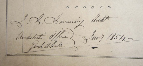
It is dated January 1854 and the prison opened just over a year earlier (the foundation stone was laid in September 1849 and it opened in October 1852), so our plan may may have been made to accommodate early improvements, such as the provision of additional tread wheels - one can never have too many 'everlasting staircases', clearly:

As they are located next to the pump house, it looks as though the power generated by prisoners was used to draw water. There are also a number of pencilled notes and other additions, indicating gardens and the uses of the various ground floor rooms in the Governor's and Chaplain's houses in front of the main gate.

I've been past the prison numerous times and there's nothing left now (other than the name of the pub opposite) to remind one of Bunning's magnificent entrance, modelled on Warwick Castle. And of course it's women-only and has been since about 1903, but for the first half century of its existence it was mixed: men, women and children, segregated in different parts of the prison;

So, juvenile prisoners in the wing on the left (61 cells), female prisoners on the right (60 cells) and the remaining 283 cells for men. A detailed account of the construction and early years of the prison can be found here:
http://www.mollycutpurse.com/Mollys_Site_4.8.2012/A_history_of_Holloway_Prison.html
2 notes
·
View notes
Text
Charles Henry Sanford's cartographic bookplate
I recently purchased a copy of Harry Panmure Gordon's 1892 The Land of the Almighty Dollar, a critical account of the United Sates chiefly based on the author's travels in New York and Chicago.

I've been dipping into it and the text is worthy of a post in itself, but I'm determined to stick to the point. I bought this copy as it is inscribed by the author, from one financier to another:

The recipient was Anglo-American millionaire Charles Henry Sanford (1840-1928), who made his fortune in Argentina and came within an ace of ruining Barings Bank in the panic of 1890. His magnificent cartographic bookplate comes well within the scope of this blog.

The artist has clearly looked for inspiration to sixteenth-century mapmakers such as Mercator and Ortelius, and the geographical focus reflects Sanford's life and business interests in Buenos Aires, New York and London, where in later life he established himself in Carlton Terrace. But the icing on the cake is that the artist was Herbert Ward - sculptor, illustrator and African explorer, a friend of H.M Stanley and Roger Casement... and Sanford's son-in-law.
1 note
·
View note
Text
Festivals, Signings & Cake
So, the eagerly awaited (by its authors, certainly) A History of the 20th Century in 100 Maps by Bryars & Harper has now hit the shops, published by the British Library here in the UK and by the University of Chicago Press in the US. Here's what 100 copies looks like:

You can imagine how much fun I had unpacking those. I suspect that I'm going through the usual run of emotions experienced by new authors, feeling weirdly proprietorial when I see copies of our book face-out in Waterstone's and Hatchard's and Stanford's and checking back to see if we have any online reviews. But absolutely no lurking or worrying of unwary browsers - I've heard enough stories from friends in the new book trade! It's not uncommon, I learn from someone who had better remain nameless, for authors to attempt to give away copies of 'their' books on the shop floor. Anyway, our book is now available from all good bookshops, including Bryars & Bryars at 7 Cecil Court.
The last few months have been very intensive. This year the London Map Fair became the largest in the world and attracted a record number of exhibitors - almost 2000 in two days. As soon as it was over we started planning the next one, and Pinda and I also set about bringing our two shops together at 7 Cecil Court, now Bryars & Bryars at the sign of the Unicorn. That too has been an incredible amount of work, but thanks to Pinda, Paul and our other friends Ian and Richard, the shop looks amazing. I'll post some proper pictures soon, but here are a few snaps from the book/shop launch party:

We displayed a few of the maps featured in the book:

It's not a party without bunting or cake, and our friend Harriet did us proud on the cake front. Our unicorn device was on top

And then a whole library around the sides. Thanks to my friend Tom for this composite image:

A History of the 20th Century in 100 Maps was shelved next to Jilly Cooper's Rivals... Downstairs, the old Paralos table was groaning under the weight of good things including an enormous homemade ham.

That's probably enough pictures of food. Back to the book. I had an inkling that my job wasn't over once I'd submitted the manuscript, but once it was published the job of promotion began in earnest. And fair enough, now that it's out there I really want people to read it. So Tom and I shared a platform with Jerry Brotton at the Soho Literary Festival:

Pictures courtesy of Neil Spence

And then it was off to the Cheltenham Literary Festival, where our finely honed double-act was warmly received by an audience of about 500. People really do like maps! A lovely day.

Here we are being interviewed by Joanna Durrant for BBC Radio Gloucester, in the Writers' Room.
Last week Tom and I gave the first of the IES/ABA Book Collecting Seminars at Senate House, and we'll be speaking at Waterstone's Piccadilly at 7pm on October 28, and Hatchard's on November 25, but if you'd like to talk about maps before then, Tom and I are both quite easy to get hold of. To paraphrase the former Bishop of Southwark, it's what we do...
Update: November 8
Delighted to say that we've had some excellent press coverage for A History of the 20th Century in 100 Maps.
Richard Morrison wrote a fabulous two page review in the Times on November 1: http://www.thetimes.co.uk/tto/arts/books/article4252679.ece
We also had galleries in the Guardian and the Daily Telegraph:
http://www.theguardian.com/books/gallery/2014/nov/04/a-history-of-the-20th-century-in-100-maps-in-pictures?CMP=share_btn_tw
http://www.telegraph.co.uk/culture/culturepicturegalleries/11190126/Rare-maps-that-show-the-history-of-20th-century.html
November 12, an excellent review by Simon Garfield in the Economist's Intelligent Life Magazine:
http://moreintelligentlife.com/blog/simon-garfield/history-maps
We've also had coverage on Monocle Radio, you can catch me on BBC Radio London's Robert Elms show, we've been in the IMCoS Journal (lovely review by Mike Sweeting), there was a great review by John Davies in Sheetlines (journal of the Charles Close Society for the study of OS maps), we were featured in Saga Magazine and in Family Tree Magazine:
https://family-tree.co.uk/2014/10/win-100-maps-book/
as well as in the Sunderland Echo (Tom's neck of the woods):
http://www.sunderlandecho.com/news/local/all-news/historian-discovers-cold-war-era-russian-spy-map-of-sunderland-1-6956843
We are on Frank Jacobs' Strange Maps blog:
http://bigthink.com/strange-maps/a-postcard-from-the-future
Slate Vault has rated us among 'the most beautiful and intelligent' coffee table books of 2014:
http://www.slate.com/blogs/the_vault/2014/12/19/roundup_of_historical_books_best_coffee_table_histories_of_2014.html?wpsrc=sh_all_dt_tw_ru
They have started running a series on favourite maps from the book:
http://www.slate.com/blogs/the_vault/2015/01/14/history_of_arctic_exploration_sir_ernest_shackleton_imperial_trans_antarctic.html
http://www.slate.com/content/slate/blogs/the_vault/2015/02/27/history_of_the_occupation_of_paris_map_issued_to_german_soldiers_on_leave.html
And the Huffington Post picked up on our Edwardian 'trip to the Continent' board game:
http://www.huffingtonpost.com/2015/01/01/a-trip-to-the-continent-m_n_6400600.html
According to the US Library Journal, we’re “ ideal for readers of cultural and cartographic history”:
http://reviews.libraryjournal.com/2015/05/books/nonfic/soc-sci/the-things-they-carried-history-100ish-objects-at-a-time/
Tom and I really enjoyed speaking at the October Gallery in April, amazing fun, thank you everyone. A great discussion afterwards too.
https://www.eventbrite.co.uk/e/a-history-of-the-20th-century-through-maps-tickets-15977047780
In June Tom and I gave the lecture at the 2015 London Map Fair at the Royal Geographical Society, and the reviews are still coming in. This delightful one by Henry S. Cohn in the journal of the US Federal Bar Association:
http://www.fedbar.org/Publications/The-Federal-Lawyer/Departments/Book-Reviews.aspx?FT=.pdf
At the beginning of January I caught my first glimpse of the new Folio Society edition. Here they are side by side - the University of Chicago edition distributed in the US, the Folio Society edition and the British Library's version:

0 notes
Text
Leslie George Bullock: cartoon maps for children
Leslie George Bullock (1904-1971) first cropped up on these pages a couple of years ago, in a post about pictorial maps of London: http://tinyurl.com/pfxonut
He created whimsical but informative cartoon maps for children, most notably perhaps his Children’s Map of London, originally sold in aid of Great Ormond Street:

He had a close association with Edinburgh publisher John Bartholomew & Son and his maps were mostly published between the late 1930s and the 1960s, often reprinted and sold over a fairly substantial period of time. Beyond that, I wasn’t able to establish much about Bullock’s life or background. Trawling the net got me nowhere. Now and again I should remind myself that I am a bookseller, and there are plenty of things in (or in this case on) books, which are not to be found anywhere online. The answers are on the back cover of Bullock’s Children’s Book of London (1948, rev 1960):

L.G. Bullock was born within sound of Bow Bells - "if the wind was right". He was educated at Alleyn's School, Dulwich, and afterwards joined the Territorial Army and saw service in the first World War. He entered the Civil Service in 1920, and worked in London, particularly with the Port of London, until 1932 when he was transferred to Scotland. In the last war he was attached to the Home Office on A.R.P. and Civil Defence duties, and was awarded the O.B.E. in 1948. Now retired he lives in Kent - as he says, not too far from London.
As well as a version of the children's map, folding onto the lower pastedown, The Children's Book of London also contains a number of double-page maps such as this one of the City:

Here are a couple of Bullock's other works:

His Pictorial Plan of Glasgow, prepared for the 1938 Empire Exhibition, is roughly contemporary with his Children's Map of London, and it seems to be among his first published works. I have not yet located anything earlier. It is very much in the same style, though without the whimsical quotes and cartoonish figures. It would certainly serve as a practical plan, as well as a souvenir, for any one of the exhibition's 12 million visitors.

Bullock's United Nations Map of the World was published in 1948, a wonderful example of postwar optimism.

As well as carrying the coats of arms of member states, the map is liberally adorned with improving classical, biblical and literary quotations, and substantial extracts from the Atlantic Charter and the United Nations Declaration.
Many cartoon and satirical maps were created by successful commercial artists, MacDonald Gill being an obvious example. I looked in vain for other example's of L.G. Bullock's published work, but now I know why. He was a civil servant - his maps for children were a private passion.
Update, 2015:
My friend and fellow map dealer Rod Barron has been able to add a considerable amount to our knowledge of Bullock’s life and work - not least of which is an extra 10 years of life! A birth date in 1895, as discovered by Rod, certainly makes a great deal more sense for his Great War service than the date of 1904 which has been commonly listed (though the youngest authenticated British soldier on the Western front was all of 12...) Here’s a link to Rod’s piece:
http://barronmaps.com/leslie-george-bullock-1895-1971-edinburgh-publisher-john-bartholomews-top-designer-of-historical-maps/
1 note
·
View note
Text
The Speeches and Writings of M.K. Gandhi - the earliest anthologies
It is almost a century since M.K. Gandhi returned permanently to India, in 1915. He was a London-trained lawyer in his mid forties, already possessing an international reputation after twenty years in South Africa, where he developed his theories of non violent civil disobedience. He was feted by Indian nationalists on his arrival. The shabby little pamphlet on the desk in front of me may be the first anthology of the writings of one of the most famous twentieth century figures.

Gandhi, M.K.: Speeches and Writings […] authorized up-to-date and comprehensive collection. First edition: G.A. Natesan & Co., Madras [1918]
8vo. pp. xvi, 296, [viii] adverts + pp. [xvi] b/w illustrations; original green paper wrappers, worn.

Internal evidence derived from the text and the publisher’s advertisements reveals that this collection was published at the very end of 1917 or early in 1918. Natesan, an Indian nationalist publisher who had sent funds to Gandhi in South Africa and who hosted Gandhi and his wife when they stayed in Madras in 1915, claims in his preface that “this is the first attempt to bring under one cover an authorized, exhaustive and up-to-date collection of the speeches and writings of M.K. Gandhi”. He adds: “the publishers desire to take this opportunity to convey their thanks to Mr Gandhi for the permission accorded to them to bring out this edition of his speeches and writings and for furnishing them with copies of several of his hitherto unpublished speeches as also with English translations of some of his writings and addresses in Guzarati”. Natesan reinforces this sense of Gandhi’s personal involvement with by reproducing a photograph of the author and his wife with the publisher taken in Madras in 1915.

It is a scarce and ephemeral title, with no copies recorded at auction and with only one recorded institutional example of this edition, held by the British Library. However, it marks a critical phase in Gandhi’s thinking. At the 1915 Madras Law Dinner, in the company of his fellow professionals, he proposed the toast to the British Empire, declaring: “the British Empire has certain ideals with which I have fallen in love”, a text which Natesan takes as a preface for this book:

In 1917 Gandhi was still actively recruiting Indian troops for frontline service and was committed to the idea of Dominion Status rather than throwing the British out of India, bag and baggage. The events of the immediate postwar period hardened his attitudes and those of his supporters considerably, which may help explain the rarity of Natesan's original edition.
The question of whether or not this is the first ever collected edition of Gandhi’s works is complicated by the existence of another work which was also published in Madras and which has been tentatively dated to 1917 by a library cataloguer - and which again is recorded in only one example. Fortunately both books are in the British Library, making it straightforward to compare them side by side. The volume published by Ganesh & Co under the title Mahatma Gandhi, his life, writings and speeches is a very different work: the collation (pp. lxviii, 288) includes an extensive introduction and account of Gandhi’s life by Mrs Sarojini Naidu, the future leader of the INC, but there is no attempt to suggest a direct link with Gandhi. It is effectively a well-intentioned pirate edition, and establishing primacy is almost impossible. The British Library copy has been rebound without wrappers or advertisements, but the foreword is dated 22nd November 1917, giving a terminus post quam, and the most recent work appears to relate to the Gujarat Educational Congress held on October 20th 1917. Publication in December would be possible. The most recent work in Natesan’s collection is also from November 1917. The publisher’s advertisements cover works published in 1917 (the second edition of Besant’s speeches for example) and a few works - but not many – which have been ascribed to 1918: for example, among the ‘biographies of eminent Indians’ series, the only volume advertised which may belong to 1918 is the life of M.G. Ranade, which serves to reinforce dating of late 1917 or very early 1918.
It is worth exploring this in some detail as the last scholarly investigation of this topic appears to be Stephen Hay’s Anthologies compiled from the writings, speeches, letters, and recorded conversations of M.K. Gandhi (Journal of the American Oriental Society 110.4, 1990). Hay noted: “Madras publishers took the initiative in assembling Gandhi anthologies. The earliest, as far as I can discover, was Mahatma Gandhi: His Life, Writings and Speeches (Madras: Ganesh & Co., 1917; rev. ed. 1918, 436 pp.; 3rd ed., 1921, 444. pp.) … In 1922, another Madras publisher apparently bought the rights to this book and offered a much enlarged third edition under the title, Speeches and writings of Mahatma Gandhi (Natesan, 64, 848, and 64 pp., with index)”. The lack of a collation for the 1917 Ganesh edition suggests that Hay (located in California) had not personally examined the book, and he is only half right at best. Natesan probably had a better claim than Ganesh & Co to intimacy with Gandhi’s circle. His work is better organised (thematically rather than chronologically), contains fresh material, is even printed on better paper stock, and is certainly roughly contemporary with the first Ganesh edition: he did not buy the rights (though quite how that would have worked is uncertain) five years later. It is possible to read into his emphasis on printing an up-to-date- authorised edition a certain annoyance that another publisher had pipped him to the post with (what he considered to be) an inferior collection, but that is pure conjecture.
It is worth noting that both publishers called on the services of the Modern Printing Works of Mount Road, Madras: pp. 273-288 (the index) of the Ganesh edition and pp. 145-296 (about half the text, beginning ‘The Duties of British Citizenship’) of Natesan’s were contracted out. As the content is so different this should be taken an indication that small publishing houses needed to call on outside help rather than evidence of collaboration: a similar book published under different imprints.
Natesan went on to publish a second edition in 1918, expanded to 480 pages (copies in the British Library and the Hesborough Library, University of Notre Dame, as well as a copy incorrectly catalogued under the date 1917 in Denmark). The British Library also holds expanded editions of the Ganesh edition, probably from 1918, with pp. 420 and 436 respectively, and an edition with pp. 444 is held in the Bogazici University Library, Istanbul and libraries in Minnesota, California and Utah. The two nationalist publishers continued to go head to head with their different collections well into the 1920s.
0 notes