Text
0 notes
Photo


anon asked for the brushes i use so here u go ! go ham lol
all are for paint tool sai, sorry i name them all weird stuff
496 notes
·
View notes
Text
Top 8 apps for 2D animation
Hello amazing people!
After the success of our Top 12 alternatives to Photoshop for digital painters and illustrators article, a few questions regarding animation programs appeared in our inbox. There are many, many apps to animate today: in this list we included 2D animation programs only, but these are the best of the best.

Formerly known as Flash, Adobe Animate helps you create interactive web-based content for games and ads using powerful illustration and animation tools.
Pros: user-friendly interface; many, many features; customisable layout
Cons: there are so many features that a few may remain hidden; it may get sluggish with big files (performance depends on the running machine); limited audio tools
Paid

Animation Pro is an app for iPad and it works like any powerful animation app!
Pros: drawing features; layers; lip-synching feature; affordable
Cons: the interface can look confusing to a beginner
Paid

Illustration or animation, CLIP STUDIO PAINT may be the answer to your needs. This program is powerful and full of amazing features and tools for the professional artist - and it made the top ten in our Top 12 alternatives to Photoshop for digital painters and illustrators list.
Pros: several illustration tools exclusive of the program; powerful
Cons: limited audio tools; limited script tools; limited technical support
Paid

Certainly one of the most used programs in the industry, Toon Boom Harmony is a powerful animation program for professional artists. It’s been used for well-known series and films, such as Makoto Shinkai’s Your Name, Rick and Morty, The Simpsons and The Princess and the Frog.
Pros: powerful tools; smart colour palettes; features for character artists; many tutorials
Cons: not easy to use; pricey
Paid

Moho Pro (Anime Studio) is a 2D animation software for professional artists distributed by Smith Micro Software.
Pros: advanced animation tools; user-friendly interface; compatibility with vector programs (ex. Illustrator) for import/export of files
Cons: N/A
Paid

We’ve already talked about OpenToonz, an open-source animation program (see this article).
While this version is the program customised by Studio Ghibli, Toonz was created by Italian Digital Video S.p.A., which distributes other important programs: Toonz Premium, Story Planner and Toonz LineTest.
Toonz is used by important studios, such as, of course, Studio Ghibli (Princess Mononoke, Spirited Away) and Rough Draft Studios (Futurama, The Simpsons).
Pros: open-source; powerful tools
Cons: not easy to learn; hidden features; “old” interface
Free

Pencil2D Animation is another open-source program for beginner and professional artists.
Pros: simple, user-friendly interface;
Cons: minimal features
Free

Another well-known animation program is TVPaint Animation. Perfect for frame-by-frame animation, this is a powerful program and may even be considered Harmony’s rival. Notable productions are Song of the Sea, Zima Blue and Kitbull.
There are two versions of the program, TVPaint Animation Professional and TVPaint Animation Standard.
Pros: powerful; many tutorials
Cons: pricey;
Paid
———————————————————————————————————–
As always, let us know what you think of these apps and what we missed. We still hope you’ll find this list useful!
Thank you and peace out,
G&M
———————————————————————————————————–
Buy us a coffee ❤
———————————————————————————————————–
Other articles:
10 inspiring and helpful YouTube channels for digital artists
6 inspiring Art Podcasts for digital artists
Top 12 alternatives to Photoshop for digital painters and illustrators
4K notes
·
View notes
Photo
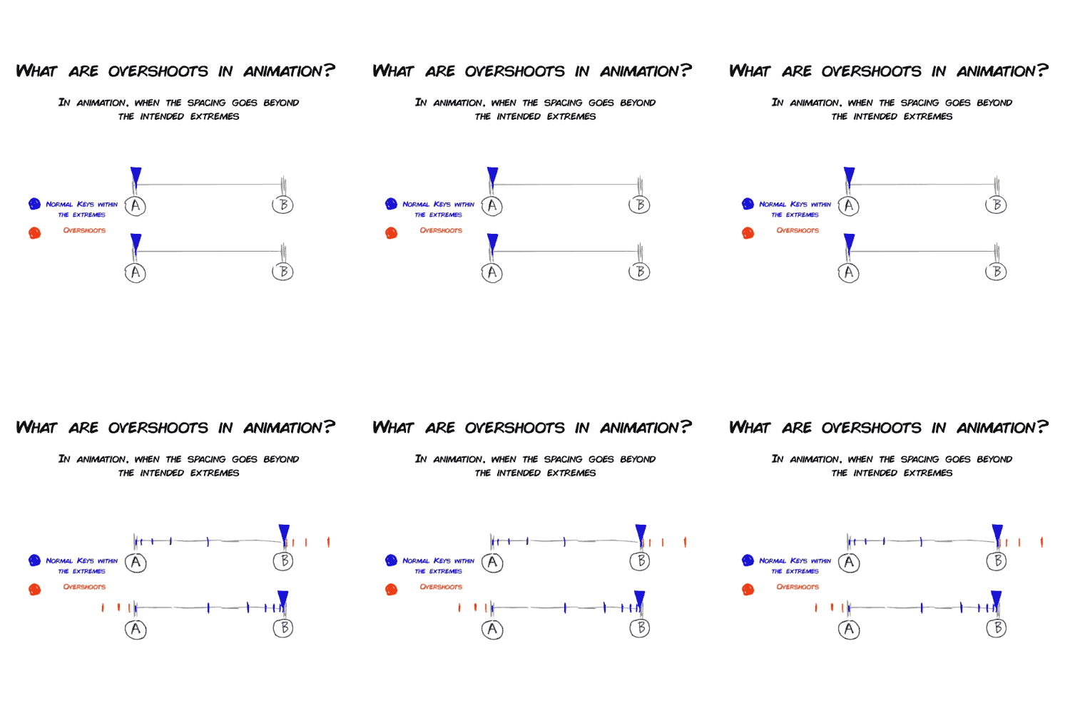

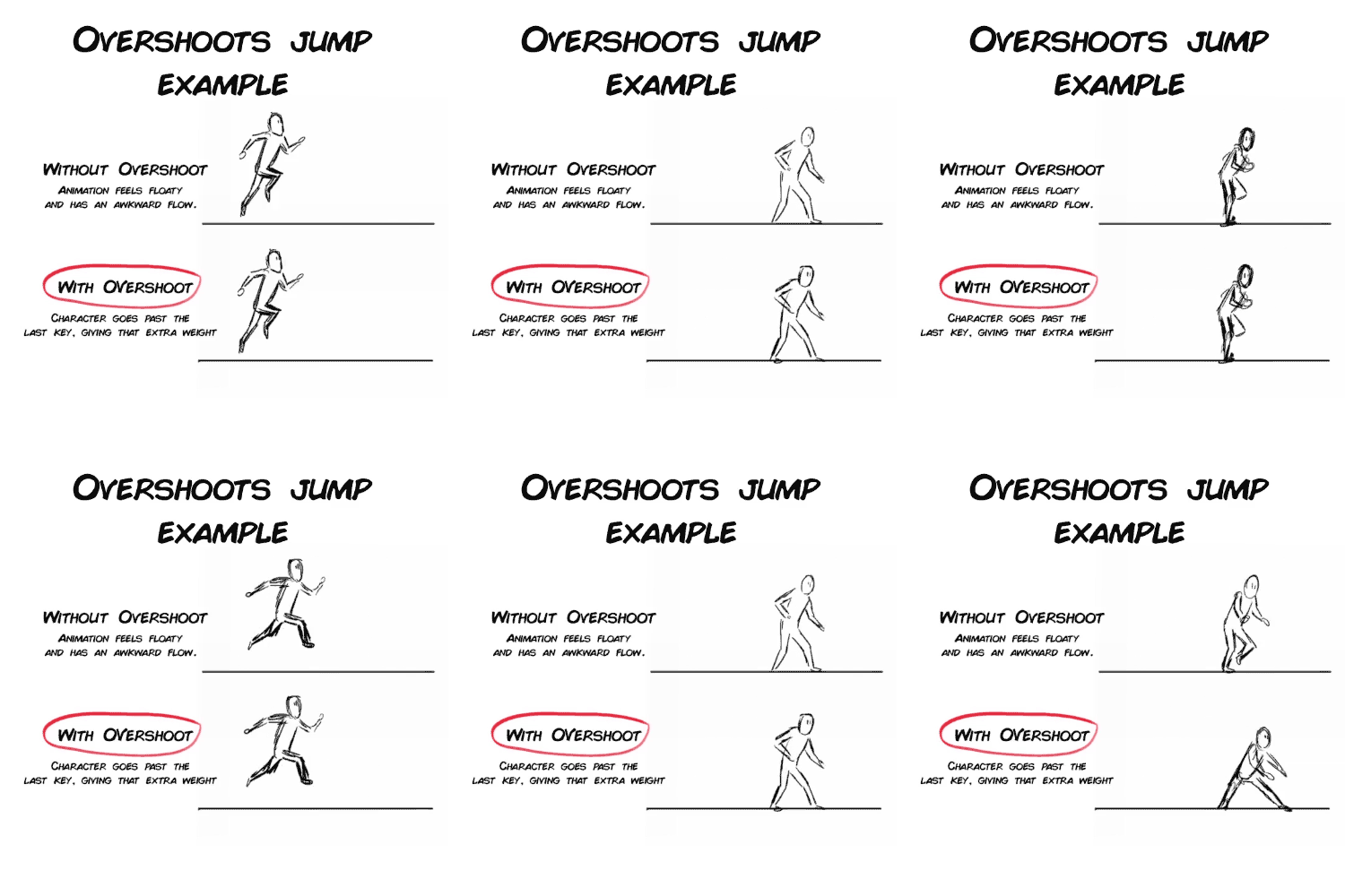
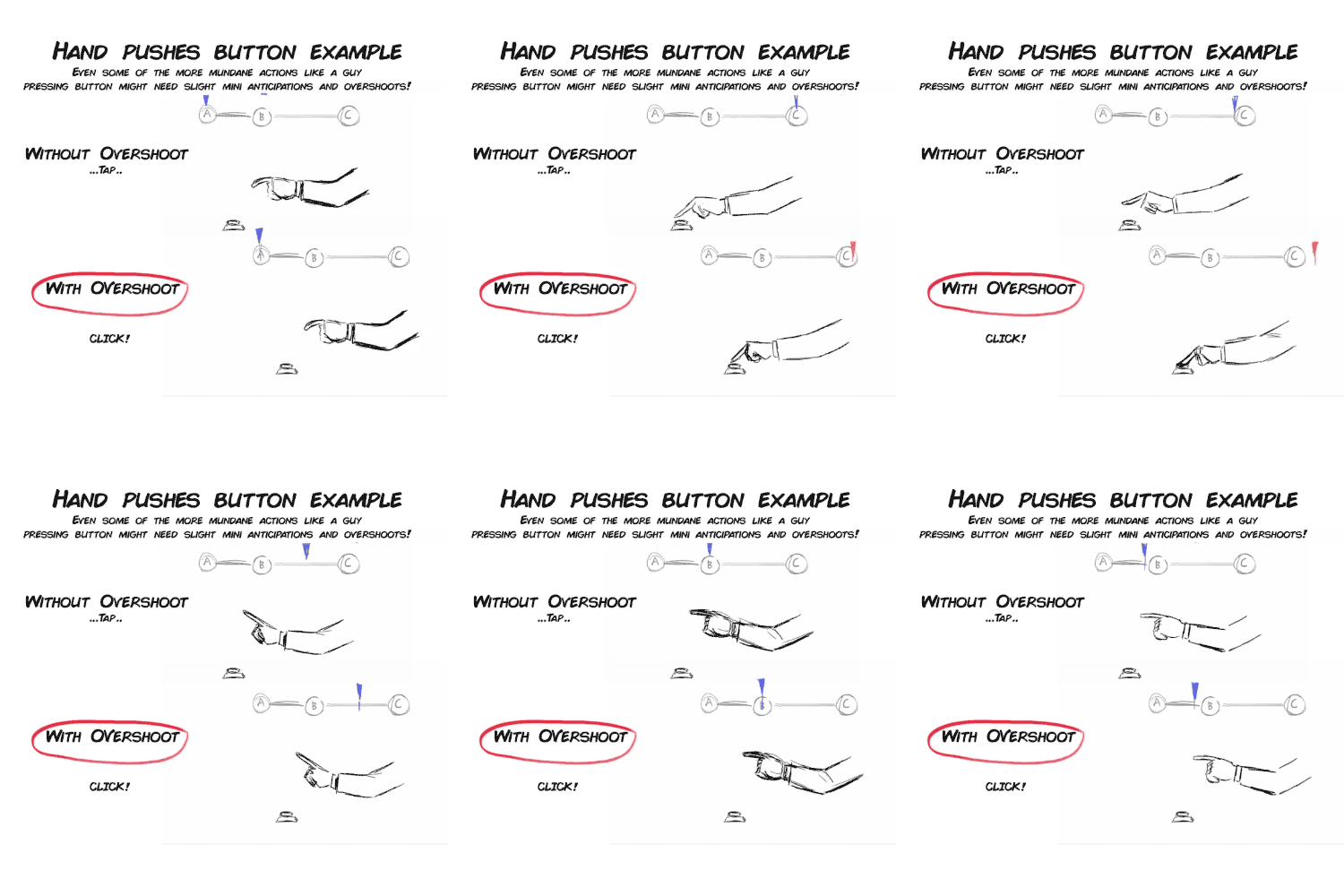
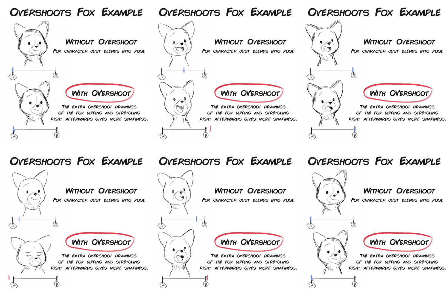

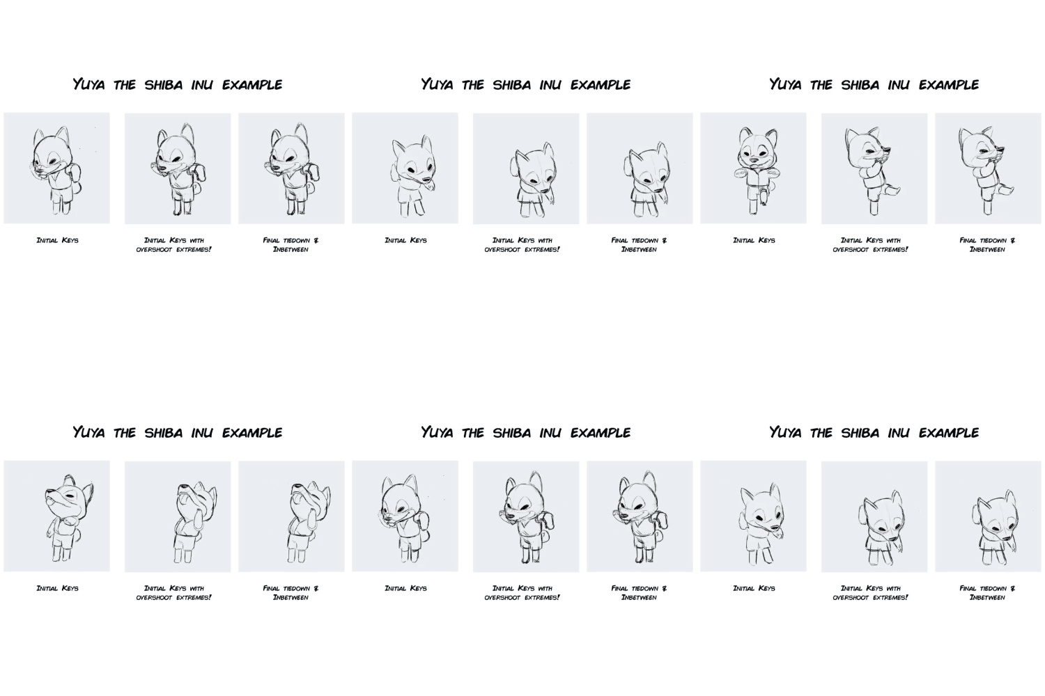
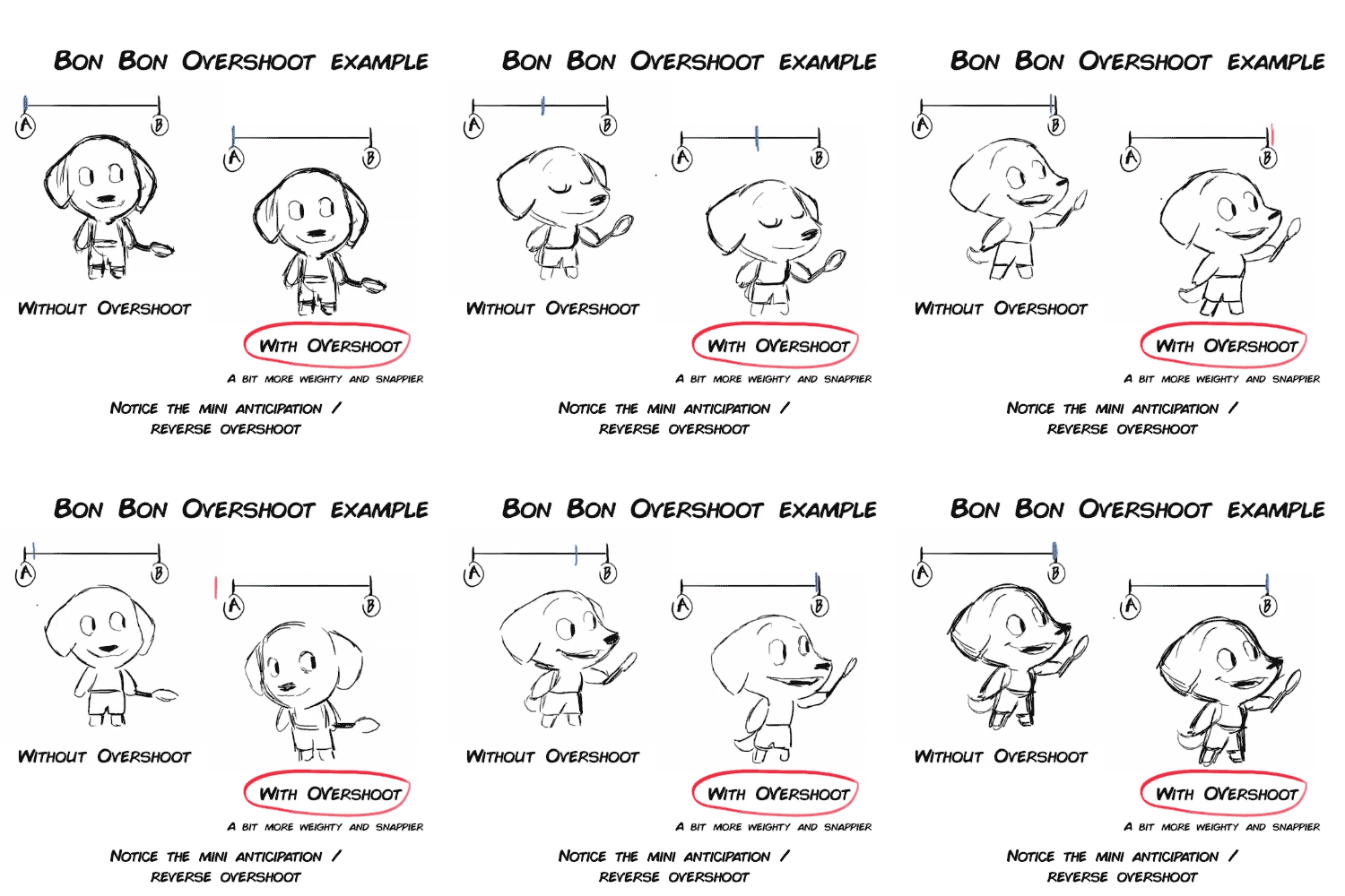
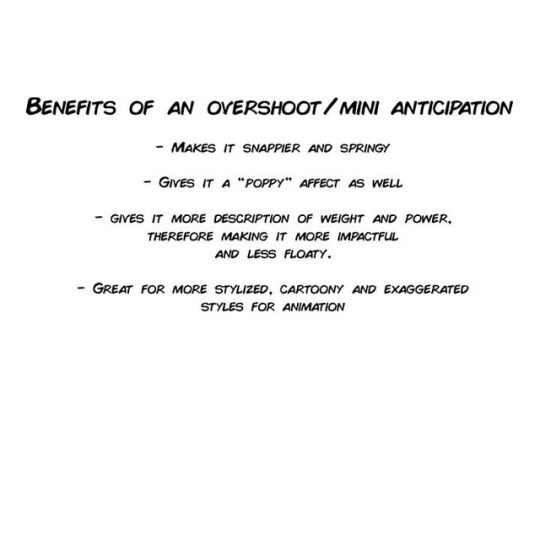
Overshoots and Mini Anticipations lecture from my Complete Introduction to 2D animation package.
https://gumroad.com/l/Introto2DComplete or you can buy each chapters, or my other tutorials: https://gumroad.com/stringbing
70K notes
·
View notes
Text
a quick grass tutorial
I’ve never really wrote a tutorial before so apologies if this is bad
1. okay first thing I do is pick three colors, a mid, dark, and light. I like to check the colors in greyscale to make sure there’s enough contrast between each one.
I then plop down a blob of whatever my middle tone color is.
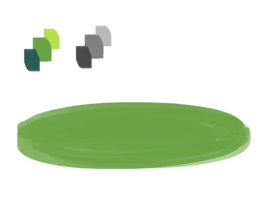
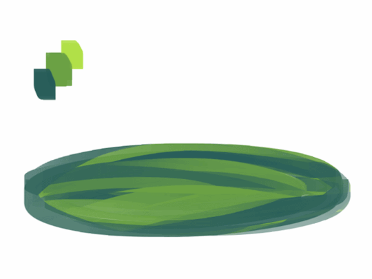
2. next, I take my dark color and just sort of randomly place it around. I try to make sure there’s a good amount of both the mid and dark tones spread throughout. I personally like to keep it kinda messy. I also have pen pressure on for both brush size and opacity, so I can have some blending action going on.
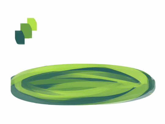
3. for the next step I do the exact same thing as before, except with the light color.
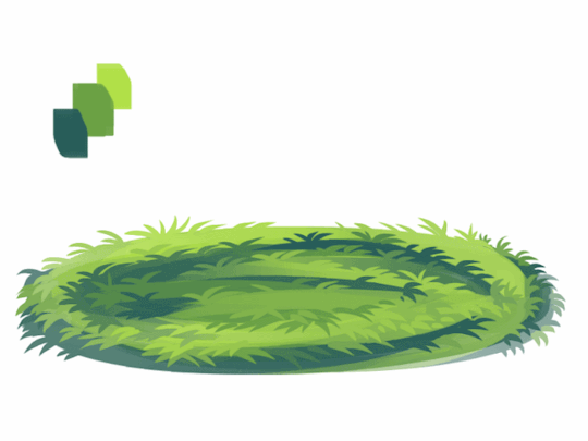
4. aight this is where we start adding details. see how you just have a bunch of colors and edges where two colors meet? use the eyedropper and go to an area where two colors meet, eyedrop a color, and then use that color to draw in your grass blades. I do this at every point where colors meet. should note I personally like to use a square brush, but you can really just use anything.
5. you can technically stop at the last step if you’re going for a more simple look, but to add more details I go to the “empty” areas of solid color and just draw in random strokes using a color nearby. it’s just a way to fill up the empty space.

6. basically more of the same idea of eyedropping and drawing. for more variety so things look interesting, I like to add random plant shapes.

7. and so the grass doesn’t look too plain, I add random dots of color and pretend it’s flowers and stuff.
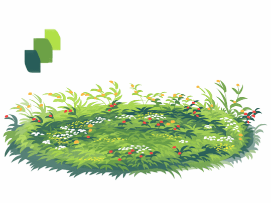
and there you have it, this is how I approach drawing grass.
122K notes
·
View notes
Photo


hope this tutorial helps, anon!! a lot of this is a result of experimentation and seeing what looks best based on your picture. what i’m essentially doing is relying on the overall “mood” bg colour tie everything together cohesively by putting the local colours over it on the “soft light” filter. the other changes i do, such as the blue light on him and the flavour elements are all based around making it more cohesive, e.g. the glow from the pool is all over the background AND the subject, instead of just the pool, pulling them together, if that makes sense!
of course this also relies on having some sense of what a realistic version of your scene would look like - for this comic i looked up “pool scenes night” on google to gather references i could take the colours from, and looked up lighting references for the way light would hit a face if coming from the bottom, stuff like that.
the other example is from a commission i did:

in this case, the lighting situation has a lot more light, and isn’t as atypical as pool-at-night lighting. so it was easier to rely on my usual method of colour layering, i.e.
local colour on multiply (as opposed to soft light)
monochrome shading on normal
again, experiment experiment experiment! hope this helps!
8K notes
·
View notes
Photo
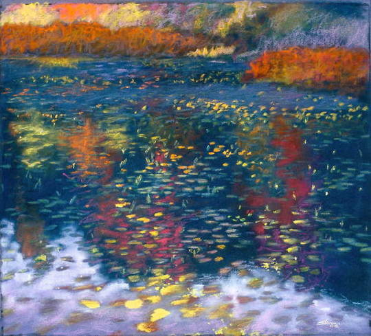
Pond in Fall
pastel on paper | 18 x 20" | 1992 rick stevens art
147 notes
·
View notes
Text
Some Photoshop Tips
I’ve been getting quite a few asks about the process for the patterns in my stylized artworks, so I decided to put together a couple of tips regarding them.
Firstly, what you need are
— CUSTOM BRUSHES —
Most of the patterns I use are custom brushes I made, such as those:
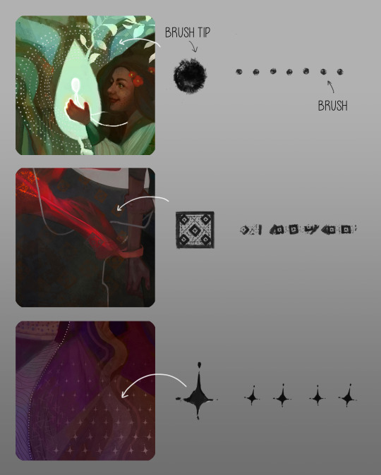
For the longest time I was convinced making brushes must be super extra complicated. I was super extra wrong. All you need to start is a transparent canvas (2500px x 2500px max):
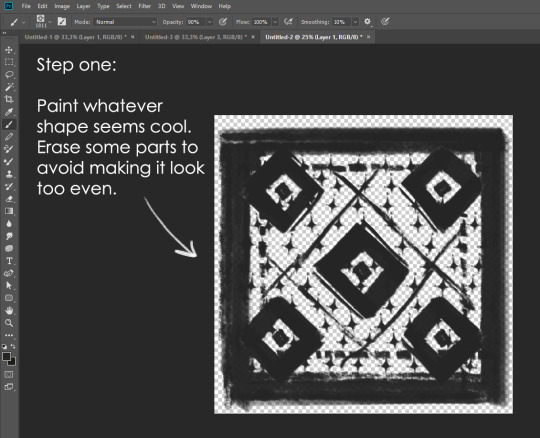
This will be your brush tip. When you’re satisfied how it looks, click Ctrl+A to select the whole canvas and go to ‘define brush preset’ under the edit menu
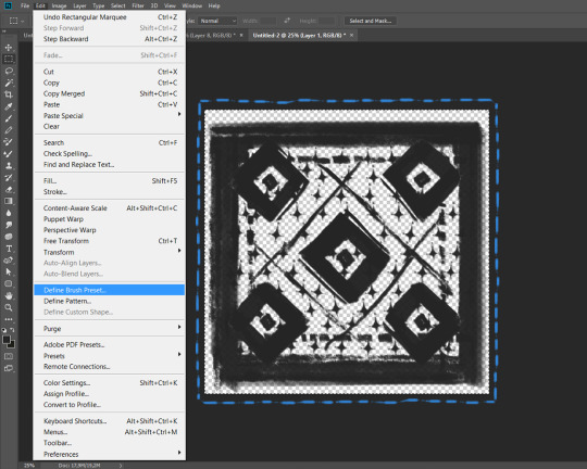
You will be asked to name your new glorious creation. Choose something that describes it well, so you can easily find it between all the ‘asfsfgdgd’ brushes you’ve created to be only used once

This is it. Look at it, you have just created a photoshop brush. First time i did I felt like I was cheated my whole life. IT’S SO EASY WHY HASN’T ANYONE TOLD ME
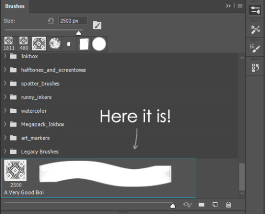
Time to edit the Good Boi to be more random, so it can be used as a Cool Fancy Pattern. Go into brush settings and change whatever you’d like. Here’s a list of what I do for patterns:
- under Shape Dynamics, I increase Size Jitter and Angle jitter by 5%-15%
- under Brush Tip Shape, I increase spacing by a shitload. Sometimes it’s like 150%, the point is to get the initial brush tip we painted to be visible.
- If I want it to look random and noisy, I enable the Dual Brush option, which acts like another brush was put on top of the one we’ve created. You can adjust all of the Dual Brush options (Size, Spacing, Scatter, Count) as you wish to get a very nice random brush to smear on your backgrounds
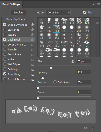
The result is as above. You can follow the same steps to create whatever brush you need: evenly spaced dots that look like you painted them by hand, geometric pattern to fill the background, a line of perfectly drawn XDs and so on.
BUT WAIT, THERE’S MORE
— PATHS —
But what if you want to get lots of circles made of tiny dots? Or you need rows of triangles for your cool background? Photoshop can do all of that for you, thanks to the magic of paths.
Typically, paths window can be found right next to Layers:
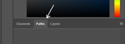
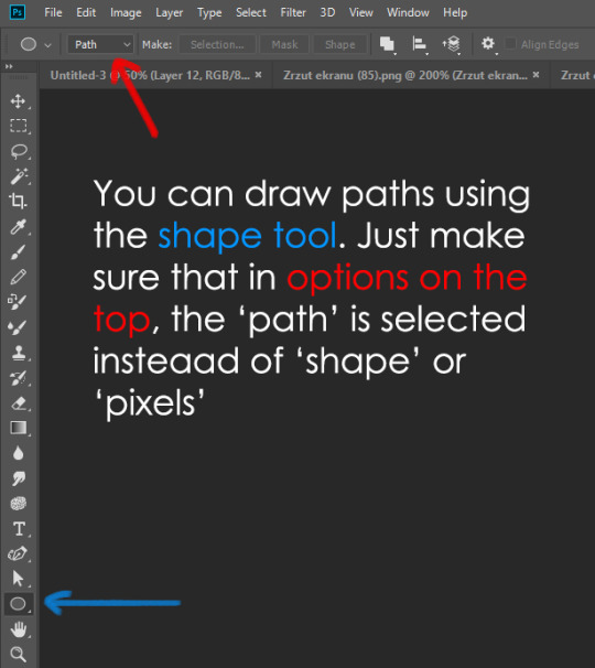
Draw whatever path you want, the Shape Tool has quite a bit of options. Remember, paths are completely different from brush strokes and they won’t show up in the navigator. To move a path around, click A to enable path selection tool. You can use Ctrl+T to transform it, and if you move a path while pressing Alt it will be duplicated.
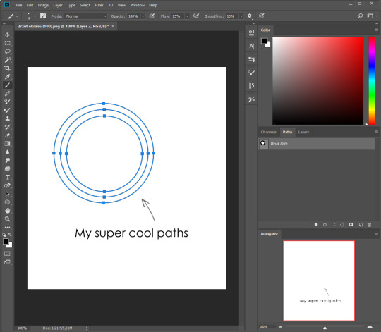
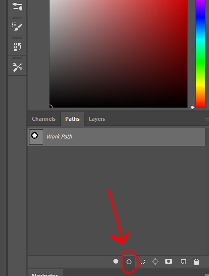
Now, pick a brush you wish really was in place of that path you’ve drawn and go to layers, then choose the layer you want it to be drawn on. Then, click this tiny circle under the Paths window:
Then witness the magic of photoshop doing the drawing for you while you wonder how tf have you managed to forget about this option for the past 2 years
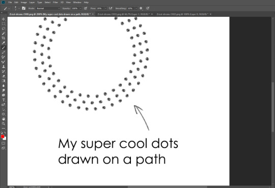
You can combine special brushes and paths for all sorts of cool effects. I mostly use them in backgrounds for my cards, but you can do whatever you want with them.
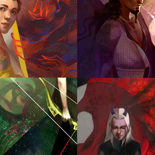
I hope that answers the questions for all of the people who were sending me inquires about the patterns. If you have any questions regarding this or any other Photoshop matter feel free to message me, I’m always up for complaining about how great and terrible Photoshop is C’:
93K notes
·
View notes
Text
Firealpaca Tutorial.
I’m awful at explaining things, but heres my best go.
First things first, firealpaca is a new art program that is free. You can download it in any language for mac or pc and it works pretty nicely. You can download it here.

Here is how I set up my artboard. Tools are on the left, layers and a preview are on the right. If you ever loose a window, you can click “windows” in the top. You can find save, new file, and open file under “file.” Undo, Redo, Copy, past, ect you can find under “edit.” New layer, fill, clear, rotate, ect you can find under “layer.” Select, Deselect, inverse, ect you can find under “select.” To have the pen or tool snap to a certain line and only draw in one direction, you can find under snap. Color gives you the option of a bar or wheel. "Tools" is basic tools, all of which you can find on the left of your screen as well. "Windows" controls the different windows open such as layers, brush control, color, ect. Help will find you certain tools incase you get lost or need assistance with a problem.

I am working with a mac, not a pc, however the set up and tools are pretty much the same from what I’ve heard.
I’ll start off by explaining how to make a new page, the brushes, and the tools that come with Firealpaca. Like most art programs, you can import different brushes and such to use. It gives you a few basic brushes to start out.
You can either go to the drop down menu under “file” and select “new” to make a new file, or you can use command + N if you’re on a mac.

This window will appear and you can choose the size of your file, the dpi, and the initial layer format (color or 8 bit). I usually work in 2000x2000 unless I’m doing a commission, then it varies around 4000x4000.

Here are the different brushes. You can see their textures below. If you want to edit any of the brushes, just double click on them and youll get a small page to edit the name, type, width, size, and opacity settings.

Those are the main brushes I use when I’m drawing. I use the pen for most things, but I like to paint with pencil and watercolor as well. I have two custom brushes that I use for blood, but nothing else really. The eraser brush erases and the firealpaca brush lets you draw with the firealpaca symbol. I don’t ever use it so I didn’t include it.

Firealpaca also gives you a nice little preview of the brushes when you’re using them. Here you can change the size and the opacity of the brushes really quickly while drawing incase you need a thicker or thinner or less noticeable line.

Above that I have my color palette. I only have saved Bubble, Mod, Carousel, and GhostBunnies colors. To add colors, you click that cute little page button. To delete one, you click on it and click the trashcan button. Be sure you add them in the order you want them because you cannot move the colors around.

These are your tools. They’re pretty basic. Pen for drawing, Eraser for erasing, Dot brush for pixel art, v for the normal arrow tool that I call the grab tool, shape tool for drawing basic shapes (shift does not keep them at the basic size so you will have to eye it), the bucket tool for pouring colors, gradient tool for basic two color gradients, select tool for selections, I dont know those next tools names, I think theyre drawing selection and erasing selection or something, but you can draw with them to make selections which is pretty cool. I usually use the lasso tool though. Text tool for text, however you are very limited with what you can do with text. You have quite a few font options though! hold down option to get the eye drop tool and hold space to be able to move around the drawing if youre zoomed in.
I’ve included the quick keys so you don’t have to go over and click the button every time you need to use a certain tool. Down below you can see the options you get with each tool. The tool options appear at the top of the program and change depending on which tool you are on.

For the pen and the eraser, you get the snap tool (quick keys 1,2,3,4 and 4) which just makes it so you can only draw straight lines in certain directions. You can also draw a straight line by making a dot, holding down shift, and clicking where you want the straight line to go. AntiAliasing makes the lines texturally smoother, and then line correction makes them visually smoother.

The dot brush you can choose your pixel size, anywhere between 1 and 3. This is good for if you’re doing pixel art.


For the shape tool, you can choose your shape (you have rectangles, ellipses, and polygons), you once again can choose antialiasing or not, and for rectangles you can choose to have round corners and the percent of how round they are! You can also edit the opacity of the shape.

For the Bucket tool, you can reference either the canvas or the background. Once again you can choose antialiasing or not, and then theres the expand option! This is important if you are going to be filling or coloring with the bucket tool! It will expand your coloring 0-3 pixels so you dont get that white line between the color and your outline.

Gradients you can choose weather its Linear or circular and you can choose if its forground-background or just background.


The select tool lets you select a certain part of the drawing, for example if you want to cut it out or move it. It gives you four shape options, I usually find myself using the lasso tool when I’m cutting out certain parts of the drawing. If you grab a certain part and realize you suddenly want more, hold down shift while you are selecting and it will just add onto the selection instead of starting anew one.
If you are going to be moving your selection, you must have your move tool over the selected area or it will move the entire layer.

For the drawing selection tools, your only option is antialiasing.

Here is the right side of my screen. I keep the navigator small and it just gives you a preview of the art board. You can zoom in/out by clicking the magnifying glasses or command + +/-. You can zoom to a certain selection by the blank magnifying glass. You can twist the layer by pressing the circular arrows or keyboard right/left, and you can go back to the original right side-up by clicking that cool line circle thing.
Then you get to layers which is very fun. You can change the opacity of the layer with that pink bar. Lower opacity means it will be clearer, higher opacity means it will be stronger. I only change the opacity when I am trying to differentiate between layers or when I am drawing lineart over a sketch.
You have these lovely blending options.

I cant explain them without sounding dumb so I wont try, but Multiply makes the color darker, add will make the color almost white and it will make an airbrush look crazy bright. Great for lighting up sparkles or doing shines on the hair. I dont use overlay or screen much.

Protect alpha will protect the lines under it, a clipping layer will only let you draw on whatever its clipped to, and locking a layer will make it so you cannot draw on the layer at all.

When making a layer, clicking the blank page will get you a new layer, clicking the 8 page will make you an 8 bit layer, clicking the two pages ontop of eachother will duplicate the layer you are on, clicking the page with an arrow will merge the layer to the lower one, and clicking the trashcan will delete the later.
…
Yeah that’s all I got. I’m horrible at explaining things, so I’m sorry. xD but best of luck!
Go draw me a picture.
2K notes
·
View notes
Text
Woke up at 2am and couldn’t fall back asleep so I made a tutorial on the Photoshop techniques I use most frequently. Starting with the sketch:
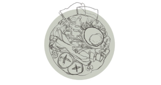
adjustment layers: specifically the hue/saturation slider in this case, allows you to color correct quickly
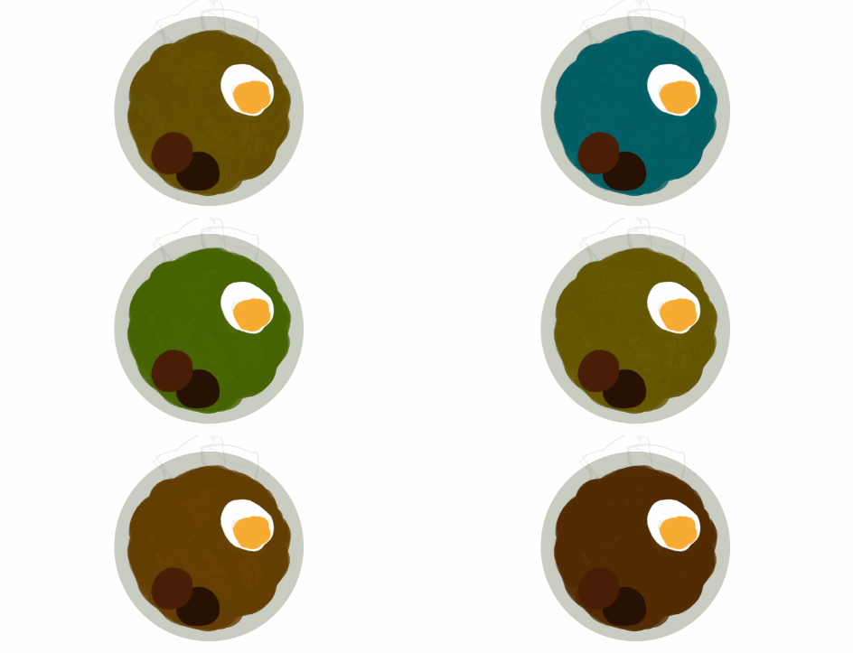
lasso tool: for sharp edges!

alpha lock: useful for painting within a pre-defined area (especially useful when painting characters)
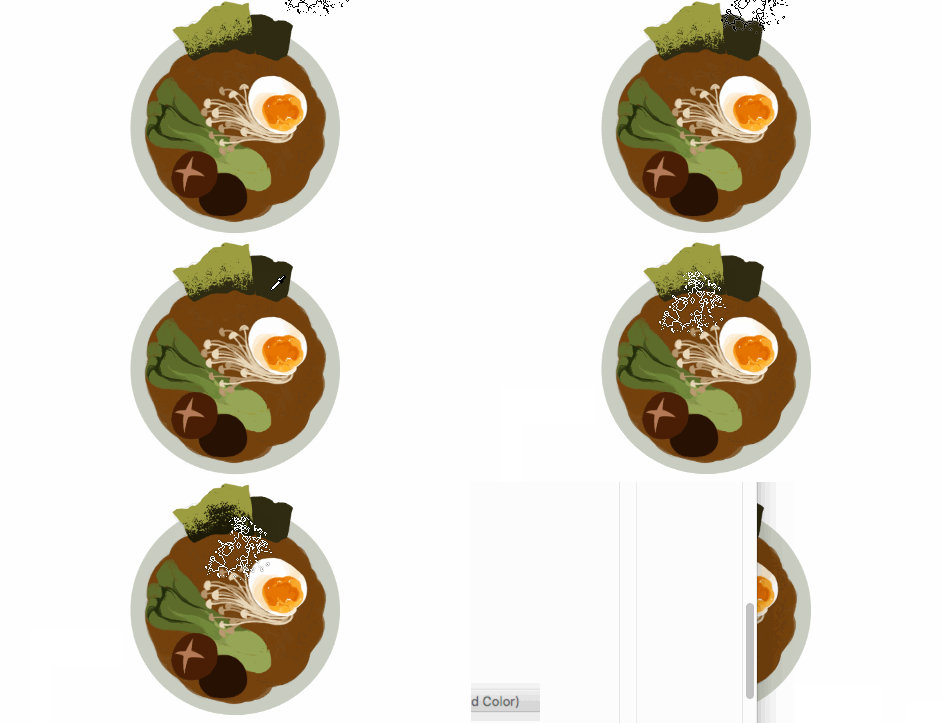
x (hotkey) : toggle between foreground + background colors- let’s you easily blend between 2 colors

ctrl/cmd click : quickly change current active layer. Especially useful if you’re burdened with too many layers (or just very disorganized)
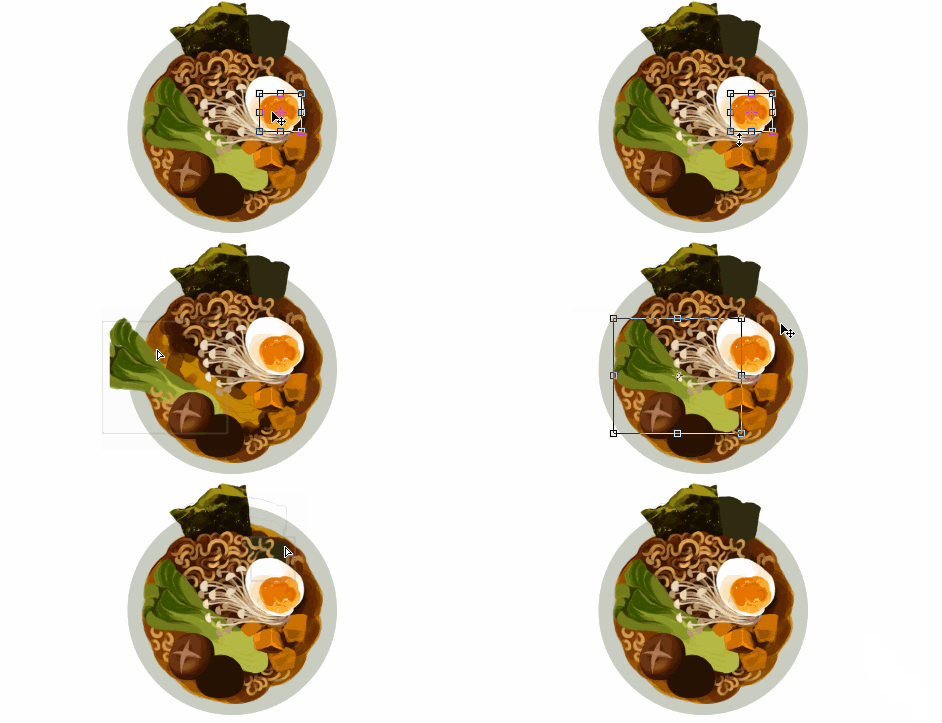
clipping mask: similar to alpha lock, but can add details without changing/ painting directly on the previous layer. I often use them to test out + apply gradients.
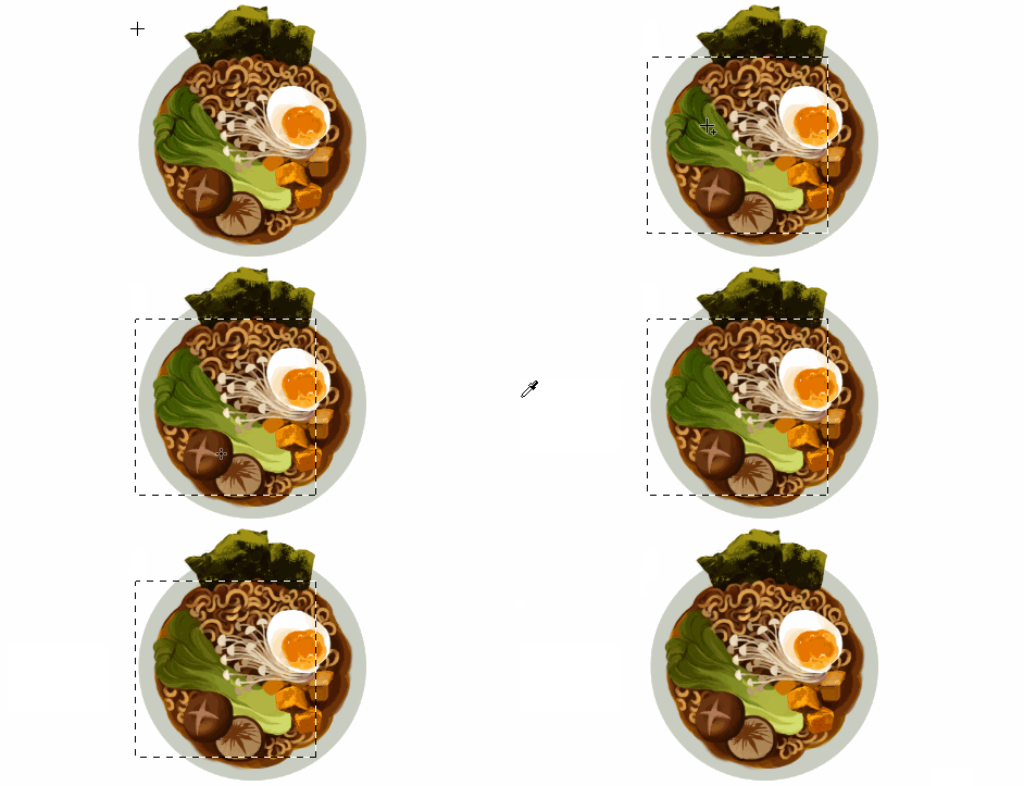
layer styles: I didn’t use any in this image, but the possibilities for layer styles endless, from simply adding a quick outline (useful for die cut demarcations when making stickers!) to creating more seemingly complex appearances. Here’s a gif of Nick Carver using layer styles (a combo of drop shadows + inner shadows) to quickly make the illusion of snow but with simple strokes.

ending on this:

64K notes
·
View notes
Text
Final Progress^^🐌
#김영성 #극사실 #물고기 #개구리 #달팽이 #극사실주의 #pebeo #ykim #YoungsungKim #Hyperrealism #hyperrealistic #oil #painting #drawing #contemporaryart #art #handpainted #environment #frog #snail #insect #goldfish #animal #sculpture #museum #artgallery #modernart #cube #varnish #artvideo
815 notes
·
View notes
