What if they were just a bunch of kids LARPing in a park? we thought that would be funny.
Don't wanna be here? Send us removal request.
Text
Park AU P3!

Its that time again! More park AU updates!!
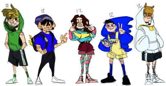
Next up in the park au line up is all the 12 year old's! (and some designs that i think are overall really solid.)
AU info and design rambles under the cut :)
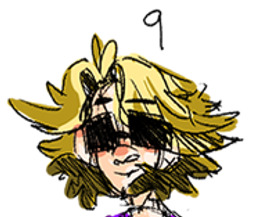
First in line we have Punz! Older brother to purpled (9) and can be found just...around the park. If you know where to look.
I think his design is pretty ok. I didn't really do much different with it than his actual skin, but for once i think it actually somewhat works ya know? However maybe next time I will lean a bit more into the shape langue he has going on.
He’ll do almost anything for the right price. ( The price usually being someone's lunch money/ any snack foods he likes), Punz isn't exactly easy to bribe, but it can definitely be done, and is done quite a bit.
Next up in the Line is Connor, I love his design. He’s sonic with the with the wario overalls. He’s got Pokémon cards, he has a purple under shirt that matches the purple in his wario overalls, he wears blue socks that match his sonic onesie/hoodie. The only reason I didn't give him red shoes was because he’d be too powerful then. So much fun 10/10
He sort of hangs out by the picnic tables and waits for kids to come and hang out and talk about Pokémon with him/ battle with him. Once techno hears about this he also starts bringing his cards to the park and they like to trade and battle and just kind of talk about Pokémon. Bench trio also stops by occasionally.
Niki! ok so in the last post I talked about how I kind of wanted Niki and Jack manifold to sort of match visually (because their best friends). Just to both be bright and colorful and represent those two ends of the kids clothing spectrum.
This is how Niki turned out!... its definitely better than Jack manifold, I think I'm gonna be making just a few slight changes in the future. Like I like the blue, pink, burgundy color pallet I seem to have going. while I'm not the biggest fan of the yellow. And I'm also probably gonna make her leggings and sweater a solid color rather than their being patterns because it just looks a little to busy. But yeah for the rest of the design I love it.
Niki's family owns the local bakery “The Honey Bunny”, she plays soccer, (George occasionally coming to goalie), and She does self defense training/ sparring with Techno. Her and techno tend to hang out while she bakes, him often reading aloud, And jack manifold and Niki tend to talk a ton about various movies (mostly sci fi and fantasy and super hero's because their both geeks). Jack manifold, Eret, Niki, Fundy, and Wilbur are a pretty tight nit friend group.
Now for Quackity, I absolutely love his design its one of my favorites! I think the colors and shapes are just super solid, and I love his tiny duck wing backpack. (like those small bags that they try and market to mostly older kids and teens in middle/high school. and how some of them also have like little themes. He has one and its black with duck wings:))
He’s really close with Sapnap and Karl, and their known as the besties (instead of the fiancés ya know) he also hangs out a ton with foolish, Wilbur, Charlie, dream, Sam, and purpled. and sometimes fundy, tubbo and schlatt too. really he’s just a huge extravert. Later on in the au (mid to late high school) he and Wilbur run for class president against each other, and foolish and him start up a small business customizing shoes for people. (Its really popular with the misfits and Beasts crew.)
Dream. His design is fine. its solid. it does what it needs to do and says what it needs to say. I think it matches pretty well with his sister Drista (6). There are some things i would change, but for now I'm happy with it.
Dream is friends with Sapnap, George, and bad, along with the Minecraft brothers. He often asks favors of Punz and can be seen doing parkour with Charlie. I've mentioned before in previous posts that he goes on missions to search for George, as he’ll often sleep through his curfew and get grounded if someone doesn't wake him up and remind him to go home. Later in the au (late middle school) He’s foster brothers with foolish and lives with puffy. He and Drista visit as often as they can.
AU credits: squeed/Vibe
Art Credits: Tooknoken
If you want to see any more of the park au you can check out our other posts here :)
Park AU1
Park AU2
#punz#niki nihachu#quackity#dream#punz fanart#connoreatspants#connoreatspants fanart#niki nihachu fanart#quackity fanart#dream fanart#dreamsmp#dreamsmpfanart#dream smp au#mcyt au#mcyt#mcyt fanart#dreamsmp art#mcyt art#dsmp#dsmp au#dsmp fanart#dsmp art#nihachu#nihachu art#nihachu fanart#dream art#quackity art#connoreatspants art#punz art#art
48 notes
·
View notes
Text
Park AU P2!

More park AU designs!! I'm gonna be honest, the only ones I really love this round are Fundy and Skeppy, but I already low-key redesigned Jack manifold (only sketches so far.) And since his was probably my least favorite original design from this batch I thought id go ahead and share.
(Character/AU info and design rambles under the cut)
First up we have Fundy (11), His design is one of the ones I'm most proud of along with purpled and a few others. I think I did a nice job keeping interesting shapes for him and I think his outfit really has something to say (neopets <3) , which is something that is always fun. At this point I had given up on drawing unique shoes for him, so that's something I'm gonna have to do going forward, and I'm not sure if I like his pallet or not. Overall I think his design is pretty solid.
He’s just a trans furry living his life.
In the au Fundys pretty chill with rocket duo and Eret. Along with Wilbur and a few other people. He and Wilbur have a bit of a complicated friendship, especially since their third friend sally moved away, but they tend to make it work.
Next up is.....Jack manifold (11). There was a thought process, there was a concept. Niki and jack manifold in the au are a bit of a duo, Niki is jacks best friend and I wanted there designs to kind of go together like that? I wanted both of their designs to be very bright and colorful. to kind of mirror those types of trends in kids clothes that follow a lot of patterns and neon colors. I had a pretty solid idea of where I wanted to take Niki's design but I was a bit stuck with jack manifold, so I asked my friend if they had any ideas and they told me to make him a highlighter kid.
It was a good concept, but I really didn't like how I executed it. I also didn't add His glasses or headset/mic into the design? so in the line up he looks a lot like Caillou and I'm not living for it.

I haven't done a full redesign yet but in some doodles I gave him his 3D glasses back and translated his headset mic into hearing aids because that sounded like it would be cool.
I did a bit of research into what types of hearing aids there are and what would probably work best design wise and au wise and i settled on heavily basing his off of a few different behind the ear hearing aids.
It was some really interesting research to learn about the various types of hearing loss, and hearing aids. Although if anyone from the deaf/ Hard of hearing community has an issue with this or with how we’ve portrayed you please let us know. Our goal is to be as respectful and accurate as possible.
He and Niki are best friends, and spend a lot of their time hanging out talking about movies they like. His parents are literal rocket scientists and are also pretty big Sci-Fi nerds so he tends to have a lot of science in his day to day.
After Niki and Jack became good friends so did the twos family! The two families like to have movie nights and dinner parties. (Niki's family owns the local bakery)
Skeppy (11), I love what I did for him. He looks like he just got dropped off from tennis practice, and that's exactly what I was going for. The pallet is something I might work on, (I don't know how I feel about his jacket and his hat being two different blues like that), but according to another friend of mine who used to play tennis, his uniform looks alright. I don't have a ton to say on his design aside from that.
Au wise we don't have a ton for him yet other than he’s one of the kids BBH tends watch more often than not, and he plays tennis.
Lastly Sapnap (just turned 11)..... The biggest change I'm probably gonna make in his redesign is to get rid of that sweater and to change up his haircut. He kind of falls under the same criticism that I had of Tommy's first design in which it was just a smaller tommy. So I'm currently trying to figure out how to make him recognizable but still younger looking, and I think the first thing to do would be to get rid of the sweater he has under his t shirt. Since it doesn't really make a ton of sense in a playground setting.
Sapnap is the same with Skeppy, we don't have a ton of au information on him yet, aside from being dream and George's friend, and another kid that BBH tends to have to watch occasionally.
If you haven't seen the other park design’s check them out here :)
au credits: Squeed
Art credits: Tooknoken
#dreamsmp#dreamsmpart#dreamsmpfanart#fundy fanart#fundy art#jack manifold fanart#jack manifold art#skeppyfanart#skeppy art#sapnapfanart#sapnapart#dreamsmpau#art#digital art#mcyt art#mcyt#jack manifold#fundy#skeppy#sapnap
48 notes
·
View notes
Text
The Park AU!
Hi! I'm Took, more or less the concept/comic artist for the Park AU!
The Park AU is a personal project me and few other friends have been working on for the past few months now! Although the AU itself was thought up and made by our friend Squeed. So aside from the artwork I myself make, a lot of the creative credit goes to them! (and partially our third friend vibe who likes to occasionally pitch an idea or an artwork.)
The idea of the Park AU is basically “What if the Dream SMP was just a bunch of kids roleplaying in a park, and more or less partially their lives outside of that.”
How would everything change and look different within that context? That's what we wanted to explore here!

This is my first bunch of the design concepts! None of them are perfect, and I'm in the works of making better, more full on character sheets. but to introduce the park, I thought it was important to start near the beginning. and since I'm the artist here and not the writer, my beginning is these designs.
All the way on the right at 6, we have Drista! I remember wanting to to try and give her matching clothing with dream, while still trying to capture that younger sister energy and individuality she shows every time she's on screen.

I love how both their hair colors came out, but I'm definatly planning on changing how I'm doing Dritsa’s overall striped clothing and color pallet. but I adore the idea of her getting hand me down hoodies from dream so you can definitely expect that to be one of the aspects that stays
In the AU she tends to stick with the dream team whenever shes allowed to come to the park (she doesn't get to come very often for a couple of reasons.) But at some point during her visits she can usually be found being watched for a short while by bench trio while dream goes off on a quick mission. It never lasts longer than 30-40 minutes, but her and tommy are good friends. And dream really appreciates it.
Next over is both the youngest of SBI and of Bench Trio, Tommy (8). I’d recently watched Luca when I designed him.(which I've been told is rather apparent after I've said it so I thought I'd might as well share that.) I think the thing I'm most disappointed in this design is that its just a smaller Tommy. One of my goals for the art of this au was to try and avoid that as much as posable where I could. Especially with the younger kids, considering how much children tend to change from year to year.

I recently did a redesign that I'm much happier with personally, (here's a little sneak peak of part of the sketch). I think It leans a lot more into kid styles of clothing, and his more nature loving side. (Its also like a much more recent drawing so my more cartoonish style looks a bit better and a bit cleaner. I'm much happier with the shape language.)
Personality wise and family dynamic wise its a pretty classic tommy. Loud youngest brother with a soft side. a bit of a scamp who tends to act out, but he makes friends quickly and if your willing to work with him he’s willing to work with you. He collects and releases bugs, and he really really loves cows.
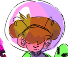
In the center we have by far one of my favorites, Purpled (9). I really love this one to bits. His purple space helmet, his antenna, the way his hair is shaped and is covering is eyes,

his sweater with the classic green alien head,

His alien friend that's styled after those stuffed animals that have those Velcro feet so they can be worn like back packs, or a perma-hug. That and his black light flashlight which I thought would be a fun touch since black light is usually a shade of purple!
- But yeah cool guy, related to Punz (12) in the AU. 8.9/10 design :)
we haven't really discussed much about Purpled’s personality or his place in the au, but he’s really close to Punz. even if they don’t really get each other. and aside from aliens, space, and a few people around the park he’s really not much of a talker.
Tubbo (9), I don't have much to say about him visually other than, I would probably make his overalls more fun, put more into his hair. and just put more personality into his design overall. I think in a lot of occasions I was trying really hard to balance simplicity over personality. But kids at this age usually have too much personality to be so simple.
His scar is still there, and its still a fire works scar. just a bit smaller.

Personality wise though, in the au ide say we leaned very much into the “cheerily burns down your house” type of schemer you see a lot of the time. Just with more “I'm not quite sure what's happening but, I'm a smart enough kid to know that when I'm fully sentient its over for you fools” and it will be. He’s got the reputation of Techno, Schlatt and Wilbur to live up to. In a few years time the town will never know peace again.
Finally Ranboo (9). His design is one I both like and need to work on. I really enjoy the idea of Ranboo having vitiligo and like natural discoloration because of that in a lot of his hair and skin. I also really like the idea of Ranboo having a wolf cut (or like whatever hair cut this could be described as?)

But when it came to an outfit I didn't really have a solid direction idea to lean into, and I think it shows.
I know I wanted to go more for the color aspects of Ranboo (the purple, red, and green) because of his age. Like what 9 year old do you know walks around solely in monochrome? But for like the clothing itself I was trying really hard not to put every single kid in like a hoodie/tee shirt and jeans, and while I'm not sure if I was completely successful I still do like the look of his half and half sweater layered over with a tee shirt.
Although its something I'm probably gonna play with in the future, especially pallet wise. He’s a bit to eye bleed-ish for my liking at the moment. I wanted spirit phone vibes but I think the colors I was choosing for a lot of this tended to lean a little to vibrant.

For now though- here's memory boy. Taller than everyone in his grade, and the next few grades over. Other than his design we really haven't explored him as a character currently. I have a few ideas, but until we as a whole group can talk more that's, it for Ranboo.
I do hope if anyone stayed this long you all enjoyed listening to me ramble a bit about my designs and the park that Squeed, and vibe, and I have been building!
#dreamsmp#dreamsmp fanart#mcyt#mcyt fanart#dreamsmp au#mcyt au#tommyinnit#tommyinit fanart#tommyinit mcyt#tommyinit dsmp#tubbo#tubbo fanart#tubbo myct#tubbo dsmp#ranboo#ranboo fanart#ranboo mcyt#ranboo dsmp#drista#drista fanart#drista mcyt#drista dsmp#purpled#purpled fanart#purpled mcyt#purpled dsmp#benchtrio#beeduo#alliumduo#benchtrio fanart
32 notes
·
View notes