Text
Tiny World Shoot
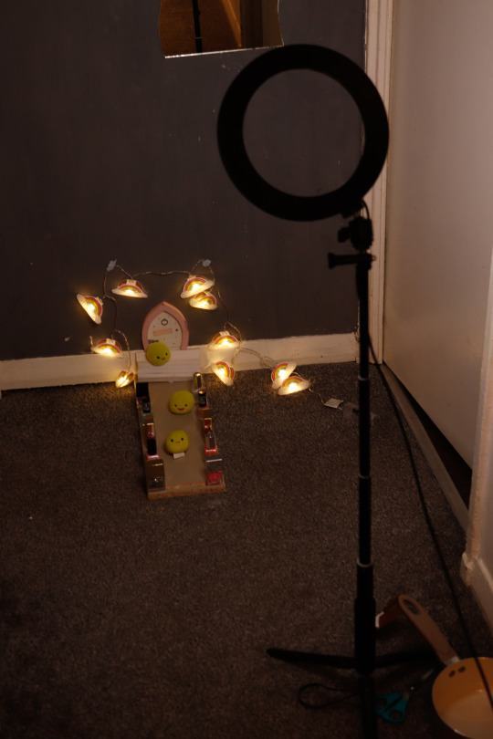
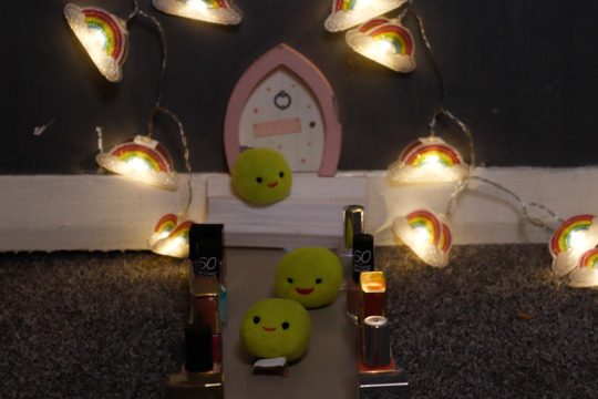
Below is a photo showing how i set the scene for my tiny world photo along with a couple of the final photos i captured.
1 note
·
View note
Text
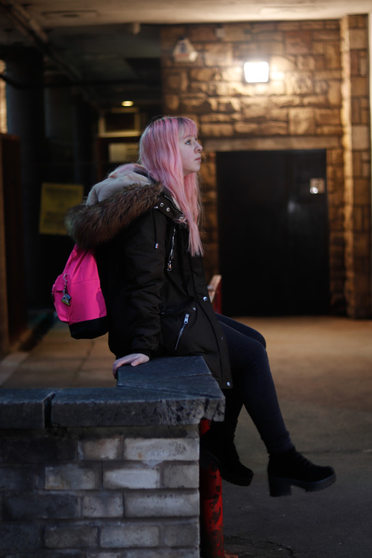
Dusk Till Dawn Final Image
9 notes
·
View notes
Text
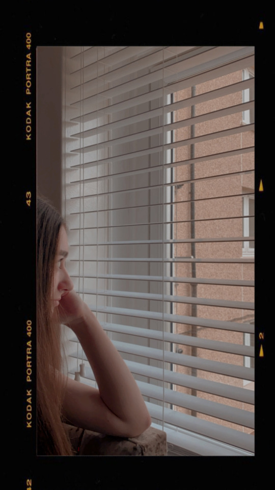
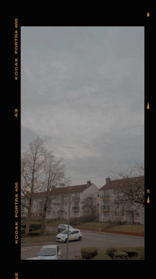
Kodak Filter Images
These are a couple images I shot using the Kodak filter on instagram.
2 notes
·
View notes
Text
Student Scran Task 6 Spark
https://spark.adobe.com/page/UfKKIF1MrUcxd/
2 notes
·
View notes
Text
Emulate and Create
Group Presentation Link
https://cityofglacolac-my.sharepoint.com/:p:/r/personal/30319224_cityofglacol_ac_uk/_layouts/15/Doc.aspx?sourcedoc=%7BB1C31DED-7F84-4C24-8C1C-E7C41C01C487%7D&file=task%20%20Retouching%20tools%20.pptx&action=edit&mobileredirect=true
0 notes
Text
Actor Headshot Processing
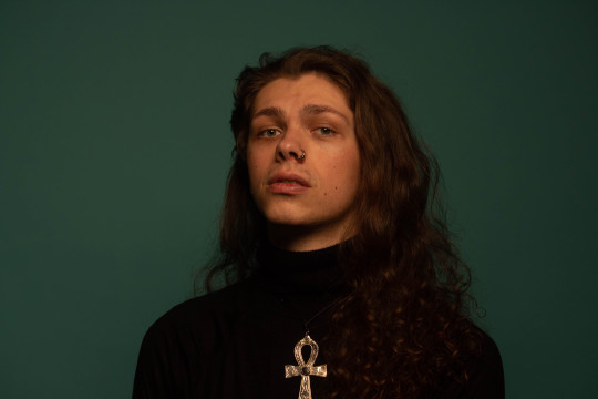
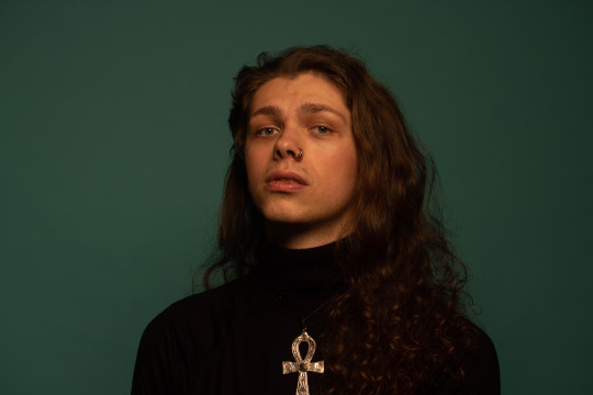
The first image is the photo before I used retouching techniques to make the models face slightly smoother. I used the heal tool in Lightroom to blend some of the freckles and scar spots out by swapping in different spots on his face. After doing this, I was left with a more smooth image. The shortcut button for the heal tool in Lightroom is “Q” and you can change the brush size using the scroller on the mouse.
0 notes
Text
Packshot Layer Mask Practice
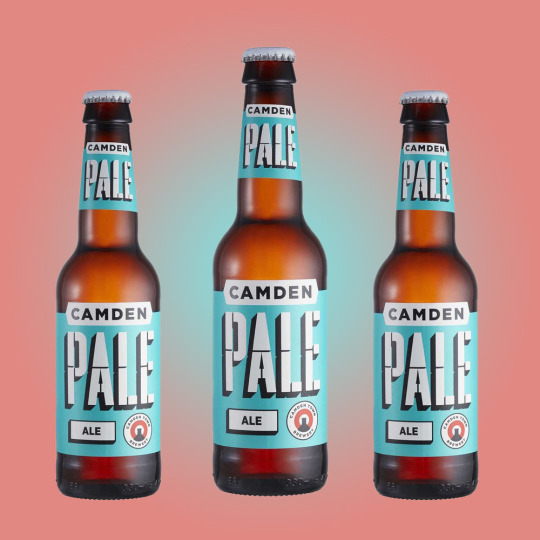
Today in imaging class, I practised layer masking in photoshop.
First I used the quick selection option to highlight the product. Then I went into the select subject button which showed the product highlighted but with no background. This then allowed me to use this product itself without any background and place it on to other photos or change the backgrounds colours and design.
I then used the gradient fill to choose a design for the background of this photo. Once I had chosen the design, I used the eye dropper tool to sample colours from the bottles label to then use in my background design.
My next step was to multiply the image so that I had two smaller images on each side of the main photo. I done this by using command J which duplicated the image. I then moved the duplicates and resized them by using command T.
3 notes
·
View notes
Text
Filters - 31.01.20
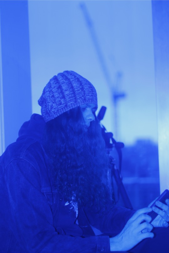
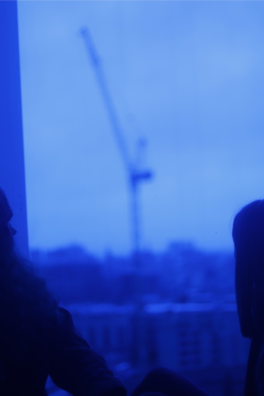
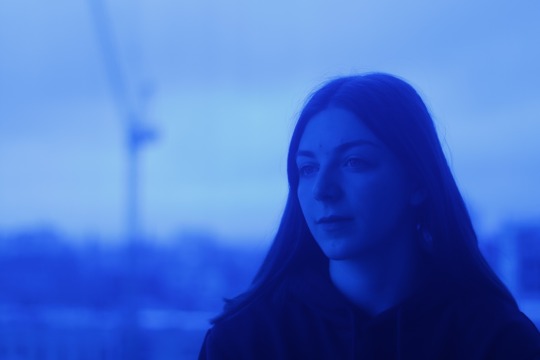
We looked into filters and how they can affect an image when used in class, I used a blue translucent sweet wrapper to tint the colour of my lens. By using blue, this gave me further ideas for when I shoot my mental health images, as I feel that the blue tint gives my images a somber feeling.
0 notes
Text
Location, 31.01.20
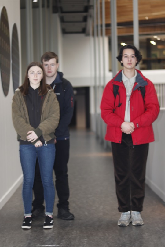
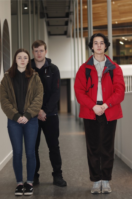
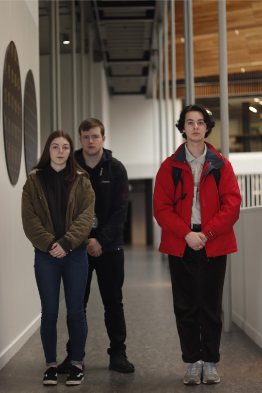
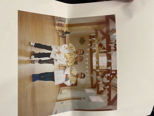
We were sent out to recreate location images in groups. We were given three different settings to shoot on which has made us more familiarised with the on camera flash.
2 notes
·
View notes
Text
Victorian Image
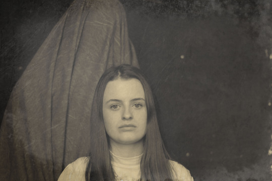
This is my first victorian image I have edited using photoshop. I shot this image using a tripod and a 50mm lens. Once I picked what image to use, I opened up photoshop and began editing by removing the colour and making it black and white. I then added a photo filter and gave the image a brownish tint to give it an aged effect. I then found a texture that suited the style of the image I wanted to recreate and dragged the save image onto the one I was already editing. Once I had both images, I dragged down the opacity to make the texture translucent. Overall, for my first image edited on photoshop, I am pleased with the outcome and look forward to using my photoshop skills in future tasks.
0 notes
Text
Mental Health
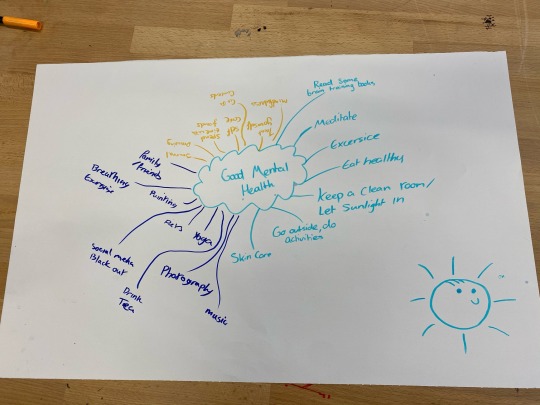
Today in class we discussed mental health and it’s different forms. We then discussed how to better your mental health and relieve some of the pressures of it. I am choosing the theme of depression to use as my creative theme.
5 ways to deal with depression:
- Keep a clean room
- Focus on self care
- Meditate
- Try and get outdoors as much as possible
- Be open with your friends
0 notes
Text
Victorian Portrait Inspiration
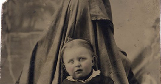
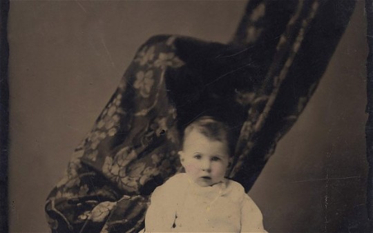
The two photos shown above are what I'm going to use for inspiration when recreating my victorian portrait. Upon researching the style of both these images, I found out that the figure like shape behind the child is in fact a parent with a piece of material hiding them. They done this so that the child would feel comfortable and not alone when having their photo taken, making it easier for the photographer to get a photo of the child without it moving much. I am choosing to try and recreate these pictures as I feel there is something unsettling about these images and that they leave you with a weird feeling after seeing them. What interests me the most about them is that the way they make you feel doesn't reflect what the images actually represents. For example the photos are quite disturbing and dark, however they simply are portraits of childs with a parent keeping them held upright.
1 note
·
View note
Text
Laurence Winram
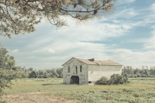
Today I attended an 1 hour and 30 minute talk hosted by Laurence Winram. There was an unbelievable amount of things I took from this chat, one of the main things I learned was the importance of your own self interests and the work you create for yourself. By doing this it not only keeps you happy when working in an advertising environment but it also has a great effect on the clients you attract. People are more likely to want you to do a job for them based on them seeing your creative images that you have taken yourself rather than pictures you have taken from other jobs. He also taught me about being different and standing out when producing images. After viewing some of his work, I felt that there was a really interesting aspect to each image and there was never an image that felt underwhelming. Overall I am very grateful to hear from Laurence as I have taken a lot away from this chat and i feel that he has inspired me to do better and be more creative when shooting images.
0 notes
Text
Still Life Inspiration
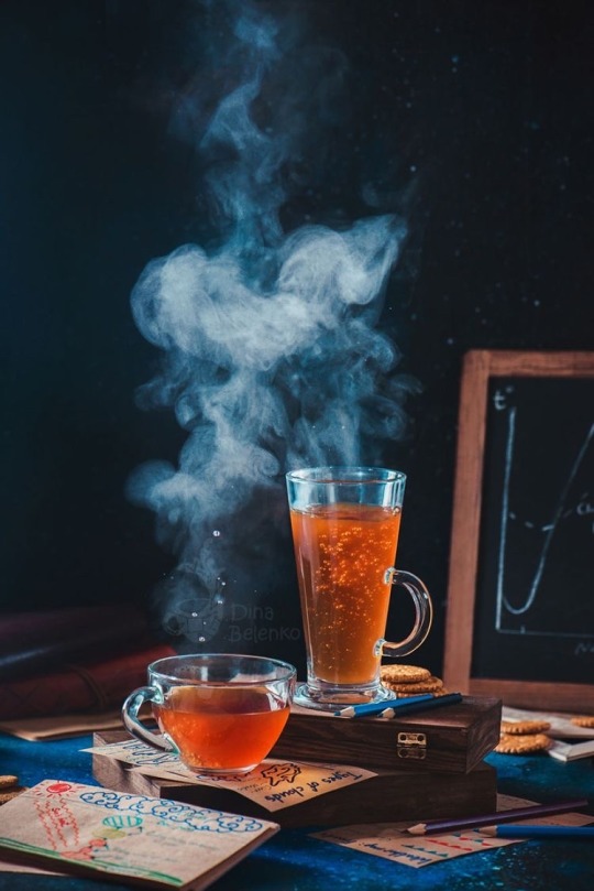
This picture also has inspired me to create an image involving steam and a dark background, in this one the colours in the glasses are very vibrant and I will take this into consideration when choosing what I am going to add the hot water to.
0 notes
Text
Still Life Inspiration
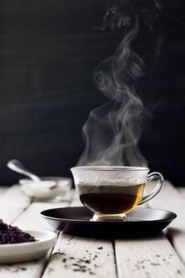
This image inspired me to take on the challenge of capturing steam rising from a glass after hot water being poured into it. My favourite thing about this photo is how the white smoke is visible with the black background and I will use this technique to create my own image.
0 notes
Text
Inspired By Art Potrait Research
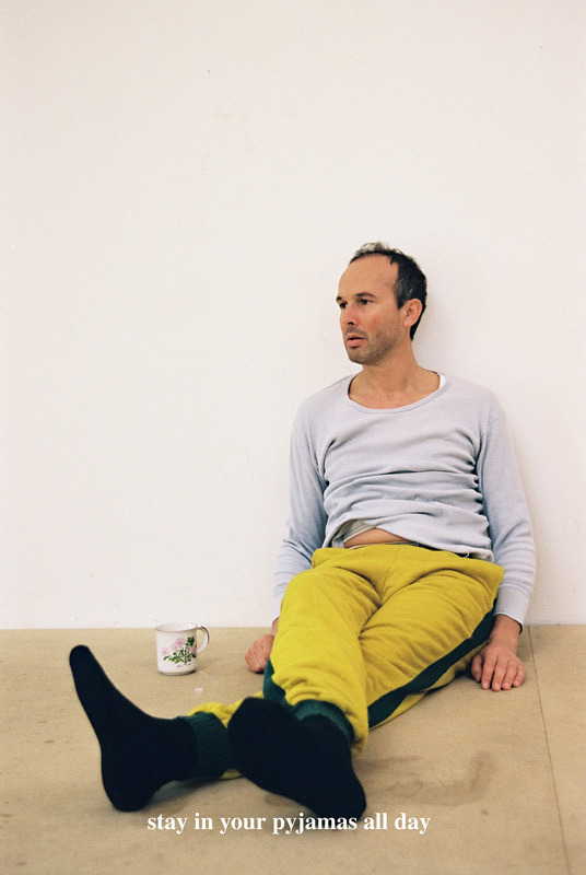
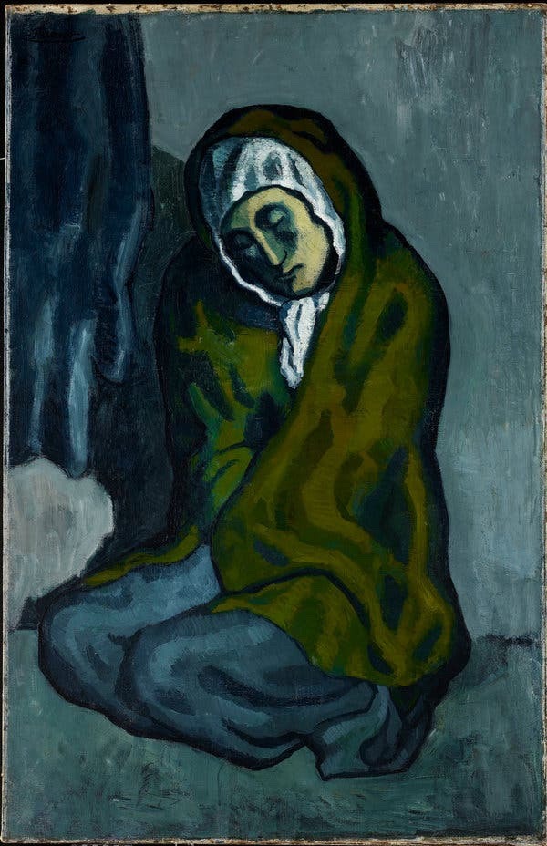
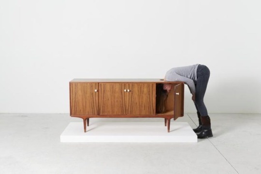
In the 3 images above, I wanted to create a potraiture image in the studio that had relevance to each one of them. Firstly I took inspiration from an Erwin wurm photographic sculpture from his series “instructions for idleness”. I wanted my subject to have the same lost/disinterested look that the character in this image has. I wanted the audience of the photo to think more about perhaps is going on in the subjects head/life and mostly get them thinking in general about what the photo represents. Secondly I wanted to incorporate tones from the famous painter Pablo Picasso’s blue period. This was between 1901 and 1904 where most of his painting were painted in blue, yellow and green colours. This happened not long after the suicide of his best friend and to me he is showing his emotion through the colours and techniques in his paintings. Lastly, this sculpture from Erwin wurm is very subjective, however to me I wanted to take the trapped feeling from this photo and recreate this in my own image. I feel that taking these 3 inspirations and merging them together, could certainly lead to a very interesting potrait.
0 notes
