#zombie anime
Explore tagged Tumblr posts
Text
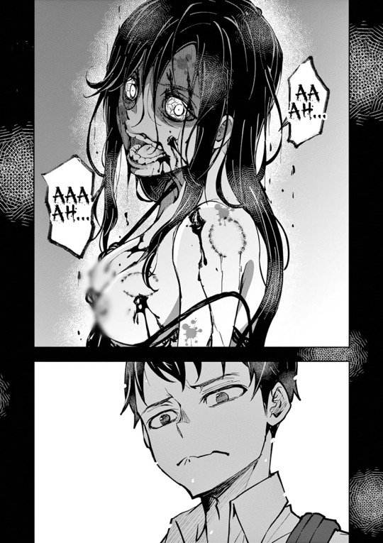
One of my favorite underdog shows of the summer season!!! It done a good job adapting the manga so far!!
We’ll be discussing every new episode on our podcast ( https://linktr.ee/Animedegens )
Also, if you like anime join our discord! ( https://discord.gg/xe6D7wsxfT )
#anime #manga #zom100bucketlistofthedead #Zom100 #mangapanel #zombie
#anime#anime degens podcast#anime podcast#anime and manga#anime news#one piece#anime degens#anime movies#podcast#isekai anime#zom 100: bucket list of the dead#zom 100: zombie ni naru made ni shitai 100 no koto#zom100#zom 100#zombie#zombie anime
34 notes
·
View notes
Text
Zom 100 - Bucket List of The Dead Episode 1: Akira of The Dead

I'll lay my cards on the table right from the start: I haven't read Zom 100, and at this current moment I have no real intention or interest in doing so. Why might I be watching the anime then? Well because it's BUGS FILMS first anime, that's why. They've done production assistance on series like Komi (due to staff overlap at the time), and have parted themselves out for key animation here and there, but this is their very first lead and solo production. Of course I'm going to see how it is. And how is it? Well, it's a grab bag of insanity handpicked from the minds of the creative team behind this adaptation, crafted with surprising expertise, and delivered in a very polished package to the eyes of viewers. So yeah, very good, and very much plenty to talk about!
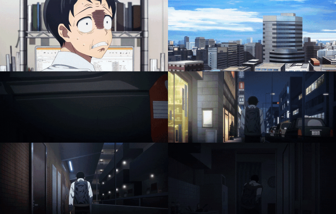
I think one of the most interesting things off the bat is how strong the direction is through this first episode. Kawagoe Kazuki (who's first direction credits were for Komi) brings the heat through this first episode as the lead and episode director, as well as storyboarder. Back to why the direction is interesting though, initially you might think "oh, widescreen because it's a movie, and it just has a more muted color palette", but that's not the case. It's a bit of a two in one, where the widescreen indicates that we're looking through Akira's eyes, and the lack of color is a reflection of their outlook. It's well done, but I also think they could do a bit more to really explore the idea, but in its current state it's still really solid.
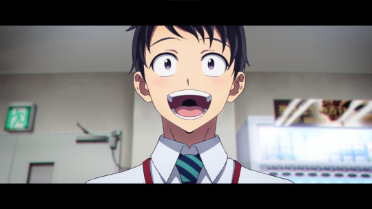
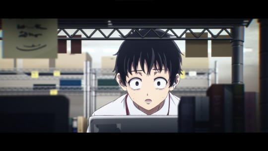
While not as important as the widescreen effect and use of color, the transitions boarded by Kazuki themself are very creative and blend incredibly well with the episode. Just one of those things that adds some real nice flair and style that can help tie the bleaker/more plain moments together with the more showy ones through the latter half of the episode.
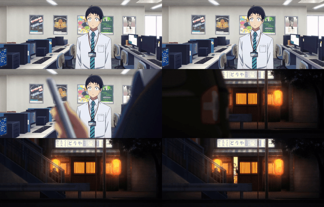
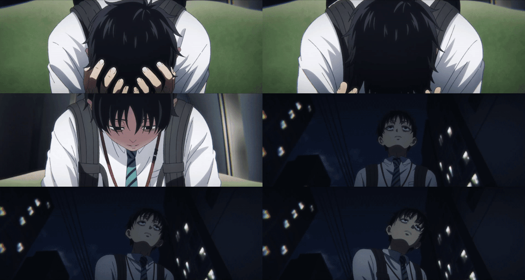
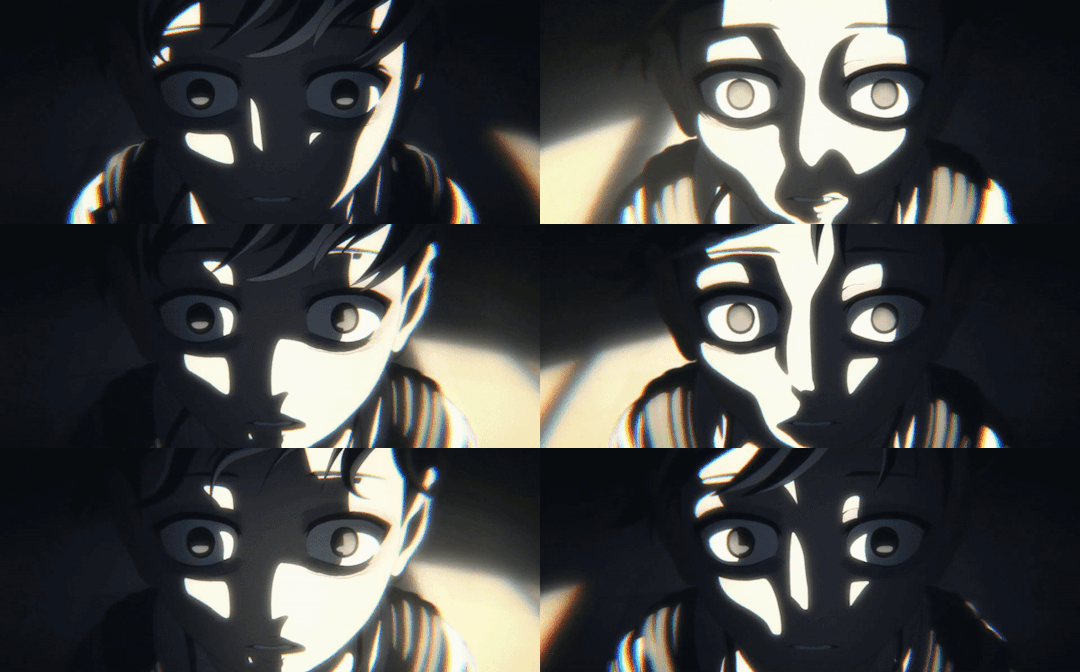
What you can (sort of) see through these gifs though is another important piece that I think is well done through the episode: the "zombification" of Akira himself. More sluggish and unresponsive, coupled with heavy and off balance movements. The entire concept of the gradient and Akira's descent into depression and exhaustion is very well depicted. Towards the end of his backstory though is arguably the best pieces for his despair, just really well done animation and direction that sells that zombie side of his character.
Also, just a little side piece. Following this scene we return with Akira to his room where we see on the news the beginnings of the zombie outbreak. But actually, the episode spoils the fun a few seconds in advance with the ambulance that passes by Akira's apartment. Just a really neat little detail to show that the outbreak isn't just a single point that's currently starting, but rather it's already expanded to a network that continues to grow.
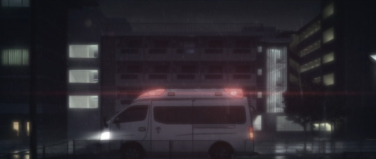
Anyways, the next topic of the post: depth!. I mean, you can see it in the above still as well, a lot of scenes are well layered with their content. Not all of them will have detailed parts that are all moving, but they will provide the context that there is a greater world that exists outside of Akira's vision (though this does fade as his exhaustion and depression grow).

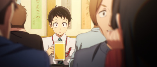
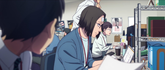
Also, people aren't explicitly required to provide depth or layers to a scene, it's just that they're the easiest examples to provide. These solo shots manage the same effect, for example.
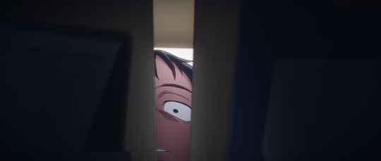

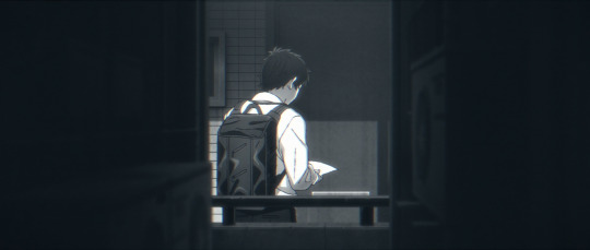
Coincidentally, this is also where the episode picks up! Flashes of color appear, Akira regains his energy, and a horde of zombies claw at his heels. I was very surprised with this latter half, and I mean very. They use some really sneaky tactics to make the best of the moment. Have a zombie that's going to make a lunge for Akira? They're in 2D. Have a zombie in the background that's going to just zombie about? Make em 3D. The heavy visuals effects coupled with the more "rough" art style allow them to blend in really well unless you're looking right at them.
For example (though it may be hard to tell because of compression and size, so best to open the image in a new tab), take a look at this still and see if you notice anything. That's correct! The first two zombies in the row are 2D (because they lunge at Akira), while the rest in the line are 3D. Really smart workflow that's further bolstered by direction that does its best to mask the 3D zombies.
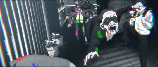
For a purely 2D affair though, this incredible short cut from Akira fleeing up the stairs. I'm endlessly impressed with how solid BUGS' work is through this first episode.

As you can tell, this second half/latter third brings an insane amount of energy to make up for how devoid of it Akira was through his backstory. It's really great work, and the flow of the action through Akira's chase sequence is really impressive. They do a great job with interacting with the environment while providing a cramped feel through the apartment complex alongside some "right behind you" tension. All of which leads to this moment, essentially the perfect personification of this half of the episode.
Just completely out there and ridiculous work that's strung together by loose threads to create a bigger picture that completely captivates viewers. Does it have to make sense? Definitely not. Does it have to look cool? Absolutely.
I could share a lot more about the episode past this point, but I'll limit myself to this last piece: the tone changes. It's not longer Akira's life or death situation that feels very tight and narrow, it's his escape towards freedom that gives him plenty of space (which is shown in these shots). It's a somewhat subtle difference, but provides a massive gap in feel for viewers.
Well, when you extract it from the chase sequence at large, it's pretty obvious: there's hardly any zombies in frame with Akira.


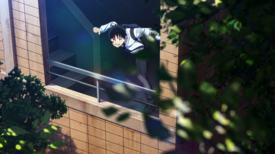
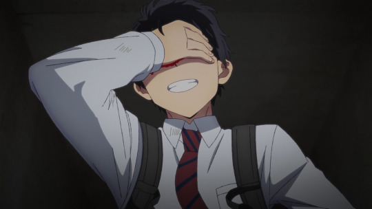
And so we cruise into the end of the episode with a fight sequence here, and a chase sequence there, leaving off with Akira on his own and making his bucket list of things to do. There's lots more to chat about in regards to direction with things like the first person views and the really impressive blending of 2D and static/3D environments, but I think the point has gotten across that Kazuki's direction, and BUGS FILMS work as a studio, is incredibly expressive, dynamic, and punchy, leaving viewers with quite the promise for this season at large.
My only real concern is if the source material for Zom 100 can continue to deliver ridiculous ideas in spades for BUGS to convert on. I'm rather confident in their ability as a studio since they've worked as a third part/assistant on a number of series, so I'm just really hoping that the creative vision can hold the momentum given to it through this first episode.
#zom 100: zombie ni naru made ni shitai 100 no koto#zom 100: bucket list of the dead#bugs films#zombie anime#anime recommendation#anime review#anime and manga#ゾン100~ゾンビになるまでにしたい100のこと~#anime#horror anime#comedy anime
22 notes
·
View notes
Text

Shizuka isn't the only addition to Akira and Kencho's group in Zom 100: Bucket List of the Dead Episode 6. They also acquired a brand-new RV!
#zom 100#zom 100: zombie ni naru made ni shitai 100 no koto#zom 100: bucket list of the dead#zombie anime#shizuka mikazuki
2 notes
·
View notes
Text
Seasonal First Impressions: The Apocalypse as Liberation - ZOM 100: BUCKET LIST OF THE DEAD is the Season's First Must-Watch
The best premiere of the year to date, Zom 100 explores the end of the world as a source of joy and liberation via the medium of high-energy animation and ultra-colorful blood splatter. Watch it! ------
Seasonal First Impressions is a column where I detail my thoughts, however brief or long, about a currently-airing anime’s first episode or so. Oh thank god, an unequivocal winner. Listen; there have been a few things this season that I thought were decent, or have potential. Some have even been pretty good. But most of what’s premiered so far this season has been bad. Very bad. Evidence of the…

View On WordPress
#2023 summer anime season#anime#Bucket List of the Dead#BUG FILMS#Zom 100#Zom 100: Bucket List of the Dead#zombie anime#zombies
4 notes
·
View notes
Text

#posting as mature for violence: anime girl gets hit by a truck#boom a big fat truck#tumblr#tumblr gifs#gifs#gif#anime#anime memes#zombie anime#I forgot the name
0 notes
Text

the flesh will persist (graphite & digital, 2023)
#salmon#zombie salmon#freshwater fish#nature#graphite#traditional art#my art#animal death#id in alt text#been thinking a lot about how salmon can start to decompose while they are still alive
18K notes
·
View notes
Video
youtube
Zom 100: Bucketlist of the dead Ep 1 Reaction | Akira of the dead
#youtube#zom 100: bucket list of the dead#zom 100#zombie anime#anime#zom 100 reaction#anime reaction
1 note
·
View note
Text


HOUSE OF 1000 CORPSES rob zombie, 2003
#hes my spirit animal#captain spaulding#house of 1000 corpses#sid haig#rob zombie#horroredit#horrorsource#junkfooddaily#filmedit#dailyflicks#horrorfilmgifs#dailyhorrorgifs#classichorrorblog#userorion#userscary#userhorroredits#mari.gif
2K notes
·
View notes
Text


Rotting Season
Follow the trail. Catch the Scent. Hear the air wheezing between buzzing of insect wings. Shake off the flies. Find the dawn.
Download - Prints and Apparel
#happy halloween!#zombie#gore#blood#horror#horror art#body horror#zombie deer#zombie elk#animal death#zombie animal#maggots#corpse#macabre art
1K notes
·
View notes
Text


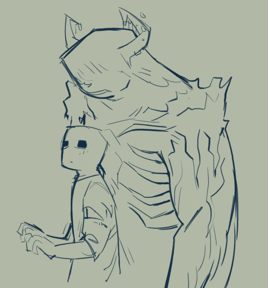

Bunch of kinda old doodles.
#I should draw more complete drawings of the iron golem and warden bc i lov emmm#art#minecraft#minecraft warden#minecraft iron golem#minecraft zombie#minecraft villager#minecraft enderman#animal crossing#kicks AC#furry
1K notes
·
View notes
Text
Yall know what day it is. Degen day! And it’s Zom 100 themed!
We talk about our “Bucket Lists of The Degens” & Discuss the last 3 eps of Zom 100!
Next week we’ll have a special guest, so hope everyone’s ready for those shenanigans!
Links- Linktree.com/animedegens
#anime

#anime#anime degens podcast#anime podcast#anime news#anime degens#anime and manga#anime movies#podcast#zom100#zom 100#zombie anime#zom 100: bucket list of the dead#zombie#bug films
1 note
·
View note
Text
Zom 100 Episode 3: Best Friend of The Dead

So, our first SHAFT-involved episode has arrived and at the very least I'd say it's an interesting one. It does give BUGS that extra push required to really show off, but in the same breath it adds another degree of struggle to keeping the production organized, on task, and coherent. I'd certainly say it's a better showing than the second episode, though not without its own unique struggles. Of course this means there's lots for me to chat about, so enough beating around the bush.
So for clarity's sake, SHAFT's involvement. They're basically a partner on this series, but the partnership is a bit different than what you might expect. SHAFT handled the animation direction for this episode (both chief and regular) as well as 2nd key animation and in-betweens, but left BUGS to do the 1st key animation. Doesn't really sound like much of a partnership but is sadly what's needed to keep BUGS going. I wouldn't call it terrible or a struggle for BUGS, especially since they've retained control over the most "important" pieces like first key animation. I'd just more so say that SHAFT is doing all the heavy lifting so that BUGS can show off some.
Anyways, the episode itself. We start with a hostess club/Yakuza Joint (? not super familiar myself) going to bat against a bunch of zombies. I think it's a fun idea that really sells a lot of the typical desperation of the zombie apocalypse, but is overshadowed by the struggles illuminated with the production: character models. They're.... how you say, a little all over the place? Just check out this new character Shou. A little messy and odd, right? Maybe not the greatest example, but something you pick up on pretty quickly with changes like how the hair is shaped and things like that.


Following this up, we have the issue of compositing. I wouldn't say it's terrible through the majority of the episode, but there's certainly moments where the art style of the characters just has zero chance of meshing with the environment. It sticks out like a sore thumb because of things like heavy outlines or rough line art, so I'm not entirely sure what prompted this decision when it seems like something that can be solved. Also, some of the CGI stuff is pretty rough like the beat up car/van in this image.

In comparison, one thing that I think BUGS is still doing really well is the integration of Akira riding his motorcycle. Perhaps a little bit messy at times when in 3D, but the tight and closeup shots that allow them to work in 2D really help alleviate some of those struggles.

I'll quickly double back on that CGI comment to cover the zombies as well. It's eight out of ten times really good, and two out of ten not-so-great. Take a look at this scene, for example. When in the typically bright exposure of Zom 100 the CGI zombies look good. In the shade though? Not so much. I will say though, BUGS is aware of their limitations here and chooses to zoom outward so you don't get a perfectly clear look at some of their not great work.

Following this we get treated to the opening, which does change compared to episode 2. I get it, I think, but I don't really like it honestly. They're re-using basically a whole bunch of scenes from the prior episode to provide the foundation for the next episode's opening, and I just don't really find it a creative or well-used idea given that they're simply choosing the best animated sequences.
Anyways, the episode goes on and we find Akira in his apartment fooling around with stuff to cross off his bucket list. To be honest, I'm not that interested in this side of the story really, but at the very least do appreciate the use of letterboxing to indicate past-tense for the story.

Overall, nothing really of note with the sequence other than some cut corners to preserve effort. You'll notice it with things like the phone when it's motion and whatnot. The more glaring issue is once more the compositing. Akira as a character blends really well with the environment, but the details like the pieces on the table, the rugby ball, and so on are very out of place. Once again, it's a somewhat odd decision as Akira interacts with very little on the table. Maybe a gamble to make the objects seem more normal by having more drawn on top of the environment? I'm unsure, but regardless it's there and can be a bit jarring.

Also, just a quick callback for the phone. This is the same phone in another cut. Obviously, a shorter cut and one that only moves in the typical X and Y axes, but still one that can be confusing and jarring when coming about a minute (or less) after the prior cut of the phone.

Alright, enough complaining for now. Let's talk about some good stuff! I really liked how the letterboxing was made use of in this cut. When you have a widescreen ratio you definitely have to pull things out to establish the space in the scene, and it's used expertly to begin the implicit conversation about Akira and Kencho's "freedom" that they explore in the latter half of the episode. Similarly, I think they make an interesting but valid choice with Kencho's half of the ultrawide conversation. It makes sense with how the camera pans that he appears in a similar format to Akira, albeit closer to the camera, but I feel like the ideals of the two characters in this moment would be better represented if we continued with the closeups of Kencho that were used prior to and after this phone call.


So personally speaking, I'm not typically a fan of overexposure in terms of lighting in scenes. Because of that I'm also not the biggest fan of Zom 100's composition typically. However, there are certainly moments that lend themselves to overexposure, like the above (which is only slightly so), or this scene of Akira remembering his time with Kencho. Against the photograph backdrop something about it seems very cinematic and well received compared to if it were more usual lighting. Also, I did go back and check the manga for the first time with this scene, and this is an original concept which is incredibly well done. I might not think it's the greatest episode on average, but there's certainly more than a few great ideas woven into it.

Keeping the train rolling, I'm a massive fan of static layouts that focus on character acting and movement through a scene, so of course I've got to sing my praises for this sequence. Maybe a bit of an odd spot with that one weird jump in animation for Akira (and the shading being far too dark/not changing), but overall I really enjoyed the sequence. Also, the hotel's called Hotel Z. (please ignore the weirdness of the coloring, gif compression isn't easy thanks to Tumblr)

Alright, where to next? I thought the horror vibe of Kencho's escape was fun. Lots of great ideas, with a few that were inches away from being outstanding. Blown perspective with low and high camera angles? Great decision. Indirect views of Kencho as he walks down the hallway? Love the idea. Empty hallways with (very subtle) dolly zooms and long holds? Great suspension. A shot of Kencho's back as he walks? Incredibly close to greatness in selling the ending sequence of the scene. I'm not sure what was up, but the opted for the camera to follow Kencho, and evidently their CGI environment wasn't able to keep pace. I think the more obvious and way cooler answer would to have another dolly zoom in the sequence as Kencho makes his way down the hallway. Would solve the struggle of the environment and further contribute to the horror feel.
Okay, I do have to slow down the hype train and point something out though. In this sequence, we get four different approaches to lighting and composition. I still think it's a solid sequence, but similarly, the struggles are very apparent through it.


Moving forward, Akira finds Kencho and they end up being forced to flee to the rooftop with a horde of zombies on their tail. Push comes to shove and big movements end up happening. Overall, it's probably the best animated sequence in the episode. Nothing incredible or super flashy, but just well done work on all fronts to create smooth and effective cuts.


Anyways, push comes to shove, Kencho overcomes an emotional boundary about work culture (which is well done, it's just that once more I'm not super invested in the story), and the two escape the zombie horde and have a beer on a rooftop to end the episode.
I think it's pretty clear where BUGS as a studio lies in terms of strengths. They've built out a solid cast of high quality key animators, but lack a lot of staff and management to be able to properly deliver on solo projects. Maybe a smaller scale production would have worked better for them, maybe with the success of their collaboration with SHAFT they'll do more projects together, or maybe the success garnered from this series will allow them to greatly improve. I'm not sure which it might be, but I'm hopeful for them to move forward and learn from this experience.
And an experience it is. The composition is very messy and inconsistent, the character models are a bit too elastic and disorganized, there's some animation errors here and there, and so on and so forth. Some of it can be attributed to the issues of juggling production between two studios, but it doesn't alleviate all of the challenges seen today. I'm still hopeful, and still interested alongside many others though in what BUGS can do with this series.
#zom 100: bucket list of the dead#zom 100: zombie ni naru made ni shitai 100 no koto#Zom 100#bugs films#zombie anime#anime recommendation#anime review#anime and manga#horror anime#anime#comedy anime#ゾン100~ゾンビになるまでにしたい100のこと~
11 notes
·
View notes
Text

In this review of Zom 100: Bucket List of the Dead Episode 3, I go over some of the different bucket list items we can expect to see in the series.
#zom 100#zom 100: zombie ni naru made ni shitai 100 no koto#zom 100: bucket list of the dead#zom 100 anime#zombie anime
4 notes
·
View notes
Text
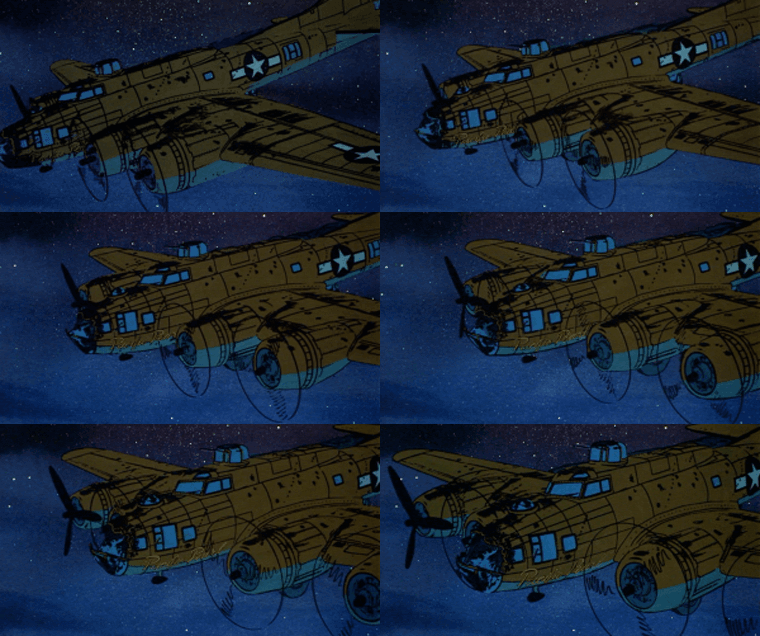
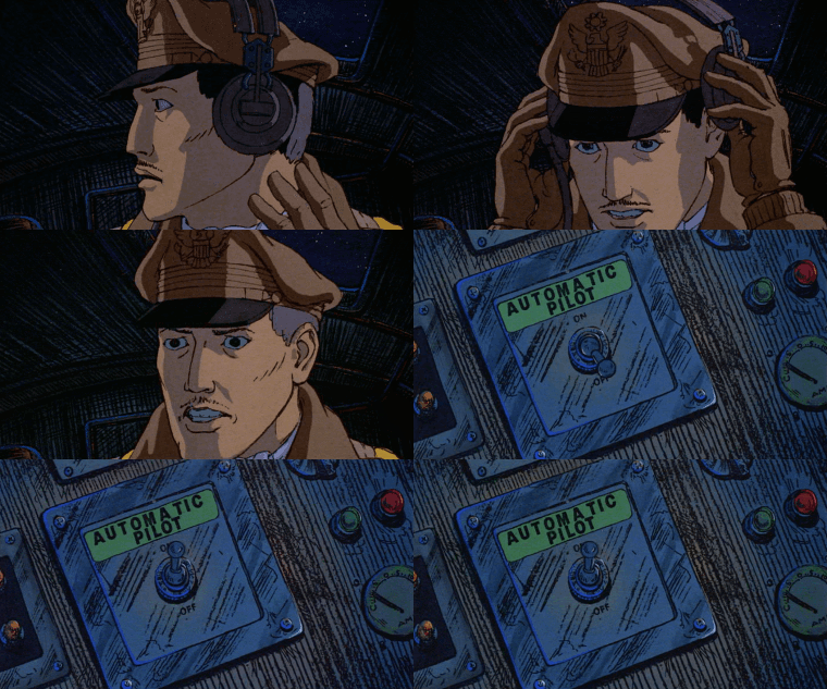
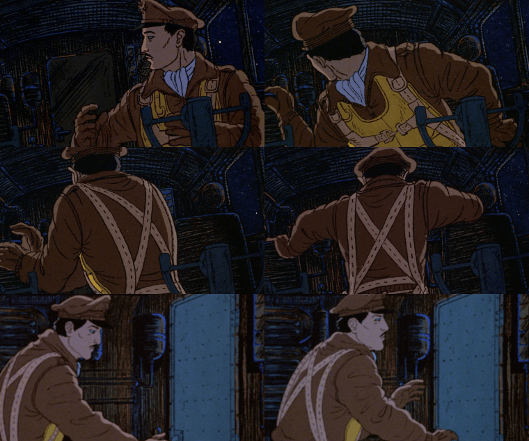
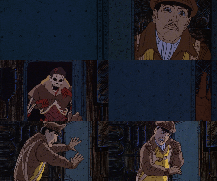
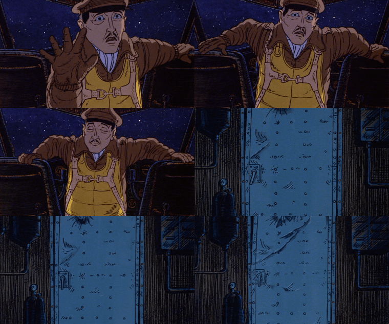
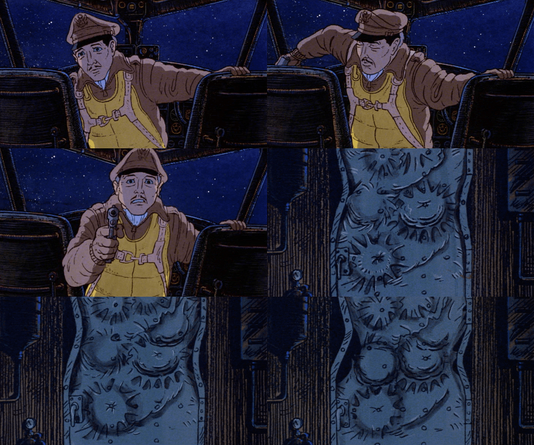
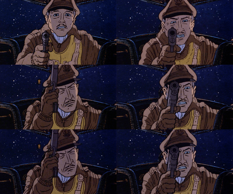
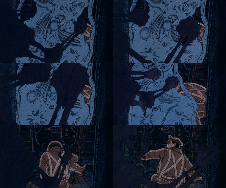
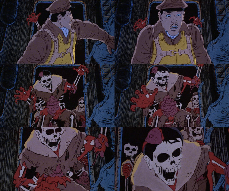
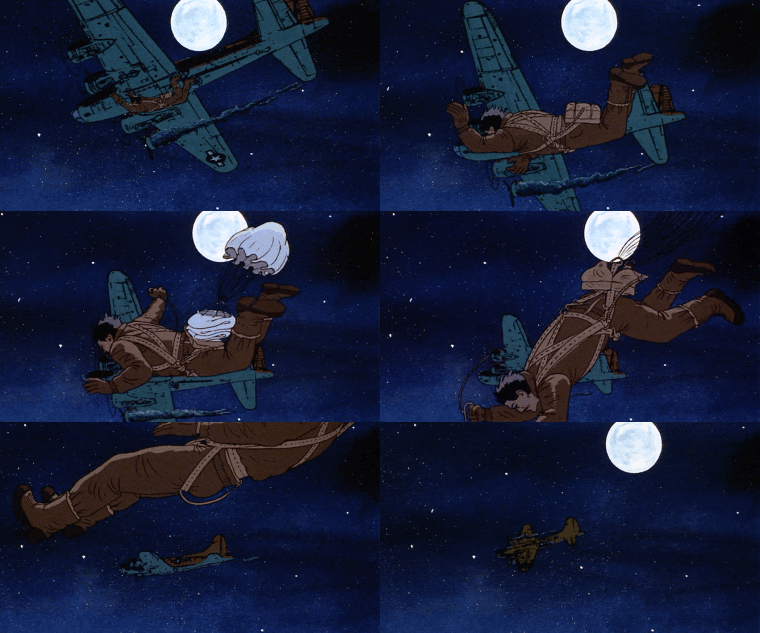
B-17 - Heavy Metal (1981)
#heavy metal gif#b-17 gif#cw flashing#heavy metal movie#80s animation#animated features#80s horror#wwii#zombies#dan o'bannon#barrie nelson#atkinson film-arts#80s movies#1980s#1981#gif#chronoscaph gif
947 notes
·
View notes
Text
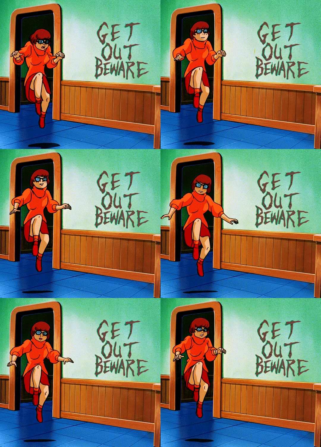
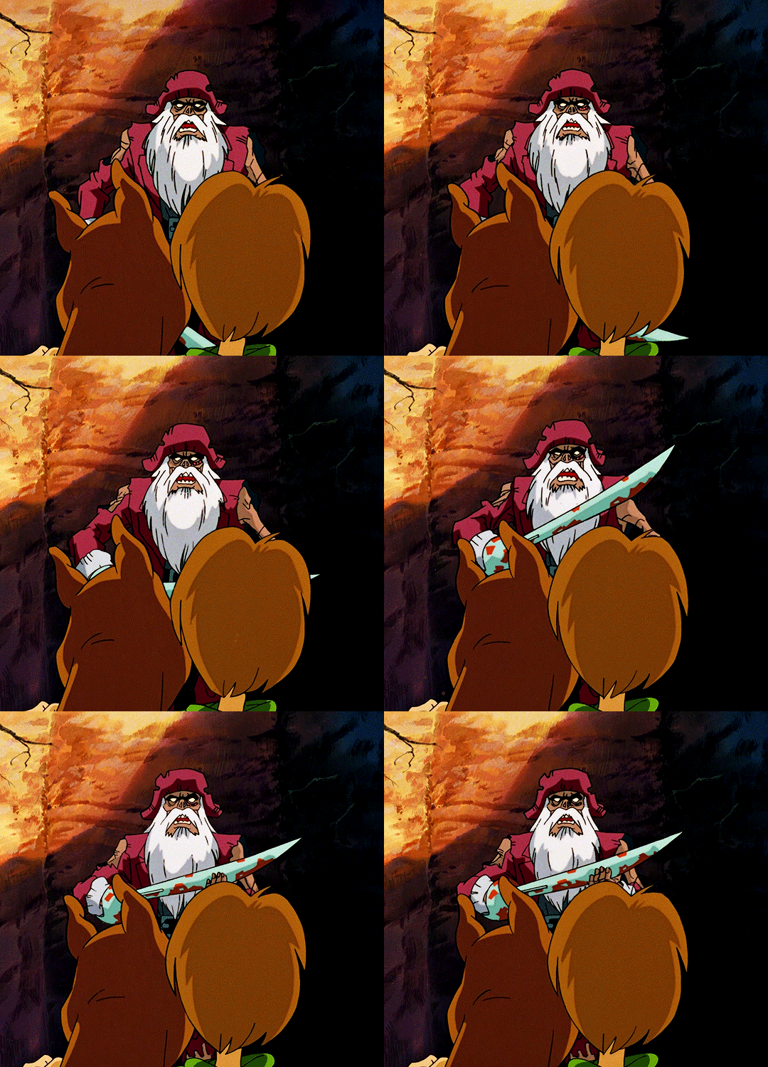
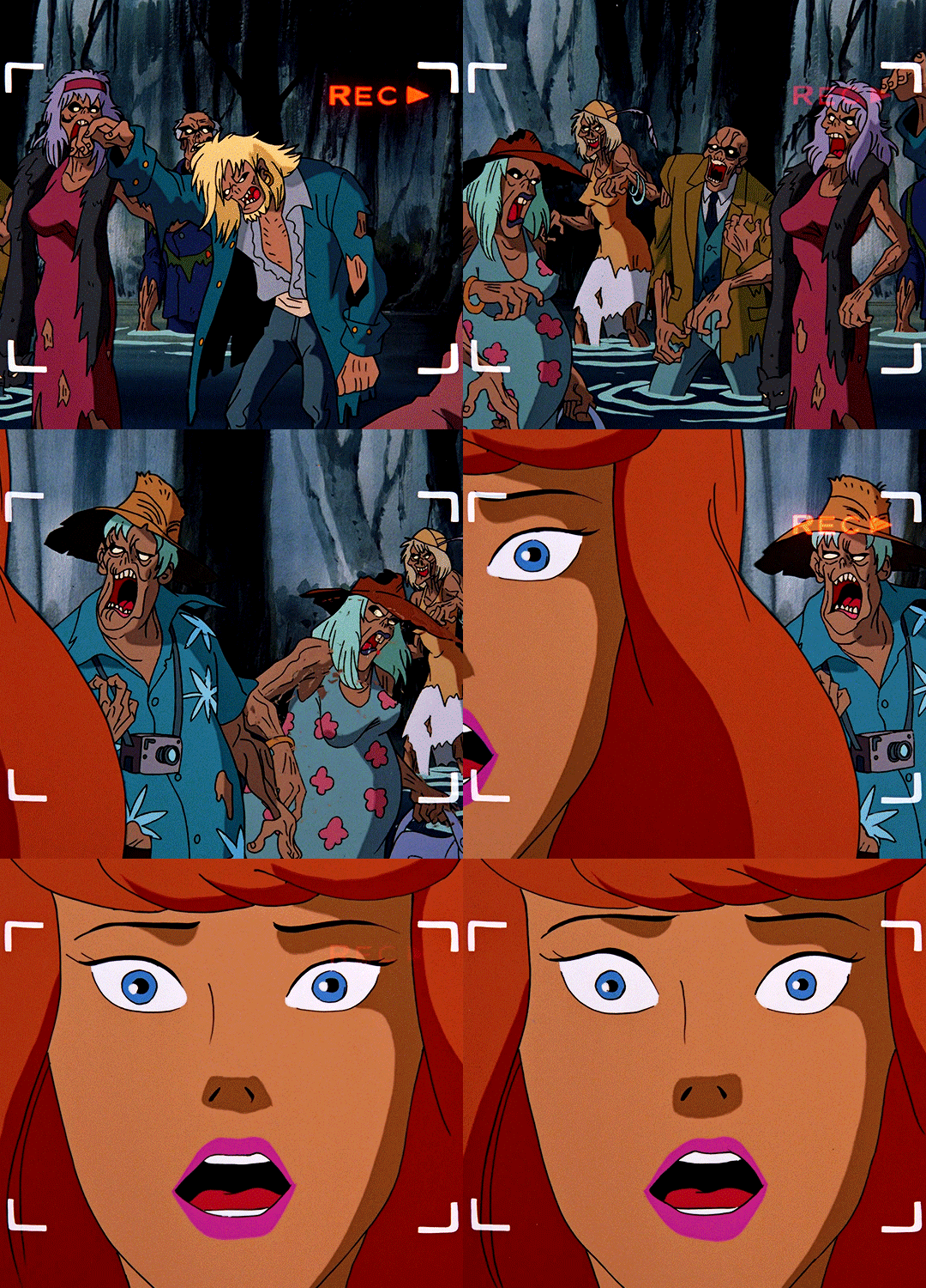
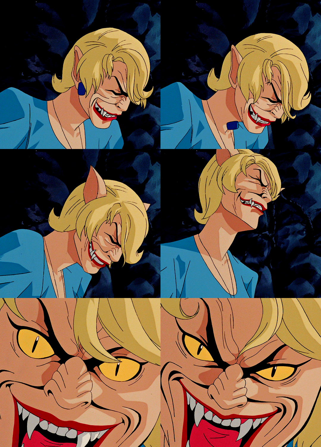
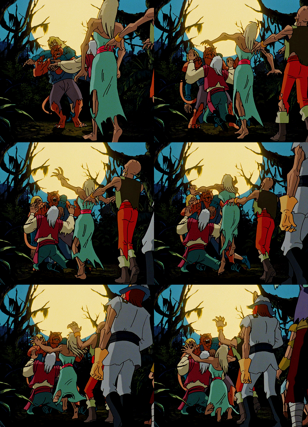
Those zombies are just the poor souls you drained! They were just trying to warn us so that we wouldn't suffer the same fate they did!
SCOOBY DOO ON ZOMBIE ISLAND 1998 — dir. Jim Stenstrum, Hiroshi Aoyama, Kazumi Fukushima
#scooby doo on zombie island#scoobydooedit#animationedit#animationsdaily#dailyflicks#filmgifs#horrorgifs#userscary#userbbelcher#tuserhan#tuserdana#heymax#usersameera#xuseralex#animation#horror#*#movies
4K notes
·
View notes
Text


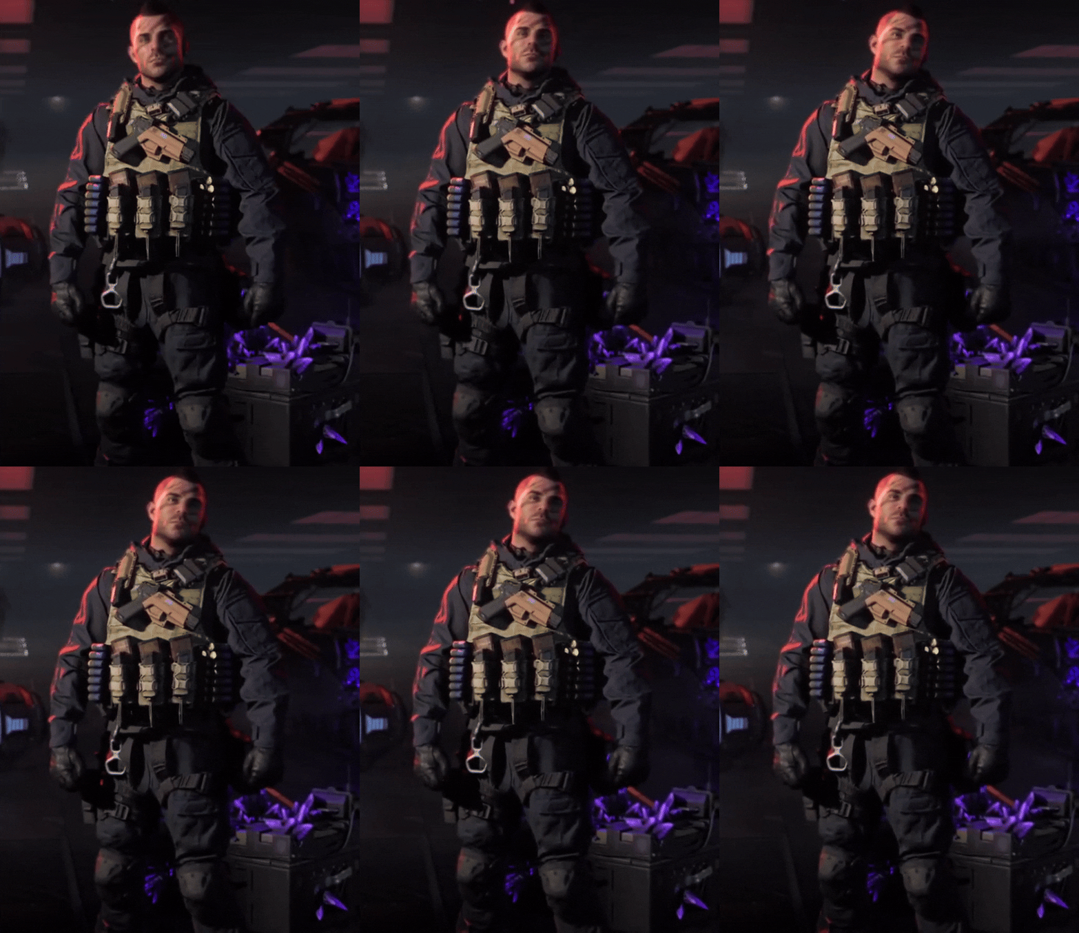
Covert Ops Soap in the Zombies Lobby<3
#i love this animation#he's so cute#call of duty#soap mactavish#gif#gifset#video game#call of duty zombies#zombies#mwz#modern warfare zombies
2K notes
·
View notes