#xitsen….asking me?.? for art advice
Explore tagged Tumblr posts
Note
Hello! I'm a big fan of your colour choices in your art especially for your painting style pieces(if that's what you'd call those?). Is there a technique behind how you pick the colours for your works so they work as harmonically as they do? Studying your art fr fr
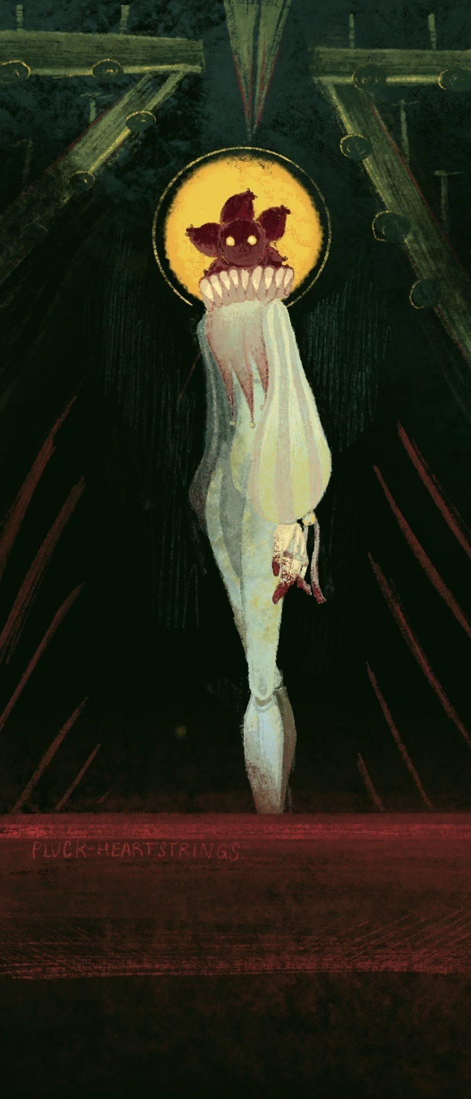
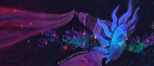
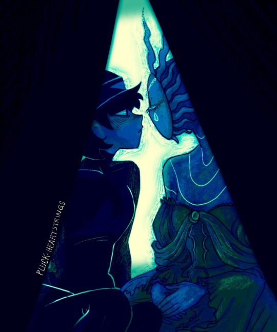
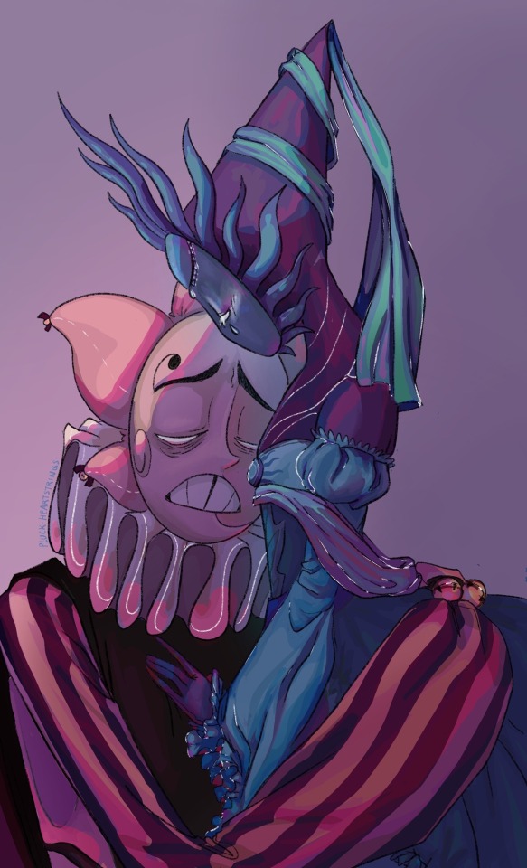
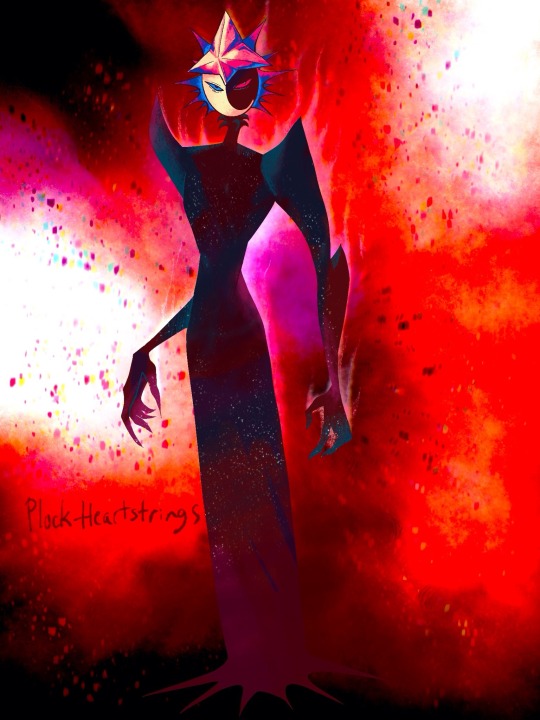
Here's some of my favs of yours and just to show what I mean by paintings :] so very tasty. If you feel like it's purely intuitive I get that! and thanks for blessings our eyes anyways!!
Lmaooo Xitsen I wish I could tell you I have a magical formula when it comes to colour. In reality, I have a very frantic process /sweats
The first three images actually had designated ‘colour reference’ that I was using. Basically I had a pose ref and a colour ref. I don’t always use a colour ref, but for these three I did. AND EVEN THOUGH I DID, the final product ended up being very different from the reference. I also chronically merge layers. Like all the time, even if I regret it sometimes, I can’t be stopped.
I remember specifically on the Sun one, I was working with two layers; the background and the figure. Then I duplicated the Sun figure, shifted the colour in the ‘hue’ slider, and fiddled around with some of the layer filters. I merged those two layers, and used my trusty 6B Procreate Pencil brush (default) to blend in some of the colours that looked wonky. And I don’t mean smudge, I mean eye dropper and sketch on top. Messy messy.
The last two were a bit different but still kinda the same. I frequently duplicate layers I’ve already done and mess around with the colour on the hue slider, using the layer filters all wild. I just try and see what looks good, but I try to stick with at least a cool shadow with a warm light, or the opposite.
Basically, fiddle with crazy colours and win silly prizes. My colours don’t always turn out nice, but I’m flattered that you found the ones that I also like. The first three are gems in my collection that I think back on like ….how did I do that…?
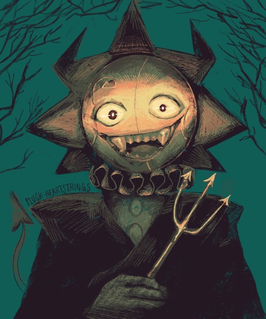
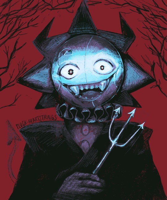
As a special bonus to prove my point, here’s an art attack I did for last year that started with an entirely different colour scheme from the final.
On the left is the colour scheme I chose from colour reference (I think an old movie poster) and the right is the more ‘vampiric’ one that I ended up choosing. But in all honesty, there were a bunch of colour schemes that looked good with this piece. It’s a good example of cool shadows, warm light and vice versa.
#ask pluck#xitsen….asking me?.? for art advice#I need to go lie down#Xitsen is the reason Eclipse and PMH Moon have claws THERE I SAID IT
48 notes
·
View notes