#with added stuff on top. Lineart Two if you will. and i had an absolute blast (i love lineart)
Explore tagged Tumblr posts
Visit Tumblr Blog
Explore Tumblr blogs with no restrictions, modern design and the best experience.
Last Seen Tumblr Blogs


Fun Fact
In 2020, 27% of US Tumblr users had an annual household income of over $100,000.
Text

@midoyuzuweek day 7 | christmas / wedding / free day
mdyz christmases you will always mean everything to me. decided to give lineless art a shot again after how many years and it was pretty fun!! also i lied when i said the ghostic piece was my favorite actually cause this was extremely fun to draw
ideally this wouldve been the last day but because i am sick and twisted theres one more tomorrow 👍 beware
#duck scribbles#enstars#mdyzweek2025#midoyuzu#yuzuru fushimi#midori takamine#yuzumido#ensemble stars#the depression is eating me alive i think and this week has been some solace but if i go missing for a while dont worry too much abt it#xmas live youll always be famous......#last time i tried lineless/smth akin to painting was like 2022?? im pretty sure.but this time it feels a lot more like just regular lineart#with added stuff on top. Lineart Two if you will. and i had an absolute blast (i love lineart)#ink pen my lovely wife i missed you i am so sorry for abandoning you all these years#the art pencil brush is too satisfying ive neglected you for so long in favor of it#also screw you flambe outfit for that annoying design at the back. it got covered up anywaysssss argh#ughhhhhhh i dont wanna do assignments and midterms. i have to lock in again.... i dont wanna....#other than getting to do this ship week its honestly been Incredibly Indescribably Excruciatingly Miserable for me for the last seven#or so days. or i guess its been a few weeks already. this thread is so close to snapping but feck it we ball i guess#at least theres fictional characters to get me through the fact this sorry excuse of a government reinstated martial law#hate it here
74 notes
·
View notes
Text
A totally self indulgent compilation of my favorite works on this blog of the year June 13, 2020 - June 13, 2021
2019-2020
The following lists are all in chronological order according to the date each post was first published.
Top 10 panel edits:
#1: It's our first morning
Date: Aug 20th, 2020 Time: ~ 2:18 h I really like how this one turned out!!! The 2020 Emma b-day edit has a lot of major panel redraws, but this is probably my favorite. I I really enjoy how I made the shadows work!! And the ear banfage looks pretty neat. Nice!!! Immagine
#2: Norman birthday edit 2021
Date: Mar 20th, 2021 Time: ~ 2:21 h Awww, soft Norman :') There was a bit to redraw, but I think everything turned out pretty neat!!! I believe everything works out fine. Though looking back at it, the part of the ID I added is definitely top small :')
#3: Manga dub: Yuugo gets knocked out
Date: Mar 27th, 2021 Time: ~ 5:05 h Here start the Manga Dub redraws to which I gave my everything ahah. This one turned out nice! I think the shoes turned out particularly good eheh. I like how Yuugo's clothing lineart- for the texture, I wanted to go for something heterogeneous, but I'm not fully confident in the final result. Gilda looks very rushed but ¯\_(ツ)_/¯
#4: Manga dub: Yuugo makes his dramatic entrance
Date: Apr 5th, 2021 Time: ~ 4:02 h This is pretty cool!!!! The coat took ages to redraw, but sis it turned out perfect!!! I'm very proud of this.
#5: Manga dub: RayGildEmma hug!!!
Date: Apr 9th, 2021 Time: ~ 1:31 h Awww, a beautiful panel I was really happy to have the chance to redraw. Taking into account what there was to redraw, I'm actually surprised with how little this took! Ray's backpack was a pain to make, but I think it turned out fine. I'm very happy with Emma and Ray's heads!!
#6: Manga dub: Formalities
Date: Apr 12th, 2021 Time: ~ 5:31 h It is not always easy to give sense to Demizu's perspective, but I do my best!!! In this I am *so* happy with how Don and Ray turned out, they look neat! The background on the other hand... It took hours to make ahah. I'm not fully confident in the perspective, but I'm happy with the details I've added- I really did my best to make it look like athe other manga panels and I think it paid off!!!
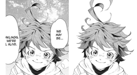
#7: Manga dub: We may be weaklings, but we're still alive
Date: Apr 30th, 2021 Time: ~ 1:37 h This little Emma is so cute!!!!!! I think the redraw turned out pretty perfect. I'm really satisfied with how this one turned out, and it's such a cute little Emma!!!! She's so brave and optimistic, I love her. It's a shame this panel didn't make it to the episode :')
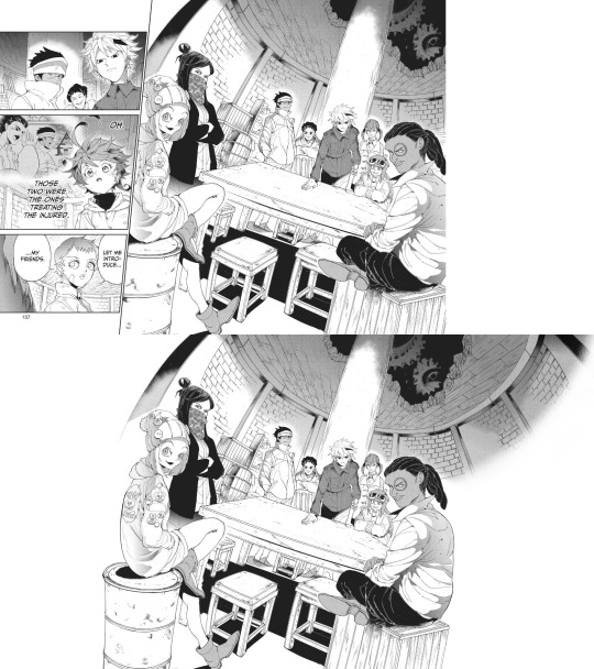
#8: Manga dub: Goldy Pond Gang
Date: May 7th, 2021 Time: ~ 8:44 h lmao This is probably the panel redraw I'm the most proud of ever :') Just think everyone turned out very nice!! The ceiling is not exactly perfect, but it still works somehow. I'm very happy with how Gillian's back turned out!! I don't really like the fading effect on the right, but 8h in I got pretty tired of working on this ahah
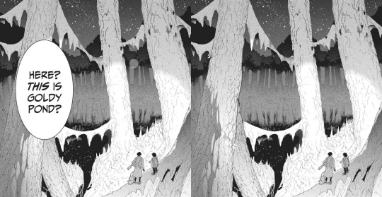
#9: Manga dub: This is Goldy Pond
Date: May 21st, 2021 Time: ~ 1:29 h I'm very glad for how the Manga dub has been challenging me to learn to redraw backgrounds, something I had quite literally never tried before. It can be a little frustrating, but it's so satisfying to see the final cleaned piece!! With this panel, I also learnt to use copy and paste, which is something I had never done before beyond texture
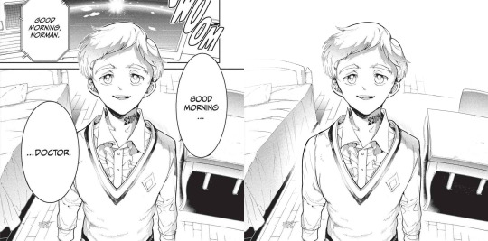
#10: Manga dub: Good morning doctor
Date: May 21st, 2021 Time: ~ 3:42 h This is another background that turned out pretty good!! That one Norman is one I knew I would have had to fully redraw sooner or lager- the background was a bonus ahah. I'm very happy with the final result!!
Top 5 edits as whole:
#1: The Promised Neverland manga ending edit
Date: Jun 14th 2020 Time: ~ 12h 41min (5h 45min of cleaning panels in the edit + 5h 37min of cleaning panels that didn't make it to the edit + 1h 19min of resizing) + time spent cleaning panels I've deleted the file of so I can't see lmao This is overall very nice!!! The concept of an Emma evolution through her back is cool, and I think overall the edit turned out very aesthetically pleasing. The concept idea came to me while I was working on the 2019 Emma's birthday edit, a long time before the manga ending announcement- back then I wouldn't have imagined using it in occasion of the manga ending, but I think it ended up making a nice tribute. The colors add a nice touch, since so far my edits had always been black and white- it makes a sweet closure. To make that edit I selected 76 panels of Emma framed from her back; I plan to make other versions of that edit using the discarded panels eventually!
#2: Emma - Chapter 181: Beyond Destiny
Date: Jul 12th 2020 Time: 2h 57min My last edit for the manga 🥺🥺 I think this one is my very "manga ending edit" because to me it really signed the ending of weekly chapters and their weekly chapter edits. It makes me a little sad to look at it, but it's also, I don't know, kinda sweet to see how I grew both in my panel cleaning and as a person since I first started my blog. I'm glad I got into TPN!
#3: Emma birthday edit 2020
Date: Aug 22nd 2020 Time: 8h 54min This one turned out so well!!! Though I used the same concept for all the trio edits, I think this one is the best one. The two panels on the left / two panels on the right alternation combo never fails ahah. The colors are nice (shout-out to my sister for making me a palette), despite the fact that it was hard for the lighter ones to make them work with the images without having those disappear. I'm very satisfied with the panels I chose for this, I think they work really good together! Also, it got me very happy to read everyone's comments saying they liked the fading effect in the last panel :)
#4: Emma + Eyes Close Ups [1/?]
Date: Jan 24th 2021 Time: 5h 55min This one was really nice!! Another idea I got when working on the 2019 Emma birthday edit I was glad to finally execute. Started the edit in September, finished it in December. I'm overall very happy with how it turned out... I hope I will be able to make more in the future!
#5: The Promised Neverland Parallels → (9/?) » 114 // 122
Date: Feb 23th 2021 Time: 5h 7min (panel cleaning only) Aaaaahh I really like this one!!!! A parallel I love very much, and I'm really happy with how the edit turned out. All the hair redrawing looks neat!!!! The gif is maybe a little excessive, but I think overall it's a nice edit. I like it!!! Fun fact, I completed it on August 26th 2020, but I couldn't find the right moment to post it ahah.
Honorable mention: The Promised Neverland Parallels → (5/?) » 08 // 16
Date: Aug 30th 2020 Time: 2h 52min (Second picture cleaning only; I deleted the first picture art file so ¯\_(ツ)_/¯ ) I don't have much to say about this one except!! It turned out very nice!!!!! Love the pen lmao.
Top 10 analysis:
Too many analysis,,
#1: Post chapter 181 Emma analysis
Date: Jul 9th 2020 Mmmh a nice analysis. I think it was important for me to put down in words what I think of Emma's characterization and the manga ending, so I'm happy I did it!
#2: A long Oliver analysis because I love him very much
Date: Dec 6th 2020 What can I say I just love Oliver tons 😔😔💕💕 This was very fun to make!!!
#3: TPN s2 previsions
Date: Jan 14th 2021 Really love the effort that went into this + me proving that 11 episodes GP could have possibly worked + it's just a lot of fun to read again after s2 ended pffft
#4: More s2 delusional previsions lmao
Date: Jan 27th 2021 I think the points and previsions I made where pretty neat!! In my defense, it was pretty impossible to predict the anime would have ended with this season. I always feel honoured when friends and Anon ask for my opinion, I'm like "you wanna know what I think? Wow. I'm flattered (◍•ᴗ•◍) " Thank you to anyone who ever sent me an ask!!
#5: Why Emma not wearing pants is 𝕨𝕣𝕠𝕟𝕘
Date: Jan 29th 2021 Really proud of this!!! Pants Emma is important!!!!!
#6: Post episode 5 manga Emma analysis
Date: Feb 4th 2021 A depressed analysis, but a necessary one 😔
#7: Norman analysis
Date: Feb 12th 2021 I love him!!!! And I'm happy I eventually got to put down in words what I love about his character. The day I posted this ww3.readneverland was in maintenance so I couldn't use the volume scans for it- the thought of that post having fan edited and fan translated scans still haunts me
#8: RayDon rambles
Date: May 12th 2021 I had a blast writing this and like. It's likely the post of mine I reread more often of them all. I love this ship tons!!!!! I'm satisfied with how I put down in words what I like about them. I LOVE THIS SHIP
#9: Chapter 58 analysis
Date: May 23th 2021 I've wanted to express this concept since like the first time reading the manga- I'm so happy I finally did!!!! This concept is one of my absolute favorite things about tpn- the feelings that people are good. The concept that kids who got to live in an healthy and supportive environment will always be inclined to kindness and altruism, because humans are just inherently good. From the Three Character Classic: “people at birth are inherently good”. I want to have faith and courage to hold on the goodness in myself, and to hold on the goodness in the world, no matter how difficult it to do that (Chloé Zhao).
#10: Norman and Lambda squad relationship analysis
Date: May 24th 2021 I think this was a pretty sharp analysis and I like what I did with it!!
Other stuff:
#1: Krone birthday edit
Date: Jul 15th 2020 This edit is so good ;; Like not perfect since it was my first attempt at coloring gifs but still I believe it turned out so good ;;;;;; The time and effort that went unto this is crazy, but... Maybe I'm happy to have dedicated time to something I like for a satisfying result.
#2: Get to know my ship- Wolfpack Trio
Date: Aug 24th 2020 Uuuh a good post. A good ship.
#3: Gilda + blank glasses
Date: Aug 27th 2020 This is such a cute nice compilation!!! I love looking at it. A few panels are missing but still :')
#4: Apollo Ray AU
Date: Sep 7th 2020 (Though it was written Sep 2nd 2019 lmao) I'm so happy I finally gathered the courage to post this ���😭 I really enjoy what I did with this AU, so this one and its other installments are all posts I have a lot of fun rereading. More than everything, I was astounded and overjoyed by the positive response it got: that gave me tons of confidence to put my ideas out there, no matter how unique they sound!!! Here's to hoping I will be able to post my RayEmma Hadestown AU, by other big AU from late summer 2019 :')
#5: TPN timeline project
Date: Dec 2nd 2020 This is like. I don't know it's a lot ahah. Arguably the project I'm the most proud of ever making. I'm just so happy of all the months long hard work and of the final result!! The post didn't receive much response (though the ones I got were extremely kind and sweethearted so that totally makes up for it), but in the end I don't really mind? I'm just so proud I accomplished that idea :')
#6: TPN calendar
Date: Jan 4th 2021 A nice sum of the tpn timeline + everyone's birth dates!!! I really like how it turned out visually. It's a cute little tpn calendar!!!
#7: Ray smiles compilation
Date: Jan 17th 2021 Ray's smile. That's it that's the post :')
#8: Trans Oliver headcanons
Date: Jan 24th 2021 MMMH really like this headcanon I think about it a lot
#9: Thoma and Lani theory
Date: Jan 28th 2021 I really don't want to brag but this is the best joke I've ever made :')
#10: My TPN AUs
Date: May 10th 2021 Ok you gotta admit those are very good AUs, I'm glad to have made a list out of them!!!
#11: Ranking Emma promotional art outfits
Date: May 16th 2021 This is one people seem to have liked a lot which makes me happy ahah. I'm glad to know we can all agree Emma deserves more pants outfits!! Please stop it with the gendered clothing :') This is the post I want to be remembered for
#12: TPN musicals AU part 2
Date: May 20th 2021 A GREAT POST I can't stretch enough how happy I am with those character-song associations. I hope I have time to make a part 3 in the future!!
#13: TPN Drive folder
Date: May 30th 2021 This was born as a way for me to have all the tpn extra contents easily accessible, but I'm happy to have shared it with people- I hope it will turn out to be useful to others too!
#14: TPN s2 recolorings
Date: Jun 12th 2021 A more diverse children cast is good for the soul :')
That's it, this year was really fun!! Thank you to everyone who supported me through it, I can't express how grateful I am for all the kindness and validation I received. Here's to many more months in the fandom!!! (ノ◕ヮ◕)ノ*.✧
#mine#tpn#the promised neverland#tpn manga spoilers#Tumblr: *literally refuses to let me open the post*#Me: *Turns on my computer* B*TCH YOU THOUGHT I'M POSTING THIS TODAY AND NOTHING IS GOING TO STOP ME#Been working on this for four hours now.. I'm literally dead...#Also thank you Tutu for deleting the other post you're the sweetest :')#Once again this is just a personal report you don't have to read all (or any) of it unless you want to :)#Ok to reblog btw#I'll click the post button now I don't want to hear anyrhing else
27 notes
·
View notes
Text
on a related note to the whole "drawing Asian people" thing (and to that post I made a while ago about people only using one or two shades of brown skin across the board!) - this is from an Art perspective rather than a Representation perspective (and, as ever, from a White Person perspective so grain of salt grain of salt) BUT
I think as an artist it's a pretty good exercise to work on diversifying your character art in ways other than skin colour and trappings like clothes and hairstyles. like. I very often see art that's like "this person is Indian" but lineart wise they're like. indistinguishable from a white person, they've just been like. coloured in brown and put in a sari. and to me that's dodgy bc a light-skinned Indian person is still Indian (think of someone like Aishwarya Rai and especially how many Indian celebrities are photoshopped to be as light as possible but they're still visibly Indian) and an Indian person wearing a t-shirt and jeans doesn't magically become Not Indian because they aren't wearing a sari and bindi and have hair to their waist. like ethnicity isn't a costume or a colour.
and that's not to say Draw Hyperexaggerated Stereotypically Racialised Features. that's definitely.......not good, and something a lot of people of colour have complained about particularly as regards art of Black, Indigenous and East Asian characters. and nor is it to drift into "BEHOLD, THE SKULL OF THE CAUCASOID EXHIBITS A PRONOUNCED BROW RIDGE" eugenicist bullshit, because no, there isn't A Singular Way that every member of a specific ethnic group looks, nor are there hard divisions between ethnicities.
Idk I've just found it helpful in my art to think about what my lines are conveying before I add colour or clothing or hairstyles. Originally this was about more broadly tracking the same face syndrome which is really easy to fall into when you're a mediocre manga artist in your teens (as I was) and really undermines visual storytelling, but then I realised while I was getting good at visually distinct faces, I was still only getting across that someone was Tamil or Jamaican or whatever by shading, which doesn't...at all work. it kind of just looks like you've drawn a white person doing brownface 9 times out of 10 if you are, effectively, just drawing a white person then Making Them Brown. So I had to work on that, and I'm still a long way off perfect, but imo it comes down to reference broadly (don't just Google 'Black woman' and base all your assumptions about how you'd draw Black facial features from the first page of results), think critically about what you're assuming are the "important" features (for example: do all Black people have thick lips and broad noises? really? when you look at reference photos are you looking at what's actually there or at what you expect to be there?), and listen to what people of colour are saying about how people of their race are depicted. but like. idk. I think it's a thorny topic but it's worth appreciating that as white artists we do have to actively teach ourselves to draw characters who are visibly non-white, because the Western art establishment in general and art teaching in specific tends to work from the assumption of white-as-default-ideal.
yk we learn to draw double-creased eyes as standard. we learn that a profile has a highly defined straight brow and nose, a minimally defined mouth, and a protruding chin. we learn that the upper and lower lip are about the same size and cupids-bowed. most art teaching and most how to draw books are based on the Classical Ideal which is a product of white supremacist idealism and the way a lot of books teach art is there is the Standard Figure (white, slim and cis male), the Standard Female Figure (white, slim, curvaceous and sexualised) and then you paste Diversity on top. and that requires in my opinion active unlearning. we should endeavour to get out of a place where we see white faces as the baseline and everything else as Adding Stuff On Top. idk. it's difficult to talk about our explore without falling into absolutist, highly racialised ways of thinking. and we absolutely will fuck up and the fact that we're trying doesn't make that ok! and when we do fuck up and draw something harmful we need to be humble and willing to accept criticism even when the urge is there to get very defensive.
#art#idk I'm probably talking absolute crap here#it's just something that seems like an important part of artistic development to me
18 notes
·
View notes
Text
Hyacinthus Art Process! (Part One)
ART PROCESS BELOW!!! (forgive me if I’m salty, I was looking for the link for Step One for almost HALF AN HOUR)
Also end and forgive me I made the bunning Hyacinthus PURPLE. Luckily I change it but S T I L L I’m ANGRY ABOUT IT
Step One - Rough Draft

Okay! So I started this album around October 20th, 2020 on a Tuesday (lol).
When I was thinking of the song (while doing the covers of the last two), I really wanted to show that power and desperateness of Jamil (and how he indulges and relishes in it). I remembering see this pose by yama_kome and I really liked how they represented Jamil’s overblot.
Ever since I saw this incredible piece of art, I wanted it to be done in this kind of way. Now, since I’m releasing covers of Scarabia (Mystique and Cardenalia), I decided to do it this time for his overblot.
Besides, I wanted to change things up a little bit!
This took me a while to get (almost a day I believe?), but when there’s a will - there’s way.
Just to let you know: I was originally going to name the song Hyacinth but if you say all the Scarabia Trilogy’s Tracks in order - it wouldn’t sound right. So that’s why I changed it to Hyacinthus.
Secondly, I feel like if you say a flower’s scientific name than its common name - it gives that effect of a beginning, of a source and of an origin. I feel like the Overblots are a representation of their true feelings and emotions (in this case, Twisted Wonderland) so that’s partly the reason why I changed it as well.
Step Two - Rough Lineart

This dang lineart took me till Thursday, October 22nd. Here’s why.
1. I COULDN’T WING IT THIS TIME - there was a lot going through my head as well as references about what I wanted him to wear. Other ideas popped into my head such as, “Should I add some blot there?” or “What should I do for the shirt?”.
So many ideas, but few were added.
2. The DESIGNS. - So many interpretations and stuff were everywhere, and they all looked good. But the problem was the amount of time to put such beautiful details. That killed me.
To sum up one and two, my brain for ideas went brrrrrrrrrrrrrrrrrrrrrrrr-
Steps of Lineart (at the top of my head - yes. I don’t write this in the time I’m doing it because it slows me down lol):
1. Face (was done already) - more specifically the side profile to the neck
2. Nose Piercing (yE-)
3. Mouth Piercing (hOt-)
*4. Braided Hair (*dies*)
*5. Veil on Face (then the pattern waaaaaay after)
*6. Dazzling-Jewelry-Neck (more sure about doing the neck first, but #6 and #7 can be interchangeable)
*7. Snakes (only the right of the art piece though/snakes nearest to braids or plaits)
8. Upper Body
9. Robes
*10. Chest
11. Shoulders
12. Right Hand - Fingers
13. Right Hand - Fingernails
14. Right Hand - Palm
15. Left Hand - Fingers
16. Left Hand - Fingernails
17. Veil on Body
18. Ear (YUP, I FORGOT THE BUNNING EAR-)
*19. Snakes (left of Jamil and his beautiful hair strand)
20. Right Earring
21. Left Earring
22. Thing on his head (nope, don’t know the name and I ain’t bothering)
*For numbers 4, 5, 6,7,10, 17 and 19 in particular, I had to do multiple layers to make the detail. I would say:
#4 - Two layers: One for the plaits and one for the line...thingy...
#5 - Six layers: It’s technically two, but I had made multiple to get the pattern I wanted. Sadly, I didn’t achieve it so I decided to stick with the one above.
#6 - Six layers: THE FULL DANG TRUTH. The diamonds were first (1), then the line separating the pearl and diamonds (2), Later the designs of the pearls + rectangular thingies (3), The triangle into multiple triangle thingies were next (4), Soon after was the circles into multiple circles + Two triangles overlapping each other (5) and then that last bit at the end of the neck (6).
There’s actually more due to the designs of the diamonds and pearls, but I’m not going that far into memory lane.
#7 - Eight layers: If you count them, that’s how much layers I had to go through.
#10 - Four layers (without counting the two (or three) patterns that you see up there): That darn pattern (1), Them s p i k e s (2), That thing it’s being held up in (3), that pattern near the spiky pattern (4).
#17 - Four layers: Just count, please. Going up and down with my eyeballs is killing me.
#19 - Seven layers: Not as bad (because it’s pretty small), but whatever. (1 - 3) First three ear piercings you see (you may see two though), that tail, long thingy (4) that crap Bubbles wear...them circles (5 & 6), and that diamond. (hehe cATER DIAMOND)
HI!!!
You better read that crap. I took a good while writing it. If you did, you earn my biggest respect and time in the inbox.
Step Two and a Half: Cleanup WITHOUT the Background

Ah. The nostalgia. That feeling when you forgot the flower you were supposed to be working on...
Words, text and speech can not even compare to the feeling I had when I rEALiZED, I foRGOT the BUNNING FLOWER-
Step Three: COMPLETE Cleanup
Perfection. Isn’t that nice?
Step Four: Coloring
October 22nd, 2020 at 11:03 AM...
Immediately when I thought of Jamil I immediately wanted to give him that w h i t e s c h e m e
The reason why I wanted to was because he hard more darker colors in his normal design, and besides - his power has something related to the meaning of white ;). Anyways, I made sure that the ivory (celestial?) theme continued to flow through the whole art piece. Basically, making this smol boy a goddess-
Also, I was thinking that this Overblot scheme would be his true form or something, but he kept it locked away maybe due to how much it takes up his health. Consider this idea though as 100% “Not-Fully-Developed-But-Getting-There” Idea.
I really wanted them snakes to be white. Sorry not sorry.
Plus, I wanted that veil black instead of white, but I was way too into it to ever think of that apparently. In particular, them f i n g e r n a i l s. I absolutely wanted Jamil to have that light peach color and all that so I did it! Makes my heart go UwU-
<>
Annnnnnnd cut! That’s Part One for you.
Hyacinthus [ Art Process - Part Two ] here!
Thank you for your continuous support!
#just#please#end me here and now cause I'm just like ://///////////////#it's easy to fix though so anyways-#TWSTxDAL art process#TWSTxDAL overblot#TWSTxDAL#twisted wonderland#date a live#scarabia#kalim al asim#jamil viper#twst kalim#twst jamil#this is the final one...:(((((#at least original Jamil's back again!#Requests are open - including Overblot Jamil HEHEH-#finally I queued this! Thank goodness...#now you guys don't have to wait! YAY!#but dang#ever since I've made music for scarabia I've started to love the characters in them espECIALLY JaMIL-#YE#UwU
4 notes
·
View notes
Text
Alright, time for an explanation
Or as best of an explanation I can give at this point.
So, yeah I’ve been pretty much absent from this blog for like what? 2 years? 2 and a half?? I’m not sure of the exact time frame, but needless to say, it’s been a hot minute.
So, where to start?
Well, I should probably say why I got so sluggish with this whole thing.
So, one reason is that I had started working as I had some tuition I needed to pay off and just to get some income in general. The hours , though supposed to be part-time, got weird. Like, work 8-10 hours one day and an hour and a half the next. This not only made my pay really fucked up, but also (and more importantly) had me just too dead to do anything else once I got home.
In fact, even my days off were just me resting and not really wanting to do any big art projects. Which brings me to my next reason:
If all of you who’ve been here remember where we left off, I was working my way up to revealing a very important character. And how I wanted to do it, was I wanted to have this entire comic laid out to introduce him the way I wanted to, drop some exposition, and set up future character arcs.
However, the little project balloon up a little too much. And by a little too much, I mean it took ages just for one strip of panels. Like a couple of weeks for like 5 panels-which there were 5 panels for each part, and there ended up being more 20 parts- I also had very little skill/experience with making anything in a comic structure (I still do, but I’m branching out and am better at it) so everything is in a top-down format and it added to how time-consuming it all was.
So, with everything moving at a snail’s pace, and the number of people coming aboard to see what this blog had to offer I started getting anxious about doing anything on here knowing that the more time I stalled, the more I was just disappointing everyone here. And then, the project ended up needing more panels than I was anticipating, therefore extending my workload tenfold. At some point, that anxiety spread to what I was working on and I could barely focus on what I was doing and kept worrying about how much I wasn’t getting done, how I wasn’t able to do anything else, all the details I was trying to put in that weren’t going well , etc., etc.
Eventually I just kinda sat around worrying about what I was gonna do about this whole thing while simultaneously getting absolutely nothing done.
And then that, combined with my shitty work situation making me practically depressed basically had me sitting on the whole project barely touching tumblr at all. for like two years. I mostly just kept to DeviantArt for a lot of my stuff.
Of course, during those two years, Bendy and the Ink Machine continued, ended, and is getting another game. And through all that time with the progression of the plot and such, I kept getting more and more headcanons and ideas that all tied into this blog’s AU
But I couldn’t show them, because they would be spoilers and would take place after what I was doing. Which meant I’d have to do that first. Which brought back the problems I mentioned before.
Now, even my DeviantArt content is starting to dry up, because of all the things I have to withhold until the stuff is finished.
Finally, I just go fed up with putting the ideas on hold and not getting shit done. And I finally came to the conclusion that I had been too inexperienced to try taking on a project that fricking big and honestly shame on me for that
So, here’s what I’ve decided.
I went ahead and decided to condense the project down to something that I could accomplish. I was originally going to have this character exit at the end, and only sometimes be available to for asks, but the amount of work that entail, if I wanted to get the points I wanted across, would basically put me back to square one. So, instead of doing that, everyone will get to ask him all the stuff they want in order to further this story.
Also, the way I’ll be doing answers will be slightly different; in that it’ll be a bit less of just answering questions with a bit of lore thrown in, and more of asks helping to guide the story. I’ll still give you guys a lot of fun input, though don’t worry! ;)
Next, the characters won’t be quite the same as we left of. You know, having a thousand and two ideas bouncing around your head for a while tends to lead to a few changes in how you do these characters. There’s been a good deal of character development, and a few dynamics have changed, so these characters may act a bit differently than expected.(how many times can i say characters in one paragraph???)
Next, fair warning about how the comic will look. I did have a few parts of it finished before trimming it down. Some parts had all the shading and dialogue and stuff finished, while some parts just had some lineart done (i did lineart for the fudkigng background why did i do that that was such a bad idea D:) Some panels will have the original lineart from 2 years ago-that i did not touch outside of cleaning- and others will be my recent style, so it might look kinda wonky with my old art and current skill right next to each other so just bear with me on it.
And finally, the last thing I need to say is that the amount I had condensed everything down to is almost finished- like, ready to go up within the next week finished. Hell, it could maybe even be finished within the next few days(but probably not because i nitpick like a mofo so it’ll probably be next week)
Sorry for the wait, all this time guys, I promise your patience will be rewarded
I might open the asks for anyone who has anymore questions for me, about this, or about the blog. What do you guys think?
13 notes
·
View notes
Photo
I’m Not Dead
I'm not laughin', You're not jokin' I'm not dead I only dress that way Out nowhere take me out there Far away and save me from my Self-destruction, hopeless for you Sing a song for California --My Chemical Romance, "Boy Division" ____ Have you heard?? Have you heard the news?? Well if not, I'm gonna tell ya: MY CHEMICAL ROMANCE IS BACK, BABY!!! :D On Halloween, we got the announcement that they will be playing a show in Los Angeles, California on December 20th. And just a few days ago we got the news that they're also going to New Zealand, Australia, and Japan which basically confirms to me they're doing so sort of tour, whether they actually call it that or not. There's still a lot we don't know for sure; whether this is just a one-time reunion tour or their official comeback tour, if we'll be getting new original music both at the shows and available for download/purchase or if they're just going to redo their existing music and covers, if it's only going to be the main four that were there at the end or if there will be some of the other members that were in and out over the years rejoining them...Where all they're going to go on this tour...the list goes on. But! The important thing, at least to me, is that they came back at all. Six years. Six years we've waited and hoped and prayed, been let down by false rumors and speculation...And now it's actually happening. I just... Hence why I had to make an art piece celebrating the occasion and as an excuse to talk about it. (I figure if I'm going to dump my opinions on the internet I might as well make some art to go with them. Sue me. ) Originally, I was planning on making something more along the lines of true fan art, as this is more pseudo fan art here, but I just couldn't settle on one good idea that I felt really comfortable pursuing. Although I am still considering doing an updated (or at least colored in) version of my Killjoys, Make Some Noise! (lineart) I did a couple of years ago...we'll see. Anyway. Since we did get the news on Halloween, it's worth noting that originally I'd been debating if I wanted to do any makeup this year at all or just slide on a mask since my only plans were going to Krispy Kreme, who was offering a free donut if you showed up in costume. But after the news broke, my decision was made for me. I had to. MCR isn't strictly associated with skeletons/skulls, as has become my preferred Halloween costume, but The Black Parade, their second album, does have a little skeleton as the leader of the marching band, and the band members did wear skeleton/skull inspired makeup during that time. Admittedly this year's makeup wasn't nearly as involved or elaborate as what I've done in years' past, but it beats last year's absolutely nothing. I ended up taking a few pictures to preserve the look, as I always do even though I rarely take photos of myself, and I would decide to draw one of them where I was trying to do this face that Gerard (the frontman and lead singer of the band) has made on a several occasions; this wide-eyed intense stare. Partly because this, I'm sure, is very close to my actual face when I heard the news that they're back, the makeup was inspired by them anyway, and also because it pairs very well with one of my favorite lines from my favorite song by them. Said line being, obviously, "I'm not dead I only dress that way," from Boy Division, as cited at the top of the description. If I'm being completely truthful, I can't even really put my finger on what it is about Boy Division specifically that makes it my favorite, as I've yet to hear an MCR song I truly do not like, but I think there's something in the lyrics of the full song that just sells it for me in combination with the high-energy music. But whatever the case, it is my favorite nonetheless. Beyond that though, it's really hard to place the rest of them in any coherent order because, at least to my ears, they're all really great. Anyway. So I went about drawing my face, erring slightly more on the realistic side than usually (but obviously not too much) in hopes of capturing the facial expression. Which, it's pretty good, but I do think it could've been a little better. I think my biggest problem was getting the eyebrows a mouth right, and I'm still not sure they're quite there since my real eyebrows are pretty translucent and the mouth was hard to balance between looking logical and more neutral than sad/angry. And I think maybe the proper expression was a little more apparent in the sketch, but it's pretty normal to lose some feeling between the sketch and the final product so that I won't discount too much. After that, I had to take a break from the drawing to think about how to color it in any style it and everything. I ended up transferring the sketch to Mixed Media paper after deciding I wanted to use alcohol markers as a base but not knowing if I'd need to adjust it with colored pencil and/or other mediums on top or not, and I did the lines with my Faber Castell Polychromos once I felt like just black lines would be too harsh and thinking colored lines would be better. Plus, the Polychromos are very non-reactive to water, so if I really wanted to I could add watercolor or something water-activated without having to worry about the lines getting messed up. I did not consider how the Polychromos would react to the alcohol markers, but other than one or two spots where the top layer of pencil kinda dissolved after some heavy layering (which was easily fixed by just going back over the lines in that area again really quickly), fortunately, it worked out okay. Although sweet sparkles I swear it took at least twice as long to actually do the lines as opposed to normal between having to apply enough pressure to get the right amount of color down and working on the differences inline weight. Anyway. I was a little worried about some of the shading/effects I'd be doing with the markers, but I think I did alright with it. This mixed media paper (Strathmore 400 series for anyone who cares) is nice and thick, so I had plenty of room to layer up and blend as I needed to get the look I was going for. This came in especially handy around the eyes and on the nose when I told myself to at least try and get the colors like the photo before cheesing it and just using straight (or nearly) black. The only area that I think came out a little rough is really the skin, mainly the forehead. But that has more to do with 1. There isn't much contrast on the face in the photo so I didn't want to take it too far in the drawing and 2. I think I may have started slightly too dark for skin this pale. I realize that's a weird thing to say, but when you're pale as a ghost like I am, you'd be surprised how easy that is to do. And to be fair, I probably could've tried to adjust that with colored pencils, and my original plan was to add some white pencil on top in the areas of the face where a highlight would naturally hit (forehead, bridge of the nose, cheekbones, etc.) But by the time I got done with the markers, I honestly felt like it was nice enough without any additional pencil that I thought it might be best to just leave it alone. Since I still have the original drawing, my thoughts may change on that and I could update this eventually, but for now, my decision stands. On the other hand, I was actually pretty pleased with how the hair turned out once it was colored. That is until I scanned it in. I don't know why, but the darkest shadows in the hair were too dark and too bluish on the scan, despite everything else looking fairly color-accurate. I fiddled with the scanner settings for a few minutes to try and fix it, but it became quickly apparent there wasn't much to be done about it at the level. Which meant I had to try making the adjustments in Photoshop. Now, I've done my fair share of scan-fixing, photo editing, and just color adjustments on digital art, but for the life of me I could not get things to work the way I wanted them to here. It became to the point I'm starting to suspect if the actual true-to-life shades of purple of the drawing are just really hard or even impossible for computers to capture and/or create accurately. Fluorescent colors fall in that category, surely they're not the only ones. In the end, after more time than I bothered to document messing around with settings and adjustments, and firmly decided I was not going to essentially manually re-color/shade the hair digitally, I tried the only other thing I could think to do. I took the hair, as I had been for all my adjustments since the rest of the colors were fine, on a separate layer and took all the saturation out so I was left with just the gray values. And I noted while I was at that point that it didn't seem to be an issue of the contrast between the shadows and the rest of the hair. The transition looked perfectly acceptable in grayscale. Then, I added a color layer on top of that one, clipped it to only show up on the hair, and changed it to an "overlay" layer so that I would get the values from the gray layer, but colored purple. It did take a couple of tries to get the right shade of purple for the color layer, and I'm sure it's still not 100% accurate to the IRL drawing, but it's a heck of a lot closer than it was. And this gets even weirder when you consider that just a few days before I made this drawing, I made a different one for a friend where I used the exact same marker colors for the hair, blended in almost exactly the same manner, on the same paper, and it didn't have this problem when I scanned that one in. I have never in my life. Anyway. The accessories actually didn't give me much trouble in drawing or coloring. Admittedly, I did tone down how many feathers and stuff are actually on the tiny hat for my own sanity's sake, and while I did my best with the lace on the choker, I don't have a ton of practice with drawing lace like this so I'm sure it could be improved. Although I did decide to color both of those areas (what I didn't draw/fill in with the pencils at the line stage) with a super dark blue-violet instead of a gray or straight black for the purpose of not totally hiding the linework I'd put in and to make it just slightly more dynamic. Which I think was a good call as it seems to tie in pretty nicely with the grayish tones on the face. Other than that though, I did try to stay fairly accurate with my color choices, and I think I did pretty well with that, all things considered. (Despite having a much larger selection than I did just a few months ago, I do still need a wider selection of alcohol markers in some areas just for the sake of color accuracy and smooth transitions.) Once my face was done, then came the text. I searched for a while, hoping to find an MCR appropriate font that I could hopefully add by hand, but my search came up empty. I did find one I really liked the look of though, called "Miserable." So I scanned the drawing in and after the aforementioned hair struggles, I got to play with the placement and structure of the words. I knew I kinda wanted something that just has that "I'm a logo/t-shirt emblem" kind of feel, and in the end, I think I got that. But I do think I could've planned out the drawing itself a little bit better in terms of the space left to fit the words into. I really didn't do myself a lot of favors on that one. It has its problems, but I'm still really actually kind of proud of how this turned out...and that's really all I have to say about it. Eh, maybe I'm just really happy because I know why I made it in the first place. Now if MCR can just come within 1-2 hours of my location so I can actually go see them...please... ____ Artwork © me, MysticSparkleWings ____ Where to find me & my artwork: My Website | Commission Info + Prices | Ko-Fi | dA Print Shop | RedBubble | Twitter | Tumblr | Instagram
#my chemical romance#mcr#boy division#dead#conventional weapons#return#the black parade#skullmakeup#art#fan art#self portrait#i’m not okay#killjoys make some noise
2 notes
·
View notes
Note
top 5 manga/doujins
okay i spent a lot of time thinking about this and i don’t think i can really rank them in any significant way other than the order that they popped into my head after reading this and hopefully that will speak for itself
1. Fukaboku
its fuckiiiiiiiiin fukaboku babeyyyyyyyy!!!! the first chapter of this dropped a couple of months after i began understanding myself as nb and it just continued to kill it for like 8-ish chapters afterwards, during which i ended up finding the courage to actually think of myself as an nb person rather than [assigned gender]. i feel really weird about putting this as #1 cuz as the months go on, it’s becoming increasingly clear that what i want from fukaboku and what it wants to do with its premise are gonna become harder and harder to resolve with each other, but it’ll always have a special hold over me cuz it was the #1 thing i was looking forward to reading every day for like 6-ish months www
2. My story of being loved
yeah this kinda sucks. i reread it just now and one of the dramatic plot twists actually made me burst out laughing. but there’s something really sincere and sweet about it?? i don’t like reading into works in this way but it really does feel like the author just wrote this to communicate something to a specific type of person in the most blunt way possible aka a thinly-veiled author insert character who spends most of the oneshot reacting to the other girl. i think a lot of why i like this one so much is cuz even all of its’ weird writing decisions feel like the manga tripping over its own balls because it’s so excited to sell you this specific story
3. Her Pet
this one’s a little rough because while it’s not overtly horny about its high school-aged cast there’s definitely a lot of horny undertones to it and i dont want to eat my own ass for her pet because its absolutely written and marketed with that in mind but it’s also the only story about bullying that i’ve ever actually connected to specifically because of this, because of how it shows how bullying fucks up your ideas of romance, intimacy, and sexuality, because of how it showed a character who got abused for so long that she was unable to create an intimate relationship with an entirely different person without recreating aspects of that abuse, because of how even the happy ending where she gets over all of this has her relapse into this sort of thinking (its played off as kind of a joke but it still sticks out in my mind a lot because MAN). it’s genuinely a really dense piece of work, narratively, but it’s really worth it and imo it’s one of the best manga/comic/manhwa out there about abuse because even though it’s steeped in melodrama all of the neat narrative choices about the aftereffects of gayoon’s shitty school life bleed into the text in a bunch of really subtle ways? there’s definitely some narrative tension into Wanting To Do A Melodrama With A Whacky Slightly Horny Marketable Hook and Wanting To Be Tasteful And Frank About It(which, to its credit, is the one that wins out most of the time) but it gets resolved really well by the time the whole thing ends off.
4. Girl’s last tour
If girl’s last tour didn’t exist i absolutely wouldn’t be doing art right now. I spent 2 years feeling extremely exhausted with contemporary pop art (both in anime/manga and broader pop culture) and images in general because i felt like i was looking at the same images repeated ad infinitum reduced into the barest of shapes like some night in the woods type thing. artistically, girl’s last tour felt like the one thing that actually understood what i was going through. reading the manga, yuuri and chiito are both drawn as these vague shapes that are definitely meant to be people but feel like they are animated by the wind rather than by like, muscles, or something. their shapes bleed into each other, and into their surroundings, and it feels like if you poked a spoon into any page of the manga you could stir it around and see these shapes swirl into each other before slowly becoming even more indecipherable. even the architecture feels vague, meant to give off the IMPRESSION of a building/monolith in such a way that it sometimes feels like the drawings are barely holding themselves together. like if you looked at a road too hard it would break in half. this is a really hard thing to communicate but i hope that you get what i am saying. the art of GLT felt like it embodied the same feeling i had for years at that point, where i felt like my lineart was barely holding myself together, and if i let my guard down for a second i would spill into the floors and drains of the buildings around me and only be able to exist by being acted upon. with that in mind, it was absolutely lifechanging that the actual narrative content of glt is about two people who are alienated from their environment in every meaningful way and no doubt have the same variety of brain shit i do, but are still able to find happiness even just by being alive. There’s a longer version of this part where i go on to talk about what the narrative actually does and the larger tkmiz mythos surrounding it, and how THAT became it’s own obsession that used to be an extension of my love for glt but now exists as the main thing and w glt as an extension of THAT. but this is maybe getting too long and i think you probably get the idea now. i know this is a lot coming from someone who only does one okay art thing every other month but like even though it makes me feel like shit 90% of the time drawing stuff is the one part of my life i feel like i actually have some Ws in, and without glt and without tkmiz’s larger work in general, i wouldn’t even have that much going on
5. vector spectacle
to be honest, vector spectacle isn’t nearly my favourite touhou doujin(at chirei no contest), but it feels so special just because of how unlike anything else i’ve read it is. There’s so much energy in the pages, it’s basically a pop-up book. i can feel the almost nauseating, manic, energy bouncing from page to page, that itself feels directed at nothing and everything all at once; at whatever point in time this was drawn, wherever in the world it was drawn, the person who drew this felt this exact emotion
12 notes
·
View notes
Note
Hi, I'm a young artist, and I've spent time teaching myself the basics of digital art, but I'm wondering how you draw like you did in the grimmons picture of them in the closet. Because I'm not sure if that's painting or something else. But it looks cool and I love how textured and beautiful your colored works are, I'd love to learn how to draw/color that ways as well because I think my current form of coloring is too flat. Do you have anything specific you do, or any tutorials or advice?
hi! first off, thanks!! to put it simply, most of my fully coloured stuff starts off as a drawing, and then gets painted on over the top, with a textured brush and some photoshop layering effects. a more detailed run down is under the cut!
I’ll just preface this by saying that this is just how I do things, and is in no way the best or most effective way to give the impression of tone in your art, its just what works for me!
the way i get it to look textured is by using this brush + settings,

its nothin special, its just a default photoshop brush under M Brushes but it does the trick!
BONUS TIME I GUESS but heres the original sketch i started out with lmao

i knew i was gonna mess with the colours a lot so i didn’t worry about getting them perfect, just enough to get the general idea. I will own up to forgetting grif’s skin stuff though that ones on me.
okay i wont lie my painting technique is largely bullshit, but i think i make it work.
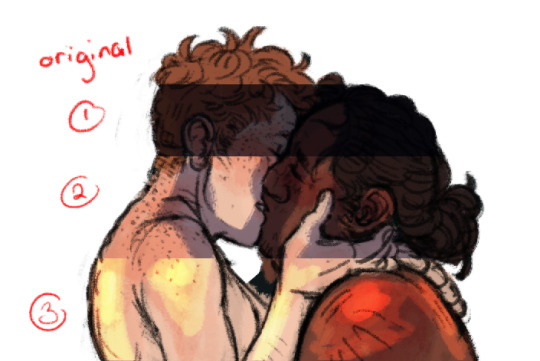
this is just a basic breakdown of how i sort out shadows, highlights, etc.
1. fun fact: i abuse the shit out of the colour sliders. Adjustments>Hue/Saturation and >Colour Balance are what i usually use to sort out what basic lighting i’m going to have right from the get go. lighting helps really push the tone and makes it super super clear what you’re going for, even if you don’t get it completely realistic. This section has its lightness and saturation lowered, and has had a little bit of cyan added in colour balance.
2. ok at this stage i’ve slided the colours but i kept it like this so the shading is easier to see. Multiply layers save my ass every fucking day. I go for a cool blue or purple, on a multiply layer, getting the shadows down. typically i use 3+ multiply layers to do the lightest to darkest shadows, and use different opacity brushes/eraser to get it smoother.
3. heres a colour dodge layer for highlights, but sometimes it’ll be linear dodge just depending on my mood/ what looks better. again, using different opacity brushes to softly shade.
when im happy with all the simpler shading stuff underneath the lineart, i group together all the layers, duplicate the folder, and then merge them ALL. Which is often a really risky way to do things, ESPECIALLY if i forget to duplicate the layers first, and considering i don’t save duplicate files super often it means if i want to change something major i’m FUCKED but i’m getting better at duplicating stuff and making like checkpoints i guess. But yeah most of my paintings are done on one, maybe two or three layers how nuts is that.

painting at this stage is just kind of experience really, to keep colours consistent ill eye drop tool a colour from elsewhere in the painting to where i think i need it. A tip i guess is try to use a lower opacity brush rather than the blending tool if you want softer shading. Photoshop’s blend tool, in my experience, kind of just blurs whatever section you use it on and its not very strong. That’s more of a personal preference thing though!
At this stage i still use multiply/colour dodge/linear dodge layers to really get the lighting how i want, and then merge whatever layer down so i can smooth it out.

its from a different piece but this is kinda how my painting process goes.
another thing i use to imply form are lines! here an example bc its easier just to show.

see how the lines of grifs arm hair + their scars kind of curve around their arms? that helps round the shapes out.
OKAY I hope this helps and wasn’t just filled with useless nonsense, if you have absolutely any questions about this LONG ASS tutorial or anything else just shoot me an ask! I don’t know if it is but ill always try to offer good advice.
Thank you for reading this far! Here’s a bonus! Have a good day!

#coldishsummer#asked#this is fucking long and might not even help but theres probably some useful advice in there?#best of luck to you i hope all of your art goes well <3#not art#also im sorry this took so long i was halfway through the uni semester when you sent it and i didnt have a chance to do this really well#untill now
142 notes
·
View notes
Text
Why Do So Many People Love SAO? The Art of Mass Appeal
Hey! It’s okay! You are allowed to like Sword Art Online. I feel like I needed to explain that before somebody gets the wrong idea and thinks this is just me saying, “I don’t understand how somebody likes an anime that I don’t like!”
I just want to put this on the record: You’re not a bad person for liking SAO. You don’t have shit taste, and you’re not stupid. There are plenty of legitimate reasons to like this show, and, for this review, we’re going to be exploring what those reasons are because any show that can reach over a million people has to be doing something right.
No, this isn’t going to boil down to an insulting and reductive conclusion, like, “Thirsty weebs need wish fulfillment,” although I do think that is part of it for some people. This is a serious, analytical look at the series. The mechanics of mass appeal have always fascinated me, and SAO’s lacking qualities in other departments make it easier to isolate those mechanics than it would be looking at something like FMA.
You really can’t understate the impact that SAO has had on popular culture. It takes a lot of brand recognition for an American product to get a shot on network television, let alone a Japanese one. Much as critics like to downplay popularity as a measure of quality, success like that doesn’t just come down to random luck.
That said, luck is a major factor. SAO is often lauded for its great premise, but that’s only half the story. The most obvious factor in SAO’s whirlwind success is that it hit on the right premise, at the right time. When SAO came out in 2012, eSports and Free-to-Play games were becoming huge in the public eye. League of Legends had overtaken WoW as the most-played PC game of the year, and WoW’s death grip on the MMO market had loosened enough so that the landscape of online worlds was becoming more expansive and varied than it had ever been before. It was the perfect time to release any story about hardcore gaming, hardcore MMO gaming in particular, and with the Hunger Games phenomenon just starting to “catch fire” thanks to the first movie’s release, the market was hot for death game stories in particular. Add to that the exploding popularity of the then-new Game of Thrones and Walking Dead, and any series with a similar sense of lethality was bound to do well. Just look at how many articles at the time compare Attack on Titan and SAO to those two shows.
On top of that, anime was about to blow up in a big way in the West. Crunchyroll came to my attention in Fall of 2011, when they acquired the rights to Fate/Zero. I was hooked enough on the series from watching it on their ad-supported site to bite the bullet on a subscription just to get one episode ahead, and I don’t think I’m the only one. From 2011 to 2012, Crunchyroll began offering a serious value proposition by doubling their seasonal anime library, and becoming the go-to place for basically everything coming out of Japan by the Summer of 2012. It might not have been Fate/Zero specifically, but between huge series like HunterxHunter and quality niche stuff like Space Brothers and Kids on the Slope, the streaming service finally had enough content to pull in and sustain a hundred thousand subscribers by September of 2012, and two hundred thousand by March of 2013. Crunchyroll had become the service of choice for the then-niche community. SAO hit right in the middle of the surge in anime’s Western popularity, right at the point when Crunchyroll had enough content to be worth a subscription, but before it became totally unreasonable to watch everything on the service.
As one of the biggest fish in a rapidly-expanding pond, SAO both benefited from and helped spur on the service’s growth. Since it was one of the most popular shows on the service, Crunchyroll naturally put it at the forefront of their marketing push, which only increased its brand caché among anime fans and casuals alike. At this point, SAO was huge in Japan, and within the niche of Western anime fandom. It had proved its market viability enough to become a flagship title for the recently revived and redesigned Toonami block on Cartoon Network in Spring of 2013, and it was both relevant and popular enough to be added to Netflix in 2014, right in time to hype up the second season.
Anime had become a massive wave, washing over popular culture. Like 2013’s Attack on Titan, SAO had the good fortune to start riding that wave while it was still small, and go all the way to the top. The two series’ similar tone, and similar lethality, meant that fans of one were likely the fans of the other, and the cross-pollination only helped them both.
However, if good timing and an enticing premise were all it took for a show to embed itself in the popular culture, we’d be staring down Season 3 of The Unlimited Hyoubu Kyousuke right now. As much as it pains me to admit it, SAO does do some things very right when it comes to its execution that primed it for its whirlwind success. One of the biggest factors in this regard is the look of the show. A1 Pictures has faced a lot of criticisms from anime YouTubers and critics in general for the uniform look of its productions, and indeed, it can get pretty tiring to see the same faces, in nearly identical art styles, over and over again. However, that’s not going to be a problem for the casual anime fan, whose only seen a few dozen series. Their shows might look pretty similar, but they all look polished and professional, assuming they’re given enough time in production. They might not look or feel as nice as something from Ufotable, Kyoto Animation, or Bones, but they can get most of the way there in less time with a smaller budget, and that’s impressive. People like things that feel polished and professional.
If you haven’t seen a million shows like it before, SAO looks really clean and cohesive. It looks like what you expect a good anime to look like. The lineart is sharp and crisp, the characters blend with the environments well (at least, when the characters aren’t moving), and you can freeze on almost any frame and use it as a pretty decent wallpaper, which is all that many casual anime fans look for in a show’s visuals.
A1’s visual style is also very versatile. Its characters look cool, but they’re still very expressive. The girls can be moe cute, the heroes can look badass and youthful, and the adults can look old and hardened, and they all exist within the same world. Despite its “same-face syndrome” problem when put next to other A1 anime, SAO’s main cast has impressively diverse and easily recognizable character designs.
On the subject of design, while I do think that SAO would be a crappy game in real life, I will credit it for looking very visually appealing. The environments are super varied and interesting, from the flower dungeon, to the ice peak where they fight the dragon, to the trippy cave system where they find the Gleam Eyes. As VR spectacles go, this world would be a hell of a draw. The show’s visuals can really pop with vibrant colors, without looking too silly, and those can be muted down for more serious scenes without it looking incongruous with the rest of the show. SAO manages to sell moe, horror, action, and even Looney Tunes-esque cartoon comedy at times, and it all feels like roughly part of the same series.
That highlights one of the show’s other big strengths: plot variety. Because of the longtime scale of its storyline and the way that its setting creates a sort of blank slate for adventure, it can dabble in lots of different plot concepts, and even genres. One episode might be a short tragedy about Kirito watching all of his friends die, while the next is a cute story about saving a little girl’s pet and beating up some cackling Team Rocket villains, and that can be followed with a two-parter murder mystery, and after that, why not, let’s go on a side quest for crafting materials that blossoms into a short unrequited love story.
None of these individual stories have to be particularly great, hell, they don’t even have to make much logical sense because each one is so different from the last that it’s kind of fun to watch just for the surprise of finding out what they’re going to do next. Even if you really hate one storyline, you can rest assured that something new is on the horizon within an episode or two, and there’s a good chance that at least one of the many things the show tries will work for you.
Because Kirito’s character arc is about learning to open up to other people, all of those different plots feel like they’re moving the central plot forward, or at least a little, even if they’re really just filler. That results in a show that feels like it’s moving forward at a good pace. Emphasis on “feels” because if you look at the actual storytelling and logical structure of events, it’s an absolute mess. Just look at the final fight between Kirito and Kayaba Akihiko, it just comes out of nowhere on Floor 75 and it doesn’t work at all. However, if you’re just sitting down for entertainment, how a show feels to watch is paramount, and what sense it makes doesn’t matter so much.
Just to be clear, I’m not saying that it’s dumb to enjoy a show on that level. There’s value in sitting down, turning your brain off, and simply being entertained for the sake of relaxation. Analyzing anime can feel like work. For some, it is work. In SAO, it feels like at least one really important thing happens every single episode, and there’s usually a really cool-feeling action scene every two or three episodes to keep the excitement up. As a result, the show has momentum. Once you start watching, it’s very easy to keep watching without getting bored or confused. The show is consumable, like popcorn or other A1 Pictures shows like Gate.
The show suffers, a lot, when it loses this forward momentum, which I think is a big part of why even fans of the series acknowledge that the Fairy Dance arc kinda sucks. Kirito has a clear goal there, with an obvious solution in trying to rescue Asuna, which means that any diversion from that goal, like going off to fight a random guy in PvP, feels like a true waste of time. Furthermore, Kirito’s character is entirely static during that storyline. He doesn’t grow or change at all. Neither does Asuna, nor anyone aside from Suguha, and even then, only kind of. Therefore, even when the story is moving forward, it feels kind of flat.
Gun Gale fixes this problem in a kind of artificial way of giving Kirito sudden onset PTSD to get over, but it does help the story feel more substantial, and fans reacted positively to that. When it does work, even if it doesn’t actually have any idea where it’s going, SAO’s story moves forward with a bold sense of confidence and purpose.
Speaking of boldness, SAO also excels at setting a strong tone for whatever is happening in its story at any given time, particularly early on. Not necessarily the most appropriate tone, but a tone that is powerful and striking nonetheless. The monsters feel scary and intimidating, the comedy feels fun and lighthearted, the romance feels heartwarming and intimate, and deaths feel tragic and poignant. If you’re not invested in the story and characters, a lot of this can feel cloying and emotionally manipulative, but until something happens to take you out of that (like Yui’s death did for me), watching SAO is an emotional rollercoaster.
A big part of that is Tomohiko Ito’s direction. He is really good at placing the camera and cutting in a way that draws out the maximum possible emotion from any given scene. He needs to work with great source material, like Erased or Gin no Saji to really shine, but even working with Reki Kawahara’s leavings, he does a good job. The use of reflections in windows while Kirito listens to Sachi’s last message to him is legitimately incredible filmmaking.
The emotional impact of the series is further enhanced by the work of Yuki Kajiura, Tomohiko Ito’s most favorite composer, who also crafted the amazing soundtrack of Erased, as well as Tsubasa, Madoka Magica, Fate/Zero, Kara no Kyoukai, and some of the Xenosaga video games. Yuki Kajiura is one the most singularly talented composers working in the anime industry today, and it’s hard to understate just how much of an impact I think she’s had on the perceived quality of SAO. Her compositions for the show give it an air of cinematic quality, but they also feel distinctly, and very appropriately, video game-y. In particular, I’d argue that she is the primary reason that people say SAO has good action scenes. Her compositions make fights that are actually pretty stilted and janky, outside of a few sakuga cuts, feel incredibly bombastic and slick. When SAO’s music kicks up, it gets your pulse pounding, and it’s hard to resist getting caught up in it or even humming along to that memorable hook. Watch these fights without the music, and they kinda suck.
Kajiura’s abilities don’t just improve the action scenes, though. Her work is an integral part of that emotional roller coaster effect, heightening the emotion of each scene and connecting the emotional beats so that the shifts in tone feel less jarring than they might otherwise feel. She makes the scary scenes feel scary, the sad scenes feel much, much sadder, and the romantic scenes feel powerful and moving. That brings us to the big reason that I think people love SAO.
Most of the things I’ve talked about so far aren’t totally unique to SAO, and though they are important factors in getting people interested and keeping them invested in what’s going on, they’re not enough on their own to make people care so much that they’ll tell me to kill myself when I badmouth it. To evoke that kind of emotional response, a show really needs to get its audience to say, “Fuck yeah!”
The thing that makes a lot of people say that, myself included when I first watched SAO, is the fact that Kirito and Asuna get together in Episode 10, after several episodes of buildup where other characters notice they have a thing for each other, and it’s just really cute. That’s just not a thing that happens in anime. Even in shows with a clear OTP relationship, nine times out of ten the romance will be drawn out to its breaking point, and the characters will only hook up right at the end of the story, which isn’t just a lazy way to create an emotional arc, it’s tedious to watch.
The “will they, won’t they” is a story we’ve seen a million times, while the equally interesting story about what happens after, the trials and tribulations of actually dating and being in love, is almost never touched upon. You can justify that in a romance anime where the story is about characters sorting out their feelings and finally getting together (Toradora does that and it’s just about perfect), but even there, after a while you start to crave shows that buck that trend, like Ore Monogatari, My Little Monster, and Golden Time.
Also, with shows that have other things driving the plot, there’s really no excuse. There are few things that could really improve on Fullmetal Alchemist, but Winry and Ed hooking up earlier in the story would probably be one of them. Look at how many people loved Mikasa’s confession to Eren at the end of Attack on Titan Season 2. That was beautiful!
It’s a very pleasant surprise to see two main characters of a show like SAO commit to a monogamous relationship this early in the plot, and I think that most people who love the series do so because, in this respect, it doesn’t waste their time. This plot turn changes a lot of story dynamics, too, since Kirito and Asuna can be explicitly motivated by their love for one another, and that love can be made much deeper than the obvious mutual crushes that drive shows less willing to pull that trigger. For a story so driven by its emotional content, that one change makes SAO feel very different from just about everything else a casual fan is likely to have seen, and from what you would probably expect going into the show.
Now if you’re like me, and you think a lot about story structure and plot logic, that effect of that change doesn’t really last. Reki Kawahara is totally unwilling to abandon his harem anime nonsense, so every arc sees Kirito introduced to a new hot girl who wants to jump his bones. In terms of narrative structure, that really undercuts the importance of his commitment to Asuna.
However, if you’re just watching the show to enjoy a show, then it feels very substantial, to the point that fans get very mad at me when I call this harem anime a harem anime, in the same way that all of the deaths early on make the show feel very lethal and dangerous, so long as you don’t realize that all of the key characters have plot armor. If you do buy into it, the scenes of Kirito and Asuna being a couple and enjoying each other’s company are extremely emotionally satisfying. By the same token, if Yui doesn’t bug you the same way she bugs me, her relationship with Kirito and Asuna is adorable. Hell, Asuna and Kirito’s romance is the only part of the movie that I think really works. To get more cynical for a moment, for the segment of the audience that does use this show as pure escapist wish fulfillment, the fact that Kirito can have an emotionally fulfilling relationship with his wife, while still being chased by hotties all because he’s so dang good at video games that he’s basically invincible, those aspects only improve the show for you.
However, I don’t think that most people who love SAO love it for those reasons. I think they love it because it managed to get them deeply invested in its main characters through one very bold plot turn, and once you care about those characters, seeing Kirito be an unstoppable badass stops being eye-rolling, and starts being cool and fun. I think they love SAO because the world that it creates seems like a very appealing place on the surface to spend time in, and you can imagine yourself being one of the NPCs going off and doing something that’s not vital to Kirito’s plotline, like that guy who’s fishing, for some reason. I think they love SAO because it came at the right time in their lives, right when they were getting into anime. If you’ve seen hundreds of anime, then yeah, parts of it are going to feel played out, but if you’ve seen just a handful, SAO is going to feel fresh, and new, and exciting.
Considering that it’s at the forefront of the anime fandom, even today, I think it will be among many people’s first anime for many years to come, and I think that ties into why so many of us so passionately hate this show as well. Because when we discovered it, it had all of this promise and potential, but at one point or another, be it a poorly-executed death or a very, very poorly-executed rape scene, it let us down profoundly, and we were left unable to enjoy this thing that, at one point, seemed like it could be so great, that was, at one point, so enjoyable for us. That disappointment is a lot more cutting than the overt and unsurprising terribleness of something like The Asterisk War or Akashic Record.
But not everyone was disappointed in it in the same way. While I do think it’s fundamentally poorly made, SAO does some things right that are going to be more important for some people than the things it does wrong are for me.
0 notes