#wireflower
Explore tagged Tumblr posts
Text
okay. im done complaining now
0 notes
Text
0 notes
Text
More photos of my wire flowers used in the exhibition at Attenborough Arts ‘Natural Instincts’
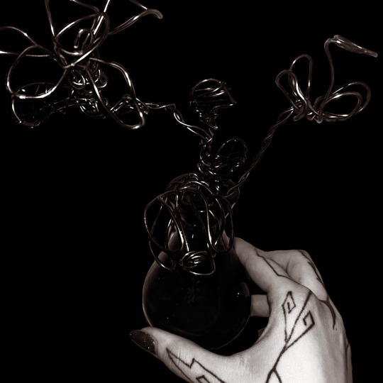
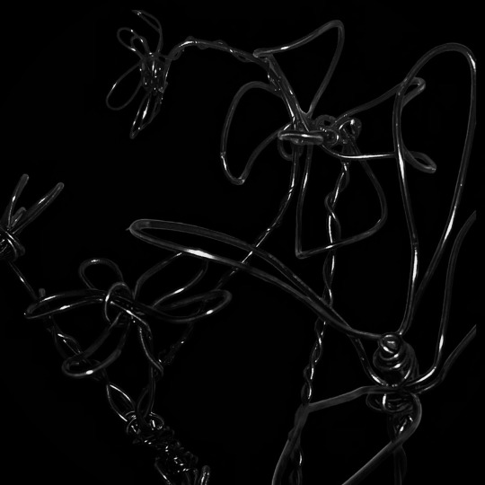

1 note
·
View note
Photo

Vibia Light’s custom sculptural Wireflow pendants via interiordesignmag Follow Souda on Tumblr
#modern#design#product design#home#decor#decoration#home decor#home design#interiors#interior design#living room#bedroom#kitchen#buildings#architecture#furniture#furniture design#industrial design#minimalism#minimal#living rooms#lighting design#lights#bathroom
2 notes
·
View notes
Text
Vibia Leuchten
https://www.wunschlicht.de/family/Vibia/Algorithm/
https://www.wunschlicht.de/family/Vibia/Alpha/
https://www.wunschlicht.de/family/Vibia/Balance/
https://www.wunschlicht.de/family/Vibia/Bamboo/
https://www.wunschlicht.de/family/Vibia/Break/
https://www.wunschlicht.de/family/Vibia/Brisa/
https://www.wunschlicht.de/family/Vibia/Cosmos/
https://www.wunschlicht.de/family/Vibia/Domo/
https://www.wunschlicht.de/family/Vibia/Duo/
https://www.wunschlicht.de/family/Vibia/Empty/
https://www.wunschlicht.de/family/Vibia/Flamingo/
https://www.wunschlicht.de/family/Vibia/Fold/
https://www.wunschlicht.de/family/Vibia/Funnel/
https://www.wunschlicht.de/family/Vibia/Guise/
https://www.wunschlicht.de/family/Vibia/Halo+Circular/
https://www.wunschlicht.de/family/Vibia/Halo+Lineal/
https://www.wunschlicht.de/family/Vibia/I.Cono/
https://www.wunschlicht.de/family/Vibia/Jazz/
https://www.wunschlicht.de/family/Vibia/Join/
https://www.wunschlicht.de/family/Vibia/June/
https://www.wunschlicht.de/family/Vibia/Mayfair/
https://www.wunschlicht.de/family/Vibia/Meridiano/
https://www.wunschlicht.de/family/Vibia/Musa/
https://www.wunschlicht.de/family/Vibia/North/
https://www.wunschlicht.de/family/Vibia/Origami/
https://www.wunschlicht.de/family/Vibia/Palma/
https://www.wunschlicht.de/family/Vibia/Palo+Alto/
https://www.wunschlicht.de/family/Vibia/Pin/
https://www.wunschlicht.de/family/Vibia/Plis+Outdoor/
https://www.wunschlicht.de/family/Vibia/Puck/
https://www.wunschlicht.de/family/Vibia/Scotch/
https://www.wunschlicht.de/family/Vibia/Set/
https://www.wunschlicht.de/family/Vibia/Skan/
https://www.wunschlicht.de/family/Vibia/Structural/
https://www.wunschlicht.de/family/Vibia/Suite/
https://www.wunschlicht.de/family/Vibia/Swing/
https://www.wunschlicht.de/family/Vibia/Tempo/
https://www.wunschlicht.de/family/Vibia/Up/
https://www.wunschlicht.de/family/Vibia/Vol/
https://www.wunschlicht.de/family/Vibia/Wireflow/
4 notes
·
View notes
Text
WIREFLOW LINEAL _ VIBIA _ ARIK LEVY
SHOP
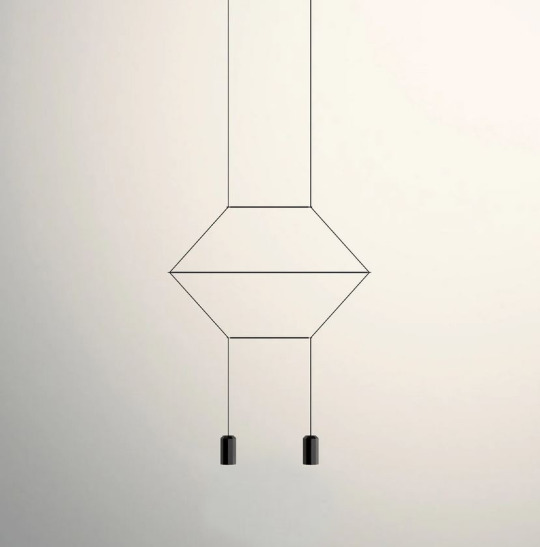
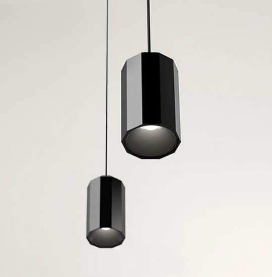
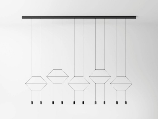
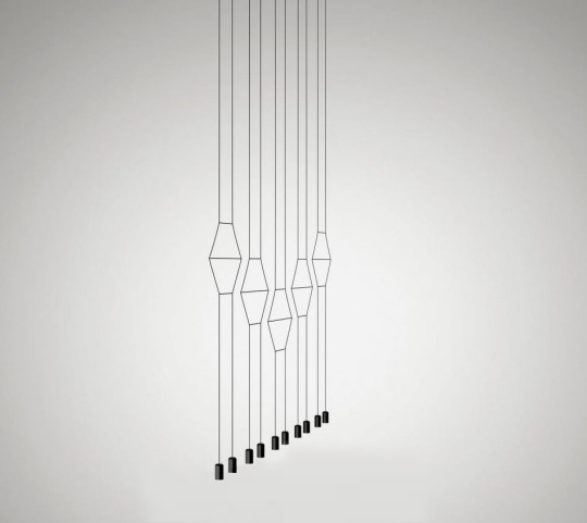
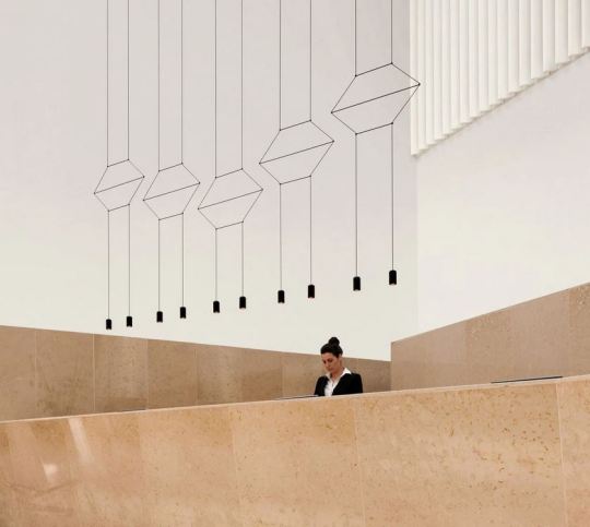
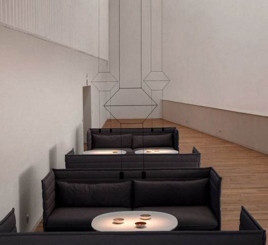
#wireflowlineal#wireflowlinealllamp#vibia#vibialighting#ariklevy#suspensionlamp#lightindesign#light#lighting#lightingproduct#lamp#mustseegallery
0 notes
Text
Wireflow Pendant Lights in Modern Cafe
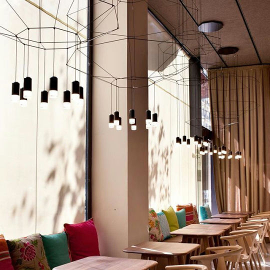
Vibia Light’s custom sculptural Wireflow pendants via interiordesignmag - Modern cafe interior with unique geometric lighting design, wooden tables, colorful cushions, and sunny ambiance. Follow Ceramic City on Tumblr Source: https://soudasouda.tumblr.com/post/749282965127839744/vibia-lights-custom-sculptural-wireflow-pendants
#modern#design#product design#home#decor#decoration#home decor#home design#interiors#interior design#living room#bedroom#kitchen#buildings#architecture#furniture#furniture design#industrial design#minimalism#minimal#living rooms#lighting design#lights#bathroom
0 notes
Photo

Vibia Light’s custom sculptural Wireflow pendants via interiordesignmag Follow Research.Lighting on Tumblr Source: https://soudasouda.tumblr.com/post/749282965127839744/vibia-lights-custom-sculptural-wireflow-pendants
#modern#design#product design#home#decor#decoration#home decor#home design#interiors#interior design#living room#bedroom#kitchen#buildings#architecture#furniture#furniture design#industrial design#minimalism#minimal#living rooms#lighting design#lights#bathroom
1 note
·
View note
Text
Wireflow – free, online, open source tool for creating user-flow prototypes
https://wireflow.co
0 notes
Text
Week 8
Improved UI, IA, etc.
There are several actions you could take at this time if this is the course you want to take.
Low-fidelity paper-and-cardboard prototypes with modifications and ideas
new information architecture card types
tests of novel navigation in trees
Based on desk research, how have other solutions handled this issue?
Survey on methods of operation: 12 replies so far
The biggest factors affecting attendance in classes are public transportation and commute time.
The type of work they are completing determines how most pupils prefer to work.
However, more pupils believe that they work more effectively at home than in a classroom.
a classroom
What's positive: constructive criticism, devoted work hours, group activities, and cooperative work
What's not so good: travelling, learning, and exhaustion
Home:
What's good: comfortable, relaxing, concentrated, private, and adaptable
Not so good: Lack of feedback, procrastination, and diversions.
Low to hi fidelity levels
You will go through numerous stages of increasing fidelity with your designs, starting with rudimentary sketches to explore concepts and possibilities.
At each stage, you'll discover something new.
If your early concepts received favourable feedback, you may begin creating wireframes and prototypes to evaluate the structure and flow. If you require feedback on your navigation at this time, card sorting and tree testing can be useful.
Get it right before you go hi-fi with the user flow
Definition: A user flow is a series of interactions that illustrates the normal or optimal sequence of activities required to complete a regular task wit a product.
with a thing.
Simple flow charts, task diagrams, or low-fidelity wireflows are a few examples of artefacts that can be used to describe user flows. These maps record important user actions and system reactions; unlike trip maps, they do not contextualise the process with feelings and thoughts.
User flow: where designers and developers get together
Creating flowcharts is a common requirement for developers when preparing their code. The decision points (diamonds) and links to databases (cylinders) in these flowcharts are both represented by common symbols. The designer's version of these are user flows.
The Happy method (the most typical predicted method to achieving a goal where everything goes right) as well as Exceptions must be mapped out by the designer. How does the application respond to typical situations like.
networks not working
Data is downloading.
No data, such as the initial state
User flow: Moving from Lo fi to hi fidelity
We can consider shifting from low to high fidelity in how we map our users' paths across our solution, just like with design and content fidelity.
1. Clearly defining the user's aim is the first stage. The tale in Agile is a common name for this.
What are the assignments? Try formatting this in the manner shown on the right.
Wireflow 3. What UI component links the user to the following screen.
4. Adding logic, exceptions, and interactions to the user flow.
flow of users: why do they
Developers frequently ask UX/UI designers to provide rather thorough responses to enquiries about how the app or product will behave. By considering this and developing user flows, you can foresee their enquiries. The best practise approach should be researched ahead of time rather than having to be thought up on the spot. Additionally, customers don't always choose the "Happy Path"; therefore, planning ahead will speed up production, prevent delays and rework, and improve user experience.
a user's flow
Participate in a design crit with other designers. To discuss your solution, present it to developers, business analysts, or product managers.
Investigate many options before prototyping
Round 2 prototypes
When choosing a prototyping tool, keep in mind the type of prototype you're creating as well as the tools you already have.
Do you design for mobile or responsive web?
Are smooth animations and interactions crucial to your experience?
Or do you require a clever technology that can produce realistic personalised material, such as the user's grandmother?
You'll probably need to become a little more advanced and produce a more lifelike experience for your high fidelity prototypes.
Techniques for reducing time
Now that you're getting into high quality, it's quite simple to lose track of time. A little preparation now can save a lot of time later.
tile patterns: You can use a single page as a "sampler" of Ul pieces to test out various themes before incorporating them into your layout.helpful for group design projects as well.
Symbols and templates are reusable components that speed up design and maintain consistency. They go by different names in different prototype tools. A button is an example of a symbol. Update the master to update all symbols at once.
Grids: Designing with a grid is a wise move.
This is especially crucial for creating responsive websites. Frequently, the code is supported by a framework like Bootstrap that adheres to a grid.
Styles: To expedite design and encourage consistency, employ text styles similar to those in InDesign.
Future steps: prototypes from round 1's user testing
Some pointers: Never describe your prototype to participants in a real user test (as opposed to testing it on peers). NEVER describe your prototype in detail. It should be simple for your representative users to fit into a scenario you've built for the test. This is different from telling everyone about your concept.
You only get one chance to receive objective, recent feedback. Don't ruin it with hints!
For next week:
Keep your prototyping fast and your designs sketchy at this stage
Tested your prototype with 3 users
Have synthesize your findings
-Are you heading in the right direction?
-Do you need to re-think your idea?
Keep referring back to your HMW. Have you addressed this challenge in your prototype?
0 notes
Text
i wsajnt a caretakerr sonbad i want helpiwant yo be loved as a baby i want to be good. please i need help pleaseplease i need help i jeed help
0 notes
Text
Week 8 tasks, Monday class & Tuesday class

TO DO LIST:
User Journey/ interviews/ surveys?
Card sorting/review IA
Review HMW Q + update into Slack spreadsheet
Lo Fi Prototype in paper/in Figma (sketch - wireframe - prototype - design)
User Flow Map (in-class today) --> Imagine/sketch 2 different ways to reach 1 task
Happy-path? --> when the user gets easily its path.
(Below, slides screenshots - just for me to have all important info here - will delete them later)

Re-visualised below by me with brainstorming to create the USER FLOW JOURNEY:

IN CLASS TASK (n1):
User Flow Map (in-class today) --> Imagine/sketch 2 different ways to reach 1 task
PATH 1:

PATH 2:

Three KEY WORDS have araised from this task:
customise
prioritise
reorganise
(all in regards to “information”, part of the IA Information Architecture reorganisation)
I DECIDED TO INCORPORATE THESE KEY WORDS IN THE HMW Q - REVIEW OF IT:
CURRENT REVISITED based on the FORMATIVE FEEDBACK:
"How might we improve the My Fitness Pal profile menu and the meal log tasks for daily new users, ensuring the content they need is more intuitive and accessible?"
POSSIBLE NEW ONE INCLUDING THE 3 KEY WORDS:
"How might we improve the My Fitness Pal MENU and the PROFILE set up for daily new users, ensuring the content they need is more customised, prioritised and organised?"
FEEDBACK FROM EZRA + my new ideas from it:
path 2 looks more visually clear
when personalising profile & menu separately, is there a way to save as a draft?
can you only customise profile or only menu? can you do in the same page?
When personalising the menu, decide what to place on R and L depending on dominant hand or most often used icons + want to have an horizontal scrolling?
3 diffwerent colors to possibly utilise to 1) customise 2) prioritise 3) reorganise
Useful links from slides:
https://www.nngroup.com/articles/user-journeys-vs-user-flows/
https://www.nngroup.com/articles/wireflows/
Put the sketches into words and detailed diagrams below:

JOURNEY EXPERIENCE MAP, done on Figma, with explanations:


Tuesday:
CARD SORTING, can be qualitative or quantitative, open (people create their own categories) or close (set categories prior to people sorting)
Is it the right tool for me?
I could make sort cards about:
what to have in the menu
what to have in the profile
what to have in the dashboard
DOWNLOAD “optimal sort” https://www.card-sorting.com/optimalsort/


Final Visual resume for myself + find and colours branding:

Useful links from class to save for me for later:
https://www.userinterviews.com/blog/user-testing-questions
https://www.nngroup.com/articles/data-findings-insights-differences/
https://www.card-sorting.com/card-sorting-tools/
0 notes
Photo
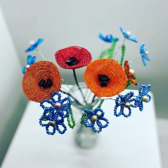
Wildflower home decor, wire flowers 💐 do you like this flowers??? #wildflowers #wildflower #poppy #poppies #poppyflower #poppyflowers #cottagecore #fairycore #wireflower #wireflowers #wiresculpture #beadflower #beadsflower #wiredecor #flowergift #officedecor #frenchbeadedflower #beadedflower #beadedflowers #floraldecor #forgetmenot #forgetmenotflowers #modernflowers #glassflowers #glassflower https://www.instagram.com/p/CWDUSfjMIdt/?utm_medium=tumblr
#wildflowers#wildflower#poppy#poppies#poppyflower#poppyflowers#cottagecore#fairycore#wireflower#wireflowers#wiresculpture#beadflower#beadsflower#wiredecor#flowergift#officedecor#frenchbeadedflower#beadedflower#beadedflowers#floraldecor#forgetmenot#forgetmenotflowers#modernflowers#glassflowers#glassflower
0 notes


