Don't wanna be here? Send us removal request.
Text
Teach me assignment.
For the first few weeks of this assingment I need to structure a 10 minute lesson on teaching a group of people how to do something.
The thing that I want to teach to the class is how to do a kickflip on a skateboard. A kickflip is a trick on a skate board where you manage to get the board into the air and rotate 360 degreese and then land back onto it.
To learn a kickflip you would usualy learn more basic tricks like a ollie or pop shuv it first which are less advanced tricks but I am picking a slightly more chaleging trick because its slightly more complexed and takes more steps to learn and I think it will fit the 10 minute time limit better then the first trick most people learn which is an ollie.
For the lesson I think both interacting with the class and then showing visual examples will help people learn about how to do the trick better.
things that I would like to incorparate into my lesson are:
Photos
Video
A selection of steps
Power Point Presentation
Interacting with the class
Using a real skateboard to help cover the steps
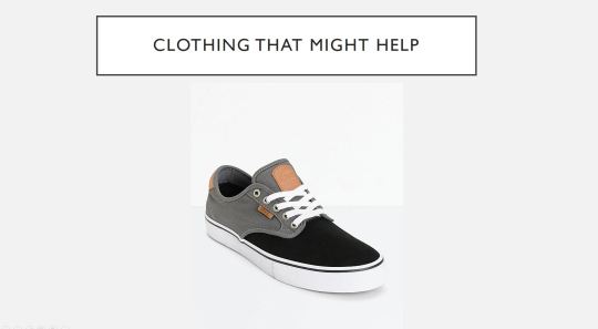
Clothing/shoes that can make the trick easier to learn
The learning process and how it can vairy between people
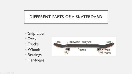
Terminology of the different parts of a skateboard.
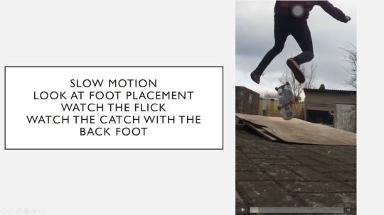
The First thing I want to go through in the lesson is ask if people know what a kickflip is and then show them a video example so I will haft to take a video of me doing a kickflip with multiple angles and possibly slow motion so its easier to see whats happening. Then I want to take screenshots from a video or photos of me going though the steps.
So I need to film some video and take photos and plan out the steps of how to do a kickflip on a skateboard. The photographic steps will be on how to do a kickflip stationary and then I will talk about how to do one moving and how it can be different.
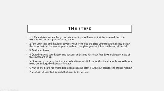
Step 1: position board on the floor on a flat cerfice
Step 2 get onto the board and distrabute your weight by putting each foot on the set of dolts at the front and back of the skateboard
Step 3 place your front foot slightly behind the bolts at the front/nose of the skate board and put your back foot on the tip of the tail/back of the skateboard.
Step 4 look forward to the front of the board and bend your knees
Step 5 quickly push the back/tail of your skateboard down and try and slightly jump.
Step 6 just after you push down on the tail of your board flick outward towards the concave in the skateboard making your foot come off the board allowing it to rotate.
step 7 With both feet off the board and in the air watch as the board rotates underneath your feet and plant them onto the board pushing the board to the ground once its finished a 360 degreese rotation.
Now I have planned out my steps I need to work on my power point presentation which will involve the photography and videography so my next step is to film me doing a kickflip both static and moving and in slow motion and normal speed and also take photos to help visualise the information I am giving in the steps.
what you are going to teach?
How to do a kick flip on a scoreboard
What will be the best way to teach it?
I am going to use visuals like photos and videos of the trick being performed and also try and engage with the class by asking questions hopefully making them stay more interested and focused.
How will people learn? Refer to learning theory.
People learn in lots of ways but lots of traditional methods like just righting things down or putting text books in front of students might not be as effective as other techniques such as interacting with the class and using things like props and asking question which might make the students more interested.
How will you assess that people learned?
At the end of the lesson I might as some questions about skateboarding and how to execute the trick.
What resources will you need?
I will need a screen to show photos and videos in a power point presentation.
How will you begin the session and explain the aims of the session?
I will begin by introducing myself and what i’m going to teach and then cover some basic group and work out it anyone does not know anything about what i’m about to teach them and then move to the power point presentation.
How will you assess learning? Q&A? QUIZ?
By asking and answering questions.
lesson plan
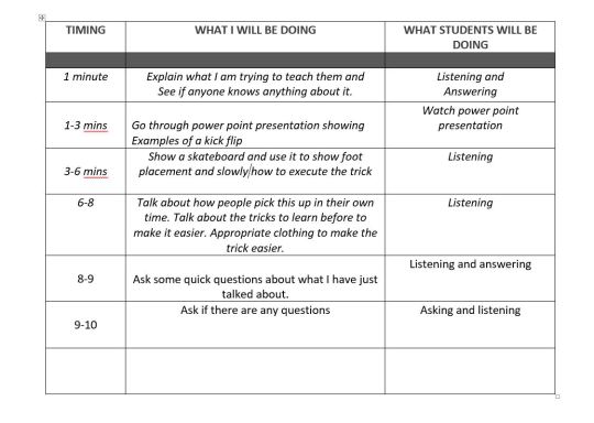
Lesson Finished.
I have done my lesson and it went as planed. I used a power point presentation with text and videos to explain my topic and I also used my skateboard. At the end of the lesson people asked me some questions about getting started in skateboarding which I answered and then I asked the class some questions about the different parts of a skateboard which people answered correctly. I also picked someone to explained how to do a kickflip and the steps and they explained it well and did not miss anything out meaning they had learnt how to do a kickfip.
What could I have done better.
the reason I talked and used my skateboard in class was to hopefully keep people engaged as I feel when learning something sports based especially skateboarding tricks its helpful to actually see how someone would perform it on a skateboard in person to make it easier to get things like foot positions right but with that being said I could of tried to have more interactions within my presentation to make people more engaged as I feel for me personally the more you go round a class and ask them questions or get them to do quick tasks the longer they stay focused because they might not want to not get questions wrong or perform whatever task wrong. I tried my best to put as much as I could into the time slot and teach people how to do the trick and the fundamentals of skateboarding but If I had more time I could talk more about the history and culture as well as influential skaters and brands.
Here are some screenshots of the presentation I used and the videos I used within the presentation.
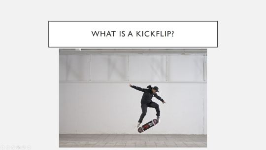
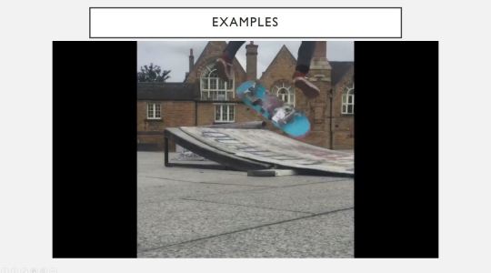
youtube
youtube
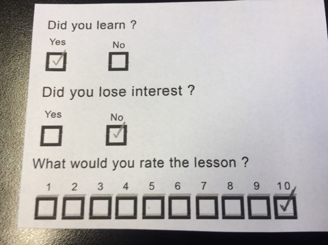
For the lesson I made little feedback forms with three questions on them which you could answer by ticking boxes because its easy and quick and dose not take much effort to tick boxes compared to writing something. 100% of people said they had learnt, 14 out of 15 people said they didn't loose interest and the average lesson rating is 8.3 out of 10. overall I think It went well and as planed and the feed back was positive.
Now I have taught my mini lesson I need to make a resource using art and design that teaches something. There are lots of things and problems that you could teach how to solve from doing an activity or learning about something historical. There are also lots of ways to present it within art and design you could communicate through animating, posters, illustration and more so I need to work out what I am going to teach and how I am going to teach it.
I could list all the things I could teach but that would be a list that consists of pages so I am going to list things that I am passionate about/interested in.
Basketball
Skateboarding
Graphic design
Animation
Illustration
Coffee
Tea
Travel
Netflix
Musical Instruments
Jazz
Animals
Sleep
Fashion
advertising and Branding
The top three things on this list that I could go into and teach are - Coffee - Skateboarding - Sleep.
Coffee - I could teach people about the history of coffee. I could teach things about the different coffee. I could teach people about coffee tasting. I could teach people about the manufacturing process of coffee. I could teach people about different types of coffee and how to make them.
Skateboarding - I could teach people about skate culture. I could teach people about the manufacturing process of how skate decks are made. I could teach people about the history of skateboarding. I could teach people how to do easy medium and difficult tricks.
Sleep. I could teach people how to get to sleep. I could teach people how to nap correctly. I could teach people about dreams. I could teach people about brain activity whilst your sleeping. I could teach people about my dreams.
0 notes
Text
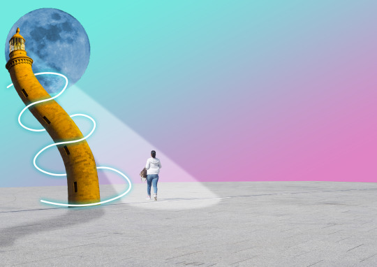
In class I made this sureal landscape image and thease are the steps I took to create it.
First thing I did was open up the photoshop file provided with all the layers and imagery in it to create this piece. I made sure all the layers wernt visiable and selected the market square layer, made it visuble and the resized it by using controwl T and made it fit acros the bottom half of the screen. I then went to the background layer at the bottom and created a gradient adjustment layer and used the sliders within the drop down box to great my gradient. Next I selected and turned on my moon layer and added a hue and saturation adjustment layer too it making sure colorise was selected within the options. I then held alt and cliked inbetween the adjustment layer and the moon layer making it so the hue only changes for the moon layer and not everything els. Next I selected the light house layer and draged abouve the moon and maket square layer and resized and positioned it how I wanted. With the light house layer selected i went to edit and the clicked on pupet warp. I then made a dot at the top and bottom of the lighthouse and added three in the middle between. Then I dragged the dtos to warp and bend my lighthouse image. The next thing I did was take the elipse marke tool and created a circle selection on the marked square floor, then I selected the double box icon to make sure I could make multiple selections so I then took the poligon lasoo tool and clicked down from the top of the lighthouse then went through the circle selection and then back up. Then I made a new adjustment layer and slected curve and in the adjustment menue I made a slight curve in the levels to make the selection I had just made brighter. I then went to filter, blur and the selected gausion blur and added blur to make the light look more natural. Next I selected the lighthouse layer held control and cliked on the picture preview of the light house to create a selection around it and I added a adjustment layer and selected curves and draged the line down slowly so it gets darker, I then selected the adjustment layer and moved it away from the lighthouse. I then fliped the shadow I juste made and presed control T to rotate and scale the it down so it looked like a shadow coming from the lighthouse. I also held controwl and on the selection corners to make it latger towards the front of the image. I then addeda blur to the shadow mask by once again going filter blue and then adding a slight gausion blur. Next I took the cruvature pen tool adn made swirls around the light house like a rounded zigzag going up it. Then I made sure on my brush settings I had a white fill adn was using a hard brush with the size of 15 pixels. I created a new layer and right clicked the pather and selected stroke path and in the drop down box I selected the brush. Whilst doing this I made sure I was on my light house layer and then with the pen tool I right clicked adn deleted the path. I then made a layer mask and held contowl and clicked on the lighthouse layer to give it a selection and erase erase every other stroke line in the layer mask using the brush tool with a black fill. Lastly I went control d to deselct everything and with my stroke layer selected I clicked fx and out glow and then created a blue outer glow useing the sliders withing the outer glow menue. This lleft me with this as my image.
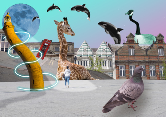
Using simular techneaques I went and exsperimented with all the other images provided to create this.
0 notes
Text
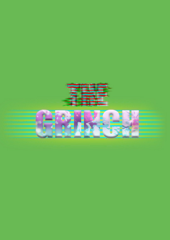
We were given a step by step tutorial on manipulation text.
First thing I did was take a film name and created a a4 photoshop document with a ppi of 72. I then added a fill layer and make the colour green. I then took the text tool and typed out the words and made sure each word was on a indervidual text layer and aranged and aligned the words. I then grouped the text layers by having both of them selected and going controwl G on my keyboard.
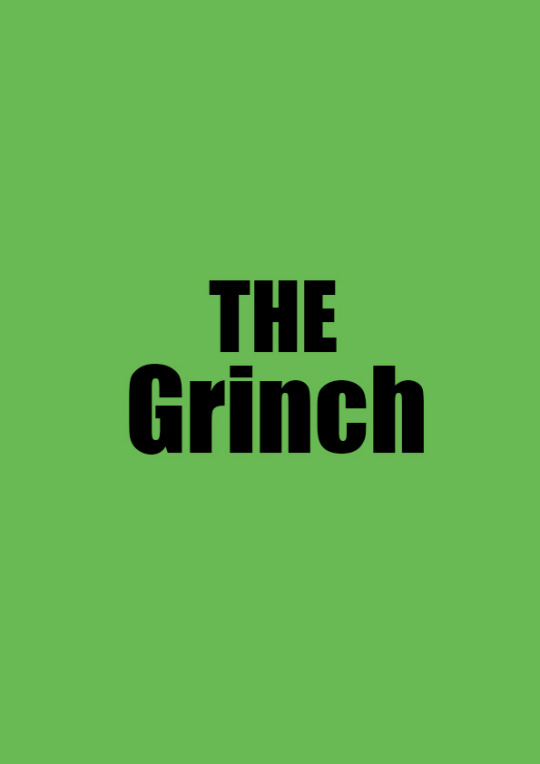
I then went into goolge and found a christmas image because it related to the film I chose and opened it up in the photoshop document. I then changed my grouped text layers name to title and duplicated the group by going control J on my keyboard. I then changed that groups name to title 2. Next I put the christmas image inside the text by making sure it was ontop of the text layer and then right clicking the image layer and selecting cliping mask.
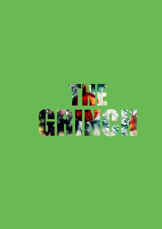
I then turned off the visibility on my title 2 layer and selected two colours in my colour pallet which were a red and a blue tone. I then selected my first word which was the and went to filter then filter gallery and then clicked convert to smart object. This brung down a filter drop down box and in this menue I selected sketch and selected the half tone pattern and I made sure in the menue line was turned on. also In this menue I set the line size to 2 and the contrast to 30. Next I added motion blur by going filter, blur and then motion blur which brung down a drop down menue and in this menue I put the distance up to 1 and then clicked okay and duplicated the layer by going control J. On the new duplication layer I selected filter, distort and wave which brought down another drop down menu where I used sliders to manipulate the text to give it a slight glitch affect. I then went onto select the next word and made it white.I then clicked on fx and selected outer glow and gave the text layer a blue glow in the dropdown menu and then duplicated the layer. on the new layer I did the same thing and added a outer glow but this time i made it a pink color. I then went back to the layer with the blue glow and aplied the same sketch haltone filter I previously used and then once again added motion blue to the layer.
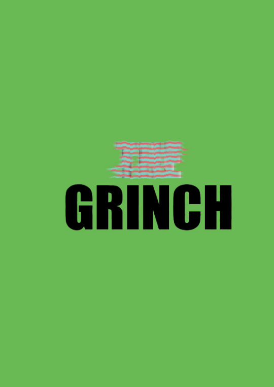
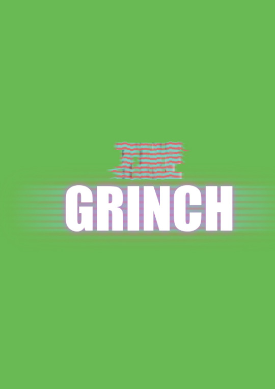
I then held control and clicked on the top text layer to get a selection around the word and made a new layer keeping my selection. I then went onto the new layer with my selction of the word and selected the brush tool and made sure I had a larger soft brush. I then painted the top and bottom of the layer within the selection and then went to fx and selected bevel and embos which brung up a menue where I used sliders to make the word look a little more 3d. On the text layer bellow I once again went to fx and aplied a white stroke but i changed the colour to pink.
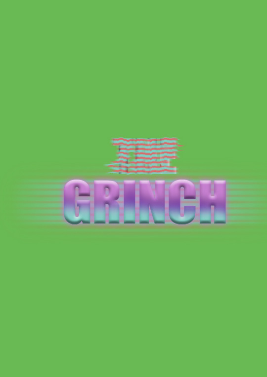
Lastly I exsperimented with the layer opacities and bleding modes on the layers.
0 notes
Text
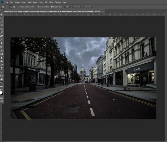
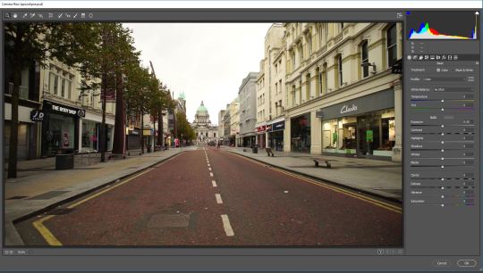
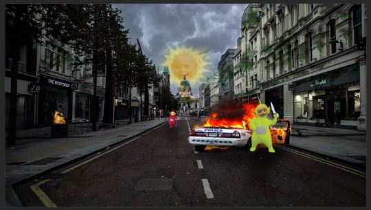
rWe were given the task to turn a normal street image to make it look like an apocolipse. I jused the skills I had pracitsed in the previouse lessons to create my apocolipse image. Here is some of my process.
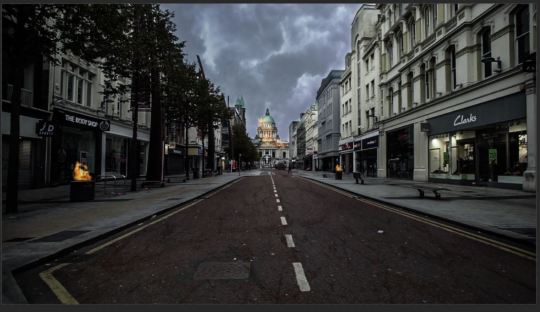
First I started with this image.
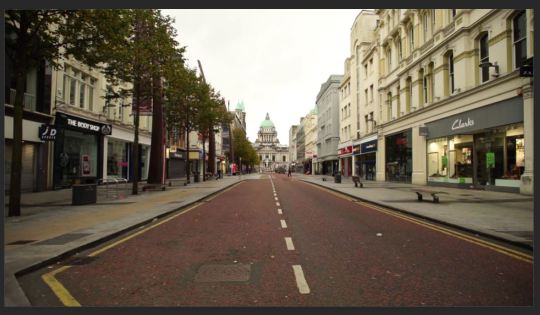
I then Made the sky more cloudy and dark by adding a image of clouds and using a layer mask and the brush tool with a black and white fill to erase the imafe so it looks like it was in the sky, I turned my brush fill to white if I erased too much out and wanted to bring it back. I also slightly turned the opacity down on it down so it looked more natural in the sky.
I also made the image darker and changed the colours and things like clarity, exposure and contrast by selectiong my layer and doing the short cut, Controwl alt shift E which merges everything onto a new leyer. From here I went and clicked filter and then selected camera rar filter which brung up box where and can change tings like contrast and saturation and this is how I made the image look darker and more moddy to fit the theme.
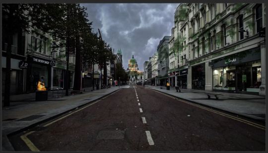
I then used the same techneaque I used to create the sky but with images of fire. I added some images of flames with a black background and then changed the blending mode so it got rid of the black background. I scaled the fire up and down so it fit on the bins and then I used the clone stamp tool whith abother fire image to make it look like the building at the end of the road was on fire, this was done by duplicating one of the fires on the bins, scaling it down and placing it on the building. I then turned the layer opacity down so it made the fire look more natural and used the clone stamp tool to make my fire look more random and larger by holding alt and clicking on the fire layer which sampled it and then I would use that to paint in more fire.
Using the same techeaques as I did with the fire I added greenry and ivy to buildings by once again taking a image of ivery the warping and scaling it to fit the building and using the clone stamp tool to create more greenery across the building.
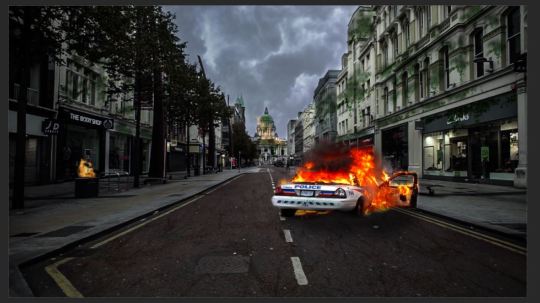
I then found an image of a car of fire and I created a layer mask so I could erase everything around the car leaving me with just the car on fire. I then scaled it so it looked right on the road. I also added a shadow to make it look like it was more realistic and actualy on the road by right clicking the car layer and clicking blending options. this brings down a drop down menue which I can use to add a drop shadow to the car.
I then found some transparent images of telly tubies and added them to my image and gave them shadows. I also made it look like one of them was holding a knife using layer masks.
Lastly I added the sun from the telly tubs behind the building at the end of the road once again using layer masks to make it look like the sun was coming from behind the building.
0 notes
Text
Today we took an image of someone and made it look like the were disintegrating.
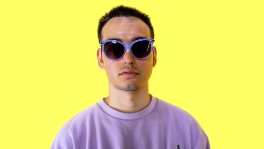
First I opened my image in photoshop and made sure it was a high resolution image which involved a person on a plain background.
I then selected the poly lassoo tool and held shift and started create selection on the face of my moddel which were shapes like triangles and squares, I then went to edit and clicked define brush preset which allowed me to turn my shape selections into a brush. I deselcted my selections and created a new layer.
Next I selected the clone stamp tool and went into the tool options and selected my new brush that I made. From here I went window and then clicked brush settings. This brought down a drop down menu were I could customize my brush further. I then exsperiemented with the options in the brush setings and made my brush randomize in things like size and rotation so everytune you click the pattern is slightly different.
With the clone stamp tool I held alt on my keyboard and clicked the background giving me a selection of the yellow background. I then used that sample and with my brush I painted over sections of my moddels face. This made it look like the models face was disapearing. I then turned this layer off and draged it to the bottom.
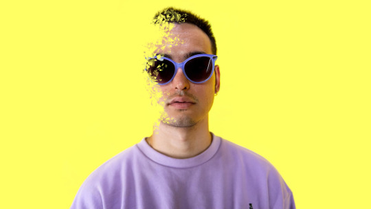
I then created a new layer and took the clone stamp tool but this time I held alt and sampled sections of the models face and painted over where it looked like the models face was being desolved.

Next I added a crack texture image and scaled it so it was over the models face.
I then went edit, transform and warm and warped the image so it was more of a circular shape to fit round the moddels face more. With the layer selected I went into the blending modes and changed it to multiply which got rid of the images white background. I then dupliacted my layer and moved it slightly so it was not in lign with the other crack texture and changed its blending mode to devide.
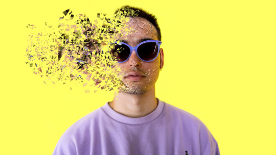
Lastly I created layer masks on both layers and used the brush tool with a normal round brush to erase the section of the cracks that were covering the models glasses or going over the models face to far. I did this by using a black fill to erase and a white one to bring back any mistakes I made. I then turned both texutre layers opacities down slightly so they faded into the face more.

0 notes
Text
Today we looked at the clone stamp tool and used it to get rid of and duplicate things within images in Photoshop.
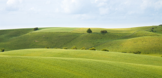
First I opened this photo in Photoshop.
I then selected the clone stamp tool and in my tool options I made sure (all layers) was selected. I then created a new layer and took the clone stamp tool and held alt on my keyboard and clicked at the bottom of the tree which gave me a small preview of the tree/what I could paint and I aligned it with another part of the hill and painted more trees in using the tool and not holding alt.
I then tried to get rid of the tree and I did this by holding alt and selecting a section of the image that was close to the tree and then painted over the tree with the sections of the sky I had selected which made my tree disappear. I also did this on a new layer so If i wanted to bring the tree back I could just hide the layer I just created to remove the tree.
I then used the same technique on a new image and got rid of the power lines in the sky. I made sure that I had selected a section of the sky close to the power lines so that when I used the sky to cover the lines it look a similar tone to the rest of the sky in that section of the image.


Then I did the same thing and got rid of a shed like structure in the field to the left to the image and replaced it with grass by selecting the grass next to the shed holding alt and painting the grass over the shed without holding alt.
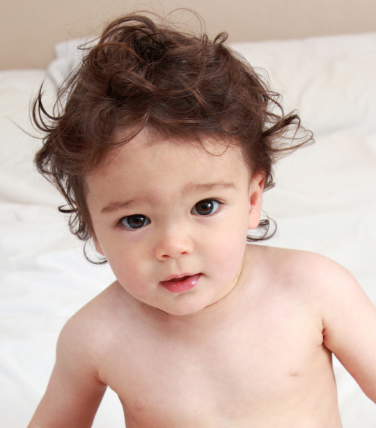
Another task we were given was to remove the spots from this photo.

First I took the spot healing tool and used a variety of brush sizes to cover up the spots and smooth the skin where spots have been. clicking and dragging got rid of most of the spots easily but for the spots in the hair firs I removed it with the spot healing tool and then brought back sections of the hair I got rid of with the clone stamp tool by selection a close by piece of hear to the spot I just removed and painted hair over it.
We were then given the task to pick a photo and restore it. Here is the photo that I chose.
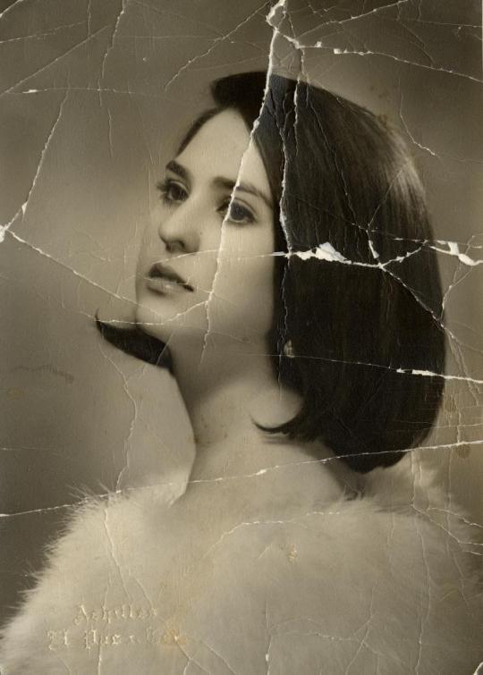
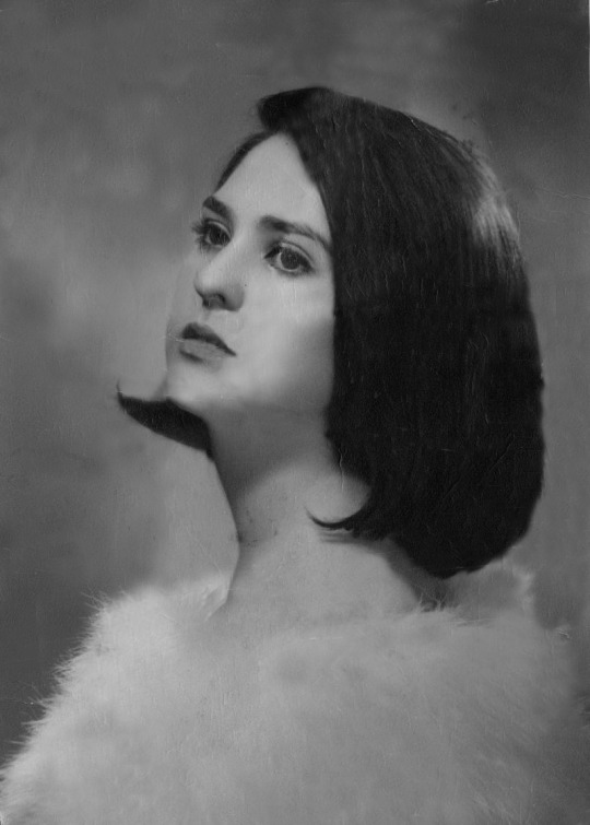
Using the same tools and techniques that I used to manipulate the other images I managed to get rid of most of the wear in the photo and I tried to rebuild her face. The creases and lines at the background was easy to get rid of as the background is smooth and has no detail but the face was really hard to rebuild especially the eye. I had to get rid of the line going through her eye and then use a very small brush size with the clone stamp tool and replaced her eye lashes and eye brows. I also struggled to make the face look smooth and one tone after removing the lines and creases.
0 notes
Text
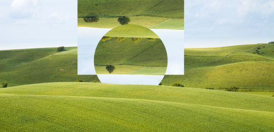
in class we did some Photoshop image manipulation, this is what we did and how we did it.
First I opened my image in Photoshop. This is the image I used.
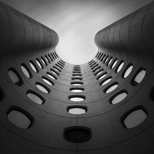
I then went to view and clicked (New guide layer) this brings up a menu where you can make a grid by changing the gutters, rows and columns. I set it to 8 columns and 0 gutters, leaving me with 8 lines spread across the image which I will yous as guides. I then took my rectangle marque tool, held shift and made a selection of every other column. I then did the short cut control c and v which copied and pasted my selection of rectangles onto a new layer. Next I made sure I had my new layer selected and did the short cut control T and rotated my image 180 decrease.
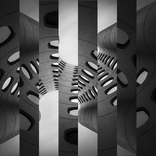
I then added some color to my black and white image. I did this by first clicking on the bottom layer and adding a hue and saturation adjustment layer and I used that to change the color of one of my images. In the hue and saturation menu I made sure I had selected colorize which allowed me to add and change the color of the black and white image. I then changed the color of the other layer by first clicking the layer on top and then adding a hue and saturation adjustment layer. This layer changes the colors for all the layers bellow it so with the adjustment layer selected I used my mouse to hover over both my rectangle layer and the adjustment layer and clicked whilst holding alt which then made it so I could only change the hue and saturation of the rectangles layer.
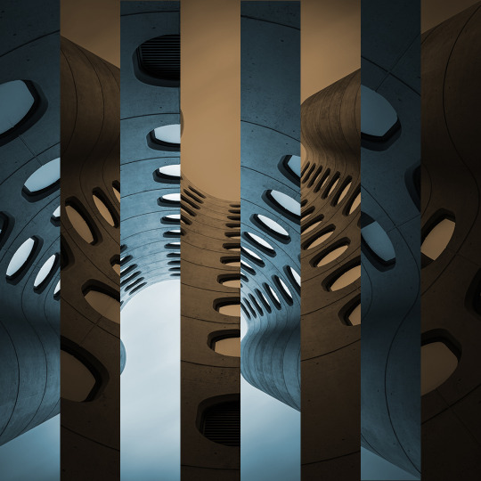
Using the same shortcut, control T I then scaled the rectangle image layer down by holding shift and alt and then aligned it so it was in the center of the page. I also changed and adjusted the colors by using the hue and saturation adjustment layers I had already applied.
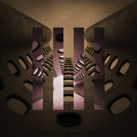
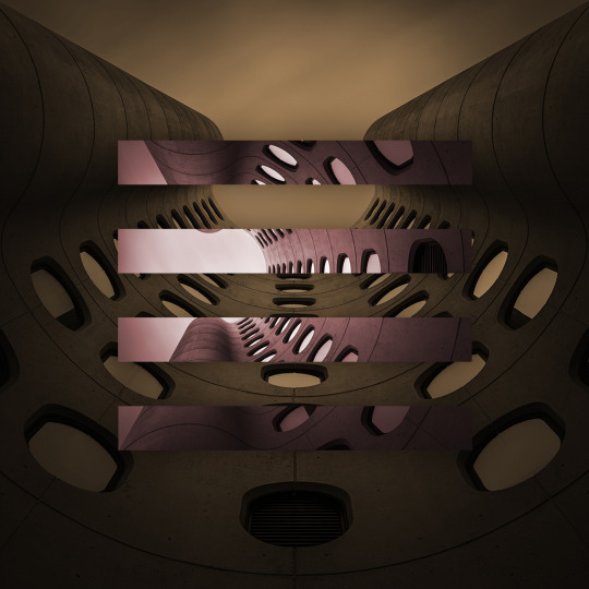
Next by once again using the same short cut I rotated it 90 decrease and added a light drop shadow to the image, I did this by clicking on FX and then tinseling drop shadow whilst my layer was selected which gave me a menu where I could create a drop shadow and also made the shadow color the same color as a part of my image.
0 notes
Text
We were given the task to do a face swap in Photoshop.
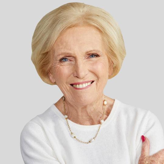
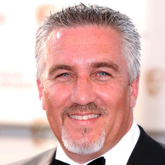
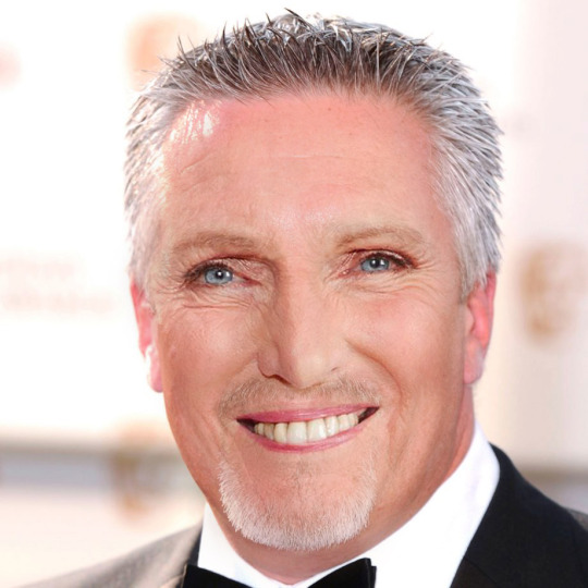
For the face swap I chose two images one was of marry berry and the other was paul hollywood, they are both judges of a tv show called the great british bake off.
First I opened both the images, I then went onto the image of marry berry and selected the pen tool. I went round marrys face with the pen tool and then right clicked my path and made a selection. Next I gave the selection a feather of 30 pixels so it was a little faded to help me place marrys face onto paul hollywoods face. I then took the move tool and dragged marrys face that I had just cut out onto the image of paul holly wood. I used control t to then rescale the image so it fited pauls face better. I also turned the opacity of marrys face down to I could try and align the eyes and mouth of both images to help me get the correct size and placement. Once I had the placements right I created a layer mask on the image of marry berry and used a very soft brush with the opacity of around 50% and a flow of 15. I then used black and white to use the brush tool to erase sections of marrys face and bring it back if I had erased too much out. I then slowley rubed out sections of marrys face image layer to make both faces fade into each others. Next I used a sturation adjustment layer to get the colour of marrys face closer to the colour of paul hollywoods. I hoverd my mouse inbetween marrys face layer and the adjustment layer whilst holding control and cliked which meant I only changed the saturation of the layer that was of marrys face instead of both of them. Finally I slightly made the image lighter wo make pauls skin less red by changing the levels of both images at the same time using an adjustment layer.

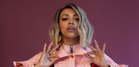
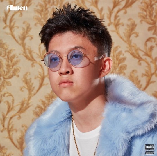
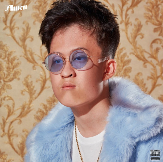
We were given the task of creating a caricature and we did this in Photoshop,
First I opened the image I wanted in Photoshop, unlocked and duplicated my image layer and then went to filter and clicked liquefy. From here I used three tools on the left to manipulate my image these tools were forward warp tool, pucker tool and bloat tool.
Forward warp stretches and moves the selected area of the image.
Pucker makes the things within your brush selection smaller
Bloat makes the things within your brush selection bigger
I then used the tool to warp and manipulate my image to try and create my caricature. Once I finished I clicked okay and exported my image. I also used the short cut control Z to see the before and after.



0 notes
Text
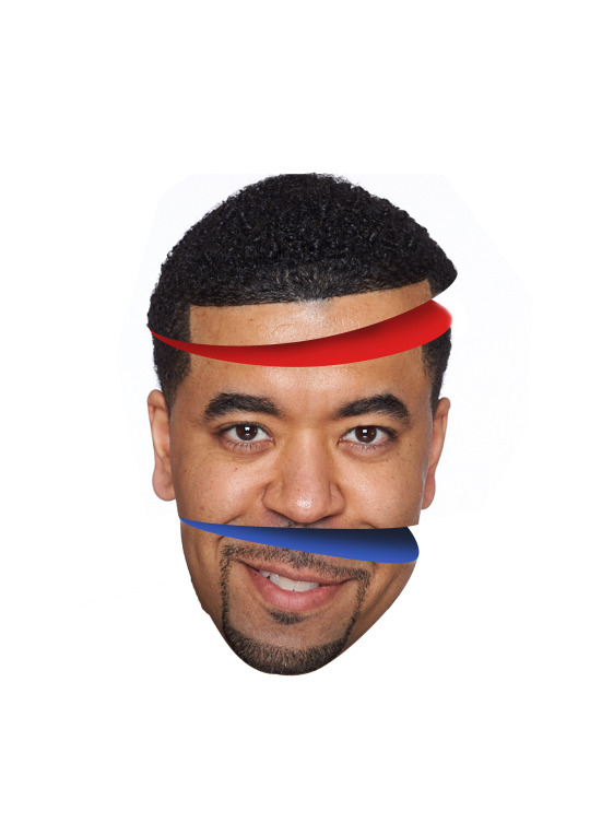
how was it made
1 take curvature pen tool and create oval shape over forehead
2 create selection with 0 feather
3 create a new fill layer and click solid color
4 turn oval selection into a color and pick a color
5 select the rest of the head but only the upper section and add it that path to the oval selection
6 select the original head layer and copy and paste it by typing control c v
7 put the head layer over the oval color layer
8 Then rotate by typing control and t and then rotating
9 select the left over white bits around the top of the head using the magic want tool and shift to select everything.
10 then click select, inverse and then create a mask to make the white sections disappear leaving the head.
11 on the first original head layer remove the hair using the mask layer and the brush tool with the color black to rub it out.
12 then add shadow using the burn tool on the oval color layer to make the top of the colored oval darker creating shadow.
This left the image of the man have his head cut open at a angle I then used what I have learnt to do the same thing lower down the mans face.
0 notes
Text
we were given the task to create an idea that would teach children to do something, After brainstorming ideas and concepts I came up with the idea to have a sort of vending machine which you had to complete tasks and then you would be rewarded with something out of the vending machine. After researching about learning and how the brain works there was one experiment were a monkey had to remember number patterns and number orders and when he got it right he was rewarded with some sort of food every time he got it right, we are using this same concept but for humans. We mainly focused on making this vending machine idea to do with math but essentially it could be used for multiple learning activities. How it works is there is some sort of box with a touch screen on it and you would complete mathematical questions and then either a compartment with a reward in it would open or like a vending machine it would drop down.
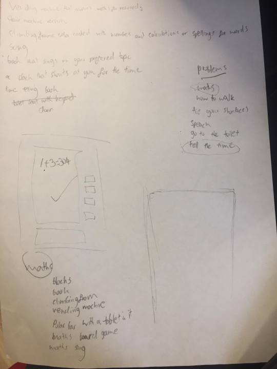
Here are the sketches for the design.
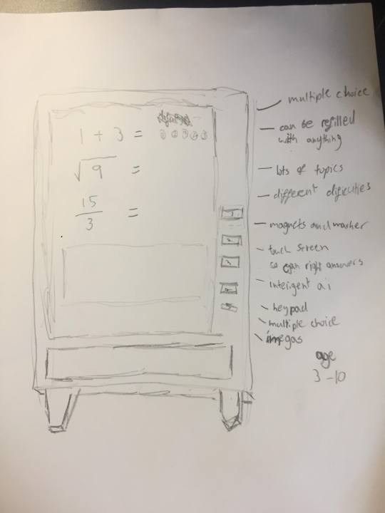
The main ideas we had for the system and design were that
1 there are multiple choice questions
2 the machine can be refiled with anything that will fit so for example if your trying to teach your child math the parents could fill the vending machine with things like raising and nuts or whatever you fancy.
3 the unit has a large library of topics and subjects
4 It will be touch screen and touch and pressure sensitive so you can wright on it or draw answers.
5 it has intelligent ai so the machine knows what its user is writing and if its getting the questions wright.
6 it also has a keypad
7 it can also use imagery for learning.
I then went into illustrator to make this idea look a little more real.

We then had to pitch idea to the class to gain feed back and to help build on our design, unfortunately I was in London looking at universities so I couldn't make the presentation but one of the group members said it went well and the audience understood the concept and idea.
In terms of feedback apparently people liked the idea and there was no bad ideas but there were some suggestions such as,
1 make the machine bigger for older children
2 make larger versions and put it in supermarkets so children could play on them whilst there parents went shopping like an arcade but the children could win free food. this is a good idea because sometimes dragging your children around a supermarket can be annoying and not helpful but also depending on what age the machine is targeted at which would probably be around something like 3 to 13 you do not want to be leaving your three year old on there own whilst you go shopping and you also do not want to wait for them to finish playing on the machine so you can then go shopping.
3 Get in partnership with companies like Disney to create machines with there branding and imagery from films to make the machines look more fun and appealing.
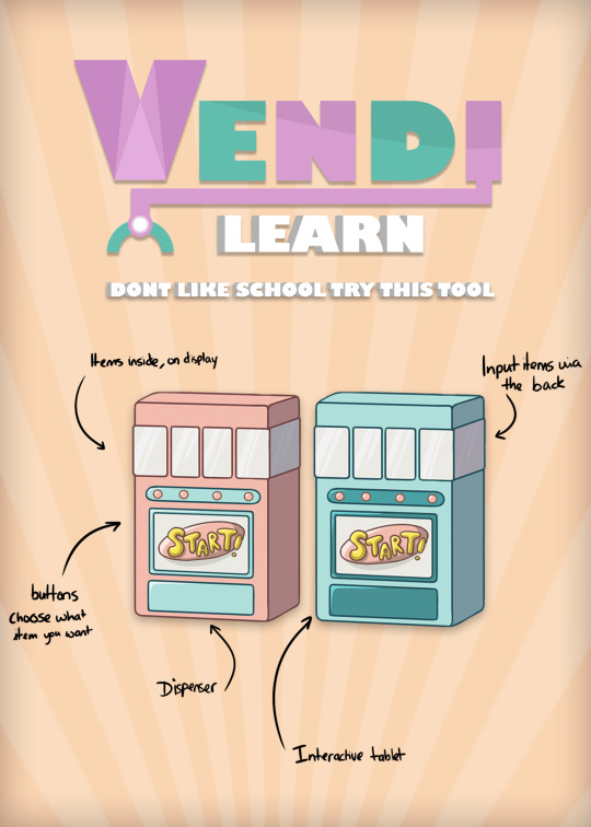
After this the group got together to and talked about the tasks we needed to complete to help us make a final advertisement. The first thing we did was agree on what the machine would look like so we had one final model, one of our members had some good drawings of the machine so we agreed on a final look and gave her the job to create a piece of artwork which showed the machine and listed the things it did and how it worked, I then brainstormed names for the company that was supplying the machine and the name of the actually machine.
The name that I came up with for the machine was Vendi its essentially the word vending like in vending machine shortened down to vendi. So the company name is called vendi and then the machine is called vendi learner. Me and my my other group member rhea brain stormed some slogan ideas which were:
Learn and win
Rewarded Learning
Get it right get a prize
Don’t like school try this tool
fun learning
We decided to go with don’t like school try this tool as our product slogan. I personally am not a huge fan of the slogan as I feel it could be a little long for a slogan. After this I started making a logo in illustrator for the company and rhea started looking at lay out for our final advertisement.
Was your team effective? Why? Who in the group came up with the best ideas?
I think towards the end we worked as a team and did lots of group decision making but at the beginning no one was really taking charge so I was the only person really putting down ideas and trying to get things to happen. The hole concept of the machine was essentially my idea as there is an experiment were monkeys do a task and they learn and get rewarded with nuts, I decided to create something similar for humans so I thought there could be some sort of vending machine about the size of a mini fridge and it has a screen on it or something to interact with so you can complete tasks and get rewarded with the outcome hopefully being that your learning. I also came up with the company name, slogans and drawings and illustrator work for the beginning model of the machine. One of are group members holly did her own drawings of the machine and created a similar but improved build/model of it that we as a group preferred so that was also a good idea. Our team was effective because there is a product idea and advertisements and a brand identity so work was done but there could of been more material if everyone was doing both ideas and designing as It was just me and holly doing the actual work in software and rhea contributed more on the pitching and helping with ideas and giving her opinion to help build the brand but if rhea also did some designing more work could have been made.
Who in the group didn’t contribute enough?
I think everyone did pull there weight it was just in different ways as I came up with a large amount of the ideas and a logo and then holly did lots of illustrations and artwork for the advertisements and rhea led the first pitch as me and holly were away and she also gave her opinion on the logos I made and said what she thought looked best. I think the person that put the least amount of time in was rhea as she didn't really do much designing work and she only gave her opinion on what she liked and disliked whilst me and holly spent lots of time in class and at home making all the design elements. Also for the final pitch we were all there but only me and rhea talked whilst holly sat down but we didn't discuss if we should all talk so I think we all contributed in our own way but me and holly put in more work and time than rhea did.
Would you approach the process differently if you did them again?
I think we could of managed our time better and planed everything out before hand so we had a time skedual and that everyone worked together and did the same amount of work.
Have you improved the product much and do you think it is a good product now?
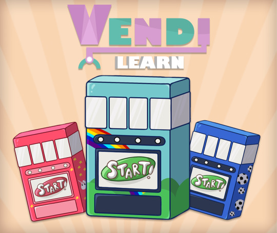
We didn't improve the product much as we were not given a lot of feedback in the first pitch but holly did do some drawings of the product with more imagery on it like footballs and rainbows which is something that was suggested in the first pitch.
pitch two
What feedback did you get from the focus group in pitch 2? Do you agree with it? Why?
the feedback we got was to make a specific logo for the product that fits the color scheme better and not just a adjusted version of the company logo for the product logo. I agree with this as they should be two separate things and we could of made the product logo look a lot different from the company logo and still make it fit the brand and this could of made the advertisement and product look better.
Someone said that we needed to make sure kids couldn't brake the devise and steal the prize and this is something we thought about but never went in detail with within our product drawings but essentially there could be some sort of key or password the parents use to replace and lock the prizes away.
Someone said to turn it into a app.
I disagree with this as the hole point is that there are fiscal prizes put in by the parents which motivate the kids to use the machine and learn if its in a app this cant happen potentially making the learning experiences less appalling. Also if we made an app it would probably be cheaper than the vending machine so parents would prefer to buy the app possibly preventing sails.
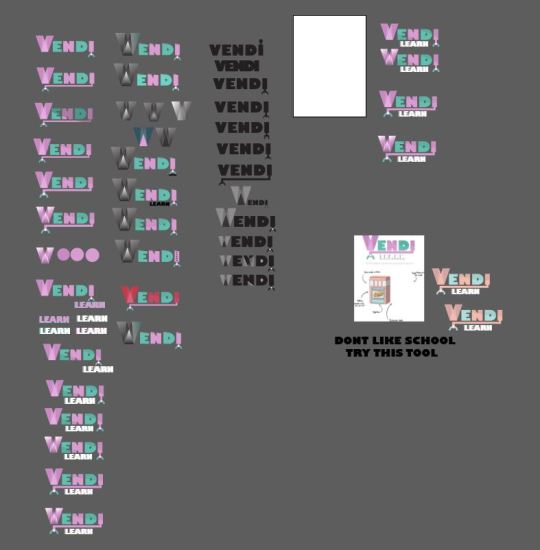
Here is the logo I made and its development.
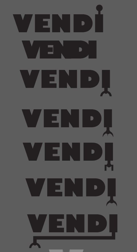
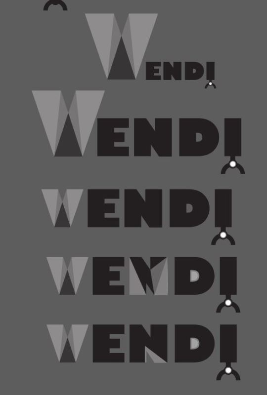
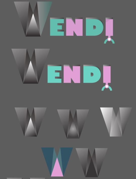
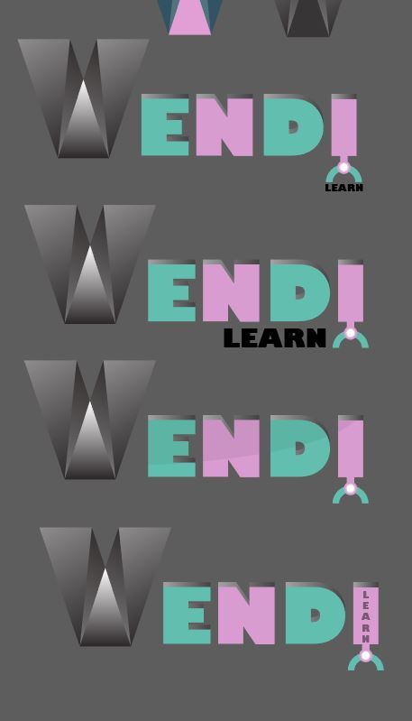
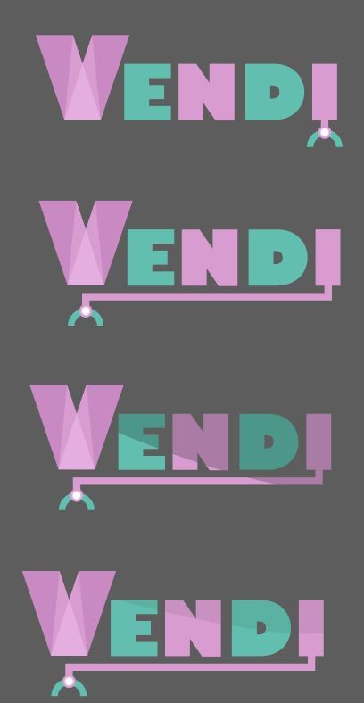
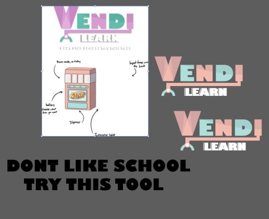
Here is the final advertisements that i made and the group helped with layout, colours and text effects by giving there opinion so the end product was something we all agreed on.
0 notes
Text
studies on memory
Multi-Store Model (Atkinson & Shiffrin, 1968)
An influential theory of memory known as the multi-store modelwas proposed by Richard Atkinson and Richard Shiffrin in 1968. This model suggested that information exists in one of 3 states of memory: the sensory, short-term and long-term stores. Information passes from one stage to the next the more we rehearse it in our minds, but can fade away if we do not pay enough attention to it.
Levels of Processing (Craik & Lockhart, 1972)
Fergus Craik and Robert Lockhart were critical of explanation for memory provided by the multi-store model, so in 1972 they proposed an alternative explanation known as the levels of processing effect. According to this model, memories do not reside in 3 stores; instead, the strength of a memory trace depends upon the quality of processing, or rehearsal, of a stimulus. In other words, the more we think about something, the more long-lasting the memory we have of it (Craik & Lockhart, 1972).
Miller’s Magic Number (Miller, 1956)
Prior to the working memory model, U.S. cognitive psychologist George A. Miller questioned the limits of the short-term memory’s capacity. In a renowned 1956 paper published in the journal Psychological Review, Miller cited the results of previous memory experiments, concluding that people tend only to be able to hold, on average, 7 chunks of information (plus or minus two) in the short-term memory before needing to further process them for longer storage. For instance, most people would be able to remember a 7-digit phone number but would struggle to remember a 10-digit number. This led to Miller describing the number 7 +/- 2 as a “magical” number in our understanding of memory.
Here is a study that says middle age woman have better meomory than men.
Memory loss, unfortunately, is a well-documented consequence of the aging process. Epidemiological estimates suggest that approximately 75% of older adults report memory-related problems. Women report increased forgetfulness and "brain fog" during the menopause transition. In addition, women are disproportionately at risk for memory impairment and dementia compared with men. Despite these conditions working against them, middle-aged women still outscore their similarly aged male counterparts on all memory measures, according to the study.
The cross-sectional study of 212 men and women aged 45 to 55 years assessed episodic memory, executive function, semantic processing, and estimated verbal intelligence through cognitive testing. Associative memory and episodic verbal memory were assessed using a Face-Name Associative Memory Exam and Selective Reminding Test.
In addition to comparing sex differences, the study also found that premenopausal and perimenopausal women outperformed postmenopausal women in a number of key memory areas. Declines in estradiol levels in postmenopausal women were specifically associated with lower rates of initial learning and retrieval of previously recalled information, while memory storage and consolidation were maintained.
I think its common knowledge that age has something to do with memory loss because in lots of ways when you become very old it is almost like your a baby again where you cant walk or talk in some cases and your memory can lessen for things like short term memory but on the other hand I understand that there has been times where elderly have very strong long term memory and can remember all sorts from when they were younger.
for example here is a article that talks about how your memory and reaction times become slower as you get older.
Aging affects the speed of information processing. Older people tend to be slower than younger people in processing sensory information. Most of this change occurs in the central nervous system where various mechanisms translate sensory input into responses. But changes peripherally also occur. Conduction velocities in sensory and motor nerves slow down with age. Changes in storage and retrieval of information occur for all age groups. Recall, the searching and retrieving of factual information from storage, worsens over time. But recognition, the matching of stored information with information in the environment, changes very little over time. Encoding, the process of preparing information for memory, takes more time and effort. This relates to sensory barriers and creates a disadvantage to initial processing.
Links:
https://www.psychologistworld.com/memory/influential-memory-psychology-studies-experiments
https://medicalxpress.com/news/2016-11-memorymen-women.html
https://www.eurekalert.org/pub_releases/2016-11/tnam-wht110716.php
https://www.psychologytoday.com/us/blog/the-art-and-science-aging-well/201611/how-aging-affects-our-memory
1 note
·
View note
Text
we are all learning new things every day, sometimes we dont even realise we are learning new things but since we were born we are constantly reading peoples lips and watching how they act and soon enough as you devolpe you learn how to walk right ride a bike ect.
what is leaning ?
learning is where you gain knoledge or a skill and so you are able to do something that you used to not be able to do. so its when something might improve in skill or you might be able to talk about or recall something that you used to not be ables to because you havnt learn that thing yet.
How do we learn?
There are lots of different ways of learning and everyone finds it easier to pick things up and learn things quicker there own ways and thats why there are different methods of ways to teach people things if its trying to improve your techneaque in a sports activity or something like maths and english.
there are some main methods of learning and some can help people learn sertain things more than others.
Visual (spatial) - this is were you use things like images and pictures to help you understand things and learn for example infographics could be a visual way of teaching you something from images.
Aural (auditory-musical) - This is where you learn from listening and audio so it could be your teacher talking to you trying to educate you on a subject or you could be listening to a podcast about design or a song and it might stick in your head and help you remeber it especially with things like songs about maths or science eqwations
Verbal (linguistic) This is also audio based but its more about words in general so some people find it best to learn things out of books or articles in a newspaper or a newspapper.
Physical (kinesthetic) - for this method your using your body so your hands and movements can help you remember how to do something so this method is mocomonly used in sports so someone could teach you how to sertain moves in basket ball and the more you practise the movements the easier it is to remeber what you need to do and you will get better and quicker at it or it could be teaching someone how to use software, as long as your fisically doing it over and over then you might learn.
Logical (mathematical) - you might prefer using logic and maths to learn things or sertain systems and layed out steps or programs to help you learn and remember something.
Social (interpersonal) This is were you learn by being around others and working with other people so for example group activities and sociallising with others cna help you learn.
Solitary (intrapersonal) this is were you learn by being alone and working on your own so you might learn better with less movement or noise around you.
these are the main ways that we learn.
How can we improve learning?
we all have are own ways of learning and some people find it easier to focus in sertan situations but there are some techneaques and methods to help you consetrate but some of the comon ones are
1 focus on whats relevent so if your trying to read a textbook or watch a video try and focus on the main things that are relevent to what your doing so dont get destracted by less important articles or social media
2 take time to reflect and self explain, this can help because sometimes its good to take a brake from working and just sit back and take another look at what you have done and this way that repatition of you going through your work again and potentially cretaking it could help you remeber what your trying to learn.
3 use different types of media to learn so dont just stare at a screen or book all day trying to remeber things it could help to go for a walk with an audio version of what your trying to learn in your headphones.
4 change things up as much as possible, this is like the other point the more you switch things up the less destracted you might be and the more interested you might become.
5 realise were the gaps are and set goals. If you work out whats distracting you or slowing you down then you can try and eliminate that thing, also seting goals for yourslef cna be a great way to motivate you to acheave something.
How can you improve memory?
Here are some examples.
1 coffee is said to help you increase you memory as it stimulates you and makes you feel more awake potentially helping you focus and recall things better than you would without it.
2 eating berrys to increase your long term memory, A study from the University of Reading and the Peninsula Medical School found that supplementing a normal diet with blueberries for twelve weeks improved performance on spatial working memory tasks.
3 regular exercise could increase your recall memomry, Studies in both rat and human brains have shown that regular exercisecan improve memory recall. Fitness in older adults has even been proven to slow the decline of memory without the aid of continued regular exercise.
4 chewing something or movements could help your memory, Another easy method to try that could improve your memory is chewing gum while you learn new things. There’s been some contradictory research around this topic, so it’s not a solid bet, but a study published last year showed that participants who completed a memory recall task were more accurate and had higher reaction times if they chewed gum during the study.
5 studies and research shows that the rush of adrenalin can massivly increase you reaction time and memory recall so for example after being on a rollercoaster there has been many cases were reaction time and quick thinking is increased.
Links:
https://www.learning-styles-online.com/overview/
https://warwick.ac.uk/fac/soc/cte/students-partners/academictechnology/learningtheories/whatislearning/?post=8a17841b5e5cebca015e8c5d87f32ace
https://www.opencolleges.edu.au/informed/features/10-ways-improve-transfer-learning/
https://www.fastcompany.com/3028359/6-science-backed-methods-to-improve-your-memory
http://www.bbc.com/future/story/20180208-an-effortless-way-to-strengthen-your-memory?ocid=global_future_rss
1 note
·
View note
Text
We were given the task to create an info graphic of how to make a certain meal so I chose to make a info graphic on how to eat a banana, I made it simple so I could focus on putting detail into the banana so I only have three steps. The bananas in the box represent step 1,2 and 3 and the steps are simply, get a banana, peal it and eat it. For the design of the banana I worked with thick strokes and then I used the pen tool to make the black lines thicker or to create lines in the banana skin.I also added some different yellows to add some depth and shading and some light drop shadows so it looks slightly lifter off the background.
What do you like:
I like the banana design especially the first one in the set of the three because I think it has a nice cartoon look and I really like the bold thick lines and slight accents of other shades of yellow which helps the art stand out and just look a little more completed and nicer to look at.
What do you not like:
I think some of the lines look a little bit wrong because all the wights and thicknesses are all different and in some places the black lines do not really connect that well because of the different thicknesses. Another thing that I liked the idea of but not everyone will get that the bananas represent numbers for the steps of how to eat a banana.


0 notes