Blog where I post my creative pursuits and the decision I take. And sometime porn as well.
Don't wanna be here? Send us removal request.
Text
#20: College and programming.
Last 2 weeks was a jam cuz I intend to go to college this year. and continuing me dialogue system.
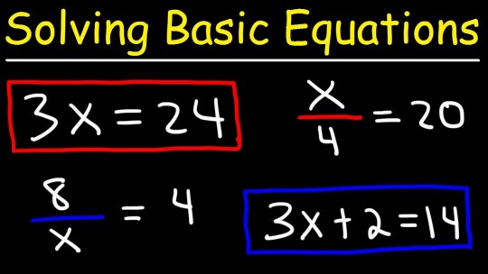
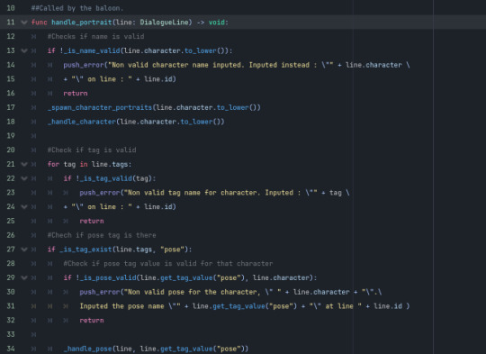
Sharpened my highschool level math again to a point for the entrance exam and as I kinda liked doing those math operations were done, I wanted to do another problem solving task again. So back to programming I go.
There was a lot for me to study, or atleast I thought I needed to ,but I knew math would be my weakest point.
Reading comprehension is easy for me, abstract thinking just needed time and science is all trivia so it's really hard to study for. But math was different, If I knew nothing here, I will fail all since I generally understood that you need to know the basic algebra just to do all the advanced stuff. Linear equations, geometry and finally trigonometry. All of it build on top of each other so I need to slowly study my way to the top.
As I was doing it, it started to get fun actually, I treated it more and more like learning tools to solve a problem. When I tried to test myself out, I did the math equations okay but the word problems were just fun to solve. Understanding the problem, building a sensible equation for it, and seeing how the things I learned solve it was a satisfying feeling. I knew then that I actually enjoy math as a way to solve problems. but what I hated was the test.
Test have time limits, failing test bad. means that this is a stressing exercise.
So yeah, that's my though towards math as I studied.
------------------------------------------------------------------------------
After finishing the exam, I loved having my brained be engaged in those problem solving questions so I, yet again, revived my dialogue system and actually made adequate progress with it. Far from finished mind you but pretty solid form before.
Look I even made a kanban board so I can see how much stuff I finished over time. Greatly satisfying.

As I worked on it more, I slowly realized that I need more features to be reliable but that should also grow my finished block as well so it's a great feeling.
The idea here is that I can re-used this for me future projects with minimal changes to the code to fit my needs. Just need to attached the dialogue service node to anything that I need to talk to, write some dialogue here and there and it should just work. Like I don't need to think the lower level logic after all of this.
My first game project with this would be where you talk to one character and based on what they said, you would infer answer from. Then something bigger after that. Like the case of golden idol but instead of a point and click game, it's a top down.
------------------------------------------------------------------------------
How about art? yeah, I did some these last 2 weeks. Just not a lot to warrant a post and if I did, not allowed here. But right now, I'm handling my time to do programming in the morning then art in the afternoon.
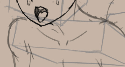
You can have this wip of the collarbone for now though. As you can see, it far more raunchy than I usually do but, it's a commission and, honestly, good practice anyways for me.
0 notes
Text
#19: I'm Alive.
2 weeks gone cuz I got busy during first then got sick on second.

Though I am now back in making content again. In this case, I'm learning how to use line weight again. Like I already knew but only thicken from the start. Now though I'm learning how to make them thin instead. And honestly, it looks pretty good.
Though That my only content this week though. Still got plegm in my lungs and slowly getting my strength back. Don't know about the near future as well as I get busy with school as I am preparing to back to college.
0 notes
Text
#18: Speeding Up.
This week, I'm hunting for for simple art challenge for engagement and speed practice. And continuing my commission work.
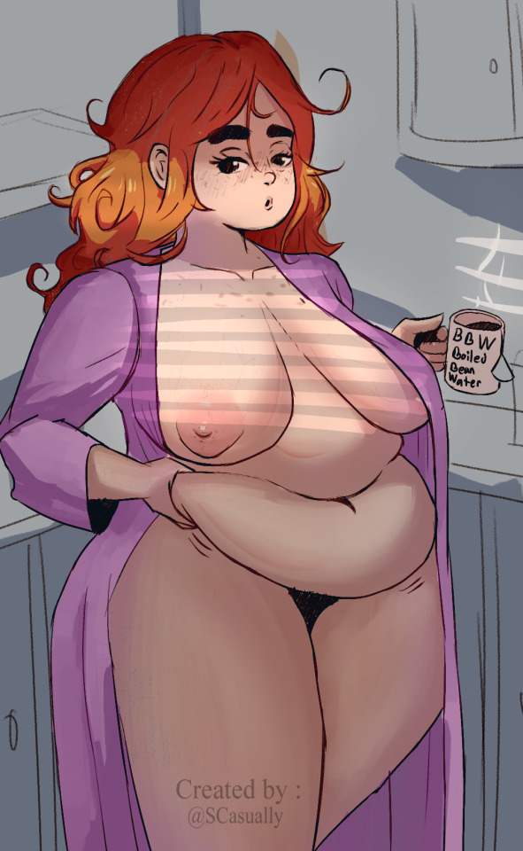
This is OC by @juicydemon. They did a DTIYS challenge that I partake. Now I'm looking for my challenges like this.
Last week I did murgotten and this is juicydemon. I noticed that my recent output for art is way too slow for my taste. I'm fine actually with being slow but now this slow. So I thought I should challenge myself with these kind of stuff. Bit selfish since I'm doing it for likes and retweets but I did it to counteract the feeling of having a lower quality output while I try to increase speed. Also helps for people to maybe even check my profile and see my recent art of Zelinks and such.
I prefer these kind of challenges since it hits an area of practice that I need to work on, the rendering part. Other one being drawing more dynamic poses, rendering takes long time for me. Most likely because I can't properly get it internalize since my rendering skill are practiced way too far apart. But I am getting there.
Now I'm scouring twitter for a similar challenge again.
------------------------------------------------------------------------------
In other news, I have taken another commission from previous client. This time I recommended them a comic. I ask them what kind of thing they want this time and they gave me ideas to work with. I wanted to do more lover dovey kind of things since those are the works I enjoy most.
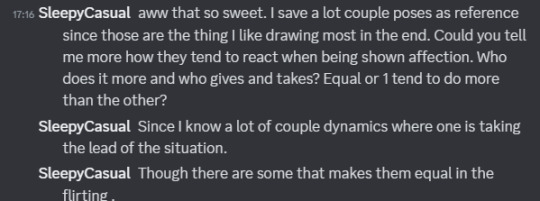
Like how they're characters interact and they're personalities and such. They told me a details and the only thing that I came up in my mind was a comic. So now I'm doing that.
48 notes
·
View notes
Text
#17: Banged one out and a quickie.
Finished the second part of Zelink thing and did a "do it in your style" post by @murgoten

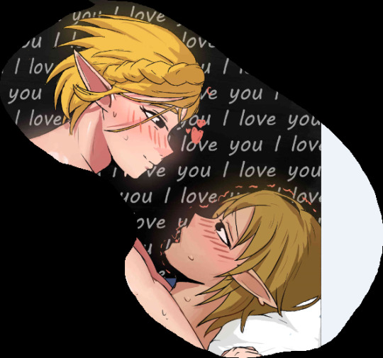
If you want to see a full version, you can see my twitter and reddit for it. Maybe the next thing I should do is TwiYor next ;)
I'm quite happy doing murgoten prompt cuz it made me do a quicker workflow that I needed. Just need more practice more dynamic poses and refined renderings in the end for the touches.
I wish I could show more of the process here but tumblr is scared of boobs so I sadly can't. Which is fair enough since it is just them straight up fucking so whatever really. But one thing I can talk about is my rendering process. Like I'm slowly getting an idea on how to do my own version. Flats, to shadows then soft edges then add highlights and saturated colors. It's probably the mixture of good shapes theory that I need to work on. Also learn how to lessen contrast. I do blen, but only lost edges. Only adding in colored lines around the end when I should probably do it earlier in the process.
You see it here actually in the quickie I did.
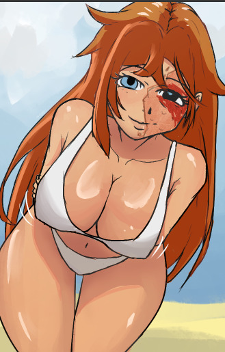
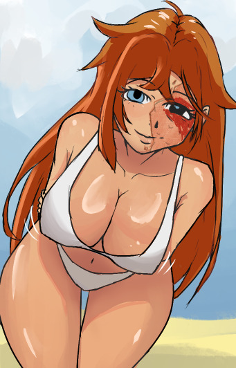
It's subtle but the it adds harmony within all colors. But not like every where though. Only where it realistically lands and/or make two things in the pic feel more like a group. Like that example from teal guy.


Stuff that I need to apply more next time. All this, just in lineart too.
2 notes
·
View notes
Text
#16: Heatwave.
Major heat coming through our areas here. Making me not want to do anything before 5pm. Still continued my art and programming thing.
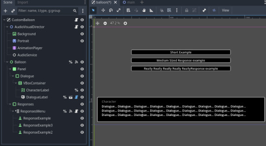
Art finished this week is my commission again and reworking my Dialogue System.
Spent most of time finishing these 2 commission.
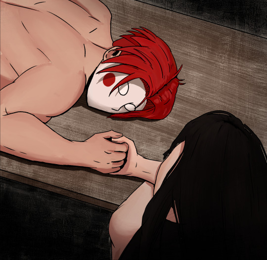
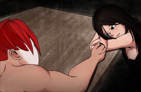
They look great, don't they? Really liking the red the Kero's hair is giving. Plus the textured background really makes everything pop. It was based on this panel by my client's comic. The texture in there plus the bnw really inspired me to do something similar. Even did a perspective change so that they can be a pair together.
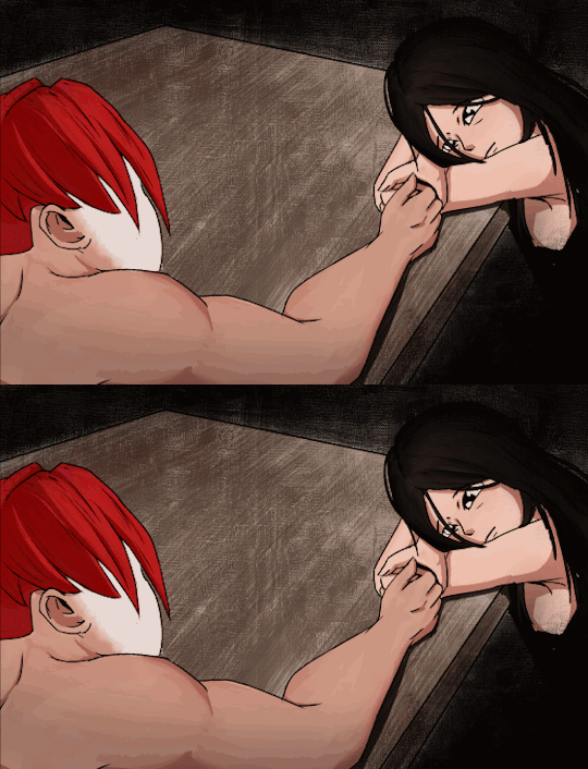
Also made this cute GIF as an extra. The line boil is really cute. Though maybe next, I should lower the framerate but do all the lines for a better hanging out feel. Hmmmm.
------------------------------------------------------------------------------
If you're waiting for the Zelink art. I'm still doing it. Just focused all my effort on these 2 commission you see.
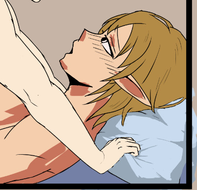
Let me tell you, getting that pillow was quite something. I never drew something soft before really. I drew clothes on hard body and also drew boobs getting squished but never both never both at the same time really so it took a lot of tries and help to get it right. Plus the grab too was quite something. I love how it turned out. It's a combination of a design theory "small, medium, large" for those wrinkles and triangle to show points of tension. Hopefully, the hand look as intense as I wanted it to be..
------------------------------------------------------------------------------
Though most of this week has been spent on programming. Project? A dialogue system. Reviving it from last year. Needed something to stimulate my brain differently from art. And man has it grabbed a hold on me yet again. But not with put problems. The biggest one is that, my project depends on a addon, Dialogue Manager, to handle Dialogue internally while I handle showing it. It had a feature that I needed but since my version was so far apart form latest, it broke the project.
Thankfully I use git so it was'nt much of a problem but goddamn did it took a lot of time. Eventually, in the end, I decided to restart my project. I was scared taking long again to build but I realised that the only reason it took so long was because of designing the system. That's what originally took so long. So now all of I have to do just write the code. Took like a day, not like a 1 month I was expecting. Now I reached where I was before, I'm back with designing the system again. Specifically, how to store and retrive 3 layers of a sprite that are interchangeable while maintaining scalability and flexibility.
0 notes
Text
#15: Locking in during my commission. Also reviving my game dev tool thing.
Mostly did commission this week but at the end of the week, re opened an old project.
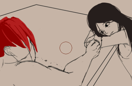
I intend to finish this commission this week but a heatwave blasted through the area and as a guy with no AC, I can't work during at this heat. Ended up only working only at night. Though I did end up moving my sleeping schedule more into the night so I can skip the hot afternoon. Actually works too.
With this new work time, hopefully, I can finish this out this week cuz it's been a month since the initial commission. Also be able to do the zelink thing right after this also.
------------------------------------------------------------------------------At the end of the week, I don't feel like doing art during the hot hot afternoon but my mind still needed some stimulation so I re started my game dev tool, "Dialogue System." Using godot with the Dialogue Manager addons as a base. It only provides the writing the dialogue part of the system so I need to hook it up to all output stuff of it.
When I find this good enough, I intend to make this a component I could use in my future project. I plan to battle test this with a small game. I'm thinking like a dialogue heavy game to fully use the system. Nothing too complicated though. Case of the golden monkey is probably the gameplay loop but you can walk in the overworld rather than click and point game. I don't intend this to be a good game since this mainly a test, so to prevent me from over polishing and taking too long, I'll probably just kit bash random free assets from the internet.
0 notes
Text
14: Busy Busy.
Mostly did art and locking in the detail during sketching.

Also got busy with life in general if you notices why no update last week. Mostly did grinding torso's like above of trying to get the hair, hand or expression right.
During this 2 weeks I made good progress between these artworks while trying to maintain practice sketching a day.
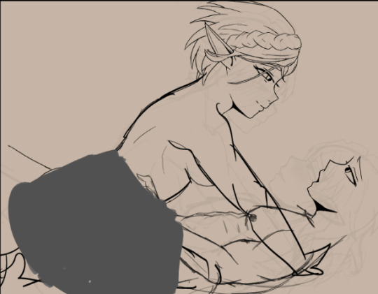
As you can see, compared to before, I made some decent progress over here however, there is a lot thing I noticed that just looks compositionaly off. So Imma try to fix this. This got even more obvious when I see saw my initial compo test.
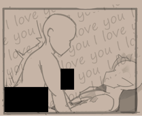

It sadly happened again. I overworked it again. Thankfully I always try to save to states just in case these stuff happens. Though I might have to change Zelda's hair to match frame, like the one you saw in last blog post.
*Sighs, this happens to me way too consistently and honestly I don't how to solve it. Nevertheless, with enough hard work, I can eventually finish these things.
------------------------------------------------------------------------------
I have thought that after this that I take a whole week where I don't do anything other than just this kind of sketching plus more dynamic poses with multiple bodies interacting and perspective. Also It's good content to post. The one on the top isn't how I actually drew unto the paper. It looks like this actually.


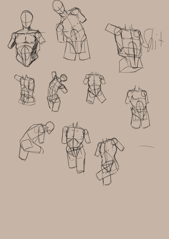

I just made the final picture by taking best things that came out that day and arrange them according to size and emphasis. Honestly this amazingly good for a quick 2 minute edit. I'll probably do this with all my art since this good thing to post on social media a lot.
Hopefully, by next week, you can see me start rendering LOZ piece already. If not finished god wills it.
0 notes
Text
13: I actually finished that wip.
Started like november. Got a job during the holidays. Also did 2 commissions but eventually I finished it.

Link to see the full pic.
------------------------------------------------------------------------------
After the day I finished the commission last week, I took a small break than immediately started doing this WIP. It was already pretty good and most of the sketching is already done. Just refined the expression a bit and a few identifiers so the piece looks more 3d looking. I did not however block in the hand. I placed it's general area and box perspective of it but nothing else. Took me a day and a half just to get right. Eventually conceding and asking helped in the discord.
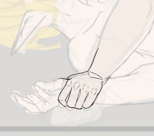
In the end, the final shot looks better when zoomed in. WIth the fucking hand that I toiled for cropped out.
If you looked at my twitter, you'll noticed that the lighting was not there originally. I added it in since I noticed that it felt boring. Like it felt to consistent. The darkening of the piece with the slight glow of Zelda's face really popped off for me. Plus it makes the whole thing more intimate.
------------------------------------------------------------------------------I also got commissioned again by my previous client. t;s great and I love doing they're characters. I'll probably won't be so in depth with them in the next following blogs. I saw all my past blogs and I thought that there should be more variety here. So yeah. Imma do study mode this week before I tackle the frame two of the zelda frame thing.
18 notes
·
View notes
Text
#12: Done with all commissions.
I'm finally done with all. I'll discuss the process during it (As far as I can remember at least) and what I'll be doing next this week.
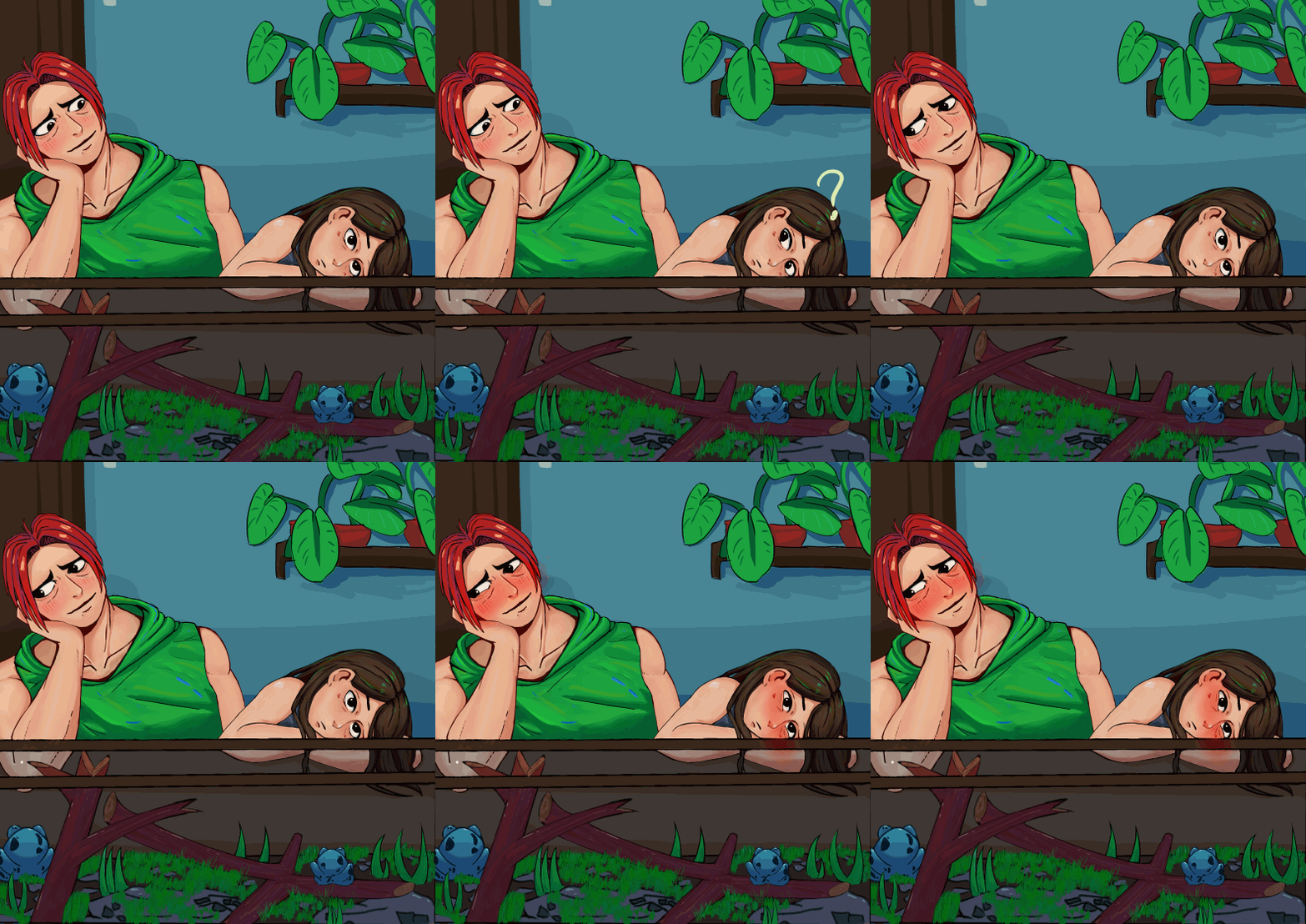
Look I even made a small gif at the end. It looks incredibly cute and the commissioner loved it.
------------------------------------------------------------------------------
The commission started after I made his santa gift. He asked if I was taking commission and I said yes, I was. It was my first time doing commission and, thank to gods, was so incredibly patient and understanding for me. Asking what kind of commissions I was most comfortable taking. Didn't even knew what kind of commission he wanted, he just wanted a one.
My commission process started with sending 4 simple thumbnails to the client with their idea and 50% of the agreed price for insurance. I suggested, "why not about them showing affection to each other in their own way."


Based on that description, I made these thumbnails.
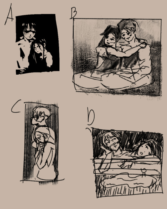
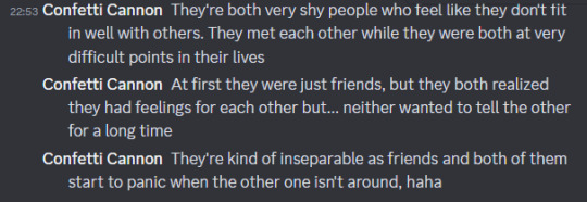
The idea I had going to this was something quite casual. They both like each other but the other doesn't know it so I imagined that they like hanging out a lot, no matter the activities as long the other one one there. But no touching since they don't want the other person to think that they are annoying. A, C, D explores the idea of them just hanging out, just with A being more about showing them off to the viewer. I wanted a bit more variation so I made B where they are more comfortable in showing they're affections with each other.
The client loved them.

They like it so much that they decided to commission me for both A and D.
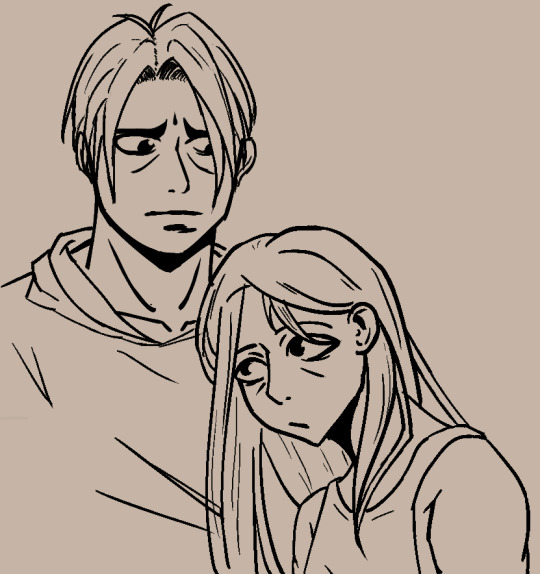
Which I eventually translated to sketch ,line and finally color.
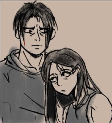
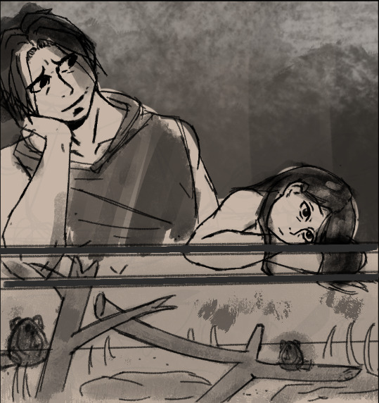

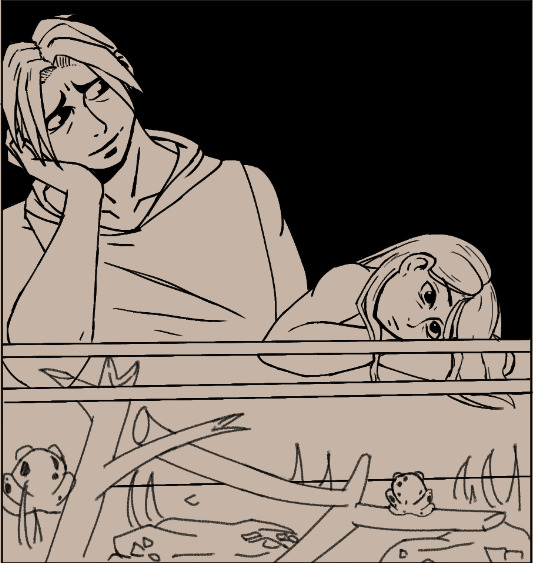

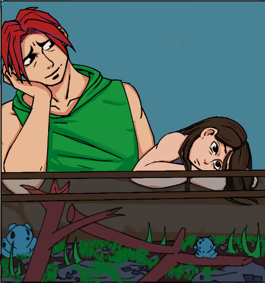
Each step of the way I showed these stages for approval if the current design looks okay. At this point I ask for the remaining 50% percent before I start rendering. They paid I got to work to make these.
During the rendering phase, I experimented a bit.
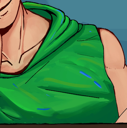
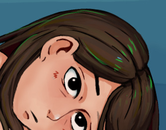
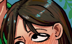
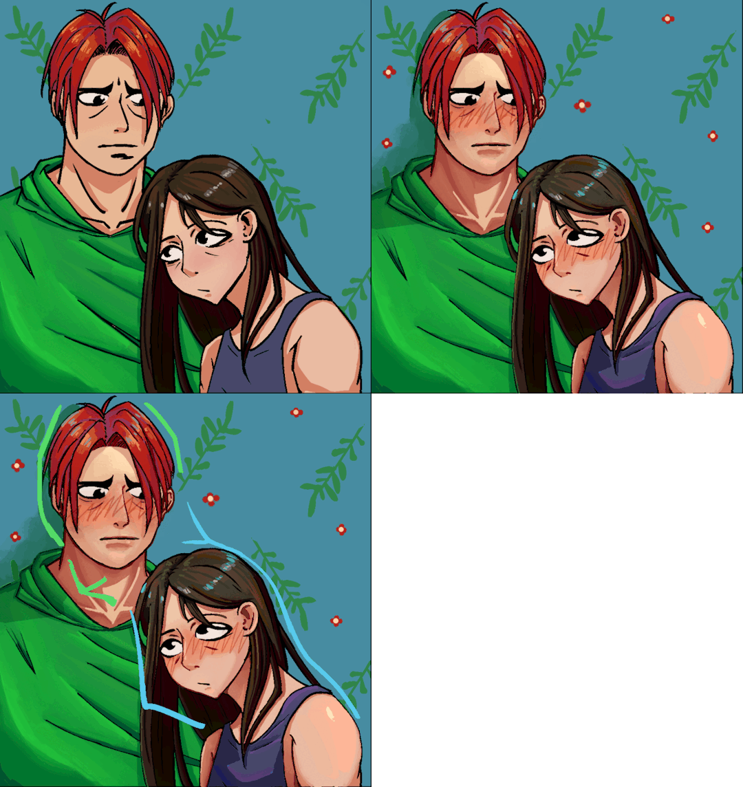
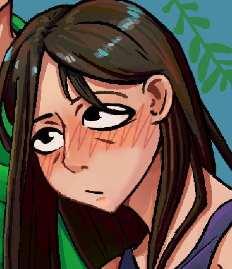
Doing color streaks. I like it a lot as it gives a lot of color punch to the picture. I came to it thinking, as long you can tell what is the supposed color is, you can add random streaks of color as stylization. The colors used are other colors in the pic as well so that it can feel more "together". And in the end, it looks amazing.
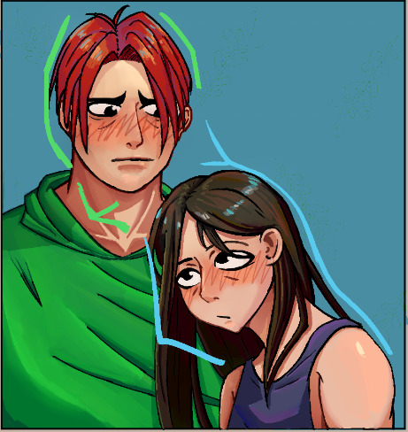
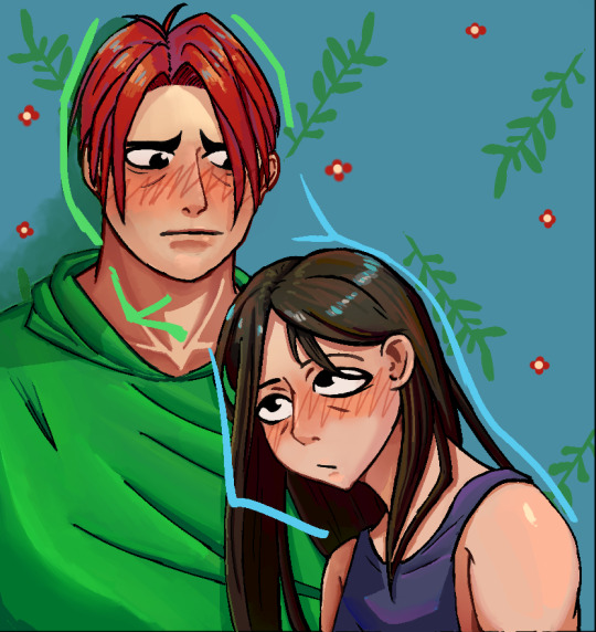
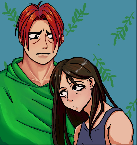
Made a quick background so it isn't so boring. Look at the difference below on with and with BG here. And during this, also tested the workflow of just doing 2 layers of line and color only. It feels better and I think Imma experiment this more in the future.

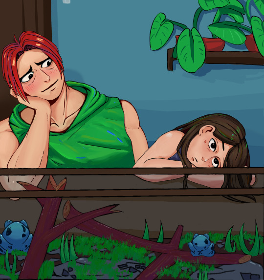
I even made the short gif you see at the top as gratitude for being patient me. The whole commission took me like 2 months to complete. Mostly due to work taking most of my time but I was able to power through and it's over now so I can now actually focus more on art now.
------------------------------------------------------------------------------
What's next?
Probably finish that zelink wip that I did. some stuff already. Even applying some stuff I experimented during the commission like drawing a sketch first, make new layer for all the color first then the clean lines in another laye. So mainly 3 layers during the work. It actually allows me to work faster and it matched my tempo.
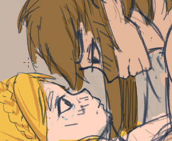
Here ye wip of it. With this new technique, perhaps I could get this wip done next week. Or atleast this frame ready.
2 notes
·
View notes
Text
#11: Shit I forgot
I may have forgotten to update last week and a little late this week, but I did something during those times.

Look at the progress here. And I also did some programming. Like an automatic gif creation with ffmpeg. Quality is low though. I think I can improve it by messing some of the parameters but it's good enough. Shortened it even more with a .bat file.
I was watched this short from proko while working on the commission that inspired me to do it. You can see it here with the Puck's hair.


It's subtle but I like it a lot. You may also noticed the green highlights I added. I realized that as long the color isn't too dominant and is presented as a highlight, people will think it's a highlight and still look good. I color pick the green from Kero's shirt so the piece would feel more whole together. I also went back in a bit and added those blue streaks. Same reasoning as before without the highlighting thing.
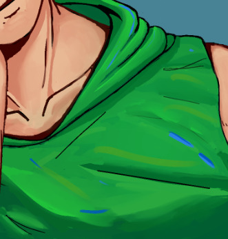
It looks amazing for me and I really how it turned out. But I knew I needed to control myself as this would be a great way to introduced some contrast between those with and without color jittering. If you looked at the whole WIP I made below, you'll see that I only did it at two places only. It brings emphasis towards those areas. At least in theory. Though I am considering to add at Kero's hair as well to match his boyfriend.
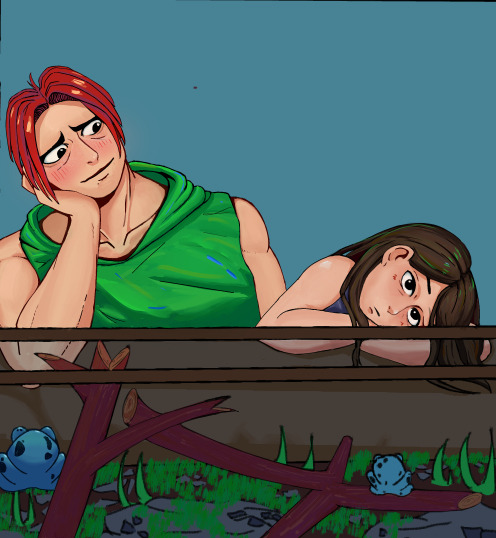
They're done though so only thing I have to do is all the BG for it.
------------------------------------------------------------------------------
As for programming, I learned one ffmpeg command. I like using gifs to show progress over time. I did'nt know how to export gifs in CSP so I what did was export as jpeg then upload them to a online gif maker. I was looking for a new programming project to do after the blog updater (Still Broken in auto runnning, will fix eventually ) I thought why not automake gifs instead? Downloaded ffmpeg and after some finagling, figured out this command
ffmpeg -y -f image2 -framerate 1 -i in%03d.jpg -vf "scale=500:500" out.gif
I wanted it to be a single clock as well so turned it into a .bat file. Broke, spent an hour figuring out why till learned that .bat file reads % as to fill. I escaped with a double percent sign instead and it works.
ffmpeg -y -f image2 -framerate 1 -i in%%03d.jpg -vf "scale=500:500" out.gif
A single click and boom, a gif is made instantly. Better than the 3 minutes during the oldways.

1 note
·
View note
Text
#10 : One done, one to go.
Commission 1 is finally finished. It took some time but it's here.
I'm quite happy how this turned out in the end. Due to the facts that I take quite some time to finish some, I rarely get a whole practice in where I do all the steps. From thumbnail, sketching, lineart and render. So there is always a sense of unease here. But, in the end, it still okay.
I loved doing their characters and when I'm done doing both of their commission, I'll show you guys the talk we had and how it led to here.
But for now, I'll show you what I did here this week.

Here's a little timeline on how the commission work went visually.
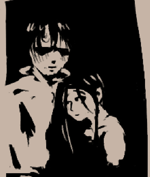


Thumbnail is for the overall composition .
Sketch is for going in depth.
Lineart is cleaning the lines
Flat color is, well, flat colors and the overall shadows of the piece.
Render is all the render passes I do.
This is the process I do when I make art. I copied the process since it's quite similar on how others do it, minus the painting-esk thumbnail. As I revisit the rendering stage for another time. It always carried a feeling of slowness. Like my mind was going faster then what my hands can do. Especially when I have the change the lines and then picking the line layer was such a hassle. So for this commission, I tested the workflow on merging all the colors and lines into one layer.
And I like it a lot.
It makes me stay in focus for far longer than my old ways did. I'm going to try to attempt this in the next composition to render things this way.
Two things of note here. I have made the canvas size too small and testing out more color jitter effects.
For the canvas size one, I actually I'm fine when doing art in this resolution since I was going to post it online anyways, but only now when I was going to export this did I realize that I made the canvas size way too small. The client deserved a higher rez pic. Thankfully he did'nt complained about it and in fact loved it but for the second commission, I am going to make sure that I increase it.
For the color jitter one, if you notice in the hair, there is more color variation there. I wanted to experiment to add more texture to place and I thought adding color variation would be a fun way to do it. It didn't go for the look I was going for but in the end I did like how colorful it looked,
1 note
·
View note
Text
#9: Finalizing the commission.
This week, commission stuff rendering phase has begun.

The original lineart look good, as a concept phase, however it did not hold up in the final art phase. Looking at it, the lines are too thick. Though they were line weight, it was close enough that nobody could tell from a distance. Replaced some with hard edges instead. Originally, I made them all hard edges but I didn't liked the look so I added back some black lines.

When adding lines, one tip I have is to draw it like painter. Here is a sinix video explaining it. TLDR: Think with lighting in mind. Another thing to add about is contrast and how it can be used to separate objects. Here's another video by proko that goes more about line weight. They're great videos that made me understand lineweight better. I can't get them right the first time but I am able to see what was wrong and fix accordingly, shown here.
As for this commission, I'll finish Kero's face then do Puck then finally do a simple pattern BG.
------------------------------------------------------------------------------
They commissioned me to do 2, so here's the other one going.

I did the flat color and how the terrarium worked. The idea behind here was them simply vibing about during activity but I don't like the current composition it has right now. So my idea is to add texture all over the place except these two. But twist is that the texture is details. Like brushstroke details. Both in the foreground and in the background. In theory, it would add a detail contrast between them that would draw further emphasis on them.

Like around this area would be good. Would also test some color contrast as well.
2 notes
·
View notes
Text
#8: Blog Notifier and stuff.
Finally finished my little app and some colors now for the commission.
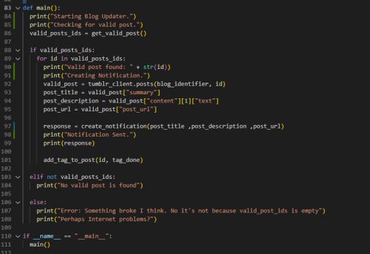
It's like 90% done. That means that there is now only 90% left to do. The blog notifier just needs to be run now indefinitely. For now I'm going to do it locally, ie. my computer, but I eventually will plan to do host on a raspberry pi.
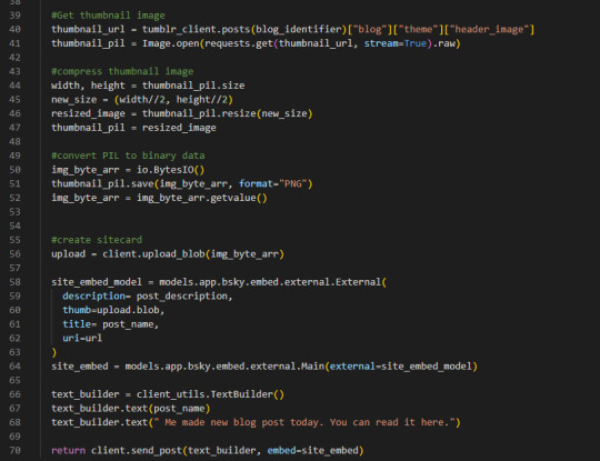
It's currently called by the windows task scheduler, weekly at 11:00 pm Saturday. Just an hour after my usual timed post here. I couldn't get it to work on twitter cuz twitter a bitch with their current api plans, thanks elon. So I relegated to blueskye instead and learned their Atprotocol. After some tinkering, I got it to work. Site cards and everything. Only took like an hour but the thumbnail wasn't there so I solved that problem.

It took 6 hours. Holy shit it took 6 hours. Adding just the thumbnail to the sit card tool 6 fucking hours. My god, first I need to figure on what field to add the image, then realized that I'm adding the wrong type to I did that. Then I realized that urls arent pictures so I converted them to images to with the python library PIL. Still didn't work. Then I realized that it needs to be in a binary format. I thought okay, everything should be over now yeah? like it's in binary format, like the documentation said. The image was too fucking big.
Compressed it then finally it worked. It took like 6 steps just to add the the thumbnail. wow. Like the code itself is small but figuring out each step took like an hour and a half. Even went to a discord for help.
Thinking I should add that it write the results on a .txt file so I could read what's happening.
______________________________________________________________
Other thing that I did this week is the commissions again.
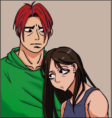
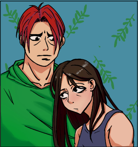
This is the the current set up right now. I sent my colors to my client for a check. I feel weird if I only do flat colors when verifying something. So I add shadows to it as well in mine so there is a more information they can use to see if they like it. Like all the rendering passes I will do will be based on the main light and shadow shapes after all. As well as the local colors.
If you see at the top, that the more updated one I'm doing. Adding a simple BG pattern should make the piece come together better, Being a light desaturated blue make the darkers saturated color pop more, ie. the character. I'm quite proud of it. I wish I can finish this commission faster but my work is taking my time, and well my other hobbies as well. I'm practically done now with my blog app so I now have more time for this. I have asked my client if they're fine with me taking a month with the commission and they said it's okay, so there's that.
1 note
·
View note
Text
#7: Testing some stuff around.
Last week, I did me commission work and more studying around for textures and colors.
This week, I did me more commission work, applying the stuff I learned this week and started making a blog updater to my other social medias with python.


I'm currently watching color survival by Marco Bucci. I learned most of my current knowledge on how color works, value, hue and saturations wise all thanks to him and his free videos on youtube. The first topic discussed was how the color gray is great because it can connect a lot of color together.
I believe this is why a lot of people start their flat colors with a desaturated base. Since everything desaturated works together, it makes the picture much more cohesive, then you add saturation at areas when you need it.
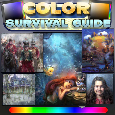
cover of color survival.
I tried applying it on the final one but I think I did it too much here or maybe not, I'm not sure. I haven't tested raising the color here yet. But hopefully it'll good in the end. Saturday came so fast since I spent most of the time either working on me day job or working on the commission.
I tested it with the commission I'm currently doing. I wanna make them proud since they are my first ever client. That and all the art I'm doing is their stuff. Drawing other people's character are fun. I'm like an incomplete circuit that needs one last part to complete the circuit, then boom, my art get wayyyyyy better suddenly. The same thing happened since I ditch my original character and darted doing zelink instead.
My characters didn't really have much other than looking pretty to draw sex scene with but with zelink I was able to put more thought on how they position and expression should be so it feels more personal. Which is something I always want to add to my work.
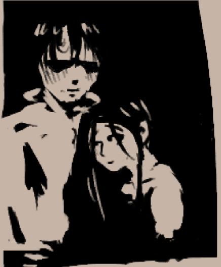


progression of they're commission A. from thumbnail to flat color.
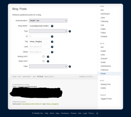
I didn't much time since last I promised to study art because then I suddenly thought to make an blog updater app. I know basic python but I haven't touched how to do APIs and stuff. But the plan was simple of course.
Access my blogs posts
Get all the post that has the sleepy_blogging tag
Get the valid post url
create a tweet on twitter with the valid post url
add valid post tags with sleepy_blogging_known
but I'm having a huge road block with the twitter of all things. I know that twitter is having a shit fest with their APIs and everythong around it but like, come on man. It's like, one tweet a week. I thought it would be easy and stuff. Like the code works on their code sample API on their github page. But like, it requires a manual input of a pin into the terminal in vscode to post. That's not automation.
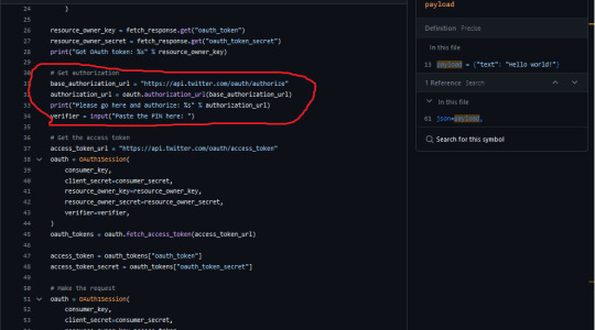
Man, it was gonna be so cool. I wan planning to do host it as well with a PI. It doesn't need a lot of processing power to do so it doesnt need much but it would look so good to add it to a list of projects that I have done. I guess I have to do it on blusky instead.
1 note
·
View note
Text
#6 : Studying Inspired stuff.
Did both commission work and studying colors and texture this week.
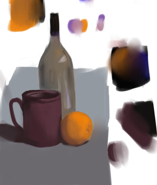

Work has eating a lot of my time so I couldn't art much this week. But what I did do was quite simple.
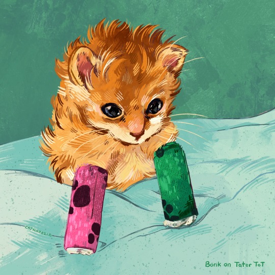
This picture by catwheezie really inspired me to put more brushwork in my art. I just love how much details it provide. I know it doubles as texture for the fur but I wanna add details like this to things the are not fur. The most obvious way is probably to do detail contrasting cuz if you see here, there more texture at the cat versus the BG. So I'll probably do that as my study this week.
Downlodead the G-Rutkowski brushes2017. I think they look pretty good. Eventually, I'll learn how to use them in my stuff.
------------------------------------------------------------------------------
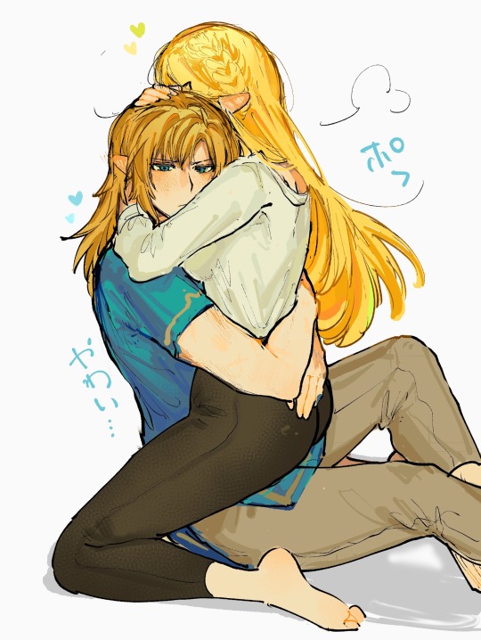
This one by shanodesu . I love the colors chosen here. It looks so much more vibrant compared to mine. This is what inspired me to study color again cuz, I may know how to render thing but I don't know how to color them.


Cuz mine looks pretty good but after doing some observation, I think it's because I lack some neutrals that would make, in contrast, the saturation pop better. Atleast, that's the theory of it.
Anyways, that what I plan to study more this week and hopefully by then or the after that, I have something for you guys to see.
0 notes
Text
#5: Slowdown and First Commission
This week, I have run out things to post. Time to finally start posting the original purpose of this blog. in progress stuff a lot.
EDIT: Removed pictures. Links them instead to my reddit.
COVER and other wips of it. Refer here for those.
I am a slow artist. Taking a little time everyday doing my art. As an example, the WIP I posted has taken 1 month now. Here is some more version of it.

Most of the thing that takes time is the sketching part for me. It's usually the step where most of the decision are made here. While the thumbnail stage is where the big decisions are made (eg. composition, framing, lighting sometimes), the sketching is where I have to make the art look good here now.
Is the head shape okay? Does expression work here? How's the proportion here when this happens? Why does this look wrong now? Now I realized that I have to change the thumbnails a bit cuz it looks wrong in greater detail, How do I change it while maintaining most of the original thumbnail decisions.
Lot of questions there. But eventually, little by little everyday, I answer all of this questions and finally move one to line art stage. Eventually finishing, like I have done before.
------------------------------------------------------------------------------
Another thing that happened this week. Remember the the person I was gifting from last post? they commissioned me. My first commission ever as an artist. 🤭🤭🤭
And they commissioned me to draw their characters again. Along with his BF this time.

I always imagined that when I start doing commissions, I would do them some fast thumbnails, since I like doing them a lot and they get a lot of options for them to do.
He said that he wanted his characters to be doing stuff together as a couple. Which is perfect since I also like doing couples art. So I asked them those characters personalities are like and how their personalities affect each other. And this is what I came up with.
He loved it. He loved so much that he wanted to do add another commissions so that I can do both A and D since they said they can't decide between the two. It feels amazing that someone liked your depictions of their characters so much that they pay you money.
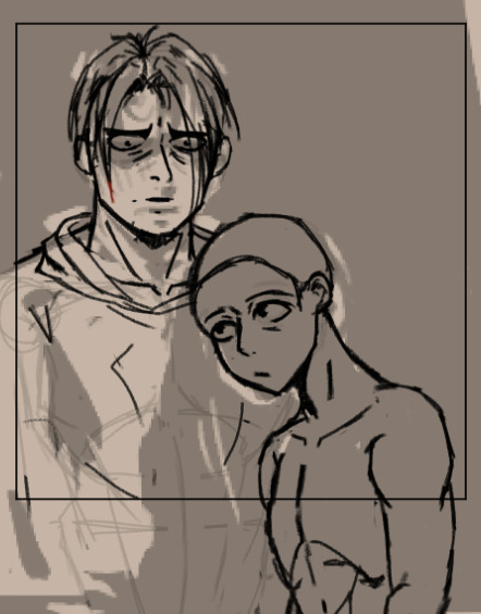
Now I'm in the sketching stage for both of them and it's gonna take some time now. Here's a WIP from A.
Hopefully, I can make them proud.
0 notes
Text
#4: Secret Santa 2023 Experience.
Happy Holidays to all. And this year, I joined a secret santa at discord and had fun time doing it.
Meet Kero. The OC of the giftee, @dirtj0b. Has hard looking face but his actually quite softer. He loves frogs as well. Hence the name.
Here my thought process behind this one
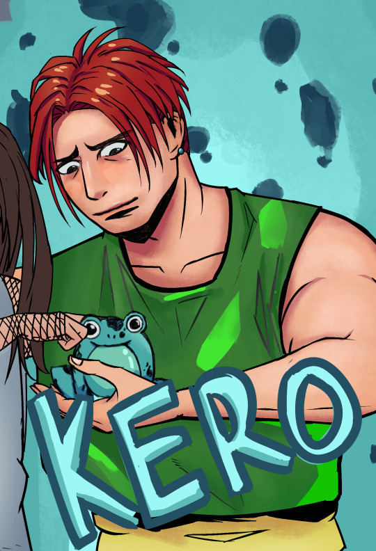
Was a fun character to do. This is the first time that I drew a more masculine character. Before, I did more curvy women and a twink named Link. Here some reference provided from him.
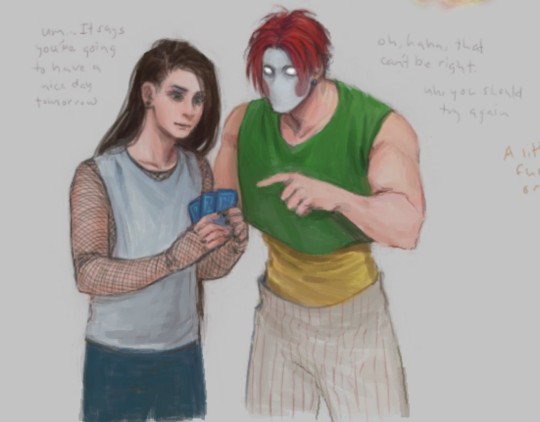
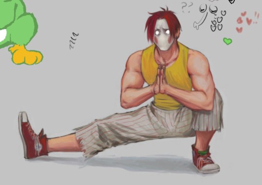

Sketching out his more muscular frame and huge shoulder was quite a feat. Making sure that the inner lines around it would properly convey the foreshortening and how muscular he is.
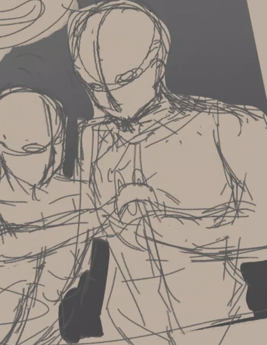
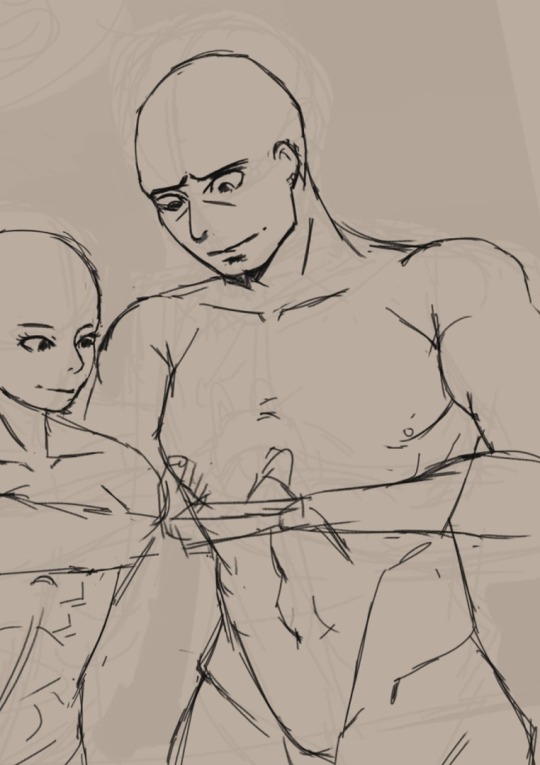
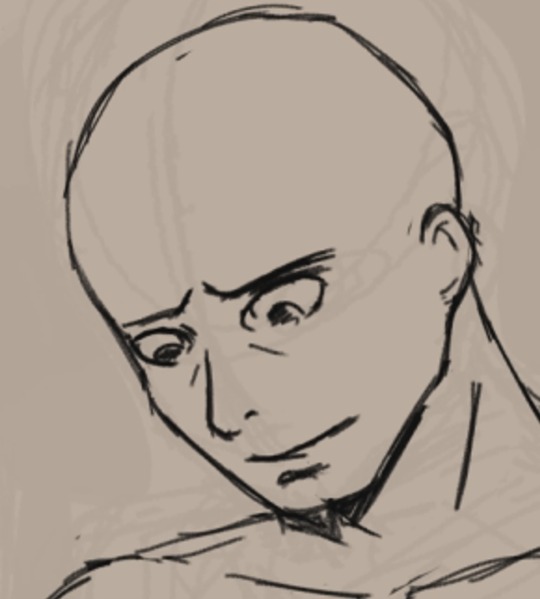
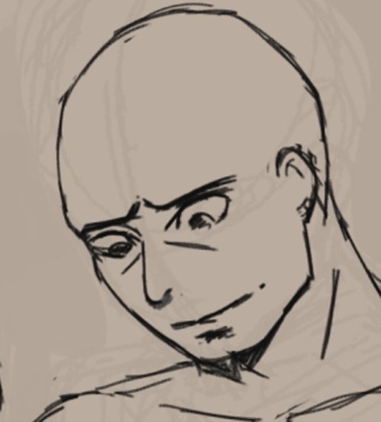
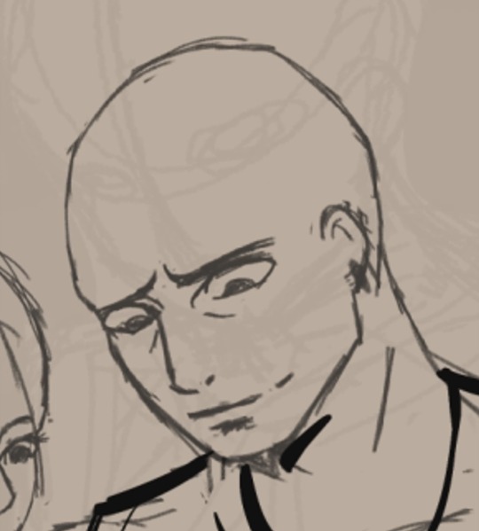
Another new thing I did was drawing a masculine looking face. Mostly doing women and Links has made me a habit of softening the facial features. After taking a quick nap and looking at the picture again, I realized how soft his face is and needed more angular, sharper lines around the face.
Here, you can compare these all faces to see for yourself. Each small line really makes the difference. Would sleep after an attempt and wake up to see if it still look like the OC I'm making. Had even over layed the characters face to see where I'm going wrong here.
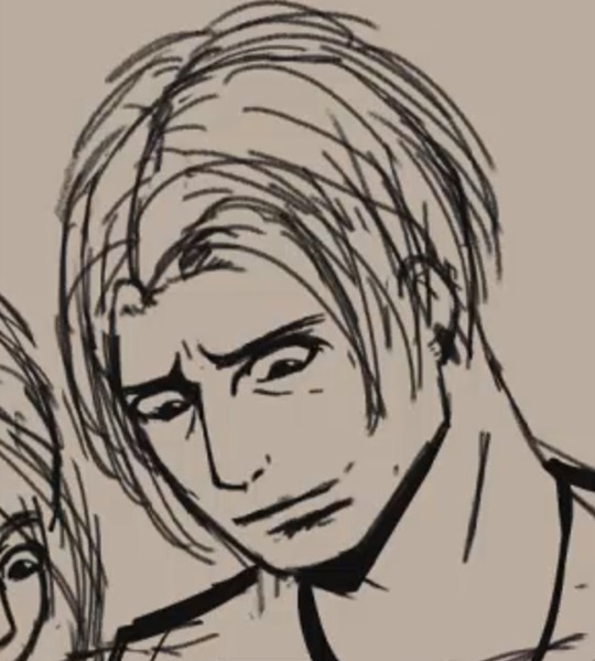
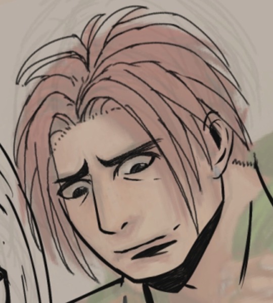
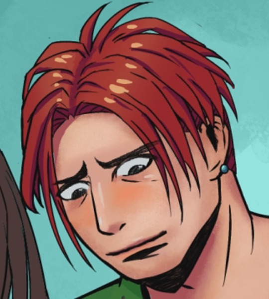
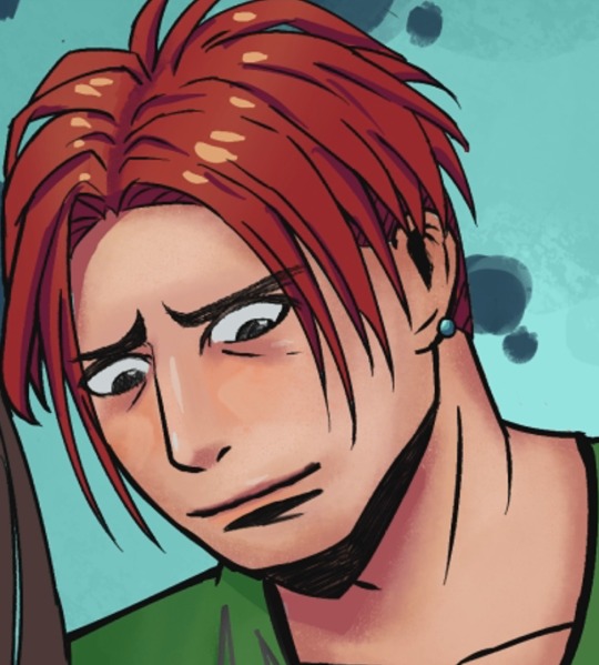
Originally I wanted to also include his Boyfriend, Puck. I thought it would cute to be together. But day work got busy and I was running out of time to create this. I could just said "fuck it, here it is" but it wouldn't represent them best together. So I just had to scrap him altogether in the end.
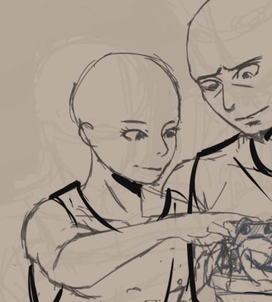
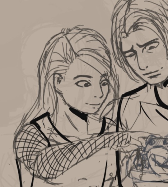
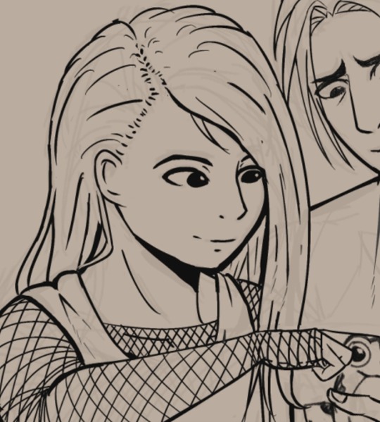
Added the blue frogs cuz he likes them. Also the background as well. They're both blue since they contrast well against Kero's green shirt and red hair.
Finally, added some neon inspired text of his name. If you're asking about the saturated greens on his shirt, it's because it adds some nice color vibration to it.


How about my secret santa gift? I asked Zelink fan art. I only really wanted to give this year but the requirements inlcuded getting gifted. I like it. I thought I wouldn't feel anything in receiving art of characters I always draw, but surprisingly, it felt good.
Thank you Ralph for a wonderful Christmass gift.

Anyways, Merry Christmas and a Happy new year to all ! ! !.

#secret santa#gift#digital art#artists on tumblr#not my oc#Might join next year again.#sleepy_blogging#sleepy_blogging_known
1 note
·
View note