#which is just a dark desaturated version of his scarf color
Explore tagged Tumblr posts
Text
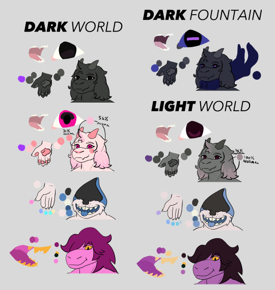
Looking Glasses Development Art 4
<== Prev Next ==>
Here's the color reference that I've been using to make Looking Glasses (prettied up a bit). This was one of the first things I made for the comic, but a lot of it wasn't finalized until after I'd already finished the first few pages. These character designs have changed a lot since then, especially Lancer's, so I'm actually in the process of making a new color reference guide with full-body paper dolls so I can design outfits on them. This guide was incredibly useful though, especially after I had Lancer paint his nails five different colors, which made my life a living hell.
#looking glasses#deltarune#utdr#lancer's design has really changed#by the time I introduced him I wanted him to have less of a hershey's kiss shaped head and I gave him paw-pads which aren't here#I also really love Ralsei's light world eye color#which is just a dark desaturated version of his scarf color#Ralsei's whole light world design is meant to be a merging of his two dark world color schemes
28 notes
·
View notes
Text

[Image ID: Several digital sketches of two classic Sonic redesigns. Both have been made to look more like desert hedgehogs, with large ears, dark brown mask-like markings on their faces, and distinct quills. Both have pale blue fur, darker blue quills, and green eyes so dark they appear black.
The one on the left is labeled "Baby Blue". Handwritten notes point out that he is "thin, malnourished", with "scruffy" quills. He has fluff on his cheeks, which a note says he "hasn't grown into". Another note points out his plain brown sneakers, as he has "no sneaks yet".
The one on the right is labeled "Classy". The notes point out that he is "chubbier" and "a lil taller than Blue". Another note points out that his quills (smoother than Blue's) "arch up more", resembling the "mohawk" of Western classic Sonic. He lacks Blue's fluffy cheeks, as his is "smoothed down". His brown markings are lighter colored. He wears classic Sonic's red and white sneakers.
Black-and-white sketches to either side demonstrate expressions for both versions. /end ID]

[Image ID: A digital drawing of two Sonic the Hedgehog OCs on a plain white background. On the left is Black the Wolf. He has dark blue, almost black fur, with pale blue markings on his muzzle, underbelly, paws, and tailtip. His eyes are dark green. He has bright blue markings around his eyes and on his paws. Another marking on his forehead resembles an eye, formed from a crescent and a dot. On the right is White the Lion. He has creamy white fur, with a golden mane and dark brown markings. His eyes are yellow-green, with a matching yellow-green marking just below his throat. /end ID]

[Image ID: A digital drawing of two variants of Sonic the Hedgehog. On the left is Nega-Sonic. His colors are inverted from regular Sonic's, with rusty red-orange fur, pale yellow quills, pale blue markings, and pink eyes. His gloves, socks, and the straps on his shoes are black, while his shoes themselves are bright blue. His quills are jagged, and he looks down with a furious expression. On the right is a version of Boom Sonic. His colors are more desaturated than regular Sonic, and his quills are puffier and hang down more. He wears a red scarf around his neck, and looks to the side with an annoyed expression. /end ID]

[Image ID: several digital sketches of Dr. Eggman a redesigned Sonic the Hedgehog. In the first Eggman stands with one fist upraised, grinning evilly, while Sonic stands to the side frowning up at him. On the right is a smaller drawing of Sonic smiling and waving to an unseen crowd, while a furious Eggman looms behind him. Finally, in the bottom right is a small drawing of Eggman grinning at Sonic while Sonic glares at him, raising his hands in a "time out" gesture. /end ID]
more experiments with my Sonic redesign. what's with the multiple versions of Sonic? don't worry about it :)
#2023 art#my art#gaia au#sonic gaia au#sonic the hedgehog#sth#sonic redesign#digital art#procreate art#dr eggman#black the wolf#white the lion#nega-sonic#remembered space#classy the hedgehog#baby blue the hedgehog#nick the hedgehog#fleet the hedgehog#don't worry about it :)#sonic au#image described#has image id#trying to keep the ids shorter and more to the point#brevity is not my strength#accidentally posted on my main#has id
24 notes
·
View notes
Text
Dragon Age Tarot Style Guide: Part Two

The second of my at least three part set of tarot tutorials. This sentence will link to the first one on composition if you haven’t seen it. It’s been a four year gap between these, and I apologize for that. To all you who messaged me and reminded me of this project, thank you. You kept me from forgetting and I’m glad. <3
It won’t be another four years until I post the next segment, which will be pattern and texture focused. It’ll hopefully be in the next month or two.
This is going to be a long post, so I’m putting it under the cut. Apologies to the mobile users!
As a general disclaimer, this is an unofficial guide, I’ve never worked with Bioware. All of this is based on how I approach tarot design, my inspiration being heavily rooted in Dragon Age Inquisition’s companion card designs.
Secondly, I know nothing about tarot. I tend to use http://www.ata-tarot.com/resource/cards/ heavily as a resource for my understanding of the cards and their meanings.You don’t need to know anything about tarot to do illustrations, just have as much fun as you can. <3
So I typically work with a color composition in mind, but for those who are struggling to imagine a color scheme, my best advice for coming up with a palette is to just throw down some colors in this sort of an arrangement.
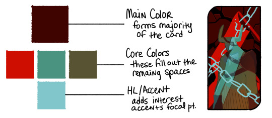
Your Main is going to be whats forming the base of the card, or it’ll be the most widely used color. Backgrounds usually make up the main, but sometimes it’s a foreground element or the character’s clothing.
Your Cores are going to be colors that accent the base. You can make these pretty wild to be honest, but complementary colors and triads tend to work best for a balanced color composition. That’s what you’re trying to achieve with these--balance. Think about what’s drawing the most attention. The red in this example I did with the Iron Bull is very strong, and the teal I chose is fighting with it so my last color is something a bit more desaturated that accents the teal instead of picking another aggressive color, like a saturated yellow.
The Accent or HL color is whatever you’re going to use to add the final focus notes. It will typically be your brightest or your most saturated color, though not always. Sometimes your HL color might be the darkest of the composition because your main and core colors are naturally bright. It should be used sparingly, or if you’re using a lot of it, focused in one area.
You can use more colors than this! For my example card with Bull, you can see I made his pants a sort of subdued yellow and added accents to the background and lit parts of his body in in different colors, But you’ll want to keep your major colors limited to keep it cohesive. If you start losing cohesion, I recommend using a gradient map over your picture set to multiply or soft light (not at 100%) to tone down your most divergent colors, and you can mask out areas where appropriate.
This Bull card is one I made by picking my colors first then deciding on the content and composition. Color picking can be done first, or second as I’ve done with the rest of my examples.
Card #1: Rayne Amell [ @dracoangel ]
The Queen of Cups
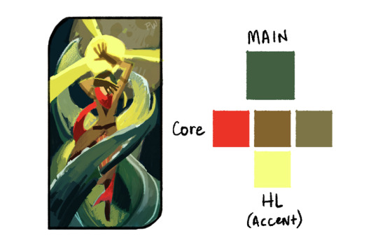
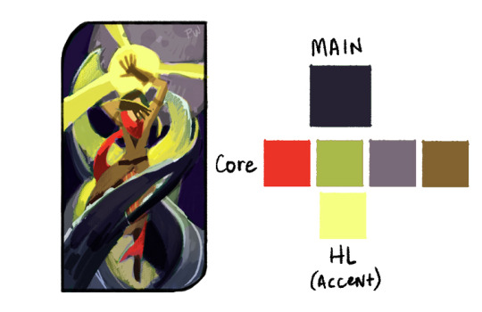
This card went though several iterations with color, and the end product is less about story and more about atmosphere. The drawn composition reflects more of the story: she conceals her thoughts and feelings, but the world bends around her like water. I wanted to add more purple to this card, considering the character’s preference for it, so I skewed the color scheme in the final to be more purple. The first version probably makes for a more cohesive palette, but it lacks the same depth and drama as the one with purple. I added another core color to the second palette, which is totally okay to do. Sometimes the core palette might be 7 colors, sometimes it’s 2. The idea is to strike a balance. Colors that are super eye catching like the red in the scarf might better serve the composition as a lesser accent, whereas the purple core is a great fill because it’s fairly desaturated and doesn’t demand as much attention.
The HL color takes up a fair amount of this composition, but note that it’s strongest in the top two thirds, and is centered in the top third. The foreground water also cradles it against one of the darkest purples of the card, which helps center focus up top.
Card #2: Valora Lavellan [ @kylorensprettymuchanasshole ]
The Devil
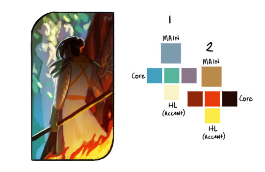
This was the most difficult of the palettes, I’m working with two separate light sources in two wildly different locations. On the one side you’re at an ancient elvhen temple, on the other, in a burning chantry. It only made sense to have two different palettes for this composition. Where I really failed here was in not having a color that bridged the two sides. If you can engineer a color to be in between two differing palettes, you’re in a good place.
With that in mind, I revisited the thumbnail.
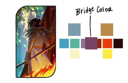
The execution is a little weak, but the idea works. The bridge color could work in either of the palettes and is a midway point between the two most similar values of the core colors. It’s used primarily where the separate palettes meet each other smoothing that transition. In this instance, it also helps to define the figure and double down on where the focus is, since before it was fighting between the top left and bottom right corners. Now the focus works as a diagonal from one corner to the other.
Double palettes are hard, but can make for some truly dynamic color compositions.
Card #3: Iothari Mahariel [ @theuselesspotoo ]
Six of Swords

This card was a struggle for completely different reasons. The palette is pretty homogeneous, primarily purple, with a hint of green. This one could use far more variation, and the challenge is in driving interest with such a limited palette. This is where your values are going to be super important. Your darks vs lights are always hugely apart of composition, but in limited palettes they do the most work in driving interest. Make sure to break up some of your larger and more prominent shapes with value differences, the snow vs the dark stone beneath it.
If that isn’t enough though, there’s a few tricks that can help push focus where you want it without heavily changing the color scheme.
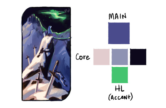
We have three very distinct planes in this; the sky, the distant mountains and skyhold, and the cliff the figure is standing on. We can push the far mountain plane back by reducing the brightness of it, and we can pull the nearby plane closer by adding stronger highlights to the lit areas. I also brightened up the figure since they were getting lost in the sky a bit.
In addition, I popped the foreground colors with just a bit more red, to separate that plane from the more bluish purple mountain plane.
Just those small changes really sharpened up the focus of the composition, and we were able to keep the palette fairly limited.
Card #4: Tighe Lavellan [ @queen-scribbles ]
Nine of Wands
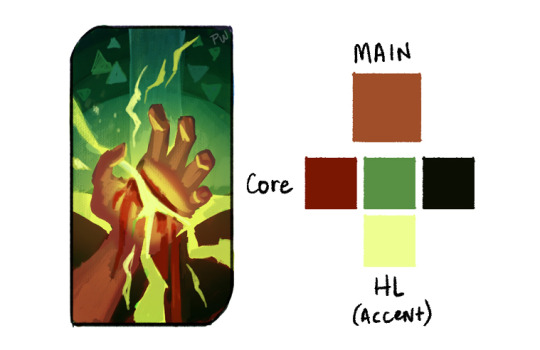
This palette was a breeze compared to the others. We’re working with complementary colors, reds versus greens, and very little divergence in either direction. The bottom half is primarily reds, the top greens, and they meet in the middle with a soft orange and harsh yellow. Palettes with complementary colors are the easiest to work with, the important part is making sure their balance works with your drawn composition because they like to fight. All of my reds are limited and desaturated because the greens and yellows, by the nature of the composition, are the most demanding elements.
Card #5: Lathari Lavellan [ @jisabeau ]
The Chariot
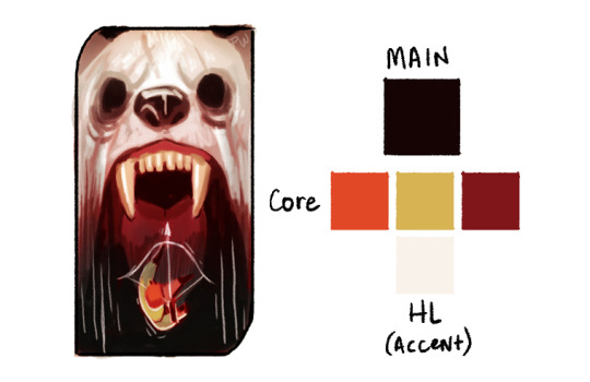
I knew what I wanted for this one immediately when I started it. I really wanted the character to be falling into a void, to mirror their emotional crisis when dealing with the deadly white bear of their past. But though this works fairly well as a base palette, it’s really missing the intense horror I wanted when I started.
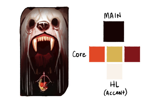
So in my edits I pulled them further apart, and pushed the darks even further. The challenge here is having a dual focus, since I don’t really know if either stand out enough from one another at this phase. I have to pick a focus, either the bright whites of the bear or the strong orange/green tones of the character.

This is probably the strongest focus-wise.
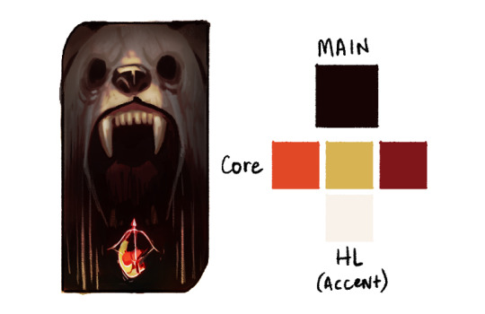
But I enjoy the color notes of this one far more.
The point here is, sometimes things aren’t perfect, and that’s also okay. Pick your favorite, or at least pick one, and take that to completion. It’ll occur to you while finishing it what I needs. Which brings us to the final point, similar to that of tutorial part one:
Final Note: Don’t spend overlong on one thumbnail. I’ve spent days in the thumbnailing stage, that’s fine, but don’t spend more than 1 hour on any one color thumbnail drawing; it’s not worth it. If an idea is good but not great, just start a new thumbnail of something similar, and you’ll stumble onto the right composition.
Remember to explore your own color intuition. My way of doing this might be helpful, but if it’s not, don’t feel compelled to follow it. Everyone has a unique vision, and we’ve got to feel out our own paths.
If you have any questions, send them to paperwick [at] gmail [dot] com under the heading “Color Tutorial: Questions”, OR comment on this post (I might not see them on a reblog) and I’ll pool them into one area and answer as many as I can in a separate post.
Finally, I’d like to give another shout out to everyone who sent their character breakdowns to me for this. I wish I had time to get to all of them, and I really appreciate you taking the time to put them together! Thank you all so much!
Not making promises on when Part Three will come out, but it WILL be coming out. Thanks for reading through all this, I hope it’s been helpful.
#dragon age#dragon age tarot card#art style guide#tarot card tutorial#color tutorial#tutorial#color#dragon age 2#dragon age inquisition#the iron bull#palette#color palette#da2#da#da3#dai#thumbnails#thumbnail#thumbnailing#jisabeau#dracoangel#kylorensprettymuchanasshole#theuselesspotoo#queen-scribbles#lavellan#amel#mahariel#my tutorials#my art#2019
1K notes
·
View notes